
literepedegeaba
Litere Pe Degeaba
Good looking fonts from around the web. For free.
17 posts
Don't wanna be here? Send us removal request.
Last Seen Blogs

stephdragonness
StephDragonness

pokegalla
The Power Of Memes, Fanfics, And Skellies

let-the-dream-begin
Precious Little Ingenue

dragdraws-art
Sloth | DragDraws

jlaiyon
JLaiyon
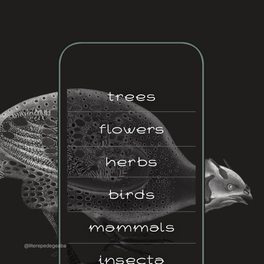
Photo

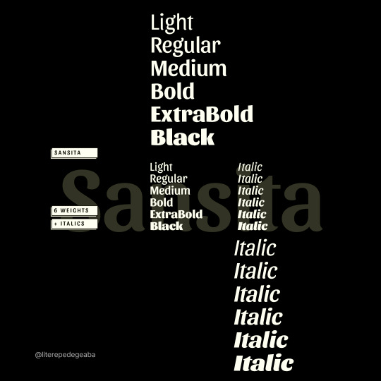


Sansita by Omnibus-Type / @omnibustype
Sansita is a tasty typeface family, with 6 weight variants, plus matching italics. Each stroke weight has its own allure, as Sansita explores the borders between typography, calligraphy and lettering. It is ideal for any short text destined to strike. Its vigorous uppercases makes it an excellent choice for branding, packaging, slogans and book covers.
—
Download - http://bit.ly/30SvKwY
—
1 note
·
View note
Photo


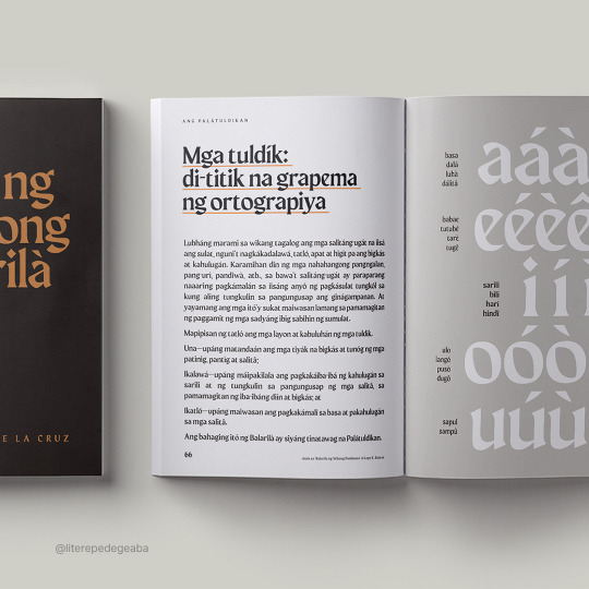


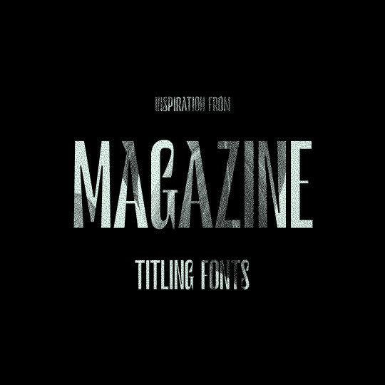
Maragsâ by John David Maza / @jad.psd
Maragsâ is a display, semi-serif typeface that owes its form to one of the accent marks used as a guide to the correct pronunciation of Filipino words—the pakupyâ accent—whose tapered tips heralded the sharp edges, hastily-flowing strokes, and abrupt cuts in the characters, similar to the manner words with the stress should be spoken.
The term "maragsâ" refers to the way of pronouncing words in Philippine languages when there is a simultaneous occurrence of a stress (diin) and a glottal stop (impit) in the last syllable. It is represented by attaching a circumflex or "pakupyâ" mark on the final vowel of the word.
—
Download - http://bit.ly/2MoWxxc
0 notes
Photo

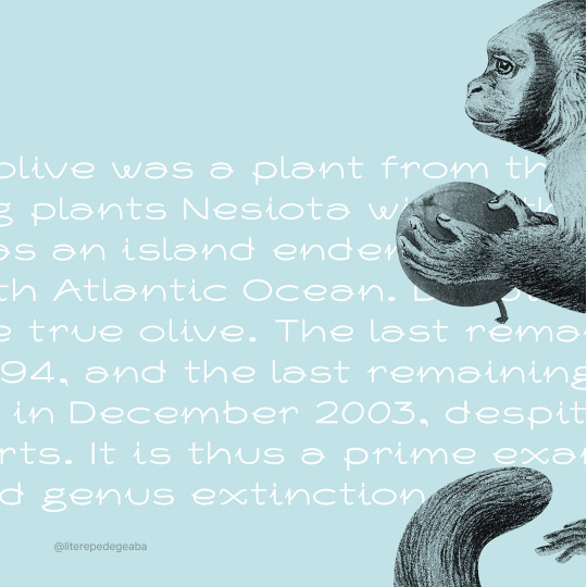
Nesiota by Mikko Nuuttila / @mikkonuuttila
Nesiota is an experimental font with light curvy strokes and unique features.
—
Download - http://bit.ly/2OSuXcN
—
0 notes
Photo


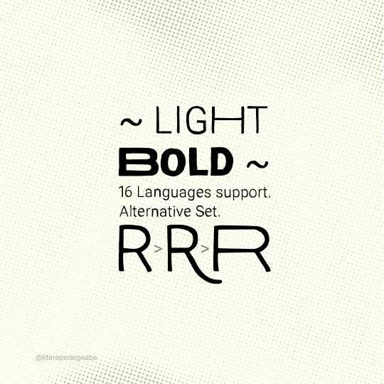


Ramona by Rostype Foundry / @rostypefonts
Ramona is a type family developed by Cristian Tournier in 2020.
Inspired in argentine famous Folk songwriter Mercedes Sosa, offers in its character map uppercase and lowercase glyphs, diacritical marks and a variety of alternative characters. Its remarkable irregular outlines presents features that simulate handcrafting making it perfect for warm and friendly communications.
Ramona contemplates two weights, Light and Bold, that help in the process of makin harmonic publications and generate visual contrast. Ideal for headlines or highlights in posters, books, magazines, promotional material, advertising, branding or any text that needs to have its own personality.
—
Download - http://bit.ly/2Ziqp19
—
0 notes
Photo


Tourney by Etcetera Type Company / etceteratype.co
Tourney is a variable font with competing interests! Outline vs Inline. Upright vs italics. Condensed vs expanded. Solo vs Stacked. While the possibilities aren't literally endless, there are a lot of fun combinations you can make with Tourney.
This is a collaboration of tech and sport. At least, that is where the inspiration came from. Tourney would feel at home on a space ship or in a stadium. It is optionally stackable with itself. If you're new to layering fonts, there's not much to it: duplicate your text layer, and change the color/weight as you see fit. The lightest weight of Tourney (100) is almost an outline (but it rests on the baseline) and that "stroke" thickens as the weights increase. 900 is completely solid.
Tourney comes in static styles for desktop and web as well as a single variable font and has received several updates since its release in August of 2018.
—
Download - http://bit.ly/2ZfMrSb
—
0 notes
Photo
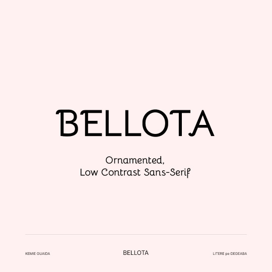


Bellota Font Family by Kemie Guaida / @kemieg
Bellota is an ornamented, low contrast sans-serif with text and swash alternates. It’s just cute enough! It comes in two variations: regular and text. Each of these comes in tree weights (light/regular/bold) and italics. There are stylistic alternates (for swash and non-ornamented characters) and ligatures available through opentype features. Stylistic Style1: Text Stylistic Style 2: Swash caps.
Bellota supports most latin languages and basic cyrillic.
—
Download - http://bit.ly/37a9nqe
—
0 notes
Photo
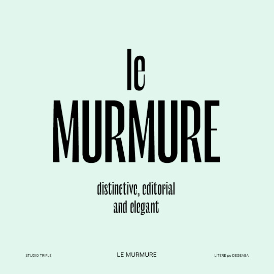
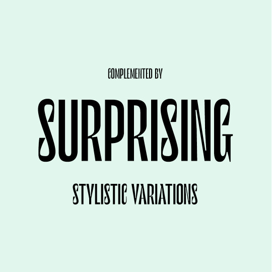
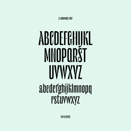

Le Murmure by Studio Triple / @studiotriple_
To renew their brand image, the French design agency Murmure has decided to base their remodeling on a custom-designed typeface: Le Murmure (“The Murmure” in French). Studio Triple designer Jérémy Landes has developed an especially distinctive, editorial and elegant font, which has been complemented by surprising stylistic variations.
This typeface comes with many glyph variations, meaning alternate letters drawn in an even more original way. Here lies infinite potential which the users will take great delight in exploiting through a random opentype function.
—
Download — http://bit.ly/3rQqc1A
—
0 notes
Photo
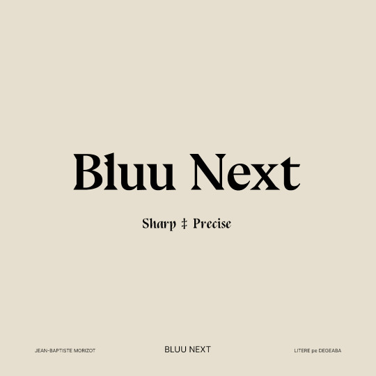


Bluu Next by Jean-Baptiste Morizot / @phantomfoundry
Sharp and precise, a totally good choice to replace any boring serif font like the Times New Roman or the Calson Graphic.
-
Download — http://bit.ly/3abY56U
-
0 notes
Photo


Plaisir by Justin Penner / @_justinpenner
"Today I was looking some beautiful art deco lettering, on a piece of ephemera from the 1937 World Expo in Paris. I started this typeface by drawing a few similar letters, but made some changes and took it in another direction as I didn’t want to do a direct revival, and I only had a few letters to look at anyway."
-
Download — http://bit.ly/3b18lOG
-
0 notes
Photo


Argesta by Atipo Foundry / @atipostudio
Argesta is a powerful neoclassical serif font family with high contrast. The ideas for this font has a wide range of reference, from vintage, classic, until the modern era, making it the perfect typeface for an understated, modern, sophisticated look. Stylistically, Argesta is directly inspired by haute couture and it is well-suited to classy branding identity, magazine design, or for luxury product packaging design.
-
Download — http://bit.ly/3749XFZ
-
#literepedegeaba#font#fontforfree#fontfriday#freebie#freedownload#freefont#goodtype#type#typedesign#typeface#typefaceforfree#typegang#typematters#typetuesday#typography#atipofoundry#serif#neoclassical#highcontrast
3 notes
·
View notes
Text
Merriweather Sans
Merriweather Sans is the companion to Merriweather. It comes in 4 weights designed specially for screens. The classic structure provides a notable difference from other Google Fonts. Merriweather Sans was developed using TTFA rapid test design solutions. As a result, Merriweather Sans was designed to ensure excellent Windows rendering. Designed by Eben Sorkin http://sorkintype.com/fonts.html#mws Download link: http://www.fontsquirrel.com/fonts/merriweather-sans

1 note
·
View note
Text
Sreda
Designed by Elena Kowalski http://www.behance.net/glenjan Available for free at MyFonts http://www.myfonts.com/fonts/glen-jan/sreda/gallery.html

0 notes
Text
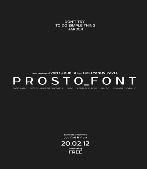
Prosto
New font for project of free fonts www.jovanny.ru Font has multilanguage support and could be used as in titles, as in body text. Format: TrueType (.ttf) Compatible: PC & Mac Glyph coverage: Basic latin, West european diacritics, Euro, Central europe, Baltic, Turkish, Cyrillic, Romanian Download link: http://jovanny.ru/fonts/Prosto.rar
0 notes
Text
Cinzel Font Family
Cinzel is a typeface inspired in first century roman inscriptions, and based on classical proportions. However it’s not a simple revivalism. While it conveys all the ancient history of the latin alphabet it also merges a contemporary feel onto it. http://www.1001fonts.com/cinzel-font.html

0 notes
Text
Nexa
Fontfabric type foundry presents Nexa free font! Two styles (Light & Bold) available for direct free download only from fontfabric.com http://fontfabric.com/nexa-free-font

0 notes
Text
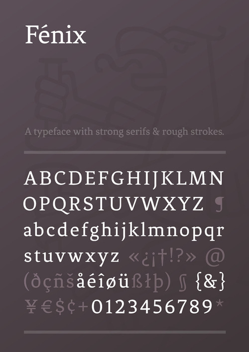
Fénix
Fénix is a serif typeface designed for display and long texts, its foundations are based in calligraphy, with strong serifs and rough strokes. Its proportions seek to gain space in height and width. Fénix is elegant at large sizes and legible at the same time, with a lot of rhythm in small sizes. http://www.myfonts.com/fonts/tipotype/fenix
0 notes
Text
Calendas Plus Regular
Calendas is a typeface with a classical air, great legibility and elegance, designed for work in small sizes. Its special characteristics derive from its calligraphic finishing. Download Calendas Plus Regular for free by just paying with a Tweet or a Like. http://www.calendasplus.com
0 notes