#fontfriday
Photo


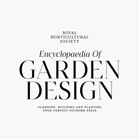

Argesta by Atipo Foundry / @atipostudio
Argesta is a powerful neoclassical serif font family with high contrast. The ideas for this font has a wide range of reference, from vintage, classic, until the modern era, making it the perfect typeface for an understated, modern, sophisticated look. Stylistically, Argesta is directly inspired by haute couture and it is well-suited to classy branding identity, magazine design, or for luxury product packaging design.
-
Download — http://bit.ly/3749XFZ
-
#literepedegeaba#font#fontforfree#fontfriday#freebie#freedownload#freefont#goodtype#type#typedesign#typeface#typefaceforfree#typegang#typematters#typetuesday#typography#atipofoundry#serif#neoclassical#highcontrast
3 notes
·
View notes
Photo

Little snippet of the first variable font from the studio collection. Have you started using #variablefonts so far or it’s still pretty new to you? . . . #typography #typeface #design #graphicdesign #graphicdesigner #font #fontfriday https://www.instagram.com/p/BysdHWoiGN9/?igshid=1sjanc7bb2v8f
1 note
·
View note
Photo

Font Friday: 2018 World Cup (Dusha)
While soccer fans around the world watch the FIFA World Cup in excitement, designers usually tend to cringe at the font choices.
This year, FIFA chose to use Dusha (Russian for “soul”). The font was designed by Brandia Central, a Portuguese agency, in 2014. And it looks like they’ve designed fonts that other tournaments have used: 2015 Copa América in Chile, 2015 EuroBasket in Ukraine, and 2016 UEFA EURO in France.
The fonts they’ve designed aren’t terrible. And it’s not the font itself that we’re disappointed in. It’s the way FIFA is using the font during the broadcast that makes some of us designers want to bang our head against the nearest wall. Dusha actually looks pretty okay for the logo—where it says “Russia 2018.” But everyone knows that this year’s World Cup is hosted by Russia, so legibility doesn’t matter as much—you get to use weird fonts. But when the broadcast is highlighting a player or something else that’s important to the game, you’re most likely going to have to really focus to read it. That shouldn’t be the case.
So why Dusha? This stylized font has Russian characters. Hosted in Russia, so choose a font with Russian characters? Yeah, makes sense. But we’re pretty sure there are better font choices than Dusha that have Russian characters. It seems like the people in charge of choosing the fonts for the World Cup seem to be stuck in a rut. They like a sans serif font with some sort of slanted crossbar on a capitalized “A” and a wide glyph width. Sounds a little like a font we all hate—Comic Sans.
Will the font choices get better in the future? We’re already looking a little more sophisticated for the 2019 FIFA Women’s World Cup in France. Maybe by 2026, when we co-host the World Cup with Canada and Mexico, they’ll have it figured out.
4 notes
·
View notes
Photo

#fontfriday (at Gelibolu) https://www.instagram.com/p/B62SjqxlHOQ/?igshid=1p4q1zkfq5daz
0 notes
Video
A first look at Biscuit—an addition to the font family ‘Colette’ due out just in time for summer vacation.
#LuxTypo#FontFriday#typography#fontstyle#fonts#ArtStudio#FontArt#CustomType#typomania#TypographyInspired#typeeverything#TypographyArt#Goodtype#TheGoodType#TypeDesign#TypefaceDesign#typeface#TheDailyType#typograph
0 notes
Photo
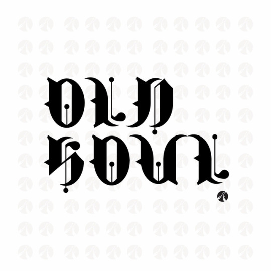
Old Soul #fontfriday #fontdesign #typedesign #illustrator #adobe #alphabet torresdesign.org #akachele
0 notes
Photo
Heritage_Display Font by Andres Silva Bello #graphicdesign #font #fontfriday #artdirection #typography #designforall #wrkhaus https://instagr.am/p/CAyENHBjUBk/
0 notes
Photo
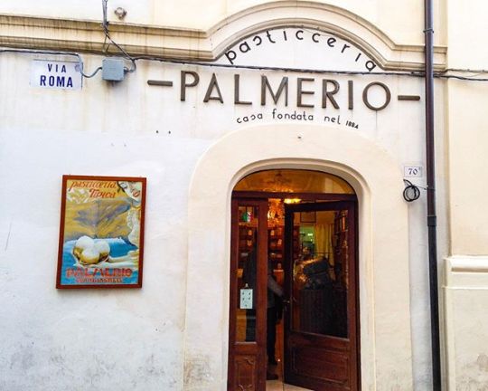
Is today #fontfriday? Venerdì in villaggio? Whatever it is, here’s an example of one of the many small town shops I have photographed just because I loved the typeface. The pastries were delicious, too. #italogram http://bit.ly/2SQ1wIG
0 notes
Photo
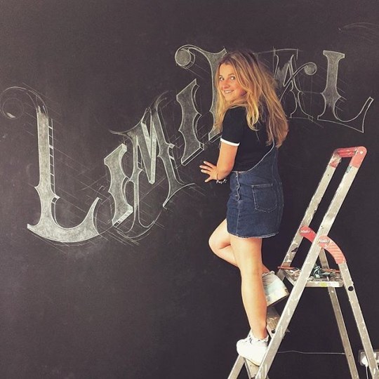
Day 24 of #marchmeetthemaker 🤓 ~ MILESTONE 🖌🏁. . I think that a real milestone for me was getting repeat work from clients & getting commissioned to create my second ever mural, back in 2015. My first mural was by chance when I was walking down the street and saw a sign saying 'illustrator required' I was fresh out of Uni and willing to do anything slightly creative to make some 💸, I got the job ( a chalk #staircasemural how hard could it be? A builder set me up some scaffolding ( just an old plank 😳) and off I went.. I finished the job and was quite pleased with outcome and continued to try and hustle other illustration jobs.. a few months later a lovely graphic designer had seen the mural and asked me to mural in his studio and now murals make up about one half of my work! 🤓. . . . . . . #lettering #mural #muraling #typetopia #typematters #calligritype #designspiration #illustration #thedailytype #typedaily #chalk #chalktype #handdrawntype #strengthinletters #madeinbrum #typography #dailytype #fontfriday #victorian #design #letterer #handdrawn #victoriantype #ligaturecollective #typegang #birminghammural #muraldaily
#handdrawn#muraldaily#illustration#birminghammural#chalktype#victoriantype#typetopia#dailytype#typematters#strengthinletters#chalk#mural#ligaturecollective#design#victorian#staircasemural#designspiration#typography#thedailytype#madeinbrum#marchmeetthemaker#calligritype#typegang#letterer#fontfriday#lettering#handdrawntype#typedaily#muraling
1 note
·
View note
Text
Favorite tweets
We love free fonts, don't you? Props to @CreativeBloq for putting a list of 68 best free fonts from designers. Go crazy: https://t.co/T7VjiOrazO #FontFriday pic.twitter.com/e1VxcVdDXw
— Adobe Illustrator (@Illustrator) April 7, 2018
from http://twitter.com/Illustrator
via IFTTT
0 notes
Quote
Favorite tweets: Mais uma fonte script com essa vibe de assinatura pra eu ficar babando! Fica linda como logo e na ID visual de marcas. #FONTfriday - Signeton Font Script Signature: https://t.co/GV36MMWBIT pic.twitter.com/yBlKYldt3W— Loma 🌵 김로마 (@sernaiotto) March 30, 2018
http://twitter.com/sernaiotto
0 notes
Photo

For #FontFriday, get your scoop on this free SlasherX font. Watch a time-lapse video on how this font was created: https://t.co/Rbgd4j2pBj https://t.co/jwmB9Cfrdp
0 notes
Photo

Font Friday: Bodoni
There’s a reason Italians have led the fashion industry—while other countries have just followed in their footsteps. Not only is Milan the fashion capital of the world, but Italy has produced some of the world’s top fashion designers: Versace, Armani, Prada . . .
Italy doesn’t just have a good sense of fashion, though. The country is known for architecture, espresso, pasta . . . And you guessed it, typography.
Let’s talk about one particular typeface—Bodoni. You’ve seen it on the cover of Vogue Magazine, Armani ads, your Calvin Klein underwear, Elizabeth Arden products, Beyoncé’s album 4, all Nirvana albums, and Lady Gaga’s album The Fame.
Designed by Giambattista Bodoni in in the late 18the century, Bodoni has become one of the world’s most revived fonts today. Bodoni admired the work of John Baskerville, which included increased stroke contrast and more vertical axis. He took both of these characteristics and made them more extreme. Bodoni also studied the designs of French type founders Pierre Simon Fournier and Firmin Didot.
Bodoni and other typefaces were originally called “classical” designs because of their rational structure, but the fonts weren’t updated versions of Roman or Renaissance letter styles. They were totally new designs! Because of this, designers and print-makers started calling them “Didone” designs (or modern serif designs).
There are over 48 revivals of Bodoni since 1909 when the typeface was first used in America. AFT Bodoni, designed by Morris Fuller Benton of American Type Founders, was the first accurate revival of a historical face for printing and design applications. Some details in the revival were based on Didot to help with legibility for mass print production.
Bodoni is one of our favorites. It’s timeless.
1 note
·
View note
Photo


A more in depth look at DENSA—an upcoming release from @luxtypo. #FontFriday #typography
#LuxTypo#font#fonts#FontArt#ArtStudio#custom#InstaArt#CustomType#typomania#typorama#TypoShop#TypographyInspired#TypographyDesign#typetopia#TypographyArt#typograph#typeface#TypefaceDesign#type#typespire#TypeDesign#TheGoodType#TheDailyType#FontMania#advertising#design#VisualDesign
1 note
·
View note
Photo

🖌🌹. Here's a recent branding project for lovely @alderleybotanist 's #theroserooms 🌸🍸🌹. It opened a couple of weeks ago and is well worth a visit if you're ever in the Cheshire area! 🍸. . The logo was completely hand rendered and a really lovely project to work on ~ I thought this snap 📸 would fit today's final #marchmeetthemaker theme: CUSTOMERS perfectly 🍾 . I've been lucky to have worked with some really lovely clients and made some great friends during my freelance career. Feeling pretty sad that #Meetthemaker has finished ~ Thanks so much @joannehawker 👏🏼💛 . . . . . . . #branding #illustration #fontfriday #ladieswholetter #rose #typography #handlettering #signpainting #lettering #handdrawnlogo #logodesign #handmadefont #19thcenturyfont #madeinbrum #typographic #typematters #thedesigntip #designspiration #handrenderedtype #typetopia #lovetype #typspiration #illustratedtype #letteringlove #typegang #handdrawn (at The Botanist Alderley Edge)
#typematters#marchmeetthemaker#typspiration#illustration#ladieswholetter#illustratedtype#theroserooms#typography#typetopia#meetthemaker#lovetype#designspiration#madeinbrum#rose#handdrawnlogo#typographic#signpainting#19thcenturyfont#logodesign#letteringlove#handrenderedtype#thedesigntip#lettering#handmadefont#handdrawn#handlettering#fontfriday#typegang#branding
0 notes
Last Seen Blogs

charakveda
Charakveda
icepimp
818LIVIN

gossiprry-backup
gossiprry back up

homediscipline
Domestic Discipline
milkfrost
Milkfrost's World