lesbianladysif
Gay is always better
Mar, 23, any pronouns. I track #usermarlies, feel free to tag me in your edits. This is a sideblog where I post my gifs, my main blog is haeva.
76 posts
Don't wanna be here? Send us removal request.
Last Seen Blogs

instantengineeringblog-blog
Instant Engineering
notsosimstober
Not-So-Simstober

translationworkzoneblog-blog
Translation Workzone

rebsouthern
Cars, Trucks, guns, nature, adult and, randomness
seenonandwornonicarly
seenonandwornicarly
Text


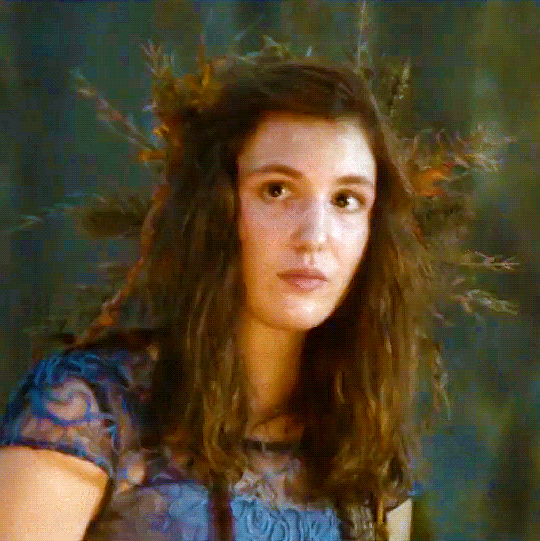
Olivia Taylor Dudley as Alice Quinn
The Magicians | 4.06 - "A Timeline and Place"
#alice quinn#the magicians#themagiciansedit#alicequinnedit#tvedit#myedit#I love her so much and I'm obsessed with this dress okay#wish we'd seen her wear it more often
49 notes
·
View notes
Text
Your Guide to Gif Subtitles
At times, subtitles can be overlooked. So I've decided to create this comprehensive guide for beginner and experienced gifmakers to styling gif subtitles.
By no means does this post intend to limit the way you do your subtitles.
Please like/reblog if this has helped you and feel free to hit me up for any questions and concerns! ♥︎
↓ SEE SUBTITLE GUIDE UNDER THE CUT ↓
NOTE: I've used only screencaps for most examples due to the 10 pics per post limit, so let's just pretend they're animated 😂 My apologies for the very bad quality!
Gif Subtitles Style Guide
[1] Spelling
Look up words and names you don't recognize (fictional or not) to know how they're spelled.
Look up the proper capitalization and hyphenation of terms, even if you're already familiar with it (e.g. macOS, Professor McGonagall, Spider-Man).
[2] Words
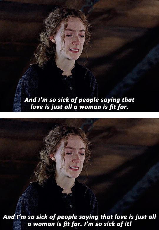
Long Paragraphs
Subtitles are added to be read, so to ensure readability, avoid putting long paragraphs in a single gif.
Try to have only 1–2 rows of text in one gif, 3 rows at most. To do this, make sure there are only 1–2 sentences per gif then move the rest in the next gifs.
The first gif below is an example of a long paragraph cramped into one gif.
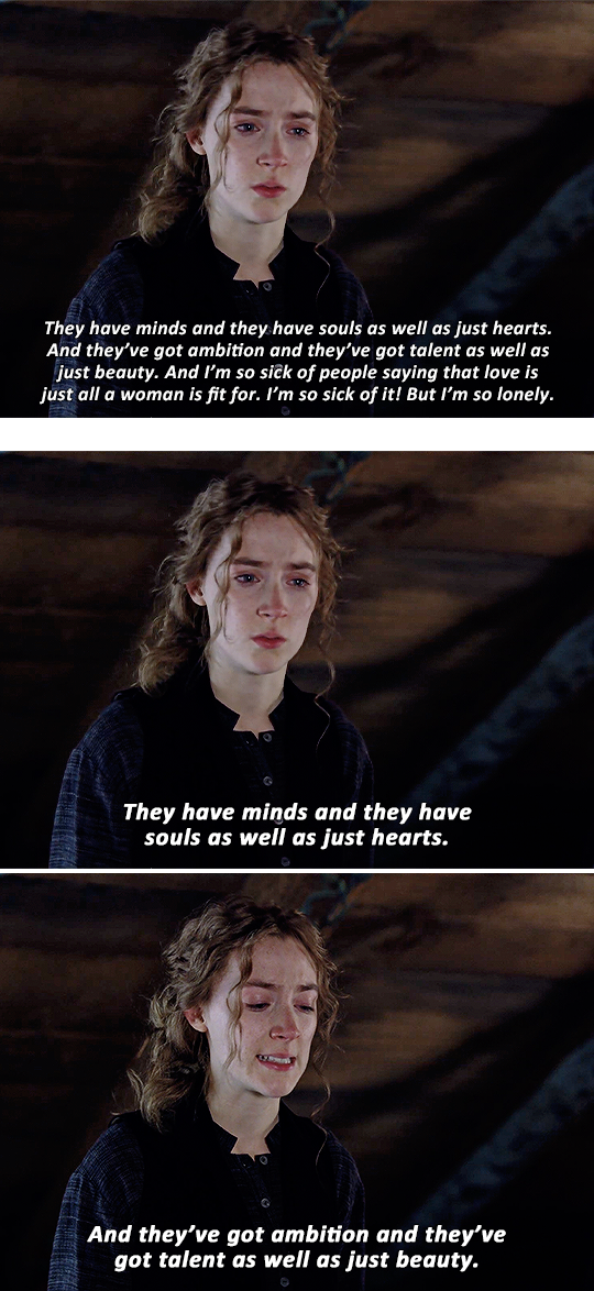
The example above splits the paragraph across several gifs, making it easier on the eyes and giving each sentence more impact.
Widows
Widows are lone words on new rows of lines.
Widows leave too much white space at the bottom of a gif. It interrupts the reader’s eye and diminishes readability.
In the first gif below, "just hearts" is an example of a widow.
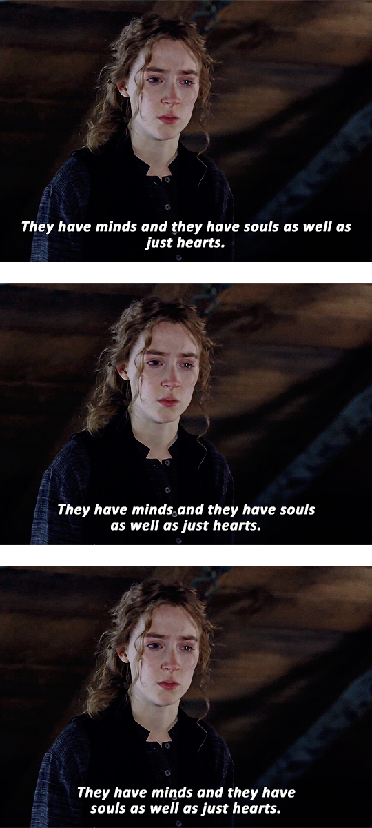
To fix a widow, split your subtitles before an article, conjunction, preposition or punctuation then continue it in the next row. To do this:
Split your subtitles before a point in conversation (i.e. articles, auxiliary verbs, conjunctions, prepositions or punctuations). Doing this would also depend on the flow of the conversation OR the overall look of the subtitles.
Continue the conversation in the next row
In the second example above, the focus is on the flow of the conversation: the widow was fixed by breaking the line before "as well as" (which kind of functions like a conjunction), making the flow of reading much better.
In the third example, the focus is on how the subtitle looks: the sentence was split before "souls" (which follows the auxiliary verb "have") to make the width of the overall subtitle more even.
NOTE: The second and third example show there's no definite way in splitting subtitles. Just be mindful of widows and do whatever looks good to you :)
Widowers
(To be honest I'm not quite sure what the term is so I've decided to just call this one a widower 😂 #equality #girlbossing)
A widower is the first word of a sentence left behind.
A widower follows a punctuation in the same row.
Fixing a widower is similar to fixing a widow except we're keeping an eye on lone words that follow punctuations.
In the first example below, the widower is "But" which follows an exclamation point (a punctuation).
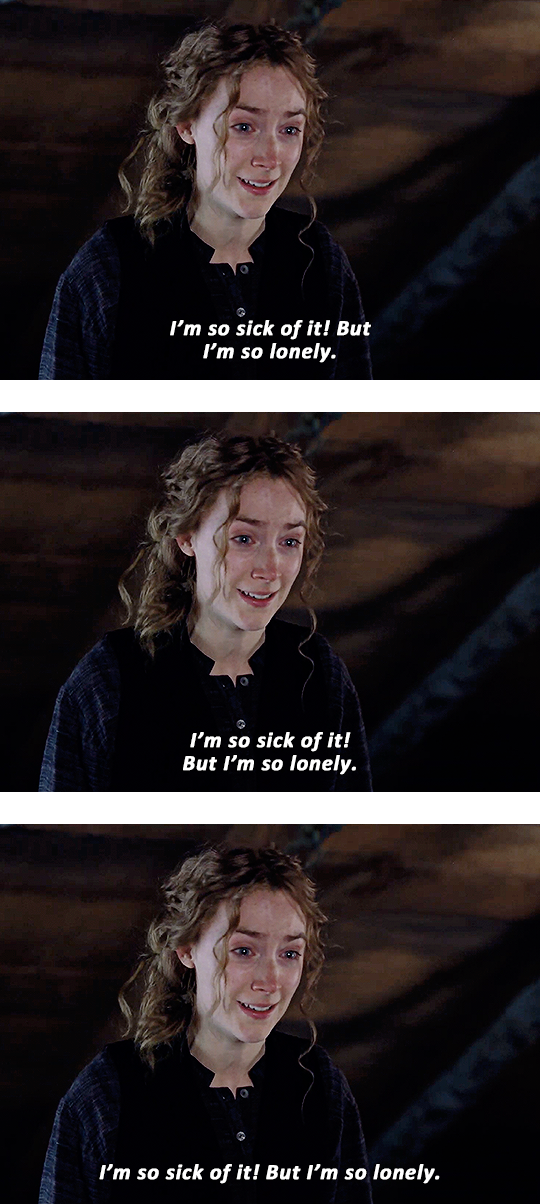
In the second example above, the widower was fixed by moving it in the next row with the rest of the sentence, which is less awkward to read unlike the first one.
In the third example, it has moved the second row ("But I'm so lonely") back up with the first since there's ample space. Not so lonely anymore, is it? 😂
[3] Text
Font vs. Typeface
To this day, I still get confused. Hopefully, writing all this will finally make the distinction stick.
Typefaces are also known as font families. It's a specific collection of fonts varying from Thin to Black, Narrow to Wide, Roman and Italic.
For example: Bebas, Baskerville and Futura are all typefaces
Fonts are part of a typeface. Each variation of a typeface is a font.
For example: Montserrat Thin, Arial Italic and Georgia Bold are all fonts
Serif vs. Sans Serif
Serifs have serifs.
A serif is a small stroke attached to the end of a larger stroke in a letter or symbol. Think Times New Roman, Baskerville, and Didot.
'Sans' is old French for 'without', so Sans Serifs are literally without serifs. Think Arial, Century Gothic and Comic Sans.
Content creators most often use sans serifs such as Arial Bold Italic, Calibri Bold Italic and Helvetica Bold Italic. These fonts aren't flashy and don't distract the viewer from the main visual, the animated pictures.
TIP: Avoid (ultra) Black and Heavy fonts especially with paragraphs because it will make the sentences look bulky and hard to read.
Some gifmakers apply Faux Bold and Faux Italic to their text (the ones highlighted pink in the examples below). Apply whatever looks good to you.
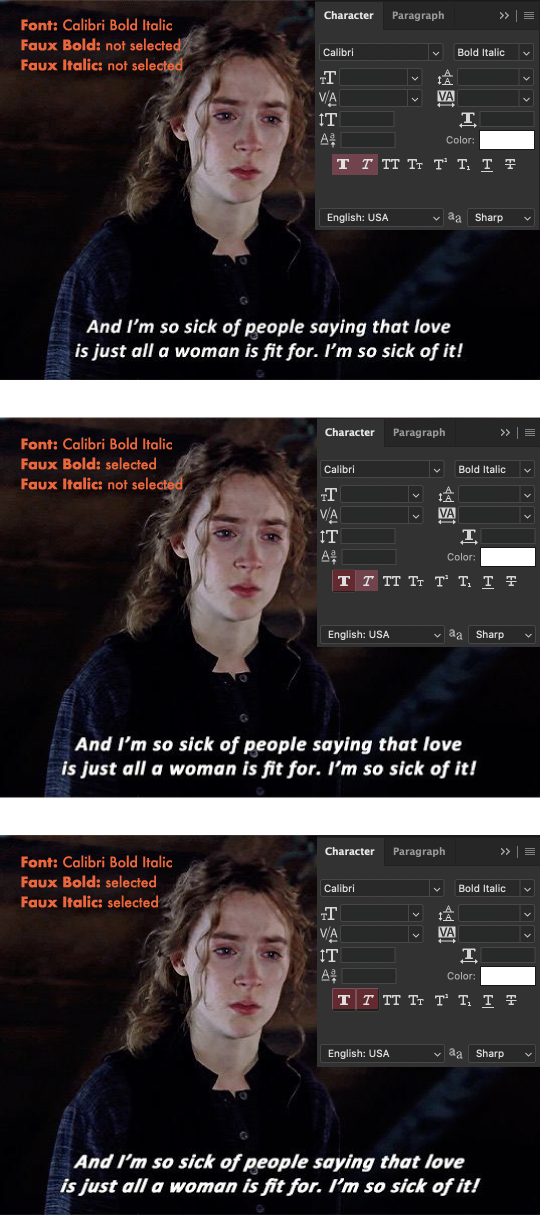
The first example above looks good, but my personal preference is the second where faux bold is selected. The third one looks much too italicized, since the font itself is already italic.
Alignment
There are four ways to align text:
Left
Center
Right
Justified
As you may have noticed, gif subtitles are center-aligned and then centered in the gif.
TIP: Avoid justifying especially long lines of text. Doing so will create awkward spaces, making it difficult to read.
Tracking and Leading
Tracking adjusts letter spacing.
Leading is the amount of space between two rows.
In 'textbook' typography, increasing the leading does improve readability since it helps guide the reader's eye to the start of the next row (especially for multiple rows of text). However, I think this one doesn't apply to Tumblr subtitles. Compare examples 1 and 2 with 3 below.
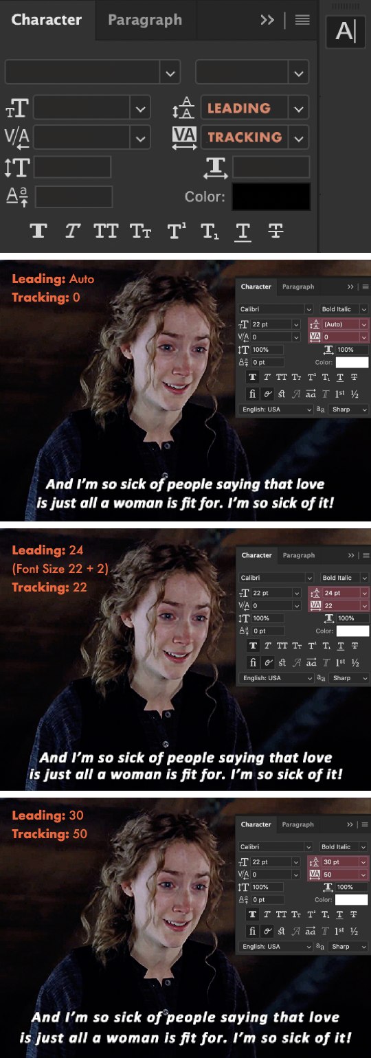
The first example above has leading and tracking set to default. Most typefaces already have a set tracking and leading amount, so if it already looks good, then leave it as is.
The second example has the leading decreased which I found is what most gifmakers do, and it looks great! I've added 22 tracking to add some breathing space for the letters since faux bold is applied.
The third example has the leading increased, making the two rows of text look separated. The tracking further increased, making this one harder to read compared to the first and second example.
TIPS: The leading/tracking amount would also depend on what font you're using so feel free to lessen it, add more or leave it be! :)
Spacing
Please be mindful of the space between the subtitles and the edges of the gif (lined with pink). @kylos notes that Tumblr cuts off the bottom of gifs by 2px on the desktop version.
There is no definite amount, so just make sure to avoid placing your subtitles too close to the edges like in the examples below:
The first example above has the subtitles too close to the bottom edge and the second has the subtitles too close to the sides.
TIPS:
To avoid example 1: Nudge your text higher by selecting the text layer and pressing: shift + [up arrow key] once, and if you want to make slight adjustments, press only the up/down arrow key.
To avoid example 2: Since there's still enough space in the second row, move some words from the first row in the next line to add some space at the sides, keeping in mind what we've learned in the [2] Words 'chapter'.
NOTE: Sometimes, example 2 (or every example in this whole guide really) cannot be avoided, and that's ok. I've only included it as an example for when it can be avoided :)
Font Colors
A color is used to indicate the speaker and is assigned to a certain speaker.
For one speaker / a first speaker: the standard color is white.
For a second speaker: gifmakers commonly use shades ranging from yellow to orange, some use other colors such as blue or purple.
For a third, fourth, fifth speaker: the colors are up to you.
TIP: Avoid using black or dark shades.
Font Sizes
For 540px gifs: 18 to 23 pt
For 268px gifs: 14 pt or higher
TIP: For 268px gifs, it's best to start at 16 pt if you're catering to mobile users or if you yourself frequently use the mobile app.
Nowadays, gifmakers are leaning towards bigger font sizes (i.e. 18+ pt), making subtitles readable on mobile.
NOTE:
The font sizes I've mentioned above would also depend on the font.
So depending on the font, going lower than 16 pt will make the subtitles difficult to read and strain the reader's eyes.
Feel free to do some experimenting of your own! Just keep in mind the readability, paragraphs, widows and widowers :)
Below, I've demonstrated the relation between the font size and the gif size (540px and 268px).
As seen in the first and second 540px examples (and also maybe the third for those with bad eyesight), smaller text sizes don't really work with 540px gifs.
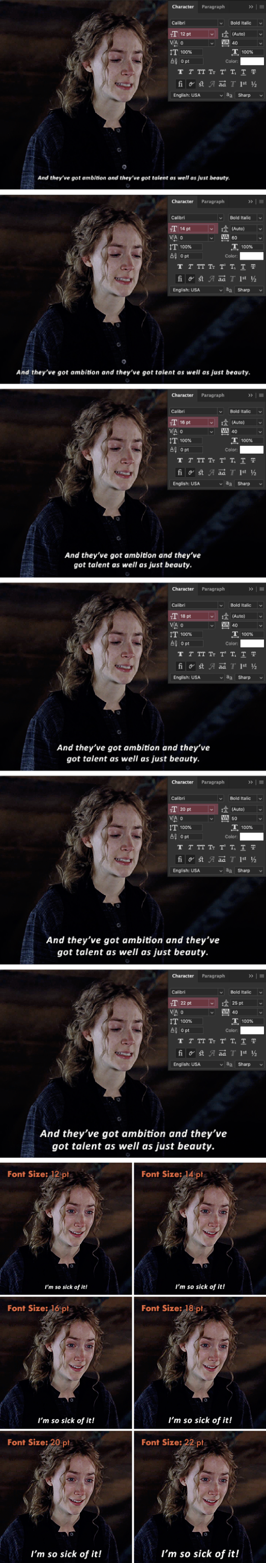
To be honest, I thought 12 and 14 pt would read better on 268px gifs but as you can see, you can't see it. 😂 It would ultimately depend on the font and the length of the text but for this Calibri Bold Italic font, 16+ pt reads better.
[4] Finishing Touches
Stroke
Adding Stroke will make subtitles even more legible, especially if the background is as bright as the text color.
TIPS:
Make sure your stroke color is black (or any color as long as it's in a shade much darker than the text) with an opacity greater than 80%.
The stroke thickness would also depend on your font so if 1px looks like nothing on the font you're using then try upping it to 2px or 3px. Different strokes for different fo(lks)nts 😂
The first example below shows what a subtitle looks without a stroke. Incomplete, right? And without the added drop shadow, "sit" would blend in with the background.
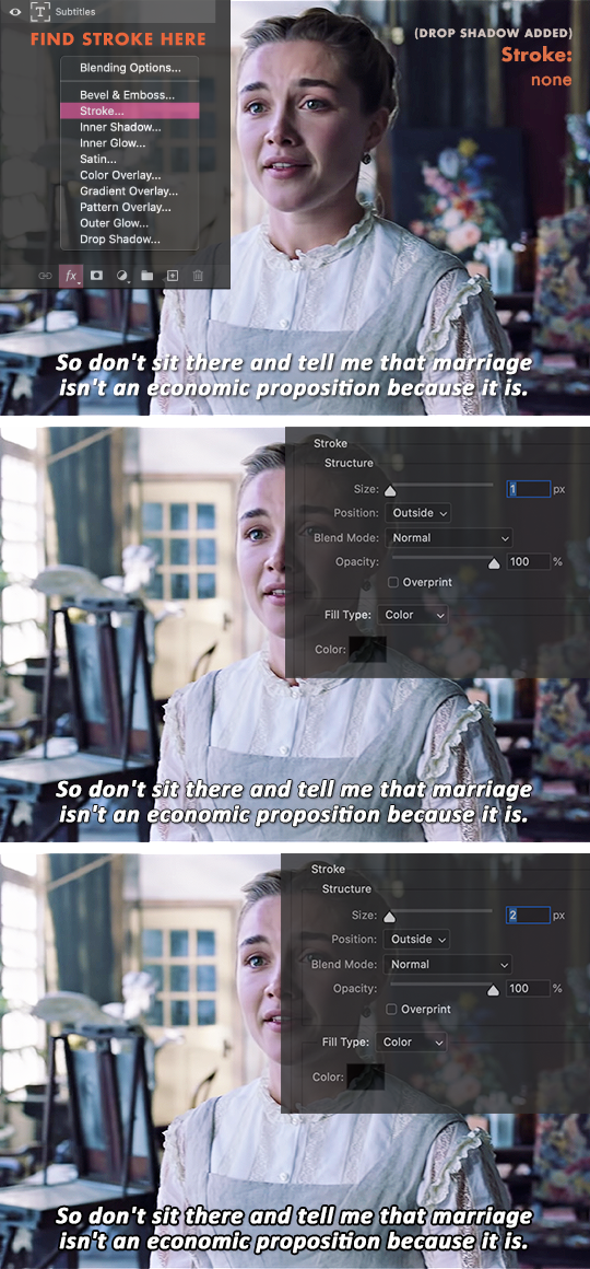
The 1px stroke in second example already looks good and readable to me.
The 2px stroke in the third example is readable, but it looks too dark and bulky.
Drop Shadow
Drop Shadow makes subtitles even more legible, especially if the background is as bright as the text color, just like Stroke.
Drop Shadow gives more depth to subtitles.
For this topic, each gifmaker most likely has their own drop shadow settings, such as the ones I've listed below: (Click to view their settings)
itsphotoshop's
maziekeen's
kylos's
favreaus's
dingyuxi's
What unites all their settings is using the color black #000000.
TIPS:
For dark backgrounds, adding drop shadow isn't necessary since it won't be seen anymore.
Since it's a shadow, make sure your stroke color is black or grey. If it's too dark, lower the opacity.
Making the shadow's distance too far away from the text tends to look distracting and hard to read. A distance between 2–4 is the best way to go.
A large drop shadow size sometimes gives the illusion of blurry text, so try sticking to sizes below 5px.
These tips would also depend on your font and font size. Do what looks good to you and remember to keep in mind the overall readability.
Set the Anti-Aliasing Method
Anti-aliasing produces smooth-edged type by partially filling the edge pixels. As a result, the edges of the type blend into the background.

None: Applies no anti-aliasing, looks very jagged. Avoid this.
Sharp: Makes subtitles look its sharpest, which is the goal.
Crisp: Makes subtitles look somewhat sharp, which is also the goal.
Strong: Makes subtitles look bolder. Avoid this since we already use bold fonts / apply faux bold.
Smooth: Type appears smoother, but personally it just looks blurry to me, so for Tumblr gif subtitles let's avoid this.
TIP: Most gifmakers use the Crisp anti-aliasing method.
〰️
Aaaand that's the end of this comprehensive guide! I hope you learned as much as I did when making this tutorial :) Again, by no means does this post intend to limit the way you do your subtitles.
Please like/reblog if this has helped you and feel free to hit me up for any questions and concerns! ♥︎
〰️
REFERENCES:
99designs
Rev
fonts.com
itsphotoshop
Adobe one, two
Documentary Film Cameras
1K notes
·
View notes
Text

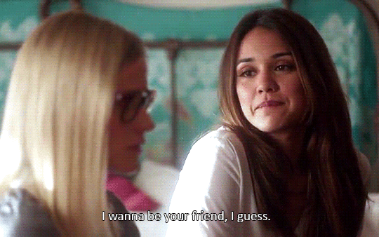
Yellowjackets (2021 - Present)
1.01 - Pilot // 1.09 - Doomcoming
#jackie taylor#shauna shipman#yellowjackets#yellowjacketsedit#jackietayloredit#shaunashipmanedit#yjedit#jackieshauna#shaunajackie#tvedit#myedit#I'm sure someone has done this parallel before#but i don't care I had to make this
136 notes
·
View notes
Text


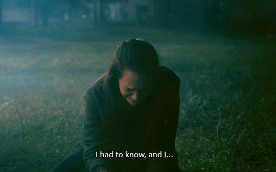
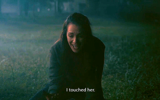
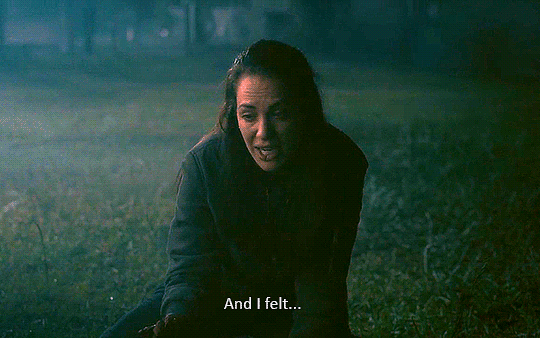
Yellowjackets (2021 - Present)
1.09 - Doomcoming
227 notes
·
View notes
Text

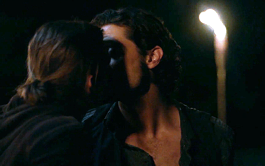
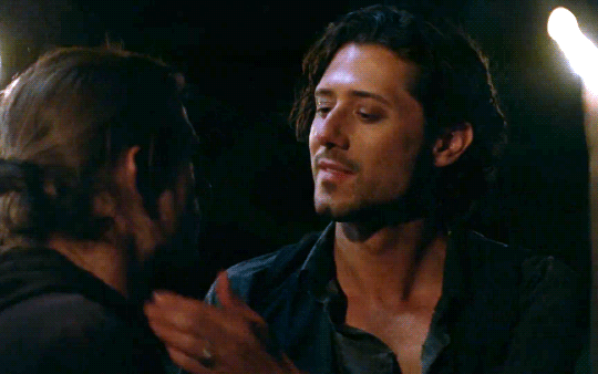
Happy anniversary, Q.
#quentin coldwater#eliot waugh#queliot#the magicians#themagiciansedit#queliotedit#quentincoldwateredit#eliotwaughedit#myedit#tvedit#this episode lives in my head rent free
758 notes
·
View notes
Text


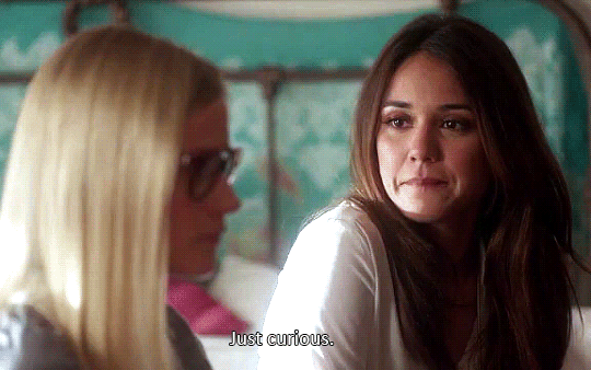
Paget Brewster as Emily Prentiss/Lauren Reynolds
150 notes
·
View notes
Text

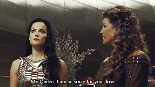


How is he?
#lady sif#sif#frigga#queen frigga#sifedit#friggaedit#thor#thor (2011)#thoredit#marveledit#myedit#i'm back on my brand#I hope this still looks good on mobile colouring this sucked so I tried something new
129 notes
·
View notes
Text


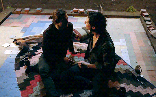
I don't feel like you do.
#alice quinn#margo hanson#the magicians#themagiciansedit#alicequinnedit#margohansonedit#myedit#sorry for the shitty quality I couldn't find any good versions of this ep for some reason#and it looked better in photoshop I swear!
88 notes
·
View notes
Text

Just nothing...
#theodora crain#the haunting of hill house#theocrainedit#theodoracrainedit#thehauntingofhillhousedit#thohhedit#netflixedit#tvedit#myedit#this is so bad I'm sorry#I tried but this scene is so dark and there's this ugly blue filter over it this is the best I could do
59 notes
·
View notes
Note
Hello! I'd like to request a gifset of loki removing that guy's eye in the avengers and hela slashing thor's eye in ragnarok. Like sister, like brother
Posted here! I'm so sorry this took so long, I was very busy with my studies.
#again I'll probably posting more after january cause I'll have more free time#if my laptop allows it
0 notes
Text
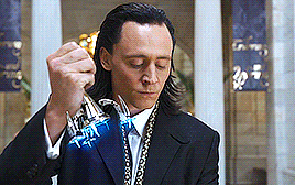
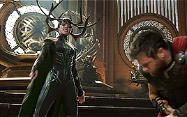

Like brother, like sister
#loki#hela#lokiedit#helaedit#thoredit#avengersedit#thorragnarokedit#marveledit#myedit#requests#I'm so sorry this took so long I was really busy but I'll try to post more often
129 notes
·
View notes
Note
Did you see loki S1 deleted scene about frog thor? I haven't seen a gifset of the frog boy yet anywhere 👀
I have seen it! However, I'm having trouble finding a HD version of the clip to use for a gifset.
#all I'm getting is tiktoks of people filming their screens#maybe I just can't google :'(#if anyone has a good quality version of the clip please send it to me
0 notes
Note
I heard that you're taking gifset requests? So I was rewatching the avengers and noticed that Thor saves natasha (not only natasha) twice, first in the avengers from the hulk, second in infinity war when he shows up in the battle of wakanda and she nods, I just wanted to see those scenes together ♥ their friendship is so rarely explored
Here ya go, nonnie!
#I totally agree with you their friendship is so underrated!#wish we'd gotten to see more scenes with them especially considering how thor reacting to nat's death
0 notes
Text


Thor swooping in to save Nat (and other people)
#thor#natasha romanoff#thoredit#natasharomanoffedit#avengersedit#infinitywaredit#marveledit#myedit#their friendship is so underrated#bleached brows besties
70 notes
·
View notes
Text
Got any gifset requests?
#honestly requests are always open but I wanna make something#and I need to take my mind of this math problem or else I'll go insane
1 note
·
View note
Text
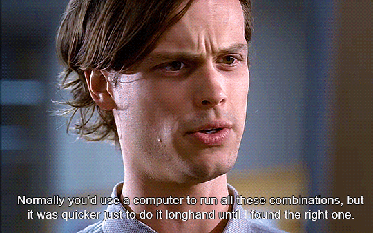
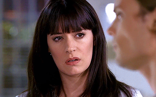
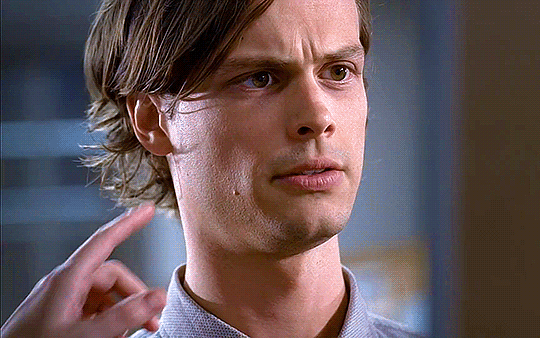
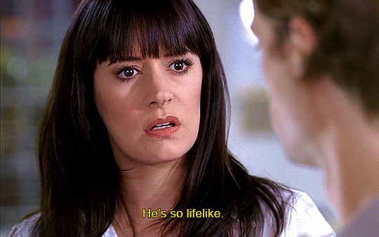
"This combination yields 32 possible encodings..."
#emily prentiss#spencer reid#criminal minds#emilyprentissedit#spencerreidedit#criminalmindsedit#myedit#I love these two as a duo#yes I'm gonna gif every scene of this episode
719 notes
·
View notes
Text


Sophie Nélisse as Shauna Shipman
Yellowjackets | 1.01 "Pilot"
17 notes
·
View notes