
kristinagehrmann
my illustration blog
Kristina, deaf, she/her, professional artist, Germany. +++ Twitter +++ Instagram +++ Website +++ Prints
213 posts
Don't wanna be here? Send us removal request.
Last Seen Blogs

veayrss
OBSESSED WITH
HAYDEN CHRISTENSEN🤭

cannabisweedssupplier
The city delivery - Buy Weed Online | Recreation dispensary

azarosx
azarosx

lilaccatholic
sic transit gloria mundi
thepineconelord
●o^o^o●
Text
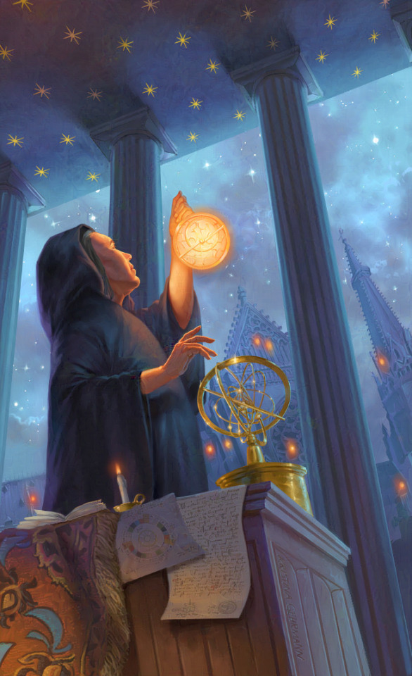
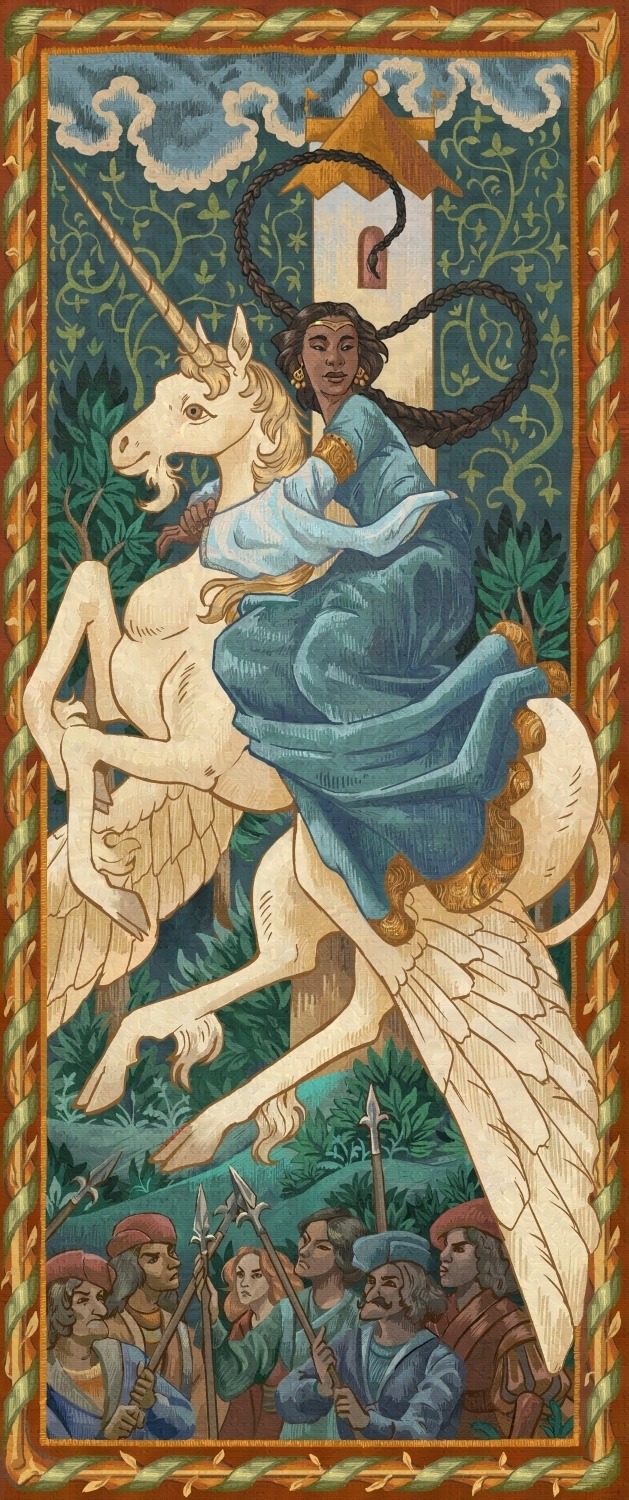
"The Hierophant" - tarot card art for a project still to be announced.
52 notes
·
View notes
Text
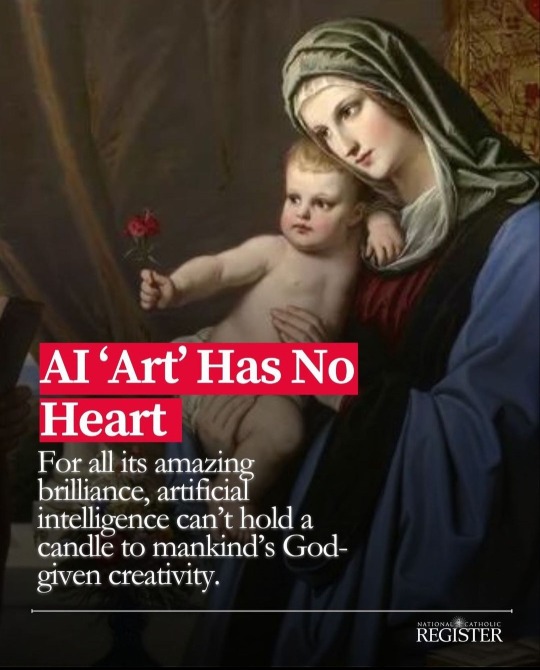
Oh damn the Catholics have joined in on the war against AI "art".
75K notes
·
View notes
Note
I've only recently found your tintin art, but i'm in love with all of them!! I wish you the best in your professional art career, but I hope you know that your fanart is not for nothing, and that it is so so stunning!
Thank you so much! I'm truly happy that my Tintin fanart still resonates with people after so many years :)
4 notes
·
View notes
Text
ai generated images make me increasingly sad and tired the more i see them in more and more casual contexts. i dont know how to explain, but it just fills the world with a bunch of nothing. no matter how visually stunning the pictures might be, there's nothing behind it for me. no dedication, no emotions, no feelings, no hard work or creativity, nothing i can truly think about, admire or enjoy. i dont think thats how art is supposed to be
51K notes
·
View notes
Text
I have shared versions of this on other platforms before, so I might as well make a tumblr edition: here some tips for MtG portfolios I gathered and might be interesting for some people who follow me.
1. Since this is a trading card game, here comes the obvious one first: Always keep in mind that these are card illustrations, they have to be readable in super small. Which means that strong silhouettes and value structures are a must have. If you work digital, check the zoomed out version on regular basis, or even have some jpgs to check their thumbnails in your file browser. That can give you an idea about their readability. Traditionally you can of course take some steps back, or take some photographs to look at smaller previews on your devices.
Also: print illustrations often come out darker than their screen versions, be careful with your darks! It's rather easy for things to go muddy, even if they look good on screen. In doubt, increase the brightness a bit. It's okay to have different versions for screen and print to meet their needs.

2. Be versatile about your topics and compositions. Zoom in, zoom out. Don't fall into the trap of your own comfort zone zoom level of showing things, or one way of doing things.
It can be positive to offer purposefully unusual options.

3. Be aware of the focus. If you have a magician with a staff, ask yourself if the card is about the staff(artifact), the mage (creature) or perhaps even the spell. The composition and focus of the illustration should shift accordingly! Clear action is important for readability – since that is not just visual hierarchy here, but also storytelling. Which brings me to the next point:
4. Good narrative matters, but mechanics matter even more. So, again, be very aware of your illustration's focus. You can potentially add extra elements for the story to make it more fun, but it should not get too convoluted, and even less should it distract from what the card it actually about.
If you come up with your very own ideas for a portfolio this is of course much more open than if you work from a description. But you can find a bunch of official MtG descriptions online which are super useful for training.

5. Show care. Plan the illustration, get the references in place. It's the best time to get good habits in place, and really finish the pieces. Don't make them weaker by going too fast, that is not convincing. It just lets people assume worse things for tight deadlines.
This does not mean everything needs to be rendered to death - but shape design should remain thoughtful and purposeful even where soft and lost edges are used.
6. It's potentially okay to have your specific stylistic or thematic niche. It can mean less assignments at times, but can also mean more special ones. It's cool though for your voice to be visible as long as the other needs of the product are met.
7. Never stop using those references. Get them, make them, use them - take them seriously. (at least for any of the more realistic styles). It's one of the most repeated tips for any student to actually just use more references. They do a ton to get complicated things like anatomy and lighting right, but also cultural references and versatility. Many of the best Magic artists also make the best references – it's not a coincidence. Learn from the people who have already established themselves, they have great wisdom to share.
8. Your quality has to match the current roster.
Yeah, sorry, no way around that one. You need at least to be as good as the currently "worst" artist in the roster to have a chance. And the ADs need to be sure that even on a bad day your art can meet their quality bar. Which is the reason why you likely need several art pieces at the required level, to prove it wasn't just some lucky fluke.
Though once you're really there, that also means a bit less pressure to perform, since you're likely comfortable at your skill level and can only go up from there.

184 notes
·
View notes
Text
Good news, fellow artists! Nightshade has finally been released by the UChicago team! If you aren't aware of what Nightshade is, it's a tool that helps poison AI datasets so that the model "sees" something different from what an image actually depicts. It's the same team that released Glaze, which helps protect art against style mimicry (aka those finetuned models that try to rip off a specific artist).
As they show in their paper, even a hundred poisoned concepts make a huge difference.
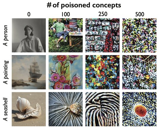

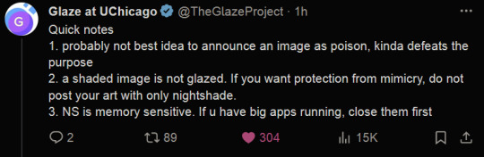
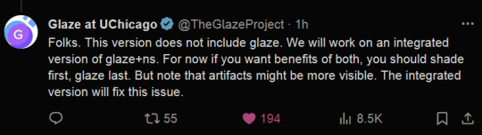
(Reminder that glazing your art is more important than nighshading it, as they mention in their tweets above, so when you're uploading your art, try to glaze it at the very least.)
91K notes
·
View notes
Text


New illustration that I did for an educational kids' book, showing a birdseye' view of a medieval monastery with cutaway walls.
In the foreground from left to right we see a hospital wing, dining hall (refectory), the monks' dormitory, a scriptorium, and gardens.
Client: Noordhoff
Medium: Clip Studio Paint, Photoshop, Wacom Intuos
#digital illustration#medieval#middle ages#monastery#medieval history#book illustration#history#illustration
124 notes
·
View notes
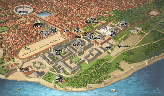
Text

A new work from me!
Panoramic illustration of Constantinople in late 10th/early 11th century. For a nonfiction book.
Medium: Clip Studio Paint, Photoshop, Wacom Intuos.
Client: Noordhoff
A little What's What of various elements:
71 notes
·
View notes
Text
The US Copyright Office is currently asking for input on generative AI systems ...
... to help assess whether legislative or regulatory steps in this area are warranted.
Here is what I wrote to them, and what I want as a creative professional:
AI systems undermine the value of human creative thinking and work, and harbor a danger for us creative people that should not be underestimated. There is a risk of a transfer of economic advantage to a few AI companies, to the detriment of hundreds of thousands of creatives. It is the creative people with their works who create the data and marketing basis for the AI companies, from which the AI systems feed.
AI systems cannot produce text, images or music without suitable training material, and the quality of that training material has a direct influence on the quality of the results. In order to supply the systems with the necessary data, the developers of those AI systems are currently using the works of creative people - without consent or even asking, and without remuneration. In addition, creative professionals are denied a financial participation in the exploitation of the AI results created on the basis of the material.
My demand as a creative professional is this: The works and achievements of creative professionals must also be protected in digital space. The technical possibility of being able to read works via text and data mining must not legitimize any unlicensed use!
The remuneration for the use of works is the economic basis on which creative people work. AI companies are clearly pursuing economic interests with their operation. The associated use of the work for commercial purposes must be properly licensed, and compensated appropriately.
We need transparent training data as an access requirement for AI providers! In order to obtain market approval, AI providers must be able to transparently present this permission from the authors. The burden of proof and documentation of the data used - in the sense of applicable copyright law - lies with the user and not with the author. AI systems may only be trained from comprehensible, copyright-compliant sources.
____________________________
You can send your own comment to the Copyright Office here: https://www.regulations.gov/document/COLC-2023-0006-0001
My position is based on the Illustratoren Organisation's (Germany) recently published stance on AI generators:
https://illustratoren-organisation.de/2023/04/04/ki-aber-fair-positionspapier-der-kreativwirtschaft-zum-einsatz-von-ki/
170 notes
·
View notes
Text
Magical Academy -- commissioned illustration for Cards by Prox.
AD: Aaron Miller
Medium: Photoshop & Wacom Intuos
Print available
45 notes
·
View notes
Text
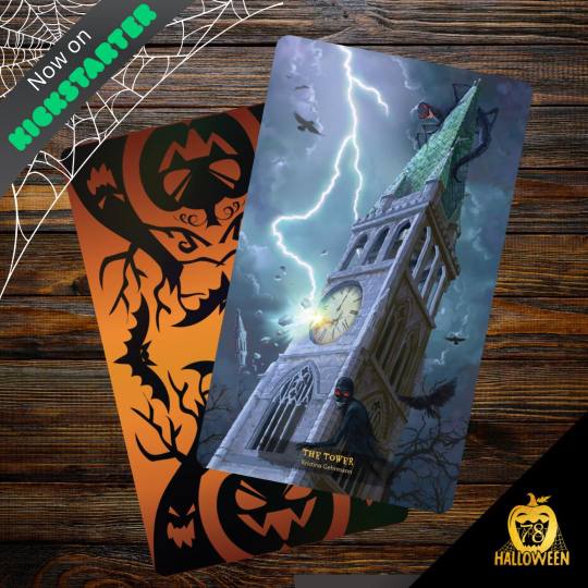
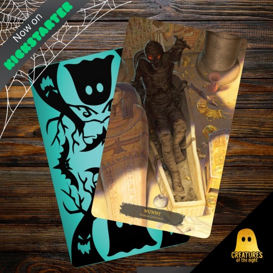
Just 4 more days to go on the 78 Tarot Halloween kickstarter! 😊
I contributed 2 card illustrations to this collaborative set of amazingly spooky art. :)
6 notes
·
View notes
Text
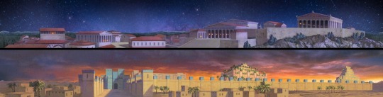
Panoramic illustrations of ancient Athens and Babylon (not historically accurate, but rather to set a mood) for the planetarium of the Arche Nebra museum in Nebra, Germany. These are projected at the low edges of the planetarium/skydome, while a video is shown in the sky area. I actually delivered them without the sky part, it's here in the image just to enhance the atmosphere.
This one you really gotta click on to really see and appreciate them because these are wide, lol.
Client: Arche Nebra
Medium: Photoshop & Wacom Intous
50 notes
·
View notes
Photo
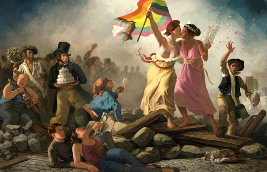


The Wedding of Liberty and Love!
My contribution to the Classics but make it gay zine vol. 3, a collaborative project of 70+ artists re-interpreting historical artworks through a LGBTQ+ perspective. Super honored to be a part of this <3
Classics but make it gay vol. 3 can be ordered at https://novaandmali.com/shop !
Print available here: https://www.inprnt.com/gallery/kgehrmann/the-wedding-of-liberty-and-love/
343 notes
·
View notes
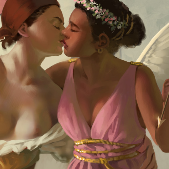
Photo


I'm excited to be a part of "Classics But Make It Gay - Volume 3" with an illustration of mine! *_*
This artbook series is a collection of over 70 artists re-interpreting classical artwork with a LGBTQ+ twist.You can pre-order CLASSICS VOL. 3 at https://www.novaandmali.com/shop
Above: preview of cover illustration by Ant Qiu.
Below: preview of my work
44 notes
·
View notes
Text
a lot of people still have trouble spotting AI art and i just want to give some quick tips on how i usually quickly recognize it
often it’s the smoothness of the image that sets off my initial alarms, a distinct lack of minor textures you’d expect from real things.
sometimes the texture doesn’t match what it was supposed to represent, and often things look oddly soft and rubbery. the light doesn’t bounce off it quite right and it feels over-rendered.
i’ve seen weird random blurring on many AI works as well
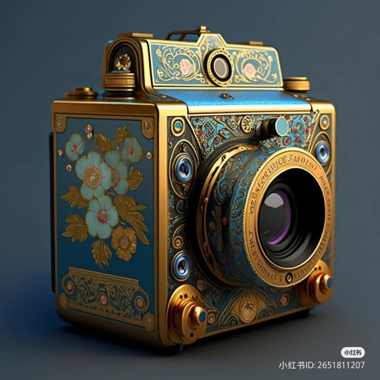
The longer you look, the more you realize that it’s lopsided in several places, positions and distances of objects make no sense.
A closer inspection usually makes you notice the smudged details, which i think is what truly gives it away - AI mimics real patterns, but doesn’t always nail them.
More complex small objects get smudged and blended together, and complex patterns look more like an oil spill rather than anything designed with clear vision and intent.
If there are any letters, they never look real or readable
I’ve seen people AI generate “"historical”“ objects and paintings and post them with a fake caption, claiming that they are real
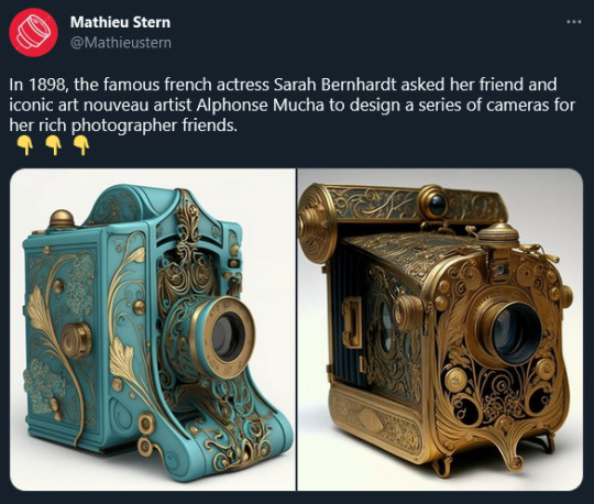
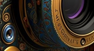
Be wary, because we live in a very uncertain age when it comes to information. Learn to spot AI-generated images, reverse image search and fact-check when something seems off.
In this case it’s just a fake camera, but this technology can, will, and already is used in much more malicious ways.
19K notes
·
View notes
Photo
The book project to which I contributed an illustration is still going on Kickstarter: https://www.kickstarter.com/projects/hitpointpress/big-bads?ref=3rfvpw
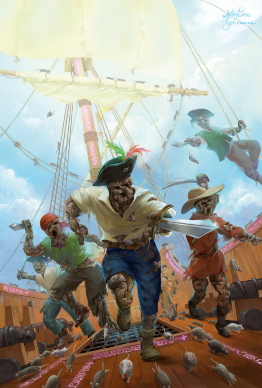

Pi-rats! 🐀 A cover illustration for Hit Point Press, for one of their Big Bad booklets: The Melcombe! I enjoyed the challenge of depicting dynamic movement and speed here.
And of course I always love to draw a ship 😃
This is part of a 2 volume collection of Big Bads which is now running on Kickstarter, you can check it out here! 😊 https://www.kickstarter.com/projects/hitpointpress/big-bads?ref=3rfvpw (affiliate link)
20 notes
·
View notes
Text
Review: XP-PEN Deco L
As someone who prefers screenless "normal" pen tablets for ergonomical reasons, I'm happy to test this simple graphics tablet provided by XP-Pen.
Let's see how it compares to my old Wacom Intuos 4 M! That is my favorite tablet that I have been using for many years and which is the standard I compare all other tablets to.
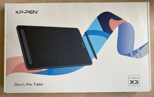
The XP-PEN Deco L is small and light, but the active drawing area is very similar to a medium one from either Wacom or the XP-Pen Deco Pro line. So that is perfect!
There's also a wireless Bluetooth model available but Bluetooth hasn't always worked well for me in the past, so I chose the cabled version.
It has some keys on the side but I've never really used those anyways (I prefer the keyboard, which is always right above the tablet) so I can't speak to their efficiency. But what I noticed is they have little nubs on them so you can differentiate them by touch alone, which is a nice detail!
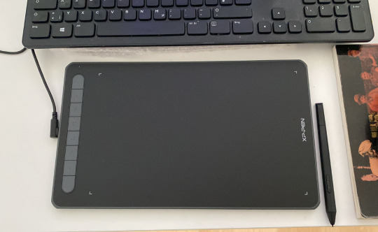
The pen is relatively thin and light, a little more so than I'm used to, but that's not really an issue. It would probably be ideal for artists who can't easily hold heavier pens for long.
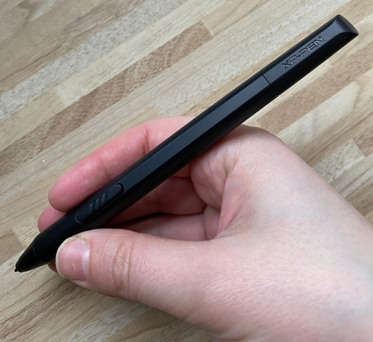
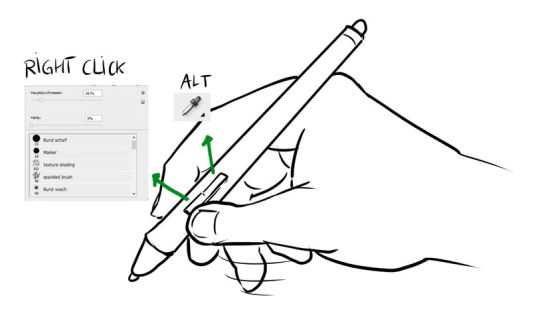
Importantly for me, it has those 2 keys/buttons on the side -- just like the Wacom pen -- that can be set individually. I use it for Alt (color picker in Photoshop) and right click.
The installation was super quick and easy (I use Windows 10). Just plug the Deco L in your computer, download the latest driver from the website, install that, restart, and you're ready to draw!
Drawing, painting and sketching is fluid and easy enough in both Photoshop and Clip Studio Paint that I can work with this tablet professionally. The pressure sensitivity is very much like the one from the Wacom Intuos 4 that I'm used to. This is the most important aspect for me.
I also noticed that it works very well as an input device for the PC in general, even in the browser (which some tablets don't work perfectly with, especially when it comes to scrolling and copypasting). I still assume it may vary depending on your OS and browsers.
Who the XP-Pen Deco L is for:
- anyone who wants an affordable basic pen tablet that works perfectly
- artists who need a mobile tablet that can easily be carried around to places.
Hope you enjoyed this review!
Store link: https://www.storexppen.de/buy/deco-l.html?channel=Kristina
19 notes
·
View notes