Last Seen Blogs

pornpornpornpornandmoreporn
Porn Duh
pornpornpornpornandmoreporn
Porn Duh
janesurlife
Janes
gloriarestaurant
Gloria Restaurant
jinjalim6974
진자림💕
Text
Unit 32 - Experimental Imagery in Photography - Harman Competition
Blog Content: Scenario, Introduction, Chosen Film Information, Investigation & Experiment, Research

Scenario:“You are a professional photographer working to develop ideas for a new personal project. To instigate ideas you will experiment and investigate photographic film and digital processes. Like all professionals you want to challenge yourself & promote your own work; you must therefore experiment using a wide variety of approaches to create two final images, one digital, one film based, that MUST be entered in the 2015 Harman Student competition.”
Research Chosen Film - Wizard of Oz - (Task B)
For this project, I have chosen the film ‘Wizard of Oz’ an American fantasy musical produced by Metro-Goldwyn-Mayer in 1939. The film is of course based on L Frank. Baum original novel ‘The Wonderful Wizard of Oz’ from 1900. The film was known for his Technicolour which was a colour motion picture process invented in 1916 and then developed and improved over decades to come. The technicolour was just one part of the interesting factors of the film, along with the unusual creative characters featured throughout the film, the beautiful musical based songs and the overall fantasy storytelling which makes the film what it is. It has been nominated for 6 Academy Award including Best Picture despite losing this to another film, however it did win Best Original Song with ‘Over the Rainbow. The film did not originally make the profit that was originally desired, it was MGM’s most expensive production at the time, however it finally started to turn profits again in theatrical re-releases in 1949.
The main actress that plays the part of Dorothy Gale is Judy Garland, who was an upcoming icon during this time in the 30’s.
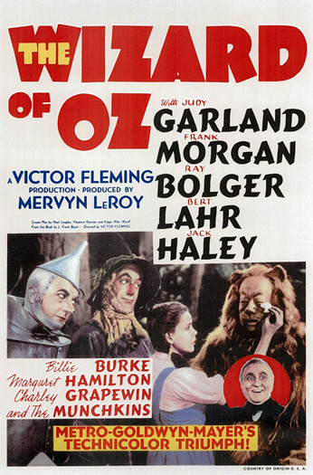
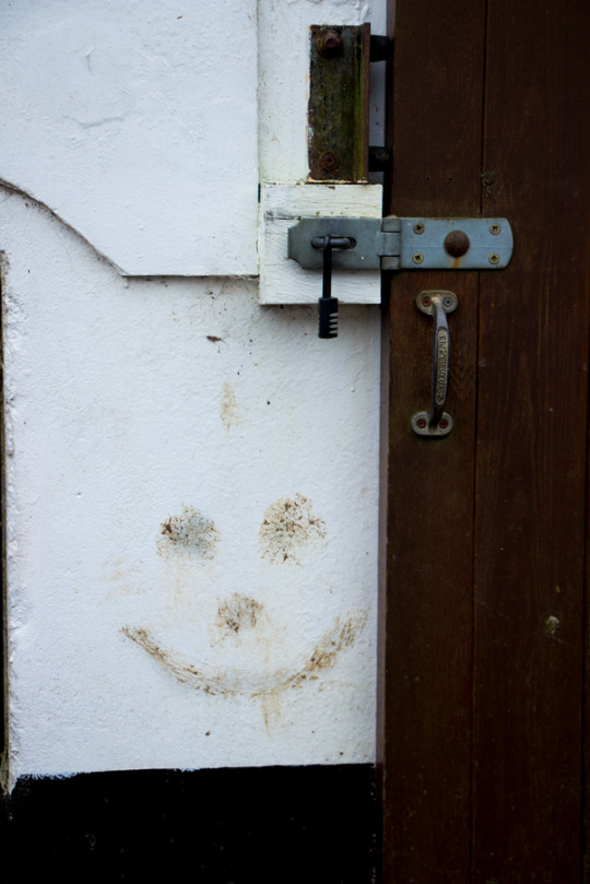
- Theatrical Release Poster for Wizard of Oz
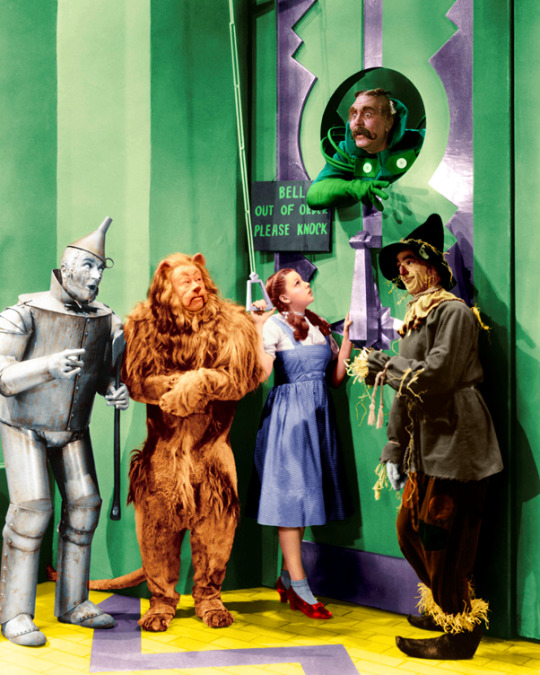
- Movie Still from Dorothy & the gang arriving at the Emerald City
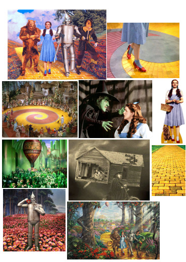
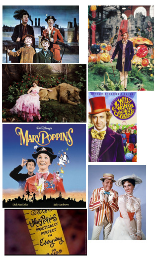
Wizard of Oz Theme Moodboard

Film Still Analysis
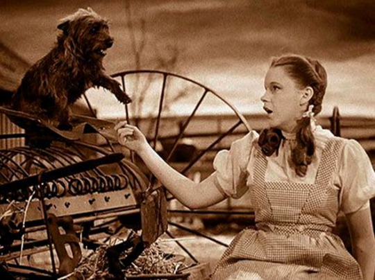
The first film still I am analysing is this one from the beginning of the movie, where Dorothy is based in Kansas on her family’s farm with her dog Toto. This part of the movie is accompanied by Dorothy singing the iconic song ‘Over the Rainbow’ which also reflects her current unhappiness with the life she leads. This part of the film is in Black and white which I feel reflects the mood of the beginning of the film with negative themes such as Dorothy not being happy, her pet dog being taken away and the cyclone her home is caught up in. Eventually she ends up in colourful Oz where the colour is first introduced to the movie which I feel is symbolically linked to Dorothy’s song ‘Over the Rainbow’ Rainbow representing the colour of beautiful colours of Oz. The costume Dorothy is wearing is iconic to this film and is very popular amongst fancy dress today,
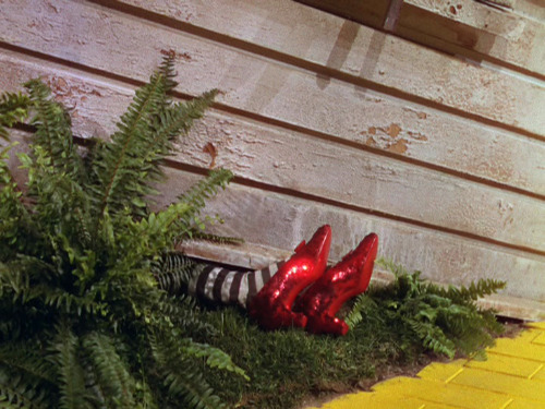
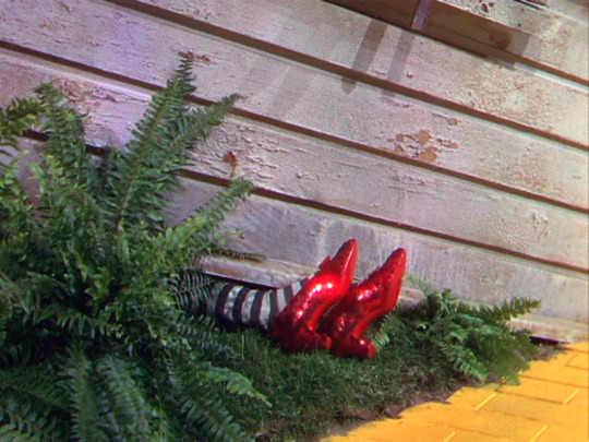
This film still is from the first half of the film, this part is where the Wicked Witch of the East is squashed my Dorothy’s house much to the Wicked Witch of the West’s dismay. This was the part where Dorothy acquired the famous Ruby Slippers which were owned by the Wicked Witch of the East. The main focus of this still is of the Props and the Yellow Brick Road, the use of colour of both of these creates emphasis of the importance of these props and the theme they represent throughout the film. They are two key features that are consistent about the film and I feel both can individually represent the Wizard of Oz film alone. At the beginning of this film, the setting is in Black and White when Dorothy is still in Kansas, it is when her house arrives in Oz, following a cyclone, when the colour was introduced to the movie, which I personally believe makes the film what is is. The use of colour throughout the film is such an important part, the shiny glittery Ruby Red slippers instantly attract your attention and help you understand why they are so wanted throughout the movie, this is the main use of the colour red throughout the film and is used in a positive light, the yellow brick road represents their journey throughout the movie and is extremely prominent, and finally I feel the colour green is used in a mixture of ways both positive and negative, the wicked witch of the west is green coloured representing evil and darkness, whilst the Emerald city is a beautiful positive place representing a close to their journey finally followed by the hologram of Oz which is both positive and negative to Dorothy and her friends as they are pleased to have met him but are left disappointed by what he has to say and the revelation of who he really is.
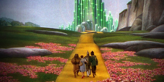
This film still is one from midway through the wizard of Oz when Dorothy, The lion, the scarecrow and the Tinman are linked arms skipping along the yellow brick road to Oz the big green building ahead of them. This is a very iconic image from the film and represents a happy moment and a breakthrough for their journey that you accompany them with throughout the movie. It is quite bright and pleasing to the eye with a mixture of colours. The films settings were mostly hand painted backdrops throughout the entire film as film effects were nowhere near as good as they are today being as the film was produced during the 1930’s, so you can really appreciate the effort that has gone into every scene as the backdrops were all drawn or hand-painted, most included the yellow brick road which was a key setting for most parts of the movie and is extremely iconic to this film today. The characters each remain in their same costumes throughout the film also, each outfit is also unique to this film. Half of this still is the painted backdrop whilst the other half is made entirely of props such as yellow brick road, poppies that were actually made from asbestos despite the health hazards being known for quite sometime before the production of the film and of course just the characters and their costumes.
Historical & Contemporary Research
Historical & Contemporary Moodboard

Similar works to that of the Wizard of Oz that I have come across are films such as 1971’s Willy Wonka and The Chocolate Factory and 1964’s Mary Poppins. The reason I have chosen these two movies is because they have many different similarities despite having different storylines. Wizard of Oz was of course the oldest out of three movies and was produced during a time where special effects were not easy to produce, even though both the other movies, Willy Wonka and Mary Poppins were produced before the 80’s and also contain limited special effects. All three movies are musicals so they contain fun filled, catchy songs throughout that are well known to this day so they are all very similar in terms of sound. All three movies also contain backdrops that were hand-painted and specially made unique props that were specific to the film, the films in general contain a lot of colour throughout the film and all have very surreal, fantasy, fairy-tale like storylines and features.

This film still contains a hand painted backdrop and is part of one of the songs in the musical Mary Poppins. Although the colours in this particular scene appear quite dull the rest of the movie is fairly colourful as they are scenes that are actually cartoon as well as real life. I can see the similarities with there being a few select main characters that embark on a journey together. The film is upbeat for the best part of it similar to Wizard of Oz and is a light hearted fun film to watch and listen too.
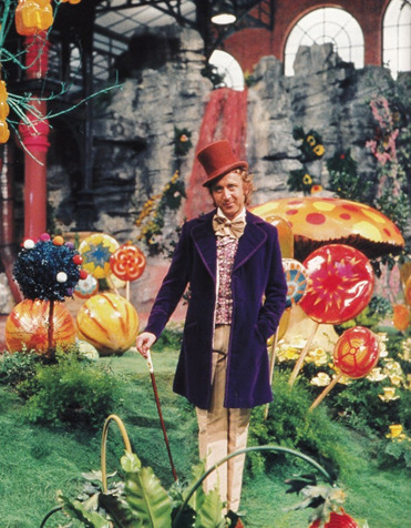
This is a shot of Gene Wilder as Willy Wonka in his colourful and edible Chocolate Factory. You can see the bright and vibrant colours that his Chocolate factory consist of and visually appealing for the best part of the movie. Its colours help to exercise your imagination as much as descriptive words do in a well written story. There are backdrops in the film that were also fake and appear as scenery which is similar to both Wizard of Oz and Mary Poppins. I think this is a good historical example of work similar to that of my chosen film, as the artists and producers clearly had similar ideas in terms of what they wanted their audience to see and experience when watching the film.

I have chosen this contemporary image produced by Annie Leibovitz as part of her Disney Homage Series. I chose this particular image that was featured in Vogue magazine and reflects the Beauty and the Beast as I feel it has similarities to the previous works I have researched (Wizard of Oz, Willy Wonka & Mary Poppins) as it has a backdrop that has been produced specifically for this shot. It is hard to tell whether or not this backdrop is painted but you can see there are props that have been included especially and a fake scenery backdrop. This is a great contemporary example of a fantasy photography shot of characters from a Disney cartoon Musical Beauty and the Beast. Other works in this series of Leibovitz had really been enhanced and manipulated digitally using Photoshop software whereas to produce the backgrounds whereas this one has been specially designed for the shot. This image unlike the others I chose to analyse is a real photograph with models and props purposely set up for photographic purposes whereas the others were film stills from the film itself.


However, these two images from Leibovitz’s Disney Series of Wizard of Oz are by far my favourite contemporary version of work relating to my chosen ideas. Similar to the Beauty and the Beast image, the sets have been specifically and uniquely designed for the shoot and are really imaginative and creative. They directly link to my film as they are actually paying homage to the film with the Actress Kiera Knightley. They are modern and colourful and in both images you can see she is wearing Red shoes that are very subtle but clearly Leibovitz felt they were important to include as an iconic feature of the character which directly inspires me within my own work. I don’t feel she need to put as much emphasis on the shoes in these particular images as they top one contains other iconic characters from the film and in the second the shot is focused as a whole on the scenery, setting, scarecrow, Dorothy and Toto. They have been set up so perfectly and are such a great idea and have always been my favourite since I first saw them feature in Vogue. Really love this as a contemporary example and they have definitely inspired me in terms of allowing me to elaborate on ideas of how I’d like to include Ruby Slippers in my shots and or backgrounds/scenery.
Experimental Portraiture (Digital & Film, Studio & Location)
Film & Location Portrait
Aims & Objectives – To produce a portrait shot on location on either digital or film. For this image, I will be shooting on a Digital camera on location.
Concept – I will be shooting a landscape image of the Ruby Slippers and black and white stripy tights placed in the style as if a house has landed on them the way it does in the movie.
Location – I will be shooting In Ashridge Woods with a small wooden hut as the main focus to represent the house squashing the witch.
Lighting – I will be using natural lighting for this image as I will be shooting outdoors.
Equipment – I will be using a Digital camera (Canon 700d) to shoot this image.
Influence -

This image is what I have been inspired by since beginning my research for the film, this has also been a key part of the film I have always remembered from a young age and is a key feature of the film and the journey of the ruby slippers and how Dorothy acquires them.
Props – In this image I will be featuring the wooden hut, the black and white stripy tights that I will fill with screwed up newspaper to form the shape of the ‘legs’ and the Ruby Slippers.
Character – The character I am depicting in my image is the Wicked Witch, as she will appear squashed underneath a house (Wooden Hut) with just her legs appearing slightly squashed they way they do in the movie.
Contact Sheet for Digital Location Image
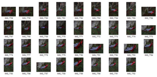
As you can see from the contact sheet I tried to shoot from various different distances away from the subject, I wanted to ensure I had a variety to play with when I came to editing my images later on. I wanted to make sure I did not lose any detail by shooting further away and also tried to shoot in both portrait and landscape. Although I shot less in landscape, I actually decided my final image was a landscape shot. It was definitely better in terms of composition and also was a similar style to the film stills I had found when researching which made me feel more comfortable about how successful it would be.
Chosen Final Digital Location Image

- F-stop - F/5.6, ISO 400, Shutter Speed 1/125, Focal Length 69mm
Digital Final Image Evaluation
I am really pleased with the final outcome of my image, It was exactly what I had in mind when imagining how I wanted to shoot my image. I wanted to ensure I had the right settings when shooting and try to make my image the best I could in camera so that it did not require too much editing. The only editing I had to do to my image was using the ‘Selective Colour’ to enhance the red tones so that the redness of the ruby slippers came out as well as enhancing the green grass. The point of using these techniques was so that it appeared vibrant in colour as I feel that the use of colour is really important and prominent throughout the movie so I wanted this to come across in my image.
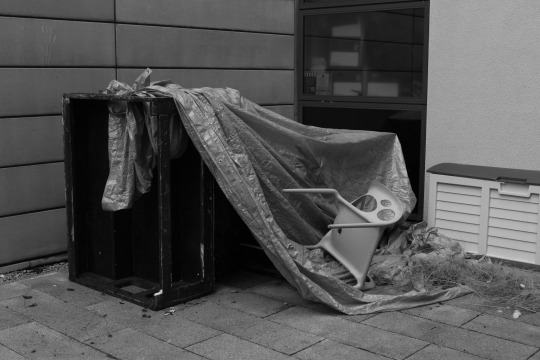
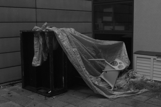
Film Image
Aims & Objectives – To produce a portrait shot inside the studio on either digital or film. For this image, I will be shooting on a film camera.
Concept – I will be shooting a Silhouette type image by experimenting with shadows. The silhouette will be of the Wicked Witch as I have chosen to develop her character throughout the project rather than change to a different character. I would like to have her with her hands out appearing Witch-like and creepy.
Location – I will be shooting this image in the studio within my college at West Herts College.
Lighting – I will be using a Snoot to produce this image, I wanted to a circular amount of light that the snoot will allow me to control due to the shape of the end of the snoot. I also wanted the lighting to be hard which is exactly what the snoot produces as I would like my silhouette to appear fairly sharp and dark.
Inspiration -
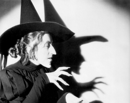
I have take direct inspiration from this image I found during my research of the film, this stood out to me massively and was not an image I had seen before and was not a still from the movie, this is a seperate image shot alongside the film. I would like to experiment with casting shadows for his shoot.
Equipment – I will be using a Canon 700D SLR to test on however my final image will be shot on a Film camera with 35mm Film.
Props – In this image I will be using classmates Hannah Wilson as my model with a Witch’s hat which includes a black veil connected to the hat that I will include in my image.
Character – The character I am depicting in my image is the Wicked Witch, I have chosen to stick with the Wicked Witch as my main character throughout the project as she has been extremely good fun to work with and has allowed me to stretch my ideas in different styles to produce different outcomes.
Digital Experimentation

Here is a small cut of the shots I tested with digitally before shooting on film. As you can see I experimented with increasing the aperture to produce a darker silhouette which also effectively darkened the white backdrop to a grey tone. I really liked the outcome of the shadowing experiment and found it appeared really effective overall. This gave me the go ahead to copy my settings over to the film camera and produce some shots on that instead. The outcome of my film after being processed was also really successful and I am pleased with the outcome of the shoot.
- F-stop – F/16, ISO 400, Shutter Speed – 1/125, Focal length – 27mm
(Exact settings applied to Film Camera, bracketed F-stop by 1 stop under way i.e; F/8.
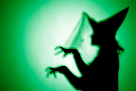
I also wanted to produce a little digital version of the image I will be shooting on film as another form of experimentation. I wanted to introduce a green colouring to my image so that it matched the theme of the Wicked Witch. Her face in the film is Green and is also the same colouring of the theme of the West End show ‘Wicked’ based around the Wizard of Oz Witch. I really liked this digital effect and felt it helped add the colour to the image that is an important essence of the movie throughout as it is extremely colourful throughout with its unique backdrops and props. Obviously I appreciate that I will be shooting this image on film therefore my image will be printed in black and white however I wanted to use my digital techniques to produce an outcome to demonstrate some digital experimentation as this is an important part of the project as a whole.
Film Final Image

(Quality reduced due to scanning process)
Film Final Evaluation
I have found this whole idea quite difficult at times to try and get right however when I finally found the right settings and exposure times I managed to produce a print that I felt worked well for me. The overall print isn’t brilliant in all honesty, there are some marks on the Witch silhouette which are actualy from effects made on my negatives, they are merely scratches on the neg or potentially rinse stains however these are minor and I felt ok to put this aside as I was more concerned about the ink application and colour. You can see a subtle green glow on my witch which was the exact effect I wanted to produce, I did not want the colour to be too in your face or tacky as that is not the effect I have aimed for. I wanted the colour to be subtle but effective, I carefully coloured in the silhouette with green ink and made sure to very carefully paint a real slim margin outside of the silhouette so that you could see a green glow on the outside of my witch to help her stand out against the white and create some texture to the image. I wanted to use this shade of green also as it was a deep green which I think matches the ‘witchy’ feel more especially the sort of green that is used in the West End shows for ‘Wicked’ which is based around the wicked witch from the Wizard of oz. The process was tricky but I am pleased with the outcome of the image and felt that my experimentation has been successful and effective to my final overal print and is definitely something I would like to progress practicing and experimenting with further in the future. This same process will be applied to my final showstopper image I have planned also so I am glad to have managed to practice and experiment at this point of the project.
Darkroom Experimentation for Final Film Image
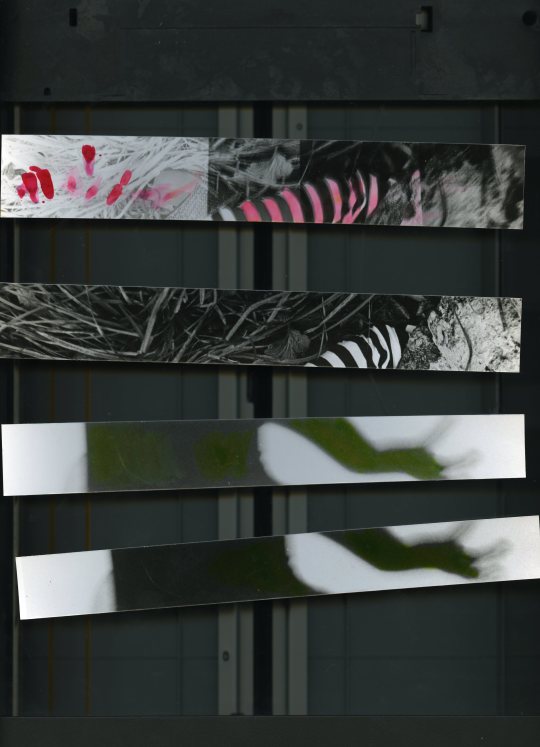
These are some test strips I produced before printing my final image. I had to experiment with exposure to test the best outcome with the ink painting experimentation I had in mind. Two of the test strips are from the film silhouette witch print and 2 are from the location film print of the ruby slippers crushed under the house. Both I used to practice ink painting on before applying this to my final print. I found with the silhouette print that it was a better outcome to produce a print that wasn’t as black in its shadows because it meant you are able to see the green ink better on the print. The bottom test print was a darker test strip I produced with an exposure of 12 seconds, I wanted the dark area of the print to be slightly lighter and a darker grey tone rather than black so I just exposed for 2 seconds less and still kept it on a contrast of 5 on the enlarger. This provided me with a dark grey area to work with which appeared better and more visible when applying my green ink.

This was my first initial full sized print of the negative I shot, I was initially inspired by an image I found during my research of the Wicked Witch casting a shadow on a white backdrop. I chose not to include the physical witch in mine and wanted to focus solely on the shadow which was an experiment in itself as I found I had to set up my lighting and position things accordingly to produce the best sharp outcome of a shadow that I possibly could. Of course this print here you can see the darker area is black, this I managed to do by turning my filter on and putting my contrast up to 5 with an exposure of 12 seconds. However, I didn’t really like that the ‘White’ areas were also actually a lighter shade of grey so it was the best option to expose for less time when producing my next print.

This was my first proper full sized test print that I needed to produce in order to get a better idea of how the overall image was going to look. You can see that from 2 seconds less exposure that the lighter areas of my print are much more whiter than previously produced and the black areas were a darker grey tone which I needed to be able to apply my green ink efficiently. I practiced with various different brushes and strokes when applying the ink, it was hard to try and get a decent outcome. I had to water down my ink so that it was more water based and easier to apply with leaving a excess ink that was going to try and leave a mark. The best option was to have 2 sets of ink ready to use, one more water down and the other more pure so that I could apply a more intense colour. I had to go around the edges of the witch with the watered down ink which essentially ‘puddled’ my print with watery ink, and then I was able to add the darker ink in the centre. I also wanted to experiment with what the colour would look like if I painted the white background as initially I actually considered submerging my entire print in a green toner however unfortunately I was unable to get my hands on some leaving me with no choice but to practice with green ink instead. I felt when applying green ink to the white background that it actually looked quite messy and I knew i would not get the even spread of green I wanted that I could have produced with toner. From this experiment, I was clear on the process I was going to use for my final print. This same method will also be applied to my film print with the red ruby slippers.
The ‘Showstopper’

The specific object I have chosen to focus my ‘Showstopper’ images around are of course the Ruby Slippers that Dorothy acquires early on in the film and keeps throughout to the end. The Ruby Slippers are truly beautiful, glittery and eye-catching and one of the main consistent themes throughout the movie, they are wanted so badly by the Wicked Witch which instantly informs of the audience of their importance. When viewing the larger subjects of the film from start to finish, you see themes such as true friendship, a journey, escape, inadequacy of adults, power, gender, roots and family. As much as the film seems to be such a fun, colourful, fantasy based movie there really are larger important themes that have an underlying impact on the overall success of the movie. The inadequacy of adults directly relates to the fact that all of the good adults within the movie appear to be powerless, Auntie Em, The Scarecrow, The lion, The Tinman and even the Wizard of Oz himself. Also I don’t believe it is a coincidence that the only characters that have any true power are all female, Glinda the Good Witch and Miss Gulch/Wicked Witch, there was a real reversal of roles in terms of power of gender during this time which in the Hollywood world always seemed to be a masculine hero of some sort. For me the real most important theme of the film is the power within ourselves, which is what the Ruby Slippers represents. There is an element of escape through the film as well as elements of embracing your roots which are clearly conflicting and opposite to each other but their journey shows a way of joining both ideas. Glinda the good witch says to Dorothy at the end that she had the power to return home all along although she didn’t know it however this truth only emerges at the end as it’s made to look throughout their journey that she is gaining the power and importance from the Slippers.
Final Showstopper Images (Digital & Film) - Task C
Digital & Studio Portraits
Aims & Objectives – To produce two Final Images as part of ‘The Showstopper’ task on this project. I have chosen to shoot this first image digitally.
Concept – I will be shooting a close up shot of the Ruby Slippers with black and white stripy tights depicting the Wicked Witch.
Location – I will be shooting in the studio at West Herts College.
Lighting – I will only be using a Snoot to light my props as I think it would be most effective to use hard lighting for a more dramatic effect.
Equipment – I will be using a Canon 700D DSLR with a 16gb SD Card, I will also be using a sync lead and Studio lighting equipment with a black backdrop.
Props – My image is going to be of the lower half of a model’s legs wearing black and white stripy tights with sequin covered Red Ruby Slippers in the style that Dorothy Gale wears in the movie Wizard of Oz.
Character – The character I am depicting in my image is the Wicked Witch, you’ll be able to tell this as my model will also be wearing the black and white stripy tights that she wears when she is squashed under the house.
Contact Sheet -


As you can see from the contact sheet, I tried to experiment with a through different ideas of how I could shoot this studio image of the shoes. I wanted to make it interesting and rather than just a bog standard shot of the shoes. I wanted to make sure the shoes appeared glitzy and eye catching so I felt the best option for this would be to use hard lighting so that the light reflected off the sequins on the shoes made them appear as if they were glowing. I tried to shoot without the tights at first however I felt these images appeared really bland and boring and didn’t exactly represent the Witch they way I wanted too, the tights added a much more Witch like feel to the image and matched the outfit of the Witch that gets squashed in the film. I wanted to experiment with some shadowing by using the lighting, however I found this really difficult to focus on both the shoes and the shadows. I found it difficult to make both techniques look really great together so I moved on and shot an image of the shoes looking eye catching and glamorous the way I wanted them to look. I decided I would wait to experiment further with some shadowing a different time when I go on to produce another image of just the witch as I have some interesting ideas for that shoot. I am pleased with the outcome of the shoot as you can see the quality of my shoot and ideas improved throughout the shoot and my images became much more interesting towards the end of the shoot. Each image I took meant that I would be able to push myself further to see what further ideas I had during shooting resulting in some great images.
Final Digital ‘Showstopper’ Image

- F-stop - f/5.6, ISO 100, Shutter Speed 1/125, Focal Length 95mm
Final Digital Studio Image Evaluation
I am extremely pleased with the outcome of my final image from my digital studio based shoot. I managed to produce an image that was beyond was I originally expected to produce. I had an idea before shooting but allowed myself to be carried away during the shoot with the instant outcomes of each image in camera. I noticed my progression throughout the shoot and was pleased that my work was improving from start to finish. I wanted to focus my sole attention on the shoes and the way the light reflected of them, I shot on a black backdrop so was particularly happy with the reflection of the sequins on the bottom of the black backdrop as I felt it added a nice glittery effect to my image which helped highlight the overall magical effect I wanted to produce with the Ruby Slippers. I did not have to edit my image much afterwards in Photoshop as I tried to ensure that my image was shot well in the first place, however I slightly burned the black areas of the tights as well as some real slighting burning of the backdrop. I did not want to over burn the backdrop black colour as I wanted the shadowing underneath the shoes to still stand out. I also used the ‘Selective Colour’ tool on Photoshop to enhance the Red in the shoes however it was not as effective as I thought it would be and also made my Ruby Slippers look worse than better, they made the whiter reflective parts of the shoes more Magenta coloured or made them appear to dark of a red so I was not satisfied. Upon reflection I realised I actually really liked the shoes as they were shot and decided to leave them alone. I wanted to experiment with the ‘Selective Colour’ tool however I found it was not as successful as I hoped. The overall image however I personally believe is really successful and matches exactly what I aimed to produce. I believe you would look at this image and instantly think of ‘The Wizard of Oz’ which is exactly what I wanted to achieve.
Film Location Image
Aims & Objectives – To produce two Final Images as part of ‘The Showstopper’ task on this project. I have chosen to shoot this first image on film.
Concept – I will be shooting a landscape image of the Ruby Slippers and black and white stripy tights placed in the style as if a house has landed on them the way it does in the movie. I have chosen to progress further on my original image I produced digitally earlier on in the experimentation part of the project, this time introducing the black and white feel which is closely linked to the beginning of the movie itself which was produced in black and white.
Experimentation – I will be using special Ink to paint on my final film print specifically on the ruby slippers with a Crimson ink. I wanted to include this experimentation to my final print as it creates emphasis on the main feature of my image which are the ruby slippers.
Location – I will be shooting again In Ashridge Woods with the same small wooden hut as the main focus to represent the house squashing the witch.
Lighting – I will be using natural lighting for this image as I will be shooting outdoors.
Influence -
This image is what I have been inspired by since beginning my research for the film, this has also been a key part of the film I have always remembered from a young age and is a key feature of the film and the journey of the ruby slippers and how Dorothy acquires them.
Equipment – I will be using a film camera to produce this image.
Props – In this image I will be featuring the wooden hut, the black and white stripy tights that I will fill with screwed up newspaper to form the shape of the ‘legs’ and the Ruby Slippers.
Character – The character I am depicting in my image is the Wicked Witch, as she will appear squashed underneath a house (Wooden Hut) with just her legs appearing slightly squashed the way they do in the movie. I have chosen to stick with this character as I have really enjoyed working with her throughout this project and have found her really interesting from start to finish.
Final Film ‘Showstopper’ Image

Film Final Image Evaluation
I was extremely pleased with the outcome of my final film print, it was a development from the digital version I produced earlier on which was vibrant in colour and I was also really pleased with. I chose to shoot this image in film as I felt it closely matched the effect of the movie which was produced 77 years ago and began in black and white and was originally shot in black and white before the colour was introduced in later years. I chose to experiment with some coloured Ink to add to my final print after I developed it in the darkroom which I focused specifically around the Ruby Slippers which was the object I chose to focus on as part of ‘The Showstopper’ task. I developed my print along with test strips beforehand which I used to practice my ink painting on. I found that there was a particular method that had to be used for the best outcome to produce a respectable final image that I have explained earlier on. The quality of my image has been reduced after I scanned it in to be able to upload onto my blog however I am confident this is not a problem as my final print will be what is assessed. It was fairly straight forward to produce and with the correct planning I put in place in advance helped me produce this outcome efficiently. I think next time I would like to practice further with methods of painting Ink onto a final print so that I have a flawless print however I am pleased I experimented in a way that I have not done before in my photographic practice. I liked the outcome of the overall print and feel that my experimentation has been successful and effective. It highlights the object I chose to focus on in a unique way.
Project Evaluation
What went well on the project?
I personally feel that there were areas that went well with the project whilst there were others areas I certainly can improve on for the future. I enjoyed the location shoot for both digital and film outcomes for this project of the wicked witch squashed underneath the house. I used a local wooded area for this print that had a small ‘witches hut’ as I’ve always called it growing up. This was the perfect setting for the image I had in mind that I wanted to produce and certainly had fun shooting. I shot both digital and film that day and used my digital camera to help assist me with the correct settings for the film camera. I enjoyed seeing the outcome of the images also as they were exactly what I aimed to produce.
What did you find difficult?
I found getting initial inspiration for ways in which I could experiment with in both the darkroom and digitally for the project. Perhaps further research into ways of which I could have expanded on experimented with would have been beneficial to my project. After getting stuck for inspiration towards the start of the process, I found this started to take its toll on the way I was managing my time on the overall project. It began to slow me down and the typical perfectionist within my personality refused to settle for any idea that didn’t sit right with me. I tried to think of ideas of ways I have experimented with previous to this project that could have been beneficial to this project however I knew I wanted to produce something that I hadn’t before and add fresh ideas to the project. Eventually I got an idea and managed to go with it however the slowing down at the beginning of the project was extremely difficult and definitely had an effect on my workload and the way I managed to project.
Did you find the experimentation process beneficial?
I found the experimentation process vital to my project, without it I would not have been able to complete it. I previously mentioned about initial inspiration for ways in which I could experiment was slow however once I got the ball rolling with my ideas I managed to progress at a steady pace. I found the darkroom experimentation more effective and interesting in all honesty and I found that digital experimentation was confined to digital software in the case of this project which is something I am used to doing so I found it wasn’t as interesting as perhaps the darkroom experimentation was. It was fun to test with inks and I would also have liked the opportunity to have been able to practice with toners as well however there was not any green toner available to me within the college which is a shame as I think it would have been a good idea to be able to compare the two results and decide which would have been good to include in my project.
What would you do differently next time?
Next time I would definitely carry out my own research on darkroom experimentation to gain better inspiration towards my project, I think if I had done this from the start I would have been more successful with my time management which would have effected the overall flow of the project. I would also like to ensure I stick to arrangements I make in order to keep to a strict schedule and also try to shoot ahead of when I was supposed to so that if for whatever reason I am delayed I don’t actually end up falling behind as such.
Did you find the research useful?
I found the research as vital to my project as the experimentation, I think it was so important to develop what and why I am producing the images I was to keep things relevant to both the brief and my initial idea. It was actually really interesting to learn about a film I have been watching for the past 20 years and break it down in ways I hadn’t before, it allowed me to understand the larger subjects of the movie which have always just appeared has visual and audio scenes to me previously. I also found it really useful to look at the contemporary works of other artists such as Annie Leibovitz that had produced images similar to what I wanted to do in paying homage to both Wizard of oz using famous actresses such as Kiera Knightley. Her disney recreation series is something I have always been fond of since discovering it a year and a half ago. It has been useful and beneficial to research areas of the film that were going to effect my project and think I would not have been as successful with the overall outcome of my final images If I had not have researched to the extent that I did by producing mood boards and analysing key still images from the movie.
How did you manage your time on the project?
I previously mentioned when evaluating ways in which I could improve in the future and what I found difficult that I found my time management was not as good as it could have been. Initially I was slowed down because of a delay inspiration but once I got going I found it was quite a downhill sprint towards the end which was good. I could plan better in the future and stick to tighter schedules and timetables in terms of shoot days and making sure that I allocate time to study when I can find peace and time away from distractions. I found turning my phone off or putting it on silent was also a massive help, I lead a busy life and finding time to actually sit and focus on my work is something i regularly find a struggle.
Are you pleased with your final images?
Overall, I am extremely pleased with the outcomes of my final images. They are exactly what I aimed to produce and had in mind from the start. I think I probably could have improved on my darkroom practising, whilst I personally feel I succeeded in experimenting, I think I probably could have cleaned up my standard darkroom processing and developing a bit more i.e quality of the film negatives and final print. I especially love my final digital image and competition submission of just the Ruby Slippers, it was quite unique and a nice contemporary attempt.
#unit32#harmancompetition#wizardofoz#experimentalphotography#experimentalimagery#darkroom#filmphotography#digitalphotography#l frank baum#technicolour#mgm
2 notes
·
View notes
Text
Unit 36: Darkroom Applications & Unit 32: Experimental Photography - Colour Filter Experiment
Blog Content: Colour Filter Introduction, Digital Experiment and Annotation, Film Experiment and Annotation.
Colour Filters
With black and white photography, there is often a problem when an image is converted into greyscale as the colours all look very similar. In colour, each colour would stand out from each other however in black and white, shades of red, blue or green all look too similar and blend into each other resulting in an image that appears flat and lacks contrast and definition. A way of solving this issue would be to use various different colour filters such as Red, Orange, Yellow, Green and Blue which each have a different effect on black and white conversion. It helps separate and define parts of the image such as the Blue sky from the Green Grass in a landscape.

- Untitled Film Still #14, 1978 Cindy Sherman
Digital Experiment Using Filters
Shot on a digital camera without a Filter.
The same image was then shot using a Blue filter,

Close up shot without a sepia filter.

Close up shot with a Sepia Filter
This close up shot we decided to use a Sepia filter but on half of the face, you can see a curve across half the image which is the black edge of the round filter however you are able to see the colour difference, the left side being the side with the filter whilst the right side is without.

We used a Magnifying Lense Filter and placed it at the end of the Camera Lense and found the effect was unnoticeable. We knew we had to try again with it in a slightly different position.

This was shot using the Magnifying Lense filter, We held it half way between Hannah and the Camera Lense so that you could see the effects of the magnifier as we previously learnt holding it at the end of the camera Lense didn’t really have much of an effect.
#debbie#alistair#unit36#unit32#darkroom#experimental#experiment#darkroomexperiment#practice#filter#filters#colourfilter#photography#studentphotography#youngphotographer#georgiannesmith#georgiannesmithwhc#westherts#experimentation#lenses#magnifyinglense#colourlense
1 note
·
View note
Text
Unit 32: Experimental Imagery in Photography - Filters With Film
Blog Content: Introduction, Scanned Film Images and Filter Explanation.
Introduction
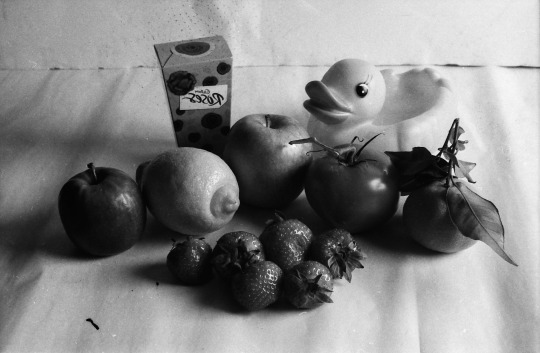
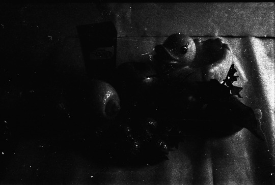
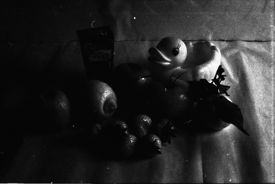
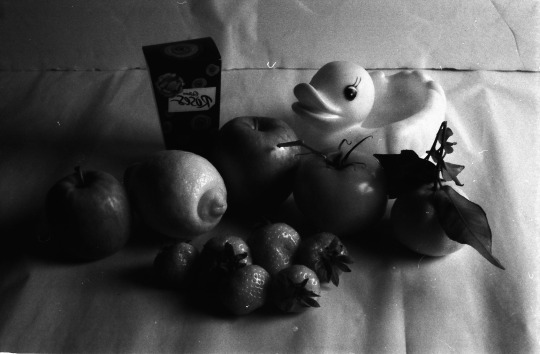
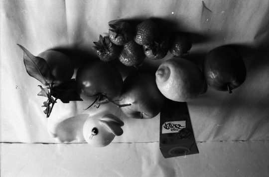
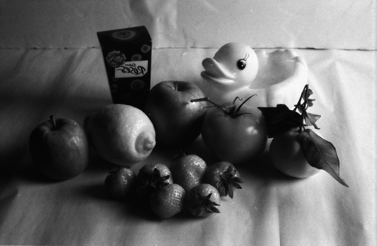
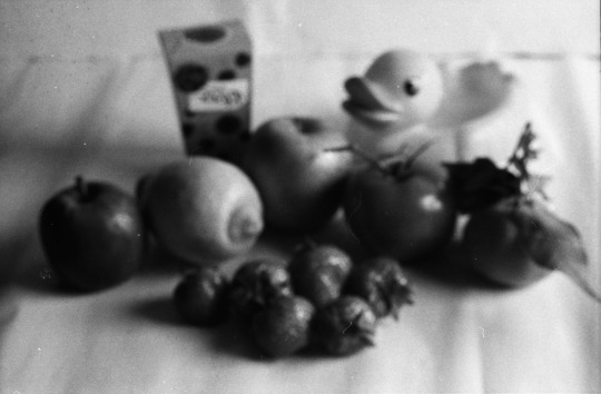
As part of Unit 32 which is based around experimental photography and strongly focused on the darkroom, we have been shooting film whilst experimenting with different colour filters and seeing the effects they have on our images. We arrange a mixture of fruit and vegetables, as well as a box of chocolates and a yellow rubber duck to produce a still life set up of different colour objects and took images on a film camera with different colour filters each time. We also shot with a bracket of 3 exposures, we tested the light on a light metre, and decided that the right exposure to shoot on was F11, however for most of the filters we shot at F8 and F16 also to ensure we had a range of exposures so have the best possible outcome with our film.

F11
F8
F16
No Filter - These images are of the set up we put together of the mixture of fruit and vegetables without any filter. We tested the light with a light meter and found that F11 was the best aperture for us to use, this helped us understand which other Aperture brackets we should shoot with which was F8 and F16 so that we would have at least one good outcome.

F16
F11
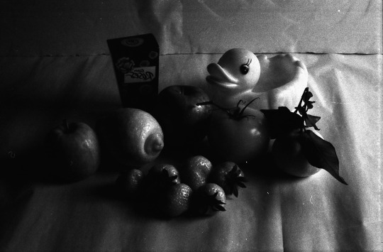
Blue Filter - Blue Filters are rarely used for black and white photography, however I still wanted to test it out to see the difference. I noticed it has darkened the colour’s across the entire image and slightly reduced the contrast by darkening the colour. It has also created a slight haze over the image, slightly cloudy looking which would probably be more useful for a landscape shot. I don’t feel it is had made much of an interest effect on this image. As you can see on the F16 exposure, it is way too dark, it is also still quite dark on the F11 exposure so perhaps we would have benefitted from doing a shot at F8 with this filter.

F8
F11
F16
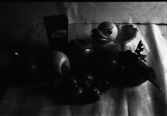
Copper Filter - The copper filter has had quite an intense effect on the images, as you can see F11 and F16 are way too dark. The F8 exposure is the best image out of all three, so I will analyse the F8 image for the purpose of this. I feel it has darkened the green and blue colours in the image which in result I think has increased the contrast of the overall image.
F16
F11

F8
Red Filter - The red filter is a popular filter used in black and white photography, it is very useful for increasing contrast and increases visibility through haze or cloudiness. The F16 is too overexposed and is not the best image to analyse as you can see the image is very dark and black. The best shot to analyse the red filter is the F8 image as you can see the blue/green fruit objects have been dramatically darkened and increased the contrast against the yellow duck which is alot lighter. You can see it has also darkened the foliage in the image which is mostly green colour on the fruit. It makes the image appear as if it had been through an infared filter.

F8
F16

F11
Yellow Filter - The yellow filter is a very subtle filter, it usually just helps to lift the darker areas of the image. In each of these exposures you can see that rather than adding a great contrast like some of the other filters. It also helps to even out the tones as you can see instead, it is a less intense version of the orange filter. Would perhaps be more effective on a landscape image where it would darken the blue sky and bring out the clouds in an interesting way.

F16
F8

F11
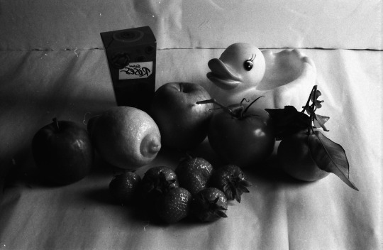
Orange Filter - The orange filter is a very popular filter used in photography, it is used for general purpose. It sits in between the red filter and yellow filter and balances out each filter nicely. It helps smooth out the lighter tones creating a blemish free effect, and also the contrast is slightly increased. This also has reduced any hazy effect similar to the way the red filter does as you can see all of the fruit clearly, it helps define each colour in a unique way. However judging by these images it has darkened the green and red colours in the image. The best shot to analyse is definitely F11.

F16
F8

F11
Magnify Filter - The exposure didn’t matter too much with this image as the colour has been greatly affected by the magnify filter. However for analytical purposes of this blog, you can see throughout each image the difference in the magnification, the F8 print is the most magnified resulting in the image appearing blurry, this was created by holding the magnifying filter slightly away from the lense having a magnifying effect. I found that holding the magnifying filter directly onto the end of the lense it made no difference to the image at all as you can see in the F11 print. The f16 print is a of a shorted distance and inbetween both the F16 and F8 prints.

F8
F11
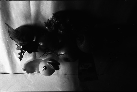
Half & Half Filter - This filter has had a slight effect on the colouring of the image as half of the filter was a black shade whilst the other a normal clear filter. It is obvious to see the effect the black filter has had as it has practically fogged the image. However the clearer side of the image has had an effect on the objects as they are darker than normal whilst the background (WHITE) is very light, essentially creating a strong contrast.
#filter#filters#bluefilter#redfilter#orangefilter#yellowfilter#experiemental#experimentalphotography#westherts#westhertscollege#georgiannesmith#georgiannesmithwhc#film#filmphotography#darkroom#processing#developinng#enlarger#developing#debbie#brett#alistair#level3
0 notes
Text
Unit 32: Experimental Imagery In Photography - Lith Film & Colour Toner
This is the original Lith Negative Film however when scanned it appears as a Positive file. You can see the print has some chemical damage as well as finger prints around the edges of the film which has damaged it also however the film is fairly decent considering it was our first attempt and a practice.
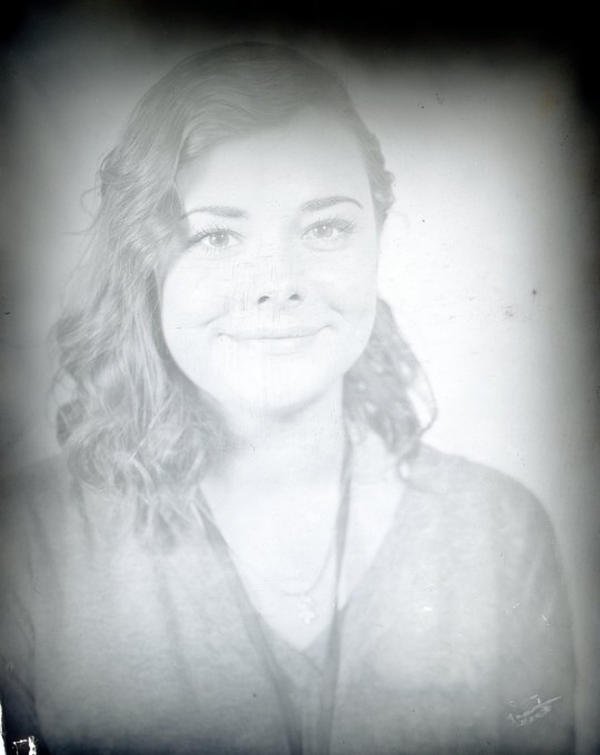
This is a Positive Lith print created by placing a negative lith film on top of a blank piece of lith film, then we exposed them to light using the enlarger then placed the film into the developer trays and developed as normal resulting in this.

This is a normal photographic paper print from the lith film. First we developed the print as normal, then placed the print into a bleach for 5 minutes which makes the print lose detail followed by placing it into a Sepia Toner for a few minutes which readds the detail with the sepia toner.
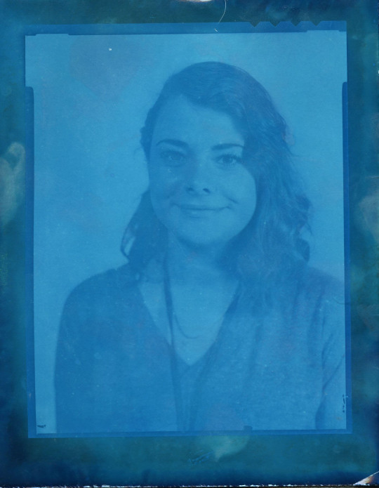
This is another normal photographic paper print developed as normal then placed into a Blue Colour Toner, this was not placed into bleach first like the Sepia Toner print. We left the this print in Blue Toner however we left it in for too long as the Blue is intense and has clouded the image. Next time if I was to re-do this, I would not leave it in the Toner for as long.
#lith#lithfilm#photography#experimental#darkroom#unit32#experimentalphotography#lithfilmexperiment#toner#bluetoner#sepiatoner#negative#lithnegative#lithpositive#contactprint#debbie#alistair#brett#whc#georgiannesmithwhc#experimentalimageryinphotography#westhertscollege
2 notes
·
View notes
Text
Unit 6 - FMP - (Christmas)

Blog Content: Review of Summer Project, Personal Brief, Key Influence, Experimentation & Investigation, Contact Sheets, Final Images, Evaluation
Review of Summer Project
Earlier on in the year before starting the 2nd year, I completed a Summer Project which I focused on Portraits of 2 young boys in a wooded area. This series was called ‘Lost Boys’ as I was directly inspired by the lost boys theme within the movie Peter Pan. I tried to produce a contemporary take on the lost boys characters and shot natural poses amongst nature itself in a wooded area. I was really pleased with the outcome of my summer project and the final 6 images that I chose, I felt that the location of this shoot was so important and a key feature of my shoot. I enjoy shooting on location and it is something I have tried to push myself to do more as in my 1st year as a photography student, I often would confine myself to studio based work and after being advised by a tutor to challenge my skills by practicing on location, It has opened my eyes to a whole new world within photography.
Project Idea
I’d like to progress further with the christmas project and do something different to my summer project where I shot portraits. This time I would like to produce images based around Horses, I’d like to dabble with some documentary/Fine Art shots in and around the Stables to gather together the feel of the Horse & Equestrian environment with shots of both their living environment and the horses themselves.
Personal Brief
Aims& Objectives – I would like to produce a series of images with a mixed style of both documentary photographs and some fine art shots of the horses.
Location – I will be shooting at Balls Pond Farm in Kings Langley, Hertfordshire which is the home to my 3 ponies and 2 horses.
Equipment – I will be using my Canon 700d DSLR to shoot these images as well as 16GB memory card.
Influence – I have been directly inspired by photographer David Sinclair, a Horse photographer that specialises in different forms of documentary photography covering all aspects of the Horse World photographing both Horses and their Owners, as well as all sorts of Horse Sporting events across the world.
Light – I will be using natural lighting for this project as I will be shooting outdoors in and around the stables.
Genre – I would like to think I have a mixed genre of work within my series including Documentary style work as well as some that fit the genre of Fine Art.
Audience – I will be presenting these images to my class in a class critique as part of our Christmas Project Task. I will also be uploading these images to my Flickr & Tumblr Blog.
Research of Influential Ideas
David Sinclair

Having grown up around Horses my whole life I have always had a natural interest for Horse life around the yard which sort of becomes second nature life for those with horses. I have been researching images I like on media sites such as Facebook, Tumblr, Google, Pinterest etc and have over time gained an interest for unique Horse photographs as well documentary Horse photographs such as based around the yard etc.
I came across photographer David Sinclair, who didn’t have much interest for Horse photography until he moved to Gloucestershire 5 years ago where he was surrounded by Farms, Horses and Equine disciplines. He became very interested in documenting Horse Life, Yard Life and Horse Sporting Events both locally and worldwide as he started to travel in aim to capture as much of the Horse world and life style that he could. Not only did he photograph the horses themselves but he wanted to also capture the spirit and lifestyle of those who work with horses and have a passion for these beautiful animals. He has documented many events ranging from British Equestrian including Team GBR, Dressage Tests, Eventing etc to Farming, Horses in Argentina, Racing, Polo, Studio Horses, Rodeo, Western and much more.
I have much enjoyed and followed the works of David Sinclair which directly inspired me to produce a Fine Art/ Documentary style project of my own, photographing at my own yard where my horses are kept. I have chosen to produce images of both the horses and parts of the horse yard which is where every Horse lover will spend their time in all sorts of weather conditions, every day of the year.
You can find the rest of his work on his website at www.shootshorses.com

Contact Sheets


Final Images


Evaluation
Project Brief
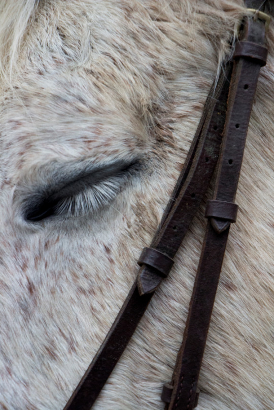
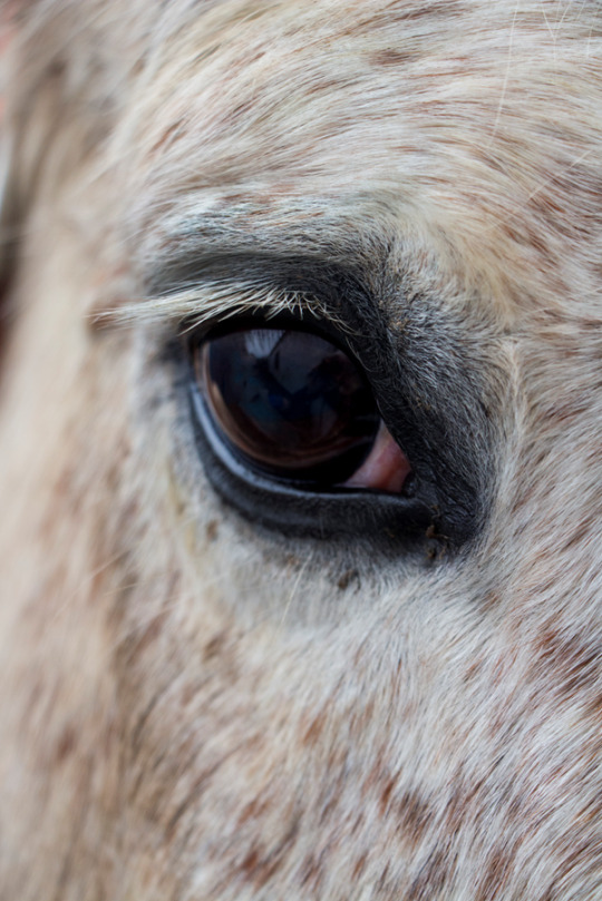
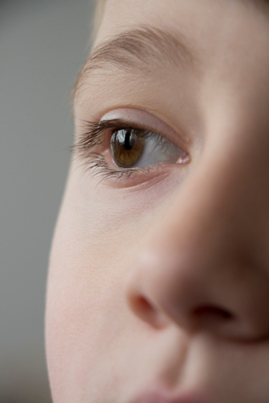
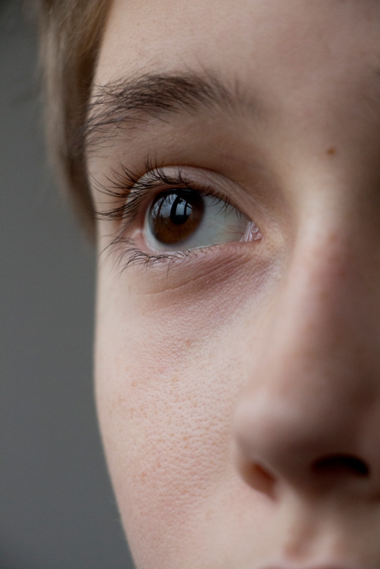
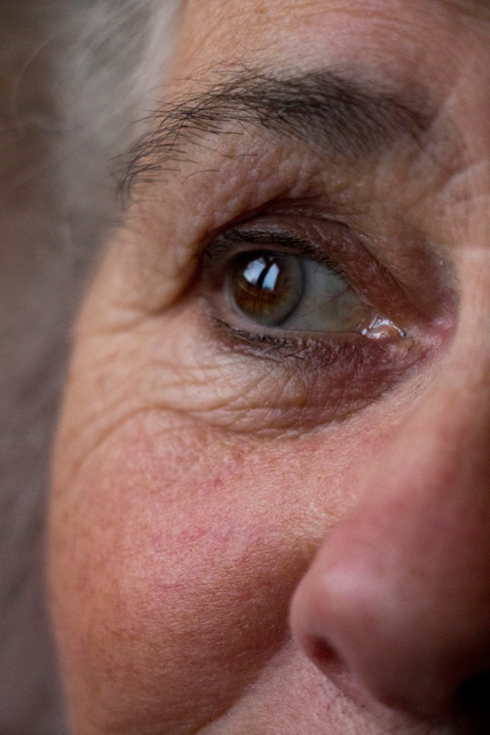
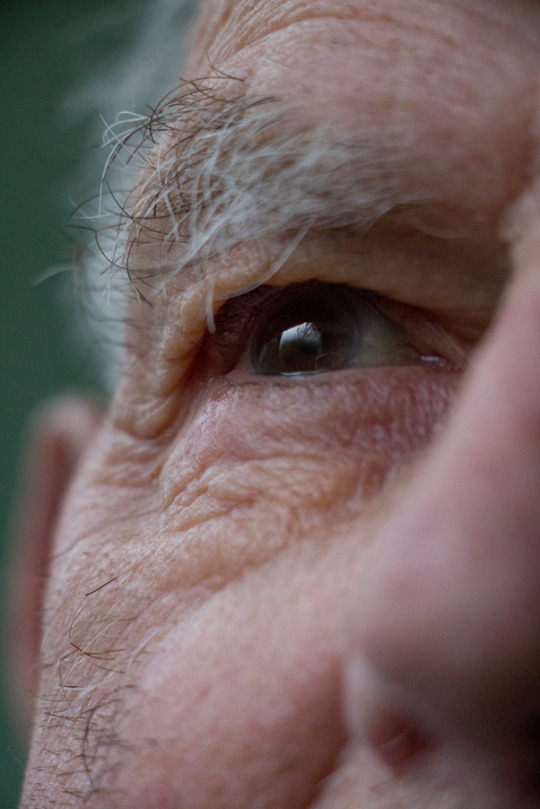
Aims & Objectives – I am aiming to produce a series of images focusing on the Eyes of my closest family members. I have chosen to photograph 13 family members ranging from 4 months of age to 92 years old spanning across 4 generations.
Location – I will be shooting within my Mother’s home and my Nan’s Home in Hemel Hempstead, Hertfordshire. I found this was the best option as family have gathered over the Christmas Period.
Equipment – I will only be using my Canon 700d DSLR and 16GB Memory Card.
Concept – I wanted to get across an idea of how life might be perceived through the eyes of 4 generations of one family. I would like my images to display a sense of time, sense of family and a sense of past, present and future through the eyes of 13 family members with a life span of almost a century.
Influence – I have been directly influenced by Photographer Suren Manvelyan, an Armenian photographer with great interest in Macro photography and that has produced a few series on close up shots of Human Eyes and Animal Eyes. I have always been fascinated in the human eye, and eyes of any being for that matter. It has been something I have had ideas about photographing for a long time and thought it would be a nice idea to shoot the eyes of my family members.
Light – I have chosen to set a parameter for myself for this task, this being allowing myself to use natural light through a window. I will not be using any additional lighting.
Audience – I will be presenting these images to my class and tutor during a class critique displaying work we have produced following the Christmas Project Task that was set before the holidays. I will also be uploading these images to Flickr & Tumblr Blog.
Research Of Influential Ideas –
Suren Manvelyan


When researching the works of photographers that have focused on the eyes of both human beings, animals and other life forms, I came across photographer Suren Manvelyan that became a professional photographer in 2006. His work has been published in magazines and newspapers in Armenia and across other parts of the world. He has always had an interest for Macro photography.
His most recent series was titled ‘Your beautiful eyes’ which practically speaks for itself, however it is a series based on close up images of the human eyes displaying the unique patterns in each human eye that can never be duplicated in another being, they are as unique as our fingerprints. He also produced a series on Animal eyes which have been published in National Geographic, Yahoo, The Sun, The Daily Mail, The Independent, Wired, and many other magazine and newspapers across the world.
I have found great inspiration in the work of this photographer as Macro photography is something I have always found myself interested in. I have always wanted to be able to produce beautiful shots of the human eye. On this occasion I chose to produce a series that had an added theme of family and generations so wanted to include some extra features of the face but not so much that they became a distraction to the main focus of the eyes. I felt it was important to add a little more personality to my photographs considering they were based around family, past, present and future.
His work can be found at www.surenmanvelyan.com.

Contact Sheets
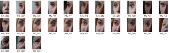
Final Images


#unit 6#matt#christmasproject#finalmajorproject#fmp#year2#photography#westherts#georgiannesmith#georgiannesmithwhc#development#progress#photographystudent#youngphotographer#suren manvelyan#eyephotography#eyes#horse#horsephotography#equestrianphotography#davidsinclair#stables#horses#equinephotography#generation
1 note
·
View note
Text
Unit 12 - Computers in Art & Design - ‘Destroyed Portraits’
Blog Content: Scenario, Research - Mood boards 3x A4, 5 Images Discussed in Depth, 3 LRC Portraits Research, Practice Self Portrait Screenshot Steps & Practice Final Image, Practice Portrait of Another Screenshot Steps & Practice Final Image, Self Portrait/Destroyed Shoot Brief, Final Self Portrait Images & Contact Sheets, Final Self Portrait/Destroyed Self Portrait Steps & Final Image, Final Image Analysis, Final Portrait of Another Images & Contact Sheets, Portrait of Another/Destroyed Shoot Brief, Portrait of Another/Destroyed Portrait of Another Steps & Final Image, Final Image Analysis and Project Evaluation.

- ’Douglas Gordon - Seeds of Destruction’
Scenario:
“You are a photographer commissioned to shoot an editorial portrait for a well-known publication, Art Review Magazine. You must create a simplistic but technical effective portrait photographs. You must then ‘destroy’ the images in an effective and dynamic way showing experimentation with computers in Art & Design. Both originals and destroyed images will be displayed alongside each other.”
Research
Mood board - 3 x A4 - “Research abstract/destroyed portraiture, produce a mood board of images that relate to your ideas - Create a moodboard equivalent to 3 full A4 pages”
Additional Comment - I found the Mood Board Research very helpful in initiating ideas for this entire project. It allowed me to research various portraits and destroyed portraits on the internet which proved very beneficial to me and helped me a great deal with inspiring me in a way that I didn’t originally believe it could.
5 Images - “Discuss in depth 3 to 5 images that are a key influence on your ideas for your destroyed portraits.”
I have chosen 5 images that I previously selected to produce a Mood board of ideas to start of my project and will be discussing them in depth, explaining how they have influenced my ideas for my final portraits. Some are already destroyed portraits whilst a couple aren’t obviously destroyed but probably shot in a way that makes it look like they could have been.

Image 1 - To start off, I really like this monochrome composite image of a female with rippled water blended over the top of her head. This image would have been digitally manipulated in Photoshop and the techniques used would probably have been the use of multiple layers and layer masks, along with the use of Brushes to remove parts of the image that were unwanted on the lower half of the image by painting on the layer mask. I think this is quite a simplistic idea by still appears quite sophisticated and effective. I also think that it would be as effective had it been done in colour as that could have proved fairly distracting, although I have not seen a colour version, I really like the image as it appears before you. Both images used in this I would say have been shot separately, one looks like a studio shot portrait whilst the other was probably shot on location somewhere and I think all editing has been done digitally, I don’t think anything has been done physically to either the image or the model in this case. This has influenced me to produce a final image or at least practice with blending layers on top of each other, as well as practicing with brushes, I also really like the way the whirlwind hole in the water is based around the eye of the individual, I would like to integrate something along the lines of that into one of my images.

Image 2 - This destroyed portrait is extremely powerful and caught my eye straight away. I think the central composition is quite interesting allowing space for the smoke to leave the top of the head on the individual here. This again is composite image made up of perhaps 3 images, one of the model, one of the fire and another for the smoke. The model as you can see has been painted in some way which is a physical effect that has been done in order to produce this image, I don’t think that has been done digitally. The smoke and the fire look as if they have been shot separately and placed onto the image using the techniques of copy and pasting onto the Layers using Ctrl+A to select an entire image, Ctrl+C to copy and Ctrl+V to paste and the Free Transform Tool has allowed the artist to place the images individually where they wanted them to make the image effective. I like the way the ‘brain’ has practically been removed whilst the fire and smoke is coming off it potentially indicating a larger subject such as mental or physical illness or thought patterns. It is a beautiful expression in visual form and a really love piece of digitally manipulated work. This is a mix of digital manipulation and physical work as the model was painted before shooting along.
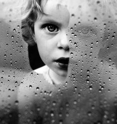
Image 3 - I was interested in this image as soon as I saw it as I am not sure if it was intentionally shot this way or has been digitally manipulated, it could have been either or. I love the use of the raindrops on the glass before the person, it adds texture to the image and makes it more interesting to look at. It could indicate some reflection of a mood or external larger subject and feel the image looks like it could even be used in some sort of child abuse campaign or advert but is equally beautiful on its own. I don’t feel like this image has purposely been shot to be a destroyed portrait as such like the previous images I have discussed I think this piece is as it is in its own way. I love the emphasis that has been put onto the child’s eye by the clear gap in the glass which much reminds me of the first image I discussed where the eye was used a focus point on the image, I definitely would like the integrate something like this into my final image as I previously mentioned. In my personal opinion, one of the first things I tend to look at in a portrait is the eyes of the individual, I feel they can give away so much about the image itself, allowing you to appreciate the mood of the image or indicate what sort of portrait it is trying to be. If I was to look at this image as if it had been digitally manipulated, then I would say the glass would have been shot separately to the image of the child and added in by copy and pasting the image on the image of the child by the layers and potentially the opacity setting could have been adjusted although I feel the image was probably shot this way or made to look like a natural shot.

Image 4 - This image is rather simple and looks to me as if it has been produced by a young student or somebody experimenting like myself now. It looks similar to an image that has been shot with a slow shutter speed to display some form of movement, however I feel this ‘movement’ has been done digitally. It is probably a composite image made up of about 4 images in total that have been layered on top of each other to produce the final movement result, it is quite interesting as each image you can see a different expression on the individual, this is perhaps representing some form of emotional expression or confusion. It is simple but interesting and something I would like to practice with, I like the blurred effect of the multiple images and would like to practice with the ‘Smudge Tool’ or ‘Blur’ tool to create a similar effect of the images put together. I am not sure whether I would integrate this into my final images at this point but it is something I would definitely like to practice with.

Image 5 - Finally my favourite image out of my chosen 5 images from my mood board, ‘The texturized man’, an image I actually found on Pinterest from a foreign account. This initially caught my eye because of the bright colour, to me this is a fabulous piece of work, I am in love with the different textures involved with this piece. This has been digitally manipulated in Photoshop and I think at least 2/3 different images have been used in the production of this as I am not sure where the texture on the model in the bottom half of the image has actually been painted onto the model before shooting, it could equally be another copied texture placed onto the image. Again, the techniques used would have been multiple layers, brush tools to remove parts of the copied images on the layer masks and general touching up with tools such as ‘Clone Stamp’ or ‘Spot Healing Brush Tool’. The main thing I love is the consistent colour which matches through the entire image, the different shades of blue look great and really make this image what it is. I definitely would like to practice or add a cracked texture background into one of my final images as this to me is such an interesting and eye catching effect for a destroyed portrait. I also really love the Jigsaw pieces that are at the bottom of the image placed onto the skin of the individual that sort of creates some added information about the larger subject for this image that could have potentially been an important influence for the production of this image. You can see around midway of the image some a slight blur which is where both images have been blended together and perhaps the ‘Blur Tool’ has been useful here to blend the two with an obvious line, the cracks aren’t as sharp as the top half of the image. Overall, a stunning piece of work and something that had definitely influenced my final pieces of work, it has given me some great ideas, I definitely wanted to produce an image and keep it in colour also because of this piece.
LRC - 3 Portraits -

- ISBN - 978-1-57687-662-6 ‘Vivian Maier - Self-Portraits’
I really liked this portrait of Vivian Maier that I chose from a book I found in the LRC containing her Self Portraits. I liked it because in this image, you can’t see her camera, it feels a bit more staged compared to some of her other portraits. Her other portraits are usually in front of something that reflects her such as a mirror or window, there aren’t many that are set up like this as you are able to see both of her hands in this shot. She has a stern look upon her face in this which could perhaps reflect the mood she was in at the time, that is also another reason why I like this image as you can really see her emotion/mood more in this whereas her others are much harder to see expression on her face because of the type of reflective shots they are. I think I would like to produce something similar when shooting my own self portrait, I would like to set up my camera and make use of the timer so that I am entirely in front of the camera rather than hand holding it in a ‘selfie’ style. This image has inspired me in my future work within this project, I would like to produce a similar self-portrait, it certainly stood out to me.

- ISBN -0-500-54321-6 - William A. Ewing - ‘Face, The new photographic portrait’
I came across this image in a book in the LRC called ‘Face, the new photographic portrait’, a book containing many a different portraits by various different artists that all use different techniques and have all sorts of unique artistic effects. This image in particular caught my eye immediately, it is part of a series called ‘Dystopia’ by ‘Aziz & Cucher’. When doing further research on this image I found a little right up about this series that read ‘An inventory of a bizarre skin growth, DYSTOPIA, seems to document a pathology. It seems clear that at some level this pathology is not only dermatological, but cultural, commenting, perhaps, on the gradual but waxing loss of identity and the means of communication in a technological environment that promotes anonymity and conformity”. —Adrian W.B. Randolph’. This image has clearly been digitally manipulated in Photoshop, I would personally say that this looks like the ‘Clone Stamp’ has been used on this, it is the first technique that I would guess has been used, along with potentially the ‘Spot Healing Tool’ and other ‘Colour Balance’ or ‘Colour Filters’ to bring out the freckles on the face. It has inspired me a lot, I certainly would love to include something very similar within my work for the destroyed project, it is a unique piece of work that I have not come across anything remotely similar throughout my research. I found it very interesting and eye catching and I think I would be able to achieve something similar in my own destroyed portraits by using the ‘Clone Stamp’ Tool.
- ISBN -0-500-54321-6 - William A. Ewing - ‘Face, The new photographic portrait’
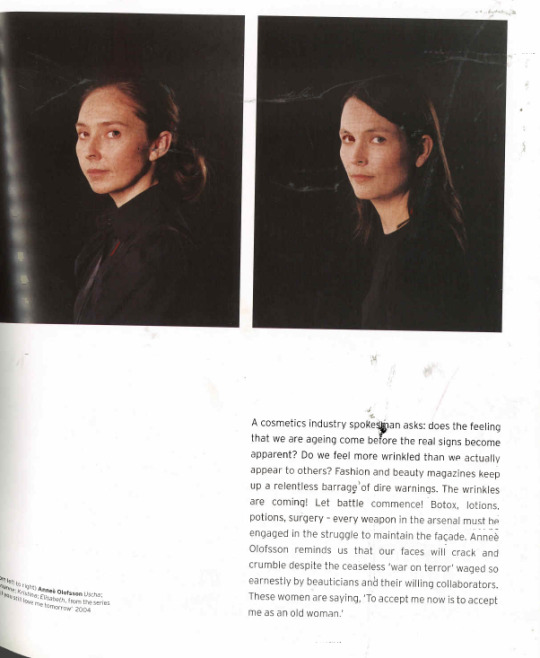
The last portrait I researched was from the same book ‘Face, the new photographic portrait’ By William A. Ewing that I used for the previous image I chose, this image is part of a series of 8 called ‘Will you still love me tomorrow’ by Annee Olofsson. These images are portraits of women with cracked faces, they are to represent wrinkles and the larger subject of ageing, as the title implies the question of will they still be loved as they age. I love the effect of the cracked face, in these images they are quite a subtle effect and the only effect but an interesting effect nevertheless, I like the idea of this effect and imagine it would have been done by using another image of the crack and layering it on top of the portrait. Further techniques used could have been the ‘Liquify’ mode and the ‘Warp Tool’ which would allow the layered image to be contoured around the facial features, the opacity and blending mode could have played a part in this also which would allow the blending of the two layers to fit better together. I think these images would be much better in print rather than in the book as I don’t feel it does them much justice as the effect of the cracked face is hard to notice from a distance however it is a really interesting effect that I would like to try out even if just for a practice, however if I am successful in practicing I would really like to integrate this into my own destroyed self portrait.
Practice & Experimentation
Practice Destroyed Self Portrait Steps & Practice Final Image - “Practice, experiment and investigate how to manipulate images to produce a destroyed self-portrait. Using a computer, manipulate your image. Print screen and explain what you’ve done and your decision making process.”
To begin this part of my project, I wanted to show some images I have produced by experimenting with various tools and image layering on Photoshop. I have played around with a self-portrait, I shot previous to this project just so that I could gain a little practice in playing around in Photoshop. I have also used some images I purposely shot for this project of another person to create a practice outcome.
My practice of my self-portrait is of an image I previously took of myself during a studio session at college.

I opened my image and duplicated the layer by pressing Ctrl+J so that I was not editing my original image. I wanted to experiment in this instance with the Black and White adjustment in Photoshop as it is something I regularly put on my images but simply leave as it is rather than play around with the tones.
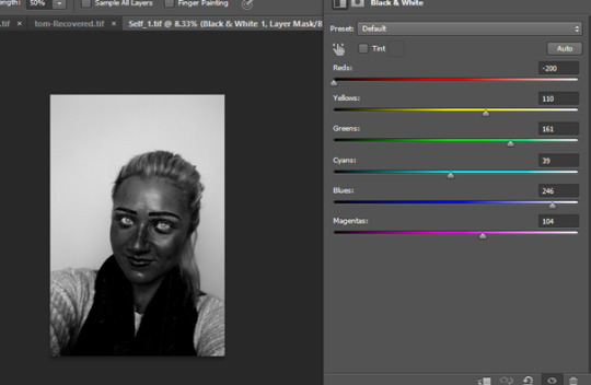
I selected the Black and White Adjustment from the Adjustment section on the right of my image (I could also go to Image>Adjustments>Black and White), for me I just felt it was an easier way for me to adjust my image whilst watching how each setting is effecting my image. I wanted to do something extreme with skin tone, so I reduced the ‘Red’ Colour right down to the black zone. This made my skin look scary as if I have put sun burnt skin under UV light. This was quite a cool effect which I liked. I adjusted the ‘Blue’ Colour the opposite way which increased the lightness of my background which was originally a grey tone, it also made my eyes super bright, this made me look mutant-like.

It was a great way to experiment I felt, although I also wanted to try to see what it would like if my eyes weren’t there, like hollow eye sockets. So I selected the ‘Brush Tool’ and changed the colour to black and carefully coloured in my eyeballs as so to make my eye sockets look empty. I felt this matched the scary theme a little better.
Final Practice & Experimentation Destroyed Portrait Image

I don’t feel this image is a great image overall but it allowed me to experiment with my skin tone by using a Black and White Adjustment. I found this quite interesting and is something I have always been interested in learning about when using Photoshop. It really brings out all blemishes in the skin and gives it quite a scary appearance.
The main reason I don’t feel this image works is because in this image I am clearly smiling, the scary eyes and strange skin tone doesn’t quite match the mood of the image which is quite a happy photograph, I feel if my facial expression had have been different it perhaps would have suited the manipulation a little better but seeing as I was only practicing with this it is okay.
Practice Destroyed Portrait of Another Steps and Practice Destroyed Portrait of Another Final Image
My practice destroyed portrait of another is a composite image made up of 3 images in total, shown below:
I opened the original image and duplicated the layer instantly to save editing my original image or damaging it. I then opened the other images separately and copied them via layer by pressing Ctrl+C on the individual images and pasted them onto my original layer so you can see they are listed here.

One of the images has been duplicated as I wanted to vertically flip as a seperate duplicated layer, which I did by going to Image> Image Rotation>Flip Canvas Vertically.
I then reduced the opacity of the layers accordingly so that they appeared more transparent and ghostly like. I kept my original image at 100% as I wanted that to shine through.
Then to finish off, I simply used the ‘smudge’ tool to blur the ghostly appearance of the other layers a little around the edges to create a unique blurred/smudged effect.
Final Practice Destroyed Portrait of Another

I found this practice quite interesting as it allowed me to practice with the ‘Smudge’ tool which is something I definitely will carry through and use on my Final Portrait of another individual as I really like the artistic effect it creates. The practice allowed me to practice with layering different images and adjusting the opacity to an appropriate level that meant you could see different images shining through the final image. I feel for a practice attempt the image is quite interesting and was certainly fun to produce. I am hoping to only use one or two images for my final portrait rather than 4 layers like this one, however it was good to practice using different images layered on top of each other to produce a final outcome. The techniques of multiple layers, blending modes and smudge tool will definitely be carried through to my final images when editing them.
As i previously discussed when discussing my 5 chosen images from my mood board, I wanted to practice with the ‘movement’ effect which I feel I have successfully done with this practice, It was a key influence on the practice work I have just done.
Final Self Portrait/Destroyed Self Portrait Shoot Brief
Project Brief
Self Portrait/Destroyed Self Portrait
Aims & Objectives – I have been asked to shoot a self-portrait and then using digital software such as Photoshop, ‘destroy’ my image by digitally manipulating it. I have chosen to shoot an image of myself, as well as image of a cracked painted wall that is peeling in my bathroom to blend onto the surface of my skin for my destroyed portrait.
Location –
I will be shooting my self-portrait at home in my bedroom and the cracked/peeling painted wall will be shot using a part of my bathroom wall.
Equipment –
I will be using my Canon 700d DSLR, a 16 GB memory card and laptop to edit my images on Photoshop.
Digital Techniques –
I will be using multiple layers to produce my final image as well as the ‘Liquify Technique’ for the main editing of this image. I will also be using ‘Spot Healing Brush’, ‘Burn Tool’, ‘Hue/Saturation’, ‘Clone Stamp’ and adjust ‘Opacity’ and ‘Blending Modes’
Concept -
I wanted my image to represent my current state of mind and reflect my personal struggles at this moment in time in my life. A way of expressing my emotions in a positive way through my photography.
Influence –
I have been influenced greatly by an image that I found when doing research for this project initially found in my Mood board and that the 5th image I discussed in depth within my research.
Light –
I will be using natural light coming from my bedroom window directly in front of my face for my self-portrait.
Genre –
Portraiture, Surrealism
Audience –
I will be presenting these images to my class in a group critique as part of this ‘Destroyed Portraits’ Project.
Self Portrait Final Image
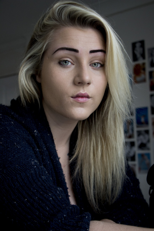
As many people are, I am not one that enjoys taking images of myself, I much prefer taking images of others and being behind the camera rather than in front. For this part of the project, destroying a self portrait, I don’t think it was essential that the image of our self we use to destroy was actually taken by our self, however I wanted to push myself as much as possible and take my self portrait by myself. I set my camera up in my bedroom in front of my window, and used the natural light as my main light source. I took a few images as you can see on my contact sheet below but this image was the last and best image I took on a 10 second timer on my DSLR.
Self Portrait Contact Sheet

Cracked Wall Final Image
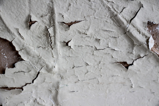
Cracked Wall Contact Sheet

Final Destroyed Self Portrait Steps

I opened my image and duplicated the layer by pressing Ctrl+J.

I then opened my other image that I will be using on and duplicated the layer. I then pressed Ctrl+A to select the entire image followed by Ctrl+C to copy the image so that I could paste it onto my main self-portrait layers list.
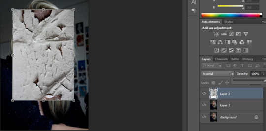
I pasted my image onto my self-portrait by pressing Ctrl+V. I then pressed Ctrl+T which is the control for ‘Free Transform’ which allows you to move you image, resize or reshape it. I made my image smaller and placed it over where my face and neck would be which is where I want the cracks so show up mostly. I changed the blend mode to Multiply.

My next step was to distort the texture, so after highlighting the texture layer, I went to Filter>Liquify.
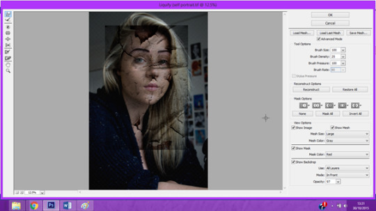
I activated the ‘Forward Warp Tool’ In the top left hand corner, and set the Brush density to 25 and the Brush Pressure to 100. I checked the ‘Show Backdrop’ Box and set the opacity so that I could see both layers easily with the cracks visible. Then I carefully contoured the face by doing short strokes with the brush on areas of the face that the cracks needed to blend around such as along the nose and around the eye sockets, the natural dips on the face.

Then I wanted to remove the crack from all of the parts of the image except my skin on my face and neck. I created a layer mask but clicking the layer mask icon at the bottom of the layers palette and selected a soft brush and changed the colour to black. Then I painted over all the areas that I did not want the cracks to show on, including the eyes and lips.

Then I wanted to sharpen the texture a little, so I highlighted the texture layer and went to Filter>Sharpen>Unsharp Mask. I played around with the adjustments to get the sharpness of the cracks exactly where I wanted it, I didn’t have to do too much as my cracks where already fairly sharp.
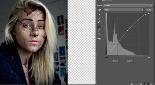
I wanted to lighten my face a little, so I used the ‘Curves’ Adjustment to lighten up the face.
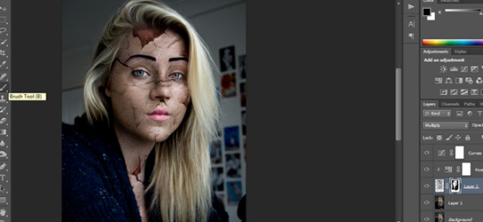
Going back to the brush tool that allowed me to remove any part of the cracked image from my self-portrait, I reduced the opacity of the brush which allowed me to go over some parts of the face that I felt were still too dark. I gently went over a few areas and took a few of the real dark parts of the cracked image which weren’t an actual crack itself.

I wanted to change the colour slightly of the large cracks/gaping holes on the face and so I did this by adjusting using the ‘Hue/Saturation’ adjustment. I learnt whilst practicing with this that I started to change the entire images Hue/Saturation which I did not want to do, to avoid this, I right clicked on the Hue/Saturation layer and selected ‘Create Clipping Mask’, this linked the Hue/Saturation layer directly to the previous layer which is the image of the cracks itself, therefore only the cracked image would change according to how I wanted to colour it.
I finally tweaked a few areas of my images by using the ‘Burn Tool’ and darkening some of the parts of my face including bringing out my eyes by burning my pupils and eyelashes as well as darkening the cracks on my face.
My image at this point

I saved my image at this point as a TIF so I could refer back to my layers as they were if needed. My next move is to create a more interesting background.
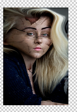
I went to Filter>Liquify and with a really big brush pushed the edges of my hair to the outside of the image as so to blur my hair.

I duplicated my original layer and also created a layer mask by clicking on the layer mask icon at the bottom of the layers palette.

Then I selected the Brush Tool and clicked on a Splatter Brush and adjusted the size according to how I big I wanted it. Then I used this brush around the outside edges of my image to produce a splattered edge background.

But before I started to use my splattered brush tool around the edges with a soft normal brush I painted the edges white around the outside of my body so that it would be more effective when my splashes shine through.
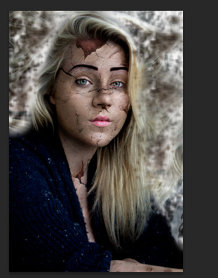
I then used the splatter brush around the edges which technically erased parts of the top layer bringing through the layer underneath that I used to liquefy to bring through a unique but weird background.
This was my final finishing touch. I wanted my image to be weird and mismatched. I wanted my audience to be able to take what they wanted from it, I know I chose to do it this way to reflect a certain part of my personal feelings at the moment in time in my life. A state of hectic confusion whilst feeling fragile and cracked ready to shatter.
Final Destroyed Portrait

Final Image Analysis
My final destroyed portrait was a real personal project for myself, I put a lot of my emotional creativity into this image. I wanted to reflect how I felt internally and produce this as an external effect on my skin and background. I was directly inspired by my research into portraits by Annee Olofsson with the ‘Will you still love me tomorrow’ 8 image series. I found the Liquify technique really useful for the editing of this image as well as the Splatter Brush tool which was really effective for my hazy background that represented external confusion. I also made use of layering the image of the cracked wall from my bathroom to produce the crack on the face of myself and then edited the Hue/Saturation to add further colour into the gashes on my face. The warp tool in the Liquify mode was quite useful too as this allowed me to slightly contour the crack on my face to match my facial features such as around the nose etc. I am pleased with the final outcome of my image, I would be interested in learning further techniques in the future that would allow me to improve my image upon feedback from my tutor however for now I don’t think I could have represented my emotions any better than I have with this image.
Portrait of Another/Destroyed Portrait of Another Shoot Brief
Aims & Objectives –
I have been asked to produce a considered portrait of another and then to destroy this image digitally using software such as Photoshop. I have chosen to shoot an image of my younger brother in the bath filled with milky water to produce a soft, white, water effect in the water. Then I have chosen to shoot an image of the bathroom window with raindrops to add texture to my image of my brother in the bath and blend it in with the white water as well as using techniques to smudge parts of the image.
Location –
I will be shooting the image of my brother at home in the bathroom, as well as using the bathroom window with raindrops on to produce my image.
Equipment –
I will be using my Canon 700d DSLR, a 16 GB memory stick and laptop to edit my images. I will also be using milk to add into the bath water to produce milky white water effect for my portrait.
Digital Techniques –
I will be using multiple layers to produce my final image as well as the ‘Smudge Tool’ for the main editing of this image. I will also be using ‘Spot Healing Brush’, ‘Burn Tool’, ‘Clone Stamp’ and adjust ‘Opacity’ and ‘Blending Modes’.
Concept -
I want this image to represent a state of mind, introducing the larger subject of of mental struggle and disorders such as Split Personality Disorder, Bi-Polar, Depression & Schizophrenia.
Influence –
I have been influenced my images that I found for my Mood board mostly found on Pinterest and on the internet throughout my research, one of my favourite images influenced me with the raindrops as added texture to the image which is discussed earlier in depth.
Light –
I will be using natural light from the bathroom window for both of my images for this final image.
Genre –
Portraiture, Surrealism.
Audience –
I will be presenting these images to my class in a group critique as part of this ‘Destroyed Portraits’ Project.
Portrait of Another Final Image

Raindrop on Glass Image

Contact Sheet of Portraits of Another

Contact Sheet of Raindrop Glass
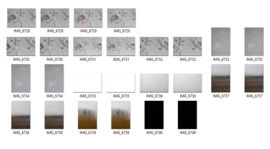
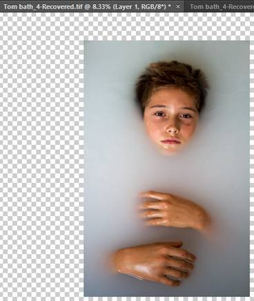
I opened my final chosen image that I wanted to use for my destroyed portrait and instantly duplicated the layer by pressing Ctrl+J.
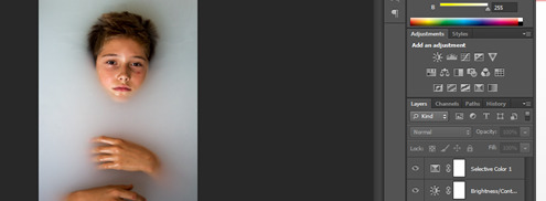
Then I slightly adjusted the whiteness of the background by using the ‘Brightness/adjustment’ on the Adjustment Window as well as the ‘Selective Colour’ Adjustment which made my background a slightly brighter white. This was a really minor tweak as it was hardly noticeable but I was much happier working with my final image this way as it made my subject stand out more.
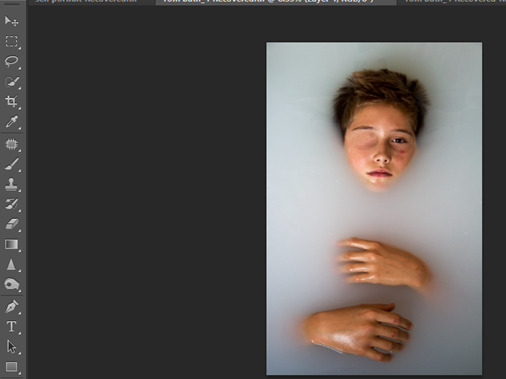
My next step was to remove the eye of my subject by using the ‘Clone Stamp’ Tool. I carefully selected areas around the eye of the skin and used this to stamp over the eye so that it looked as if my subject eye was missing and covered up by skin. This was quite an interesting surreal effect that I wanted to have on my image before progressing any further.
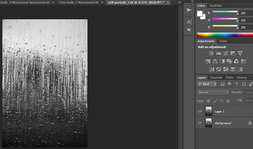
Then I opened the other image I shot of a window with raindrops on and edited into black and white previously. I duplicated the layer and pressed Ctrl+A to select my entire image, then pressed Ctrl+C to copy the image so that I could paste it onto my other image I already had opened and was editing.
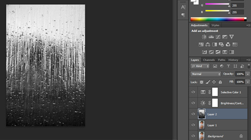
Now you can see in my layers list that the window image has been pasted onto my list so that I could not begin blending this background onto my image.
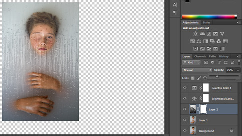
I reduced the opacity so that I could see my other layer through this image so I knew where to begin blending the two images, I know I can put the opacity back up afterwards if I want too. I then created a mask layer by clicking the mask layer icon at the bottom of the layers window for the window image. This adds a black filled mask.

I then selected a soft brush and changed the colour to White as the layer mask was black and brushed over the parts of the image I wanted to show through which in this case was my subjects face and hands. You can see on the layer mask box next to my window image a black silhouette of what I have brushed off to show through the layer.
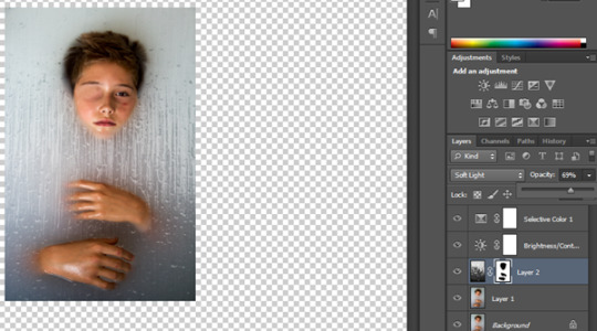
Then I changed it to ‘Soft Light’ and increased the opacity to 69%. This was just enough of the effect I wanted in the background of my image. I couldn’t have the image too strong or else it made my face and hands looks superimposed and quite tacky. I wanted the texture of the background to be fairly subtle.
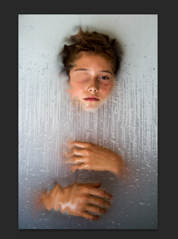
Then using the ‘Smudge Tool’, I changed my brush size to 170 at 50% opacity and in anti-clockwise circular motions I smudged my image to create a weird blurry smudged effect on only half of my subject, The half of the subject that also has the missing eye, I only wanted to do half of the image so it split my person in half so that it perhaps displayed sense of a ‘split personality’ in a visual way.

I saved my image at this point as TIF so that I could refer back to my image if needed with these present layers as they are. Then I went to Layer>Merge Visible and merged all my images together. Then I duplicated the final merged layer again by pressing Ctrl+J.

Now my layers were merged, I went to Image>Adjustments>Desaturate. I then changed the blend mode to ‘Soft Light’.

Personally for me at 100% opacity the effect of the desaturation at soft light was a little too strong, so I reduced the opacity to 67% which I much preferred my image like.
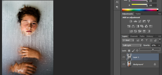
This last part of editing on my image was quite a vital part, before desaturating the image and placing the blend mode onto soft light, the image was still quite whitewashed and light, I wanted to create a little more dramatic lighting and so by doing this is created more contrast in the shadows to the light part of my images.
Final Destroyed Portrait of Another

Final Image Analysis
My final destroyed portrait of another is an overall representation of mental struggle in an individual, I have displayed this by splitting the image in half, as I have blurred half of the photograph using the smudge tool. I also removed one of the eyes as I was inspired by the portraits by Aziz & Cucher by using the Clone Stamp tool, this was to metaphorically remove the clear minded-ness and eyesight of somebody struggling with mental illnesses. I also chose to include the raindrop covered patterned window in the mix as I felt the raindrops represented some sadness. I love the image as a whole, I feel it is interesting, unique, refreshing and creative, it openly put out there my representation of this. I felt the image worked better in black and white also, I don’t think colour was necessary for this, i don’t think it needed to be in colour as I felt this could have been quite distracting. My final portrait of another was definitely a considered portrait as I did have to plan it with my model, I asked him to lay in a warm bath that I added milk into to get the creamy white effect in the bathwater, this gave me a great starting point, It made my model look like he was just emerging out of the water which was quite weird looking in the first place. I think both images are quite successful and I am really pleased with the outcome of both of them.
Project Evaluation
When considering your own work, what went well? What was a success?
Overall, I feel I was quite successful with the project as a whole, I am really pleased with the outcome of all four of my portraits, normal and destroyed, and feel I put all that I could into the project.
Where do you think you could improve your project?
I think I could improve the project in the areas of the practice, I could have done some more practices experimenting with further techniques to gain a little more confidence in the work I was producing, however I was inspired quite early on from my research and moodboards that I already had in mind exactly what I wanted to produce therefore I practiced with some different techniques before starting my official editing.
What were your original intentions with this project? Did you achieve what you set out to do? if yes, explain how? if no, explain how you could have approached this assignment differently?
My original intentions were to investigate various different destroyed portraits and try to research as much as I could to gain as much inspiration for my project as possible, after producing the mood boards I was inspired already by what I had seen, I had a brief idea of what I would have liked to produce, but then the further image analysis of images I found online and from the LRC allowed me access to some of the most interesting portraits I have ever come across. These images such as the cracked face by Annee Olofsson and the Dystopia images by Aziz & Cucher were the main inspiration for both of my destroyed portraits. I am confident i achieved what i set out to do with this project and don’t think I could have approached this any differently than i already did.
Was your experimentation and investigation valid and useful?
Without the experimentation and investigation I would not have been able to produce the final destroyed portraits that I have, it was this area of the project that gave me inspiration for the rest of the entire project. It set my mind at ease that I was heading into the production process of this project knowing exactly what it was I wanted to do, the rest was fairly easy as I wanted to make it as enjoyable for myself as I could as I feel my creative streak flows best this way.
What did you learn during this assignment? Identify areas of strength and areas for development
I learnt a range of different techniques and unique methods that allow me to creatively manipulate images I have shot into an entirely different image. The research and the experimentation was a really great way of testing different ideas that I hope I can expand on in the future. It has given me a massive insight into creative photography and the limitless use of Photoshop.
How did your practical work relate to your research? Did the research influence your end result?
My practical work directly linked to all of my research, I was initially inspired by the mood boards but it was the image analysis and image analysis of the portraits from the LRC that really got my mind set as to what techniques I would like to use and effects that I felt would look good for my destroyed portraits. The rest of the message of the image was my emotional input and the way I chose to express myself in this project hoping it would reflect in my photography in a positive way.
What next? How will you move forward now? Has working on this project identified any areas (e.g equipment/technical, genre, style) that you will continue to practice?
I would like to produce further images that will make use of the techniques I have explored such as layering images and blending photos together to produce a different images. I would like to explore further beyond portraits and perhaps produce some types of landscapes and experiment in the genre of surrealism as I feel this is quite closely linked to the type of destroyed portraits we have been focused on recently in class and as part of this project. I am pleased with the overall outcome of this project and am really glad to have learned more Photoshop tricks and methods that will stay with me for a lifetime.
#Unit12#computersinartanddesign#destroyed#portrait#destroyedportrait#portraiture#destroyedportraiture#tutorial#screenshots#stepbystep#editing#photoshop#digitalmanipulation#georgiannesmith#georgiannesmithwhc#westhertscollege#westherts#photography#photographystudent#youngphotographer#finalimage#raindrops#crackedskin#layer#layermasks#technique#digitalphotography#projectevaluation#vivianmaier
1 note
·
View note
Text
Colour Balance Adjustment
Colour is one of the first things we notice when looking at pretty much everything we set our eyes on every day, within photography it is such an important factor that will change the way we see an image. Adjusting Colour in an image would be done using the ‘Colour Balance’ Adjustment, typically it would be used for correcting Colour in an image so that is appears more appropriate to the mood of the image or for creating some more abstract Hues for a more artistic effect.
‘Colour Balance’ is a really important adjustment within Photoshop despite it being such a minor adjustment, It is seen as a ‘Non Destructive’ feature, meaning it allows for changes to occur without causing physical change to the file you have open.
There are 6 colours available in this feature, however they do work in pairs meaning when one colour is reduced its pair would be increased. Finding the right balance is up to your own personal preference.

I opened this file and instantly duplicated the layer so that my original copy is safe.
I then went to Layer> New Adjustment Layer> Colour Balance. This then created a new layer, a pop up box appears which allows you to adjust the name of you layer, click OK and proceed. You will be faced with the Colour Balance Box.

The original image I opened was already quite a strong green colour, so I knew I needed to decrease the Green slider towards the Magenta.

This left me with a much better Colour Balance for this image, I was quite happy with the outcome of this and felt it was a nice image like this.

This is the difference between the two images after adjusting the Green/Magenta Slider.

Then I went to Layer> New Adjustment Layer> Levels and decided to increase the Levels to brighten up the image.
I adjusted the sliders accordingly to level I was happy at and left it there. The image looks much better than when i originally opened the file.
I repeated the Colour Balance process with another Image. I duplicated the layer then went straight to Layer> New Adjustment Layer> Colour Balance.
I analysed the colour balance by looking at the image and comparing it to the 6 colours available to me in the colour balance box. I noticed it was closest to the Cyan colour, this meant I had to decrease the Cyan in the image therefore Increasing the Red Colour of the image.

I increased the Red and also felt the image needed the Yellow adjusting too, So i decreased the yellow slightly and increased the Blue. I was happy with this result.
It is a really simple technique that can be used in Photoshop which can have a massive impact on the overall look of the image. With a poor colour balance, it could totally ruin the image as a whole.
#unit12#colourbalance#colourbalanceadjustment#photoshop#editing#colour#balance#digital#digitalmanipulation#destroyedportraits#westherts#westhertscollege#georgiannesmith#georgiannesmithwhc#youngphotographer#studentphotographer#tutorial#colourbalancetutorial#students#photography
0 notes
Text
Cutting Out in Photoshop
Blog Content: Steps to cutting images on photoshop and Final Image.

Blog Content:
I started by duplicating the layer by pressing Cmd+J.
I then went to the Channels tab and selected the layer that has the most contrast in, which is usually the Blue Layer. I have also deselected all of the other layers as it is the blue layer I want to work with which I did by clicking the eye icon and turning the other channels off.

I then clicked on the little drop down box on the channels tab section and selected ‘duplicate channel’.
I was then presented with this box and saved the channel as ‘Blue Copy.

Then it was important that I deselected the other blue channel I was originally working with and selected the blue copy instead by selecting the eye icon.

I then inverted the channel so that the image appears like a negative by pressing Cmd+I.

Then I went to Image>Adjustments>Levels after clicking F on my keyboard to go to Full Screen Mode.

I increased the black output to increase the black on my image and also adjusted the White output slightly to increase the highlights without pushing them both too far which would have resulted in losing detail such as with hair strands.
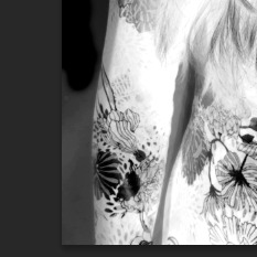
Then I selected the burn tool from the tools palette and made sure my range was set to shadows, I then burned all of the shadow areas of my image such as round the images which would not effect the highlighted sections of my image. This allows me to tidy up my image ready for when I make a selection.
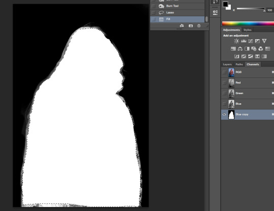
Then I had to make sure all of my subject area is white for the layer mask which is the opposite of my background area. I then chose the Lasso tool and carefully selected around my subject as close to the edge as possible and when my selection was complete I pressed Cmd+D which filled my selected Area White.

Then I used the dodge tool and set the range to highlights and dodge around the edges of my subject area that was i was unable to select during the lasso tool selection and made them as light as possible.

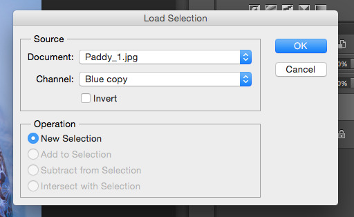

Then i went back to Channels and selected the RGB mode making sure everything is visible and the ‘Blue Copy’ i created was not visible. Then i went to Select>Load Selection and on Channels i loaded the channel i created called ‘Blue copy’.


Clicking the Rectangle Icon with circle in the middle i created a layer mask on my adjustment layer. A little inverted icon appears next to my image icon on my adjustment layer.
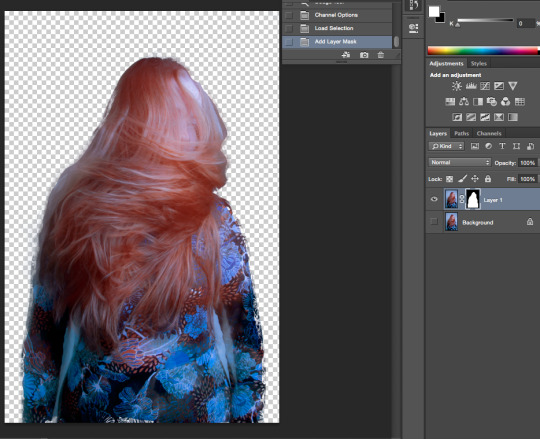
Then I disabled the background layer visibility and my subject selection stands alone on a transparent background.
Then using a brush I selected carefully the areas I wanted to become visible that i might have missed in my selection. White brush reveals and black hides.

By pressing Cmd+Z i am able to move my selection around and place it wherever I want it.
Now I wanted to add my selection onto a different background. I copied my selection by pressing Cmd+C and pasted onto my separate background layer that i had already opened by pressing Cmd+V.
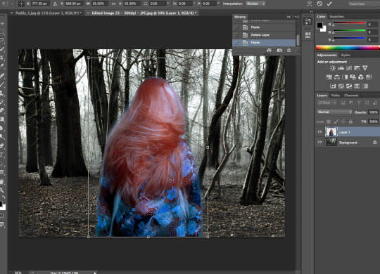
Then I resized my image by pressing Cmd+T and held shift to ensure my image resized equally. I placed the selection where i wanted it and my image was finished.
Final Image

#cuttingout#photoshop#lassotool#georgiannesmith#georgiannesmithwhc#youngphotographer#student#westherts#photoshoptutorial#matt#unit12
0 notes
Text
Submarine Task
Blog Content: ‘Submarine’ Film Cover, Film Research and My Image.
Task: Part 1 - Choose one of the following; A character, a space/place, specific object, sound from the film ‘Submarine’ by Richard Ayoade and create an image responding to your selection.
Part 2 - Research the film and the chosen subject area, from the list above to present alongside your final image.

Research
Written and directed by Richard Ayoade, Submarine is a dark but cool take on the comedy based around the coming-of-age of a young teenager, Oliver Tate, in 1980’s Swansea. Oliver is lovestruck with his classmate Jordana, a very mysterious and intimately awkward character rolled into one by her significant red coat.
The pair begin to build a unique relationship whilst individually facing their own trials and tribulations of life. The first noticeable theme outside of Oliver and Jordana’s relationship is the ever-growing obsession Oliver has with his parents,Lloyd and Jill, private life, he admits, in a diary-like narration, his observations of the proof of his parents sexual activity or lack of which soon transitions into a wild-stalker type infatuation when his Mothers old flame Graham re-emerges back into her life. This becomes a large problem in Oliver’s life and consumes most of his thoughts outside of that which concerns Jordana, he eventually wishes to discuss this with Jordana, despite the pair not usually being overly open about their feelings with each other, before finding out that actually Jordana’s mother has a brain tumour which he then feels is far more serious and instantly decreases the importance of his issue regarding his parent’s marriage and holds back. Oliver fears the illness of Jordana’s mother will make her ‘gooey in the middle’ which is the opposite to what he loves about her and makes the schoolboy error of cutting of contact with her rather than supporting her through this difficult time, she then proceeds to get another boyfriend resulting in Oliver realising his mistakes leading us to the final part of their relationship in the film.
The film cleverly covers some dark and intense subjects such as mental and physical illness, bereavement, marital breakdown, class, sex, youth and love but manages to smooth the sharp content of these subjects with a comedic touch. In my personal opinion, it is such a great way to approach these sorts of subjects with some comedy to avoid the film/storyline from becoming too heavy and overwhelmingly intense. I feel Ayoade allows you to experience each scene with some sort of teeth clenching awkwardness before quickly throwing in some blunt humour moving on to the next scene.
After being asked to produce an image responding to either a character, space/place, specific object or sound from the movie, I have chosen to produce one based around the main character Oliver Tate. Towards the end of the movie, Oliver deeply experiences the breakup with Jordana which for me was probably the part I could relate to most from my memory of being a young teenager. I found these scenes most moving where he appears motionless, expressionless, sad, depressed, and numb which is displayed in many ways ranging from him staring into space to taking a bath in his clothes which also matches another scene of him sitting in an empty bathtub outdoors. I wanted to incorporate this bath theme into my image along with the motionless blank expression indicating the films theme of depression and deep thought. I experience this as a reflection of the mild suppression of a theatrical part of Oliver’s personality as we earlier hear him wondering what the reactions of those around him would be if he were to die which is quite a dramatic thing to think about.
Despite initially finding the film really strange and weird whilst watching it, upon reflection I feel it has been produced with a real clever approach and looking back on the way the strong themes have been covered In a way that they can still seem funny is what makes this film interesting and maintains my fascination throughout.
My Image

#submarine#photography#westherts#youngphotographer#filmreview#debbie#alistair#nd2photography#submarinethemovie#research#water#milk#bathphotography#studentphotography#georgiannesmith#georgiannesmithwhc#georgiannephotography
0 notes
Text
Portraiture Task
Blog Content: Final Images, Evaluation.
- More images to be uploaded to this blog post soon.
Final Images
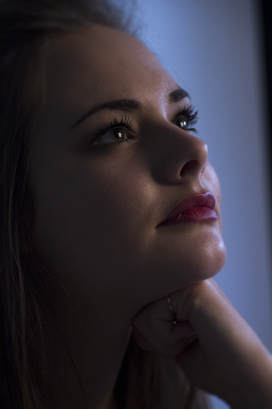
2. ‘A Friend’

3.‘An Older Person’
4. ‘Somebody Indoors’
5. ‘Somebody wearing colourful clothes’

6. ‘Somebody Outside’

7. ‘Using a wall as a backdrop’
8. ‘On a plain white backdrop’

9. ‘A self portrait’
10. ‘Somebody in the shadows’

11. ‘Somebody in the highlights’
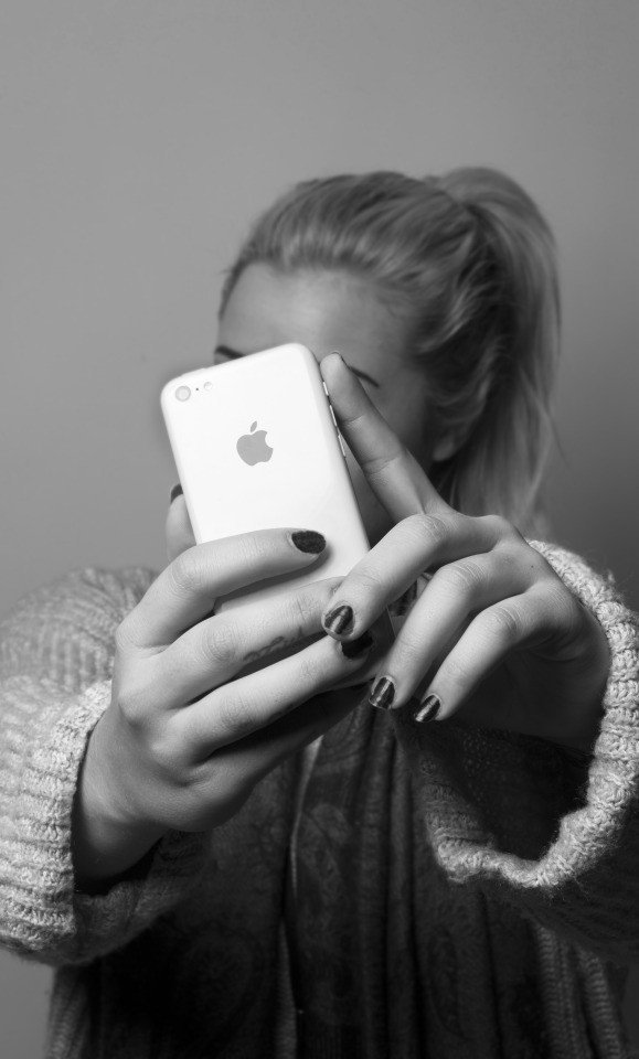
12. ‘Another self portrait that refines the ideas from your first attempt.’

13. ‘Photograph somebody you’ve already photographed but in the opposite way.’

14. ‘A young man’

15. ‘A young lady’
16. ‘An over-exposed Portrait’
17. ‘An under-exposed Portrait’
18. ‘A parent/guardian or somebody at their or your home.’
20. ‘Interview somebody ask them 3-5 questions about who they are. Create a portrait influenced by the answers that they give’.
1. If you had to describe what sort of student you was back when you was in school, what would you say you were? - ‘I was always the class clown, i messed about too much, not much has changed really.’
2. What sort of person are you today? - ‘ I am a father, our fourth child was born this week, although I feel sorry for my partner because really for her its like having 5 children with me around.’
3. What do you like to do outside of family time? - ‘To be fair, being a Dad takes up most of my time every day, I usually sneak out for a few drinks with workmates after work or friends on the weekends as much as possible, which isn’t very often as I usually get myself into trouble.
4. How did you feel posing for this photograph? - ‘Absolutely fine considering I suggested it, I guess it reflects my sort of humour and the person that I am, always messing about and can never be taken seriously.’
Evaluation
At the beginning of this task, I was very unsure about how I felt about it. I enjoy producing portraits but I knew this could potentially have been difficult given the time schedule along with other college work, my part time work and other commitments outside of college. However, I do feel the images I have produced so far have been fairly successful. I really have tried to produce portraits that vary in terms of where I shoot, what my background looks like, the people I photograph as I did not want to shoot all of these images on a boring white backdrop. I felt like I needed to push myself and get out of my normal comfort zone when shooting which I think I have managed to do. I personally think I have managed my time quite well as I tried to shoot as soon as possible which has benefited me as I am now ahead of schedule seeing as I have shot over ten portraits before I was meant too. I am pleased with the outcome of the images I have already shot and hope I have managed to produce a varied selection of portraits. I am looking forward to expanding on this and progressing with portraiture.
#portraiture#portrait#studentphotographer#youngphotographer#westherts#westhertscollege#georgiannesmith#georgiannesmithwhc#georgiannephotography#hemelhempstead#hertfordshire#weeklytask#portraituretask#extendeddiploma#unit12
0 notes
Text
Summer Project 2015 - ‘Lost Boys’
Blog Content: Introduction, Inspiration, Moodboard of LJ Photography, Moodboard of ‘Lost Boy’ Theme, Project Brief, Contact Sheet of Images, Final Images & Analysis & End note.
Introduction
Over the summer of 2015, we have been asked to start preparing for our Final Major Project by producing our own considered project. We are able to shoot in whatever style, genre or format that we would like, but just need to plan and record everything we do involved with that shoot.
Having always had an interest in Children’s photography, I knew I wanted to do a shoot which involved children however I wanted to do something on location rather than studio based. This meant I was able to be more creative in terms of flexibility with the style/theme of my shoot.
Inspiration
I have covered my social media network sites with various different photographers from all over the world that specialise in the sort of photography I am interested in pursuing a career out off ranging from fitness photography to children’s photography and have found it keeps my mind inspired daily.
One photographer in particular, Lisa Holloway, is a Fine Art Portrait photographer based in Las Vegas, affiliated with Professional Photographers of America, inspires me daily. She produces beautiful fine art photographs of children but are different to many others I see, they spark your imagination into producing a story almost, very fairytale-like with rich natural colours and the subject is always amongst nature. I love her style and use of colouring portraying innocence and youth in such a stunning way.
I have chosen to take the ‘fairytale’ style from her work as well as the ‘storylike’ style and incorporating that into my work.
- Moodboard of LJPhotography

Another influence on my work came funnily enough from having a movie night in with my nephews over the holidays. We watched ‘Peter Pan’ together after a long old evening of attempting to amuse them when I realised they were as wild as the ‘The Lost Boys’. This made me do some research into the sort of costumes and style of the characters playing either Peter Pan or the Lost Boys in other plays and movies to gain more inspiration of what I could add subtly to my shoot. I didn’t want to have my nephews wearing costumes or anything to obvious or cheesy, I wanted my images to have a hint of the ‘Lost Boy’ theme.
- Moodboard of ‘Lost Boy’ Theme Influence

Project Brief
Aims - Produce a considered shoot in whatever style, format and genre of my choice.
Location - I will be shooting at Ashridge Woods, Buckinginghamshire/Hertfordshire border.
Equipment - I will be using my Canon EOS 700D to shoot these images with a 16g SD Card.
Lighting - I will be using natural light for this shoot.
Theme/Style - I will be including the ‘Lost Boy’ theme from Peter Pan to influence my images, I wanted my subjects appearing in a natural state and would like to shoot some images of them without their tops to appear ‘lost’ and ‘feral’ like.
Genre - Fine Art Portraiture
Audience - Tutor & Classmates
Contact Sheet of Total Images Shot
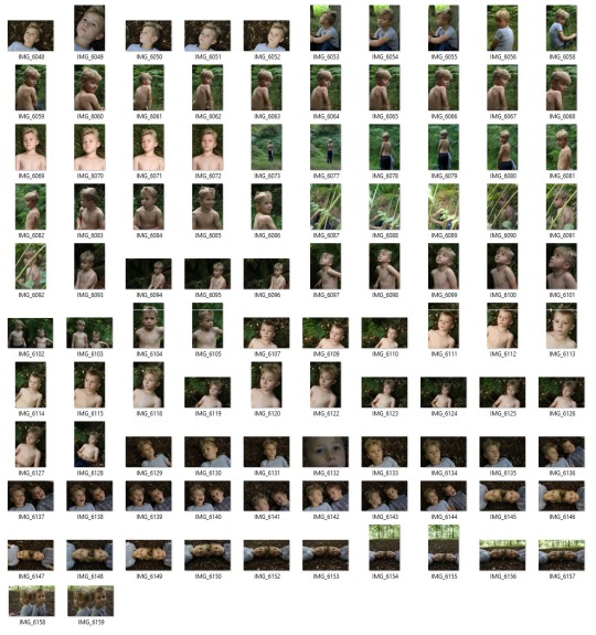
- I shot a total of 102 Images on this shoot. As you can see from my contact sheet, I tried various different areas around the woods. I wanted to make use of the woods and beautiful surroundings to produce some interesting shots.
6 Final Images & Analysis
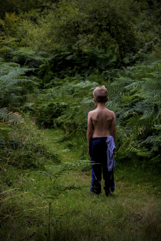

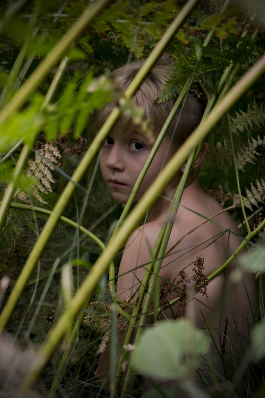

Image 1 - This was one of the first shots I tried to produce, I knew in my mind that I wanted to focus on the texture of the ground. I scouted for ground that had various different shape sticks and leaves that would make an interesting background. I loved the slight colour coming from the leaves symbolising the up coming end of summer and approaching autumn. I wanted my subject to appear in his own little world of thought, leaving a question mark for my audience as to what he is thinking about. I considered my composition before shooting and wanted to angle my model in this way so that I had reasonable ground space to display texture as well as enough space for my model, it made the image more interesting to have him this way. I used a warming filter on Photoshop to add a warming colour to my model’s skin colour, an added ‘Vignette’ effect and sharpened the ground texture which is the only digital manipulation after editing in Camera Raw.
Image 2 - This image I loved as soon as I shot it, although I knew it would work better in black and white. I felt it worked a thousand times better in black an white as he was ever so pale which amongst the grass didn’t work aswell as the tones did in black and white. His facial expression was totally natural, I asked him to lay there with a blank expression as he was normally giggly and I captured this. He looks deep in thought and sort of sad which I felt worked well with my ‘Lost Boy’ theme. He looks sort of lost, dazed and confused which is exactly what I aimed to capture. I liked how his collarbones sectioned the lower part of the image which really underlined his and helped frame his head creating emphasis for facial expression which was the main theme of the image.This image has an added ‘Vignette’ effect applied.
Image 3 - This image I really loved straight away, I felt it was the image that captured the story telling theme I really wanted from this shoot.I was quite particular about the composition of this shot, as you can my subject leads your eye straight away down the slight pathway, between the greenery, ahead. This allows a sense of storytelling of a journey for the subject. I also liked the idea of his top of and tucked into his trousers symbolising a ‘lost boy’, scruffy looking as if he doesn’t have a mother around to correct the way he is dressed as the ‘lost boys’ didn’t have in Peter Pan. I loved the overpowering green from this image, it was such beautiful natural colour and was great for my story of the sort of surroundings they are in. I also used a warming filter on this image, after editing in Camera Raw, in photoshop as well as some slight sharpening along with a ‘Vignette’ effect around the edges.
Image 4 - I had so much fun shooting these images with my subjects, the younger of the two, he was such a natural poser and had an amazing ‘blank’ expression face after the giggles. Seeing as I wanted this image to be focused on the subject rather than the ground texture or story telling theme I felt it worked really nicely in black and white.
Image 5 - We purposely scouted for an area that we could try to get this sort of shot from. I took a few images like this but this was by far the best. I wanted the main focus of the camera to be of my subject’s eye through some plants and greenery. I wanted it to appear like he was some sort of feral and lost child hiding from the rest of the world which I hope I managed to capture well. I don’t feel the plants in the foreground are too distracting which was my original concern. Most tweaks to the image I tried to complete in Camera Raw, meaning I did not have to do much in photoshop other than add a warming filter and apply the ‘Vignette’ effect. I was really pleased with the outcome of this shot in the end, we had so much fun shooting it and got exactly what we wanted.
Image 6 - This 6th and final image is most probably my favourite. I really loved what I managed to capture here, his eyes were the key feature for me. They are so clear and appear glass like which reflects the tree tops and light gap beautifully. His facial expression is so blank and serious which is something I tried to maintain throughout this shoot. This shot was definitely better in colour, his eyes are a beautiful shade of brown that matched the autumnal theme of the rest of the image and the way his eyes are staring straight into the camera is so striking. His skin is absolutely immaculate displaying the beauty of youth in a young boy. This has a warming filter applied as well as the ‘vignette’ effect. Overall, my favourite image.
Ending note
I really enjoyed this shoot in its entirety, we really had so much fun together finding cool places to get some photographs, the willingness and creativity in the minds of the my subjects really helped make the shoot easier too, they were great models and enjoyed looking at the final images with me. I feel I successfully planned a shoot with an idea in mind of what I wanted beforehand, getting onto the location and scouting the area for places to shoot really benefited me also, luckily the weather conditions were okay for us to shoot without any interruptions although we were mostly shaded by treetops anyway.These were only 6 of my images of my final images, there were others i was equally extremely pleased with too however these were the best. Overall, I feel it was a successful shoot and I am really pleased with the outcome of my images.
#summerproject#westherts#westhertscollege#georgiannesmith#georgiannephotography#studentphotography#studentphotographer#youngphotographer#photographer#portrait#portraiture#fineart#fineartportrait#lostboys#peterpan#disney#ashridge#ashridgewoods#wild#feral#young
0 notes
Text
Task 2 - Narrative
Blog Content: Task, Personal Brief, Image Visual Analysis, 10 Final Images/Story.
Task
“You must produce a title for your project & a personal brief explaining your intentions. You will include 1 visual analysis on an influential photographer that has inspired the look of your work. You must produce 5-8 final images posted to your blog & the college Flickr group. You must arrange these images in a specific order to tell your story. You have 1 week, be prepared to discuss your work at the critique the following week.”
Personal Brief
Aims & Objectives - Produce 5-8 images telling a story, with each image adding more to the story following the previous image. The final selection of images must make sense. I will be telling a story based around life at the stables in the eyes of a competent child, this will include grooming, tacking up the horse, riding the horse, preparing the horse after riding ready for bed, feed and stable preparation.
Title -
Location - I will be shooting at my horse yard in Kings Langley, Hertfordshire.
Equipment - I will be shooting RAW using my Canon 700d DSLR to shoot these images.
Influence - Mark Harvey - Dog, Horse & Rider Fine Art Photographer
Lighting - I will be using natural lighting as most, if not all, of my images will be outdoors at the stables.
Look and Feel - Documentary, storytelling, eyes of a child.
Audience - I will be presenting my images to my classmates and tutor in a class critique sessions.
Visual Analysis
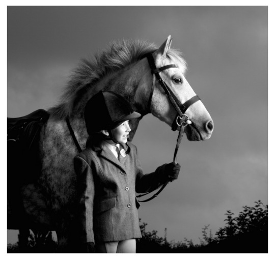
- Image by Mark Harvey
I have chosen this image to visually analyse by Mark Harvey of a child alongside a horse. The use of the outfit the child is wearing visually communicates to me that they have taken part in a horse show of some suit due to the type of smart riding clothes they are wearing. I like how the outfit of the child allows me to distinguish between what type of photograph this is as typical horse riding wear for around the yard is usually scruffy and untidy as the stables is typically a place you will get dusty and dirty, the smart uniform displays they have been a part of a show where their appearance is very important. I think this photograph could have been taken after the show as the lighting appears quite late in the day despite the image being in black and white. I also like how the image has been taken from a fairly low vantage point which sort of keeps you on a level with the child which is something i will be taking from this and putting into my own documentary narrative story, i want to photograph from the vantage point or eyes of a child meaning i will have to shoot from a fairly low vantage point. I also would like to keep my photographs in colour rather than in black and white as i would like them to have a more documentary feel to them.
Final Images/Story
#georgiannesmith#georgiannesmithwhc#westhertscollege#westherts#narrative#youngphotographer#studentphotography#student#photographystudent#hemelhempstead#hertfordshire#storytellingphotography#narrativephotography#finalimages#personalbrief#visualanalysis#markharvey#horsephotography#childphotography#equestrianphotography#equestrian#stablelife#stables#horseyard#riding
0 notes
Text
‘Wild Hearts’ - May Half Term Task - Parameters
Blog Content: Task, Personal Brief, Image Visual Analysis, 10 Final Images.
Task
“Come up 2-3 rules by which you will work by, produce a title for your project & a personal brief explaining your intentions. Include visual analysis on an influential photographer that has inspired the look of your work. Produce 10 final images, post to your blog & college flickr group. You have 1 week, be prepared to discuss your work at the critique the following week.”
Personal Brief
Aims & Objectives - Set parameters within which I will work on a shoot producing 10 final images to present in critique. My parameters I have set are: 1) Shoot with manual focus only. 2) Shoot within an hour time frame 3) Shoot horses naturally. - Don’t interfere by calling/distracting/staging images.
Title - ‘Wild Hearts’
Location - I will be shooting in a field at my horse yard in Kings Langley, Hertfordshire.
Equipment - I will be shooting RAW using my Canon 700d DSLR to shoot these images.
Influence - Kimerlee Curyl - Wild Horse Photographer - Fine Art
Lighting - I will be using natural lighting for my image as I will be outdoors in an open field.
Look and Feel - Natural, Wild, Beautiful.
Audience - I will be presenting my images to my classmates and tutor in a class critique sessions.
Visual Analysis
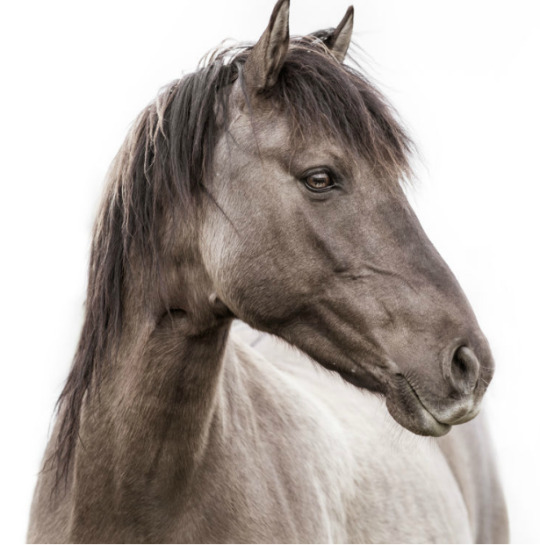
- Image by Kimerlee Curyl
I have followed the work of Kimerlee Curyl for quite some time now, having grown up in the equestrian world, I’ve always had appreciation for any photography involving Horses. I particularly love this shot of a Sulpher Springs Mare from Curyl’s Wild Mustang collection. This beautiful horse I felt at first appeared very masculine and stallion like, until learning she was actually a mare, which is amazing as she stands strong and proud. I love how she has managed to capture the strength and vigiliance of this mare and also love the wild majestic feel to the image. Her work has inspired me greatly and has made me want to strengthen my experience in shooting photographs of horses. I will produce similar headshots of the horses ill be photographing in my half term task.
10 Final Images
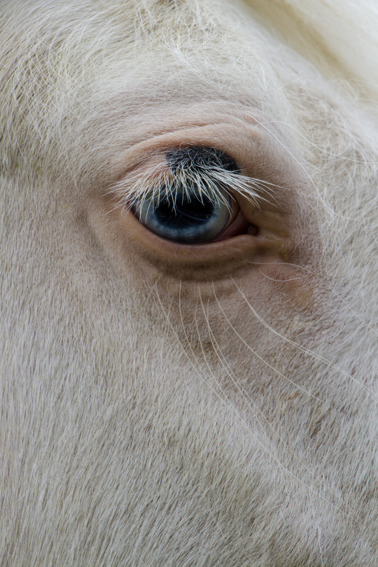


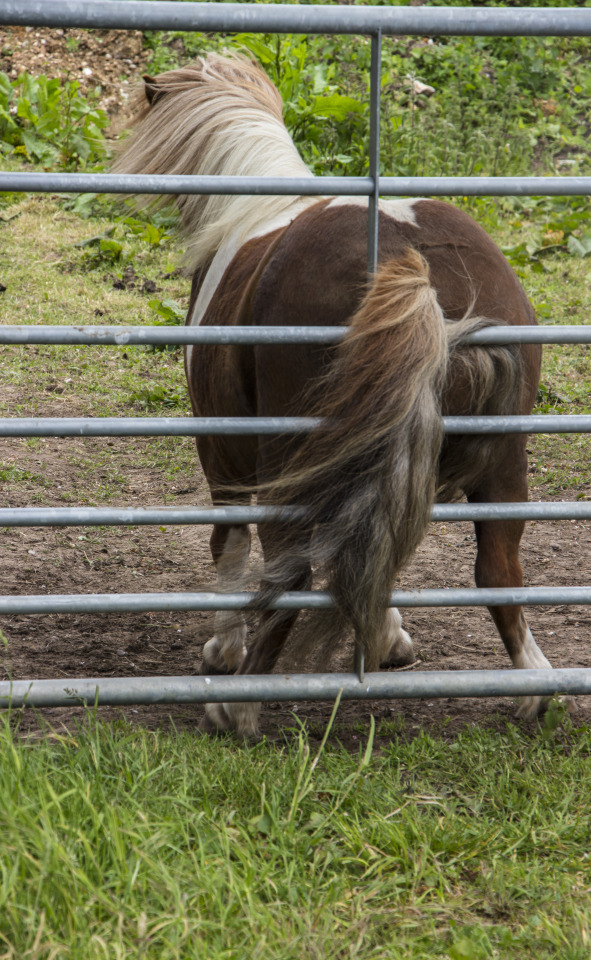
Extra Favourite Image

#georgiannesmith#georgiannesmithwhc#westherts#westhertscollege#studentphotographer#photographystudent#youngphotographer#parameters#halftermtask#practice#equestrian#horses#shetlandpony#welshsectiona#miniatureshetlandpony#kingslangley#hertfordshire#hemelhempstead#personalbrief#kimerleecuryl
1 note
·
View note
Text
Unit 27 - Digital Image Capture & Editing - Final 6 Images
Blog Content: Film Homage Twist Final Images from all sections of Unit 27 Digital Image Capture & Editing ‘Homage’ Project. Film Homage, Digital Homage and ‘Client Brief’ Homage with Original Artist Images.
Film Artist Image - Albert Renger-Patzsch - Task 1
Film Homage Recreation

My Film Homage Twist

Digital Artist Image - Erik Johansson - Task 2
Digital Homage Recreation

Digital Homage Twist

Client Brief Artist Image - Hannah Starkey - Task 3

Client Brief Homage Recreation

Client Brief Homage Twist

These images complete my Homage Project in total.
#unit27#homage#homageproject#georgiannesmith#georgiannesmithwhc#roughcollie#homagetwist#hannahstarkey#hannahstarkeytwist#isolated#companionship#dog#pet#friendship#embrace#filmphotography#digitalphotography#digitalhomage#filmhomage#bengalcat#bengalkittens#lazydog#erikjohansson#albert renger-patzsch#bengaldelivery#youngphotographer#studentphotographer#photographystudent#hemelhempstead#hertfordshire
0 notes
Text
Client Brief Homage Twist & Final Image
Unit 27: Digital Image Capture & Editing
Blog Content: Scenario, Task Introduction, Homage Twist Personal Brief, Model Release Form, Contact sheet of total image shot, Digital editing & Manipulation/Saving files and Brief Evaluation.
Scenario:

Task Introduction:
Following my previous homage recreation of Hannah Starkey’s cafe image, I am now going to produce my third and final homage twist photograph to conclude this project. My image still has to pay homage to the original image given to me by my tutor to recreate but this time with a definite twist of my own, this is up to my own interpretation but should still include a similar mood, effect or theme.
Homage Twist Personal Brief:
Aims & Objectives - Recreate image provided by tutor as closely as possible followed by creating another image still paying homage to artist and original image but adding my own creative twist. I want my image to be similar in terms of darker lighting but a similar visual mood and effect, in the original homage the subject appears very lonely and isolated, however in my homage twist i’d like to display companionship and much needed friendship at a time in need curing the loneliness of the individual from the original, which also is the direct opposite to the original.
Location - Adeyfield Park, Hemel Hempstead, Hertfordshire.
Equipment - I will be shooting RAW using my Canon 700d DSLR to shoot this image.
Influence - Hannah Starkey series of staged photography of the moments in between each task of women in society’s daily routines.
Lighting - I will be using natural lighting for my image to ensure I can match a similar lighting effect of the original image. I will digitally manipulate the light on Photoshop to create a darker effect around the edges in a different style to the original.
Look and Feel - 'A moment in time’, an embrace, friendship, companionship.
Model - I will be using my Mum again for this image to keep my model the same as my homage recreation and will also be using my Nan’s Rough Collie Crystal.
Genre - Fine Art
Audience - I will be presenting my images to my classmates and tutor in a class critique sessions following final submission.
Model Release Form

Contact Sheet of Total Images Shot
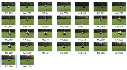
Digital Editing & Manipulation/Saving Files

I opened my RAW file in Camera Raw and processed my file, I made the adjustments I wanted and saved it as a TIFF File, this means my original RAW File is still saved untouched and I have a further TIFF file with the appropriate changes made in Camera Raw saved also. I only really increased the clarity slightly and increased the contrast a tiny bit.

I opened my saved TIFF file in Photoshop and instantly duplicated the layer by pressing Ctrl+J so that I was not editing my original TIFF file in case I wanted to go back to the original image during editing.

I wanted to apply the Vignette effect to my image, I did this by going to Filter>Lens Correction which then opened a new window. I then went to the custom tab at the top, and adjusted the Vignette Lever to the left which darkened the image around the edges.

I increased the contrast of my image a little more.
I then wanted to adjust the curves slightly until I liked what I saw in the image which I did by clicking on the curves adjustment.

I then adjusted the saturation as I did not want the image to appear as vibrant as it was, I wanted to stick to the dark effect that the original image had which I have tried to recreate with the vignette effect. I decreased the saturation and the lightness a little so that it matched the effect I wanted to give my photograph.
Final Homage Twist Image - ‘The cure for loneliness’
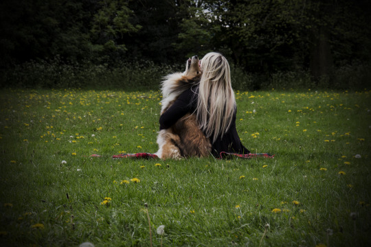
Brief Evaluation
What did you try to do?
I tried to produce an image that had a twist on the original, something with my own original ideas and own touch. I wanted to include a similar feel to the original image, Hannah Starkey produces staged photographs made to look natural displaying the in between moment of everyday tasks and daily routines, so my image was obviously staged but i wanted it to appear like a natural moment.
What were the key elements you tried to keep/change?
I wanted to keep a darker edging to the outside of the photograph, i understand that the homage and homage recreation was darker around the edges due to lighting whereas I have digitally manipulated the edges on Photoshop on my third homage task. I wanted to change the mood from lonely and isolated to something more light hearted, sort of like a follow on image from the original but with a definite happier feel to it.
What did you find hard?
Out of all the homage images i have produced, i found this one the hardest to think of an interesting twist for. I tried to ask people around me such as family and friends what they thought of the original image by Hannah Starkey, asking what they got from the image and if they had to describe the mood of the image what would they say? And most of them came back with loneliness, isolation, depression, mind wondering etc. I used this information to try and think what was the opposite to these words and tried to recreate them instead.
What do you think was successful?
I wanted my image to appear natural despite being staged and i felt i was successful in achieving this. I positioned my model and the dog and allowed them to do what felt natural, I sat back and shot from a distance, this was my favourite shot of them, it seemed so natural and a lovely embrace displaying companionship and friendship like i originally intended on my project brief.
What would you improve on next time?
Next time I would probably improve on the mood and effect of the image, perhaps try to match the ‘documentary’ staged style of Starkey’s images rather than an image that looks like one for the family album but i tried my best with the project and enjoyed shooting. I wanted to realise my planned intentions and i feel that i did just that by recreating something with my own added twist of changing the mood and effect.
#unit27#homage#homagetask#homageproject#georgiannesmith#georgiannesmithwhc#youngphotographer#photographystudent#hannahstarkey#homagerecreation#homagetwist#creativity#cafe#isolated#emotional#digitalimagecaptureandediting#digitalmanipulation#digitalediting#digitalhomage#personalbrief#finalimage#savingfiles#hemelhempstead#westherts#westhertscollege#watfordcampus#westhertswatford#hertfordshire#briefevaluation
0 notes
Text
Client Brief Homage Recreation Final Image
Unit 27: Digital Image Capture & Editing
Blog Content: Final Homage Recreation Image, Original Artist Image and Brief Evaluation.
Final Homage Recreation Image
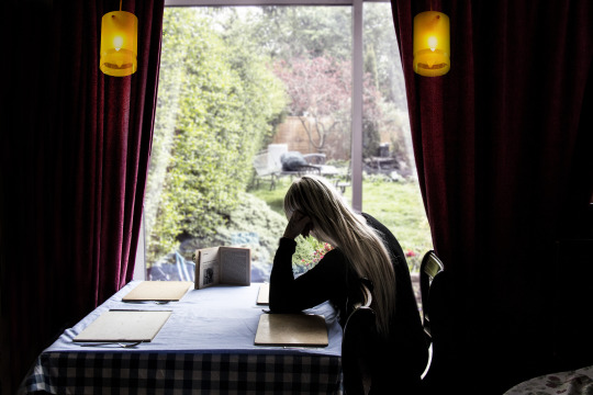
Original Artist Image

Brief Evaluation
What did you try to do?
I have tried to recreate the artists image given to me by my tutor the best I can by trying to recreate the scene as closely as i could to the original. I tried to decide what I felt the key elements to the image was so that i could ensure i try to infiltrate this into my homage recreation.
What were the key elements you tried to recreate?
After visually analysing the image, I decided they key elements within the image was the lighting, position of the model, red curtains, orange lamps and bright window light. I tried to recreate as much as i could using props however the one thing i didn’t have access to on location was the lamp, therefore i shot this separately and added it into my image.
What did you find hard?
I originally struggled with coming to terms with the fact that i would not be able to recreate the image exactly for geographical purposes. I knew i wouldn’t be able to recreate it as much as id like to because i couldn’t copy the location exactly so i had to make sure i could try and make use of props to help my recreation.
What do you think was successful?
I think my overall homage attempt was fairly successful, i tried my best with the use of props to try and recreate the location. I didn’t scout cafe’s for a place to shoot, i already had an idea in mind of where to shoot that had a similar layout or at least one i could work with. I think the lighting i managed to replicate went fairly well with the aid of digital software to finalise that.
What would you improve on next time?
Next time i would try to collect the lamps to include in my original shoot rather than shooting it separately and adding it in as i feel it doesn’t look very authentic. It does look false but i feel it works because of the concept behind trying to recreate the image. Usually i would try to avoid producing composite images like this without it being apparent as i feel trying to pass of a composite image as a single image is not easy. I would also try to maybe find somewhere that had a similar scene through the window however i could not find a location with both.
#unit27#homage#homagetask#digitalimagecaptureandediting#georgiannesmith#georgiannesmithwhc#photographystudent#studentphotographer#hannahstarkey#digitalphotography#digitalhomage#recreation#homagerecreation
1 note
·
View note
Text
Client Brief Homage
Unit 27: Digital Image Capture & Editing
Blog Content: Scenario, Task Introduction, Artist Research, Image Visual Analysis, Project Personal Brief, Contact sheet of images shot, Contact sheet of chosen images, Digital Editing & Manipulation/Saving Files.
Scenario:

Task Introduction
As part of this project, we were asked to select a piece of paper containing a number on which linked to a powerpoint presented by our college tutor. This powerpoint had 27 images produced by famous historical and contemporary, film & digital artists. Whichever number we had chosen meant we had to recreate the image on the powerpoint. We will next have to recreate the chosen image followed by creating a further image containing our own added twist.
Artist Research
The artist that produced the chosen image I am to make a homage recreation and homage twist of is Hannah Starkey. Hannah is typically known for her reconstructed images of women in everyday life situations such as shopping or in cafes. She likes to focus on the in between stages of everyday tasks within individuals daily routines. The images have a high focus on freeze framing moments of emotion reflecting states of isolation provoking the viewer’s imagination to read into a suggested narrative. She often infiltrates cultural themes within her images such as gender, race and class within society by the way she makes use of her models and location. Her work is often titled ‘Untitled’ followed by a date of production which helps to add to the overall mood of the image appearing as vague memory by not stating a fixed location or time which matches the theme of the blurred mix of reality and staged photography she creates. Hannah’s work has been displayed in solo and group exhibitions, across the world, spanning from 1997 to 2014.
Image Visual Analysis
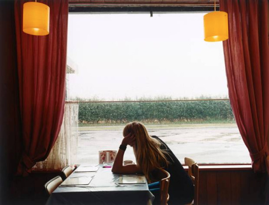
- ‘Untitled, October 1998′ - Hannah Starkey
The image I have been assigned to recreate is of a young female looking out of the window in what appears to be some sort of quirky cafe. The mood of the image appears quite dull and miserable whilst the model appears extremely isolated and in her own world. She is staring out of a window into an empty space perhaps reflecting the emotion of the individuals portrayed current feeling or state of mind. The fact the camera is facing the blast of light coming in from the window means the foreground in the image appears very dark and shadowed which again could metaphorically be mimicking the mood Hannah intended to produce.
Personal Brief
Aims & Objectives - Recreate image provided by tutor as closely as possible followed by creating another image still paying homage to artist and original image but adding my own creative twist.
Location - I will be shooting my image at a family members house that has a similar layout to that of the cafe with the open window and curtains.
Equipment - I will be shooting RAW using my Canon 700d DSLR to shoot this image.
Influence - Hannah Starkey series of staged photography of the moments in between each task of women in society’s daily routines.
Lighting - I will be using natural lighting for my image to ensure I can match a similar lighting effect of the original image.
Look and Feel - Dull, Miserable, Emotional, Isolated
Genre - Fine Art
Audience - I will be presenting my images to my classmates and tutor in a class critique sessions following final submission.
Model Release Form
Contact Sheet of Total Images Shot

Contact Sheet of chosen images final image
From all the images I shot, I picked two final images that i wanted to work from for my final image. I practiced shooting on different settings to experiment with the lighting to see which looked best and like the original. I chose the one closest that required the least editing so that i can try and maintain as much detail within my image afterwards as possible.
Digital Editing & Manipulation/Saving Files
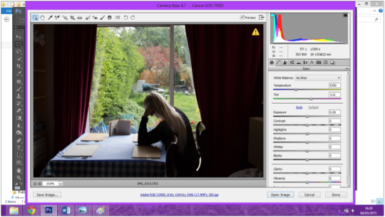
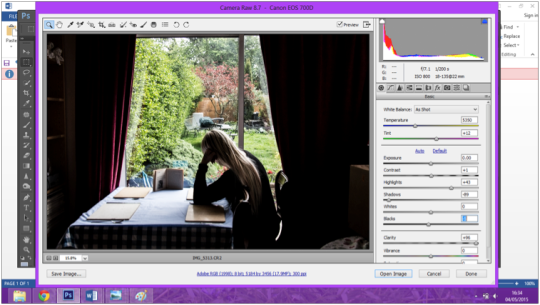
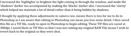


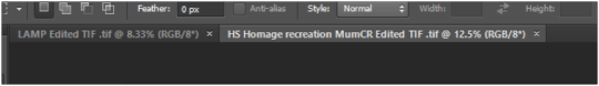


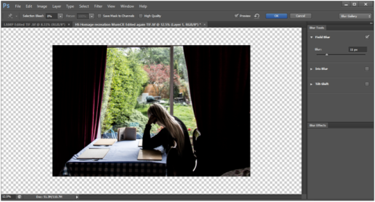


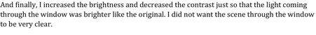
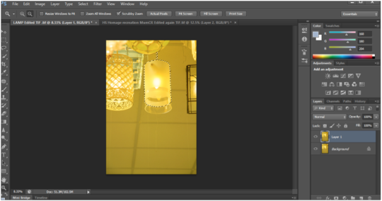


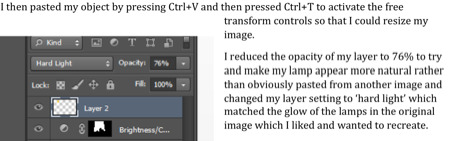


#unit27#digitalimagecaptureandediting#westherts#westherstcollege#studentphotographer#photographystudent#youngphotographer#homage#homageproject#homagetask#hannahstarkey#fineart#personalbrief#visualanalysis#filmphotographer#digitalphotographer
0 notes