Text
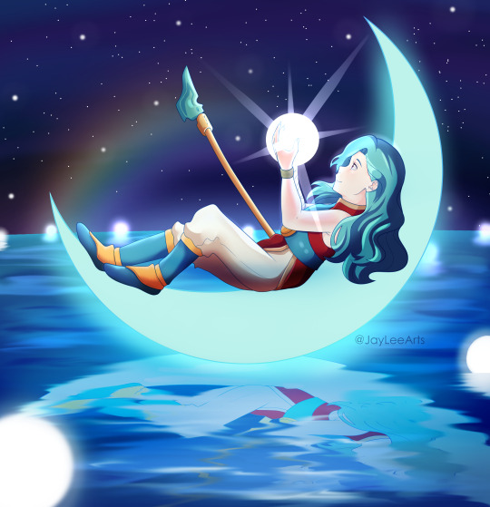
Finally got to do some Sea of Stars fanart! I went with Valere as my party leader, so it felt appropriate to draw her first.
If you've played, who did you choose? :O
Please play this game, it is absolutely amazing TwT
90 notes
·
View notes
Text

Oooo colors! I'm actually pretty hype that this came out the way it did lol I love messin around with lighting effects
Fan art of one of my besties characters, Avrel, based on a scene from a story we're writing~
Avrel belongs to @execk-the-creator :p
11 notes
·
View notes
Text
Pokemon SV Spoilers Ahead! (Part 3)
Yet again another part to my SV Spoilers! Is it a good enough time to where I can post these without a keep reading? Yes? No? Eh, doesn’t matter for now.
I’m back once again with two more Paradox Pokemon, one Past and one Future. Both Lucario.
Let’s start off with Surging Aura:
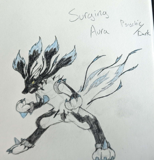
Surging Aura marks the second Past Paradox design I’ve done, the first being Iron Maw from Part 2.
In the ancient past, Lucario were unable to contain their Aura, leading to it constantly being expelled from various points on their body in order to avoid overloading.
This design essentially “retcons” the Dex Entry for Mega Lucario. Rather than the black streaks being from intermingling Aura and Mega Evo Energy, this rolls with the idea that Mega Evolution just made its aura stronger, with the black streaks being a result of stronger aura.
Now, its typing. Its part Psychic due to the common argument I’ve seen in the past of “Steel makes no sense, why isn’t it Psychic”. As for its Dark typing, that is because it fit the “overloaded to the point of being feral” design it has going for it. (Also, because the two types are my favorites, but we don’t have to talk about any favoritism here...)
Lastly, a couple extra details. It’s got a larger build and goes on all fours when running.
Next up is the Future Paradox Lucario, Iron Zenith:

Yeah, this one’s the only one I fully colored, as opposed to only coloring the neon lights.
The Steel-typing of Lucario fit in just fine here, so It stays. Instead of Fighting, it has the Fairy type, with the general idea that its Aura is pure and perfected in this future state.
In the far future, Lucario has reached the same level of merciless combat capabilities as its Past Paradox and Mega counterparts, though in a cold and calculating manner rather than wrathful and loud.
I decided to forgo the Mega details here, as it doesn’t necessarily NEED them, given Iron Thorns. I also may or may not have forgotten.
Its claws (both hands and feet) and its tail can retract quickly. While its claws are only deployed when necessary for combat, it lets its tail flow freely when idle.
In case it wasn’t made blatantly obvious by my making both types of Paradoxes, Lucario is one of my top favorite Pokemon. Awesome design, awesome character in the best movie in the franchise, what’s not to like?
#pokemon gen 9 spoilers#pokemon spoilers#pokemon violet spoilers#pokemon scarlet spoilers#pokemon scarlet and violet#pokemon scarlet#pokemon violet#pokemon#paradox pokemon#lucario#pokemon lucario#lucario pokemon#mega lucario#fanmade pokemon#Fakemon#fake pokemon
3 notes
·
View notes
Photo
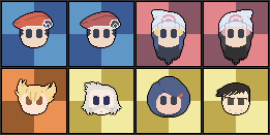
It has been... far longer than I intended, but here we are yet again! This time we’ve got...
Sinnoh Misc (Pt.1)!
...Yeah I couldn’t come up with a better name, sue me.
Yet again, the icons mostly take their colors from the official artwork, with just one set of exceptions. For Johanna (Mom)’s hair, as well as DP Dawn and Lucas, I used the colors from Dawn’s Back Sprite in DP.
Platinum’s Dawn and Lucas have slightly darker and washed out hair since, well, their hair in Platinum looked a little more washed out. I just amplified it a little to justify having two slots filled by the Platinum variants.
Lucas, Dawn, and Barry’s Backgrounds are colored based on their Poketch colors, while Rowan, Johanna, and Looker’s are colored based on Platinum’s “World of Pokemon” Speech Background.
Looker’s facial expression is meant to mimic that which he has in the official art.
Hm... What to say down here...
Well, Sinnoh Misc (Pt.2) will hopefully be out sooner than this one.
Expect some familiar faces from the TCG with that one!
#lineless pixel icons#pixel art#pokemon#pokémon#Pokemon Diamond And Pearl#Pokemon Platinum#pokemon brilliant diamond#pokemon shining pearl#lucas pokemon#pokemon lucas#lucas#dawn pokemon#pokemon dawn#dawn#barry pokemon#pokemon barry#barry#rival barry#professor rowan#rowan#johanna#pokemon mom#pokemon looker#looker pokemon#looker#sinnoh#sinnoh region
19 notes
·
View notes
Text
Pokemon SV Spoilers Ahead! (Part 2)
This is a Part 2 to a prior post, as indicated by the title.
This doesn’t mean you need to see the other first though.
The first paradox of this batch is Ore Maw:
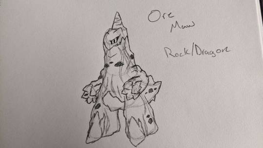
Ore Maw is currently the only Past Paradox I have designed, and it is a Paradox Duraludon.
Its first basis is a mountain dotted with cave homes. In the past, Durant could have nested there. The Durant would feed Ore Maw, and Ore Maw would serve as their protection.
The second basis is iron ore. I turned the wavy blue lines and most blue exposures from Duraludon into wavy streams of iron ore and exposed iron chunks.
Were it not for the united ability Protosynthesis, Ore Maw would likely have Lightningrod.
Next up we’ve got a couple I made for fun, not necessarily to fit in.
This one is Iron Cage:

A Paradox Electrode.
Its based on a Master Ball. The eye shape would be more consistent, but... Doing both eyes isn’t my strong suit, at least not in traditional art.
To make it more distinct than just “Master Ball Electrode with Metal Sonic eyes”, I made it open up. It would close itself when it needs to move around fast though.
The name “Cage” comes from the nature of Poke Balls as capturing devices. Were it not a signature move for a legendary, it would probably learn Thunder Cage.
Lastly, there’s Iron Justice:
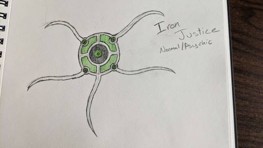
Iron Justice is a Paradox Unown.
It’s based on the theory that the Unown are Arceus’ 1,000 arms. To show it, I based it a bit off Arceus itself as well as vaguely off of biblically accurate angels.
Its name “Justice” comes from Arceus’ move Judgement.
Its normal-typing comes from Arceus’ default type.
Its neons, yet again, come from Arceus. This time from his eyes.
Yeaaah, this batch is a bit more simple overall, since the last two are Paradoxes of fairly simple Pokemon.
Anyways, that’s all five of my Paradox Pokemon designs. I had fun making these, and posting these has given me a bit of a confidence boost. I may post even more traditional art here in the future!
#pokemon gen 9 spoilers#pokemon spoilers#pokemon violet spoilers#pokemon scarlet spoilers#pokemon scarlet and violet#pokemon scarlet#pokemon violet#paradox pokemon#duraludon#electrode#unown#pokemon unown#fanmade pokemon#fake pokemon#fakemon
3 notes
·
View notes
Text
Pokemon SV Spoilers Ahead!
I mentioned back in November that most of my time has been spent in the new Pokemon Games since their release, and that’s remained true.
However despite my lack of progress on the Pixel Icons (sorry to any hoping for more at the moment), I have drawn a few concepts for Paradox Pokemon of my own. I’ll only be posting the first two for now.
First up is Iron Knight:
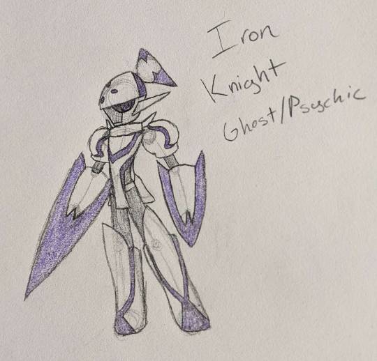
It isn’t exactly subtle, but Iron Knight is based on Armarouge, Ceruledge, and the general idea that Iron Valiant brought to the table.
Rather than the flames on the top, I went with something like Iron Valiant's... pigtails? Sure, pigtails, as the Future Paradox Pokemon don’t tend to have free-flowing energy in the fashion of the Armor Duo’s flares.
The legs combine both the wider feet of Armarouge and the wider tops of the “boots” Ceruledge has.
Rather than utilizing the pauldrons as an arm cannon, Iron Knight utilizes its sharp energy gauntlets as both swords and shields, taking more from the “Armor” aspect. Due to this, the pauldrons of Armarouge are used as the shoulders.
The Neons were supposed to be an obvious purple, but in the picture they ended up looking a little more bluish-purple, too close to Ceruledge’s “energy color”.
Like Iron Valiant, it takes the two secondary types of its basis-es.
Next up is Iron Tower:
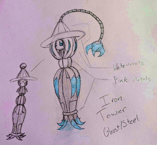
-Otherwise known as “Paradox Hatterene”.
The hypothetical color scheme came from the idea of utilizing Shiny Hatterene’s colors as a base, as most future Paradoxes only use Silver, Grey, a Neon (including the black when they’re off), and a Metal Color.
It may not be obvious, but looking to the right side of the image, you can notice some awkward coloring. That’s because I had decided on blue neons... after having already colored them in pink. So I hue-shifted the image. This is why I don’t usually color my traditional drawings at all.
Iron Tower’s “arm” can retract, much like Iron Bundle’s tail. The fingers on the hand can retract as well.
Iron Tower is larger than the average Hatterene, hence “Tower”. The name also comes from the wizardly appearance (Wizard Towers).
Rather than the stick-figure-like true body Hatterene has, Iron tower has an orb that splits out side panels into arms.
The neon strips on the uppermost “hair” segment is loosely based on the open gaps in G-Max Hatterene’s hair.
Iron Tower would also hover around.
I chose the Ghost type due to how it generally fits Hatterene’s vibe, and Steel due to the more cold and emotionless face I gave Tower compared to its present day counterpart.
As of now, these are but two of five.
(If there’s any better way of spoiler tagging things here, please let me know! I don’t want to be “that guy”).
#pokemon gen 9 spoilers#pokemon spoilers#pokemon violet spoilers#pokemon scarlet spoilers#pokemon scarlet and violet#pokemon scarlet#pokemon violet#paradox pokemon#armarouge#ceruledge#hatterene#iron knight#iron tower#fanmade pokemon#fake pokemon#fakemon
1 note
·
View note
Photo
So... A little late from when I meant to post this, as I did intend to keep it in line with the roughly 2 day gap between each of the other uploads, but as any fellow Pokemon fan would know... Scarlet and Violet released on the 18th. Yeah, I spent all of my time there.
Anyways, back on point, today we’re back with
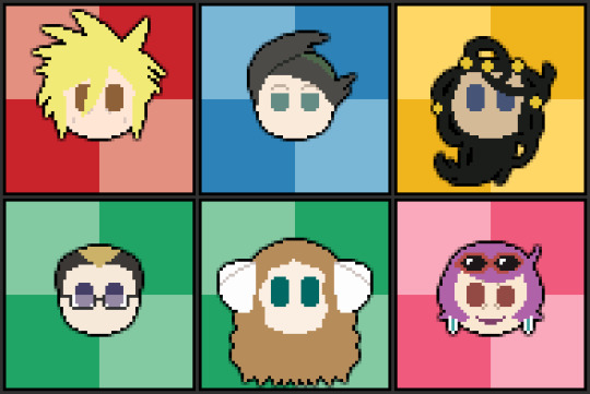
The Frontier Brains of Sinnoh!
Once more their icons take colors from the official artwork, with mild edits.
With their background colors I took from the color they’re represented by on the Battle Frontier’s logo.
And of course, despite Darach being the Frontier Brain, not Caitlin, I decided to include her as well due to her inclusion in his battle sprite and later importance in Generation 5.
As of now, I have no more icons pre-prepped for upload, so there may be a longer gap between uploads.
What’s next? Well, there’s one last set of characters from Sinnoh’s main cast, then I have some lesser named characters and movie characters planned! So stay tuned!
#lineless pixel icons#pixel art#pokemon#pokémon#pokemon diamond and pearl#pokemon platinum#pokemon brilliant diamond#pokemon shining pearl#palmer#pokemon palmer#tower tycoon palmer#factory head thorton#thorton pokemon#thorton#dahlia#castle valet darach#caitlin#pokemon caitlin#caitlin pokemon#argenta#battle frontier#frontier brain#battle tower
12 notes
·
View notes
Photo

Lineless Pixel Icons Log: Entry 4: ... I’m running out of ways to introduce these.
Well, whatever. Today we’ve got:
The Stat Trainers!
Or at least that’s what Bulbapedia calls them as a group.
Yet again the icons take their colors from the official Ken Sugimori artwork.
Since each trainer was colored uniquely on the Bulbapedia page, I decided to use darker versions of the colors used there.
Note to self: If I can avoid spriting braids, do so as often as possible.
One more set of icons coming soon!
(I finished a set I had in progress during the days I’ve been posting these first four sets!)
#lineless pixel icons#pixel art#pokémon#pokemon#pokemon diamond and pearl#pokemon platinum#pokemon brilliant diamond#pokemon shining pearl#cheryl#mira#riley#pokemon riley#riley pokemon#marley#buck
0 notes
Photo

This time on “Lineless Pixel Icons”, I bring you:
Team Galactic!
Once more the icons take their colors from the official artwork.
Rather than a colored background for type specialty, I opted to give the group a unique background with their logo.
A special note here since it’s... well, fairly notable; Jupiter has a visible mouth while the rest don’t since she has lipstick, while the other icons I’ve posted up until now haven’t had anything similar as a reason to imply a mouth.
One more set of icons coming soon!
(More will come as I complete more)
#lineless pixel icons#pixel art#pokémon#pokemon#pokemon diamond and pearl#pokemon platinum#pokemon brilliant diamond#pokemon shining pearl#team galactic#mars pokemon#jupiter pokemon#saturn pokemon#galactic leader cyrus#cyrus pokemon#charon#team galactic grunt#pokemon mars#pokemon jupiter#pokemon saturn#pokemon cyrus#pokemon charon#galactic commander mars#galactic commander jupiter#galactic commander saturn
13 notes
·
View notes
Photo

Next up with my Lineless Pixel Icons...
The Sinnoh Elite Four and Champion!
Like the Gym Leader Icons their colors are taken from the official Ken Sugimori artwork (albeit adjusted for style).
The color of the checkered backgrounds correspond to the primary types each trainer uses, except for Cynthia of course.
Cynthia’s color comes from the “???” type colors from early games, as I tend to use the old “???” as a representative of wild-card trainer type specialty.
Two more sets of icons coming soon!
(More will come afterwards, these are just the ones I have complete at the moment)
#lineless pixel icons#pixel art#pokémon#pokemon#pokemon diamond and pearl#pokemon platinum#pokemon brilliant diamond#pokemon shining pearl#elite four aaron#elite four bertha#elite four flint#elite four lucian#champion cynthia#aaron#aaron pokemon#bertha#flint#flint pokemon#lucian#lucian pokemon#cynthia#cynthia pokemon#pokemon aaron#pokemon flint#pokemon cynthia#bug type#ground type#fire type#psychic type#elite four
12 notes
·
View notes
Photo
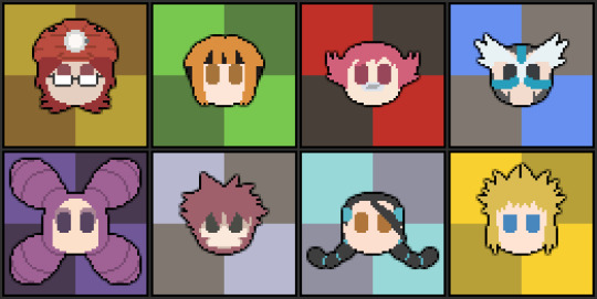
Started making these a bit ago, but here’s the first set of my “Lineless Pixel Icons”. I use the term “lineless” a bit loosely, as there are certainly a few lines visible here, but... Don’t worry about it.
This set is of the Gym Leaders from the Sinnoh Region.
Their colors are taken from the official Ken Sugimori artwork, but are adjusted to fit the lineless flat style.
The checkered backgrounds are meant to lightly reference how I’ve seen many display pixel art before, as well as making it easy to find the direct center of the icon at a glance.
The colors of the backgrounds are taken directly from the Gen 3 type icons’ darker two shades, using the type that correlates to the Gym Leader of course.
Three more sets of icons coming soon!
#lineless pixel icons#pixel art#pokémon#pokemon#pokemon diamond and pearl#pokemon platinum#pokemon brilliant diamond#pokemon shining pearl#gym leader roark#gym leader gardenia#gym leader maylene#gym leader crasher wake#gym leader fantina#gym leader byron#gym leader candice#gym leader volkner#roark#roark pokemon#gardenia#maylene#crasher wake#fantina#byron#byron pokemon#candice#volkner#pokemon volkner#pokemon roark#pokemon gardenia#rock type
15 notes
·
View notes
Text
Arrival.
So, first post here... despite having this account for ages. I have no clue how long I’ve been here, honestly. I’ve mostly lurked.
However, for likely a predictable reason, I’ll be posting my art and the likes here.
That reason is DeviantART’s recent choices, and how it’s kinda killed my faith in it as a platform. A shame, since I loved the format of its watch inbox and galleries, but eh, what’re ya gonna do?
1 note
·
View note