
ellafmpflipside
Ella’s FMP Flipside
I’m an inspiring artist and photographer, who would love to pursue my dream to teach art all around the world to everyone who wants to learn my ways to create artwork. I’m very unique from every artist out there. I like to work with all different medias and techniques and I’m not one to back down from a challenge.
98 posts
Don't wanna be here? Send us removal request.
Last Seen Blogs

my-secrets-secrets-are-no-fun
The Hidden Side Of Me
x-u-x
Xochitl

chronodickpriisy
Prisy's Underland

fully-stated-locked-and-loaded
Insomniac Kittens and Dragon Scales

xonous
Untitled
Text
Evaluation
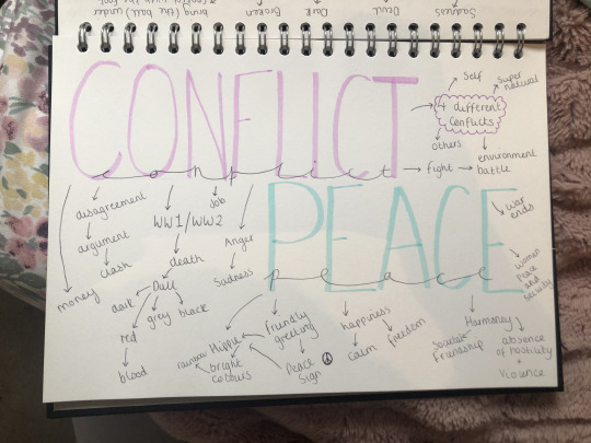
I was interested in my chosen flipside words which was ‘Peace and Conflict’ because immediately I thought of WW1 and WW2. Throughout the years of being an artist I have thought about doing a project based on a massive conflict such as WW1/2. However, I never had the confidence to step out of my comfort zone to actually try and something unique.
The three pieces of artist research that has had an impact on my ideas/artwork was Pablo Picasso, Angie Lewin and Karl Schmidt. Pablo Picasso had a big impact on my work because of his piece of artwork called ‘Guernica’. His artwork ‘Guernica’ made me realise that I wanted my piece to be based on a massive tragedy and have meaning behind it.
Angie Lewin has been my favourite printer for years. She inspires me because she creates these amazing lino prints using sceneries all around her. I decided that I would use my own photographs of nature and sceneries to base my work on. She had a huge impacted not just on my FMP but me as an artist because her work was the reason for me to start printmaking. I enjoy all types of print making but my favourite has to be lino and that is because of Angie Lewin beautiful lino prints.
Karl Schmidt has had a impact on my work because again he is a printmaker. Furthermore, he uses geometrical shapes and lines to create this more bolder print and I love including shapes and lines in my artwork. So when I was introduced to this artist I know that I want to include his ideas of the lines and shapes into my FMP.
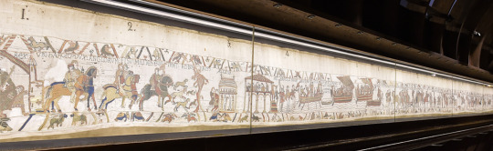
I did wider world research on the Bayeux Tapestry in Normandy, France. I watched part of a documentary on YouTube about the Bayeux Tapestry and learnt that it was all handstitched with wool. The Bayeux tapestry links in with my flipside theme because its all about a massive conflict. Furthermore, It links in with my thoughts on WW1/2 as that was a massive conflict in the past as well. But it links with my project work as I wanted to create a tapestry with all my prints and hand stitch my work.
The concept behind my work was that I wanted it to be about WW1/2 and the effects of conflict. However, in my work I included peace as I wanted to represent the innocent people that died and suffered during WW1/2. I wanted my work to have meaning and be unique. My main idea was I wanted to create a textile piece of work were I sewed back into my work using hand stitching or even embroidery.
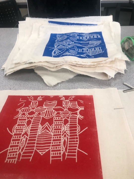
One of the experiments that I did during my FMP for the first time was woodcut printing. The materials I used were fine liners, wooden board, ruler, paper, carbon paper, lino cutting tool, wooden cutting board, newspaper, ink roller, printing press, inking up board, black ink and paper. The techniques I used was wood craving, printing and sketching. I have learnt how to cut out a woodcut print, how to print my wood block design and overall how to create woodblock prints.
Firstly, I started out by drawing out three different designs for my wooden board using fine liners, paper and a ruler. I decided on my mandala design as I thought it was a challenging piece to do. Once I finalised my design using carbon paper I drew out my design onto my wooden board. After I had drawn it all out using my lino cutting tool I carefully cut out my design making sure I cut deep enough so when I printed my design you could see the design. Next, grabbed my inking up board and newspaper and laid them side by side. Placing my wood block design on to the newspaper. I squeezed some black ink onto my inking up board and rolled it out using my ink roller until it was even. I rolled the black ink evenly onto my wood block design. Then I took my design and a piece of paper over to the printing press. I placed my design down first then placed the paper on top. Printed my work I repeated these steps about five times until I was satisfied with all my outcomes.
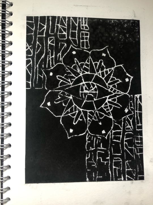
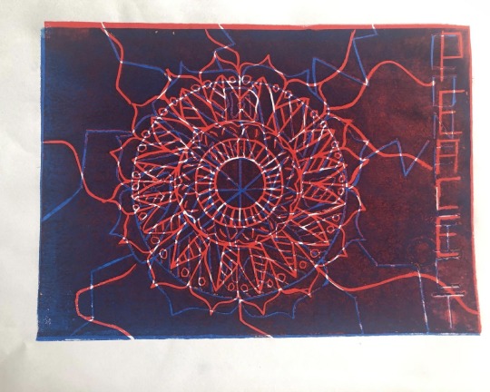
One piece of art work from this project that I feel was the most valuable to my learning was my mandala drawings. The reason I believe this is because its opened another side of my artistic talents I didn’t know I had. I have always been interested in mandalas but I never actually artistically thought that I could create artwork from mandalas. I think the drawings were most successful pieces of artwork because I believed that my mandala gifs looked beautiful epically because I digital edited them. Overall, starting my FMP on mandalas had a massive impact because all I wanted to draw was my mandalas and experiment with them. Its helped build my confidence up a an artist as its helped me to experiment with new topics and ideas.
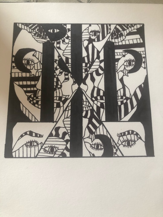
In the beginning on my FMP, I had no idea what my final outcome was going to turn out like. My initial ideas was to use the technique sewing and embroidery into my work. I wanted my work to have both peace and conflict but I had no idea what it was going to be about. When we were introduced at the beginning of our FMP we were give the topic mandalas and I wanted to maybe have a series of posters of mandalas for my final outcome. However, when I had my formative assessment Derek and me discussed about an idea I wanted to include in my work which was WW1. Derek had a gas mask and lent it to me to experiment with. We both discussed about my ‘Flipside mirror faces’ I did during lockdown and thought I could incorporate that into my work. This was the beginning of my final outcome.
I have learnt that your initial ideas don’t always go to plan. In the beginning I didn’t really have an idea at all, I know I wanted to maybe do a series of posters. I have learnt that doing loads of experiments and workshop can help unlock so many ideas. I mean after all the workshops we had do I just focused on the ones I most enjoyed and went from there.
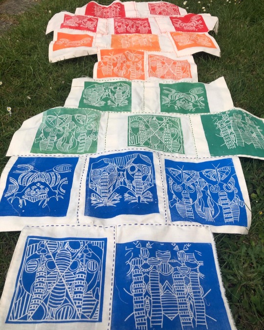
I am so pleased with my final outcome I think it looks extraordinary, I can’t actually believe I manged to handstitched 20 prints and then sew them all together. It turned out better than what I expected because I thought it would be too plain but I love how it looks. The embroidery stitching helps it to stand out from the crowd and it looks so unique and incredible. I am so proud of myself for hand stitching all of my outcomes.
My plan to display my work at the end of year show it to use a painted white background and pin it to the wall. At first I thought about making it into a hanging piece but I realised it would just fold in on itself so I would have to pin it up.
If I could display my work anywhere in the world it would have to be the National WW1 Museum and Memorial in Kansas City, Missouri, United States. I would want to display my artwork here because I feel like I would be almost given back to the innocent people that died during WW1. As well I want my work to be seen by all the people interested in WW1 just like myself so it could inspire other people to create artwork about this historical event.
The 10 words I believe that describe my final piece is:
· Unique
· Extraordinary
· Ambitious
· Glowing
· Bright
· Eye-catching
· Fascinating
· Vibrant
· Appealing
· Astonishing
If I needed a soundtrack or music to go with my outcome it would be ‘Afterglow’ by Ed Sheeran. I would pick this sound track as my work is representing all those innocent lives that was lost during WW1 and its quite a depressing yet happy song. This song sort of makes me think of like all those innocent lives now at peace with the world. I love this song and I feel like it would compliment my work really well.
I spent probably around everyday trying to complete my final outcome. I would go into college, work the entire day then go some and once I had my dinner carry on sewing. Sometimes when my hands were tired I would spend time doing other work such as updating my blog or sorting/planning my week.
At home I work mainly in my bedroom by sitting on my bed or at my desk. Every now and then though if everyone was out I would sit in the living room or up at the dining room table.
Flipside Theme
Beginning
Expressive
Lifeless
Research
Fascinating
Electrifying
Exploring
Development
Advancing
Eye-catching
Vibrant
Final outcome
Extraordinary
Exquisite
Striking
At the beginning of my FMP I never knew how to produce a woodcut print which is one creative skill I had not done yet. However, one of the workshop we did was a woodblock print and I learnt how to execute and create some. I would like to create some more woodcut prints in the future.
My initial ideas were that I wanted to create a series of posters with embroidery and hand stitching. They have developed from this idea by all of the research and workshops I have done since we have been back from lockdown. As well I started to think about what materials I have access to now that we are back on site and that I don’t have such a small material range. My initial ideas has evolved from the series of posters because I started to experiment with lino printing as that’s one of my skills. Then realised that I don’t want to do posters I really want to create something nobody has ever seen before. I think my ideas really evolved is when Derek formative assessed me and spoke about ‘Guernica’ by Pablo Picasso. I wanted to do something similar to ‘Guernica’ and I wanted it to have meaning.
As I wanted my work to be about peace and conflict but have meaning I decided to add innocent things like flowers and butterflies to my gas mask to represent the innocent people that died. However, the gas mask to show the fallen soldiers that died in WW1 to save our country.
#evaluation#finaloutcome#handsewing#embroidery#linoprints#linocutouts#angie lewin#karl schmidt-rottluff#Guernica#Pablo Picasso#bayeux tapestry#widerworldresearch#Artist Research#artwork#FMP#Conflict#peace
0 notes
Text
Photoshoot!
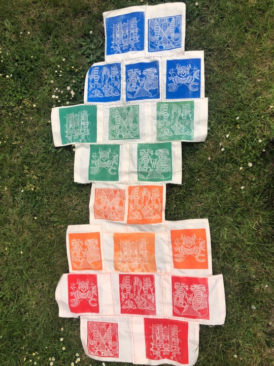
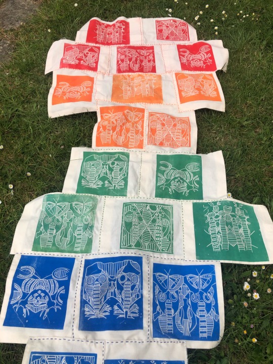
My task for Wednesday was to photograph my work so I could upload pictures to my blog, Instagram and google sites. I took most of them outside on my grass as it was such a bright and sunny day. The sun helped really bring out the colours of my prints and I think my final piece turned out amazing. I’m so proud of this piece of work and I’m so glad I managed to hand stitch the whole thing.
If I could change anything of my final outcome it would be to maybe change the shape and have it rectangular and to add maybe yellow prints. The reason being I feel that having it rectangular would make it look so much more neater. Then adding yellow prints so its a rainbow of colours. However, I’m still so proud of what I have achieved.
#wednesday#handsewing#sewing#embrodiery#photoshoot#photography#linoprints#Linocutting#linocut#finaloutcome#Conflict#peace#ww1#tapestry
0 notes
Text
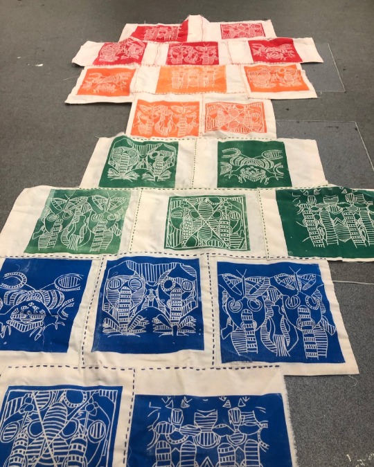
Last Stages
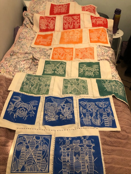
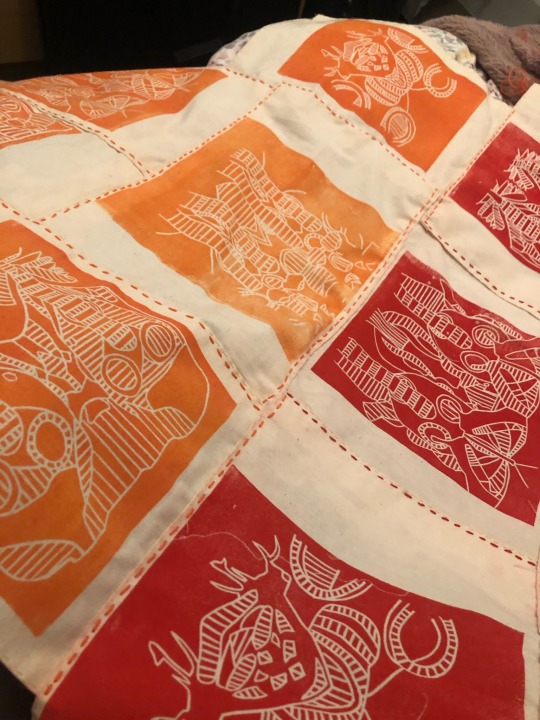
Late Tuesday Evening, I had completed sewing my red and orange prints together. I finally got to pin both the red/orange and green/blue together to start sewing the finally part of my tapestry.
I did complete it that night as it was only a small section to sew together. I was ecstatic that I had managed to finish it as I was beginning to think I would have no time to complete any other work that I need to do. I did run into a problem when I began sewing I didn't actually sew the print together properly so some of the thread came undone so I once I had finished sewing right to the end. I just went back to the beginning to sew the rest back up.
#tuesday#late at night#handsewing#sewing#embroidery#red#orange#green#blue#linocut#linocutouts#linoprint#gasmasks#gas mask linos#ww1#Conflict#peace
10 notes
·
View notes
Text
Embroidery sewing Process
On Tuesday evening, I started sewing my red and orange prints together. I had already sown each colours together separately but now I can finally sew them and start creating my tapestry. I didn't run into any problems other than my needle bending so I had to garb another one.
#Tuesday#embroidery#handsewing#sewing#thread#gas mask linos#gas masks#death#horror#peace#Conflict#ww1#linocutouts#linoprint
0 notes
Text
Embroidery sewing process
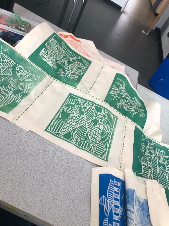
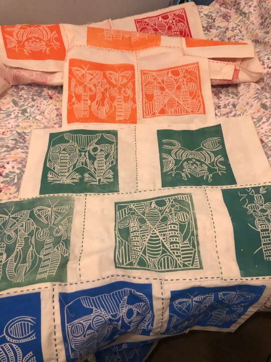
On Monday/Tuesday I started sewing all my blue and green prints with my green/blue embroidery thread. I managed to sew all of the green prints together on Monday and then started sewing the blue ones to the green prints on Tuesday.
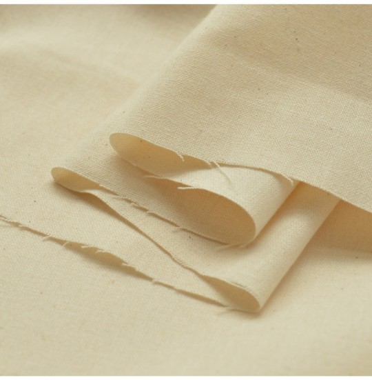
I did run into a problem the blue prints were to small to sew all five together so I had to pin the first three to the green and managed to sew them as straight as I could together. The reason why they were so small is because when I went to get my calico fabric they only had these rectangle shape left they did fit my prints on. However, there wasn’t a big border like I wanted but I had to work with it as the art department had run out.
#monday#tuesday#gasmasks#linoprints#sewing#handsewing#embroidery#thread#linocut#calicofabric#innocent#ww1#death#tapestry#gas mask linos
0 notes
Text
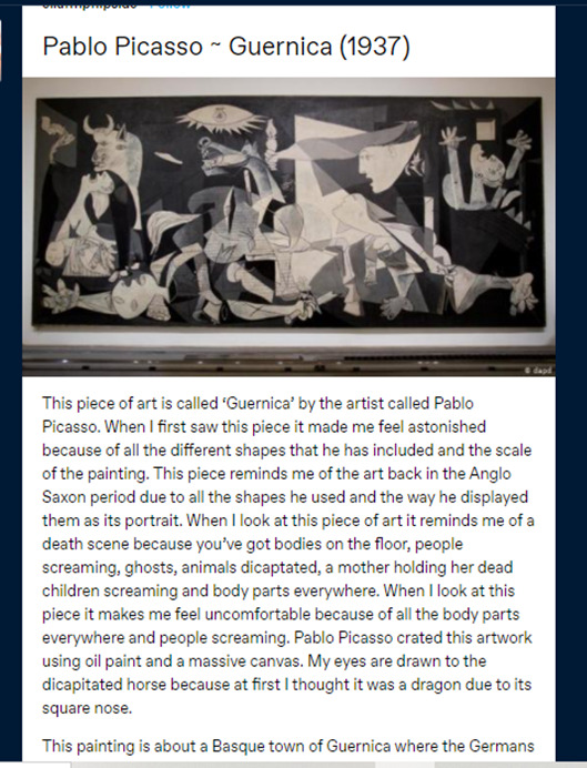
‘Guernica’ Pablo Picasso
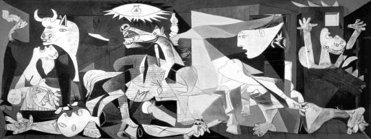
I have already done some research on this piece but I want to drive a little deep so we actually know the truth behind this painting. I gathered all my research from this BBC video clip on ‘Guernica’.
https://www.youtube.com/watch?v=l_VSixma864
It’s one of the most famous paintings in the world and its a portrait of the pain and horror of war. It was painted in 1937. At the height of the Spanish civil war on the 26 April 1937 a fierce bombardment devastated the town of Gernika in the Basque country. The attack by the German and Italian allies of general Franco is considered the first rehearsal of a total strategy.
The art work has many different pieces of imagery. There's a women holding a dead child and this is one of the most powerful images in the painting. Th e women represent life and pain of motherhood. There’s another women trying to escape, another with arms in the air and one with an oil lamp. In this painting the women are main character. The women who run from the flames, who suffer and illuminate the scene at the same time.
There's a chicken in this painting its next to the bull but you can’t really see it in this image. The chicken represents animals fleeing in fear as the bombardment happened on a market day. It represents the suffering of animals.
On the bottom left there is a solider on the ground. The solider represents the Spanish people. Some say it could represent the Republic which was fighting for a new Spain and this dream lies broken, in pieces, on the floor.
Next to the chicken there's a horse most people believe this symbolises the Spanish people being attacked. However, some say it represents fascism.
The bull in the top left corner is said to be for Juan Larrea which is intellectual friend of Picasso. Some say again that the bull represents the Spanish people. However, it is said it signify Picasso himself or fascism or violence.
This piece does not celebrate victory it shows the drama and people suffering. Guernica is a departure from the idea of heroism. The heroism in this is the human pain. Everything in the artwork suggests pity and respect for pain.
#Guernica#Pablo Picasso#pain#death#women#fascism#heroism#animals#suffering#devastation#horror#drama#broken#children#1600deaths#3hours#shattered
1 note
·
View note
Text
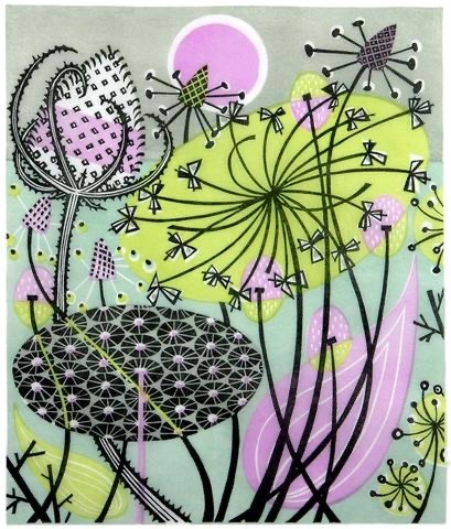
Angie Lewin
litogra
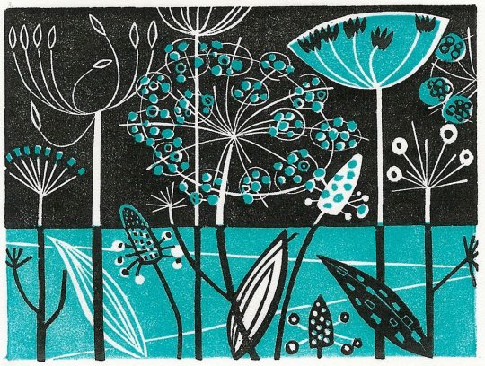
This piece of art is called ‘Clifftop’ by the artist Angie Lewin. When I first saw this piece it made me feel exhilarated because of the beautiful bold lines and layered colours. This piece reminds me of a cold winters day due to the colours she has used. The blue reminds me of ice, the white snow and then the black for the cold nights of winter. Furthermore, it reminds me of the winter time when the flower/ plants have frost or ice all over them. When I look at this piece it makes me feel almost chilly because it takes me to those cold winter evening. Were you wrapped up in blankets, have a hot chocolate in your hand and watching a Christmas movie. Angie Lewin has creates her artwork using a range of techniques such as linocut, wood engraving, screen print, lithograph and watercolour. My eyes are drawn to that turquoise blue because it stands out from the monochrome colours.
#angie lewin#printmaker#linocut#woodengraving#screenprint#litograph#watercolour art#turquiose#Black and White#flowers#nature#ice#frost#winter#cold#beautiful#enchanting
0 notes
Text
Week 9/10 ~ Reflection
The research I have done this last two weeks that had a big impact on my ideas/ work is the research on the Bayeux tapestry. The reason being is its helped me to think about whether I wanted to hand stitch or use a sewing machine. It made me realise I wanted to hand stitch. In addition it helped me to think about the layout of tapestries and how I wanted to present my work.
I did some wider world research on the Bayeux tapestry and found a YouTube video and did all my research from there and it helped me visual understand how to present my work.
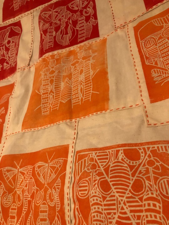
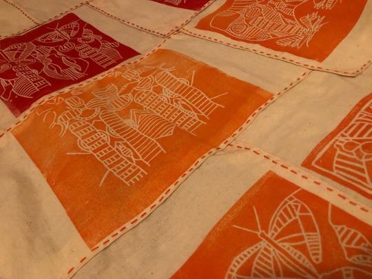
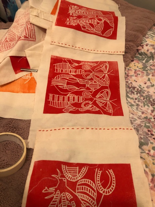
The materials I used was embroidery thread and needles, calico fabric, sewing needle and thread, pins, iron and bobby pins. The techniques I used was sewing, embroidery, printing and ironing. These two weeks I have completed ironing all my borders and then sewing all the borders. I then started embroidery sewing all of my orange and red prints together.
The practical problems I have faced this week was when I was sewing all of my prints together using embroidery thread some of the prints were too small or too big so I had to rearrange all the prints so they could fit together.
#reflection#week9/10#handstitching#embrodiery#sewing#tapestries#bayeux tapestry#widerworldresearch#calico fabric#linoprints
0 notes
Text
Embroidery Sewing Process
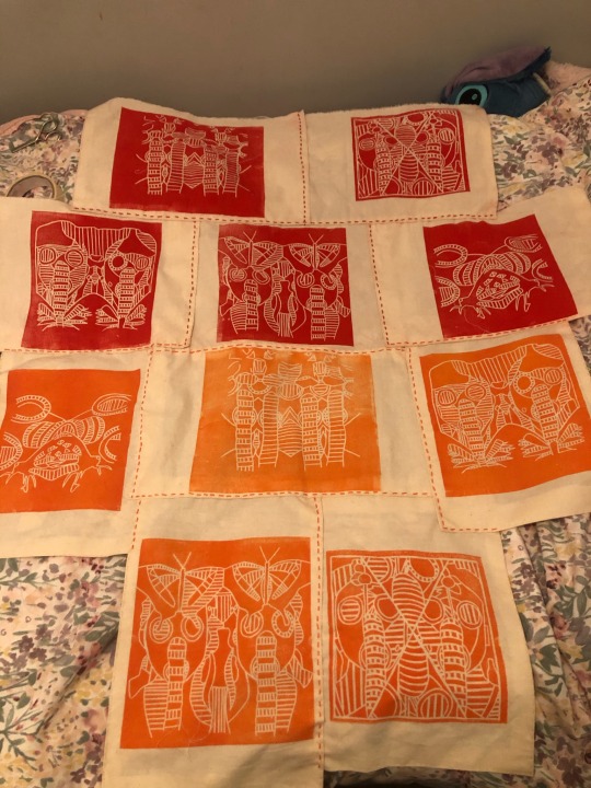
On Thursday, I finished up sewing my blue print borders. Then I started sewing all my red and orange prints together using my red/orange embroidery thread. I did this after I had finishing sewing all the outer border together to make them look tidier and neater.
I did run into some problems as not all of the prints fit together as they were either too small or too big. However, I rearrange them to then make sure they all fit together nicely.
1 note
·
View note
Text
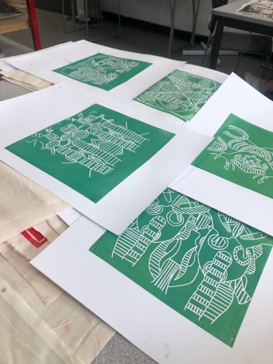
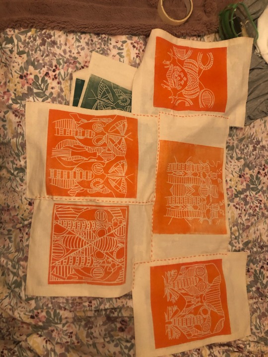
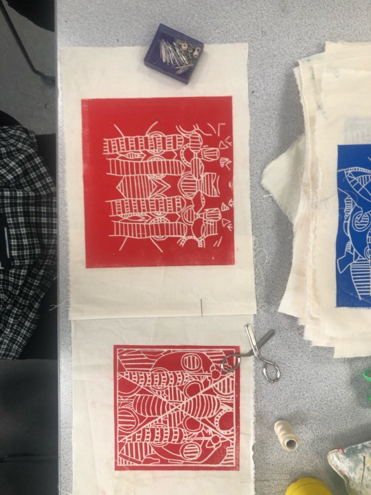
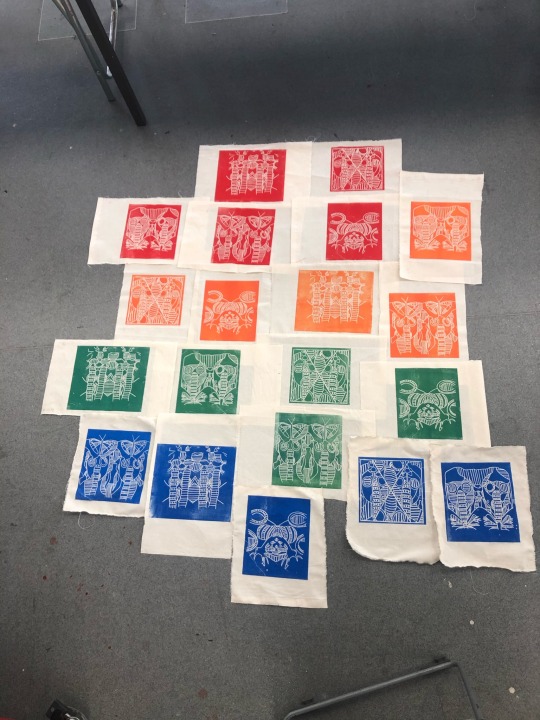
Layout Designs
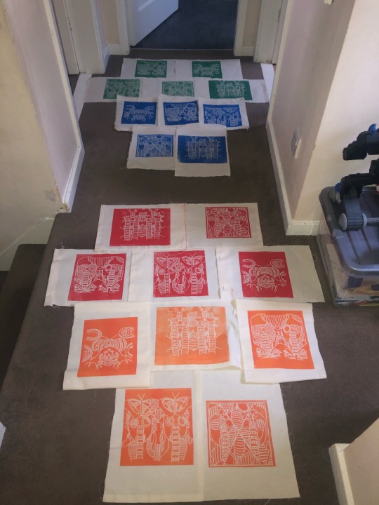
On Wednesday, I started laying out my lino to try and figure out how I want to present them and sew them together. I have decided to go for this lay out for each colour prints but sew them together. However, to make it more neater I need to iron the side of my prints and sew the border. As I feel that they would look considerable tidier.
#wednesday#linoprints#linocutouts#gasmasks#prints#primary colors#secondary colors#layouts#border#sewing#embroidery#neater#tidier
0 notes
Text
Calico Fabric For Lino prints
I used calico fabric for my lino prints as I tried it out with one of my lino cut outs. I think that on calico fabric it looked so much better compared to on A3 card. I just felt like they looked so much neater compared to the card prints.
Calico Fabric is made of 100% cotton and its untreated medium weight fabric. The term ‘calico’ refers to an unbleached, unfinished fabric made from cotton fibres. It’s for craft, paint, home décor, patchwork and apparel. In my opinion this fabric is the best for printing lino because it takes the ink so well and it prints so evenly.
#calico#fabric#100% cotton#fibres#printing#ink#painting#crafts#home decor#patchwork#apparel#research#widerworldresearch#widerworld
0 notes
Text
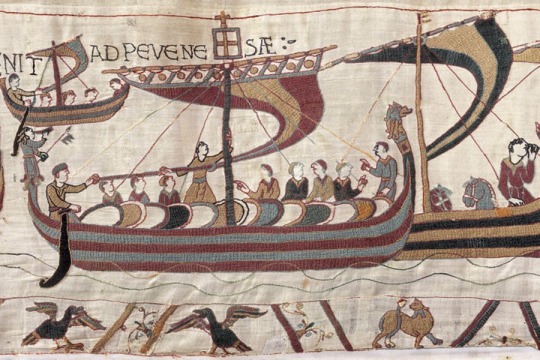
Bayeux Tapestries
I decided to look into tapestries and I remembered that I had actually gone to see this the Bayeux Tapestry when I went on a school trip to France a few years back. This is one of the reason why I wanted to start learning to sew and wanting to start embroidery as I was so inspired by this 70 metres and 50 centimetres high art piece. It’s sown with wool into lining. It’s all handstitched and it is in the Musee de la Tapisserie de Bayeux in Bayeux Normandy in France. It is 11th century Romanesque art which was made in 1077.
This tapestry has helped me to think about how I want to present my work and that I want to hand stitch my work instead of using a sewing machine.
I watched a video on YouTube all about this tapestry.
https://www.youtube.com/watch?v=F8OPQ_28mdo
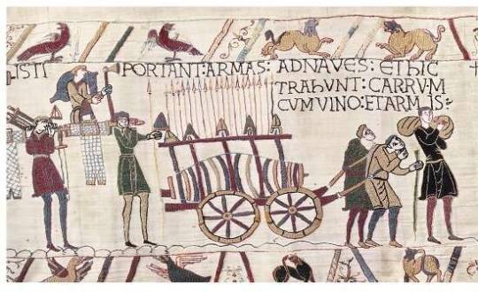
The tapestry is commissioned to celebrate William's conquest of England. It begins with events that lead up to the conquest, the death of Edward the Confessor King of England and then the succession of the new King Harold. It has little details of farming life, ploughing fields, a man kill birds with a sling. It has the Westminster Abbey were Edwards funeral and a image of Harold's crowning.
It shows William preparing for invasion, trees being cut down for building boats and weapons/ armour being made. Horses being put on ship and other things. Them sailing to Pevensey and before battle the army being feed chicken kebabs and William feasting with the men. The men preparing for war and building a castle made of wood at Hastings.
It features them all burning houses and a women leading her child away from the burning house. The battle begins and you see heads chopped off as well as hands or other body parts. The battle raging all day long. Rumours spread through the battle that William was dead but he turns around on his saddle, lifts his helmet up and shows his face. It suggests that Harold got an arrow shot in his eye but nobody knows if this is true or not. After this he was slaughtered.
In this video they described this as ‘magical work of art’.
#bayeux tapestry#embroidery#anglo saxon#handstitched#wool#lining#harold#william#research#widerworldresearch
0 notes
Text
Colour Theory Research
Colour theory is a practical guidance of colour mixing and the visual effects of colour combinations. In colour theory the colours are organised into three categories based on the colour wheel. There is primary colours, secondary colours and tertiary colours. A colour circle is based on red, yellow and blue which is traditional in the field of art. Sir Isaac Newton developed the first circular diagram of colours in 1666.
The primary colours are red, blue, yellow. These three colours cannot be mixed or created by any combination of colours. All other colours can be created with these three hues.
The secondary colours are orange, green and purple. These colours are formed by the primary colours.
The tertiary colours are yellow-orange, red-orange, red-purple, blue-purple, blue-green and yellow-green. These colours are created using primary and secondary colours.
There are two more basic categories in colour theory that are useful to know. These are colour harmony and the context of how colours are used.
Colour harmony can be defined as a pleasing arrangement of parts whether it be music, poetry, colour or even ice cream. In visual experiences, harmony is something that is pleasing to the eye. It engages the viewer and it creates a sense of order. When something is not harmonious it’s either boring or chaotic. When the visual experience is so bland the viewer is not engaged at all. However, when the visual experience that is so overdone and chaotic the viewer can’t stand to look at it. The human brain rejects what it cannot organize what it cannot understand. Colour harmony delivers visual interest and a sense of order.
Colour context is how colour behaves in relation to other colours and shapes. This is a complex area of colour theory. Below is an example I found that I understand about colour context. Let’s compare the contrast effects of different colour backgrounds for the same red square. The red square appears more brighter against a black background whereas duller against the white background. In contrast with the orange background the red appears lifeless. In contrast with the blue-green it becomes brighter. In addition you can notice that the red square appears larger on the black background compared to any of the other backgrounds.

#colour theory#primary colors#secondary colors#tertiary colors#colour wheel#colour context#colour harmony
0 notes
Text
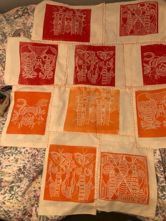
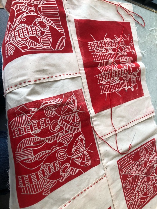
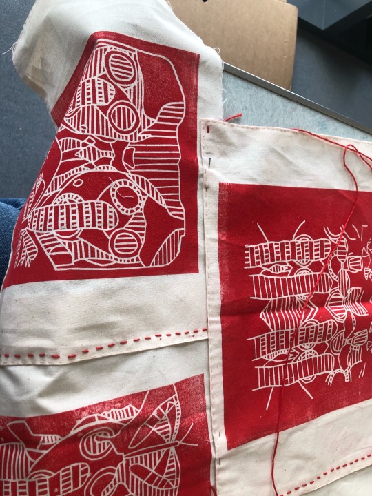
Sewing Process
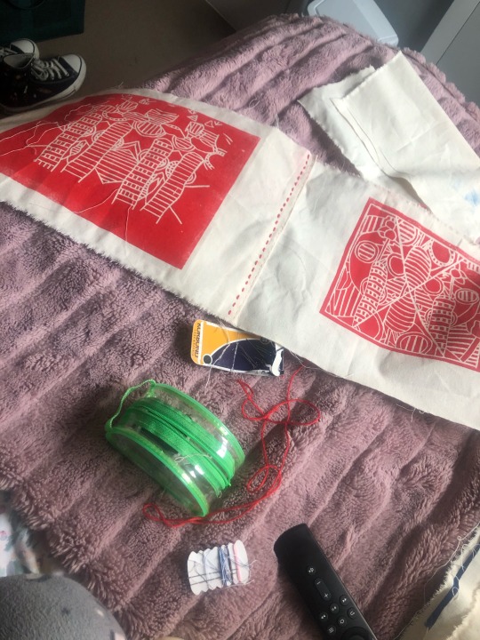
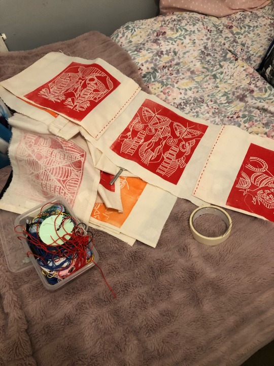
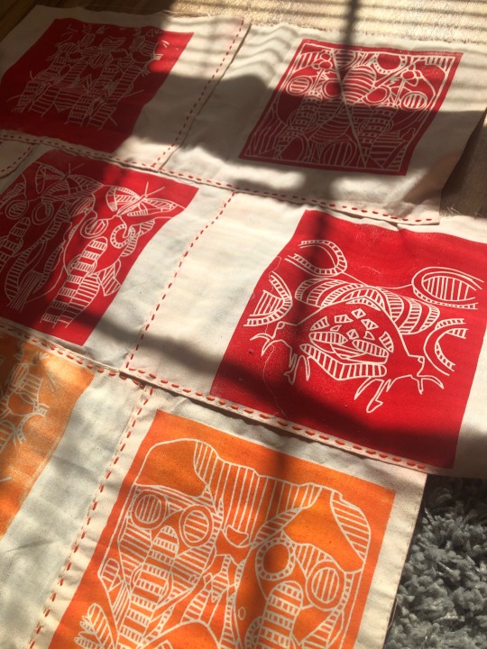
On Tuesday/ Wednesday I started to sew all of my prints individually. This means that each print I did, I ironed them to create a nice straight border and started sewing all around the edge to create a nice clean edge. I hand sewed each one using the thin sewing thread in this cream colour. Once I had handstitched all the borders on all twenty, I started to hand stitch all the red prints together using red embroidery thread. I managed to get all the red prints sown together using the red embroidery thread.
#Tuesday#wednesday#sewing#handstitched#red#orange#green#blue#embrodiery#thread#handsewing#linoprints#Lino#calico#fabric
2 notes
·
View notes
Text
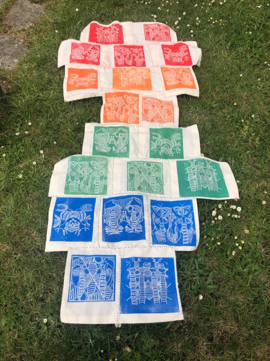
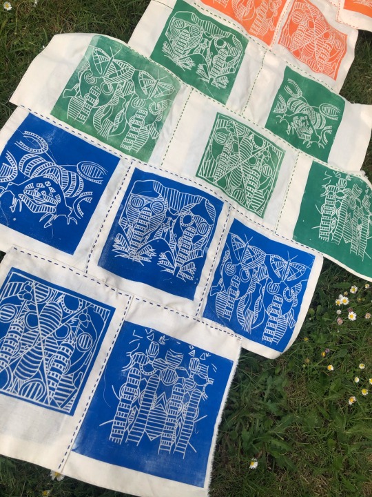
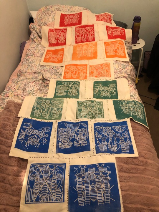
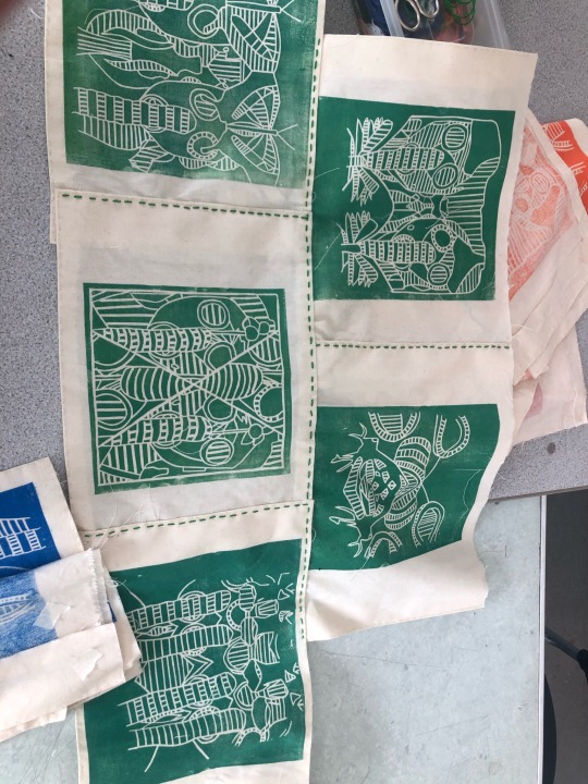
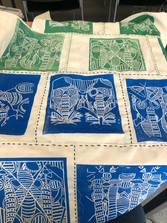
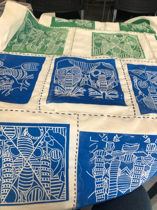
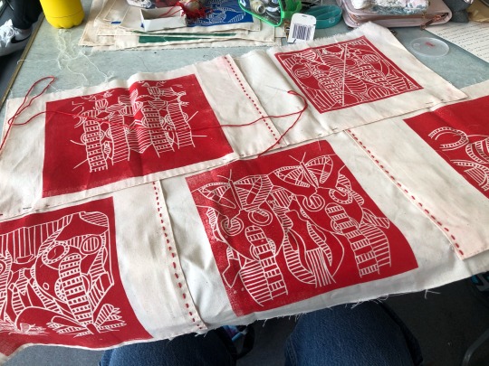
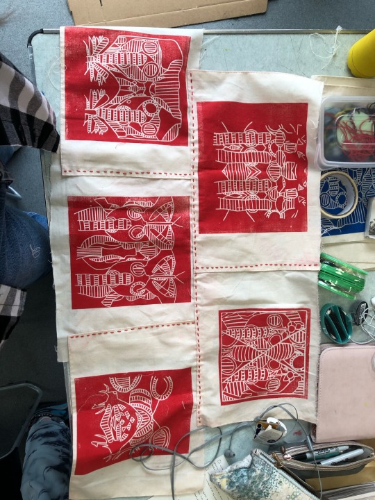
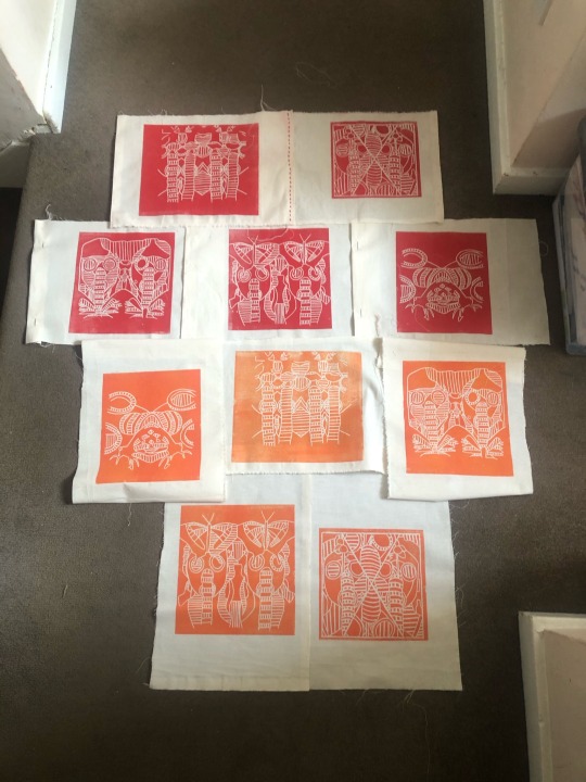
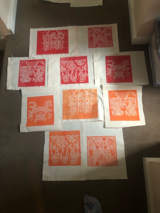
Presentation
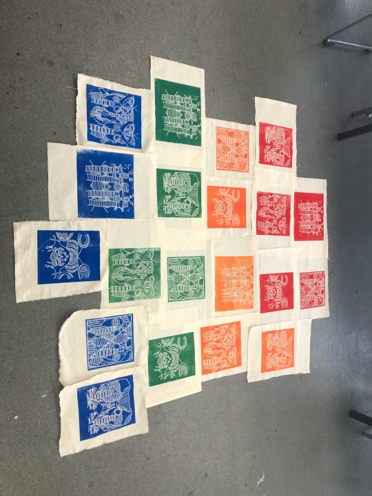
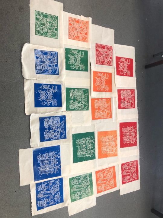
During the last couple of weeks I have thought about how I will present my prints. What order? How they will look? Will I mix up all the colours or have them each in a row? All these questions went through my head so Monday afternoon I spent laying them out and rearranging them to see what style I wanted. To be honest I still don’t know what style to place them in. I like both of these layouts and the colour arrangements.
1 note
·
View note
Text
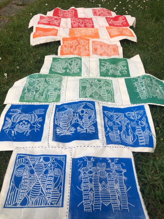
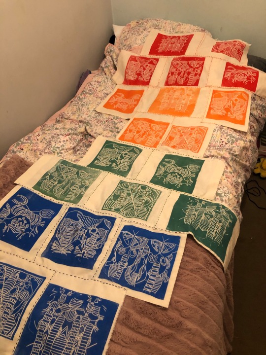
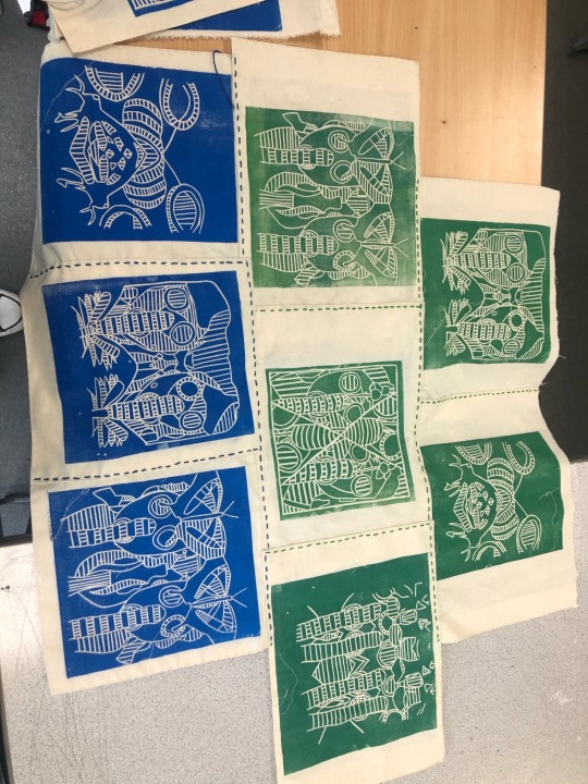
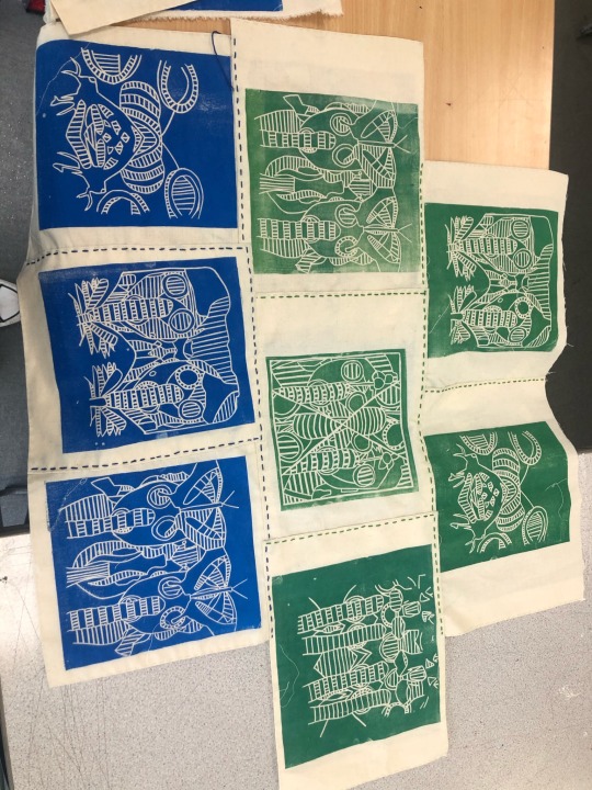
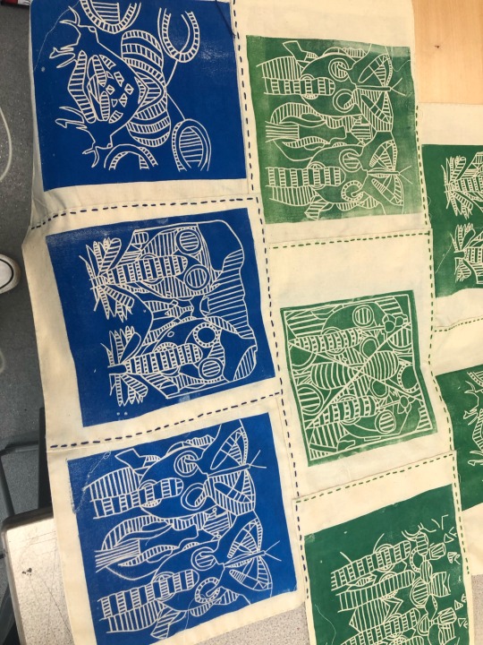
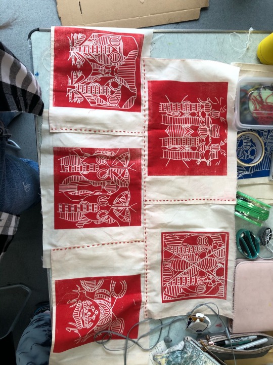
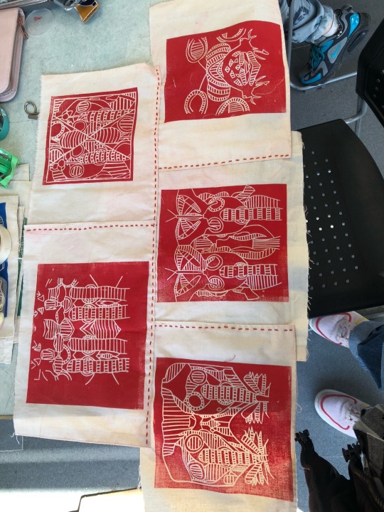
Presentation
During the last couple of weeks I have thought about how I will present my prints. What order? How they will look? Will I mix up all the colours or have them each in a row? All these questions went through my head so Monday afternoon I spent laying them out and rearranging them to see what style I wanted. To be honest I still don’t know what style to place them in. I like both of these layouts and the colour arrangements.
#monday afternoon#linoprint#Linocutting#gas mask linos#gas masks#shapes#stitching#sewing#arrangement#innocence
1 note
·
View note
Text
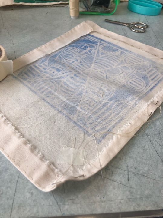
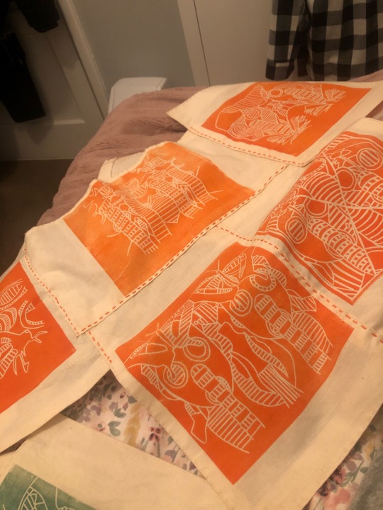
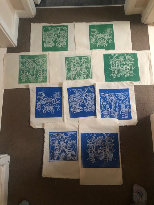
Final Piece Lino Prints
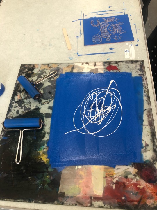

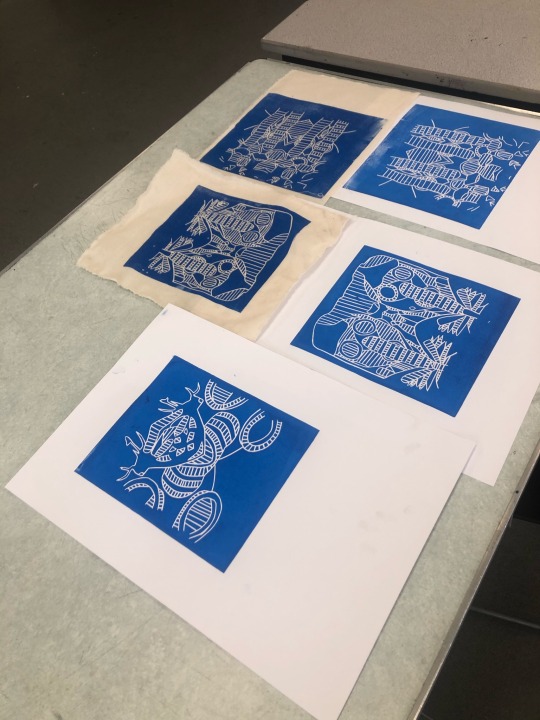
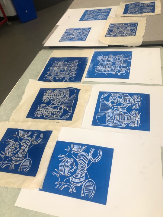
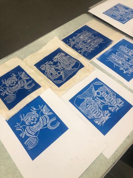
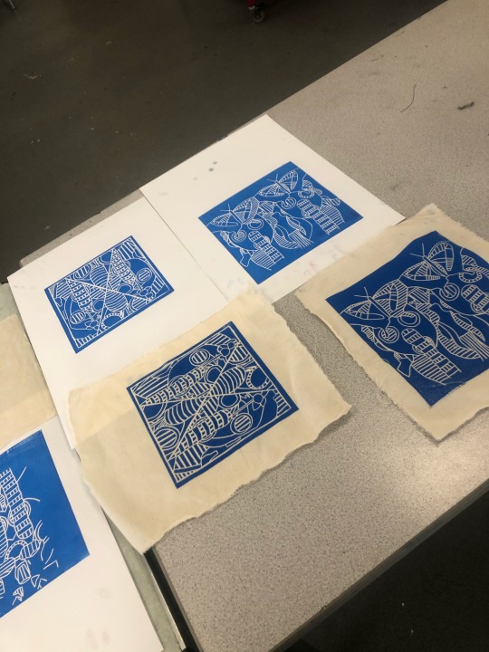
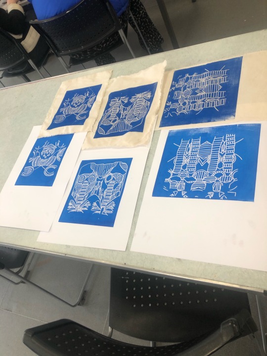
On Monday, I started to finish off printing all of my linos but this time in a royal blue I created using white and a blue ink. I made sure to firstly print on paper then to print on to fabric. I wanted to make sure I have the right amount of ink on my roller so it doesn’t come out faded or even too inky.
#monday#linoprint#blueink#Linocutting#printing#gas mask linos#gasmasks#lines#shapes#colours#innocense
0 notes