
drawsbye
drawblog
sometimes i draw things and post them here. sometimes i post those things to my main, which is smallsith. i also reblog a lot of art references here!
270 posts
Last active 60 minutes ago
Don't wanna be here? Send us removal request.
Last Seen Blogs

bguette
Bguette
quatanggomsu
Quà tặng gốm sứ

joyous-paradise
Remember to Smile!
orange-guts
clown piss

kabarbolablog-blog
Blog KabarBola
Photo
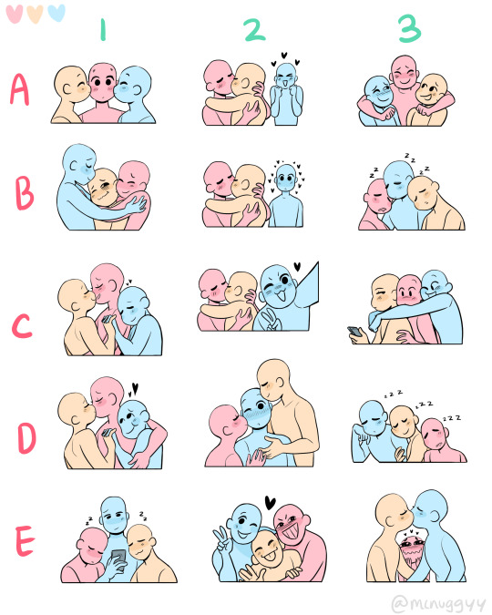

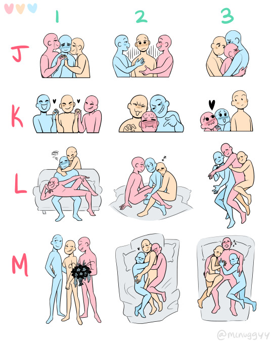
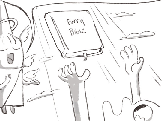
i felt like there wasn’t enough polyam trio art memes so i decided to make my own <3 self indulgence be damned
❤️💛💙
( feel free to share and tag me in any of the cute art you make i would love to see!!! 🥺💕)
128K notes
·
View notes
Note
Dont know if you were joking about needing catboy references a couple of weeks back but here ya go


Theres one for sheep too if you need that
the sacred texts.... thank you for bestowing it upon me
32K notes
·
View notes
Text
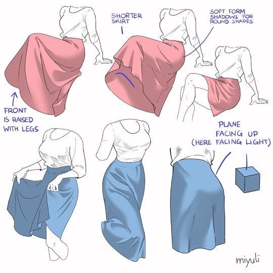
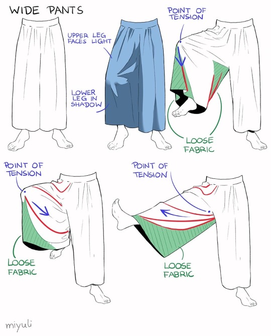
“Notes on skirts and pants”
Source: miyuli on twitter
47K notes
·
View notes
Note
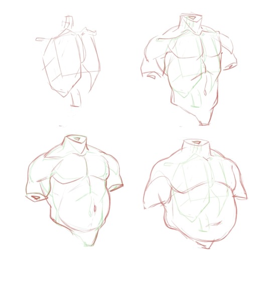
I’m really sorry if you’ve answered something like this before (feel free to ignore this if you have) but I was wondering how you went about studying anatomy because the proportions are great and the way you stylise it whilst still making it seem believable is incredible, but yeah I was wondering if you had any tips, or even like a little process or sketch on how you break down the anatomy. Thank you!
Hey! They have but I've never had the energy to do a small sketch about it until today. Here's how I generally approach anatomy, I hope this helps!

282 notes
·
View notes
Text
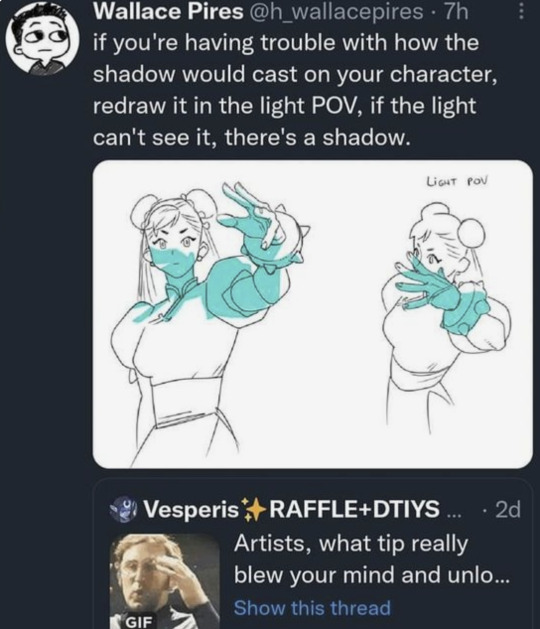
this is to this day my favorite art advice i've ever seen. who is out here like damn figuring out where shadows go is just too hard. guess i've got to simply redraw this pose perfectly at a completely different angle and FOV
64K notes
·
View notes
Photo


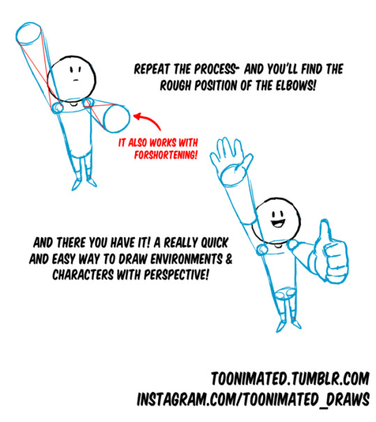
COFFEE QUEST CONTINUES!
Join our coffee adventure!- Or at least check out more Art Goodies here:
[Check out Toonimated’s Coffee Quest] <Take a look!
144K notes
·
View notes

Text

tweet
Something like this would be so colossally helpful. I'm sick and tired of trying to research specific clothing from any given culture and being met with either racist stereotypical costumes worn by yt people or ai generated garbage nonsense, and trying to be hyper specific with searches yields fuck all. Like I generally just cannot trust the legitimacy of most search results at this point. It's extremely frustrating. If there are good resources for this then they're buried deep under all the other bullshit, and idk where to start looking.
113K notes
·
View notes
Text
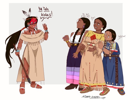
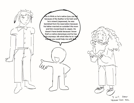
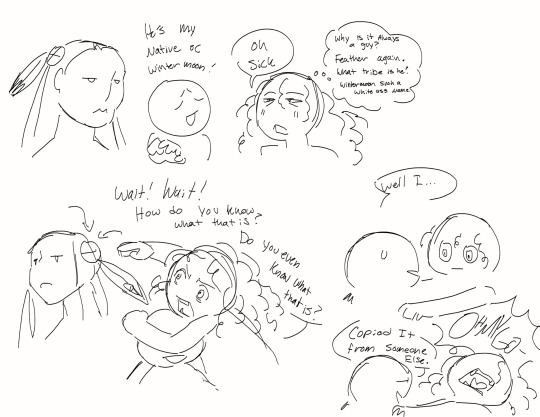
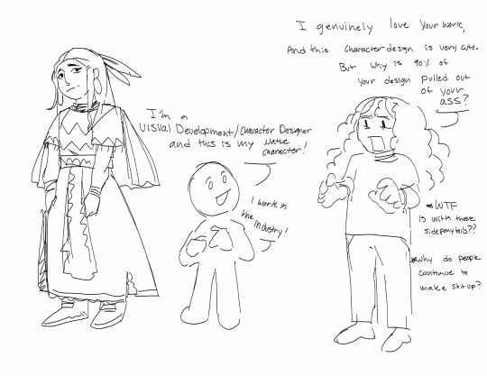
I genuinely feel like I’m going insane sometimes
#ref#native#indiginous#cultural sensitivity#ffs i get so tired of people (esp other white people) acting like native americans are like. fuckin elves or fairies or some mystical shit#make your characters a character not a fuckin. stereotype or some shit#jesus effing christ it ain't hard just do some goddamn research
58K notes
·
View notes
Text
Why are people so stupid I just saw an ig reel of an artist being like "tee hee we weren't allowed to record at this nude life drawing session but I took a risk!!! Here's my processes I videoed" you idiot thats such a huge violation of that model's privacy. They're not saying you can't record because they hate you they're saying that you can't record to keep the model out of a potentially exploitative environment that's such a shitty thing to do. They have rules for those sessions for a reason and as an artist you should be trying to make the situation as respectful and comfortable as you can for the model you're drawing and that includes keeping your fucking camera device in your pocket
37K notes
·
View notes
Text
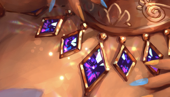
Mirre’s “How i render gemstones” tutorial!
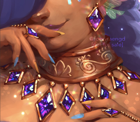
(note: image above is not what is shown in the walkthrough. It is an example piece)
Ingredients:
Art program that has layers and selection tools
Patience (hubris or stubbornness is fine too)
(recommended) photo references of gemstones and/or prisms
(Optional but very helpful) Knowledge on how to use Reference layers and anti-overflow in Clip studio Paint
For this tutorial i am going to use clip studio’s “anti-overflow” feature. This post is not going to explain how to use that specific setting but you should be able to find guides on how to use it on clip studio’s official website or on youtube.
Please Note: The result of this technique will not 100% represent real life gemstones. These are more simplified but should still make an impression of the brilliance and appeal of gems, crystals and diamonds.
If you don’t work in CSP: the best workaround is to use the polygonal lasso selection tool for the same purpose.
This ended up being a long post so I am putting it under the readmore:
First off; Basic idea on how the light refracts inside a solid transparent object:
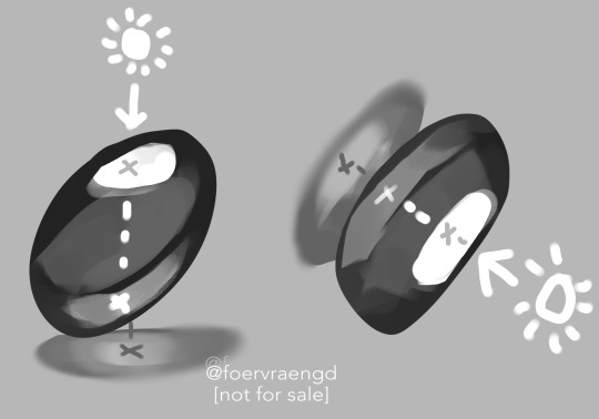
Wether it is acrylic, glass, water or crystal, the way light pass through more or less should behave the same as long as it is solid and not hollow inside. Pay attention to how the darkest parts of the stone goes along the inner edges, leaving a ”mid tone” sort of in the center. However, this might vary depending on the light setting. But it is a generally good rule-of-thumb to follow if you’re drawing something not based on a photo. Another thing to pay attention to here is how the placement of the highlight will lit up the inside of the gem in a parallel line. It also shows through on the cast shadow.
Light refraction on a cube:
I have already made two posts on this, so definitely go through them:
CUBE BREAKDOWN POST HERE (tumblr wont let me paste the link so i will update this once this is fixed.)
But a rough summary from those two links would be: Every side/facet of a gem or a cube etc refracts the light individually and not as one entity (that would make it look hollow and not solid). Think of it like how each piece in a broken mirror individually reflect your face back to you. Like a weird patchwork!
Putting this into practice:
For this tutorial I’m going to be nice to myself and not try to draw perfectly accurate gemstones. Instead I’m gonna draw them with a more ”natural” looking set of facets. Which actually isnt as common in real world as video games makes us think. Some crystals have geometric shapes naturally, but a lot of other stones are not as fancy. Anyway, im taking artistic liberty on these example stones because the technique I’m going to use will work for these just fine.
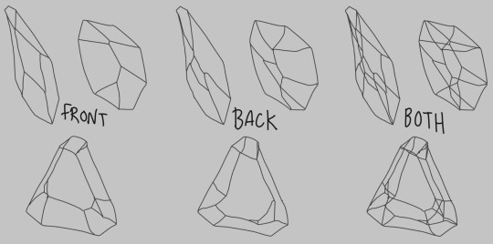
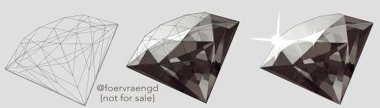
So, in clip studio paint, I first draw the stones on a vector layer. I give them facets for the front side. Then I duplicate the layer, remove the front facets and replace them with the facets on the back of the stone. The third image here shows both layers visible on top of each other. I now put these into a layer folder and mark the folder as ”reference”.
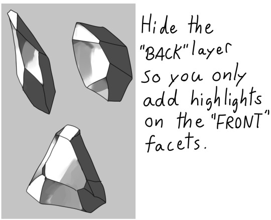
Now, on a layer below the lineart folder, fill with your base tone. Then make a layer on top (if you can clip it to the base tone, do that), this layer is where you decide where the highlight will be placed. In some cases the highlight is only lighting up one single facet - it really depends on the design of the stone. You can also blend and soften the highlight here if it looks good for you, just make sure not every facet is highlighted. The highlight layer should be on top of all the other layers clipped to the base tone layer.
Now it is time for the juicy juicy stuff! Turn on both lineart layers so they’re both visible. I hid the hilight layer here because it was in the way, but might not be needed in your case. Make a layer clipped to the base tone and paint in the darkest tone. This is where anti-overflow helps me out, because when i run my brush over all these crossed lines it will make the stroke pop in and out for each facet. If you dont use CSP, this is where you can use the lasso tool and select every second facet. It will take a bit more time but it should work similarly.
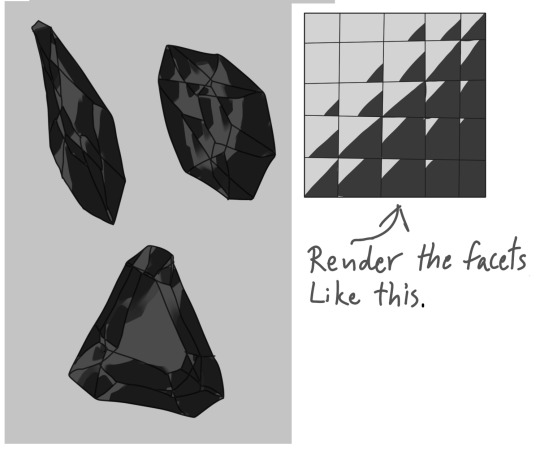
After the darkest tones I then make a layer for the inside light that the highlight has lit up. Here i keep it inside the darkest tone but this might vary depending on the light setting. If it looks good to me, then that’s what i stick to.
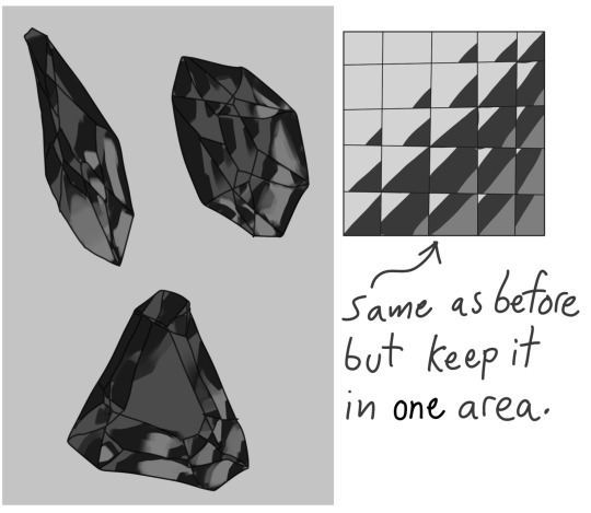
The way I approach rendering the facets here is like the grid in the example images above, every shade and tone appear more or less in each facet but the amount is relative to their position. So a gradient wouldnt have a smooth transition; it would be slightly scewed in each square on this example grid. Essentially like how some bathroom window glass panes look like.
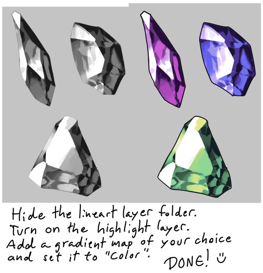
Now it’s time to hide the lineart layer folder and check if the gemstones look decent to you. If not, then you can look up some reference photos and analyze where the values group together the most; be careful not to focus too much on the photos 500 million sparkles. Squint your eyes or blur the reference and try to see how the overall values behae.
I, personally, am satisfied with these rocks so I slap on a gradient map (you can manually color in them too if that’s your thing) and call it a day. The lit up inside of a gemstone tend to have a brighter and more saturated color than the mid tone.
Other Examples with this technique:
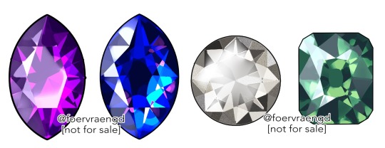
If you look up ”gemstone types” you can often find images displaying various facet types from more than just front view. These can serve as useful base templates for practicing this rendering technique. The backside of a gemstone is called the “pavillion” and is really useful to have at hand when it comes to painting the inner refractions. You can probably also use 3D models and convert the wireframe into lineart. But that is slightly out of my pool of knowledge.
Applying this knowledge without using a base lineart layer is of course possible. In this painting I followed a simplified summary of how the facets sparkle: Keep the highlight shape to match the front facet design, and all the inner refractions should be more scattered and split up but face a direction towards the center of the gem. Now don’t you think this sort of makes the gems look like eyes? That’s right! You can, and absolutely should, apply this on eyes to create the most sparkly anime eyes ever.
Now, refracted light that lands on the surface surrounding gemstones varies depending on the material - and if the gem is inside a metal frame it usually doesnt create this much refraction around it. But I want to have fun so i decided to break this rule in the name of pretty sparkles. :)
2K notes
·
View notes
Text
i hate that every time i look for color studies and tips to improve my art and make it more dynamic and interesting all that comes up are rudimentary explanations of the color wheel that explain it to me like im in 1st grade and just now discovering my primary colors
137K notes
·
View notes
Text
being a self-taught artist with no formal training is having done art seriously since you were a young teenager and only finding out that you’re supposed to do warm up sketches every time you’re about to work on serious art when you’re fuckin twenty-five
366K notes
·
View notes
Text
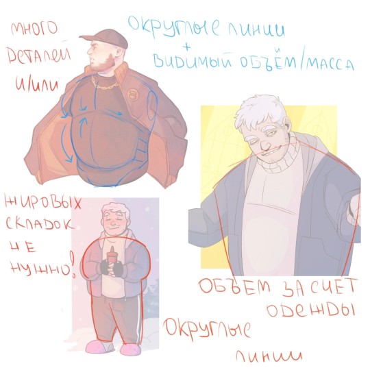
1) Width. Add it.
2) Width. Just. Yeah. If you want to draw a really big guy - do it. The third guy is ok, but it's just a small guy with belly!
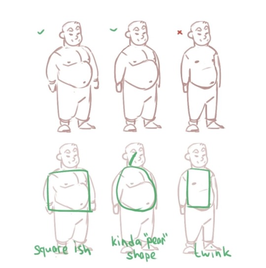
3) Gravity! More fat - more soft - gravity goes brr.
4) Basic shapes and clothes would definitely help you to draw a big comfy soft guy!
Miaou
35K notes
·
View notes
Text
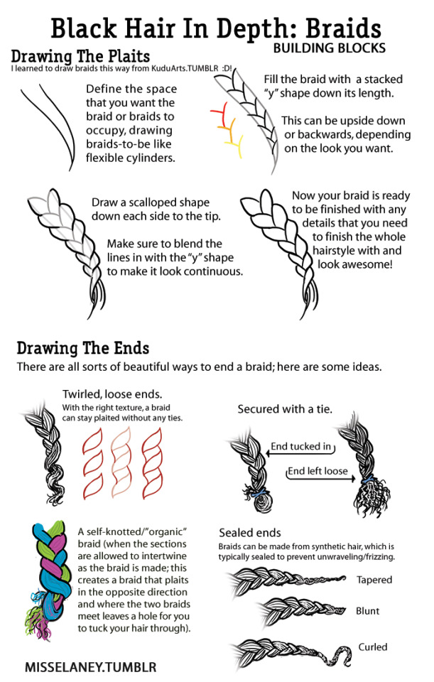
Well it being black history month is reminding me how I wanted to doodle something like this down for a while. Since it’s been a lil detail I always take notice of in drawings. These are very simple depictions but I hope it’s enough to give the general idea! Feel free to reblog
30K notes
·
View notes
Photo
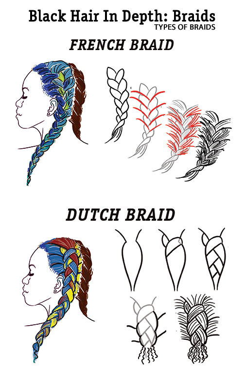
After a long hiatus (sorry, RL ate me), I am doing braids! Here are the first two pages.
On my list of braids to go in depth into are cornrows, micro braids, box braids, ghana braids, and tree braids. Stay tuned in the next couple of weeks and I will release them one by one, and then put them together in one big compilation.
More Black Hair In Depth:
Drawing Natural Hair
Dreadlocks
22K notes
·
View notes
Text
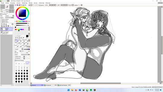
wip illustration for my current wip novel, my two mcs who have devoured my brain like parasitic worms
it's kind of hilarious how much bigger stayne is than nerezza- she's about 5'7", 5'9", stayne is roughly 6'10". them's lorj
anyway i tried a new thing with the posing, blocking out the rough shapes before narrowing down the finer details and then narrowing them down farther w/ the lineart
might try painting it when the lineart is done, might just slap some flats on it and call it a day
3 notes
·
View notes