
daydreaming-stardust
Artbloggy
This is where I’m putting my art for you to see. Feel free to request something, I honestly have trouble coming up with ideas anyway.Main Blog: @headfrogs
270 posts
Don't wanna be here? Send us removal request.
Last Seen Blogs

derlunal
endlessly wistful

o-schist
diamond, please

eagle-975
Untitled

boostmobilefarmingtonave
Boost Mobile Farmington
o-schist
diamond, please
Photo
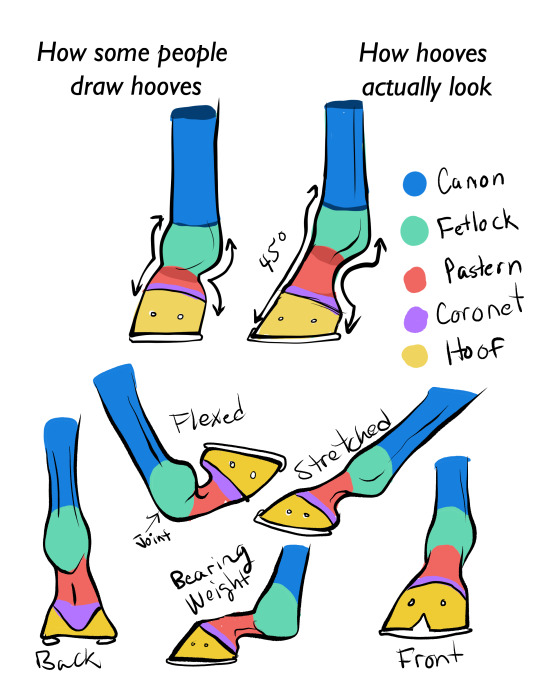
for all of you who struggle to draw horse feet. :) You’ve gotta have those pasterns in there, as they are the horse’s main shock absorbers, as seen in the “bearing weight” example.
If you can handle an animal autopsy, here’s an interesting vid on how the muscles and joints work in the lower leg of the horse.
24K notes
·
View notes
Photo
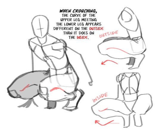
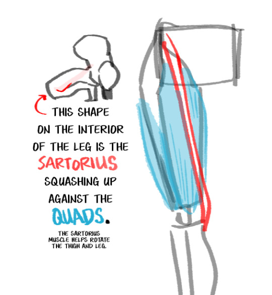
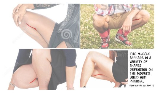
Here’s a little Art Tip about a very specific part of the body. Pop a squat and see how it looks on you.
37K notes
·
View notes
Text
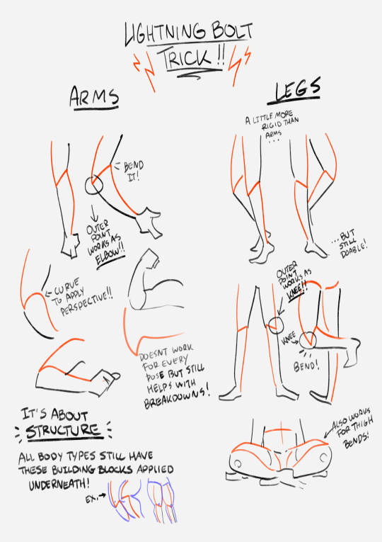
this showed up in my FB memories, the lightning bolt trick! I don't sketch out the lightning bolt much nowadays but it's still super helpful when I need to lay out tricky arms and leg poses. And I still apply the logic of it, especially with how I draw arms :' ) Biggest thing it helps with is shape breakdown and visualization, we gotta use whatever works to break down shapes into simpler concepts for our brains 👏💓
11K notes
·
View notes
Text
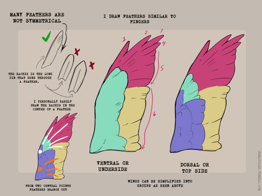
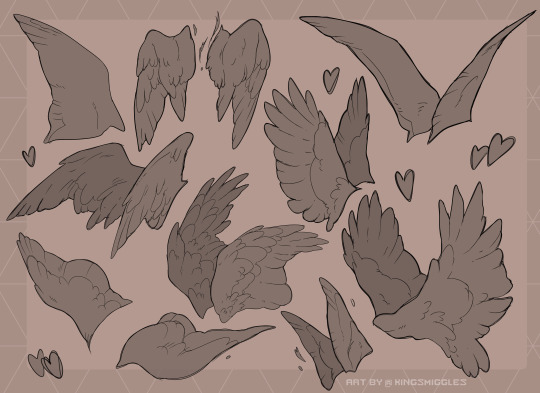
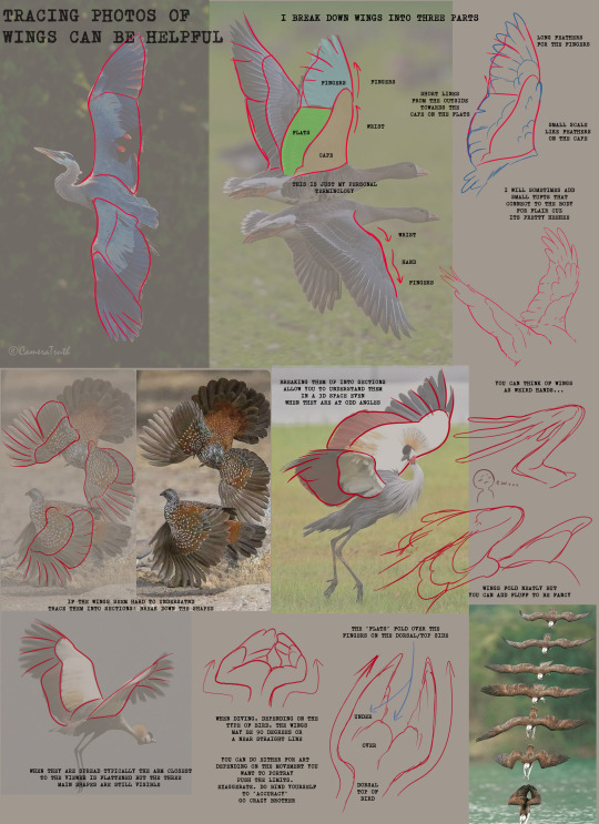
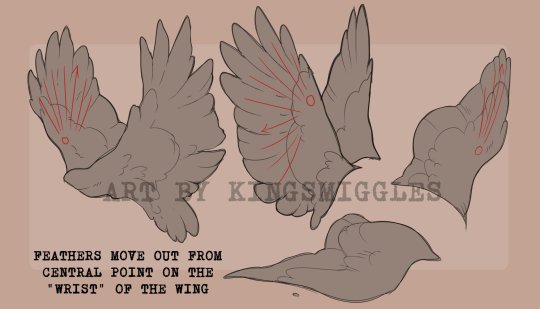
I made an art/anatomy tutorial about birds! I hope people will find it helpful!


27K notes
·
View notes
Text


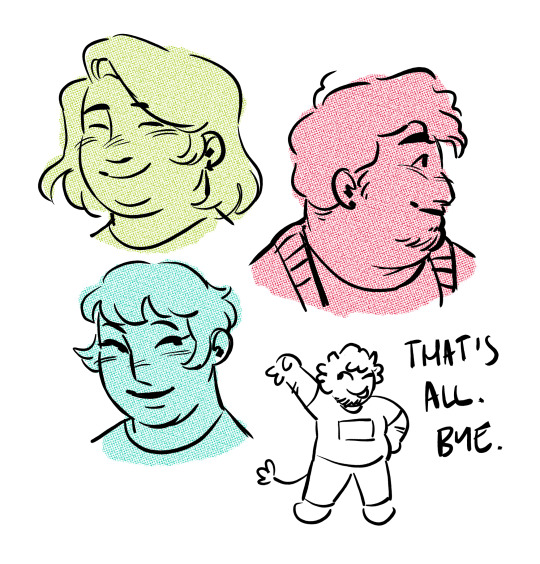
draw more fat characters ok. i love you
33K notes
·
View notes
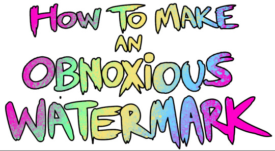
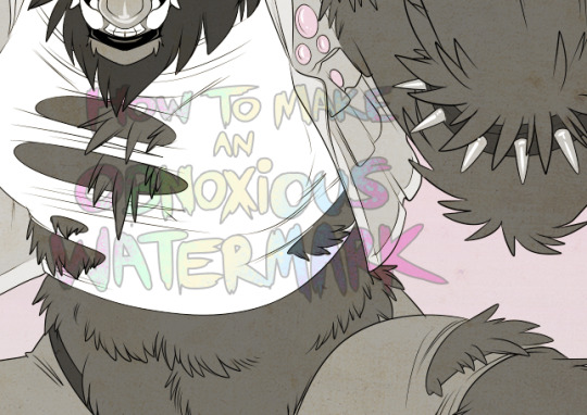
Text
...that your audience won't hate.
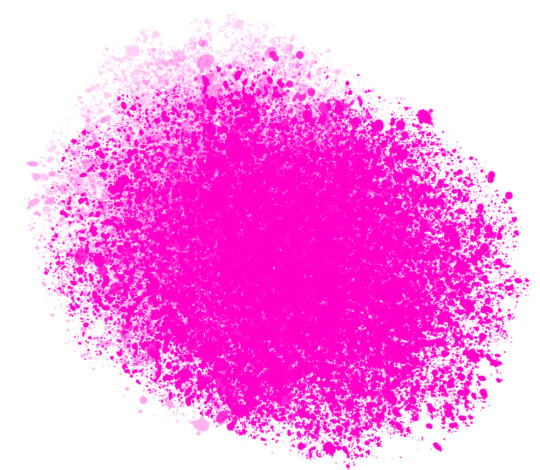
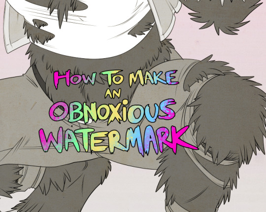
This is a method I started using when NFTs were on the rise - thieves would have to put actual work into getting rid of the mark - and one that I am now grateful for with the arrival of AI. Why? Because anyone who tries to train an AI on my work will end up with random, disruptive color blobs.
I can't say for sure it'll stop theft entirely, but it WILL make your images annoying for databases to incorporate, and add an extra layer of inconvenience for thieves. So as far as I'm concerned, that's a win/win.
I'll be showing the steps in CSP, but it should all be pretty easy to replicate in Photoshop.
Now: let's use the above image as our new signature file. I set mine to be 2500 x 1000 pixels when I'm just starting out.
Note that your text should not have a lot of anti-aliasing, so using a paint brush to start isn't going to work well with this method. Just use the standard G-Pen if you're doing this by hand, or, just use the text tool and whichever font you prefer.
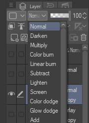
Once that's done, take your magic wand tool, and select all the black. Here are the magic wand settings I'm using to make the selections:

All selected?
Good.
Now, find a brush with a scattering/tone scraping effect. I use one like this.
You can theoretically use any colors you want for this next part, but I'd recommend pastels as they tend to blend better.
Either way, let's add some color to the text.
Once that's finished,
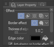
You're going to want to go to Layer Property, and Border Effect

You'll be given an option of choosing color and thickness. Choose black, and go for at least a 5 in thickness. Adjust per your own preferences.
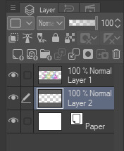
Now create a layer beneath your sig layer, and merge the sig down onto the blank layer.
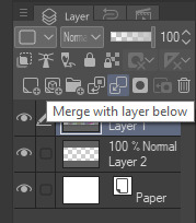
This effectively 'locks in' the border effect, which is exactly what we want.
Hooray, you've finished your watermark!
Now let's place that bad boy into your finished piece.
You'll get the best mileage out of a mark if you can place it over a spot that isn't black of white, since you'll get better blending options that way. My preference is for Overlay.

From here, I'll adjust the opacity to around 20-25, depending on the image.
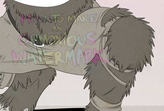
If you don't have a spot to use overlay, however, there's a couple other options. For white, there's Linear Burn, which imho doesn't look as good, but it still works in a pinch.
And for lots of black, you have Linear Light
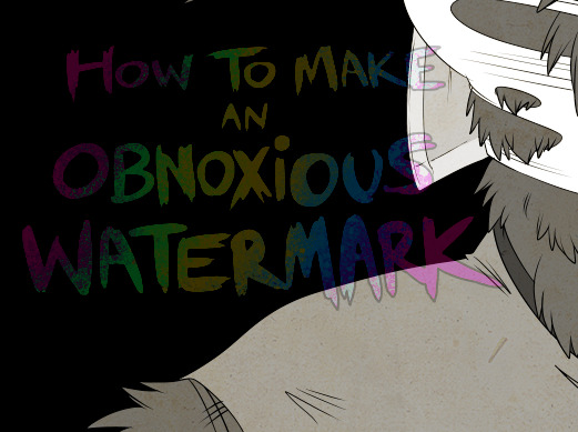
Either way, you're in business!
EDIT since this has escaped my usual circles, and folks aren't as familiar with my personal usage:
An example of one of my own finished pieces, with watermark, so you can see what I mean about 'relatively unobtrusive'-- I try to at least use them as framing devices, or let them work with the image somehow (or, at the very least, not actively against it).
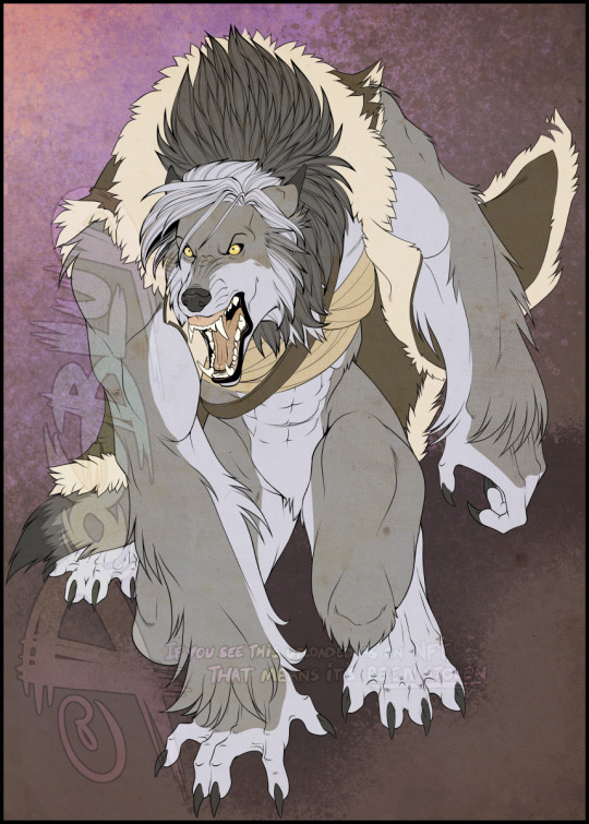
I know it's a bummer for some people to "ruin" their work with watermarks, which is part of the reason I developed this mark in particular. Its disruption is about as minimal as I can make it while still letting it serve its intended purpose.
There's other methods, too, of course! But this is the one I use, and the one I can speak on. Hope it helps some of you!
52K notes
·
View notes
Text
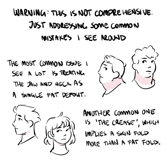
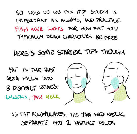
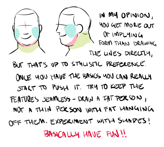
fat bodies, fat anatomy, and how body fat tends to work should be taught as standardly as skinny anatomy and how muscles work in art courses. fat bodies are not an outlier. fat bodies are not a minority and theyre not abnormal or wrong. fat bodies are normal and they belong in art teaching spaces as commonly as other anatomy, because fat bodies ARE normal anatomy. people have diverse bodies and there will never be a single body type that encompasses the “normal body type”
tldr; fat anatomy should be taught as a staple in art courses just like any other anatomy. this is fact <3
45K notes
·
View notes
Text
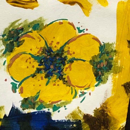
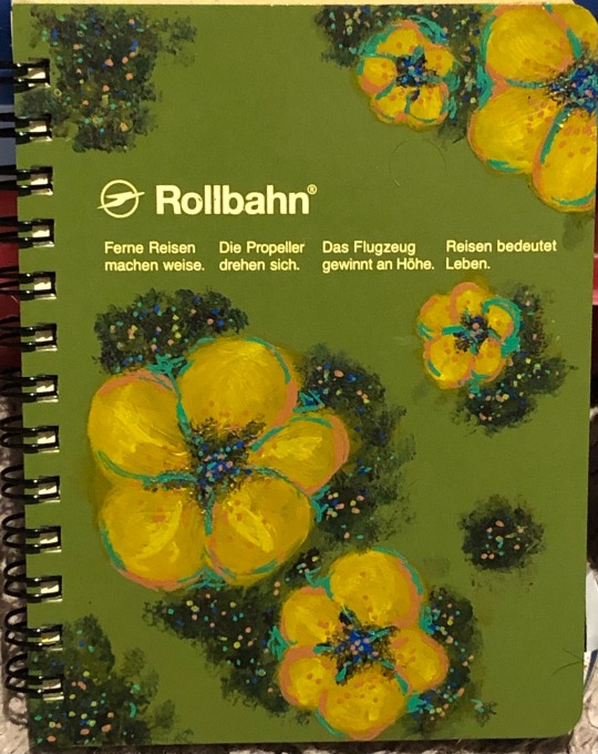
i don’t really post my work anymore but this sketchbook ender photographed so well i just had to.
0 notes
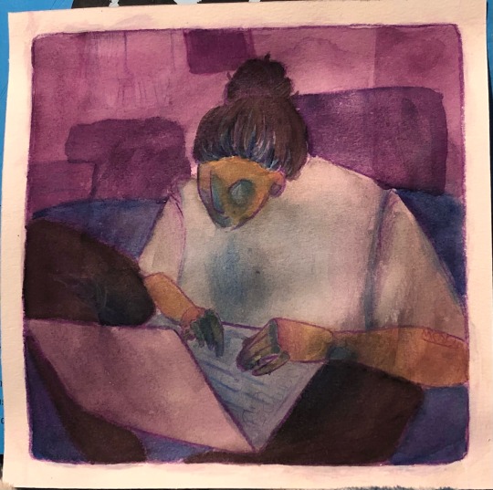
Text
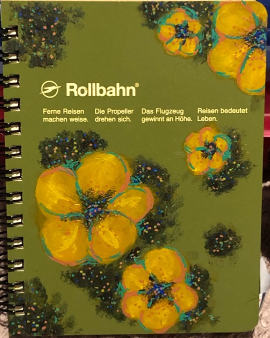
I now present the biannual Im-Not-Dead-Yet post!
+ a sketch and alt vers for the notepad
2 notes
·
View notes
Text
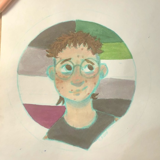
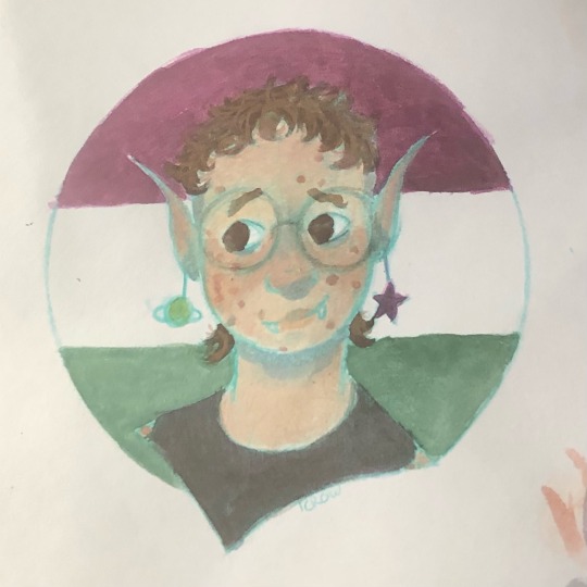
finally remembered it was pride month!
#its like 4 am and i am well out of energy#so this is what you get#my art#self draw#okay babble time#1) dont ask why i did the sketch in teal it was a shitty idea anc i regrey it#although it did remind me how nice colored pencil sketched are to draw on#2) i fucking despise waiting for layers to dru#i started this at like 930 i couldve breen done hours ago if it weremt for dru time#3) i am so fucking sorry about the photo qhality theu loois mich better irl i promise#im just way to tired to edit#4) mit looks good now but working onit was a MESS#a fun one but holy shit#5) you might see a lot of self art over summer because i wanna try and familiraixe my self w my fave more#thatd sounds weird i know but i do need to work on it#anyways i go sleeby now#they speak
3 notes
·
View notes
Text
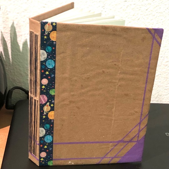
gave bookbinding another shot! the smallness of it keeps making me giggle so here’s a picture with my hand for scale
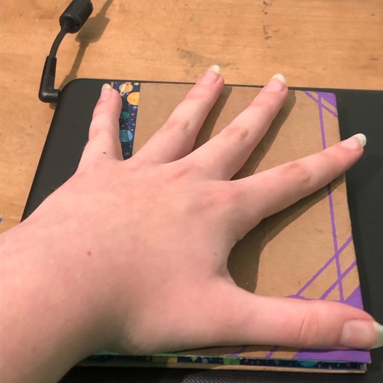
#seriously i put it in my pocket a while ago#and i can only imagine what that grin must have looked like#but yeah i really like how it came out#sketchbook#they speak
3 notes
·
View notes
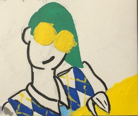
Text
I was really enjoying my outfit today and that inspired some stuff, but i wasn’t really intending to post any of it. That being said, the fact that these two were drawn consecutively is making me lose it.
1 note
·
View note
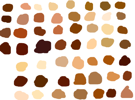
Photo
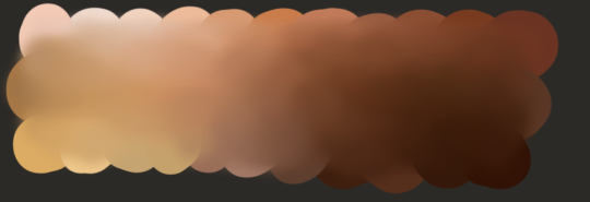
It is not the prettiest but here is a little chart I made of skin tones.
The idea is to eye-drop anywhere on the chart to get a unique skin tone instead of getting stuck in the loop of “white, tan, dark”.
340K notes
·
View notes
Text
Why do artists refuse to use references why why why.
It’s not a contest to see who can get by without them. It’s not cheating to look at a thing in order to know what the thing looks like.
You don’t get stronger or better by pretending. Nobody is impressed by the awkward whatever-it-is you just drew. Use references.
282K notes
·
View notes
Text
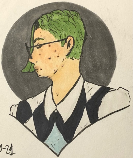
School has officially forced me to work on finished pieces for once! have this!
4 notes
·
View notes
Text
skin color ref because some of yall non-black poc and whites keep fucking up as if yall don’t know there’s other shades of brown when u racebend for woke points or something
(non-black artists please reblog)
184K notes
·
View notes