
anniesarthistoryblog
Annies Art History Blog
A blog to capture my responses to the Art History element of @strodefad
16 posts
Don't wanna be here? Send us removal request.
Last Seen Blogs

officialkohart
Kobuns Official Art


karrarin
Karrarin

futbolymar
Futbol y Mar

cloudyandcoldrain
my little blog (:
Text
Ethics and Morality
This Month we looked at the ethical aspects of creative practice and discussed whether artists should consider the moral and ethical implications of their artworks. With changes in cultural and political acceptance happening all the time, history is full of examples of artists who fell foul of moral judgement of their patrons or audiences and had their work either damaged, destroyed or removed from show.
Even though we are thankfully more civilised in our societies now that artists are no longer imprsioned or executed for offending religious sensitivities, the Charlie Hebdo terrorism attack in 2015 where 17 people lost their lives due to the publication of a cartoon that offended religious fundamentalists shows that art can still provoke a strong reaction, and the artist (and those that publish work) needs to hold some accountability for what they are creating.
This article examines some of the arguments for ethics in contemporary art. I believe that is important to remember is that looking at art is mostly voluntary- the viewer can choose whether to look at it or not it if is displayed in an exhibition, and there are many ways of interpreting work based on the individual viewer’s knowledge and experiences. The artist is expressing their views or feelings about their chosen subject through their choice of materials and how they are presented, but the impact on the viewers, (although influenced by the artist) are still out of the artist’s complete control.
We can think as artists about what materials we use, how they are sourced and what impact we have on the environemnt by using them whilst making our art, and we can influence others by the messages we are sharing in our work.
This Article by Edward Winkleman proposes the ‘non-existance of unethical art’, and to a certain degree I agree with him. However if the artist knows that their creation may cause harm to viewers either physically or mentally, or promote discrimination of any kind, then they have a duty of care to give viewers an informed choice of whether to view it or not- this can be done without taking away from the impact of the work.With simple tools such as trigger warnings or support material to promote wider conversations about the issues that the work is about, there should be no censorship required, unless the artist is deliberately setting out to offend or harm, then one would question why they would be choosing to do that?
0 notes
Text
A Review of three works from the ‘Shape and Form’ Exhibition at @heartofthetribe Gallery, Glastonbury
As our final assignment for our Art History module for @strodefad we were required to write an essay discussing eithere an art history movement or a recent exhibition visited. Always up for a challenge i chose to write about the brief opportunity I got to see an art gallery between lockdowns in the new gallery that i am fortunate to have just a few minutes walk from my home here in Glastonbury.
What made it a really special experience was that i managed to contact two of the three artist I chose to include in the essay and they very generously answered my questions about their exhibit pieces to give me some context and process insights as first-hand accounts and it was wonderful to be able to ask the creators quesitons about their work and how they made it. The exhibition had high quality contributions from over 30 Somerset artists, so it was hard to select just 3 works, but I managed and got the essay completed in time.
This is an analysis of three selected works from the ‘Shape and Form’ exhibition at the Heart of the Tribe Gallery in Glastonbury. The gallery only opened in September 2020 and despite the restrictions caused by the COVID pandemic, this was the third exhibition that the gallery has managed to stage since then.
Following a core artist group launch exhibition ‘Diversity’, and solo exhibition ‘Beauty and Truth’ by John Minshull, this exhibition was a collation of works submitted by 30 Somerset artists following an open call for contributions from the gallery core artists and online directory members.
Curated by gallery manager Kim von Coels (aka artist ‘The Krumble Empire’), the aim of the exhibition was ‘to explore the fundamental building blocks of visual art, both geometric and organic’. The exhibition was open from 3rd December -26th January and I managed to see it twice before lockdown restrictions came into force. A virtual tour (1) is also available here
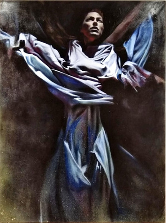
1. Millie Gleeson: ‘All We’ll Know’
The Painting was displayed in a prominent position on the last wall as you exit the exhibition, directly opposite a canvas featuring an abstract female form in greyscale graphite, and the scale of this canvas (60 x 48 inches) made it really stand out.
I saw Millie’s solo show also entitled ‘All We’ll Know’ at the Red Brick Building in June 2019. She uses reference photographs to help with composition and is heavily influenced by her time in Berlin and Mexico.
Many of her works feature masks painted on the (mostly nude) female subjects, so what I found fascinating about this piece was that the face was illuminated and prominent and she is swathed in billowing robes.
I contacted the artist for more information on the context and process of the painting.
She told me this is a self-portrait, painted from a 'still' of the artist performing in a music video her friends (the Hics) produced, also called "All We'll Know"( 2 )
Gleeson started began painting this in 2014, but it was put into storage until she revisited to complete it in 2019.
She commented ‘it was a huge time of transformation and the end of an era and perhaps I had to return to the painting when I felt I'd fully transformed.’
The Painting has lots of movement, which is representative of the video it is sourced from, the performers are in an industrial setting and are either submerged under water, or as captured in this image, rising up and breaking free. The robes are flowing and there is a sense of movement in the arms and legs. Her website (3) describes how the work was developed as part of a series developed during an Artist Residency at Arquetopia in Mexico.“The residency applied Levanasian ethics to the artistic process, teaching to respect the integrity of differences and question the desire for totalisation. Questioning whether you can truly know the other and if you only know the self, how can you respect the space between?” “Any creative project I have embarked on at the core has revolved around the topic of identity or identification. Following the residency lectures my project became entirely introspective, leading me on a journey of self-discovery. I began to look at my own shadow, distortions, fractions, mirror images, deep and dark aspects of myself. Using the vibrant colours that surrounded me I began to explore my own conflicts and duality through a series of self-portraits, in an exploration to “All we’ll know.”I really resonated with this piece as it reminded me of the Salvador Dali painting ' Christ of St John of the Cross’ I saw at the Glasgow Kelvingrove museum. Light comes from above and the arms are widely placed. The pale blue colour palette and rich drapery in the dress against the dark background is similar to that shown in ‘The Countess of Southampton’ ( 4) (Anthony Van Dyck 1599-1641), seen at the Cambridge Fitzwilliam museum.
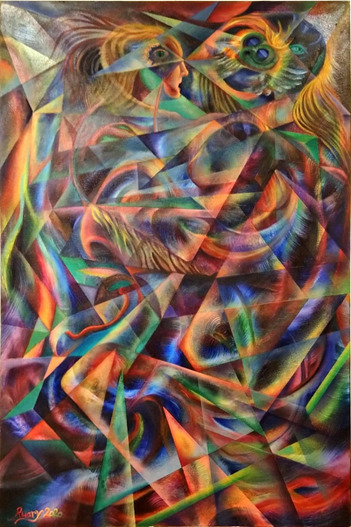
Ruary is an Edinburgh-born artist who has lived and worked all over the world and is a gallery core artist working in an attic studio above.
He is inspired by nature and psychedelic culture (6) and another of his works ‘Sacred Chaos’ was chosen as the exhibition feature image.
I interviewed the artist to learn more about the context and process behind these works. Ruary explained that “Trap Dance was a process-oriented piece, created as an experiment using masking tape to create random abstract geometric forms”.
The piece depicts two females and a male dancing, with Cubist and Italian futurists-influenced segmentation and distortion of the figures. The artist noted that the title ‘Trap Dance’ is a pun, as the two female figures appear to be being pressed together by the male dancer (Allen quipped it should have been called ‘Tape Dance’). The experimental process with repeated randomly placed masking tape and paint until the forms emerged, resulted in an abstract image.
The artist saw the forms of the dancers appearing and added them at late stages of development. It is more narrative in comparison with the cover piece ‘Sacred Chaos’; which was another process oriented, straight-edged construction using platonic forms, mathematical constructions, intersecting circles and combining them to make a striking abstract image. The artist has a lifelong interest in Alchemy in art and alchemical symbolism, and this is evident in the works presented here (7).
The colour palette is cooler at top and has more vibrant and darker tones at bottom, with a spotlight in the top left corner, which the artist suggests is reminiscent of a stage or nightclub scene. There is lots of movement as the figures are interweaved amongst the abstract shapes.
This painting is hung in a long narrow corridoor directly opposite the toilets (another ‘trap’ reference?) and adjacent to the exit door to the garden space. The works surrounding the piece are smaller in scale and have less visual impact, and I think that having to stand so close to it makes it more of an experience as the viewer is drawn into the movement and abstract forms on the canvas. There is no opportunity to stand back and see the work in a wider context so one is trapped like the dancers in the image.
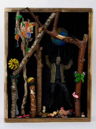
3. ‘Lost Toys’ by Julie Ackerman .
This is an installation assemblage sculpture piece selected from a collection of 10 museum themed boxes. (8). The work is inspired by the ‘cabinets of curiosities’ or ‘Wunderkammer’ (as described by Anastasiya Gutnic from the Metropolitan museum of art here with an example from the German artist Nicolaus I Kolb) (9).
The cabinet is displayed with a second piece called and ‘Science Lab’ and both are relatively small in scale requiring the viewer to lean in close to see the details.
Key elements of a Wunderkammer are:
· Naturalia (natural, found objects),
· Artificialia/Artifacta (mand-made, abstract objects), and
· Scientifica (scientific instruments and technological items)
The cabinet contents are carefully considered to reflect the message that the artist is trying to express, and fits the categories described above.
I chose this piece as the lockdown period has made many of us question what is important to us and question our consumerism and its’ environmental impact.Using upcycled packaging and materials has been a theme of my own creative practice this year.
The artist states on her biography (8)
“I was compelled to take on the challenge of using unwanted objects and materials as an art medium. Raising awareness of a world in crisis through art is paramount in my work. By transforming waste into beautiful works of art, I hope to inspire and encourage the 'Art of Recycling' turning a negative situation into a positive one.”
The artist goes on to state “The impact of overpopulation means greater demand on natural resources and an escalating waste problem. We need nature to thrive by reducing our demand for new materials, leaving nature intact.”
In the ‘Lost Toys’ cabinet a collection of sticks and a pine-cone (Naturalia) are surrounded by a plastic ‘monster’ (Artificialia) and assorted toy animals. A green butterfly rests on a branch with a wooden ’tribal style’ peg and a ‘protective’ dragon flying overhead and a lurking toy hairbrush in the background.
The second cabinet has scientific paraphernalia (Scientifica) and a skull with glasses, references to the impact of sanitary waste and plastic pollution on marine life. There are also humorous touches, like the small creature and drawing pin on top of the skull.
This fits with the exhibition theme as it invites the viewer to examine how the items relate to each other and to our own experiences. Viewers will respond to the individual elements and interpret their relationships differently.
The placing of the cabinets in a transition space between two rooms containing large paintings is also an interesting variation in form and requires a different type of interaction by the viewer.
Summary
The aim of the exhibition was to explore the fundamental building blocks of visual art, both geometric and organic, and the curator has selected a broad range of 2D, and 3D exhibits to really allow this theme to be represented. I found it quite difficult to select only three works for this essay as there was such a high quality to choose from.
These three selected artists have interpreted the theme in quite different ways, but one gets a sense of shape and form from all of their works shown.
References
1. Shape and Form Exhibition Virtual tour: https://www.infohost360.com/heart12/
2. Millie Gleeson – The Hics reference video "All We'll Know" https://youtu.be/RB2MweTwfQY.
3. Millie Gleeson website: https://milliegleeson.co.uk/all-well-know
4. Van Dyck Image reference found in Fitzwilliam Museum Cambridge guide, p37. 2016 ISBN: 978-0-9574434-9-5
5. Image sourced from https://artuk.org/discover/artworks/rachel-de-ruvigny-countess-of-southampton-as-fortune-5613
6. Ruary Allen Artist Bio: https://heartofthetribe.com/portfolio_page/ruary-allan/
7. Ruary Allen Artist website: https://artalchemist.com/
8. Julie Ackerman Artist Bio: https://heartofthetribe.com/artist-directory-view-by-artist/user/77/
9. Cabinet of Curiosities reference video: https://youtu.be/j6q10euArks Nicolaus I Kolb (German, 1582–1621). Apothecary Cart, 1617–18. Veneer: ebonized pearwood (Pyrus communis), ebony, partially gilded silver; carcass: conifer; interior: protective quilted cushion covered in red silk, drawers and chest lined with red silk velvet; gold, trimming; mounts and fittings: brass, partially gilded; thirty-two (32) vessels and utensils: glass, partially gilded silver, low carbon steel, leather, 11 x 11 x 9 1/16 in. (28 x 28 x 23 cm). The Metropolitan Museum of Art, New York, Purchase, Anna-Maria, and Stephen Kellen Acquisitions Fund, 2019 (2019.229.1a–c–.32a, b)
10. Cabinet of Curiosities reference description: https://en.wikipedia.org/wiki/Cabinet_of_curiosities
11. Dr. Beth Harris and Dr. Steven Zucker, "How to do visual (formal) analysis," in Smarthistory, September 18, 2017, accessed January 28, 2021, https://smarthistory.org/visual-analysis/.
#artists on tumblr#art history#glastonbury#ruary allen#millie gleeson#julie ackerman#heart of the tribe#strodecollegeartdepartment#anniesartthings#anndimentartist#artalchemist#the hics#wunderkammer#all we know#local gallery#shape and form#ual art and design
1 note
·
View note
Text
Art History - Conflict
Today we discussed the depiction of #conflict in art and examined the three pieces below:
· Torso in Metal from ‘The Rock Drill’ 1913–15. Sir Jacob Epstein.
· Guernica by Pablo Picasso. 1937. oil on canvas. 349 cm × 776 cm.
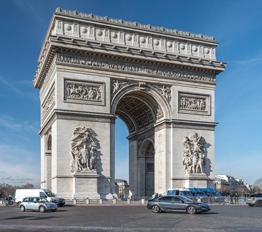
· Arc de Triomphe de l'Étoile, 1806-36, Jean Chalgrin. 50 metres high, 45 metres wide, 22 metres deep

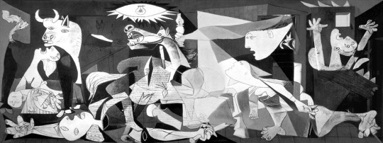
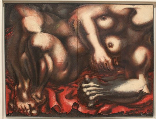
We had some very interesting discussions about these pieces and were tasked with choosing another artwork to write about. As we discussed Guernica, I have chosen another piece about the impacts of war on civilians by the Mexican artist David Alfaro Sequeiros entitled ‘Echo of a Scream’, painted in enamel on wood in 1937, so is contemporary with the Picasso piece. I was fortunate to see this piece as part of on our trip to the @whitneymuseum in New York last year with @strodefad, so the photographs are my own.
In 1936 Sequeiros set up the Experimental Workshop in New York to teach artists (including Jackson Pollock) to make revolutionary art using techniques of the past . He created this piece in 1937 at the height of the Spanish civil war around the same time as Picasso created Guernica.

The painting depicts the horrors of war and the impact on civilians- in particular a commentary on the war crimes perpetrated by Fascist forces on women and children in Europe in the1930s.
The faces of the screaming woman and child however are thought to have been inspired by a photograph of a Kenyan woman taken in 1925 by H T Cowling for the cover of National Geographic magazine, the distortion in proportion seems to make the scream feel louder. The red drape symbolises Communism, and is a strong focal point amongst the muted tones of the rest of the painting.
The horrors and devastation of war are very powerfully shown in the background with twisted and broken metal and a desolate landscape. The Artist felt so strongly about this issue that he left New York to join many others from across the world in a Republican army in the fight against general Franco shortly after completing this piece before returning to Mexico to create works like this, ‘La Guerra’ in 1939. similar in tonal range and with the flashes of red, this piece again shows a female form, but this time she is contorted and faceless. Standing in front of this huge canvas in the gallery was a very moving experience. Women and Children are too often used and abused as collateral damage or possessions in conflict situations, and this painting shows the female form in full, voluptuous flesh: they are human and should be treated as such when the powers that be decide to start conflict as too many innocent lives are destroyed by war and conflict.
#art history#glastonburyartist#anniesartthings#picasso#guernica#mexicanart#whitneymuseum#strodecollegeartdepartment
0 notes
Text
Art History Blog- Masculinity
This week in Art history we were looking at portrayals of Masculinity in art. We looked at and discussed three key pieces with very differing portraylas of the male form:
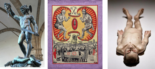
· Perseus with Head of Medusa, 1545-54, Benvenuto Cellini. Bronze, 5.2 metres tall including marble base
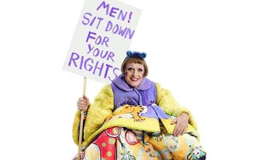
· The Death of a Working Hero, 2016, Grayson Perry. Tapestry.
· Dead Dad, 1996–97, Ron Mueck, Silicone, acrylic paint and human hair – a 2/3-life-sized sculpture
Because he is a favourite artist of mine, and I am so grateful for his efforts to keep us creating during lockdown, I have chosen to write about GraysonPerry for this blog, including, his book ‘The Descent of Man’ written in 2016 after his very moving TV documentary series’All Man’ exploring his thoughts and musings on Masculinity and our social stereotypes of what boys and men should do and be.
The artwork that we looked at in the lecture ‘Death of a working Hero’ even inspired a church sermon by the Precentor, Canon Anna Macham last August that eloquently decribes the impact and messaging of the work and compares it to experiences of Christianity.
‘ “Death of a Working Hero” was part of a TV series Perry did in 2016, called “All Man” that explored aspects of masculinity and how perceptions of it have changed over time. Perry spoke to city workers, who in their grey suits he labels “Default Male”. And in the programme that this artwork comes from he went to the North East where he met former mine workers and cage fighters. With its rich colours and pain-staking attention to detail, this sumptuous work is a tapestry with a practical use, a banner to be carried in procession from its starting point at the back of the Cathedral. It was inspired by the ceremony of the blessing of the banners in Durham Cathedral, a moving ritual which is part of the annual Durham Miners' Gala where trade-union banners are paraded through the streets accompanied by brass bands. The blessing of the banners in the glorious setting of the cathedral accompanied by mournful music, Perry writes, “seemed to me to be a funeral for a certain sort of man”.

(image source https://www.holburne.org/shop/)
In the book, ‘The Descent of Man’ and the touring art exhibition ‘The Pre-Therapy years’ recently shown at the Holbourne museum in Bath (that I sadly was unable to get along to before lockdown) Perry presents a different view of maleness and asks what sort of men would make life happier and the world a better place for everyone.
Chris Stephens from the Holbourne museum describes the exhibition in this video here
In Graysons’s work, he asks 'What would happen if we rethought the old, macho, outdated version of manhood, and embraced a different idea of what makes a man?’ Apart from giving up the stressful need to be ‘top dog’ and the vast new wardrobe options, he sugests that the real benefit might be that a newly fitted masculinity will allow men to have better relationships - and more happiness.
Here is Grayson being interviewed in October 2016 on Channel 4 about these views https://www.youtube.com/watch?app=desktop&v=YzMHaLQK2FU
Grayson Perry admits he's not immune from the stereotypes himself - as the psychoanalysts say, 'if you spot it, you've got it' - and his thoughts on everything from power to physical appearance, from emotions to a brand new Manifesto for Men, are presented in his highly accessible works created in a range of media, including tapestries, ceramics, paintings and sculpture, with a belief that, for everyone to benefit, upgrading masculinity has to be something men decide to do themselves. In his view, they have nothing to lose but their hang-ups.
(Image source https://images.radiotimes.com)
#art history#masculinity#grayson perry#alan measles#holbourne museum#anniesarttthings#strodefad#male beauty#gender stereotypes#equality#social commentary#salisbury cathedral#durham miners gala
0 notes
Text
Art History - Feminine Art
For this week's blog post about representation of female character in art I have chosen an artist I had no prior knowledge of until researching after the lecture today.
We studied three female artists today and discussed what impact and message the chosen pieces had on our views of the feminine identity.
These were:
A: Jenny Saville, Propped (1992)
B: Sarah Lucas 'Pauline Bunny' (1997) . Assemblage.
C: Cindy Sherman Untitled B, untitled (C 1975).
I chose a different artist to write about today: Judy Chicago is an American artist born in 1939 (as Judy Cohen), and the piece chosen is The Dinner Party, a large installation work (1463 × 1463 cm) created over 4 years (1974–79) made of Ceramic, porcelain, textile.
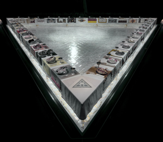
It is sited permanently in the Brooklyn Museum (a Gift of the Elizabeth A. Sackler Foundation) and forms the centrepiece for the Elizabeth A. Sackler Center for Feminist Art which occupies the 4th floor of this museum.
‘The Dinner Party’ has been described as an iconic piece of 20th century feminist art. Created in a triangular table form, it is 'set' with has 39 plates representing famous women including; Georgia O’Keeffe, Virginia Woolf, Emily Dickinson, Elizabeth I, Theodora, and Sappho.
If you look closer at the plates, they resemble female genitalia with raised central motifs that are based on vulvar and butterfly forms. Each place setting has been created in the 'style' of the person honoured there. The artist has also written 999 names in gold on the marble floor beneath the table.
The installation incorporates many different art forms and media, some typically associated with 'femininity' such as embroidery, but also includes, gold chalices and utensils, china-painted porcelain plates, and tiling work.
This piece is honouring over 1000 women and their sexuality, historical significance, and, I think most importantly, their individuality. They are not just here to serve, reproduce and conform, they each have their own talents, personality and voice, and this piece goes some way to helping us to understand that.
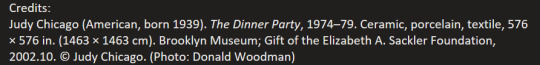
The artist changed her name in the 1960′s to represent the place of her birth, and helped set up the first Feminist Art Program at California State University, Fresno, in 1970. In 1971 with, with artist Miriam Schapiro, she co-founded the Feminist Art Program at California Institute of the Arts, Valencia.
In 1972 they created with their students a collaborative installation and performance space called Womanhouse - transforming an abandoned building into a house representative of women’s experiences. This was the first public exhibition of feminist art.
Together, the students and lead artists worked to build an environment where women’s conventional social roles could be shown, exaggerated, and subverted.*
Only women were allowed to view the exhibition on its first day, after which the exhibition was open to all viewers. There was a dining room installation space in this house and I wonder if this influenced the creation of her iconic piece over the next few years?
So, in Summary, I feel that this artist has represented female experiences and values and has challenged many sterotypes and patriarchal societal views on what women do and how they are valued.
Sources:
https://www.thecollector.com/feminist-art/
https://nmwa.org/art/artists/judy-chicago/
https://www.brooklynmuseum.org/exhibitions/dinner_party
https://en.wikipedia.org/wiki/Womanhouse
*(source Smith, Terry (Terry E.) (2011). Contemporary art : world currents. Upper Saddle River [N.J.]: Prentice Hall. ISBN 9780205034406. OCLC 696321779.)
#art history#feminist art#judy chicago#jenny saville#sarah lucas#helen shapiro#female artists#strodecollegeartdepartment
12 notes
·
View notes
Text
Social Commentary
This week in art history at @strodefad we were looking at three very different pieces of art that made comments on a social issue and were tasked with writing about an artist of our choice that provoked social comment:
The three images we discussed were:
1. Beer Street/Gin Lane, by William Hogarth (1751)

2. History Painting: Shopping Mall 1993-4, Jamie Wagg

3. Brexit Vases (2017) , Grayson Perry
I wanted to highlight the work of #LedByDonkeys as we are approaching the time that the transition period for exiting the EU is ending and the news is full of reports on the trade negotiations going to the wire. Their work has served to highlight the propaganda and lies that were told during the 2016 referendum campaign , and remind those that told them as their rhetoric changed or they seemed to forget what they had said! Using audiovisual projections onto historic landmarks like the white cliffs of Dover or the Houses of Parliament, or by poster billboards being erected or toured in areas where the protagonists live and work, this campaign gorup have harnessed the power of social media and public art to make the audiences think about what is being done ‘in our name’. Like Perry’s Brexit vases that we discussed in the lecture, this work is often very polarised and divides opinion but in essence it is simply tellig the truth about lies and divisive political policies that get whitewashed by the mainstream press depending on which political masters they are supporting.
Source https://www.facebook.com/ledbydonkeys/
Their message goes beyond Brexit though- this image a comment on the infamous ‘Barnard Castle’ daytrip that broke lockdown rules by a senior Government advisor and the hypocrisy of those choosing not to take action.
Many memes have been created mocking the ‘3 word slogans’ used during this COVID pandemic but this rings true considering the Official number of excess deaths have now topped 60,000 in the UK. Like Hogarth trying to persuade Londoners to stop drinking Gin and move to a safer beverage, Led By Donkeys are asking us to hold our Government to account for the lives they are taking by their actions (or inaction)?
Image Source https://www.facebook.com/ledbydonkeys/
1 note
·
View note
Text
Week #7 Message #1
This week we looked at the hierarchy of ‘importance’ of art styles as defined by the 17th Century rules and are tasked with examining this perception and looking at how contemporary values may challenge these ‘rules’.
Our task was to look at a contemporary artwork and critique it according to the 17th Century rules.
I have chosen a piece by the Singh Twins as I recently discovered their work and love how they entwine historical references, multiculturalism, humour and social justice messaging in their richly detailed illustrative work.
Here is a quote from their Facebook page explaining their latest piece, celebrating the 18th Century British Artist, Poet and Satirist, William Blake, a local hero here in my home town of Glastonbury.
Today we celebrate the birth in 1757 of the brilliant British painter and poet William Blake whose political, symbolic and satirical art has inspired our own practice. Our painting ‘Beast of Revelation’ pays tribute to Blake’s work by the same title. Blake’s work illustrates the Biblical account of St John’s vision of the seven headed Red Dragon bestowing power on a Blue Beast rising from the sea. Within early Christian tradition this account was popularly regarded as symbolising the partnership between evil earthly rulers and Satan’s servant or the Antichrist which would lead to the temporary stronghold of Satan over the world before his final defeat in the ultimate battle of good over evil at the second coming of Christ.
First here is Blake’s original image- ‘The Great Red Dragon and the Beast from the Sea’ which was one of a series of watercolors which portray the artists interpretation of Biblical images from the Book of Revelation. Note that the heads of ‘the beast’ are anthropomorphised, and could relate to figures from the artist’s time? (Image source https://www.nga.gov/collection/art-object-page.11499.html).
And here is the Singh Twins modern interpretation and a very insightful quote from their page explaining why they chose to create their work this way .
They explain the Religious iconography and symbolism used in both images. There are modern historical references and satirical portraiture, and they have enriched the quite muted tones used in Blake’s original painting with vibrent reds and blues, perhaps a nod to the blood spilled by British and American leaders in the image? The Muted blue-green of the beast emerging from the sea is like the Statue of Liberty, and I love their final question, provoking the viewer to think about who they might include as a head of the beast! :
‘Our artwork explores the universal and contemporary relevance of this specifically Christian theme. Satan’s reign on earth is translated as the very real evils of this world which have manifest themselves throughout history in the horrors of war and the atrocity of slavery; in the gluttony that has made species extinct and laid waste to natural environments; in the moral and spiritual decline of an increasingly individualistic, consumer society controlled by market forces and political agendas and in the self-serving interests of irresponsible and corrupt political and religious leadership..It's a timeless message.
If we were to create this same artwork today, it would look like the second image. Who would you add?’
3 notes
·
View notes
Text
Week #8 Message#2
For this blog we looked at 3 images that challenged the stereotypes on different cultures and discussed the social messaging the artists were trying to convey. The images we considered were:
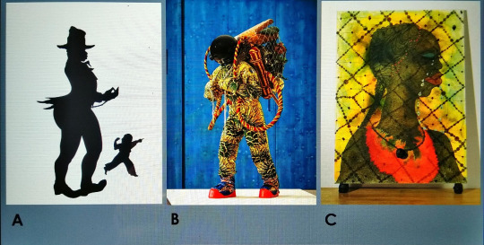
A: Emancipation Anticipation, by Kara Walker (2000). Screenprint on paper.
B: Refugee Astronaut, by Yinka Shonibare (2016) (mixed media sculpture).
C: No Woman, No Cry, by Chris Ofili (1998) (mixed media on Canvas and Elephant dung).
We were then tasked to select an artwork that challenges prejudice and explore how it has effectively communicated the message.
Challenging mental health stigma is something I feel passionate about and use my art practice and other work to start conversations about this issue (see this Blog post)
I have chosen Photographer Edward Honaker, who at just 21years-old began experiencing depression and anxiety, which he described as feeling like 'being at war with his brain'.
To cope, he turned to his camera to create a series of self-portraits to reflect his own experience of depression. The images he created are evocative and challenge the stereotypical views on mental illness, whilst retaining the essential emotional response of feeling isolated and trapped by the illness, and are a powerful reminder that, while each individual's experience with depression is personal, the feelings can be globally identifiable.
As the artist says in his interview with the Huffington post:
"I think a really helpful way to end the stigma surrounding mental illness is to be there for others who might be suffering,"
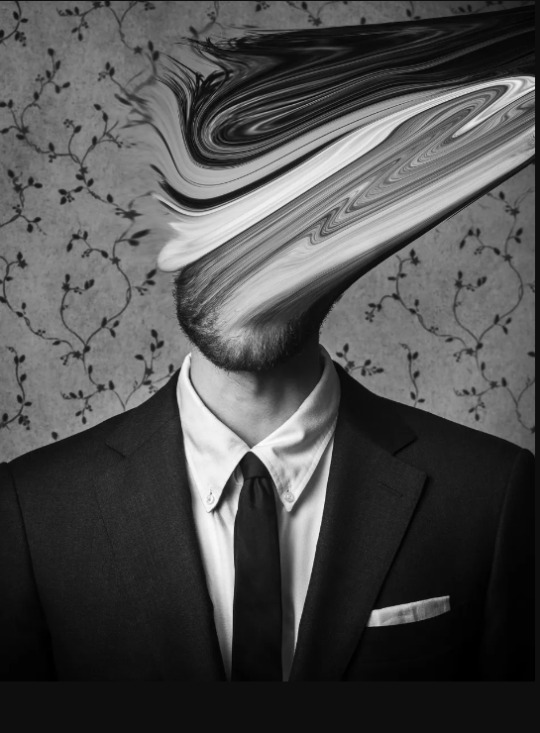
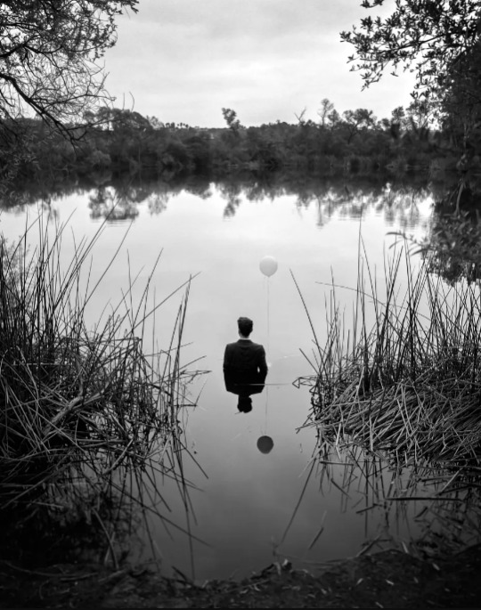
What is so wonderful about his photographs is that he is inviting Men to talk about their mental health challenges and portrays men in ‘power suits’ distorted in some way, to reflect how mental illness can affect anyone. The figures are placed in domestic settings or with props such as baloons (I believe as a metaphor for ‘getting out of your head’) and the image above with the figure half submerged in the water and their reflection is a small fraction of their real self speaks to me of how crippling anxiety and depression can be- on the outside the smart suit and ‘mask’ appear fully functional, but internally the mind is taken over by the illness. Other images in this collection comment on family dynamics and fitting in with society .
I think this quote from the artist is a good summmary of how we should respond to his work, and in general as a society:
"You never really know what others may be going through so all you can really do is be kind and nonjudgemental."
Quotes and images sourced from <https://www.huffingtonpost.co.uk/entry/edward-honaker-photography-mental-illness_n_55f0759ce4b03784e2777fbb
Images original source from: http://www.edwardhonaker.com/booktwo
#art history#strodefad#edward honaker#mentalheathawareness#photography#mensmentalhealth#challenging stigma#anniesartthings#timetochange
2 notes
·
View notes
Text
Week #6 Land and Site-specific Art
This week we looked at three very different site-specific installations by:
1. Ai Wei Wei- Sunflower Seeds
2. Andy Goldsworthy- Snowballs in Summer (2000)
3. Alexander Calder- Lobster Trap and Fishtail (1939)
Our task was to find another piece of #site-specific or #landart and write about it.
My choice for this task was to look at the Bristol artist Richard Long, who has prodigiously been creating art in respoonse to his experiences in nature since the 1960′s. As a long term admirer of Andy Goldsworthy I hadn’t known much about Long’s work until researching this blog post and can see now how much of an influence on Goldsworthy he was.
The first work that struck me was an early piece called ‘Line Made by Walking’ (1967) and is simply a photograph of a line made in long grass after the artist repeatedly walked bakcwards and forwards along it. At first glance it is merely a photograph of worn down grass, but then you consider the deliberate perpendicular angle used to take the photograph, the ‘performance art’ element of creating the line in the London park, and how this may have been perceived by observers. Transforming a regular patch of grass into his own personal canvas , I think that the artist has invited the observer to reflect on the marks they leave on their environment, and how much they take it for granted.

Long is the only artist to be shortlisted four times for the prestigious Turner prize eventually wining in 1989 for ‘White Water Line’ made by pouring white pigment directly onto the floor of the gallery- and I love this quote from the artist made seven years previously:
‘A walk marks time with an accumulation of footsteps. It defines the form of the land. Walking the roads and paths is to trace a portrait of the country. I have become interested in using a walk to express original ideas about the land, art and walking itself.’
Richard Long, Words after fact, 1982
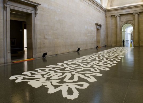
(image source https://www.tate.org.uk/whats-on/tate-britain/exhibition/turner-prize-retrospective-1984-2006/turner-prize-retrospective-2)
A second piece I have chosen by Long is just one of many he made using mud as paint, taking from it’s natural environment and placing it into a gallery context therefore connecting the two spaces. ‘River Avon Mud Circle’ (1982) was created using mud taken from the artist’s home town of Bristol and transported to the National Gallery of Canada in Ottawa, where it was ‘painted’ directly onto the wall by the artist using his body as the ‘brush’. Long created several other works using handprints annd mud which were clearly identifiable as hands, but in this piece he has smeared and smudged the prints leaving his own unique mark. There is a theme to many of Long’s works- he confines a range of materials into perfect neat circles, and this piece is one of contrasts- the chaotic, multilayered and textured mud marks are all still held in a perfect circle.
The method of creating this work makes it very site-specific, and whilst the pieces are only transient in nature (they mostly get removed or painted over when the exhibition ends), the photographs remain as a permanent record. Using this primitive technique, reminiscent of early human cave paintings, Long is commenting once again on how we leave our marks on the world.

#art history#strodecollegeartdepartment#richard long#landart#instllationart#anniesartthings#britishart#bristolartist
0 notes
Text
#5- Installation and Performance Art
This week we looked at three pieces of #installationart and #performanceart:
1. Balkan Baroque (1997) by Marina Abramovic
2. Cold Dark Matter: An Exploded View (1991) by Cornelia Parker
3. Seizure (2008) by Roger Hirons.
and our task was to comment on something in this genre that we found interesting. As an artist and performer I have a keen interest in this area and found it difficult to choose just one piece for this blog post!
I settled on writing a few thoughts about my experience of visiting the Olafur Eliasson ‘In Real Life’ exhibition at the @tatemodernuk last December. I had watched a documentary programme about this prolific artist, architect and activist before starting on the @strodefad course and was thrilled when we had the opportunity to visit this exhibition on a college trip. It contained a retrospective of the Artist’s work including a series of installations where the visitor became part of the art and thus part of the performance as we interacted with each installation and responded to the spaces created throughout the exhibition rooms.
I love this quote from the artist, (which ties nicely into our next pathway project ‘then and now’)

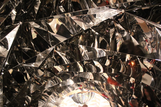
Several of the installations in the exhibition make us reflect on time and space perception, whether it is the bright strobe effect lights projected onto a wall and capturing silhouettes of visitors as a brief stop-motion type freeze-frame (Your Uncertain Shadow, 2010) , or the tunnel lined with mirrored geometric forms that distort the inhabitants view of their surroundings from all angles above , below and around as they walk throught the space (Your spiral view, 2002) , I emerged from this exhibition with mind expanded about the possibilities of how an artist can get an audience to interact with their work.
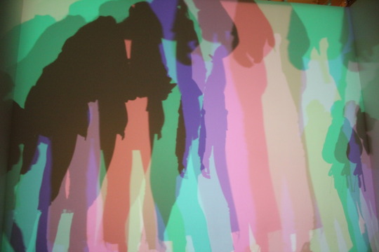
Your Uncertain Shadow, 2010 (images taken by Ann Diment Dec 2019)


‘Your Spiral View’ Olafur Eliasson 2002 (Image taken by Ann Diment 2019.
#tatemodern#olafur eliasson#strodecollegeartdepartment#glastonburyartist#anniesartthings#installationart#modernart#sculptureart#art history
1 note
·
View note
Photo
Art History Week #4 : Assemblage.
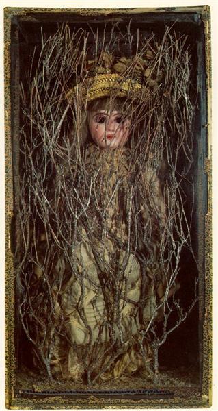
This week we looked at how artists use assemblage of found or constructed objects to convey their message. We were given a list of suggested works to study and the one that stood out for me was this nostalgic piece by #JosephCornell ‘Untitled (Bebe Marie)’ Thought to have been created in the 1940′s, the piece comprises of a Victorian doll hidden behind some branches, all contained in a wooden box frame, and is thought to be a comment on lost childhood and the constraints he felt with his domestic responsibilities.
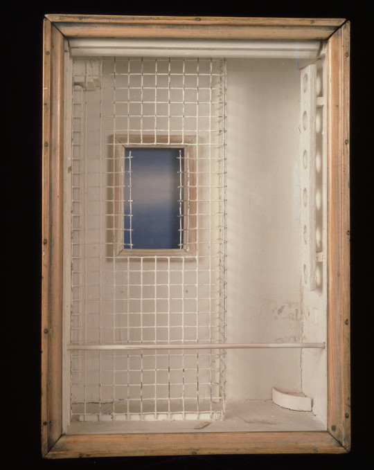
Whilst researching the piece however, I discovered another of Cornell’s works created in 1953 in honour of the American Poet Emily Dickinson entitled ‘Toward the Blue Peninsula’. Both pieces are enclosed in a box frame- symbolic of confinement (Cornell and Dickinson were known to be introverts who worked in their basements).
The ‘Toward the Blue Peninsula’ piece plays with shape, form and shadows, and includes elements of a cage and bars, ( thought to represent the Poet’s basement bedroom where she wrote her works) with a beautiful blue window implied outside of the box (thought to represent hope and optimism that the outside world could change.
This work was completed less than a decade after WW2, when America was in the grip of post-war industrialisation and standardisation. Cornell was heavily influenced by poetry in his works and It is claimed that it was inspired by this Dickinson poem in particular:
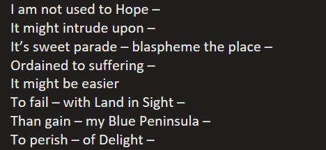
12 notes
·
View notes
Text
Art History Week 3- Materials
This week we were exploring #Stone as a material and the different forms and treatments that can be used by artists. The surface finish (or #patination) can really make a difference to the way the work is viewed and we have been tasked with choosing a sculpture artwork to demontrate this.
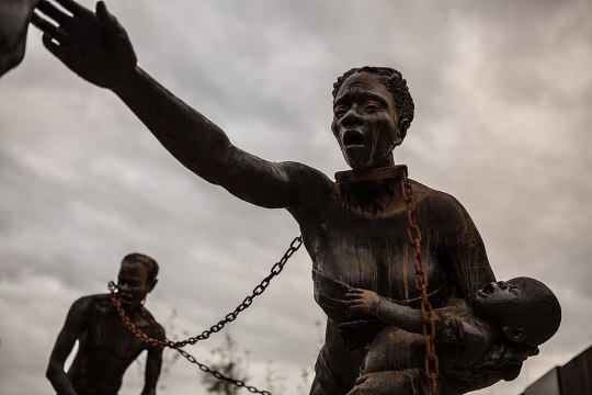
As it is #BlackHistoryMonth I have chosen the work of the Ghanaian sculptor #KwameAkoto-Bamfo, who has created large installations of sculptures dedicated to the memory of the millions of Africans who lost their lives to the Slave trade. This sculpture a Nkyinkim was installed in Alabama , USA at the National Memorial for Peace and Justice and is such a powerful piece, with the use of rusting iron chains creating flowing marks like tears or blood down the body of the enslaved figures being shown. The mother holding her baby is reaching out for help and the baby screaming and holding onto her falling dress revealing her exposed breast. The overall effect of the surface treatment of this intallation is dark and damaged, and the artist has decribed the difficulty in creating the resin cast model for this piece in his Patreon Blog here.
Nkyinkim is an ancestry project, each model is called a Nkinkim and the artist has also created hundreds of #concrete cast heads with varying surface treatments and mehtods of display, including submerging in water, half burying in the ground and placing on multiple different locations to depict the horrific trade in human lives that was taking place. He has set up an #Ancestry Project to teach young africans about their history using art and sculpture as a means of communication and providing a skilled trade. This Video shows some of his incredible work
This Image of his installation (obtained from Soniakapadia via wikipedia)
Also in the same installation in Alabama is this powerful sculpture called ‘Rise Up’ by Hank Willis Thomas featuring heads and arms of Black figures ‘surrendering’ , a comment on Police brutality in the USA.

Here the treatment of the surfaces is different- the concrete is industrial looking and urban, whereas the figures emerging are polished in places and dynamic, at different heights and with varying amounts of the faces being shown. The positiioning of the piece is in a park setting with in sight of residential buldings and the colours stand out against the greenery around it.
2 notes
·
View notes
Text
Week #3 Paint

This week’s theme is about the use of Paint in Art throughout history and I have chosen an image by Andy Warhol entitled ‘Marilyn Diptych’ as it relates to my pathway project theme #adistanceformasaroundourbodies too. See my @anniesartthings blog for posts relating to that. htis iconic image has ben considered one of the top10 most influential pieces of modern art by critics and is currently owned by the Tate.
Formed of 2 separate canvases underpainted in bright bold acrylic colours and multiple repeated silkscreen prints with black acrylic paint, they were created just weeks after the death by overdose of the iconic Hollywood actress #MarilynMonroe.
It is reported that his original intention was not to present them as a diptych, but Warhol did so on the suggestion of visiting art collectors who saw the works when they visited him. Diptychs were traditionally used in religious iconography so by combining the 2 works, Warhol is commenting on fame and how we worship public figures.
Together the paintings reflect the two sides of famous people- the bright flashy colourful public persona, and the blurred, greyscale private individual that is behind the public mask.
The fading and blurring of the images on the right canvas (created by differentially applying pressure when placing the paint through the screen) is a reference to her fading and passing, and the choice of source image used- from a publicity poster for the 1953 movie ‘Niagara’ is symbolising Marilyn at her brightest point.
In terms of scale- Warhol cropped the image to make her face larger than life and repeated it multple times (50 in rows 10 x 5) on large scale canvases over 2m x 1.5 m size to represent the public commodity that she became. Each reproduction of her image is similar but not identical and the ‘pop art’ colour pallette on the left canvas makes the left canvas seem like the movie posters you would see plastered on walls (or in modern times on advertising screens). The use of screenprinting to reproduce the face also
In the context of the time this piece was made, colour Television was still relatively new in the 1960′s, and the ultra-white teeth and bright yellow hair are in a way a social commentary of the perfectionism that Marilyn struggled to cope with and ultimately died because of. This is sadly still relevant today with Social media and press images of ‘perfect’ looks.
#popart#andy warhol#strodefad#art history#strodecollegeartdepartment#paint#marilyn monroe#screenprinting#acrylicpainting#anniesartthings
5 notes
·
View notes
Text
wk #2 Concrete
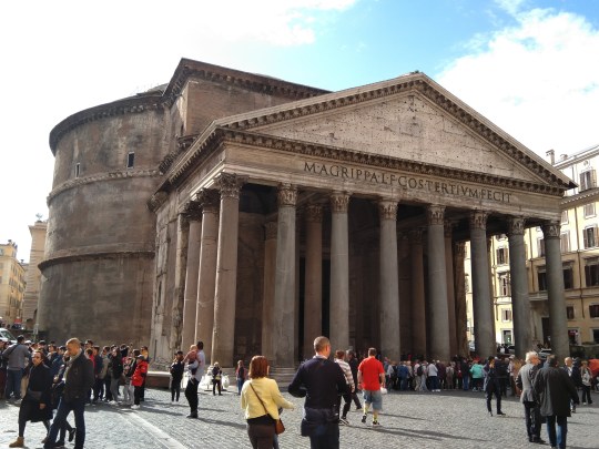
This week we looked at the properties of concrete as a material. We studied the Colosseum, as an example of how the Romans pioneered the use of concrete for their buildings, however my building of choice as an example of how concrete transformed construction is the Pantheon in Rome.
I have had the privelege of visiting this building twice and was blown away by it’s beauty, form and stature as well as the ingeneus design elements. The current structure was built for emperor Hadrian as a temple around 113-126 AD and remains the world’s largest unreinforced concrete dome almost 2000 years later!
Used as a Catholic church since the 7th Century, the building has an impressive portico frontage with eight large granite Corinthian columns backed by two rows of four more supporting a large triangular pediment with is highly decorative and demonstrates the building’s status across the piazza it stands in.
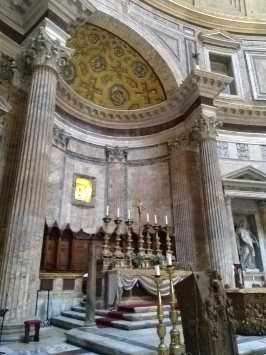
The outstanding element of this structure though is the large rotunda, topped with a massive concrete dome which has a central circular opening (oculus) allowing the heavens to be seen by all occupants. This ray of light moves with the time of day and seasons/equinoxes making it function as an observatory and connect with symbolism inside the building where different parts are illuminated at different times. The height to the oculus is the same diameter of the rotunda- an impressive 43m making the building shape harmonious and structurally sound with weight evenly distributed around the base of the dome. The ornate marble floor of the rotunda is designed with a drainage function to reduce flooding inside.
Concrete is cast in a decorative form as the pictures show, and is in contrast to the colours and highly polished marble used for the decorative pillars and altar structures and memorials inside the building. It is beleived that the external surface of the dome was gilded with bronze to represent the sun shining but these were removed in the 7th century by emperor Constantine .
Entering this building from the spacious piazza through the monumental columns and dark porch into the expansive open rotunda, it takes your breath away as you encounter the light and space symbolising the heavens. It is a truly beautiful and powerful tribute to the patrons and craftsmen who built it, and the advanced technological skills used to cast and construct a 43m diameter unreinforced concrete dome in the 2nd century AD.
0 notes
Photo


wk #2 Concrete
This week we looked at the properties of concrete as a material. We studied the Colosseum, as an example of how the Romans pioneered the use of concrete for their buildings, however my building of choice as an example of how concrete transformed construction is the Pantheon in Rome. All images taken by me on my visit in 2018.
I have had the privelege of visiting this building twice and was blown away by it’s beauty, form and stature as well as the ingeneus design elements. The current structure was built for emperor Hadrian as a temple around 113-126 AD and remains the world’s largest unreinforced concrete dome almost 2000 years later!
Used as a Catholic church since the 7th Century, the building has an impressive portico frontage with eight large granite Corinthian columns backed by two rows of four more supporting a large triangular pediment with is highly decorative and demonstrates the building’s status across the piazza it stands in.
The outstanding element of this structure though is the large rotunda, topped with a massive concrete dome which has a central circular opening (oculus) allowing the heavens to be seen by all occupants. This ray of light moves with the time of day and seasons/equinoxes making it function as an observatory and connect with symbolism inside the building where different parts are illuminated at different times. The height to the oculus is the same diameter of the rotunda- an impressive 43m making the building shape harmonious and structurally sound with weight evenly distributed around the base of the dome. The ornate marble floor of the rotunda is designed with a drainage function to reduce flooding inside.
Concrete is cast in a decorative form as the pictures show, and is in contrast to the colours and highly polished marble used for the decorative pillars and altar structures and memorials inside the building. It is beleived that the external surface of the dome was gilded with bronze to represent the sun shining but these were removed in the 7th century by emperor Constantine .
Entering this building from the spacious piazza through the monumental columns and dark porch into the expansive open rotunda, it takes your breath away as you encounter the light and space symbolising the heavens. It is a truly beautiful and powerful tribute to the patrons and craftsmen who built it, and the advanced technological skills used to cast and construct a 43m diameter unreinforced concrete dome in the 2nd century AD.
1 note
·
View note
Photo


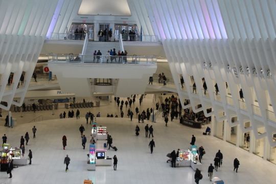
This is my #arthistoryblog for @strodefad and I will be recording my responses to art , architecture and sculpture in response to prompts provided during the course.
This week I am reflecting on the new World Trade Center transportation hub aka ‘The Oculus’ in #NYC. The building was desigend by Santiago Calatrava- a Spanish architect, engineer, sculptor and artist renowned for his innovative, nature-inspired and highly functional buildings, bridges and sports venues.
This is a modern, monumental steel and glass structure built as a shopping mall and transport hub next to the site of the original WTC buildings destroyed in the 9/11 terrorist attack. The building was designed in 2004 to replace the original PATH hub destroyed in 2001, and was completed in 2016 when it won Design of the Year 2016 and a SARA Special Design Award of Excellence in Urban Infrastructure It has openable skylights to give access to the NY skyline, and the ribs on the outside provide shade for the Memorial plaza. The vast expanses of glass allow light to flood into the spacious shopping mall and down to the transport hub beneath it.
These photos were taken by me on a visit to #NYC in February 2020 with @strodefad. I was particularly moved by this building as I had walked around the mall of the original WTC just 2 weeks before 9/11 on my first visit to NY and visited the contstruction and memorial site 10 years later when I came back to complete the NYC Marathon, so was interested to see what would be built out of that scene of destruction. The whole site is very moving, with the variety of architectural styles, sizes of buildings and reflective structures all tied so closely with the natural surroundings.
1 note
·
View note