ygoartreviews
/I'm/ the Top Ranked Card Art!
Hey it's Cyber here to rate some Yugioh card artwork!
513 posts
Don't wanna be here? Send us removal request.
Last Seen Blogs

photogetnet
صور فيس بوك

paperweightshopp
Summon the soup

ericalowe36
Done-For-You Custom Keto Diet Plan

nic-and-annie-in-france
Nic and Annie in France
Text

Armored Gravitation
This card is still noticeably an anime only card from its style, but everything about the way it was put together feels more like it came from the actual card game itself. Cool pose, a good amount of detail, and even a fun angle and some depth added in. The chaos duel disk on the left arm is a neat little detail too.
I guess the only thing here is... This feels more like a monster card than a spell card. It does represent the fully formed version of Valon's armor monsters (including an actual person to wear it), but not much here says "spell card" to me. There's no real action going on aside from some lightning and sparks flying around (and some implied motion from the background speedlines). I guess my main issue is that there's no active gravitation pulling these armor parts together going on, as they've already fully connected, around a person no less.
Rating: 8/10
#Armored Gravitation#yugioh#yu-gi-oh#ygo#Duel Monsters#Valon#Spell Card#From episode 165#I still don't entirely understand how this duel ended but oh well!#Duke and Rebecca was a funny tag duel combo
2 notes
·
View notes
Text
Because I'm curious... For those of you who watch any of the Yugioh anime series:
#Not a review#I included the last option because that's my answer#I mostly just watch one or the other for whatever series#But ever since I watched the battle city finals I've been so curious as to what they changed between the two versions of DM#I.e. I pulled up the original version of that one episode to watch Joey actually literally die#Also: I think of Weevil's “SAY GOODBYE TO EXODIA” as such an iconic line but in the original????? He literally says Nothing
3 notes
·
View notes
Text

Orichalcos Gigas
Man... I hate this guy's weird, bone/bump mohawk he has going on. Regardless of what you think of the rest of this design, his head bumps are easily the weirdest part. He wasn't allowed to have a proper nose (only nose slits), so I guess they felt it necessary to put something on there (even if their choice was..... Extremely weird). I think the only other thing I have to say here really (aside from him looking like a pretty generic evil monster) is that his upper arm/shoulder area looks soooo painful. The way his muscles were drawn, especially on the right side, make it look like his arms are physically being twisted to look so skinny in that area. How can you even live with arms like that...
Rating: 3/10
#Orichalcos Gigas#yugioh#yu-gi-oh#ygo#Duel Monsters#Dartz#Effect Monster#The duel this monster first appears in and the two duels afterwards all had me going “huh????? Wait what the Fuck is going on??????”#I haven't watched further than that yet but my major thoughts are “wow this arc is wild” and#“The dub really makes most of these villains unsympathetic”
5 notes
·
View notes
Text

Curse of Dragon
"A wicked dragon that taps into dark forces to execute a powerful attack."
Curse of Dragon definitely seems to be cursed in that it never seems to get new art ever. The classic Curse of Dragon look (you know the one)? That's how it looks 90% of the time. Thankfully, this is one of those times when it actually looks different. The choice to make the majority of its body facing dead on is really unique for this guy, even if it was probably done just to keep most of its body in frame. Another fun thing about these video game artworks that I haven't mentioned yet is that monster art often overlaps with the black and white border around it, creating a sense of depth. I think Curse of Dragon here showcases it really well, combined with its tail trailing in the background. Maybe it would be a little more exciting if the wings popped out more, but it's still very good. They really managed to make the red parts of this dragon pop in this art, which is aided by that extra, double mouth looking fin added onto the bottom of Curse of Dragon's neck, which isn't present in any other art of it. Its addition is a little weird if you notice it, but it honestly doesn't look out of place. Like I said, it definitely adds more color to an otherwise dull toned monster.
Rating: 8/10
#Curse of Dragon#yugioh#yu-gi-oh#ygo#Duel Monsters#Yami Yugi#Yugi Muto#ARC V#Normal Monster#Dark#Dragon#Video Game Art#That's the last of the video game art reviews (for now)#Idk when I'll do more but if you find one you like feel free to request it!
4 notes
·
View notes
Text

Chimera the Flying Mythical Beast
I've always thought this fusion was kind of wild, especially considering how often it seems to pop up. Then again, early DM seemed to have more creative/unique fusion monsters than the ones we get today (which mostly seem to be archetype related). Still, I have to question why they even considered that Gazelle plus Berfomet equals that mythical beast everyone knows, the chimera. Gazelle I sort of get, but Berfomet? A winged demon dude? Sure, there's the argument of "goat-headed demon," but he....... Doesn't even have a goat head here...... Also I think it's funny that they just slapped a third, backwards facing horn on top of his head. You know, for fun. Really though, I think what's always bothered me about naming this monster "Chimera" is the addition of wings, something you really don't see in depictions of the original Greek chimera. Still, it gets points for creativity (and the nebulous green background is surprisingly kind of pleasing to look at while complimenting Chimera excellently).
Rating: 7/10
#Chimera the Flying Mythical Beast#yugioh#yu-gi-oh#ygo#Duel Monsters#Yami Yugi#GX#Dimitri#Fusion Monster#Effect Monster#Wind#Beast#Hey........ Episode 163 in the dub is wild#They really said “Oh Weevil? He died”#I literally can't stop thinking about this
6 notes
·
View notes
Text
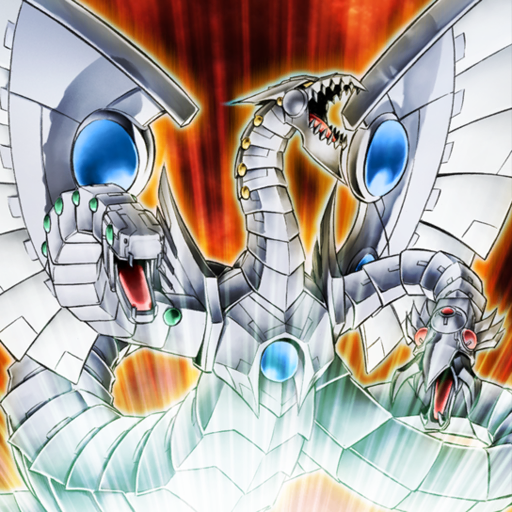
Cyber End Dragon
By request, my favorite of the two (three?) Cyber End Dragon artworks.
While I really like the "Cyberdark" version of the original Cyber Dragon, I feel like that version of End Dragon loses something. I think it's primarily the lack of dramatic summoning lighting from underneath that you can see clearly here, which projects fun little shadow puppet versions of the two side heads along its wings. The other version of the art doesn't have that, and even the redone Rush Duel art gets rid of that detail in favor of more blurred shadow look. But really, in the end, you just can't go wrong with classic Cyber Dragon colors, even if the darker color scheme is cool, too.
About Cyber End Dragon itself, I love the distinct head designs it has, especially for the two side heads. You got the cool, snake like, green eyed one on the left there, and then there’s the one on the right that barely looks like a head and more like some sort of sick battle mace. It’s definitely the one that least looks like it has eyes, but it’s still cool nonetheless. Of course, you can’t forget the addition of the wings to this guy, making it look more like your typical dragon than most other Cyber Dragons.
Rating: 10/10
#Cyber End Dragon#yugioh#yu-gi-oh#ygo#GX#Zane Truesdale#Syrus Truesdale#5Ds#Paradox#Fusion Monster#Effect Monster#Light#Machine#Original Artwork#I'm looking at the redone version of Cyber Dragon that they did for rush duel and I'm crying#How did they make the bend at the front look so clunky aaaaaaaaaaaaaaaaaaaa#You're breaking their spine!!!!!!!!
9 notes
·
View notes
Text

Kageningen
"He yoozes both a physical and a shadow form ta attack. So he's a tough monstah ta beat!"
Out of the random video game card arts that I selected to review this month, this one is my absolute favorite. I think this card alone showcases why I've been wanting to review these. They took a card with not very exciting art and turned it into this! Like, that blue shadow guy is literally unmelding himself from the main red guy. The area where they're still pulling apart is purple instead of just kinda a blurred area like on the main art. I know it's just pixels but you can really feel the motion in this one; like there's even some strands of hair still being pulled taut!! This whole thing is just a massive improvement over the original honestly.
Rating: 10/10
#Kageningen#yugioh#yu-gi-oh#ygo#Duel Monsters#Joey Wheeler#5Ds#Normal Monster#Dark#Warrior#Video Game Art#I've been having to take allergy meds at night so I've been soooo sleepy lately#-snoozes in the middle of writing reviews-
9 notes
·
View notes
Text
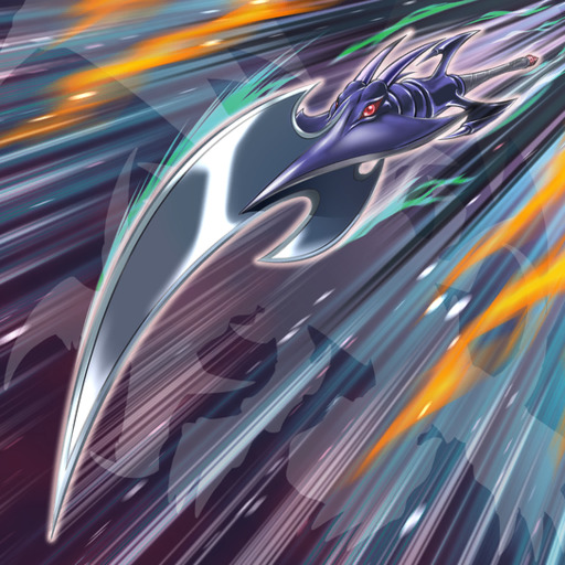
Red-Eyes Black Dragon Sword
I feel like the main downside to this card is that it's not as funny as either Time Magic Hammer or Rocket Hermos Cannon. It definitely gains a lot of points for actually resembling the iconic monster used to create it (for once), but I like the silliness of the other two much more. That said: this is still a pretty damn cool sword. Who wouldn't want a dragon themed sword, especially a Red-Eyes one? While the sword itself is cool, I do wish it stood out more from the background like the two Hermos fusions I've reviewed previously. The major colors used for the sword itself and the background are the same (black and gray), with only a little bit of green and orange present for effect. A red background would probably pop much better, while still being fitting for Red-Eyes, of course.
Rating: 8/10
#Red-Eyes Black Dragon Sword#yugioh#yu-gi-oh#ygo#Duel Monsters#Joey Wheeler#Fusion Monster#Effect Monster#Dark#Dragon
5 notes
·
View notes
Text

Winged Trumpeter
Today we have: just a little guy in some big poofy pants. And uhhhhhhh no shirt.
For a guy whose name includes the word "Trumpeter," you sure don't see a whole lot of the namesake trumpet in this art, nor are the parts you do actually see drawn very clearly (as in: it's nearly impossible to tell that he's blowing into the end of the horn, when the trumpet just seems to end in a weird spiral). Despite this (and some wonkiness on his hands), he has such a charming little outfit, even if he isn't wearing a shirt of any kind. I genuinely think it's interesting that his actual wing (the one not connected to his hat or boots), is attached to his arm and not his back. Interesting implications for flying there. They also maybe should've included a wing coming off of his other arm, but oh well.
Rating: 5/10
#Winged Trumpeter#yugioh#yu-gi-oh#ygo#Spell Card#Video Game Art#Hey did you know? There are cards exclusive to yugioh video games? (I did not)
2 notes
·
View notes
Note
As someone who discovered your blog recently I didn't realize it's been going for so long! I love how much thought your put into your review it's always a treat to see one of your posts on my dash.
Lol yeah I started doing this wayyyy back in 2018, but I only ran it for a year before getting distracted with real life things.
Thank you so much for your kind words! I try to make every review as entertaining as possible, whether its through actual review-like language, silly 1-2 sentence statements, or even proclaiming how much I love certain funny little Yugioh monsters that I've never heard anyone else ever say they love lol. But really, I just love talking about Yugioh cards, even if I don't consider myself super good at actually playing Yugioh.
#Not a review#I literally made this blog in the same month that I started reading Dungeon Meshi; a fact I've been thinking about a lot lately#So much has changed in 6 years but also I'm still enjoying some of the same things as back then#Like silly Yugioh cards lol
3 notes
·
View notes
Text

Vanquish Soul Caesar Valius
This dude's design is wild, but man does he have so much goddamn energy. Look, he even crushed the shit out of that blue and purple rock with his bard hand!! Back to his design for a moment though, the way his thighs are built is insane. His knees even have mouths??? For some reason??? Impossible to say what they were really going for here other than "make him as spiky as possible." This card is technically extremely busy in terms of everything going on, but there's so much contrast between things that it all manages to stay distinct. For a specific example, the use of bright red and blue (and even purple in the background) for the energy swirls was such a smart decision, as it makes them visually separate from the darker parts of Valius' body and the duller parts of the portal(?) background. Normally, the use of light blue here would bother me, but they really pulled it off. The cyan reflections all across Valius speak volumes to the attention to detail present here. Whatever's going on in the background is intriguing, especially since the wooden(?) frame of the portal seems to be disintegrating into nothingness.
Rating: 9/10
#Vanquish Soul Caesar Valius#yugioh#yu-gi-oh#ygo#Effect Monster#Earth#Dragon#This card feels like the exact opposite of the one I reviewed yesterday
9 notes
·
View notes
Text

Icejade Curse
I'll be real, I don't really like the washed out look this card has. Looking at some of the other Icejade cards (specifically Aegirine and Kosmochlor, who are featured in this card) makes it seem even more glaring. There's just so much color and value differences there that this card has extremely little of, even with Aegirine (who's primarily white colored). The only part that stands out even a little is the remains of Kosmochlor, which I guess is kinda the point, but she's fairly small and tucked away into the corner, and additionally, the white reflections from the background just make her blend in as well, especially towards the top. I guess I just wish that this card had stronger outlines around everything (a la Oracle of the Herald, which also has lots of pastel colors but maintains so much definition, or even Soul of the Supreme Celestial King, which has bits of darker color scattered throughout to break up the ultra brightness).
Rating: 4/10
7 notes
·
View notes
Text
Second Sixth Anniversary Stats
It's this blog's anniversary again! Boy does time sure fly (especially when you don't actually... Use a blog for several years...). Anyway, here's some stats for this blog over the years!
Top Ten Posts
Number 1: Ankuriboh at 147 notes
Number 2: Performapal Classikuriboh at 101 notes
Number 3: Performapal Barokuriboh at 58 notes
Number 4: Scapegoat at 54 notes
Number 5: Performapal Uni at 44 notes
Number 6: Kuriboo at 44 notes
Number 7: Gunkan Sushipyard Seaside Supper Spot at 42 notes
Number 8: Odd-Eyes Wizard Dragon at 42 notes
Number 9: Bowganian at 38 notes
Number 10: Elemental HERO Stratos at 38 notes
(Of these, only Scapegoat, Uni, and Stratos maintained their top ten position; every other card is new!)
Total Notes: 3951 notes
Total Followers: 265 followers
Total Reviews: 376 reviews
Average Rating Given: 8.3 (Now includes three previously excluded ratings, but not the one from the single submitted review)
Link to the First Year Anniversary Post for comparison
#Not a review#Anniversary#I wanted to do a section of stats Just from the past year but uhhh#It wouldn't look all that different from the total stats honestly because this blog doesn't have as much history as it Seems like it should
3 notes
·
View notes
Text

Cyber Search Dragon
The "deer in the headlights look" comment I made on Cyber Eternity Dragon just got a whole new meaning.
I adore that they finally made another Cyber Dragon that looks similar to Cyber Barrier Dragon, just outfitted for lighthouse duties instead of defense this time. The placement of its search beacons are not at all efficient in any way, but I guess the sheer number of them makes up for that. I think the one in its mouth is particularly funny in its placement, but it's also probably the only one Search Dragon has any directional control over lol. Judging by the light leaking out of the grated areas of its body (and the lit up portions of its head), there seems to be an implication here that this dragon is made out of light, or, at the very least, just a gigantic battery made to produce light and nothing else. Take off the outer metal shell, and I'm sure this guy would just basically be a huge, glowing conduit. I can't get over how much its head looks like a shark's, especially with the addition of those sharp metal teeth (and the obligatory metal tongue slapped in there for fun). The hazy/foggy background was done so incredibly well, and I love the way Search Dragon's light beams interact with it, cutting through the haze but not without illuminating the particles in the air as well. The dark purples and blues contrast well with Search Dragon's yellows and oranges too.
Rating: 10/10, the search is over
#Cyber Search Dragon#yugioh#yu-gi-oh#ygo#Effect Monster#Light#Machine#Anniversary#The one time a year I allow myself to be completely self indulgent with Cyber Dragon cards
8 notes
·
View notes
Text

DNA Surgery
Surgery time! Time to fix your DNA! These three must be super tiny if they're going to do something as intricate as DNA surgery, if such a thing is even possible (or plausible).
My main wish looking at this art is that these guys were drawn closer (/bigger). There's so much empty space at the top, especially above the two nurses!! Sure, you gotta get those operating room lights in there for an alien abduction examination type feel, but they don't necessarily need so much space to themselves. The framing of this scene is kinda wild too, if you really look at it. If you look close enough, the blonde nurse is holding onto the handle of what is most likely a hospital stretcher, which is somehow pointed towards the viewer without running into anything??? And this doctor guy is either mega tall or standing right on top of the viewer. I will say though, I love that his head mirror was drawn exactly the same way as his eyes, making him look like he has three eyes total. The nurses are drawn super cute though, and I especially like their black dot eyes. Part of me thinks that it's funny that, despite all the minor censoring they'll do, they didn't mess with the boobs on these blue elf ladies at all. Not even the blonde one who has more defined boobs.
Rating: 5/10
#DNA Surgery#yugioh#yu-gi-oh#ygo#Duel Monsters#Weevil Underwood#GX#5Ds#Continuous Trap#From episode 161: where I was robbed of seeing full insect type Gaia the dragon champion and had to look it up myself#Did you know? I have a fake version of this card
13 notes
·
View notes
Text

The 13th Grave
"A zombie that suddenly appeared from plot #13 - an empty grave."
In pixel form, this skeleton somehow manages to be that much more sinister. It's probably the now toothless gaping mouth and the directly staring into the camera dead, empty eye sockets. Its pose also radiates confidence, leaning on its clearly slanted sword and yet maintaining a completely upright position. I can't get over how well the bones were illustrated here at such a small size. Like, damn that really is a whole ribcage in there, huh? Rendered with so few colors? Amazing. The blue robe here, however, unfortunately looks like it's melting right off this skeleton, especially towards the bottom.
Rating: 7/10
#The 13th Grave#yugioh#yu-gi-oh#ygo#Duel Monsters#Duke Devlin#GX#Normal Monster#Dark#Zombie#Video Game Art#Been thinking about reviewing some of these for a while and I figured anniversary month was as good a time as any
6 notes
·
View notes
Text
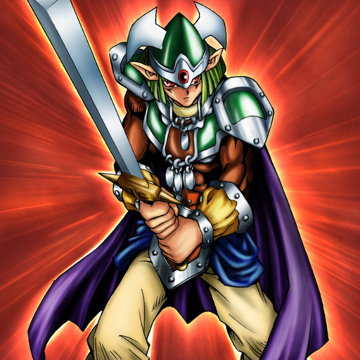
Obnoxious Celtic Guard
The fact that there is literally zero distinction between this guy and the actual Celtic Guardian is hilarious. They really just wanted Celtic Guardian 2: He has an effect this time. While I like Celtic Guardian, the fact that this guy has no differences from him at all aside from a different pose (consisting of an actual battle stance) and a background with speedlines radiating out instead of up just doesn't make it seem like all that much effort was put into designing him. Oh, and also, I guess he looks a lot less like he's on fire. But you know. Still the same outfit and everything.
Rating: 4/10
#Obnoxious Celtic Guard#yugioh#yu-gi-oh#ygo#Duel Monsters#Yami Yugi#Yugi Muto#GX#Effect Monster#Earth#Warrior#Original Artwork
4 notes
·
View notes