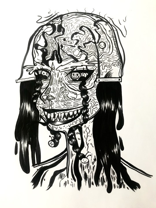
#we got tasked with drawing something “related to the lgbt community”
Text
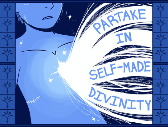
I will always insert transsexuality in my homework god bless <3
Alt text color under cut
#i do art sometimes hi#art#transgender#trans#trans art#queer#queer art#queer artist#trans artist#i love being trans <3#trans positivity#transfem#uhhh running out of tag ideas so ig i explain myself!#we got tasked with drawing something “related to the lgbt community”#AND#“monochromatically blue”#cause it was gonna go in a big ass pride flag or whatever#but we'll see just how well that turns out lol#oh yeah it was smth lgbt or smth generally related to sex education which#oh kay#anyways#trans divinity#trans joy#amirite#the first pieces i made i was so so not happy with they were way too simple#and honestly didnt convey that much of a message#this one im okay-er with#maybe itll grow on me idk#god i hate how the text ended up#i hate writing and i hate drawing in drawings and i hate having to draw knowing ill have to write
211 notes
·
View notes
Text
Overall Evaluation
This is my overall evaluation for the college year so far.
Artists that have impacted my work
In the year so far, I’ve already done a lot of research on many different artists, all of which relate to my practical work. I feel that every artist I have studied and analysed has given me a better understanding of certain techniques, topics, etc--but these artists have impacted my work and ideas the most:
Eduardo Recife
Eduardo Recife is a famous typographer/artist who is well-known for his ‘Misprinted type’. His use of unique, handwritten typefaces has given me a better idea of how typography can be used effectively in work to communicate messages, and different techniques to consider when hand-making type. As a lot of my work included handwritten type, finding a way to make it interesting proved to be quite a challenge for me.

I analysed this piece of his because I found it to be the most helpful in that area, as each letter was different in its own way. It also helped me go out of my comfort zone with typography-related work and make more attempts at complicated techniques, even if it went wrong.
Peter Bankov
Peter Bankov is most known for his poster creations. He’s one of the artists that I researched and was the most influential on my Photoshop works. His techniques fascinated me, and I found that my work instantly looked a lot better after using them in my postcards. One of the main techniques I used was colour isolation, which transformed certain images into something with an extra layer of colour over it.

I used a lot of this effect to enhance certain images in my postcard and/or give them more colour.

His overall poster theme was also quite influential on my work. A lot of his font choices were very grungy/graffiti themed, and when I started using those type of fonts in my postcards I saw a lot of improvement in my work. An example of this would be in my animated postcard, and the ‘BANNED’ lettering. The typeface feels a lot more memorable with the chosen font, and the decision was very much based off of Peter Bankov’s work.

Linda Zacks
Linda Zacks was one of the mixed media artists I researched, and her work was very inspiring to me. I really liked her monochrome and rainbow colour combinations in her work, and her techniques are something I use a lot of in my work.


These two pieces of work were what gave me the ideas for this piece, which was soon transformed into a postcard:

Ideas behind my work
As our tasks circulate around the idea of our headlines, pretty much all of my outcomes have been based around that. However, a topic that I’ve particularly leant towards throughout this project is LGBT/trans issues, as it’s an area I feel strongly about and is something that I’ve made art about in previous projects such as my GCSE Art. As someone who is a part of the community myself, I find it very easy to express my art through something that I have been through personally.
When creating my concertina, I used that theme as something to work from in my individual designs. When the monochrome aesthetic of the left and right sides of the concertina both developed into the colour in the middle, that symbolised the mental improvement of being LGBT, and a story is told from each sides. I really liked how my concertina turned out overall, and is probably one of my favourite pieces I’ve done in the course so far.


Materials/techniques I’ve found through this project
Looking back at the work I’ve completed so far, I found a common pattern with a lot of my pieces. I’ve experimented a lot with collage, something that I’ve never tried properly at home, and I’ve picked up a particular technique from that along the way.
In my visual work, I really like tearing up random pieces of text from newspapers, magazines, books etc and sticking them all down to create a jumble of words on a page. If I’m unsure of what to do for my background, that’ll usually be my go-to technique. I really like using this technique because it’s simple, yet looks really nice on a page once completed.
Here’s a few examples of this being used in my work:

Thursday’s drawing sessions
I’ve found that I haven’t attended a lot of Thursday’s lessons due to my family having to self isolate for a while, but I’ve learnt a lot from the sessions I have attended/sessions I’ve completed online.

When we experimented with our layered ‘train people’, admittedly it was something that I was very new to. But as I progressed with the tracing paper layers, I actually found that they didn’t need to be too detailed to create an interesting effect. I found that the layer at the bottom-right of the page was a good example of this, and I found that it contrasted really well with the more detailed ones. As someone who focuses a lot on detail in my drawings, this was a good exercise for me to go more out of my comfort zone with experimentation.
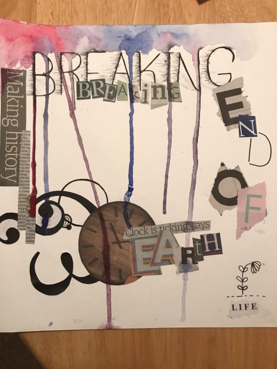
This also applied when experimenting with my ransom note-inspired pieces. There’s a lot on this page which I’m not particularly fond of, for example the ‘BREAKING’ text at the top. However, there’s a lot on this page that I actually really like, such as the ‘Clock is ticking, says Earth’. A lot of these sessions have taught me to be more experimental with my work, even if it goes wrong, which is something that I don’t usually do with my personal work. So in that sense, I think I’m slowly improving with it.
Outcome process
For this, I’ll use the process of this piece of work as an example:
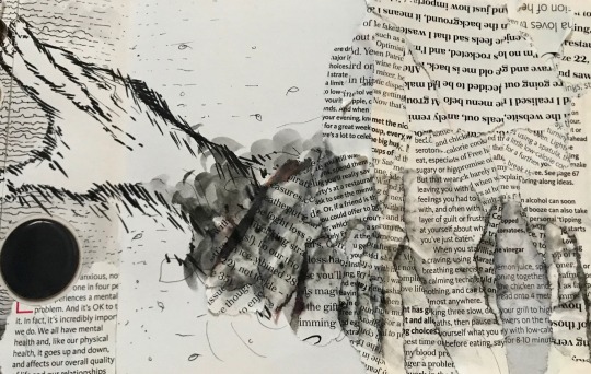
The majority of my outcomes are always inspired by an artist/an artist’s piece of work, so I start off with that. Using Pinterest to look through artist’s work is good to get some ideas flowing, and I can use certain images to study little details and techniques that I could use in my own work. For this piece, I began studying this:

There’s a lot in this image, but as I study more and more of the details I begin to pick up on what makes the style look unique. There’s a lot of drippy patterns and effects, and a lot going on inside the face with creatures inside the brain etc. I’ll then make a note of these elements and try them out in my own work.
I sketched the drawing in pencil, so that I could rub out any mistakes and generally be a lot more free with my experimentation. After I’ve sketched it and I’m happy with the initial ideas, I line everything with my Micron liners, and a marker pen for the larger lines. One thing I noted was the variety of widths in the original artwork, so I make sure I use a variety of pen widths for the drawing.
Once I’m happy with the finished result, I take a photograph and upload it to my blog with some critical analysis and links to the artist.
This is the process I go through when creating my work summed up in a Flow diagram.

Music to link with work
While I work, I like to listen to a lot of music in the background as it helps me get in a creative mindset. If I could link my work to any music in particular, it would probably be the album O My Heart by Mother Mother. One reason for this is because I usually listen to that album a lot while doing my college work, but also because a lot of their music is based around the ideas of gender and body issues; a topic that I often base my art around.
How much time I spend working at home
In my offsite sessions, I make sure I work the same amount of time I would on a regular college day to ensure that all of my art and research is done in time for the end of work hours. Sometimes I’ll work an extra few hours after that if I have a particularly high workload that needs to be completed, or to catch up on any work I’ve missed.
On days where I have free-time, I make sure that all of my work is completed so far, and if not I’ll spend at least a few hours updating my Tumblr and doing practical work. I prefer my work to be all completed by the end of the week so that I don’t fall behind on future weeks, so I try my best to make sure I’ve done as much as I can before the new week begins.
My workspace
My workspace for both college work and hobby work at home is always at my dining table, and on offsite days I wake up early to sit up the table and complete work on my family laptop. I’m not sure why I like working at this place in particular, I just find it a lot easier to focus in this spot and feel a lot more productive when working.

Skills I’ve learnt from the project
I’d say that the main skill I’ve learnt from this project is how to use Photoshop and use the tools to create work related to the theme. I had some experience with similar programs, one of those programs being Medibang Paint Pro, but Photoshop seemed a lot more complicated than Medibang so it was hard to get my head around at first.
One thing I’m quite proud of was figuring out animation in Photoshop. I couldn’t attend the session where the class focused on how to animate, but I still wanted to complete it in time for the assessment on Monday. I went on Youtube and looked up a few videos on how to animate in Photoshop, and it was admittedly very hard to figure out at first. Eventually, I got my head around it and produced a short animated postcard that I was very proud of.
Evaluation Conclusion
In conclusion, I’ve learnt a lot from this project so far. From learning new skills such as collage and Photoshop, creating lots of meaningful, experimental pieces of work, and how to apply certain techniques into my work--all of that coming together has helped me not only understand the true meaning behind my headlines, but also the true meaning behind Messages: Read All About It. I feel like I have a much more solid understanding of how to create outcomes that link to the theme well, and I feel that this will give me a better idea of what to expect for our projects in the future.
0 notes
Last Seen Blogs

laweonakenny
LaweonaKenny
dear-dale
My Dearest DALE STEYN
krisrampersad
KrisRampersad
anheelee-blog
"dream high, aim high"
rreedrosson-blog
R Reed Rosson