#ur telling me I gotta add shadows under all these layers
Text

tiny paper cut out gin from a secret santa event I forgot to post oops
#my son#gin ibushi#yttd#your turn to die#I want to see him grow up happy and healthy. he deserves the world#kimi ga shine#also digital paper cut art is very fun to do but so tedious#ur telling me I gotta add shadows under all these layers
158 notes
·
View notes
Note
I love your comic edits! How do you do ur coloring?
thank you! it’s all about adjustment layers!
under the read more I spell out the basic step by step process I used to recolor the original art on the left (Dazzler, from one of Stephane Hans’ covers for X-Treme X-Men) to look the way it does on the right. I don’t use a PSD, instead I do every single panel from scratch, which is what I’d recommend doing, as it allows you to customize your coloring!

first……………………………gotta throw on a LEVELS layer. for every layer I use in this tutorial, I’ll screencap my layer settings, but every coloring will call for different settings on the adjustment layers. the settings I used on this panel are pretty standard for my usual colorings, but you just have to monkey around with them and see what looks good! trust your eye.
the levels layer allows you to adjust the lightness levels of your shadows, midtones, and highlights. this adds contrast, and I tend to use levels to make the whites in the image match #fffff white more closely, and to make the blacks match #00000 black. I normally use 14 // 0.91 // 235, but for this art, I used the settings below, to accommodate for the tones in Hans’ watercolor style

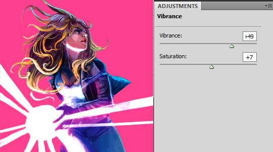
next up, vibrance! honestly, I always throw on a vibrance layer with the same settings (+35 // +7) then finish the rest of my adjustment layers, and then I go back and fix vibrance. it can be hard to tell if you’ve oversaturated the art before you finish adjusting colors, but vibrance will make your colors pop, and saturation will make them more vivid. be careful with saturation settings, or you’ll get wonky colors!
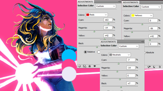
then I put on a selective color layer. this is the most dramatic change of the three layers I’ve put on, as this layer allows me to edit the colors of an image by color. for this panel, I adjusted the reds, yellows, cyans, magentas, neutrals, and blacks. Below, you can see my settings in the reds, yellows, and neutrals tabs. I Always throw on a +7 for blacks on the black tab, and a +7 or higher for blacks on the neutrals tab, adjusting that per image, but the adjustments I make otherwise all depend on the image, and the colors I am trying to match. In this image, I was trying to make Alison’s hair blonder, make her skintone a little more natural and less magenta, make her jacket and jeans match the blue in my palette, and to give her light blast a hue that matches the pink in my palette.
One thing that’s helpful in my opinion is to have an extra layer on top of your canvas where you keep your color palette, so that you have it on hand to match colors against.
so, after applying my selective color, I’m really unhappy with how un-blonde Alison’s hair looks, and I don’t think I’ve matched the tones I want to end up at. so I’ll do two things.
first, another selective color layer, but with a layer mask applied, so that I’m only adjusting Alison’s hair. I want to really up the yellows and drop the cyans in her hair, but nowhere else in the image. at the bottom of the layers tab, you’ll see buttons like this (or, you will if you’re using the version of PS that I am. if not, I promise the button is somewhere, but idk where for sure. google will know!), and the circled button will allow you to put on a layer mask. on your mask, paint with black on the areas you don’t want the layer to affect, and paint with white the areas you do want the layer to affect.

next, I painted over that same area with a shade of yellow I eye-dropped from Alison’s hair in another panel so my yellows are consistent, and set the layer to multiply. I wanted to fix the blues and pinks, so I painted over Alison’s coat and jeans with the blue in my palette with a layer set to color, and over the lightburst with a layer set to color, and then, to make the white take on a pink hue, I duplicated the pink color layer, and changed it to multiply on a low opacity.

there are plenty of layer settings to play around with, but in my experience, the best results when trying to match certain colors come from layers set to either multiply, soft light, or color, depending on the art and the colors you’re using, and would recommend just messing around and seeing what looks good. there isn’t really a wrong way.

finally, I added a brightness layer to brighten the image up! I tend to like bright colors when I edit, so I’ll normally boost saturation and brightness at the end of my coloring, to give the colors as much pop as I can without oversaturating anything, and leaving the colors still feeling more or less natural looking to me.

then, it’s time to turn this canvas with colored art into a finished panel! this part’s truly all trial and error, you throw stuff at the canvas and keep what looks good and delete what looks bad. I can’t really give a tutorial on this, but if you have specific completed panels that you want to know how I made them, shoot me an ask detailing what panel in what graphic, and I’ll do what I can to explain what I did.
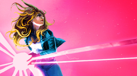
here’s what my finished product for this looks like!
I HOPE THIS WAS HELPFUL! I know it sounds complicated and there were like 465 steps, but it’s pretty chill once you get started. lmk if you have any more questions, or if there’s anything in this tutorial that was unclear : )
10 notes
·
View notes
Last Seen Blogs
inkwelloftheheart
🎀Inkwell of the Heart🎀
missamyrisa2
The Giggly Menagerie
naturalwellness365
Untitled
rainbowrocketquotes
rainbow rocket shitposting
afrohemien
Afrohemien