#trying to diversify my style a bit
Text

tripped
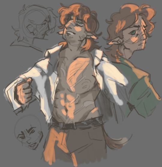
#hermitshipping#scarian#gtws#goodtimeswithscar#grian#parou sketches#trying to diversify my style a bit#i think its working
473 notes
·
View notes
Text
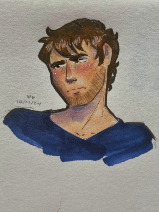
nobody's bought him flowers before
#redacted asmr#redacted audio#redactedverse#art#illustration#redacted david#david shaw#quick lil thing for his valentines video bc its cute even though he has been banished to B tier and below for his shenanigans#is this a design change or is my art style shifting?#what are you a cop how did you get into my house#i am trying to diversify my character designs a bit though#recovering from only being able to draw skinny 20something year olds syndrome#also david says vase wrong and for that he got knocked down a few pegs
29 notes
·
View notes
Photo
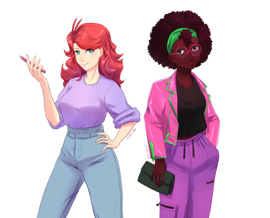
new VN sprites to pad out my portfolio in the meanwhile
#trying a bit different render style and diversify my portfolio while there is a down time with new work#it is a bit hard to with everything happening all at once all the time#but hope with new meds I'll start getting out of bed at a more reasonable hour
4 notes
·
View notes
Note
I wanted to vent, but also ask an honest question. Since I was a teenager, I always wanted to work on character design. And one thing that always caught my attention was how I always preferred male character designs over female ones. My first thought was that I was always more into androgynous fashion and more masculine styles. But time passed and I came to the conclusion that it wasn't just that, and it seems that male characters can always be different things: fat, thin, handsome, ugly, short, tall, young, old, etc. and female characters, for the most part, fall into two categories: cute or sexy. I wanted some tips on how I can make female characters with more interesting designs, without having to fall into those two categories. I love your work and you managed to make someone else like the three musketeers <3<3
Hello ! That's definitely a good question and something I think about a lot. The bias towards beauty is very strong in character design and it takes a conscious effort to diversify output in that regard.
That sort of advice might be a bit obvious, but one habit I picked up from the director on my first feature film gig was to actually "cast" characters. Without reference, we tend to go for the kind of symmetrical face and "average" features mostly out of stylistic habit. I like to look at character actors with distinct faces (I like this pinterest page that has a lot of faces in one place) but also just acquaintances or pictures of random crowds.
When designing a character, at first I'm always building a big reference board trying to decide what Type of Guy (gender neutral) I'm going for, trying use photos rather than other people's art, because I want to rely on automatics and graphic symbols as little as possible. Whether I'm designing a man or a woman or other, I use references of fashion styles and people across the board in terms of gender so I keep the scope open. Sometimes a character ref board for me will be a picture of one of my aunts next to a bunch of screenshots of Columbo.
In my experience, a lot of the times, it's mostly about going with styles and archetypes the same way you would for a male character, and switching it up somewhere along the way by looking at real women in your life and beyond as a grounding mechanism. Sometimes that will mean changing almost nothing, because the borders between genders and how you characterize them is blurry and fluid, and sometimes it will mean using features that are uniquely tied to some sort of female experience.
I enjoy realism and I think getting more proficient at it did help me diversify my designs (I find that more difficult to do with more minimalistic styles). Still, I am mostly a fantasy artist and in my case that comes with some amount of stylization and idealization of shapes and looks. I'm far from perfect in my biases and I'm not going out of my way to draw "ugly" characters because that doesn't mean much to me ; I try to draw inspiration from the faces of every day people and I associate it with my love for fashion. It's also worth noting the work I post here for fun is a lot more hash tag aesthetic than the stuff I do professionally where diversity is much more important.
I don't know if any of that is relevant but that's definitely an interesting topic ! I'd love to know others' perspective and tips on the matter.
239 notes
·
View notes
Note
May I ask how you shade skin? No worries if not!! Im obsessed w the way you render
Well thank you very much, I'm flattered. Sure, I'd be happy to try and share my skin routine with you!
I think one of the main things I began doing a while back with painting skin that's really helped it look more lively is diversifying the colours you can see on it. Adding various warm and cool tones can really help emphasize any shading! I'll use my Klavier and Daryan illustration to show what I mean as I still have a layered version.
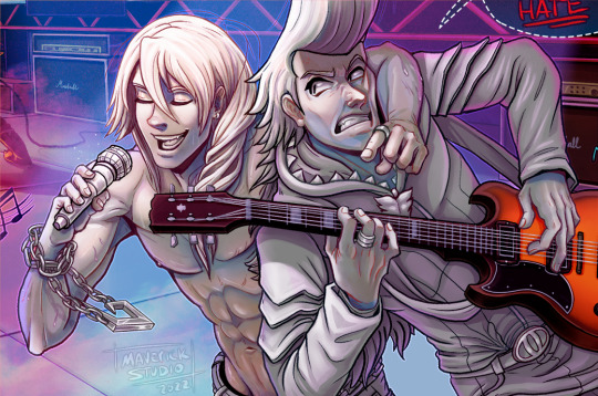
Above are the boys with a 50% grey base layer. Notice the hints of blue, red, and yellow about the skin that can't be seen on Daryan's jacket, for example? That is what I'll be referring to!
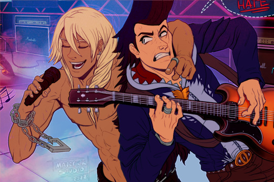
I'll typically start with basic skin tones for the character (above) and on two separate layers begin to paint on some variations of red, orange and/or yellow (layer 1) and blue, teal, and/or purple (layer 2). I typically already have the opacity on these layers down, but just to kinda show you the types of colours I may use and where I place them, this is the kind of monstrosity I create:
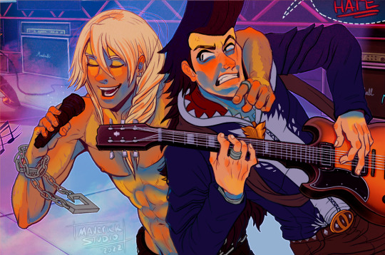
In my experience, Yellow is a good neutral zone addition, Red is great for places with a lot of blood flow like cheeks or fingers, and Blue is good for areas that may not get full exposer to the light source(s). I was first taught a real simple gradient down the face of yellow (brows), red (cheeks/nose), and blue (chin, jawline) for faces. Then as you get more comfortable with slapping them on the canvas, go a little wild with it and start intermingling the colours like adding blue on the eye lids or red on the lips, for example.
For Layer 1, or our warm red/orange/yellow colours, I typically set the layer style to something like a Multiply and lower the opacity to 15-30% depending on the skin tones and image's lighting.
For Layer 2, or our cool blue/teal/purple colours, I do a highlight layer style with Overlay typically being a nice safe pick. For this layer I generally stay around 20-45% opacity. After you have that all set, you'll get something like this:

Which is thankfully not quite as jarring as the other version haha. From here, I start shading normally! I typically use 2-5 shading and highlight layers, depending completely on the lighting of the piece. For skin specifically, I try to keep a smooth gradient or matte look to these areas with a soft brush and blending. Back lighting and colours from the surroundings generally seem to bounce off skin well so I tend to utilise a lot of that too.
In the end I wind up with the top(which I now realise was a pretty bad example image to use as they are in a SPOT LIGHT I'm so sorry) and also added the version without the extra colours for comparison(bottom):


I know it's nothing SUPER noticeable in this piece if you're not looking for it, but that's also the point! It's a little bit of flavour without being a distraction. I've personally really enjoyed the overall look of the skin I've painted since incorporating this.
On the other hand, when it comes my single layer paintings (using my recent painting of Beanix as an example,) I couldn't really tell you my process besides throwing colours at the canvas and seeing what sticks. I still try to incorporate the "sway my colour towards yellow here, change the hue to a bit more blue there," but there isn't much method to my madness outside of that. Just have fun with it!
I hope all this gave you some insight or helps in the slightest! If I didn't answer the right thing, you have any other or more specific questions regarding how I paint skin, feel free to ask them at any time. I'm happy to help where I can.
#art tips#art#digital art#wip#tutorial#mav speaks#ginyia#mavsart#I was originally going to do a whole time-lapse of that Beanix picture but I forgot to record the very end. :')#glad to still get to share the beginning with yall. Thanks for the question!
151 notes
·
View notes
Text

Its been a decent couple of months of productive work, so it's sadly time for a schedule change. I'll be posting pages two weeks apart again. Details provided below if you're curious as to why.
In all honesty there's no big dramatic reason this time around. I've just slowly lost drive to work on Dread Not as often and as thoroughly as I used to be able to. As I said in one of my previous posts (that sounded suspiciously like this one), I want to focus on other projects as well. One of those is my personal art blog, which I've neglected even though I've had art on the backburner that I've been meaning to post for AGES. Kingdomrune is another one of those, where I have shit I could post that I just... never did. Dread Not takes a lot of time and I miss being able to dedicate that time to consuming media instead of just grinding and trying to produce my own. One of the most important things to do as an artist is to broaden your horizons and take in as much art as you can, to diversify and expand what you know and what you can make. But, when all day every day I'm just sitting and drawing my own thing, it's like I have tunnel vision and my creative resources run dry. It's starting to feel weirdly soulless on my end, because I don't feel nearly half the inspiration to make the pages as I did when the big hiatus ended. It's all dependent on time and exposure, and I can only crunch for so long before it starts to feel damaging to me instead of fun and creatively fulfilling.
So what does this mean, practically speaking? Well, for one, I'm spacing out the page upload for the rest of Act 1, as previously mentioned. I'm well aware this will kill the pacing and it'll drag out longer than it theoretically needs to, but I'd even rather that than trying to rush out a page in the Two Days I have free this week (yeah, ONLY two days free out of the ENTIRE week. Don't ask me why it's not even my fuckin' fault this time). If pages become even more scarce than 1 page per 2 weeks, blame it on college. I'm getting new subjects and I don't even know the class schedule yet. Concerning Act 2 though, I'll be changing the structure of the pages from their core. I'll be switching to a different drawing software (probably Krita, suck my dick Photoshop) so it'll take some getting used to. I can't even promise bonus content or anything during the necessary break between acts because of that shift in software happening, I've never done a massive technical move like this. However, it'll allow me to, not only work on Dread Not better, but expand my art overall, so it's definitely worth it. I've wanted to get into animation for YEARS and Krita seems like an okay place to start (the gif on this post WAS made with Photoshop, but shitty gifs are about all I can make as animations in Photoshop). Act 2's style will, predictably, differ heavily from Act 1 and (with how long writing the dialogue alone for it is taking), it might end up being Longer than Act 1, too. Visually, it'll probably be something like cleaned up and coloured sketches, with simpler colour palettes and simpler (big airquotes) visuals overall, and it'll speed up the process and possibly allow me to post more than one page at a time. Possibly. That's not a promise.
I'm sorry if that's disappointing to anyone, but I physically can't make myself continue the current artstyle across all acts. It's just not feasible.
For those curious about the FARTHER future of Dread Not, I have plans to turn Act 3 into a series of fics rather than full comic pages, and something maybe a bit more insane for Act 4. I don't have everything figured out yet, and I don't want to make any false promises or give any grand ideas I won't be able to commit to, since only time will tell how my creativity will flow years from now. If you all want more content from me specifically, again I'm planning on reviving my art tumblr like a half buried zombie, and you'll probably see more there than you bargained for once I actually get into the habit of posting things. If you're mayhaps interested in my original stuff, keep your eyes peeled for a guy called Duro, I might start posting about him some time soon.
As always, thank you for your patience, and apologies again if this news was disappointing to anyone. I'm just one guy and this comic is a titan of biblical proportions. I'll keep you all posted on any further developments and plans for the future! Stay tuned!
#dread not#dreadnot#dread not au#dreadnotau#not comic#kris#schedule update#i was supposed to post this yesterday but then i got fucking sick#spent all day in bed hardly awake#so those two free days i mentioned in the post?#gone. just like that.#fuckin pray for me
30 notes
·
View notes
Note
Since you asked me, here's my ask! How about, 5, 14, and 22.
Whoop whoop!
Based on this ask game
5. Have you practiced /drawn in other styles?
I supposeee you could say I attempted the Steven Universe style?
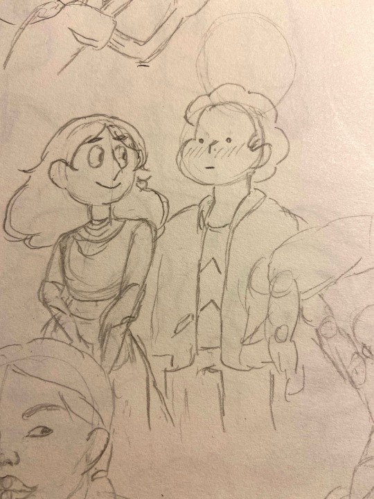
This was in 2020, I was obsessed with my American Indian queen Connie 😩
9. What is your least favorite piece that you have done?
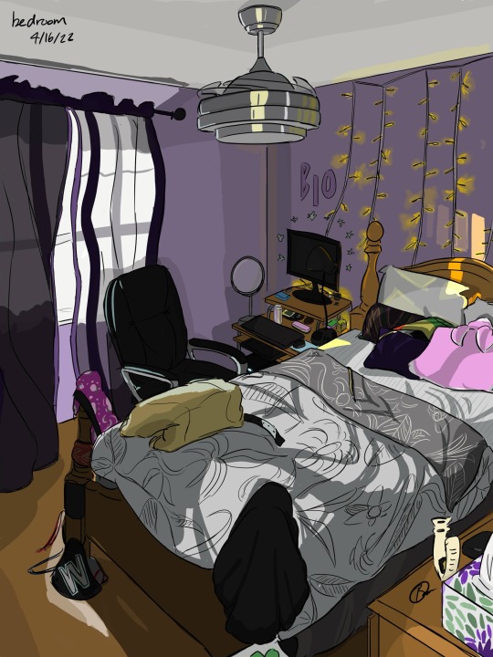
This will have to do it. 😬 you know that feeling as you’re doing art, it looks good along the way, but when you finish and step back all the way it’s just… ehhhh? That’s what this piece was for me personally, I was still new to drawing environments and lighting, so it’s not the best. It’s definitely giving me the motivation to recreate it cause I have gained some understanding of lighting over the last two years.
14. What do you like drawing the most?
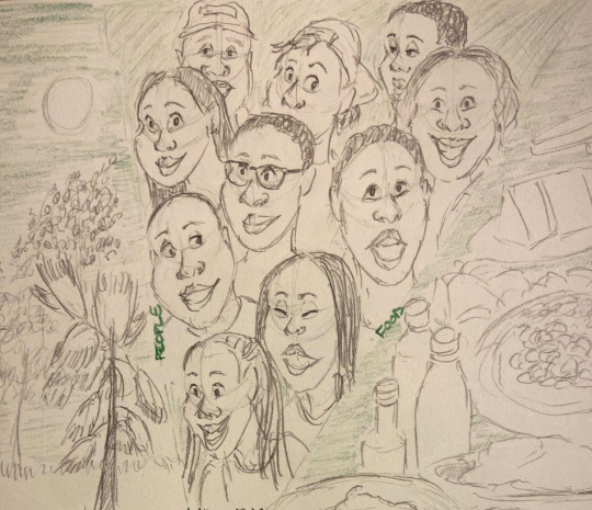
People!! It just comes the most naturally to me. I’ve been giving myself a challenge to diversify face shapes so not all characters look the same. Obviously, I’ve been drawing Mario stuff a lot, so that isn’t too bad, but when it comes to real life, I’d like to exaggerate some details a bit, which I’m still working on.
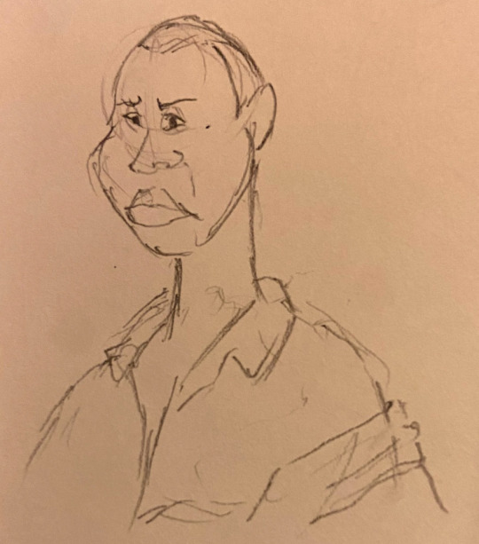
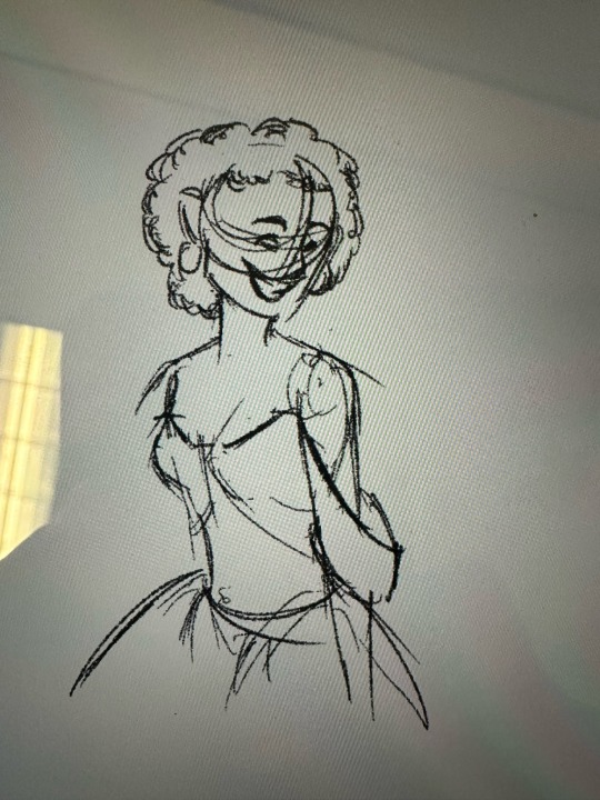
Here are some more examples of me trying to practice this, and one w my friends (with their perms ofc, I’m on the bottom right hehe)
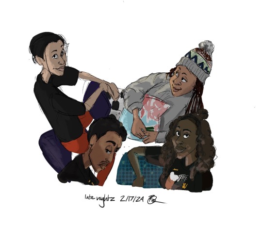
8 notes
·
View notes
Note
Hi omg I adore your art (esp your yttd stuff) just. Everything about it is just so cool I’ve sent it to my freimds a couple times being like “YOO LOOK AT THIS COOL ARTIST” and I was wondering if you could/if you have given advice on how to diversify ur art? Like, I personally struggle wit the fact I can probably draw a total of 4 hairstyles and probably have a real bad case of same face syndrome, and while I’m really trying to practice I keep looking to your stuff as a prime example of good™️ amd was hoping you could give some pointers
Augh it’s late sorry if this makes no sense or is like single-handedly the most annoying ask you’ve ever seen
thank you so much for your kind words!! <3 I'd be happy to share some character design tips I've learned over time.
now before I start, I just want to emphasize that none of this is new or revolutionary by any means, nor am I an expert. I still have plenty of room to grow myself! I'll just be sharing my reasoning for specific character design details as examples of character design theory at large, utilizing my yttd designs as examples because I've had almost two years to get comfortable with my styles for them.
the two biggest things that have helped me in character design are to 1. emphasize the character's personality/identity/hidden agendas through their design and 2. draw fat characters. I cannot stress how important it is to get comfortable with drawing more body types. it is vital to character design diversity, and it sets characters apart in more ways than just color and hairstyle.
it is also the backbone of shape theory, which is an excellent, subtle way to clue the audience into what a character might be like. take my Keiji design for example:

Keiji presents himself as an upstanding, reliable person that others that can depend on - hence, his form is big, tall, and solid, like a sturdy wall. big, blocky shapes make up his body. but his body language is conflicting, with one open, inviting arm and the other hidden behind his neck.
what sets the viewer off about what he's really like is the expression. shady eyes, never anything wider than a smirk on his lips, permanent eyebags - whatever has happened to this guy, it's taken a toll.
I'd also like to take this time to point out hair, since you mentioned it; I'm a big fan of bangs as a form of character expression! Keiji's are shaggy and messy, nearly falling over his eyes to add to the shady look. as for the rest of the shape of the hair, I like to start from the part (easy to spot in my Keiji design - just look for the brown hair!) and go from there in either direction.
don't be afraid to keep it simple! I used to be unable to end short hair in anything other than a mullet because I wasn't sure how to resolve it, but usually, all you need is just a single line to define the back of the neck. and again, shape language is your friend here! just look at the difference between Sara and Joe's hair:

Sara's hair is easily parsed into angles and blocks - it is orderly and uptight, just like the image she projects as a star student. on the other hand, I couldn't even find regular shapes in Joe's!! the messy spontaneity of it speaks a lot to how he is as a person! Keiji's hair is somewhere in-between; it's got that blocky orderliness as a nod to his time as a policeman, but it's just messy enough to suggest something's off.
we'll look at Shin next. he's another character with lots to hide, but he goes about it a very different manner, hence the different build:

Shin is one of my designs where I think shape theory especially shines. without his protective scarf and big coat, the guy is tiny. he looks vulnerable and weak, and he knows it - hence his hunched posture, as if he's curling in on himself to protect his vital organs. it's like how cats hate being pet on their stomachs, you know?
add the scarf and the jacket though - and he actually has a presence now! he's still a bit curled in, but for different reasons: the scarf is heavy on his shoulders, quite literally weighing him down.
focusing on his face though - I give Sara and Shin similar facial features (long noses, heavily angled profiles) to emphasize their nature as foils. it's especially obvious here, I think:
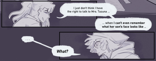
despite being at such odds, they're very similar people - and small details in design choices can help clue the viewer into drawing these similarities, even on a subconscious level.
and I think that's all I've got for now! hope this helped just a little bit! good luck!
29 notes
·
View notes
Note
I probably found you through Ysayle art! I adore your style and the way you put fat and shape into bodies and faces. I also love your butch versions of male characters to the point that, even for games I've never seen you interact with, now I sometimes think about hitting characters with the butch beam and how delightful they would be
Aww thank you!! I've always been fat myself so I find that drawing fat characters or even just, fit characters with a bit of weight and roundness on them, comes really easily to me! I like to draw a variety of body types, I think it's just really nice to imagine how different characters might carry their weight or have muscle or what have you :3
And I'm so glad to hear that!! :D You absolutely should!! I think it's really fun to explore characters in that way, especially from a point of like, taking a typically male archetype and seeing how it would be different for a masc woman instead!
Though I'm curious now of which characters you were thinking of! I don't talk much about other stuff I'm doing but I do play other games besides ffxiv I swear.. 😂 I used to draw a lot more variety of fandoms (especially for games that tend to have smaller fandoms or are just older/not talked about as much) but these last 5 years or so I've just been sooo stuck on ffxiv haha. I have been trying to diversify a little bit though! I've been recently replaying skyrim and a few of the fallout games, and I've been playing through bg3 for the first time! Though I think ffxiv will still be inhabiting my brainspace for a good while to come, especially when 7.0 hits :3
9 notes
·
View notes
Text

Hidden Gems by @fw00shy
I’ll never stop screaming about the masterpiece that is Phoenix in the Fire - not on this list but one of my top five favourite short fics ever - but when it comes to Fwoosh, suddenly I can’t find the words to covey the way her writing cuts me raw and deep. She’s hands down one of the most talented, daring and resourceful writers I’ve ever seen, and I’ve been around for a very long time. A master of short form, her unique and bold style steal my attention right away, her sharp dialogue and unbeatable world building make me sit straighter and forget whatever’s going on around me, her impeccable prose with perfectly chosen and well-placed words takes my breath away, her tender angst makes my heart break for pining Harry, her deliciously explicit, self-indulgent smut make me sweat like a whore in the church 🥵
As if that wasn’t enough, fwooshy’s range is really impressive and she always manages to deliver a long-lasting blow with any genre, any rating and any length, but especially under 3k. Her creative mind, vibrant characters and powerful writing deserve way more recognition and that’s why everyone should go check her catalogue right now. I’ll help you out and share a short selection of goodies below - I could have chosen any 10 fics at random but I wanted to include a little bit of everything, even tropes that aren’t really my jam (hello MCD!)…. unless they’re written by her, lol 🤡 this is actually my second reclist for Fwooshy so I tried to diversify a bit, you can find the previous one here. Happy Monday with these delicious short treats!
Drarry:
Silence on the Seventh Floor (T, 970 words) - such a creative and heartbreaking drabble, love this pain-in-the-ass ghost!Draco and smitten Harry, my heart ached so much for them. Cw MCD
Draco haunted the seventh-floor corridor of Hogwarts. A Third Year found him up there one night, knocking the frames together as though trying to shake something out of them. She reported it straight to Headmaster Potter, who passed her a Cockroach Cluster and sent her off to bed with a promise to handle it.
Basement Level 9 (M, 2k) - poignant and disturbing short story with dark!Draco and a resigned Harry who loves him, plus excellent dialogue and a brilliant Ron puzzling the pieces together, ugh so good 😔🤌🏼
Draco was behind the bomb that blew up Level 10, though they didn't talk about it.
You Either Fuck or You Get Fucked (E, 2k) - the ultimate enemies to lovers PWP with scorching hate sex, crude dirty talk and top notch banter, sharp and witty! I’m obsessed with this confident Harry and their sexy push and pull, thought I’d combust on site 🔥
"That's not how fucking works. Fucking's…" Draco waved a hand in the air. "You either fuck or you get fucked." "Sure," Harry said. He took out a Sickle. "Toss for it?" Read my rec here.
10:47 am (T, 2.3k) - this series of short yet immersive slice-of-life vignettes are wonderfully original with vibrant multiple POV and such distinct character voices. One of the fics that best showcase Fwoosh’s genius writing
Scenes of lives lived out in front of an open balcony window.
Big Hands (E, 4.5k) - Victorian AU with pianist rivals, yes please!!!! Incredible world building, delightful and on point humour, unbelievable ust, that basic hand kink we all deserve AND a piano sex scene as a treat, this is rich and sexy and the atmosphere is irresistible
Draco Malfoy is a pianist who's just moved to Paris. Harry Potter, his new roommate, has the biggest hands he's ever seen. Draco is immediately obsessed. Read my rec here.
in a rambling way (T, 7.5k) - probably the softest Fwoosh fic I’ve read so far, a gorgeous and wistful break up make up with lots of pining Harry, camping shenanigans and peak road trip romance. A must read!
Ron knocked Hermione up, and now Harry's got to figure out how to clone himself so that his friends don't split up fighting over him. Falling for Draco again was never part of the plan.
Rare pairs:
In the Mood (E, 367 words) - the hottest 367 words you’ll read today, delicious established Dron feat. rough sex and feral possessive Ron hoho me gusta!
“I saw you with Harry today," Ron says. "In the Ministry cafeteria."
Money (M, 1k) - my favorite Ginsy treat out there, hot af and with an impressive amount of character and story for a short fic. Superb Pansy + superb Ginny POV, I want them both to ruin me (and then each other) pls and thank
Pansy looks like money. Ginny's letting her call the shots.
Laundry Day (E, 1.8k) - I’ve been in a Ginny/Hermione phase lately and this neighbours AU PWP is s total banger! Laundry room snogging, confident buff Gin and shy horny Hermione, excellent dynamics and really hot smut
Hermione was afraid of Ginny, because Ginny made her wet.
They Bought A Sports Bar (T, 2.2k) - another compelling femslash because yes, Fwoosh can write pretty much any ship. A fascinating take on Cho and amazing dialogue, love her subtle dynamics with this patient Ginny, and the idea of a sports bar is brilliant!
Ginny buys a sports bar (run-down biker pub, really) and ropes Cho into helping out. They're just business partners, so why does everyone else think they're more?
102 notes
·
View notes
Text
Investing 101
Part 5 of ?
How to select a Broker/Advisor
Beth's brother works in the Investment Advisor industry, he's not a broker himself, but he recommended a local broker from his national firm. I liked his recommendation because we wanted the security of using a broker from a large firm. Large firms have sophisticated compliance organizations which monitor the trades of their brokers to ensure they aren't churning (buying and selling excessively to earn fees). The firms also ensure that the brokers are licensed, etc. and the firms have secure, convenient online and mobile tools. If you don't have a relative in the business, ask your friends, your parents, your boss. You might want to ask the firm that manages your company's 401K.
Twenty years ago we met/interviewed the broker who was recommended by Beth's brother and we liked him. More importantly, we felt like we could trust him. He asked about our life goals, tolerance for risk, etc. and we felt like his style could match our style. He was a bit older than us, old enough to have experienced several economic cycles. We weren't looking for a guy who was going to call us once a week with a hot tip. We wanted rational, long term investing of a diversified portfolio which would grow to fund our children's college education and our retirement.
Selecting an investment advisor is a little like choosing a psychic (though I don't believe in psychics). You're looking for an advisor who is smart and successful, but let's face it, if he was really an investing savant, he'd be early-retired, relaxing on a beach or golf course instead of slogging out a 9-5 office job managing other people's money. Likewise, someone who was really psychic would have bought the winning lottery ticket years ago.
As much as anything else, an investment advisor helps keep his/her clients from doing something stupid. Beth and I are a perfect example of a couple who has invested broadly in the market and done well, mostly because we haven't done anything stupid. That's not to say every investment has been a winner, but we've cut those losses when we necessary.
Beth and I also have a very conservative view of what it means to do well with our investments. Frankly we have low expectations. We want to earn a few % points more than inflation over the long term. Ideally our portfolio (after paying the investment advisor's fees) will at least match or even slightly exceed the performance of the broader market, but probably not by much. If we see that the performance of our portfolio is beating the overall market by a lot, we assume there's probably something wrong we should fix - we are probably invested in something which the rest of the market thinks is too risky. Likewise, if our performance is lagging the market, we're probably invested too conservatively. We don't trade options, we don't buy meme stocks and a 'guaranteed return' like Bernie Maddoff would instantly make us suspicious.
Whether you invest through a broker/advisor or you do it yourself, the key, in my opinion, is to have a broad portfolio and never stop saving and investing. Don't try to time the market - i.e. pause your investing because you think the market is weak and instead decide to wait until the market starts to recover. I have no idea what the market is going to do next week or next month or next year. But I'm pretty confident that in 5 years it will be higher than today and 5 years from now I will wish that I'd invested today.
This concludes my prepared remarks - what questions do you have?
13 notes
·
View notes
Note
The music suggestions thing sounds fun! I might try some time to diversify my listening... anyways here's my picks:
Pathetic by Blame Candy
Tenebre Rosso Sangue by Keygen Church
Sleepwalk by Forrest Day
The Spy and the Liar by Puddles Pity Party
The Garden by The Crane Wives
Queen of Nothing by The Crane Wives
Pathetic by Blame Candy
Very funky. The effects on the vocalist's voice are nicely balanced between heavy reverb and chorusing. Their falsetto voice is really nice. The beat is nice and groovy, very nice beat. The guitar solo was a nice deviation from the main song. The random extra beat into the last chorus threw me off, though. But honestly, that's nitpicking. I even do that in my songs sometimes to change things up. Reminds me of newer Red Vox music a tiny bit. 7.5/10 would listen again if I were in the mood for a song like this.
Tenebre Rosso Sangue by Keygen Church
I like this. A lot. The coupling of church organ and metal is excellent. Sounds like a cross between Doom and Castlevania in the best of ways. Made me want to play Castlevania. The drop is excellent, but I do wish it wasn't so suppressed. They could have made the synth louder. Added to my liked song, 9/10. Would listen again. As an added bonus, We've Got Hostiles from Half Life came on afterwards on Spotify.
Sleepwalk by Forrest Day
This catch to this got stuck in my head 100%. I love the pizzicato done throughout the song on the violin. I really love the use of the violin, or maybe its a fiddle? I felt like I should like this more, but something didn't get me with it. I don't think I would go out of my way to listen to this, but it was an enjoyable song. 8/10 loved the fiddle and made me want to go out and buy one.
The Spy and the Liar by Puddles Pity Party
A beautiful song. The vocalist has some serious talent. Surprised the song was so short. The ending was extremely satisfying with that note the vocalist sustained. It had a very good resolution melodically as most songs of these type do. It isn't my style of music, but I'll be damned if I don't appreciate a good set of lungs when I hear them. 7/10.
The Garden by The Crane Wives
Again, wonderful vocalist. Love the tremolo they did with their voice. They were the one carrying most of the melody as opposed the the guitar, which is pretty impressive when bands can do that. It made me feel like a cowboy though, 5/10.
Queen of Nothing by The Crane Wives
Again, vocalist has amazing vocals. They've got that feminine country grit. The fadeout in the end was a nice touch to the song, with only the vocalist singing. It gave the lyrics more impact. 5/10, I wouldn't listen to this again.
You should try it out, Melody! Its pretty cool being able to listen to new music~ Thanks for sending me over these songs~!
7 notes
·
View notes
Text
In the last art post I made, I mentioned wanting to shade the designs I had made for Ben and Ally that I'm using for my Ben 10 fan-project (which I will reveal the title for at a later date). However, I recently watched a Ben 10 redesign video by @crystal-moon-101 and was inspired to make some tweaks to Ben and Ally's designs.
The key difference is that I drew more in my style rather than trying to replicate Omniverse. After all, Ben 10 has never really had a consistent art style anyway.
Other than that, the changes I made to the designs weren't major, but they're still noticeable. Here are all the changes I made in the sketches:
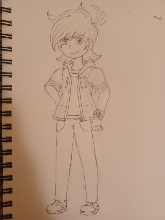
The first thing I changed about Ben's design was his hair, which was actually inspired by Crystal's design for Ben. I also added the ahoges from Omniverse (and made them longer lol) and made the numbers on his hoodie look digital (can you guess why?). In addition, there will be a pocket on his shirt with the number 10 on it (it's not visible yet, I'll draw it later). As for the Omnitrix, I tried making a new design for it that was more gaunlet-like (shown in the image), but I later decided to use the Omniverse design for it instead (at least for now). Finally, I changed the design of his shoes a bit.
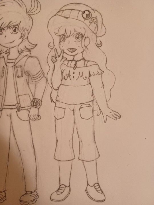
Next is Ally. One advantage to using my own art style for these designs is being able to better portray diverse body types, something the official Ben 10 art styles seem to lack (especially with the most notable characters). Ally used to have a body type similar to Gwen, Julie, and several other prominent female characters within the Ben 10 franchise. However, for the sake of diversifying the character designs, I tried to make her slightly heavier-set. For her hair, I had used Emmy Altava from the Professor Layton series as a reference point. Unfortunately, Ally's hair ended up looking too much like Emmy's, so I loosened her curls a bit.
I left her tank top and necklace the same, but I made some small adjustments to the rest of her outfit: I made her crop top more ruffled, flared out the hems of her pants, removed the Omnitrix symbol from her shoes, removed the music note patch (which was barely visible anyway) from her beanie, and turned one of her gold circle buttons into a music note button to replace the patch.
This post is getting long, so I'll post the next designs later. For now, let me know if there's anything I can improve about the designs.
4 notes
·
View notes
Note
I think all of your art is kinda stiff, maybe try diversifying the poses a bit more? All your pieces look the same. Try change stuff bc it literally is all the same pose.. only If you can? It's difficult to change it up when you're known for what you do and stuff - it's a shame because your colouring style is gorgeous..
Thanks for ur honesty! Im rlly happy to say that both this month and last month ive been playing with perspective on my pinups! Still figuring it out but its very fun. And as for my coloring, I’m working on that too! Its a little tricky to make client work more interesting though bc thatd be on the person paying me, but when i have control i always try to push myself (well…unless im having an off day, it happens. Hahahh)
In short i appreciate ur suggestions and your compliments! Working on it i promise! ❤️
8 notes
·
View notes
Note
your style seems really cool but how come you only draw skinny characters? :(
Hi! You should prolly send these asks to my art blog next time rather than this one in the future but that’s ok I’ll answer it here, and actually I’m glad you asked this because I agree with you. I look at my galleries and I don’t like what I see.
This is probably going to be really long so I’m putting my full response under the cut
I do want to say that I only post an extremely small fraction of my art publicly, and I post to tumblr the least. And I also almost exclusively draw ocs (you can probably see that the only fan art I tend to make is of Gon and Killua) and I am even more guarded about posting my ocs online. My neocities is still a WIP and a lot of my ocs don’t have pages yet either.
THAT BEING SAID, I still don’t have enough fat characters, there are ocs that I am redesigning to be fatter and there are fat ocs from the past that need more attention from me. You’re right, skinny people dominate my galleries. I have recently come to this realization myself and I want to remedy it.
Also I’m not gonna lie, my art has stopped diversifying in pretty much every aspect.. I stopped doing backgrounds, I stopped doing dynamic poses, I stopped branching out and challenging myself. I actually consider myself a beginner now and I am very very very slowly relearning art and trying to rediscover my love for it. I have a really tumultuous history with art, and I don’t think it’s relevant to your ask for me to dive into it, but I just wanted to say that I am VERY AWARE of all my problems and shortcomings as an artist and I am working to fix them. Treating skinny people as the default is one of them!
I honestly don’t think any of what I wrote is a very satisfactory but I want to be as open and sincere as I can be. I used to be a much better artist than I am now, maybe not in technical skill but definitely creatively and as far as subject matter went. I’m not particularly happy with where I’m at now, but I am regaining my motivation to be better. I have a list of 2024 artist goals which includes trying to find a life drawing class and doing studies again.
And now for the sappy part, your ask is actually something I really needed to hear. I’ve spent a very long time believing no one cares what I draw either way, and that I can draw or not draw whatever I want because no one is looking. Your ask, even on the off chance that maybe it was sent in bad faith, is the first sign the someone actually does care, at least a little bit, and has noticed my art enough to be able to point out a glaring flaw. No one else has taken that much of an interest, positively or negatively, in an extremely long time and I didn’t realize how impactful feedback is until right this moment.
I would say keep an eye on my neocities, because i still avoid posting ocs to tumblr, so most of my art will probably end up there. or on sheezy whenever it comes back!
#anon#i hope this was coherent it is pretty hard for me to put my thoughts into words#maybe im shooting myself in the foot posting this while taking commissions but ya know
3 notes
·
View notes
Note
I've been trying to learn how to draw and I love your art style so much I've been practicing by copying it (just in my notebook not like sharing it anywhere) as I love the way you capture characters and emotion but I was wondering how do you go about simplifying a character? I'm not sure if this makes sense but like what do you look for when taking realistic looking characters and translating them into a stylistic version?
Thank you for the ask!
keep tracing and copying, its a great way of building the muscle memory and familiarizing yourself with breaking things down into shapes. It means a lot that my art is something that you wanted to use that for!
https://twitter.com/meatgirI/status/1606375868959543298?s=20&t=ve-GgU0nMrUBRZnTj0kI3Q
I would say that this tweet by meatgiri is a good way of finding different facial features and breaking the face/eyes/nose into shapes, and that its a really good way of getting started.
However I also think that learning proportions and anatomy is a really good way of further pushing this skill. im going to explain it a bit, but if it feels overwhelming or makes art something thats not fun, you dont have to use any of it. youll pick up these things through practice and observation.
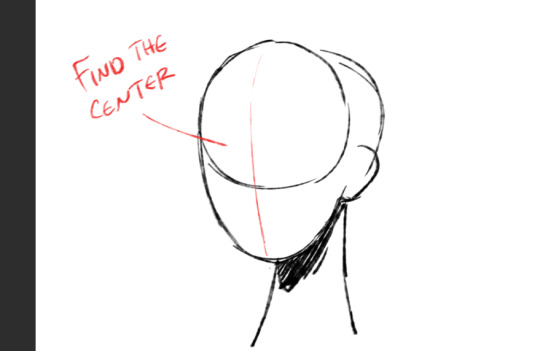
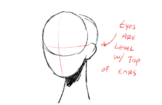

I like trace out these lines on my face. they follow these proportions that are applicable to almost all people. once ive got this figured out, i start to fill in the eyes, nose and mouth.
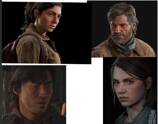
(some examples of characters... see how this rule still applies even though they look very different.
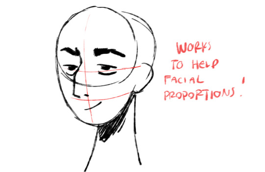
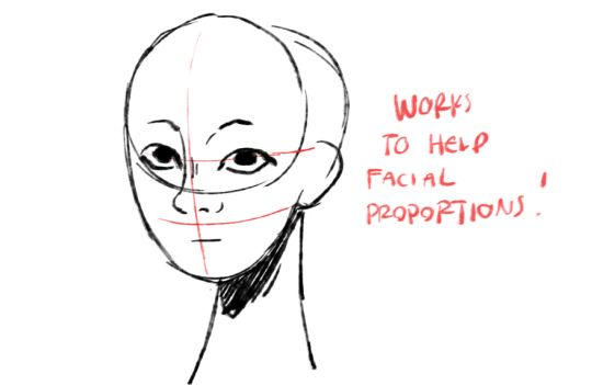

again see the tutorial i linked above to get a feel for breaking these facial features into shapes.
this is what i would suggest to practice different types of faces if you dont have a super good understanding of facial structure
as you observe more in faces, you notice a lot of difference in face shape and structure. but this is a really good way to play with JUST facial features and maintain them consistently
if you want to get into facial structure, then you wanna start looking at the actual anatomy
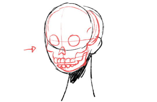
try to picture where your face sits on your skull.
this can help you decide how MUCH of the bone sticks out from under the face. if you are underweight, older, or have shaper facial features, youre going to see a lot more off things like cheekbones
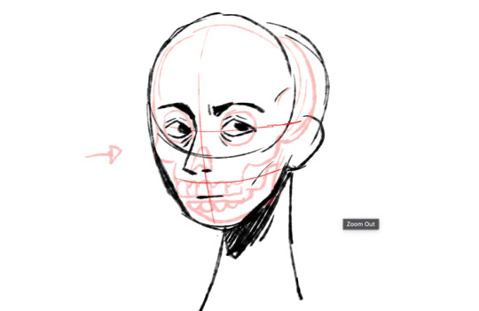

so now even though im using the same skull as a base, i can still have a different face shape. because this person might be older, they have a stronger jawline, and their features are sunken in
and the cool thing is that this isnt just applicable from a 3/4th angle. the proportions are always like that!! they might change because of perspective or the angle but honestly at that point youd want to start trying to develop your sense of 3d space
this is just a really simple way of diversifying one single method of drawing faces. notice how i only used the one "base" shape
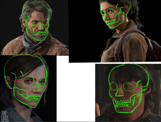
and here you can see examples of how their faces sit on the skull. obviously you dont need to be drawing perfectly anatomical skulls every time you draw a person, but it does make good practice to trace those shapes. basically training yourself to get better at observing different features!
you can get into even more varying features when you start to use different skull shapes too. all of these characters have different skull shapes and their features change depending on how they sit on that skull

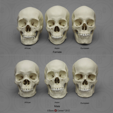
here is a good demonstration of anatomically correct differences in skulls of different races. Obviously i tend to think of it as masculine/feminine rather than male/female, but this is a scientific model used for identification (which is based off of sex and not gender)
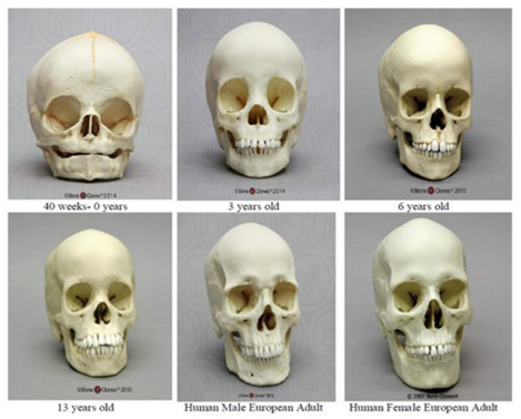
age can also play into your skull shape and facial proportions.
combining all of this knowledge you can not only have a wide range of different characters, but you can also tell a story.
again the less fat you have on your face, the more sunken in your features are going to be. so you can tell your audience about your character just from this alone
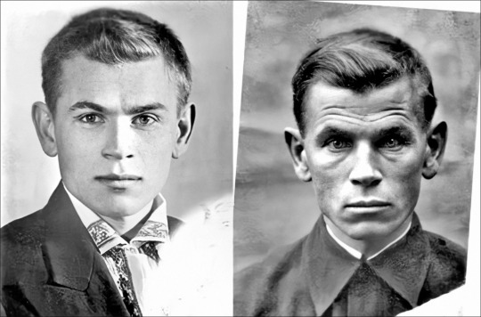
this is a good example. its a soldier before and after war. you can see how the stress, trauma, living conditions, etc, have all changed how he looks.
obviously this is getting into the real nitty gritty anatomical aspect of it but i do think its a really good way to have your characters feel like they belong to the environment they are in. it also just further illustrates my point earlier, how you can have MANY different types of faces even if you are using the same base for all of them.
again if this seems overwhelming, its ok! a lot of this is stuff you pick up via observation as you continue practicing. draw what makes you comfortable, draw what you think is fun, and start off simple.
Also know that you really dont need to be going into such detail and drawing the skulls haha. thats really just moreso to demonstrate the fundamental understanding.
Good luck with art, keep pushing yourself to learn more and draw what you see!! youll pick up on all these subtle details as you keep at it
21 notes
·
View notes