#stephen frykholm
Photo

Stephen Frykholm / Herman Miller / Eames / Poster / 1973
2K notes
·
View notes
Text

Stephen Frykholm | Herman Miller
12 notes
·
View notes
Text

2 notes
·
View notes
Photo

Stephen Frykholm, Herman Miller Summer Picnic, July 29, 1978
347 notes
·
View notes
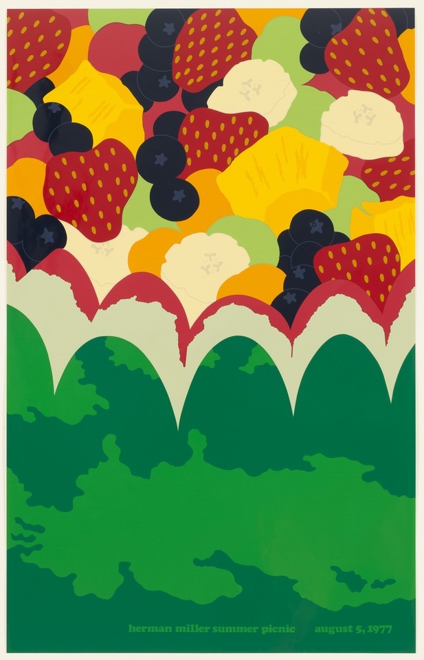
Photo

Stephen Frykholm, Herman Miller Summer Picnic, August 5, 1977, 1977, screenprint with lacquer, 100.4 x 63.5 cm, MoMA, New York. Source
Wishing everyone a fabulous weekend with all the fruit salad you could wish for. I will be posting a few more of these gorgeous summery prints from Stephen Frykholm today and tomorrow, so keep a look out.
#art#art history#painting#screenprint#modern art#pop art#stephen frykholm#summer#fruit#fruit salad#food in art#1970s#moma
50 notes
·
View notes
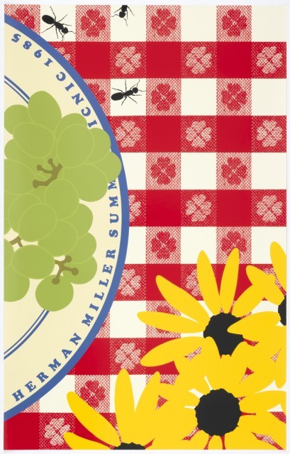
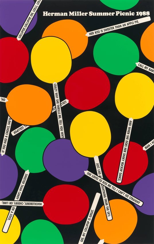
Photo

Stephen Frykholm
Herman Miller Summer Picnic poster, 1985.
3 notes
·
View notes
Text
A Nice Day for a Picnic
Today’s blog post was originally published on June 18, 2013.
In 1970, Steven Frykholm was working as the in-house graphic designer for the furniture manufacturer Herman Miller, Inc., when a company vice-president stopped by his desk. Every summer, the VP said, Herman Miller hosted a company picnic. Perhaps Frykholm would make up a poster for the event?
Frykholm already had a passion for screenprinting, a method of printmaking that lends itself to flat, bold areas of color—ideal for making a poster. He had taught himself how to screenprint years earlier when he was living in Aba, Nigeria. As a Peace Corps volunteer there, Frykholm had spent two years teaching at the government trade school for girls. With few materials at hand, Frykholm wanted to teach the girls a trade that would enable them to produce an income. Screenprinting offered an inexpensive, versatile and practical solution.
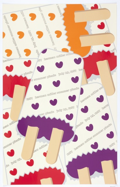
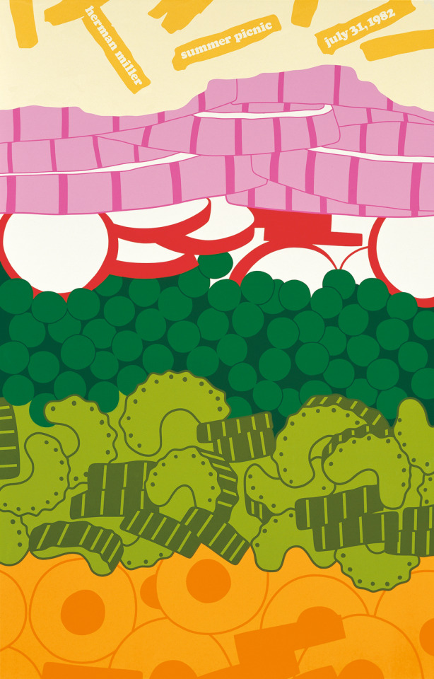
Frykholm drew on his this printmaking experience to create a striking poster. He played off the picnic’s theme of Sweet Corn Festival by sticking an ear of corn between his teeth and asking a fellow designer, Phil Mitchell, to draw his face. The poster went on to win an AIGA award, and just as the annual picnic had become part of the company culture at Herman Miller, so too did Frykholm’s picnic posters. He continued to design one a year for twenty years, featuring such classic picnic items as cherry pie, watermelon, ice pops, fruit salad and lemonade. With their vibrant colors and close-up depictions of tasty summery treats, these posters still make me long to spread a blanket out on the lawn and join my friends in a meal.
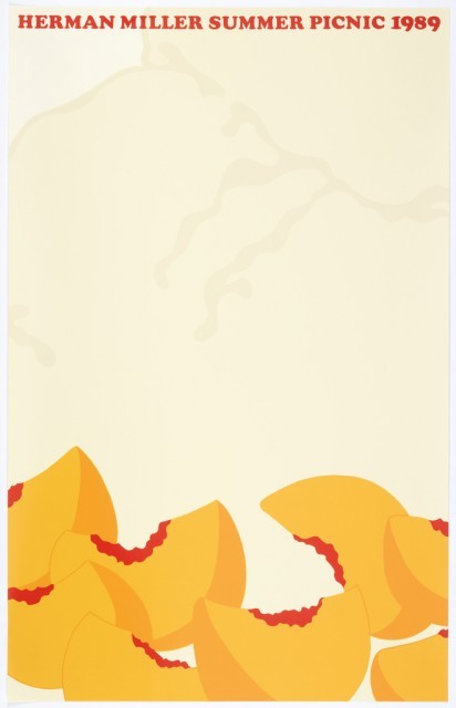

Posters, Herman Miller Summer Picnic, 1985, 1989, 1988, 1987; Designed by Stephen Frykholm; Gifts of Sara and Marc Benda, 2010-21-85, 2010-21-81, 2010-21-82, 2010-21-83.
Caitlin Condell is the Associate Curator & Head of Drawings, Prints & Graphic Design at Cooper Hewitt, Smithsonian Design Museum.
from Cooper Hewitt, Smithsonian Design Museum https://ift.tt/2LtUTaY
via IFTTT
7 notes
·
View notes
Text


Stephen Frykholm (1970s) • Herman Miller Picnic Posters
#graphicdesignwow #american graphic design #stephen frykholm #poster #1970 #1980
0 notes
Photo

Wongani M - Toxic Asset Horror Cabinet (2012 Competition by Henry Stephens, Hannes Frykholm & Nick Roberts) - (Source: https://issuu.com/henrystephens/docs/gradportfolio_2014)
0 notes
Photo

Stephen Frykholm, Herman Miller Summer Picnic, July 29, 1978, 1978, screenprint with lacquer, 100.4 x 63.5 cm, MoMA, New York. Source
Happy Sunday everyone. I’ll be having tea and cake with my friend today because I am a sophisticated lady.
#art#art history#painting#screenprint#stephen frykholm#cake#food in art#1970s#modern art#pop art#moma#summer#picnic#sunday#afternoon tea
49 notes
·
View notes
Photo

Stephen Frykholm
#stephen frykholm#herman miller#hm#hermanmiller#poster#poster art#concert poster#event poster#design#graphic design#Typography
92 notes
·
View notes
Text
Getting Better
This poster designed by Seymour Chwast for Herman Miller Furniture Company is all about the details. Chwast skillfully packed a bustling city scene overflowing with conversation into the poster’s vertical format, requiring the viewer to look closely and engage with the design’s dialogue as though reading a comic or storybook animated by Chwast’s careful attention to gesture and form. The scale of Chwast’s design presents an interesting departure from the furniture company’s iconic graphics. Art director Stephen Frykholm, Herman Miller’s first in-house graphic designer, often approached detail as the essential element of a composition, creating a zoomed-in point of view that abstracted forms into geometric lines rendered in super-saturated hues. Though Frykholm worked with consultant Ralph Caplan to develop the design scheme and text for the advertisement, he proposed commissioning a celebrated graphic designer to illustrate and sign the poster, allowing it to function both as an advertisement as well as a gift for special Herman Miller customers.[1] Frykholm chose Seymour Chwast, one of the country’s leading graphic designers and, together with Milton Glaser, one of the co-founders of Push Pin Studios. The resulting poster celebrates both Herman Miller and Chwast and demonstrates an important choice to ally the furniture company with another design icon.
The occasion for the poster was a new version of Herman Miller’s workstation product Action Office. Since the company was introducing an improved product rather than a new one, Caplan was inspired by the 1967 Beatles song “Getting Better” to create a city scene in which the figures remark on ways in which their worlds are improving.[2] The verticality of the design features a building under construction at center, deliberately signaling progress, and the abundance of high-rise windows allows many of the conversations to enter the scene from unseen office interiors, no doubt outfitted in Herman Miller’s Action Office. Many of the dialogues in the design are direct advertisements—one man in the center building says, “Everything in this poster is going up,” to which his female colleague replies, “Except Action Office prices, which have just gone down.” Others are more clearly corporate in-jokes, such as a dialogue between two unseen figures, one of whom remarks, “Careful, this plant is going to get knocked off.” to which the other replies, “Getting knocked off is in the Herman Miller tradition.” Still other exchanges are more comedic—a dog on the sidewalk shares a funny and thoughtful statement about Herman Miller, while the boy walking beside him barks. It is perhaps this comic tendency which makes Chwast such a good fit for the poster’s execution—while the words alone are amusing, Chwast’s attention to gesture and line animate the scene. Without showing office interiors or even many of the scene’s figures, Chwast creates a rich and compelling image that continues to amuse. Though Herman Miller presented a straightforward concept to Chwast without much need for further development, the presence of Chwast’s hand and style clearly distinguish the work as his own.
Julie Pastor is Research Cataloguer in the Department of Drawings, Prints & Graphic Design at Cooper Hewitt, Smithsonian Design Museum.
[1] Steven Heller, “Predictably Unpredictable,” Herman Miller, 2016, accessed March 20, 2017, http://ift.tt/1TpuG62.
[2] Ibid.
from Cooper Hewitt, Smithsonian Design Museum http://ift.tt/2nwcB1X
via IFTTT
2 notes
·
View notes
Last Seen Blogs

wcender-art
wc art
mullomohiam
the original mullomohiam
tonystarkisamoron
Anti Tony, Pro Everyone Else


ichijimak
ブログみち2