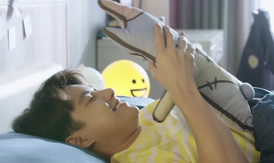
#some of this other designs at the time had elements a little too similar to my redesigns too
Note
Ghoulia
drawing mh requests again because life got busy right after i asked for em

i may like g3 but ghoulia is not included in that :] g1 ghoulia is so much better
#digital art#redesign#fanart#monster high#ghoulia yelps#scene fashion#side note im like 99% sure somebody traced or copied my ghoulia design (from my 2022 mh redesigns) like a little bit after i posted them#so that was weird#some of this other designs at the time had elements a little too similar to my redesigns too#but like i just kinda left it because it wasnt a big deal#but thats the first time ive ever had that happen to me#my art#i never draw ghoulia very decomposed because i like to think they became a zombie very shortly after dying#(yes canonically she was born a zombie and no i dont care about that fact)
45 notes
·
View notes
Text
Various HH characters x Artist reader
Prize 4/5 for @coldestcoconut
This post contains: Charlie, Vaggie, Alastor, Angel Dust, Husk, Sir Pentious, and Nifty
Notes: Reader is GN
CWs: None
CHARLIE
Its canon that Charlie herself is an artist, she makes her own presentations and everything! Shes very open to sharing her supplies with you, though a lot of the colors she has are very bright and saturated. You might inspire her to have an artsy based exercise in the hotel, you... may get a few groans and looks from some of the other hotel residents.. whoops.. gushes and goes insane whenever you make something for her or really show her anything, she can go on for hours and hours about how lovely your work looks! Woukd put it on the fridge/hj
VAGGIE
Not at all an artist, and she doesnt... exactly know techniques and terms. She is proud of you and shes trying her best to show that, but... her compliments seem to fall a little flat when praising you thanks to her voice as well as her just not knowing terms. A lot of the time its comments like "oh, this looks good," whereas other characters can say WHY it's good. Though is that really that important when seeking validation? Keeps all the art you give her in a folder somewhere, neat and away from harm
ANGEL
It should be a given that hes going to ask if you can draw something... rather inappropriate. Were you really surprised? He might likely also ask you to draw fat nuggets, he even offers to pay you. Keeps some of your doodles pinned up on his vanity mirror on his room. Hes an artist, just not in the way you are. He has an appreciation for your work even if it's a different genre! It doesnt matter what your skill level is, hes going to be a little interested. He offers to pose for you if you need a quick reference, he can offer something interesting thanks to his flexibility! Free of charge, too!
ALASTOR
Similar to Angel, hes an artist just in a different way! Angel is a dancer and an actor, and Alastor uses radio as his medium! Hes.. interested enough in your work, though he can be a little more.. critical in his criticisms (but only if you ask for it, hes not rude!). He doesnt intent to fully stamp out your excitement, hes simply trying to get you to reach your fullest potential as an artist. It is balanced out by elements he enjoys in your art. Watches you like a hawk when you work. Dont try to be sneaky and try to draw him, he already knows what you're doing.. but he might just allow it, it's not like you're using a camera
HUSK
Hes indifferent, at least.. mostly.. he listens when you talk about your hobby and he makes sure you know hes paying attention. But you can tell that hes not sure how to keep the conversation going thanks to him just... not being into art. Sure he can tell when something has talent and had work put into it, but hes not the type to sit down and really dissect a piece. Though... his appreciation for art does grow thanks to you. Keeps the doodles you slide to him while he's working the bar- gets a little pissed at himself if part of the papers get wet from the condensation from the drinks
SIR PENTIOUS
NIFTY
She draws! As a hobby and when shes not warring with the bugs in the hotel! Sometimes the two of you sit and draw together- though Niftys more.. scribbling on the papers. Shes just excited is all! Don't ask where she got the red paint from. Hoardes the art you give her, very possessive of the drawings. Probably attempts to stab someone if they get too close to her stash
Hes a bit artistic himself, being an inventor and all! He draws his own blueprints and as well as his own designs. It may not be the same as the things you may create, but it's still a bonding point between the two of you. He let's you use his fancy pens and stuff, just please return them! Will praise you to heaven and back whenever you show him something, he knows some art terms and you can bet hes going to be using them to really push his praise! If you ever draw him anything hes going to keep it, likely framing it as well!
#hazbin x reader#hazbin imagine#hazbin hotel imagine#hazbin hotel x reader#charlie x reader#charlie imagine#charlie morningstar x you#charlie x you#vaggie x you#vaggie imagine#vaggie x reader#angel dust x you#angel dust x reader#angel dust imagine#alastor x you#alastor imagine#alastor x reader#radio demon x you#radio demon imagine#radio demon x reader#nifty x reader#nifty x you#husk x you#husker imagine#husker x reader#husk x reader#husk imagine#sir pentious x you#sir pentious imagine#sir pentious x reader
230 notes
·
View notes
Text
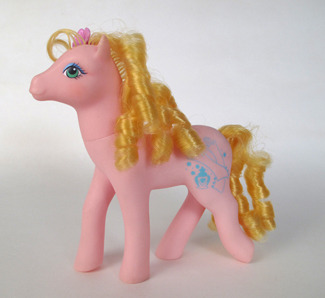
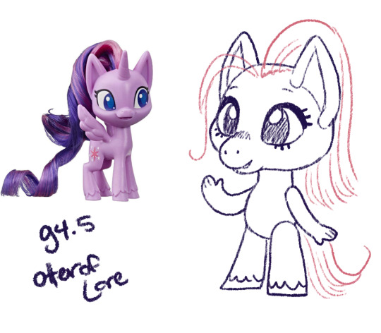
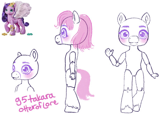
MLP-Takara generations: a design experiment
Takara MLPs are considered generation 1 My Little Pony; the original ponies look like little horses and the takaras are obviously very different.
But the standard MLP toyline underwent a lot of changes throughout the years... so, if the takaras had been successful, what would their changes look like?
Generation 1 year 2+ takaras.
Year one MLP was only a few ponies with a single color of body + matching hair... just like the takaras. It was year 2 that they introduced unicorns. pegasus, and seaponies.
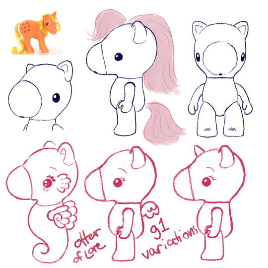
You all know I've already been concepting these so it's not surprising at all. As MLP g1 went on, they ended up doing more and more gimmicks throughout the 80s which would also be kind of fun to see the takaras do... (hint hint if you want me to draw those lmk which gimmicks are your favorites)
I also think they should bring in markings like the normal ponies but that could be part of the gimmicks. Maybe on their cheeks, or on their bellies like care bears?
In the later years og MLP also had a lot of variations on the normal pony body type, so maybe you could also see the takaras with that kind of variant, so that might be cute:
Moving on!
Generation 2
If you aren't big into early gen My Little Pony you might not know that generation 2 didn't do very well; it was a reboot of a beloved franchise, it was new, and different, and all that jazz:
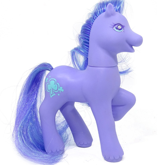
Main differences between them and g1: first, you can see they have a very late G1-type body, which is why I pointed out the thinner pony in g1. Their face is less detailed and rounder, but they have a little more expression, very smiley.
Their ears have a more horse-y curled in shape, they have fur around their hooves (in g1 only the boy ponies had hoof floof), and they have a gem in their eye.
Also they had a lot more moving-leg gimmicks where you could push one part of their body and another would move (eg push tail -> bobs head)
So you may ask, how am I could to g2-ify the takaras? After all, they are already much rounder than the g1 ponies. Well, I'm not going to make them just *look like* the g2 ponies, although I'll borrow more elements.
Instead: I am going to take and exaggerate all of the differences that I listed above and see what we come up with.
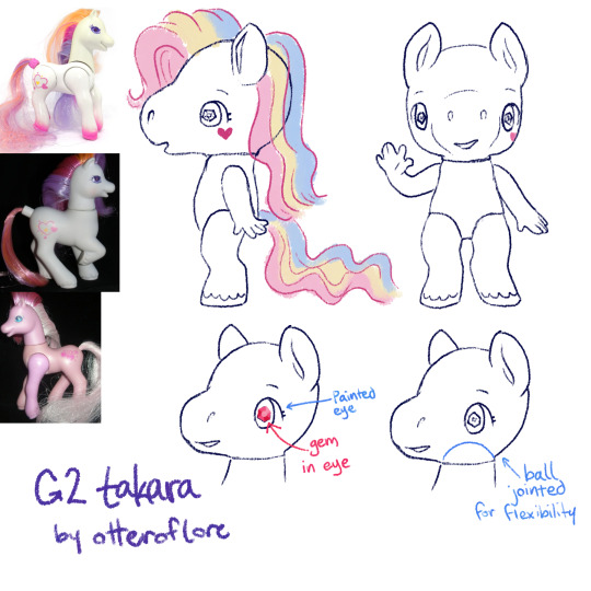
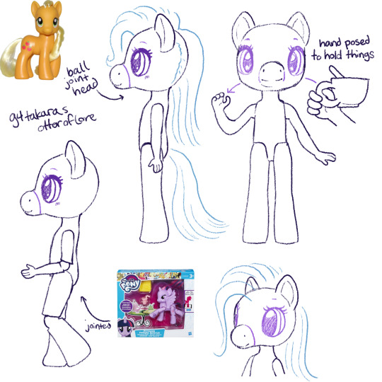
So! Here is my idea for g2 takara pony. I feel like its the exact balance of very cute and something that would upset collectors familiar with the original takaras, just as g2 upset the g1 fans.
First off, she's thinner, the iconic takara nose is removed in favor of a sculpt with a smiling mouth, the legs are more horse shaped with fluff and human fingers to match the additional foot detail. a lot of people find the g2s a little "uncanny" so I feel like this works.
The sparkley eye gem and ear shape are just straight off the original g2s, just to have extra gimmick to it (also the og takaras basically had the g1 ears)
g2 came out in the late 90s so I like to imagine the pony eyes would be extra shoujo too
Finally, a ball jointed head for more flexibility. (yes the arm would be posed like that in the doll, because its a more dynamic pose, and we can also assume that the larger size allows the doll to have a joint with more flexibility)
g2 had pretty similar gimmicks to g1 but also had some light up ponies, so maybe the takaras could have some with that gimmick too
fun fact, g2 MLP was sold for a longer time in Europe and performed better there.
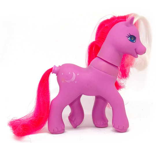
Generation 3
Generation 3 ponies are a pretty clear return to g1 MLP style, kinda scrapping most of the changes g2 made, other than proportionally thinning out the ponies a bit.
g3 ponies have very similar face sculpts with bigger eyes, nearly the same legs, and their heads just a bit bigger in proportion to their body
They do remind me a lot of the g1 Petite ponies, which were 1 inch sculptures that also had those proportionally bigger eyes and chunkier legs.
I have here included the g1 so you can see the slight changes better! I think the main difference would be the g3 takara would be a lot rounder, smoother, and cutesy-er. While the original has the hello-kitty simple cute look, the g3 version would definitely have like eyelashes and big eyes.
The only other thing to note about the body is some bigger ears, a generally rounder face, and round feet.
There weren't many gimmicks super /unique/ to g3 but one I wanted to highlight was the Breezies. G1 did have the flutter ponys, which were ponies with butterfly/dragonfly type wings, but the breezies are like their own little species AND they have antennae. While the flutter ponies were sort of graceful and thinner than the other ponies, the breezies are like little chibi-er ponies.
A little bit Littlest Pet Shop-core, since its the early 2000s too.
SPEAKING OF
Generation 4 Generation 3.5
Before there was gen4 there was a subset of Gen3 ponies with a different and unique style. They were basically an exaggerated version of the Breezies with even bigger feet and tinier snouts. They are also VERY littlest-pet-shop-core.
So, pretty straightforward changes
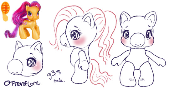
Just an even more chibi, kid-ish style pony. I think the g3.5 ponies were even meant to be kids. So this is just an even more child-friendly, littlest pet shop type horsey.
Generation 4
So, obviously generation 4 ushered in a whole new era of My Little Pony with its unique and bright artstyle, which did need to transfer over to the ponies
Personally, while I love g4 in a lot of ways im not a fan of the toys in the same way I am the other generations, their little noses have shrunk to specks, they're skinnier and more big-eyed than ever. Well, g3.5 was pretty big-eyed but at least those ones were like little kids.
This is such a drastic shift from g1/g3 and even g4, I would be unsure about the takaras.
So: eyes, bigger. Snout, so tiny and so smooth. Ears, bigger. Hooves are flatter and parts of the legs are just kinda featureless. a longer neck. They released a decent amount of ponies with plastic hair this gen, too.
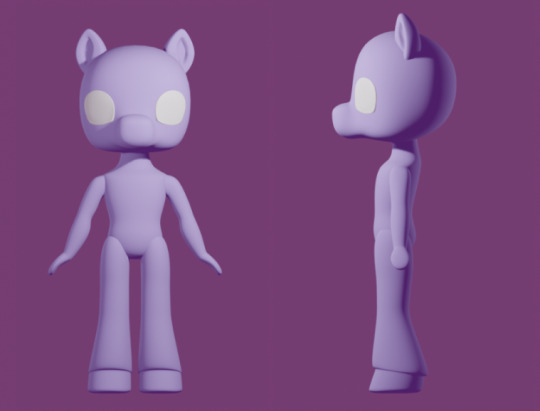
I was struggling to come up with a doll for this one, but I finally realized I was doing it backwards. The thing that makes g4 stand out, I think, is the fact it was fundamentally designed opposite from g1. Lauren Faust, an animator, designed the ponies and the toys had to be designed around her art.
So the primary difference was considering what a tv show- a tv show concieved in the 2000s and airing in 2010s- and I did look into some kids properties from that time period as I was designing
I think these Strawberry shortcake dolls are really close to the concept I'd want for a early 2010s mirror of MLP g4. So basically these toys but more anthro.
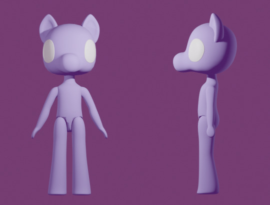
I ended up making a 3D mockup so I'd be able to plan the different angles and keep them consistent.
The eyes are kind of far apart but I think thats true of the g4 pony toys as well. Again, because of the way the g4 show was stylized as animation, there was sort of cheating with the anatomy, especially on the face.
Generation 4.5
Gen 4.5 was a spinoff of gen4, just like gen3 had 3.5 where the ponies are more chibi. More big eyes with even bigger ears and a face like... a cats? instead of a horse. Hoof fluff again.
I think this nailed the style without being as much of an outright copy. The bendy arms with fingers seem so silly but also I think that matches the vibe/artstyle.
G4.5 don't look like horses to me really at all though, they're like cats with hooves. Out of all of them we've seen so far they're suffering the most from "predator eyes" where they've gone so far as to make their eyes just face forward.
Generation 5
Generation 5 premiered with a CGI movie, so the toys that would be released are fairly on model with their movie selves except for the fact their heads are smack dab in the middle of their neck which i find extremely unsettling and dislike
We've gone full "predator eyes" (no the predator eyes thing doesnt 100% biologically hold up but I find them freaky and I get to say it) AND full human eyebrows stenciled in like a makeup vlogger in the same color as the hair.
The ears are back to cup shaped (more horselike) but again the face is round with a little muzzle (more catlike). The hooves have really detailed feathering on the legs. Otherwise the body is mostly just structured like the g4 body (except a bit longer) just with more specific horse details.
These continued the trend of having a lot more articulated versions with moving legs as well. I think given that most dolls these days have articulated elbows and knees, it is reasonable to expect the takara g5 dolls would too.
Again, I made a 3D model so I could keep it consistent from various angles.
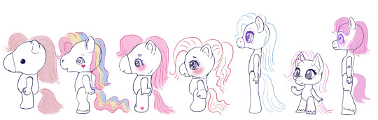
ta-daaaa heres my takara pony generations 1-5 lineup! Tell me which youuuuur favorite are. if you want.
#im sorry for how long this post is#long post#my little pony#takara pony#mlp gen 1#mlp gen 2#and so on#generation 1#doll designs#sketches#i also wanted to do the clothes styles for each gen but this took so long already#and alternate gimmicks#would be fun to explore
207 notes
·
View notes
Text
About the whole "Fyodor-switch personality" thing: We don't have enough information to confirm whether it was real or fake right now, and besides, both possibilities are really interesting.
If the switch was real and Fyodor was lying to cover it up (...because 'you know characters can lie, right' could mean... this part of it was the lie too...), that could easily be made a reference to Dostoevsky's The Double, as I was kindly made aware of. We've also already had an image of a young woman who looks like Aya from potentially a long time ago, given the outfit and that it is Bram's memory we're presumably seeing there, which may tie in interestingly with "what year is it?" The knife he pulled out also is genuinely a unique design for the series, and looks like it might be an old make. If this original is very old, then something in the takeover of personalities may explain why he hasn't seemed to age. Fyodor being a separate personality created from his ability and kicking out the original could tie in with his ability not attacking him in Dead Apple. This also raises more questions about Fyodor's motives, and I think opens the path for some pretty fascinating theory making. It also places Fyodor as something both human and not... intriguing for the ongoing theme of humanity in the series.
If the switch was a fake and Fyodor was being a completely hilarious little shit (which, we know the Joker is part of his inspiration and he is often contrasted with Dazai, Nikolai, and Mori, for whom this kind of behaviour would be expected - it's characterization, that's not 'done for no reason'), it would quite possibly be the funniest thing he's done in the series so far. But! More importantly, it strengthens Fyodor's connection with the Book (or rather, with altering the narrative). He's told a lie that sounds completely ridiculous but makes sense given the world and situation he's in - and notably, could fool Sigma... and the readers. Fyodor also managed to change the lightness of his eyes without changing the state of his soul - something that no other character seems to be able to do. (I know Dazai can feign the shocked expression, but that's not the clear lightness we saw in Fyodor's eyes in this panel. Nikolai's eyes change lightness but that actually seems to be genuine.) While this doesn't help us discern anything more about Fyodor's motives, it does emphasize his expertise at information manipulation - we cannot trust a single thing this character says, not just in universe, but out of it too. We, the readers, cannot listen to Fyodor and take anything he says as supporting evidence for theories. If this is true - that's fascinating. The other characters will have to solve the mystery of this man completely indirectly, and so will we.
Of course, there is the secret third option: it was a lie mostly, but there is an element of truth to it somewhere, which is actually par for the course for BSD as a whole. It is very rare that a character turns out to be lying completely. The question then becomes "what part is true and how much is it true", which is also very compelling. This, personally, is what I'm ascribing to for now until new info comes up.
Anyways, the last thing I wanted to point out is that if it was genuine, then remember The Double was inspired by Hohol's works, and if it was a lie, then that is very similar to the bait-and-switch performances that Nikolai has done multiple times in the series. Either way, it implies some influence on Fyodor by Nikolai and of course vice versa, which probably means the return of the clown (finally!) and more focus on their dynamic, which is a funny thing to show Nikolai having apparently had influence on Fyodor (even if in more of a meta way) as he is actively trying to kill him right now.
Love wins/loses?
#i also kind of have my gripes about split identity storylines... but in the end i just want whatever happens to be#the most interesting story to tell with this character#we still know nothing about fyodor and certainly not enough to know how much we can take as truth or lies#bsd#bsd chapter 108#bsd spoilers#bsd fyodor#fyolai#storyrambles
305 notes
·
View notes
Text
jellicle lineups; part 3/4
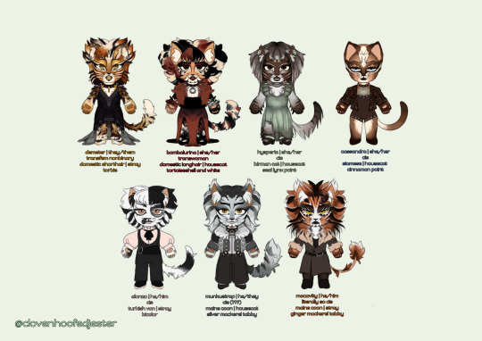
LETS GO PEOPLE!! LETS GO !! sorry for taking so long to get around to this one !
demeter | 🔒 🍰 🌇
DEETER
ive seen a lot of complaints about demeters design being toned down over the years so i decided to bring some of the bolder design choices back for mine. mullet demeter is REAL now ! honestly i couldve done more w/ their makeup but shhh its ok....
i tried to push the gold in their design by making the eyeshadow really obvious and giving them gold lips. enjoy their lacy dress too... i tried to design something which they could dance comfortably in
demeters newer 3 words (nervous, sensual, secretive) mean everything to me. love them so much. i think theyd be 29 in human years
bombalurina | 🌹 🍓 🛼
so i totally based her hair on that concept art for drag queen bomba. the bob is too cute ! i had a blast doing her design for the most part. i struggled w that makeup and the color of her dress but its ok.
i also tried to give her something she could dance in—just like. imagine the length of the dress a little shorter. im not going back and fixing it
i based her color palette/patterns directly on her concept art because tbh, i dont love blond/ginger bomba ! so black/white/red hair bomba it is
i think she would be 27 in human years
hysperia | 🪴 ⌚ 🍡
this is my version of exotica, renamed hysperia, because i do not love her og name. its not fun. the name hysperia is taken from an ensemble kitten character from the og london production
i also based her design on a multitude of things, asides from her 2 costumes in 98—like some nbq/greycat designs since i feel like that design not becoming a common ensemble character was a waste. A WASTE I TELL YOU! ive also based her fur length on warsaw victoria because oh my godddd that design is so good. peak
her neck bow is a nod to the 2019 movie... the macavity girls w/ those bow collars. they were onto something there
she would have a much more prominent role than the few times she cameo'd in 98, still retaining the elegant/shy personality she shows in the film. shed be 29 in human years
cassandra | 🪐 ♠️ 🥯
i originally made her makeup a lot closer to her replica designs but decided to go for something a little different based on a makeup look i saw on pinterest LOL. so like. enjoy her slight earthy gothic vibes. i also didnt struggled too much on her outfit since i came into this knowing that i wanted her to be wearing something formfitting and bejeweled. a little circus-y too
more people have got to play up her disdainfulness. she'd be 26 in human years
alonzo | 🎹 🍢 🎳
once again, another design pretty similar to his standard replica one. i just tried to make the black patch on his face a little greyer and with some white detailing. because tbh every alonzo with white mascara makes me go crazy its so cute
i also tried to make his head fur/bangs a little distinctive—inspired by a random pic from a production i dont know the name of
enjoy his little cute fit too. pinklonzo. pastelonzo
that one gif of him pantomiming eating a playing card IS canon to me. he'd be 28 in human years
munkustrap | 📼 🥧🎙
verrrry similar to standard replica munks makeup-wise ! however, fur wise.... say hi to mulletstrap. to manestrap. 2 me he is tuggers brother so he gets that. i have no justification for the mullet other than idk, looks good, is funny, and the oslo 1985 production was right to give him one. also he and demeter can match now
i do like when theyre seen as something of a prince... so say hi to the gothenburg and opera populaire-esque epaulettes. theyre cayoot. they also get warsaw munks Big Pant Vibes
give this man a break. hed be 30 in human years
macavity | 🔥 🥂 🎯
he was actually one of the first cats i made design notes for when i started hyperfixating on this musical like.... two months ago. i really tried to mix elements from a bunch of different designs 4 him.... and sorry yall hes a deut brother too. im predictable
the manginess, mane, more ginger-y head fur, tugger-ness and the mouth markings from the 2016 revival... the big big hair, white fur and general makeup from his replica design... and the stylings of il sistina mac with the fitted coat. he also gets unique eyelashes like tugger—this time white instead of gold. he also gets that ominous magic cat eye shading
i think he would act a lot like 2019 mac... suave. but also not as dorky and desperate as he is in that movie LOL. he'd be 33 in human years
ONLY ONE MORE LEFT..... THE OLDIES........ MAYBE... I MIGHT MAKE DESIGNS FOR SOME OF THE SWINGS TOO LOL
#cats the musical#cats musical#sfw furry#character design#chibi#my art#demeter#bombalurina#hysperia#exotica#cassandra#alonzo#munkustrap#macavity
70 notes
·
View notes
Text
More Cyberpunk au details + details of the RGB desings + earlier concept drawing
(Before that please let me know if you want more info on the au because I have a couple drawings planned but with school and stuff I can't draw much and Idk if I can stay motivated that long. So my next posts could be mostly au lore with maybe some sketches, tell me if you'd like that)
In general terms, to give the Cyberpunk aesthetic to all of their designs I try to avoid symmetry by adding belts or patterns to break it. And for the colors, I focused on darker hues and neon tones. This way, the designs have a “punk”/dystopian-ish vibe while representing the high-tech elements of their society (which is like Cyberpunk in a nutshell).
As for the young versions of RGB, each one has their own color palette: Kai's is Red and orange with shades of black; Nya's is Blue, pinkish red and light shades of gray; and Lloyd's is light Green and also dark blueish green. Kai and Nya get a few details (shoes, arm or jacket) of each other’s main color as a wink ;).
Kai's outfit is meant for moving around comfortably both in the city and outside, Nya's is like a mechanic uniform for tinkering, and Lloyd's is for running as fast as possible; he also has a puffy sleeve similar to Kai's (le wink again). All three of them have a letter of RGB in some part of their outfit and share a tech pattern, each positioned differently (Kai in his inside shirt, Lloyd in his sweatshirt and Nya in her leggins)
As for Kai's eye:
One day, when they were exploring around the danger zone of the outskirts of the city, Kai accidentally activated a trap set by one of the last survivors of the Outside that unexpectedly still lived there (a paranoid rancid sociopath). The violent trap had become infested with Red plants with time and made Kai get in contact with it too: it instantly dug its roots deep within his right eye socket and Kai was unable to pull it off. Since it was such a sensitive spot where the plant was sucking all the nutrients out of him, he was so weak that Nya had to slowly and painstakingly carry him back through the ruined suburbs to get help inside the city walls. After getting around the border control with the plant still stuck to Kai’s eye, all thanks to Echo’s help (who also carried the kid the rest of the way), they got to the doctor’s. Luckily, he was able to cure Kai, but he was forced to remove the affected area, which were his eye and part of the skin of his face; however, if he had waited any longer the plant's roots would have reached his brain and killed him.
Nya then started looking for a biomechanic while Kai rested with little Lloyd, who’d followed his sister all throughout the loaded trip back but could do nothing but keep her company due to his size. However, when the girl finally found one who agreed to make the prosthetic eye for them, a fellow demon named Ronin, he set them the condition to seek out a strange artifact for him as payment, giving them a total of eight years to find it. With no money and no choice, they were forced to accept, but Nya managed to get a picture of the prosthetic’s plans; this ensured that she’d be able to fix it and not depend on the guy too much, but four years later they were found out and their deadline was cut down to only another year.
In the end, Ronin will be Ronin, and the mysterious artifact was in fact a collectionist piece of
Garbage.
Apart from that incident though, as kids they don’t really spend that much time in the city, and they generally only come there to visit their friends/acquaintances and sell stuff Nya finds. For example, they do both of those things in Ed and Edna’s junkyard, where Nya trades her scraps for their more useful scraps while visiting their friend Jay. She and her siblings (who always need to stick together inside the city walls just in case) like telling stories about their adventures in the Outside to the oblivious inhabitants, so obviously Jay is no exception. The girl is very energetic and much more of a little unhinged rascal in this au, so her stories are usually really exciting and filled with funny acting for the little boy. Additionally, as they are both mechanics in the making, whenever the siblings come around his parent’s workshop, Nya and him show each other their latest creations and sometimes they even discuss how they could improve on their work.
But the one who most often talks to people, especially strangers, is Kai. Because even though they are feared as demons, the boy is much more chill and charismatic than his siblings, and is usually in charge of being the friendlier face (although he does like staring at the people who get scared of his dragon ears a little too hard hehe). In fact, they use that awkward fear to their own advantage: due to Lloyd’s much more obvious demon features (his ears are even pointier than the other two’s and his eyes are straight up red), he is often the distraction whenever they need to steal food, either in times of need or if they just wanna cause trouble. People just cannot stop staring nervously at the little boy, who is great at drawing the wrong kind of attention, and when the act is up, he’s so fast following his siblings that no one can ever catch him.
Overall, they don’t really give a single damn about society and think too many of them are just as parasitic as the plants in the Outside, so they don’t often bother as kids to get into the city. That, paired with the fact that they are just three tiny outcasts who somehow miraculously keep coming back from the “deadly” Outside, means that people in the city just tolerate and more or less respect them (out of being kinda spooked by them), so they tend to get away with their shenanigans without much repercussion.
But in the future, they do change their habits a little bit.
When it comes to their designs, they do keep the same purpose but with variations in their shapes. Kai still uses casual comfortable wear but his color palette changes a bit, with a more pinkish Red with blue highlights instead of orange, but he does keep the shades of black. His outfit now consists of a thin bodysuit cut at the chest and hips to make sort of a hexagonal fishnet pattern, trousers and boots, along with a ton of new accessories (more slutty in general).
Nya keeps the mechanic vibe but with more of the gray and blue colors and barely any red. She has huge trousers with bigger pockets and her tools attached under her belt, a sports bra (for the ladies ;)) and mech gloves. She keeps her goggles, which are a different color now.
Lloyd has a sports outfit similar to the previous one in the shorts and leggings. He keeps the puffy sleeve on his left arm, although it is now a standalone piece, and has bigger trainers. His color palette is black and white with neon/bright greens. He lost his arm in an accident with plants too: the affected area was on his upper arm so they had to remove the entire thing, and Jay made his prosthesis.
They all have more small details of their other siblings’ colors (for example Lloyd has the pins on his casual vest); also, and instead of having their respective RGB letters on a random part of their outfits they are now matching at the back of the three jackets. Some other details on them are the fire symbol in blue on Kai's bomber jacket and on Nya's military jacket, the label on the chest that reads "samurai", complete with its X on the arm sleeve.
Their more mature personalities make them live around more in the city, although practically nobody knows their true names still, while also not leaving behind the Outside or Echo (in fact, their expeditions tend to be longer now that they have more experience and overall strength and abilities).
Nya (still just known as “Blue”) actually works in her own workshop now, selling her works on her own. However, her stubborn, energetic and blunt personality has now matured into pure badass and she’s constantly looking for a fight, but nobody can touch her or at least seriously hurt her because she’s insanely strong.
Also, even if they do manage to actually harm her she has her brother Kai (“Red”) looking out for her, who can basically destroy anyone’s private life if they mess with any of their siblings through blackmail :). In fact, he’s usually seen hanging around in the Red district (they even mistake him for a prostitute sometimes lmao), which is where most of the juicy information is flung around, so he has no trouble getting sensitive information about anyone and anything in the city. In addition, he’s developed a calm and charismatic personality that lures people into their manipulative tactics to take advantage of virtually anyone he wants, but his temper can be frail sometimes, especially when his siblings are hurt in any way. But, when it comes to them, even though he is more protective of them as the older brother and can explode if they are treated badly, he still fully trusts them and their abilities and they all rely on and fiercely fight for each other like a team whenever necessary.
In contrast to his siblings, though, Lloyd tends to avoid conflict as much as he can: despite looking like a human neon sign with his jacket on, he always manages to scurry out of sight whenever he’s in trouble as the speedy, witty little monke he is. And the reason he gets caught up in so much drama is because he is extremely curious and, as they aren’t kids anymore, people now care about the demon trio’s meddling in their business quite a bit more.
In conclusion, as they grow, Kai, Nya and Lloyd become more intelligent and fleshed out in their own ways, and even though they still have no respect for society as a whole, they do keep some friends close to them. They love each other and Echo as the unique family they are, and always make sure they have each other’s backs no matter the situation.
Here is Kai's early design + scar (TW: gore)
#ninjago#ninjago cyberpunk au#sketch#ninjago kai#kai smith#ninjago nya#nya smith#ninjago lloyd#lloyd garmadon#rgb siblings
114 notes
·
View notes
Text
Helios: A New Era Story 1
A little shorter then my usual stories, but this is a taste of whats to come for the Helios series.
It had been 6 months since Kara’s triumphant experimental birth. She was rewarded by becoming Dr. Karens Vice president. Kara was now finished with initial training, and the renovations to the Helios Birthing Center were complete. There were now 2500 birthing women in the facility, 20 new gardens along with 10 new birth pools added. Kara played a huge part in designing the new gardens and facilities. She was now a full fledged member of the Helios Society and was now to begin experimentation as well as assisting birthing mothers at the site.
Helios A New Era: Kara’s first birth assist.
It was early morning in Kara’s office located in the north tower of Helios birthing facility. The office was similar to the labs below it. Very sterile, white, and mostly featureless. Kara was writing some new experimental birth agendas when a call came in from Helios Security.
“Security too Kara.” The device said.
“Go ahead.” Kara said.
“Please respond to garden 15R upper level. We have a mother struggling to birth.” security said.
“On my way up.” Kara said.
Kara gathered her to-go bag of supplies and headed out the door. Once out of the office Kara boarded an electric scooter and made her way down the corridor to the Central Halls. The central halls were the eating place as well as the center hub of the entire facility. It was common to house 500-750 women at any given time. Kara made her way down the scooter path passing walking women and staff members. She then hung a right turn to go towards gardens 7-15 corridor. A 1/4 mile later she arrived at garden 15. She entered the garden, so lush and resembling the Amazon rain forest, a trickle of stream water could be heard nearby. She boarded a clear see-through elevator up to the 15R block of the garden facility. Garden 15 was a new remodel that Kara had taken part in designing. She was very proud of it, and happy to see mothers using it to birth.
“Kara to security” Kara com linked.
“Go ahead.” Security said.
“Which section of 15R?” Kara asked.
“Go to the far block, section 10.” Security replied.
“10-4, mothers name?” Kara responded.
“Felicity” Security said
Kara walked to the far back corner of the 15R Jungle section. It was near a small water fall and pond. She arrived at a birthing station. The modern birthing station designed by Kara herself contained many elements for a birthing mother. It was equipped with a bed, bidet for washing, birth stool, squat bar, lubrication and pad station, and so much more. Also like any other place in the facility the entire floor was a self cleaning membrane, so mothers could birth anywhere freely. Their lying on the bed, on her side, was Felicity, the mother in question.
Felicity was a young red head girl, she was 19 and new to the facility. She was bigger boned an had wider hips. Kara walked up as she was mid-push. Felicity was side laying, with one leg pulled up. Kara could hear felicity grunting hard through a tough push. She could also see a liver of the babies head visible in her vaginal opening. She was in full birth mode, but apparently struggling.
“Hello!” Kara said as she walked up.
Felicity turned her head to look, she smiled as she saw Kara.
“Oh I’m glad you're here!” She said. “I need help.”
“Ok, let's see where you are at.” Kara said Grabbing her portable device.
Kara scanned Felicity’s arm tag. All mothers at Helios had an implanted arm tag to monitor health and track cycles.
Kara received the tag info:
Person ID: Felicity
Age: 19
Status: Pregnant- in birth
Time in labor: 168 hours (1 week)
Pushing time: 96 hours (4 days)
Child weight: Unknown, probe needed.
Child number: 1st baby
Kara grabbed her probe next. She inserted the end into Felicity’s vagina.
“Ok push for me.” Kara said
Felicity tried a hard push, Now lying on her back, she pulled back her legs to push. Kara noticed she curled her little toes as she struggled to push. Felicity’s belly tensed and her belly button protruded out during the struggle.
Kara got the data:
Weight: 21 pounds
Gender: Male
Semen type: 52C EXP
Position: Posterior
“Good girl, nice push!” Kara said. Felicity moaned as the push ended. “The little head is just inside you. Looks like 21 pounds and a first time mommy, this is a stuck little boy!”
“Ive been pushing for 4 days and i just cant get it out!” Felicity said.
“Well first time mommy and a 21 pound baby….” Kara said. “Plus little man is a type 52C so his head is a bit larger. Makes for a tough birth.”
“So why am I pregnant with a larger baby for the first one?” Felicity asked.
“You were selected because of your wider hips, it was determined you could likely birth a larger baby.” Kara said.
“Well I’m starting to think that I cant get him out of me, he’s just to big!” Felicity said.
“Oh he’ll come out.” Kara said. “He’s just being a bit stubborn in there.”
“I want him out!!” Felicity yelped as a strong contraction overtook her. She pulled back her legs and made a large push. Kara noticed that she was opening up, the little head was making an appearance. As felicity pushed Kara opened felicity’s vagina up a bit more with her hands.
“Ohh he’s wiggling around in there! He’s moving his little head back and forth trying to stretch you!” Kara said.
“Good, wiggle out! “ Felicity said. “Can he wiggle out on his own?”
“No silly, he can try but he needs mommy to push him out. He’s too big to wiggle outta there!” Kara said.
Felicity pushed again. This time the babies head came a bit more into view. Inevitably however the head slowly retracted back inside after the push.
“Good girl, he loves mommies belly, doesn’t wanna come out of there!” Kara said.
“Come out!” Felicity yelled.
“Relax, he will come.” Kara said.
“Lets check him again.” Kara said.
Kara pulled out her probe and placed it inside Felicity’s vagina. The probe tapped the babies head.
“All is well in your belly.” Kara said.
Kara reached over and grabbed some lube from the station. She liberally applied it around Felicity’s opening and inside around the babies head.
“Lets get you lubed up and help him slide out.” Kara said.
Other hour of pushing went by, felicity tried side laying, squatting, and even the birth stool. The baby in her belly just wasn’t moving. However the head was now staying down. Felicity’s vagina opening was now opened up in a tear drop shape around the babies head. Felicity continued to push for 2 more hours like this with no progress. A little meconium was starting to come out of felicity’s opening around the babies head.
“Lets get you cleaned up hun.” Kara said.
Kara assisted Felicity over to the bidet. Felicity sat down and Kara grabbed the shower head attachment. Warm water began to flow over Felicity’s opening as Kara washed. The warm water felt good for felicity as she began to moan. Kara used her hand to wipe down Felicity. She also cleaned the babies head as it was poking out ever so slightly. The wash finished and Felicity returned to the bed to lay down.
“Felicity, there is trick we need to try. Here at helios we cannot do c-sections, they are too risky for mother and baby. So we need to figure out how to get the baby to progress.” Kara mentioned.
“I want you to pleasure yourself and orgasm. It will help advance the baby, and help you relax.”
Kara pulled a small vibrator from her pocket.
“You know what to do.” She smiled.
Felicity applied the device to her clit area and began working toward orgasm. About 10 minutes passed.
“Im getting it! Getting it” Felicity yelped.
“Ok mommy, let it go, and push hard at the same time.” Kara said.
“Ahhhhhh! mmmmmm! ahhhhhhuuuuggg!” Felicity mumbled.
The orgasm began and felicity pushed. Her belly contracted heavily as she pulled back on her legs, delivering a massive push. The babies head contracted in and out with the strong contractions. As it did, it slowly advanced.
“Push Push Push!” Kara yelped.
Felicity continued to push until her orgasm ended. The babies head had progressed to crown. Her vagina was stretched very far, farther than even Kara thought it would.
Felicity settled after the orgasm, her baby stuck fast at full crown.
“Dont relax too much hun, he could slip back in!” Kara warned.
Felicity kept a steady push.
“I can feel him wiggling!” Felicity said.
“Yeah, he’s trying to get out of there!” Kara said.
Kara felt around the crowning head.
“Wow that’s one stuck little guy there, Very tight!” Kara said.
Felicity made another big push. To their amazement the head popped out!
“Oh my, didn’t think he was going to come that easy!” Kara said. “Hey there big guy.” Kara said as she touched the now birthed head.
“The shoulders could take, minutes, hour, or even days, depending upon size and position. I think this baby just has a big head, he should come out fine now.” Kara mentioned.
Felicity pushed for another hour. The baby slowly rotated and made its way out. Kara was right, the rest of the baby was much easier. This birth was over, But Kara was now called to another interesting mission.
#birth#birth kink#pregnant#giving birth#crowning#birth denial#pregnancy#birth story#scifi birth#Helios
61 notes
·
View notes
Text
I don't trust that new character.
So, minor-ish Shadow of the Erdtree spoilers, though Elden Ring's Twitter itself officially posted the art.
Talking about this person here.
Their whole everything is very, very off.
Now, I will first note that a lot of their design elements are very specifically stuff associated with Miquella and Trina. Helixes and lilies and growing plants, along with the colors. (I should know. I spent way too much time screenshotting and looking at stuff in Elphael and the Haligtree lol.)
But it's the how that first set off alarm bells.
So, you see, Miquella's own outfits tend to be very simple when we've seen him depicted in statues, and in the other pieces of artwork. His followers wear some more complicated designs, along with certain items associated with him/implied to be his creations, such as the Pulley Bow and Malenia's prosthetics.
This design is far too overdesigned. It's so over the top and that's what's bothering me. Miquella's following and Malenia wear nicer stuff than Miquella himself, true, but it never is to this point. Mohg himself, while he has his ostentatious mantle, has some much simpler clothing underneath.
(Mohg seemed to key in on Miquella's distaste with showy stuff, too. He's the only logical person to have made the ring that the giant Miquella body is wearing. It's notably subdued compared to Mohg's taste for ostentatious clothing and seems more akin to the little flower buttons on Mohg's undershirt in its relative simplicity.)
There's also some oddities in terms of the details as well. The white cloak isn't pure white and has some almost purple undertones (more of a pink). We've seen this before, though- Dolores the Sleeping Arrow, wearing the page's armor, and it is similar in that it's almost a pinkish color instead of purple. (Who, mind you, is tied to St. Trina.) The sword itself has a crisscrossing pattern that is reminiscent of Radagon's seal.
There's also the implication that they are the one giving the dialogue to tell the player to go to the Land of Shadow, and narrating about what Miquella told them. Along with the implication that they're some kind of knight of Miquella.
First thing's first. Miquella never had any knights sworn to him specifically. All of the people in Elphael are specifically Haligtree knights and soldiers, not Miquellan. We do encounter a Miquellan Knight Sword, but it is explicitly labeled as not having a master. It seems awfully suspicious that someone shows up as what is clearly supposed to be a knight of Miquella.
Miquella also departed for the Land of Shadow alone. And everything in the world design seems to imply that he wanted to keep both his following safe (and probably the Mohgwyn dynasty, too, considering all the design overlaps in security), and to make sure nobody would actually follow him.
So this person miraculously shows up, knowing how to get to Miquella despite Miquella deliberately leaving alone, when everyone Miquella clearly cared for doesn't seem to know what's going on.
Second is how they know what they know. They talk as if they've spoken to Miquella, but that seems really fucking weird, doesn't it? If Miquella deliberately left the way he did, why would he just tell random people he met that kind of stuff? Too much of it is raising red flags for that reason. He seems to have been very secretive in what he knew, like he wanted to fix it all without getting others involved unless necessary. He compartmentalized information quite a bit.
This makes sense, though, if it isn't something they needed to be told because they already knew it.
I think it's St. Trina, searching for Miquella, to get him to go back to his fate. A fate Miquella deliberately wished to abandon.
16 notes
·
View notes
Text

First post on sideblog, let’s goooo!
Image ID 1.0: The uppermost image is an image dump of rendered sketches of a ROTTMNT: The Movie AU version of Renet. She’s a young black girl, about the same age as April in the film, and she shares a striking resemblance to her, short for Renet’s hair being bleached blond. The drawings included in pictures described later, and in the bottom left corner is a photograph of the pencil sketches from a notebook. The text in the image reads:
Renet (ROTTMNT MOVIE AU)
- F!April’s daughter
- Master Michela[n]gelo’s protégé
- Got sent back before Casey but got stuck in limbo; emerged after events of the movie.
- Possibly a clone of April
(End ID)
I was rather disappointed we got another Casey as the MC in the movie instead of her, so it got me wondering if she could fill the same role as him. In my opinion she can, and that birthed this AU idea. Her being Future April’s daughter and Mikey’s protégé fit too perfectly, so I would actually have her be Jr.’s old childhood friend who was missing for many years (in limbo), so both of them are happy to see each other again in the present new timeline.
Regarding the “possible clone” comment: Many headcanon Casey Sr. either finding Jr. in a dumpster somewhere and adopting him, or that she asked Draxum to clone her. I’ve never really subscribed to either, since he does look very similar to her (which makes me think they are biologically related), but his temperament is basically the complete opposite of hers (which refutes the clone theory in my head). I always just assumed Cassandra had a boyfriend too irrelevant to mention in the show, even long before the movie released. I figure he’s her biological son, but he inherited his father’s temperament (and his mother’s looks). That being said, I’m willing to apply the cloning idea to Renet. I cannot picture April with a man, ever, so I can see her demanding Draxum clone her to give her a daughter. Maybe the kinder side of April’s personality is stronger in Renet since she grew up in an environment where kindness and hope are the only things keeping a community together and its members sane. Maybe she even adopted some of her other mom’s (Sunita’s) traits, who knows?


Image ID 2.1: A 3/4 view of Renet’s head, drawn in a style very close to the show’s/movie’s. She’s looking forward, away from the viewer, smiling slightly with a little of her teeth showing. She wears her blond hair in a ponytail like April did in the show’s finale arc, and she has a blue headband and a decorative silver tiara resembling a clock (10, 11, 12, 1 and 2), which bears a slight resemblance to the Statue of Liberty’s crown. Her cape is the same shade of indigo as her headband, and the cloak’s collar is majorly oversized, revealing her neck. She has an earring in the shape of an hourglass. (End ID)
Image ID 2.2: A fully rendered illustration (not in the style of the show/movie) of Renet and a teenage April from the end of the movie in front of a sunset. They are standing in profile towards each other, with Renet on the right, holding April’s hand in her left and her time sceptre in her right. April’s expression is slightly confused whereas Renet’s is tender and happy. A small speech bubble reads “Hi mom.” Renet’s chest plate/plastron is brown/dark orange to mirror Casey Jr.’s teal, showing her connection to Michelangelo, much like Casey’s shows his connection to Leonardo. (End ID)
I’m not entirely sure on her cloak’s exact design yet. If you look closely at the pencil sketch of her body, you can slightly see Donnie’s Genius-Built Apparel ‘D’ logo on her sleeves. I left it out of the illustration with April by accident, but I’m not sure whether I necessarily want his logo in those spots on her cloak. Maybe it’s at the bottom of the tail? I’m also not sure whether I want it to have those glitter-esque particle effects from the bust drawing; it’s not really a design element in-canon. Although, I do find it very pretty.
#mimjan draws#mimjan rambles#art and text-based post#first post on this blog#rottmnt au#canon-based au#rottmnt april#rottmnt renet#she was so snubbed fr#I love Casey Jr as much as the next person#but come on! did we really need two?#Cass is my once and forever main ‘Rise’ Casey#they can share that title#I really just wanted to see their take on Renet more
26 notes
·
View notes
Text
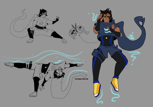
Adult John redesign because he deserves it
Also a follow-up on my threat of airbender John aka John is basically an airbender if you think hard enough about it.
See below if you want to hear my yap session on elements of this design vvv
Okay so, why have I done this?
I wanted to make my own take on his design because I hate seeing my boy get roasted so hard by his friends for his outfit. I tried to keep some elements akin to his child-self’s design for sake of identification. I specifically kept the appearance of a crop-top (as seen in hs2 when he wears his younger self’s outfit) but with the addition of a skin-suit underneath for some actual practical protection (as I assume he will be doing some fighting at some point in the comic). I also kept his hood (it would be a crime not too) but with the addition of a collar to make it more similar to Commander Karkat’s outfit.
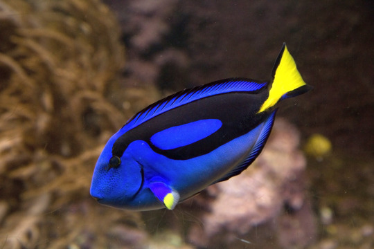
I also had an idea to make his outfit inspired by a Blue Tang, as his original colors are blue and yellow. I liked the addition of darker, more muted colors to keep up with the idea that they’re adults and this world they ended up in did not end up to be all sunshine and rainbows. BUT I kept his brighter colors as accents to call back to his fact. But yeah, idk why but I really liked the idea of theming aspects of his design on this little fishy vvv.
As far as the airbending aspect, outfits from ATLA for airbender are dynamic and move with the wind, which I felt suited John’s original outfit well. I’d imagine his hood will blow with the direction of wind which he is bending. Additionally, the reason he has a thigh back (other than its a little bit slutty) is that by having it attached directly to his thigh, he’s less likely to have it get in his way while fighting/wind/airbending.
Finally, the locket. I’m just a sap but I have a headcanon where he insists on fighting alongside his friends, BUT, that means he has to go off on his own a lot of the time, and isn’t able to see them or his son because of safety reasons. Thus, I think it is just a nice symbolic thing (especially because he is depressed) to have a reminder of people he cares about with him constantly.
I might in the future do a LOK screencap redraw from that scene where Zaheer uses airbending to take the air out of a person’s lungs, but I genuinely don’t know who John might do this to, other than random grunts.
#homestuck#homestuck2#homestuck beyond canon#hs#hs2#john egbert#john Egbert design#homestuck headcanon
17 notes
·
View notes
Text


Developing S0-R0 (Sketches)
I just feel like drawing Kun3h0-likes lately, so I decided to work more on developing a "rival" character for her. Right now, I'm whittling away at this design that I'm calling "S0-R0" for the time being.
The 2 pics are the latest drawings, then I have the progress of getting to that point in chronological order. You can see the very first "rival" sketch in the last Misc doodle dump.
When I first went into this project, I didn't have any strong direction for where I wanted the character to go. Since Kun3h0 isn't fully developed as a character either, it was kinda hard to think of a foil to basically nothing. However, I did know that I at least wanted the rival's theme to be "stars" to contrast Kun3h0's hearts. So whatever I did was gonna drift towards sharpness.
The first chronological sketch is almost a straight inverse of Kun3h0's design in terms of palette. I wanted the silhouette of their arms and legs to be roughly similar so that it's more clear that they're supposed to be connected and not (just) that I have a limited amount of body-plans that I default to. I do like the black/green color scheme, but they've got a real "XBox" and "Monster Energy" vibe to them.
The outfit itself was heavily based on these clothes, just to give me a little direction, but the current design really drifted away from this.
(I added spinning bulborb just so the clothes wouldn't stretch out the post too much)
I also borrowed an old idea from my "Digital Idol Kayane" design, where she had some of her elements floating around. I figured since Kun3h0's ears/antenna just kinda "float" that I could apply the same logic to the whiskers. That detail would persist through most iterations of the design, but I eventually dropped them.
But, I was still pretty unhappy with that design, so I made another sketch and started working around it. The first iteration was mostly a palette swap to get away from Monster Energy, so I went with cyan since it's a kinda futuristic color that I thought would go great with the black base. Eventually it evolved into the second iteration where I went back to giving them the pants of the very first rival sketch and working from there. I'm not quite sure where the idea for the spikes came from. I think I just wanted to add some more "sharpness" to really work in the star motif, but then that kinda became the "main" motif beyond the stars.
I thought the black/cyan/red color scheme was really cool, but it kinda works against my established symbology where stars are yellow and moons are blue. In the event that I design a moon-motif character in the GAB universe, it would be odd for them to now not be able to use blue because the star-motif character got to it first. So, I did another palette swap, this time exchanging cyan for yellow and gold.
While I was working on that, I also got the idea to design their mascot to help with the design process. Since Kun3h0 was originally based on GAB, I thought that it might help me come up with ideas to solidify the mascot design first and that would help me design the rival proper. So, I made this little fox fella and have been designing S0-R0 around them since. I made several other palettes for the mascot, but in the end I went with my first design.

Finally, I took another stab at the outfit and landed on this minidress and made the collar comically large. I really liked the idea of this slim body being covered in large, overbearing spikes. I also took out more of the red accenting since I wanted to limit their palette as much as Kun3h0's, which is a neutral + 2 shades of the same color + a pop of one other color for small details.
It's not perfect yet, but I do like this direction. I went with this for some rough characterization: While GAB sought out someone with a strong heart to help them, FOX (name not final) sought someone with physical strength. Unlike Kun3h0 who is more emotional than a robot ought to be, S0-R0 tries to complete tasks as efficiently as possible, which leads to them using physical force to address most of their problems. They're not evil per se, they just don't consider the greater ramifications of their actions if they still ultimately complete their original task.
I haven't drawn it yet, but I think their weapon would be a morning star/flail.
13 notes
·
View notes
Text
BAD BUDDY – ON GRAPHICS, GUARDIANS AND GATEKEEPERS
I've written about Pat and Pran's comfort objects before (see these links here and here), and my surface read at that time was that their security blankets reminded them of each other – Nong Nao kept Pran in mind for Pat, while the second, secret P on Pran's hobo bag was a visual metaphor for his hidden crush on Pat, that he'd been nursing like an unseen wound ever since high school.
(top) Bad Buddy Ep.10 [1/4] 8.53 – Pat smiling at Nong Nao in the morning light; (bottom) Bad Buddy Ep.2 [1/4] 3.26 – Pran and his PP hobo bag, ready to face the world outside
But looking at this again, I think it's equally valid – maybe even more so – that Nong Nao and the PP bag may actually have a second layer of even deeper meaning. For they can also be read as metaphors for each boy himself – with Nong Nao a stand-in for Pat, and the double P on Pran's bag also symbolizing how Khun Parakul lived his life behind a host of defensive walls…
One of the write-ups linked above (Who Are You Really, Nong Nao?) examines how extrovert Pat, growing up under Ming's influence and without Pran in his life, would probably have sought comfort by holding Nong Nao tightly to himself in his darkest moments alone.
But if adolescent Pat had truly been struggling with issues of identity (grappling with the different, belligerent versions of himself that he was forced to assume by Ming, all at odds with his true nature that was more empathetic and loving), the Frankensteinishly stitched-together Nong Nao would actually be a most apt metaphor for his jumbled sense of self.
And knowing Pat's scent kink, a doll-pillow suffused with the smells of his own body from being hugged tightly every night would have been the ultimate comforter, that reminded him of his own elemental truth even as the other versions of Napat Jindapat haunted his night-time dreams.
I now have this as part of my headcanon, that Nong Nao was as much a reminder to Pat of his own truth, as well as a reminder of the other nong that was taken away from him – Pran Parakul Siridechawat.
And then I got to thinking, wouldn't it be great if the PP bag could be playing a similar dual role for Pran as well? But here's the thing – I think it actually does in a way.
My first instinct (and I still hold this to be true) is that the smaller P nestled within the bigger one was very much a metaphor for how Pran (the big P) was nurturing his secret crush for Pat (the smaller P) deep within his heart. And in this way, the bag was a reminder to Pran of his beloved Pat.

But as a parallel to Nong Nao's role as comfort object for extrovert Pat and his aversion to alone time (see the write-up mentioned above), the bag can also be read as a comfort object for introvert Pran and his aversion to the world outside his sanctuary (see these write-ups linked here and here for more info on private Pran's inner world).
Pran's hobo bag was not just some random prop inserted for the possibility of merchandising after the series. It was very much part of Bad Buddy's original DNA, and was present even in the informal pre-filming promo trailer released in 2020 (see this link here) although the graphic at that time was very different.

But the bag even then had a very homemade feel (soft and unstructured, with an untidily knotted shoulder strap), suggesting that Pran himself may have had a hand in designing and making this piece of psychological armor that he would put on himself to face the world.
Anyway, building on this, it's the final version of the graphic on Pran's PP hobo bag that tells the most about its role as a security blanket in Pran's life.

My headcanon for the bag is that Pran – during his early days as an architecture student immersed in creative activity all the time – must have designed the logo himself.
And Mr. Metaphor, who plastered the walls of his life with signs and symbols (e.g., his smiley/frowny notepaper and doorhanger, his little sketchbook doodles) took the opportunity to silkscreen a talismanic symbol onto his bag to add another layer of protection for his inner life, that he would clutch to his person as a means of boosting his psychological comfort whenever he had to venture into the world outside.
It wasn't the only time Pran had done something like this – I think the supersized smiley guarding the door of his student apartment fulfilled much the same function:
So on one level the double P on Pran's bag represented his feelings for Pat. But on another level, the double P illustrated how Pran was constantly buffering himself from the outside world, erecting ramparts of perfectionism and excellence for exterior display (see the write-up mentioned above), all while keeping his true nature and own sense of self buried within.
And that is another reading of the larger P (public Pran) surrounding and shielding the smaller P within (private Pran).
But Pran's double P graphic actually went further that that – for it also referenced the other, human protectors in Pran's life, and in that way drew from their power to offer additional comfort to him. 👀 (Bear with me on this.)
Prior to Ep.10 (before the watershed khan maak that was Pran's big coming-out), Bad Buddy showed us that Pran was quite content to live his life uncomplainingly under the guardianship of someone higher in status and/or more powerful at dealing with the world. The narrative gave us several examples of these people:
Dissaya was the ultimate gatekeeper and guardian, hovering protectively over Pran at all times.
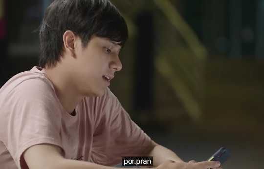
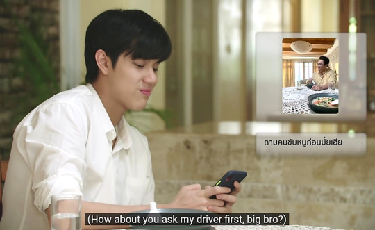
Pran's dad was referenced twice in a protector role, with the first being part of his chat ID por.pran in Ep.1 (the Thai word for father – พ่อ – is pronounced like por). Pran had set it up so that his dad stood before him and loomed ever-present even in his private online interactions with others. Noting that in Bad Buddy PatPran's digital devices also symbolized their private lives and hearts (see this write-up linked here), this suggests that matters of Pran's heart would also be subject to his dad's approval. And the second reference to Pran's dad in a protector role also backs this up – when Pran only somewhat half-jokingly told Pat that he would need his dad's permission first in order to woo him (at the beginning of Ep.7, during their morning phone chat).
At the Archi Faculty, peer mentor Joke took up the role as Pran's guardian – this was evident in how hard he grilled Pat about his feelings for Pran during the Ep.10 khan maak. Joke's name was also invoked in Pran's original computer password Pransocool (see this write up linked here), standing guard over another metaphor for his inner life. (As an aside – Joke was also the father figure for Pran in his university family, so his approval for Pat and Pran's relationship as part of the khan maak engagement ceremony was actually a full-circle moment, calling back to Pran's reminder to Pat about paternal permission at the breakast table phone chat of Ep.7.)

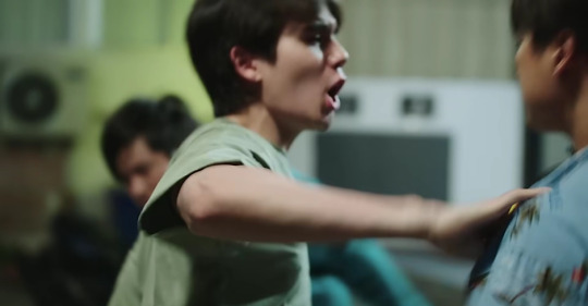
And during Pran's teen years at boarding school, Wai would have fulfilled that protector role, because his rough aggressiveness toward others while being his best friend would have been shielding for Pran as well – and we saw Wai taking his protective duties very seriously still during the fight scene of Ep.5:
Knowing how the naming of characters tends to signal deeper meaning in Director Aof's work (see these write-ups linked here, here, here and here) I'd often wondered what significance the names Wai, Dissaya and Joke had. But I could never find anything to explain why or how those names were chosen – until now.
I have come around to thinking that these characters were so named because they can be linked back to the graphic on Pran's bag – if you look a little more closely. 👀
In Thai, Wai's name is spelt ไว. Here he is at Ep.2 [3/4] 3.35, moonlighting at the Flagpole Bar with ไว clearly emblazoned on his nametag:
I think the text on his nametag was purposely oversized so that it would be clearly visible onscreen, for us to notice (and also dwell upon 😂).
Anyway, if you spin the PP graphic of Pran's bag around and invert it laterally, the similarity to Wai's name is unmistakeable:

As for the other protectors in Pran's life (Joke, his dad or por, and Dissaya), just rotating the graphic changes it into the initial letter of each word:
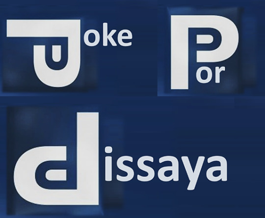
In this light, it's possible that the names Wai, Joke and Dissaya were chosen to fit the graphic and not the other way around. And Pran's dad was then added as another protector because the word por would fit too.
But within the context of Bad Buddy's narrative, what we got was uber-designer and future architect of MBS Tower 4 Pran (see this link here) coming up with a multi-layered metaphor on his bag that both represented him (by alluding to his protective shell, and his feelings for Pat) and also comforted him (with shielding powers drawn from his human guardians, that he invoked literally by name) whenever he ventured outside into the wider world. 👍
If this isn't just my imagination running wild again (and even if it were 😂) isn't it kind of nifty that Pran's PP logo can do this? 🤩 I love the art direction and graphic design in Bad Buddy. 💖
13 notes
·
View notes
Note
Okay so before I saw your design for the RAM!AU I’d actually been thinking quite a bit about what Vox would look like in this, so if you don’t mind, I want to write down some of my thoughts about an alt design of sorts for him
I think both his antennae would be bent, like you drew them, since they’re often written to be in some way connected to his thoughts and . Well .
I think his outfit would definitely take after Alastor, maybe even moreso, with a few changes to be more… uh, docile ? Like, his shoulder pads would be horizontal instead of going upwards like Alastor’s do . Alastor’s suit kinda goes into a triangle shape at the bottom, so Vox would have that but it would be shorter . His tie would still be big but it would have the same shape as Alastor’s . I don’t think he’d wear as much blue if he wears blue at all, or at the very least he definitely wouldn’t wear the bright cyan since that’s something he didn’t wear as often back when he was a box-screen . Also, the cross Alastor has on his chest would be replaced with an X because it’s a type of crucifix that’s was specifically requested by someone who didn’t think they deserved to be on the same level as the J-boy himself and, well, we know Alastor doesn’t see Vox as an equal anymore .
Those are the big ones but some others thoughts I had were that Vox probably has like . No edge to him anymore . Because while Alastor sucks at taking responsibility, there are times where even he has to step in and take care of Vox . For example, if Vox ever hurts himself because he, hypothetically, forgets that he’s a demon with super sharp claws that can easily pierce through his screen…. Well, then the easy solution would simply be to file them down, no? Declaw him? (I’ve heard declawing has like pretty bad effects on cats too so . Easy angst for him and maybe indirect angst for Husk who has to deal with like….. phantom limb pains but in reverse ?)
Anyway yeah . Just wanted to say some thoughts I had . Love this AU btw !
Yeah, I thought about incorporating more of Alastor's design elements, but I ended up just kinda not? I did try to make the red in his palette more prominent though.
The similar suits is quite a good idea, but I wanted him in casual clothes– he may want to continue dressing sharp, but he's just not in a headspace where he can wear a suit 24/7 anymore without it being constantly damaged and disheveled. Plus, the design I drew is specifically for the hotel route, so I wanted to keep the outfit more reminiscent of clothes a handyman would wear while still incorporating the 50s aesthetic and keeping it recognizably Vox. I let him keep his little bowtie though, since that's one aspect of his base design that he definitely stole from Alastor, and there's symbolism to be had by leaving it perpetually undone.
But oh man, that declawing idea is deliciously brutal. Heck, Alastor might not have even been the one responsible for it– what if it was Val and Velvette? An act of care gone wrong? I mean, how were they supposed to know that not every part of Vox's body is purely synthetic...
10 notes
·
View notes
Text
New CR Theory Time!
So, this has little basis in fact, and is almost all pretty reach-y extrapolations of what we know already, but I really like the theory, so I’m going to lay it all out for you:
Ashton is Ludinus Da’Leth’s grandson
Hear me out. Here’s what we know for certain:
· Ludinus spent a while in Issylra before coming to Molaysmyr
· He arrived at Molaysmyr as a ‘young man’ (though if he was already deep into magical works, he might have been able to extend his life significantly, which has to be true if he really did survive the Calamity)
· The Hishari village was located in Issylra (I think? I can’t actually find the source for this one, but it’s been thrown around a lot, so I’m going with it)
· It would make sense that Ludinus, still enraged that the mortals so devastatingly lost their war with the gods, would be seeking out other pre-Calamity peoples to work with. We know the Ashari are an offshoot of a former druidic people, the Drashari. It seems likely, given the similar etymology, that the Hishari were another offshoot
o It would also just be a very Taliesin thing to do to make the evil mirror image version of one of the most idyllically good civilizations in Exandria
· The Ashari would be unlikely to want to start shit with the gods again, but the Hishari might have been more open to it. While the Ashari seem to be all about balance and living within nature, it seems like the Hishari wanted to control it and gain power from it. That might have appealed to a young Ludinus.
· Ashton’s mother was described as ‘saintly’ (and given comments in a 4SD episode, was almost certainly Aasimar) and his father was specifically described as elven. Those were literally the only attributes Matt saw fit to describe in Ashton’s flashback, so it’s very possible that those attributes are important beyond making Ashton originally half-elven with a dash of divinity.
So let’s get into the theory. Ludinus seems too old to have been Ashton’s father, and was well out of Issylra by the time Ashton was born, unless there was some sort of time fuckery with the Hishari destruction as well as spatial fuckery. But given the forces they were messing with, it seems less likely that time was also wacky.
So my guess is that Ludinus spent some time with the Hishari before coming to Molaysmyr. He met another elf there, possibly a druid, and they ended up hooking up. She got pregnant, and Ludinus likely left her and the baby. Why? Because he’s an asshole.
His son was then raised in the Hishari village as one of them, but also inherited his father’s drive for power and control, so he became the spearhead for developing a ritual that would give them incredible control and power over the elements (or maybe just the element of Earth? Unclear.). He hooked up with an Aasimar woman, possibly arranged specifically for the ritual, and had a child designed from the ground up as the centerpiece of that ritual: a child with divinity in their blood, of pre-Calamity elven stock, and likely with a few attributes no one knows about yet. They set the ritual into motion, and something went wrong. Instead of achieving whatever power or control they were aiming for, they created a massive disruption in space and elemental forces, blowing the entire area to kingdom come and dumping one of the few, if only, survivors, said child, through a portal a continent away. Whatever his old name was got lost, and the child eventually became Ashton Greymoore, punk orphan in Bassuras.
The timing and the motivations seem to work. Matt seems to really enjoy tying Taliesin’s backstory into his campaign-spanning narrative, so I wouldn’t be surprised if Taliesin gave him elven father, and Matt tied him back to Ludinus.
And all of this means that Ashton, gutterpunk, is actually Taliesin’s second noble-in-hiding character. It would make his mocking of Dorian a bit poignant, and make their struggle against Ludinus a bit more personal (Ashton does love hitting parents, and I imagine grandparents work too). It would also mean that Ludinus has yet to get a really good look at his grandson. After all, Ashton has been busy both times Ludinus has directly interacted with the party, and he still doesn’t know that his grandson has somehow gotten dosed with the Cerberus Assembly’s own dunamis cocktail directly into his brain, creating a brand new branch of the magic that Ludinus has clearly played with already. How fascinated would he be to find out about his last living relative, and how much more dangerous would that make him to the party?
Anyway, like I said, all of this is based on speculation, stringing together the very thin facts as I see them, and a lot of wishful thinking. I think it would be cool, I think that after Caduceus really took a back seat plot-wise last campaign it would be fun to see Taliesin get his turn to be at the nexus of fate, and I would love to see some of the interactions, both interparty and with Ludinus, that would come about because of it.
#Critical Role#Ashton Greymoore#ludinus da'leth#CR theory time!#lots of speculation built on a very thin net of strung-together facts#probably wrong#but it's still fun to speculate
59 notes
·
View notes
Text
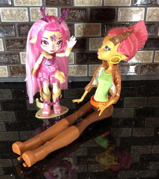
Magic Mixling Review: Deerlee!
Guess who got her hands on Deerlee?? I did! I couldn’t find her anywhere in my area, nor any of my neighboring towns. After ordering her twice on Amazon, I finally got her (the first time was another Unia). She was the one I was most excited for too.
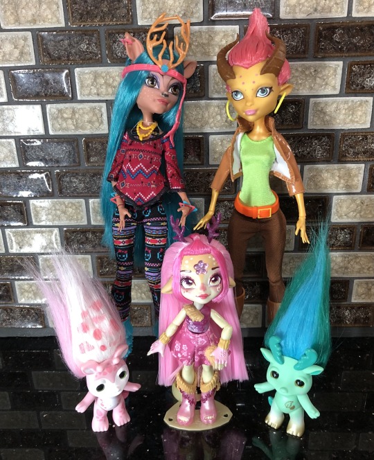
Here’s Deerlee with all of my other deer-esque dolls. Monster High Isi Dawndancer, Monster High Gilda Goldstag, Zelfs Talleen (she’s not technically a deer….but I wanted something else in the picture) and Manny the moose Zelf.
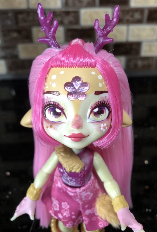
Here she is!! She’s super cute. She has a bunch of cute (I think plum) blossoms all over her, including her antlers.
More of her and other deer dolls under the cut!
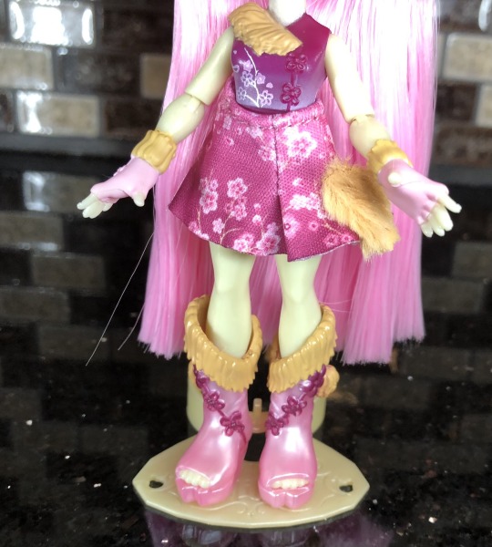
As with almost all of the Pixlings, she has sculpted clothes (including gloves) and a “swimsuit” with the same theming. The knots on her top/boots/back of gloves remind me of pankou knots (I’m not sure if that intentional or not). It does bother me that her little tail is on the side. I need to make her a little tail like Winter and Unia.

Here are both sides of her shoes (she has hooves sculpted on the front).
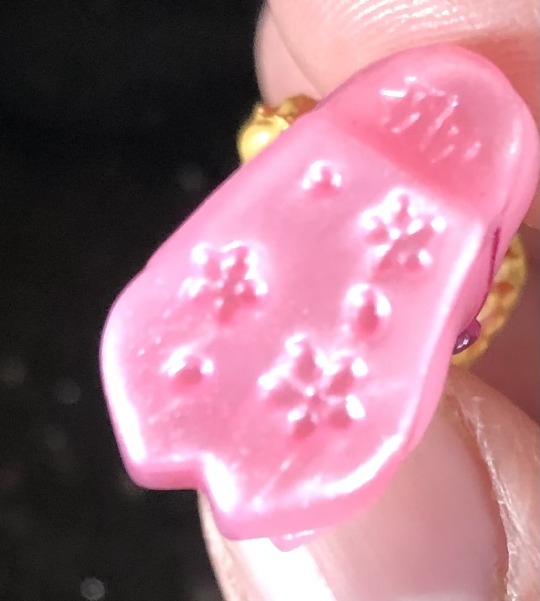
The bottom has more plum blossoms, petals, and the Moose Toys logo.
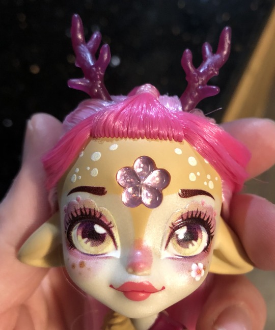
Her hair is super soft by the way. It feels just as soft as the other Pixlings. She also still has some pixelization (but again, it’s not as distracting as Mattel’s printing). Her blushing on her nose and one side of her upper lip is a bit off, but not too bad. She also has a very cute assortment of freckles and petals on her face.
Oh! And her ears are fully sculpted to her head, they’re not separate pieces.
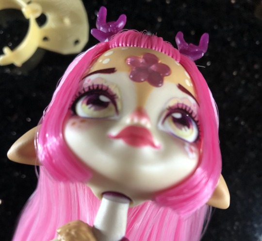
An oddity with Deerlee is her neck peg. It doesn’t seem to have any paint on it and it is very visible when she lifts her neck up.
Let’s briefly compare her to some of her deer attributes to other deer-like dolls (as I don’t own many of these and I do deeper dives into them on my other Pixling posts).
Her and Gilda both have deer-like ears sticking out of the side of their heads, pinkish hair, face spots, and light tan/gold skin (the darker tan on Deerlee is very similar to Gilda’s skin tone). Her antlers are much more like an antelope than those of a deer.
Gilda’s horns have more in common with Enchantimals: Gabriela Gazelle’s.

Let’s compare her to someone who has more deer features: Isi Dawndancer.
Isi actually doesn’t have attached antlers, and her ears are placed higher on her head; she does have lots of freckles/spots on her face though. To make up for the lack of antlers, she has some of the COOLEST FEET EVER! Take a look Deerlee!
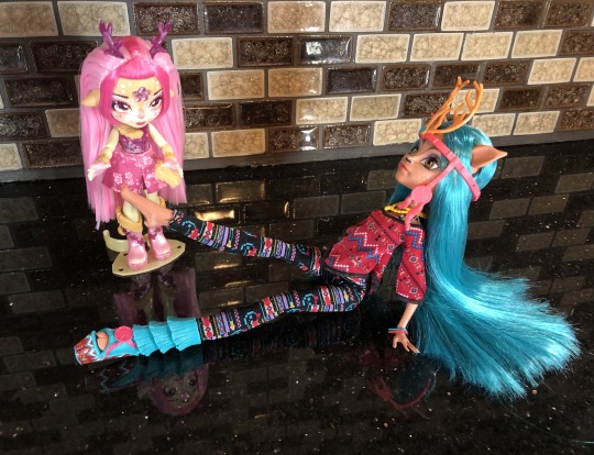

Cute little hoofies!!! She’s actually the only one of these bipedal deer dolls that (were created) to have hoof feet.
Monster High had another deer-like character: Fawn, but she never received a doll. She has deer ears on the side of her head, no antlers, face freckles and she has HOOF FINGERS!!
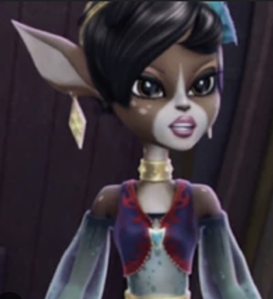
Ever After High’s Dragon Games’ Deerla (a smaller pixie doll, ancestor to their Enchantimals’ line) has similar design elements to Isi, Fawn, and Deerlee:

Her skin tone looks very close to Fawn’s, she has freckles, and deer ears on top of her head (like Isi’s).
-I still can’t get over the two pairs of ears design choice-
……her antlers look really odd, like they have a main antler shape in there, but they added a bunch of random swirls to them as an afterthought.
Deerla passed down her golden ears, antlers and second pair of ears to her Enchantimal cousins.
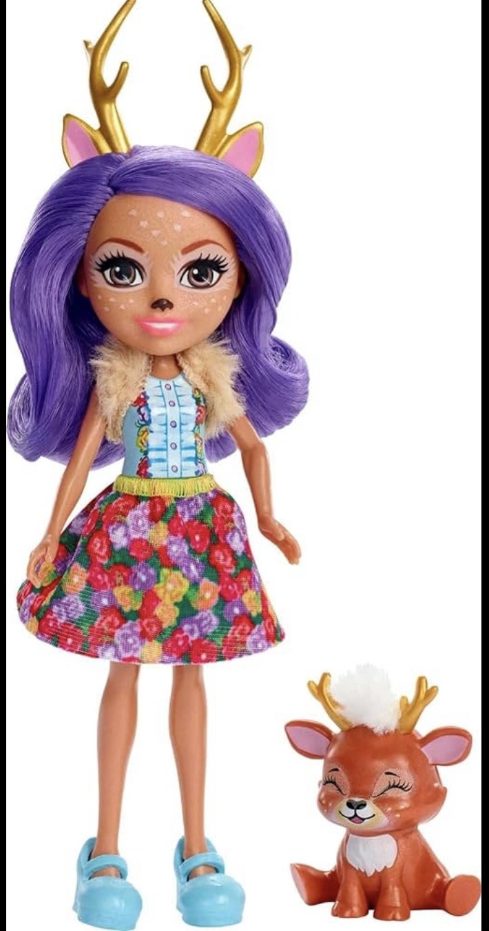
Danessa Deer is one of the main cast of Enchantimals. She is about the height of Deerlee, has a similar skin tone to Isi, and once again has freckles.
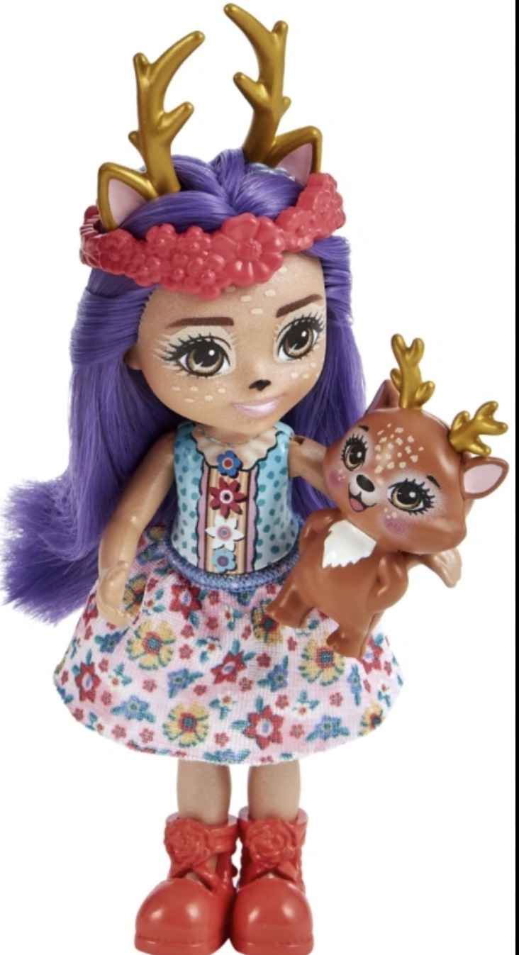
Danetta Deer (-they seriously just took the two ‘s’s in her name and changed them to the next letter in the alphabet-) is on a much smaller Enchantimal body and basically looks like a smaller version of Danessa with a cuter face (in my humble opinion).
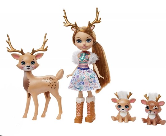
Rainey Reindeer has some impressive looking antlers. She has the lightest of freckles and she looks close to Deerlee’s skin complexion. Honestly, one of the cuter Enchantimals (maybe because her ponytail hides her human looking ears).
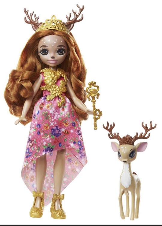
Nope, I lied. Queen Delilah has the most impressive looking set of antlers sculpted onto her head (for the Enchantimal line anyways). -someday she will be mine- She is eight inches tall. A tiny bit shorter than the Ever After High Pixies which were 8.5 inches tall, but she has more articulation: her knees! Not even Deerlee has that!
She looks to be the same color as Rainey and parts of Deerlee. Of course she has the freckles too.
The last Mattel line I’m going to look at are the Monster High Frightmares. Specifically the two “deer” looking frightmares: Fawntime Fallowheart and Meadoe Flurry. -two more deer dolls I desperate wanted but never bothered to buy when I had the chance!!-
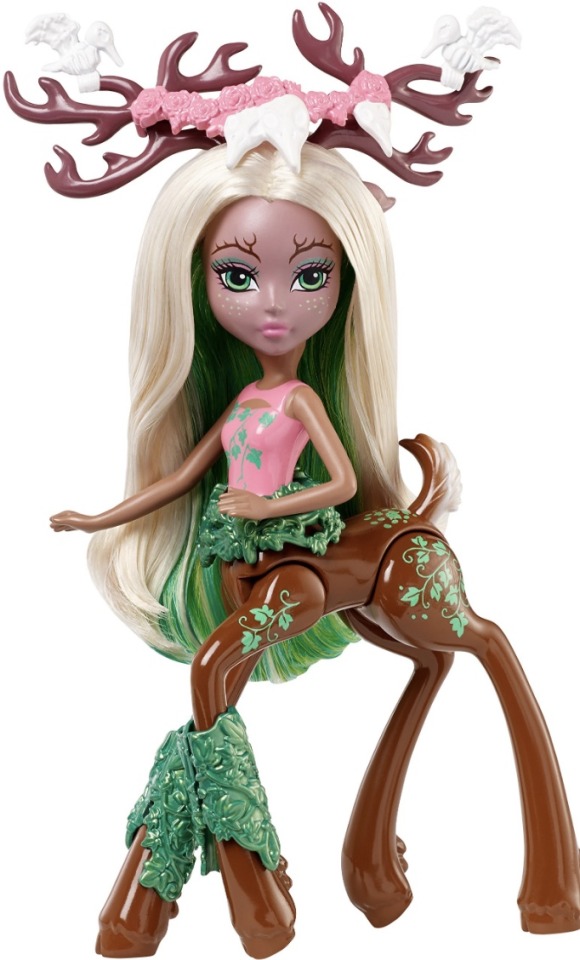
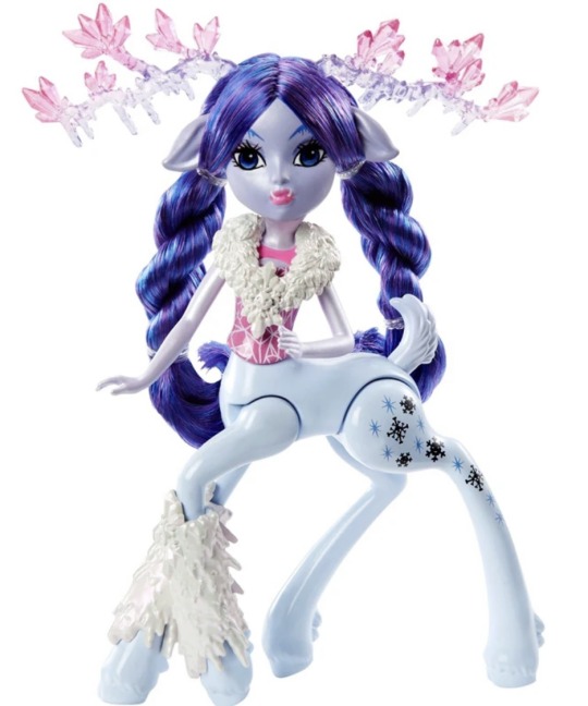
They are 6 inches tall, have molded on clothing and down turned ears just like Deerlee! Their arm articulation is pretty limited, but they could move at the hip and neck. They have the cutest little molded deer tails!! And their bodies are giving me nostalgia for my G2 My Little Ponies. I think only Fawntime has freckles (and some unique branch eyebrows) and Meadoe has only powdered lavender/ periwinkle skin tone so far (and the most badass looking fantasy antlers).
Okay! Onto MGA’s deer doll offerings.
-my holy grail- Novi Star’s Doe A. Deer! She has flocked legs (and I thiiiiink that’s all…which is a choice).

Her body is mostly white and her dress looks like something Fawntime would like to graze on, she doesn’t have any freckles (just some dot eyebrows, Gilda would be pleased), I don’t believe she has a tail, her ears look to be the same, but her antlers are wonderfully large.
Na! Na! Na! Surprise had a female and a male deer doll: Myra Woods and Donnie Ranger.
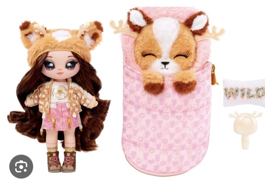
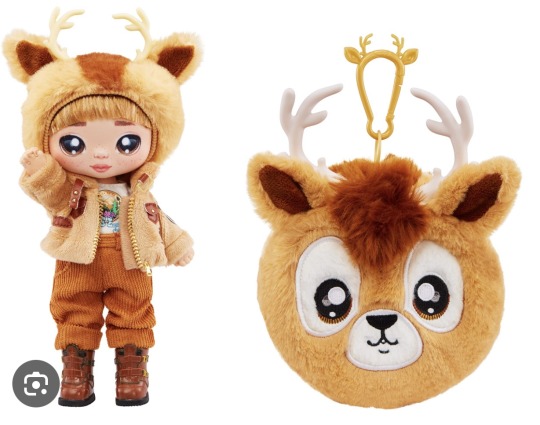
Both have the littlest of freckles, super detailed clothes (seriously, Donnie’s look amazing) and plastic horns stuck to their hats (both seem to be new sculpts too). For some reason, Myra’s sleeping bag’s antlers are set under her ears.
Okay! Onto another Moose toy!!! Zelfs!!!
I have already said how much I love posing my pixlings with my Zelfs, but they are so cute together. Deerlee seems to like gossiping with Talleen and Manny.
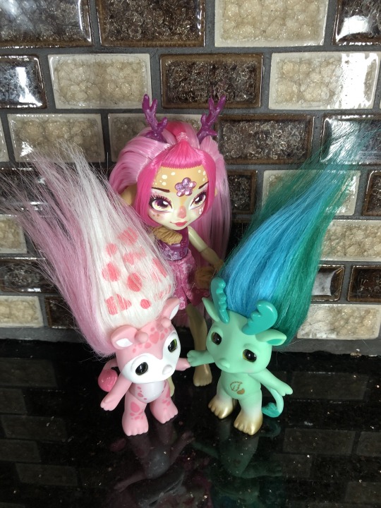
Both of them have ears stuck to the tops of their head like Isi and the Enchantimals.
There were two more deer themed Zelfs: Dorthy-doe (who looks a bit more like a pink Jack-a-lope than a deer) and another reindeer to join the herd: Rein-Doe.
Both lack face spots and have different horns than Deerlee (although Rein-doe looks very similar - he even seems to have a flower theme too).
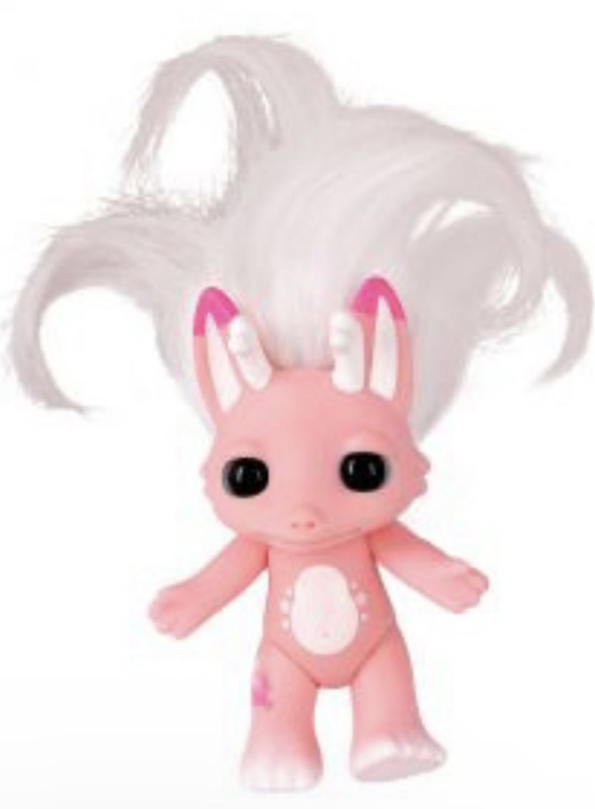
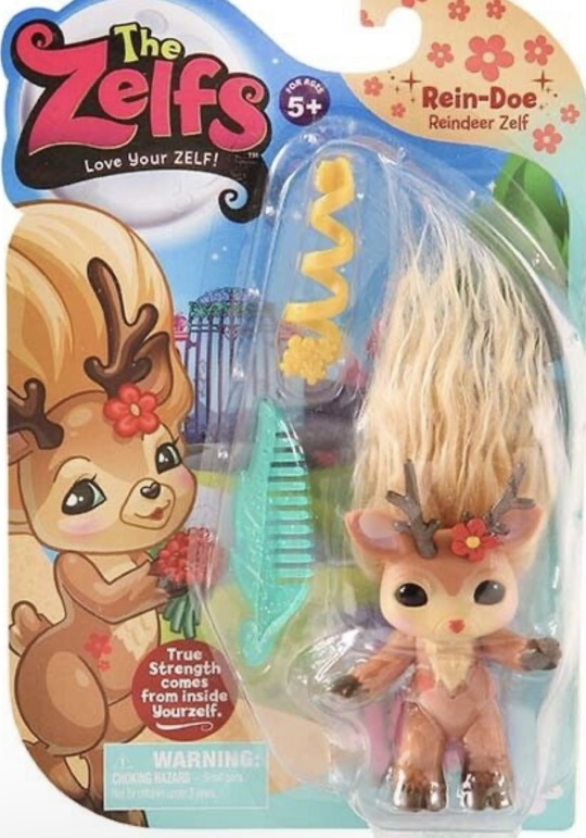
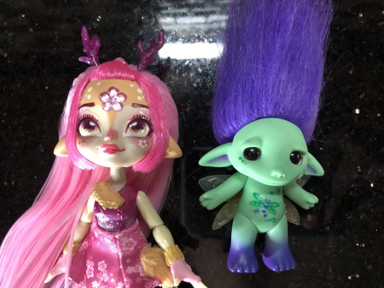
I had wanted to compare her with one of my Zelfs that had downturned ears (as what hers immediately reminded me of). Hmm, it actually looks like the Zelfs (this is Flitter by the way) had a little indent in there and Deerlee had thicker chunkier ears.

Anyways, not as deep as I usually go for over-views on dolls, but I’ll take some more photos of her after I give her a proper tail and paint some of the detail on her shirt and gloves.
Did you guys have a favorite deer themed doll? Any of these on your want list? Did I miss any play line deer dolls??
She was super cute, and while I would still love for the line to give us knee articulation, more dolls with fully removable clothing, and the option to buy the dolls without the potion bottles (which are fun, but I am not going to be playing with them again). I look forward to trying to find the dragon and the fairy pixlings.
#aleta’s toys#doll collecting#dollbr#magic mixies#magic mixies pixlings#Deerlee#doll reviews#doll review#deer doll#pixling#pixlings#Deerlee Pixling
11 notes
·
View notes
Text
Mudborne - Devlog #02
Hey everyone!
Been awhile since I opened up Tumblr to write something - I've been trying not to add the pressure to make myself post every single month, as half the time I don't have much to say and the other half making it something I HAVE to do prevents it from being something I WANT to do
But it's been a little while of working on Mudborne stuff in between all the final APICO update stuff, and I wanted to share where I've got to so far with your new fav frog game
Back To The Drawing Board
So if you haven't already seen, one of the main things I'm doing with Mudborne is updating the style and the art. The gamejam version was made in a week, and a lot of that was shameless art rips of APICO with some reskins - which was still cute but after working in the APICO "style" for nearly 5 years now I wanted something different.
For that I'd already played with a few ideas:
The game is set in a pond, so I wanted it to be mostly water. This meant thinking about what the landmass or even buildings would be like - I've always found the land style I did for APICO really weird as it's severe top-down but all the sprites are like sortof side view? So I wanted to work with that in mind and have the land match that perspective more.
I also really liked the idea of the stone slabs as the land instead of dirt, as it had a nicer overall vibe and helped the mud stand out from the "dirt" of the early ideas.
I also wanted to have lots of plants and nature stuff that wasn't necessarily interacted with but added to the overall scene. One thing I really hated with APICO is it relied on the trees/shrubs for balance of the overall palette, so this time I wanted enough flora scattered across the waters to make it look pretty all the time not just before the player has a killing spree with their axe.
What I ended up settling on after a few weeks was this:
As you can see it's mostly water, with some large stone slabs to act as "land" and break it up, and lots of green. I wanted a consistent darker outline for anything you can interact with, which then let me have a lot of "background" flora and scenery.
The stone slabs also felt like a perfect place for buildings - I'd tried an attempt at a few building designs, but overally didn't really like how they fit in with the world

Having the stone slabs as the buildings felt more natural and the little extra details of grates and drains and windows I think helps sell it more as lived in. Also by having a fixed "size" of the blocks in tiles, I could match that for the inside so all the spaces matched up when going in and out (and also means I'd be able to show "hidden" rooms while inside that give you a clue to how to get into them)
To finish it off, I worked on the menu designs to see how the UI would fit in - there's some similarities to APICO's basic UI style but I changed the colors a bit and added more space around all the elements.
I also wanted some clearer slot stuff, so like mushrooms and their powder/magic mud to have a small icon for the mushroom, buckets to have a liquid icon - I'd made a few sprites in APICO that were far too similar, so I wanted to avoid that this time round.
I also wanted to keep the main UI as minimal as possible, just some indicators, a current quest log, and then the tooltips if hovering something - this means I've got some flexibility later to add some more stuff.
Once I got this coded up I'd tweak a few things, including the design of the titular mud itself, but overall things pretty much match those final concept arts above.
===
Lost In A Dream
With that done I wanted to work on the next main part of the design - the dream world. In the gamejam when you dream you visit the big frog god and they tell you your progress, but what I actually want is a whole dream world that acts as an "opposite" to the waking world.
With APICO I always felt like the gameplay was fun but the NPCs and story and exploration was pretty non-existant. In Mudborne I wanted to expand that, have a similar "maths for fun" genetic puzzle to work on as the core game but then have a much richer world to explore.
With the dream world I could have things change between the worlds - new doors and rooms appearing, broken bridges now fixed, stone lilypads disappearing. By using the big froggy pools the player can switch between the two, and access new areas they couldn't before, along with new frogs or mushrooms or NPCs.
This ends up with a sort of APICO x Metroidvania in a way, you find different mushrooms, create new frogs, and based on the frog genetics you can "unlock" these gates to get to new areas - some part of the main story, others optional to learn more about the secrets of the world, but the different frogs will gate your progress and exploration.
It also gives me a lot of scope to do fun things with the differences between the two worlds, whether thats trees turning into jellyfish that float around, or NPCs being different and saying/selling different things.
It also has some importance within the story itself so I think it should end up as a nice mix of fun gameplay, cool vibes, and a nice story to tell.
===
Something Old Something New
With the overworld itself I'd done a lot of changes, looking at the gamejam you can see just how much differs, not just colors but the world objects too.
Some of the items I still liked, like the mushroom designs or the basic tools, some I think make for a fun "nod" to APICO, (like the frogspawn being the honeycomb sprite but modified), with the objects themselves though I wanted to try and match that new "perspective" shared by the stone buildings and the trees.
I also wanted to start using some more colors and have things less flat, so it was nice to finally move away from a lot of the stuff I'd drawn for APICO. When it came to the menus though, I still think the rough style of menus worked really well - it's been battle tested and I know what worked and didn't, but the UI has always been pretty solid.
The main changes I did was update the spacing between elements to give the slots + UI inside menus more space, and then I wanted to change some of the border/header styles slightly and have the tiny lilypad icon in there too. To start with I just fleshed out a bunch of the machines I had in the gamejam plus a few extra ones (also yes thats a slightly different shade of brown to APICO, you have good eyes!)
I really liked some of the menus have these sort of "mini" interfaces inside that showed a bit more of what is going on in the overworld, so wanted to lean into that a bit with some of the other machines.
I also still liked the idea of having some mechanism stuff - for APICO players I appreciate it's lost the charm, but anyone new to Mudborne thats never heard of ol' bee game can still appreciate it!
===
Maths For Fun
As I started implementing the mechanics some of the menus changed a bit - for the current "vertical slice" I'm making for pitches, the main machines I needed were:
- Spawner (frog+frog = frogspawn)
- Grinder (mushroom = powders)
- Cauldron (mud+powders = magic mud)
- Nursery (magic mud + frogspawn = tadpole)
- Feeder (tadpole + bugs = frogs)
- Bed (skip ahead time)
The main differences to the gamejam version is the extra step with mushrooms (so that you don't have to find + pick as many mushrooms as you'll get multiple powders from one), the cauldron accepting up to 3 powders that can be the same or different (so one magic mud can have 3 buffs), and the nursery having multiple layers (so you could do 3 different genetic changes or use a +1 mushroom 3 times for a +3 in one step)
The nursery change is the most important here, as being able to do 3 buffs at the same time is important as it's part of the genetic puzzle I'll explain later - but it also removes some grindyness, instead of needing to do 3 cycles for a 4 trait to become a 7 trait using a +1 mushroom, you can do just 1.
The feeder expands the process to include bugs you find to feed the tadpoles - once they grow they'll appear in the overworld as actual frogs again to catch, but this time they might be some new species depending on the genetic modifications you made with the mud. I'm still playing with what the different bugs might do or how which bugs are decided as needed, but I think it gives me a lot of room to play with from a mechanics standpoint.
The final "new" machine I needed was the actual teleportation pools - these would have the genetic "lock" that you need to make a frog to match.
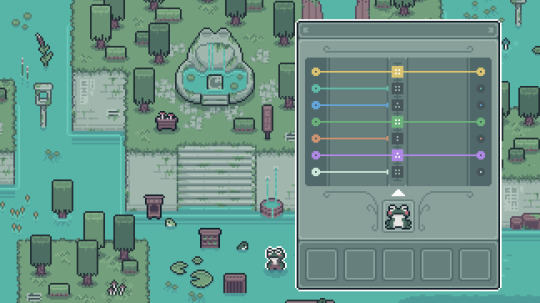
The puzzle starts off simple enough, get a frog that matches the 7 traits the pool requires. Putting a frog in the pool starts the little coloured lines to "move" from left to right, stopping if the number the frog has doesn't match whats needed.
Once you have a frog with all numbers matching, all the dots can join up, and the pool unlocks to be used to travel between worlds.
"That's easy" I hear you say, and yes! To start with this is easy enough, sure you might need to combine different mushrooms to counter certain modifications you don't want, but you can cycle frogs as much as you want to keep modifying until you get there. However this is me making a game so obviously I need to then show you something that makes you cry - which is when I introduce the concept of ancestors to the genetic locks
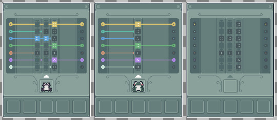
Instead of just looking at the traits of the frog, it also looks at the traits of the frog of the previous generation, and maybe even the generation before that! So starting from the first "column" you need to jump to the next one in a single frog cycle, using the right mushrooms to modify the numbers in one leap (ha).
You then might need to do that again (and again) until you have a frog that has each previous generation matching whats expected. There'll be some tools to help you "predict" this, as well as lots of different mushrooms you'll find as you explore that do different things, +1, -1, *2 AND -1 etc. Planning this out is a nightmare as you can imagine...
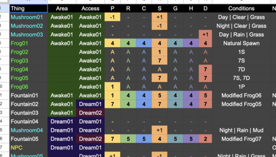
Also having 7 traits each with 7 values means a lot of combinations (823543?!?), which means I can "hide" a lot of frogs to be discovered. For example go scroll back up and look at the "finished" concept art without UI for both the waking and dream world - notice that piller on the left? By travelling to the dream you can get the missing numbers that give you a trait "key" you could make to find a new frog.
In this way there can be a bunch of frogs you have to find to progress through the pools to new areas, some frogs you can get through experimenting (what if I do 777777?) and some found through clues in the world.
===
What Next?
So right now I've planned out all the mechanics and I've been starting to implement them into a prototype of sorts (in my new favourite engine LÖVE) to make sure it all feels fun and has the right vibe, so lots of little bugs/critters roaming around, a cute day/night cycle, weather etc
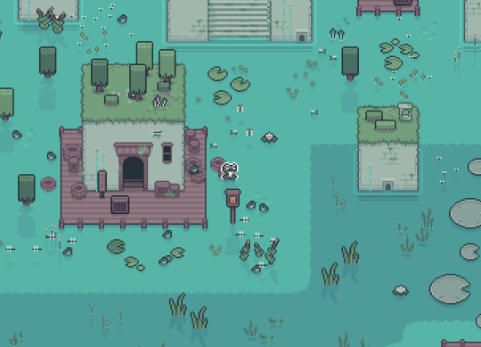
I'm trying to spend more time on little details and effects in the world, all very small stuff but all adds up without the player realising, reflections or pollen or subtle movement.
The goal is to then finish that as a vertical slice I can use to pitch to publishers, cos although APICO did well that was a couple years ago now, and outside of this final update I essentially have no releases until Mudborne is done so money is pretty tight :')
While doing that, I'll be continuing on with the game, starting with the first "training" area that will essentially become the demo. My plan is to release the demo later this year showing that first area, while I continue finishing the game to release in 2025 - right now the demo on Steam is still the gamejam version, which while it has some of the vibes it's not the full concept of what I want Mudborne to be, so I'd like to get that updated to really show people what they can have to look forward to.
I have a lot of the full game mapped out now, in terms of the story, areas, npc, general mechanics etc. I'm also literally mapping it out, each area on some graph paper, so will be interesting to see how closely I follow this for the demo + full game, esp. as I've already changed the houses (and is a nice analogue break for my poor eyes)

===
As I mentioned at the start, having to force a devlog every month didn't work great for me, I'd rather do larger devlogs now and again to catch you all up with what I've been doing over a couple of months otherwise it feels like I'm scraping the barrel some months when I've been busy on other stuff.
I do share the odd video + sketch in Discord now and again, so if you want to come chat about it I'd love to see you there, but I'm committing to do devlogs when I can so you can keep up with everything <3
~ Ell
#game development#indie game development#indie games#game design#video games#indie dev#pixel art#frogs#mudborne
9 notes
·
View notes
Last Seen Blogs