#responsivewebdevelopment
Text
#WebDevelopment#WebsiteDevelopment#DigitalDevelopment#OnlineDevelopment#WebDesign#WebProgramming#FrontEndDevelopment#BackEndDevelopment#FullStackDevelopment#WebApplicationDevelopment#WebDevelopmentServices#CustomWebDevelopment#ECommerceDevelopment#ResponsiveWebDevelopment#ModernWebDevelopment#Mississauga#Ontario#Toronto#Canada#Ottawa#Calgary#Montreal#Vancouver#Edmonton
0 notes
Text
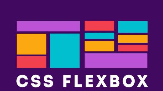
Creating Responsive Images with CSS Flexbox
Introduction to Responsive Design
Responsive design is an essential aspect of modern web development. It refers to the approach of designing and building websites to provide an optimal viewing and interaction experience across a wide range of devices and screen sizes, from large desktop monitors to small mobile phones.
The primary goal of responsive design is to ensure that your website adapts seamlessly to different screen resolutions and orientations, allowing users to access your content without the need for excessive zooming or horizontal scrolling. This enhances user experience, improves accessibility, and can positively impact search engine rankings.
Key principles of responsive design include:
- Fluid Grid Layouts: Using relative units like percentages to create flexible grid systems that adjust to screen size.
- Flexible Images: Scaling images proportionally to prevent distortion or overflow on smaller screens.
- Media Queries: Employing CSS media queries to apply different styles and layouts based on the device's characteristics, such as screen width, height, or orientation.
- Mobile-First Approach: Starting the design process with mobile devices in mind and progressively enhancing the design for larger screens.
By embracing responsive design, you can reach a broader audience and ensure your website looks and functions well on various devices, ultimately improving user satisfaction and engagement.
Understanding the Issue: Image Alignment in Responsive Design
One of the common challenges in responsive web design is achieving consistent and pleasing image alignment as the screen size changes. In the scenario you've described, you have an image with a float: right property, and when you resize the page, the image remains on the right side of the content. However, you want it to move to the left as the screen size decreases.

The problem with using float: right for image alignment is that it's not inherently responsive. It positions the image to the right, but it doesn't adapt to different screen sizes effectively. This can lead to undesirable results, such as images overlapping text or becoming too small to see on small screens.
Responsive design aims to resolve these issues by providing a flexible and adaptive layout that responds to the available screen space. To address image alignment in a responsive manner, we can use more modern CSS techniques like Flexbox, which allow for precise control over the positioning of elements without the need for explicit floats.
In the upcoming sections, we will explore the benefits of using CSS Flexbox for image alignment and demonstrate how to make your images responsive while maintaining a visually pleasing layout across a variety of devices and screen sizes.
The Problem with Using Floats for Alignment
Floats have been a traditional method for aligning elements on webpages, including images. They were widely used in the past to make text wrap around images or to create multi-column layouts. However, using floats for alignment in responsive design presents several challenges:
- Lack of Predictability: Floats are not inherently responsive. When you float an element, it's removed from the normal flow of the document, which can lead to unpredictable behavior, especially on smaller screens or when the content changes. Images floated to the right, for example, tend to stay on the right side regardless of the available space, causing layout issues.
- Clearing Floats: When you use floats, you often need to add clearing elements (e.g., clear: both;) to prevent subsequent content from flowing around the floated elements. This can result in extra markup and CSS, making the code less clean and maintainable.
- Overlapping and Collapsing: Floats can cause elements to overlap or collapse in unexpected ways, especially when the screen size changes. This can lead to issues like text flowing underneath floated images or elements not aligning as intended.
- Complexity and Fragility: Implementing complex layouts with floats can be challenging, and small changes to the content or styles may break the layout. This makes it harder to maintain and update your website over time.
For these reasons, floats have become less suitable for creating responsive layouts. To address the challenges of image alignment in responsive design, it's advisable to explore more modern CSS techniques like Flexbox, which provide better control and flexibility while maintaining a responsive and predictable layout.
Introduction to CSS Flexbox
CSS Flexbox, short for "Flexible Box Layout," is a powerful layout model that provides a more efficient way to design complex web layouts with a high degree of control and flexibility. It was introduced to address the limitations and challenges associated with traditional methods like floats and positioning when creating responsive designs.
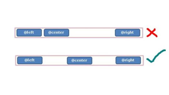
Flexbox is designed to simplify the alignment and distribution of elements within a container, making it ideal for tasks like centering elements, creating equal-height columns, and achieving responsive image alignments. Key features and concepts of Flexbox include:
- Container and Items: In Flexbox, you have a parent container and child items that you want to arrange. The container is often referred to as the "flex container," and the items are the "flex items."
- Main Axis and Cross Axis: Flexbox operates along two axes, the main axis (usually horizontal) and the cross axis (usually vertical). You can control how items are arranged on both axes using Flexbox properties.
- Flex Properties: CSS properties like display: flex;, justify-content, and align-items enable you to control the layout of items within the container, making it easy to center items or distribute them evenly.
- Flexibility and Adaptability: One of the primary advantages of Flexbox is its inherent responsiveness. It adjusts the size and position of items based on the available space, making it an excellent choice for responsive web design.
Throughout this tutorial, we will explore how to harness the power of Flexbox to create responsive and visually pleasing layouts, including addressing the issue of image alignment that you mentioned. By the end of this tutorial, you'll have a solid understanding of how Flexbox works and be equipped to use it in your web design projects to achieve modern and responsive layouts.
Applying Flexbox to Align Images Responsively
Step 1: Modifying the CSS for the Image Container
CSSsection.QuemSou{
float: left;
overflow-wrap: break-word;
font-size: 1.3em;
margin-top: 40px;
margin-left: 5%;
font-family: 'Century Gothic', sans-serif;
}
p#Quem_Sou{
line-height: 30px;
}
/* IMAGE */
div.divimgMAIN{
/* float: right; REMOVING FLOAT PROPERTY */
margin-top: 40px;
margin-right: 10%;
margin-bottom: 2%;
display: flex; /* APPLYING FLEXBOX */
flex-direction: row; /* SETTING FLEX DIRECTION TO ROW */
justify-content: space-between; /* ADJUSTING ITEM SPACING */
align-items: center; /* ALIGNING ITEMS TO CENTER VERTICALLY */
}
Step 2: Adjusting the Flexbox Properties for Responsive Behavior
Now, to make the image responsive, you can adjust the flex properties to control the behavior of the image within the flex container. By fine-tuning the flex properties, you can ensure that the image adapts to different screen sizes while maintaining its alignment and proportions.
In the upcoming section, we will integrate these changes into the provided HTML code to demonstrate how the modified CSS, combined with Flexbox properties, enables the image to align responsively and adapt to varying screen dimensions.
Implementing the Changes in the Provided HTML Code
Now, let's apply the changes to the HTML code to achieve responsive image alignment. We'll modify the 'divimgMAIN' class, remove the 'float: right' property, and add Flexbox properties for responsive alignment.
Modifying the 'divimgMAIN' Class
HTML
In the HTML code, ensure that the 'divimgMAIN' class is applied to the container div that holds the image you want to align. This class will be used to apply the Flexbox properties for responsive alignment.
Removing the 'float: right' Property
CSSdiv.divimgMAIN{
/* float: right; REMOVING FLOAT PROPERTY */
margin-top: 40px;
margin-right: 10%;
margin-bottom: 2%;
display: flex; /* APPLYING FLEXBOX */
flex-direction: row; /* SETTING FLEX DIRECTION TO ROW */
justify-content: space-between; /* ADJUSTING ITEM SPACING */
align-items: center; /* ALIGNING ITEMS TO CENTER VERTICALLY */
}
As a responsive design strategy, remove the 'float: right' property from the 'divimgMAIN' class to allow the image to adapt to different screen sizes without being stuck to the right side.
Adding Flexbox Properties for Responsive Alignment
With the 'float: right' property removed, apply the following Flexbox properties to the 'divimgMAIN' class to achieve responsive image alignment:
CSSdisplay: flex; /* APPLYING FLEXBOX */
flex-direction: row; /* SETTING FLEX DIRECTION TO ROW */
justify-content: space-between; /* ADJUSTING ITEM SPACING */
align-items: center; /* ALIGNING ITEMS TO CENTER VERTICALLY */
These Flexbox properties will help you create a layout where the image adjusts its position and spacing within the container to fit the available space while maintaining alignment with other content.
With these modifications in place, you are well on your way to achieving responsive image alignment using CSS Flexbox. In the next section, we will test the changes to ensure that your design behaves as expected on various devices and screen sizes.
Testing the Changes and Responsive Behavior
After applying the Flexbox properties and making modifications to your HTML and CSS, it's crucial to test the design to ensure that it behaves as expected on various devices and screen sizes. Testing will help you confirm that the responsive image alignment is working effectively.
Step 1: Resize the Browser Window
Start by resizing the browser window to various dimensions, including both larger and smaller screen sizes. Observe how the image and text content within the 'divimgMAIN' container respond to changes in the available space. You should see the image adapting its position and spacing while maintaining alignment with the text.
Step 2: Test on Different Devices
For a more comprehensive test, view your web page on different devices, such as smartphones, tablets, and desktop computers. Ensure that the design remains visually appealing and functional across the entire spectrum of screen sizes.
Step 3: Inspect for Anomalies
Pay close attention to any anomalies or issues that may arise during testing. Check for any text overlapping the image, visual distortions, or unexpected behavior. If you encounter any problems, review your HTML and CSS code to identify and resolve the issues.
By thoroughly testing your design, you can confirm that the changes you've made to achieve responsive image alignment are effective and that your web page looks and functions as intended on all devices. Responsive design aims to provide a seamless and optimal user experience, and testing is a critical step in achieving that goal.
With successful testing and confirmation of responsive behavior, you can now confidently implement these techniques in your web design projects to create modern and adaptable layouts that cater to a wide range of devices and screen sizes.
Conclusion: Achieving Optimal Responsive Image Alignment
In this tutorial, we've explored the challenges of achieving responsive image alignment and the limitations of using traditional methods like 'floats.' We introduced the powerful CSS Flexbox layout model as a solution for creating responsive and visually pleasing designs.
By following the steps outlined in this tutorial, you've learned how to:
- Modify the CSS for the image container by adding Flexbox properties.
- Remove the 'float: right' property to ensure that the image adapts to different screen sizes.
- Apply Flexbox properties like 'display: flex,' 'flex-direction,' 'justify-content,' and 'align-items' to achieve responsive alignment.
- Test the design on various devices and screen sizes to confirm its responsive behavior.
By implementing these techniques, you've taken a significant step toward creating web designs that cater to a diverse audience using different devices. Responsive design not only enhances the user experience but also contributes to better accessibility, improved search engine ranking, and overall user satisfaction.
As you continue to develop your web design skills, remember that responsive design is an ongoing process. Keep testing, refining, and adapting your designs to meet the ever-evolving landscape of web technologies and user expectations.
With the knowledge gained from this tutorial, you can confidently create modern and responsive layouts that align images optimally across a wide range of devices, ensuring a seamless and engaging user experience.
Thank you for joining us on this journey to achieve optimal responsive image alignment using CSS Flexbox. We hope you find this knowledge valuable in your web design endeavors.
Final Thoughts and Additional Resources
Congratulations on completing this tutorial on achieving optimal responsive image alignment using CSS Flexbox. You've gained valuable insights into creating web designs that adapt seamlessly to different devices and screen sizes. As you continue to explore the world of web development and design, here are some final thoughts and additional resources to guide you:
Keep Learning and Experimenting
Web design is a dynamic field, and there's always something new to learn. Stay curious and keep experimenting with different design techniques, layout models, and frameworks. The more you practice and explore, the more proficient you'll become in creating outstanding web experiences.
Stay Updated with Web Standards
Web standards and best practices evolve over time. Stay updated with the latest trends, technologies, and standards in web development. This will help you create designs that are not only responsive but also performant and accessible.
Explore CSS Grid
While Flexbox is excellent for certain layout tasks, you may also want to explore CSS Grid Layout, another powerful CSS layout system. CSS Grid can be especially useful for creating grid-based designs and complex layouts. Combining both Flexbox and CSS Grid in your projects can provide a comprehensive toolkit for handling various design challenges.
Additional Resources
Here are some additional resources to further enhance your web design skills:
- MDN Web Docs: Flexbox - In-depth documentation and tutorials on CSS Flexbox.
- MDN Web Docs: Grid Layout - Comprehensive guides on CSS Grid Layout.
- A Complete Guide to Flexbox - A helpful resource by CSS-Tricks, offering a detailed guide to Flexbox.
- Smashing Magazine - A valuable source for web design articles, tutorials, and best practices.
Remember that web design is both an art and a science. It's a creative process that combines aesthetics with technical expertise. Keep exploring, learning, and pushing the boundaries of your skills to create remarkable web experiences that captivate and engage users.
Thank you for choosing to expand your knowledge with us. We wish you all the best in your web design journey!
Read the full article
0 notes
Text

Unlock the potential of your online presence with our expert responsive website development solutions. We're the go-to company for confident English network enhancement on Instagram! 💪
Call At:+91 9540041043
Visit Now : www.attractivewebsolutions.co.in
#responsivewebdevelopment#websitedevelopmentcompany#webdevelopmentteam#responsivecoding#mobilefriendlywebsites#webdesignagency#customwebdevelopment#webdevelopmentcompany#webdevelopmentexperts
0 notes
Text
Master the Art of Responsive Design for Website Success
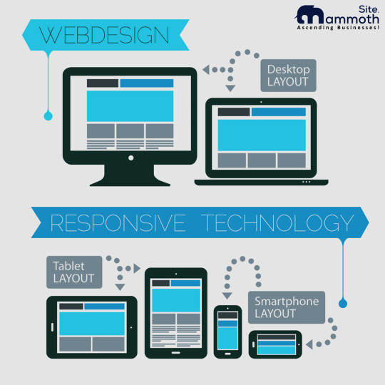
Having a mobile-friendly website has become non-negotiable in today's digital age. With over 3 billion smartphone users worldwide, mobile devices account for a significant portion of internet traffic. Responsive design ensures that your website is optimized for different screen sizes and device types, providing a seamless user experience.
Adaptive web design is another crucial aspect of responsive design, enabling websites to adapt to the individual needs and preferences of users. Responsive web development involves implementing various elements such as responsive layout, responsive design framework, and responsive design templates to create a visually appealing and user-friendly interface.
Partnering with a responsive web design agency or using a responsive website builder can simplify the process and provide tailored solutions to meet your business needs.
Key Takeaways
- Responsive design is crucial for achieving website success in today’s mobile-first world.
- Adaptive web design enhances user experience by tailoring your website to individual needs and preferences.
- Responsive web development involves various elements such as a responsive layout, responsive design framework, and responsive design templates to create an optimal user experience.
- A responsive web design agency or website builder can simplify the process and provide tailored solutions.
Understanding Responsive Design: A User-Centric Approach
Responsive design is all about creating a seamless user experience, regardless of the device or screen size. A user-centric approach puts the user at the center of the design process, ensuring that your website is optimized for their needs.
Mobile optimization is a crucial component of responsive design, as more and more users access websites on their smartphones. With responsive design, your website will adapt to different screen sizes and orientations, providing a consistent and user-friendly experience for all visitors.
By implementing a user-centric approach to responsive design, you can improve engagement and conversions, and enhance the overall usability of your website. So, whether your users are browsing on a desktop computer or a mobile device, they'll have a seamless experience with your brand.
The Benefits of Responsive Design
Responsive design offers numerous benefits for your website, ranging from improved user experience to increased search engine rankings and site performance.
Improved User Experience
Responsive design ensures that your website adapts seamlessly to different screen sizes and devices, providing a consistent and user-friendly experience. Whether your audience is accessing your website from a desktop computer or a smartphone, they will be able to navigate easily and access information quickly.
Increased Search Engine Rankings
Search engines such as Google prioritize websites with responsive design, as they provide a better user experience. This can lead to increased visibility and a higher ranking on search engine results pages, ultimately boosting your website traffic and conversions.
Optimized Site Performance
Responsive design involves optimizing your website's performance across different devices, resulting in faster load times and a smoother browsing experience. This can lead to reduced bounce rates and increased engagement from your audience.
By implementing responsive design on your website, you can unlock these benefits and achieve website success. Prioritizing user experience, search engine rankings, and site performance can have a significant impact on your online presence and overall business success.
Responsive Design Best Practices
When it comes to implementing responsive design, there are certain best practices to keep in mind. These practices can help ensure that your website functions seamlessly across different devices and screen sizes, providing an optimal user experience.
Accessible Content
Firstly, it's essential to create accessible content that can be easily consumed on a range of devices. This means using fonts that are legible on smaller screens, keeping line lengths reasonable and avoiding large blocks of text.
Flexible Images
Images are an integral part of any website, but they can pose challenges when it comes to responsive design. One solution is to use flexible images that can adapt to different screen sizes. This can be achieved through the use of responsive images, which are loaded dynamically based on the device's screen size.
Breakpoints
Breakpoints are an essential component of responsive design. They define at what point the design should change to accommodate different screen sizes. It's crucial to set breakpoints based on common device sizes to ensure that your design functions correctly.
Load Time Optimization
Finally, load time optimization can significantly impact the user experience on your website. Since responsive designs often involve loading additional assets, it's crucial to optimize load times. This can be achieved through techniques such as compressing images, minifying code, and reducing server response times.
By following these best practices, you can ensure that your responsive website design functions flawlessly across various devices, providing an optimal user experience and boosting your website's success.
Choosing the Right Responsive Design Framework
When it comes to selecting the appropriate responsive design framework for your website, there are various factors to consider. By choosing the right responsive design framework, you can streamline your design process and achieve optimal results. Here are some key considerations:
Customization Options
Make sure that the responsive design framework you choose offers sufficient customization options. Look for frameworks that allow you to tailor the design and functionality to your specific needs and preferences.
Support
Check if your selected responsive design framework has adequate support. Look for frameworks that are frequently updated and have an active community that can address any issues that may arise.
Community Documentation
Ensure that the responsive design framework you select has comprehensive documentation available. Look for frameworks that have easy-to-follow online manuals and guidelines that can assist you with any questions or concerns you may have during the design process.
In conclusion, choosing the right responsive design framework is a crucial step in the design process. By considering customization options, support, and community documentation, you can select a framework that aligns with your business goals and delivers exceptional results.
Utilizing Responsive Design Templates for Efficiency
Creating a visually appealing and user-friendly website can be a time-consuming and expensive process. However, utilizing responsive design templates can save you valuable time and resources. These templates are pre-designed layouts that can be customized to suit your brand's visual identity. By using templates, you can streamline the website development process and achieve a polished look without starting from scratch.
Template customization is a straightforward process that enables you to add your brand's colors, images, and content to the pre-existing layout. This process is made more accessible by drag-and-drop interfaces, allowing you to move and adjust elements with ease.
By using responsive design templates, you can ensure that your website is optimized for different screen sizes and devices, without sacrificing visual appeal or functionality. Additionally, the time-saving aspect of utilizing templates allows you to focus on other essential aspects of your website development, such as content creation and promotion.
The Role of a Responsive Web Design Agency
When it comes to implementing responsive design for your website, partnering with a responsive web design agency can make all the difference. These agencies bring a wealth of expertise and professional services that can help you craft tailored solutions that meet your business needs and goals.
One of the primary advantages of working with a responsive web design agency is their focus on user experience. By prioritizing seamless navigation and accessibility, these professionals can ensure that your website caters to the needs and preferences of your target audience.
Moreover, responsive web design agencies possess the technical knowledge and resources required to create responsive designs that function optimally across various devices. Their expertise in responsive design frameworks, breakpoints, and load time optimization can ensure that your website runs smoothly and efficiently, leading to improved engagement and conversions.
Ultimately, partnering with a responsive web design agency can provide you with tailored solutions that align with your business needs and offer a competitive edge in your industry. By leveraging their professional services and expertise, you can achieve website success and deliver an exceptional user experience.
The Advantages of a Responsive Website Builder
Creating a website that looks great on all devices can be a daunting task, but with a responsive website builder, you can easily achieve this goal.
One of the greatest advantages of using a responsive website builder is its user-friendly interface. These platforms typically feature a drag-and-drop interface, allowing you to place elements on your website without writing a single line of code. This feature makes website creation accessible to individuals without coding knowledge.
Moreover, responsive website builders offer a range of customization options, allowing you to create a unique and visually compelling online presence. From themes and templates to fonts and colors, you can tailor your website to match your brand's visual identity. The flexibility of these builders also makes it possible to add a range of features such as contact forms, galleries, and social media integration.
By choosing a responsive website builder, you can ensure that your website is optimized for all devices and screen sizes. With its drag-and-drop interface and customization options, you can create a visually appealing and responsive website that engages users and drives traffic to your business.
Responsive Design: Future Trends and Innovations
As the world becomes increasingly mobile-centric, responsive design continues to evolve to cater to changing user behavior. The future of responsive design is undoubtedly shaped by emerging trends and innovations that help businesses stay ahead of the curve.
Mobile-First Approach
Responsive design is no longer just about adapting web pages to fit different screen sizes. Instead, designers and developers are shifting towards a mobile-first approach, where mobile design takes precedence over desktop design. This is driven by the fact that more people are accessing the internet through their mobile devices than their desktops. As such, designing with mobile devices in mind ensures that the website is tailored to the most commonly used device.
Progressive Web Apps (PWA)
The increasing popularity of progressive web apps is also shaping the future of responsive design. PWAs are web applications that provide a native app-like experience without the need for users to download traditional apps from an app store. They are highly responsive, fast, and provide offline access to users. As such, PWAs have become a popular choice for businesses looking to provide a seamless mobile experience.
Implementing PWAs requires a mobile-first approach and a focus on responsive design, with emphasis placed on fast load times and smooth performance. As they become more widely adopted, businesses will need to prioritize incorporating PWAs into their responsive design strategies to remain competitive.
Design Systems
Design systems are gaining popularity as an efficient way to ensure responsive design consistency across all devices. They provide a scalable collection of guidelines, assets, and code snippets to create a consistent visual identity and user experience. Design systems are becoming increasingly important for businesses looking to maintain brand consistency and reduce design and development time.
As the demand for responsive design grows, so will the need for innovative tools and solutions that streamline the process. By keeping an eye on these trends and emerging technologies, businesses can future proof their responsive design strategies and stay ahead of the competition.
Overcoming Challenges in Responsive Design
While responsive design offers numerous benefits, it also presents unique challenges that need to be addressed for optimal performance. One of the major challenges is browser compatibility, as different browsers interpret CSS and HTML in varying ways.
Therefore, it's crucial to test your website across multiple browsers and devices and ensure a consistent experience. This can be done using browser testing tools or by manually testing on various devices.
Another challenge in responsive design is performance optimization. With multiple devices accessing your website, load times can be a significant factor in user experience. To overcome this challenge, you can utilize techniques like image optimization, cache optimization, and minification of code.
Finally, testing is critical to identifying any potential issues, both in terms of responsiveness and functionality. This can include user testing, regression testing, and performance testing, among others. By prioritizing testing and optimization, you can overcome challenges and deliver a seamless responsive design to your users.
Achieving Website Success with Responsive Design
Responsive design has become a critical aspect of achieving website success in today's fast-paced and mobile-first world. A website that looks and functions seamlessly across all devices enhances the user experience and promotes engagement.
Incorporating responsive design into your website also has a positive impact on search engine rankings. Google's search algorithm prioritizes mobile-friendly websites, resulting in increased visibility and organic traffic.
To achieve website success with responsive design, prioritize the user experience by focusing on mobile-friendly design and optimization. Make sure your website's content is easily accessible and navigable across all screen sizes and devices.
Regularly test your website's performance and ensure it loads quickly to eliminate any potential bounce rates and improve user experience. Prioritizing browser compatibility and adhering to optimization techniques for load times are crucial factors to consider.
In conclusion, the art of responsive design should not be overlooked when seeking to achieve website success. By prioritizing user experience and optimizing for search engines, you can unlock your website's full potential and reach your business goals.
FAQ
What is responsive design?Responsive design is an approach to web design that focuses on creating websites that adapt and respond to different screen sizes and devices. It ensures that your website looks and functions seamlessly across smartphones, tablets, and desktops.Why is responsive design important?Responsive design is crucial because it provides an optimal user experience. It allows your website visitors to navigate easily, access information seamlessly, and interact with your site on any device. Additionally, responsive design can positively impact search engine rankings and improve site performance.How does responsive design benefit my website?Implementing a responsive design offers several benefits for your website. It improves user experience, enhances site navigation, and provides a seamless interface across devices. Additionally, responsive design can boost search engine rankings, increase website traffic, and improve conversion rates.What are the best practices for responsive design?When implementing responsive design, it's essential to follow certain best practices. These include creating accessible content, using flexible images, setting breakpoints to design for specific screen sizes, and optimizing load times for faster performance.How do I choose the right responsive design framework?Selecting the right responsive design framework depends on various factors. Consider customization options, support, and community documentation when choosing a framework that suits your needs. This will help streamline your responsive design process and achieve optimal results.Can I use responsive design templates?Yes, responsive design templates are a great option for efficient website development. These templates can be customized to match your brand's visual identity, saving you valuable time in the design process. They enable you to create a visually appealing and user-friendly website interface.How can a responsive web design agency help me?Partnering with a responsive web design agency offers many advantages. These agencies have expert knowledge and resources to create tailored solutions that align with your business goals. They can ensure that your responsive design is implemented seamlessly and effectively.What are the benefits of using a responsive website builder?Responsive website builders offer user-friendly interfaces and drag-and-drop functionalities. These platforms make website creation accessible to individuals without coding knowledge. They also provide customization options, allowing you to create a unique and visually compelling online presence.What are the future trends in responsive design?The future of responsive design includes a mobile-first approach, where websites are primarily designed for mobile devices. Additionally, progressive web apps are gaining popularity and influencing responsive design. By staying informed about these trends, you can continue to enhance your website's responsiveness.What challenges may arise in responsive design implementation?Common challenges in responsive design implementation include browser compatibility and testing to ensure a consistent experience. Performance optimization is also important to overcome potential issues and deliver a seamless user experience.How can responsive design contribute to website success?
Read the full article
#adaptivewebdesign#mobile-friendlywebsite#responsivedesign#responsivedesignframework#responsivedesigntemplates#responsivelayout#responsivewebdesignagency#responsivewebdevelopment#responsivewebsitebuilder#responsivewebsitedesign
0 notes
Text
0 notes
Photo

Ready to Transform Your Website? Limited-Time Offer on Web Development Services
Get ready to transform your website with IosAndWeb Technologies. Don't miss our limited-time offer on web development services. Enhance your online presence, improve user experience, and unlock your business's full potential. Take advantage of this opportunity to revitalize your website and drive growth.
Visit: https://iosandweb.net/web-development-services/
#websitetransformation#webdevelopmentservices#digitalrevamp#limitedtimeoffer#enhancedonlinepresence#userexperience#businessgrowth#websitedesign#responsivewebdevelopment#professionalservices#onlinesuccess#customwebsolutions#iosandwebtechnologies#digitalmarketing#weboptimization
0 notes
Photo

#1 Web Design & Development Company in Bihar !! Visit us:- www.netmagesystem.com #webdesign #webdevelopment #website #websitedesign #webdeveloper #websitedevelopment #websitebuilder #websitedesigner #websitedesigning #websitedevelopmentcompany #websitedesigningcompany #websitedesigningservices #websitedesigningagency #webdesigncompany #responsivewebdesign #responsivewebsite #responsivewebdevelopment #dynamicwebsite #DynamicWebsiteDesign #dynamicwebdesign #ecommercewebsite #ecommercedevelopment #Bihar #Patna #Gaya #UttarPradesh #Jharkhand #delhi #mumbai (at Bihar Patna) https://www.instagram.com/p/Cpx577oyxmp/?igshid=NGJjMDIxMWI=
#1#webdesign#webdevelopment#website#websitedesign#webdeveloper#websitedevelopment#websitebuilder#websitedesigner#websitedesigning#websitedevelopmentcompany#websitedesigningcompany#websitedesigningservices#websitedesigningagency#webdesigncompany#responsivewebdesign#responsivewebsite#responsivewebdevelopment#dynamicwebsite#dynamicwebsitedesign#dynamicwebdesign#ecommercewebsite#ecommercedevelopment#bihar#patna#gaya#uttarpradesh#jharkhand#delhi#mumbai
0 notes
Text
webdevelopment #webdevelopmentcompany #webdevelopmentservices #webdevelopmentagency #frontendwebdevelopment #webdevelopmentdubai #ecommercewebdevelopment #webdevelopmentindia #webdevelopmentservice #customwebdevelopment #phpwebdevelopment #learnwebdevelopment #webdevelopmentsupport #bestwebdevelopmentcompany #webdevelopmentbootcamp #fullstackwebdevelopment #backendwebdevelopment #webdevelopmentinlagos #floridawebdevelopment #webdevelopmentmiami #webdevelopmentcompanymangalore #webdevelopmentjakarta #wordpresswebdevelopment #responsivewebdevelopment #webdevelopmentagencyindubai #webdevelopmentsandiego #webdevelopmentjobs #webdevelopmentagencyinuk #webdevelopmentagencyuae #webdevelopmentftlauderdale #mobilewebdevelopment #laravelwebdevelopment #webdevelopmentinlebanon #magentowebdevelopment #pythonwebdevelopment #webdevelopmenttips #digitalmarketingtipswebdevelopment #learningwebdevelopment #webdevelopmentexpert #webdevelopmentuae
#Innovation#Management#HumanResources#DigitalMarketing#Technology#Creativity#Future#Futurism#Entrepreneurship#Careers#Markets#Startups#Marketing#SocialMedia#VentureCapital#SocialNetworking#LeanStartups#Economy#Economics#digitalmarketing
0 notes
Photo

Proponent Technologies provides creative, responsive website development, designing, and development service. We always provide expert service to our clients according to their desire within a restricted time frame.
For more information and a free quote visit us at www.proponenttechnologies.com
#techsupport #livechat #chatsupport #seo #digitalmarketing #socialmediamarkerting #webdevlop #webdevelopment #developer #webdesigning #responsivewebdevelopment
0 notes
Photo
Site Mammoth believes in quality work and dedication toward our customers. We create responsive websites for your audiences. We make sure your user experience is the best.
#sitemammoth#responsivewebdesigns#responsiveweb#responsivewebsite#responsivewebdevelopment#responsivewebsitedesign#responsivewebsites#websitedesignanddevelopment#responsivewebsitedevelopment#webdevelopment
1 note
·
View note
Text
Equip your business with a mobile-friendly website and experience amazing growth among them. Hire the best web development experts to develop your opportunities and grow excellent solutions for reaching out to a large number of your audience. Responsive website can create wonders for your business.
#responsivewebsite#mobilefriendlywebsite#websitedevelopment#webdevelopment#responsivewebdevelopment#webskitters
0 notes
Link
#ProBlogBooster#BuyDomain#Rules#SEO#blog#Godaddy#Bloggers#marketing#WordPress#blue#host#hostgator#WebHosting#ResponsiveWebDevelopment#Domain
1 note
·
View note
Photo
Dream Car Restorations NY | PTsupport
10 notes
·
View notes
Link
What Is Responsive Web Design?
Responsive Web design is the approach that means that style and development should answer the user’s behavior and environment supported any screen size, platform and orientation. The ultimate goal of responsive web-design is to avoid the unnecessary resizing, scrolling, zooming, or panning that happens with sites that haven't been optimized for various devices.

Benefits of Responsive Web-Designs:
Cost effectiveness
Flexibility
Improved user experience
Search engine optimization gains
Ease of management
Get more user traffic
Boost for SEO
Lower bounce rate
Improves conversion rates
Easier To Maintain
Lathiya Solutions is the most well-known responsive website designers and developers. You can hire website expert developers from us and we will give you assurity about your success. User-friendly responsive website design can attract more users, if more user traffic and conversions are arrived then you can see the more growth in your business eCommerce websites.
#responsivewebsite#responsivewebdesign#websitedevelopment#responsivewebdevelopment#websitedesign#wordpresswebsite#lathiyasolutions
0 notes
Photo
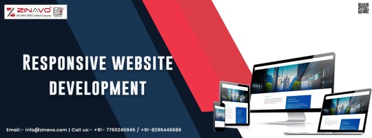
Zinavo is one of the most preferred Responsive website development company in Bangalore,have a expert team of designers for design and develop stunning responsive websites.We help businesses generate a higher ROI through responsive websites.
#zinavo#webdesignbangalore#websitedesign#responsivewebsitedesign#websitedevelopment#responsivewebdevelopment#webdesigningcompanyinbangalore#websitedesignbangalore#mobileresponsive
0 notes
Photo
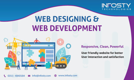
Are you looking for Web Development Company to develop your website? if yes, then you are at right place. Infosty Technologies develop the SEO friendly and fully responsive website. For more information contact us at (042) 35304353 or visit our website
🌐 https://www.infosty.com
#webdevelopmentInLahore#webdevelopmentcompanyInLahore#ResponsiveWebDevelopment#bestwebsitedesigner#websitedeveloper#webdesign#webdevelopmentcompany#webdevelopment#webdesigning
0 notes
Last Seen Blogs

downs1de
IT WASN'T KIND, IT WAS KIND OF BORING


2-dont
Hey there demons

rizzlergyatt435
bbuugh

lauriesaskblog-blog
AskLaurie. com