#posterdeisgn
Text
Poster research
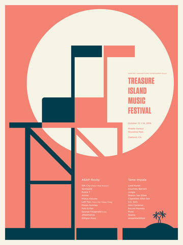
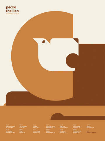
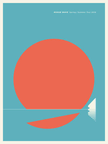
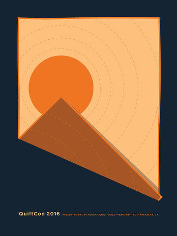
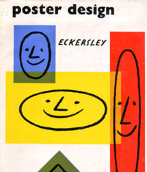
To research how to approach m,y poster creation i looked into successful flat colour design poster's
Jason Munn
Tom Eckersley
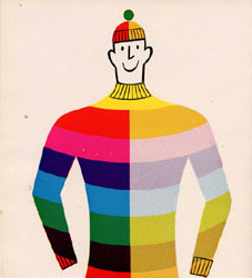
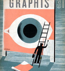
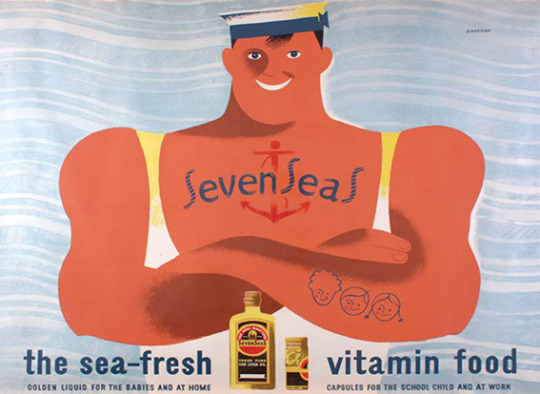
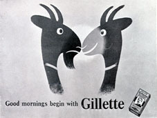
2 notes
·
View notes
Text
Demons in my head project
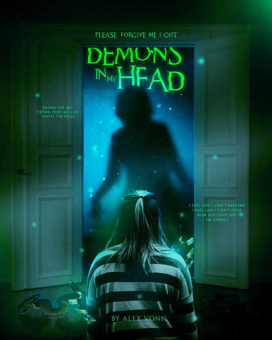


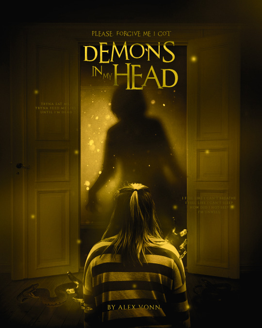
#hayley kiyoko#posterdeisgn#alexvonn#graphics#music#pposterartwork#artwork#simpleposter#experimentalposter#october#halloween#santanarchives#popmusic
1 note
·
View note
Text

A complete business kit was attractively designed by @_dhanvisuthar
From business cards to envelopes and letterheads-everything was designed.
Ready to give your brand a makeover too ? Get in touch with us right now! - [email protected]
#businesskit #businesscard #businesscarddesign #businesscarddesigner #businesscarddesigns #businesscardideas #letterhead #letterheaddesign #brandidentity #brandidentitydesign #designinspiration #brandinginspiration #brandingtips #brandingexpert #branddesigner #branddevelopment #broucherdesign #idcard #idcarddesign #posterdeisgn #posterdesigner #designfeed #designbusiness #brandgrowth #designart #graphicdesign #graphicdesigner
0 notes
Text
REFINE POSTER 3 [GMS BRIEF]
For my third poster design, I tried a new printing technique and I absolutely loved it. I love trying out new hands-on techniques and I will use this again and hopefully master it!
Cyanotype
Cyanotype is a printing process used in photography and creates a cyan-blue print. This process has been most popularly used since its creation in 1842 by engineers and a lot of cyanotype printing can be known as 'blue prints'. It is a process that uses a mix of chemicals to copy drawings or in our case, create images using everyday objects. The process is photo-sensitive and the application of the chemicals to a porous surface, allowed to dry in the dark and then exposed to UV light when ready to create your copied image as a contact print.
In printmaking, plants are typically used in this type of printing however you can use any solid object, pressed onto the sensitized paper usually with a sheet of glass over the top.
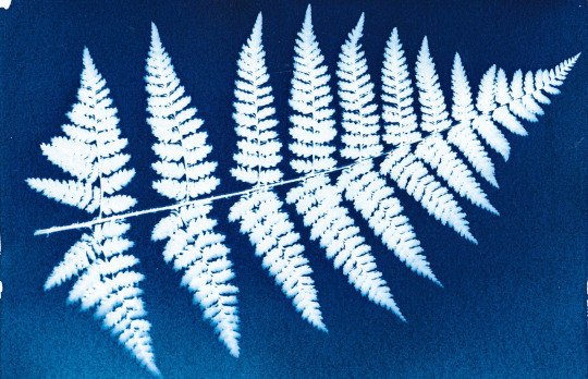
- An example of a cyanotype print using a fern leaf
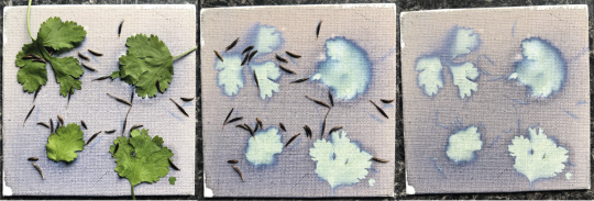
When I started, I tried a Cyanotype on a small piece of canvas with some every day objects and seeds to see if I could create a nice effect using plants and seeds. I loved the effect created however the canvas continued to develop and the image was soon lost.
For my cyanotype experiments I used letters I had previously made for this project and placed them on paper I had sensitised with a chemical solution.
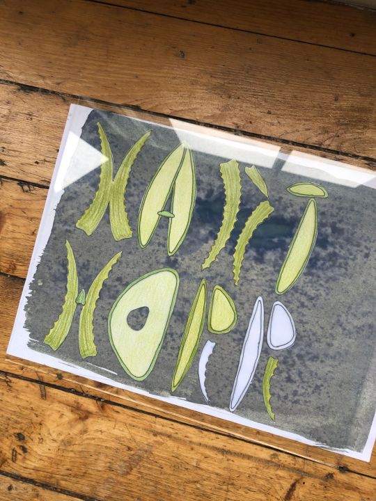
I arranged the letters and allowed them sit in sunlight for 30 mins. I had sesnsitised some recycled white paper as I wanted a grainier texture to the image however in the final prints, the recycled nature of the paper caused the ink to gather in spots and not dry fully. At first i wasn’t happy with this however in the end it worked out.
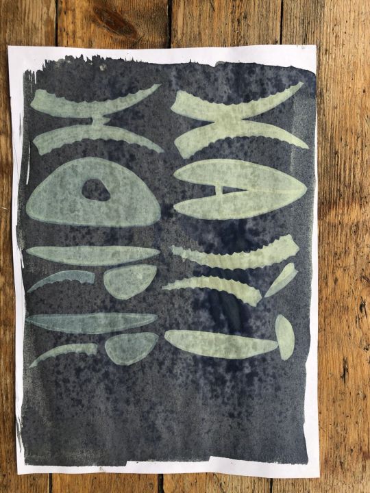
My first print came out okay - too much ink as mentioned but I did enjoy that the pencil strokes had even come through on the image.
I tried again with another formation, this time arranging my letters at random on the paper.
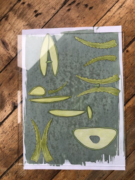
I used a sheet of glass on each print and left under the window. This time for 40 minutes and this page I sat in the sun for a couple of minutes before I out the letters on.
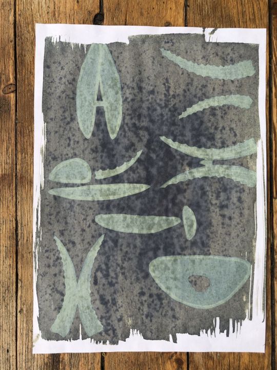
I liked this version a lot as again, you can really see the different colours coming through from the different pencils in the rendering. The gathered ink on the recycled paper wasn’t great though.
On my third attempt, I changed the letters around again.
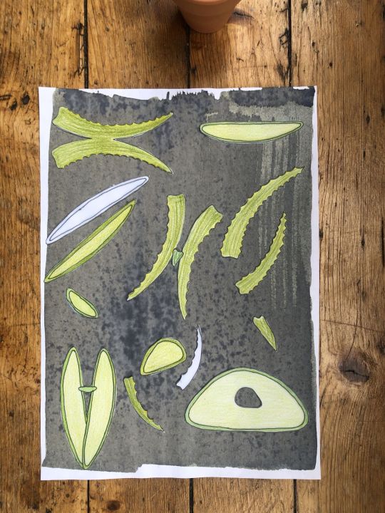
And my print came out like this:
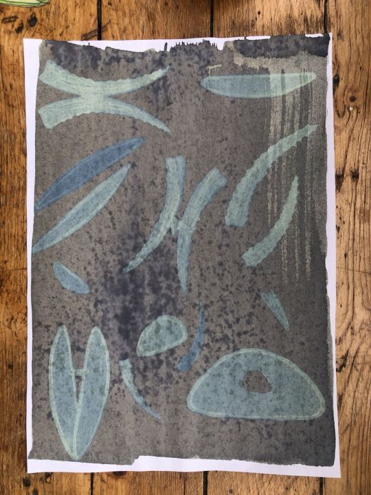
I had added extra shapes but these were not coloured in and you can see this clearly on the print so I didn’t like this as much as the other two. I chose my favourite image and used that for my poster design.
Using photoshop, I tuned the image a little, I wanted to pull through some greens to maintain the aloe feel. I had attempted to tone the prints with tea however this washed away my entire design so definitely something to play with in future.
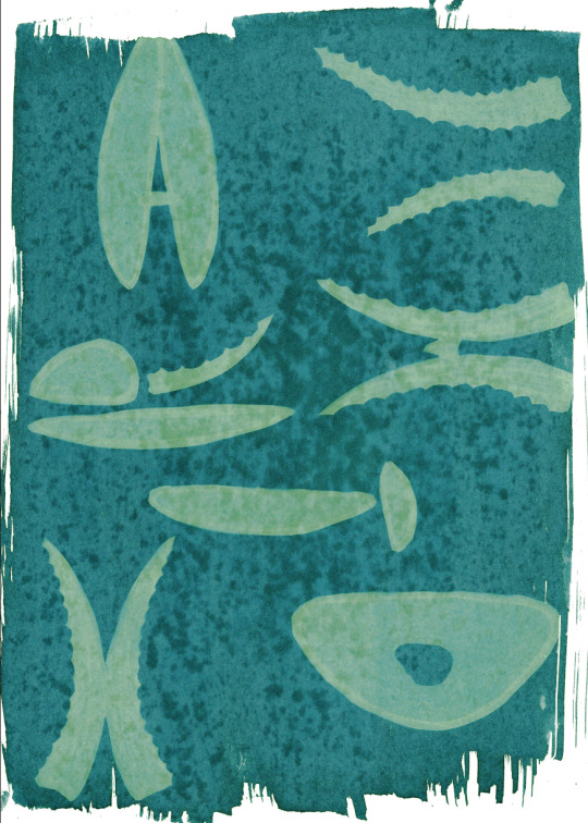
I am so happy with this design - it has become the front of my final design solution. I then played around with fonts to use to go along with this and the back side of my poster can be seen below, using a typewriter style font to enhance the imperfect print style qualities. I brought some graphic qualities from the front onto the back of the poster to make it more dynamic and brought my font in black.
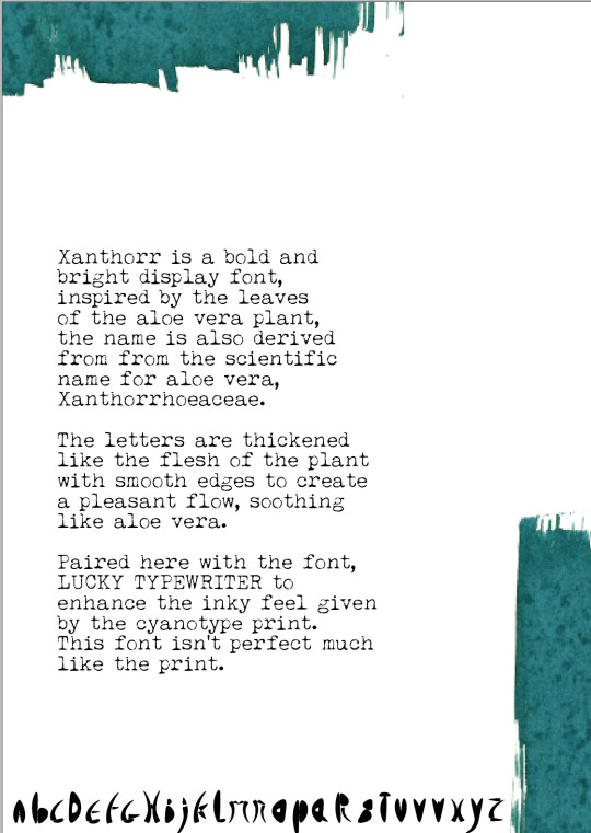
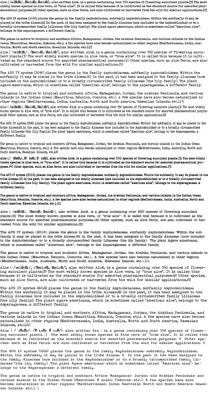
On reflection, I really enjoyed this process and would use it again. I spent a good amount of time looking for fonts that could match up with the design (seen below) and I am happy I settled with this one. If I were to do it again, I would perhaps try layering cyanotype on top of each to see how that would work or I would move the letters about halfway through processing time.
5 notes
·
View notes
Photo
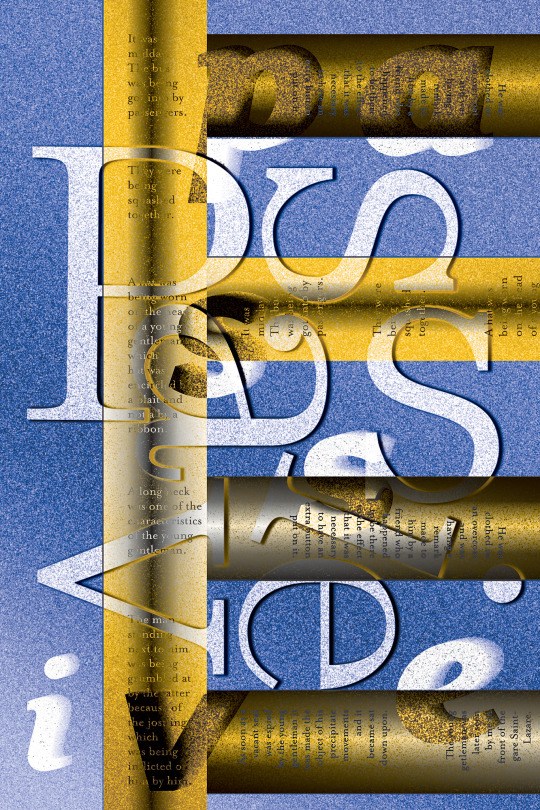
Passive in Situ. Experimental Typography poster. 2019
#poster#typography#type#experimental#experimental typography#posterdeisgn#graphic#graphicdesign#CalArts#los angeles designer#posterdesigner#print#experimental poster#ImageMaker
2 notes
·
View notes
Photo
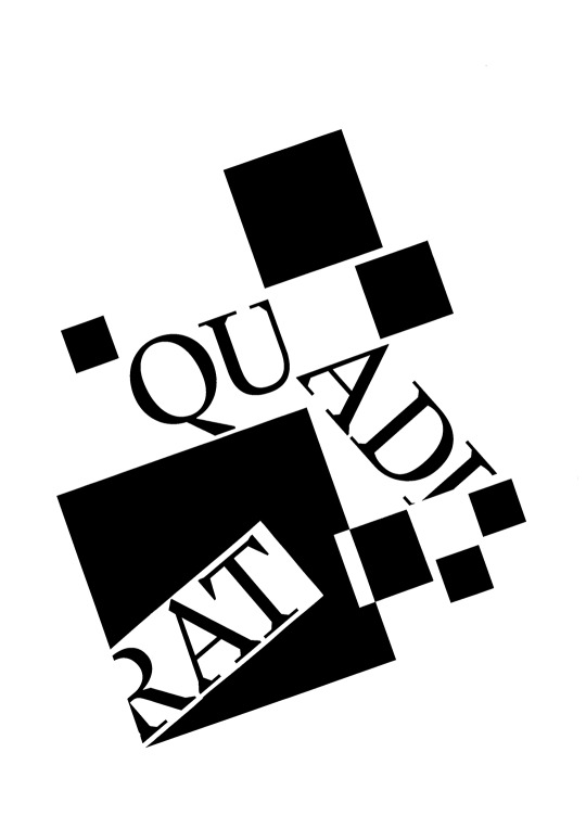
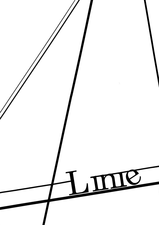
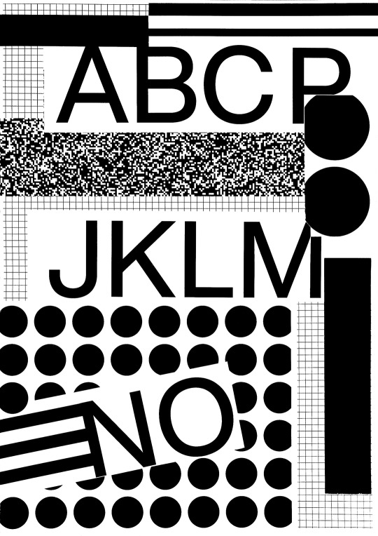
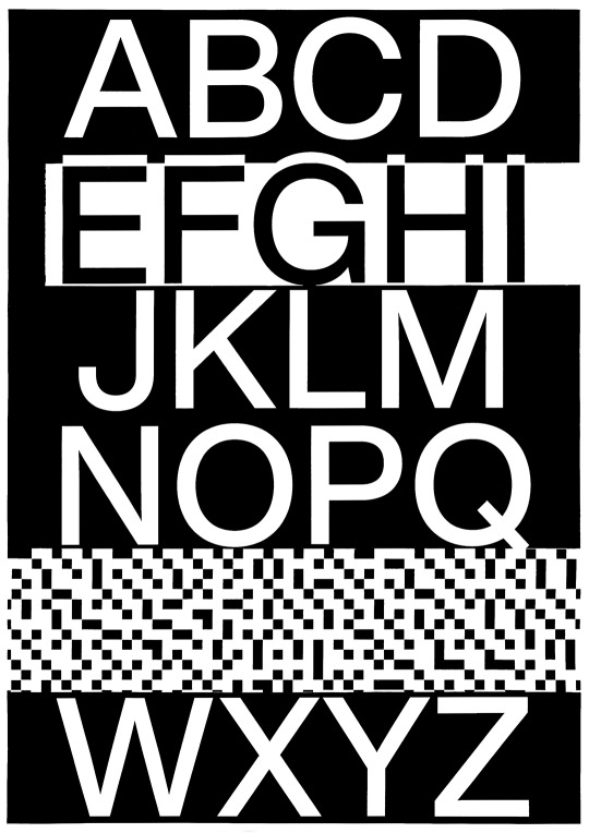

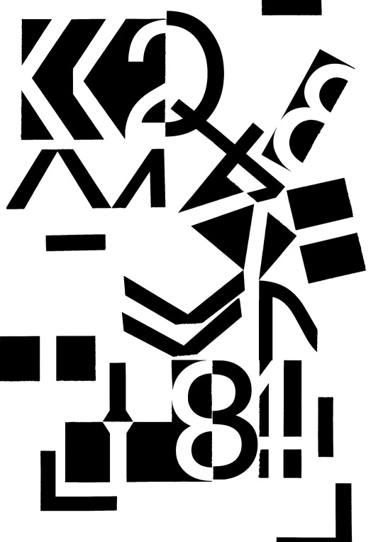
I’m attending a typography course this semester. I’m not exactly a natural…
The second and third piece in this compilation are called Counterconfirmation. I didn’t feel like naming any other of these yet. Maybe I can feel more serious about this kind of art after I leveled my skills a bit more.
Instagram | @helenapeculiar
#art#typography#logo#logodesign#design#black and white#minimalism#poster#posterdeisgn#poster design#b/w#original art#artblr#artist#artists on tumblr#female artist
2 notes
·
View notes
Link
Project Runic™. Re-experience your journey. Custom designed runic inscription, using Futhark alphabet.
1 note
·
View note
Photo

More info at http://www.liefhebber.biz/design/laracon-eu-2017
#branding#poster#posterdeisgn#graphic design#designer#designstudio#type#typography#neon#fluor#minimalism#print#printisnotdead#constructivism#cubism#abstract
1 note
·
View note
Text
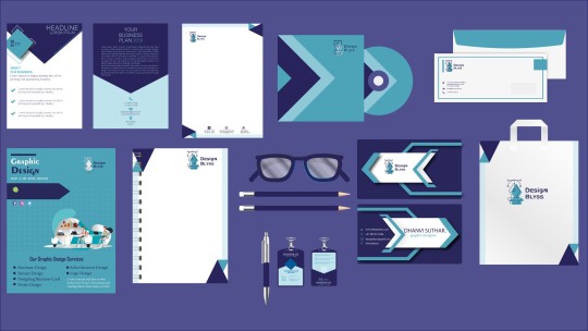
A complete business kit was attractively designed by @_dhanvisuthar
From business cards to envelopes and letterheads-everything was designed.
Ready to give your brand a makeover too ? Get in touch with us right now! - [email protected]
#businesskit #businesscard #businesscarddesign #businesscarddesigner #businesscarddesigns #businesscardideas #letterhead #letterheaddesign #brandidentity #brandidentitydesign #designinspiration #brandinginspiration #brandingtips #brandingexpert #branddesigner #branddevelopment #broucherdesign #idcard #idcarddesign #posterdeisgn #posterdesigner #designfeed #designbusiness #brandgrowth #designart #graphicdesign #graphicdesigner
4 notes
·
View notes
Photo
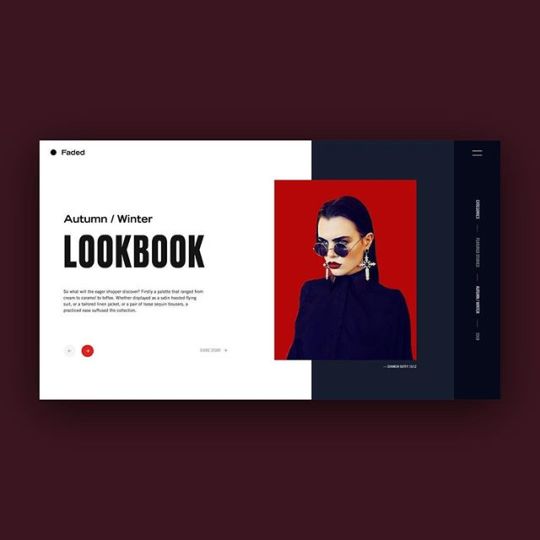
Fashion website concept #icons #iconography #design #posterdeisgn #poster #type#typography #kinetic #app #appdesign #kinetictype #kinetictypography #visualgraphc #visualgraphic #design #itsnicethat #eyeondesign #formfiftyfive #logoarchive @visualgraphc @visualjournal.it@aigaeyeondesign @etapes #etapes@inspofinds #inspofinds @welovewebdesign #welovewebdesign @ui_design_inspiration http://ift.tt/2oh4apd
0 notes
Text
Nike Poster Research
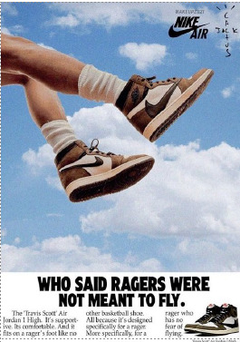
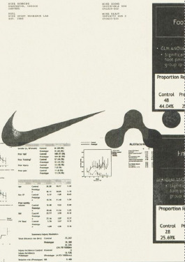
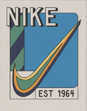
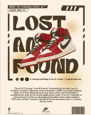

To help with my poster design for a campaign including nike i looked at posters i liked as well as majority of nike poster's. i also looked at a few of keith haring's posters, on so much for the style more for the colour pallette he sued with beige backgrounds and colour choice, flat colours in particular.
1 note
·
View note
Text
poster plan and inspiration
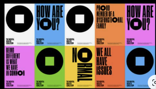
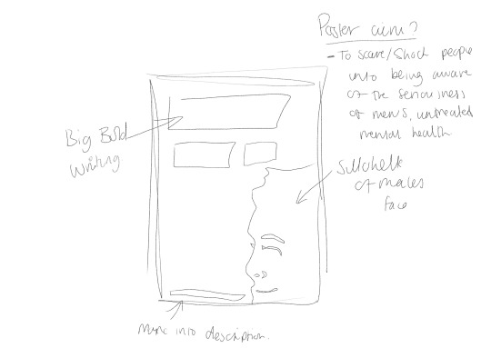

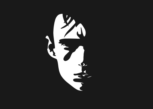
These are the poster/poster ideas i had originally prior to a 1:1
my aim with this poster style was to:
to scare/shock viewers who saw the posters as they're quite dark and have a hidden meaning of the seriousness of the situation
to show deep meaning with little amount of explanation and a call to action information at the bottom of the poster to redirect viewers to website and the app creation.
simple yet effective design style (which may not help find my target audience, this prompted my main reasoning to change my posters eventually)
Things to think about between now and 1:1:
does this style attract the correct audience?
will it attract a positive audience at all?
does it convey a deeper message with little to no explanation needed? (posters need to convey information with little to know explanation all through design/ technique)
Does the posters attract the viewers to learn more of be more aware? or is the poster just a confusing visual?
#graphic design#viscomaub#aubviscom#viscomstudent#visual communication#posterdeisgn#aub#branding#brand design#viscom#unistudent
0 notes