#pc music
Text
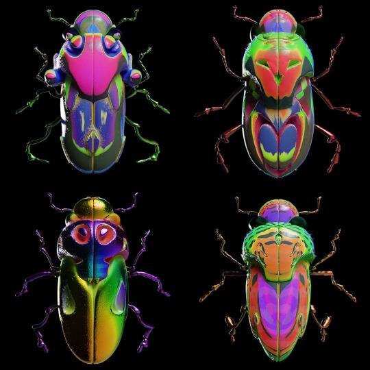


Jonathan Zawada
127 notes
·
View notes
Text
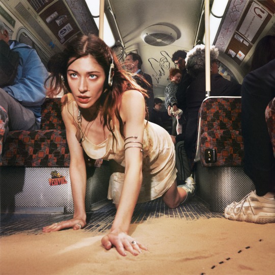

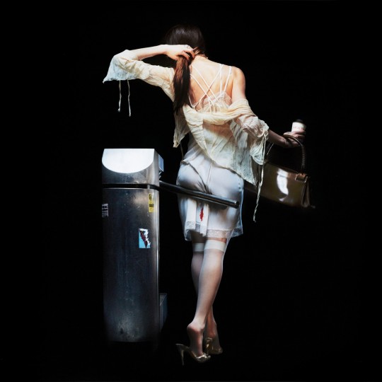


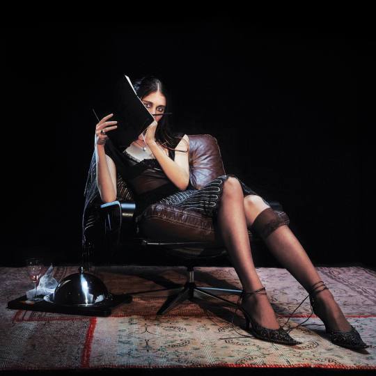
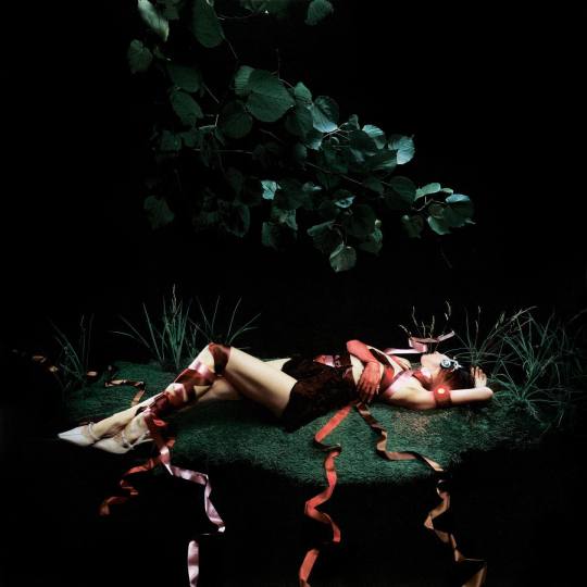
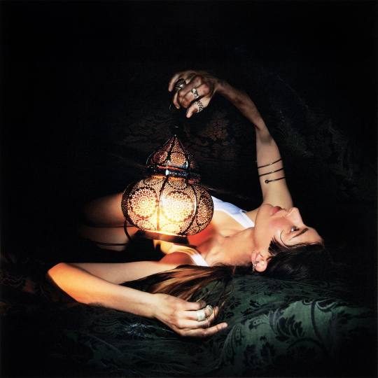

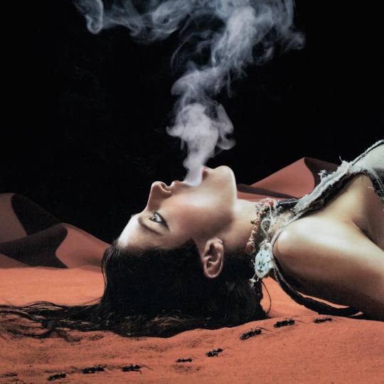

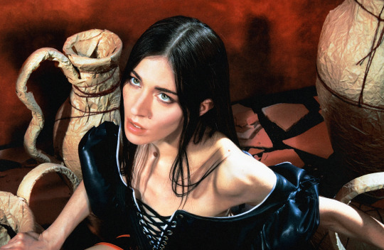
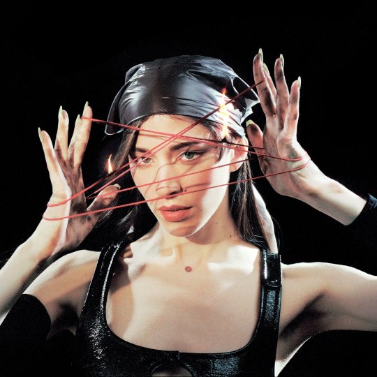

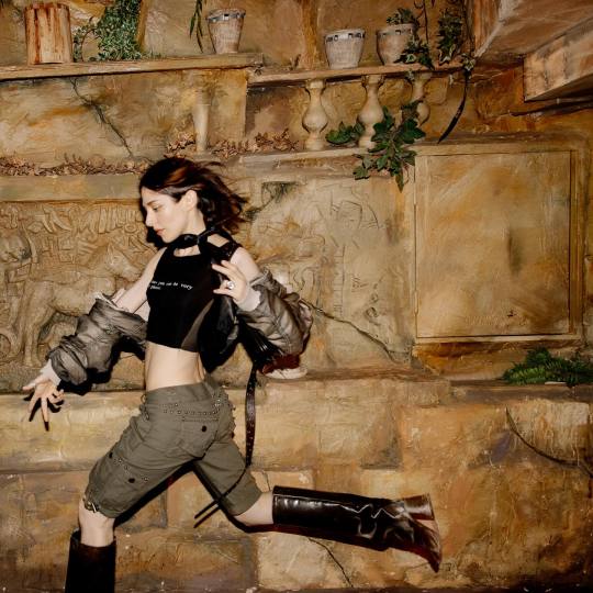

Caroline Polachek - Desire, I Want To Turn Into You (2023)
Shot by Aidan Zamiri, last photo by Camille Summers-Valli
#caroline polachek#music#dailymusic#album cover#album art#art#photography#pc music#pop music#i love women
116 notes
·
View notes
Text
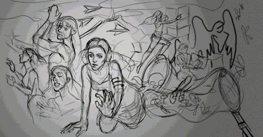
HAPPY 1ST ANNIVERSARY TO DESIIIIIIIRE I WANT TO TURN INTO YOUUU a tribute fanart piece to my queen CAROLINE POLACHEK
STREAM EVERASKING EDITION
#art#artists on tumblr#digital art#illustration#caroline polachek#desire i want to turn into you#welcome to my island#fanart#hyperpop#pc music#desire#music#aidan zamiri#character design
71 notes
·
View notes
Text


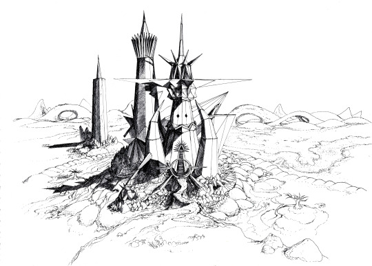

Done for PC music ! For the first Thyslaughter music video :) (agcook and easyfun)
109 notes
·
View notes
Text


53 notes
·
View notes
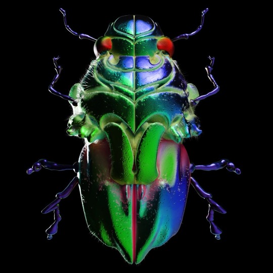
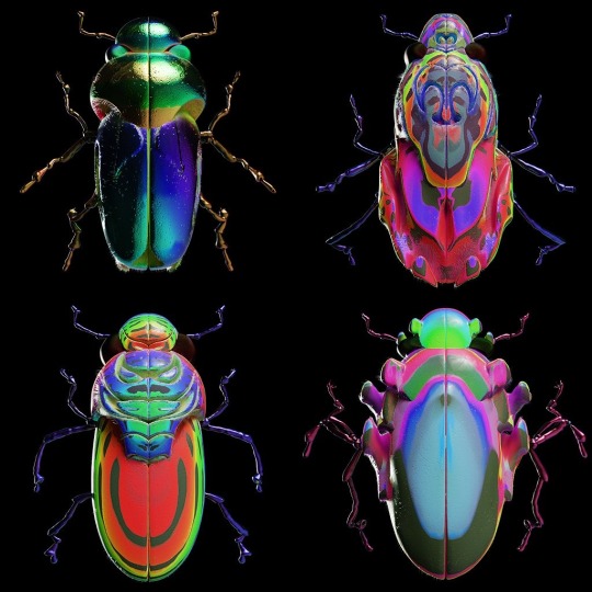
Text
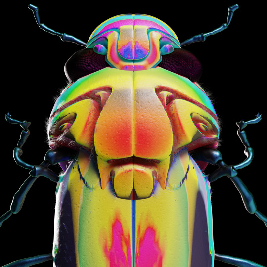
Honeybee is out now on PC Music
Artwork by Jonathan Zawada
103 notes
·
View notes
Text
in defense of the brat album art

my feed stopped when charli xcx dropped the album art for her upcoming sixth studio album "brat" a few weeks ago. like many angels, i was confused at first, as the image staggered out of the code on her merch site unannounced through a vinyl preorder link that originally had no image to go with it (and yes i ordered one before seeing any visuals...). even after she tweeted it, and the creative team posted about their contributions to it, questions were left unanswered. was it real? was it just a placeholder? was it an alternative cover for the brat_360 exclusive vinyl? this is not the album cover right? one angel dared ask our god in her twitter replies.
even before i got official confirmation that this was indeed the official cover, which i think came from charli's interview with vogue after the release of lead single von dutch, i was obsessed. the green: neon, but not tacky like the overdone highlighter trend already claimed by k-pop boy group nct, rather a muted, dull lime, catching your eye but not blinding you. the font: a simple sans serif, slightly condensed and elongated, nothing over-the-top or borderline illegible like the custom fonts artists usually commission. and the blur, the pixelization, the resolution, the quality (or lack thereof)—this is what really does it for me.
they're barely there, the rough, blurred edges of each letter, but once you see them you can't unsee them. the design evokes the feeling of waiting for an image to load in full quality on instagram, a youtube video playing in less than 1080p while buffering, a hi-res photo downloading from the cloud, a show or movie lagging its way into clarity on streaming services. or as oomf (@_alienmelissa) using a fan edit of von dutch lyrics put it:
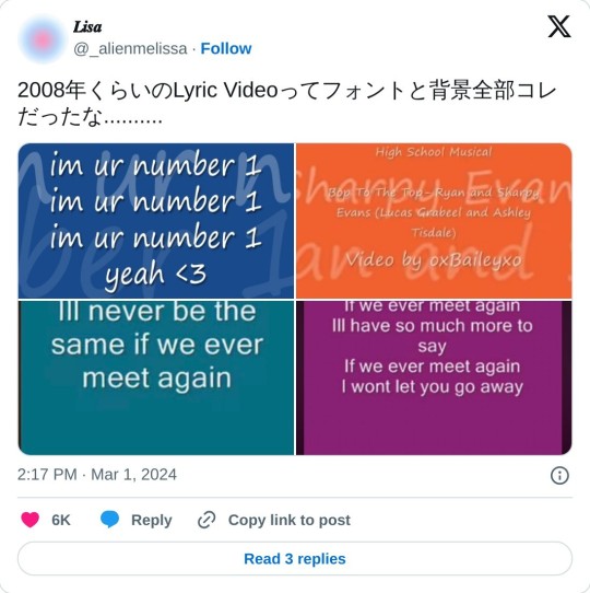
(trans: lyric videos around 2008 all had fonts and backgrounds like this..........)
while thinking about the many implications of the low quality text on the cover, i read the essay "in defense of the poor image" written by hito steyerl in e-flux journal back in 2009, which perfectly put into words what i had been ruminating on:
[The poor image] mocks the promises of digital technology. Not only is it often degraded to the point of being just a hurried blur, one even doubts whether it could be called an image at all. Only digital technology could produce such a dilapidated image in the first place.
"one even doubts whether it could be called an image album cover at all," as many have due to the "poorness" of the brat art. better yet, steyerl goes on to proclaim "resolution was fetishized as if its lack amounted to castration of the author," also predicting the mass ridicule of charli for choosing and releasing such a "hurried blur" of an album art design.
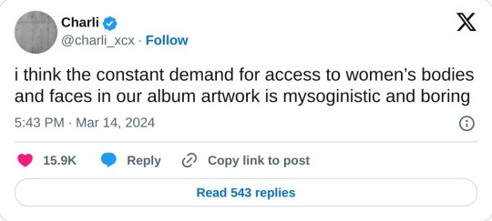
regardless of what you compare it to, the low-res, early internet digital aesthetic it speaks to is something i haven't seen spoken much about. many twitter gays are up in arms about the lack of an image of charli on it, breaking her faceful cover streak (although she does hide it a bit on pop 2), and not giving them a new image to set their profile pictures to. charli has acknowledged this in the vogue interview: “I mean, as a female pop artist, what’s more bratty than not being on your album cover? Especially when there is so much pressure for women within the pop sphere to do exactly that," as well as in a tweet posted right before i started writing this:
which grimes replied to while i was writing this:

grimes scratches at what i'm getting at, but is more focused on the shock value that comes with its loud simplicity. this sentiment of breaking the feed, cutting through the visual muck and endless faces with a bold monotone color and by refusing to show face, is something i also admire. yet i think why i feel so passionately about the aesthetic value of this cover is that it offers me a respite from the overflow of high-res images mediated through the internet and onto my phone screen.
i'm so sick of the flood of iphone/digital photography, its quality increasing with each new device release. these images try too hard to replicate what they're representing, and create a false reality that many (myself included) get trapped in. we've sunken into the uncanny valley, and it's about time we claw ourselves out. i don't want to experience the physical through the digital anymore. i'd rather see all your pores when you're inches from my face than through the insane number of pixels resting in my palm. i want the images on the internet to be so obviously contained within it that there's no mistaking them for something material. i think this is why i'm such a fan of camcorder style photography and videos: like the chunky pixels surrounding "brat," they whisper i'm not real, i'm flawed technology, i will never replace the resolution of your retinas.
lucky for me, brat isn't the first artwork to do so, as there seems to be a shift back towards the materiality of the offline and the rougher edges of early internet interfaces within the broader art and design world as well. kat kitay describes this as "technoromanticism" in her essay "what's after post-internet art?" for spike magazine:
Exposed circuitry departs from the post-internet gloss typified by DIS Magazine, which shined up or hid away the ugly parts of technology. Hardware is made visible, laying bare the flow of power and information, at the same time transfiguring electronics into sacred objects.
replace DIS magazine with PC music (its audio equivalent imo) and you'll get an analogy more relevant to charli's own aesthetic journey here. the super slick black lamborghini on the cover of the vroom vroom ep has driven off, her impossibly iridescent skin on the cover of pop 2 has shed its shine, and the skyscraper she's perched on for the cover of xcx world (RIP) has long been toppled, leaving nicki minaj's gag city in its ashes. the brat cover is the antithesis to these eras.
while ecco2k croons all i wanna see is 1080p / but reality keep me on 240 on "hold me down like gravity," maybe it's time to embody the "240" of reality again. with charli teasing this record as her clubbiest to date, tapping back into her party girl roots attending uk raves in her tweens, brat offers us a chance, both visually and sonically, to embrace the blur, the sweat, the adrenaline, the tears, and of course, the poppers fumes, of a low-res life.
35 notes
·
View notes
Text

✨Happy Birthday, Sophie Xeon. ✨
Rest In Power. . ✊ ☄️
#music#Bandcamp#SOPHIE#sophie xeon#sophie#electronic music#pop#sound design#icon#lgbtqia#rip#music producer#legend#pc music#hyperpop
126 notes
·
View notes
Text
My remix of Acid Angel is out now!! <33
30 notes
·
View notes
Text


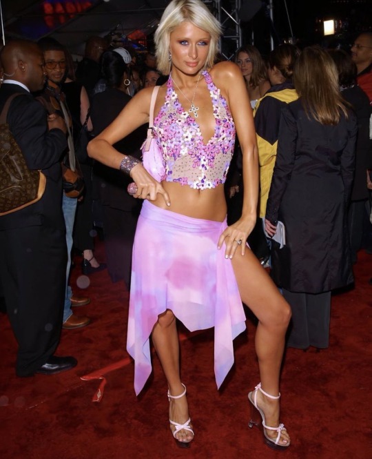
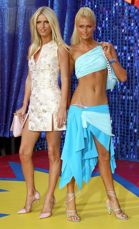


love paris <3
#paris#paris hilton#beach babe#beachy#tanning#2000s#2000s aesthetic#gyaru#latina#gyaru gal#gyaru magazine#gyarustyle#lyn may#2000s internet#agejo gyaru#ayesha#gyaru aesthetic#pc music#gal#icon
288 notes
·
View notes
Text


"Make Me Cry", Astra King
32 notes
·
View notes
Text

hannah tonight <3
10 notes
·
View notes
Text
My net buddy System ST91 who does awesome 90s dance / VGM inspired tracks paired with their sweet (also 90s inspired) anime art is so close to 1K subscribers on youtube, meaning they can soon monetize / get superchats and other benefits on their channel! which FYI youtube shows ads on people’s videos regardless of being in partner program or not so might as well get something out of it 🙃
so to celebrate I’ll post my top 5 favorite songs of theirs (that are on YT). music ranges anywhere from DNB breaks, jungle, techno, garage house, vaportrap and juke with touches on various atmospheres and game setting themes:
youtube
youtube
youtube
youtube
and my absolute favorite, the entire Mind-Station 98 album 🔥🔥🔥:
youtube
#System ST91#wish i could list 10 songs but i'll just post more of my favorites later#breaks#DNB#drum n bass#VGM inspired#garage house#jungle music#techno#juke#cyberwave#Y2K#Fluid#Depth#Beat Planet Music#PC music
97 notes
·
View notes
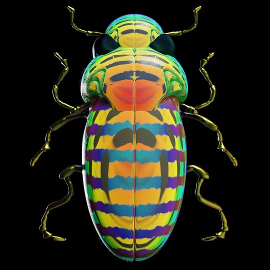
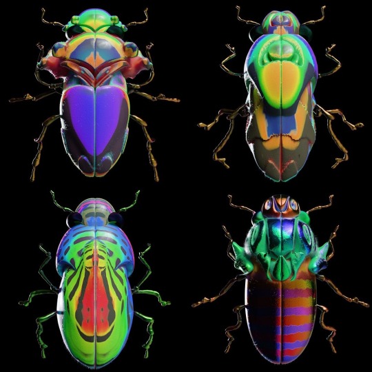
Text

Honeybee out November 9th on PC Music
Artwork by Jonathan Zawada
101 notes
·
View notes
Last Seen Blogs

avthreads
AV Threads Sewing

softbrambles
UN JOUR JE SERAI DE RETOUR PRÈS DE TOI
void-icons
Mills

tridentcorp
Fence Solutions for Deer

1991designstudio
1991 ARCHITECTURE & DESIGN STUDIO