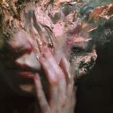
#oh those beautiful hands
Text

Another pretty photo from FB
#greg lake#look at his face!#and his hair!#oh those beautiful hands#that little peep of chest#and his mouth#oh man#elp#emerson lake and palmer#emerson lake & palmer#emerson lake palmer#a greg a day (or two or more)
12 notes
·
View notes
Text
The racism my beloved Simon had to face….my baby. 🥺💔
Although painful to watch, it felt incredibly validating. It was so annoying watching some people say this show was “only about class” while dismissing the BS that Simon had to go through. The abuse was ten fold because he’s POC and S3 finally exposed that.
That being said, and on a more positive note, it was so incredibly sexy when Simon sang happy birthday to Wille in Spanish (he feels safe with him!) and when Wille admitted to fantasizing about stroking those beautiful curlssss (and then actually did it). 🥹❤️🩹
Wilmon forever. 🤎🤍
#simon the bravest of braves and the sweetest of sweets i love him sooooooo much#and apparently inspo was from irl hate comments omar has received? 🔪#oh HELL no. 🐓🤎#omar brought face heart soul and curls to this season and to this damn show and i love him and simon so much#like it wouldn’t have been that bad if he was fully white and didn’t look the way he did and i stand by that#those online hate comments were disgusting#imported? latin lover? (they were a breath away from flat out calling him a wh*re and i was ready to throw some fucking hands)#even more hurtful because simon was very obviously a virgin when he met wille and didn’t even sleep with that douchebag#who shall not be named on my blog#y’all can try to pry this interracial ship out of my cold dead hands (you won’t)#but we heal and that’s beautiful ❤️🩹#they mean soooo much to me 😭😭😭#and like i said before#no it wouldn’t have been good if simon wasn’t poc I SAID WHAT I SAID WHAT I SAID#young royals#wilmon#simon eriksson#simon my beloved 💜#i love them sooooooooooooooo much.#🤎🤍
108 notes
·
View notes
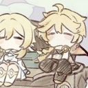
Text
NEWSFLASH- He thinks you’re pretty~
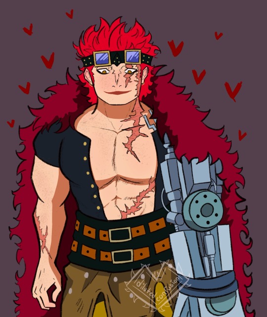
#WAHHHH I made him so much softer then he usually is and IM LOVING IT#I added freckles cause my boy is a big chonky ginger#brb im bout to hold his face and give him forehead kisses like no other#IM TRYING TO HUSBAND THIS MAN UP#oh and he looks completely different then my other two artworks#i realize that and its okay my hands are stupid#i also drew those other illustrations like last year/early this year#SOOOOO its been awhile and I’ve grown and changed and now hes prettier#MIGHT ADD MORE TO THIS PIECE LATER#BUT HERES THE START OF BEAUTY RN#eustasscaptainkid#eustass kid#one piece#digital art#digital illustration#do tags even work??#IDK but imma use em
41 notes
·
View notes
Text

2/10 - Naga's birthday coincides with me watching the finale of this show. I miss him already 🐍
#super sentai#uchuu sentai kyuranger#naga ray#kyuranger balance#BN team#AAAAAAAAAAA AA AA A AAAAAAA AA AAAAAAAAAAAA A A A A AAAAAAAA#the show was pretty good#i put it on one beautiful afternoon and i watched 20 entire episodes in a single sitting absolutely unable to move#THEY MAKE ME SOOO SICK OH MY GOD I HATE THEM I HATE THEM I HATE THEM#I PUT DOWN MY STYLUS FOR ONE SECOND TO BURY MY HEAD IN MY HANDS#so if youre wondering hey this looks kinda messy then its because I CANT LOOK AT THEM FOR PROLONGED PERIODS OF TIME#they are a combo meal do not seperate#i have chat logs of messages just talking about bn. my sketchbook is infected with bn. agepoyo dance got stuck in my head#somewhere there is a video of me saying 'IM GOING TO [colorful threat]' over the scene in naga's brain. you know the one#happy stinger saturday to those that celebrate. peace love kaitou bn dan. good night. agepoyo uei
43 notes
·
View notes
Text
dedicated to last year and this year and my friends and me <3
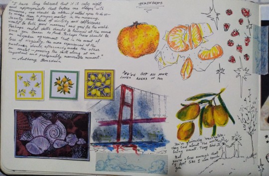
#oh whats this. a sketchbook spread. i bet none of you expected that !!!!!!!!!!!!#also the writing under the olives next to the lil guys holding hands is from a poem i wrote but probably won't post#'youve got all your loves ahead of you' is from a richard siken tweet#and the lyrics on the second page is from true blue by boygenius#art#syd's art#the clementines are kind of sucks but those olives...... beautiful to me
41 notes
·
View notes
Text


adventures from a rly fun magma i got to relaxe in today
#jrwi fanart#this gets ONE (one) proper tag bc im actually rly proud o these. thats IT!!!!#anyway AAA okay so. some1 in the magma reccomended i draw edynXkira. n im like OH MY GOD. thats GENIUS#they both work at the same job or watever. coworkers. they meet only bc edyn happens to break down infront of kira#i mean she IS under alot o stress. w knowing her brother is out there in harms way. aching not only from the decades of abuse but also#from her blatant absence and silence. she KNOWS her brother cares for her bc she feels the same way. and worries just as much.#anyway kira feels bad for whatever shes got going on w this brother of hers. whoever that is. and gets her icecream.#thats what happens in MY beautiful heart. i looove kira i loooove her shes so cuuuute and so sweeeet#IN OTHER NEWS. i also love vex n viv their canon outfits are SOOO FUN. evojelly u legend#no one knows how long i fought w those hands. oh my god. drwaing hands and tools and holding and things is so ANNOOYYIINNGG#yknow what ISnt annoying tho. drawing william wisp. he comes so naturaly to my hand now. i love him so much...#ouuuhhh prime defenders oouuuhhh i miisss youuuu hope ur doing well prime defenderrrsss#aauubabbab i think thats all i got in the ol brain. here. eat my scribbles and arts. hauve fun
23 notes
·
View notes
Text
will never ever ever ever ever ever ever EVER ever forgive them for how they used pj harvey in a DEAN scene >:((((((
#crying .... those were a beautiful few deanless episodes we had there...sighing forever :(#oh well on the other hand..... sooo close to S2 JESS SEASON WOOHOOOO <3333 a thousand angels singing sunshine crops flourishing etc#gilmore girls
24 notes
·
View notes
Text
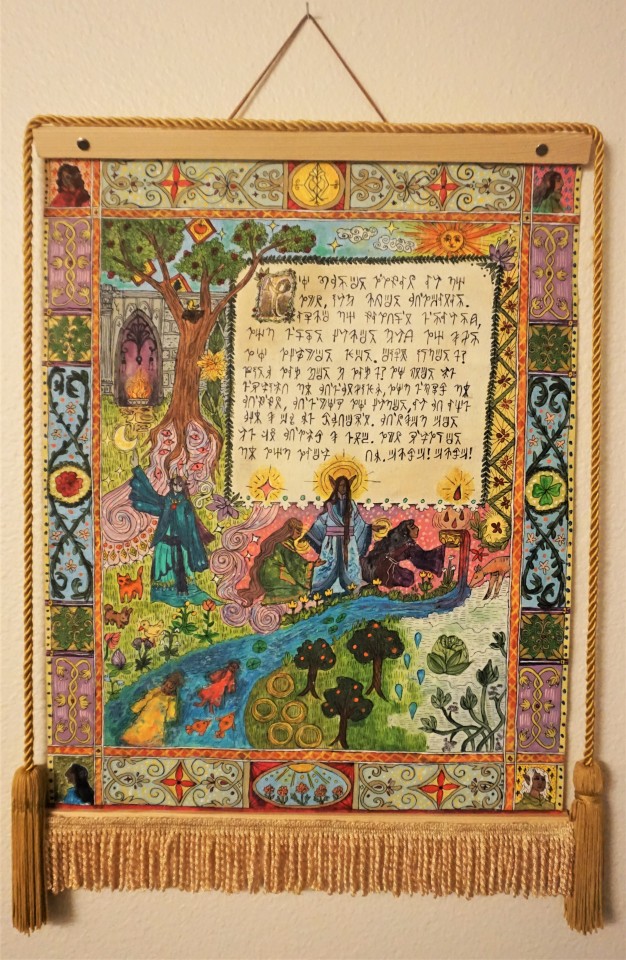
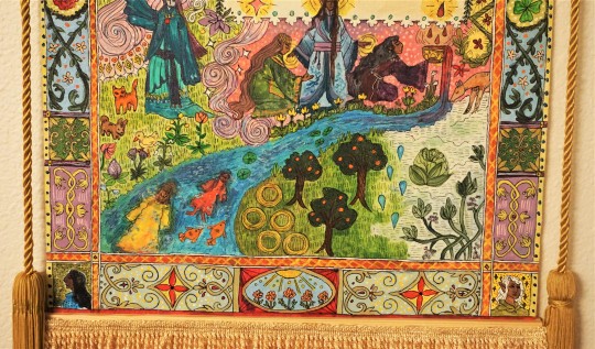
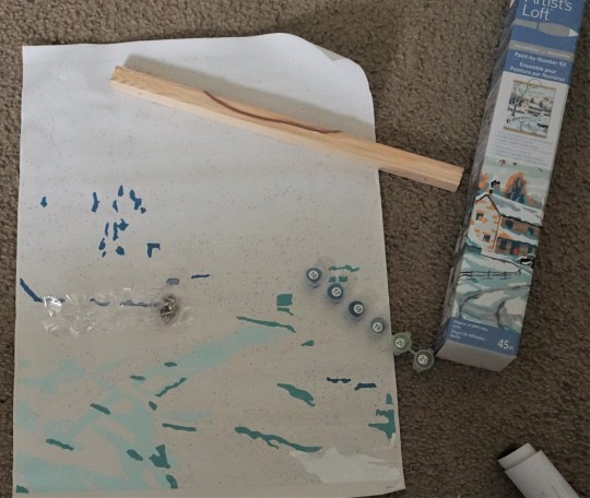
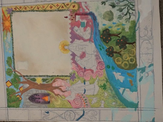
Finally finished my weird hanging painting thing (originally a secondhand partially-done 'paint by numbers' kit that I found at a thrift store and kept to repurpose lol)! Imagery somewhat based in my own worldbuilding projects, and text written in my constructed language for one of my fantasy species, but also vaguely inspired by old tapestries and illuminated manuscripts and etc. I've never been great at neat clean patterning or text, but it looks cool from afar, and I always enjoy making "props" or things that are somewhat like real objects that might could exist in my world. :0
(additional pictures/info under the readmore)
-
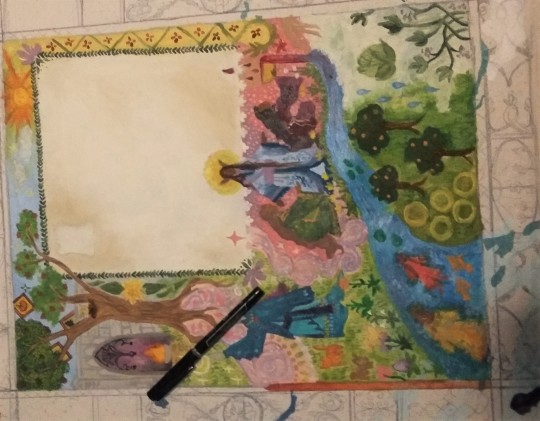
Here's what it was originally! I probably didn't have to actually have a river running down the middle because it further makes the composition of the whole thing weird (various connected yet separate locations and things happening, instead of one unified event being portrayed), but I wasn't sure if I'd be able to fully cover up the already existing paint that was there.. and I can also kind of justify it by going with a more "all the imagery is just symbolic so it doesn't have to make exact sense" approach lol.. How is one half of the grass green and the other is suddenly snowy? shhhh.. it's not literal.. shhh...
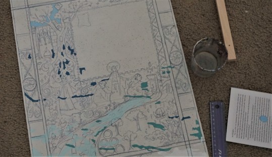
Made a vague sketch, then painted over it, and then added more distinct lines in black pen. Center image first and border second.
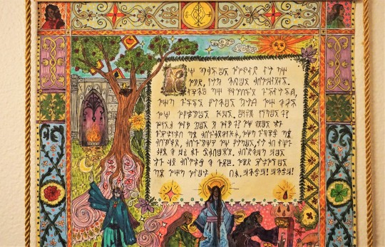
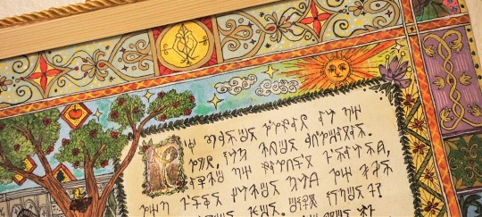
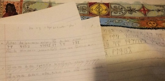
The very last thing was the text, which actually took forever to translate because my conlang is still only like.. partially done, and some of the grammar is not worked out exactly how I would like it to be, so a few sentences I had to think about for a long time before just going "eh, this is probably not how I would do it if I considered it more, but I'll go with it for now" lol . I also am not entirely satisfied with all of the characters for the writing system, but again, it's good enough for a quick project, it doesn't have to be 100% accurate and perfect because it's a fake language that nobody knows anyway lol.
I thought about breaking down the text and translation here like I have for some of the tidbits of Avirrekava (the language) in things I've posted in the past, but I think it would take too long and is not interesting to anyone but me ghghj, so for the sake of getting the post out quickly, I shall not spend an hour typing All That lol.
The general jist of the writing though is that it's just about the Avirre'thel being cast out from the other elves, after abandoning their magic for immortality as a means to truly attain perfection (an important concept in elven culture), the usual, blah blah blah, but how it's Actually A Good Thing, because the gods are wrong and immortality is Cool actually and they like the shitty frozen lands they were sent to, so it's fine that everyone else is being a Hater about it lol
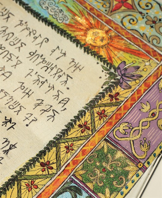
Lastly, here's a few photos outside in the sun to TRY and show the gold detailing actually shimmering or showing up! It really doesn't come through in photos, but there's plenty of little golden spots to highlight light or Importance.
Mostly the fire, the pink sparkle that represents magic, the red drop that represents blood, the light behind Inaashi's hands and head (common symbol for the elven religion/one of their main gods, shout out to anyone who read the ancient elven religion post and recognized that lol), the sun, and the symbol for the Avirre'thel/country of Navyete at the very top. I did a few other gold bits, but they're not highlighted because they're Significant, more just that it looked more symmetrical to have some gold on the border too lol.
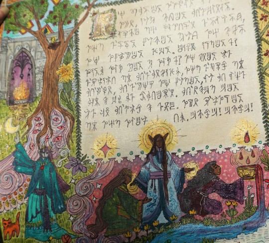
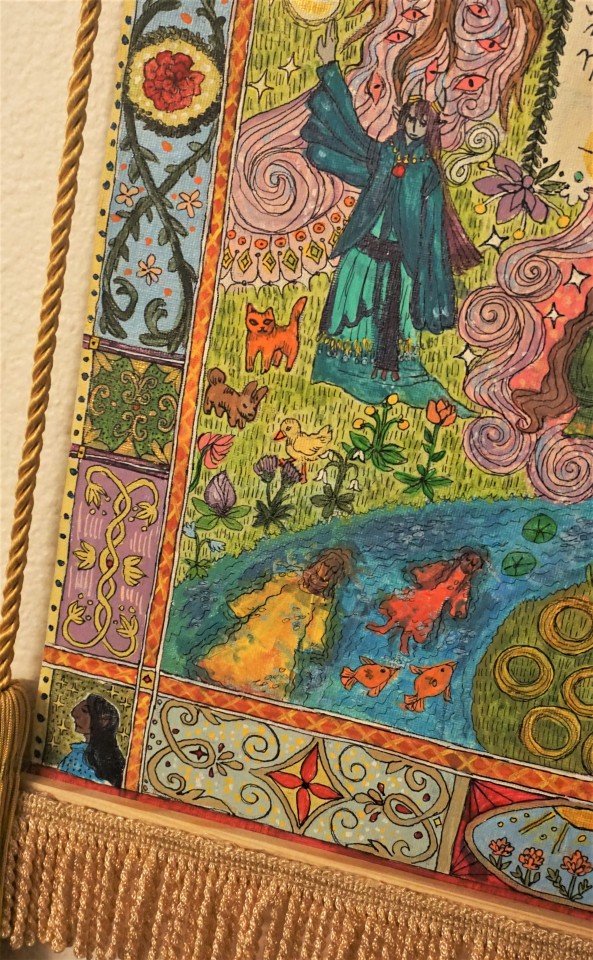
Other things of note: The animals are not actually significant to Avirre'thel culture really, I just wanted to put a cat and a bird because I like them lol. (I also wanted to have a few funny looking creatures, as I was slightly trying to go with the 'in some old medieval painting the anatomy and perspective is very weird' vibe, though I think some of the other parts of it look too Normal to pull it off entirely). Same with the four leaf clover, which means nothing in their culture - but these are the only areas where stuff was just added self-indulgently .
Bligabata (giant cabbage that grows along rivers in Navyete) making an appearance! The architecture of the building IS based on actual concepts for ancient elven/older Avirre'thel architecture and metalwork. The Avirre'thel who's turning away from Inaashi/elves/magic and collecting blood, is doing so in a Special Bowl, as is part of their culture (collecting it in the hands, or just in a normal vessel would be disrespectful, they have Specific Bowls which is the only thing blood can be kept in, etc.).
The figure that represents Jhevona (and thus, a closer connection to magic, celestial imagery, etc.) is in weird ugly teal, which is not necessarily a color or design associated with them, as I don't have much common culture (like clothing) worked out for Northern Jhevona (who the avirre'thel would have come into contact with) yet, BUT everyone else is in more Typical colors (a northern elf in green, Inaashi in lavender + white + blue, an Avirre'thel in darker purples and reds).
Some things, like the four figures in the corners, and the two people + fish in the stream, do not currently have a meaning, but in-world they would.. Like, I could make up lore for how they're culturally significant and it would be true because I am god of the world, but I don't have anything currently. But just know.. they DO mean something, I just haven't decided it yet, maybe kind of fill in as I go, come up with a meaning later lol. Probably along the lines of an old myth from the ancient elven religion, a story, etc.
-
I don't know, probably other stuff, but that's my Trying To Keep It Short rambling for now lol. I'm just glad I finally finished this! For how vaguely sloppy it is up close (everything being completely freehanded, only used rulers once when doing the initial sketch and lining where the border should be + my hands are shaky + the canvas is bumpy + my handwriting is scratchy and terrible + etc. etc.) it still took a REALLY long time, even when not trying to make it all perfect. Especially if including the text translation + writing, which took like 3+ hours itself.
Maybe all the asymmetry/lack of things being centered is NOT because I was too lazy to measure anything, but is actually because in-universe, it's a practice illustration made by some young apprentice who has to work on little canvases for years before he can be trusted will a full sized mural or tapestry. It's his first week on the job! of course he's uncoordinated! don't laugh at him!!! lol
#worldbuilding#elves#I AM WORKING ON A NEW PAVENTURE POST also !!!! I know I keep being like 'oh I'm going to get back to that! I'll stick to it this time!!'#and then another whole month goes by without me posting a new poll adventure - however - this time I DID fully intend to so#*do another one soon but my beloved beautiful perfect cat unfortunately passed away AND there was a heat#wave ANd I felt sick for a while for unrelated reasons so I just genuinely was not focused on posting online at all#I am trying to get back to it though along with other things hopefully so.#ANYWAY#avirre'thel#irithoas#maybe???? not super relevant to elves but I'll keep it intheir tag anyway also. Just since their lore is so closely tied with avirre'thel s#stuff and they're mentioned in the post. Or the gods are. Inaashi is.#OIGUGUGUGUHH I should have done a tapestry with the FCJhjkING triplets!!!!! Sehalanora Semoniyare and the other one whatever the hell#his name is. ... sehalanora my beloved .. (I'm referencing the ancient elven gods - for those who dont know)#It's funny that I rarely watch tv shows and when I do I rarely if EVER care about characters at all in any capacity#with maybe like a handful of even then extremely minor exceptions so I cannot relate to the concept of like 'having a blorbo' or whatever#but then for my extremely niche worldbuilding content#.. it's like OMG MY FAVORITE character!!! my favorite obscure god from a religion#that I entirely made up myself for a cultural group that I also made up that literally only I and maybe like two other#people who are able to sit through my novel long dry and wordy worldbuilding posts care about!! you all know them DUH!!#even WITHIN modern elven culture in the world at the moment in current day most people do not give a shit about them hghj#BUT .. I should have made a painting of the siblings actually!!! I stand by that!!#I mean I like Inaashi and Nisateyu and everything too. Actually all of them are fine except for Ea'ivuyera I guess. whoever the#like War and Order bootlicker god is basically. and the Evil dumbass one. but all the others are fine. I'm suprised I'm even able to rememb#that many ancient elven goofily long names ghgh.. But I could have maybe made it about the elven gods#The thing is just that.. i Don't have ancient elvish worked out as a language and I knew I wanted to put text on it#so it kind of HAD to be something written/drawn by the Avirre'thel#Knwoledge of the ancient elven gods is still a thing in their culture. But usually more as a joke or just a common fairytale knowledge#sort of thing. not really something to make a painting of. Inaashi is here less because of Inaashi The God being genuinely significant and#and more just she's there to Symbolize the elven religion as a whole. just like all the other figures are mere symbols of things. etc.
93 notes
·
View notes
Text
My hyperfixation on Motley knows no bounds. Nothing else on the planet could motivate me to write a whole 11 page screenplay in like two days
#just adapting the first 3 chapters into a little fake first episode#i say fake but im probably gonna make a storyboard for it in my freetime. lol#maybe ill even get ...... voice actors#oh the dream#shoot for the stars i guess#not art#the beauty of having premade chapters to base the episodes story on is that i can improve stuff from those chapters#ohhhh i love me characters. you can pry them from my cold dead hands
21 notes
·
View notes
Photo

Just received a stunning commission from @leifor of everyone’s favorite star trek couple: Tuvok and T’Pel!
#THE star trek ship#LOOK AT THIIIS~!!! THIS BEAUTY~!!!#the clothes look like they'd be so soft~!!#and Tuvok's heeled dressy starfleet boots vs T'Pel's more practical ones....#and the way their fingers are touuuching ~!!!#T'Pel STARING at Tuvok as she is want to do!!!#I really love the design of T'Pel's clothes like they're so vulcan but also so practical!!#I can just imagine her leaning slightly into Tuvok's hand...#the shadow on T'Pel's sleeve and and the light on Tuvok's collar and the shading of his hand...I love all those little things!!#and of course...Tuvok's got that canon-confirmed ass v_v#OH BUT ALSO OHMY GOD THE BACKGROUND#the sort of hazy(?) light around the two of them while everything else is a plain blue...they are COMMUNICATING something is HAPPENING#anyway you should all commission leifor who patiently and kindly listened to my rambling and produced this BEAUTY#ok NOW I'm done v_v#Tuvok/T'Pel#Tuvok art#T'Pel art#Tuvok/T'Pel art#other people's art
277 notes
·
View notes
Photo
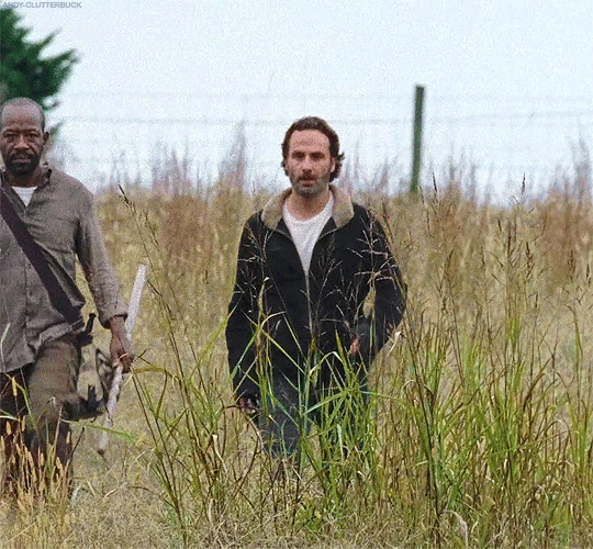


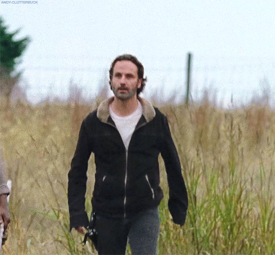
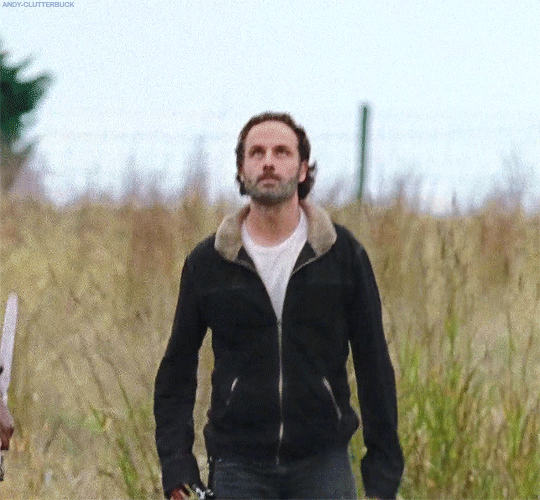
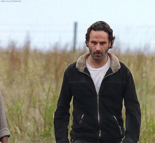
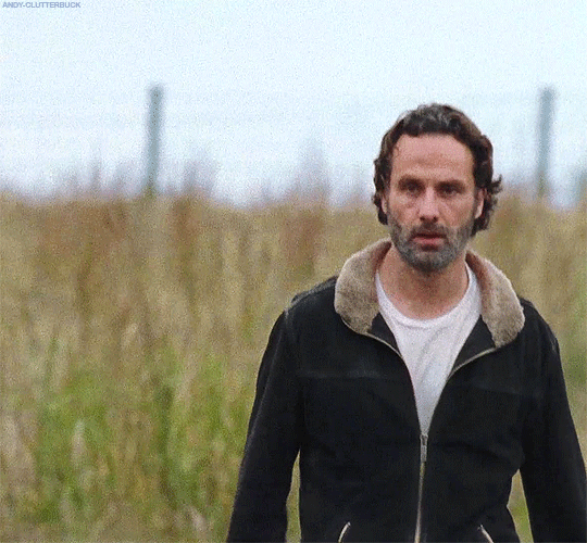
6x15 | East
#oh lord he comin#Rick Grimes#*#rg#S6#richard pls#I'd wear his thighs like a scarf tbh#HIS BEAUTIFUL LIL LEGS#me as the weeds he's stomping over#loved that the murder coat was a tad too big so the sleeves hung over his hands#watching him walk is like when kaa does his snake hypno thing in the jungle book#imagine rick controlling his cowboy daddy swagger#sounds fake#🎵 when times go bad when times go rough won't you lay me down in the tall grass and let me do my stuff#ticks? i don't know them#richard you look frustrated#i volunteer to be the outlet#bout to invest in those kneeling pads people who garden a lot use
108 notes
·
View notes
Text
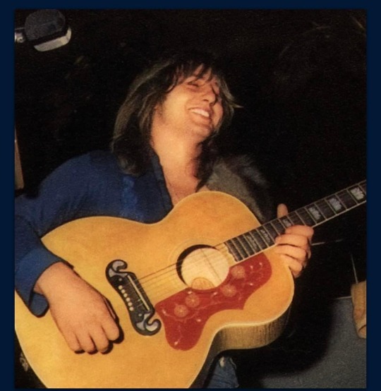
Oh
#greg lake#oh my#pure joy!#oh his smile#and his hair#our beautiful troubador#those magnificent hands!#I just want to …#yeah#acoustic guitar#elp#emerson lake and palmer#emerson lake & palmer#emerson lake palmer#EmoLakeVember#a greg a day (or two or more)
15 notes
·
View notes
Text
While we all know about Hawke's character-assasination in inquisition, I personally remain.. preplexed? a morbid kind of impressed? with how that game also managed to butcher my Warden
with only about 5 lines of dialogue referring to him and a letter.
#dragon age#dai critical#mostly everything leliana says#because look. they were friends in origins. But it was doomed from the get-go#and that's kind of the beauty of it in origins isn't it? The setting of war makes a lot of room for relationships that would in any other-#place in time- any other scenario be impossible- to happen!#for Orion this applies to Sten and Morrigan too.#The whole thing of- one day you will walk out of Denerim and into a life that will entirely contrast my every value;#Stealing Dalish artifacts. Becoming Arishok. Working as left hand of the Divine.#Next time we see eachother chances are we will no longer be on the same side#we both know this but tonight we still gather around the campfire. we still sing. we still laugh; exchange gifts and talk about the world.#it's bittersweet yes but it's the type of tragedy that feels like everyone involved already knows and is at peace about it#So when inquisition comes around and Leliana tells me Orion is still a close friend of hers? It feels like it cheapens the whole thing#Yes the devs can't possibly account for every possible way either installment can be played just for those small moments#But that is WHY they should either be bringing the old protagonists back as playable or simply not include them at all#The warden I made would not even leave room to question that he and leli are now on hostile terms#and he CERTAINLY would not send a polite little letter to a force whose purpose is to restore the chantry to power#And then you have the throne room chatter. which i straight up hate im not going to be poetic about it#the fucking da keep remains horrendous#oh we desperately need to have shithead npcs shittalk the hof . what? your hof did NOTHING that would warrant that? haha too bad#you simply can't pick what you actually DID in those quests#You found Bevin didnt take the sword and just gave them 5 gold out of the goodness of your heart? No you didnt#You just persuaded the random mercenaries in the gnawed noble tavern to leave? No you killed them#it infuriates me
35 notes
·
View notes
Note
yeah no fr you get it. i notice so many little things that just feel weird when games try to be too realistic. like modern fallout games? you immediately notice when character's mouths or animations are wonky. tbh i play far too few super-realistic-games to really point out any ones i have flaws with but like!
final fantasy! 15 is pretty realistic but still keeps that anime vibe. prompto's hair is a little silly but hey, its ff! and it fits in the world and doesn't feel off. kh? entirely silly. even in kingdom hearts 3 where there's a lot more like "high-def" textures and stuff, all the characters are so silly and anime-esque that it still just works.
hell i sometimes think ts2 has more polish and personality than ts4, and that came out in approx 2004...
idk man i love my silly anime games and my clunky/chunky/low-poly graphics. realism is fun as are pretty graphics but man. i can look past shitty graphics if the story and characters are fun and i have a reason to care. but if the graphics are slowing my device down and i can barely play? that's just a pain.
on that note why are assassin's creed games so fucking big. i had to dl over 100gb for ac: valhalla awhile ago. is this even necessary anymore...? ngl i like ac4's graphics more than the more modern games sometimes...
sorry im a little passionate abt games. oopsies. ily corks
No, but exactly, that's why i brought up ff. It has a dash of realism to it, but the charas look so stylised in the anime way despite that, that flaws don't jump out as much as they do in the RE engine, to me. I very much remember wonky hair being a thing despite the fact that i played one (1) 3D final fantasy entry, and that was years ago, but it never struck me as odd, because... it was stylised, and it could get explained as part of the style. When you aim for photorealism, even the most minor flaw registers as - a flaw, cannot be explained by saying "it's stylised".
And, yeah, real. I can't tell you for Valhalla or Odyssey - I don't own them and don't really have an urge to get them either (not in an elitist "it's not a proper ac game", but just a bit of a side-eyeing "i play ac for certain reasons, and odyssey and valhalla took a path that removed those reasons"), but from what I hear they have a fuckton of content. I think Origins also took so much to download, it was ridiculous.
(And same tho. I made tumblr bc i wanted to be insane ab elder scrolls somewhere, enstars just kinda took over. But i've always been a video game freak)
#oh asscreed. idk i play it for the ''hey what if this historical event... actually went like this.....'' and then for the weird ass lore#they made but i feel like origins i barely accepted but then after origins it kinda took a nosedive for me#i love fantasy and i love historical fantasy but imo odyssey and valhalla went too far into fantasy and don't really have much on the#historical aspects - as that was my main draw to the franchise i don't feel much of an interest to those newest entries#besides the gameplay change. i'm still not quite used to origins - it just doesn't feel Right in my hands even tho i do prefer RPGs#but well! if it's fun it's fun#but black flag was beautiful#a lotta folks criticised it bc assassins couldn't be pirates#but i could write an essay on how it fits perfectly as an assassin's creed game.#it really is good i love it#throwback to the time i played it so much i developed a welsh accent#<- the charm of being a non-native speaker is that you tend to just absorb whatever accent you listen to the most#or at least such is my experience#asks
11 notes
·
View notes
Text
chiyo biting her fist when guys have nice hands and ladies are very shaped? yeah
#honestly i'm thinking about it again and she's just#' oh my gosh look at their jawline... look at their cute lil ankles... i wanna smooch that collarbone... '#' is it too much to say i want my head crushed with those thighs?? and those hands i'm-- '#ASDFG it's an inner monologue that no one will ever hear or she'll die :' )#i think she just admires each person's beauty -- like it's more a category of traits vs a specific trait that she likes if that makes sense#like she has no preference for dainty and delicate hands over rough calloused hands#she just thinks hands are attractive#she doesn't have a preference for body types -- she just likes seeing someone's figure and thinks the lines and curves are pretty#is this making sense??? i hope so asdfgh#headcanons | chiyoko#as always i rambled too much to not save this as a headcanon :' )
3 notes
·
View notes
Text
I wish I had my babies to take care of me while im recovering :-c
#ot3: ❤rhyme💛easy💙#tape entry circa 1980#i love this photo of them they both look so damn cute...#i dont have a lot to say tbh... i just miss them so so damn much... id do anything to see them rn#oh my min... my baby min-gi my dumpling...#ive been thinking abt him so so much#thinking of his beautiful soft face... god. how is it possible for him to be so handsome and cute at the same time#looking at him or even hearing him makes me melt#everything abt him feels so warm and safe... just to be in his arms would make everything in the world alright#i miss my ryan sm too#my baby ryan... my princess AND prince hehe#i thought abt it recently... i think i want that to actually be something i refer to him as#when i sweep him off his feet and have him melting in my arms hes my princess 💖💖💖#...but when we're just laying together... and i get to admire his beautiful face... the shape of his nose#the veins on his hands... shape of his lips... his collar bones peaking out from his shirt collar#in those moments when im entranced by his very existence... hes my prince#and id follow my prince to the ends of the earth if hed ask that of me#mi principe 💖#id love to have my min-gi making me food to eat while ryan also tries to help w doing chores around the house#just full house husband mode#also i think its funny that min would empty my drains cause hes very meticulous abt that kinda stuff#but hes also gets queasy#so he ends up passed out outside while ryan has to finish helping me and redressing me lol#and ryan would for sure be trying to cuddle me and hold me as much as he could but id have to constantly remind him to#watch out for my drains and stitches cause hes so excited abt being able to cuddle w me#and ryan would be sooo sad that he and min cant sleep in the same space as me while recovering hgdjfks#min of course doesnt like the idea of being away from me while recovering but knows its best for me to sleep comfortably#anyways idk i just wish they were taking care of me rn... ik they want to#im glad they were taking care of me through out the surgery though... when i heard afterwards how everything went as smooth#as it possibly could in a way thats honestly rare. like. i could feel it was because min & ryan were there for me the entire time
12 notes
·
View notes
Last Seen Blogs

itsfootballbih
Footballers Are Hot

as1fyou
그믐
alessandra-ettori
Alessandra
beyondcelestia
Aether + Abyss!Lumine

hyundaideriogrande-blog
Untitled