#nye
Text
295 notes
·
View notes
Text

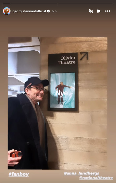
Backstage of Nye, 23/04/2024
92 notes
·
View notes
Text
Missed Nye in cinemas last night? 👀 Catch Michael Sheen portraying the influential politician on stage in Cardiff 18 May – 1 June. 📸 : Cameron Slater
94 notes
·
View notes
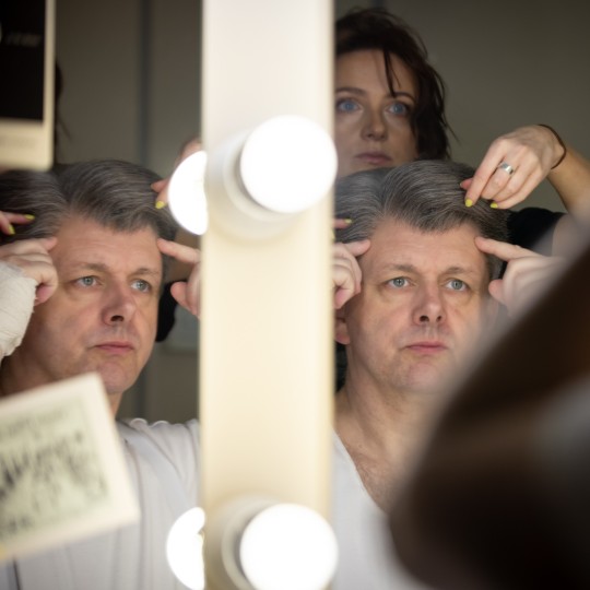
Text
Michael's dressing room last night, probably:

65 notes
·
View notes
Text
Sad you can't travel to London to see Nye?
National Theatre Live is now also showing it in cinemas in other countries! They even have a map that shows you when it's in a theater close to you (mind that most cinemas only have a few screening dates):
https://nye.ntlive.com/
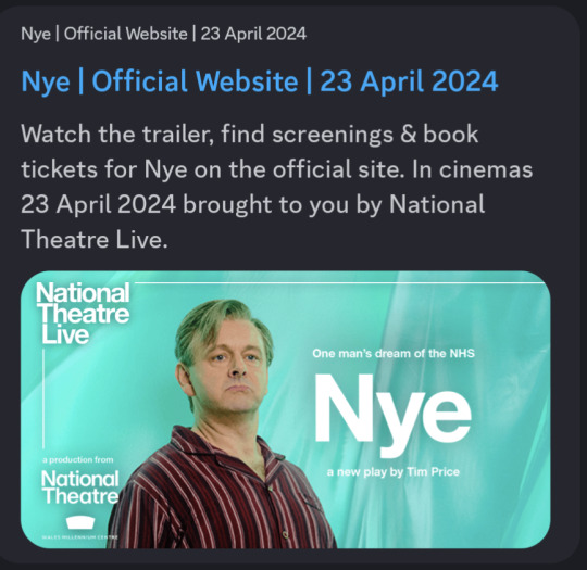
55 notes
·
View notes
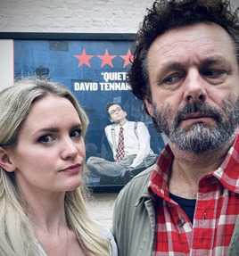
Text
I love how he has his phone in his hand as if he was taking pics of the poster or something 😅

#michael sheen and david tennant#david tennant#michael sheen#ineffable husbands#aziraphale#crowley#good omens#aziracrow#staged#whelshmeal#besties#work husbands#nye
42 notes
·
View notes
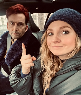
Text

27th April. And I'd have wanted to watch her watching David watching Michael. My heart goes boom. 💥
#ineffable husbands#good omens#david tennant#michael sheen#aziracrow#aziraley#nye#please please please
29 notes
·
View notes
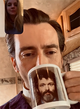
Text

This is so lovely 😍😍😍
#good omens#crowley#ineffable husbands#aziraphale#good omens 2#michael sheen#david tennant#aziracrow#nye
21 notes
·
View notes
Text
Here's a map of the original names of Palestinian cities before its colonization.
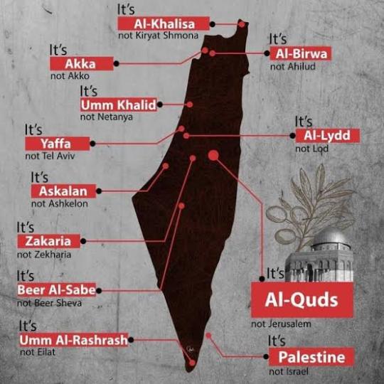
Why does it matter to know this? Because changing the names as part of colonialism is not new in history.
Learning about the history of colonialism and imperialism is important. When we say educate yourself on these matters, it's because you need to learn to recognize patterns and prevent them from reoccurring.
The idea of the West being civilized is all a sham. The idea of Arabs being terrorists is a mere lie similar to the endless lies that have been told about Native Americans and many other indigenous groups.
If you're going to use the word 'terrorist', it's about time you use it on the real enemy.
Free Palestine.
#free palestine#palestine#gaza#from the river to the sea palestine will be free#signal boost#social justice#palestine resources#colonialism#imperialism#jerusalem#the west bank#happy new year#human rights#united nations#United States#gaza strip#ceasefire#ceasefire now#nye
15K notes
·
View notes
Text
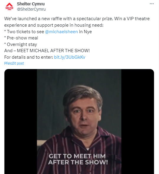
A raffle to meet Michael! 👀 link
200 notes
·
View notes
Text

update:

86 notes
·
View notes
Text
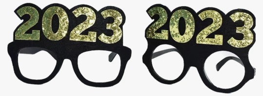
I’m not breaking any new ground here, but it’s obvious that the peak of novelty New Year’s Eve numerical eyewear was 2000-2009

10/10 for legibility, visibility, and typography
for years now, this industry has been stubbornly clinging to an idea that has become too cumbersome. if you will indulge me, I will now rate 2023’s new designs:


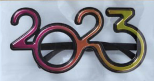
5/10 best I can say is “it gets the job done.” it does clearly read as 2023, but the typography is bad & the visibility leaves much to be desired.

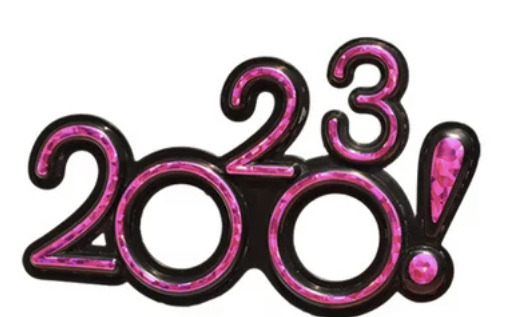
2/10 happy 20?3, i guess. they started with a decent font, but these are illegible and everything about the eyehole placement sucks.
6/10 hear me out: this is an okay compromise. it’s a cop out, sure, but it’s a viable alternative. it satisfies the basic requirements of legibility, visibility, and typographical acceptability, yet it lacks all whimsy. this feels like when you don’t do a project the way the teacher intended but you pass anyway on a technicality. this isn’t school, though, so i’m failing this design.
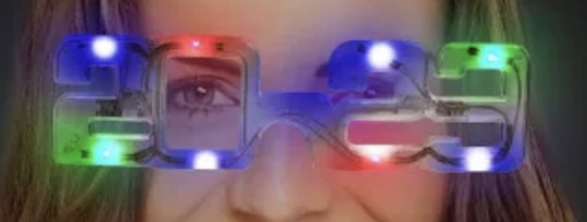
1/10 come on, guys. if you’re going to use the top of the 2 as an eyehole, at least use a font with a more open design, perhaps something art deco. at least when you look in the mirror with those LEDs directly in your line of sight, you won’t notice how bad the glasses look.

7/10 now we’re getting somewhere. like the first design, it uses the 3 as the second eyehole but it does so without compromising the shape of the number. unfortunately, the lack of outlines does negatively affect legibility and there may be some visibility issues for the left eye.
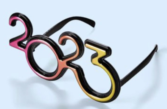
9/10 this is as good as it’s gonna get, folks. an actual graphic designer was clearly involved here. the typography is appealing, the color works, visibility looks good. nicely done.
-1000000000000000/10 :(
30K notes
·
View notes
Text


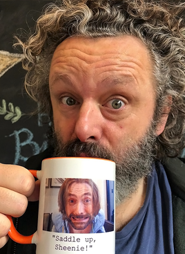
Parallel photos: The Tennants and the Shebergs
#david tennant#georgia tennant#michael sheen#anna lundberg#because I love posting parallels#and apparently these two couples enjoy making them#who knew good omens#would lead to so many good things#good omens#nye#good the play#and their marvelous mugs#stuff i posted#parallels#tennant sheberg parallels#cute couples being cute together#staged#bbc staged#I nearly included the taking babies home from the hospital photos#will include those if I ever do a part 2#but I liked this set with everyone's faces
3K notes
·
View notes
Text
i’m real good at resolutions ~ edition of 60 available here
3K notes
·
View notes
Last Seen Blogs

umbrace-rambles
Brainrot

hiscoreclub
Hi-Score Club

rhythmofrobotics-archive-blog
(Semi-Hiatus)Keep going for all it's worth.

paulinacarmonadominguez-blog
ENGLISH B1

siljaevelyn
Writer