#notable examples include the whole Trixie Thing
Text
Perhaps I’m projecting, but I think Rimmer would be genderqueer (in some direction) if he was like, 50% less repressed
#red dwarf#arnold rimmer#something something his fascination with inhabiting the female form#notable examples include the whole Trixie Thing#as well as being Kochanski in balance of power#would he use different pronouns? probably not but idk he might#I think he might not mind she/her pronouns completely…#like perhaps in the way that gay men use them but also a little bit more than that#hmmm#idk I spend a lot of time thinking about this it just feels right#I could go on and on but I’ll stop here for now
53 notes
·
View notes
Note
i!!!!! am so SO proud of you and so proud to have bared witness to the creation of this masterpiece..,,… you absolutely did that. i can’t tell you how much i (we all!!) love to bathe in the glow that is your mind & talent…… ding fucking dong…..
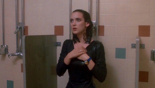
thank you my favorite little gay person who lives in my phone!! idk wtf your url has become but i love you anyway
hijacking this ask to serve also as @applesdefinitely's DVD Behind The Scenes™ with some fun facts about the painting.
I am not religious lolol. I knew a fair bit about The Last Supper before making it (including where Judas was, which those of you accusing me of making Trixie Judas do NOT know) and I read the whole wikipedia article about it before setting up the painting. The most interesting thing about it I think is how destroyed it became over the years and the various restoration attempts over the centuries.
Alaska is Judas, for clear and amusing reasons. In da Vinci's painting, Judas is spilling salt, which is related to the expression "betray the salt" or betray one to whom you are loyal. In my painting, she is spilling the tea. I replaced wine with tea throughout the painting to strengthen the allusion.
Trixie is the Beloved Disciple, for even clearer reasons.
Everyone else was arranged primarily by position and body language. James the Greater and Phillip, for example, had body language that reminded me of Kasha and Bebe respectively. Sasha has a fierce and extremely recognizable profile so I made her Simon, while Kim Chi is more recognizable head-on so she is in Jude's place.
All the queens are wearing their own looks, some with color modifications. Some notable ones are Trixie in her dress from the Jackson music video, Jackie in a red version of her s12 intro look, Raja wearing the shoes from her Shoes music video, and of course Katya in one of the main looks from Ding Dong.
On the table are items paying homage to each of the other four tracks on Vampire Fitness, plus some UNHhhh props and of course Katya's daughter Tabitha.
I was originally going to have tiny hands on the table in place of the bread rolls, but I got so fucking sick of drawing hands that I just couldn't bring myself to do it.
8 notes
·
View notes
Text
Adventures in Deckbuilding #163: Rarity, Mover and Shaker (White/Purple/Yellow Aggro) [Harmony]
Rarity, Mover and Shaker
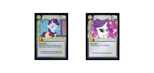
Toil And Trouble
It would have been nice to be able to include at least one Zecora with a name like that, but in terms of brewing pots Snowfall Frost is going to have to fill in here. Nevertheless, the more important part of the reference comes in the two words which immediately precede this deck’s title.
In certain respects, of course, this deck does look very similar to the one that I made just last week. I know that we like to keep things fresh in this series, yet at the same time today I could approach building this deck with a bit of experience that I don’t usually have. Today I’ve just come back from playing five whole rounds of a very competitive tournament, using a deck quite similar to last week’s submission. (I made a few changes to it in the process of building it in paper, for the usual reasons of being short on some of the URs.) Thus right now I suddenly have a whole heap of evidence that I can use to modify the deck’s structure and build it more toward its actual strengths. And plus the new version has Purple. So that’s a pretty big change too, I would say.
The first lesson that I learned from playing last week’s deck for real is that I think I made a mistake in focusing so much on synergizing with Tymbal. Not only is that a straightforward weakness that opponents can exploit, I’ve actually come to think that Tymbal isn’t even that great of a card. It’s good, but I now I don’t believe that he’s the best thing that the changeling deck has to put forward. Its real strength, I think, is in its ability to generate lots of power with relatively small cost. It reminds me a lot of Octavia, and indeed I think that the Octavia Mane might be the best one for a Changeling deck, really.
It all comes down to the way that dependent and independent modifiers interact. Pharynx, with his ability to double Power whenever a Changeling enters play, is an amazing card. I found that to be the case even in a deck that was largely missing additive Power effects. Even without them, I still pulled off most of my power turns with a well-placed Pharynx that took little effort to confront a huge Problem. With a few more additive Power boosts in this build, we should be able to do that even more reliably.
The second thought that came into my head after playing in the tournament was (surprise, surprise) just strong of a card Portal is. We tend to think of it as a defensive play often enough, whether used to re-trigger removal or to send something home the old-fashioned way, but used right it can be plenty good at offense too. For example, here in this deck, it wouldn’t be hard for Portal to be an eight-Power play, if we Portal a Symbiosis and have a Trixie and a Pharynx already around.
Another thing perhaps notably missing from this build is Herd of Adoring Fans. That card almost certainly has a place in changeling decks (it can also do all of the stuff in the preceding paragraph, for example) but I think that to some extent that card is a bit of a trap, since people tend to associate it first and foremost with Tymbal. Especially in a three-colour deck, I wanted to see what I could do going without it, and I think the end result here should be plenty good enough.
And none of that is even to mention the secondary Unicorn synergy. For the most part, that’s only there to increase Field Twirler’s utility as an endgame play, but it’s worth pointing out that Reliving History potentially gets a lot more powerful if its Harmony text actually fires. It’s another card that I think people primarily look at for its first piece of text, and while that text is very versatile, the second part can be quite impactful too. Sometimes, when the game is in its last few turns and the opponent needs only to move some things around to confront a couple of Problems, it can be a one-AT answer that keeps your chances alive for another turn.
All in all, I had a lot of fun playing changelings in Core today, enough so that I expect I might keep experimenting with them for a while. It feels to me like there is enough latent Power in the deck to have a go of things. It’s all just going to depend on coming at it from the right perspective. Is putting Purple in the right way to go? Only playing the thing can tell.
Next week’s Mane shall be Muffin Mare, Sharing is Caring. Perhaps this is the beginning of my predicted avalanche of Blue and Orange. Surely I hope not. Working too long within the same colour saps my creative energies like nothing else.
1 note
·
View note
Text
Typewriter Fonts You Need To Create Classic Designs
A lot of designers are looking for typewriter fonts to use in their designs and this shouldn’t surprise us. The variety of clients that we come in contact with generate a multitude and mixed type of projects.
But let’s take it from the basics.
Typography defines typefaces as combined font families where each member comes with glyphs that have common design properties.
Each of the typeface’s fonts is distinguished by style, weight, width, condensation, italicization, slant, ornamentation, and foundry (commonly referred to as size for motel fonts).
To give you an example – ‘ITC Garamond Bold Condensed Italic’ stands for the bold, italic, and condensed-width version of the standard ITC Garamond font, and its features make it different that other ITC Garamond fonts such as Bold Condensed or Condensed Italic.
ITC Garamond, on its own behalf, looks differently that Monotype Garamond or Adobe Garamond, as these are its alternative updates created for digitalisation purposes, while the font itself can be traced to the early 16th century. At the moment, there are countless different typefaces and typewriter fonts available, and newer ones are emerging as we speak.
Designing typefaces is a separate craft and art in the creative world, usually referred to as type design.
The artists in charge of it are known as type designers, and their role is to support the work of type foundries. In the age of fully digitized typography, these professionals are also required to design typewriter fonts.
Obviously, the best way to make text look typewritten is to actually use a typewriter. Once your document is ready, you can scan it, and still get to use it in a digital version. Yet, isn’t that a bit exaggerated? Isn’t there a way to create old typewriter fonts from the comfort of your computer?
Sure there is! And that’s where typewriter fonts take over!
Image source: Georgy Pashkov
As we mentioned before, typefaces consist of glyphs, and each glyph is used to represent a different letter, number, symbol, or punctuation mark. These glyphs can then be made to work for all sorts of characters in diverse scripts – the Roman uppercase A, for instance, is identical to the Greek uppercase alpha, and the Cyrillic uppercase A. There are also unique typefaces that were created to serve special purposes, as for instance astrology, mathematics, map-making, and so on.
Typefaces were often confused for fonts, but in the era of digital typography and online publishing people find it much easier to distinguish between them and to understand their meaning.
Scrapbook pages are the most common users of typewriter fonts, thanks to the fact that these fonts are very legible and come in different styles and versions, among which messy, clean, grungy, modern, aged, or even ‘hand-written’.
The tips & tricks you should know about
In the work of real typewriters, one uses a machine to press letters onto paper sheets. The same process can be mimicked digitally in a very simple way, namely by using Photoshop’s pillow emboss style.
The effects of your work will be more subtle than harsh, and inject a realistic vibe that the font was pressed onto the paper instead of being brought to float over it. You can make it less or more prominent, depending on the nature of your work and your personal preferences.
What font looks like a typewriter font? To help answer this question, we conducted an online research on the best paid and free typewriter fonts, and preselected those that have the potential to make your design look more retro!
What font looks like a typewriter font? Let’s find out together!
Here is our list of the best typewriter fonts you should consider for your design:
FF Trixie
Designers who’re after a grungy typewriting feeling should definitely look at FF Trixie, an old and popular typeface whose origin was a mystery for many years. The classic typewriter font and one of world’s oldest typefaces was created by Erik van Blokland in the Hague, and first unveiled in the ‘Made with FontFont’ book which mentions Nuremberg’s 1930s Triumph Durabel font as its original version.
Letter Gothic
Letter Gothic is a Roger Roberson product designed for needs of IBM at the beginning of the 1960s. The lettering is flat, clean, and appealing, and consists of monospaced sans serifs types with different weights.
Olivetti Typewriter
Olivetti Typewriter was created by Iza W, a classic fonts’ designer trying to mimic the effect of slopping ink on old machines. You can get in 5 separate weights, including thick and traditional styles
Smith-Premier Typewriter
Smith-Premier Typewriter is a family of playful, warmly-toned fonts that suit the needs of artistic projects and creative designs. It makes use of slim and lightweight serifs, and it beautifies them with unique curls.
Old Typewriter Font
If looking for the perfect hand-drawn font, Old Typewriter is a self-explanatory choice. It is in fact a kit of rough and old-fashioned fonts, and helps turn even the simplest project into a masterpiece of vintage aesthetics.
Grandpas Typewriter
Grandpas Typewriter relies on both its name and looks to inspire a retro feeling, and helps make any type of content look aged and valuable. Its secret is that it was originally created on a genuine Olivetti Typewriter machine, and has preserved much of its amazing, lightly distressed regular version. Another thing that makes it extremely popular nowadays is that it features an X version with tests, stains, and mistakes.
Baltimore Typewriter – Basic Pack
Baltimore Typewriter is the perfect alternative for those interested in a bold font, as it puts even four distinct font styles on the table. You can choose anything from a classic version to custom typewriter keys, or even use its extra bold variations.
Four Hours ‘Til Dawn
Four Hours ‘Til Dawn is the right choice for minimalist designers, best known for its clean and sleek letters. It is commonly applied and conserved appropriate for professional and academic content, but you can also consider it for creative work.
Lettre
Lettre will attract you with its geometric serif letters, but also notable imperfections that make it reminiscent of hand-writing. It is trendy and appealing, and suits well all types of content.
Special Elite Pro
Those of you familiar with the Special Elite Type No.NR6 will easily recognize Special Elie Pro, an elegant and vintage typewriter font that inject a warm vibe, and provides users with an extensive set of symbols and figures.
Noodlerz
Noodlerz is, in a nutshell, a friendly and playful font. As you can conclude by its name, the font features curvy serif letters (the cross between a Sharpie and a typewriter, as the creator fancies calling it), and prides itself with admirable versatility.
Font + Textures Pack #1
Font+Textures Pack #1 is an Ana’s fonts &c. Product based on the company’s most popular Rusty typewriter font. It aims to invoke a vintage vibe with its rough edges, and it offers even 15 grunge textures to support its beautiful appearance.
Mayonez Extralight
Mayonez Extralight is another popular typewriter font than strikes the perfect balance between friendliness and seriousness. In its core, it is a rationally structured serif product, but its contours are rounded to make it more approachable.
Gabriele
Gabriele received its name after post-war Germany’s most popular typewriters, at a time no one could imagine how well it would be embraced by modern web users. It comes with a distinctive texture and kerning-free monospaced fonts, fully reminiscent of old-fashioned typewriter ribbons. It is free to use both for personal and commercial purposes.
Xerography Font
Xerography was completed with wonky, rectangular edges, and represents the perfect alternative for typewriters nostalgic for old-fashioned hammers. The font’s creators certainly knew how to work with negative spacing, and created a product that can comply with any background colour.
Happy Days
Happy Days can be easily recognized by its glitchy, fuzzy finish that lets you set a targeted audience with solely visual means. The whole alphabet is made available in lower and upper cases, while there is also a limited library of numbers, symbols, and accented words.
Kingthings Trypewriter
Kingthings Trypewriter is without doubt a role model of typeface versatility, and it is dedicated to those looking to combine lower and upper case letters, symbols, numbers, and punctuation.
Love Letter
How about inspiring some romantic feelings? Love Letter is a font that brings us back in the days where typewriters wrote about love and feelings, and beautifies our work with some old school passion. Believe it or not – it is available absolutely for free!
Ending thoughts on typewriter fonts
Retro and vintage designs have much at stake to gain from smartly chosen typewriter fonts.
The leader among these typewriter fonts is probably Courier, but that shouldn’t stop you from exploring your options and browsing among the best typewriter-inspired designs. In the best case, you will get the perfect font without spending a penny on it.
If you liked this article about typewriter fonts, you should check out these as well:
Cool Fonts: 100 Free And Unique Fonts To Download
Free Handwriting Fonts To Download (57 Script Fonts)
34 Free Arabic Fonts Available For Download
61 Free Russian Fonts Available For Download
The post Typewriter Fonts You Need To Create Classic Designs appeared first on Design your way.
from Web Development & Designing http://www.designyourway.net/blog/typography/typewriter-fonts/
0 notes
Text
Tropes: When You’re Fairly Certain You’ve Seen These Odd Parents Before

Anybody who watches cartoons or anime might recognize today’s topic: tropes. These literary devices act as a mostly visual way (at least, on screen) for the creator of a work to quickly and easily convey a concept to their audience. They can take many forms: a figure of speech, a character type, a plot device, a location or location type, a pattern of storytelling, a sub-plot, and other repeatable elements.
I originally intended to focuses on the anime Silver Spoon for today’s post, but after whipping out a Fairly Oddparents reference, I couldn’t stop myself. The series sucked me in with its abundant tropes, clichés, and stereotypes (which are all related, as you will see shortly). For the sake of keeping this post at a reasonable blog length, I didn’t cover every example (or even one tenth of them) appearing in this ongoing series. If you have a favorite example that didn’t make the cut, be sure to share it in the comments! I would love to see which ones you like.
Hey, I’ve Seen this Before!

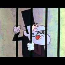

Did somebody oversleep and run to school with a piece of toast in their mouth? You’ve got a trope! Did a romantic scene feature beautiful tropical trees and a placid lake? You’ve got a trope! Did an unsavory character in dark clothing with a thin mustache and shifty eyes slink in and declare their evil ways? You probably didn’t need them to proclaim their badguy status because… You’ve got a trope!
Although often considered the mark of lazy writing, these literary devices are not inherently bad. They allow an author to quickly communicate an idea without spending too much time elaborating on it. Imagine if the last cartoon you watched spent five or more minutes elaborating on the personality of every single side character. That’s nearly half of its 10-12 minute episode run time per character. Doing so would really take away from the main story and characters, slowing the pace and bogging everything down. Instead, the writer or artist can throw in a few characters with pre-established types: the aloof cool kid, the absent parent, the shy poet. These character types quickly establish each character’s role and clues the viewer in on their purpose and personality.
Let’s take a look at a few examples found in Butch Hartman’s The Fairly Oddparents.
Characters
The most common examples are character tropes. As discussed above, character types appear in cartoons in order to quickly establish background characters’ personalities and relations to the story or other characters.

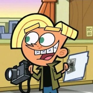
Timmy’s friends AJ and Chester, for example, represent the genius friend/idiot friend combo. One is a brainiac, while the other arguably wouldn’t find his way out of a paper bag even with a map. Both types of characters typically fall into the unpopular category at school, with AJ and Chester being no exception. Audience members have seen this character dynamic in other series, and don’t require an in-depth explanation. They know what to expect, and draw the correct assumption that Timmy is most likely as unpopular as his friends.
Social Structures
Speaking of Timmy’s popularity, a trope might also convey larger concepts such as social structures. In The Fairly Oddparents, we see a common social hierarchy: the popularity food chain. This hierarchy often comes in to convey where the main character stands in relation to their peers, as well as quickly establish more information about the story’s setting.

It’s easy to spot the popular kids Trixie, Veronica, Tad, and Chad in The Fairly Oddparents. They are well dressed, travel as a group, and say disdainful things about their peers. Additionally, they never miss an opportunity to brag about their family’s massive wealth, relying on it to get them into and out of every situation they come across.
In order to demonstrate that the main character, Timmy, is not on the same social level as them, the popular kids regularly treat Timmy poorly. Trixie even refers to him as “Empty Bus Seat,” indicating his low standing in the social order. With the inclusion of these characters, Hartman sets Timmy up as the unpopular underdog, and shows that the world he lives in is just as unfairly tipped in favor of money and status as our own.
These characters also allow Hartman to create contrast, cause tension, draw parallels, and achieve other desired effects throughout the series.
Story Arcs
Everybody usually has their favorite episode type: the beach trip; the everybody-swaps-bodies; the school festival; the year that so-and-so almost ruined Christmas (because, sadly, the other holidays rarely ever get their own special episodes…). Narrative patterns like these are also tropes. Many creative works will use similar episode storylines for a variety of reasons. They often introduce new information about the characters while using a familiar narrative to do so. The audience easily settles into the familiar pattern, freeing them to focus on the characters rather than getting caught up in the conflict of the episode.
First season alone contains a number of notable tropes without even looking at the other 9+:
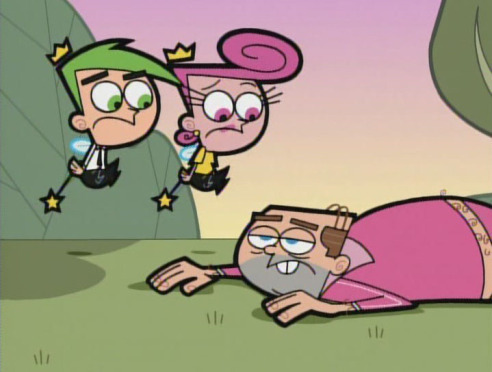
The trope of a child becoming trapped in an adult body appears in the episode “The Big Problem,” the first full-length episode following the shorts released for Oh Yeah! Cartoons. Tired of being picked on and pushed around by older kids and adults in his life, Timmy wishes to become an adult. He expects to enjoy all of the privileges that come with adulthood, but it all blows up in his face (as often happens with this type of episode) when he fails to consider the drawbacks and responsibilities of adult life. Episodes like this often appear in order to highlight the similarities and differences between children and adults, as well as demonstrating that adult life isn’t all fun and games like it sometimes seems.
Successful use of a trope requires some level of ingenuity as well. If every child-in-an-adult-body episode was exactly the same, nobody would like them. Hartman does this brilliantly. The episode serves to establish Timmy’s relationship with the adults in his life, as well as shining a light on Timmy’s tendency to try and take the easy way out. Using this particular story arc also allows Hartman to introduce the concept that Fairies can only grant the wishes of children. As soon as Timmy ages to adulthood, Cosmo and Wanda lose the ability to grant him wishes and receive a new child assignment. The same concept could have been established using dialogue, but using dialogue for key concepts often creates flat characters and boring conversations that feel forced and fake.
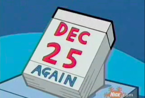
Other trope episodes include “Power Mad!” (characters enter a videogame world), “Transparents” (characters pretend to be someone’s parents to get them out of trouble), and “Tiny Timmy” (characters shrink and enter another character’s body only to discover a literal civilization inside). And what kind of late 90’s, early 2000’s cartoon would it be without the “Christmas Everyday!” episode? The first season concludes with an episode in which Timmy wishes for Christmas every day. Naturally, the wish backfires, leaving Timmy and his Fairies to set things right.
Comics inside of Cartoons

World building elements such as magic systems, television shows, or hover cars are also tropes. Authors can provide some fast world building by including everyday things that their viewers can relate to such as comics, cartoons, or other media from the fictional world. These elements reveal characters’ personalities, add commentary on real social issues, or make characters more real and relatable.
Timmy loves reading The Crimson Chin comics. Every month, he eagerly awaits the next issue, devours it, and repeats. Whenever he doesn’t want to wait, he simply wishes himself into the heavily inked panels (look, another common story arc!). These superhero comics add depth to Timmy’s personality and to the world as a whole.
Turning the Cliché Trope into a Joke
Unfortunately, when used too often, either in the same work or in multiple, tropes become a problem. If ten series on the same network utilized a scene where a character falls down the stairs and wakes up in another world, things would start to feel a little stale. Audience members would grow bored. They know what’s going to happen and knowing yanks them out of the immersive experience of watching. When this happens, the well thought-out device becomes a dastardly cliché. Just like a pair of underwear worn unwashed for a month, nobody likes clichés.
One of the things that I love best about Hartman’s work is that he often takes clichés and skillfully flips them into jokes. He sees tired tropes turning into clichés and shines a spotlight on them so brightly that they become jokes in his works.
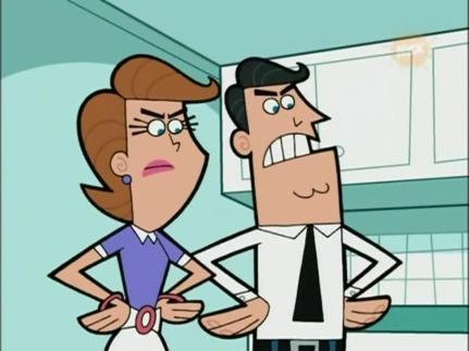
Take a look at Timmy’s mom and dad. Who are these characters? Simply Timmy’s mom and dad. No explanation needed. They act as the authority in Timmy’s life, the symbol of traditional family structure, and the oblivious parents who don’t understand their son’s life. Parents appear in many stories with no further explanation behind them, presenting the assumption that the character simply needed a mom and dad. In many series, especially older cartoons, moms and dads rarely receive names because their only purpose is to represent the authority and family structure in a character’s life. Hartman takes this and turns it into a running gag in his series.
What are the names of Timmy’s mom and dad? Why, their names are…. Actually, we never learn their true names. The episode “Father Time” addresses the question when Timmy travels back in time and meets his parents’ childhood selves. Whenever someone goes to say either character’s name, a conveniently timed loud sound drowns them out, and the audience catches the follow-up of “but you can call me Dad/Mom.” Accordingly, we can only assume that their names are Mom and Dad.
How Stereotypical!
When used carelessly, Tropes can easily become stereotypes by mistake. If a character or location isn’t fleshed out enough, they tend to take on vague concepts often used to characterize a particular type of person or place, creating a stereotype or cliché. People generally feel negatively toward stereotypes as they do not reflect the true characteristics of the people or locations being portrayed. In many cases, stereotypes present harmful representations of people or groups.

For an example, let’s consider the popular girl mentioned earlier, Trixie Tang. Trixie seems like the stereotypical popular girl. She cares about makeup, her social standing, clothes, and anything girly. On top of that, she treats all unpopular kids with disdain (or simply acts like she can’t see them) and sucks up to the adults around her who can get her what she wants. Characters in her role typically don’t care about the less popular kids, carry around a snarky attitude, obsess over their looks, and float through life in relative bliss.
In many cases, stereotypes and clichés are not only boring, but also harmful. Many create a generalization of what a particular type of person acts like, whether maliciously or not, that makes it seem like all people who identify that way must act similarly. Like other popular girl stereotypes, Trixie does not accurately represent real girls and young women who consider themselves to be popular. Sure, there may be a number of individuals who act similarly in real life, but this is not true of all popular girls and young women. Every person is their own unique individual with layers upon layers that shape their personal and social identities.

At first, Trixie receives very little screen time with which to build her personality and show her as anything but a cookie-cutter representation of popular girls. Anybody who has seen the gender-swapping episode “The Boy Who Would Be Queen” knows that Trixie just puts on the stereotype persona for the sake of her popularity. She actually really likes The Crimson Chin comics, and admits that she wishes girls could do more boy stuff and vice-versa.
Bonus: If the popular-girl-secretly-does-unpopular-things storyline seems familiar to you… you guessed it—you’ve got a trope! The concept comes up in countless other narratives in order to convey the idea that people are deeper than their social presentation allows others to see.
Bet You Didn’t See This Coming!

Overall, tropes are useful literary devices that allow creators to develop and convey new ideas using familiar sequences, characters, locations, or other narrative elements. They work as a type of short-hand utilized by all, understood by most.
Now that you know what they’re all about, it’s time to tackle finding some and identifying their significance on your own! You can find them in your favorite games, shows, movies, books… they’re everywhere in pop culture. If you’re coming up blank, here are a few suggestions to get you started. Come back and share what you find!
The competent new kid (The Backstagers)
Annoying laugh (Spongebob Squarepants)
Salvage pirates (Firefly)
Carrying a cutlass between your teeth (Muppet Treasure Island)
Superheroes wear capes (The Incredibles)
A bus full of innocent people put in danger (Detective Conan/Case Closed)
Body swapped (Gravity Falls)
School festival (Ouran High School Host Club)
It was all a dream (The Wizard of Oz)
Your hero is a jerk in reality (bonus points for finding an example! I’m chagrined to admit that I drew a huge blank here!)
If you’re an anime fan and want to see more examples, check out KawaiiPaperPandas’ great post listing ten of the most common occurrences and cliches in anime!
Wrapping Up
I wanted to extend a huge thank-you to the amazing minds over at TVtropes.org for their ongoing work in discussing and rounding up tropes in the narrative worlds around us. Their extensive work helped me to put simple names to long-winded ideas. If you enjoyed reading about this literary device and want to learn more about it, check them out!
What’s your favorite trope? Share it in the comments! You can also connect on Twitter at @Popliterature, or send a message on the “contact me” page of my home blog.
And as always, if you have a literary device you want to know more about, or a game, comic, show, or movie that you want to see make an appearance on the blog, leave a shout-out in the comments!
#animation#literarystudies#literarystudy#english language arts#literary study#literary studies#literary trope#trope#tv trope#literary device#the fairly oddparents#fairly oddparents#cartoon#cartoons#nickelodeon#butch hartman#english class#english class help
0 notes