#murielcooper
Photo
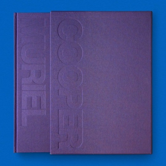
Muriel Cooper / Available at www.draw-down.com / The career of the pioneering designer #MurielCooper whose work spanned media from printed book to software interface. By #DavidReinfurt and #RobertWiesenberger / Muriel Cooper (1925–1994) was the pioneering #designer who created the iconic #MITPress colophon (or logo)—seven bars that represent the lowercase letters “mitp” as abstracted books on a shelf. She designed a modernist monument, the encyclopedic volume The Bauhaus (1969), and the graphically dazzling and controversial first edition of Learning from Las Vegas (1972). She used an offset press as an artistic tool, worked with a large-format Polaroid camera, and had an early vision of e-books. Cooper was the first #designdirector of the MIT Press, the co-founder of the Visible Language Workshop at MIT, and the first woman to be granted tenure at MIT's Media Lab, where she developed software interfaces and taught a new generation of designers. She began her four-decade career at MIT by designing vibrantly printed flyers for the Office of Publications; her final projects were digital. Designed by #YasuyoIguchi / Hardcover in slipcase #graphicdesign #typography https://www.instagram.com/p/BuJTXf3nWWf/?utm_source=ig_tumblr_share&igshid=t1nnyyzay8h6
#murielcooper#davidreinfurt#robertwiesenberger#designer#mitpress#designdirector#yasuyoiguchi#graphicdesign#typography
6 notes
·
View notes
Photo

Muriel Cooper by David Reinfurt / Design by Yasuyo Iguchi / Published by MIT Press * * * * * #muriel #cooper #murielcooper #mitpress #bauhaus #MIT #graphicbooks #books #book #bookdesign #booksondesign #graphicdesign #design #graphicdesigner #type #typography #interfacedesign #typeface #publishing #publication #layout #grid
#type#publication#typography#graphicdesign#interfacedesign#publishing#bauhaus#layout#books#muriel#mitpress#grid#murielcooper#bookdesign#cooper#mit#typeface#graphicbooks#design#graphicdesigner#booksondesign#book
1 note
·
View note
Photo


Typography. Michael Tully. Pick a graphic designer that inspires you, and create a poster in their style. I choose Muriel Cooper, because she uses dimensional typography and bright colors. The first image is the rough draft, and the last image is the final draft.
0 notes
Text
“Ask me anything”
For our next assignment I’ve started compiling a list of Designer and Artist I would potentially like to create an interview for. I’ve condensed my list to 3:
Massimo Vignelli
Italian Designer 1931 - 2014
Fascinated me in the Helvetica movie and I found him extremely endearing and would love to deep dive into his work, I researched him a bit for my tumblr but only scratched the surface and genuinely love his modernist design style. I think he would be perfect for the assignment because of how well known and influential his work has been and also he has firm principles around principle and elements that he thinks makes good design.
Yves Klein
French artist 1928 - 1962
He is most widely known for his use of a rich ultramarine blue that is patented internationally under his name “Yves Klein Blue” he used this colour in all of his works which ranged form painting, sculpture, installation to performance pieces. His pieces were controversial such as his series involving naked women laying on canvassing in his famous blue colour. He co founded nouveau realism and was one of the most influential artists of the post war European art movement.
3. Muriel Cooper 1925 - 1994
Designer and educator who was the art director for the MIT press and co founded the MIT media lab
Extremely influential in explorations into the interactions between technology and design. She designed over 500 books and 100 of which won design awards.
info sourced:
https://www.moma.org/artists/6155
https://www.aiga.org/medalist-murielcooper
http://www.yvesklein.com/en/biographie/
0 notes
Text
Tumblr Journal - Entry 6
For this week’s tumblr journal, we were told to pick two designers - discussed in two different articles - and talk about what we like about them, research them, and analyze some of their designs.
The first article was “A Typographic Exercise to Readdress Design History’s Gender Imbalance,” by Madeleine Morely. In her article, Morely talks about a project created by designer and professor Andrea Tinnes for a Type and Typography course at Burg University of Art and Design. This project involves students designing a speaker poster for an imaginary conference called “Strange Lab.” This particular year, Tinnes crated a line-up of all-female designers to discuss the under-representation of female designers at conferences. Morely then goes on to list quite a few examples of female designers “seen” at this conference, including Muriel Cooper. The typeface featured on Cooper’s poster is black-and-white and has a 3D appearance, which draw’s from her computer experiments, (Morely). What I really like about Cooper’s design’s are the technological aesthetic, which appears to be inspired by these experiments. According to another article, Cooper was “the first graphic designer to carry out really profound explorations of the possibilities of electronic media - things like 3-D text. [...] She understood from the beginning that the digital world opened up a whole domain of issues and problems, and she wanted to understand these problems in a rigorous way,” (https://www.aiga.org/medalist-murielcooper). As someone who uses a computer on a daily basis, especially to create designs of my own, I was just really drawn to Cooper’s work and her ability to combine technology with design.

(https://www.aiga.org/medalist-murielcooper)
This piece is a perfect example of how Cooper utilized digital media to explore new ways of designing. In this piece, Cooper created a computer-generated stacks and distorted type. Using technology, this type appears three-dimensional, with distortions and blurs, all while still being two-dimensional. The brights colors of the background also allow the type to stand out more. Overall, Cooper is able to explore how the advancements in technology can be used to create new designs, and how to face the new problems caused by these advancements.
The second article was “Celebrating the African-American Practitioners Absent from Way Too Many Classroom Lectures,” also by Madeleine Morely. This article talks about ‘As, Not For: Dethroning Our Absolutes,’ an exhibition of works by African-American designers that wants to “question, inspire, activate, and challenge the design community and beyond with the objective of promoting deep history, design theory and aesthetics of African-Americans,” (Morely). One of the African-American graphic designers discussed was Sylvia Abernathy. Abernathy is the only woman featured in this exhibition, and her career is considered to be tied chiefly to her husband’s. Much of Abernathy’s design work was creating covers for records, which I found extremely fascinating. A large reason why I still buy CD’s is because of the cover art, so I was immediately drawn to Abernathy’s work. She was one of the few women believed to be working in this male-dominated industry, and “is believed to be the first black woman to be credited as a designer on album covers. Her keen typographic eye and deft use of abstraction and contrast made her work stand out from long-established, formulaic styles, and a quick listen to any album reveals her natural talent for translating the unique sound of each musician into a graphic form,” (https://letterformarchive.org/news/laini-sylvia-abernathy).

(https://letterformarchive.org/news/laini-sylvia-abernathy)
In this album cover design, Abernathy is able to express the “avant-garde musical expression” through her typography and other design choices. The circles radiating out towards the edge of the cover could be representative of the music. She plays heavily with the contrast of black on white, representative of the aesthetic of this time, though it appears to be one of Abernathy’s more subdued designs. There is not much written about her work on this design, but its simplicity and modernist aesthetic is what drew my eye to this rather than her other cover works.
0 notes

Photo


Muriel Cooper Inspo http://www.aiga.org/medalist-murielcooper
0 notes

Photo
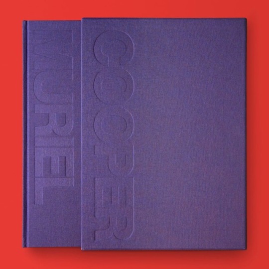
Muriel Cooper / Available at www.draw-down.com / The career of the pioneering designer #MurielCooper whose work spanned media from printed book to software interface. By #DavidReinfurt and #RobertWiesenberger / Muriel Cooper (1925–1994) was the pioneering #designer who created the iconic #MITPress colophon (or logo)—seven bars that represent the lowercase letters “mitp” as abstracted books on a shelf. She designed a modernist monument, the encyclopedic volume The Bauhaus (1969), and the graphically dazzling and controversial first edition of Learning from Las Vegas (1972). She used an offset press as an artistic tool, worked with a large-format Polaroid camera, and had an early vision of e-books. Cooper was the first #designdirector of the MIT Press, the co-founder of the Visible Language Workshop at MIT, and the first woman to be granted tenure at MIT's Media Lab, where she developed software interfaces and taught a new generation of designers. She began her four-decade career at MIT by designing vibrantly printed flyers for the Office of Publications; her final projects were digital. Designed by #YasuyoIguchi / Hardcover in slipcase #graphicdesign #typography (at MIT Press) https://www.instagram.com/p/BpcJ8j7BZA1/?utm_source=ig_tumblr_share&igshid=10yj9ykn3k4e4
#murielcooper#davidreinfurt#robertwiesenberger#designer#mitpress#designdirector#yasuyoiguchi#graphicdesign#typography
28 notes
·
View notes
Photo

SAVE 10% on EVERYTHING w/ code: “COLLECTION” / Muriel Cooper / Available at www.draw-down.com / The career of the pioneering designer #MurielCooper whose work spanned media from printed book to software interface. By #DavidReinfurt and #RobertWiesenberger / Muriel Cooper (1925–1994) was the pioneering #designer who created the iconic #MITPress colophon (or logo)—seven bars that represent the lowercase letters “mitp” as abstracted books on a shelf. She designed a modernist monument, the encyclopedic volume The Bauhaus (1969), and the graphically dazzling and controversial first edition of Learning from Las Vegas (1972). She used an offset press as an artistic tool, worked with a large-format Polaroid camera, and had an early vision of e-books. Cooper was the first #designdirector of the MIT Press, the co-founder of the Visible Language Workshop at MIT, and the first woman to be granted tenure at MIT's Media Lab, where she developed software interfaces and taught a new generation of designers. She began her four-decade career at MIT by designing vibrantly printed flyers for the Office of Publications; her final projects were digital. Designed by #YasuyoIguchi / Hardcover in slipcase #graphicdesign #typography (at MIT Press) https://www.instagram.com/p/BrLA8GPALbN/?utm_source=ig_tumblr_share&igshid=1oe11cv5b6q28
#murielcooper#davidreinfurt#robertwiesenberger#designer#mitpress#designdirector#yasuyoiguchi#graphicdesign#typography
9 notes
·
View notes
Last Seen Blogs

tsundere-goddess-blog
21 세기 소녀

decyzje2942-blog
rachunki 117

wonshuasvt
❤W.Shuaaa❤

pepa-brainrot
The brainrot is strong (and so are the drinks)

graserbae-blog
Bae