#maybe grocery store websites have an english version
Text

hate writing fanfic in english this is so humiliating fdgkjhgkjghj
#every time i have to google stupid mundane things#groene zeep#fuck#the entire closet/cupboard/wardrobe/cabinet debacle#christ#dont get me started on frisdrank ive put it out of my mind#im sure i use slightly weird words for things sometimes#not like. incorrect necessarily. though that too undoubtedly sometimes. but more like#second choices#you know how sometimes you can tell what someone's native language is bc they pick like a slightly unexpected word#for something. because that second choice word is what looks more like the word int heir langauge than the first choice?#im sure i do that#anyway google doesnt seem to be helpful in this case#maybe grocery store websites have an english version
47 notes
·
View notes
Text
Culture and Translation - S01 E02 C04-C07 and SKAM+ Clip 1
Hi hi! Okay, so I’ve both gotten a bunch of followers and the tag is a lot more poppin since the last time I posted one of these. Quick explanation: when I got into og Skam, I felt I had to piece together a lot of the cultural context behind it, such as, yes, Russetiden, but also stuff like the cost of a bunad or sex without protection. I’ve also read from multiple Norwegian people that the fansubs didn’t do justice to the slang Skam characters use. So these posts provide cultural context. They also provide explanations for the translation I went with in the subs and the best approximation to the slang the Skam España characters use on the show in the cases where I felt the translation didn’t fully do justice to the actual dialogue.
Note: these posts are based on my own subs/translations, so they might not make as much sense if you hadn’t watched those.
Note 2: You can check the culture and translation tag for the rest of the posts.
CLIP 4: In which I learn that a dj system is not a mixer.
This clip was shot in the Pinar de Chamartín subway station. It’s the only station that connects another line with lines 1 and 4, and the show thanks Metro Ligero in the credits. Pinar de Chamartín is a Metro Ligero subway station. (There are several kinds, depending on which company manages the station.) They probably used this station because it’s big and doesn’t get a lot of commuters. Otherwise, it’s completely out of the way of anything these characters would go to.
Hola acosadora! (“Hi creeper!”): would be closer in meaning to, “hi, harasser!” (which doesn’t flow well in English) or “hi, stalker!” (but Eva uses the word in English right after). So creeper it is.
Dale duro (Subs: Hit it hard): I don’t really have any comment about this, other than it seems to be Lucas’ signature phrase. He’s always saying it.
La gente se cree que hacen una movida los DJs que flipas (“People think DJs are some kind of crazy wizards”) Holy shit, I had so much trouble with this sentence. I wish I knew whether this line was on the original script or if Jorge’s actor reworded it. As per the FormulaTV article, the actors get to reword lines if they think it’d sound more natural some other way. Alas, I couldn’t think of how to translate “movida” in this context (it comes up again later), so I settled for the line in the subs. Let’s just say that the implication is that DJs are almost unknowable in their mad DJ skillz, what with the “movida” and the verb “flipar” that we’ve seen so often at this point. I find my translation much inferior to Jorge’s line, which provides such a vivid visual and is hilarious.
Hablando de punchi punchi (“Speaking of sick beats”): Jorge obviously doesn’t say sick beats, but he’s trying for an onomatopoeia for the beat in dance songs. There are a lot of variants in Spanish for this specific purpose of talking about the beat in a song. Another popular one is, “chunda chunda.” I’m actually really proud of how I translated this line, lol. Too bad I can’t put it on a resume.
“¿Te renta?” is another idiom that often comes up on Skam España. I’ve been told it’s Madrileño slang, but I’ve personally never used it or heard it before the show. (Which doesn’t mean it’s not in use, lol, just that it hasn’t made its way to me yet.) A literal translation would be, “Is it worth it?” Jorge asks Lucas whether it’d be worth it to Lucas to do something this weekend, and Lucas responds going out for beers would be worth it to him. In this case, I didn’t go for the literal translation as this scene is already too long and involved to be throwing more idioms into the mix. Other times, I’ve translated it as is, because I do feel it sums Madrileños up well. Like, we can’t be bothered to do anything or go anywhere if we don’t feel it’s worth it.
Keli (“House”): This has been Madrileño slang for decades at this point. It just means house.
Sí, movidas, ya sabes (“Yeah, shit, you know”): “Movidas” comes up again, this time in the context of Lucas’ home life. Basically, there’s trouble, but the use of “movidas” implies movement, i.e. it’s an active, ongoing situation.
Tengo un programita (“I have some ‘wares”): The literal translation is, “I have a little software,” but I remembered downloading completely legal software from sketchy websites, which would call them ‘warez.’ I thought this phrasing would be more vivid for English speakers. Also, there’s really nothing about Jorge’s persona that suggests this software would’ve been obtained legally, so yeah.
It’s unclear what part of what Eva is saying Jorge reacts to when he says, “Fuck…” Personally, I think he’s impressed that Eva has scammed a rich dude out of an invite to that huge-ass house. But it could also be that he’s proud she’s making plans with the girl squad! Either way, he’s impressed!
Pico, pala, pico, pala (“Joke, flirt, joke, flirt”): OKAY. So, the literal translation of this is, “Pick, shovel, pick, shovel.” This is fairly common Spanish slang for the process of flirting with a girl until she is won over, or she is less reluctant to flirt back. Visually, it makes you think of a miner having to put in long hours of exhausting physical work in order to get results. It makes it sound like more scummy than it is, kind of? I translated it as “joke, flirt, joke, flirt,” because that’s what it usually amounts to. As we’ve seen from Jorge, he does voices, gives odd nicknames and generally aims to be cute in a cheesy way. That is the kind of techniques that are meant to win a girl over, or at least get her to joke along with you.
One more objectionable maneuver, which would still fall under the umbrella of pick and shovel, would be Cristian’s “my DMs aren’t working” move to get Eva to give him her cellphone number.
Final lines from the clip that didn’t make it to the episode:
Eva: But, okay, no. Save up or ask your parents to get it for your b-day, no?
Jorge: Nah, maybe I’ll just get one secondhand.
Lucas: And you lend it to me.
Jorge: Okay.
Lucas: But you can’t… [cuts off]
I love the way all the dj system talk ended up having no impact whatsoever on the plot. It’s not like I had to look specific terms or anything.
CLIP 5: The girl squad chooses an impractical, yet picturesque, meeting point
Eva is waiting right outside Tribunal subway station. I’ve met up with friends at this station probably since I was allowed to hang out on my own, lol.
You can barely make out a building behind the girls. It’s this one: Museum of History of Madrid. Entrance is free, and it has tons of cool stuff to check out.
The girls have a quick chat on how they’ve dressed up for Cristian’s party. Cris says it was about time they had a chance to dress up. Nora says she put on one of her daily outfits, but the girls don’t buy it and tease her over it. Honestly, she doesn’t look overdressed at all? She wore an actual dress for New Year’s Eve.
Maripili! (“Maripili!”): Maripili is a name, which Nora randomly uses to call Viri over. It doesn’t seem to be a meme, so I think Nora is just teasing Viri with a name that sounds dated and cutesy. It’s very gentle teasing though.
Al chino (“To the convenience store”): Eva instructs the girls to go to “el chino,” which is slang for a type of convenience store owned by immigrants. These are usually Chinese immigrants, hence the name, but stores owned by Maghrebi and Latinx immigrants are also fairly common. The name “chino” has stuck regardless. These convenience stores sell a small range of foodstuffs, such as canned food, microwavable food, some fruit and vegetables, ice cream, bread, and, as the scene implies, booze. They also remain open longer than most grocery store chains, often until 23:30 on a weekday and way past midnight on Fridays and Saturdays. They’re not allowed to sell alcohol to minors, but I guess they don’t mind breaking the law? I don’t know, guys, we got older students to buy us booze lol.
Que me acaba de dar un cringe (“I just cringed a lot”): “Cringe” is an English loanword, which is obviously the word cringe.
Tú la que más, tú la que más (“You’re partying the hardest, you are”): The literal translation is: “You’re the most, you’re the most.” It’s implied that whichever girl is “you” (it’s the singular form, so Cris doesn’t mean all of the girls) is doing something the most, but the sentence doesn’t have a verb. Basically, it’s a way of hyping themselves up for the party. I assumed Cris meant “partying” from context, but it’s not explicit.
In the episode, clip 5 became two different clips to account for the train ride. That’s why there’s a timestamp in the middle of the clip when you watch the episode version.
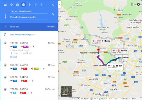
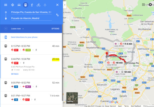
Cristián lives in Pozuelo de Alarcón, an affluent Madrid suburb with its own city hall. At the time, twitter commentary from Spanish viewers was critical of the show choosing to make the girls meet in Tribunal, because public transit from Tribunal to Pozuelo takes too many connections and it’s not like Madrid isn’t rife with convenience stores. I included both the route the girls take, and an alternate for ur edification.
I just realized that when Viri goes over to greet Lara, you can clearly hear Lara saying, “what’s up, dude?” in response.
And also, when Eva begs Nora not to leave her alone, Nora teases Eva by saying the sentence back to her. That’s why Eva laughs and says Nora is being dumb.
A saco (“going all out”): “A saco” is that kind of slang that’s hard to translate, but Eva means that Viri is assertively taking the lead in pursuing (and making it clear she wants to make out with) ALEJANDRO, rather than waiting for him to notice her.
CLIP 6: Viri lost a battle, but she didn’t lose the war!
Nora’s ringtone is so… She truly leaves me speechless sometimes.
No soy celoso (“I’m not possessive”): I translated “celoso” as possessive, because if I translated it as “jealous” it would mean that Cristian, right this moment, doesn’t feel jealous of Jorge. In fact, what Cristian is saying that this is a general personality trait of his, like being blond. He is totally chill with any and all girls he is interested in having boyfriends. That’s not at all an obstacle!
It’s also a very corny thing Spanish guys say all the time when a girl says she’s taken, hence Eva’s uncomfortable smile in response.
As Inés and Alicia greet ALEJANDRO, he seems pretty annoyed by Viri floating around him, clearly laying a claim on him. The three of them intentionally crowd Viri out.
CLIP 7: Hard work pays off
En doce siglos (“in twelve centuries”): This is Amira’s catchphrase for measuring time. She also uses it during the truth or dare game.
One of the season 1 mysteries: what did Alicia say to Inés to make her leave so quickly? In hindsight, it doesn’t seem to have anything to do with Jorge, but that was one of the popular theories at the time.
Another detail: Cristian is behind Inés, seemingly on her side of this girl fight. ALEJANDRO’s crew seems to be pretty friendly with Inés and Alicia. They celebrated Inés’ birthday together, and often post ig stories together.
Social media:
I already mentioned this in a post, but Cris’ instagram makes it very obvious that Cris is a stoner. Her rainbow tops are peak Spanish stoner girl fashion, the soap video she regrammed is the sort of thing a stoner would be fascinated by, she follows ifyouhigh and highpeopledoingstuff, and she’s holding a blunt for her first ever ig pic. So yeah. I also just realized the implications, seeing she’s the s2 main. I don’t think she’ll lose a bunch of weed, but she might smoke it with 🐸?
“Perezón,” i.e. the title of clip 4, would literally translate to sloth or laziness, but its actual meaning is “what a drag,” as in “that party/those people/going to that rally is such a drag.”
Viri’s house is pretty basic-looking. What we can see of it looks like a working class household, but it isn’t the borderline hoarder situation in Vilde’s clip.
Eva watches an 11-episode show, which may or may not be Skam s1. The fun thing is she promises she won’t watch episode 12. The NYE special is listed as episode12 on the Movistar site.
Jorge got ahold of a charger after midnight!
SKAM+ #1:
This clip takes place between episode 2 clips 6 and 7. Specifically, 20 minutes before the last clip.
Aitana is a Spanish singer born in 1999. She became famous thanks to talent show Operación Triunfo, where she came in second. At the time season 1 aired, she had only dropped two songs, Lo Malo with Ana Guerra, and Teléfono. Both of these songs played a prominent role on the show.
Cristian’s dad works at a record label! Explains Cristian’s huge ass house and mixing room!
ALEJANDRO asks Aitana where she’d like to hang out with him at Retiro Park. Retiro Park is one of the largest parks in Madrid. The park belonged to the Spanish Monarchy until the late 19th century, when it became a public park. It’s one of the most picturesque sights in the city and it’s overrun by people. So I don’t think it’s the place you want to take a celeb on a low-key date, but otherwise, good choice! Almost makes it seem like ALEJANDRO isn’t after sex!
Hasta yo preferiría a Aitana (“Even I’d rather Aitana”): That is… so lesbian of Viri.
Speaking of lesbians, Cris is also absolutely overcome by Aitana’s beauty.
In case you weren’t aware, Spaniards greet each other with two cheek kisses when we meet someone. Touching people’s hair without their permission, though, is still a no-no.
15 notes
·
View notes
Text
03/24/2021 DAB Transcript
Deuteronomy 2:1-3:29, Luke 6:12-38, Psalms 67:1-7, Proverbs 11:27
Today is the 24th day of March welcome to the Daily Audio Bible I am Brian I am glad to be here with you today. I'm always glad. This is one of the great oasis’s in my life and I hope it's the same for you. I love that we can come around the Scriptures and allow them to speak into our lives across generations, across millennia, and speak truth into our hearts. So, we’re reading from the English Version…the English Standard Version this week. We have just begun the book of Deuteronomy. And just by way of reminder, these are the last three speeches or discourses or discussions or talks of Moses life, the last things that he has to say to the people that he has been leading for so long. And knowing that should give it gravity and should…should inquire of us that we might pay close attention just as the people would've been paying close attention. And, so, let's dive in. Deuteronomy chapters 2 and 3 today.
Commentary:
Okay. So, in the gospel of Luke today we have encountered some territory that…that might seem familiar. We saw it more extensively in the book of Matthew and this is known as the sermon on the Mount, Jesus’ sermon on the Mount, which is known to be His central teaching, like a the core of the message that He is delivering. And actually, maybe even equally is important, the message that He's modeling, the message that He's living…like the sermon on the Mount certainly gives us the core doctrine of what Jesus is teaching to people but it's also what He's living. There's not like some guru come down off the mountain with a new way of doing things and He’s just telling it to the people. He’s going about the countryside living this way and…and people are intrigued and are watching Him. And this set of teachings that Jesus traveled around and spoke of inviting people to open their eyes and see a kingdom that is being revealed and how it works, this wasn't…like Jesus didn’t go around the countryside and people then began to call His teachings and the way that He was leading and speaking, they didn’t call it Christianity, that term is a Gentile term that came much later. Early on this was called “the way”. The Way - because Jesus was showing a different way of looking at the same picture, a different way of being in the same circumstances. In other words, nothing has to change around you for you to experience the way. It's what changes within you. And once you see it and begin walking the way it changes the way you look at everything else and then you realize there are other ways of seeing and other ways of being and some of this is a choice. Some of the chaos, some of the drama, it comes upon everybody, but some of that we just…we just go to like a moth to the flame and we just keep getting taken out and wondering why it's not working when Jesus is saying there is a totally different way of being, a totally different way of living, a totally different way of seeing and that way was and is disruptive and even difficult, might even call it a narrow path. Imagine that, when your…I don't know…when you're in a grocery store and you got your…you ran in for a few things, you got your few things, they’re bagged up, you’re walking your cart out and there’s somebody standing outside the grocery store just on the way little bit kinda like, you know, Salvation Army does a Christmas when they ring the bell and stuff. There’s just somebody down a few steps and there's maybe 10 people around them or 20 people around them and they're talking and your intrigued, “what's going on here?” And, so, you walk over and then you overhear this person saying, “listen, love your enemies, do good to those who hate you, bless those who curse you, pray for those who hurt you. If someone slaps you on the cheek, turn the other cheek also. If someone demands your coat, offer your shirt also. Give to anyone who asks and when things are taken away from you don’t try to get them back. Do to others as you would like them to do to you.” If…like…you would probably recognize these words but if you had never really heard these words before and they were coming to you in a context of just your busy life then you’d see just how disruptive this is. This isn’t the way of our culture. The way of our culture isn’t love your enemies, it's destroy them. It's not to do good to those who hate you, it’s to hate back and build up walls of protection between us so that we can’t be hurt. There’s so rarely turning the other cheek in the world system that we live. And, so, we could see that even now where the words of Jesus, were they spoken out in the same kind of context that they were spoken in originally, they would be disruptive, they would be calling out a different way of looking at things. We might even listen to the words and think to ourselves, “that sounds so nice. Like the world would change if everybody did. Like this is a way that if people lived this way, the world would be a remarkably different place but nobody's gonna do that. Or even if we decided I'm going to do that. I'm gonna live like this I’m gonna follow this person. They seem to…they seem to know something. I’m gonna follow this person. It's crazy if we’ll observe ourselves the things that come pouring out of our mouths before we can stop them that are completely contrary to the way of Jesus. So, if you wonder about the narrow path that leads to life, if you wonder about what it practically looks like to be a disciple of Christ then love your enemies, do good to those who hate you, bless those who curse you, pray for those who hurt you. If someone slaps you on one cheek offer the other cheek also. If someone demands your coat offer your shirt also. Give to anyone who asks. When things are taken away from you don’t try to get them back. Do to others as you would like them to do to you or maybe we could say that another way. Love your neighbor as yourself. There is a way. Jesus said there is a way that leads to life. He just said few ever find it. This is the way friends. And I look at that way and I have known this, and I have known this way most of my life. But I have known what I'm saying to you for a long time, and I look at those words and it makes me want to weep at my failures. And I realize I have no capacity. I mean I can…I can do this for couple hours, right? We can do this for a day. Like, we can…we can sort like white knuckle it and hold on tight and just make ourselves. Maybe that's the first step though. Maybe that's the first step to discipline, first step to opening our eyes to see, first step to say I'm not…I'm not…I'm not leaving any other way but the way of Jesus anymore. Nothing else works. This way that Jesus is describing is the ultimate of letting go, the ultimate of saying I am utterly and hopelessly dependent upon God and His mercy, and nothing else I try to arrange or build or make to ensure myself safety, that’s just a joke. The only true way, and honestly it's such a cliché, such a cliché I’m about to say but the only way is to let go and let God, to lay ourselves down because isn't this what Jesus is talking about? I mean to love your enemies is to lay yourself down, right? To do good to those who hate you, that’s like…that's to lay your rights down. Like that's to say, “I am not my own and I am not the judge and I am not retaliating I am letting go. I am hopelessly and utterly dependent upon God. God is the judge. I…I don't even have to carry…this isn’t even a chain around my neck anymore. I am letting go. So, letting go of my offenses and letting go of the things that I need retribution for also means I'm letting go of the chains that are around my wrists attaching me that situation and that person. I'm letting go. And what happens happens. I am at the mercy of God. I would rather be safely there and at anyone else's mercy.” So, let's give that some thought today. This will be the last time that we…we reach the sermon on the mount in an encapsulated way like this this year. And yet this is so foundational. This is so important to what it means to follow Jesus that we just cannot blow by it. And if we want to go deeper than read it again or go back to Matthew 5 and read the whole thing again.
Prayer:
Jesus, we invite You into this contemplation, into this consideration. None…none of us are living up, none of us are measuring up and it's frustrating but none of us are ever going to be able to without Your compassion and Your kindness…kindness and the leading of Your Holy Spirit and that You are faithful and just to forgive us our shortcomings in our failures. At the same time as much as we may fail as we walk this path You have given us the path. This is the way to go. This is the way to be, and so help us as we take steps forward because each step forward is a step forward in sanctification is a step forward in us being made holy and set apart, is a step forward in our transformation as we become like You. And we become like You by following the way and following the way requires that we lose ourselves in You, that we become a living sacrifice, holy and acceptable to You. Come Holy Spirit into this we ask in Jesus name. Amen.
Announcements:
dailyaudiobible.com, that’s home base, that’s the website, that’s where you find out what's afoot, what’s going on around here, how to get connected around here, how to go deeper. So, certainly check that out.
Check out the Daily Audio Bible Shop. There are resources there that cover the gamut, whether that be our Wind Farm coffee and tea that we roast fresh at altitude out in Colorado and send it all over the world, whether that be the Global Campfire line of things to just be…yeah…just…just feel connected to each other in this virtual way, whether it be the music from the Daily Audio Bible musical projects that we've done over the years, whether that be going deeper on specific topics that we…we've written about that are there in the in the Shop. Just check…check it out and take this journey as deep as it will go while we are on the voyage of a lifetime across the year and across the Bible. So, check out the Daily Audio Bible Shop.
If you want to partner with the Daily Audio Bible, you can do that at the website as well. There’s a link that just sits right there on the homepage and I thank you with all of my heart with all humility and with awe that we’re doing this, that we’ve been doing this day by day step-by-step all of these years. I thank you profoundly for your partnership. If you’re using the Daily Audio Bible app you can press the Give button in the upper right-hand corner, or the mailing address is PO Box 1996 Spring Hill Tennessee 37174.
And, as always if you have a prayer request or encouragement, you can hit the hotline button the little red button in the app share from their no matter where you are in the world who are you can dial 877942 4253.
And that's it for today. I’m Brian and I love you very much and I'll be waiting for you here tomorrow.
Community Prayer and Praise:
Hi this is Nikki Calhoon from Detroit. I'm just calling in just saying praise the Lord because He is so awesome and so good and I'm just now getting wind of this app and it was a blessing to me today. But I wanted to speak to Lori Music who was just on here that made a comment praising the Lord and was talking about the passing of her husband. I just want to say that I'm praying for you and your three beautiful daughters. I'm so glad that you are encouraged, and I just pray for strength for you guys through this journey. I pray that God will open up more blessing, more understanding, more wisdom, more insight is who He is and that He will pour out unto you everything that He has for you, that you will walk right into what He has for you. And, so, I just wanted to tell you that someone is listening, that you are loved you are being prayed for and that your strength and…and…and your testimony they just touch me. So, just keep fighting, keep walking sister. Keep going through what you need to go through as a soldier in the army of the Lord and you will see your husband again on the other side. God bless you. Love you.
Good morning DAB community this is Ming from London. Just want to lift up in prayer to the Lord everyone, all…all the brothers and sisters in the Asian communities following the recent spread of attacks in the US. I just lift them up to you Lord. I pray that you just be with my brothers and sisters, Your assaulted, Your racially abused. And following the recent shooting and…and attacks Lord I just pray that You be with them. I pray for leadership, justice, wisdom to come from You. I just…I just pray Lord that…that You…You help them to…to protect my Asian brothers and sisters. I just…just pray for love and understanding Lord. Yeah, yeah. I just pray this all in Your name. Amen.
Grace and peace Daily Audio Bible family this is RJ representing Jesus from Connecticut. I just felt led to call in and just give a word of encouragement two brothers and sisters out there. I just wanted to say that I myself has been one who have been just at a point in my life totally rock bottom. I mean, I've seen incarceration, I've seen drugs, I've seen fornication, I've seen a life of partying and just doing all sorts of things that were so unruly and ungodly, but the Lord has allowed me to see that He loves me more than that and He has reconciled me back to Himself and right now I feel so blessed. You know, it’s been maybe 2 maybe 3 years that the Lord has brought my children back into my life. He has allowed me to be married to a beautiful, wonderful woman of God and, you know, secure in home. And I just want to encourage someone else and let you guys know that the Lord can turn your life around. The Lord can bring you back to a place where you rightfully belong, which is with Him. Be encouraged family. Don't give up. The Lord is with you. He promised never to leave us nor forsake us. Just keep looking to Him and He will do what He say he will do. Grace and peace family. God loves you.
Hey DAB family it's Danny from Southern Oregon. Hey, the other day Brian you were talking about how when we spend time with God why is it that we do all the talking? And boy that really hit me and it took me back to about a year ago when I used to dedicate time every single morning to sit with God and be still, to listen to the DAB, to Journal, to specifically write down the people and praying for and to write down my own prayers to God and…and just be quiet and listen to what God had to say. And at that time I don't think I'd ever been closer to God in my entire Christian walk. And, so, I know…I know that's super important. And for some reason busyness of life and everything has just kept me from dedicating that time in the morning. I still…I still listen, I pray for people but it's on the go and I'm squeezing it in. And I..I know it's not the same. And, so, anyway I wanted to thank you for reminding me how important that is. And also, I just wanted you all to pray with me. O heavenly Father, we just come to You and we ask You Lord to remind us that Your arms are always open for us, that we can crawl into Your lap we can snuggle in close and You can wrap arounds around us and You can keep us safe from everything that's out in the world whether we're tired or we’re afraid or sick, anything Lord. Your arms…or Your healing arms You can just help us to feel so good. And, so, remind us that Lord that we...that You are our refuge always in Jesus’ name.
Hello DAB family this is Angel from California and I wanted to reply to Nathan. Nathan you had a stroke and I heard you on March the 22nd podcast and you said that you'd been posting. And actually, that's where my ministry is, in the Prayer Wall. I pray for a lot of people and I remember you. I remember you posted, and you got feedback from us. So, I listen to the Daily Audio Bible every single blessed day and I…when you, when people need prayer what I do is I…I post it in the Prayer Wall and I want you all to know that I am listening. And…and check us out in the Prayer Wall and post any…any need that you might have and may God bless you. And I am really, really happy that Daily Audio Bible is blessing so many people. And thank you so much and God bless you. This is Angel from California.
0 notes
Text
Books and books
Thanks for tagging me, @alexaprilgarden! This was fun to think about.
1. Which book has been on your shelves the longest?
I think it must be a paperback of Charles Dicken’s A Tale of Two Cities. There’s an old TV version in which Chris Sarandon played Sydney/Charles and I had a huge crush on him when I was like 12.
2. What is your current read, your last read and the book you’ll read next?
I’m currently reading Enigma Variations by André Aciman and Word by Word: The Secret Life of Dictionaries by Kory Stamper (this was a gift from my hubbie because he knows I’m a word nerd). My last book was Exit West by Mohsin Hamid. Next on my list may be The Power by Naomi Alderman (a friend recommended it).
3. Which book does everyone like and you hated?
I have never read 50 Shades of Gray. I probably never will.
4. Which book do you keep telling yourself you’ll read, but you probably won’t?
The Lord of the Rings series. (Sorry!)
5. Which book are you saving for “retirement?”
Nothing -- I never even thought of waiting!
6. Last page: read it first or wait till the end?
WAIT TILL THE END!
7. Acknowledgements: waste of ink and paper or interesting aside?
I skim them. Sometimes they’re interesting.
8. Which book character would you switch places with?
Pippi Longstocking? Nancy Drew?
9. Do you have a book that reminds you of something specific in your life (a person, a place, a time)?
Hemingway and Fitzgerald remind me of my college days.
Barbara Kingsolver’s early books remind me of my first years on my own as a young adult.
10. Name a book you acquired in some interesting way.
I received the audiobook of Call Me By Your Name from the lovely @missmuffin221! I had to use a lot of Google translate to figure out how to download it from the German Audible website to the U.S. Audible app!
11. Have you ever given away a book for a special reason to a special person?
I’ve given books as gifts over the years -- and I lent a Gabriel García Márquez book to a friend once and never got it back. But that’s ok. I hope they enjoyed it.
12. Which book has been with you to the most places?
I’ve drug a lot of books around with me since my early 20s -- I used to move around a lot more. Most are those are the aforementioned lit classics from college.
13. Any “required reading” you hated in high school that wasn’t so bad ten years later?
In university I was supposed to read James Joyce’s Ulysses for a literature class. Didn’t finish it. Still won’t.
14. What is the strangest item you’ve ever found in a book?
It’s usually a store receipt, grocery list, or the due date slip from the library. Nothing very exciting so far.
15. Used or brand new?
Both are good.
16. Stephen King: Literary genius or opiate of the masses?
I never really got into Stephen King. I think he’s amazingly productive, but he’s not my cup of tea.
17. Have you ever seen a movie you liked better than the book?
The English Patient, maybe? And I always enjoy the Harry Potter movies as much as the books.
18. Conversely, which book should NEVER have been introduced to celluloid?
I know I’ve walked out of a theater saying “the book was better.” If only I could remember....
19. Have you ever read a book that’s made you hungry, cookbooks being excluded from this question?
Like Water for Chocolate, Julia Child’s My Life in France
20. Who is the person whose book advice you’ll always take?
Friends, mostly. And my local library and bookstore have some great recommendations.
I tag @threewhiskeylunch @somewhereinmalta @girlwhowearsglasses and any other bookish types out there!
8 notes
·
View notes
Text
Korea Q&A
This is an ongoing thing...so feel free to ask any questions about living in Korea. I will do my best to answer anything.
School
I was wondering about how school works? How do grades work? Is it like kindergarten through 12?
Grades are similar to kindergarten to 12, although Kindergarten is technically not required here (though probably 99% still go). The main difference is how students talk about their grade level here.
Here, the grades in Korean sort of “reset” as they change schools, if that makes any sense to you. So, if the student is in grade 7, they would call it ‘first grade in middle school’ or if they were in grade 12 internationally, in Korean they would call it ‘grade 3 of high school.’ To me this can be confusing but it’s the norm here.
Elementary/Primary School – grades 1 to 6 (Korean ages 8-13)
Middle School – grades 7 to 9 (Korean ages 14 – 16)
High School – grades 10 to 12 (Korean ages 17 – 19)
High school seniors (grade 12) have to sit for the CSAT exam before entering university. This is basically the Korean version of the SAT but it is only given one time a year, normally in mid-November. This is a huge exam and students are so nervous about it that they often spend 12 hours a day studying all year.
University – four years (freshman to senior)
Most men take leave from university after the first year or two in order to complete their military service. It isn’t uncommon for the ladies to also take a year or two off as well. This is when many gain experience abroad. You’ll meet many Korean who are 25 and still in university.
Language
How did you learn Korean? I’m also trying to learn but I don’t feel like I’m learning it fast enough or well enough. Any websites, apps, books, etc. that you’ve used? Thank you.
To be honest, you don’t really need to speak Korean to live here. I have a friend who was here for three full years and she never even learned to read Hangul….she could say annyonghaseyo and kamsanida.
Most people use Talk To Me In Korean and I do think this is a nice site that teaches the more “necessary” phrases. There are website lessons, YouTube videos, and workbooks.
Also the books used for TOPIK, which is the Korean language exam are helpful when you get to the intermediate stage.
I highly suggest journaling in Korean every day. Also, speaking as much as you can will help so much. To be honest, as a trained linguist and ESL instructor, I don’t actually believe that a person can have a solid grasp on the language without speaking it. My students who consistently speak only in English far surpass the students who still rely on Korean not for any reason more than they try.
Food
How difficult would it be for a vegetarian with really limited Korean to eat around Seoul?
In Seoul it’s doable but obviously a bit harder than an English speaking country. You can always have a little card that says you’re vegetarian or just learn the phrase “no meat please”
But please be warned that many things (soups and kimchi for example) have fish sauce in them so if you avoid fish as well this is something to keep in mind. Also some older Koreans don’t actually think that spam is meat so you might run into troubles with that.
I have friends in smaller cities who are vegan or vegetarian and they don’t seem to struggle too bad but Seoul has many more English speakers and food options since it’s so large and has many more foreigners compared to my area.
Girl Stuff
Is it true tampons are nowhere to be found in Korea?
To be honest, I use a menstrual cup so I’m not completely sure off the top of my head. So I went to the local grocery to check. Tampons aren’t as common here at all (most wear pads) but you can find them in some stores. I saw maybe a couple boxes which looked like the OB style ones or maybe with a cardboard applicator, but there aren’t many options and the ones available were a bit expensive. Maybe 12 for 5,000 won….although I’m sure a larger city like Seoul would have more options and there is always the option to buy online.
I even asked one of my good friends. She is Korean but spent most of her adult life in America. She even says that she chooses pads over anything else in Korea at least.
Also a side note, you really won’t be able to find thongs in Korea if that’s your kind of thing. I’m not a huge fan of the fabrics for most Korean underwear and they don’t cater to the thicker girls out there.
Cultural Differences
Okay so like why people don’t hug that much and/or don’t like hugging in Korea (I mean the majority idk)? Cause I still don’t quite understand….
Hugging still happens here but only among really close friends or family. It isn’t like the Western world where you can hug someone on the first meeting. Normally you just give a slight bow or smile as a way to greet or say goodbye. This is just the cultural practice that has been around for hundreds of years. While many Koreans are fans of skinship (like touching arms or knees) this doesn’t happen until you are much closer to the person.
Maybe I should also mention that I’m not really a “hugger” so this sort of culture is just up my alley.
My general rule is that I won’t initiate a hug with a Native Korean but of course will accept one if offered. It really just depends on how connected they are to foreigners and their general comfort levels with this. I would never hug one of my Native coworkers even after hanging out with them multiple times just because that’s not what you would do but some of my Korean friends who have spent a year or two abroad have no problem after a little bit of time hugging.
I would say that it isn’t common at all between a guy and girl who aren’t dating to hug though. Just one of those things where it means more to them in general than what we as Westerners might be used to.
26 notes
·
View notes
Note
Hi rose I was wondering if you had any tips or suggestions on how to learn Japanese by oneself. Do you think knowing Chinese would help in learning it? It's so cool that you know more than one language I wish I could be that cool ;w;
hahaha i’m really #NotCool lol
i actually learned japanese by myself so i’m literally full of tips and suggestions haha.
addressing knowing chinese--do you mean that you’re currently learning chinese? if you’re considering learning them side-by-side i honestly don’t think that would be very helpful? the two languages developed independently of each other so they’re virtually unrelated grammatically. japanese kanji does come from china but, unless you’re talking about traditional chinese, almost all of the characters were edited to be faster to write, whereas the original versions are still used in japanese. i do think kanji is important (and fun!) to learn but you should take it slowly and don’t make it your first priority. you’re not going to want to learn a bunch of kanji right off the bat because you’re going to forget all of the ones that aren’t used in common words. i’d say learn a few every week or so? find a pace that works with you best.
if you mean that you already know chinese, there’s a handful of words which are similar and, if you can write it,you’ll be able to pick up kanji faster simply because your brain is already wired to interpret and recreate such characters. but tbh i don’t think it would be much of an advantage.
but before you even touch kanji, learn both kana systems. you can find guides fro them easily enough online. some ppl recommend not learning katakana but tbh i find that katakana is used very often. learn hiragana first going down the rows. at first i learned it five per day but i bumped up that speed after a while. keep writing them. write them whenever u have a free minute just write them over and over again and try to make their sounds as you do.
from this point.... it’s a little fuzzier? there’s a fuck ton of japanese resources out there online. not including textbooks you can buy or rent at ur local library. my suggestion is to find a resource that starts from the beginning and get going with it. no matter what website or book it is it’s not going to be perfect. keep this in mind. i remember with my first book it explained adjectives so poorly i gave up on learning japanese for months because i thought it was just too hard--but then i eventually found a different source which explained adjectives in like two sentences and it made perfect sense. so, whenever you’re using your primary reference and it confuses you, go to a secondary source and see if it explains it better. there’s so many resources out there you can find the explanation you need for any topic.
when you have a basic grasp of grammar, like ‘AはBです” levels of basic, start speaking and writing it. i have a little gaudy pink journal which contains my very first japanese journal to myself, written in glittery pink pen. for these journals don’t look up new words and don’t worry about being grammatically correct. just write. set a length requirement--maybe only four or five lines at first and then let that requirement grow larger and larger as it gets easier and easier for you to write. if you find yourself needing a word in english, like you got halfway through the sentences before suddenly realizing you don’t know the word you need, try to sound it out in katakana. believe it or not, it’s sometimes a struggle to understand english words said in japanese, so try to get yourself used to this concept. do try, however, to only use words you know and to write every day. it doesn’t matter if your journals start out like ‘my name is susan. i am seventeen. i went to school today. in the morning i ate breakfast. i had a test.’ just write.
as for talking, virtually the same rules apply. at first you’re going to have to force it, so try in the morning while you’re getting ready, or in the shower, while cooking... etc.. look up pronunciation videos online and soon you’ll find yourself not forcing out the japanese when you’re talking to yourself.
once you have a good basis in grammar, you can move on to learning more vocabulary. i, personally, used the jlpt sets on memrise, starting with n5. but, as with all sets, these aren’t perfect. memrise is, however, fucking great. use it to build sets of the vocabulary in your primary resource or vocabulary you think might be useful to you in your journals. memrise is themed around learning words being similar to taking care of plants, so it times when you should review different words. on the mobile app you can set it to alert you at a specified time to go over your words, and you can also set goals to drive you to review words or learn new words for a certain length of time every day.
personally, for the words i add to my own personal lists, i don’t worry about kanji, as the jlpt sets all have kanji. you will, however, need to learn kanji using something else. personally, i used he book remembering the kanji but it’s not perfect. as with grammar, there’s a lot of different resources so find the one that explains kanji in the way you like best.
for me i made flashcards of kanji and went over them daily. when the number became too great for that, i went over all of them once a week and put the words i got wrong into a separate pile called my ‘stress words.’ i would go over these several times a day and then, once a week, would learn a few more kanji and add those to the new ‘stress words’ for that week. i also bought a mini white board to use when writing kanji but it’s also a good idea to practice with graph paper so you can learn to keep them in the proper shape and size.
another great app i liked a lot is hellotalk. it’s virtually an instant messaging app meant to connect you with people who are native speakers of the language you want to learn. since i used it, it has also become a little bit more facebook-esque,which i think can make things a bit awkward--as you can make a post about what ur eating or whatever and a japanese person might see it and then you can use that as a way to start conversation and avoid the awkwardness. it also has ways for you to limit what sex and age range can talk to you, but when i used the app recently i had people voice call me virtually immediately and i’m personally not comfortable with that :/ i’d hope that the app has maybe changed that setting but i haven’t checked. i’d suggest downloading it and seeing if the setting has changed or if ur comfortable with just refusing calls from people because having ppl to talk to is the best way to learn.
another website similar to hellotalk is lang-8, but, instead of instant messaging, on lang-8 you write journal entries in the language you’re learning and native speakers correct it--and then you correct their journals in exchange. obviously, you have to be a bit more advanced in japanese to manage this, but it’s very useful! your journals don’t have to be anything insightful--i remember writing one about how iced coffee is more popular in asia than it is in america and another about going to the grocery store. it’s also a good way to potentially meet ppl you may befriend and speak japanese to some day!
these next two are hella amazing. one is an app called imi wa? it’s a great dictionary app that helps you conjugate verbs, search kanji by not only radicals but by ‘primitives,’ and, best of all, has an analyze function which lets you paste in a block of text and defines all of them so you can translate sentences with much more ease. the other is rikai-kun (chrome), -chan (mozilla) and -sama (i forgot?). it’s another dictionary for ur browser that will let you scroll over words and immediately look over their definitions. you can develop an over reliance on it but at the beginning stages it’s going to be hella useful so, download it.
a great resource in particular to use with rikaikun is nhk easy , which is japanese news articles written for elementary and middle school students--and foreigners! you can set it so locations/names/businesses will appear in different colors and you can scroll over some words for definitions. the articles are also relatively short so i’d recommend going through at least one a day to practice your reading. also considering following japanese fans or artists on twitter and trying to translate their tweets--but if you find yourself getting overwhelmed by the number or length of tweets, don’t feel pressured to understand all of them. a lot of learning a language by yourself is trying to avoid frustrating yourself--since you’re studying alone, there’s nothing to keep you from giving up aside from yourself. so if you find yourself getting very frustrated, you should probably switch up what you’re doing.
in terms of practicing your listening skills, i’d recommend watching dramas. try to find half hour long dramas (or just watch half an hour long episode) and then immediately after watching the half hour, watch it again without subtitles. at first you’ll feel like you get absolutely nothing out of this, but stick with it.make sure not to play with your phone or distract yourself while listening. try to remember what the characters said or what’s going on in the episode. soon you’ll find yourself recognizing words!!! then phrases!!! then sentences!! then you’ll be able to understand it on your own!
if you really like anime, you can also watch anime at first or every once in a while--but i’d really recommend dramas. people in anime don’t speak like normal people do, but it can be easier to recognize words and such because their voices are clearer. dramas better reflect the way actual japanese people speak. (however i wouldn’t recommend watching something like terrace house because it is actual people talking and the mics aren’t perfect. if you’re a student, i’d say to watch high school dramas because they will contain words which may be relevant to you in your journals and while talking to ourself and what not!)
you can also rewatch episodes with the screen blackened, so you’re just listening to it? i personally think this is lots of fun but that’s just me.
songs tend to follow their own grammatical rhythms so they’re not too useful for studying aside from vocabulary.
the key, to me, at least, was to study every day. my schedule was:
1. talk to self.
2. study stress words (once a week go over all kanji)
3. half hour drama episode (watch twice)
4. nhk article
5. journal
6. memrise vocab
7. translating tweets
the key is to try to study every day and to make a schedule of your own which lines up with how much free time you have. you can divide drama episodes into ten minute blocks, read your article on the bus, write your journal before bed and do memrise while waiting in line at the grocery store. just find something which works for you--and don’t let yourself get frustrated. even if you’re tired as all fuck, try to at least reach your memrise goals or watch your drama episode, or whatever study method you find the most useful. it’s hard work, but be nice to yourself!
頑張って!
6 notes
·
View notes
Text
How to Run a Cohort Analysis in Google Analytics
Traffic and page views are nice.
But they’re limited. In a few ways.
Site wide traffic looks nice on a blog post or meeting with your HiPPOs. But it’s not actionable. And it doesn’t tell you what’s going on beneath the surface.
For example, you have no idea if those users are returning. If they’re subscribin’ or buyin’. Or how they compare to peeps from a year ago.
In order to find out that detailed info that ultimately moves the needle, you need to dig a little deeper. And you need to be able to view these basic metrics through a more detailed lens that includes segment information.
Google Analytics cohort analysis tool can help. Here’s what it is, why it’s important, and how you can run your first cohort analysis report today.
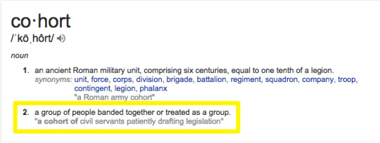
What is a Cohort Analysis?

A cohort is “an ancient Roman military unit, comprising six centuries, equal to one tenth of a legion.”
Wait. That’s not right. Is it?
Ohhhh. It’s the second one.

My bad. A cohort is simply a grouping; a subset of people brought together because of a similarity or shared value.
Think of a retail store. You have a cohort of customers who bought in the last week. And another that bought this same exact week, but last year.
A cohort analysis, then, is the number crunching. It’s the sleuthing to determine if the customers from this week are worth more or less than the ones from a year ago.
Things change over time. Maybe the products are different. Maybe you switched manufacturer’s and the quality is different. Or maybe you’re using a new layout in your retail store that affects how people ‘flow’ through it.

Those changes, while seemingly small, can have a big impact on the bottom line. There’s a ton of psychology behind where the eggs are in grocery store (and where they’re hiding the booze).
So analyzing trends and patterns from customers based on when they shopped (i.e. acquisition date) can provide a lot more meaningful feedback on what changes resulted in different results (and why).
Here’s why that’s important (beyond just finding out where the booze is).
Why Cohort Analyses are Better than Standard Metrics
Google Analytics provides a wealth of data.
It’s perfect for finding certain things at a glance. Like aggregate, surface level data. That’s not a knock; it’s one of the best tools to see simple site wide metrics like top visits from certain sources, or dive a little deeper on how individual pages or pieces of content are performing.

But as with the retail store example earlier, websites change. A LOT.
Each time you redesign it, come out with a new product, update your service offering, and a host of other random reasons.
When those changes happen, it’s important to put these metrics in context. Comparing traffic or Time on Site of a particular blog post from now vs. a year ago might not be super relevant if it’s undergone a tremendous visual change in the meantime.
Cohorts can help. It’s like layering on a filter to add context to data you’re looking at. Viewing those details, by segments, now should produce more accurate findings. (And not just a vanity sepia filter to hide your bald spots. Just me?)
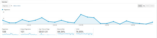
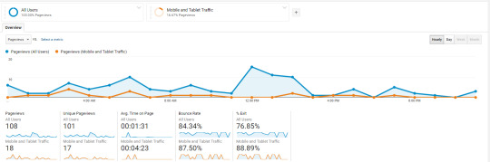
For example, let’s take a look at how tablet and mobile traffic compares to our site’s average over the course of a day.

Pretty interesting right?
Check out that massive Time on Site difference!

This information is interesting… but not sure helpful or actionable by itself.
So let’s add a cohort. Let’s look at the number of first time visitors who’ve left our site today, and see how many of those come back the next day.

Now we can dive deeper into how many of those people are coming back to our site (within X number of days of their first visit).
This brings us closer to Activation, Retention, and all those other Pirate Metrics to obsess over.
Zooming out, you can see these changes both numerically and visually.

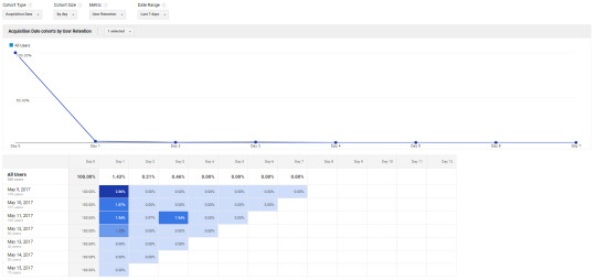
How about the plain English version?
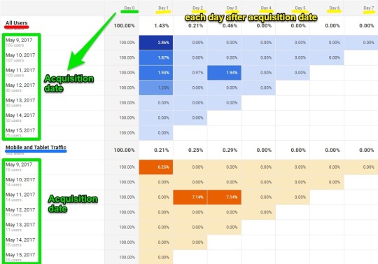
First, the graph depicts the percent of returning visits over a (default) seven day range.

The colorful, blue comparative table below the graph is where things start to heat up. (Literally.)
The table shows you what percentage of people came back to your site within seven days of their initial visit.
The second column from the left, Day 0, reflects the day on the left-hand column under all users:
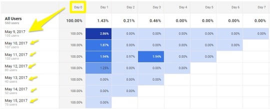
The next column, Day 1, represents the first day after this group of people visited your website on May 9th.
That means 2.86% of people who visited your website for the first time ever on May 9th returned the next day. Day 2 would be what percent of those visited again on Day 2, etc.
Each date under All Users starts a brand new cohort. So May 9th is one. May 10th another. And so on. And each has their own pattern of returning users.
According to the tiny sample size in this example, the oldest cohort, May 9th, has seen a majority of first-time visitors come back to the site.
Make sense? Kinda, sorta?
Well if that wasn’t nerdy enough for you, it’s about to get a whole lot more geeky.
How to Use Google Analytics Cohort Analysis Tool
Let’s do a step-by-step walkthrough to see how you can start using Google Analytics’ cohort analysis tool.
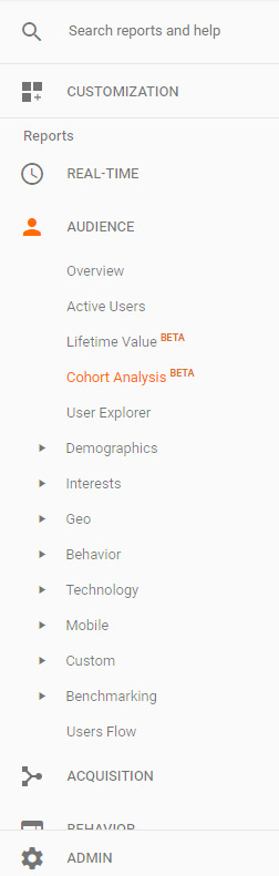
Pull up Google Analytics, click the Audience drop down in the left-hand sidebar, and look for Cohort Analysis:

Here’s how the Google Analytics cohort analysis report will look like at a glance:
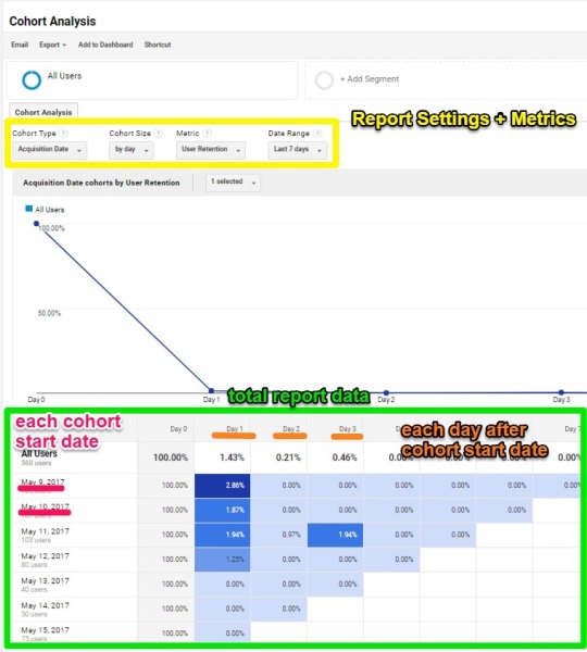
Report settings and metrics are all the way at the top
In the middle is a giant graph (that’s kinda useful, but more for the visual peeps out there)
While the final table at the bottom shows the results by cohort and date.
Here’s what that graph in the middle is showing:

We selected Acquisition Date for our specific cohort type, so that’s how the information is sorted in this graph. Day 0 is your acquisition date. While Day 1 is one day after, Day 3 is three days after, etc.
You can adjust these different cohort factors up at the top:

Here are the main factors you can analyze:
Cohort Type: Restricted to Acquisition Date
Cohort Size: Sort by day, week or month
Metrics by category:
Per user:
Goal completions per user
Pageviews per user
Revenue per user
Session duration per user
Sessions per user
Transactions per user
Retention:
User retention
Total
Goal completions
Pageviews
Revenue
Session duration
Sessions
Transactions
Users
You can access all of these in the cohort analysis drop down menus:
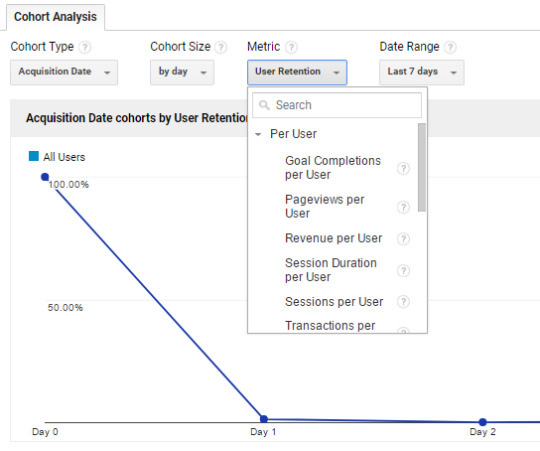
Here you can select to run an analysis of a group of users sorted by day, week, or month (or whatever other variable you want).
For example, if you want to know how many pageviews each user had (metric), sorted in groups by day (cohort size) for the last 7 days (date range), you simply enter the following into the drop down menu:
Then, I am presented with the following graph:

So, what we see here is:
The May 9th cohort of users had 1.5 pageviews per user
That same May 9th cohort also had an average of 0.03 pageviews per user the next day (Day 1).
Now, let’s jump back to our original chart, showing the following data.
You may be asking: “How the heck do I use this information?”
“What do I do (ha – you almost said doodoo) with the fact that only a tiny percent of first time visitors are returning the next day (or the one after that)?”

“Why did 2.86% of the cohort visit again the next day with the may 9th sample, but then a big drop off for the May 10th cohort?”
Let’s find out.
Fortunately, Google Analytics allows you to break down these reports even further. So you’re not stuck in the proverbial analytics dark.
Notice at the top, we can add different segments to break down our report further:
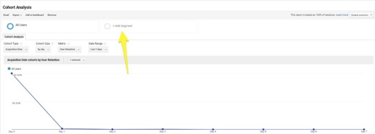
Now let’s go back to analyzing the Mobile and Tablet segment:

Select it, and you can now see a comparison from your original data set (all cohort users segment) vs. the Mobile and Tablet traffic:

So, this data is showing us the cohorts of people sorted by date, who visited our site the next day after visiting for the first time, sorted by mobile and tablet. (Or, the very definition of a boring example.)
But check out that leap in return visits from the May 11th mobile cohort!
Obviously our conclusions in this case are limited because it’s a tiny sample of a too-limited date range. However, hopefully you can see the potential here.
If that’s not enough, you can also sort by just mobile, or even traffic sources like Organic Search, Direct, and more. (If you’re masochist.)
For example, here’s what Organic Search visitors look like:
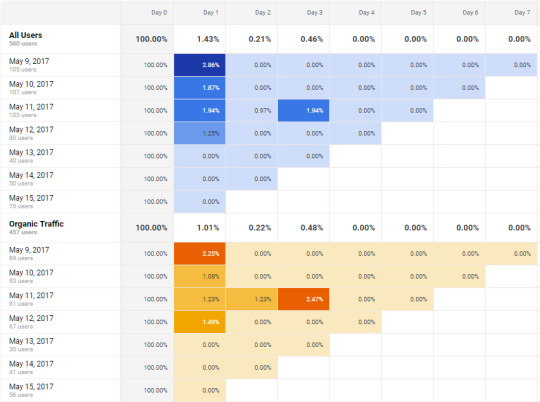
Hmmm. Interesting. Organic Search visitors from the May 11th cohort are returning more frequently than average.
Was there a new blog post that day that’s bringing them back?
Dunno. But you get the idea.
Conclusion
Cohort analyses allow you to view data by segments of people.
Businesses of all shapes and sizes and flavors can use them to determine what changes (if any) resulted in better overall performance.
Google Analytics cohort analysis tool can help you put otherwise generic, aggregate website data under the microscope.
In all of about five minutes, you can quickly compare how different cohorts compare with others. And then cross reference that information with your own actions or marketing decisions may have played a role.
They allow you to zero-in not only on who is your most profitable customers, but why (or what) influenced them to become your most profitable customers.
And how you can do more (or less) of the same to scale results accordingly.
About the Author: Brad Smith is the founder of Codeless, a B2B content creation company. Frequent contributor to Kissmetrics, Unbounce, WordStream, AdEspresso, Search Engine Journal, Autopilot, and more.
from Online Marketing Tips https://blog.kissmetrics.com/cohort-analysis-google-analytics/
0 notes
Text
How to Run a Cohort Analysis in Google Analytics
Traffic and page views are nice.
But they’re limited. In a few ways.
Site wide traffic looks nice on a blog post or meeting with your HiPPOs. But it’s not actionable. And it doesn’t tell you what’s going on beneath the surface.
For example, you have no idea if those users are returning. If they’re subscribin’ or buyin’. Or how they compare to peeps from a year ago.
In order to find out that detailed info that ultimately moves the needle, you need to dig a little deeper. And you need to be able to view these basic metrics through a more detailed lens that includes segment information.
Google Analytics cohort analysis tool can help. Here’s what it is, why it’s important, and how you can run your first cohort analysis report today.
What is a Cohort Analysis?

A cohort is “an ancient Roman military unit, comprising six centuries, equal to one tenth of a legion.”
Wait. That’s not right. Is it?
Ohhhh. It’s the second one.
My bad. A cohort is simply a grouping; a subset of people brought together because of a similarity or shared value.
Think of a retail store. You have a cohort of customers who bought in the last week. And another that bought this same exact week, but last year.
A cohort analysis, then, is the number crunching. It’s the sleuthing to determine if the customers from this week are worth more or less than the ones from a year ago.
Things change over time. Maybe the products are different. Maybe you switched manufacturer’s and the quality is different. Or maybe you’re using a new layout in your retail store that affects how people ‘flow’ through it.

Those changes, while seemingly small, can have a big impact on the bottom line. There’s a ton of psychology behind where the eggs are in grocery store (and where they’re hiding the booze).
So analyzing trends and patterns from customers based on when they shopped (i.e. acquisition date) can provide a lot more meaningful feedback on what changes resulted in different results (and why).
Here’s why that’s important (beyond just finding out where the booze is).
Why Cohort Analyses are Better than Standard Metrics
Google Analytics provides a wealth of data.
It’s perfect for finding certain things at a glance. Like aggregate, surface level data. That’s not a knock; it’s one of the best tools to see simple site wide metrics like top visits from certain sources, or dive a little deeper on how individual pages or pieces of content are performing.
But as with the retail store example earlier, websites change. A LOT.
Each time you redesign it, come out with a new product, update your service offering, and a host of other random reasons.
When those changes happen, it’s important to put these metrics in context. Comparing traffic or Time on Site of a particular blog post from now vs. a year ago might not be super relevant if it’s undergone a tremendous visual change in the meantime.
Cohorts can help. It’s like layering on a filter to add context to data you’re looking at. Viewing those details, by segments, now should produce more accurate findings. (And not just a vanity sepia filter to hide your bald spots. Just me?)
For example, let’s take a look at how tablet and mobile traffic compares to our site’s average over the course of a day.
Pretty interesting right?
Check out that massive Time on Site difference!

This information is interesting… but not sure helpful or actionable by itself.
So let’s add a cohort. Let’s look at the number of first time visitors who’ve left our site today, and see how many of those come back the next day.
Now we can dive deeper into how many of those people are coming back to our site (within X number of days of their first visit).
This brings us closer to Activation, Retention, and all those other Pirate Metrics to obsess over.
Zooming out, you can see these changes both numerically and visually.

How about the plain English version?
First, the graph depicts the percent of returning visits over a (default) seven day range.

The colorful, blue comparative table below the graph is where things start to heat up. (Literally.)
The table shows you what percentage of people came back to your site within seven days of their initial visit.
The second column from the left, Day 0, reflects the day on the left-hand column under all users:

The next column, Day 1, represents the first day after this group of people visited your website on May 9th.
That means 2.86% of people who visited your website for the first time ever on May 9th returned the next day. Day 2 would be what percent of those visited again on Day 2, etc.
Each date under All Users starts a brand new cohort. So May 9th is one. May 10th another. And so on. And each has their own pattern of returning users.
According to the tiny sample size in this example, the oldest cohort, May 9th, has seen a majority of first-time visitors come back to the site.
Make sense? Kinda, sorta?
Well if that wasn’t nerdy enough for you, it’s about to get a whole lot more geeky.
How to Use Google Analytics Cohort Analysis Tool
Let’s do a step-by-step walkthrough to see how you can start using Google Analytics’ cohort analysis tool.
Pull up Google Analytics, click the Audience drop down in the left-hand sidebar, and look for Cohort Analysis:
Here’s how the Google Analytics cohort analysis report will look like at a glance:

Report settings and metrics are all the way at the top
In the middle is a giant graph (that’s kinda useful, but more for the visual peeps out there)
While the final table at the bottom shows the results by cohort and date.
Here’s what that graph in the middle is showing:

We selected Acquisition Date for our specific cohort type, so that’s how the information is sorted in this graph. Day 0 is your acquisition date. While Day 1 is one day after, Day 3 is three days after, etc.
You can adjust these different cohort factors up at the top:

Here are the main factors you can analyze:
Cohort Type: Restricted to Acquisition Date
Cohort Size: Sort by day, week or month
Metrics by category:
Per user:
Goal completions per user
Pageviews per user
Revenue per user
Session duration per user
Sessions per user
Transactions per user
Retention:
User retention
Total
Goal completions
Pageviews
Revenue
Session duration
Sessions
Transactions
Users
You can access all of these in the cohort analysis drop down menus:

Here you can select to run an analysis of a group of users sorted by day, week, or month (or whatever other variable you want).
For example, if you want to know how many pageviews each user had (metric), sorted in groups by day (cohort size) for the last 7 days (date range), you simply enter the following into the drop down menu:
Then, I am presented with the following graph:

So, what we see here is:
The May 9th cohort of users had 1.5 pageviews per user
That same May 9th cohort also had an average of 0.03 pageviews per user the next day (Day 1).
Now, let’s jump back to our original chart, showing the following data.

You may be asking: “How the heck do I use this information?”
“What do I do (ha – you almost said doodoo) with the fact that only a tiny percent of first time visitors are returning the next day (or the one after that)?”

“Why did 2.86% of the cohort visit again the next day with the may 9th sample, but then a big drop off for the May 10th cohort?”
Let’s find out.
Fortunately, Google Analytics allows you to break down these reports even further. So you’re not stuck in the proverbial analytics dark.
Notice at the top, we can add different segments to
0 notes
Text
Texas’s Favorite Grocery Store Is a Way of Life<p class="p-dropcap has-dropcap p-large-text" id="vavTjJ"><strong>The story of H-E-B seems</strong> unoriginal, as far as cult grocers go: A family launches a store in a small town a long time ago (in this case, the Butt family, in Kerrville, Texas, in 1905). That store earns a loyal following and expands throughout the region (Texas). It becomes known among its fans for its wildly dedicated employees (many have worked there for 30-plus years), top-notch customer service (only at H-E-B will someone hand you a freshly baked tortilla to snack on while you shop), and unique food products (hatch chile cookies!). Adoring <a href="https://www.epicurious.com/expert-advice/the-best-grocery-store-in-america-is-heb-article">public odes</a> are published about it across the Internet. <a href="https://www.itemonline.com/news/local_news/customers-flock-to-new-h-e-b-store-on-opening/article_1f9c3d27-617c-597d-9ab9-b9eeb81673bc.html">Long lines form</a> whenever a new location touches down. </p> <p id="D5oF9v">This tale could be told of any beloved regional grocery store — your Publixes, your Wegmans, your Harris Teeters — except that San Antonio-based H-E-B exists in a single U.S. state (with 52 stores across the border in Mexico) and is the 12th-largest private company in the country, <a href="https://www.forbes.com/largest-private-companies/list/#tab:rank">according to <em>Forbes</em></a>. What’s the difference between H-E-B and everyone else? Sure, it’s <a href="https://www.glassdoor.com/Award/Best-Places-to-Work-2018-LST_KQ0,24.htm">ranked among the top places to work</a> and is pretty ahead-of-the-curve with its mobile checkout (maybe that’s <a href="https://www.mysanantonio.com/business/local/article/Amazon-looked-at-H-E-B-Whole-Foods-to-break-into-11303341.php">why employees at Amazon suggested that the tech giant acquire H-E-B</a> before it settled on that <a href="https://www.eater.com/2017/6/16/15816202/amazon-buys-whole-foods">other Texas grocer</a>). </p> <p id="SciLGZ">But, really, H-E-B has just tapped into one of the most powerful cultural forces in existence: Texas pride. H-E-B’s corporate campus — where many of the buildings are made of Texas limestone, and the neoclassical design is quintessential Texas architecture — runs along the San Antonio River Walk, and is built on an old military compound called the <a href="https://tshaonline.org/handbook/online/articles/qbs02">San Antonio Arsenal</a>. A Texas landmark, known for being a major supply depot during both world wars, it now supplies Texas to Texans, from Whataburger Fancy Ketchup to Takis rolled tortilla chips to Franklin Barbecue sauce. </p> <p id="AJRBzf">The H-E-B <a href="https://careers.heb.com/about-heb/">website</a> prominently declares that H-E-B has “proudly served Texans since 1905,” and that its stores are all about “outfitting Texas families with all they need for Texas lifestyles.” In 2016, <a href="https://www.nytimes.com/2016/05/08/us/what-makes-texas-texas.html">Manny Fernandez succinctly described</a> what that means in the<em> New York Times:</em> “You don’t just move to Texas. It moves into you ... We tattoo Texas on our arms, buy Texas-built trucks and climb fire escapes with Texas dirt in our pockets. Place, we are unsubtly suggesting, matters.” Being from most states is just part of your bio; being from Texas is a lifelong commitment. </p> <p id="2F2SFv">I know this is true because I am from Texas. My parents moved the family to Dallas from New Hampshire when I was around a year old. My dad shades his face from the Texas sun with a cowboy hat on his daily walks, and has long identified as more Texan than Indian; as kids, my sister and I posed for photos off the highway amid the Texas bluebonnets every spring; I know all the lyrics to the de facto state song, “Deep in the Heart of Texas”; and though I live in Brooklyn now, I still wear shorts emblazoned with the Texas flag to the gym. </p> <p id="50sbXJ">If you’re not from Texas, the state might seem like one giant stereotype of cowboys, conservatism, and brashness. But Texan identity is more complex than that: There’s rural Texas, Silicon Prairie Texas, honky-tonk Texas, hipster Texas, Latinx Texas, oil-soaked Texas, Vietnamese Texas, and yes, gun-slinging Texas — just to name a few. A grocery store can be a prism for identity, refracting and focusing it; Whole Foods famously does this for an entire group of people held together by little more than social class and a vague sense of taste. What’s unique about H-E-B fandom is that its customers are ultimately loyal to H-E-B <em>in so far </em>as they are loyal to Texas. This is perhaps one of the most distinguishing factors between H-E-B and the other cult grocers: People love Publix subs, crave Trader Joe’s snacks, and revere Wegmans’ customer service, but H-E-B is a way of life. </p> <hr class="p-entry-hr" id="sR5Xpr"/><p class="p-large-text" id="uEuADT"><strong>Have you ever wanted</strong> a cast-iron skillet in the shape of the Lone Star state? Party tray? Burger-shaper? Cutting board? Pecan cake? Cheese? You can find them all in the aisles of H-E-B. Texas’s unique outline, with its right angles and craggly edges, is probably <a href="https://www.texasmonthly.com/the-culture/the-shape-were-in/">one of the most recognizable</a> in the country. There are hundreds — literally hundreds — of Texas-shaped items at H-E-B. An employee at a San Antonio location tried to convince me that the Texas-shaped tortilla chips are superior because the unique silhouette, with its handle and curved ridges, was practically made for scooping up salsa. A shopper from Schulenburg, who regularly drives 25 miles to visit her nearest H-E-B, told me that she fills her grandchildren’s Christmas stockings exclusively with Texas-shaped novelty items purchased at H-E-B stores.</p> <p id="zXt6A1">It turns out that, after oil, Texas pride may be the state’s single most lucrative natural resource — in part because it can take so many different forms, each of which can be sold to a distinct audience. Against the backdrop of a <a href="https://go.redirectingat.com?id=66960X1516589&xs=1&url=https%3A%2F%2Fwww.newyorker.com%2Fmagazine%2F2017%2F07%2F10%2Famericas-future-is-texas" rel="nofollow noopener" target="_blank">broader conversation about the future of Texas</a> and Texan identity, H-E-B is unabashedly embracing the longer, wider, more diverse view of <a href="https://www.texasmonthly.com/the-culture/the-native-texan/">what it means to be a proud Texan</a>, and reaping the financial rewards of doing so; H-E-B’s more than 340 stores span several concepts, each of which appeals to a specific Lone Star State community or sensibility.</p> <p id="uHKAEn">Most notably, in 2006, H-E-B launched Mi Tienda, a grocery chain that caters to the needs of the state’s vast Latinx population, with a masa factory and tortilla presses in each store, products like dulce de leche and Mexican wedding cookies, and <a href="http://mitiendatx.com/">a default Spanish-language website</a>. Additionally, there’s Central Market, H-E-B’s specialty-foods store, which was launched in 1994 to appeal to a more globalized audience by offering a cross section of the cuisines that comprise an increasingly multicultural Texas, and now competes with Whole Foods; Joe V’s Smart Shop, a budget grocery brand; and Oaks Crossing, a family-friendly restaurant in one San Antonio store serving chicken-fried carne asada and brisket nachos. </p> <p id="ZMpoyY">Four years ago, H-E-B ventured into the barbecue business — the category of food that Texans are the <em>most</em> particular about (even if <a href="https://www.eater.com/2018/3/7/17081968/best-food-texas-tex-mex-barbecue">Tex-Mex is what more Texans actually eat</a>). “What is the most Texan food we can put out there?” Kristin Irvin, who is in charge of development for H-E-B’s True Texas Barbecue, asked me. “It’s barbecue.” She added that her team tasted barbecue from more than 25 different iconic Texas spots — Black’s,<strong> </strong>Franklin, and the like — to make sure that their version would pass muster. To Irvin and her team’s credit, the food I tried at a True Texas Barbecue inside a San Antonio H-E-B was pretty good — the sausage was appropriately snappy and well-spiced, the char on the brisket was just right, and even the turkey tasted impressively juicy. There are now 10 True Texas Barbecue locations spread across the state. </p> <p id="O44eMa">True Texas Barbecue was followed by another True Texas business, True Texas Tacos, which opened earlier this year in San Antonio. The restaurant, which focuses on breakfast tacos, is housed in another spin-off concept, the H-E-B Convenience Store, because eating gas station breakfast tacos is, to some, a Texas rite of passage. At True Texas Tacos, the tortillas are flour (anything else would be blasphemous) and freshly made on site. The fillings come in <em>barbacoa</em> (stewed cow’s head), <em>picadillo</em> (ground beef), and my personal favorite, a crisp slab of bacon with refried beans and cheese. </p> <p id="azF1Yn">You can also grab a Big Red, the bubble gum-flavored soda that was invented in Waco and is taken as a matter of fact to be the ideal counterpart to a smoky barbacoa taco. When an H-E-B employee found out that I had never even heard of Big Red, despite growing up less than 100 miles away from its birthplace, they immediately filled a large cup with the frighteningly red soda, and made me try it with the barbacoa taco — the combo was at first cloying, then pleasantly salty. (I probably could have done without the Big Red.) Still, I couldn’t believe that I had missed out on this allegedly quintessential Texas experience. It made me wonder: If H-E-B doesn’t do it, is it really Texan?</p> <p id="C78439">In Dallas, where I’m from, there’s no vanilla H-E-B location, a source of <a href="https://www.reddit.com/r/texas/comments/8nw1fa/rant_why_is_there_no_heb_in_dallas/">extreme annoyance</a> among locals. But my family has long been devoted to Central Market, where we could buy whole spices, ghee, <em>masoor dal</em> (red lentils), and whole-wheat tortillas, which are (still) the closest approximation my mom has found to roti in any mainstream grocery store. Central Market also introduced my family to English double cream, arborio rice, and miso, broadening our palates with tastes from other cuisines. There are still sizable communities that H-E-B could do a better job of showcasing — the state’s robust immigrant populations from China and Vietnam come to mind — but it’s hard to think of another brand that’s as expansive in its vision of who and what gets to be Texan, or that comes as close to its aspirations to represent all of Texas. Whatever the future of Texas looks like, there’s a good chance it’ll show up in H-E-B.</p> <hr class="p-entry-hr" id="cqZ2Ua"/><p class="p-large-text" id="MY2nZ2"><strong>We may </strong><a href="https://www.curbed.com/a/texas-california"><strong>live in</strong> the United States of California and Texas</a>, but H-E-B has no plans to expand beyond Texas, at least in the U.S. Julie Bedingfield, an H-E-B public affairs manager, says that the company gets requests to open stores outside of Texas, mainly from Texas natives living elsewhere, “every single day.” You’d think that, in the same way that Popeyes has exported its Louisiana fried chicken across the country, H-E-B would <em>want </em>to sell its brand of Texas to people outside of the state. But H-E-B just wants to dig into its native soil even harder: Shortly after Amazon acquired Austin-based Whole Foods, H-E-B announced the creation of a tech and innovation lab in Austin, which will house its latest acquisition, a Texas-based delivery app called Favor. </p> <p id="8Ypp10">The strategy seems to be working. “I don’t really like Whole Foods after they got bought by Amazon,” an H-E-B customer in San Antonio told me. “I don’t like seeing the Amazon stuff everywhere.” With H-E-B, on the other hand, “I feel like they do things to support the community,” she added. “Many people I know, their kids work there ... I think H-E-B has earned the monopoly.” </p> <p id="ceD2Rr">The dedicated barbecue sauce aisles and the chicken-fried steak may sometimes seem a bit like Texas caricature — but whether or not every H-E-B customer connects with every Texas-adjacent item isn’t the point. It’s all just a way for H-E-B to communicate its message, loud and clear: <em>We get it. You love Texas, and so do we. </em></p> <p class="c-end-para" id="fO5SdF">I’ve noticed, living in New York, that people tend to write off Texas as a Wild West of conservatism and unruliness. Similarly, when my parents moved to Dallas from Nashua, New Hampshire in the ’90s, everyone told them they would face intense racism. Instead, we’ve all found the opposite to be true, at least where we’ve lived — Texans, on the whole, are open, honest, dedicated, and friendly. Maybe that’s why H-E-B resonates so strongly in Texas. The stores represent Texans as they<em> </em>see themselves. There is no attempt to construct a monolithic image of Texas — or even to help people outside of Texas understand Texas. H-E-B is the secret that only Texans are in on. It’s a retailer whose ethos is very clear: This is Texas — where the food is better, the people are more loyal, and the shape of our state is actually quite remarkable. <em>Y’all got any questions? </em></p> <p id="J8iole"><a href="https://twitter.com/PKgourmet"><small><em>Priya Krishna</em></small></a><small><em> is a food writer who contributes regularly to the </em></small><small>New York Times</small><small><em>, </em></small><small>Bon Appétit</small><small><em>, and other publications. Her cookbook, </em></small><a href="https://go.redirectingat.com?id=66960X1516589&xs=1&url=https%3A%2F%2Fwww.amazon.com%2FIndian-ish-Recipes-Antics-Modern-American%2Fdp%2F1328482472%2Fref%3Dsr_1_1%3Fie%3DUTF8%26qid%3D1536589970%26sr%3D8-1%26keywords%3Dindianish" rel="nofollow noopener" target="_blank"><small>Indian-ish</small></a><small><em>, is out April 2019. </em></small><br/><a href="https://www.instagram.com/laurakraaydesign/"><small><em>Laura Kraay</em></small></a><small><em> is a freelance illustrator living in Austin, Texas. </em></small><br/><small><em>Fact checked by </em></small><a href="https://twitter.com/emgrill_o?lang=en"><small><em>Emma Grillo</em></small></a><br/><small><em>Copy edited by Rachel P. Kreiter</em></small></p> <aside id="YtlPqm"><div class="c-newsletter_signup_box" id="newsletter-signup-short-form" data-newsletter-slug="eater" readability="7.8834196891192"> <div class="c-newsletter_signup_box__main" readability="33"> <span class="c-newsletter_signup_box__icon"> <svg xmlns="http://www.w3.org/2000/svg" xmlns:xlink="http://www.w3.org/1999/xlink" version="1.1" id="Layer_1" x="0px" y="0px" viewbox="0 0 38 54.231" xml:space="preserve"><g><path d="M1,20.304v9.981v6.393c0,9.046,7.332,16.375,16.375,16.375H33.75v-11.09H17.375 c-2.914,0-5.285-2.369-5.285-5.285v-6.393h18.383v-9.981H12.09V11.09h21.66V0H1V20.304z"/></g></svg></span> <h3 class="c-newsletter_signup_box__title"> Eater.com </h3> <p class="c-newsletter_signup_box__blurb">The freshest news from the food world every day</p> </div> <div class="c-newsletter_signup_box__disclaimer" readability="8.6"> By signing up, you agree to our <a href="https://www.voxmedia.com/pages/privacy-policy">Privacy Policy</a> and European users agree to the data transfer policy. </div> </div> </aside><br/><br/>Source: https://www.eater.com/2018/12/11/18133776/heb-texas-origin-cult-following<br/><img src="https://thumbs.dreamstime.com/z/chef-cooking-kitchen-stove-flame-frying-pan-31742315.jpg"/><br/>
0 notes
Text
How to Run a Cohort Analysis in Google Analytics
Traffic and page views are nice.
But they’re limited. In a few ways.
Site wide traffic looks nice on a blog post or meeting with your HiPPOs. But it’s not actionable. And it doesn’t tell you what’s going on beneath the surface.
For example, you have no idea if those users are returning. If they’re subscribin’ or buyin’. Or how they compare to peeps from a year ago.
In order to find out that detailed info that ultimately moves the needle, you need to dig a little deeper. And you need to be able to view these basic metrics through a more detailed lens that includes segment information.
Google Analytics cohort analysis tool can help. Here’s what it is, why it’s important, and how you can run your first cohort analysis report today.
What is a Cohort Analysis?
A cohort is “an ancient Roman military unit, comprising six centuries, equal to one tenth of a legion.”
Wait. That’s not right. Is it?
Ohhhh. It’s the second one.
My bad. A cohort is simply a grouping; a subset of people brought together because of a similarity or shared value.
Think of a retail store. You have a cohort of customers who bought in the last week. And another that bought this same exact week, but last year.
A cohort analysis, then, is the number crunching. It’s the sleuthing to determine if the customers from this week are worth more or less than the ones from a year ago.
Things change over time. Maybe the products are different. Maybe you switched manufacturer’s and the quality is different. Or maybe you’re using a new layout in your retail store that affects how people ‘flow’ through it.
Those changes, while seemingly small, can have a big impact on the bottom line. There’s a ton of psychology behind where the eggs are in grocery store (and where they’re hiding the booze).
So analyzing trends and patterns from customers based on when they shopped (i.e. acquisition date) can provide a lot more meaningful feedback on what changes resulted in different results (and why).
Here’s why that’s important (beyond just finding out where the booze is).
Why Cohort Analyses are Better than Standard Metrics
Google Analytics provides a wealth of data.
It’s perfect for finding certain things at a glance. Like aggregate, surface level data. That’s not a knock; it’s one of the best tools to see simple site wide metrics like top visits from certain sources, or dive a little deeper on how individual pages or pieces of content are performing.
But as with the retail store example earlier, websites change. A LOT.
Each time you redesign it, come out with a new product, update your service offering, and a host of other random reasons.
When those changes happen, it’s important to put these metrics in context. Comparing traffic or Time on Site of a particular blog post from now vs. a year ago might not be super relevant if it’s undergone a tremendous visual change in the meantime.
Cohorts can help. It’s like layering on a filter to add context to data you’re looking at. Viewing those details, by segments, now should produce more accurate findings. (And not just a vanity sepia filter to hide your bald spots. Just me?)
For example, let’s take a look at how tablet and mobile traffic compares to our site’s average over the course of a day.
Pretty interesting right?
Check out that massive Time on Site difference!
This information is interesting… but not sure helpful or actionable by itself.
So let’s add a cohort. Let’s look at the number of first time visitors who’ve left our site today, and see how many of those come back the next day.
Now we can dive deeper into how many of those people are coming back to our site (within X number of days of their first visit).
This brings us closer to Activation, Retention, and all those other Pirate Metrics to obsess over.
Zooming out, you can see these changes both numerically and visually.
How about the plain English version?
First, the graph depicts the percent of returning visits over a (default) seven day range.
The colorful, blue comparative table below the graph is where things start to heat up. (Literally.)
The table shows you what percentage of people came back to your site within seven days of their initial visit.
The second column from the left, Day 0, reflects the day on the left-hand column under all users:
The next column, Day 1, represents the first day after this group of people visited your website on May 9th.
That means 2.86% of people who visited your website for the first time ever on May 9th returned the next day. Day 2 would be what percent of those visited again on Day 2, etc.
Each date under All Users starts a brand new cohort. So May 9th is one. May 10th another. And so on. And each has their own pattern of returning users.
According to the tiny sample size in this example, the oldest cohort, May 9th, has seen a majority of first-time visitors come back to the site.
Make sense? Kinda, sorta?
Well if that wasn’t nerdy enough for you, it’s about to get a whole lot more geeky.
How to Use Google Analytics Cohort Analysis Tool
Let’s do a step-by-step walkthrough to see how you can start using Google Analytics’ cohort analysis tool.
Pull up Google Analytics, click the Audience drop down in the left-hand sidebar, and look for Cohort Analysis:
Here’s how the Google Analytics cohort analysis report will look like at a glance:
Report settings and metrics are all the way at the top
In the middle is a giant graph (that’s kinda useful, but more for the visual peeps out there)
While the final table at the bottom shows the results by cohort and date.
Here’s what that graph in the middle is showing:
We selected Acquisition Date for our specific cohort type, so that’s how the information is sorted in this graph. Day 0 is your acquisition date. While Day 1 is one day after, Day 3 is three days after, etc.
You can adjust these different cohort factors up at the top:
Here are the main factors you can analyze:
Cohort Type: Restricted to Acquisition Date
Cohort Size: Sort by day, week or month
Metrics by category:
Per user:
Goal completions per user
Pageviews per user
Revenue per user
Session duration per user
Sessions per user
Transactions per user
Retention:
User retention
Total
Goal completions
Pageviews
Revenue
Session duration
Sessions
Transactions
Users
You can access all of these in the cohort analysis drop down menus:
Here you can select to run an analysis of a group of users sorted by day, week, or month (or whatever other variable you want).
For example, if you want to know how many pageviews each user had (metric), sorted in groups by day (cohort size) for the last 7 days (date range), you simply enter the following into the drop down menu:
Then, I am presented with the following graph:
So, what we see here is:
The May 9th cohort of users had 1.5 pageviews per user
That same May 9th cohort also had an average of 0.03 pageviews per user the next day (Day 1).
Now, let’s jump back to our original chart, showing the following data.
You may be asking: “How the heck do I use this information?”
“What do I do (ha – you almost said doodoo) with the fact that only a tiny percent of first time visitors are returning the next day (or the one after that)?”
“Why did 2.86% of the cohort visit again the next day with the may 9th sample, but then a big drop off for the May 10th cohort?”
Let’s find out.
Fortunately, Google Analytics allows you to break down these reports even further. So you’re not stuck in the proverbial analytics dark.
Notice at the top, we can add different segments to break down our report further:
Now let’s go back to analyzing the Mobile and Tablet segment:
Select it, and you can now see a comparison from your original data set (all cohort users segment) vs. the Mobile and Tablet traffic:
So, this data is showing us the cohorts of people sorted by date, who visited our site the next day after visiting for the first time, sorted by mobile and tablet. (Or, the very definition of a boring example.)
But check out that leap in return visits from the May 11th mobile cohort!
Obviously our conclusions in this case are limited because it’s a tiny sample of a too-limited date range. However, hopefully you can see the potential here.
If that’s not enough, you can also sort by just mobile, or even traffic sources like Organic Search, Direct, and more. (If you’re masochist.)
For example, here’s what Organic Search visitors look like:
Hmmm. Interesting. Organic Search visitors from the May 11th cohort are returning more frequently than average.
Was there a new blog post that day that’s bringing them back?
Dunno. But you get the idea.
Conclusion
Cohort analyses allow you to view data by segments of people.
Businesses of all shapes and sizes and flavors can use them to determine what changes (if any) resulted in better overall performance.
Google Analytics cohort analysis tool can help you put otherwise generic, aggregate website data under the microscope.
In all of about five minutes, you can quickly compare how different cohorts compare with others. And then cross reference that information with your own actions or marketing decisions may have played a role.
They allow you to zero-in not only on who is your most profitable customers, but why (or what) influenced them to become your most profitable customers.
And how you can do more (or less) of the same to scale results accordingly.
About the Author: Brad Smith is the founder of Codeless, a B2B content creation company. Frequent contributor to Kissmetrics, Unbounce, WordStream, AdEspresso, Search Engine Journal, Autopilot, and more.
http://ift.tt/2qasp8E
from MarketingRSS http://ift.tt/2raoqNq
via Youtube
0 notes
Text
How to Run a Cohort Analysis in Google Analytics
Traffic and page views are nice.
But they’re limited. In a few ways.
Site wide traffic looks nice on a blog post or meeting with your HiPPOs. But it’s not actionable. And it doesn’t tell you what’s going on beneath the surface.
For example, you have no idea if those users are returning. If they’re subscribin’ or buyin’. Or how they compare to peeps from a year ago.
In order to find out that detailed info that ultimately moves the needle, you need to dig a little deeper. And you need to be able to view these basic metrics through a more detailed lens that includes segment information.
Google Analytics cohort analysis tool can help. Here’s what it is, why it’s important, and how you can run your first cohort analysis report today.
What is a Cohort Analysis?
A cohort is “an ancient Roman military unit, comprising six centuries, equal to one tenth of a legion.”
Wait. That’s not right. Is it?
Ohhhh. It’s the second one.
My bad. A cohort is simply a grouping; a subset of people brought together because of a similarity or shared value.
Think of a retail store. You have a cohort of customers who bought in the last week. And another that bought this same exact week, but last year.
A cohort analysis, then, is the number crunching. It’s the sleuthing to determine if the customers from this week are worth more or less than the ones from a year ago.
Things change over time. Maybe the products are different. Maybe you switched manufacturer’s and the quality is different. Or maybe you’re using a new layout in your retail store that affects how people ‘flow’ through it.
Those changes, while seemingly small, can have a big impact on the bottom line. There’s a ton of psychology behind where the eggs are in grocery store (and where they’re hiding the booze).
So analyzing trends and patterns from customers based on when they shopped (i.e. acquisition date) can provide a lot more meaningful feedback on what changes resulted in different results (and why).
Here’s why that’s important (beyond just finding out where the booze is).
Why Cohort Analyses are Better than Standard Metrics
Google Analytics provides a wealth of data.
It’s perfect for finding certain things at a glance. Like aggregate, surface level data. That’s not a knock; it’s one of the best tools to see simple site wide metrics like top visits from certain sources, or dive a little deeper on how individual pages or pieces of content are performing.
But as with the retail store example earlier, websites change. A LOT.
Each time you redesign it, come out with a new product, update your service offering, and a host of other random reasons.
When those changes happen, it’s important to put these metrics in context. Comparing traffic or Time on Site of a particular blog post from now vs. a year ago might not be super relevant if it’s undergone a tremendous visual change in the meantime.
Cohorts can help. It’s like layering on a filter to add context to data you’re looking at. Viewing those details, by segments, now should produce more accurate findings. (And not just a vanity sepia filter to hide your bald spots. Just me?)
For example, let’s take a look at how tablet and mobile traffic compares to our site’s average over the course of a day.
Pretty interesting right?
Check out that massive Time on Site difference!
This information is interesting… but not sure helpful or actionable by itself.
So let’s add a cohort. Let’s look at the number of first time visitors who’ve left our site today, and see how many of those come back the next day.
Now we can dive deeper into how many of those people are coming back to our site (within X number of days of their first visit).
This brings us closer to Activation, Retention, and all those other Pirate Metrics to obsess over.
Zooming out, you can see these changes both numerically and visually.
How about the plain English version?
First, the graph depicts the percent of returning visits over a (default) seven day range.
The colorful, blue comparative table below the graph is where things start to heat up. (Literally.)
The table shows you what percentage of people came back to your site within seven days of their initial visit.
The second column from the left, Day 0, reflects the day on the left-hand column under all users:
The next column, Day 1, represents the first day after this group of people visited your website on May 9th.
That means 2.86% of people who visited your website for the first time ever on May 9th returned the next day. Day 2 would be what percent of those visited again on Day 2, etc.
Each date under All Users starts a brand new cohort. So May 9th is one. May 10th another. And so on. And each has their own pattern of returning users.
According to the tiny sample size in this example, the oldest cohort, May 9th, has seen a majority of first-time visitors come back to the site.
Make sense? Kinda, sorta?
Well if that wasn’t nerdy enough for you, it’s about to get a whole lot more geeky.
How to Use Google Analytics Cohort Analysis Tool
Let’s do a step-by-step walkthrough to see how you can start using Google Analytics’ cohort analysis tool.
Pull up Google Analytics, click the Audience drop down in the left-hand sidebar, and look for Cohort Analysis:
Here’s how the Google Analytics cohort analysis report will look like at a glance:
Report settings and metrics are all the way at the top
In the middle is a giant graph (that’s kinda useful, but more for the visual peeps out there)
While the final table at the bottom shows the results by cohort and date.
Here’s what that graph in the middle is showing:
We selected Acquisition Date for our specific cohort type, so that’s how the information is sorted in this graph. Day 0 is your acquisition date. While Day 1 is one day after, Day 3 is three days after, etc.
You can adjust these different cohort factors up at the top:
Here are the main factors you can analyze:
Cohort Type: Restricted to Acquisition Date
Cohort Size: Sort by day, week or month
Metrics by category:
Per user:
Goal completions per user
Pageviews per user
Revenue per user
Session duration per user
Sessions per user
Transactions per user
Retention:
User retention
Total
Goal completions
Pageviews
Revenue
Session duration
Sessions
Transactions
Users
You can access all of these in the cohort analysis drop down menus:
Here you can select to run an analysis of a group of users sorted by day, week, or month (or whatever other variable you want).
For example, if you want to know how many pageviews each user had (metric), sorted in groups by day (cohort size) for the last 7 days (date range), you simply enter the following into the drop down menu:
Then, I am presented with the following graph:
So, what we see here is:
The May 9th cohort of users had 1.5 pageviews per user
That same May 9th cohort also had an average of 0.03 pageviews per user the next day (Day 1).
Now, let’s jump back to our original chart, showing the following data.
You may be asking: “How the heck do I use this information?”
“What do I do (ha – you almost said doodoo) with the fact that only a tiny percent of first time visitors are returning the next day (or the one after that)?”
“Why did 2.86% of the cohort visit again the next day with the may 9th sample, but then a big drop off for the May 10th cohort?”
Let’s find out.
Fortunately, Google Analytics allows you to break down these reports even further. So you’re not stuck in the proverbial analytics dark.
Notice at the top, we can add different segments to break down our report further:
Now let’s go back to analyzing the Mobile and Tablet segment:
Select it, and you can now see a comparison from your original data set (all cohort users segment) vs. the Mobile and Tablet traffic:
So, this data is showing us the cohorts of people sorted by date, who visited our site the next day after visiting for the first time, sorted by mobile and tablet. (Or, the very definition of a boring example.)
But check out that leap in return visits from the May 11th mobile cohort!
Obviously our conclusions in this case are limited because it’s a tiny sample of a too-limited date range. However, hopefully you can see the potential here.
If that’s not enough, you can also sort by just mobile, or even traffic sources like Organic Search, Direct, and more. (If you’re masochist.)
For example, here’s what Organic Search visitors look like:
Hmmm. Interesting. Organic Search visitors from the May 11th cohort are returning more frequently than average.
Was there a new blog post that day that’s bringing them back?
Dunno. But you get the idea.
Conclusion
Cohort analyses allow you to view data by segments of people.
Businesses of all shapes and sizes and flavors can use them to determine what changes (if any) resulted in better overall performance.
Google Analytics cohort analysis tool can help you put otherwise generic, aggregate website data under the microscope.
In all of about five minutes, you can quickly compare how different cohorts compare with others. And then cross reference that information with your own actions or marketing decisions may have played a role.
They allow you to zero-in not only on who is your most profitable customers, but why (or what) influenced them to become your most profitable customers.
And how you can do more (or less) of the same to scale results accordingly.
About the Author: Brad Smith is the founder of Codeless, a B2B content creation company. Frequent contributor to Kissmetrics, Unbounce, WordStream, AdEspresso, Search Engine Journal, Autopilot, and more.
How to Run a Cohort Analysis in Google Analytics
0 notes
Last Seen Blogs

bennewwe
(Hiatus)

natural-fangirl
Coraline

neksaaaan
Neksan ★

reverie-doll
Reverie☆Doll

wrong-side-of-realityyy
Ground control to Major Tom