#i've been messing around with this one watercolor brush
Text
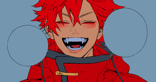
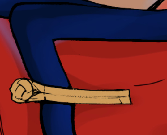
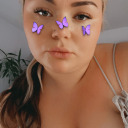
red color palette catra ❤️
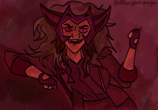
#this was supposed to just be a warm-up#but i got carried away and i love how it turned out omg#i've been messing around with this one watercolor brush#it's my favorite thing ever#catra#catra fanart#catra art#catradora#she ra and the princesses of power#spop#spop art#spop fanart#fanart#art#red color palette
76 notes
·
View notes
Text
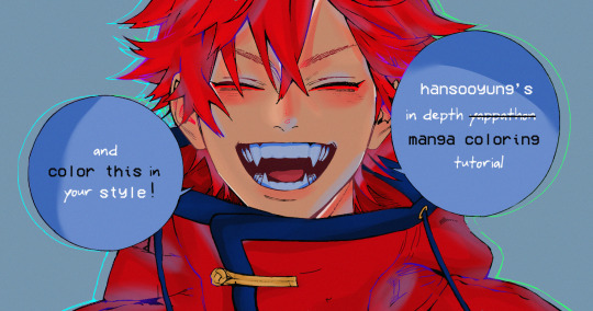
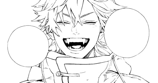
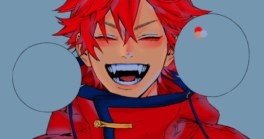
hansooyung's coloring tutorial & ctiys: alma time! 🍒
hello everyone! though i've been meaning to for a while, i've finally gotten around to making my first manga coloring tutorial! i'll be going over cleaning panels and screentones, choosing base colors, and finally shading and lighting.
this will also be a color this in your style challenge, so if you're willing, feel free to post your colored panel and tag me in it!! i'd love to see all the results :)
find details under the cut! 🦋
DISCLAIMERS:
this is just how i personally color! i know for a fact that some of my other friends follow other methods and have such beautiful colorings <33
for colors specifically, i play around a LOT. if you don't like your color scheme for the time being, mess around with it! i don't use psds since i like to mess around by hand with color palettes, but maybe i'll look into it for the future.
i explain a lot just bear with me gang 🙏
TECHNICAL STUFF:
software: ibis paint x (on iphone). i use ibis since it is FREE for all phones and it worked on my chromebook as well.
while this tutorial is made for ibis paint x, everything works on other softwares except the brushes, which i've provided alternatives for below.
brushes: i will be using dip pen (hard) which is automatically included with ibis, and two other brushes i made myself which you can find here and here. for more brushes, @/bkdkdh was incredibly helpful and posted her awesome set here!
for other softwares, you can use similar brushes. dip pen (hard) can just be the default brush, while wet edges is just the default brush on lowered opacity (and more of a rectangle/marker shape?). watercolor pencil is a watercolor brush in the rectangle/marker shape as well. if you can't get the shape, you can always smudge your lines into shape as well, so don't fret too much! a bunch of people only use one brush for coloring everything (which is insane to me, personally, they are so talented!)
fun fact: the first brush listed that i made was originally called "aki tao watercolor smooth" 👍
ok here we go guys!!
STEP ONE: CLEANING THE PANEL
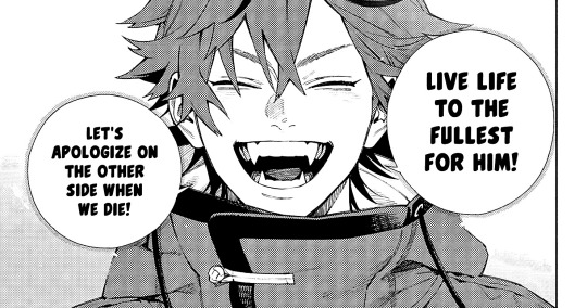
i think of this part as setting up the panel for coloring! usually it's pretty exhausting cuz it's all b&w but it's all worth it i swear. the panel i'll be coloring is this beautiful one of alma from chapter 2:
imgur link here (x)
a lot of people redraw their lines to avoid screentones, which is extremely helpful. however, i work on a phone and my fingers are not steady even with the stabilizer turned all the way up T~T. i do it this way, but a different (possibly easier) way may work for you!!!
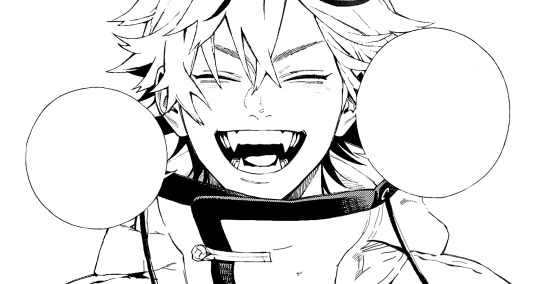
your first step will be to remove all the white, giving us a transparent background to work with. THIS IS THE NUMBER ONE REASON WHY I USE IBIS PAINT X.
when you upload the image to ibis, a popup comes asking if you would like to "extract line drawing". this creates a lineart of your image. click yes, and your work is like 90% done.
if you're not on ibis, you can redraw your panel, put lineart layer on screen, etc. or you can just extract line drawing from ibis and upload to software of your choice
for those of you not on ibis, i've included the line drawing here (x) if it looks black, don't worry and set your background to white.
omg i was not kidding when i said i explained a lot. ok now onto the three main steps of cleaning the panel:
cleaning background
removing screentones
repainting black lines
for cleaning the background, we're going to clear off all the extraneous stuff. this includes the text in the speech bubble, the gradient screentones behind alma, and the panel line on the left side. just use your eraser tool and go crazy! (i forgot to save the panel at this point of the coloring OTL)
for removing screentones, we're going to remove all those "dots" that mangakas use for shading. these are used to show value for b&w art, but since we're coloring we don't need them—a lot of people have really cool ways of incorporating screentones in their colorings though, and it looks amazing! i used it on nana's hand in my bnha coloring.
remove the screentones from alma's hair and jacket with your eraser tool. this will take time, but it's worth it in the end!
for portions with a bunch of lines, you can create A NEW LAYER and redraw some of the lines. that way, you can erase indiscriminately from the original layer but the lines you drew are still there. again, like i said, my hand is really shaky so i don't do it a lot, but it's extremely helpful for smaller parts where i have control! i used this on alma's jacket, and here's a screenshot of the process:

(i made his jacket purple so i could distinguish between layers easily).
it should look like this when you're done:
for the final step of cleaning, i like to erase all the things colored black (the collar and strings of the jacket, along with the back part of his hair). that way, i can color them in with dark colors and it adds to the whole look of the coloring.
i've circled the parts i'm going to erase below:

and it should look like this when you're done!
ok everyone cheer we're ready to color now!!!!
STEP TWO: BASE COLORS
CROWD CHEERS ok lets go!
this part is the most important to me, because it sets the tone for the whole coloring. i like to use three-four main colors in my colorings, and it's usually background, skintone, hair, and the secret fourth color. the secret fourth color is usually whatever color fits the character's vibe, or if the character's color is the bg, it'll be an accent color.
for example, with my nagi coloring, i used white for the hair, i had my skintone, i had blue as the main coloring vibe (as nagi's color), and black as the accent color.
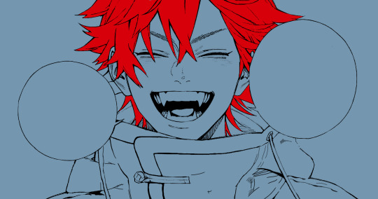
for alma, i chose his main color to be red! it's the color of his hair and his jacket, so i wanted it to be vibrant and stand out. since blue contrasts red, i went for a greyish-blue shade for the background. (i went for grey rather than solely blue because then it would clash rather than complement).
disclaimer please please please take your device off night mode warm mode f.lux whatever you have. this has screwed me over more times than you may think :(
i like to make my vibrant colors closer to the right end of the color square. for alma's hair, i chose this color:

i dragged it down from the corner a bit but kept the saturation since his hair is kind of dark. we can use vibrant colors to shade it though, so don't worry!
here's his hair and the background together:
now from here, play around with skintones until you find one that matches the hair!
i usually drag around the wheel to the orange-red intersection, and have it on the lighter, more saturated side. here's the color i chose for alma's skintone.
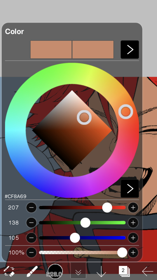
i thought his original skintone looked a bit too orange, so i pulled the saturation back a little bit (moved closer to the left side of the square).
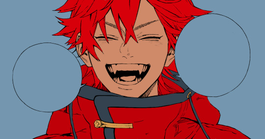
after that, color in his jacket with a bit darker red than hair, choose a gold color for the accents on his jacket, and color in the black parts with a grey-ish color (we will change that later).
here's the base colors!
if it looks a bit bright, don't worry! we can change that with shading. or you might just have to. accept the light.
STEP THREE: SHADING AND LIGHTING
wooo we made it!!!!!!! ok now i lied, we have a bit more of base colors to go. on a layer above the skin, color in your teeth and tongue. for pieces that have a more red feel (like this one), i like to make the teeth and the shading a more vibrant blue color. (for blue pieces, i make it a purple!).
IMPORTANT NOTE: ALL SHADING AND ALL COLORS SHOULD BE DONE ON NEW, CLIPPED LAYER.

i'll then go in and do some light shading with my wet edges brush. i'll use a darker color for hard shadows and then a lighter, more vibrant color to accentuate it.
next up we have blush! a lot of people do this in very different ways but i like to do it directly under the eyes, in a vibrant red shade. make a new layer above the skin and clip it on. color pick alma's hair and drag it to the most saturated shade (red corner). then using the watercolor pencil brush, lower the opacity of the brush and drag a line under the eyes on both sides.
make sure to erase the portion of blush that goes above the eyeline. i also added some lips for alma as you can see, and then added a red line under the eyes! this was back to the regular dip pen (hard) brush on 100% opacity. it may take a few tries to get your blush to the way you want it, so don't worry too much.
now we can start our actual shading!
i break this part up into three steps: skin shading, blue shading, and light shading (highlights?)
for all of them, think about where the light is falling and how it will look on alma.
quick interlude about brushes: i use the watercolor pencil brush for softer, bouncy looks (like blush and noses) and i use the wet edges brush for more hard lines in shading.
again, make a new layer above the skin and clip it on. (i like to have it below the blush, so it doesn't cover it). for skin shading, i take the vibrant red and lower the opacity of the wet edges brush by a significant amount (specifics don't really matter, as long as you're happy with it). i'll trace his neck, from the shadow of his face, shadows of his hair falling on his face, ears, and nose. (for the nose i used the watercolor pencil brush for a softer look).

this is what i have once i'm done!
next we have skin shading part two, where we basically make a new layer on top of our first shading, lower the opacity further, and trace outside whatever we just did to blend it in more.

i used the watercolor pencil brush since it's more softer shading meant for blending! i also added it around the eyebrows for depth.
next up we have our blue shading! this is a technique that i learned from @/bkdkdh's colorings, but adding blue as a shadow really adds to the whole coloring. using the watercolor pencil brush, select a light-ish blue shade (a bit more saturated than background color) and use it to shadow a few more areas than your skin shading. i always make sure to hit the underside of the nose, cuz i think it adds depth!
finally, to wrap up our skin shading we have our lights. i use an orange-ish yellow color, which i set pretty light to not blend into the skin. using the watercolor pencil brush, i'll basically highlight any areas opposite to where the blue was, and highlight different parts. i always highlight one side of the nose as well.
i erased the line around the nose since we now have shading there, and added a darker shade to the teeth since i felt it wasn't shaded enough.
now onto the hair!!! (guys we're almost done bear with me, skin and hair are the two main things and then you can half-ass the clothes)
color pick alma's hair color, then drag the red a bit further down to get a darker yet still saturated color. here's mine:

then, using the wet edges brush, draw lines of shadow wherever clumps of his hair fall or overlap with each other. you can have the opacity set to whatever level you want, i just went with around 90. just try to follow the natural lines and patterns of the original line drawing, and everything should work out fine.

here's how mine looks! then, just like we did for skin shading, place a layer on top and lower the opacity to around 50%. place some more shading to blend it in. you can also shade more parts with this shade for some softer shading. i actually forgot to take a screenshot of this step but you'll see it in the next one!
for our (almost) last part of hair shading, take a layer and place it below both of your shading layers. this is going to be our highlight layer! you can see it below, labeled 49%.

remember how we set alma's hair a bit darker from the corner color? now select that corner color and draw highlights in the center of each hair clump.

lightly visible but it's there!
now here i skipped around a bit bc i was having fun and forgot i was doing a tutorial, but repeat the shading (not highlighting) steps with darker colors for alma's jacket. you should have your base layer, a dark shading, and a softer shading for blending.
we're almost there guys!!!
for the pretty much final step of shading, select a light blue color and do some blue shading with the watercolor pencil brush opposite to wherever your darker shading falls (just like we did on the face). make sure to do it to both your hair and your jacket! here's mine:
now for the black portions, we're going to color the whole thing in a dark blue color. just alpha lock your layer and make a big stroke of dark blue, almost black. for our black shading, we're actually going to go lighter.
select a lighter (but still dark) color and place highlights on the base layer, then take an even more vibrant, lighter blue and place it on the very outside for highlights. a better example of this would be nagi's legs in his blue lock uniform here. then, choose a shade to apply shading to the gold accents on alma's jacket and we're done!
CROWD CHEERS!!!!!
STEP FOUR: FINISHING TOUCHES
we made it guys!!!! for finishing touches, i'll usually do background effects or text or that kind of stuff.
step one is coloring your lines. you can add a new layer and clip it to your lineart, or simply alpha lock your lineart and color directly on top. for hair i like to add vibrant blue/purple lines, along with a few red ones. for skin lines i try to do dark brownish purples, but leaving some black is good too bc it adds flavor!
i colored in the text boxes and added shadows using the wet edge feature, then added some text. for the glitch effect, i duplicated the lineart, dragged the layer below all of my colors (including speech bubbles) and then used the glitch effect with height full from ibis. if you don't have ibis, you can look into features on your software, or you can also just drag your lineart layer a bit to either side and color it in. i also applied just the tiniest bit of noise on top of everything
and there we go!!!!! we made it to the end :)
if you've read all the way til here, thank you so much! if you decide to color this panel of alma (or any other panels!) don't be afraid to post them and tag me for a color this in your style type of thing! (you can also put it in my tracked tag, #user.roy) i'd love to see everyone's works :)
here's the full timelapse: (it stalls for a bit at some times but hey we can't have everything)
#roy colors#tutorials#manga coloring tutorial#useraki#usergojoana#usermica#usernikiforova#tagging some friends <3#alma#gokurakugai
56 notes
·
View notes
Text
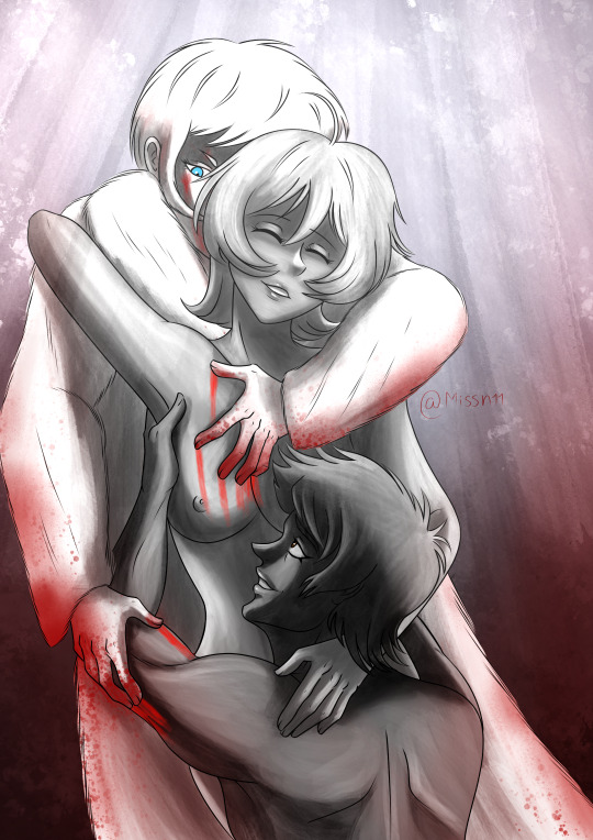
She was their Deity
"Like a deity, Miki is what keeps Akira and Ryo going, it is what makes her love and hate them both for all eternity. Because to them now, she is nothing but a symbol to fight wars over. A saintly love without flaws and a deep regret that’ll never truly be forgiven. Because Miki will never be allowed to be a human being in their eyes again, for in their eyes and through her end, she has become divine."
Okay so I've finally gotten around to watching Devilman Crybaby, and I don't hate it, I actually like it a lot more than I thought I would despite its flaws and oh boy are there some flawwsss (holy shit they did Sirene so fucking dirty in this series!!! Worse part of crybaby for real) and I can't say I was 100% fond of how they depict Ryo (before going into this series I did headcanon that they were portraying Ryo/Satan as someone who had lived in such a warlike mindset for so long he couldn't get out of it even when he thought he was human, and thus couldn't live in peace, Akira was the only thing that gave him peace but he couldn't admit it, if he admits love exists and thus sorrow exists and that'll slow him down from doing what needs to be done. Maybe I'm just coping but whatever it works for me, and if that was what the creators were going for then they needed to make it more clear and have more eps cause the break neck speed this series had really hurt it! But I have to say the last four eps were really good and ep 9 and 10 really brought me to tears like damn the series had good bones it just needed more time!😭Also I needed more Zennon pleasseeeee!
Crybaby really made Miki an almost saintly character and while I do like that she ultimately helped Akira by inspiring every devilman to come out and fight for humanity, I do miss her feisty side and her being just a normal teenage girl being unfairly murdered all because Akira had lived with her family and how society tends to punish women especially teenage girls who are barely involved more harshly than the people directly involved. But whatever those are different takes and honestly both are good but ya know personal preferences and hey since I like to play with time loops in my AUs its one of those possible things (tho I will say that my crybaby verse is much more edited and Sirene has pretty much the same motives and arc as she did in the manga and ova cause woww nope not having what happened crybaby)
But more nice things I will say about the series, I really love the music, it is amazing and also I love the intro so much, I've been listening to it a lot and I try to watch it when I watched the next ep! I love the ink blotty look to it and the symbolism!And that's what lead me to make this picture, cause yes my ot3 exist even in my crybaby verse, but oh boy is it messy!XD Since Miki is pretty saintly in crybaby, I wouldn't be surprised that Akira and Ryo would come to see her as a saint after her death, Akira mourning her loss and Ryo regretting letting her die. So I did some grayscale shading with the watercolor brush in procreate and it was fun to mess around outside my usual style and yes I gave Ryo his sideburns, he needed them back! XD it was fun to play around with my style and maybe I'll do something like this again sometime, maybe not crybaby related tho.
Btw if you like what you see and want a commission drop me a direct message on tumblr, instagram, a note on deviantart or artistree https://artistree.io/missn11
youtube
#devilman#devilman fanart#devilman art#my art#fanart#digital art#akira fudo devilman#akira fudo#digital fanart#devilman crybaby#devilman crybaby fanart#devilman crybaby art#ryo asuka devilman#ryo asuka#miki makimura#devilman miki#miki makimura devilman#akira/miki/ryo#blood#nudity#video#my video#speed paint#my speedpaint#artists on tumblr#procreate#procreate fanart#procreate art#Youtube
14 notes
·
View notes
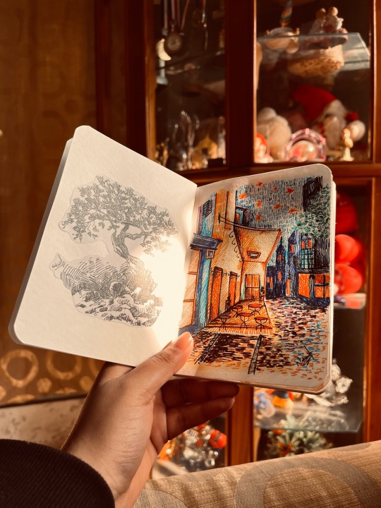
Text
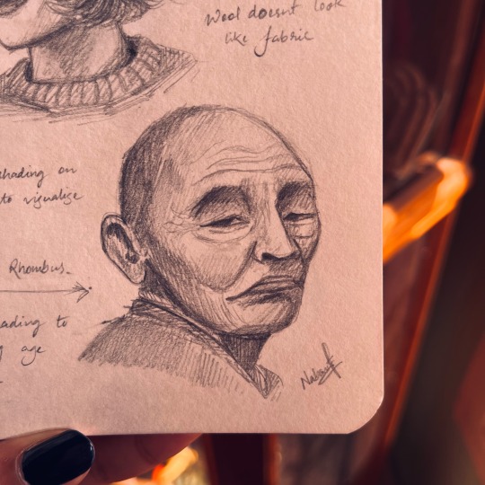


I've been doing digital art for almost 2 years now, with little to no practice on actual paper for these 2 years, and that got me thinking did I Lose my touch with traditional art, Haven't picked up an actual paint brush in so long. Its easy to get lost in the vast possibilities that digital painting softwares offer, ranging from hundreds of brush textures, to tools to make your shaky lines smooth, making the perfect circles, filing a solid colour in an instant.
Where you absolutely dont have to wait for your oils or watercolor to dry up before going for the next layer, and most importantly no need to spend dollars on art supplies and if you make any mistake the undo option is always there for you.
It did make painting easier in a way, but it also comes with its own cons, when I started digital painting I felt like I had to learn from scratch how to use the particular software, and had to learn to paint all over again. Tho it catches up quick but still figuering out how to use each tool, how all the functions, brushes, layers, blend modes work. It does take some time.
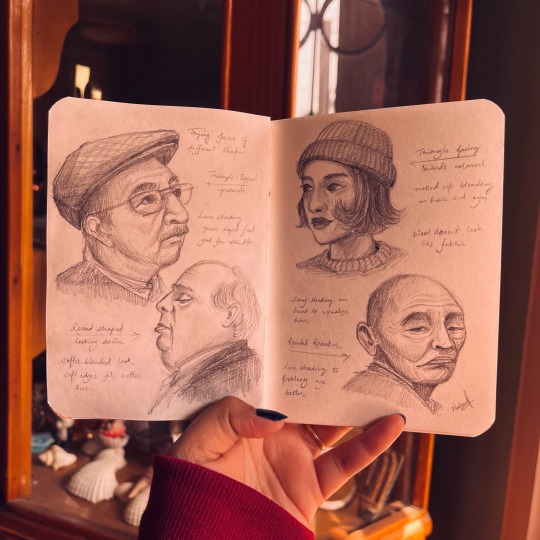
Nevertheless I ventured from my point, so since I've been painting dgitally for 2 years I figured its time to indulge in some traditional work, touch base and see If im still worthy.
I tried painting a couple of small canvas and got stuck figuring out what to draw, to have the exact outcome planned out because if I decide halfway through coloring my background that I dont like how it looks, I dont have a ctrl Z to help me this time, I'll have to paint over the whole thing and start from scratch. Painting on the canvas directly is a commitment and theres a looming pressure that the outcome should look beautiful and completed, and I already have enough anxiety, not really excited about been anxious about the thing i love.
One warm afternoon I picked up a tiny notebook I had, bought it on a whim last year and it has been sitting on my shelf since then, its a 4"x4" pocket notebook with decent paper quality, perfect to try out the random black gel pen I found lying around. And I got to it, found a cozy warm place and made a small pen sketch of a tree. The texture looked nice, i did mess up a couple timeson the leaves but since its just a disposable paper I didnt worry much on it, just covered it up with more scriblings. It felt pretty good, ad I realised with digital art the one thing I'm missing is customisign how I organise and decorate my work collection.
With digital software all your art is stored as mere .png or .jpg or whichever format you prefer, but thats it, its just a photo album, unlike a sketchbook where you can decorate the cover, add a couple of sticker or notes to it, stick a dried flower you found, or just about anything creative.
The overall feel of a sketchbook is entirely different and I dont have to worry about each page looking like a finished work.
I love painting digitally but painting on a sketchbook is almost nostalgic, so I finally started one.
Got myself a small A6 sketcbook with a pretty floral cover,cut out the pen sketch i did and glued it on the first page, and thus started to fill each page with totally random unrelated paintings.
So anyway this was a lengthy way to tell you how painting on a sketchbook somehow made me improve my art, and felt incredibly amazing, tho I've completed just couple pages, each page looks beatifull in its own way, and i got to try out a couple of pens, and paints that I havnt used in so long.
got to try doing simple portraits, tried to double tap multiple times on the page (stupid muscle memory).
so anyway here are a few pages that I have completed, and if you did read till the end, thanks for bearing with the (rant)?
#artists on tumblr#artwork#illustration#art#drawing#ink art#mini sketchbook#sketchbook tour#sketchblog#painting#portrait#portrait study#graphite sketch#rant post#personal rant#traditional art#tradiotional art#creative inspiration#how to draw#art tips#classical art#i wrote something#i drew something#goth#dark core gothique#cottage core#dark academia#dark aesthetic
5 notes
·
View notes
Note
I need to get this off my chest because I see it everywhere BUT.
There's no right or wrong way to do art (with some exceptions. For example, please don't use watercolor brushes with acrylic paints, it will probably mess up your brushes. Even then if you do it I'm not gonna be a dick about it because it's frankly none of my business). I'm tired of people acting like there is. Giving tips is all fine and dandy but for the love of god do not tell people they're drawing wrong. What might work for one person won't for another. Like I saw a tiktok once that was like "if you use shapes to map out bodies, YOU'RE DRAWING WRONG" and I was like just because it doesn't work for you doesn't mean it won't for another person??? Like it doesn't really work for me personally, but I'm not gonna tell someone who does do it that they're drawing wrong because I don't personally do it.
Additionally, artists do NOT need to improve their art if they don't want to. My art has been relatively stagnant for probably around a year or two and any improvement I've made has been as a result of how much I draw and not because I'm actively trying to improve.
Basically. Hot take: there's no right or wrong way to do art and you shouldn't feel pressured to improve if you don't want to. Give tips but don't say that your tips are objectively better ways of drawing because just because they work for you doesn't mean they will for someone else and it is hella toxic to act like your way of drawing is the only correct way to draw.
Also sorry for how long this is asadjkdfshf
No, don't apologise!
I think you're absolutely right -
I'm not going to say that there aren't fundamentals that are important to improve as an artist - art is a practical skill that is then used as a form of self-expression - and sharing advice on how to improve those foundational skills is absolutely fine! So yeah, like you say, it's not the advice itself, it's usually how it's delivered.
Getting advice from someone who's more experienced than you is usually super useful, but acting like the way you draw is the 'correct' way not only makes you look massively self-centred - since there's always going to be someone out there better than you - but you're also actively trying to tell other people that the way the method they use to express themselves is wrong; people have different styles, that's what makes art wonderful. And besides, people aren't going to listen to you more just because you made them feel like shit first.
And yeah, no one has an obligation to improve their art - to tell a complete stranger that they're not a real artist because you've decided their art isn't good enough and needs to be improved just seems so sad and pointless? It would be like if I eavesdropped on your phone conversation on the train and then tapped you on the shoulder so I could correct your grammar. If you're an experienced artist who wants to give advice online, you absolutely should! But remember that if someone wants that advice they're going to come to you - otherwise, just leave them alone.
tl;dr - fuck Dali's pretentious ass, draw however you like! One thing will work for one person, another will work for someone else, but they both still work. So I'm not sure what the issue is.
That applies to a lot of the hot takes on this blog as well - the fact you guys refuse to bite ice cream is wild to me, but I'm not gonna gatekeep the way you eat your sundae. Lick it, snort it, drink it through a straw, unhinge your jaw like a boa constrictor and swallow it whole! However you choose to do it, we both get to enjoy ice cream, so everyone wins! And, if you don't like ice cream, I'll eat yours as well, so double win for me, and then we'll order pizza when we get home and I'll let you have the bigger half.
To be honest, I'm not an artist in any way, so I'm probably not the right person to ask. If someone else who knows more about this than I do wants to share their own thoughts on this, I'd really appreciate it! <3
18 notes
·
View notes
Text
Been trying to get back into watercolors.
Even though I don't really have watercolor paper. LOL Actually, I think I have a pad of watercolor paper, but I'm not sure where to dig around in my room for it. Or maybe it's in storage; not sure. But either way, I've always been too anxious to be anything less than stingy with art materials. It was a real problem in painting class, when everyone kept telling me that I don't mix enough of the paint colors that I need. But I just couldn't stand the idea of throwing it out at the end of class. And even though I've switched to alcohol markers, I'm still too nervous to use expensive paper like watercolor paper. When I'm too afraid to mess up with expensive supplies, I end up drawing nothing, for months and years. Though, it is strange that I have no problem using Copic markers and other artist markers, though on cheaper paper. Maybe it's because I almost always get my markers on sale at anime/comic book conventions. Never pay $8 for one Copic marker, when convention booths will usually have them for $5 each.
Been making some notes during these past few days, while experimenting with getting back into watercolor painting:
5/12/2023. Tried to make intentionally messy, to differentiate from marker coloring. I wanted this to be obviously watercolors, to make switching from my usual markers medium, worthwhile.
5/12/2023. Still practicing watercolors, so tried doing my final linework as only pencil. Sometimes I wonder if the softness of pencil fits better with watercolors. I still want to differentiate my watercolors from my marker/ink drawings. So I tried some wet-on-wet techniques and allowed a lot of messy imperfections.
5/14/2023. I know I should have stuck to my usual Copic markers, since I was short on time. But it’s been a long time since I’ve done referential drawing, and I wanted the pencil’s ability to erase mistakes. Also, I’ve recently been experimenting with trying watercolors again. Back before markers, I primarily used watercolors. (Then again, back then I also had sketchbook paper thick enough to handle watercolors, and that’s not really the case anymore.) I may be comfortable with alcohol markers and ink pens now, but I keep wondering if something good might come of me returning to watercolor painting. Maybe it would look nice to color more organically, and allow some loose messiness, the way watercolors are often afforded. Maybe that type of style could really work for me. So I’m trying watercolors again.
Today reminded me how much I love drybrush, when I use brush pens—even though I haven’t gotten the hang of setting up that technique with a paintbrush yet. So I might practice more drybrush with watercolor paintbrushes.
5/18/2023. My last watercolor drawing reminded me that I could use drybrush with watercolors, to mimic the feeling of using brushpens, which I love. So I did a lot of hatchlines, like I would do with my usual pen/ink drawings. I actually wanted to do more sharp detail, but needing lighter colors for those details necessitated more water, which made the brush tip less tapered, so those smaller details I wanted, ended up broader and messier. But didn't I recently get back into watercolors, wanting to differentiate them from my pen/ink drawings? And I determined that allowing watercolors to be messy and looser (since people usually afford/expect that from watercolors) would be how I would differentiate my watercolors from my marker drawings? Then again, I had been wanting for a long time to find a way to break out of my hyperfocus on one medium at a time. If I could switch to dip pen in the middle of a watercolor painting, maybe that will bring me closer to mixing color pencils on top of marker drawings, or mixing pastels on top of marker ink, and just mixing more mediums. I want to be able to use the mediums to achieve the effects I need in each case, but I keep unconsciously locking myself in to only one medium at a time. But if dip pens make my watercolors too precise and erases that lovely, organic, messy looseness, then what's the point of me going back to watercolors from alcohol markers? Hmmm….We'll see what happens.
2 notes
·
View notes
Text
Today has been a day 🫠 I've been without internet almost the entire time. I finally got it back around 8:45PM-ish. (I don't know what's going on in my area. I guess the storms here in Cali have really messed things up 🤷🏻♀️)
I spent the entire day trying to complete chores and get together missing art supplies. I also seem to have gotten sick? So, been dealing with that. 🤒🤧
I mentioned in my last post I wanted to pull together a couple watercolor glasses and petri dishes. Well I found the perfect things!
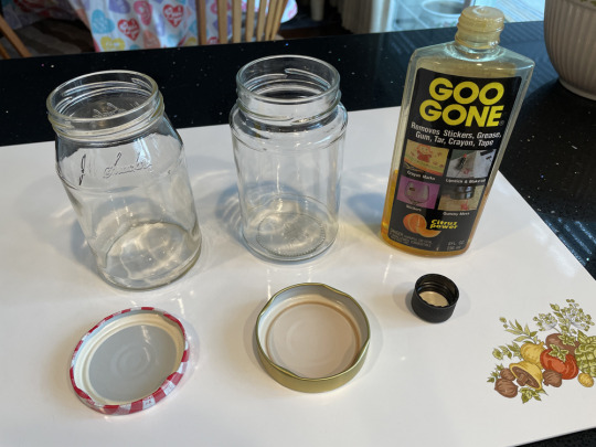
Jam jars! Typically we clean them out after we use everything in them and in this case I just had to use some goo gone to remove the labels, and viola!
The lids will be the make-shift petri dishes, and well... the jars are obviously for the water. I'm happy with this find, I don't need to go buy anything or use anything fancy 👍🏻
And because I'm feeling insanely dizzy with vertigo and drinking ginger tea up the yin yang to combat my nausea- I didn't feel like beginning any "projects". So I just started working on a palette sheet of my colored pencils. This is a "must have" anyways, imo. Most artists will suggest you have one and I wanted to test out my new pencil extenders.
(I washi taped it down because I was intending to use solvent on parts and then decided not to 🙃)
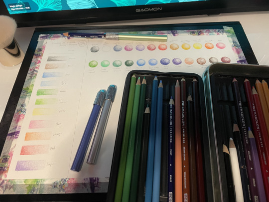
These extenders are awesome! But if you tighten them too much, they dig into your pencil's wood, so watch out for that...
Oh and I have this body kabuki brush I bought last summer, or the summer before that, but never used it. Now I'm using that for my "eraser brush" to brush away eraser particles off my paper (and any other particles) 😄. I'm just reusing all the things I can find lol.
The Kabuki is here: https://colourpop.com/products/body-kabuki
The Pencil extenders are here: https://a.co/d/gdCgfbr
I'm sure you can get a cheaper brush from the dollar store or something, but I mean... that's an option if anyone is interested 🤷🏻♀️
My finished palette sheet of the Snoopy Pencils, the 24 Prismacolor Pencil Set, and the 11 Piece (8 Pencils) Faber-Castell Pitt Graphite Matt Set. 👇🏻
Colors are highly likely to be distorted from my camera phone though + lighting in my room + my walls being red.
But you can get an idea at least.
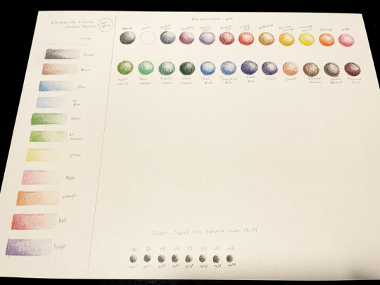
I feel like the snoopy pencils had a lot of grit in them... and they colored very lightly. It's no wonder why prismacolor is the favorite choice when it comes to colored pencils.
I have another set of colored pencils but I have the palette already done for them and they're in a tin. I didn't take a photo 🙃
They're kinda cheapy pencils also and they break easily down the center of the wood. I don't recommend lol 😅
(If this post is incoherent in some parts, it's cause I'm sick and I apologize lol. I don't know how derpy I am atm 🫠)
0 notes
Note
i’ve been following your art since you were vinnybox02 (you’ve improved SO MUCH BTW. not enough people say this!!) and seeing you grow has made me really interested in some of the ways you colour stuff!
two things i want to ask are:
1 - how you do the watercolour texture! is it a brush or are you using a technique?
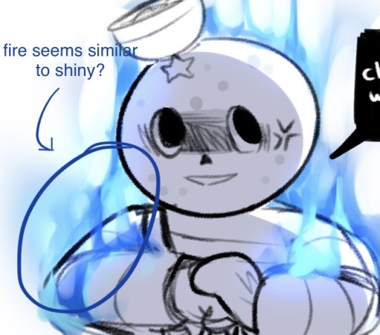
2 - how you do lighting on shiny clothes (spandex, etc) and fire, i’m guessing they’re done the same way cause i noticed a bUnch of similarity between the way you draw fire and light on certain clothes.
you’re one of my biggest inspos and just making you know how much i adore your art is enough for me. :]
aaAAAAAAAAAAAA!! HELLO! haha yes it's been a long journey!! :D Im happy to be an inspiration to you!! .·´¯`(>▂<)´¯`·. <3 Im glad you like how I color some stuff! :D I honestly mostly just kind of mess around until things look good HGDSHDJ
but!! Here's the general process of how I go about the stuff you mentioned! tysm for asking! I've been waiting to answer these kinda questions FOREVER
These can be applied in both CSP and SAI since tbh I still prefer SAI when doing watercolor style coloring since it feels simpler to me
Tutorials undercut! :]
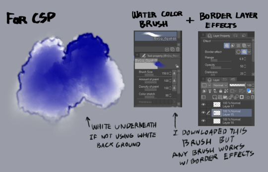
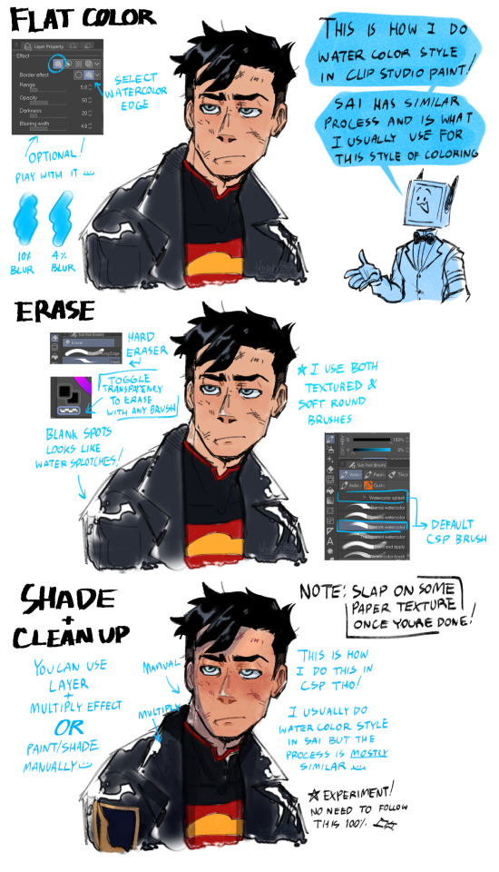
Most of this Watercolor style I learned is from this post! I just applied my own lazy ways to achieve a somewhat nice look DFSGHDS But here are two watercolor pieces drawn in SAI and CSP to compare!
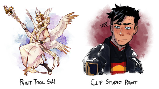
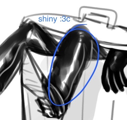
As for the shiny parts and flames!


Hopefully these are helpful! <3 <3 <3
Not gonna deny how lazy I am when it comes to art, so I almost always cut corners if I can, and there's nothing wrong with making your process a little easier/simpler 👌 As long as it works for you, keep doing it!
This is how I go about things, but one thing I will always say is studying from real life or photos or referencing will always be helpful when drawing! Experimenting helps you find what works best for you!
#ask#ask vinny#art process#art tutorial#vinny tutorials#kadennotmain#long answer#yakuza#Goro Majima#Majima#Kon-El#Superboy#furry
197 notes
·
View notes
Note
Hello!
I see request are open so may i request for headcannons for Felix with an artist!s/o
or a oneshot where Felix becomes a muse (aka inspiration) for whatever they're drawing or painting
no pressure!
dhfkdhkdhfghfgh I've been a wannabe artist for so long this is so cute akfhkehfksgjdfkhgkdgh
Also "or"? More like an "and" ill do both.
(Long post warning)
-C'mon felix is a nerd, a bookworm, and canonically a theatre kid what makes you think he isn't an art nerd
-Even if he doesn't have quite a art skills himself (the last time he touched a box of watercolors he painted his bedsheets more than he painted on the paper) he still has a deep appreciation for art and there's many expensive paintings hung around in their manor.
-You cannot tell me he doesn't have at least one goth painting hung as a display somewhere around his room
-If you're an art student, he's pretty interested in the things you have to tell about what you learned there. Art is a lot more than just drawing and painting, it's culture. It's history. He wants to know more about your culture.
-Teach him art! He'll be more than glad to finally improve his skills after perhaps having given up long ago.
-With every technique you're teaching him there's always some old fun memory that comes up to share. Laughing together. Felix talks about how Scylla wouldn't let him hear the end of it when he messed up his bedroom for an umpeenth time trying to 'perfect his skills in watercolor'. You watch him struggle with a particular technique and remember how long it took you to master it. You both realise that there's so many stories about each other that you don't know about yet and there's so much left to learn.
-Let me just imagine a picture of child felix sitting in a mess of watercolors with his hands the color of the rainbow. There's a little color mark on his nose and cheeks dhfkadshakha
-Has books about the history and culture in Astarea, tells you all about the famous era-defining paintings and artists.
-ART GALLERY DATE I REPEAT ART GALLERY DATE.
-If you've never gone to art school and self-taught yourself art, Felix is in awe.
-How. How are you so skilled?
-"It seems that I am not the only 'prodigy' in this room. You are a prodigy in art, just as much as I was in magic."
-He is a rich boy any art supply you want you'll get before you've finished asking for it.
-The way he looks at you when you're super concentrated on your current piece. He's paying full attention to every stroke you make. He's paying attention to the way you pause for a moment to brush back your hair. He's paying attention. He's paying attention and he's lovestruck.
-He will never tire of watching you work and do what you love.
-Make an art piece specially for him. Gift it to him. He will cry.
----------------------------------------------------------------
-"Woah, this is beautiful" Even if you wanted to say something humorous, or witty, or something that could just capture the pure awe you were feeling right now, you couldn't. Your breath was caught in your mouth.
Felix didn't even attempt to hide his smirk, satisfied that you loved this sight as much as he hoped you would. "I did tell you that this is one of those events I look forward to throughout the year. Papa is masterful at his gardening skills."
An assemble of flowers lay before you, in full bloom. They almost looked like tiny little lights sparkling in the sunset. The wind was cool, bright, making them sway only ever so slightly. You'd found a newfound appreciation for spring, right this moment.
"This is so peaceful."
Felix bent down only ever so slightly, moving his face closer to the bushes. "These are my personal favorites, they are called double-black hellebores." He looked up at you, expectant. "So, what do you think?"
But your priorities had changed, right this very moment. "Felix, don't move"
"Huh?"
"I need to paint this." You almost squealed with excitement. "You look absolutely ethereal."
"I'm glad you liked these flowers so much you want to paint the- Wait. Me? Did you just say you want to paint me?"
You rubbed your hands together, looking down nervously. "Umm, you don't mind right?"
"Mind? Me? WhywouldImindItotallydontmind" Felix glitched for a moment, realised he was tripping over his words so hard he might as well be speaking Vellan right now, and repeated in a coherent manner. "I was just surprised that you wanted to paint me of all things."
Clearly enjoying how flustered he got, you decided to take your chance. "Why? You're prettier than any flower over here."
-This man is redder than the sun rn fr. Make sure to have lots of red in your pallete to make a point of it.
-jk draw him pretty. And yes make a point of how pretty he is.
-Felix still decides that standing half-bent holding a flower in a bush isn't exactly the most comfortable position to pose in, so you still decide on a different pose. Now he's sitting on a bench nearby holding the black hellebore in his hand instead.
-This man doesn't move a muscle no matter how long you're taking fr. He wants you to do your absolute best and would feel guilty if you 'messed up because of him'
-It's especially hard too because the excitement of being painted by you is making him go jdbfkajsbsjvasvjbs internally. He is a mental mess rn he is the mascot of the screaming internally meme currently. He is my face when im reading fluff but my parents are in my room.
-The wind is just as cool and continues to blow just as lightly. His soft hair sways just as slightly as the other flowers in the garden. It the only thing of his that's moving right now.
-It's late in the evening and you can hear the sounds of all different kinds of birds chirping as they make their way home. It's getting dark so you decide to speed up a bit or you'll be having trouble completing it when the light's too dim.
-Felix doesn't know where to look so he just kind of decides to have a staring competition with the flower in his hand. He does that for quite a while until he finds himself wondering if you're done yet and shifts his gaze slightly to look at you.
-Unfortunately for him, your eyes meet.
-It's taking him everything to not get flustered and change his expression, posture, anything.
-You smile. "It's okay, you can relax. I'm done now."
-He does a little stretch of relief before getting up. "Boy, it was getting stiff."
-One look at your painting, and the past whatver-amount-of-hours he was sitting are suddenly worth it
-"This is so..." Felix was at a loss for words. "I've never had anyone paint me so.."
-"Handsome? Pretty? Cute? I worked hard to make it extra good. I really wanted to convey accurately how you look like, to me."
"Is... this how I look like, to you?"
"Well, I could work a bit on the angling, and i guess I messed the hair up a little and-"
"It's perfect." And he tackles you into a hug hkjfkjdfkjgbfdk
-That portrait will remain with him till the end of time i tell you.
-At some point when he's confident enough in his own art skills he'll offer to draw you too. He's probably going to take a lot of time 'because he really wants to convey how beautiful you look to him.' and he'll probably mess up because he was trying to be too perfectionistic BUT HES TRYING HIS BEST HES TRYING HIS BEST YOU HEAR ME? :(
DGUASKBKGJ THIS TURNED OUT LONG
#fictif#last legacy#last legacy felix#felix iskandar escellun#fictif felix#fictif last legacy#rime solano varela#sage lesath#anisa anka#fictif nix hydra#ask#last legacy request#asks
66 notes
·
View notes
Note
hi!! i LOVE your art so much it always cheers me up to see!! what texture do you use on your coloring? its sort of like static and i love the look of it
aaa tysm!! it makes me really happy to hear that,,
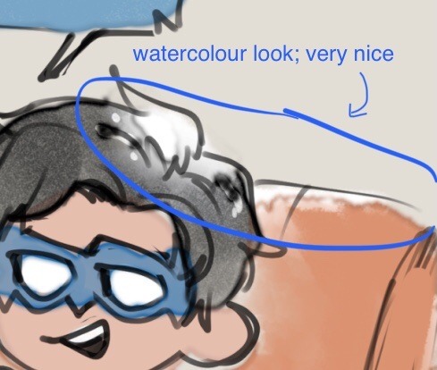
I, uh, use a bunch of different textures but the most common ones I use are Paint Tool Sai's default Watercolor B, or Paint Tool Sai 2's Watercolor 1 or 2 textures, I usually mess around with the settings to make it more intense. you'll see those textures in maybe 98% of my art
Occasionally I'll use Procreate's "noise" effect too which I find has its own nice little feel
Example of how that looks:
my coloring brushes themselves use texture too, the procreate brush I've been using recently esp for ask blog stuff has a salt watercolor texture so . all that combined i suppose creates the final static-y result !
at one point I was using the default procreate brush "fresco" to color which .. . has an idk texture it looks stone-like weirdly enough but it's what I used for the regular art in the "Puzzle" PV for example
19 notes
·
View notes
Note
i love ur colored panels so much and im considering taking it up myself 🧍🏻do u have any advice or anything :000
AUGH thank u sm🥺🥺🥺 I do all mine on ibis so like my advice might be dif than how it would be on other art programs but!
50% opacity on your shading layers (PLEASE separate the shading and base colors omg you will regret it if you don't) and use a blur tool also at 50 % (altho I do sometimes blur more or less depending, and same w layer opacity but that's normally what i do)
If you are struggling w a color palette, coolors.co will be ur best friend forever, it even has hex codes and stuff! I try and keep my color palette on the panel (altho I normally ajdjfj forget if I'm not doing one from this site but it's a godsend for blushing and stuff!)
If ur doing a chapter cover, go to the file page on the Jojo wiki and find the highest quality one! You can also like def do normal panels that way but I normally have multiple scans I check to get the best quality (I find the shonen jump app is normally the highest quality ones? Esp w smaller panels!)
Big big one (esp bc I struggle w shading), but having the official colors pulled up, it can help a lot, esp if you're staring at an area and have NO idea what the section is!
I uh? Overuse layers a lot (the foolymes one was like 50 layers before I merged) but I keep each color on a different layer so I can rly easily adjust it if I don't like it (I believe you can do this all on the same layer and select w medibang but this is what I do w ibis!) And then merge when I've finished literally everything
I normally just like use my default brush (in ibis it's Dip pen (hard)) to color and sometimes with shading I'll use a watercolor or pastel brush although I normally use the same brush for everything!
For like eyeshines and details that are painted black (ie the baseball threads on the foolymes one were black) you just add a layer on top of your panel and color over so if it messes up you can really really easily just erase it and it doesn't ruin progress!
Also for face shading I normally look at makeup contour guides! It helps to know where exactly everything goes!
Also def start w smaller panels! The chapter covers can get rly rly long and maybe a bit overwhelming so like finding a panel that's just like a face can make it a lot easier (at least from experience!)
Oh also w face shading I normally have it layered with the bottom layer being the shading, middle layer being highlight, and top being blush! I color pick from the base skin and adjust until it works right but it's also def some trial and error! I also like don't blend those layers until they're all down just to make sure I have stuff in the right place!
I don't have a like particular method to coloring overall other than I normally save the big areas for last so I can have a layer underneath and just hit it with a big brush and not have to worry about going around a million things! (I normally use the felt tip pen (hard) brush for this as it goes up to 1000 pixels!)
Shading legit is soooo important tho, like flat colors can def look good (and I do always pass my flats to a friend to make sure the colors work before I start shading, it helps to have a second pair of eyes esp when you've been working on SMTH for so long) but shading adds so much dimension and highlighting can be so so so good too! I think it just like depends on what you're going for but shading is so helpful in the long-run esp when i get the hang of it!
12 notes
·
View notes
Text
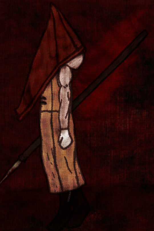
Red Angel
Posted: 07-29-2021
{more below to shorten post}
This felt like it took a long while, but i have only been working on it since the 23rd. Idk how I've done this. This is literally probably the best I've done(?) ( 0-0)
Brushes used (Oil paint, Sumi 4, and Fluffy watercolor 2) were picked by my discord server.
Originally I didn't plan for it to have a red background (i was just going to have a stone one), but I was messing around with custom noises and the colors red. I just had to keep it because it reminded me so much of some of Masahiro Ito's works i love and the use of reds.
___~___Progress___~___
It really couldn't handle the transparent ones. XD
also, i meant to say progress, but I'm too lazy to change that-

___~___Credit___~___
App used: Medibang
Drawing tablet: XP-Pen
Fandom: Silent Hill (2)
Inspiration: This tweet
#my art#corrupted nightshade's art#art#digital art#digital drawing#2021 art#red pyramid head#pyramid head#silent hill 2#tw blood#tw: blood#red pyramid thing
3 notes
·
View notes
Note
Hello there ~ Congrats on 100! 🎉💕 I'm so happy for you!! I was wondering if I could request a match up for Ikevamp. I'm fairly new to Tumblr and this is my first match up request so I'm a bit nervous since you are literally the first person I will have interacted with on here 😅 but I love your writing! If you are busy or have a lot of requests or anything please don't worry about it or overwork yourself! It's a lot of work and I totally understand!! Also edit, I'm really sorry in advance. This was way longer than I intended.
I am a bi female. I am an Aries but I am close to the cusp (April 18th). I don't typically associate myself with most Aries traits outwardly though since I am really shy and reserved, but internally I can see it as I am competitive with myself and a major perfectionist. But I'm low-key chaotic as can be like I'd identify myself as chaotic good since I'm just a mess with good intentions 😂 I am an INFP-T personality (which is scary accurate to me) if that helps any!
I am very short, only 5' tall and I am slim with overall small/petite features and frame. I have medium/dark, warmer toned brown eyes and auburn wavy/loose curly hair. I am very pale but have a lot of small freckles on my face and body. I've been told I look a lot younger than my age I think since I have a round face and am overall a small person. I'm very friendly and smile a ton but I am shy. I get big "eye smiles" whenever I smile and tend to blush a lot cause nerves. I've been told I tend to smile a lot and because I'm a shy, vv awkward person, my go to whenever I meet up with literally anyone is to smile out of nervous habit so people tend to think I'm overly friendly or approach me but in reality I'm a nervous boi.
I study landscape architecture and wildlife biology in college rn so I really love art and nature! I want to do habitat restoration after college. I especially am interested in plants and often go hiking and identify plants as well as do botanical drawings.
I am interested in both math and science as well as art. I enjoy watercolor painting as well and I am interested in illustrating children's books if landscape architecture doesn't pan out 😅
Besides that I have an obsession with extreme love for cats. I'm not ashamed to say my cat is my best friend, she is perfection 😂 I love anything living though thats not a person. Plant, animal, insect, they're all so wonderful to me and I tend to feel more comfortable around animals and nature than people.
My favorite color is a pale pink, I really love light, cutesy things. But my personal style is very retro academia. I wear a lot of clothes from the 60's and 70's or inspired by then. I really like fashion and fashion history.
My favorite food is spaghetti with just cheese. I may be an adult but oh well,, some plain ol spaghetti just hits the spot every time. I love baking and cooking though and have a sweet tooth. I used to decorate cakes in high school and I enjoy creating my own recipes and desserts.
I like to daydream, play video games, drink tea, sketch, read, and listen to music as well. I also spend a ton of time outdoors enjoying nature. I love trivial and fun facts. I want to gain as much knowledge as I can about the world.
I don't like things that are too loud I suppose. I'm a pretty easy going person but I am very nervous in crowds or places that are too loud. I'm also afraid of storms and I'm not fond of extremely dark places either. I don't like failing/faltering or embarrassing myself, especially in academics. I am extremely nervous talking to large groups or meeting new people as well, I prefer small, more personal interactions. While I enjoy talking to people it's just really hard so I don't usually unless they reach out to me first. I also hate conflict and drama (unless I'm not involved, then bring the popcorn). But any conflict is a big oof for me.
In a relationship, I really like surprise hugs and signs of affection. Sudden surprises create a sense of excitement which I really like to have. I like the idea of a relationship feeling new, passionate, and exciting, despite being together for awhile. I don't like gifts necessarily since I feel uncomfortable receiving things, I prefer sharing special memories. I'm not huge on PDA, I feel uncomfortable if someone is too clingy around others, especially my family or someone I know since my family is pretty conservative. But if we are alone, I love tons of affection and little acts of love. Hugs from behind, a small brush of our hands, holding pinkies, light kisses, and lots of smiles just make me melt, ugh tiny gestures are so cute. Communication is very important to me but not my strong suit, I tend to shy away from issues and trip over words I don't mean, but body language is very important and I think can be better for me and for my partner to understand.
I would like to be able to enjoy a comfortable silence with someone while we both read or do something while holding hands or just touching in some subtle way. I would love to be able to escape my perfectionist front that I have around others when I'm with my partner and be able to make really silly, dumb jokes and have lots of laughs. I love the idea of joking around while loosely holding each other. I present myself very seriously but I'm a big goof and rather dorky and like to have fun but romantic interactions.
Also it would be a plus if they love or at least tolerate kitty cuddles with me and my cat. My cat is such a baby, she's constantly in my lap or following me around so we are a package deal basically 😂
I'm sorry this is so long, and I hope it is enough for you as well!! Thank you so much for opening up match ups too! If you need anything else let me know! Take care of yourself and congrats!! 💕
It’s perfection don’t worry. Thank you so much for sending the request. I hope you are taking care of yourself too and everything is good.
Anyway I matched you with.....................
............Isaac
HA BET YOU DIDN’T SEE THAT ONE COMING!
oh you did?
ok I’ll stop
Isaac is a very curious person much like yourself
he loves discovering and learning new things
and that is the first thing Isaac noticed about you to be honest
sure he saw you and was like Damn she gorgeous but that was about it
however when he discovered that you are also a curious but little nervous bean he started opening up to you
neither of you like crowds and loud people who disrupt your concentration, so usually you spend your time in the library
sitting together in silence and reading
loves that your cute and blushy
even tho he’s exactly the same
as you got closer he started noticing more and more things about you
how your eyes would lit up when you passed certain plants in the garden
how you would hum to yourself and dance around thee kitchen a little when you thought nobody was looking
he loved everything about you from your adorably freckles to your reserved yet charming personality
it too him a long time to confess to you
a long time and a lot of pep talks from Leo
in the end he forgot everything Leo said and confessed to you in his own way
after that oh boy
you are the definition of inseparable
he’s new to this so you have to give him a little time to get used to it
after he’s comfortable he’s very affectionate
more in private but still
will give you surprised hugs all the time
whether it’s that he walks up behind you and hugs you while turning apple red God if Isaac was here he’d kill me for that pun or him walking and scooping you up and plopping you in his lap in the library as you both get into some book
totally gets that you don’t like going to very crowded places
BOOM your wish is my command Isaac will almost always take you to fields of beautiful flowers so you can hang out, goof around, have a picnic and the stargaze
Isaac will pull you close or just hold your hand while explaining a few things about the constellation, after you will just enjoy the silence as you bask in each others company, while gazing up at the starry sky
he holds you pinky
finds it super cute and usually blushes harder than you even though he initiated it
holding your pinky is a personal thing for him
he finds it reassuring
you’ll just be walking and all of a sudden Isaac intertwines your pinkies
he’s anxiety on legs and holding your pinky is his way to tell you that in that moment he’s scared, anxious or just extremely nervous
you usually hug him and kiss his cheek
holding your pinky can also be that he loves you and hopes he’ll be with you forever
it depends on the situation, but he likes telling you he loves you like this
he has a surprisingly good sense of humour and likes to goof around with you
loves your cat
he wasn’t much on a cat person before, but your cat likes o play with Harry and he thinks that’s really cute
all in all you guys have a really good relationship
Ok now i have to pour some water on my head
CUTENESS OVER LOAD
Lia .exe has stopped working
That’s it! I hope you enjoyed and I hope you are well! Once again thank you @uwu-catlin for the request and the compliment. Love you 3000!
#Ikemen Vampire#cybird ikemen#ikevamp+matchups#ikemen vampire match up#ikemen vampire isaac#ikemen vampire isaac x reader
10 notes
·
View notes
Text
As an early present I ended up getting a new gouache set. I've been just playing with them as I don't know what to paint but I like it. I also finally got a chance to swatch my paints and compare them. I figured I'd post here as both sets are cheap and have a low entry point for people starting. I have used professional watercolor paint before but feel it's a waste as I'm still learning and don't need that high quality yet for the price.
Pentel 18 watercolor set:
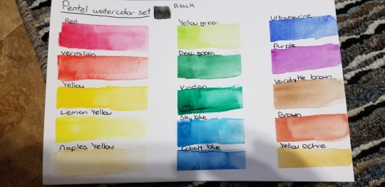
This is the one I've been playing with the longest. They're tubes whice I personally prefer but you can make pans if you want as they reactivate very nicely. The colors in the set are alright but aren't super pigmented so need a lot of layers to get deep colors. The dark greens and blues are also very simular. They don't grain up so good for smooth colors . Mixing is a bit muddy but if you take it slow you can get some good combinations. I found this works nicely on cheap paper too so if you just want to add some color to sketches go for it. Very translucent. Washes off of brushes very nicely!
Reeves 18 watercolor set:
I haven't had a long time to play with these ones yet. They're very different in feel though. The texture is more grainy but the colors far more vibrant. You get two nice shades of your primaries which is nice for mixing. The pigments cling to your brush you don't need to return as often. These paints share the same parent company as Windsor and Newton which is nice as I personally found the shades simular. I look forward to playing with these more and trying a few pieces with them.
Reeves Gouache set:
I don't have much to compare to for quality. This is my first gouache set. But can I say I love it? Very smooth, very pigmented, great color range. I really like it! It's a middle ground between watercolor and acrylic and I can't wait to use it for detail work and block in color which I think is where it'd shine. Without knowing any other brands I recommend giving this a shot if you want to try gouache.
I'm not a professional, and these are just rundowns based on my dabbling. But so far I'm happy, and think if you like to use tube colors this is a great start to your collection.
I've used the artist loft sets too and hated them so skip that. They were dry and not pigmented leaving a lot of wasted paint. They reactivate awful! I ended up having to throw a lot away.
If you like pans you'll want to shop around or make your own, I don't like the mess and having to return so I don't use them much. I know a lot of people love them though.
All sets are under $20 which if you're starting is very reasonable. You need very little so they go a long way. Watercolors and gouache reactivate so don't clean your pallets just add a drop of water and continue. Plastic pallets bead up so if you want smoother looks and for stuff to stay together use ceramic or porcelain. Synthetic brushes are a lot cheaper and cleaner but don't hold water well so you'll need to return more. Natural are more expensive and messy but hold one color and water for a lot longer making them excellent fir big areas and washes. Have fun and practice!

Made using the pental set.
7 notes
·
View notes
Last Seen Blogs
prettybxbyy
Treat People With Kindness.

otter-writes-stuff
Otter can write :|

lightandcolor-rassvet-blog
L AND C
sophianell
Life.
gregorygalloway
Gregory Galloway