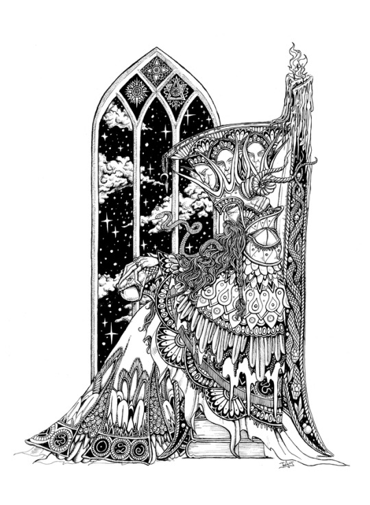
#i wanna do some more things in art nouveau. it's a fun style
Text
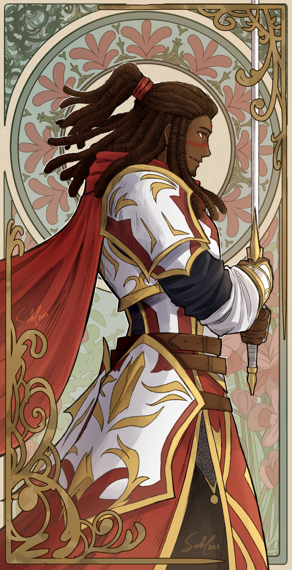
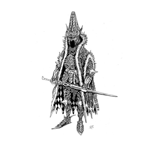
A Paladin in Art Nouveau.
#i wanna do some more things in art nouveau. it's a fun style#dnd#dungeons and dragons#oc#original character#art#artwork#medieval fantasy#paladin#dnd paladin#armour#art nouveau#knights#dnd5e#aasimar#aesthetic#aasimar paladin#my art#my artwork#dreamerx86
2K notes
·
View notes
Text

An update to this post !
Part 2 to my little collection of redesigns, now including more characters! While I already have done more detailed redesigns for Ubercorn and Glitch, as well as creating a humanoid form for JetPad’s AI, I wanted to include them all in this set, with a few little changes to boot ! While Jett looks mostly the same, Glitch has no helmet, as to show off the hairstyle I gave him ! I imagine that he’s got a bald spot at the back, which he is very embarrassed about. As for Ubercorn, you may have noticed, he’s human !! I’ve wanted to design a human Ubercorn for a while, and this felt like a fun opportunity to draw one, even if it’s simple. I won’t go too far into detail, but I do wanna mention that the streaks in the hair come from @edibleartsncraftz who made a human design based off my Ubercorn redesign on instagram a while back! If you want to know other things about my personally design process for my human Ubercorn I’d be more than happy to do so in a reblog or something. And of course- Tala’s included, too! It would be a crime not to do so.
I hope you guys like this style of post ! I’d love to do a part 3 to this, maybe with some redesigns of a few background cadets, or Professor Wave & Nouveau ! And sharing more of my general doodles! I understand that not everyone likes the more simple art, but I’m so busy at the moment that I’ve gotta test these new things out and get a little more comfy with not always posting my best work.
Thank You, Go Jet Academy ! 🩵💙🧡
#go jetters#go jetter#gj#gogo-jetters#geo-blogging#gogojetters#tomm talks#tomm’s art#tomm art#my art#thunderstomm art#thunderstomm#your once a month reminder that this blog is run by thunderstomm#Ubercorn#go Jetters ubercorn#ubercorn go jetters#grandmaster glitch#grandmaster glitch go jetters#go jetters grandmaster glitch#tala#tala go Jetters#go Jetters tala#jetpad go jetters#go Jetters JetPad#JetPad#Jett JetPad#Jett go Jetters#go Jetters Jett#okay to reblog#please reblog
8 notes
·
View notes
Note
i'm obsessed with klimt!jester and byzantine!molly, my gosh. what wonderful ideas you had for all of them! how long did it take you to settle on each inspiration, and what other ideas did you almost go with?
This is a fun question. Here’s how it went (behind the cut because this got so very long)-
Caleb happened first, and without any intention of doing a whole set. I wanted to try to do Van Gogh’s coloring thing, and Caleb seemed like a really good target. It was deeply fun.
Beau- Hey, I like this Caleb piece! What if I do art stuff for all of the M9? I wanna try those long inky LIchtenstein lines! And what could go wrong? Surely this won’t extend to two months of extensive research and work!
Molly- As soon as I decided to draw Beau, I knew I wanted Molly to be some highly iconographic thing with glorioles and gold leaf and things. I have a longstanding fascination with Catholic and Orthodox iconography and gosh do I love messing with gold leaf. Early concepts included some Fra Angelico action (he does this thing where you texture the gold leaf to create patterns in the frame, which i find absolutely stunning. This is also a Big Look in 17th Century Spanish polychrome sculpture, which I obviously couldn’t pastiche directly, but wanted to reference, if the opportunity came up)-
I also considered going a bit Russian. Russian iconography has probably the most opportunities for adding layers of symbolism (it just occurred to me that I probably would have needed to find someone who understood cyrillic to make it work)-

In the end, I was paging through a book of decorative motifs and was reminded of the Byzantine mosaics in Ravenna, which are probably the most iconic of the form outside of the Hagia Sophia. I decided that I’d probably have lots of other opportunities to paint, and I wanted to try my hand at a realistic tile look.
Caduceus- I thought of Mucha straight away, but I really didn’t want to do it, because I had already seen it done several times, and I thought those other artists had done really well, and that the concept was a closed book. The other big concept was Picasso’s Old Guitarist-
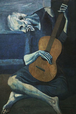
It’s got the lankiness and the stylization and I love the pose, but in the end I just really thought that Caduceus was more Art Nouveau than expressionist. Also my brother was really voting against any pose that included a profile, because I had never drawn Cad in anything other than profile. So that cinched it.
Jester- I never considered anything else but Klimt. I tried hard to think of something else, because my last two brain cells have just enough self awareness to know that Klimt is way, way above me in terms of pattern and texture and motif, and I was pretty sure it was gonna be too difficult for me. It was, by the way. I stopped long before I wanted to and didn’t include a lot of what I had dreamed of adding.
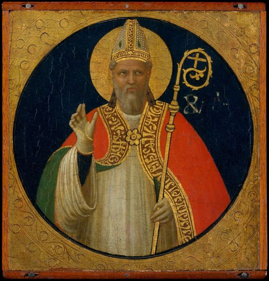
Matt- Following my fascination with iconography, I still wanted to do the heavily painted, loaded with symbolism and rich color portrait that Molly wasn’t. I looked at artists like Ghirlandaio, Castagno, and Jan van Eyck (I never considered Da Vinci, his sensitivity is way outside my orbit), but in the end I kept coming back to Holbein, who really raises the bar on color choice and symbolism. I love that all his portraits seem to be set in plain or dark spaces, but are somehow glowing and mysterious. I didn’t have the guts to put in a deep, perspective-y background, but omg I wish-
I mean I’m not a fucking wizard. But holy shit look at that. The notes and crap hanging off the wall all look like clues. Like Sherlock Holmes would be able to write the whole life story of this guy. It’s almost trompe l’oeil.
Yasha- First concept for Yasha was a Minoan fresco from Knossos-
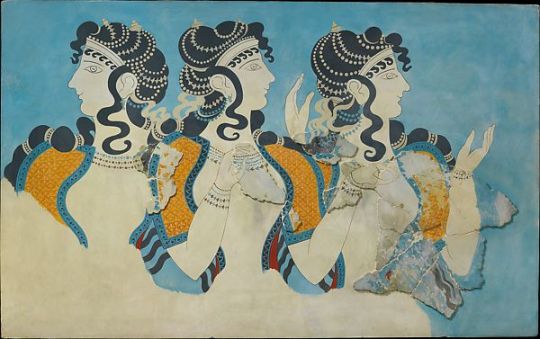
If I was designing Yasha’s tribe, I think I’d go for a melange of Mongolian and Minoan, throwing in some Tibetan textile patterns. I just think this looks so much like her, and also some other Minoan frescoes include insane levels of ritualized badassery, like Bull Leaping and young girls offering saffron to incarnate goddesses. I just love it. In the end, I was worried that the relative clean-ness and simplicity of the lines in the Minoan style would make it look like I was giving Yasha short shrift. This feels a little ridiculous to me now, but I had just come off three in a row that took more than ten hours. My next thought was the Book of Hours of Joanna of Castile. The thought here was that some of the pages actually look like Yasha’s book of pressed flowers-
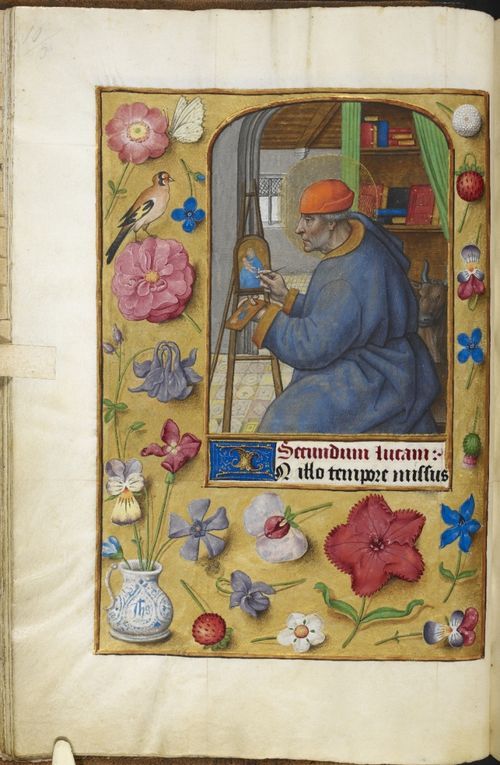
This felt like a totally winning direction to me. As I researched illuminated books more, though, my concept started to broaden and get more stylized, and I just went with it. I think it turned out okay.
Fjord- Fjord is handsome and iconic, so the ideas flowed easily for him. The first and most obvious was a Fabio-era (read- 80s to early 90s) romance novel cover-
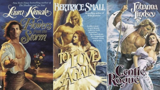
I didn’t go with it because the Tusk Love thing meant that a lot of other artists had tried it already, and many of them had done a damn fine job, and I didn’t think that I had anything to add. The next concept was David’s Napoleon-
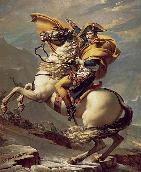
Very solid concept, but two issues- 1. Most portraits of Napoleon are pretty standard, in the mold of, say, Holbein, which I had already done. 2. The horse portrait is awesome, but I think Fjord had only been on horses circumstantially. I couldn’t picture him on a horse. He’s not iconically horsey, he’s iconically sailor-y. I can’t confirm whether or not he had a moorbounde when I painted this, but I know I hadn’t seen any of those episodes, yet. So. All of this dithering kept going until the DAY I STARTED PAINTING. And suddenly pulp cover fell out. I love pulp art. This is the second fandom I’ve done pulp art covers for.
Nott- Full credit to @essayofthoughts, who came up with the playing card thing right at the get go. I wasn’t sold, though, and floated two other concepts. First was a Mughal Miniature-
The thing about these is that they are very often like little comics. On one side of the painting, you can have the main character at a lake, picking daisies or being drowned or whatever, and then on the other side that same character can be picking pockets in a crowded bar. There’s loads of opportunity for detail and symbols and fun stuff like that. On the other hand- I’m not a goddam genius. I could not have taken in the style and substance of Mughal storytelling and then just spit it out in a few short weeks and done it any justice. Nope, that concept was just too difficult and too far above me.My other concept was Millais’ Ophelia-
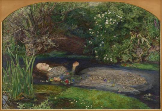
This one might have been amazing, but the second half of the 19th century was getting very crowded indeed, with Caleb, Caduceus, and Jester all having concepts from that era. That and I wanted something more graphic artsy than painty to round out the series. Beau was starting to feel like an outlier and I wanted to loop her in closer to the bunch, if you know what I mean.
Okay that was a lot, but I apparently had a lot to share. I hope you found the unused concepts interesting, at least. What would you have done, were you me? I would love to hear outtakes from alternative universes.
59 notes
·
View notes
Photo
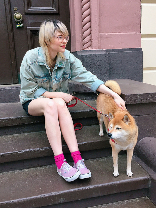
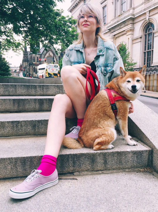
ART SCHOOL | INTERVIEW WITH JUSTINE JONES
Baltimore based artist and illustrator Justine Jones creates her vein of psychedelic fantasy horror drawings–filled with tiny black lines and an occasional pop of bright colors–which have been featured on the covers of Kobold Press and Warlock magazine. Using the hashtag #VisibleWomen to amplify the voices and portfolios of women comic artists, Justine has be able to do more illustrative work and character design. We’re excited to find out more about Justine’s artistic journey, her love of role-playing games, comics, art, her influences and much more. . . Take the leap!
Photography courtesy of the artist.
Introduce yourself?
Hi, I’m Justine! I’ve lived in Baltimore Maryland for the past decade and currently live in a small apartment downtown with my partner and my shiba inu Mo, who is a cool and grumpy guy.
How would you describe your work to someone who is just coming across it?
I used to call it storybook surrealism, but now I guess it’s more like psychedelic fantasy horror? Monsters and Wizards. Lots of tiny black lines, sometimes with lots of bright intense colors.
How did you start from doodling and drawing to what you do now?
I feel like it sort of happened organically. When I was younger, I would do just pencil drawings, and then in my late teens, I got more into using micron pens. I didn’t really discover color until a few years ago, so I’m a huge color noob. I think a lot of it also came from working in comic shops for years and going to conventions. Seeing all of these amazing artists grow, and thinking hey, I could maybe also do that! I first started with t-shirt designs because it just seemed really fun, and I used to have a really hard time selling prints. People don’t need more prints, but they can always use clothes! Now i’m getting more into illustrative work and character design, and I’m loving it!
Who and what were some of your early artistic influences?
When I was a baby, my dad hung an Aubrey Beardsley print over my crib. My mom thought it would make me deranged, and maybe it did, but it also made me love ink work and Art Nouveau style haha. I was obsessed with sword and sorcery stuff and loooved cartoons like He-Man and She-ra, and later, Pirates of Darkwater. I also spent a lot of time in elementary school copying sexy comic book ladies from 90s comics, and I know that is pretty far from what I do now, but it’s honestly how I learned to draw. I also copied a lot from children’s storybooks when I was little.
What are some things that inspire the drawings you make? What are some of your favorite creatures and beings you like to explore in your art?
Video games are a huge inspiration to me, from SNES JRPGs, to games like Dark Souls and Bloodborne. Also folklore and mythology from around the world, and fantasy artwork from the 70’s, 80’s, and 90’s. Basically anything fantasy. My favorite things to draw are wizards and monsters. I love body horror, anything disgusting and beautiful at the same time. I take a lot of inspiration from Manga, like Berserk, or anything Junji Ito. I’ve done a lot of Illustrations for Clark Ashton Smith stories, which I find endlessly inspiring, visually. Just like, fantasy/ sci fi/ dying earth type stuff.
When did you start collaborating with Kobold Press on creating some awesome fantasy art covers for their publications?
I remember getting the email from them when I was on the way to Necronomicon Providence in 2017. I thiiiink they found my stuff through the visible women hashtag on twitter? I was very excited because I owned some of their adventures from back in the day when I played Pathfinder!! Plus, I have always always wanted to draw things for table top RPGs, so it’s been really cool to actually do it! The Warlock mag that I’ve been doing covers for is awesome because it’s going for an old school DND vibe, but it’s all things that are made for 5th edition. You can get it on their patreon, and I hiiiighly recommend it to anyone who plays 5e dnd!!
Take us through your artistic process? What’s a typical day in the studio like?
Haha extremely chaotic! I don’t even have a real set workspace, which I really need to change, I just draw where ever. Just chill out, listen to music or a podcast, and draw. If I’m further along in a drawing and don’t need to focus so much, I’ll watch movies or video gameπ– let’s plays while I’m drawing. I also love to listen to/ watch things that are in theme with what I’m drawing, to give me some inspiration. I try to go to coffee shops to change things up sometimes! Basically I just do a bunch of sketches until something materializes, and then I will just slowly refine the sketch. I guess it’s not that exciting, but it’s cool to see the first sketch and the finished product because in my head, the sketch always looked like the finished product, but when you go back to look at it, it’s usually just indecipherable scribbles.
What are your essential art tools and materials?
90% of my art is just done using a .05 mechanical pencil and micron pens. I also draw everything on smooth bristol. If I have time and want to make my lines super crisp before I scan them in, i will use a light box. Then for color, I generally use Kyle T Webster brushes in Photoshop with my Wacom tablet. If I’m on the go, I like to draw things in Procreate on my iPad Pro, but I’m definitely not as good at doing detailed lines digitally.
What do you do when you’re not drawing or working on projects? How do you unplug?
Haha, I wish I ever truly unplugged, I think my brain is now melded into the internet! But mostly I love to play video games. JRPGs and anything From Software/ Soulsborne (currently obsessed with Sekiro!) I also love comics and manga. I’ve been reading The Girl From the Other Side, which is a beautiful dark fairytale Manga by Nagabe. I also just got one called Witch Hat Atelier, which has the most amazing art! My partner also owns an insane amount of board games, so we play a lot of those. I’m obsessed with coffee, and work part time at a coffee shop, and my favorite thing in the world to do is eat good food.
What has been the most challenging project you’ve worked on? How did you overcome those obstacles and what did you take away from it?
I made a kind of cosmic horror short story in mini comic form last year for SPX, I had very little time, and it was my first time actually writing a story/ dialogue to go with my pictures. It was insanely challenging. I ended up with a finished product that I’m really proud of and that I’ve gotten a lot of positive feedback on. I think it really drove home the fact that I just need to stick with things and finish them, even if I don’t feel like they’re perfect. I’m never going to have the time that I want, and I’m never going to feel like anything is perfect. I can still make a great thing!
What advice would you give someone who wants to follow in your footsteps and pursue art?
Don’t spend 4 years doing nothing, but playing World of Warcraft (Or doooo?). Uhhh, believe in yourself. Be nice to other artists. Draw all the time! Immerse yourself in things that inspire you! Also, like I said before, things don’t need to be perfect. Let go of perfect, because sometimes it’s an unattainable ideal. Just do as good as you can, and don’t beat yourself up so much! I’m horrible at advice!!!
What’s your best Art School tip that you want to share with folks?
Haha, I moved to Baltimore to go to MICA like, 14 years ago, and then realized I was poor, and would never be able to go to MICA… sooo… I never went to real art school. I wanted to go so bad, and I still wish I’d had that experience, but I want other people who can’t afford it to know that you don’t NEED it. Things are a bit harder, but you can find so much free info online if you have the drive, you can teach yourself so many things. Don’t get discouraged just because art school isn’t gonna happen for you.
What are your favorite style of VANS?
I love my lavender/ sea fog Authentic Vans, because they basically go with anything, but I am always eyeing those Sk8-His.
Anything you can share that is coming up?
Ahhhh, I have some realllly cool things that I can’t share yet, but just everyone keep an eye out (It will be very exciting, i swear)!! As for things I can share, I’m working on some new t-shirt designs, and another comic, and also plan on drawing some more cool wizards in my spare time. So if you wanna see some cool wizards, uhhh, come to my Instagram–you guys! Let’s hang out and look at wizards. And talk about wizards. And if you don’t like wizards well, don’t come I guess.
FOLLOW JUSTINE: INSTAGRAM | WEBSITE | TWITTER | STORE
229 notes
·
View notes
Last Seen Blogs
siriusbutts
a little more time with you
shinji-no-warau
I mean, I love you

twinestars
Wip
whitebuffaloimprints-blog
Untitled
fitness-babes1
Fitness Babes