#i posted alternate palettes for this on twitter and i like one of theme way better but im too lazy to get it rn. Lol
Text

i wanna make a prsk major arcana...
#[knows i wont fucking do that so i post the 1 rough i have instead] all in a days work#project sekai#pjsk#prsk#mizuki akiyama#i posted alternate palettes for this on twitter and i like one of theme way better but im too lazy to get it rn. Lol#i would like to do skecthes for them all but im like ..#um. i dont know snything about tarot so people who DO will see my card assignments and go wtf are they feeding this guy#hermit is easy. pjsk gave that right to me. justice meiko too.#ive decided to pull a revstar and do the 25 card visconti with kagamines in one card. so now i have to reassign with hope charity and faith#boohoo. however the sun emu and the moon mafuyu are staying i know what im about. also kohane with death and an with the lovers#those make me feel like a genius. the rest ill stay shy about. if i say all my assignments ill never feel the urge to draw them#sorry for scheduling these to post at 8am#proseka tarot
2K notes
·
View notes
Text
Han juri mugen archive 18

#HAN JURI MUGEN ARCHIVE 18 UPDATE#
#HAN JURI MUGEN ARCHIVE 18 ARCHIVE#
#HAN JURI MUGEN ARCHIVE 18 MODS#
JnXC's Juri dons a red Shadalloo cap and some tattered clothes similar to some looks we've seen on M. Not only did they share some new in-game shots of the costumes (we've previously only seen them in concept art form), they were even kind enough to tack on an alternate color for each of the DLC uniforms. Translated to - Youre gonna be raped next Rohan: Shut Up Ill use my heavens door on you Now GET OUT OF MY SIGHT, before I call the police Reply Join the community to add your comment.Īlready a deviant Log In DeviantArt - Homepage About Contact Core Membership Careers Developers Advertise Terms of Service Etiquette Privacy Policy Copyright Policy Help FAQ DeviantArt Facebook DeviantArt Instagram DeviantArt Twitter 2021 DeviantArt All Rights reserved.Capcom announced today via Twitter that both of these fresh looks will be dropping in just three days on Thursday, March 18. I couldnt care less about anything else Minotaur: Random Moos. Reply 1 like ZoroWarner Edited Rohan: DO YOU THINK THAT I, ROHAN KISHIBE, DRAW MANGA FOR MONEY AND FAME I draw comics because I want to be read Thats the one and only reason. Reply Beast-fight Cool I like when bestial rapists get what they deserve Reply ZoroWarner Agreed Bestiality is the WORST part of hentai MUGEN Reply InitiativeDrive121 Rohan: Take that NOTE: Its me Jansen121, I Had 2 DA Accounts but these ones are really crappy imo. Image details Image size 640x480px 57.75 KB Published: 2019 - 2021 ZoroWarner Comments 6 Join the community to add your comment.
#HAN JURI MUGEN ARCHIVE 18 ARCHIVE#
Why does the Minotaur have to be an 18 character, are those idiots dirty minded or something Heres Rohan Kishibe (Made By Amarimono) from JoJos Bizarre Adventure: Diamond Is Unbreakable (his face isnt shown due to the Minotaur being up close) with his Stand Heavens Door getting revenge on the rapist Minotaur for a good reason - Because I Hate 18 MUGEN Also I might be making a SFW Version of Minotaur in the future with different moves instead.īy the way Two Safe For Work Versions of the Same Minotaur is Available in MUGEN Archive Ill remake this video very soon - On another channel since the other one is gone JJBA Belongs to Hirohiko Araki David Production. You can also see the Minotaurs velocity meter on the right as well. The Minotaur is my favourite mythical monster of all time, but this wannabe bull-headed, Minotaur-like MUGEN character literally sexually rapes victims at any cost instead of fighting, Im not joking.Īlso hes actually a sprite edit of a ne Zangief from Street Fighter (but tanned) with the Oxs head taken from SNKs Karnovs Revenge (a Fighting Game) and uses generic bull sound effects. Rohan Kishibes Payback to MUGENs Minotaur By ZoroWarner Watch 5 Favourites 6 Comments 229 Views NOTE: The Minotaur who chases the Goldilocks girl in the intro or drinks the potion and does something gross (in Dark Palette as shown here) actually rapes victims While his other intros with the walk in intro with the CPS2 Theme or Mooing with the Microphone doesnt rape at all, instead he just fights like a regular fighter. Poll Ask the community Find out what other deviants think - about anything at all.ĭA Muro Paint a picture Experiment with DeviantArts own digital drawing tools.ĭeviation Actions Add to Favourites Comment See More by ZoroWarner You Might Like. Literature Submit your writing Upload stories, poems, character descriptions more.Ĭommission Get paid for your art Sell custom creations to people who love your style. Journal Post a journal Share your thoughts, experiences and the tales behind the art.
#HAN JURI MUGEN ARCHIVE 18 UPDATE#
Status update Post an update Tell the community whats on your mind.
#HAN JURI MUGEN ARCHIVE 18 MODS#
Mugen 18 Mods By Aurora Mugen 18 Update Post An
1 note
·
View note
Text
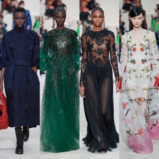
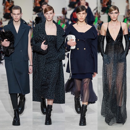
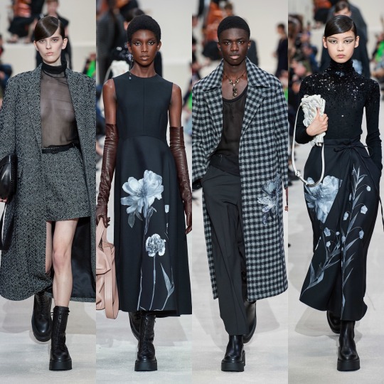
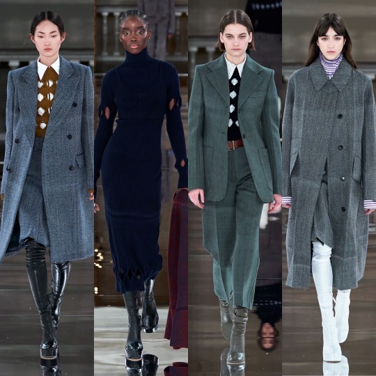
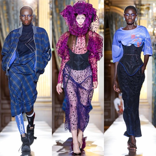
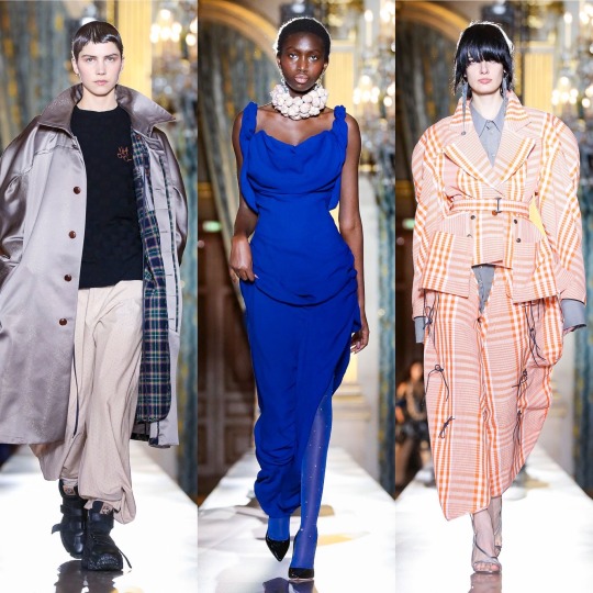
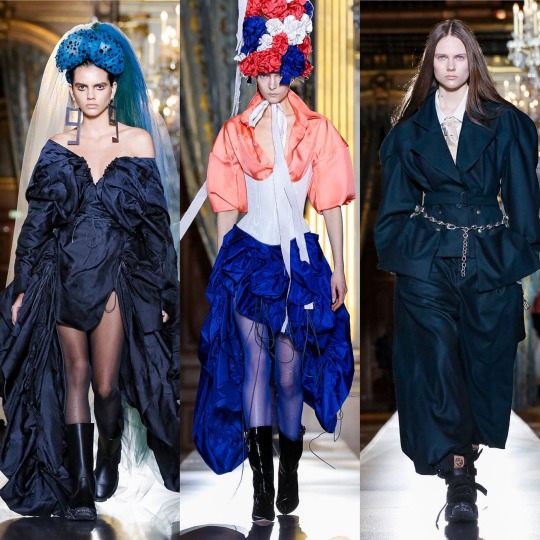
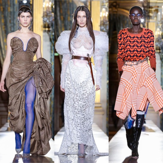
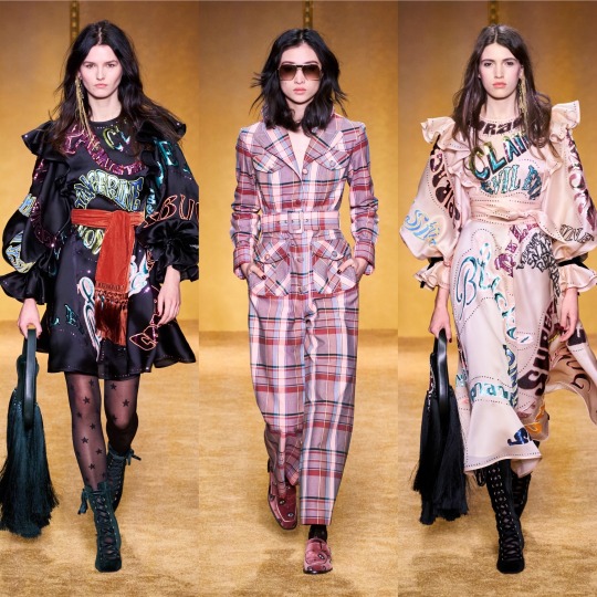
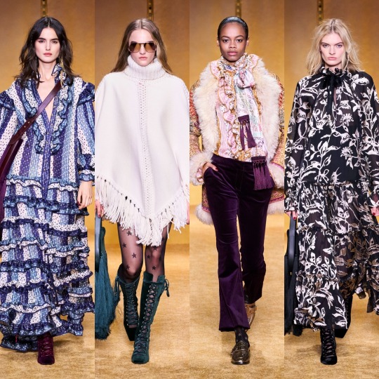
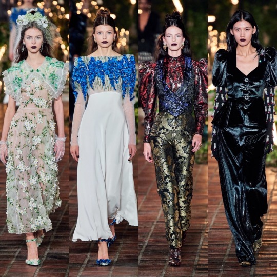
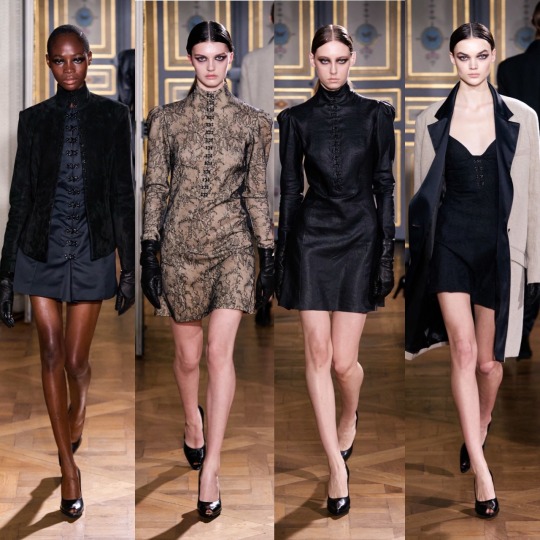
A/W 2020 Fashion Month & Top 20 Collections: Before Vogue Went Blank (Part 4)
Hi all,
Welcome to part 4! It’s gonna be a bit of a shorter one because I wasn’t sure if I could fit the last few collections into my part 3 since I also want to include a ranking of my favourite F/W20 shows. I have so many ideas for what I’d like my next few posts to be (there’ll probably be a bit of gap between them as I would like to try and get some fiction writing in too) and I need help and recommendations on one post in particular so I thought I’d open by explaining that if anyone would like to send me suggestions! The post is basically going to highlight the often under-appreciated personal style of PoC, and I’d also like to make sure I include all types of bodies and genders and ethnicities (other than white girls, as we get enough credit as it is, all a tall, skinny blonde woman has to do is wear some light wash jeans, heels and a blouse and high fashion Twitter are posting non-stop about how incredible her style is)! This can be a celebrity, a model, an influencer or even just one of your friends if you think they deserve some hype too! Obviously there’s only so many photos I can include but I will make sure to look at any suggestions, though of course I’m gonna be biased towards the grungier looks; I gave Dolls Kill a pass for a long time because I thought the brand had changed and become more responsible over the last few years but since Shoddy Lynn’s thoughtless Instagram post during the protests last month and then her lacklustre response video, I say fuck that “goth is white” bullshit, alternative black women are hot af. I’ll also make sure to include a list of my favourite black owned clothing lines I’ve seen people talking about on Twitter and Instagram so again, if you have any suggestions feel free to inbox me. Other than that, I have a couple of lookbooks planned and after, either a post about my favourite shows for style inspiration OR a lookbook depending on whether I have the clothes to do it already/can source a few things from Depop-Depp-I’ve made a commitment not to buy anything new for the next couple of months and I want to stick to that this time round! I’d also like to do a general collation of my favourite summer outfits, an almost scrapbook-y kinda post, and another post on some of my favourite fashion icons (I’ll probs end up repeating a lot of the women from the post I was talking about above but I’ll try and include different outfits to keep it varied!).
Now, into the final part, and the top 20, starting with Tory Burch (I’m really pissed off because I added an unnecessary E in after the R and now Tumblr is once again being stupid and not saving any of my editing changes-also I said on the next post instead of in in the last paragraph and my anal-retentiveness is kicking into high gear).
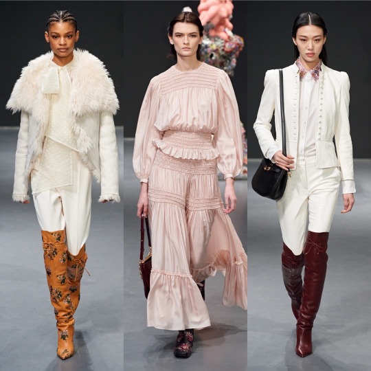

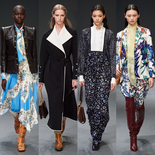


You’d think it’s a kinda anti-climatic one to open with but I do like this collection! It reminds me a bit of last season’s Miu Miu but more so of Brock’s general aesthetic, though with more layers and in some ways to its detriment, a lot more wearable. Looking like something from a bygone era is part of what gives Brock its mystique, but Burch’s designs are practically made for the Chelsea born and bred lifestyle blogger who dresses for a cold spell in the Coachella valley all year long and treats trawling Pimlico’s furniture shops and meeting their girlfriends for coffee like it’s a full-time job. She’s probably born into money and doesn’t work all that hard but hey, she looks angelic holding a bouquet of flowers and in 2020 we all low-key want her life, right? It’d go against my ethics but...*whispers* it would be nice to be that girl just for a couple of days. It is a gorgeous collection, with a lush colour palette and an ever graceful variety of prints and textures, and it toes the line of being accessible and being worthy of a fashion week spot with dexterity. 8/10 and it only loses marks because it’s safe for the brand.
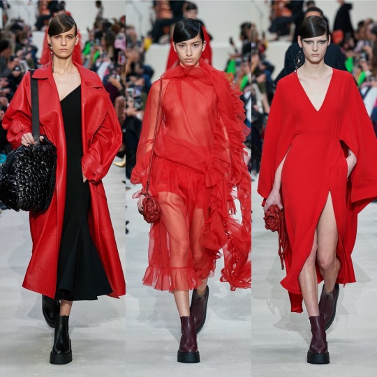


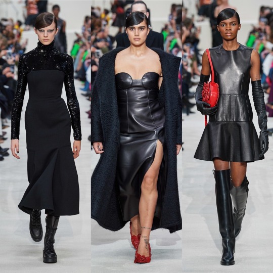

When it comes to Valentino, they’re a pretty reliable favourite for me, and this season’s collection doesn’t break tradition; this one is slightly grittier than usual too which is a big win for me. Whilst the usual sophistication and delicate details are there, quirky embroidery, sequins and tulle, we also get a lot of leather and more black than usual, which I pray doesn’t a herald a return to people thinking “I only own black clothes and listen to Artic Monkeys” is a personality trait. I don’t know if it’s intentional, but there seems to be a lot of aquatically inspired pieces in this collection too; the 3d roses resemble scales to me (and are a really unique texture), and the way the tulle is placed kinda reminds me of fins and has a mermaid on land feel. It wouldn’t surprise me, since Valentino does tend to draw from nature quite a bit. Highs for me were the Valentino red tulle piece and the tulle pieces in general, of course with the embroidered florals as well which the basic bitch in me always looks forward to. The few lows were concentrated in the leopard print section, a print that for me is really overdone and reminds me of recent Dolce and Gabbana. It was cool when layered with the matching coat but I otherwise could’ve done without it.


Vera Wang is another one of my reliable faves-I think I like this collection even more than the last, it really is a fucking DREAM. The overly floral pieces I wasn’t too keen on but I’ll ignore that on the basis that as with Gucci, the tulle-harness combo is everything I look for in a dress and more. I know manic-pixie-dream-girl is a bit of a slur (not a slur slur but you know what I mean) in terms of the associated character, but this 90s Courtney Love grunge twist on that aesthetic is gold, fully realised big anarchist fairy energy (which is a screen name I’m surprised I don’t see more often and which I might now steal). These dresses were made for someone like Zoe Kravitz or FKA Twigs on the red carpet, and if god forbid I somehow ever ended up on one, I would go to the ends of the earth to be wearing one of the dresses from this collection. Aside from the dresses, I appreciated the moody doesn’t-want-to-be-at-the-family-function teenager inspired sleeves and the 2014 Tumblr Cruel Intentions style knee high socks. Love, love, LOVE it.


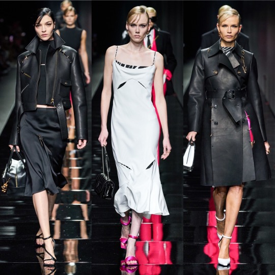


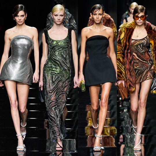
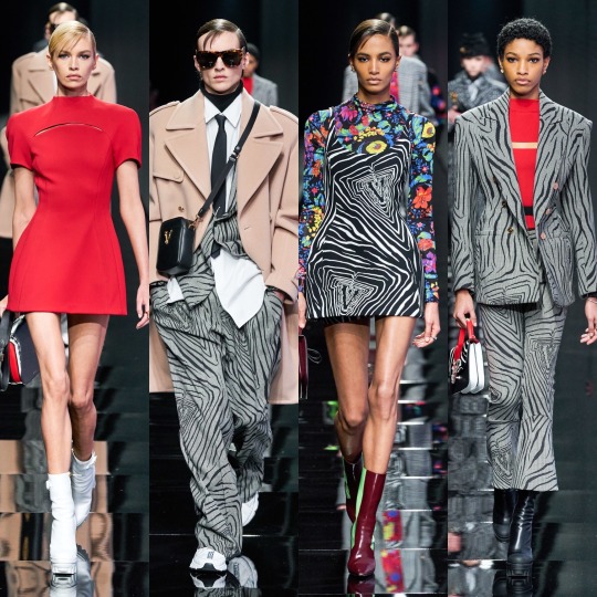
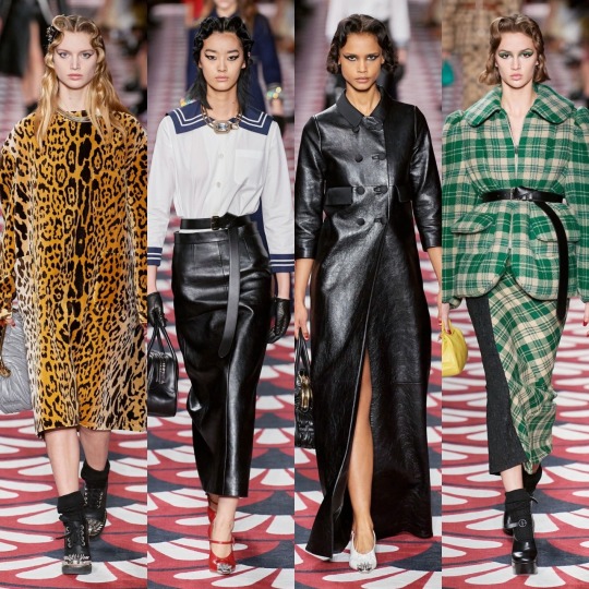
So, Versace started off strong with the all black looks-the cut outs were cute if impractical and the fit and flare trousers in particularly were really well fitted (from a distance, at least). I hated the film Red Sparrow but the visuals were very cool, and this section reminded me of that, like a high fashion collection based on Jennifer Lawrence’s character. There were some stunning colour combos in the Ashish like hyper-floral part too, and the houndstooth, marble and Versace tile prints were sick. The black jumper with the flowers on reminds me of a jumper of my nan’s I always wanted that my aunty ended up donating to a charity shop after she died not knowing I liked it. Gutted (not just about the jumper obviously, looool).
HOWEVER, as with many 91 look collections, it was sloppy at times. A lot of pieces I at first liked (I.E the silver dress we saw Kendall Jenner in, included above) are kind of unfinished up close. There was also a big varsity inspired section which was nice at times but got pretty repetitive and occasionally looked like it could pass for Jack Wills or a bad Michael Kors collection. On the whole, it had both its pros and its cons which puts it directly in the middle of the pack.


Victoria Beckham’s collection is near the lower-middle quartile when it comes to plotting the highs and lows of the F/20 collections. The pieces are pretty and accessible, I’d definitely wear them, but they’re predictable and mostly a rip-off of other brands who did something similar in a more interesting way. Though her collections are never really experimental, this one is particularly safe, and she and whoever helped design this season’s pieces were clearly avoiding the edges of the box like a child playing the floor is lava. It’s alright, and I hate coming towards the end of the post with negativity, but I have to be honest, and this just doesn’t really interest me beyond a “yeah, that’s nice” glance.

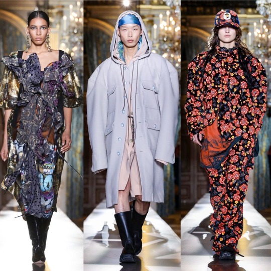
Vivienne Westwood, on the other hand, is always interesting whether I would actually wear it myself or not. Despite the mix and matchiness that is essential to the deconstructed look, which being the basic bitch I am I often struggle to see past, there were some gorgeous pieces and eurgh, I could really talk about that Bella Hadid look all day. The contrast between the exaggerated femininity of the waist cinchers against the androgyny of the less structured, oversized pieces is a really interesting one and the colour combinations work beautifully together. I also love the idea behind the collection, which is, in the words of Andreas Kronthaler about “rites of spring, and the good and the bad, and conflict, and the good prevailing over evil”. Ahhh, I hear you say. THAT’S what’s with the garlic necklace. Can I get another pat on the back for summing up this collection as “vampire slaying uniform” in my notes? I mean, that’s kind of a good vs. evil situation, isn’t it? I know it’s hard to ignore how hot vampires always are in TV series and movies but just think of the true forms of the ones off Penny Dreadful and remember THEY DRINK BLOOD (I personally think being a vampire would be really cool, just need to work out how to do it “ethically”).


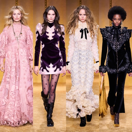


Lastly, Zimmerman, and I really can’t say how happy I am to end on a positive note because this collection was stunning. Not without all the characteristically ornate, indulgent and painstakingly detailed efforts we’ve come to expect from Nicky and Simone Zimmerman, these looks (in an icy winter themed colour palette as well) are the offspring of a sophisticated flower child and a 70s glam rocker and I think with this sentence I’ve finally put my style aspirations into words. Honestly, give me the money to produce a modern day Almost Famous and I’ll make my character this no-nonsense intersectional feminist front woman of a fictional Haim-like band who sings with the voice of an angel but is rock and roll as fuck and eats men for breakfast and I’ll put her in this collection and (deep breath) it would be ICONIC. There. Got to the point eventually. Am I talking about a 2020s version of Steve Nicks? Possibly. After all, I do have a framed illustration of her on my wall. But regardless, I need those lace-up velvet BOOTS, that mesh dress with the celestial embroidery, the flame detail pieces, the white pussy bow blouse with the eyes on it. Everything is sooo dreamy; when I was looking through the collection for my favourites, I saved pretty much every. single. look. IT’S EVERYTHING I STRIVE TO BE. WHY CAN’T I AFFORD ZIMMERMAN GOD DAMN IT!?
See, I’ll be going on about Zimmerman in a couple of paragraphs again because it will be very high in my top 20, which I’m so glad is a top 20 BTW. I know I said it would be a top 10 in my last post because I thought that was how I structured it last time but I double checked and it is 20, which is a relief; once again, picking only 10 collections would be very hard. SO! Let’s get into it!
1. Gucci

I hate being predictable but Gucci once again holds the top spot for me. How could I not love this? I would say that I hope Alessandro Michele fucks up next season so I don’t come off as a boot licker but when the boots in question are platform Mary Janes and knee high socks and they’re underneath tulle with BDSM inspired harnesses on top...maybe boot sole doesn’t taste so bad after all.
2. Zimmerman
Well, I did say it wouldn’t be long until you were seeing the same outfits again, so at least you know my word is good.
3. Moschino

Wow, as if putting Gucci first again wasn’t bad enough, Moschino’s also a non-mover. But...Marie Antoinette this season and Picasso last? And this campy? It’s like Jeremy Scott reached into my brain magician-into-a-top-hat-style, picked out an interest of mine at random, and tried to communicate this to me through the medium of design with THE most chaotic energy humanly possible. I an only commend the man, because he succeeded, and I approve. It’s weird because before I always saw Jeremy Scott’s designs as tacky and yet I’ve loved all the collections I’ve reviewed, so I must ask...are the collections getting less tacky or am I getting more tacky? Much to think about.
4. Vera Wang
The battle armour of a punk princess. Not very good at protecting against knives, arrows, bullets or...anything really, but I’ve never really been the kind of person to get into physical fights (apart with a bouncer who tried to push me down the stairs once at an ABBA night but I was really drunk and she was mean, alright!?), so who cares? Nobody can make you do anything in dresses this pretty.
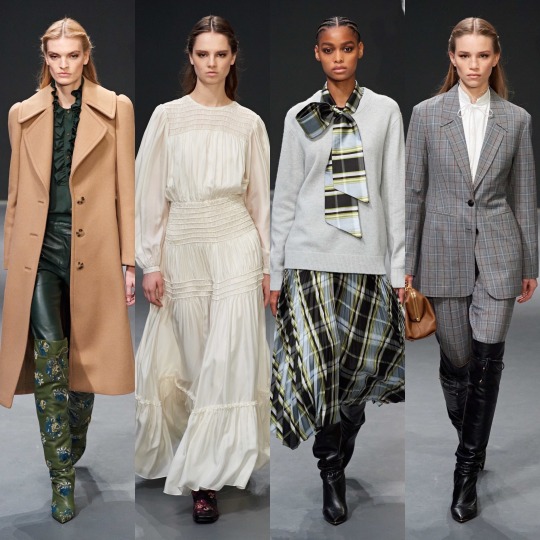
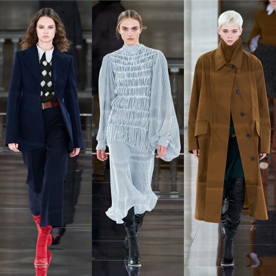
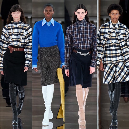
5. Lanvin

I’m a few years behind everyone else but I’m still on the Mad Men hype train and I don’t ever want to get off. All I wish is that Betty Draper had *SPOILERS* divorced Don’s detty arse earlier and rode off into the sunset in that white Bella Hadid coat with the red lip to match (or the checkered one above will do).
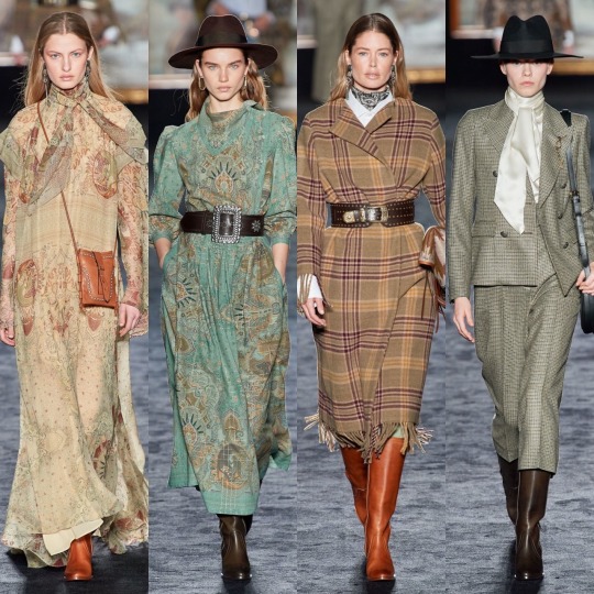
6. Etro
As long as she remains the queen of dreamy bohemian fashion, I’m not gonna do Etro dirty by putting her any lower than this ever again on the basis that she’s not conceptual enough which ashamedly is what I implied in my last ranking-yes, Etro is a she because just as most women deserve more from men, she is beautiful and deserves better than my previous disrespect! I said what I said.
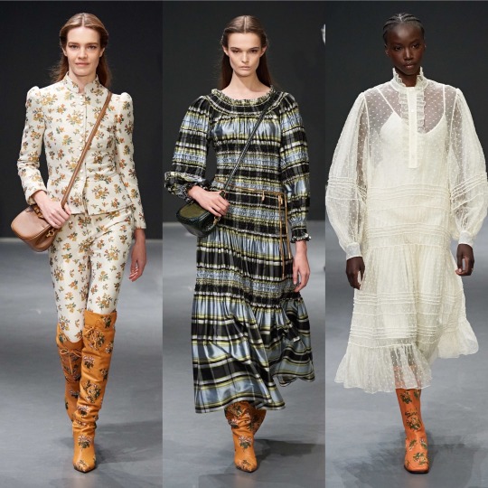
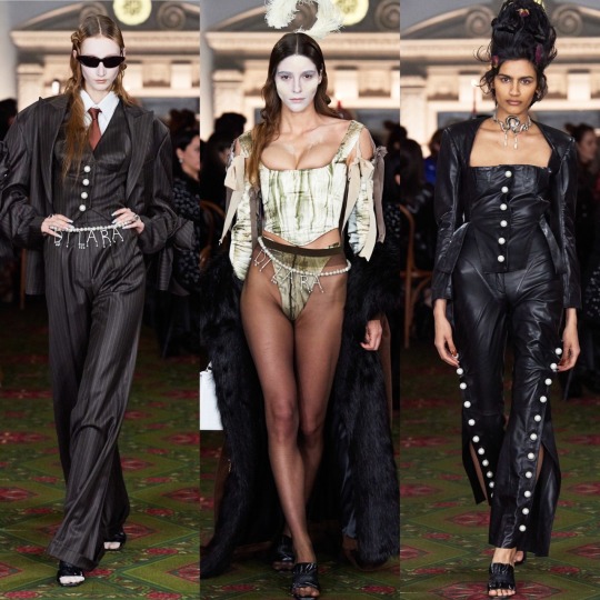
7. Dilara Findikoglu
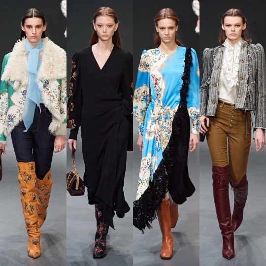
I see your Thom Browne and your Commes Des Garcons and I raise you my “weird”-though-not-actually-that-weird-at-all-can-we-all-just-dress-like-this-on-a-day-to-day-basis-please? fave, Dilara.
8. Paco Rabanne

Battle armour that actually COULD protect you against knives, arrows, and bullets. Maybe. Well, you’d hope so anyway for the price.
9. Rodarte
Suddenly my phobia of spiders has evaporated. And no, it doesn’t have anything to do with the fact that these ones are diamond encrusted, what are you on about?
10. Alberta Ferretti
The colour combinations in this collection were stunning. Honestly. I just picked a really bad pic to illustrate that. Go read my first post to see (grifting 101: complete)!
11. Charlotte Knowles
I saw Bella Hadi wearing a Charlotte Knowles two piece, so I bought a Charlotte Knowles two piece.
LMAOOO, I wish.
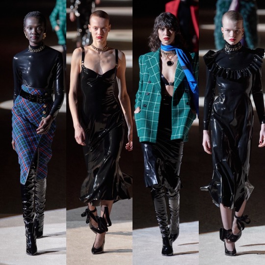
12. Balenciaga

It’s occurred to me a couple of posts too late now on the basis that Tumblr is being a dick and won’t go back and let me edit stuff, even little typos, but I’m now wondering if there’s a link between the climate change theming of the show and the exaggerated structures of the pieces? Ya know, the whole abundance is killing the planet line of thinking? I know analysis isn’t exactly on brand with these silly mini captions and that oversized and exaggerated proportions is one of Balenciaga’s running motifs anyway buuut just a thought I had! And sidenote: I do believe overconsumption is killing the planet! The way I phrased that made it seem like I’m a climate change denying dickhead! That I am not! Maybe if I shave my head, legally change my name to Steve, get a British flag tattoo on my bicep, and spend every waking moment in my nearest Spoons I’ll get there but it’s not on the agenda quite yet!
13. Christopher Kane
If fashionable robots took over the world, they’d raid Christopher Kane’s studio and fry us all with laser beams whilst wearing his dresses.
14. Fendi

Siri, play Vroom Vroom by Charli XCX.
15. Olivier Theyskens
Mandarin collar. Mandarin collar. Mandarin collar. NEXT TIME I WILL REMEMBER WHAT THE PROPER NAME IS INSTEAD OF NEEDING TO GOOGLE IT AGAIN. Come on brain, you’re supposed to be good at this kinda thing, make it happen.
16. Elie Saab

Blair Waldorf’s wet dream. Add in some platform boots and chain jewellery and now it’s my wet dream too.
Because Chuck Bass is creepy as FUCK and maybe it’s because I watched Gossip Girl at the ripe old age (lol) of 21 and most people watch it as teenagers but I don’t know why YOU WERE ALL SO OBSESSED WITH HIM! He tries to sexually assault Jenny who is about 14 in the VERY FIRST EPISODE. I think I went off on a tangent here but it had to be said. You girls have no taste.
Don Draper was an absolute dog, but he was played by Jon Hamm, and he might be one of the finest men on the planet. What’s your excuse, Chuck and Blair enthusiasts?
17. Miu Miu
As someone who has probably been/met many a spoilt brat in her time, I appoint Miu Miu as the official sponsor of the Spoilt Brat™ aesthetic and yeah, that’s something I just made up but I’m on the money here. Imagine one of those “daddy, can you get me a pony?” types all grown up. Are you telling me you don’t picture her in Miu Miu? Because that sounds like a lie.
18. YSL
The war flashbacks I get of the Friends episode where Ross tries to get out of those leather trousers aside (I know it’s PVC her not leather but they have the same sheen, you can’t deny it), these outfits turn me into the irl version of the heart eyes emoji. It’s not like I think this is the best collection I’ve ever seen, YSL could def push the boat out a bit in terms of experimentation, but there aren’t many people who wouldn’t look hot as fuck in one of these pieces
19. Balmain
I didn’t like ALL of it, but the looks that I did like were amongst the ones that stuck out to me most when I was reflecting on the collections I’ve reviewed: the breast plates and silk capes and the scorpion detailing are real chef’s kiss moments.
20. Marques Almeida
Miss the collection that gave us this coat off the list? Never.
SO!
That is the end! Wow! I started saving the photos for this review back in late January/early February or whenever it was that the first fashion week began and now it’s mid-fucking July!? I don’t know if that speaks more to my incompetency or what a state the last few months have been. I’m not gonna write a super long ending paragraph because you’ve heard enough from me already and it’s 2:30am and I’m being hassled by Trump supporters on Twitter (literally just for stating that it’s a privilege to be able to pursue a career you truly have a passion for rather than having to be practical about finances first) anddddd I’ve got a closing shift tomorrow so I should probably log the fuck off and remove my clown makeup before it’s time to start my shift, lol!
Quick recommendation before I wrap this up, there was a really interesting debate on ITV literally a few hours ago on the Stephen Lawrence case that I thought I would recommend (they also showed the 1999 dramatic portrayal of events afterwards) about racism in England and whether or not much has changed since the murder. I didn’t catch the whole thing but from what I did see, there were some really strong points being made and I think it could be a good thing to sit and watch with your family members if you want to get talking about the Black Lives Matter movement and aren’t sure how to broach the topic. I bring it up because I feel like most middle-aged white people trust ITV so they’re less likely to turn their noses up (lol, I wish I was joking) at it and maybe go in with a more open mind. I’d like to keep the conversation about social issues going so if there’s anything you’d like me to get some information together on and make a post about-I read yesterday that there’d been arrests of THE PEOPLE PROTESTING the way Breonna Taylor’s death has been handled. No, not the police officers responsible for her death, the people simply pointing out that those police officers have done wrong. It’s a ridiculous situation and just shows how deeply embedded a police officer’s supposed right to kill and to use force is in upholding the American status quo. I wish I could end the post on better news, but let’s hope that next time I post, there is some, and as always thank you for reading til the end if you did get this far! I really don’t have all that many followers on here but do et me know if there’s anything I can reblog or share to help.
Lauren x
#fashion week#fashion#fashion inspo#style#style inspo#style critic#pfw#nyfw#balmain#balenciaga#paco rabanne#gucci#haute couture#designer#runway#ysl#brock#adut akech#bella hadid#model#street style#lfw
28 notes
·
View notes
Text
Hello everyone! When I first started blogging, I had no idea what I was doing and it stayed that way for two years until I joined WordPress and participated in challenges and read about what to do. Now, I’m still learning, but I’ve got a better handle of the ins and outs of what to put on a blog/website and what NOT to do, but it’s taken me 6 yrs to get here.
Today, though, I figured I’d list what bloggers should and shouldn’t have on their website, all of which would help them reach more readers and get more views so that no one else has to take at least 2 yrs to figure out what they’re doing. Let’s go…
What To Include (general page ideas):
Landing page aka Home (optional)
as an alternative for readers to land first on your blog, you can have a static home page which gives a little intro to who you are and what you blog about. It can either serve as a short version of your About Me/Blog sections or it can actually be the sections.
the only thing you should watch out for is that if your end goal is for people to read your blog posts, you would be increasing the number of steps it would take for readers to get there, which decreases the likelihood they will actually press on a post and read it.
About Me
this is the page where you introduce yourself. Some things to include are:
your name (either real one or that of your online persona)
what reading means to you
how you got into blogging or why you’re blogging aka what’s the goal that you want to accomplish with the blog. It doesn’t have to be big or overly ambitious. It can just be to “help readers find good books” or something.
your social media
About The Blog (optional)
you can combine this with your About Me page if you want (I did!) and summarize what types of books, genres or topics you like reading about, what kinds of blog posts you do (reviews, discussions, blog tours etc) and how often you post. It’s best to only disclose how often you post if you are good about being consistent, otherwise, readers might get confused/lose faith in you if you say you post twice a week when you might only post twice a month.
Blog
this is basically the page where all your blog posts show up – regardless of what type of post they are. You can create extra pages that specifically show one type of post (see next section) but that is optional and, regardless, you should have all your blog posts together on one page
Blog Category Pages (optional)
Along with their general blog page, some bloggers will also create pages from various blog categories. Some of the most common pages I’ve seen are:
Discussions
Reviews (A – Z)
Reviews (by author)
Memes page(s) like Top Ten Tuesdays or Waiting on Wednesdays
Interviews
Blog Tours
again, these are all optional and, in my opinion, neither especially help or hurt your blog. TBH, you can just create a “categories” widget (which you can see on my sidebar) so that people can easily see only one type of post.
(Review) Policy
this is where you talk about what you are willing to accept from authors, publishers and companies and what you are willing to do. some examples of things to mention or keep in mind are:
what genres of books will you read? what will you definitely not read?
are you willing to read e-books (and more specifically, pdfs, e-pub, kindle)? or do you only read paperbacks/hardcovers?
will you do only book reviews or might you also be willing to collaborate on doing interviews, subscription box reviews, giveaways, blog tours etc?
what’s the best way to contact you? you can link them to your contact form and/or give them your email address
Contact Me
the best way(s) to contact you whether it’s a contact form on the website, social media, letters, email etc.
a brief summary of what people can and can’t contact you about
a link to your policies page for the specifics of what to contact you about
[Related – DISCUSSION: 15+ Author Website Tips]
What To Include (specific content):
Search bar – pleaseeeeee put a search bar somewhere on your website whether it’s up top or on the sidebar where it is immediately visible (aka don’t put your search bar in just the footer). Search bars are you and your reader’s best friends because it is a lot easier to find a post using the search bar than having to comb through post archives.
Blog follow buttons – whether you want them to follow on WordPress, via email, BlogLovin’ or an RSS feed, make sure you have a follow button on your sidebar and your footer so your readers know when you have new posts out and can keep coming back!
Social media buttons – if you have any social media relating to your blog (and you really should have at least one!), then you need to include a way for your readers to jump to said social media and follow you. I personally recommend you put them either up top or on your sidebar, as well as down in your footer.
A blog graphic in every post – images catch people’s eyes much faster than texts do (an image is worth a thousand words) so, by adding an image to your post, you can catch the attention of the reader and draw them into reading the post. Of course, the image should be appropriate to the topic and, typically, follows a consistent style. For me, when I need to create my own image (aka I’m not using a book cover or blog tour banner), I tend to do the same kind of thing. As you can see from the gallery below, I have the same background in each of my images, the font is the same, and the size of the words are typically the same (tho there are some outliers depending on the post). This consistency allows readers to become familiar with you and your blog in another way so that, if they saw one of your images on social media, they would immediately know “hey this is from X’s blog!” even if they’ve never read the post or seen the pic before.
This slideshow requires JavaScript.
What NOT to do:
use weird coloured backgrounds or writing (like yellow, purple or green) PLEASE – My eyes are already bad we don’t need to make them even worse lol
show your entire blog post on the blog home page – in doing so, people are not going to press on the specific post and read it there. This means that all your blog views will show up as “home” and you won’t see any stats about the specific articles people are reading which you need to help you understand what types of posts are doing well and which aren’t. To fix this, just go to your blog settings and make sure the “Limit feed to excerpt only” option is on. For bloggers on WordPress, this can be found by going to settings –> writing –> feed settings.
not personalizing your website – if you have any free blogging account (aka free WordPress, free Blogger, free Tumblr etc) you are most definitely going to pick a theme that hundreds of others have used before. The key to making YOU and your blog stand out is in how you design it. This happens by changing around
the colour palette you use (mine is primarily white, turquoise, black)
your blog header and other blog images
the formatting
fonts
Tips:
Put the link to your website in all your social media bios
Have at least one social media that you can focus and build an audience on, as well as share your posts to. For me, my main social media is Twitter (though I am on others) and it’s where I get the majority of my blog views. Every time a new blog post is published, it gets automatically shared to Twitter and I spend time marketing posts on Twitter to drive up views on the blog.
Make sure your posts will automatically be shared on your social media(s) when they are published. On WordPress, you can do this via Publicize.
Don’t include more than 3 category-like blog pages otherwise, you’re just crowding the top of your blog for no reason
Have a master spreadsheet or list of any and all blog post ideas you think of. This will better help you when you’re in the writing mood but can’t think of any ideas.
Also, when you’re in the writing mood, write as many blog posts as you can – whether partly or fully – ahead of time so that it’s easier when you have less motivation or need to post something ASAP (seriously scheduling posts out are the absolute best!)
If you aren’t art or design-inclined, make sure you hire someone to make your blog header and other blog graphics and help you design your website. I’m a graphic designer (and former website designer) and I love helping people out with their blog headers, business cards, post graphics etc. If you want to know more about how I can help, tweet me, contact me or email me and I’ll get back to you within 24 hrs (twitter is definitely faster tho)!
Other Blogging Guides
All About ARCs (Advance Reader’s Copies)
Book Publicity Contacts Directory
Writing Tools, Resources & Tips
And that’s really all I can think of in terms of tips and tricks. What do you guys think? Do you have any cool blogging tips or tricks? Let me know in the comments below! If you have any questions, concerns, or ideas, comment them below! Lastly, don’t forget, I’m always happy to either casually or completely audit your website and see what you’re doing well & what you can improve on, as well as make any graphic designs, blog headers, business cards etc for you! Just tweet me, contact me or email me and I’ll get back to you within 24 hrs! Thanks, have a great day/night and tata for now!
Angel
Red Bubble ❙ Society 6
DISCUSSION: 15+ Blogger Website Tips & Tricks Hello everyone! When I first started blogging, I had no idea what I was doing and it stayed that way for two years until I joined Wordpress and participated in challenges and read about what to do.
#audit#blog#bloggers#book#books#do#don&039;t#feedback#help#helpful#how to#marketing#marketing plan#plan#service#services#tip#tips#trick#tricks#website#websites
1 note
·
View note
Text
The moving sketches of Goro Fujita
the whimsy of looping motion
Goro Fujita is an animator who posts 3D animations, which he calls quillistrations, using the VR software Quill. The animations are very fun. They uniquely show a 3dimensional space in a sketchy manner. The staccato motion of his work makes it feel lifelike even with the limited frame count.
https://twitter.com/i/status/1319333281314242565
in this first animation, Goro creates an incredibly frantic scene through a multitude of arms. It almost reads as motion blur. The shaky patterns serve to further drive the tension. Throughout this whole piece small actions are used to communicate a theme rather than reality. There is no pepper coming out of the pepper mill. Nonetheless, it reads. This is a long running theme in his work. The human mind is quick to file off the sharp edges of an animation. As long as the principles of animation are adhered to, the artist is capable of getting away with a slightly more choppy piece of art.
https://twitter.com/gorosart/status/1318362826357047298?s=20
This and the above illustration were done just this month for Inktober. Both are illustrated in just black grey and white. This should limit the readability of the compositions, but clever usage of Despite the fact that these animations are made with a strictly limited color palette, they use chiaroscuro and texture to show the volume of the objects. The small crosshatched shadows place the dog and cat within the world.
https://twitter.com/gorosart/status/1303463893558341633?s=20
Here we have a clearly looping animation. This is a form of pattern which allows Goro to suspend a moment in time. Clear perfectly looping gifs like this are something which animation is uniquely suited to. Something that should also be noted here is the artist’s intelligent usage of angles. In all of his animations he uses a hand full of different shots. I believe it is a way to show off the three dimensionality of the piece. Nonetheless, he remains restrained, never breaking the 180 rule. It grounds the world without upsetting the composition of the piece.
If you want to check out his work, you can follow his twitter at:
https://twitter.com/gorosart
Glossary
Pattern - an arrangement, configuration, array, formation, guide, matrix of repeated forms. Patterns create rhythm and can be used to predict and organize design elements such as using a grid.
Alternating pattern - means to occur in succession, such as day alternating with night. To pass back and forth from one state, action, or place to another such as alternate between happiness.
Chiaroscuro - a technique of painting or drawing using a predictable sequence of light and shade to achieve a three-dimensional quality.
Collage - a technique of an art production, primarily used in the visual arts, where the artwork is made from an assemblage of different forms, thus creating a new whole.
Gradient - continuous change, darkening, lightening, increasing or decreasing color saturation. A gradient is created when two or more different colors are layered to paint one element while gradually fading between the hues or values.
Grid - a rectangular system of coordinates used in locating the principal elements of a plan.
Progressive patterns - create active change, momentum by shifting in a direction, increasing, escalating, or accelerating.
Radial balanced patterns - based on a circle with its design extending from its center. A few examples of radial balance are; a star, the iris in one's eyes, and a wheel with spokes.
Texture - the way something feels when you touch it, how smooth or rough it is. The texture of an object depends on the unique structure of its molecules.
Tactile - tactile textures are physical, touchable textures that you can actually feel on your skin in the real world, like when you pet a cat or dog.
Texture mapping - Texture mapping is a process in which a two-dimensional surface, a texture map, is wrapped around a three-dimensional object. When wrapped, the 3-D object acquires a visual surface texture.
Visual texture - an illusion of texture. Pixels or traditional drawing and painting media can be manipulated to give the impression of texture, while the surface actually remains smooth and flat.
180-Degree Rule - a basic guideline regarding the on-screen spatial relationship between a character and another character or object within a scene.
Anticipated Action - A dramatic action frozen in time, the tension mounts, we feel anticipation.
Camera Motion Arrows - a simple and recognizable way to show motion or progression in a storyboard
Kinesthetic Empathy - A player’s actual movement when responding to action in a game.
Line of Action - an artistic concept, an invisible line that captures the thrust and vitality of the movement. The line of action can be drawn by artists as the first element to capture or exaggerate the pose.
Motion Blur - When your eyes or objects are in motion, the image will suffer from motion blur, resulting in an inability to resolve details.
Optical Movement - is an optical illusion. Although the image is not moving, it appears to move.
Stillness - calm, quiet, inaction, and peace. Stillness is the opposite of motion.
0 notes
Text
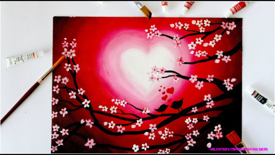
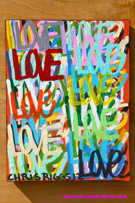
21 Quick Tips Regarding Valentines Canvas Painting Ideas | Valentines Canvas Painting Ideas
Oh yeah, Valentine’s Day is array of their thing… Visit them and boutique the best appetizing alternative of annoying novelties, ability and games, lingerie and V-Day treats that will appearance ’em you’re alike sweeter on the inside. Spoil yourself or your lover, either way, this V-Day will feel like ME-Day! This year, try these fun treats from HUSTLER® Hollywood & analysis out added account online.

Easy Valentine’s Day Canvas Art | Domestically Creative – valentines canvas painting ideas | valentines canvas painting ideas
Lingerie
Looking for the better alternative of adult lingerie in the city? You’ll acquisition it at HUSTLER® Hollywood.
Custom Child Acrylic Canvas – valentines canvas painting ideas | valentines canvas painting ideas
From specially-themed Valentine assembly touting red, pinks and hearts, and sweet, affected adult little delicate babydolls; all the way to the wet look and latex dominatrix.
Whether you like actuality an angel or a devil in the bedroom, you can acquisition a Valentine’s Day allotment to attract your accomplice today or all year long.

Valentine Painting Ideas – Easy Craft Ideas – valentines canvas painting ideas | valentines canvas painting ideas
Naughty Games
A abundant way to get a little aesthetic is by bringing a steamy agenda game or sex dice into the mix. Naughty amateur will accord you suggestions and account for new positions, activities and rewards for you and your lover. There’s alike a bondage game if you’re absolutely attractive to up the ante. Roll the dice and let the chips abatement area they may!

Trendy Painting Ideas Easy Canvases Valentines Day Ideas – valentines canvas painting ideas | valentines canvas painting ideas
Novelties

Custom Family Oil Portrait – valentines canvas painting ideas | valentines canvas painting ideas
Only fools blitz in…naughty amateur and novelties will accumulate the bedchamber baking hot afterwards afire out early.
Bring a beating candle into the bedchamber with your love. Accept them lie aback for a adorable beating — Earthly Anatomy makes our admired in all kinds of amazing flavors and scents. The soy-based wax melts into a

Heart and swirls – Creative Juices Art Studio – valentines canvas painting ideas | valentines canvas painting ideas
21 Quick Tips Regarding Valentines Canvas Painting Ideas | Valentines Canvas Painting Ideas – valentines canvas painting ideas
| Pleasant in order to my blog site, in this particular time period I will teach you in relation to keyword. And now, this can be the very first photograph:

Custom Oil Wedding Painting – valentines canvas painting ideas | valentines canvas painting ideas
How about image above? can be that will wonderful???. if you feel consequently, I’l d explain to you many photograph once more under:
So, if you wish to get all these incredible graphics related to (21 Quick Tips Regarding Valentines Canvas Painting Ideas | Valentines Canvas Painting Ideas), just click save icon to store the pictures for your computer. These are prepared for save, if you want and wish to obtain it, simply click save badge in the post, and it will be immediately downloaded in your desktop computer.} As a final point if you need to secure new and recent image related with (21 Quick Tips Regarding Valentines Canvas Painting Ideas | Valentines Canvas Painting Ideas), please follow us on google plus or book mark this website, we try our best to present you regular update with fresh and new graphics. We do hope you like keeping here. For most upgrades and latest news about (21 Quick Tips Regarding Valentines Canvas Painting Ideas | Valentines Canvas Painting Ideas) pics, please kindly follow us on twitter, path, Instagram and google plus, or you mark this page on bookmark section, We attempt to give you update periodically with all new and fresh pictures, love your exploring, and find the best for you.
Here you are at our website, contentabove (21 Quick Tips Regarding Valentines Canvas Painting Ideas | Valentines Canvas Painting Ideas) published . At this time we’re delighted to announce we have discovered an incrediblyinteresting topicto be pointed out, that is (21 Quick Tips Regarding Valentines Canvas Painting Ideas | Valentines Canvas Painting Ideas) Lots of people looking for specifics of(21 Quick Tips Regarding Valentines Canvas Painting Ideas | Valentines Canvas Painting Ideas) and certainly one of them is you, is not it?
spray paint ideas – Page 21 – valentines canvas painting ideas | valentines canvas painting ideas

I am going to paint Heartbeat at Pinot’s Palette – Katy to .. | valentines canvas painting ideas
Love birds valentine’s day painting || Step by Step Painting using Acrylic Colours – valentines canvas painting ideas | valentines canvas painting ideas
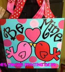
Canvas DIY Painting Ideas!!!!! on Pinterest | Teacher Name .. | valentines canvas painting ideas
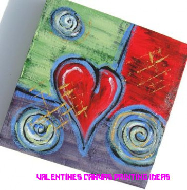
Custom Valentine Gift Idea Acrylic Abstract Heart Painting .. | valentines canvas painting ideas

Valentines Day – Step By Step Painting – Tracie’s Acrylic Painting .. | valentines canvas painting ideas

Valentine’s Day DIY Canvas Heart Art – Design Improvised – valentines canvas painting ideas | valentines canvas painting ideas

22 best Valentine's Day Canvas Ideas images on Pinterest .. | valentines canvas painting ideas

Painted Valentine’s Canvas – valentines canvas painting ideas | valentines canvas painting ideas

Uptown Art Greenville, SC (With images) | Valentine drawing .. | valentines canvas painting ideas
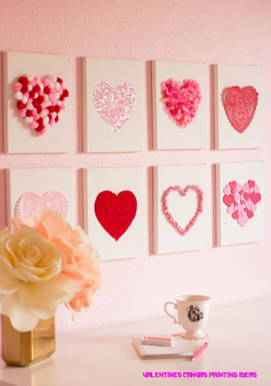
Valentine's Day DIY Canvas Heart Art | Heart art, Diy .. | valentines canvas painting ideas

Silhouette Artworks Inspiring Creative Wall Decoration for .. | valentines canvas painting ideas
ORIGINAL love abstract street art urban pop art acrylic .. | valentines canvas painting ideas

Soft Pastel Photo Art – valentines canvas painting ideas | valentines canvas painting ideas
The post 21 Quick Tips Regarding Valentines Canvas Painting Ideas | Valentines Canvas Painting Ideas appeared first on Painter Legend.
Painter Legend https://www.painterlegend.com/wp-content/uploads/2020/06/easy-valentine-s-day-canvas-art-domestically-creative-valentines-canvas-painting-ideas.jpg
0 notes
Text
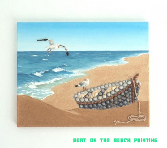
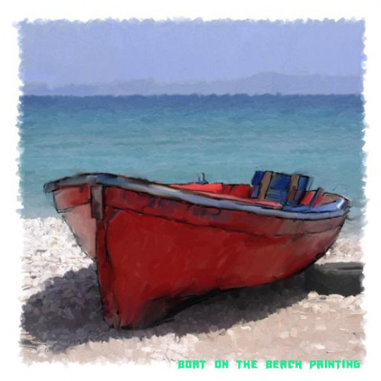
The Cheapest Way To Earn Your Free Ticket To Boat On The Beach Painting | Boat On The Beach Painting
Curriculum vitaeHis ancestor was the bottle adept František Xaver Riedel (1786-1844) and his mother Josefina Weberová (1808-1882). He was their third child, but his ancestor had three added daughters from his antecedent marriage. [4]In 1851 he advised in engineering, but he advised painting in the flat of Maximilian Haushofer (1811-1866) from 1852 to 1856. After admission from Prague, he connected his studies at Andreas Achenbach’s clandestine academy in Düsseldorf, breadth he spent four years. He again catholic to Italy, breadth he visited Rome, Tivoli, Campagno or Agrigento, and was aggressive by his landmarks, which were again a common affection of his paintings. Riedel’s abutting cruise led to France in 1864, breadth he visited Paris, Fontainebleau, the breadth about the River Seine, the boondocks of Barbizon, Brittany or the Channel Islands. [4]In 1870 he alternate to Bohemia and acclimatized in Prague. Too generally he did not leave and catholic from actuality mainly to his mother’s aggregation for alleviative cures to the Czech spa in Karlovy Vary, Dubi or Teplice. It was added and added afflicted by tuberculosis, which prevented him from alive too much. He died at the age of 44 for a medical break in Kundratia. His burial took abode in Liberec on June 14, 1876.
The Cheapest Way To Earn Your Free Ticket To Boat On The Beach Painting | Boat On The Beach Painting – boat on the beach painting
| Welcome to our website, on this time I will show you concerning keyword. And from now on, this is actually the first impression:

Frameless Beach Boat Seascape Oil Paintings By Numbers DIY .. | boat on the beach painting
Think about graphic above? can be that will remarkable???. if you’re more dedicated and so, I’l m teach you a number of graphic once again under:
So, if you want to obtain these outstanding photos about (The Cheapest Way To Earn Your Free Ticket To Boat On The Beach Painting | Boat On The Beach Painting), click save link to save these graphics in your pc. They are ready for transfer, if you appreciate and want to grab it, just click save badge on the web page, and it’ll be instantly down loaded in your notebook computer.} Finally in order to secure new and recent graphic related with (The Cheapest Way To Earn Your Free Ticket To Boat On The Beach Painting | Boat On The Beach Painting), please follow us on google plus or bookmark the site, we try our best to offer you daily update with fresh and new pics. Hope you like keeping right here. For many upgrades and recent news about (The Cheapest Way To Earn Your Free Ticket To Boat On The Beach Painting | Boat On The Beach Painting) images, please kindly follow us on twitter, path, Instagram and google plus, or you mark this page on bookmark section, We try to offer you update periodically with fresh and new pictures, love your browsing, and find the perfect for you.
Thanks for visiting our site, articleabove (The Cheapest Way To Earn Your Free Ticket To Boat On The Beach Painting | Boat On The Beach Painting) published . Nowadays we’re delighted to announce we have discovered an incrediblyinteresting nicheto be discussed, namely (The Cheapest Way To Earn Your Free Ticket To Boat On The Beach Painting | Boat On The Beach Painting) Many individuals attempting to find details about(The Cheapest Way To Earn Your Free Ticket To Boat On The Beach Painting | Boat On The Beach Painting) and certainly one of them is you, is not it?

Boat on the beach, painting collage and structure background. Copy space | boat on the beach painting

Old Boat Цифровое искусство – jack cash jr | Artmajeur – boat on the beach painting | boat on the beach painting
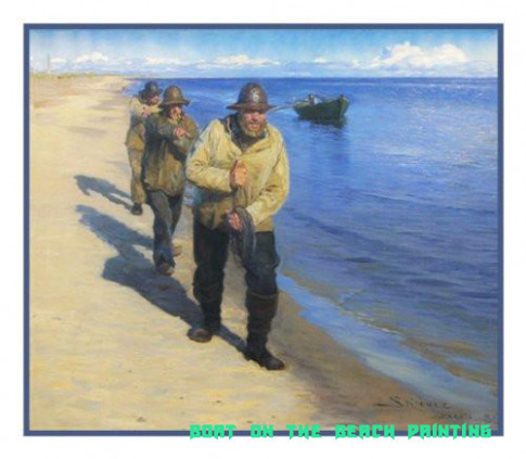
Scandinavian Artist Peder Severin Kroyers painting of Fishermen Pulling a Boat on the Beach Counted Needlepoint Chart – boat on the beach painting | boat on the beach painting

20 Diamond Painting,20D,DIY,Boat,Beach,Sunset,Landscape,Diamond Embroidery,Cross Stitch,Kit,Mosaic,Needlework,Full,Picture,Decor,Art From .. | boat on the beach painting

Fishing Boat on The Beach By Jacob Maris – boat on the beach painting | boat on the beach painting
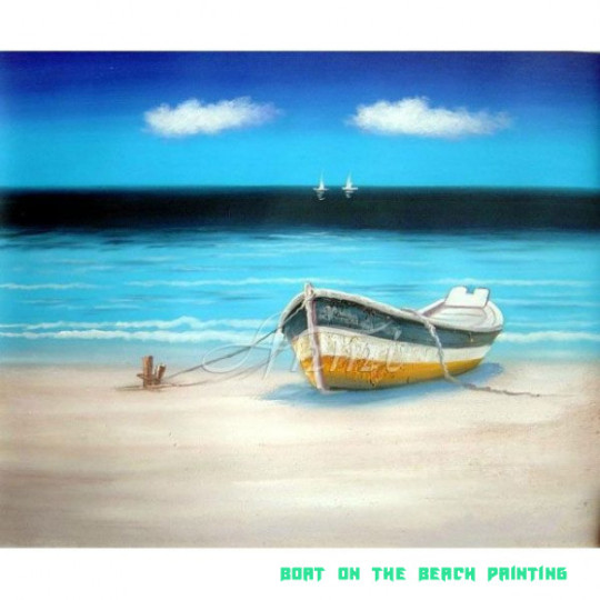
Image detail for -Boat at Beach – | Everything's Just .. | boat on the beach painting

Wholesale Latest Picture Knife Boat On The Beach Oil Painting .. | boat on the beach painting
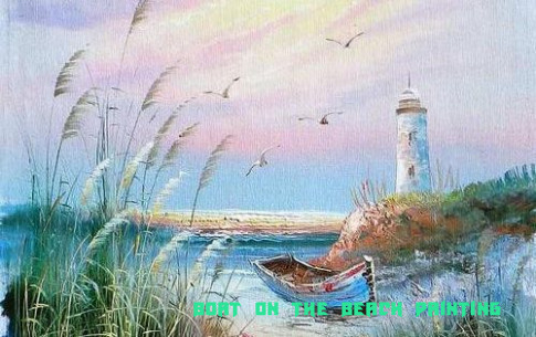
painted on canvas lighthouses | Oils – Sea with boat and .. | boat on the beach painting
Fishing Boat on the Beach Painting, Beach Scene, Seagulls and Boat, Beach Painting, Beach Lover Gift, Beach Theme Wall Art Beach House Decor – boat on the beach painting | boat on the beach painting

Marisa Murrow: Art + Design – boat on the beach painting | boat on the beach painting
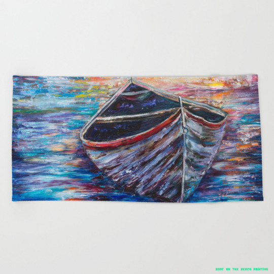
Wooden Boat at Sunrise – original oil painting with palette knife Beach Towel by olenaart – boat on the beach painting | boat on the beach painting

Workshop Demonstrations | Postcard from Provence .. | boat on the beach painting

Fishing Boats on the Beach – boat on the beach painting | boat on the beach painting

A Boat on the Beach – boat on the beach painting | boat on the beach painting
Acrylic Impressionist paintings – boat on the beach painting | boat on the beach painting

Landscape Canvas Art Print Painting Boat Beach view Wall Art Home Decor No Frame | eBay – boat on the beach painting | boat on the beach painting

An Upturned Boat on a Beach – boat on the beach painting | boat on the beach painting

Boat on the beach Original acrylic Painting on canvas by UkrHeart .. | boat on the beach painting

Watercolor Painting : Fishing Boats on Sea – YouTube – boat on the beach painting | boat on the beach painting
20 Beached Dinghy – boat on the beach painting | boat on the beach painting
The post The Cheapest Way To Earn Your Free Ticket To Boat On The Beach Painting | Boat On The Beach Painting appeared first on Wallpaper Painting.
from Wallpaper Painting https://www.bleumultimedia.com/%ef%bb%bfthe-cheapest-way-to-earn-your-free-ticket-to-boat-on-the-beach-painting-boat-on-the-beach-painting/
0 notes
Text
5 Killer Quora Answers on business cards

Exactly how to Create a Really Feeling of Deluxe with Business Cards
When you possess a luxurious brand name, luxury ought to be corresponded across every component of your advertising. The customers are going to feel it coming from the minute they keep your calling cards in their hand, right through to the moment they experience your product. Know just how to produce a luxurious feel with your business cards in this particular manual as well as you'll be one measure closer to pulling in the consumers you truly want ...
Shape
At AlphaPrint, we offer traditional oblong business cards in addition to mini as well as boxy cards. The shape you decide on will mainly rely on the kind of business you operate along with your private preference. Mini business cards are actually half the elevation of a typical card, whereas straight business cards are 55 x 55mm. Selecting an alternative condition for your business card may be an understated way to help you stick out from the crowd.
Colour
Colour can easily interact a large amount regarding a brand name without the visitor also discovering it. When our team are dealt with a specific color scheme, our experts produce quick selections business cards regarding what remains in front end of us. Daring, dynamic different colors are commonly used for vibrant, vibrant brands. Consequently, a glamorous brand ought to use colors that take high-end to mind.
When industrying a premium brand name, it is actually smart to utilize different colors thoroughly as well as elect more subtle as well as neutral moods. Make a decision exactly how you desire your consumers to experience when they think of your brand name, and pick a palette that suits with that mood. To learn more about exactly how to make use of different colors successfully in advertising, you can easily learn more in our Psychological science of Colour article.
Typography
In our article The Psychological science of Typography, our company explain the way the typeface you use may influence the way a consumer will definitely see your brand. When selecting a typeface to use for your calling cards, bear in mind your brand's character in addition to the readability of the message. It would be worthless to possess a gorgeous business card if no-one may read your call particulars!
Extravagant brands tend to select understated as well as exquisite font styles. The design of the text recommends the feeling of the product-- for instance, a brand name that values custom may opt for a manuscript design typeface. Whereas an even more modern business is going to select less complex sans-serif text like Helvetica.
Paper
There are various paper choices available, yet when creating deluxe business cards for a quality company it is regularly well to go with a luxury newspaper. Decide on a newspaper that is at minimum 350gsm (our criterion is 450gsm) and also your card will feel lavish in the consumer's palm. The sort of newspaper you pick will additionally affect the means your concept looks when it is printed-- various documents possess various degrees of absorption so colours may appear lighter on a matt paper and darker on a polish.
The paper you pick may additionally have a various form of finish. at AlphaPrint we provide three various finishes-- matt, gloss, as well as velvet. Matt finish lies and also smooth to the touch as well as develops a stylish feel, whereas Gloss is actually a high-shine finish which boosts the colour. Velvet coating is an outstanding option for high-end brand names as it offers an unrivaled soft-touch and luxury top quality. Again, birth your optimal consumer in thoughts when choosing a finish and look at exactly how the structure of the paper are going to affect the feel and look of your layout.
Decoration
An understated embellishment may go a very long way to corresponding the individual of your label. Explore embossing, hindering and also spot UV to provide your business card some extra intensity as well as appearance. Many companies select to utilize embossing for their logo or even highlight particular elements with a contact of a metallic aluminum foil. Area UV provides a selected area of your layout a high-gloss sparkle, making it catch the lighting. Every one of these decorations are actually great ways to make your card a small amount unique without being actually as well ostentatious!
The look of your business card are going to communicate quantities about your brand name, therefore take into consideration the above categories very carefully when creating. If suspicious, speak with some of our group or even select among our pre-designed themes.
Perform you have an example of spectacular branding performed right? Show us on Twitter or even Facebook!
8 Corporate Business Card Examples along with an Upper hand
Rationale behind a calling card style is actually that 1) it needs to make you stand out, as well as 2) it needs to induce an excellent adequate influence that the call you've only created phone calls you back. When you think about well-known business card instances, one of the first of these ahead to thoughts is actually Facebook CEO Mark Zuckerberg's infamous 'I am actually Chief Executive Officer, B--' card that was actually made famous in the film The Social Network. This card flaunted merely how arrogant as well as assertive the then-22-year-old Zuckerberg had to do with the business that was right on the peak of taking the planet through tornado.
These well known business cards were actually ultimately taken as well as switched out, along with the developer of claimed business cards, Brian Veloso, advising that they "were a great representation of the company lifestyle back then ... Their replacement showed the modifications a younger Facebook needed to have to look at to become where it is actually today." Andrew Bosworth, Facebook Exec, additionally believed that business cards were actually "meant as a prank for his friends." Although these business cards created a fantastic effect, they were certainly not in fact aimed to become made use of in a specialist, corporate setting.
Taking inspiration from Zuckerberg's incredibly customized calling cards example, we'll reveal you exactly how you can generate a design that definitely flaunts your individuality without risking your expertise.
Opt For an Uncommon Shape
Along with contemporary electronic publishing, it is actually never ever been easier to exhibit your artistic flair. You can go entirely on the market along with a business card molded like one thing you market or even use, like a comb for a beauty parlor or even cupcake for a bakeshop. Or if you 'd favor something even more understated, pivoted corners and straight business cards are actually an excellent way of separating yourself from your competitors.
Our experts adore the business managers as well as UX Designer Anusha Iyer's mini business cards-- the bright shades are actually excellent for this year's eye-catching layout trends as well as their unique form implies a potential client might effortlessly locate all of them again in their budget.
Have fun with Texture and also Colour
One more substantial perk in modern-day innovation is actually that full-color qualified calling cards printing does not have to cost the planet-- in reality, a lot of on the web color printers will not ask for any type of extra expense for this. It additionally indicates that there is actually a significant selection of appearances you may experiment with for your design, featuring Spot UV (also known as polish laminate). This is where you include a shiny coating to specific regions of your business card to either create them stand out or even to make a trend. How something feels in your customers' palms is actually thus necessary for making a long-term impression, therefore why not take advantage of our complimentary Area UV templates?
Our Services:
Printing Services
Copying Services
Outdoor Printing
Graphic Design
Promotional Printing
T-Shirt Printing
Contact : 01 426 4844
E-Mail : [email protected]
Address :
Unit G2, Ballymount Drive, Ballymount Rd. Lower
Dublin 12 (Same building as Office Supplies)
D12EN8A
Our Social Links:
https://www.instagram.com/alphaprintie/
https://www.pinterest.ie/alphaprintie/printing-company-in-dublin/
Related Links:
https://docs.google.com/document/d/1dPXmcMn4XMu_-tAFVnjPMQG6OlSmX1TWKDSBycGQxXM/edit?usp=sharing
https://printingcompanydublin.blogspot.com/
https://alpha-print.business.site/
https://alpha-print.business.site/posts/1516932838444735747
https://alpha-print.business.site/posts/3003857943096531290
https://alpha-print.business.site/posts/7441220902811433249
https://alpha-print.business.site/posts/7548667939518098157
youtube
0 notes
Text
Why It's Easier to Succeed With business cards ireland Than You Might Think

Just how to Generate a Really Feeling of Luxury along with Business Cards
When you have a luxury label, high-end ought to be actually communicated around every aspect of your marketing. The consumers will feel it from the second they hold your calling cards in their hand, throughout to the moment they experience your product. Discover how to generate a luxury pity your business cards within this guide and also you'll be one step better to attracting the customers you actually yearn for ...
Defining
At AlphaPrint, we provide standard rectangle-shaped business cards along with mini as well as squared cards. The design you pick are going to mainly depend on the type of business you run and also your private flavor. Mini business cards are actually half the elevation of a regular card, whereas square business cards are actually 55 x 55mm. Picking an alternate shape for your business card might be an understated method to assist you stand out coming from the group.
Colour
Colour may interact a big amount about a company without the viewer even recognizing it. When our team are confronted with a certain colour palette, our team produce immediate choices concerning what resides in face people. Strong, lively colors are actually frequently used for bold, vibrant labels. For that reason, a glamorous brand name must utilize different colors that take luxury to mind.
When industrying a premium brand name, it is wise to utilize color meticulously and choose additional subtle as well as neutral moods. Determine how you desire your consumers to really feel when they consider your brand, and also select a combination that fits with that said mood. To get more information regarding exactly how to utilize colour effectively in advertising, you may find out more in our Psychology of Colour blog.
Typography
In our article The Psychology of Typography, our company explain the way the typeface you use can have an effect on the means a client will certainly view your label. When selecting a font to use for your business card, consider your company's individual as well as the readability of the message. It would be actually useless to have a lovely business card if no-one can read your call information!
Lavish brand names usually tend to opt for understated as well as stylish fonts. The design of the lettering suggests the feel of the product-- as an example, a company that values custom may opt for a text design font. Whereas a more present day firm will definitely pick easier sans-serif lettering like Helvetica.
Newspaper
There are actually various newspaper selections on the market, however when designing luxurious business cards for a superior brand name it is actually consistently most effectively to go for a luxury paper. Select a paper that is at least 350gsm (our specification is 450gsm) and your card will feel lavish in the client's hand. The kind of paper you select will certainly additionally affect the technique your concept appears when it is printed-- different papers have numerous degrees of absorption thus shades might appear lighter on a matt paper as well as darker on a polish.
The paper you opt for can additionally have a different kind of coating. at AlphaPrint we offer three various coatings-- matt, gloss, and velvet. Matt appearance is smooth and also smooth to the style and also generates a sophisticated sense, whereas Luster is actually a high-shine appearance which magnifies the colour. Plush finish is actually a great selection for luxurious companies as it provides an unequaled soft-touch as well as luxury quality. Once more, birth your perfect consumer in thoughts when selecting a surface as well as take into consideration how the appearance of the paper will impact the feel and look of your concept.
Decoration
A subtle decoration can go a long way to connecting the personality of your brand. Explore embossing, hindering as well as area UV to offer your calling card some extra deepness as well as texture. Many brands opt for to make use of embossing for their company logo or emphasize particular elements along with a contact of a metal aluminum foil. Area UV provides a picked segment of your design a high-gloss sparkle, making it capture the light. All of these decorations are actually fantastic techniques to create your card a little bit unique without being too raffish!
The feel and look of your calling cards will certainly speak amounts concerning your brand name, therefore take into consideration the above classifications very carefully when developing. If unsure, talk with one of our crew or even choose some of our pre-designed layouts.
Perform you have an example of spectacular branding carried out right? Show to us on Twitter or Facebook!
8 Corporate Calling Card Instances with an Advantage
The whole idea responsible for a calling cards design is that 1) it must produce you attract attention, as well as 2) it has to result in an excellent sufficient effect that the call you have actually only made telephone calls you back. When you consider renowned calling cards examples, among the very first of these to follow to mind is Facebook CEO Smudge Zuckerberg's notorious 'I am actually CEO, B--' card that was actually created famous in the film The Social media. This card flaunted just exactly how cocky and vigorous the then-22-year-old Zuckerberg had to do with business that corrected on the cusp of taking the world through tornado.
These infamous business cards were actually inevitably pulled and also replaced, with the professional of stated business cards, Brian Veloso, proposing that they "were actually an exceptional depiction of the company culture at the moment ... Their replacement mirrored the modifications a young Facebook needed to look at to become where it is actually today." Andrew Bosworth, Facebook Executive, likewise thought that the business cards were actually "intended as a prank for his friends." Although these business cards produced a terrific influence, they were actually not in fact meant to be used in a qualified, corporate atmosphere.
Taking creativity coming from Zuckerberg's surprisingly tailored calling card instance, our team'll reveal you just how you can easily produce a style that truly displays your individual without compromising your expertise.
Choose an Unique Shape
Along with modern-day electronic printing, it's never ever been much easier to display your innovative panache. You can go totally out there along with a calling card molded like something you market or even utilize, like a comb for a hair salon or cupcake for a bakery. Or if you 'd favor one thing more refined, rounded corners and straight business cards are an excellent means of separating your own self coming from your competitions.
We enjoy your business owners and also UX Designer Anusha Iyer's mini business cards-- the intense shades are perfect for this year's attractive concept fads and also their unusual design suggests a potential client could effortlessly discover all of them once again in their wallet.
Have fun with Structure as well as Colour
Yet another large perk in modern technology is actually that full-color professional calling cards printing doesn't have to set you back the world-- actually, a lot of on the internet printers won't bill any sort of added price business cards ireland for this. It likewise indicates that there's a massive variety of appearances you can easily play around with for your concept, consisting of Place UV (likewise referred to as buff laminate). This is where you add a bright layer to specific locations of your business card to either create all of them stand apart or even to produce a pattern. Just how something feels in your customers' palms is thus necessary for making an enduring impact, therefore why not benefit from our totally free Area UV themes?
Our Services:
Printing Services
Copying Services
Outdoor Printing
Graphic Design
Promotional Printing
T-Shirt Printing
Contact : 01 426 4844
E-Mail : [email protected]
Address :
Unit G2, Ballymount Drive, Ballymount Rd. Lower
Dublin 12 (Same building as Office Supplies)
D12EN8A
Our Social Links:
https://www.instagram.com/alphaprintie/
https://www.pinterest.ie/alphaprintie/printing-company-in-dublin/
Related Links:
https://alpha-print.business.site/posts/6874782269417738793
https://alpha-print.business.site/posts/6986566504561667569
https://alpha-print.business.site/posts/7046696283670687750
https://photos.app.goo.gl/Szffaetq2jCES8As7
https://all4webs.com/alphaprint/signprintingindub2.htm
https://all4webs.com/alphaprint/printingindublin.htm
https://all4webs.com/alphaprint/businesssigns.htm
youtube
0 notes
Text
Instagram dark mode in mobile apps
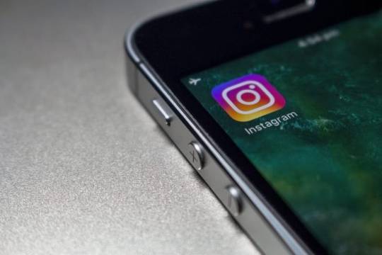
One of the most frequently mentioned highlights of Instagram throughout the years has been dark mode and now it's at long last here. Instagram quietly revealed the component on both iOS and Android. Utilizing it couldn't be simpler. You should simply ensure you download the most recent version of Instagram and that your iPhone is running iOS 13 and your Android phone is running Android 10. Dark mode on Instagram regards the framework wide dark mode settings on both working frameworks, so the second you change to dark mode in iOS 13 or Android 10, your Instagram application will likewise change to dark mode. There is no real way to flip Instagram's dark mode on and off in the application itself.
How to enable dark mode on Instagram's mobile application

iPhone users
if you use iOS 13 and have dark mode turned on at the system level, the Instagram application will auto-change in accordance with dark mode.
Ensure you're running iOS 13 on your iPhone.
Open Settings on your device, at that point go to Display and Brightness, and tap Dark.
Install the Instagram application (or update it to the most recent form) on your device and open it.
Instagram will, as a matter of course, consequently react to your device's system setting.
Android users
To empower system wide dark mode on Android 10 (and consequently in Instagram, as well):
Go to your Settings application
tap Display
tap the Dark theme button
When will Instagram's dark mode be available?
Dark mode support is apparently now turning out to the Instagram iOS application, so ensure you're running the most recent form of that application. There's no word yet on when it's coming to Android. Tragically, for as pleasant as it looks, Instagram doesn't give you a chance to flip the dark mode alternative on or off inside the application itself, as Twitter's pre-iOS 13 expansion of the feature does. That implies it needs to match your iPhone's system wide settings, which is really standard right now as most iOS application producers are including dark mode support just because.
Instagram

Since its commencement in 2010, Instagram has made some amazing progress from its unassuming beginnings to wind up one of the most popular applications out there, in excess of 300 million individuals utilize the picture and video-sharing platform and keeping in mind that it has quit developing like a mushroom after the late spring rains, the platform keeps on picking up clout and impact.
A great deal of that utilization happens late at night, obviously, few things are cozier than cuddling down under a warm blanket and looking through a couple of hundred snaps and videos. Tragically, gazing at that splendid white screen is terrible for your rest design and hard on your eyes. Hence, numerous individuals ask us whether Instagram has a "dark mode" to enable you to utilize a darker shading palette with light content on a dark background.
Conclusion
Dark Mode has arrived on Instagram for iOS 13. The hold up is presently finished. Simply update your iPhone application. Dark Mode on Instagram is empowered with your iOS 13 settings. What's more, obviously, individuals couldn't be more joyful about Dark mode, as proved by every one of the posts on Twitter about it. Dark modes have turned out to be well known lately, because of their capacity to darken interfaces, accordingly diminishing any strain on your eyes and at the same time sparing your device's battery life. Accordingly, organizations like Google and Apple have started to discharge system wide dark modes over their working system and even application engineers are updating their applications with help for dark modes.
You will also like:

Modern technology advantages and disadvantages
Read more here...

Industrial revolution: causes, invention and effects
Read more here...

Candy Crush Saga the most popular game facts
Read more here...
Here are some products for die hard fans of the Candy Crush games.
Candy Crush Saga Advanced Guide: Tips, Cheats, Secrets and Strategies (Game App Guides)Jfranco King Candy Crush Plush Blanket: 62in x 90inThe Candy Crush Adult Coloring Book: Creatively Color the Candy KingdomCandy Crush Socks Gifts (6 Pair) – (Women’s) Candy Crush Saga Merchandise Low Cut Socks – Fits Shoe Size: 4-10 (Ladies)Candy Crush “Coral” Fleece Blanket, 50 x 60-inchesCandy Crush ‘I Need a Life!’ T-Shirt
Read the full article
0 notes
Photo

Picture the scenario: Despite your best intentions and the careful consideration taken to construct a message, it gets misinterpreted by the recipient. It can happen to the best of us. Indeed, when it comes to online communication, things can often get lost in translation and it can be hard to control how we are perceived by others. This is something that can be of particular concern for businesses or brands. However, ensuring your company has a clearly defined tone of voice (TOV) can, to some extent, help reduce the likelihood of this problem occurring. In this blog post I will discuss tone of voice guidelines: what they are, why they matter and which brands are using them well. Read on to find out more. What Is Tone Of Voice? Tone of voice refers to the way you express your company’s character and personality within your communications. It entails everything from the rhythm, pace, vocabulary, grammar and syntax used in your writing and the overall tone this helps to create. Essential for connecting and engaging with customers, your tone of voice applies to pretty much all communications; every social media post, every live chat message exchanged with a customer, every slogan on ads. Some even go as far as to say that a brands tone of voice should extend to the language they use in call centres and on customer service bills. Otherwise, it’s argued, there is a potential disconnect between the brand and the customer, which could impact on sales. Similar to how you use a logo, colour palette and competitor list, it’s important your business has detailed guidelines outlining tone of voice best practice. Why Does Tone of Voice Matter? Trust and reputation is crucial to any business, especially online. Consumers know when somethings a bit off about a company and one thing that can make them suspicious is inconsistency. When browsing online, consumers will often look for consistent brand colours and a familiar logo for reassurance. Similarly, they’ll also look at a consistent tone of voice. If your tone of voice is erratic across all channels, it can be taken as an indication that your company is not to be trusted. Having a consistent tone of voice not only helps to build trust, it also helps to humanise your brand and separate you from your competitors. Plus, tone of voice guidelines matter as they help staff to adhere to the same style of writing -whether that be on your blog, on your social channels or in your advertising campaigns. Switching between different voices will often leave people confused and dilute any efforts to communicate your brand values. Speaking of which… How Tone of Voice Relates to Brand Values What is it that your company stands for, believes in and is trying to communicate to others? What is it that drives your company? These are the kind of questions you should be asking yourself when it comes to defining your brand values. Your tone one of voice, meanwhile, is the vehicle with which you express, promote and reinforce these values, traits and philosophy. Brand values are core to your company and grow naturally out of who you are as a company, as opposed to simply plucking them out of thin air. Ideally, the messaging and tone of voice used across all your communications should reflect your brand values. This will help drive people through your marketing funnel and also help you to appear reliable and trustworthy. Creating Your Own Tone Of Voice Guidelines If you are yet to create your own tone of voice guidelines, a good starting point can be to audit your existing content. Identify your best performing content and analyse the tone of voice in each. Despite having been created without a tone of voice in mind, are there any common themes evident in terms of writing style or personality? This can help you understand what kind of voice best resonates with your audience. Next, try to define your brand as if it were a real person with a real personality. Describe it in no more than 5 words, then drill these characteristics down even further. For example, if you used the word ‘alternative’ to describe your business, other characteristics you might include are ‘quirky’, ‘eccentric’ and ‘unusual’. Create a list of the words you can use in your marketing efforts. Following this, start providing examples of things your brand DOES say and, equally as important, things your brand DOESN’T say. In fact, sometimes it’s easier to begin with defining everything your company is not. If your brand is unlikely to ever be heard saying ‘epic’ or ‘awesome’, then make sure it’s documented! Having these thorough and detailed tone of voice guidelines in place is so valuable to your company, especially for new staff. Also, remember to adjust your tone and style for different channels and audiences. Whilst your brands voice remains constant, it can take on a different tone depending on the situation including: Who you’re talking to – For instance, consider the difference in how you address an existing customer compared to an individual who is completely new to your brand. What you’re talking about – Are you writing a product page, a blog post which contains instructions or talking to a customer via live chat? Each subject has a different purpose and requires an altered tone. Where you’re talking about this – The way your brand writes for Twitter will, naturally, vary compared to other social channels, your blog or a written letter. Last but not least, nit-pick away and detail your brands spelling and grammar preferences. Are American spellings acceptable? How about hyphenated words? Leave no room for ambiguity or inconsistency! Which Brands Are Using Tone Of Voice Well? Innocent Smoothies: Go ahead, roll your eyes. A blog post about tone of voice which features Innocent Smoothies? Zero points for originality, I know! But, as predictable as this one is, it’s predictable for a reason. Innocent are a brand that really understands tone of voice. Think of every possible channel this brand can communicate their voice through, from Twitter and Facebook right down to their ingredients label, and you can guarantee it has their fun and quirky personality stamped all over it. They even manage to inject a bit of fun into a bog standard 404 error page with some video content: Their navigation bar reflects their light-hearted and alternative tone of voice too. In the name of research, I had to investigate their ‘bored?’ pages. This presents the user with some fairly interesting content like information about their packaging over the years, adverts and photos from Innocent HQ. Dig a little deeper/scroll a little more, however, and you get to the truly good stuff – ‘really bored’. Videos of dogs chewing stuff and penguins pinching stuff? I.AM.SO.IN. Bravo, Innocent! Missguided: Missguided, an online retailer which sells young women’s clothing, has nailed the whole supportive best friend/sister persona down to a tee. On social media, customers are referred to as ‘babe’ and are frequently celebrated. The hashtag in particular, encourages a sense of community and sisterhood amongst its followers. Obviously aware of their young appeal, they use emojis in pretty much every single breath. They pride themselves on being fresh and current, like the clothes they sell, and this too is reflected in their tone of voice. Indeed, they’re always up to date on the latest lingo and emulate how young people speak (If the phrases ‘can’t even’, ‘lit’ ‘throw shade’ or ‘squad goals’ leave you feeling confused then you should probably go ask your BFF or bae to shed some light). On their website they describe themselves as bold, straight talking, fashion forward and say they aim to empower women globally to be confident in themselves. Something I particularly like on their ‘about’ page is the reference to a Beyoncé lyric ‘who run this mother’, when discussing their CEO. It’s youthful, rebellious and a bit cheeky, babe. Kate Spade: Kate Spade is a brand that produces women’s handbags, clothes and jewellery. Like Missguided, Kate Spade has a relatively young audience but tends to communicate with its followers in a more thoughtful and mature tone. Their social media posts are considered and lengthy, compared to the clickbait, snappy text and emojis commonly used by companies to grab the attention of an easily distracted, younger generation. There’s also a clear brand guideline which is adhered to across all their online communications. This includes minimal usage of capital letters (as seen in the ‘who we are’ page of their website and their social posts below). The Kate Spade tone of voice conveys simplicity, sophistication and elegance and is less ‘in your face’ than other brands aimed at a young women. Gillette: OOH Controversial. Gillette is a razor brand that’s been around for yonks but, unless you’ve been living your life social media free recently, you’ll be aware of the Twitter storm its recent ad campaign caused. Traditionally known for its straight talking and direct tone of voice, it’s tagline, which has always been ‘The Best A Man Can Get’ has experienced a bit of a twist for their latest campaign to become ‘The Best Men Can Be’. Entering into the current dialogue surrounding the issue of toxic masculinity, some argue that Gillette have isolated their core audience with this new advert while others have applauded them for its admirable message. As you can see on the website, Gillette have addressed their new campaign and it’s messaging on a dedicated page. The tone of voice remains forthright and frank, and they utilise short, abrupt sentences, such as the following: ‘We’ve all got work to do. And it starts today. Gillette. The Best A Man Can Get.’ However, other areas of the website such as the about page is now inclusive of women, which is more in alignment with their altered brand values: ‘We are the men and women of Gillette, and we’ve got something to say to you’. What do you think of Gillette’s change of approach and messaging? Skittles: As someone who personally has a very sweet tooth and considers themselves somewhat of a sweet connoisseur, for me, Skittles aren’t all that special. Nonetheless, they’re one of the few sweet brands which really stand out when it comes to tone of voice. ‘Taste the rainbow’, the tagline on their quirky, fun and downright bizarre adverts, is instantly recognisable. Similar to their adverts, anything normal, ordinary or standard is thrown out the window when it comes to their online communications. Even their website meta description doesn’t follow the rules. 165 characters? SEO? Google best practice? Who cares! They’re Skittles, they don’t need no visibility: Make it onto the website and your confronted with a whole host of quirky and strange statements/questions which links to their Tumblr account: And then there’s the Twitter account which is full of personality with off the wall, wacky and goofy posts. Interestingly, these posts are all written in the first person which makes Skittles unique compared to its competitors, offers a more human element to the account and encourages followers to remain loyal. Even, the ‘about’ section on the Skittles Facebook page makes for entertaining reading. “Anything you or any other fans around the globe post on the wall is your own doing, and does not reflect the opinion of Skittles, the Rainbow, any ninja, anyone registered with WM. Wrigley Jr. Company, or most registered hedgehogs”. I rest my case! Do you need help in developing or honing your business’ tone of voice? Our content team has vast experience in this area, from helping companies to define their brand values and create a tone of voice from scratch to producing content for client websites off the back of existing tone of voice guidelines. Drop us a message in the contact form below or feel free to call us at our Brighton office on 01273 733 433. Contact Us Name* First Last Email* Message*NameThis field is for validation purposes and should be left unchanged. jQuery(document).bind('gform_post_render', function(event, formId, currentPage){if(formId == 13) {} } );jQuery(document).bind('gform_post_conditional_logic', function(event, formId, fields, isInit){} ); jQuery(document).ready(function(){jQuery(document).trigger('gform_post_render', [13, 1]) } );
0 notes
Text
Blog organization: A guide
Mama bird here, gonna give ya a rundown on how to make ur bloggos 👍👍 so y’all can gain more traffic and love for all ya lovely blogs and mons.
Been doing this pokemon blogging business for 4 years, been here and back, so lemme give ya the 411 on how to make them blogs sparkle n shine

Pokeask/daily blogs should be focused on exactly that: interactions and the such. OOC should be limited to munday memes and the such. I know some folks prefer to keep ooc meme prompts to weekends and munday, I’m more neutral on that. Do what you like, just tag it accordingly so people can blacklist if they don’t want to see meme content. Use a meme tag. I myself have a personal tumblr where I reblog all sorts of stuff, cuz tbh when I look at a blog I want to see stuff relating to the theme of the blog, not random ooc reblogs (been seeing a blog reblogging animals relating to their muse under a specific tag, I’d say that’s perf fine since it’s related, and there’s a tag that can be blacklisted if folks don’t wanna see it!).
But Yonder I want to talk to other people and jab about the stuff I like! How do I talk to others if I’m gonna clog up daily/ask content here? Fam I feel you. I talk bout myself all the time lmao. On my twitter, and in discord chats! Got twitter a year ago, It’s a perfect platform to get to know others better, and you can do memes there too! Nowadays when people talk to me via IM I redirect them to my twitter cuz it’s just easier for me. The formatting of twitter just makes it easier to start convos b/c everyone’s pretty much constantly making new convo starters you can respond to whenever. This is more of a personal note but I don’t really show my personality much here on my blogs so by looking through my twitter peeps’ll be able to better judge if we’ll get along!
Speaking of tagging: Abuse the tagging system! Got an ooc post? Tag it ooc! Got an art post? Use an art tag (you don’t have to, that’s getting fairly specific, but I do)! For example: I use the tag #out of park for my ooc posts. And specific mons are tagged as is too! So if someone wants to dig up a specific response they can via a species tag like #pangoro or w/e.
As a side note when people search up tags on tumblr, only the first 5 tags of any given post are put into those tumblr searches. If you want people to find your art tagged under #pkmnart or w/e, be sure it’s one of the first 5 tags in your post! This’ll make sure your content will be seen by more people who otherwise wouldn’t have seen it.
Have all info on a muse easily accessible (aka, a ref)! If I can’t find it within 5 clicks or so (this is relating to user interfaces in general on the web), I’m probably not gonna bother to dig around for it. Got other things to do fam, job, college, commissions, adult life n all that jazz. And we all know social media gives us terribly short attention spans lmao.
Clean up outdated material. Done with that meme you did a few days ago? Delete the prompt so it’s not cluttering your content. If you really wanna save those meme responses, make them into a private post, or compile them all in a draft and delete the original posts. It breaks my heart when I see a lovely blog, but I gotta dig through 10 meme prompts to see any actual content. I usually don’t follow a blog back if I see that.
This is a huge pet peeve of mine but Trim Ya Posts!! See this?

I’ll instantly unfollow if I see this. If you’re going to reblog something like this please, I implore you to 1) use ya personal blog homie, this really shouldn’t be on an ask/daily blog. 2) tag as #long post so that blacklist extension can do it’s magic. This extends to untrimmed rps. Xkit has extensions that allow for deleting the older replies in threads, so when you reblog something your followers aren’t seeing the same starter post for the 20th time.
What if I can’t get Xkit? Well, usually in that case the best alternative is to draw/make the reply and put a [previous post] link either above or below your reply! Trust me, your followers will thank you for it.
Some other tips:
Don’t use super bright colors for blog headers and themes. If them colors make my eyes hurt I’m avoiding it like the plague. https://coolors.co/ is a great color palette generating site! How we perceive color varies from person to person but generally super saturated colors should be avoided for blog headers.
Don’t reblog 4 memes at once. It’s a bit much, at least to me;;
If someone’s taking requests and is asking for a reblogged ref, reply to the original post instead of making a giant thread of ref pics
People might be tearing into each other for w/e reason on your dash but honestly even if the people involved made it public don’t get mixed into it if it doesn’t involve you. Be mature and know when to mind your own business.
Adding to this: talk about issues privately. Not everyone needs to know your beef with so-and-so unless they’re a threat to minors or they’re doing something undeniably nasty, ect.
Don’t gossip. Dude. You may not think so but we can tell who you’re vauging about. Just. Stop. Vent to a friend in private or something.
Dumb anon bugging you? Just. Block em hun. Take a breather, they have no power over you. Just reply with ¯\_(ツ)_/¯ and move on.
Communicate. If something someone does bugs you, talk to them privately. Vauging and gossiping does nothing to solve the problem except make it incredibly hard to discern what’s truth and what’s not in a situation.
Don’t force a friendship by saying “can we be friends?” It makes things incredibly awkward. You don’t become a friend with someone via request. The best friends I’ve made on here? I don’t even remember when or how we started talking, it just happened naturally.
Generally, peeps have an internet alias that isn’t their muse’s name. For example, my name is not Grovyle. My name is Yonder, and I don’t wish to be addressed as Grovyle as she is one of many fictional fabrications I have. She’s not my identity, not by a long-shot. I’ll only resort to using the muse/url I know them by to address someone if I literally have no other way to distinguish them in a chat.
Oneliners and incoherent sentence structure (not on part of the muse’s personalty but rather the person’s writing) on a regular basis in a response tend to make it very hard for people to reply or maintain interest. Though generally this applies more to text-based blogs where text is what people are coming to the blog for.
Ur all wonderful n I know many of you are new to this and I want you all to enjoy blogging and avoid the mistakes I made when I was a wee blogger back in 2013. Feel free to ask for clarification, I write this in an attempt to help things be more streamlined and easier for everyone in this community! And of course, I’m sure plenty of this is subjective on my part.
Love y’all!
50 notes
·
View notes
Text
The Ultimate Guide to Instagram for Business
More companies are using Instagram than ever before — there are now over 25 million businesses on Instagram, most of which are small businesses.
To capture a new audience and engage with your existing customers, it’s critical you consider using Instagram for your business. With over one billion Instagram users, Instagram is one of the most popular social media tools at your disposal.Instagram has proven a worthwhile investment for marketing purposes. You’re able to market your products to a more targeted and engaged audience, and it’s cheaper than more traditional forms of paid advertising.
Plus, it’s an undeniably powerful tool to spread brand awareness — in fact, 90% of Instagram users follow at least one business on the platform.
But using Instagram for business purposes can seem daunting, particularly if you’ve only ever used it for personal use. Here, we’re going to explore how to leverage the power of Instagram for all your business needs.
How to Use Instagram for Business
Let’s delve into the six strategies you’ll need to employ to get the most out of Instagram.
1. Add Value With Your Content
First and foremost, Instagram is a visual platform. To attract an audience, it’s critical you spend time delivering high-quality, thoughtful content.
Instagram has the highest engagement rate, surpassing Facebook and Twitter. To succeed on Instagram, it’s essential you create valuable content that attracts an audience and encourages them to engage with your business. Consider how you can delight your customers while staying true to your brand.
You don’t need to just post images of your product to spread brand awareness and increase sales. In fact, in some cases, it’s better if you don’t. For instance, Hot Pockets sells microwaveable pocket sandwiches. Admittedly, I wasn’t much of a fan of Hot Pockets — until I began following their business’s Instagram account.
There are only so many times you can post a picture of a sandwich. Hot Pockets goes in a different direction. Instead, they appeal to their audience through humor, often posting relevant memes or funny quotes.
For instance, in response to @ShallowDivers’ claim that Hot Pockets aren’t sandwiches, Hot Pockets responded with this:
Ultimately, it might take trial and error to find the content that works best for your business.
While Hot Pockets relies on humor, other brands like The North Face use impressive adventure images to appeal to their demographic.
The point is, brands need to add value to Instagram’s community rather than using the platform for advertisements alone. This is critical for your long-term success.
2. Maintain a Consistent Theme
Imagine each Instagram post as an individual page of your website — while each post should be good on its own, ideally you’ll need to create a cohesive theme to maintain an audience’s loyalty.
It’s important to note, I mean “theme” in the broad sense, as it relates to everything from hashtags and captions to Stories and photos. You’ll need to create a consistent tone of voice and a unified feed aesthetic. Ultimately, the more specific and consistent you are with your posts, the more likely you are to attract your most authentic audience.
You might think it’s better to appeal to more people through various themes, but ultimately, staking your claim in a specific niche will help you create stronger, more genuine connections.
For instance, consider MVMT. Their feed is undoubtedly consistent, with similar filters and color palette, and an emphasis on darker, edgier images:
Their consistency is equally obvious in their captions, with phrases like “Create a life you can’t wait to wake up to,” and “Unexplored paths lead to undiscovered stories.” In every post, you’ll see the same hashtag: #jointhemvmt.
Undoubtedly, their followers both expect and prefer this type of content, or they wouldn’t have followed them in the first place. To continue delighting customers, it’s essential MVMT keeps true to their theme.
3. Engage With Your Audience
Engaging with your audience helps your followers feel valued and, as a result, more connected to your business.
There are plenty of ways to engage with your audience. You might reply to comments on your posts, participate in comment threads, run contests or giveaways, use Instagram Stories polls feature, or give shout-outs to followers on your Stories, particularly if they post something relevant to your brand.
Halo Top Creamery does a fantastic job of engaging with their audience. They frequently post cute ice cream pictures with the caption “Ice cream is better with friends. Tag a friend you’d like to eat this with.” A simple “tag a friend” caption is an effective strategy for growing your audience since your followers will then tag friends who might not know about you yet.
Additionally, Halo Top often does contests and giveaways, like this one:
By tagging winners in their posts, Halo Top incentivizes other followers to engage with their brand in the future. Additionally, Halo Top’s giveaways demonstrate their genuine commitment to connecting with their audience.
4. Consider Influencer Marketing
As a consumer, you’ve likely seen the recent influx of influencer marketers on Instagram — and for good reason. By leveraging the power of an influencer, who is already authentically connected with her audience and seen as a trusted source of information, you’re able to spread brand awareness and drive sales.
Micro-influencing in particular is a strong opportunity for brand endorsement. In fact, one survey found 82% of consumers are highly likely to follow a recommendation made by a micro-influencer. That surpassed the number of consumers who are willing to follow a recommendation from an average person, like a family member or friend.
You could use your budget and resources to invest in traditional advertising, but it’s often easier to create a more targeted, effective marketing campaign through influencer marketing. Ultimately, influencers have already cultivated an engaged, loyal following — by identifying the right influencers for your niche, you’re much more likely to find followers who will truly enjoy and support your products or services.
5. Implement an Instagram Ad Campaign
There are two reasons you might use Instagram ads — to spread brand awareness or to increase sales.
It’s critical you focus on one goal when creating an effective ad campaign. An Instagram ad aiming to sell a product will look vastly different from one intending to attract followers.
For instance, consider this Greenchef ad that showed up on my Instagram feed today. With various images of delicious food and an enticing “$40 OFF” discount, it’s likely a high-converting ad. It’s very clear what Greenchef’s goal is: to get people to buy their product.
YouTube, on the other hand, invested in Instagram ads for an entirely different reason. Their advertisements, featuring well-known singers like Camila Cabello, entice followers to simply follow YouTube Music’s Instagram channel (and, ideally, YouTube’s music channel itself).
To implement an effective campaign, it’s essential you decide what you’re hoping to achieve before you begin creating it.
Once you’ve chosen a goal, you’ll want to create the ad creative. Similar to what we discussed in strategy one, you’ll need to create high-value visual content if you want your ad to be successful. Take a look at other ads on Instagram and consider how you might emulate them.
Additionally, A/B test multiple variations of the same ad (changing the copy, image, or targeted audience for each version), to figure out what works best for your business.
When you’re ready to create your ad, you’ll need to use Facebook Ads Manager. Among other things, Ads Manager lets you narrow in on your target audience (including location, age, and various interests of your ideal demographic), choose your ad objective, and analyze ad performance.
6. Utilize Shoppable Posts
Shoppable Posts is an Instagram feature that makes selling on Instagram easier. You’ll be able to create posts that provide users with a seamless shopping experience directly on the platform. The advantage of this being less friction for turning your followers into customers.
Before you begin executing these strategies, you’ll need one thing: an Instagram Business Profile.
What Is a Business Profile on Instagram?
An Instagram business profile is a special account that Instagram offers to brands and organizations. With a business profile, you get access to additional features, such as Instagram Insights and the ability to run ads.
A business profile legitimizes your Instagram account and enables you to add critical information like your company’s business hours, location, and phone number.
Pros and Cons of an Instagram Business Profile
“Whoa, whoa, whoa,” you might be thinking. “I don’t know how I feel about committing to all that.
Here are some helpful pros and cons so you can determine if a business profile is right for you before jumping in:
Pros
Access to metrics on how your posts and stories perform
Ability to track how your followers engage with your content
Access to features necessary to run ad campaigns
Gain feature for adding URLs to Stories so you can send warm traffic to your site
Cons
For most brands, the benefits of a business profile outweigh the cons due to the additional features and analytics. However, it’s important to consider your goals before taking action.
How to Create a Business Instagram Profile
In order to create a business profile on Instagram, you must first create a personal Instagram account and then switch it to a business profile. If you already have an Instagram account, skip to the next section for instructions on making the switch.
If you don’t already have an Instagram account, here are the steps:
From the Computer
Go to instagram.com.
Click “Sign Up.”
Enter your email address and create a username and password. You can alternatively sign up through your Facebook account.
From an iPhone
Download the Instagram app from the App Store.
Open the app once installed.
Tap “Create New Account.”
Enter your email address or phone number. You can alternatively sign up through your Facebook account.
If you signed up with your phone number, follow the instructions for entering the confirmation code.
From an Android
Download the Instagram app from the Google Play Store.
Open the app once installed.
Tap “Sign Up With Email or Phone Number.” You can alternatively sign up through your Facebook account.
If you signed up with your phone number, follow the instructions for entering the confirmation code.
How to Switch to Your Business Profile
When you have an Instagram set up, follow these easy steps when you’re ready to make the switch:
1. Go to your profile on the mobile app.
2. Click the hamburger menu (three stacked horizontal bars) in the top right corner.
3. Click the “Settings” gear at the bottom of the menu.
4. Select Account.
5. Choose Linked Accounts.
6. Choose Facebook and follow the prompts to connect your business’s Facebook page. If you do not have a Facebook Business Page, you will need to create one before completing this step. If your Facebook page is already linked, move on to the next step.
7. Once complete, return to the Settings menu.
8. Select Account.
9. Choose the new option “Switch to Professional Account.”
10. Follow the prompts to add any additional details.
11. Select Done.
You’re now ready to begin implementing your social media strategy on Instagram. From here, you’ll want to determine the audience you want to target, the aesthetic and tone you want to convey, and the content you want to create.
Source link
source https://www.kadobeclothing.store/the-ultimate-guide-to-instagram-for-business/
0 notes
Text
Yooka-Laylee and the Impossible Lair's Levels Can Completely Change - and It's Awesome
New Post has been published on https://gamerszone.tn/yooka-laylee-and-the-impossible-lairs-levels-can-completely-change-and-its-awesome/
Yooka-Laylee and the Impossible Lair's Levels Can Completely Change - and It's Awesome
Though a sequel to the Banjo-Kazooie spiritual successor Yooka-Laylee from Playtonic Games, Yooka-Laylee and the Impossible Lair harkens back to Rare’s even older work, Donkey Kong Country, with a 2D-focused platforming adventure. And from my play time with a handful of levels — and the new capability to “flood” levels and create an alternate stage to play through — the sequel could very well prove to be an even better fit for the colorful, anthropomorphized world of Yooka and Laylee.Watch the gameplay video above to see several of Yooka-Laylee and the Impossible Lair’s stages — namely, Gasping Glades, Factory Fright, and Urban Uprise — in both their standard, and “flooded” or “updrafted” forms.
Yooka-Laylee and the Impossible Lair Screenshots
The Impossible Lair introduces the ability to solve environmental puzzles in Impossible Lair’s overworld, presented via an isometric camera, which then trigger the ability to swap a level between two versions. The first is the standard version of the level, and having played through these, they are by no mean a cakewalk. From Factory Fright’s narrow windows to dodge moving buzzsaws to the spiky platforms and enemies around nearly every corner of Urban Uprise, I certainly saw Yooka and Laylee part ways after a hit several times, but the feel of Yooka’s jump, dodge, and attacks instantly clicked with me. Playtonic’s pedigree shows, and the developers have given the platforming a satisfying weight and rhythm, with level design that pretty quickly challenges you with some rewarding scenarios.
Completing these levels in their standard form is just the start, though. You can flip them to modified versions, in these cases either by water or wind flooding in from the outside world. And the changes create almost entirely new experiences, with direct 1:1 comparisons to the level existing solely for what feels a reason to have the player go “Oh wow, so that’s how this plays now.”
And I certainly said that a few times, as the cold metallic halls of Factory Fright became a blue-tinted submerged tunnel, or the tight platforming ascending columns of Urban Uprise became wind tunnels I needed to nimbly fly through. At other points, like in Gasping Glades, the level took on a nearly unrecognizable layout, in that case becoming a vine-riding railway in its flooded level, as the jungle region became caught in a downpour.
But even when direct parallels can be drawn between the two versions of a level, each iteration feels like its own experience, testing my jumping and dodging timing in new and interesting ways. Gasping Glades’ flooded version mirrors bits of Donkey Kong Country’s mine kart levels, tasking me with worrying less about left-to-right movement and more about the painstaking precision of my jumps while grinding on vines. And the first collectible coin in Factory Fright required nimble jump dodging in its standard version. To get the first collectible coin in the flooded level, though, I just needed to easily break through some boxes in a flooded side room.
Alternate stages appear to make significant and intriguing changes to levels to essentially create new but thematically similar experiences. And each one I played proved challenging and rewarding in both forms. Part of that reward is in overcoming The Impossible Lair’s difficulty which is, so far, not impossible but definitely tested my longstanding platforming skills. And another large part of it is in the audio and visual design Playtonic has delivered.
As much of a 3D platformer fan as I am, particularly of the Banjo-Kazooie series, Yooka-Laylee’s art style feels tailor-made for 2D. It’s bright color palette makes each portion of a level pop, with a variety of cute and deadly enemy design. And Grant Kirkhope and David Wise’s new score is downright delightful. I played through these levels multiple times in large part just to hear a few of these tracks over and over, particularly the chillest of chill water level themes. Playtonic needs to release a standalone soundtrack, stat.
Overall, my time with these levels proved Yooka-Laylee and the Impossible Lair’s level flipping mechanic doesn’t just serve as a cheap gimmick or a thinly veiled set of level reskins. Playtonic has made some genuinely drastic changes to levels that maintain a level of surprise, challenge, and fun even after exploring every nook and cranny of one form.
Jonathon Dornbush is IGN’s Senior News Editor and a huge fan of Rare’s platforming catalogue. Hear him demand a Banjo-Threeie on Twitter @jmdornbush.
Source : IGN
0 notes
Text
The Ultimate Guide to Instagram for Business
More companies are using Instagram in 2018 than ever before -- there are now over 25 million businesses on Instagram, most of which are small businesses.
To capture a new audience and engage with your existing customers, it's critical you consider using Instagram for your business. With over 800 million Instagram users, Instagram is one of the most popular social media tools at your disposal.Instagram has proven a worthwhile investment for marketing purposes. You're able to market your products to a more targeted and engaged audience, and it's cheaper than more traditional forms of paid advertising.
Plus, it's an undeniably powerful tool to spread brand awareness -- in fact, 70% of Instagram users have reported looking up a brand on the platform.
But using Instagram for business purposes can seem daunting, particularly if you've only ever used it for personal use. Here, we're going to explore how to leverage the power of Instagram for all your business needs.
How to Use Instagram for Business
Let's delve into the five strategies you'll need to employ to get the most out of Instagram.
1. Add Value With Your Content
First and foremost, Instagram is a visual platform. To attract an audience, it's critical you spend time delivering high-quality, thoughtful content.
Instagram has the highest engagement rate, surpassing Facebook and Twitter. To succeed on Instagram, it's essential you create valuable content that attracts an audience and encourages them to engage with your business. Consider how you can delight your customers while staying true to your brand.
You don't need to just post images of your product to spread brand awareness and increase sales. In fact, in some cases, it's better if you don't. For instance, Hot Pockets sells microwaveable pocket sandwiches. Admittedly, I wasn't much of a fan of Hot Pockets -- until I began following their business's Instagram account.
There are only so many times you can post a picture of a sandwich. Hot Pockets goes in a different direction. Instead, they appeal to their audience through humor, often posting relevant memes or funny quotes.
For instance, in response to @ShallowDivers' claim that Hot Pockets aren't sandwiches, Hot Pockets responded with this:
Ultimately, it might take trial and error to find the content that works best for your business.
While Hot Pockets relies on humor, other brands like The North Face use impressive adventure images to appeal to their demographic.
The point is, brands need to add value to Instagram's community, rather than using the platform for advertisements alone. This is critical for your long-term success.
2. Maintain a Consistent Theme
Imagine each Instagram post as an individual page of your website -- while each post should be good on its own, ideally, you'll need to create a cohesive theme to maintain an audience's loyalty.
It's important to note, I mean "theme" in the broad sense, as it relates to everything from hashtags and captions to Stories and photos. You'll need to create a consistent tone of voice, and unified feed aesthetic. Ultimately, the more specific and consistent you are with your posts, the more likely you are to attract your most authentic audience.
You might think it's better to appeal to more people through various themes, but ultimately, staking your claim in a specific niche will help you create stronger, more genuine connections.
For instance, consider MVMT. Their feed is undoubtedly consistent, with similar filters and color palette, and an emphasis on darker, edgier images:
Their consistency is equally obvious in their captions, with phrases like "Create a life you can't wait to wake up to", and "Unexplored paths lead to undiscovered stories". In every post, you'll see the same hashtag -- "#jointhemvmt".
Undoubtedly, their followers both expect and prefer this type of content, or they wouldn't have followed them in the first place. To continue delighting customers, it's essential MVMT keeps true to their theme.
3. Engage With Your Audience
Engaging with your audience helps your followers feel valued and, as a result, more connected to your business.
There are plenty of ways to engage with your audience. You might reply to comments on your posts, participate in comment threads, run contests or giveaways, use Instagram Stories polls feature, or give shout-outs to followers on your Stories, particularly if they post something relevant to your brand.
Halo Top Creamery does a fantastic job engaging with their audience. They frequently post cute ice cream pictures with the caption "Ice cream is better with friends. Tag a friend you'd like to eat this with." A simple "tag a friend" caption is an effective strategy for growing your audience, since your followers will then tag friends who might not know about you yet.
Additionally, Halo Top often does contests and giveaways, like this one:
By tagging winners in their posts, Halo Top incentivizes other followers to engage with their brand in the future. Additionally, Halo Top's giveaways demonstrate their genuine commitment to connecting with their audience.
4. Consider Influencer Marketing
As a consumer, you've likely seen the recent influx of influencer marketers on Instagram -- and for good reason. By leveraging the power of an influencer, who is already authentically connected with her audience and is seen as a trusted source of information, you're able to spread brand awareness and drive sales.
Micro-influencing in particular is a strong opportunity for brand endorsement. In fact, one survey found 82% of consumers are highly likely to follow a recommendation made by a micro-influencer. That number surpassed the amount of consumers who are willing to follow a recommendation from an average person, like a family member or friend.
You could use your budget and resources to invest in traditional advertising, but it's often easier to create a more targeted, effective marketing campaign through influencer marketing. Ultimately, influencers have already cultivated an engaged, loyal following -- by identifying the right influencers for your niche, you're much more likely to find followers who will truly enjoy and support your products or services.
5. Implement an Instagram Ad Campaign
There are two reasons you might use Instagram ads -- to spread brand awareness, or to increase sales.
It's critical you focus on one goal when creating an effective ad campaign. An Instagram ad aiming to sell a product will look vastly different from one intending to attract followers.
For instance, consider this Greenchef ad that showed up on my Instagram feed today. With various images of delicious food and an enticing "$40 OFF" discount, it's likely a high-converting ad. It's very clear what Greenchef's goal is -- to get people to buy their product.
YouTube, on the other hand, invested in Instagram ads for an entirely different reason. Their advertisements, featuring well-known singers like Camila Cabello, entice followers to simply follow YouTube Music's Instagram channel (and, ideally, YouTube's music channel itself).
To implement an effective campaign, it's essential you decide what you're hoping to achieve before you begin creating it.
Once you've chosen a goal, you'll want to create the ad creative. Similar to what we discussed in strategy one, you'll need to create high-value visual content if you want your ad to be successful. Take a look at other ads on Instagram and consider how you might emulate them.
Additionally, A/B test multiple variations of the same ad (changing the copy, image, or targeted audience for each version), to figure out what works best for your business.
When you're ready to create your ad, you'll need to use Facebook Ads Manager. Among other things, Ads Manager lets you narrow in on your target audience (including location, age, and various interests of your ideal demographic), choose your ad objective, and analyze ad performance.
Instagram Business Profile
A business profile legitimizes your Instagram account, and enables you to add critical information like your company's business hours, location, and phone number.
Additionally, you must have a business profile to get metrics on how your Stories and posts perform throughout the day, and track how your followers engage with your content.
Plus, you'll need to switch to a business profile to create ad campaigns or add links to your Instagram Stories.
When you're ready to switch to a business profile, follow these six easy steps:
1. Click the "Settings" gear on your profile.
2. Scroll down and click "Switch to Business Profile".
3. Here, you'll need to connect to your business's Facebook Page. If you don't have one, here's how to set one up. If you do, select "Choose Page".
4. Ensure your business's Facebook page is selected, then click "Next" in the top right. Alternatively, if you don't already have one, you're given the option to create a page here by clicking "Create a Page".
5. Input your business information, including your business's telephone number, email, and address. Finally, you must un-select "Private Account" to have a business account. When you're ready, press "Done" in the top right.
0 notes
Last Seen Blogs
fdcofficial
Forever Dance Center Ballet Dance School Jakarta

saveonhome-blog
Untitled
michal-breza
Untitled

auuua-blog1
Untitled
michal-breza
Untitled