#i love this paper texture but it kind of makes flats look better than shading?
Text
I forgot to request today off from work for my birthday so alas, stuck at both jobs until 8pm, but I got a free coffee, I feel pretty for once, it's my zodiac year, and I might get cake at the second job, so hey it kind of balances out
#kite rambles#also my parents are out of state and friend are busy so if it weren't for work i probably wouldn't see anyone#and that might have been worse tbh#i also might finish my vega/warden pic tonight 👀#debating shading vs flats#i love this paper texture but it kind of makes flats look better than shading?#which is almost a bummer considering how much shading I've done that might go to waste v_v
11 notes
·
View notes
Text
Ya know... I pick fun at dumb people on the internet, but uh... I don’t pick a lot of fun at myself. I think it’s time to change that...
What kind of post is this? For once, not a Sims 4 post bitching about how custom content creators are scummy, because oh my gosh Tex, how many times can you actually bitch about shit most the people who follow your blog already know? What can I say? I’m a broken record. No today, I’m doing another art drop, this time doing an art before and after, poking fun at the old piece I did over a month ago in comparison to a brand new piece I finished up just a little while ago.

(oh muh god, the cute cheak swirlies~ I do not know what eldritch Lovecraftian abomination possessed me to leave the adorable swirly cheekies out of the first design, but it’s fucking blasphemy, I am an uncultured swine! :’) )
For context, I own a role play server that is steampunk oriented of about 100 plus people, and I write for a range of characters ranging from my own original characters, to characters from other fictional works. This here is a steampunk/Victorian adaptation of Marlya Noel from the anime, Fairygone.I finished this about an three hours ago and oh muh god. She beautiful! She majestic! Her uh... grip on the rifle could be better, but at least her hands look nice, All around, the sketch was done so much better and it really shows through on this piece. (Fellow artists. The sketch matters. Never dial it in on a sketch, because while you can fix minor errors in a sketch later on down the line, you cannot fix the foundation of it without having to pretty much redo the whole thing. Put effort into sketches, don’t make the same mistake I did and have to go back and eventually redesign a piece you absolutely despise.) That and thinking back now, I could have probably done good with a black lace headband for the goggles considering how light her hair is and I might fix that since I didn’t merge all my layers, But I really love this piece, it did justice towards a lot of the issues I had with my last version of this, which I’ll go into soon. My biggest accomplishment? Her body size. I’m used to drawing very busty women, hell, my tumblr account persona is based on my main original character who is a very busty woman, so believe me when I say this character was a challenge, because I don’t draw a lot of super petite women, and uh... here’s the original piece of reference art of who I am drawing.

Uh yeah. She a stick. She a cute stick, but still a friggin stick. As you can figure, there’s a reason I made this 2nd redesign. I did not do well at portraying her body type, and there were also quite a few anatomy errors/mediocre portrayal. Allow me to just post that train wreck now and promptly tear it apart.
Right off the bat, a bunch of issues.
MUH’LADY, YOUR HAND IS BACKWARDS! WTF??? That thumb do no go there! Hands do not work like that! That do not do the thing that your thing is doing! God, she must have an awful time using that hand for ANYTHING. I’m so sorry queen, what did I do to you???
I absolutely failed at adapting to my paper texturing, and it shows, because everything is darker than it should be, and it’s awful. That thing I mentioned about a black lace head band in comparison to the beige one? Yeah, woulda done me sooo much better to use the beige one for THIS piece, because Marlya’s hair was made so fuckin dark that you can’t hardly tell that her goggles are put on a lace head band. And don’t get me started on the hair’s shading, it’s fuckin abysmal. What’s the point of doing lighting if it’s gonna look so damn dull and hardly there, that and it’s one flat, boring color? Her eyes, although coloring wise, I do like them, are not accurate to the actual original reference, even then though is a bit dull, and neither is her hair or skin, because I failed at adapting to the texture I frequently use to make things look nice and soft. Oh! And those boots? YEAH! THEY’RE FUCKIN STUPID :D I wanted to go the route of a lacy, curve fitting dress, with some sleek, skin tight, modern looking elements to it, so uh YEAH! LET’S JUST ADD SOME BULKY ASS, HIDIOUS, BROWN BOOTS! :D Tex, what the actual fuck were you thinking??? You’ve just committed an act of mental torture to yourself and all who bear witness to this atrocity and over all to the name of fashion...
The legs are cringe. Yall don’t have weird pointy spots sticking out of the side of your right leg? BAGH! BLASPHEMY!
“SCREEEEEEEEEEEEEEEEEEEEEEEEEEEEE-”

Ma’am, you look quite perturbed and a little dead inside. It’s okay, I am too. I’ve been dead inside since I found out that Sims 4 builders think they’re entitled to money for building houses out of other people’s cc, oh and also since I found out that MAP supporters actually exist. :D
Jokes aside, her expression really isn’t that terrible, it just doesn’t work in the context of what I was drawing, but it is accurate for the type of art I was making, It’s a character ref, and I don’t want the character I’m trying to show off to be overly expressive, as I want a clear as possible image of the character I’m portraying, but like... The pose I tried to do just doesn’t work for the minimal expression. A pose like what I was doing requires more facial expression to not make the pose look super forced and stiff. It just looks really uncanny and awful. As a result of that, she legit looks fuckin dead inside. Me too Marlya, me too. The pose for the redo looks so much better, because it doesn’t require a whole lot of expression to work, that and in this AU I put her in, someone I role play with frequently expressed interest in the rifle she was using, because I described it as having a mahogany butt, and they’re like “Sounds super old, antique, and cool AF” so I’m sure he’ll be pretty stoked to see the actual rifle in question. So yeah, definitely if I’ma do a pose like I did in the 1st drawing again, it needs to be a lot more expressive.
I cannot stress this enough. The FUCKIN AUDACITY to leave out the swirly cheekies. It’s a signature part of my art style at this point, and even the dudes have them, which is saying something because I try to reserve more cutesy traits for women or feminine appearing individuals, and I didn’t put it on a woman??? What crack was I on when I made the artistic decision to leave it out? Cause I need to steer clear from that shit.
As I mentioned before actually posting this shite ass pic, there was some struggles with the body type I was trying to draw. My biggest issue was that the image I was referencing made her look like she had relatively curvy hips, and so I tried to heavily emphasize those hips to make it stick out, but by doing this, she ended up bustier than she actually canonically is, and I’m trying to make a reference piece for her, not prep her for fuckin r/34. So yeah, she ended up with tigger ol biddies than she actually has, and wider hips than she actually has. Also doesn’t help that the dress I made for her does emphasize the chest a little, so I knew breast size wise, she was going to look bigger than she is, but it’s really obvious that I over did the curves in an attempt to not overdue the curves, and clearly the dress is not THAT impactful, because I managed to pull it off in the 2nd redesign. So uh, yay me for being absolutely friggin counter productive! GOLD STAR! :D
What actually really ended up helping me is that I stopped focusing so heavily on the hips and just tried to get down the basic, general, slim yet curvy feel and just left out the usual effort that I put in like when I do with drawing bustier women, and that helped significantly, so in short, I learned not to overthink it. I need to put in as much effort as there is mass. Bigger girls need more effort, smaller girls need not as much effort.
I really friggin hated the first piece I did. I just pushed through it in using it what it was made for because I didn’t feel like making another one at the time, and then the thing that actually set me off and made me redo it was that hand, like that’s a fuckin rooky mistake for myself, someone’s actively been doing art every day and seriously practicing to improve since I was 7 years old and really awakened myself to my potential skill. 5 year old me be like: “Ooo! Pretty colors neat scribbles!” 7 year old me: “Oh hey! I semi drew anime! I think I can keep going with this!” and did. I’m an adult in my 20′s now. I’ve doing art for awhile, so that piece REALLY bugged the shit out of me, especially because these pieces are again a month apart. I could understand if maybe the piece was a few months ranging to a year old, but a single month?... I expect much better from myself than the garbage fire that was that first picture. That and I could tell I really got tired of that image towards the end of drawing it, because I really just fuckin threw in the towel. The Shading was so basic bitch, and the details were non existent. where as this recent one had a lot of details, the dress was made to look so much better, so much prettier and working very well with the style I was trying to go for, and you could really tell I gave a shit about what I was drawing there. There’s still some mistakes in it, I mean, no piece is ever perfect, but still, I love it for what it is, and it’s not only a testament that I can always do better, but it shows a difference between me when I’m passionate about a piece and when I’m not.
If yall got any criticisms for either pieces, feel free to leave em, because contrary to some people’s beliefs, I actually am very capable of taking criticism when it’s legit actual good, well informed, criticism. But also, while I won’t be a dick about it, if I do see criticism that isn’t the best, I’ll do my best to explain why it’s not the best, because as much as some people don’t want to admit, there is such thing as trash criticism, but if it’s legit criticism, I will take it to heart and try to better myself. Ya don’t have to worry about me being a butt hurt bitch over it, OBVIOUSLY because I’ll sit here and tear my own shit apart without the help of someone else.
Oh, and I went ahead and swapped out the beige band for the black since it works for her hair color now and doesn’t get overshadowed by how dark her hair is. Feel free to tell me which one ya like better.
2 notes
·
View notes
Text
Cruel Innocence
Fandom: Tears of Themis
Pairing: Artem Wing x (non gender specific) MC
Word count: 2,658
Warning: pining, lovesick.
Written by: darkmindsotome
---
“Thank you for your help.”
He stood next to his partner watching as they bobbed giving a little bow saying goodbye to their new client. Their voice was as bright as the smile on their face.
“We’ll be in touch after we have the documentation ready for you to read through.” His response felt flat by comparison but it couldn’t be helped. Be it at work or in private he often found it difficult to imbue his conversation with emotion.
Gossip was a thing that followed him through life and he was never truly bothered by it, except when he was told he needed to find a work partner. He had a good idea who he would pick, but what if they heard the hearsay in the office? If one was to believe the things that were said about him then his reputation was that of a stern man with ludicrously high expectations and standards to match. It felt like a horrible misunderstanding was now a cosmic joke following him through life.
He had high standards when it came to working, wanting to give the clients the best experience and results possible. It was something he wished those in the firm to aspire too but even he knew it would be difficult to achieve and he wasn't particularly angry when they failed to do so. They were human and the only time his high expectations ever were enforced on someone was when he pushed them on his own shoulders.
His conversational skills lacked the element of humanity devoid as they were of bits of trivia or sugar coating. Thanks to his issues with crowds and socialising in general he had developed coping mechanisms that had left him with a strong poker face. It wasn't exactly the best if he wanted to be more approachable. He was never good with small talk and didn’t follow anything that was either a trend or on social media. So, his conversations with others revolved around work. The main issue he was aware of was how robotic he could sound when talking. The way the eyes of the people talking to him glazed over or shook with dread and fear as he used direct and concise words to explain things to them. It always hurt to see it, he didn't want to be the bad guy all he wanted was to be reliable and supportive. To help.
The worries he had about his partner proved to be unfounded. Even when he apologised for boring them or sounding too harsh they smiled and reassured him they didn't think of him in that way. It stunned him when they pointed out little things he had previously been criticized for, and said they thought he was kind. He could almost count on one hand the number of people that had called him that with genuine sincerity. They were all the things he wasn’t, amazing him with some of their comments and observations. Whilst they felt the need to compare themself to him and rise to his level. He always found himself wondering if it was not him who was falling short of the mark.
Walking back from the client's meeting was pleasant even if the weather was acting seasonally unpleasant. It wasn't raining but the humidity in the air did make it feel like a heavy blanket was covering them as they walked. During the meeting, the client had the air con on full blast which meant that returning to the outside world was even more jarring. As they passed through the cities shopping district he kept glancing out the corner of his eye to check on his partner. Satisfied with them appearing happy and comfortable he shifted his focus back to the work that needed to be done and navigating back to the office.
A sigh that was so small he thought he imagined it caught his attention. His eyes moved back quickly to the one walking at his side in time to catch them staring longingly at some shops. He looked over at the storefronts the bright decorations did look like something they might enjoy.
“We have no other business for today, that meeting wrapped up faster than planned. If you wish you can go ahead and—” He didn’t wish to part ways so quickly but if this was something they wanted to do then he would let them go ahead.
“Oh! No, it’s ok I was just thinking… today is kind of a perfect day for getting a bubble tea.” They had an apologetic look on their face as they explained. The way they flustered over such a little misunderstanding had him thinking of them as cute for what must have been the hundredth time today.
“Bubble tea? You mean Boba?” He looked again across the pedestrian walkway and saw one of the brightly decorated shops had a happy little mascot holding up a menu by the door.
“Yes! Have you ever had one Mr Wing?”
“… Once. I don’t know if I can say I enjoyed it.” He remembered the strange texture of tapioca and liquid in his mouth thinking a drink should be a drink not chewy.
“Really?” The smile on their face fell slightly and the animated energy they had seemed sapped right out of them in an instant. He felt guilty knowing that it was a result of what he had said.
“If you want one go ahead.”
“Are you sure?” Gaining his approval, they seemed happy once more. This was something else where their differences made things better. He could be cool, calm and calculating. They were able to experience things on a different level and flip emotions as if they were a simple switch. “Ok, I’ll be right back. Just wait here, ok?”
He couldn’t help but chuckle at how childlike they were. The excitement of getting a treat had them bouncing along like a happy puppy. If they had not insisted on him staying he would have simply returned to the office without them. Happy to be asked to stay he moved to find a bench under one of the trees in the seating area, sitting down to wait patiently for his partner to return.
Sitting obediently in silence, he noticed the other people. It wasn’t a huge crowd but there were the occasional passing couples that caught his eye. Snuggled up to each other talking as they walked. Pointing to store windows and then buying refreshments and splitting them between them. It was a simple pleasure his heart desired and cursed him for his lack of forthrightness. As much as he might want something he just didn’t have it in him to push for it. A case in point was his one-sided love affair that at times seemed to be all in his head.
His phone vibrated in his pocket and after slipping it out to see what the notification was for a frown developed on his face.
“Don’t need to worry about coming back to work today. Enjoy your date. – Celestine”
It was more of the usual teasing from her and he was used to that but it bugged him all the same. Sometimes it was like the woman had a spy camera on him and it made him wonder if he was that easy to read or if it was simply just Celestine being Celestine. He punched out a reply telling her he didn’t need her to tell him that and put the phone back in his jacket.
“Was it work?”
The voice next to him made him jump. At some point when he had been so focused on his phone, he had missed his partner's return. They were looking at him with a worried expression etched on their beautiful face. He felt sad for being the cause of that smile once more vanishing behind a cloud.
“It was nothing really, just a reminder for something.” He reassured them giving them a faint smile.
“Oh… ok then.” They nodded and looked down at a plastic cup in their hands. An image of the store’s mascot was printed on the film lid and the colour of it was nothing like the boba he remembered.
“What is that?” Curiosity got the better of him as he asked about the contents of the cup.
“Bubble tea.” As if realising that what they had said was inadequate for answering his question they held up the cup to show him. “It’s strawberry milk tea and Lychee fruit pearls.”
“Fruit pearls?” He suddenly felt ridiculous parroting words and phrases. When he had a Boba himself, he had one the staff recommended. It was milk tea with brown sugar and black tapioca pearls. He drank it nearly choking on the tapioca not expecting it to just shoot up the straw into his mouth as he was drinking. He made up his mind this kind of thing wasn’t for him and never returned.
“It's great actually. I mean I was tempted by a few others but I just really felt like getting something summery.” There was that smile he loved. He looked again with curiosity at the drink in their hand. It was pale pink with clear bubbles below the layer of ice. It did look summery.
“Would you like to try some?” They held it out to him and then turned a faint shade of pink that matched the drink in their hands. “Oh! Don’t worry I haven’t had any of it yet. And I got a spare straw too.” They held up two straws like they were evidence in a trial.
“You came prepared.” He nearly laughed at the gesture.
“Not at all I asked for two cos the paper straws always buckle up before I can finish drinking.” The blush on their cheeks was spreading to their ears. He didn’t dare move. If he were a different man, he might have wished to tease them more to see more of that flustered expression. “Well do you want to try it?” His heart was in disarray, happy to be invited to share in the moment with the one he cared for. He was in the process of nodding when his partner joyfully took one of the straws and punched a hole into the lid of the cup before handing it over. “Here you go.”
He took a sip fully expecting it to be far too sweet and was surprised by the freshness of it. When a couple of the fruit pearls popped up into his mouth, he was ready for them but once more was surprised by how easy they vanished after popping them against his teeth. The lychee juice mixed with the strawberry milk tea creating a wonderful combination that gave him a comforting feeling.
“Well, what’s the verdict?” They were waiting for his feedback with bated breath.
“It’s not unpleasant. It’s rather nice.” He took another small sip.
“I know right? I like getting them from time to time but they can be bad for you if you drink too many. Kiki was addicted to them at one point and complained when she gained too much weight.” They were talking happily but stopped after realising he had fallen silent. It wasn’t their fault at all. His mind had decided now was the time to remind him of the happy couples sharing food and drink and stopped processing everything that his partner was talking about. “Oops sorry, I’m rambling.”
“Not at all. Thank you for letting me try something new.” He handed the drink back to them the flavours still mixing on his tongue.
“Anytime!” They punched another hole in the cup with their straw and took such a long drag on it that at least half an inch of the drink vanished in an instant. “Ah, that’s the stuff!”
They looked happy and relaxed. Falling into a comfortable silence they remained on the bench as the tea was drunk.
“Do you want the last bit?” The cup was held beneath his nose at the question. He shook his head happy enough that it was bringing satisfaction to the one at his side. They finished the drink and then dropped it into the recycling. “Alright then shall we—Ow!”
“What’s wrong? What happened?” He panicked when he heard their cry. Their hands were on their face rubbing at their eyes.
“Sorry I think something just went in my eye. I don’t think it was a bug… bit of dust maybe?” They stood there, fingers curled over into fists rolling them against their eyes like a cat grooming. He reached out and held their wrists preventing them from rubbing more.
“Don’t rub you can do more damage than you think. Let me take a look for you.”
He tilted their face up so he could get a better look at their eye. Taking out his handkerchief he ran it under some water from a drinking fountain and used it to pat around their closed eyelids removing any further danger.
“Can you open your eyes for me and lookup? I want to check inside them.”
Following his direction, they did as they were asked. It struck him that this was the closest he had been to them. He could feel their breath on his hand, feel their warmth on his palm. Forcing himself to remain focused on the task at hand he diligently looked for signs of dust in their eyes finding instead only deep pools he could easily lose himself in. The silence between them dragged on like a spell as he found himself counting their eyelashes and lost in the light caught on their wet lips.
“Can you see anything?” Their question broke his spell making him internally chastise himself for his momentary weakness.
“Not really you might have knocked it out. Close your eyes again.” As soon as they closed this time, he was more aware of the soft expression on their face. They were so relaxed and trusting.
He blew softly on their eyelids just in case something might be there he missed. He felt them flinch but they didn’t pull away and they didn’t complain. He felt a pain in his chest imagining that they could act this way with others and a protective surge of jealousy rose in him. He wanted to wrap them up in his arms and prevent others from getting this close. It was a childish selfish thought he shut down quickly. They were not his and he had no right to act in such away. He stepped back reluctantly and watched his partner's eyes flutter open again.
“Better?”
“Yes, thank you, Ar- Mr Wing.” The way they caught themselves keeping things formal between them was as familiar as it was a little disappointing. At work, in front of clients and colleagues, he could accept that but there was a desire to forget formality when they were alone. He might be a senior attorney, their superior and partner but he was also a man not too dissimilar in age to them. The formality made the gap between them feel like a vast chasm.
“Shall we head back now?”
Walking again he naturally matched his stride to theirs. It was like his body was subconsciously trying to bridge that distance between them. They spoke of little things along the way but nothing of significance.
All the time his mind went back to them standing there his hand on their cheek with their eyes closed as if waiting for a kiss. The flavour of strawberry and lychee was still lingering in his mouth and he imagined if he had kissed them how that flavour might have intensified.
To think he would be thrown so completely off his game by something so innocent as helping with a speck of dust. Naiveite is bliss as they say, but only to the ones that remain unaware. To the enlightened, it was a very cruel sort of punishment.
---
6 notes
·
View notes
Text
Cammi’s Blog Series on Watercolor #1
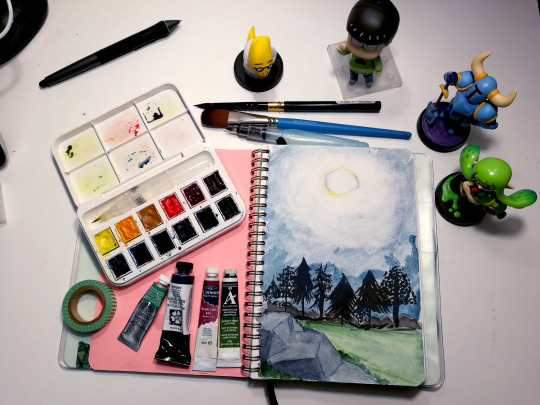
Due to several requests from many of my twitter mutuals, I’m going to talk about watercolor for a few posts.
This is everything based on my own experiences and my suggestions or methods are in no way “the right way to watercolor.” There’s pros on youtube that can teach you how to watercolor like a champ.

I just draw silly characters!
in THIS post, I will list my suggestions on watercolor supplies to purchase for getting started. Later posts during the week/month of February, I will go into defails on specific kinds of paints, paper, brushes, palettes, and then some. A table of Contents will be added to this original post as more posts are added to this series.
All price estimates are in US dollars
1: My Personal Favorite:

Daniel Smith Essentials Set of 6 ($30 on Amazon)

Daniel Smith Primatek Introductory Set of 6 ($25-30 on Amazon)

Meeden Empty Watercolor tin with 12 half pans ($11 on Amazon)
Interestingly enough, now Daniel Smith has a 15-color pan set for about the same price as this setup, and it has all the essential colors except for New Gamboge, but it doesn’’t include any of the gorgeous Primatek colors, and the lid isn’t made for mixing color (the water spills onto your lap) so you’ll have to buy an additional palette anyway. Still, iif the colors in that set are up your alley, go for it!
Daniel Smith has been my dominant paint choice for almost a year now; getting them last February and taking a few months to get used to them after using cotmans for two years and artist loft for the 10 years prior. I didn’t think artist grade paint would be worthwhile for the likes of ME because I just draw character doodles and not landscapes or textures that rely on high-pigment paint to really shine, but I was wrong. The colors lay down so much better and you use less paint per drawing because of the high pigment load. I’ve painted a lot more in 2008 than I have in previous years and none of my tubes are close to running out! The Plague Knight and Mona drawing posted above was done with artist grade paint.

I’ve expanded since then, buying another tube of Daniel Smith when I was able to go to Blick with a small wad of cash, or get a Winsor & Newton Artist grade tube for $5 with a Michaels coupon.I also repurposed my Cotman box for my current paint set. I can’t remember how much this whole palette is worth together, but the initial 12-color+metal case setup was about $70 (the primateks gifted to me), and then I added a new color every several weeks or when I felt like I really needed something else.
2: The Simple Budget Grab-n-Go
You are very new to watercolor, not sure if you are willing to commit, or you’re just plain not in a situation where you can be spendy.
Maybe you’ve used those $5 watercolor cake sets and you’re tired of the chalky powder rubbing onto adjacent pages when the paintings dry in your nice Moleskine book
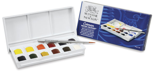
Winsor & Newton Cotman: Sketchers Pocket Box. These days, you can get it for around $13 on Amazon.
There are LOTS of different cotman sets, but this one has two kinds of reds, two blues, two yellows, two greens, and 3 neutrals, which, if you’re a beginner, is a great way to learn about color mixing. It also has some of the most popularly-used colors in the world of paint, such as burnt sienna, french ultramarine, cadmium yellow [hue], alizarin crimson, sap green, and the pthalos, so you can develop familiarity with these and easily find tips and tricks on using them online. Any color you don’t like later on can get tossed in the garbage and replaced with another color (I’ve replaced black with Paynes Grey, white with Cerulean Blue Hue, and Burnt Umber with Van Dyke Brown).
You can make all sorts of colors with this, and you won’t get overwhelmed with having too many colors to glance over.
Refills and additional colors are available for $5+ each
It comes with a small brush. You may not like it.

Cotman Brush Pen Set, $17 on Amazon.
I’m not a fan of color setup except for the inclusion of Paynes Grey, Turquoise, and a really nice purple, but I LOVE this box! It comes with more mixing space on the lid and a waterbrush that I think works really well. It’s a very thin tipped brush, so if you want something to more easily paint over larger areas, I suggest getting a medium size waterbrush listed below.
If you don’t like waterbrushes, a foldable pocket paintbrush can fit in the slot just fine.I’ll have a separate post on paintbrush details.
---
The main issue with cotmans is that they carry less pigment than more expensive pants as these are student grade. Many of the colors are still vivid and wonderful, and you’ll just have to layer some colors a few times to get some really bold color application on the paper. Many people use cotmans just fine.
avoid Van Dyke Brown at all costs. Look at this Banjo!

3: More Colors for your Buck!
You don’t care about mixing or portability, You love color. you want to explore all that’s available in paint or want to build a collection that’s as big as your copics.
You have options, my friend!

Kuretake Gansai Tambi, $30 on Amazon, $40 on JetPens. I do not recommend these if you like to mix colors or complex layering because these don’t handle that well. I’ve tried layering color on commissions and it would just lift the bottom later of paint after it dried a week prior, and this nearly destroyed two commissions. HOWEVER, if your watercolor style is simple shading, bold, flat colors, using the white of the paper for highlights, this set will be a terrific friend of yours. The pinks, greens, and blues are absolutely fantastic and I use it for my Superstar Saga art whenever I’m home.
The paint is really opague unless you water it down a ton. It’s still going to look great regardless.
Smaller sets of this are availablle, but since mixing more than two colors at a time doesn’t work out very well, you might as well go with the largest set.
There’s also the option of larger cotman sets with a half pan set of up to 45 colors for $55 on Amazon.
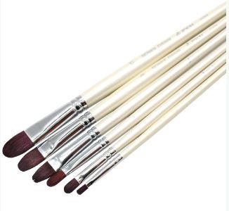
Paintbrushes
For this post, I’m going to briefly list some travel brushes. a more detailed post about bushes will come in the near future.
The main points are:
You would want a water brush if you like to paint with water in the brush, or paint on the go with no real opportunities to put a water cup down anywhere.
You would want a synthetic paintbrush if the stiffness works with your painting style and you want the brush to hold more pigment than water You can get these in assorted price ranges, but the super cheap ones will wear down and need frequent replacement.
You go for a natural hair paintbrush if you want to make really long paint strokes or paint large areas without having to re-add paint and water to the brush so frequently. Most of these are pretty expensive.
Anyone may tell you “natural hair brushes are the best brushes” but this is completely up to preference and painting habits Any small brush over $10 will last you a long time if you take care of it. Unless maybe it’s from Artist’s Loft.
A good size main brush (particularly if you do A5-sized paintings like me) is a 6 round. if you could only afford one brush, make it this one. This would be your go-to brush that can do thick fills, tight corners and thin lines as you need. Other size and shape brushes can be added to your set as you feel you need or could afford them later on.
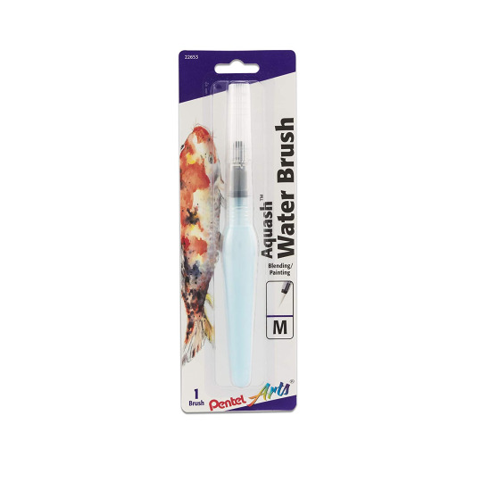
Pentel Aquash waterbrush: $10 on Amazon. You simply fill the barrel with water, and the brush will drip water from the bristles and let you paint without needing to dip the brush into a jar of water. You won’t need a jar of water at all! Some people love the convenience, some people hate how out-of-control the water flow gets.
I recommend the medium for a main brush. If you need a finer point for details, you could get one as a secondary brush, but if you feel you don’t need it, then just the medium is fine.
I just started using the Pentel brand a couple of months ago and can’t give judgement on them yet. Other brands I’ve tried before needed replacing at least twice a year with regular use.


I love travel brushes because I like the bristles to be protected when I take them places. Normal handle bushes can be cheaper or longer. Personally, I don’t look for brand names when picking brushes, I look for the material of the hair.
Both Escoda and DaVinci make great Red Sable brushes, and they have been my mains for two years. Expensive as they were, they are still working great and have perfect sharp points 18 months later. Not to mention, I’ve made the money back through watercolor commissions, in which these brushes allowed me to complete more commissions in less time.
White Taklon has worked well for me for synthetic brushes. Princeton has been my regular brand in late 2008 since I was able to snag those at Michaels in the mixed media brush section.
---
That’s it for now! Next post I’ll cover watercolor paper.
10 notes
·
View notes
Photo
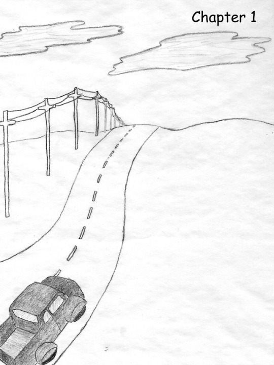


10 Years of Drawing Cars on Prairie Roads
I’ve been doing this comic making thing for about ten years now, and as I just finished a new comic in which a car drives down a road in Kansas/Missouri, I thought it was a good time to examine that motif as it has appeared in my work.
The first comic here, drawn in January 2009, was the opening page of Emma and the Fairy Queen, an ~80-page story that was my very first serious exploration of making comics. I apparently like to open comics with a travel scene and have from the beginning. I was using pencil, thumbnailing on sticky notes, doing the first draft in a notebook and a second, final draft on tracing paper. I kind of liked the texture of the paper, and I didn’t really have the tools or know-how to get rid of it, so I embraced it. All of the digital work was done using now-defunct web tools, and although I wouldn’t use comic sans now I don’t hate it with the venom the way many typographers do (it has a pretty cool history and is relatively dyslexia friendly!). It was also clearly preferable to my messy graphite hand lettering. The truck was modeled off of my Dad’s old pickup, and is not a terrible likeness. It was one of the only things in the comic I used reference for. The background is a little awkward, but this comic got me on the road and I am incredibly grateful to be here.
The second page is the opening of Ghost Room, a 16-page comic I started writing while living in Vermont, kept picking at during my year in Chicago, and finally finished after I moved to New York. This page was drawn in January of 2016, in the sweet two day period after finishing the Wit’s End Kickstarter in which I finally felt free to dive into new things, before crashing back to earth with the realization of how much work was left to do. By this point I had fallen in love with the brush pen, my one true inking tool. Color was done digitally. Some of the perspective is a little wonky in the first panel, but I’m still proud of this scene. Car interiors are not easy.
The final page is from a comic I drew this past week for my Food Comics art show, the first page (shocking, I know) of a story about starting college and baking. The background here was a bit of an afterthought (I had so many rooms full of people and furniture in this comic that my brain saw prairie and decided to take a break), and I have now remembered that Mom traded the minivan in for the Prius the year before I moved to Missouri, but... it’s a nice rendition of the minivan, and I like it. Like Ghost Room I used a brush pen and digital color (although full flat color, instead of monotone cel shading). Like Emma and the Fairy Queen I embraced paper texture, although this time with an intentionally created layer, manipulated in Photoshop like a pro. I used more photo reference per page for this comic than anything I’ve drawn before.
Ten years can bring so much change and growth. It’s important to look back, from time to time, to see that. I have better tools now and know how to use them. I no longer have to trek from my dorm to a computer lab to use a scanner. I am no longer intimidated by ink. I use more photo reference, and look things up instead of shrugging and winging it. I draw, see and write comics in a way I couldn’t yet, ten years ago. Here’s to another ten years making comics!
2 notes
·
View notes
Text
Never-Ending Survey (Saki Edition)
Basics
Full Name: Rahelle, of the Nameless Clan
Alias: Saki Sakurai (most know her by this name)
Nicknames: “Saks” (only if one wishes to die)
Age: 20 (ShB, 17 in ARR)
Birthday: 4th Sun of the Third Astral Moon (4th of May)
Ethnic Group: Mixed Seeker/Keeper
Nationality: Sharlayan (technically)
Language/s: Common, “Bastard Sharlayan” (essentially pirate pig Latin)
Sexual Orientation: Bisexual
Romantic Orientation: Biromantic
Relationship Status: In a committed relationship /w Alphinaud (but not Eternally Bonded in canon... yet)
Home Town / Area: The Isle of Intense, in the Bloodbrine Sea
Current Home: Split between the Rising Stones and the Crystarium/Pendants
Profession: Scion of the Seventh Dawn, Inventor
Physical
Hair: Black, straight and fluffy. Mid-chest length. (This changes greatly depending on where in canon we’re talking about, or which AU, with most of them being impossible to portray in game. *laughs*)
Eyes: Large, upturned and green (like peridot)
Face: Typical chubby round Miqo’te face with age/clan marks (Face 4)
Lips: Chapped (but “pliable”)
Complexion: Not exceptionally pale but also not very dark, “medium” pasty
Blemishes: None
Scars: Too many to count, magic doesn’t heal everything. Somehow she’s avoided getting any on her neck and face, but her body (esp. her knuckles) are a battleground.
Tattoos: None
Height: 4 Fulms, 11 Ilms (4′11″, short even for F!Miqo’te)
Weight: She doesn’t track this, but she’s got a BMI on the higher end of healthy
Build: Short and curvy, with large breasts and wide hips
Features: Soft and rounded
Allergies: None
Usual Hairstyle: Worn down /w bangs
Usual Face Look: No makeup, messy eyebrows
Usual Clothing: Shorts and thighboots, jackets /w rolled up sleeves
Voice Claim: Laura Bailey as Lucina in Fire Emblem: Awakening (2013)
Psychology
Fear/s: Being worthless/insignificant (Enneagram), Losing her sense of self
Aspiration/s: To get the Scions back to the Source, to stay sober, to protect Alphinaud and Alisaie
Positive Traits: Observant, Tolerant, Creative, Honest, Loyal
Negative Traits: Overly-sensitive, Rough/Crass, Cynical, Aggressive/Violent, Distrustful
Temperament: Melancholic/Phlegmatic
MBTI: ISTP
Soul Type/s: Artisan/Warrior
Animals: Black Panther
Vice Habit/s: Avoiding eye contact, laying her ears back, exaggerated tail movement/whipping, crossing her arms and turning her back
Faith: Walks a weird line between Theism/Atheism, lmao. (Basically, “I know Gods (plural) exist, but I fucking hate them.”)
Ghosts?: Undecided. In the case of “hauntings” or ghosts that do not have a physical form, she believes them to be more like “shadows created by the minds of the living” instead of being actual spirits/souls.
Afterlife?: The in-game scientific explanation — that one’s soul is reincarnated without it’s memories after a time, but one’s aether dissipates and one’s body rots and returns to the earth. Generally believes, even so, that those we lose cease to exist as we know them when they die.
Reincarnation?: See above
Aliens?: I don’t... know? *stares at Hraesvelgr* (OOC)
Political Alignment: Mostly apathetic/semi-resentful about politics, but values individualism as a personal philosophy
Education Level: Severely basic formal education, years upon years of self-study and hard-earned experience
Family
Father: An as-of-yet unnamed Nunh, who challenged and overtook the previous Nunh because he fell in love with the man’s counterpart, the head female (who had already sired multiple children with the previous Nunh) and wanted to stand beside her as her equal.
Mother: An as-of-yet unnamed head female of the Nameless clan, who had seen several Nunhs come and go and had already given birth to many children. Despite being on the tail end of her mating years, she was impressed by a Tia who defeated her Nunh in order to win her heart and become her equal, and fell in love with him. Saki and her sister were this pair’s only children with one another, born only shortly before their mother went into menopause (personal HC about Miqo’te biology).
Siblings: Multiple half-siblings, all much older than her. Her only true-blooded sibling is Rehane, her twin sister, with whom she (quite literally) shared half her soul.
Extended Family: The Nameless clan itself, though they have been estranged for nearly a decade.
Name Meaning/s: No particular meaning, but her clan’s naming conventions are a mix of Seeker and Elezen due to cultural influence.
Historical Connection?: None
Favourites
Book: Until recently, she struggled with reading due to severe untreated Dyslexia, but the situation has improved as to where she can read some things. She doesn’t have a specific favourite, but she enjoys books about engineering and will read anything Alphinaud recommends (even if only to debate about it).
Deity: None, hates all Gods.
Holiday: Valentione’s Day, as not only is it close to the Twins’ birthday (headcanon), but she has fond memories of spending this holiday with her lover.
Month: Second Astral/Umbral Moons, because for those two short months, Alphinaud, Alisaie and her are the same age.
Season: Spring and Fall
Place: Ishgard, forever and always. Also very fond of Mor Dhona and Limsa Lominsa, all because of past history/memories.
Weather: Less particular weather, more about temperature. She likes things slightly chilly, but not too cold.
Sound/s: The click of a successfully-loaded firearm, the crackle of a hearth, the rustle of paper being turned, Alisaie’s laugh.
Scent/s: Cooking seafood or meat, warm freshly-buttered bread, vanilla, fogweed, leather, lavender shampoo, the natural scent of a very specific person.
Taste/s: Rich things (like cream-based soup), seafood, garlic bread, coffee (but only secondhand *wink*)
Feel/s: Silky hair, wood grain, textured paper, the feel of nails/teeth being dragged across her skin.
Animal/s: Completely and THOROUGHLY a dog person. No contest.
Number: Two.
Colours: Midnight Blue, Cactuar Green, Pure White.
Extra
Talents: Fixing things esp. mechanical things (magitek appliances, clocks, jewelry clasps, etc.) or taking them apart and somehow putting them back together so they work better than before. Cooks pretty well. Unexpectedly amazing at taking care of her loved ones when they’re injured/sick. Can look at ideas/situations from multiple angles besides her own, making her viewpoint valuable at times.
Bad At: Guessing other’s emotions/view points without conversation, verbal apologies, dancing, turning the other cheek, conveying a point without being misunderstood or obtuse.
Turn Ons: Delicate beauty, long hair, slender necks, but most of all, intellect and passion. Height difference (bigger OR smaller), being towered over/looked up at, and flat-out excessive and obvious attention and affection from her lover.
Turn Offs: Crass, stereotypical “macho” attitudes, being hit on instead of courted properly, people who fetishize Miqo’te, any sort of unasked for non-consensual touching, being patronized or looked down upon, being “coddled” or “handled with oven mitts” because she’s small and/or looks soft/weak.
Hobbies: Inventing (of all types), telling stories, cooking, learning new things in general.
Tropes: Little Miss Badass/Broken Bird, The Gunslinger, Sugar-and-Ice Personality, No Social Skills, Deadpan Snarker, Pragmatic Hero/Chaotic Good, Jerk with a Heart of Gold/Took a Level in Kindness, Two Siblings in One/Merger of Souls, etc.
Quote/s: “Quite honestly? I can’t be arsed to give a single swiving fuck about this good/evil, light/dark shite. We’re all painted in shades of grey, and if someone endeavours to understand me, then I’ll attempt to do the same — I guess. Whether or not they are friends or foes needs not apply.”
Mun Questions
Question 1: If you could write your character your way in their own movie, what would it be called, what style would it be filmed in, and what would it be about?
Answer: Oh, Gods. Knowing her issues it’d probably be something depressing like Eternal Sunshine in a Spotless Mind or Requiem for a Dream. *pained laugh*
Question 2: What would their soundtrack/score sound like?
Answer: Early 2000s rock anthems. Green Day (esp. the songs from American Idiot), 30 Seconds to Mars, The Killers, Three Days Grace, The Fray. My Saki muse also really likes Kenshi Yonezu for some reason? (Uma to Shika, anyone?)
Question 3: Why did you start writing this character?
Answer: She evolved from an Raen Au Ra Samurai WoL from Othard, who had trust issues because her father had allowed a Garlean soldier to slit her throat (severing her vocal chords and making her permanently mute) instead of giving away the names of resistance operatives. Truth be told, they don’t have much in common anymore — the themes of trust stayed, but everything else is very different.
To tell the truth, I don’t passively create characters. I purposefully flesh them out and write backstory and indulge in their personal journey/story in order to enjoy the game, which is probably why the last game I actually finished was Mass Effect 3 the year it was released. ಠ_ಠ
Question 4: What first attracted you to this character?
Answer: Mostly the potential to explore darker themes and relational trauma of my own. She’s a very personal character (to me). That said, she also embodies some of my ideals, and we’re nowhere near the same (nor is she a self-insert).
Question 5: Describe the biggest thing you dislike about your muse.
Answer: The subtext. THE SUBTEXT. Saki is NOT a character who says what she means, often forcing the people around her to read between the lines and that’s so, so hard for me as an Aspie.
Question 6: What do you have in common with your muse?
Answer: Feeling disconnected and alienated from others, and having a lot of built up trauma surrounding connecting and interacting with them. Not going into much more detail than that.
Question 7: How does your muse feel about you?
Answer: She... doesn’t really... know I exist. I don’t really attempt to converse with any of my characters like that.
Question 8: What characters does your muse have interesting interactions with?
Answer: Alphinaud, obviously. Their relationship is strongly influenced by the “enemies to lovers” and “belligerent sexual tension” tropes, I think, since they don’t like each other at all at first but come to love one another through intellectual compatibility and conscious effort to understand each other. The rest came later.
Her and Alisaie have a strong sisterly relationship, one that eventually extends to include Ryne when they meet her.
In my Amaryllis AU she works alongside other WoLs, namely my sister’s character Syhrsyng Agatwyn and my friend Csilla’s character Csilla Beleth.
Question 9: What gives you inspiration to write your muse?
Answer: Everything under the sun. I’m always imagining her in situations I experience or see on the internet, only a quarter of which actually get written down.
Question 10: How long did this take you to complete?
Answer: ಠ_ಠ
0 notes
Text
Week 5
Link #1: How to Create a Painting With Shading : Painting Techniques
~You want to make sure you have at least one dark color and one light color.
Okok, so I’ll be including a little picture of what I did, but I’ll be using Emerald Green as the light color and Ultramarine as the dark color :)
~Now mix them together to get your medium tone.
Oh. I mean, it comes out as a pretty teal owo. You’ll see in a bit, dw.
~Dip your brush in the water and just dip into your middle tone and paint a circle on your paper or canvas.
I hope y’all know that I don’t expect you to do this with me. I mean, I wouldn’t mind if you tried this out LOL. Whatever floats your boat y’know. Besides, who doesn’t love painting circles, am I right?- But seriously, circles do be pretty hard to make legit circles. Like, I think I’ve only managed to get one even close to being an actual circle, and that wasn’t even that close.
~It’s completely okay to have some variation, thicker paint around the edges and then kind of wash you paint in the center of the sphere (for now it’s a circle, but that’s besides the point)
~You don’t have to completely rinse your brush out. It's okay to leave a little bit of that color on because it’ll create a smooth transition.
I actually didn’t think of that to be completely honest with you. I tend to always wash my brush completely before I even go into the next color. I- well the more you know, the better you can be c:
~Grab a little bit of that light color and you’re gonna add some highlights in the upper left or right corner of your sphere (whichever one you prefer I suppose, I tend to always have the light coming from the left)
~Even though we’re using acrylic, the paint should be staying fairly wet and just kinda blend that lighter color in with the darker color.
So like, wait. I just kinda went braindead for half a second, I’m like- Acrylic paint isn’t wet, that’s only water colors. And- I’m just sitting here now dumbfounded because when you think about it- Water color isn’t wet- But acrylic paint is- it’s- yes- look I have no idea where I was going with this bit LOL. But here it is-(Intense brush strokes) LOL
~Create as smooth of a transition as possible between the upper and lower part of your sphere.
I cannot tell you guys how good this looks tbh, and we’re only maybe halfway done LOL
~Dip the brush back in the water (What if I wanted to dunk it though-) and go for your dark color and basically you’re just going to do the opposite of what you did with the light color, meaning that you’ll be in the opposite, bottom corner (Don’t mind the fact that I just said the bottom corner for a sphere- I’m intelligent, yes.)
~Really try to blend it in with the paint that’s already down there.
~You should be doing light brush strokes, you don’t need to push too much paint down onto the page.
See, the thing is. I have a pretty heavy hand when it comes to anything really, so I would say this was the most challenging thing for me, so far that is one of the main struggles for me.
~Now rinse your brush out and leave a little bit of paint on the brush and this is going to be used for the shadow, which is just gonna be a washy shape surrounding the bottom of the sphere and that’ll create a plane for your object (sphere) to be on.
I never actually thought of it like that- Usually I thought of the shadow as, well, a shadow lol. But I guess when you add the shadow it does give it a little place to sit. Almost like a dog sitting on a mat or something.
My little video painting a sphere :)
(This video was well done, I would like to say that the sphere doesn’t really look all that much like a sphere BUT it does show enough to help with one’s shading, which was the whole point of that video)
Link #2: Beginners Guide to Highlighting and Shading
(So, since this is a website not a video. I’m going to only write down what I didn’t know already, that way it doesn’t take years to get through all of this kk? I did include the link^ so y’all can check it out yourself as well :) )
~Most beginners use black for all their shadows. In reality, shadows are rarely a true black.
Okay, it’s not like I didn’t know this before. But I once made the mistake of trying to make every single shadow black. I can feel the pain, it’s okay. I just learnt this at the beginning of this class to be honest with y’all LOL.
~To find the right shadow color for your object, add tiny amounts of black or the cool complementary color to the original color of your subject.
So basically, what the first link said as well. You have the light color, and the dark color. But to get that dark color you need your medium tone, so kinda backwards in a sense-ish.
~Blend out the edges to make sure you don’t have a harsh line. Use various mixes of your shadow color to gradually lighten your shading and blend it into the surrounding area.
I meannnn, I think I’m pretty good at not having harsh lines for the most part. I would say that the edges are usually always a bit harsh, but other than that I think the shading part is pretty well blended.
~You can also use a glaze to add shading. (Yo, okay so I have zero idea what a glaze is when it comes to painting- I-)
~Shadows are not always dark.
To be fair, I think most of the beginners (including myself) start off thinking shadows are always dark. That they’re more prominent than the object itself. I think that’s what’s stopped me a lot of the times with my earlier paintings that I did a while ago.
~It is important to study your scene or reference photo before planning out your painting
I 100% agree, study the scene, the object, everything. Analyze the reference you want to paint before you actually dive right in. That goes with any art actually, not just painting.
~It is tempting to add pure white paint where the light source hits your subject. (I can relate, don’t worry) However, as with shadows, highlights are rarely pure white.
~Use a soft brush with a light touch for highlights. They should be subtle and the edges well blended into the surrounding color.
Oh goodness, again I’ll have to work on my heavy hand, but other than that I would say I’m doing pretty good about this.
~Gradually build up the highlight rather than having a blob of light colored paint.
Uh, oOpS ._.
Link #3: 7 Must-Know Painting Techniques For Artists
1. Under painting
~Create an underpainting in burnt umber or a mix or burnt sienna and phthalo blues to establish shadows and values.
I never actually thought about doing this tbh. I usually start with a white canvas and go from there, y’know? Maybe if I try this I’ll see some big improvements, who knows :)
~Work paint up from thin to thick, especially when using slow-drying paints. It’s impossible to work on top of heavy, wet paint. (I agree, like- There’s been times that I’ll legit just try and paint over the first coat maybe 15 minutes after I paint it on. I’m like, nahhh it’ll be fine to paint on, what’s the worse that can happen. Well- I ruined the painting lesson learned though) In the same way, work up to highlights, adding the brightest, and usually heavier, paint at the end.
2. Blocking in
~A filbert is a good general brush for blocking in form and paint. It has a dual nature, combing aspects of flat and round brushes so it can cover detail as well as larger areas.
These would be the type of paint brush that they’re talking about. They’re a mix of flat brushes and round brushes. I maybe have like- 2 of these in all between 3 art kits to be honest. I may have to start investing in more of them, who knows.
3. Building up texture
~Almost anything can be used to add texture to your paint. (I honestly never knew that people added things to their paint to create texture) There are already made texture media available, but I have seen items such as egg shells and sand used to add interest to a painting.
Oh? Bro, who would’ve thought about adding eggshells to your paint, like I honestly never thought about adding anything actually. I just paint with what I got, y’know. But maybe I’ll try this soon™
~Use an old toothbrush to spatter your image with paint. This can be remarkably effective at suggesting noise and grain.
Well, that’s new. I really didn’t think about using anything else for a painting besides paint brushes. oOpS
4. Dry brushing
~This method tends to work best when applying light paint over dark areas/dried paint and is useful for depicting rock and grass texture.
So, I’ma be completely honest with you guys. I used to paint without water, and like- I was so ignorant about most of the things that I know now. I would only use water to wash my paint brush afterwards, but now. Water has become so helpful in my paintings oml, it’s amazing what a little bit of water can do for your painting.
5. Sgraffito
~Removing paint can be just as important as applying it.
I- I only ever removed paint when it was in the wrong spot.- I didn’t know that removing paint from anywhere can help, especially when you want to expose the underpainting.
6. Glazing
~Glazing is the process of laying a coat of transparent paint over a dry part of the painting, and it’s used for intensifying shadows and modulating colour.
Well, now I know what glazing is LOL.
7. Painting with mediums
~Mediums are fluids that can be added to paint to modulate its consistency, drying time and texture.
Again, I honestly never knew that. I’m so inexperienced with painting items and ways it’s not even funny man.
~In the case of acrylics, you get different mediums that make the paint matte or gloss.
Link 4: Acrylic Painting Techniques
1. Dry Brush
~You want to aim for seeing your brushstrokes in the paint.
I don’t tend to like seeing my brushstrokes within my painting to be honest, but if it works it works, kinda thing.
2. Sgraffito/combing
~Involves painting a layer or two of paint and then etching into it to create a design and reveal what’s underneath.
Again, I really don’t tend to do this either. Considering I just learnt it LOL but I wouldn’t have thought about removing paint or etching anything within the paint.
3. Wet-in-wet
~You can do wet-in-wet with acrylic just like you can with watercolor so go ahead and lay down some water on your paper and then you can just drop in the acrylic paint.
My thinking- If you want a watercolor effect, why not just use watercolors? Big brain time LOL
4. Overlay/glazing
~Start by laying down a darker color on your paper and then letting it dry. (Yes, we need to let this dry for several minutes. So while you’re waiting, pop in some popcorn, watch it pop, eat some and then you can go back to painting :) )
~What you’re going to do now is overlay or glaze a lighter wash over top so water down your paint just a little bit.
Y’know, this technique might actually come in handy with my next painting ngl. But we won’t talk about that until the time comes owo
5. Impasto
~You’re going to use a palette knife instead of a brush so this is a really nice way to achieve a lot of different texture within the paint.
So, I only ever use palette knives before for backgrounds. To get that kind of color dye/blending feel y’know- I can’t think of the word right off hand but- TYE DYE yes tye dye feel, hush- :(
6. Modeling Paste
Before we even learn anything, like- I never knew that you could use modeling paste for painting?!?!?! Like- I only ever used modeling paste when I was fixing a clay sculpture or something of the sort, y’know?- The more you know
~A great way to add texture into your artwork. So you can use a palette knife to scoop it out and then apply it onto your paper. You could also use a paintbrush to softly apply it to your paper. (My brain man, this is all so new for me- I-) Note you can also mix it directly with the paint color if you want to. Let the modeling paste dry and then you can paint over top of it.
Waittt, you could use this to make the texture of mountains owo and rock beds, bro- I feel so inspired by this one ngl.
7. Stencil/Stamp
So the girl in the video was pretty basic with it, you just use it as a stencil should be used and of course washing it afterwards.
8. Sponge
~With a sponge, similar process as you would use with watercolor. You’re just using the sponge to apply paint instead of a brush. (Big brain, she knows) You can go back in after you let the first layer dry a bit and add like a second or third layer of paint.
Y’know, time for a funny-ish story. So back in elementary school, we did this sponge painting, we could only use the sponge. And I’m like, I wonder what a pufferfish would be like with a sponge. So- I painted the sponge right, then I took some bottled glue, put the glue on the back of the sponge and glued it to the paper. LOL My art teacher found it funny, but had me remake the painting and explained that it had to be painted with the sponge, not made out of the sponge. So yeah-
9. Drips/Splatters
~To achieve drips, mix some water into your acrylic paint and you’re just gonna kind of angle your paper and guide the drips down. (So like, this would be kinda effective when you want the feel of a waterfall? Yes, no, maybe so?)
~For splatters, it’s better to use a flat bristle brush. Load it up with paint and you can actually just kind of flick the bristles and really control your splatters.
10. Gel Medium
~Gel medium is used to thicken your paint and also actually make it a little bit more adhesive. So you can mix it directly with your color and it’ll lighten it just a little bit.
So, when using this don’t expect the exact color, okay got it.
11. Scumbling
~You can scumble with paint just like you can with colored pencils. So use your brush in a circular motion but keep it controlled.
Well, that’s new. Now I know what it’s called at least LOL. I honestly never knew what that technique was called until now, but I remember always coloring with colored pencils like that just because my mum did--
12. Masking
~You can mask with masking tape of course or you can also use rubber cement.
Rubber. Cement. I- Howcanonemakecementrubber- I might actually have to search up what it looks like, I’ve never heard of anything called rubber cement.
~If your paint bleeds through, just go back through and patch it up with some paint.
13. Mediums: Gloss or Matte
She really just explained what she was doing for this one.
14. Soft edge vs. hard edge
~Soft edge and hard edge are just two paint terms for how the paint is laid down and the quality of it.
Who knew, I actually didn’t realize that how you lay down the paint affects how soft or hard the edge is.
So, I’m sorry for this being a bit late. But I feel like I learnt a lot with this one :)
0 notes
Last Seen Blogs

dadbods4life
Untitled
grantaireble
Grantaireble

danliveontumbler
Dan Live
jmmaproject
MA PROJECT
sugar-spic3-blog
Sugar Glider