Last Seen Blogs

dinhduongchonguoicaohuyetap
DINH DƯỠNG DÀNH CHO NGƯỜI CAO HUYẾT ÁP 0916314618
ofsetfree
🇳🇴🇹 / 🇭🇺🇲🇦🇳

snarkspawn
oh my cotton socks!
southernsoapworks
Southern Soapworks LLC

gingykfox
Gingy's Art Blog


Photo

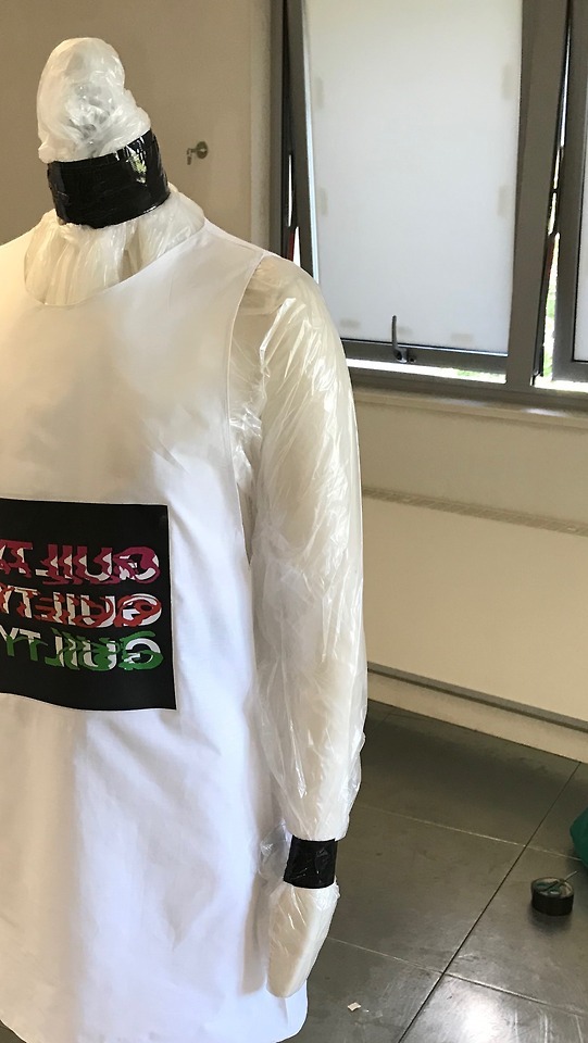

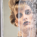
FINAL PIECE DETAILS.
Unpacking the Concept.
The work that I presented needed to be a culmination of all the works that had gone before, it needed to embody my practice as a whole. I wanted to comment on the way in which we view everything commercial through a filtered lens and how the media and big brands (especially within fashion) distort information to become unrecognisable.
By distorting and flipping the print on the dress it meant that on face value it is extremely hard to decipher, however when reflected in the mirror it is much clearer to read. The idea of the viewer physically having to reflect on the work is something that really appealed to me. It includes them in the piece and therefore by association are accused of such guilt.
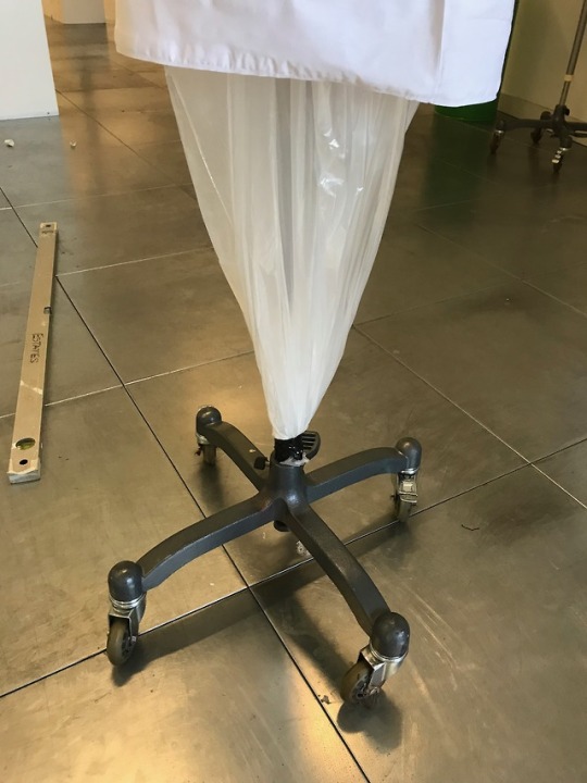
I didn't want the work to simply be placed on an ordinary mannequin as it might become too commercially viable and seen too much as an everyday item and therefore over looked. the design and concept was heavily influenced by my research into the glossy sheen of magazines and the way in which they present themselves to their audiences. By reintroducing the polythene into my work I was able to distort the mannequins appearance, suffocating it within its own packaging. The brutalist use of gaffa tape was also a very purposeful design used to represent the huge industry that is behind these slick and cheerful advertising campaigns that we are so often used to seeing. I also felt it was important that the mannequin faces the mirror as opposed to printing on the back and having it look the other way as then it further personifies it. The mannequin is supposed to represent the consumer.
I am extremely happy with how the work is presented, despite numerous changes to location and therefore having to constantly adjust the design and concept of the work the final result is effective and portrays the messages that I intended in the initial outset.
0 notes
Photo


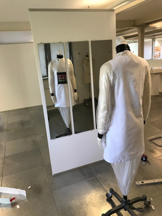

INSTALLATION
After multiple mis communication between myself the staff and the technicians and being moved twice without my knowledge, Installation proved difficult. I was initially given a space with a wall although my original brief was very flexible and said I wouldn't necessarily need one, however once I saw that i has a wall i incorporated it into my design. I was then moved to a different wall, however this was a different students space so once again I was moved however this time to a space where there was not wall on which to hang my mirrors. This was despite telling multiple tutors that the designs had changed and I needed a space with a wall i can hang things on. Eventually I was given an appropriate space and whilst it wasn't my first choice I made it work. The experience forced me to be flexible and I am happy with the final outcome.
0 notes
Photo


Untitled:
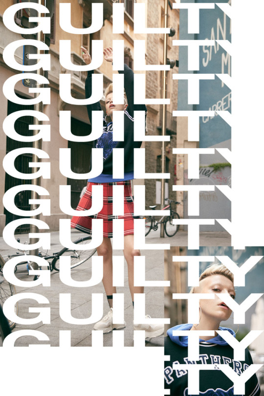
In between the making of the dress I wanted to experiment with the concept of over saturation, making so much content, all of which screams guilt. The result of which led me to printing on bed sheets tee shirts badges sticker and posters, I then went on to take images with all of the products together. At first glance all seems normal until you see the words repeating themselves and the more you look the more is revealed, drawing parallels with the way in which I research. The more you look into a company the more guilt that supposedly leaks out. I chose to use everyday products as I thought that perhaps that would be the best way to manipulate the mainstreams subconscious, make guilty an on trend brand, creating its own support base and identity or subculture.
0 notes
Photo

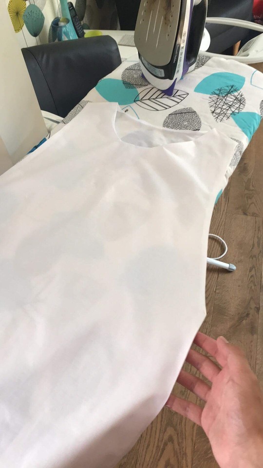
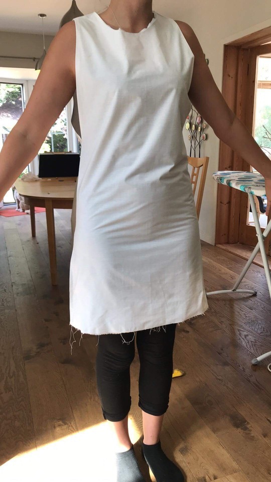

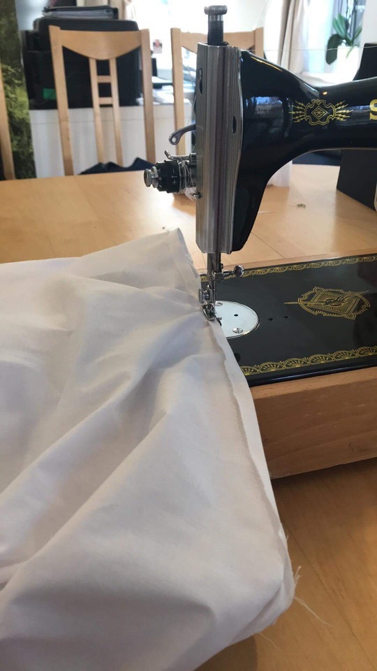

The process of making the dress.
As an artist I have never had to sew or tailor in any form, so I had to research heavily how to make dresses and consult Thomas Herd a local tailor to ask about the best methods. Using a simple shift dress template I began the process of making the dress as documented above. Using a model instead of a mannequin to make adjustments. The process was long and took two weeks to complete as I really wanted to make sure that the dress was made to the best of my novice ability. Once the dress was complete, although it is wearable, it would not be durable as the seams are too weak, however it will serve its purpose to be printed on and for a mannequin to wear perfectly.
0 notes
Photo
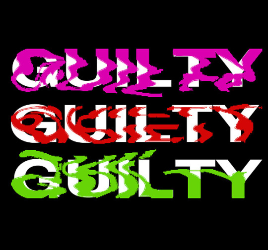
In an effort to distort the brand that I have made, GUILTY, I thought about digital distortion, using colour and manipulation of the layers within the digital makeup of the image. The result was an extremely contemporary piece of work. This design is potentially the one that I will print onto the final dress which will be presented in the degree show. The bold choice of colour and abstraction of the text means that the words are challenging to interpret. The way in which the organic shapes flow over the stark and harsh white text in the background makes the work look disjointed and uncomfortable, which in turn creates something close to the uncanny. It looks as though it is a ripple of water stopped in time and that frozen quality makes it feel cold, yet remain fluid. The only criticism I have is I still believe that perhaps it is too clear and not distorted enough.
0 notes
Photo


Targeting both asos and Primark’s advertising, I appropriated the imagery from their advertising campaigns and plastered my own branding upon it. Saying and calling out the companies on their lack off transparency within their production lines. Perhaps it might be too much but I really like the way in which the simplicity of the designs says it as is.
I thought it was really important that the images looked as though they could be posters or advertisements seen in a real bedroom or magazine. despite the source images being catalogue fashion shoots I feel as though the way in which I edited them bring them up to date and elevate the source material.They now look as though they would not be out of place in an instagram advertisement alongside the likes of Belenciaga or Supreme.
This is perhaps a design that could be progressed into something that could be used for the final print, in the MA exhibition.
0 notes
Photo

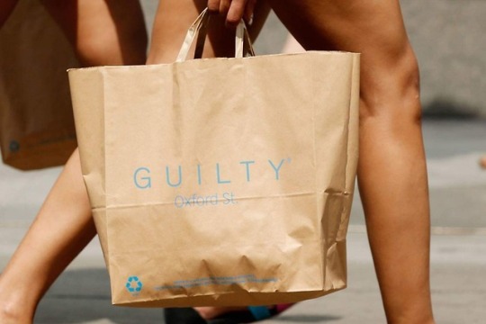
Whilst I was focussed on the packaging synonymous with household brands, I thought that I should look into other brands beside asos with questionable ethics.
For years Primark has been extremely opaque when it comes to their production line. Still, despite many campaigns, Primark refuses to take responsibility for how they source their products with their official site stating that they do not own any factories. Shurking responsibilities as many other companies do, a lack of transparency leads to a lack of accountability.
Primark has long used brown paper bags and has led the charge in that eco-friendly appearance, despite their transportation processes not being green. The brown bag is now entwined into their branding and street appearance. By targeting their packaging I am targeting them as a whole.
Due to my work around asos’ packaging being criticised as not being obvious enough I believe this makes it extremely obvious and therefore unmistakably linked to Primark. I am not sure this is the way that the design on the dress for the final piece should go as it is a little bit too obvious. I would like to make something more inline with the GUILTY branding from my previous project.
0 notes
Photo


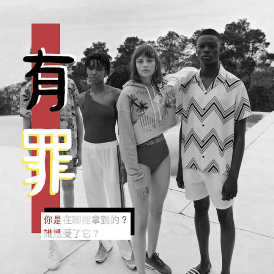
(Left to right) Guilty, Joshua Mutton | asos packaging
I felt inspired after looking into the production of asos’ own line of clothing it quickly became apparent that not a lot of information was available when it came to their processes and sourcing. I wanted to create a piece of work that called out for transparency within their production line. Over the past 8 years asos has exploded on the UK and international market and as a result has become a very familiar sight in Millennial and Generation Z culture. Their packaging, especially, is synonymous with the brand, by appropriating their style, the black and white pattern and incorporating my own ‘brand’ from the previous unit I was able to what it could potentially look like to call asos out on their ethical stance.
Although the work isn't instantly recognisable, you can’t tell it is calling out asos, I was really pleased with the overall aesthetic as it looks professional and to see a variation of the GUILTY ‘brand’ was exciting to see as it became apparent that perhaps this was something I was not yet finished with and perhaps will and can incorporate into my MA exhibition piece.
Bibliography for this post:
https://goodonyou.eco/how-ethical-is-asos/ (date accessed 12 07 18) reference in text: GOYasos
0 notes
Photo

The glossy and extremely commercially viable magazine BAZAAR was extremely interesting to research into. Looking at the fashion industry through such a filtered lens seems extremely trivial when one possess the knowledge of what is truly going on belong most of the brands advertised in such a publication.
The emphasis throughout this magazine was exclusivity, ‘be the first to see’ or ‘this is a BAZAAR exclusive’ or slogans to that effect were plastid across the internal pages as well as on the cover. In many cases one should never judge a book by its cover however in this case it is as shallow and one sided as one would expect. Absolutely no reference to where the materials were sourced or the production line in which the garments where manufactured. There seemed to be no accountability and the subject was avoided altogether.
Other than the apparently lack of transparency in the manufacturing processes, there were countless issues involving whitewashing and representation. There was an entire seven page spread on a range called ‘Out of Africa’ featuring two caucasian models wearing classic Victorian explorer clothes, whilst the images only showed the wildlife and landscape on a reserve in Kenya. As problematic as it is by itself it also seemingly promotes colonialism and that entire period, attempting to justify it. Its hard to believe something like this was approved and put in a magazine that is read both nationally and internationally.
0 notes
Photo


In my research so far many different and specific brands have been targeted for all sorts of ethical reasons, however one that really stuck with me was the AdBusters anti smoking piece. I think due to the originality at the time and the prominence of smoking culture across the world this work really caught the public eye. The sheer brutality of the work and when contrasted with the original branded imagery makes one feel ill in themselves. This infectious tendency within campaign work seems to be one of the most effective forms or creating a message.
It is something I have thought about trying to achieve within my own work however, modern day slavery seems too sensitive of a topic to create work like this, especially when I myself have had no past experience in that environment. The question rises, would it be ethical for me to comment on such a serious matter in such a brutal and harsh way?
As a result I am making work that continues with the accusatory themes but with muted imagery, perhaps hinting at some sort of dystopia rather than outright presenting one to the audience.
0 notes
Link
In order for one to effectively go against the mainstream and cultural movement, one must comprehend what it is that you are attempting to counter. Sites such as the Design Council offer great insight into the work of brands and the capitalist attitude toward marketing and the significance of a companies identity or brand in that atmosphere.
When reading this, it felt as though I was peeking behind the scenes of the commercial landscape, as a consumer we are constantly bombarded with slick advertisements, but reading this allows one to understand how each is carefully formulated and manufactured to manipulate the intended audience.
Affective Labor or the idea to sell a experience or emotion rather than an physical product is not the leading technique used by every global company, Coca-Cola for example has adapted its tag line to Taste the Happiness, implying that the product is primarily associated with happiness and to lack Coca-Cola is to lack happiness.
How has this impacted the consumer over decades of consumption?
The current consumer is a lot more aware of the market place now more than ever due to the integration of things such as social media and the internet as a whole, suddenly the consumer can review all the options on the market and fins out almost anything they want about a company if they look hard enough. However brands like Coca-Cola have adapted to this change in environment. The consumer understands that Coke is bad for their health. yet they still drink? because the company has sold it as a moment of happiness not an entire lifestyle, a treat here and there but due to its accessibility those with low will power easily ‘treat’ themselves too often, building dependancy.
Success Breeds success and Coca-Cola knows this offering alternatives for the gaps in the market Diet coke is specifically branded toward women and is the almost exact same formula as coke zero which was branded toward men, the difference the marketing and packaging both hitting the market of the healthy person looking for a low sugar alternative.
Recently Coke released Coke Life with slick green packaging for the ethical consumer where the sugar and other selected ingredients where sourced organically, appealing to the new trend in the market for ‘real’ food and drink. This branding was almost too obvious and as a result the ‘life’ branch of coca cola did not do as well as its predecessors.
Coca Cola is really a great case study as it shows how, when done effectively, marketing can create instantaneous global recognition and when forced can end a brand. The market place is smarter and therefore the market has to create new techniques in order to sell effectively.
0 notes
Text
Culture Jamming- Activism and the Art of Cultural Resistance | Marilyn DeLaure and Moritz Fink
Notes from Pages 62-
Pranking Rhetoric - “Culture Jamming” as Media Activism
- 2003 Adbusters (Blackspot) specifically target Nike- Using their logo against them - Kicking off an anti Mike campaign.
‘Phil Knight had a dream. He’d sell shoes. He’d sell dreams. He’d get rich. He’d use sweatshops if he had to. Then along came the new shoe. Plain. Simple. Cheap. Fair. Designed for only one thing. Kicking Phil’s ass. The Unswoosher.’ Blackspot 2004
- Adbusters continue targeting culturally significant brands and trends in order to further promote and injustice or expose corporate greed.
- Blame is placed upon capitalism. Celebrity culture and endorsements, ‘they wore it so I should to’ comparisons to Hitler.
- “Sabotage” means to “clog” - interestingly a shoe was used, as sabotage, which can be referred to as a clog.
-Parody and irony were the dominant motives, rather than rhetoric value or shocking imagery.
- Thomas Frank (1997) cultural critic ‘its “lynching” of consumerism’
- Fredric Jameson(1991) logic surrounding capitalism is defined by ‘codification of the eccentric modernist styles of resistance.’.
- Art like this aims to start challenging the rhetoric binaries, put out there by big business and advertising.
- Cultural Jamming; political ancestors of situationists. Situationists ‘reclaimed’ preexisting advertisements and slogans.
- Guy DeBord - Society of the spectacle. discussing trends and what is already influential in the public eye.
- To big corporations ‘workers are seen as interchangeable’
-On the Genealogy of Morals (Neitzsche) (1989) talking about ascetic ideals “has at present only one kind of real enemy capable of harming it: the comedians of this ideal - for they arouse mistrust out of it’
- Perhaps a more comedic approach generates more change? Living an ascetic lifestyle in turn means that you deny the right for media to be present in your life and therefore it is hard to be made aware of, comedy gives a further insight into that as it creates momentum.
- Part of activism is parking and hoaxes
- Seems juvenile and insignificance, but executed correctly can have far reaching results.
- Messages and Images mutate as they go through multiple media outlets twisting and polishing the story to become more palatable
0 notes
Video
Part of the requirement for this project was to present our practice to our peers, we were able to present in any format we desired however I decided to keep to a traditional presentation style but inject it with my aesthetic and personality. It was critical that the presentation displayed my working methodology and the way in which my ideas and concepts build upon each other and the fluidity of my practice.
Here the presentation has been sped up and formatted into a video, but I felt it important to display works from across my journey as a self identified artist. Starting with some of my BA works. Creating this presentation forced me to look back over my work and see the successes and failures within my practice. The process was extremely reflective and allowed me to gain an insight into how I should move forward in this current project.
0 notes
Text
Proposal
When I finished my BA degree I knew that my exploration of work tackling social injustices, specifically the huge illegal slave industry within fashion, had not finished. My BA degree show piece was just the start and I feel as though for my MA show I will need to draw from all of my previous works and experiences. It is paramount that the work retains its influence and dialogue with the viewer, it cannot simply just exist but has to embed itself into the memory of many. In such a way the work must transcend itself, become and reveal something much larger than itself, rather than creating an inward gaze, force the viewer to look outward and expand their knowledge and horizons. The aim of the final work will be to create a snap shot into a dystopian production line where the clothes are being handled in a similar way to how modern day meat production is treated. The clothes will be displayed on mannequins in order to ground the work in the human form and enhance the emotive impact of the work. It is important that the work has this emphasis of it is to be considered successful.
Create conversation - research advertising
In order for the work to be efficient in the way in which it communicates with the audience, I will need to continue my research into advertising techniques, dissecting the way in which brands and labels manipulate the eye and heart of the consumer. This will also be linked to my extensive research of Barbara Kruger, Jenny Holzer and Alfredo Jaar whom I have done multiple case studies on previously I would like to cross compare these artists with artists such as Sonia Boyce and Faith Ringgold who use very different approaches in order to create an impact with their works. By accumulating all this previous research with a new and refined perspective it will allow me to come up with a clear and cohesive aesthetic visually that will communicate the message of the work in an appropriate and direct tone.
0 notes