#i also ADORE highlights so much ;;;;; enhancing the whites to bring out the other colours just makes it look so pretty
Photo
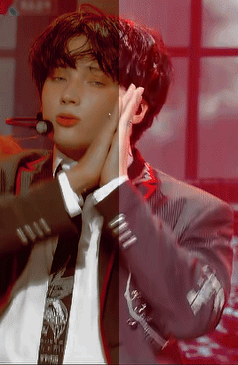
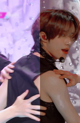
GIF colouring before & after
tagged by: @ashisland (thank you so much dear gabi ♡)
my style’s been pretty consistent with last year’s abozkdkfj i like warm tones so i usually adjust the colouring to be more towards reds, yellows and blacks + play around with gradient maps & curves until i’m somewhat satisfied!
tagging: @yjunies @hearttoshu @yngseung @leemarkies @innielove @loverbbh @seunglixes @ofkimtaehyung @thenamechapter @usertae @polaroidlove @wabisaba @song-mingi @seonghwaminho @ambivartence @roshinies @chanstopher @slowrabbitpd @wonjinist @hueningkai @limsejun @yeonjuins @letsstaywithstraykids @junhee @leenow (as always, no pressure!)
#tag games.#tagged.#i also ADORE highlights so much ;;;;; enhancing the whites to bring out the other colours just makes it look so pretty#sigh... i really need to gif other members more all of my saved psds are like 99.9% beomgyu#i save almost all my psds now because my computer gives up on me at times and i don't want to#ruin all that hard work put into colouring stuff sodkdkfj#thank you again gabi dearest i love looking at colouring before and afters... it's so satisfying seeing people bring things to life#& add their own spin on things!
54 notes
·
View notes
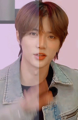
Photo

Soph’s Header + Doodle Tutorial (requested by anonymous)
Hi! I’m back again with the sequel to my icon + colouring tutorial, this time with headers and doodles! 🥰 You will need:
I’m using Photoshop CC 2018 to make these headers and doodles, but you could easily make them with earlier/other versions.
Basic gif making knowledge.
A screencap you want to use, some fun textures, and some time and patience!
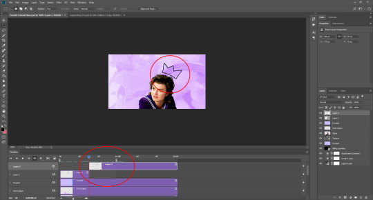
I always start off with my headers as size 500 by 281 pixels. It doesn’t really matter necessarily, as long as the size is in line with the tumblr dimensions and fits. I find these sizes work to keep a gif or header small, so you can make it a bit longer without going over the tumblr size limit. I know technically tumblr doesn’t have a size limit any more, but I do still try to stick to the 3 MB limit when I can. This is because sometimes gifs lose their quality if you go over. In my opinion, you can afford to go over a bit, but if you go too far, the quality of the gif gets destroyed, and sometimes for me even on 4 MB they just don't play, so 6 MB or 8 MB doesn’t stand a chance. Not sure if anyone else has run into this problem, but you can read more about what I mean here and here.
Okay, so. Making simple headers is actually pretty easy, it’s just a lot of layering of the right things. Once you have your base size, pick a nice gradient to put on it. For me, I’m going with a light purple to a slightly darker purple:
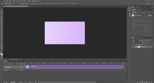
It’s important that you have video timeline turned on for this. If you are not familiar with frame animation and video timeline, I suggest you take a look at this, since we are going to be using both quite a lot in this tutorial.
Next, you want a nice background texture for your header. You don’t have to, but I think it just gives it a little something extra. You can find some textures here they have A LOT to choose from.
Once you have your texture, make it black and white and set it to soft light (unless the texture is the same colour as your background, then sometimes leaving it in colour can enhance the whole thing). Then you should have something that looks like this:

Now add your cap, coloured + smart sharpened and whatever other adjustments you want to make, on top of these layers. If you don’t know how to do this, please see my icon tutorial, where I explain how to do these steps in depth.

Obviously in this instance, Steve is much larger than if this was an icon. Make the picture proportional to the header size, but it’s up to you how big or small you want that to be! So, you could just save the header like that, if you wanted to. BUT, since we’re going to be adding gifs + doodles, I’ve had to make some special adjustments. As you can see down the right-hand side in the layers tab, I’ve added some purple colour over and under Steve (set to soft light, opacity anywhere between 5-30%, whatever suits you) and also lightened the background A LOT. There is a reason for this, which you wouldn’t need to do if you weren’t going to add gifs (unless you wanted the background to be lighter, of course).
So, for the gifs underneath your cap. Here is a pack of gif overlays that I love and adore, once you have chosen one of those, you want to put it underneath your cap. To do this, open the overlay gif, it will look like this:

And you can just drag it across from one file to another, underneath your cap.

I turned off all the layers above the gif, temporarily, so I could move it into place. Once it’s in your header file, make sure to change the gif to “overlay”, which will then bring back your nice background colour. Setting something to overlay makes everything underneath it look darker, hence why we lightened the background before, as I personally didn’t want it to look too dark for the overall header. (You could also put your cap underneath it if you wanted the gif to go over the person, but you’ll have to do extra editing to make sure the cap isn’t too dark if you do so).
Now you should have something that looks like this:

You want to make sure you end the header where the gif ends, even if your layers are “longer”, as you can see above. Again, this is a perfectly acceptable place to leave your header and save it, but this is where I tend to add the doodles!
Open a new file, I usually make them quite big say 800 by 400 px, as you can scale the doodle down later on, rather than starting small and working in a small space, which makes things unnecessarily difficult. If you would like to add some premade doodles onto your gifs, you can find some here, but I will show you how to make your own below!
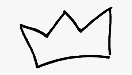
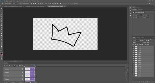
You could draw the doodles yourself, probably making your life a lot easier, but if you’re like me and you don’t want to do that (for me it’s because I suck at drawing on ps, LMAO) you can use a picture too. Find a picture of what you want, I usually just google it, so here I’ve got a simple crown:
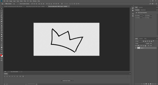
I used the magic wand tool to cut it out, and now we have this:
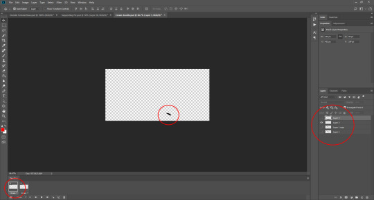
Now what you want to do is change the video timeline to frame animation. Click the “creative video timeline” button if video timeline isn’t already displayed, then the three dots in the left-hand corner to convert to frame animation, and you should get something like this:


Now, here’s the long-winded bit. It’s slightly odd and a bit complicated, so if this doesn’t make sense, please feel free to message me and ask further questions.
So, we want the doodle to look like it draws itself, right? What you want to do is crop the image so bits of it are added as the frames go on, thus achieving that effect. The key to this is turning layers on and off on the right-hand side, so only certain parts of the image show themselves one after the other.
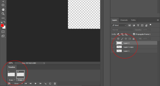
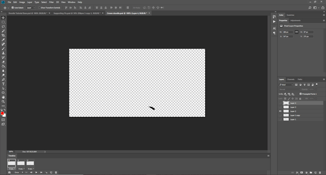
Firstly, duplicate Layer 1 and turn the original image off. This is a safety in case we mess something up later and need to revert to the original image. Now, crop out the first part of your picture. I’m going to start on the bottom of the crown and work my way around clockwise. Use the marquee tool (I’m using the elliptical one) to cut out one section of the image, then right click and select ‘layer via cut’.

Then turn off the rest of the layer, so you’re only left with this tiny piece:
Now, add a new frame. On the bottom bar there is a button, next to the bin/trash, that looks like a sheet of paper, which says “duplicate frame” if you click on it. Do that. Now is where the turning off and on part comes in. Each layer on the right-hand side corresponds to a frame on the bottom, and you want to build up what is shown in each frame every time.
This is going to involve a lot of duplicating and merging of layers, because I haven’t found a better way to do it currently.
First you want to turn off all the layers when you have Frame 2 selected. When you’re on Frame 1 your tiny piece (Layer 2) should be turned on (you turn layers on and off on the right-hand side, toggling the little eye icon). Like so:

You want to be working with Frame 2 selected for these next parts. Then you want to duplicate the tiny piece layer (so now we have Layer 2 copy). By turning the Layer 1 copy on briefly, you can cut out the next part of your image, so use the marquee tool again to cut out the next little piece. Make sure you have the layer with the rest of the image selected when you do this, otherwise you could be cropping nothing, since the other layers should still be turned off. Once you’ve done that (once again using layer via cut!) you should now have Layer 3. Move this to the top, turn off Layer 1 copy, and turn on Layer 2 copy, like so:
You may not be able to see in the picture, but the two layers aren’t quite touching. Since it doesn’t matter what the original image looks like for the end result of the doodle, you can move Layer 3 in line with your first piece. DO NOT move the original small layer, Layer 2, as then it will be in a different place on Frame 1 and Frame 2, and you’ll have to try to move it back, and that will be a mess. Always adjust the newest layer in line with the previously existing layers so this doesn’t happen.
When you’ve done that, select both Layer 2 copy and Layer 3 at the same time. I usually use the ctrl key to do this, which I think is command on macs, then when you’ve done that, right click on those layers and select merge layers from the menu that appears. They should now be one layer called Layer 3.
The problem is, when you do this in the second frame, it usually turns itself on in the first frame too, which you don’t want. So click on Frame 1, and make sure to toggle Layer 3 off for Frame 1, and on for Frame 2. And the opposite with Layer 2: make sure it is on for Frame 1, and off for Frame 2, like this:

Now, you want to repeat the process. So, add a new frame at the bottom, so you have three frames. Turn all the layers off when Frame 3 is selected. Duplicate Layer 3. Cut out the next piece from Layer 1 copy, and make sure it aligns with the other layers without moving the previous pieces. Merge Layer 3 copy and Layer 4. Make sure Layer 4 is turned off in Frame 1, because the newest layer WILL turn itself on there every time. Go back to Frame 3, and turn Layer 4 on again.
You should have something that is looking like this:
Can you see how all the different layers are corresponding to the different frames? I don’t mean to be patronising at all, so I hope it doesn’t come across that way. I just know that some people don’t understand how frame animation works, so I’m trying to be as clear as possible.
It doesn’t matter if your doodle is moving away from your original image, because you won’t be seeing the original image when the doodle is done, only the doodle. As long as the layers that correspond to your frames aren’t moved during the process, then don’t worry.
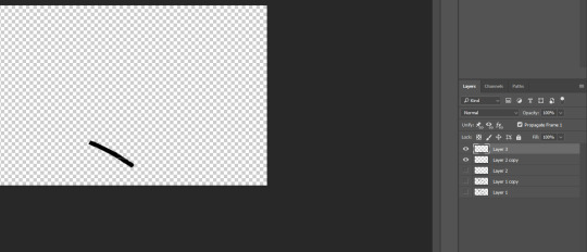
Continue to do this until the whole doodle is made, like so:

I ended up with 15 frames, and 16 layers. You can set this to whatever speed you think is best by highlighting all the Frames. If you click the thee little lines on the right-hand side of the frame animation window, a little menu pops up, and there you can select all frames (or hold shift and click on the first and the last frame). From there, you click on the time underneath the frames and adjust it whatever looks best for your gif, 0.05 usually works well.
Now, you want to convert the doodle into one object that you can move. To do this, click on the little lines in the left-hand corner (where the frame animation dots were before), and all the framers will turn into layers in video timeline. Then, to make them all one object, select all the layers at once on the right-hand side, and go to filter > convert for smart filters.
You should now be able to drag your doodle into your header file! Like so:
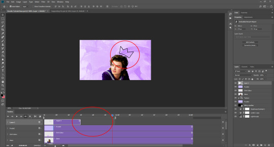
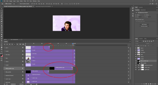
As you can see, sometimes the doodle isn’t as long as the loop of your gif, but that’s okay. What you can do is use the marquee tool and right click when you’ve selected the doodle, choosing layer via copy. This will create a still image of your doodle, which you can place after it ends to ensure it stays on the header until your gif is ready to loop again, as you can see here:
As you can see here, I decided to make the crown white, since I felt it fit better with the header’s aesthetic. To do that, I inverted the gif and the still shape, and set them both to lighten. I also added a white stroke of 1px just to make it stand out (double click your layer on th right-hand side, and find stroke in the pop up that appears, adjust to your liking!)

I also added another doodle to mine, using the same process as before. Spelling out ‘king steve’ had a lot more layers and frames, but it was the same process. Then I dragged it over, and copied the layer just before it re-looped so I could have it as a still image for a portion of the gif. You may need to duplicate your overlay gif underneath the cap to ensure eveything has enough time to loop properly, like so:
And that’s it really! If you would like to add a divider on top of your header AKA a header template, these are the ones I use (one, two). To add it, open the file and drag it onto your gif file, then place it where you want it to be. Once you’ve done that, set the layer to screen (here is a tutorial from the op) if you want it to be white, or invert the image (image > adjustments > invert) and then set it to darken if you want it to be black. If you want it to be a different colour, you’ll have to cut out the divider from the background image, and then double click the layer to get the style menu. In layer style, you can select ‘colour overlay’ and make it whatever colour you want!
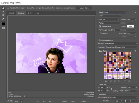
To save your gif, go to file > export > save for web (legacy). It may take a while, so just let ps do its thing until the bar has loaded. You can preview the gif by clicking preview in the bottom left-hand corner, in case you want to cancel and make some changes to your gif before you save it. These are my settings:
And voilà, you have a bright and shiny new gif, doodle, header! If you’d like to use this, you can find it here 💜
#tutorial#header tutorial#tutorial*#resources#headers#chaoticresources#completeresources#yeahps#i hope this helps!!!#thank you to ally @siriusblacks for reading this over for me 🥰
182 notes
·
View notes
Text
Parasomnia #3

Parasomnia #3
Dark Horse Comics 2021
Written by Cullen Bunn
Illustrated by Andrea Mutti
Lettered by Simon Bowland
In a twisted dream world, a nameless stranger battles nightmares in his hunt for his missing son—while in the waking world, the boy's parents find their lives falling apart. As the search for his son in his dreams carries on a bizarre plot is uncovered of children being used as bait for monsters.
Today’s theme is unusual storytelling and while dream walking isn’t anything new, there are many indigenous peoples who believe in its practice, it is something we don’t see much in comics, at least not done like this. This is the second book by Cullen I am reviewing today and this offering is vastly different from the other. The idea that the parents would dream the same dream as their son and this leads to how they are currently dealing with their lives and the fact that their son is missing. Now when something like what they’ve experienced happens there’s a good chance that there’s something genetic involved, after all if one or both the parents are capable of doing this then the chances their offspring can also do this is that much greater. Yeah I’m using science and the supernatural together in my reasoning which should tell you exactly how engaged I am in this book.
I absolutely adore the way that this is being told. The story & plot development that we see through how the sequence of events unfold as well as how the reader learns information is exceptionally well told. The character development we see through the dialogue, the character interaction as well as how they act and react to the situations and circumstances which they encounter. What we see through this is the ever changing personality to the main characters and it really makes quite an impact. The pacing is excellent and as it takes us through the pages revealing the twists & turns, the characterisation and so much more we are fully enthralled by the events we see unfold.
How we see this being structured and how the layers within the story continue to emerge, grow, evolve and strengthen is magnificently rendered. How what we see within these layers add this wonderful depth, dimension and complexity to the story through the avenues that we see open or already exist is masterfully handled. How we see everything working together to create the story’s ebb & flow as well as how it moves the story forward is impeccably achieved.
The interiors here are as gorgeous as ever. The linework we see is exquisite and how the varying weights and techniques being utilised to create the detail work we see throughout the book is beautifully rendered. That Andrea is also able to utilise colour to enhance the detail work is masterfully laid down. The way backgrounds are seen and how they enhance and expand the moments while working within the composition of the panels to bring out the depth perception, sense of scale and the overall sense of size and scope to the story is fabulously rendered. The utilisation of the page layouts and how we see the angles and perspective in the panels show a masters eye for storytelling. The various hues and tones within the colours being utilised to create the shading, highlights and shadow work shows such a great understanding of how colour works and how to maximise its effects. The dirt in his white beard or just the unusual colour schemes being utilised throughout are great examples of that.
With some extremely unusual storytelling thanks to some incredibly great writing and solid characterisation that’s wrapped up in these stunning interiors we see a father’s search for his son. We do see some signs of the search reaching the wrong ears and this could cause some serious trouble but we’ll have to wait to see. I don’t really want this to end. There's so much potential and so many possibilities with this idea and how we see things happening and it’s just fascinating all get out.

0 notes
Text
Monster World: The Golden Age #2
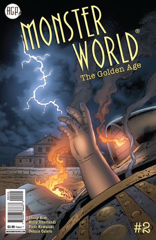
Monster World: Golden Age #2
American Gothic Press 2019
Story by Philip Kim
Written by Holly Interlandi & Philip Kim
Illustrated by Piotr Kowalski
Coloured by Dennis Calero
Lettered by Jenn Pham
A half-conscious Hank Barrymore finds himself staring down the barrel of a shotgun at the Conway farm in Oklahoma. It's the only farm still standing in the entire town, which has been cursed by a bereaved mage named Rybach wielding two elemental demon dogs! The Conways' powerful adopted son, Cole, has managed to keep Rybach at bay, but with Hank showing up bearing news about Cole's real parentage, the farm -- and Hank with it -- could be doomed.
Oh I like this franchise a whole lot. I am also a fan that they only put out a few books so what they do release are absolutely fantastic series with the writing and artwork inside being that kind of top notch no holds barred goodness.
I really am loving the way that this story is being told. I mean Hank is no stranger to the world of monsters and whether he likes it or not once you become aware there's no turning back. It will find a way to you and you won't be able to escape it's grasp. So now Hank finds himself in the Oklahoma Panhandle at home of the Conway's and the barrel of a gun. So seriously now the way this opens up intrigues me because it ends up feeling a little too familiar if you know what I mean. Then things get shaken, not stirred, to the Nth degree and boy is this a doozy!
When this story gets rolling it's like a snowball down a mountain picking up speed and mass as it grows larger and goes faster. The story & plot development and the character development that we are seeing here is utterly phenomenal. Add in the way we see the pacing pick them up and launch them through the book at, in, around and through each other so that everything moves forward in such ways that it feels perfectly natural. Overall the way that we see this story play out is fantastic it has this rhythm to it where the ebb & flow carries the reader along. I like the twist that is introduced to the story though how this makes him fit into Monster World will need some explaining, Rybach on the other hand that's easy to see him as a a monster.
Oh Piotr your linework is impeccable as always and the attention to detail that he can bring out through the varying line weights is stupendous. That the man knows how to utilise backgrounds to enhance moments and bring a sense of size and scope to the book. So that the detail all around in what we see being equally done really is a stand out factor. The composition inside the panels and how we see depth perception by utilising the foreground and backgrounds is smartly done. The utilisation of the page layouts and how we see the angles and perspective in the panels show off his stupendous eye for storytelling. Whether it is in black and white or colour the way we see light sources utilised to create shading and shadows is beautifully done. I like how the gradation effect feels with the colour blocking is rendered extremely well.
Oh there is so much here to absolutely adore in the writing and the artwork. The way the story has these twists and turns and takes you in directions that you don't expect is a highlight of the book for me. I mean I like the idea that Hank tells them about their sons origin or where he came from more accurately. Scratch that I mean theoretically when he comes from in a general sense so how he got here is another matter entirely and I look forward to seeing that explanation lol. Rybach and his motivation is loud and clear, he couldn't have been more descriptive in his reasoning and with what he now has well these ornamental objects well seeing how and when he got them is another thing I want to see.
Such a great story, series and franchise this is. You won't find this anywhere else and to be fair I'm glad because AGP is the perfect home for it.

0 notes
Last Seen Blogs
lokiamorstuffs
“remember you must die, so remember to live,”
conveyinformation
Introduction to Design 1 2019
clubcapricebingo
Club Caprice Bingo

corporationsarepeople
corps 'r' people
nuruddindzulkarnain
Gallery of Paradise : The Lost Macro World