#glass brick windows are my niche favorite
Text
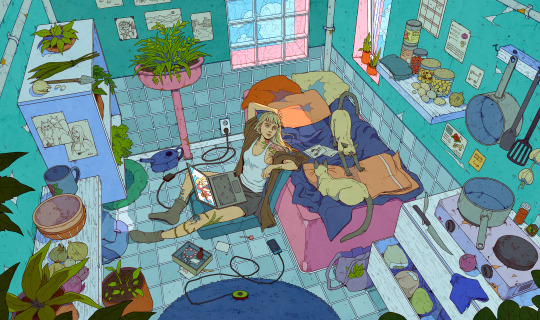
spacing out, thinking back
#artists on tumblr#glass brick windows are my niche favorite#there's just something about them i love#can't beat the vibes#we're almost through the year!#it's almost over#we made it#i wish i could say i'm looking forward to the new year#but it's more dreading than anything else#but hey!#still made it through this one
2K notes
·
View notes
Text
Beach House Tour
Built and designed by Marnie Oursler of Marnie Custom Homes (recently featured here), this spectacular oceanfront beach house is just steps from the Atlantic ocean, in Fenwick Island, DE which served as the muse for the home’s design and aesthetic. Crisp whites, beachy blues, and faded driftwood serve as the palette for this light and airy home. Inside creativity is abundant with custom bunk bed, built-ins, remote controlled sky lights in the master bedroom and bath, custom tile work and even a separate 50’s retro kitchenette for house guests. This home was designed with the view in mind featuring five balconies and a spiral staircase leading to a rooftop deck with gorgeous views of the Atlantic. No detail has been overlooked for this dream beach home with ocean views from every angle.
Pin your favorite interiors and exteriors photos of this inspiring beach house tour!
Beach House Tour
Featuring blue shingle siding and white trim, this beach house takes your breath away the moment you see it. Isn’t it stunning?!
Siding
Siding is NuCedar Siding in “Bracing Blue”.
Front Door
The door paint color is similar to “Behr Sunken Pool”.
Home-Sweet-Home
Oh, wow… Just imagine opening the front door of your home and be embraced by this view! (Take a look at the ocean for a few second and take a few deep breaths…).
Decor
Sofa: Four Seasons Slipcover Sofa from Creative Concepts – similar here.
Swivel Chair: Comfort Design Maco Power Swivel Glider from Creative Concepts. Custom fabric – Others: here, here, here & here.
Beautiful Coffee Tables: here, here, here, here & here.
Ceiling Fan: Fanimation Islander Pewter w/ Natural Palm Blades.
Rug: 8×10 Jaipur collection area rug.
Dining Room
Ocean views surround this coastal dining room.
Table: Canadel Champlain 60” Round Table from Creative Concepts – Others: here, here, here, here & here.
Slipcover dining chairs from Creative Concepts – Others on Sale: here, here, here & here.
Chandelier: Malibu 24 w/ Mother of Pearl from Ro Sham Beaux – Other Beaded Chandeliers: here, here, here, here & here.
Paint Color
The shiplap is painted in “Sherwin Williams Pearly White”.
Kitchen
This kitchen features a great layout. A butler’s pantry is located on the far left and open shelves beautifully accentuates the slab backsplash on the far right.
Kitchen Cabinets: Décor Cabinets Maple painted Benjamin Moore Decorator’s White.
Stools: 24” Amisco Ronny barstool – Others: here, here, here & here.
Anchor: Custom by @tobacco_barn_craftsman.
Appliances: Sub Zero & Wolf.
Kitchen Island Paint Color
Blue Kitchen Island Paint Color: “Santorini Blue 1634 by Benjamin Moore” – I love this color on islands!
All hardwood: Castle Combe West End, Color: Beckton by US Floors – similar here & here.
Island Countertop
Island countertop & open shelves are Butcher Block Reclaimed Chestnut from @grothouseinc.
Mixer: Kitchenaid mixer with KitchenAid Watercolour Ceramic Bowl.
Lighting
Pendants: Menton Brushed Nickel Clear Glass by Matteo Lighting. Other Pendants on Sale: here, here, here, here, here, here, here & here.
Kitchen Sink
Sink: Apron Farm Sink from Kohler.
Faucet
Kitchen faucet is by Kohler.
Cabinet Harware
Hardware: Grafton Pull in polished chrome from Restoration Hardware – Other Recommended Hardware: Pulls, Cup Pulls, Knobs & Appliance Pulls.
Stone
The perimeter countertop and backsplash is “Sea Pearl Quartzite”.
Butler’s Pantry
This practical butler’s pantry/bar is located just off the kitchen.
Cabinet Paint Color
Cabinet is painted in “Benjamin Moore Decorator’s White“.
Coffee-Time
This Miele built-in coffee machine is one of my favorites!
Trim Paint Color
All Trim: Benjamin Moore Decorator’s White in High Gloss.
Shiplap Paint Color
All shiplap is painted in “Pearly White SW 7009 by Sherwin Williams”.
Chandelier
Chandelier: Ro Sham Beaux Lily 18” light with Aquamarine chip quartz beads – Other Stairway Chandeliers: here, here, here, here, here, here, here, here & here.
Built-in Gate
This built-in safety gate was custom-designed by the builder and it mimics the exterior railing.
Shiplap Barn Door
A custom sliding shiplap barn door conceals the washer and dryer.
Powder Room
This powder rooms feels beachy and fresh. You can make any smaller bathroom look bigger if you apply the tile from floor-to-ceiling.
Tile: Fan shaped Aquamarine #1383 with Capri #1384 by Quemere Designs Tile – Other Fun Tiles: here, here, here, here & here.
Sink: Kohler Memoirs Pedestal Sink.
Toilet: Kohler.
Mirror: Pottery Barn – Others: here, here & here.
Light: Elk Lighting.
Guest Bedroom Paint Color
Paint Color: “Evening Shadow SW 7662 by Sherwin Williams”.
Bedding: Restoration Hardware – similar here & here.
Throw Blanket: Kaley Throw (slate) by Alcott Hill from Birch Lane.
Bed: Remington bed from Wesley Allen (Custom Color).
Side Table: Bungalow 5 Dakota 1 Drawer Side Table (white).
Side Chair: CR Laine – Other Nice Chairs: here, here, here & here.
Ceiling Fan: Fanimation Islander Pewter w/ Natural Palm Blades.
Painting above bed: Alison Junda @a.junda_paintings.
Bathroom
Paint Color: “Sherwin Williams Evening Shadow”.
Vanity: Custom from Yorktowne – similar here, here, here & here.
Counters: Q Quartz Calacutta Verona
Lighting: Ashbury Double Sconce – Polished Chrome from Restoration Hardware.
Shower Tile: Mosaic: Lunada Bay Tile – Tommy Bahama Collection – Cocos Keeling Color – similar here.
White: 3×6 Bright White Ice Subway Tile.
Floors: 8” x 36” Panaria Ceramica Wood Trend White Oak with Warm Gray Grout – similar here & here.
Distressed Shiplap Bedroom
The distressed shiplap accent wall was designed by the builder/designer. The ceiling paint color is “Open Air SW 6491 by Sherwin Williams”.
Wall color: “SW Pearly White”.
Side Table: Bungalow 5 – Others: here, here, here, here, here, here & here.
Bed: Creative Concepts.
Throw: here – similar.
Guest Bathroom
Wall paint color is “Pearly White by Sherwin Williams” – which is a great neutral color!
Floors: 8” x 36” Panaria Ceramica Wood Trend White Oak with Warm Gray Grout – similar here & here.
Vanity: Custom from Yorktowne Cabinetry – similar here, here, here & here.
Counters: Q Quartz Calacutta Verona.
Shower Floor/Wall Tile: Luanda Bay Agate Pisa with Pearl Finish 1” x 4” Brick Mosaic with Avalanche Grout – similar here, here, here & here.
White Shower Wall: 3×6 Bright White Ice Subway Tile.
Lighting: Ashbury Double Sconce – Polished Chrome from Restoration Hardware.
Mirror: Pottery Barn.
Guest Bathroom
This guest bathroom features a fun geometric floor tile and white walls. Paint color is “Pure White SW 7005 Sherwin Williams”.
Counters: Q Quartz Calacutta Verona.
Vanity: custom by Yorktowne. Similar here, here, here & here.
Mirror: Pottery Barn.
Tiling
Tile floor: Lili Hexagon Tile with custom colors – similar here & here.
Shower walls: 3×6 Bright White Ice Subway Tile.
Shower Niche: Lunada Bay Agate Umbria withPearl finish 1” x 1” Mosaic tile – similar here.
Neutral Master Bedroom Paint Color
Walls are “Drift of Mist SW 9166 Sherwin-Williams”.
Doors open to a private balcony with dreamy ocean views!
Chest: Balboa Island Raffia Host Chest.
Bed & Bedding
Bed: Barclay Butera – also available here.
Side Tables: Bungalow 5 Frances 2 drawer side table – Other Nightstands on Sale: here, here, here & here.
Comforter: Eastern Accents – complete set – just Duvet Cover.
Shams: Eastern Accents Euro Shams – Other Beautiful Bedding: here, here, here, here & here.
Lumbar Pillows: Blue/Green Scallop Design Hand-painted.
Decorative Pillow: Sumba Hand Painted Coral.
Master Bathroom
The master bathroom feels luxurious and welcoming at the same time. Wall color is “Drift of Mist by Sherwin Williams”.
Bath: Archer Whirlpool Bath by Kohler.
Wall Tile
Wall Tile: Ming Green 3” x 6” Polished Marble Tile.
Floor Tile
Floor Tile: APE Project White 8” x 45” staggerd layout – similar here & here.
Accent Tile (Niche): Luanda Bay Agate Luccca Pearl Finish 1”x1” Mosaic.
Countertop & Mirrors
Counters: Q Quartz Calacutta Verona.
Mirrors: here.
Sinks: Kohler.
Sconces: Ravelle Sconces Polished Nickel from Restoration Hardware.
Hardware: Kara Pull 6 15/16” Polished Chrome & Top Knobs Knobs.
Bunk Room
The bunk room features custom bunk beds with storage staircase, custom railing and shiplap.
Wall color: Drift of Mist 9166 by SW.
Bunk Beds: Custom made by Marnie Oursler.
Quilt: Nautica Briars Navy Quilt.
Whale Sheets: Pauls Whale Sheet from Birch Lane.
Anchor Pillow: Williford Anchor Cotton Throw Pillow by Breakwater Bay.
Fan: Minka-Aire Vintage Gyro 42” Brushed Nickel.
Bathroom
The bunk room bathroom features a fun blue and white color scheme. Walls are “Sherwin Williams Pure White SW 7005”.
Sink: Brockway Utility Sink K-3200 by Kohler (custom color).
Tile: Popham Hex Star Tile – Others: here.
Lighting: ELK LightingEnglish Pub Light 2 Light in Satin Nickel.
Kitchenette
This kitchenette is located on the lower level of the house and it’s perfect for guests, as a rental or to prepare some quick snacks after a day at the beach.
Pendant Light over sink: Hudson Valley Massena Light in white & polished nickel.
Cabinet Paint Color
Kitchen cabinets are Shaker-style, painted in Decorator’s White by Benjamin Moore.
Counter: Q Quartz – Calacutta Verona.
Hardware: Charlotte Pull 3 ¾” Cup Pull by Top Knobs & Bergen Knob 1 ¼” Knob by Top Knobs.
Appliances
Appliances are Northstar.
Backsplash: 3×6 Bright White Ice Subway Tile.
Pet Shower
This open pet shower is perfect for large dogs!
Shower Wall & surrounding floor: Charm Bianco 6” x 36” from Charm by Isla – similar here.
Shower Floor Tile: BG14 Spindrift Azure Glass Pebble – Others: here, here & here.
Outdoor Shower
An “outdoor shower” is always welcoming when you live by the beach. This one is located in a covered area and I think it’s a great idea!
Backyard
Life is better when the ocean is your backyard, right?!

Railing
Decorative Panels & Railings: Intex Millwork.
Windows
Windows: Andersen Windows.
Beach House Goals
How gorgeous is this home?! I am so honored to be sharing Marnie’s beautiful work with you guys!
Get Inspired
This beach house is perfect for this narrow lot.
Coastal Life
I honestly hope you guys had as much fun as I had with this beach house tour!
Many thanks to the builder & designer for sharing the details above!
Builder: Marnie Custom Homes (Instagram)
Photography: Dana Hoff Photography.
Click on items to shop:
!function(w,i,d,g,e,t){if (!d.getElementById(i)) {element = d.createElement(t);element.id = i;element.src = 'https://widgets.rewardstyle.com' + e;d.body.appendChild(element);} if (typeof w[g] === 'object') { if (d.readyState === 'complete') { w[g].init(); }}}(window, 'moneyspot-script', document, '__moneyspot', '/js/widget.js', 'script');

JavaScript is currently disabled in this browser. Reactivate it to view this content.
Best Sales of the Month:
Thank you for shopping through Home Bunch. I would be happy to assist you if you have any questions or are looking for something in particular. Feel free to contact me and always make sure to check dimensions before ordering. Happy shopping!
JavaScript is currently disabled in this browser. Reactivate it to view this content.
Serena & Lily: Amazing Rug Sale!
Wayfair: Up to 70% OFF on Furniture and Decor!!!
Joss & Main: Up to 70% off “Don’t Think Twice Sale”!
Pottery Barn: 40% OFF plus free shipping. Use code: FREESHIP.
One Kings Lane: Outdoor Sale Up to 60% Off.
West Elm: Up to 40% Off on Sofas, Sectionals & Chairs!
Anthropologie: New Fall Arrivals!
Nordstrom: Sale – Incredible Prices!!!
Posts of the Week:
Beautiful Homes of Instagram: Charlotte, NC
Florida Beach Cottage.
Beautiful Homes of Instagram: Modern Farmhouse.
2019 New Year Home Tour.
New-Construction Home Ideas.
Tom Brady and Gisele Bundchen’s Home – Full House Tour.
Dark Cedar Shaker Exterior.
Craftsman Beach House.
Beautiful Homes of Instagram: Coastal Farmhouse Design.
Lake House Interior Design Ideas.
Neutral Home.
Before and After Bathroom Renovation.
White Kitchen Renovation.
Kitchen with Blue Island.
Coastal-inspired Home Renovation.
Southern-inspired Modern Farmhouse.
Coastal Farmhouse Home Decor.
Small Lot Modern Farmhouse.
Beautiful Homes of Instagram: British Columbia.
Reinvented Classic Kitchen Design.
Florida Beach House Interior Design.
New England Home.
Beautiful Homes of Instagram: Urban Farmhouse.
Beautiful Homes of Instagram: Fixer Upper.Beach House Interior Design Ideas.
Tailored Interiors.
Modern Farmhouse with Front Porch.
Classic Colonial Home Design.Grey Kitchen Paint Colors.
Follow me on Instagram: @HomeBunch
You can follow my pins here: Pinterest/HomeBunch
See more Inspiring Interior Design Ideas in my Archives.
“Dear God,
If I am wrong, right me. If I am lost, guide me. If I start to give-up, keep me going.
Lead me in Light and Love”.
Have a wonderful day, my friends and we’ll talk again tomorrow.”
with Love,
Luciane from HomeBunch.com
Come Follow me on
Come Follow me on
Get Home Bunch Posts Via Email
Contact Luciane
“For your shopping convenience, this post might contain links to retailers where you can purchase the products (or similar) featured. I make a small commission if you use these links to make your purchase so thank you for your support!”
from Home http://www.homebunch.com/beach-house-tour/
via http://www.rssmix.com/
0 notes
Text
A Coffee Drinker’s Guide To Detroit
What is left to say about Detroit? By now, you’ll have heard the boom and bust stories, the tales of failure and recovery. It’s old (and frankly rather boring) news—let’s just agree that Detroit is back.
Instead, let’s talk about how cool Detroit is. It has famous sons and daughters, from superstars like Madonna and Eminem to, well, Kid Rock. It’s the home of Motown, the birthplace of techno, and the den of oft-beleaguered Tigers and Lions.
And Detroit’s coffee scene is booming. Brand new cafes open seemingly every week, in monied suburbs and trendy urban neighborhoods. Detroit’s sprawling size—San Francisco, Manhattan, and Boston could all fit within the city’s 139 square miles—means there’s plenty of scope for new businesses to begin, expand and grow.
Here are ten of the best, both new and established.
The Red Hook Detroit
Originally based in the suburb of Ferndale, The Red Hook has since expanded to Detroit proper with this charming neighborhood space. The rotating roaster lineup is a mixture of star coffee names such as Parlor Coffee and Stumptown Coffee Roasters, as well as more local representation from Astro Coffee, all made via batch brew, Hario V60, or a white La Marzocco FB80.
In-house baked goods round out the menu, while plants and colorful murals make the cafe feel lively and welcoming. Its location in the heart of West Village makes it a local favorite, as well as a perfect spot for dog-watching if my time spent there is any indication.
The Red Hook is located at 8025 Agnes St, Detroit. Visit their official website and follow them on Facebook, Twitter, and Instagram.
Populace Coffee
To downtown now, and Populace’s lobby cafe inside The Siren Hotel on Broadway. I’ve written about this space before, and it bears repeating that the regal opulence of the interior is a sight to see. Heavy curtains, antique furniture, and just so much marble make sitting in the lobby and drinking a latte a distinctly fancy experience.
Populace roasts out of Bay City, Michigan, where its original cafe also resides, but this expansion to Detroit is another sign that the city’s coffee scene is flourishing, and still welcoming new players.
Populace Coffee is located at 2114, 1509 Broadway St, Detroit. Visit their official website and follow them on Facebook, Twitter, and Instagram.
Ashe Supply Company
On the same block of Broadway, a couple of buildings up from Populace, sits Ashe Supply Company, a self-styled “Lifestyle Brand” that combines clothing, artwork, prints, and coffee. Started by two Detroit natives, the cafe features industrial-chic interior design, with a curved bar clad in wood, hand-written signs, and pieces of Detroit ephemera dotted around.
Part of the space is dedicated to coffee roasting, while the rest is filled with community tables and cozy nooks, from which to gaze through the big glass windows at the comings and goings from the Detroit Opera House across the street.
Ashe Supply Company is located at 1555 Broadway St, Detroit. Visit their official website and follow them on Facebook, Twitter, and Instagram.
Dessert Oasis Coffee Roasters
Another downtown expansion for another Detroit suburb stalwart, Dessert Oasis opened this second location after beginning life 26 miles north in Rochester.
The downtown space is big and softly lit, with high ceilings, exposed ductwork and light fixtures—in fact, if it feels a bit like a music venue then that’s because it sort of is. Dessert Oasis started life as a dessert- and music-focused cafe, before adjusting its focus to include more of the coffee side of the business.
The cafes still host regular gigs, with both local and national acts passing through most weekends.
The big octagonal bar sits in the middle of the space, featuring a pour-over station and Slayer espresso machine, as well as a refrigerated display case for all the house-made cakes (dessert is in the name, after all).
Dessert Oasis Coffee Roasters is located at 1220 Griswold St, Detroit. Visit their official website and follow them on Facebook and Instagram.
Astro Coffee
Started by a couple who met while working at Monmouth Coffee Company in London, Astro is regarded by many as the center of Detroit’s coffee scene. Since 2011, Astro has offered a distinctive take on specialty coffee alongside an expansive menu of house-made goodies (plus they make their own nut milk, always a bonus).
A rotating selection of US and international guest coffee is available (Heart Roasters from Oregon and Bonanza Coffee Roasters from Germany are two recent offerings), in addition to Astro’s own roasting program, which they set up just last year.
The cafe itself is cozy and welcoming, with mural-covered chalkboard walls, plenty of seating, and a busy, community-minded feel.
Astro Coffee is located at 2124 Michigan Ave, Detroit. Visit their official website and follow them on Facebook, Twitter, and Instagram.
Lucky Detroit
A brand new cafe above a barbershop a block down from Astro on Michigan Ave, Lucky has the feel of a laid-back saloon. Interior design is big on dark wood, exposed brick and plenty of antiques (not to mention a moose head on one wall), and a huge three-part mirror behind the reclaimed butcher-block bar.
A La Marzocco Linea Mini serves espresso drinks, while manual and batch brews are also available, all made with coffee from Populace. Lucky is the ideal place to grab a coffee, relax on a comfy sofa while gazing upon the puzzled visage of a flag-draped moose, and await your turn in the barber’s chair.
Lucky Detroit is located at 2000 Michigan Ave, 2nd Floor, Detroit. Visit their official website and follow them on Facebook and Instagram.
Anthology Coffee
Previously located within the Pony Ride business incubator in Detroit’s Corktown neighborhood, Anthology’s roastery and cafe has been a Detroit favorite since 2012. The new space at the Eastern Market retains an open plan and communal feel, with the roastery on one side and a semi-floating coffee bar featuring a striking Mahlkönig EKK43 grinder and full Modbar system on the other. Everything is arranged to give the customer maximum interaction with their coffee as it is roasted and brewed.
Anthology Coffee is located at 1948 Division St, Detroit. Visit their official website and follow them on Facebook and Instagram.
Great Lakes Coffee Roasting Company
Another of Detroit’s coffee elders, Great Lakes Coffee has been wholesale roasting since 1994 and serving coffee at its flagship location on Woodward Ave in Midtown since 2012. A big, light-filled space, utilizing wood reclaimed from two demolished Hamtramck houses, Great Lakes combines a full coffee service with an extensive alcohol menu and inventive food lineup.
One part of the enormous bar features a La Marzocco GB5, Mazzer grinders, and a Hario V60 pour-over station for all your coffee needs, while another hosts a rotating selection of wines, draught beers, and specialty cocktails. It’s a harmonious blend, keeping the communal tables and bar stools that fill out the rest of the space in constant demand.
Great Lakes Coffee has multiple locations around Detroit. Visit their official website and follow them on Facebook, Twitter, and Instagram.
Cairo Coffee
On the outskirts of the bustling Eastern Market, tucked discreetly at the back of a retail shop, sits Cairo Coffee, a multi-roaster cafe anchored by North Carolina’s Counter Culture. Whether you happen upon it by chance or hear about it through word of mouth, visiting Cairo feels like visiting the kitchen of an old friend who just happens to have made a pot of coffee.
The cafe might be small, with space for just a few tables, but the coffee experience is taken very seriously, with a La Marzocco GS3 and Mazzer Major taking up most of the counter, and rotating guest coffees supplementing the ever-present Counter Culture (most recently Máquina Coffee Roasters from Pennsylvania).
In a nod to community engagement, the cafe also hosts the Library of Cairo, encouraging visitors to borrow (and hopefully return) a variety of books from the shelves below the counter.
Cairo Coffee is located at 2712 Riopelle St, Detroit. Visit their official website and follow them on Facebook, Twitter, and Instagram.
Bikes & Coffee
Another Detroit coffee newbie, having only opened in late October and located across Trumbull Ave from Wayne State University’s athletic complex, Bikes & Coffee focuses on, well, you can probably guess. The bar, big and rectangular, sits in the middle of the space, while the walls showcase bicycle paraphernalia for sale and the back of the space houses the already busy repair shop.
Another multi-roaster setup, Bikes & Coffee features local heroes Anthology as well as Hyperion from down the road in Ypsilanti and, fittingly, bicycle-themed Legal Speed from California.
There seems to be a natural intersection between bicycle people and coffee people, making it the perfect niche for Bikes & Coffee to exploit.
Bikes & Coffee is located at 1521 Putnam St, Detroit. Visit there official website and follow them on Facebook and Instagram.
Fionn Pooler is a journalist based in Ann Arbor, Michigan, and the publisher of The Pourover. Read more Fionn Pooler on Sprudge.
The post A Coffee Drinker’s Guide To Detroit appeared first on Sprudge.
A Coffee Drinker’s Guide To Detroit published first on https://medium.com/@LinLinCoffee
0 notes
Text
A Coffee Drinker’s Guide To Detroit
What is left to say about Detroit? By now, you’ll have heard the boom and bust stories, the tales of failure and recovery. It’s old (and frankly rather boring) news—let’s just agree that Detroit is back.
Instead, let’s talk about how cool Detroit is. It has famous sons and daughters, from superstars like Madonna and Eminem to, well, Kid Rock. It’s the home of Motown, the birthplace of techno, and the den of oft-beleaguered Tigers and Lions.
And Detroit’s coffee scene is booming. Brand new cafes open seemingly every week, in monied suburbs and trendy urban neighborhoods. Detroit’s sprawling size—San Francisco, Manhattan, and Boston could all fit within the city’s 139 square miles—means there’s plenty of scope for new businesses to begin, expand and grow.
Here are ten of the best, both new and established.
The Red Hook Detroit
Originally based in the suburb of Ferndale, The Red Hook has since expanded to Detroit proper with this charming neighborhood space. The rotating roaster lineup is a mixture of star coffee names such as Parlor Coffee and Stumptown Coffee Roasters, as well as more local representation from Astro Coffee, all made via batch brew, Hario V60, or a white La Marzocco FB80.
In-house baked goods round out the menu, while plants and colorful murals make the cafe feel lively and welcoming. Its location in the heart of West Village makes it a local favorite, as well as a perfect spot for dog-watching if my time spent there is any indication.
The Red Hook is located at 8025 Agnes St, Detroit. Visit their official website and follow them on Facebook, Twitter, and Instagram.
Populace Coffee
To downtown now, and Populace’s lobby cafe inside The Siren Hotel on Broadway. I’ve written about this space before, and it bears repeating that the regal opulence of the interior is a sight to see. Heavy curtains, antique furniture, and just so much marble make sitting in the lobby and drinking a latte a distinctly fancy experience.
Populace roasts out of Bay City, Michigan, where its original cafe also resides, but this expansion to Detroit is another sign that the city’s coffee scene is flourishing, and still welcoming new players.
Populace Coffee is located at 2114, 1509 Broadway St, Detroit. Visit their official website and follow them on Facebook, Twitter, and Instagram.
Ashe Supply Company
On the same block of Broadway, a couple of buildings up from Populace, sits Ashe Supply Company, a self-styled “Lifestyle Brand” that combines clothing, artwork, prints, and coffee. Started by two Detroit natives, the cafe features industrial-chic interior design, with a curved bar clad in wood, hand-written signs, and pieces of Detroit ephemera dotted around.
Part of the space is dedicated to coffee roasting, while the rest is filled with community tables and cozy nooks, from which to gaze through the big glass windows at the comings and goings from the Detroit Opera House across the street.
Ashe Supply Company is located at 1555 Broadway St, Detroit. Visit their official website and follow them on Facebook, Twitter, and Instagram.
Dessert Oasis Coffee Roasters
Another downtown expansion for another Detroit suburb stalwart, Dessert Oasis opened this second location after beginning life 26 miles north in Rochester.
The downtown space is big and softly lit, with high ceilings, exposed ductwork and light fixtures—in fact, if it feels a bit like a music venue then that’s because it sort of is. Dessert Oasis started life as a dessert- and music-focused cafe, before adjusting its focus to include more of the coffee side of the business.
The cafes still host regular gigs, with both local and national acts passing through most weekends.
The big octagonal bar sits in the middle of the space, featuring a pour-over station and Slayer espresso machine, as well as a refrigerated display case for all the house-made cakes (dessert is in the name, after all).
Dessert Oasis Coffee Roasters is located at 1220 Griswold St, Detroit. Visit their official website and follow them on Facebook and Instagram.
Astro Coffee
Started by a couple who met while working at Monmouth Coffee Company in London, Astro is regarded by many as the center of Detroit’s coffee scene. Since 2011, Astro has offered a distinctive take on specialty coffee alongside an expansive menu of house-made goodies (plus they make their own nut milk, always a bonus).
A rotating selection of US and international guest coffee is available (Heart Roasters from Oregon and Bonanza Coffee Roasters from Germany are two recent offerings), in addition to Astro’s own roasting program, which they set up just last year.
The cafe itself is cozy and welcoming, with mural-covered chalkboard walls, plenty of seating, and a busy, community-minded feel.
Astro Coffee is located at 2124 Michigan Ave, Detroit. Visit their official website and follow them on Facebook, Twitter, and Instagram.
Lucky Detroit
A brand new cafe above a barbershop a block down from Astro on Michigan Ave, Lucky has the feel of a laid-back saloon. Interior design is big on dark wood, exposed brick and plenty of antiques (not to mention a moose head on one wall), and a huge three-part mirror behind the reclaimed butcher-block bar.
A La Marzocco Linea Mini serves espresso drinks, while manual and batch brews are also available, all made with coffee from Populace. Lucky is the ideal place to grab a coffee, relax on a comfy sofa while gazing upon the puzzled visage of a flag-draped moose, and await your turn in the barber’s chair.
Lucky Detroit is located at 2000 Michigan Ave, 2nd Floor, Detroit. Visit their official website and follow them on Facebook and Instagram.
Anthology Coffee
Previously located within the Pony Ride business incubator in Detroit’s Corktown neighborhood, Anthology’s roastery and cafe has been a Detroit favorite since 2012. The new space at the Eastern Market retains an open plan and communal feel, with the roastery on one side and a semi-floating coffee bar featuring a striking Mahlkönig EKK43 grinder and full Modbar system on the other. Everything is arranged to give the customer maximum interaction with their coffee as it is roasted and brewed.
Anthology Coffee is located at 1948 Division St, Detroit. Visit their official website and follow them on Facebook and Instagram.
Great Lakes Coffee Roasting Company
Another of Detroit’s coffee elders, Great Lakes Coffee has been wholesale roasting since 1994 and serving coffee at its flagship location on Woodward Ave in Midtown since 2012. A big, light-filled space, utilizing wood reclaimed from two demolished Hamtramck houses, Great Lakes combines a full coffee service with an extensive alcohol menu and inventive food lineup.
One part of the enormous bar features a La Marzocco GB5, Mazzer grinders, and a Hario V60 pour-over station for all your coffee needs, while another hosts a rotating selection of wines, draught beers, and specialty cocktails. It’s a harmonious blend, keeping the communal tables and bar stools that fill out the rest of the space in constant demand.
Great Lakes Coffee has multiple locations around Detroit. Visit their official website and follow them on Facebook, Twitter, and Instagram.
Cairo Coffee
On the outskirts of the bustling Eastern Market, tucked discreetly at the back of a retail shop, sits Cairo Coffee, a multi-roaster cafe anchored by North Carolina’s Counter Culture. Whether you happen upon it by chance or hear about it through word of mouth, visiting Cairo feels like visiting the kitchen of an old friend who just happens to have made a pot of coffee.
The cafe might be small, with space for just a few tables, but the coffee experience is taken very seriously, with a La Marzocco GS3 and Mazzer Major taking up most of the counter, and rotating guest coffees supplementing the ever-present Counter Culture (most recently Máquina Coffee Roasters from Pennsylvania).
In a nod to community engagement, the cafe also hosts the Library of Cairo, encouraging visitors to borrow (and hopefully return) a variety of books from the shelves below the counter.
Cairo Coffee is located at 2712 Riopelle St, Detroit. Visit their official website and follow them on Facebook, Twitter, and Instagram.
Bikes & Coffee
Another Detroit coffee newbie, having only opened in late October and located across Trumbull Ave from Wayne State University’s athletic complex, Bikes & Coffee focuses on, well, you can probably guess. The bar, big and rectangular, sits in the middle of the space, while the walls showcase bicycle paraphernalia for sale and the back of the space houses the already busy repair shop.
Another multi-roaster setup, Bikes & Coffee features local heroes Anthology as well as Hyperion from down the road in Ypsilanti and, fittingly, bicycle-themed Legal Speed from California.
There seems to be a natural intersection between bicycle people and coffee people, making it the perfect niche for Bikes & Coffee to exploit.
Bikes & Coffee is located at 1521 Putnam St, Detroit. Visit there official website and follow them on Facebook and Instagram.
Fionn Pooler is a journalist based in Ann Arbor, Michigan, and the publisher of The Pourover. Read more Fionn Pooler on Sprudge.
The post A Coffee Drinker’s Guide To Detroit appeared first on Sprudge.
from Sprudge http://bit.ly/2UYvS8I
0 notes
Text
i feel like coyote peterson is the embodiment of what adhd was supposed to be for all along. like it’s why as a trait it was selected for and lasted in our collective dna and what it was supposed to be for all along. like he’s out there in the wilderness hunting, constantly vigilant (and it is hunting, what they do, albeit for the sake of cameras, not food) and he catches just a glimmer of movement out of the corner of his eye, or spots something just barely the wrong shape, and he’s diving for it before anybody else even fully grasps what’s going on. “snake! SNAKE!” “it’s a turtle! KEEP UP, KEEP UP!” “I FOUND A TOAD!” *coyote dives into a ditch*
like, can you imagine what amazing hunters, scouts and sentries people with adhd in the Long Ago Days must have been? the quick eyes and quicker shifts of focus, coupled with the lesser-talked-about symptoms like disregard for personal safety and sudden intense enthusiasm? (see: coyote thoughtlessly diving into cacti to catch a wasp - with the intention of it stinging him later. FOR SCIENCE!). it’s a recipe for an amazing and fearless and successful hunter. god, they must have got so much pussy back in the day. curse you and your sexy competence, my hunter/gatherer adhd ancestors of old.
by contrast, like, me, actuallyadhd, i work in an office, doing the same thing over and over all day at a computer. my mind roams freely since i only need to let a part of my brain go on autopilot to do my work, which is complex stuff, but i’m very good at it.
me, when i see a flicker of movement out of the corner of my eye, or feel the barest rumbling of vibration under my feet that tells me something large is moving nearby, i instinctively dart my gaze over and...it’s a coworker, walking to or from their station. occasionally the shadow of my boss behind the tinted glass wall of her office re-arranging her succulents on her windowsill. sometimes it’s a particularly windy day and i can’t stop looking out the high, narrow windows at the green branches dancing.
without adventurous active outlets in my own life, i became comfortably enmeshed in my coping mechanisms of strict routine to try and live like a normal human, escaping into hyperfixations, and/or elaborate flights of fancy, whole universes and stories within them i may never fully be able to tell. deprived of the opportunity to hunt, to explore and constantly get hit with a new dopamine rush over and over of New Things And Things To Chase, i adventure instead in my mind, both internally and vicariously. while i am much happier now than i was when i was younger - honestly, i’m happy almost all the time now! - i think it’s safe to say that i am Not Living My Best Life.
coyote and bw have been my favorite hyperfixation so far, though, and made me realize like, hey, we’re like this for very good reasons. we’re just not...particularly adapted for the modern industrialized world, is all. but though it may take longer than is “traditionally expected” - BW didn’t even really start getting truly successful until coyote was 37, did you know? - everyone will eventually find their niche in the world.
and also, i’m glad i live in florida, bc imo my day’s not complete unless i’ve spotted at least five lizards. like coyote says with his snapping turtle buddies, i will claim that i am STUDYING them! for SCIENCE! and not just bc it makes something very primordial in me delighted to be able to recognize their subtle shapes in the sun or shade. they’re my buddies! i know them and their tiny little territories in the bowl of brick and greenery that is my sanctuary of the quiet courtyard at work. i can’t live without at least a little wildness and plenty of bravery.
#love me some brown anoles even though they're technically invasive#they been here forever though and they're tiny they're not hurting anybody#also ''they must have got so much pussy'' is just a phrase i find funny i mean there's evidence of many mighty female huntresses#across multiple cultures across the world who i'm sure ALSO got tons of shall we say suitors#t#unsure on if to tag#actuallyadhd
0 notes
Text
Being Your Own Creative Boss with Desi Moore
The following post is brought to you by Squarespace. Our partners are hand picked by the Design Milk team because they represent the best in design.
Becoming an established professional in any line of work can be a long road traveled, but what if you want to really niche down? We reached out to talk to Desi Moore, aka Dude It’s Desi, about how she not only got her foot in the door of creating in the entertainment industry, but also what’s kept her there. Squarespace is the website building platform that has helped Desi out by getting her portfolio site organized in a way that represents her brand and welcomes new business with vigor, letting her quirky and fun personality and style shine through!
Back in 2003, Desi found herself in a place lots of us have been – young, undecided on a future career, and having a good time living a fun, carefree lifestyle. She had just relocated back to Los Angeles from Brooklyn and had the realization that a plan was necessary for the next steps she was hoping to take as an artist.
“I just thought artwise, without a college degree, who would hire me and for what? But I swore when I moved back to Los Angeles that I would not work another day in a restaurant, and that I had to get something legit in the entertainment biz on my resume to get some sort of foot in the door. The movie advertising agency Trailer Park hired me to be their receptionist, and I did that for about a year.”
Just before Desi planned on submitting her two weeks notice to take a position as a film director’s personal assistant, Trailer Park opened a print department specific to movie posters.
“Of course I thought that was super cool, but again why would they hire me when I had no experience. However, when the print department found out I was leaving they offered me a job. Apparently my goofy illustrated company newsletters, cut out 3D lunch menus, and all the weird arty shit I made and surrounded myself with in my reception desk area caught their eye and they saw potential in me – which to this day I am still very grateful for. So, I turned down the personal assistant job and immersed myself and became completely obsessed with learning and succeeding in being an Art Director. I worked really long hard hours and will never forget how stoked I was when I saw my first official movie poster printed.”
There’s usually that moment that stands out, the one that makes you decide to commit to what you’re doing and have a go at it with everything you’ve got in you. For Desi, it was a specific movie poster that ended up being more of a lesson than a success.
“I made a poster for Mad Max Fury Road that was super time consuming because I constructed a giant mass of people, car parts, motorcycles, smoke, destruction, skulls, etc. Each piece had to be painstakingly and intricately masked out (that is where you cut something out of its environment). So halfway through I was like ‘Oh my god this sucks, my hands and eyes are killing me, what was I thinking?!’ But I kept on going and finally finished it. The client and I both thought it turned out really cool, but in the end it didn’t end up getting used for anything, but hey that’s showbiz for ya!”
Being a creative individual in a business world can sometimes be a struggle, and you’ll often find yourself at a crossroads trying to balance both sides of a company.
Desi says, “I do find it a struggle. The business side of things: discussing money, paying bills, finding the time and energy for paperwork, etc. has always been a struggle for me. Being such a right brained individual it’s not a natural forte for me. But I absolutely love being my own boss. In my art career it offers me the freedom to work on such a variety of projects: huge movies, indie movies, album covers, gig posters, clothing brands, paintings and illustrations, whatever! So I never get bored or feel pigeonholed as an artist.”
She also owns a gallery – Showboat – in Los Angeles, an entirely different creative outlet. “As far as owning the gallery, my favorite thing is it’s like I have a big ‘ol rubber approval stamp for any idea I may have. The show concepts and artists are all decided by me. Once I even painted the whole space purple, rented a clawfoot bathtub, and exactly replicated the When Dove’s Cry video set to a tee – purple roses, smoke machine, faux doves, stained glass windows, and my friend dressed as Dr. Fink. Dan Monick beautifully lit and shot portraits of people in the bathtub all night. Carmen Electra even showed up and stole the show! Basically I spent a bunch of cash to create the raddest free Prince photobooth ever. Business-wise nobody else would have ever probably approved that idea but I did, and so it happened.”
This spring, Desi is stretching her creative legs even further and releasing a children’s book – ABCs of the 80s – in collaboration with a former coworker from her Trailer Park days.
“Erin (Campbell Dunkerley) has a young daughter and really wanted to teach her about all the cool eighties things she grew up with along with her ABCs at the same time. Being an 80’s kid myself, I was totally onboard! Erin had some letter ideas and even a few clearances already in place. She was super cool about giving me creative control of the drawings and layout of the book. We were basically on the same page as far as the letters went (although for ‘N’ I did begrudgingly draw The New Kids on The Block instead of the Nancy Reagan / Mr. T D.A.R.E program, but in return I got to do payphone over Pop Swatch so it’s all good – teamwork making the dream work!) I’m not used to working on one single project for so long and I had a hard time focusing at the start of it. So me and my little dog Crackers went up to my friend’s cabin in the mountains in California for a month last year to begin it. So very cliché I know, but it was awesome and I now get why people seclude themselves when working on a book. It hits stores everywhere March 5th and a limited advance amount are available now via http://abcsofthe80s.com!”
When it comes to choosing a favorite project Desi has worked on, I’m willing to bet you’re already familiar…
“I really love when someone says ‘just do your thing’ and I can execute my vision on a project. Being micromanaged or being used as a tool to create something I don’t believe in is never fun. As far as my favorite project to date, I would say it was working on the poster for the movie Bridesmaids. I got to see it through from start to finish, beginning with creating the concept, to art directing the photoshoot with Mark Seliger, and on to constructing the final poster. The cast were all so sweet and hilarious. We shot several setups that day and one included going to a park with Kristen Wiig, Maya Rudolph, and the rest of the girls to pose with a whole bunch of puppies, bunnies, and swans in bowties and berets. The bunnies wouldn’t stop humping and right then I knew it was career highlight for sure. In the end, we went with the original idea of making the girls look like badasses posing against a brick wall, juxtaposing the whole typical demure bridesmaids in a cupcake dress thing. The original copy line I came up with that almost made it was just simply ‘What?’. Shoutout to Damon Wolf and Maria Pekurovskaya from Universal for being a dreamteam and letting me do my thing and have fun with it!”
When it comes to searching out inspiration for her work Desi says, “I really love to travel and have my eyes opened to new customs, colors, and patterns. I travel often and try and be as porous as possible and stow it all away in my brain to subconsciously draw inspiration from when I’m just back in LA working in my studio. I like when the inspirations all get mixed up together and create a whole new vibe of their own.”
Further inspiration comes from a source that’s right at our fingertips, literally.
“On a daily basis, I would be lying if I didn’t say Instagram. There are so many amazing accounts that lead you down rabbit holes of incredible art that I would never be exposed to otherwise. I also have made friends with some wonderful and inspiring artists via Instagram and we share what we find and dig, weaving the web further. I would also be lying if I didn’t say I go into very deep Instagram meme holes on a daily basis – but hey, no shame in that game – humor is the icing on the cake of life!”
It’s clear that Desi’s outlook on the world, her eye for art, and her inherent creativity know no bounds! Squarespace has helped her corral all of the bits and pieces she excels at into one amazing site that shows all of her hard work and long hours off in a cohesive, beautiful way.
Ready to get to work on your own portfolio? Take the first step with a Squarespace website. Use coupon code DESIGNMILK at checkout to get 10% off your first purchase.
via http://design-milk.com/
from WordPress https://connorrenwickblog.wordpress.com/2019/01/28/being-your-own-creative-boss-with-desi-moore/
0 notes
Text
Duplex Style Inspiration (& How Each Side Will Be Different)
We showed you our beach house style inspiration while the pink house was barely starting to come back together. And now that the duplex is at that same stage, we wanted to share our “vision” for its design – from materials and color ideas to specific room functions or features we’re thinking about incorporating.
It’s never too early to start making the 10,000 decisions that a major house reno like this requires because your brain will practically start to smoke if you attempt to pick everything all at once. So from the moment we offered on the duplex, I’ve been keeping a huge Pinterest board to catalog all of the ideas that have popped up and grabbed me over the months.
John and I have been sifting through them all lately in an effort to pinpoint our favorite ideas (so we can avoid that last-minute brain-burn when it’s time to finalize colors, counters, tile, lights, rugs, and BASICALLY ALL THE THINGS). Is everything perfectly crystal clear now? Nope! But we’re feeling a whole lot more focused than we did when we started collecting ideas months ago. So we wanted to share what we’re loving most for the duplex’s primary inspiration.
The Overall Plan
Like the pink house, we want the general vibe of the duplex to be relaxed, uncomplicated, comfortable, and old-meets-new. We definitely want to resist the urge to overfill or overdecorate the house, since it’s meant to feel easy and light (and less stuff = fewer things for renters to damage). Plus, it’s an old home, and we LOVE keeping original details like doors, floors, and my beloved diamond grille windows. We even uncovered an old brick chimney that passes through both sides of the duplex that we will be exposing and using to create a little niche with shelves within each side’s master bedroom.
We also want it to feel beachy, fresh, and coastal. This house has fewer historic details inside that we can emphasize and use for interest. A lot was stripped out over years of being a rental (whereas the pink house sort of froze in time and has things like the curved wall, the back staircase, the stained glass windows, old trim, an antique milk-glass pendant, and the grand front railing). So we’re going to use that as an excuse to go “beachier” with the duplex than we did at the pink house. We’re definitely still going to use old doors and refinish the original floors, but we’re also planning to play a lot with relaxed colors (mint, pistachio, soft pink, blue-gray, aquamarine, etc) and pair them with crisp white and coastal warm wood tones. The photos below do a great job of capturing the overall vibe we’re hoping to create:
image sources: 1 / 2 / 3
Since the duplex is two separate residences, it means we have double the rooms to plan – two living rooms, two kitchens, two dining areas, two laundry/mudrooms, and a whopping six bedrooms and six bathrooms (four full, two half). We’re not planning to decorate each side identically – more like cousins than twins – so picture both of the powder rooms on each side having the same type of tile, but maybe in a different colorway. I think it’ll fun to have two “alter-ego” houses with mirrored floor plans, yet different colors, materials, and decor.
As a refresher, below is an updated floor plan of what one side will look like (the other is the same, just mirrored). You can read more about our floor plan in this post. There’s a video tour in there too if that helps:
So that’s the overall plan, but let’s get a little more specific and show how that will come to life in specific areas around the duplex.
The Exterior
Since the home is in a historic district, the outside will generally look like a fixed-up version of the before: it will still have shutters, corbels, and – of course – no dormer on the roof (womp-womp). We’re keeping the siding color white, but replacing the rotting wood with more durable HardiePlank siding in their stock Arctic White color – but don’t worry that it’ll look too much like this before shot. We have a few ways we’re planning to amp things up and add a lot more curb appeal.
To inject more beachiness into the exterior, we’re going to add mint green shutters (operable ones that will look so great compared to the thin plastic ones above!) along with painting the two original front doors the same mint color. We think it’ll be such a charming and colorful addition to our street. There’s lots of blue – and now pink, thanks to us – but not much green at all. And since there is so much “shutter coverage” on the front of the house, it will still make the house feel very colorful overall (it won’t really read like a white house – more like a green one). We also like the idea of doing a soft pink porch ceiling to subtly reference our pink house – just one house away – since the pink house’s porch ceiling is a minty green-blue color (winking right back atcha, duplex!).
image sources: 1 / 2 / 3
We actually started testing some mint paint colors this past weekend using some removable paint decals. We think we have a favorite, but we’re going to paint one of the doors first to make sure we like it before committing to putting it on all of the shutters.
The Transom Window
One exciting more recent development is that we decided to add an interior transom window above the opening between the kitchen and the main living area. We already had the opening framed wider, and Sean our contractor thinks he can easily rework the header to raise it and make room for the transom. People will see it from the second they step in the front door, and it’ll be another one of those cool “old details” that will add some original-feeling charm back to this house, since so much of that has been stripped out over the years.
We’ve had trouble finding images to represent what we’re thinking (I’m debating if we can do something with diamonds to tie into our diamond windows in the front and the old diamond door we tracked down for the mudroom). But these show you how much a nice high transom window can add to a doorway – especially one as wide as ours is going to be. Prediction: this addition will be one of our favorite things about the duplex when we’re done.
image sources: 1 / 2
The Kitchen
We’d love to do something with color in the kitchen, so our first option is to add it to the cabinets. Maybe one side gets soft blue fronts while the other goes mint? It will only have one window so we’ll still probably keep the majority of the room white so it feels bright, but the colorful cabinets will help it feel fun while the brick chimney we’ve exposed in one corner (like the one in the bottom right image) will add texture and history to the room.
image sources: 1 / 2 / 3
We’re also trying to be realistic that buying two kitchens-worth of custom painted cabinets could get pricey, and DIYing it could be time intensive. So another option we’re floating around is injecting the color in the backsplash tile instead, then keeping the cabinets a stock white or wood color. Again, we could pick slightly different patterns or colors for each side so they each feel distinct.
image sources: 1 / 2 / 3 is ours! :)
The Stair Railing
Since we opened up the formerly closed in stairs on each side of the duplex, we now will have an exposed railing on each side.
While a wood newel post and railing are historic and pretty, we also don’t feel like every single detail needs to feel old. In fact, it might be cool to balance out the old touches in the home with some new additions that feel fresh and coastal – like a metal railing. We have the original wood railing at the pink house and LOVE it, so it feels like we have done that – and since we opened up the stairway wall at the duplex, there’s no original railing to save. So it inspires us to try something a little different…
image sources: 1 / 2 / 3 / 4
We’re leaning towards that horizontal railing in the bottom left, but we haven’t priced anything out quite yet (and that could change our tune on metal entirely!). We know a local metal worker in Cape Charles (he forged a small support bracket for the stairs in the pink house) so it feels like something that’s worth exploring.
The Main Living Area
As you saw in the floor plan, the largest room downstairs (which looked like this when we bought it) will be home to both the living area and a dining space at the far end.
We like the idea of doing some sort of molding treatment on the walls (or ceiling!) just to keep the room from feeling too long and bare. Do we dare to finally jump on the shiplap bandwagon? Only time will tell. We especially love the beams in the picture on the left, and also like the vertical board and batten in the photo on the bottom right. These photos are all waaaaaaay too white when it comes to the furnishings (um, hello, that would never work in a rental) but the wall treatments all feel very beachy and, heck, it’d kinda be a nod to the beadboard that was there before!
image sources: 1 / 2 / 3
The Powder Room
Since there’s just a downstairs powder room in each side of the duplex (along with an outdoor shower for getting the sand off – not to worry!), we think we can play a little bit more with some colorful wallpaper or some sort of wall treatment that makes that little nook of a bathroom under the stairs feel more like a lovely little hideaway. It’s going to be small, and will most likely have the same hardwood floors that run through the rest of the first floor (except for the mudroom, which will be tiled), so we can go a little nuts on the walls. Plus, we can also do some wall molding to save money on wallpaper and tie in whatever treatment we do in the adjacent living area.
image sources: 1 / 2 / 3
The Full Bathrooms
The upstairs bathrooms in this house aren’t huge, so we think we can do something fun with tile to make the most of the small spaces. We LOVE the idea of playing with shapes (subtle stripes or colorful zig-zags) by using the same tiles in two different colorways (or four or five!). Our tile budget is always tight, so it’ll be a challenge to see what we can find without ordering anything too fancy (or high maintenance – this tile needs to be super durable). But again, the fact that they’re small and won’t require much tile may allow us to splurge a bit.
image sources: 1 / 2 / 3
I realize that’s not every single space or idea (bedrooms! backyard! laundry!) but I figured this was enough to give you a sense of the overall vision for the duplex. One thing’s for sure… there will be beachy colors! And cool old pocket doors! And interior transoms! And original wood floors! And tiling projects that take us days and days to complete! Ha!
Psst- It’s really fun to look back on the style post we shared for the pink house and then compare how those mood boards looked to the final version of the house. So funny how many things stuck!
Also, are you on our free email list? We send out quick & fun weekly emails full of bonus details, design tips, random style thoughts, and other house-related musings. Click here to join the fun. And thanks to everyone who has jumped on board – we love putting these together for ya!
The post Duplex Style Inspiration (& How Each Side Will Be Different) appeared first on Young House Love.
Duplex Style Inspiration (& How Each Side Will Be Different) published first on https://ssmattress.tumblr.com/
0 notes
Text
Duplex Style Inspiration (& How Each Side Will Be Different)
We showed you our beach house style inspiration while the pink house was barely starting to come back together. And now that the duplex is at that same stage, we wanted to share our “vision” for its design – from materials and color ideas to specific room functions or features we’re thinking about incorporating.
It’s never too early to start making the 10,000 decisions that a major house reno like this requires because your brain will practically start to smoke if you attempt to pick everything all at once. So from the moment we offered on the duplex, I’ve been keeping a huge Pinterest board to catalog all of the ideas that have popped up and grabbed me over the months.
John and I have been sifting through them all lately in an effort to pinpoint our favorite ideas (so we can avoid that last-minute brain-burn when it’s time to finalize colors, counters, tile, lights, rugs, and BASICALLY ALL THE THINGS). Is everything perfectly crystal clear now? Nope! But we’re feeling a whole lot more focused than we did when we started collecting ideas months ago. So we wanted to share what we’re loving most for the duplex’s primary inspiration.
The Overall Plan
Like the pink house, we want the general vibe of the duplex to be relaxed, uncomplicated, comfortable, and old-meets-new. We definitely want to resist the urge to overfill or overdecorate the house, since it’s meant to feel easy and light (and less stuff = fewer things for renters to damage). Plus, it’s an old home, and we LOVE keeping original details like doors, floors, and my beloved diamond grille windows. We even uncovered an old brick chimney that passes through both sides of the duplex that we will be exposing and using to create a little niche with shelves within each side’s master bedroom.
We also want it to feel beachy, fresh, and coastal. This house has fewer historic details inside that we can emphasize and use for interest. A lot was stripped out over years of being a rental (whereas the pink house sort of froze in time and has things like the curved wall, the back staircase, the stained glass windows, old trim, an antique milk-glass pendant, and the grand front railing). So we’re going to use that as an excuse to go “beachier” with the duplex than we did at the pink house. We’re definitely still going to use old doors and refinish the original floors, but we’re also planning to play a lot with relaxed colors (mint, pistachio, soft pink, blue-gray, aquamarine, etc) and pair them with crisp white and coastal warm wood tones. The photos below do a great job of capturing the overall vibe we’re hoping to create:
image sources: 1 / 2 / 3
Since the duplex is two separate residences, it means we have double the rooms to plan – two living rooms, two kitchens, two dining areas, two laundry/mudrooms, and a whopping six bedrooms and six bathrooms (four full, two half). We’re not planning to decorate each side identically – more like cousins than twins – so picture both of the powder rooms on each side having the same type of tile, but maybe in a different colorway. I think it’ll fun to have two “alter-ego” houses with mirrored floor plans, yet different colors, materials, and decor.
As a refresher, below is an updated floor plan of what one side will look like (the other is the same, just mirrored). You can read more about our floor plan in this post. There’s a video tour in there too if that helps:
So that’s the overall plan, but let’s get a little more specific and show how that will come to life in specific areas around the duplex.
The Exterior
Since the home is in a historic district, the outside will generally look like a fixed-up version of the before: it will still have shutters, corbels, and – of course – no dormer on the roof (womp-womp). We’re keeping the siding color white, but replacing the rotting wood with more durable HardiePlank siding in their stock Arctic White color – but don’t worry that it’ll look too much like this before shot. We have a few ways we’re planning to amp things up and add a lot more curb appeal.
To inject more beachiness into the exterior, we’re going to add mint green shutters (operable ones that will look so great compared to the thin plastic ones above!) along with painting the two original front doors the same mint color. We think it’ll be such a charming and colorful addition to our street. There’s lots of blue – and now pink, thanks to us – but not much green at all. And since there is so much “shutter coverage” on the front of the house, it will still make the house feel very colorful overall (it won’t really read like a white house – more like a green one). We also like the idea of doing a soft pink porch ceiling to subtly reference our pink house – just one house away – since the pink house’s porch ceiling is a minty green-blue color (winking right back atcha, duplex!).
image sources: 1 / 2 / 3
We actually started testing some mint paint colors this past weekend using some removable paint decals. We think we have a favorite, but we’re going to paint one of the doors first to make sure we like it before committing to putting it on all of the shutters.
The Transom Window
One exciting more recent development is that we decided to add an interior transom window above the opening between the kitchen and the main living area. We already had the opening framed wider, and Sean our contractor thinks he can easily rework the header to raise it and make room for the transom. People will see it from the second they step in the front door, and it’ll be another one of those cool “old details” that will add some original-feeling charm back to this house, since so much of that has been stripped out over the years.
We’ve had trouble finding images to represent what we’re thinking (I’m debating if we can do something with diamonds to tie into our diamond windows in the front and the old diamond door we tracked down for the mudroom). But these show you how much a nice high transom window can add to a doorway – especially one as wide as ours is going to be. Prediction: this addition will be one of our favorite things about the duplex when we’re done.
image sources: 1 / 2
The Kitchen
We’d love to do something with color in the kitchen, so our first option is to add it to the cabinets. Maybe one side gets soft blue fronts while the other goes mint? It will only have one window so we’ll still probably keep the majority of the room white so it feels bright, but the colorful cabinets will help it feel fun while the brick chimney we’ve exposed in one corner (like the one in the bottom right image) will add texture and history to the room.
image sources: 1 / 2 / 3
We’re also trying to be realistic that buying two kitchens-worth of custom painted cabinets could get pricey, and DIYing it could be time intensive. So another option we’re floating around is injecting the color in the backsplash tile instead, then keeping the cabinets a stock white or wood color. Again, we could pick slightly different patterns or colors for each side so they each feel distinct.
image sources: 1 / 2 / 3 is ours! :)
The Stair Railing
Since we opened up the formerly closed in stairs on each side of the duplex, we now will have an exposed railing on each side.
While a wood newel post and railing are historic and pretty, we also don’t feel like every single detail needs to feel old. In fact, it might be cool to balance out the old touches in the home with some new additions that feel fresh and coastal – like a metal railing. We have the original wood railing at the pink house and LOVE it, so it feels like we have done that – and since we opened up the stairway wall at the duplex, there’s no original railing to save. So it inspires us to try something a little different…
image sources: 1 / 2 / 3 / 4
We’re leaning towards that horizontal railing in the bottom left, but we haven’t priced anything out quite yet (and that could change our tune on metal entirely!). We know a local metal worker in Cape Charles (he forged a small support bracket for the stairs in the pink house) so it feels like something that’s worth exploring.
The Main Living Area
As you saw in the floor plan, the largest room downstairs (which looked like this when we bought it) will be home to both the living area and a dining space at the far end.
We like the idea of doing some sort of molding treatment on the walls (or ceiling!) just to keep the room from feeling too long and bare. Do we dare to finally jump on the shiplap bandwagon? Only time will tell. We especially love the beams in the picture on the left, and also like the vertical board and batten in the photo on the bottom right. These photos are all waaaaaaay too white when it comes to the furnishings (um, hello, that would never work in a rental) but the wall treatments all feel very beachy and, heck, it’d kinda be a nod to the beadboard that was there before!
image sources: 1 / 2 / 3
The Powder Room
Since there’s just a downstairs powder room in each side of the duplex (along with an outdoor shower for getting the sand off – not to worry!), we think we can play a little bit more with some colorful wallpaper or some sort of wall treatment that makes that little nook of a bathroom under the stairs feel more like a lovely little hideaway. It’s going to be small, and will most likely have the same hardwood floors that run through the rest of the first floor (except for the mudroom, which will be tiled), so we can go a little nuts on the walls. Plus, we can also do some wall molding to save money on wallpaper and tie in whatever treatment we do in the adjacent living area.
image sources: 1 / 2 / 3
The Full Bathrooms
The upstairs bathrooms in this house aren’t huge, so we think we can do something fun with tile to make the most of the small spaces. We LOVE the idea of playing with shapes (subtle stripes or colorful zig-zags) by using the same tiles in two different colorways (or four or five!). Our tile budget is always tight, so it’ll be a challenge to see what we can find without ordering anything too fancy (or high maintenance – this tile needs to be super durable). But again, the fact that they’re small and won’t require much tile may allow us to splurge a bit.
image sources: 1 / 2 / 3
I realize that’s not every single space or idea (bedrooms! backyard! laundry!) but I figured this was enough to give you a sense of the overall vision for the duplex. One thing’s for sure… there will be beachy colors! And cool old pocket doors! And interior transoms! And original wood floors! And tiling projects that take us days and days to complete! Ha!
Psst- It’s really fun to look back on the style post we shared for the pink house and then compare how those mood boards looked to the final version of the house. So funny how many things stuck!
Also, are you on our free email list? We send out quick & fun weekly emails full of bonus details, design tips, random style thoughts, and other house-related musings. Click here to join the fun. And thanks to everyone who has jumped on board – we love putting these together for ya!
The post Duplex Style Inspiration (& How Each Side Will Be Different) appeared first on Young House Love.
Duplex Style Inspiration (& How Each Side Will Be Different) published first on https://bakerskitchenslimited.tumblr.com/
0 notes
Photo

Duplex Style Inspiration (& How Each Side Will Be Different) https://ift.tt/2Mmo0Lj
We showed you our beach house style inspiration while the pink house was barely starting to come back together. And now that the duplex is at that same stage, we wanted to share our “vision” for its design – from materials and color ideas to specific room functions or features we’re thinking about incorporating.
It’s never too early to start making the 10,000 decisions that a major house reno like this requires because your brain will practically start to smoke if you attempt to pick everything all at once. So from the moment we offered on the duplex, I’ve been keeping a huge Pinterest board to catalog all of the ideas that have popped up and grabbed me over the months.
John and I have been sifting through them all lately in an effort to pinpoint our favorite ideas (so we can avoid that last-minute brain-burn when it’s time to finalize colors, counters, tile, lights, rugs, and BASICALLY ALL THE THINGS). Is everything perfectly crystal clear now? Nope! But we’re feeling a whole lot more focused than we did when we started collecting ideas months ago. So we wanted to share what we’re loving most for the duplex’s primary inspiration.
The Overall Plan
Like the pink house, we want the general vibe of the duplex to be relaxed, uncomplicated, comfortable, and old-meets-new. We definitely want to resist the urge to overfill or overdecorate the house, since it’s meant to feel easy and light (and less stuff = fewer things for renters to damage). Plus, it’s an old home, and we LOVE keeping original details like doors, floors, and my beloved diamond grille windows. We even uncovered an old brick chimney that passes through both sides of the duplex that we will be exposing and using to create a little niche with shelves within each side’s master bedroom.
We also want it to feel beachy, fresh, and coastal. This house has fewer historic details inside that we can emphasize and use for interest. A lot was stripped out over years of being a rental (whereas the pink house sort of froze in time and has things like the curved wall, the back staircase, the stained glass windows, old trim, an antique milk-glass pendant, and the grand front railing). So we’re going to use that as an excuse to go “beachier” with the duplex than we did at the pink house. We’re definitely still going to use old doors and refinish the original floors, but we’re also planning to play a lot with relaxed colors (mint, pistachio, soft pink, blue-gray, aquamarine, etc) and pair them with crisp white and coastal warm wood tones. The photos below do a great job of capturing the overall vibe we’re hoping to create:
image sources: 1 / 2 / 3
Since the duplex is two separate residences, it means we have double the rooms to plan – two living rooms, two kitchens, two dining areas, two laundry/mudrooms, and a whopping six bedrooms and six bathrooms (four full, two half). We’re not planning to decorate each side identically – more like cousins than twins – so picture both of the powder rooms on each side having the same type of tile, but maybe in a different colorway. I think it’ll fun to have two “alter-ego” houses with mirrored floor plans, yet different colors, materials, and decor.
As a refresher, below is an updated floor plan of what one side will look like (the other is the same, just mirrored). You can read more about our floor plan in this post. There’s a video tour in there too if that helps:
So that’s the overall plan, but let’s get a little more specific and show how that will come to life in specific areas around the duplex.
The Exterior
Since the home is in a historic district, the outside will generally look like a fixed-up version of the before: it will still have shutters, corbels, and – of course – no dormer on the roof (womp-womp). We’re keeping the siding color white, but replacing the rotting wood with more durable HardiePlank siding in their stock Arctic White color – but don’t worry that it’ll look too much like this before shot. We have a few ways we’re planning to amp things up and add a lot more curb appeal.
To inject more beachiness into the exterior, we’re going to add mint green shutters (operable ones that will look so great compared to the thin plastic ones above!) along with painting the two original front doors the same mint color. We think it’ll be such a charming and colorful addition to our street. There’s lots of blue – and now pink, thanks to us – but not much green at all. And since there is so much “shutter coverage” on the front of the house, it will still make the house feel very colorful overall (it won’t really read like a white house – more like a green one). We also like the idea of doing a soft pink porch ceiling to subtly reference our pink house – just one house away – since the pink house’s porch ceiling is a minty green-blue color (winking right back atcha, duplex!).
image sources: 1 / 2 / 3
We actually started testing some mint paint colors this past weekend using some removable paint decals. We think we have a favorite, but we’re going to paint one of the doors first to make sure we like it before committing to putting it on all of the shutters.
The Transom Window
One exciting more recent development is that we decided to add an interior transom window above the opening between the kitchen and the main living area. We already had the opening framed wider, and Sean our contractor thinks he can easily rework the header to raise it and make room for the transom. People will see it from the second they step in the front door, and it’ll be another one of those cool “old details” that will add some original-feeling charm back to this house, since so much of that has been stripped out over the years.
We’ve had trouble finding images to represent what we’re thinking (I’m debating if we can do something with diamonds to tie into our diamond windows in the front and the old diamond door we tracked down for the mudroom). But these show you how much a nice high transom window can add to a doorway – especially one as wide as ours is going to be. Prediction: this addition will be one of our favorite things about the duplex when we’re done.
image sources: 1 / 2
The Kitchen
We’d love to do something with color in the kitchen, so our first option is to add it to the cabinets. Maybe one side gets soft blue fronts while the other goes mint? It will only have one window so we’ll still probably keep the majority of the room white so it feels bright, but the colorful cabinets will help it feel fun while the brick chimney we’ve exposed in one corner (like the one in the bottom right image) will add texture and history to the room.
image sources: 1 / 2 / 3
We’re also trying to be realistic that buying two kitchens-worth of custom painted cabinets could get pricey, and DIYing it could be time intensive. So another option we’re floating around is injecting the color in the backsplash tile instead, then keeping the cabinets a stock white or wood color. Again, we could pick slightly different patterns or colors for each side so they each feel distinct.
image sources: 1 / 2 / 3 is ours! :)
The Stair Railing
Since we opened up the formerly closed in stairs on each side of the duplex, we now will have an exposed railing on each side.
While a wood newel post and railing are historic and pretty, we also don’t feel like every single detail needs to feel old. In fact, it might be cool to balance out the old touches in the home with some new additions that feel fresh and coastal – like a metal railing. We have the original wood railing at the pink house and LOVE it, so it feels like we have done that – and since we opened up the stairway wall at the duplex, there’s no original railing to save. So it inspires us to try something a little different…
image sources: 1 / 2 / 3 / 4
We’re leaning towards that horizontal railing in the bottom left, but we haven’t priced anything out quite yet (and that could change our tune on metal entirely!). We know a local metal worker in Cape Charles (he forged a small support bracket for the stairs in the pink house) so it feels like something that’s worth exploring.
The Main Living Area
As you saw in the floor plan, the largest room downstairs (which looked like this when we bought it) will be home to both the living area and a dining space at the far end.
We like the idea of doing some sort of molding treatment on the walls (or ceiling!) just to keep the room from feeling too long and bare. Do we dare to finally jump on the shiplap bandwagon? Only time will tell. We especially love the beams in the picture on the left, and also like the vertical board and batten in the photo on the bottom right. These photos are all waaaaaaay too white when it comes to the furnishings (um, hello, that would never work in a rental) but the wall treatments all feel very beachy and, heck, it’d kinda be a nod to the beadboard that was there before!
image sources: 1 / 2 / 3
The Powder Room
Since there’s just a downstairs powder room in each side of the duplex (along with an outdoor shower for getting the sand off – not to worry!), we think we can play a little bit more with some colorful wallpaper or some sort of wall treatment that makes that little nook of a bathroom under the stairs feel more like a lovely little hideaway. It’s going to be small, and will most likely have the same hardwood floors that run through the rest of the first floor (except for the mudroom, which will be tiled), so we can go a little nuts on the walls. Plus, we can also do some wall molding to save money on wallpaper and tie in whatever treatment we do in the adjacent living area.
image sources: 1 / 2 / 3
The Full Bathrooms
The upstairs bathrooms in this house aren’t huge, so we think we can do something fun with tile to make the most of the small spaces. We LOVE the idea of playing with shapes (subtle stripes or colorful zig-zags) by using the same tiles in two different colorways (or four or five!). Our tile budget is always tight, so it’ll be a challenge to see what we can find without ordering anything too fancy (or high maintenance – this tile needs to be super durable). But again, the fact that they’re small and won’t require much tile may allow us to splurge a bit.
image sources: 1 / 2 / 3
I realize that’s not every single space or idea (bedrooms! backyard! laundry!) but I figured this was enough to give you a sense of the overall vision for the duplex. One thing’s for sure… there will be beachy colors! And cool old pocket doors! And interior transoms! And original wood floors! And tiling projects that take us days and days to complete! Ha!
Psst- It’s really fun to look back on the style post we shared for the pink house and then compare how those mood boards looked to the final version of the house. So funny how many things stuck!
Also, are you on our free email list? We send out quick & fun weekly emails full of bonus details, design tips, random style thoughts, and other house-related musings. Click here to join the fun. And thanks to everyone who has jumped on board – we love putting these together for ya!
The post Duplex Style Inspiration (& How Each Side Will Be Different) appeared first on Young House Love.
0 notes
Text
Duplex Style Inspiration (& How Each Side Will Be Different)
We showed you our beach house style inspiration while the pink house was barely starting to come back together. And now that the duplex is at that same stage, we wanted to share our “vision” for its design – from materials and color ideas to specific room functions or features we’re thinking about incorporating.
It’s never too early to start making the 10,000 decisions that a major house reno like this requires because your brain will practically start to smoke if you attempt to pick everything all at once. So from the moment we offered on the duplex, I’ve been keeping a huge Pinterest board to catalog all of the ideas that have popped up and grabbed me over the months.
John and I have been sifting through them all lately in an effort to pinpoint our favorite ideas (so we can avoid that last-minute brain-burn when it’s time to finalize colors, counters, tile, lights, rugs, and BASICALLY ALL THE THINGS). Is everything perfectly crystal clear now? Nope! But we’re feeling a whole lot more focused than we did when we started collecting ideas months ago. So we wanted to share what we’re loving most for the duplex’s primary inspiration.
The Overall Plan
Like the pink house, we want the general vibe of the duplex to be relaxed, uncomplicated, comfortable, and old-meets-new. We definitely want to resist the urge to overfill or overdecorate the house, since it’s meant to feel easy and light (and less stuff = fewer things for renters to damage). Plus, it’s an old home, and we LOVE keeping original details like doors, floors, and my beloved diamond grille windows. We even uncovered an old brick chimney that passes through both sides of the duplex that we will be exposing and using to create a little niche with shelves within each side’s master bedroom.
We also want it to feel beachy, fresh, and coastal. This house has fewer historic details inside that we can emphasize and use for interest. A lot was stripped out over years of being a rental (whereas the pink house sort of froze in time and has things like the curved wall, the back staircase, the stained glass windows, old trim, an antique milk-glass pendant, and the grand front railing). So we’re going to use that as an excuse to go “beachier” with the duplex than we did at the pink house. We’re definitely still going to use old doors and refinish the original floors, but we’re also planning to play a lot with relaxed colors (mint, pistachio, soft pink, blue-gray, aquamarine, etc) and pair them with crisp white and coastal warm wood tones. The photos below do a great job of capturing the overall vibe we’re hoping to create:
image sources: 1 / 2 / 3
Since the duplex is two separate residences, it means we have double the rooms to plan – two living rooms, two kitchens, two dining areas, two laundry/mudrooms, and a whopping six bedrooms and six bathrooms (four full, two half). We’re not planning to decorate each side identically – more like cousins than twins – so picture both of the powder rooms on each side having the same type of tile, but maybe in a different colorway. I think it’ll fun to have two “alter-ego” houses with mirrored floor plans, yet different colors, materials, and decor.
As a refresher, below is an updated floor plan of what one side will look like (the other is the same, just mirrored). You can read more about our floor plan in this post. There’s a video tour in there too if that helps:
So that’s the overall plan, but let’s get a little more specific and show how that will come to life in specific areas around the duplex.
The Exterior
Since the home is in a historic district, the outside will generally look like a fixed-up version of the before: it will still have shutters, corbels, and – of course – no dormer on the roof (womp-womp). We’re keeping the siding color white, but replacing the rotting wood with more durable HardiePlank siding in their stock Arctic White color – but don’t worry that it’ll look too much like this before shot. We have a few ways we’re planning to amp things up and add a lot more curb appeal.
To inject more beachiness into the exterior, we’re going to add mint green shutters (operable ones that will look so great compared to the thin plastic ones above!) along with painting the two original front doors the same mint color. We think it’ll be such a charming and colorful addition to our street. There’s lots of blue – and now pink, thanks to us – but not much green at all. And since there is so much “shutter coverage” on the front of the house, it will still make the house feel very colorful overall (it won’t really read like a white house – more like a green one). We also like the idea of doing a soft pink porch ceiling to subtly reference our pink house – just one house away – since the pink house’s porch ceiling is a minty green-blue color (winking right back atcha, duplex!).
image sources: 1 / 2 / 3
We actually started testing some mint paint colors this past weekend using some removable paint decals. We think we have a favorite, but we’re going to paint one of the doors first to make sure we like it before committing to putting it on all of the shutters.
The Transom Window
One exciting more recent development is that we decided to add an interior transom window above the opening between the kitchen and the main living area. We already had the opening framed wider, and Sean our contractor thinks he can easily rework the header to raise it and make room for the transom. People will see it from the second they step in the front door, and it’ll be another one of those cool “old details” that will add some original-feeling charm back to this house, since so much of that has been stripped out over the years.
We’ve had trouble finding images to represent what we’re thinking (I’m debating if we can do something with diamonds to tie into our diamond windows in the front and the old diamond door we tracked down for the mudroom). But these show you how much a nice high transom window can add to a doorway – especially one as wide as ours is going to be. Prediction: this addition will be one of our favorite things about the duplex when we’re done.
image sources: 1 / 2
The Kitchen
We’d love to do something with color in the kitchen, so our first option is to add it to the cabinets. Maybe one side gets soft blue fronts while the other goes mint? It will only have one window so we’ll still probably keep the majority of the room white so it feels bright, but the colorful cabinets will help it feel fun while the brick chimney we’ve exposed in one corner (like the one in the bottom right image) will add texture and history to the room.
image sources: 1 / 2 / 3
We’re also trying to be realistic that buying two kitchens-worth of custom painted cabinets could get pricey, and DIYing it could be time intensive. So another option we’re floating around is injecting the color in the backsplash tile instead, then keeping the cabinets a stock white or wood color. Again, we could pick slightly different patterns or colors for each side so they each feel distinct.
image sources: 1 / 2 / 3 is ours! :)
The Stair Railing
Since we opened up the formerly closed in stairs on each side of the duplex, we now will have an exposed railing on each side.
While a wood newel post and railing are historic and pretty, we also don’t feel like every single detail needs to feel old. In fact, it might be cool to balance out the old touches in the home with some new additions that feel fresh and coastal – like a metal railing. We have the original wood railing at the pink house and LOVE it, so it feels like we have done that – and since we opened up the stairway wall at the duplex, there’s no original railing to save. So it inspires us to try something a little different…
image sources: 1 / 2 / 3 / 4
We’re leaning towards that horizontal railing in the bottom left, but we haven’t priced anything out quite yet (and that could change our tune on metal entirely!). We know a local metal worker in Cape Charles (he forged a small support bracket for the stairs in the pink house) so it feels like something that’s worth exploring.
The Main Living Area
As you saw in the floor plan, the largest room downstairs (which looked like this when we bought it) will be home to both the living area and a dining space at the far end.
We like the idea of doing some sort of molding treatment on the walls (or ceiling!) just to keep the room from feeling too long and bare. Do we dare to finally jump on the shiplap bandwagon? Only time will tell. We especially love the beams in the picture on the left, and also like the vertical board and batten in the photo on the bottom right. These photos are all waaaaaaay too white when it comes to the furnishings (um, hello, that would never work in a rental) but the wall treatments all feel very beachy and, heck, it’d kinda be a nod to the beadboard that was there before!
image sources: 1 / 2 / 3
The Powder Room
Since there’s just a downstairs powder room in each side of the duplex (along with an outdoor shower for getting the sand off – not to worry!), we think we can play a little bit more with some colorful wallpaper or some sort of wall treatment that makes that little nook of a bathroom under the stairs feel more like a lovely little hideaway. It’s going to be small, and will most likely have the same hardwood floors that run through the rest of the first floor (except for the mudroom, which will be tiled), so we can go a little nuts on the walls. Plus, we can also do some wall molding to save money on wallpaper and tie in whatever treatment we do in the adjacent living area.
image sources: 1 / 2 / 3
The Full Bathrooms
The upstairs bathrooms in this house aren’t huge, so we think we can do something fun with tile to make the most of the small spaces. We LOVE the idea of playing with shapes (subtle stripes or colorful zig-zags) by using the same tiles in two different colorways (or four or five!). Our tile budget is always tight, so it’ll be a challenge to see what we can find without ordering anything too fancy (or high maintenance – this tile needs to be super durable). But again, the fact that they’re small and won’t require much tile may allow us to splurge a bit.
image sources: 1 / 2 / 3
I realize that’s not every single space or idea (bedrooms! backyard! laundry!) but I figured this was enough to give you a sense of the overall vision for the duplex. One thing’s for sure… there will be beachy colors! And cool old pocket doors! And interior transoms! And original wood floors! And tiling projects that take us days and days to complete! Ha!
Psst- It’s really fun to look back on the style post we shared for the pink house and then compare how those mood boards looked to the final version of the house. So funny how many things stuck!
Also, are you on our free email list? We send out quick & fun weekly emails full of bonus details, design tips, random style thoughts, and other house-related musings. Click here to join the fun. And thanks to everyone who has jumped on board – we love putting these together for ya!
The post Duplex Style Inspiration (& How Each Side Will Be Different) appeared first on Young House Love.
Duplex Style Inspiration (& How Each Side Will Be Different) published first on https://novaformmattressreview.tumblr.com/
0 notes
Text
Duplex Style Inspiration (& How Each Side Will Be Different)
We showed you our beach house style inspiration while the pink house was barely starting to come back together. And now that the duplex is at that same stage, we wanted to share our “vision” for its design – from materials and color ideas to specific room functions or features we’re thinking about incorporating.
It’s never too early to start making the 10,000 decisions that a major house reno like this requires because your brain will practically start to smoke if you attempt to pick everything all at once. So from the moment we offered on the duplex, I’ve been keeping a huge Pinterest board to catalog all of the ideas that have popped up and grabbed me over the months.
John and I have been sifting through them all lately in an effort to pinpoint our favorite ideas (so we can avoid that last-minute brain-burn when it’s time to finalize colors, counters, tile, lights, rugs, and BASICALLY ALL THE THINGS). Is everything perfectly crystal clear now? Nope! But we’re feeling a whole lot more focused than we did when we started collecting ideas months ago. So we wanted to share what we’re loving most for the duplex’s primary inspiration.
The Overall Plan
Like the pink house, we want the general vibe of the duplex to be relaxed, uncomplicated, comfortable, and old-meets-new. We definitely want to resist the urge to overfill or overdecorate the house, since it’s meant to feel easy and light (and less stuff = fewer things for renters to damage). Plus, it’s an old home, and we LOVE keeping original details like doors, floors, and my beloved diamond grille windows. We even uncovered an old brick chimney that passes through both sides of the duplex that we will be exposing and using to create a little niche with shelves within each side’s master bedroom.
We also want it to feel beachy, fresh, and coastal. This house has fewer historic details inside that we can emphasize and use for interest. A lot was stripped out over years of being a rental (whereas the pink house sort of froze in time and has things like the curved wall, the back staircase, the stained glass windows, old trim, an antique milk-glass pendant, and the grand front railing). So we’re going to use that as an excuse to go “beachier” with the duplex than we did at the pink house. We’re definitely still going to use old doors and refinish the original floors, but we’re also planning to play a lot with relaxed colors (mint, pistachio, soft pink, blue-gray, aquamarine, etc) and pair them with crisp white and coastal warm wood tones. The photos below do a great job of capturing the overall vibe we’re hoping to create:
image sources: 1 / 2 / 3
Since the duplex is two separate residences, it means we have double the rooms to plan – two living rooms, two kitchens, two dining areas, two laundry/mudrooms, and a whopping six bedrooms and six bathrooms (four full, two half). We’re not planning to decorate each side identically – more like cousins than twins – so picture both of the powder rooms on each side having the same type of tile, but maybe in a different colorway. I think it’ll fun to have two “alter-ego” houses with mirrored floor plans, yet different colors, materials, and decor.
As a refresher, below is an updated floor plan of what one side will look like (the other is the same, just mirrored). You can read more about our floor plan in this post. There’s a video tour in there too if that helps:
So that’s the overall plan, but let’s get a little more specific and show how that will come to life in specific areas around the duplex.
The Exterior
Since the home is in a historic district, the outside will generally look like a fixed-up version of the before: it will still have shutters, corbels, and – of course – no dormer on the roof (womp-womp). We’re keeping the siding color white, but replacing the rotting wood with more durable HardiePlank siding in their stock Arctic White color – but don’t worry that it’ll look too much like this before shot. We have a few ways we’re planning to amp things up and add a lot more curb appeal.
To inject more beachiness into the exterior, we’re going to add mint green shutters (operable ones that will look so great compared to the thin plastic ones above!) along with painting the two original front doors the same mint color. We think it’ll be such a charming and colorful addition to our street. There’s lots of blue – and now pink, thanks to us – but not much green at all. And since there is so much “shutter coverage” on the front of the house, it will still make the house feel very colorful overall (it won’t really read like a white house – more like a green one). We also like the idea of doing a soft pink porch ceiling to subtly reference our pink house – just one house away – since the pink house’s porch ceiling is a minty green-blue color (winking right back atcha, duplex!).
image sources: 1 / 2 / 3
We actually started testing some mint paint colors this past weekend using some removable paint decals. We think we have a favorite, but we’re going to paint one of the doors first to make sure we like it before committing to putting it on all of the shutters.
The Transom Window
One exciting more recent development is that we decided to add an interior transom window above the opening between the kitchen and the main living area. We already had the opening framed wider, and Sean our contractor thinks he can easily rework the header to raise it and make room for the transom. People will see it from the second they step in the front door, and it’ll be another one of those cool “old details” that will add some original-feeling charm back to this house, since so much of that has been stripped out over the years.
We’ve had trouble finding images to represent what we’re thinking (I’m debating if we can do something with diamonds to tie into our diamond windows in the front and the old diamond door we tracked down for the mudroom). But these show you how much a nice high transom window can add to a doorway – especially one as wide as ours is going to be. Prediction: this addition will be one of our favorite things about the duplex when we’re done.
image sources: 1 / 2
The Kitchen
We’d love to do something with color in the kitchen, so our first option is to add it to the cabinets. Maybe one side gets soft blue fronts while the other goes mint? It will only have one window so we’ll still probably keep the majority of the room white so it feels bright, but the colorful cabinets will help it feel fun while the brick chimney we’ve exposed in one corner (like the one in the bottom right image) will add texture and history to the room.
image sources: 1 / 2 / 3
We’re also trying to be realistic that buying two kitchens-worth of custom painted cabinets could get pricey, and DIYing it could be time intensive. So another option we’re floating around is injecting the color in the backsplash tile instead, then keeping the cabinets a stock white or wood color. Again, we could pick slightly different patterns or colors for each side so they each feel distinct.
image sources: 1 / 2 / 3 is ours! :)
The Stair Railing
Since we opened up the formerly closed in stairs on each side of the duplex, we now will have an exposed railing on each side.
While a wood newel post and railing are historic and pretty, we also don’t feel like every single detail needs to feel old. In fact, it might be cool to balance out the old touches in the home with some new additions that feel fresh and coastal – like a metal railing. We have the original wood railing at the pink house and LOVE it, so it feels like we have done that – and since we opened up the stairway wall at the duplex, there’s no original railing to save. So it inspires us to try something a little different…
image sources: 1 / 2 / 3 / 4
We’re leaning towards that horizontal railing in the bottom left, but we haven’t priced anything out quite yet (and that could change our tune on metal entirely!). We know a local metal worker in Cape Charles (he forged a small support bracket for the stairs in the pink house) so it feels like something that’s worth exploring.
The Main Living Area
As you saw in the floor plan, the largest room downstairs (which looked like this when we bought it) will be home to both the living area and a dining space at the far end.
We like the idea of doing some sort of molding treatment on the walls (or ceiling!) just to keep the room from feeling too long and bare. Do we dare to finally jump on the shiplap bandwagon? Only time will tell. We especially love the beams in the picture on the left, and also like the vertical board and batten in the photo on the bottom right. These photos are all waaaaaaay too white when it comes to the furnishings (um, hello, that would never work in a rental) but the wall treatments all feel very beachy and, heck, it’d kinda be a nod to the beadboard that was there before!
image sources: 1 / 2 / 3
The Powder Room
Since there’s just a downstairs powder room in each side of the duplex (along with an outdoor shower for getting the sand off – not to worry!), we think we can play a little bit more with some colorful wallpaper or some sort of wall treatment that makes that little nook of a bathroom under the stairs feel more like a lovely little hideaway. It’s going to be small, and will most likely have the same hardwood floors that run through the rest of the first floor (except for the mudroom, which will be tiled), so we can go a little nuts on the walls. Plus, we can also do some wall molding to save money on wallpaper and tie in whatever treatment we do in the adjacent living area.
image sources: 1 / 2 / 3
The Full Bathrooms
The upstairs bathrooms in this house aren’t huge, so we think we can do something fun with tile to make the most of the small spaces. We LOVE the idea of playing with shapes (subtle stripes or colorful zig-zags) by using the same tiles in two different colorways (or four or five!). Our tile budget is always tight, so it’ll be a challenge to see what we can find without ordering anything too fancy (or high maintenance – this tile needs to be super durable). But again, the fact that they’re small and won’t require much tile may allow us to splurge a bit.
image sources: 1 / 2 / 3
I realize that’s not every single space or idea (bedrooms! backyard! laundry!) but I figured this was enough to give you a sense of the overall vision for the duplex. One thing’s for sure… there will be beachy colors! And cool old pocket doors! And interior transoms! And original wood floors! And tiling projects that take us days and days to complete! Ha!
Psst- It’s really fun to look back on the style post we shared for the pink house and then compare how those mood boards looked to the final version of the house. So funny how many things stuck!
Also, are you on our free email list? We send out quick & fun weekly emails full of bonus details, design tips, random style thoughts, and other house-related musings. Click here to join the fun. And thanks to everyone who has jumped on board – we love putting these together for ya!
The post Duplex Style Inspiration (& How Each Side Will Be Different) appeared first on Young House Love.
Duplex Style Inspiration (& How Each Side Will Be Different) published first on https://carpetgurus.tumblr.com/
0 notes
Text
Duplex Style Inspiration (& How Each Side Will Be Different)
We showed you our beach house style inspiration while the pink house was barely starting to come back together. And now that the duplex is at that same stage, we wanted to share our “vision” for its design – from materials and color ideas to specific room functions or features we’re thinking about incorporating.
It’s never too early to start making the 10,000 decisions that a major house reno like this requires because your brain will practically start to smoke if you attempt to pick everything all at once. So from the moment we offered on the duplex, I’ve been keeping a huge Pinterest board to catalog all of the ideas that have popped up and grabbed me over the months.
John and I have been sifting through them all lately in an effort to pinpoint our favorite ideas (so we can avoid that last-minute brain-burn when it’s time to finalize colors, counters, tile, lights, rugs, and BASICALLY ALL THE THINGS). Is everything perfectly crystal clear now? Nope! But we’re feeling a whole lot more focused than we did when we started collecting ideas months ago. So we wanted to share what we’re loving most for the duplex’s primary inspiration.
The Overall Plan
Like the pink house, we want the general vibe of the duplex to be relaxed, uncomplicated, comfortable, and old-meets-new. We definitely want to resist the urge to overfill or overdecorate the house, since it’s meant to feel easy and light (and less stuff = fewer things for renters to damage). Plus, it’s an old home, and we LOVE keeping original details like doors, floors, and my beloved diamond grille windows. We even uncovered an old brick chimney that passes through both sides of the duplex that we will be exposing and using to create a little niche with shelves within each side’s master bedroom.
We also want it to feel beachy, fresh, and coastal. This house has fewer historic details inside that we can emphasize and use for interest. A lot was stripped out over years of being a rental (whereas the pink house sort of froze in time and has things like the curved wall, the back staircase, the stained glass windows, old trim, an antique milk-glass pendant, and the grand front railing). So we’re going to use that as an excuse to go “beachier” with the duplex than we did at the pink house. We’re definitely still going to use old doors and refinish the original floors, but we’re also planning to play a lot with relaxed colors (mint, pistachio, soft pink, blue-gray, aquamarine, etc) and pair them with crisp white and coastal warm wood tones. The photos below do a great job of capturing the overall vibe we’re hoping to create:
image sources: 1 / 2 / 3
Since the duplex is two separate residences, it means we have double the rooms to plan – two living rooms, two kitchens, two dining areas, two laundry/mudrooms, and a whopping six bedrooms and six bathrooms (four full, two half). We’re not planning to decorate each side identically – more like cousins than twins – so picture both of the powder rooms on each side having the same type of tile, but maybe in a different colorway. I think it’ll fun to have two “alter-ego” houses with mirrored floor plans, yet different colors, materials, and decor.
As a refresher, below is an updated floor plan of what one side will look like (the other is the same, just mirrored). You can read more about our floor plan in this post. There’s a video tour in there too if that helps:
So that’s the overall plan, but let’s get a little more specific and show how that will come to life in specific areas around the duplex.
The Exterior
Since the home is in a historic district, the outside will generally look like a fixed-up version of the before: it will still have shutters, corbels, and – of course – no dormer on the roof (womp-womp). We’re keeping the siding color white, but replacing the rotting wood with more durable HardiePlank siding in their stock Arctic White color – but don’t worry that it’ll look too much like this before shot. We have a few ways we’re planning to amp things up and add a lot more curb appeal.
To inject more beachiness into the exterior, we’re going to add mint green shutters (operable ones that will look so great compared to the thin plastic ones above!) along with painting the two original front doors the same mint color. We think it’ll be such a charming and colorful addition to our street. There’s lots of blue – and now pink, thanks to us – but not much green at all. And since there is so much “shutter coverage” on the front of the house, it will still make the house feel very colorful overall (it won’t really read like a white house – more like a green one). We also like the idea of doing a soft pink porch ceiling to subtly reference our pink house – just one house away – since the pink house’s porch ceiling is a minty green-blue color (winking right back atcha, duplex!).
image sources: 1 / 2 / 3
We actually started testing some mint paint colors this past weekend using some removable paint decals. We think we have a favorite, but we’re going to paint one of the doors first to make sure we like it before committing to putting it on all of the shutters.
The Transom Window
One exciting more recent development is that we decided to add an interior transom window above the opening between the kitchen and the main living area. We already had the opening framed wider, and Sean our contractor thinks he can easily rework the header to raise it and make room for the transom. People will see it from the second they step in the front door, and it’ll be another one of those cool “old details” that will add some original-feeling charm back to this house, since so much of that has been stripped out over the years.
We’ve had trouble finding images to represent what we’re thinking (I’m debating if we can do something with diamonds to tie into our diamond windows in the front and the old diamond door we tracked down for the mudroom). But these show you how much a nice high transom window can add to a doorway – especially one as wide as ours is going to be. Prediction: this addition will be one of our favorite things about the duplex when we’re done.
image sources: 1 / 2
The Kitchen
We’d love to do something with color in the kitchen, so our first option is to add it to the cabinets. Maybe one side gets soft blue fronts while the other goes mint? It will only have one window so we’ll still probably keep the majority of the room white so it feels bright, but the colorful cabinets will help it feel fun while the brick chimney we’ve exposed in one corner (like the one in the bottom right image) will add texture and history to the room.
image sources: 1 / 2 / 3
We’re also trying to be realistic that buying two kitchens-worth of custom painted cabinets could get pricey, and DIYing it could be time intensive. So another option we’re floating around is injecting the color in the backsplash tile instead, then keeping the cabinets a stock white or wood color. Again, we could pick slightly different patterns or colors for each side so they each feel distinct.
image sources: 1 / 2 / 3 is ours! :)
The Stair Railing
Since we opened up the formerly closed in stairs on each side of the duplex, we now will have an exposed railing on each side.
While a wood newel post and railing are historic and pretty, we also don’t feel like every single detail needs to feel old. In fact, it might be cool to balance out the old touches in the home with some new additions that feel fresh and coastal – like a metal railing. We have the original wood railing at the pink house and LOVE it, so it feels like we have done that – and since we opened up the stairway wall at the duplex, there’s no original railing to save. So it inspires us to try something a little different…
image sources: 1 / 2 / 3 / 4
We’re leaning towards that horizontal railing in the bottom left, but we haven’t priced anything out quite yet (and that could change our tune on metal entirely!). We know a local metal worker in Cape Charles (he forged a small support bracket for the stairs in the pink house) so it feels like something that’s worth exploring.
The Main Living Area
As you saw in the floor plan, the largest room downstairs (which looked like this when we bought it) will be home to both the living area and a dining space at the far end.
We like the idea of doing some sort of molding treatment on the walls (or ceiling!) just to keep the room from feeling too long and bare. Do we dare to finally jump on the shiplap bandwagon? Only time will tell. We especially love the beams in the picture on the left, and also like the vertical board and batten in the photo on the bottom right. These photos are all waaaaaaay too white when it comes to the furnishings (um, hello, that would never work in a rental) but the wall treatments all feel very beachy and, heck, it’d kinda be a nod to the beadboard that was there before!
image sources: 1 / 2 / 3
The Powder Room
Since there’s just a downstairs powder room in each side of the duplex (along with an outdoor shower for getting the sand off – not to worry!), we think we can play a little bit more with some colorful wallpaper or some sort of wall treatment that makes that little nook of a bathroom under the stairs feel more like a lovely little hideaway. It’s going to be small, and will most likely have the same hardwood floors that run through the rest of the first floor (except for the mudroom, which will be tiled), so we can go a little nuts on the walls. Plus, we can also do some wall molding to save money on wallpaper and tie in whatever treatment we do in the adjacent living area.
image sources: 1 / 2 / 3
The Full Bathrooms
The upstairs bathrooms in this house aren’t huge, so we think we can do something fun with tile to make the most of the small spaces. We LOVE the idea of playing with shapes (subtle stripes or colorful zig-zags) by using the same tiles in two different colorways (or four or five!). Our tile budget is always tight, so it’ll be a challenge to see what we can find without ordering anything too fancy (or high maintenance – this tile needs to be super durable). But again, the fact that they’re small and won’t require much tile may allow us to splurge a bit.
image sources: 1 / 2 / 3
I realize that’s not every single space or idea (bedrooms! backyard! laundry!) but I figured this was enough to give you a sense of the overall vision for the duplex. One thing’s for sure… there will be beachy colors! And cool old pocket doors! And interior transoms! And original wood floors! And tiling projects that take us days and days to complete! Ha!
Psst- It’s really fun to look back on the style post we shared for the pink house and then compare how those mood boards looked to the final version of the house. So funny how many things stuck!
Also, are you on our free email list? We send out quick & fun weekly emails full of bonus details, design tips, random style thoughts, and other house-related musings. Click here to join the fun. And thanks to everyone who has jumped on board – we love putting these together for ya!
The post Duplex Style Inspiration (& How Each Side Will Be Different) appeared first on Young House Love.
0 notes
Text
Modern Farmhouse with Wrap-around Porch
Hi, my dear friends! How have you been? I hope everything is good with you and your loved ones. We, as a family, are trying to spend some time outside, enjoying the sunshine. It’s always wonderful to feature the stunning homes M House Development build in the Naperville, IL area and this new-construction Modern Farmhouse features a dreamy wrap-around porch that is perfect for this time of the year.
The interiors of this home feature plenty of inspiring ideas with family life in mind. Make sure to take notes on all details shared by this well-known builder and pin your favorite pictures!
Make sure to see these other popular house tours built by M House Development:
– Beautiful Homes of Instagram: New Modern Farmhouse.
– Black and White Modern Farmhouse Exterior.
– Dark Siding Farmhouse.
– Interior Design Ideas: Small Lot Modern Farmhouse.
– Modern Farmhouse House Tour.
– Interior Design Ideas: Corner Lot Modern Farmhouse.
Modern Farmhouse with Wrap-around Porch
This newly-built Modern Farmhouse feels grand but it still feels welcoming. The wrap-around porch certainly brings a “home-sweet-home” feel to the exterior.
White Siding
The white siding is James Hardie Arctic White.
Roof: Shingles, Charcoal.
Metal Roof: Matte Black.
Gutters: Black.
Black & White
The black accents are in “Sherwin Williams SW7069 Iron Ore”.
Side
This side of the home features Board and Batten siding and custom black trim and X inset detail between large windows.
Porch Swing: here – similar.
Garage
This home features a Bonus Room over the main garage and a breezeway connecting it to the RV garage.
Garage Lighting: Pottery Barn.
Driveway: Concrete Paver.
Walkway
A cupola adds architectural interest to this breezeway while a picket fence with gate leads to the backyard.
Black Accents
Porch posts, header & peak gables are in Sherwin Williams Iron Ore SW 7069.
Ceiling: Beadboard, stained.
Front Door
Front Door: Simpson Nantucket – similar here – in Iron Ore by Sherwin Williams.
Entry Handleset: Emtek, Black.
Black & White Checkered Rug: here.
Exterior Lighting: Pottery Barn.
Foyer
You feel welcomed the moment you open the front door. Interior paint color is Sherwin Williams SW7567 Natural Tan.
Door Paint Color: Iron Ore by Sherwin Williams.
Interior Trim Paint Color: Sherwin Williams Extra White.
Lighting: Rejuvenation.
Runner: Local store – similar here & here – Other Beautiful Runners: here, here, here, here, here, here & here.
Kitchen
I am loving this gorgeous kitchen! It feels spacious, bright and it has character without being overly done. Balance is always key! The perimeter cabinets are in Sherwin Williams Extra White.
Refrigerator: Subzero 48″.
Ideas to Refresh your Kitchen Area:
(Scroll to see more)
!function(w,i,d,g,e,t){d.getElementById(i)||(element=d.createElement(t),element.id=i,element.src="https://widgets.rewardstyle.com"+e,d.body.appendChild(element)),w.hasOwnProperty(g)===!0&&"complete"===d.readyState&&w[g].init()}(window,"shopthepost-script",document,"__stp","/js/shopthepost.js","script")
JavaScript is currently disabled in this browser. Reactivate it to view this content.
Countertop
Kitchen Countertop: MSI Quartz Carrara Grigio.
Window Panes Paint Color: Sherwin Williams Extra White SW 7006.
Patio Sliding Doors Paint Color: Sherwin Williams Iron Ore SW 7069.
Counterstools: West Elm – Others: here, here, here, here, here, here & here.
Island Paint Color
The island is custom stained in Phantom.
Island Pendants: Pottery Barn – Other Affordable Lighting: here, here, here, here, here & here.
Hardwood Flooring
Hardwood Flooring: Du Chateau Floors, White Oak, custom – similar here – Others: here & here.
Sink: Elkay Apron-front Sink.
Faucet: Delta.
Dishwasher: KitchenAid.
Microwave Drawer: Sharp.
Backsplash Tile
Accent Tile: MSI 8″ x 8″ Porcelain Spanish Wall & Floor Tile.
Subway Tile: Sonoma Tilemakers – similar here.
Hardware
Kitchen Cabinet Hardware: Pulls & Knobs.
Range: 48″ Range – Other More Affordable Options: here & here.
Kitchen Desk
This kitchen also features a functional desk area with marble-looking Quartz countertop and shelves.
Hardware: Pottery Barn.
Butler’s Pantry
A Butler’s Pantry is located just off the Kitchen. The rustic Bar Door conceals a walk-in pantry. Walls are in Sherwin Williams Natural Tan.
Barn Door: Custom, with custom stain color – Others: here, here, here & here.
Cabinetry
The pantry cabinets are deeply stained in Phantom, to match the kitchen island.
Cabinet Hardware: Rejuvenation.
Countertop: MSI Quartz Carrara Grigio.
Subway Tile: Sonoma Tilemakers – similar here.
Beverage Center: U-Line.
Sink: Elkay.
Faucet: Delta.
Layout
The Butler’s Pantry connects the kitchen to the Dining Room.
Dining Room Chandelier: Pottery Barn.
Great Room
Great Room features a fireplace wall with chunky Walnut mantel and custom shelving. Shiplap is in Sherwin Williams Extra White.
Sconces: Pottery Barn.
Fireplace Tile
Fireplace Tile: Long Hexagon Marble Mosaic Tile.
Fireplace Hearth: Arabescato Venato Marble.
Sunroom
The Great Rooms opens onto a Sunroom with lovely views. Ceiling is Knotty Cedar.
Chandelier: Wooden Wine Barrel Chandelier.
Floor Tile: 12×24 Tile.
Powder Room
I feel that we always should add a hint of character to Powder Rooms. They tend to be small, so why not make of this space something your guest will remember? This one feels classic and chic. Cabinet paint color is Benjamin Moore Hale Navy.
Hardware: Pulls & Knobs.
Toilet: Kohler.
Wall Paint Color
Wall Paint Color: Sherwin Williams SW 6232 Misty.
Countertop: Carrara White Marble.
Faucet: Delta.
Sink: Kohler.
Sconces: Schoolhouse Sconce with Shades.
Staircase Paint Color
Staircase Paint Color: “Sherwin Williams SW 7006 Extra White”.
Paint Color
Shiplap paneling is Sherwin Williams Extra White and walls are in Sherwin Williams SW7567 Natural Tan.
Lighting: Discontinued – similar here (smaller) – Other Beautiful Options: here, here, here, here & here.
Kid’s Bedroom
This fun kid’s bedroom features a dreamy window-seat flanked by a custom desk and bookcase. What a fantastic design!
Lighting: Pottery Barn Kids.
Desk
The custom cabinetry, countertop/tops and shelves are in SW Extra White.
Carpet Flooring: Carpet Devon Classic IV, Valley.
Hardware: Pulls & Knobs.
Paint Color
Two-toned Bedroom Paint Color: Sherwin Williams SW 6244 Naval on the bottom 1/3 of walls and Sherwin Williams SW 6504 Sky High on top 2/3 of walls.
Kid’s Bathroom
Paint Color: Sherwin Williams Wishful Blue.
Countertop: MSI Quartz Snow White.
Floor Tile: Classic White Basketweave Tile – Others: here & here.
Lighting: Pottery Barn Kids – Others: here, here, here, here & here.
Faucet: Delta.
Sink: Kohler.
Mirror: Pottery Barn.
Stripes
Bath Tile: 4×16 Subway Tile with 3×6 Daltile Subway Tile.
Shower Faucet: Delta.
Hardware: Top Knobs.
Neutral Bathroom
Paint Color: Sherwin Williams SW 6455 Fleeting Green.
Countertop: Carrara White Marble.
Vanity: Custom Classic Single 36″ Sink Turned Leg, White – Other Beautiful Options: here, here, here & here.
Bathroom Lighting: here – similar.
Faucet: Delta.
Sink: Kohler.
Mirror: Pottery Barn.
Floor Tile: 4×24 Fabric Tile.
Tile
Wall Tile: Magnolia 6×18 Ceramic tile – similar: here – Others: here, here, here & here.
Niche Tile: Calacatta Hexagon Mosaic Tile.
Daughter’s Bathroom
Wall Paint Color: Sherwin Williams White Mint.
Cabinet Paint Color: Sherwin Williams Extra White.
Countertop: MSI Quartz Sparkling White.
Hardware: Anthropologie – Discontinued – Others: here, here, here & here.
Chandelier: Landon Chandelier.
Faucet: Delta.
Sink: Kohler.
Mirror: Pottery Barn – similar here.
Floor Tile: Lantern Mosaic Floor Tile, Matte White.
Door Hardware: Matte black Schlage latitude Lever.
Bath Tile
Bath Wall Tile: Daltile – similar here.
Niche Tile: Daltile with custom colors – Other Great Accent Tiles: here, here, here, here, here & here.
Guest Bathroom
Beadboard cabinetry brings a cottage-y feel to this bathroom. Wall color is Sherwin Williams SW 6189 Opaline.
Countertop: MSI Quartz Sparkling White.
Cabinet Hardware: Schaub & Co..
Faucet: Delta.
Sink: Kohler.
Mirror: Custom – similar here.
Lighting: Wayfair.
Arabesque Tile
Accent Tile: Adko Arabesque Icelandic Blue – similar: Arabesque Glass Tile.
White Subway Tile: 4×16 Tile.
Shower Pan Tile: 2×2 Linen Mosaic Tile – similar here.
Basement Bar
This is a Basement Bar that everyone in the family can enjoy! It’s perfect to serve drinks when entertaining adults or to serve snacks to the kids whenever they have friends over. White cabinets are in SW Extra White and walls are SW Natural Tan.
Countertop: MSI Quartz Carrara Caldia.
Backsplash: Porcelain Brick Tile – also here – similar here.
Counterstools: West Elm – Others: here, here, here & here.
Flooring: LVF – similar here & here.
Lighting: Discontinued – similar here & here.
Faucet: Delta.
Bar Sink: Elkay.
Hardware: Emtek.
Refrigerator: KitchenAid.
Dishwasher: KitchenAid.
Barn Light: Overstock.
Mudroom
The Mudroom has a neutral vibe and it’s ready for a busy family. The Mudroom bench top is Walnut.
Floor Tile: 6×24 Fabric Tile – similar here & here – Other Great Tiles for Mudrooms/Laundry Rooms:here, here, here, here, here, here & here.
Lighting: Pottery Barn – similar here.
Cabinet Hardware: Amerock.
Hooks: Liberty.
Many thanks to the builder for sharing the details above.
Builder & Interiors: M House Development (Instagram)
Photography: Margaret Rajic.
Click on items to shop:
!function(w,i,d,g,e,t){if (!d.getElementById(i)) {element = d.createElement(t);element.id = i;element.src = 'https://widgets.rewardstyle.com' + e;d.body.appendChild(element);} if (typeof w[g] === 'object') { if (d.readyState === 'complete') { w[g].init(); }}}(window, 'moneyspot-script', document, '__moneyspot', '/js/widget.js', 'script');
Best Sales of the Month:
Thank you for shopping through Home Bunch. For your shopping convenience, this post may contain AFFILIATE LINKS to retailers where you can purchase the products (or similar) featured. I make a small commission if you use these links to make your purchase, at no extra cost to you, so thank you for your support. I would be happy to assist you if you have any questions or are looking for something in particular. Feel free to contact me and always make sure to check dimensions before ordering. Happy shopping!
Wayfair: Up to 65% off on Living Room Furniture and Decor.
Serena & Lily: Huge Outdoor Furniture and Decor Sale.
Pottery Barn: Up to 60% off Outdoor Furniture.
Joss & Main: Under $200: Large Area Rugs.
West Elm: Premier Event Up to 70% Off.
Popular Posts:
Black Modern Farmhouse with Black and White Interiors.
California Beachfront House.
White Home with Front Porch.
Jaw-dropping Before and After Kitchen Renovation.
Painted Brick Home.
Inspiring Charlotte Home Tour.
New England style Shingle Home.
California House Tour.
Classic Home with Wrap-around Porch.
New-construction Florida Home.
Riverside Modern Farmhouse Tour.
Reinvented Traditional Kitchen Design Ideas.
New Modern Farmhouse.
Lake House Renovation.
California Fixer Upper.
Beautiful Homes of Instagram: Florida.
California Home Interior Design Ideas.
Florida House for Sale.
California Modern Farmhouse for Sale.
Beautiful Homes of Instagram: Modern Farmhouse.
Follow me on Instagram: @HomeBunch
You can follow my pins here: Pinterest/HomeBunch
See more Inspiring Interior Design Ideas in my Archives.
“Dear God,
If I am wrong, right me. If I am lost, guide me. If I start to give-up, keep me going.
Lead me in Light and Love”.
Have a wonderful day, my friends and we’ll talk again tomorrow.”
with Love,
Luciane from HomeBunch.com
from Home https://www.homebunch.com/modern-farmhouse-with-wrap-around-porch/
via http://www.rssmix.com/
0 notes
Text
Duplex Style Inspiration (& How Each Side Will Be Different)
We showed you our beach house style inspiration while the pink house was barely starting to come back together. And now that the duplex is at that same stage, we wanted to share our “vision” for its design – from materials and color ideas to specific room functions or features we’re thinking about incorporating.
It’s never too early to start making the 10,000 decisions that a major house reno like this requires because your brain will practically start to smoke if you attempt to pick everything all at once. So from the moment we offered on the duplex, I’ve been keeping a huge Pinterest board to catalog all of the ideas that have popped up and grabbed me over the months.
John and I have been sifting through them all lately in an effort to pinpoint our favorite ideas (so we can avoid that last-minute brain-burn when it’s time to finalize colors, counters, tile, lights, rugs, and BASICALLY ALL THE THINGS). Is everything perfectly crystal clear now? Nope! But we’re feeling a whole lot more focused than we did when we started collecting ideas months ago. So we wanted to share what we’re loving most for the duplex’s primary inspiration.
The Overall Plan
Like the pink house, we want the general vibe of the duplex to be relaxed, uncomplicated, comfortable, and old-meets-new. We definitely want to resist the urge to overfill or overdecorate the house, since it’s meant to feel easy and light (and less stuff = fewer things for renters to damage). Plus, it’s an old home, and we LOVE keeping original details like doors, floors, and my beloved diamond grille windows. We even uncovered an old brick chimney that passes through both sides of the duplex that we will be exposing and using to create a little niche with shelves within each side’s master bedroom.
We also want it to feel beachy, fresh, and coastal. This house has fewer historic details inside that we can emphasize and use for interest. A lot was stripped out over years of being a rental (whereas the pink house sort of froze in time and has things like the curved wall, the back staircase, the stained glass windows, old trim, an antique milk-glass pendant, and the grand front railing). So we’re going to use that as an excuse to go “beachier” with the duplex than we did at the pink house. We’re definitely still going to use old doors and refinish the original floors, but we’re also planning to play a lot with relaxed colors (mint, pistachio, soft pink, blue-gray, aquamarine, etc) and pair them with crisp white and coastal warm wood tones. The photos below do a great job of capturing the overall vibe we’re hoping to create:
image sources: 1 / 2 / 3
Since the duplex is two separate residences, it means we have double the rooms to plan – two living rooms, two kitchens, two dining areas, two laundry/mudrooms, and a whopping six bedrooms and six bathrooms (four full, two half). We’re not planning to decorate each side identically – more like cousins than twins – so picture both of the powder rooms on each side having the same type of tile, but maybe in a different colorway. I think it’ll fun to have two “alter-ego” houses with mirrored floor plans, yet different colors, materials, and decor.
As a refresher, below is an updated floor plan of what one side will look like (the other is the same, just mirrored). You can read more about our floor plan in this post. There’s a video tour in there too if that helps:
So that’s the overall plan, but let’s get a little more specific and show how that will come to life in specific areas around the duplex.
The Exterior
Since the home is in a historic district, the outside will generally look like a fixed-up version of the before: it will still have shutters, corbels, and – of course – no dormer on the roof (womp-womp). We’re keeping the siding color white, but replacing the rotting wood with more durable HardiePlank siding in their stock Arctic White color – but don’t worry that it’ll look too much like this before shot. We have a few ways we’re planning to amp things up and add a lot more curb appeal.
To inject more beachiness into the exterior, we’re going to add mint green shutters (operable ones that will look so great compared to the thin plastic ones above!) along with painting the two original front doors the same mint color. We think it’ll be such a charming and colorful addition to our street. There’s lots of blue – and now pink, thanks to us – but not much green at all. And since there is so much “shutter coverage” on the front of the house, it will still make the house feel very colorful overall (it won’t really read like a white house – more like a green one). We also like the idea of doing a soft pink porch ceiling to subtly reference our pink house – just one house away – since the pink house’s porch ceiling is a minty green-blue color (winking right back atcha, duplex!).
image sources: 1 / 2 / 3
We actually started testing some mint paint colors this past weekend using some removable paint decals. We think we have a favorite, but we’re going to paint one of the doors first to make sure we like it before committing to putting it on all of the shutters.
The Transom Window
One exciting more recent development is that we decided to add an interior transom window above the opening between the kitchen and the main living area. We already had the opening framed wider, and Sean our contractor thinks he can easily rework the header to raise it and make room for the transom. People will see it from the second they step in the front door, and it’ll be another one of those cool “old details” that will add some original-feeling charm back to this house, since so much of that has been stripped out over the years.
We’ve had trouble finding images to represent what we’re thinking (I’m debating if we can do something with diamonds to tie into our diamond windows in the front and the old diamond door we tracked down for the mudroom). But these show you how much a nice high transom window can add to a doorway – especially one as wide as ours is going to be. Prediction: this addition will be one of our favorite things about the duplex when we’re done.
image sources: 1 / 2
The Kitchen
We’d love to do something with color in the kitchen, so our first option is to add it to the cabinets. Maybe one side gets soft blue fronts while the other goes mint? It will only have one window so we’ll still probably keep the majority of the room white so it feels bright, but the colorful cabinets will help it feel fun while the brick chimney we’ve exposed in one corner (like the one in the bottom right image) will add texture and history to the room.
image sources: 1 / 2 / 3
We’re also trying to be realistic that buying two kitchens-worth of custom painted cabinets could get pricey, and DIYing it could be time intensive. So another option we’re floating around is injecting the color in the backsplash tile instead, then keeping the cabinets a stock white or wood color. Again, we could pick slightly different patterns or colors for each side so they each feel distinct.
image sources: 1 / 2 / 3 is ours! :)
The Stair Railing
Since we opened up the formerly closed in stairs on each side of the duplex, we now will have an exposed railing on each side.
While a wood newel post and railing are historic and pretty, we also don’t feel like every single detail needs to feel old. In fact, it might be cool to balance out the old touches in the home with some new additions that feel fresh and coastal – like a metal railing. We have the original wood railing at the pink house and LOVE it, so it feels like we have done that – and since we opened up the stairway wall at the duplex, there’s no original railing to save. So it inspires us to try something a little different…
image sources: 1 / 2 / 3 / 4
We’re leaning towards that horizontal railing in the bottom left, but we haven’t priced anything out quite yet (and that could change our tune on metal entirely!). We know a local metal worker in Cape Charles (he forged a small support bracket for the stairs in the pink house) so it feels like something that’s worth exploring.
The Main Living Area
As you saw in the floor plan, the largest room downstairs (which looked like this when we bought it) will be home to both the living area and a dining space at the far end.
We like the idea of doing some sort of molding treatment on the walls (or ceiling!) just to keep the room from feeling too long and bare. Do we dare to finally jump on the shiplap bandwagon? Only time will tell. We especially love the beams in the picture on the left, and also like the vertical board and batten in the photo on the bottom right. These photos are all waaaaaaay too white when it comes to the furnishings (um, hello, that would never work in a rental) but the wall treatments all feel very beachy and, heck, it’d kinda be a nod to the beadboard that was there before!
image sources: 1 / 2 / 3
The Powder Room
Since there’s just a downstairs powder room in each side of the duplex (along with an outdoor shower for getting the sand off – not to worry!), we think we can play a little bit more with some colorful wallpaper or some sort of wall treatment that makes that little nook of a bathroom under the stairs feel more like a lovely little hideaway. It’s going to be small, and will most likely have the same hardwood floors that run through the rest of the first floor (except for the mudroom, which will be tiled), so we can go a little nuts on the walls. Plus, we can also do some wall molding to save money on wallpaper and tie in whatever treatment we do in the adjacent living area.
image sources: 1 / 2 / 3
The Full Bathrooms
The upstairs bathrooms in this house aren’t huge, so we think we can do something fun with tile to make the most of the small spaces. We LOVE the idea of playing with shapes (subtle stripes or colorful zig-zags) by using the same tiles in two different colorways (or four or five!). Our tile budget is always tight, so it’ll be a challenge to see what we can find without ordering anything too fancy (or high maintenance – this tile needs to be super durable). But again, the fact that they’re small and won’t require much tile may allow us to splurge a bit.
image sources: 1 / 2 / 3
I realize that’s not every single space or idea (bedrooms! backyard! laundry!) but I figured this was enough to give you a sense of the overall vision for the duplex. One thing’s for sure… there will be beachy colors! And cool old pocket doors! And interior transoms! And original wood floors! And tiling projects that take us days and days to complete! Ha!
Psst- It’s really fun to look back on the style post we shared for the pink house and then compare how those mood boards looked to the final version of the house. So funny how many things stuck!
Also, are you on our free email list? We send out quick & fun weekly emails full of bonus details, design tips, random style thoughts, and other house-related musings. Click here to join the fun. And thanks to everyone who has jumped on board – we love putting these together for ya!
The post Duplex Style Inspiration (& How Each Side Will Be Different) appeared first on Young House Love.
from RSSMix.com Mix ID 8265713 https://ift.tt/2JIfXXk
via IFTTT
0 notes
Text
Duplex Style Inspiration (& How Each Side Will Be Different)
We showed you our beach house style inspiration while the pink house was barely starting to come back together. And now that the duplex is at that same stage, we wanted to share our “vision” for its design – from materials and color ideas to specific room functions or features we’re thinking about incorporating.
It’s never too early to start making the 10,000 decisions that a major house reno like this requires because your brain will practically start to smoke if you attempt to pick everything all at once. So from the moment we offered on the duplex, I’ve been keeping a huge Pinterest board to catalog all of the ideas that have popped up and grabbed me over the months.
John and I have been sifting through them all lately in an effort to pinpoint our favorite ideas (so we can avoid that last-minute brain-burn when it’s time to finalize colors, counters, tile, lights, rugs, and BASICALLY ALL THE THINGS). Is everything perfectly crystal clear now? Nope! But we’re feeling a whole lot more focused than we did when we started collecting ideas months ago. So we wanted to share what we’re loving most for the duplex’s primary inspiration.
The Overall Plan
Like the pink house, we want the general vibe of the duplex to be relaxed, uncomplicated, comfortable, and old-meets-new. We definitely want to resist the urge to overfill or overdecorate the house, since it’s meant to feel easy and light (and less stuff = fewer things for renters to damage). Plus, it’s an old home, and we LOVE keeping original details like doors, floors, and my beloved diamond grille windows. We even uncovered an old brick chimney that passes through both sides of the duplex that we will be exposing and using to create a little niche with shelves within each side’s master bedroom.
We also want it to feel beachy, fresh, and coastal. This house has fewer historic details inside that we can emphasize and use for interest. A lot was stripped out over years of being a rental (whereas the pink house sort of froze in time and has things like the curved wall, the back staircase, the stained glass windows, old trim, an antique milk-glass pendant, and the grand front railing). So we’re going to use that as an excuse to go “beachier” with the duplex than we did at the pink house. We’re definitely still going to use old doors and refinish the original floors, but we’re also planning to play a lot with relaxed colors (mint, pistachio, soft pink, blue-gray, aquamarine, etc) and pair them with crisp white and coastal warm wood tones. The photos below do a great job of capturing the overall vibe we’re hoping to create:
image sources: 1 / 2 / 3
Since the duplex is two separate residences, it means we have double the rooms to plan – two living rooms, two kitchens, two dining areas, two laundry/mudrooms, and a whopping six bedrooms and six bathrooms (four full, two half). We’re not planning to decorate each side identically – more like cousins than twins – so picture both of the powder rooms on each side having the same type of tile, but maybe in a different colorway. I think it’ll fun to have two “alter-ego” houses with mirrored floor plans, yet different colors, materials, and decor.
As a refresher, below is an updated floor plan of what one side will look like (the other is the same, just mirrored). You can read more about our floor plan in this post. There’s a video tour in there too if that helps:
So that’s the overall plan, but let’s get a little more specific and show how that will come to life in specific areas around the duplex.
The Exterior
Since the home is in a historic district, the outside will generally look like a fixed-up version of the before: it will still have shutters, corbels, and – of course – no dormer on the roof (womp-womp). We’re keeping the siding color white, but replacing the rotting wood with more durable HardiePlank siding in their stock Arctic White color – but don’t worry that it’ll look too much like this before shot. We have a few ways we’re planning to amp things up and add a lot more curb appeal.
To inject more beachiness into the exterior, we’re going to add mint green shutters (operable ones that will look so great compared to the thin plastic ones above!) along with painting the two original front doors the same mint color. We think it’ll be such a charming and colorful addition to our street. There’s lots of blue – and now pink, thanks to us – but not much green at all. And since there is so much “shutter coverage” on the front of the house, it will still make the house feel very colorful overall (it won’t really read like a white house – more like a green one). We also like the idea of doing a soft pink porch ceiling to subtly reference our pink house – just one house away – since the pink house’s porch ceiling is a minty green-blue color (winking right back atcha, duplex!).
image sources: 1 / 2 / 3
We actually started testing some mint paint colors this past weekend using some removable paint decals. We think we have a favorite, but we’re going to paint one of the doors first to make sure we like it before committing to putting it on all of the shutters.
The Transom Window
One exciting more recent development is that we decided to add an interior transom window above the opening between the kitchen and the main living area. We already had the opening framed wider, and Sean our contractor thinks he can easily rework the header to raise it and make room for the transom. People will see it from the second they step in the front door, and it’ll be another one of those cool “old details” that will add some original-feeling charm back to this house, since so much of that has been stripped out over the years.
We’ve had trouble finding images to represent what we’re thinking (I’m debating if we can do something with diamonds to tie into our diamond windows in the front and the old diamond door we tracked down for the mudroom). But these show you how much a nice high transom window can add to a doorway – especially one as wide as ours is going to be. Prediction: this addition will be one of our favorite things about the duplex when we’re done.
image sources: 1 / 2
The Kitchen
We’d love to do something with color in the kitchen, so our first option is to add it to the cabinets. Maybe one side gets soft blue fronts while the other goes mint? It will only have one window so we’ll still probably keep the majority of the room white so it feels bright, but the colorful cabinets will help it feel fun while the brick chimney we’ve exposed in one corner (like the one in the bottom right image) will add texture and history to the room.
image sources: 1 / 2 / 3
We’re also trying to be realistic that buying two kitchens-worth of custom painted cabinets could get pricey, and DIYing it could be time intensive. So another option we’re floating around is injecting the color in the backsplash tile instead, then keeping the cabinets a stock white or wood color. Again, we could pick slightly different patterns or colors for each side so they each feel distinct.
image sources: 1 / 2 / 3 is ours! :)
The Stair Railing
Since we opened up the formerly closed in stairs on each side of the duplex, we now will have an exposed railing on each side.
While a wood newel post and railing are historic and pretty, we also don’t feel like every single detail needs to feel old. In fact, it might be cool to balance out the old touches in the home with some new additions that feel fresh and coastal – like a metal railing. We have the original wood railing at the pink house and LOVE it, so it feels like we have done that – and since we opened up the stairway wall at the duplex, there’s no original railing to save. So it inspires us to try something a little different…
image sources: 1 / 2 / 3 / 4
We’re leaning towards that horizontal railing in the bottom left, but we haven’t priced anything out quite yet (and that could change our tune on metal entirely!). We know a local metal worker in Cape Charles (he forged a small support bracket for the stairs in the pink house) so it feels like something that’s worth exploring.
The Main Living Area
As you saw in the floor plan, the largest room downstairs (which looked like this when we bought it) will be home to both the living area and a dining space at the far end.
We like the idea of doing some sort of molding treatment on the walls (or ceiling!) just to keep the room from feeling too long and bare. Do we dare to finally jump on the shiplap bandwagon? Only time will tell. We especially love the beams in the picture on the left, and also like the vertical board and batten in the photo on the bottom right. These photos are all waaaaaaay too white when it comes to the furnishings (um, hello, that would never work in a rental) but the wall treatments all feel very beachy and, heck, it’d kinda be a nod to the beadboard that was there before!
image sources: 1 / 2 / 3
The Powder Room
Since there’s just a downstairs powder room in each side of the duplex (along with an outdoor shower for getting the sand off – not to worry!), we think we can play a little bit more with some colorful wallpaper or some sort of wall treatment that makes that little nook of a bathroom under the stairs feel more like a lovely little hideaway. It’s going to be small, and will most likely have the same hardwood floors that run through the rest of the first floor (except for the mudroom, which will be tiled), so we can go a little nuts on the walls. Plus, we can also do some wall molding to save money on wallpaper and tie in whatever treatment we do in the adjacent living area.
image sources: 1 / 2 / 3
The Full Bathrooms
The upstairs bathrooms in this house aren’t huge, so we think we can do something fun with tile to make the most of the small spaces. We LOVE the idea of playing with shapes (subtle stripes or colorful zig-zags) by using the same tiles in two different colorways (or four or five!). Our tile budget is always tight, so it’ll be a challenge to see what we can find without ordering anything too fancy (or high maintenance – this tile needs to be super durable). But again, the fact that they’re small and won’t require much tile may allow us to splurge a bit.
image sources: 1 / 2 / 3
I realize that’s not every single space or idea (bedrooms! backyard! laundry!) but I figured this was enough to give you a sense of the overall vision for the duplex. One thing’s for sure… there will be beachy colors! And cool old pocket doors! And interior transoms! And original wood floors! And tiling projects that take us days and days to complete! Ha!
Psst- It’s really fun to look back on the style post we shared for the pink house and then compare how those mood boards looked to the final version of the house. So funny how many things stuck!
Also, are you on our free email list? We send out quick & fun weekly emails full of bonus details, design tips, random style thoughts, and other house-related musings. Click here to join the fun. And thanks to everyone who has jumped on board – we love putting these together for ya!
The post Duplex Style Inspiration (& How Each Side Will Be Different) appeared first on Young House Love.
Duplex Style Inspiration (& How Each Side Will Be Different) published first on https://landscapingmates.blogspot.com
0 notes
Text
Dover Project Feature: Contractor of the Year Award, First Place Bathroom Remodel - Dover Home Remodelers
August 17, 2017
Dover Project Feature: Contractor of the Year Award, First Place Bathroom Remodel
Dover Project Feature: Contractor of the Year Award, First Place Bathroom Remodel
Guest Blog: Designer Amy Tilow
BLOG #3 of 4 IN A SERIES
Our team at Dover was thrilled to be honored by NARI with a Contractor of the Year (CotY) Award for a bathroom remodel completed for our customer in Lakewood. Enjoy part 3 of this guest blog series by designer Amy Tilow that takes you on a project walkthrough, with details about this historic home renovation…
Continuing from my post last week….
The original bathroom design featured a pedestal sink to keep with the historic profile of the home—but when we met for plumbing selections, the husband saw a floating vanity in the showroom and decided they had to have it. That single piece was the impetus for the entire design, leading us to the faucet with its dynamic shape and a polished chrome finish. A frameless, hinged glass panel door was used on the tub/shower to give the room a light, open feel.
When it came to selecting materials, we selected materials that echoed the home’s heritage, like traditional white subway tile, but then updated the look to a larger 4” x 12” format. We also added personal touches to make the space unique: Aqua is the wife’s favorite color, which was incorporated in glass subway accent tiles and in the sink faucet handles.
The husband is fond of Carrera marble, so we chose a 12” x 24” porcelain floor tile that looked like marble—only at a much lower price point—and set it in a brick pattern. We then used actual Carrera marble in several applications—the window sill, shower niche shelves and created a custom top to cover the radiator, which also doubles as a furniture/decor element in the room.
By paying close attention to what functions best within the space and what appeals to the homeowners’ tastes, we were able to create a smart, functional bathroom that is uniquely theirs.
Next week, I’ll walk you through the final project details!
Best,
Amy Tilow
Source: Dover Remodeling
0 notes
Last Seen Blogs

succcession
Succc♡ession

poltergeist-punk
HI THIS IS MY OLD URL

kkkrhabxq
제목 없음

bluids
hhhhhhh

jangpoo
This is how much the ace is trusted, huh?