#famous painting redraws rule
Text

I wanted a fluffy Touken The Kiss version so I made one <3
#tg#ken kaneki#touka kirishima#touken#tokyo ghoul#haku's art#kanetou#that was fun#until the end#the end wasn’t fun but otherwise hell yeah#famous painting redraws rule
185 notes
·
View notes
Text
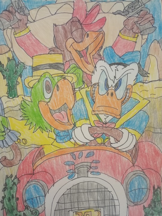


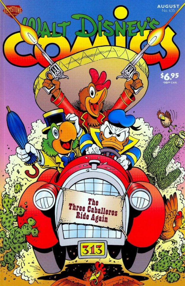
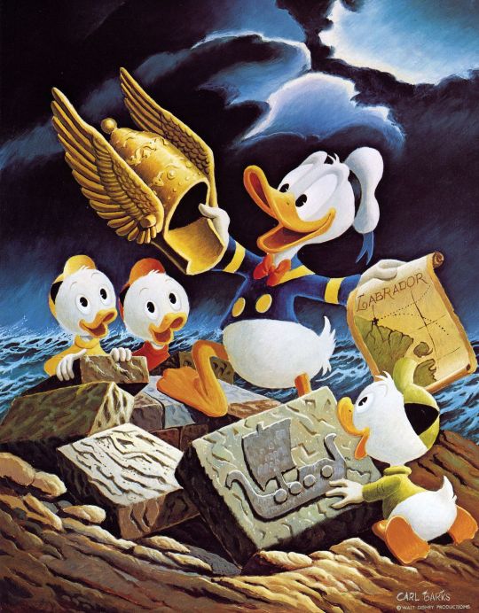
The Three Caballeros Ride Again, Mermaid Daisy Duck and The Golden Helmet (classic versions, redraw of these covers and paintings and Donald Duck comics by Carl Barks and Don Rosa)
A long title, but what's there is. Well, after a long time, to publish something, albeit belatedly, related to anniversaries.
The first drawing represents a redraw of a comic cover by Don Rosa and one of his best comics, 2000’s “The Three Caballeros Ride Again”. He drew in his own style, although not very perfect, where the famous three caballeros (Donald Duck, Jose Carioca and Panchito Pistoles) travel around North, Central and South America in their adventures. Here you can see how they cross the Arizona desert and Mexico (cacti can be seen there). Yes, Donald is in a hurry to drive his car under number 313. I definitely recommend this comic to everyone who hasn't read it yet.
Certainly the three of them love adventure.
Another drawing presents Daisy Duck as a mermaid. I know Mermay is over, but I don't care, so I'll post it for Merjune (two words mermaid and the month of June), or Toon June. I took the classic version of Daisy Duck, but I threw the bow out of her. Certainly she is waiting for her beloved to come on the rocks around the sea shore.
The third drawing is a redraw from Carl Barks' ingenious drawing "The Golden Helmet" based on the comic book of the same name, which came out on May 20, 1952, so this year is the 70th anniversary of the comic. Donald Duck and his nephews Huey, Dewey and Louie Duck are searching with a valuable artifact that can help rule all of North America. I've done this before: https://ducktoonsfanart.tumblr.com/post/672580051030753280/king-donald-duck-king-with-his-nephews-i-will
Certainly, in addition to Donald and his nephews, the museum's curator and two of Donald's villains (no, they are not Beagle Boys) are in search, and they are Azure Blue (reference to Olaf the Blue, actually to the famous Eric the Red and his son Leif Erickson), and Sharky. It's not exactly how it turned out, but I drew in my own style, mostly connecting classic versions from cartoons and connecting it with the style from comics.
Yes, and this was done on the occasion of Daisy’s birthday which is June 7th and on the occasion of Donald’s birthday which is June 9th. I wish them a happy birthday, albeit early!
Yes, just to note that the universes in the Carl Barks and Don Rosa comics are not the same, but different, although Don Rosa referred to Carl Barks, he made differences in his comics, especially in characterization.
Of course, I hope you like these drawings and these ideas and there will be more.
#donald duck#the three caballeros#three caballeros#disney duck comics#duck comics#daisy duck#huey dewey and louie#huey dewey and louie duck#ducktales#mermay#toon june#duckverse#redraw#my fanart#my fanarts#fanarts#the golden helmet#carl barks#don rosa#mermaid daisy duck#mermaid#azure blue#sharky#disney birds#disney ducks#disney parrot#disney rooster#disney dog#disney rat#disney duckverse
38 notes
·
View notes
Note
How did you get into art and what's the best way for people to get into it?
being bad at video games
GENUINELY i got the kingdom hearts manga because i couldn't get very far in the game and as i looked at the art i thought "i want to make stuff that looks like this." so i began with copying and then started drawing freely with obvious references to KH art (eyes mainly lol). pretty much every skill leap i've experienced since then has also happened once i discovered an art style i wanted to borrow something from. plus series with very engaging characters+plot makes me want to explore it more (i.e. i get hyperfixated) so i've ended up practicing a TON with little frustration because it's usually catharsis/Jokes™ that are the driving force rather than making something that looks good.
(not to say i don't ever doubt myself, because there are pieces in my head i wanted to make years ago but didn't because i lacked the technical skill)
i can only really give advice about getting into character art, because i've never been very interested in making abstract or photorealistic art or whatever. they definitely have their place but that's just my preference. that being said:
being super invested in something whether it's your own story ideas or someone else's is a great gateway to art. if you ever have the thought "haha it would be funny/cool if this happened" and the imagery/expressions stick with you moreso than like, Phrasing (personally different ideas i've had have struck me as being more suited to written work vs. drawn, or vice versa), just go ahead and draw it. and do it every time you think of something else. you don't have to show anybody. i drew fruits basket comics in 6th grade and never showed a soul. those drawings are for You
looking at other people's work.. novels, manga, cartoons, paintings, design, typography.. even if the work as a whole is something you're not that into, if there are stylistic choices you appreciate then take them. you can just straight up redraw someone else's art if you want to get a feel for how it all fits together, as long as you don't post it/claim it as your own (my rule is: no posting copies of a peer's art without permission, but yes to a famous/dead artist as long as credit is given). when you mash influences together it becomes something unique to you very quickly because no one else is going to be drawn to the exact same things as you
a major DON'T is second-guessing yourself. it's super easy to compare yourself to others especially as you get older, because if you start making art at like. 45 you may think you need to be at the same skill level as another 45-year-old who's been doing it for 30 years. it can be hard not to think this way especially if you're looking at other people's art like i suggested lol but get in the habit of hyping up your own ideas to yourself. "this such a good idea." "wow i'm so funny." "this is silly but no one has done it before so it's my job to make it."
there are people who could say all of this more eloquently and succinctly, and who follow their own advice more often--i haven't followed the third bullet in a while :o) but when i think of the most productive periods in my life these are the things that stand out the most. so i hope even just like one sentence is useful. also having adhd or autism can make this easier so try that too 👍
4 notes
·
View notes
Text
Meet the creative team: “Spellstone”
Are you a collectible card game (CCG) fan? If so, read on, because this week we spoke to the makers of Spellstone, a free-to-play (F2P) casual story-based fantasy card game that features vibrant, colourful, hand-drawn art on hundreds of beautiful cards that you can acquire and use in battle, both against the computer and other players!
TIGR: PABLO and DUSTIN are artists who have worked on Spellstone's art, helping create some of the iconic characters Spellstone fans know and love. We asked them how they came to work on the game, as well as what intrigued them about this project.
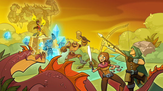
DUSTIN: I was working as a contract artist when I was asked to create some sample cards for a potential CCG, which is something I'd always wanted to do. The samples I submitted eventually led to me getting a contract to create the initial art for Spellstone. After about four months, I was offered a full-time position. I had such a great experience working with the team that I jumped at the opportunity!
PABLO: Prior to starting work on Spellstone, I remember doing an art piece to test my skills. I greatly enjoyed that because I particularly liked this game's art style - which is actually similar to my own! There were still slight differences though, so I've had to adapt a little. Blending my own personal style into an existing one was challenging. But something that intrigued me about Spellstone was the variety of factions in the game. Each and every one opens up a big array of possibilities when it comes to creating a character. I felt my options were unlimited and I loved it!
TIGR: Spellstone features many different cards and characters. We wanted to know who conceptualises all this, and how much creative licence artists get when crafting a character. FERNANDO, currently the main artist for the game, gave us more insight.
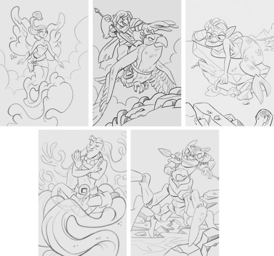
FERNANDO: That Spellstone has such an immense variety of characters means it's a complete and delightful dish for artists. It's hugely gratifying to find such visual diversity with which to play with. You're completely free to create, as long as you respect the game's universe and visual language.
As for the process, the concept of what a card must look like and how it must be functional in terms of gameplay comes from the guys in the game design department. Very creative people... sorcerers maybe? I don't know. Haha!
From a brief but concise description they give me, I can get a sense of what kind of character and action they want to see in a card. Once I have all the information I need to start sketching, my favourite hour finally begins: creative hour!
If the card description involves an existing type of character, like a goblin, part of the fun has to do with the way you depict that character, situation, action and specific emotion. There's also some freedom to create from scratch if needed - that's exciting and challenging! Sometimes the ideas come from a mix of characters, and that's when the laboratory inside my mind starts working: I press a button and something cool, spooky or funny comes out - whatever the game requires. Other times, new concepts require that I look for approximate references of what's needed, so that serves as the starting point. No matter what, it's always a very enjoyable process. Sometimes we have to make corrections, that's true. But as with everything in life, this is necessary for things to work properly. You may have to redraw stuff, but finally the card is done - it works, it delivers and it entertains!
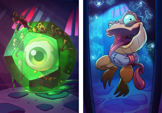
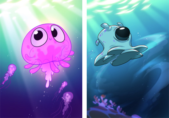
TIGR: In Spellstone, cards can be upgraded from a single to a dual to a quad, and we really like that this sometimes tells a "mini story" of of sorts through the artwork. Some are funny (we just love Honeycomb Lobber!), some cute (Bomb Spirit is soooo adorable when he’s angry!), some uplifting (Aurora Shaver ranks among our favourites), and some, um, a bit disturbing, to be honest (Cleaverstorm Hunter, anyone?!)! And some are just sad - we can't help but feel sorry for the poor li'l forest furries that presumably got devoured by Alphamech Stalker! We asked the team how they came up with ideas for all these tiny narratives, and MELINDA, one of the game designers, told us more.


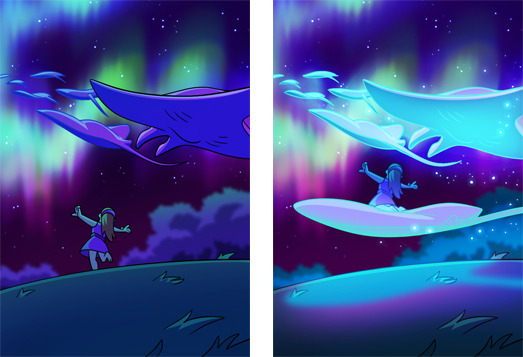
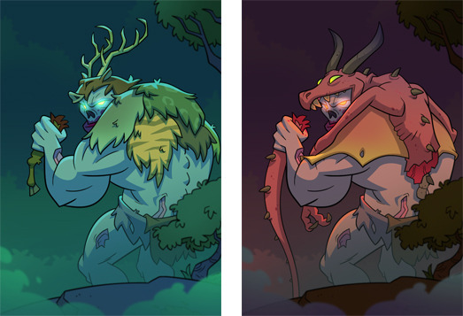

MELINDA: When I was younger, there were a few creatures in video games that terrified me. One of those I remembered most was Medusa, an air jellyfish from Ecco: The Tides of Time. While traversing through a water pathway in the sky, Medusa would try to pick up Ecco the dolphin and fling him off the path. Tetraspout's concept came from that, and you can even see poor little dolphins getting swept up in its attack!

TIGR: We asked the team if there were any cards they particularly liked creating, or found challenging to conceptualise. IVÁN, a colorist who worked briefly on the game, chipped in, as did TONY and RHADA, two of Spellstone's game designers.
DUSTIN: I loved working on the goblin cards! You could get silly with them. Frogs were a lot of fun too - the variety of colours made them interesting. For me, the water cards were challenging but I grew to love working on them.
PABLO: My favourite characters are Goblins! You can play around with them, making them look funny even when the card is telling a dark story, like a massacre. All of the cards were challenging to create!

IVÁN: I enjoyed working on Hedron The Critical Threat, Zyd The Unhinged, and some awesome Insect cards that have yet to be released (as of the time of this interview). I mostly liked them because of their cool concepts and Fernando's awesome sketches. Hedron in particular was a technical painting challenge, as it has textures, transparencies and glow!
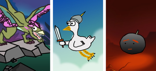
TONY: As something of an artist myself (/sarcasm), the card I am most proud of has to be Dinged Waptor. Or really any of the cards I did for the April Fool's event, which is about the only time the art team lets me anywhere near card art. :) For April Fool's, I decided it would be funny to try my hand at drawing some cards I felt players would enjoy. So the first year I drew some original characters that consisted of a few stick figures, a chicken, and a bomb. The response was good, so the following year I continued the tradition, eventually going through and tracing some famous cards like Winged Raptor. My one rule while making these cards was that I could not erase what I did!
RHADA: We used to sell boxes that contained two new premium cards instead of one. We thought of making both cards in the box thematically linked. At the same time, while brainstorming concepts for dragons, I thought we could try to make cards that formed a bigger picture on the battlefield when placed consecutively, side by side. The initial idea was a serpent whose artwork overflowed into a second card, and after some iteration, we stumbled upon the idea of a dragon dance. The result was very cool!

TIGR: With the Spellstone story campaign recently concluded, we asked what was next in store for Spellstone fans. Would there be anymore new characters and amazing art to look forward to?
TONY: Absolutely! While the main story has come to a close, we still look forward to adding new characters, cards, and art to the game that lets our artists have fun and shows off the world of Spellstone.

TIGR: And finally, the most important question of all: would real-life Spellstone merchandise ever be made available for fans of the game? We really want a plushie of the adorable Bomb Spirit (complete with detachable bombs, perhaps?), as well as his angry counterpart, Firebomb Spirit! Also for Quetee Que and Adorabilis, please! And would there ever be any actual physical Spellstone cards produced for collectors?
TONY: I would personally love to see real-life merchandise, but we currently do not have the means to take on such an endeavour. Maybe one day we can strike a partnership with a team that can make this happen!
We thank the Spellstone team for their time and all the wonderful art assets that accompany this interview! Check out the game here on Kongregate, on Steam, or on mobile - three different ways you can enjoy this fun, cheeky and adorable CCG!
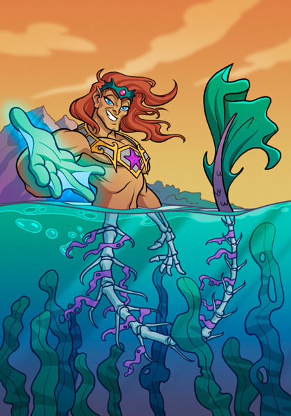
P.S. We just had to include our favourite card: Darkwater Adonis - don’t be fooled by his charms!
3 notes
·
View notes
Text
Art style challenge: reflection
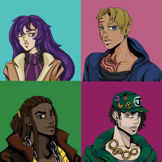
So, during this very challenging months and 3-4 weeks of social distancing I was stuck. Drawing became boring and I was in state of stale purgatory and it was annoying me. However, my sate of monotony came to a halt whenever I watch “Cheer Up!”, a show/DnD campaign created by Wrapped Lamp that was set in the world of JoJo, but in a bleak setting. It's wonderful, and the characters are brilliant. (This a link of the first episode on YouTube: https://www.youtube.com/watch?v=dVF6ShkYqU0 )
As I was watching the show I decided to challenge myself, I have never drawn in Hirohiko Araki’s style before. I have never tried to draw like that because it is a simple but complex approach to illustration that is very hard to draw, let alone replicate, but I tried and I proud of the results. So because of this I set myself some rules:
1. The illustrations must be based on the player/character icons in “Cheer Up”
2. They must look like protagonists that could be in the anime but are not copies of existing Jojo characters. (Because that's cheating)
3. Each illustration must be done within 3 days. (A personal thing for me, I get bored of drawing the same illustration for more than 3 days, if you want try this you don't have to follow this rule)
With these rules, Photoshop and google images by my side I was ready. And this is how it went!
(I am putting each reference of every character in groups of eyes, face, hair and body because I had to to a lot of research for this style, I have put the main influencers down there were more but are not important)
My process
At the start of all my attempts I create a beginning sketch of original icons. I am going in blind so doing this shows me how they created it without tracing it, sort of like life drawing. I then made a rough line drawing to see what the design looks like without making it official. I sometimes draw a second outline to figure out the details and then I compose the final line work but I also have the original art, the many characters in Jojo Bizarre Adventure and real life examples at all times. Paint the hair, skin, clothes and then create the shading and then they are done.
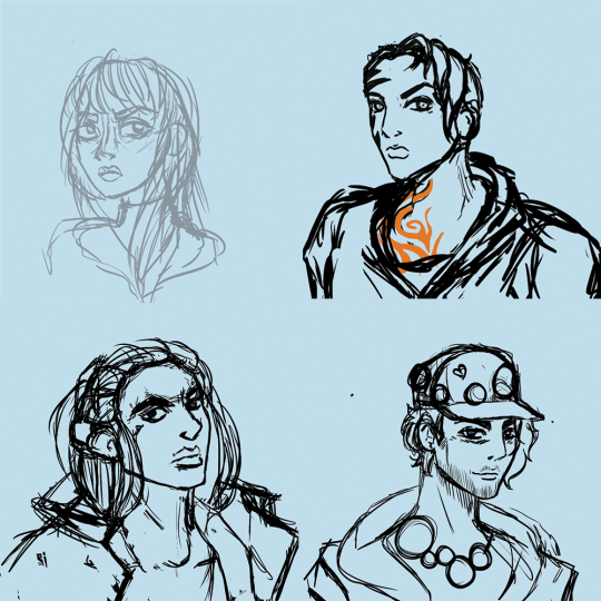
The first sketch

rough line work

The final outline with the shading
I also chose to try not to use part 3 as reference material. I personally dislike the seasons animation and character design. I don't know what happened in that season but they look terrible. It took me 3 tries to finish Stardust Crusaders and the art work was the main reason.
The Characters
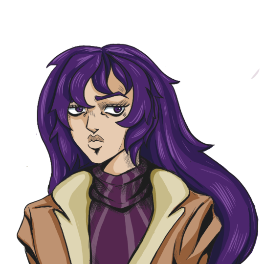
Isadora
Played by jay (Stabbyness)
Isadora was the first character I drew. I chose her because the next live “Cheer Up” episode was in 3 days and with that time I decided to give myself a fighting chance by drawing her first (I find women easier to draw than men).
With Isadora I had to also decide what Jojo season they would be in from the start, I wanted consistency because they are the protagonists. I decided to do a mix of part 4 but was mainly based in part 5. For me I liked the colour shading of part 4 but loved the structure and graphic style of part 5. This made shading and highlights easy and consistent.
Because I had never drew anything like Jojo I had to use multiple characters as a frame of reference, (I did not copy the originals, if I did then there would be no point of doing this challenge in the first place). I thought it would be good to show how many characters I referred to to help with this process.
Isadora was the easiest to draw out of the 4. She has a traditional female design, her only challenge was her eyes. As the first one this one was done in time and and looked good at the time. However now that I have got the hang of drawing in this style I want to redraw her again to show myself how much I have grown during this challenge.
Characters that i used for art style reference
Eyes: Trish Una, Narancia Ghirga and Yukako Yamagish
Face: Trish, Erina Pendelten, Yukako
Hair: the whole part 5 crew (I had know idea how draw Jojo hair at this point)
Body: Joylne Jostar, Yukako
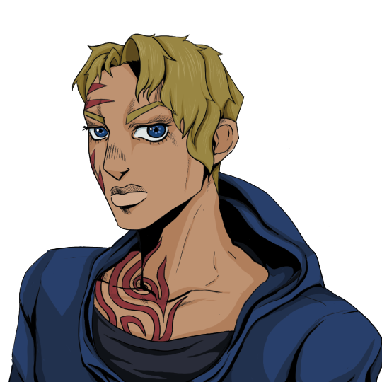
Donna
Played by Will (bigmovingtarget)
Donna was the hardest overall draw. She is a wonderful character but she does not typical female build. She is a MMA fighter, a tattoo, wears a hoodie and jaw that could cut glass. This created some problems, Araki characters rarely wear hoodies and his female characters are not normally drawn with strong features, they don't ever have a massive tribal tattoo. Also Araki’s female cast have a very small range of hair styles so I had to look at the male cast for inspiration and information because donna is an unusual design!!
Her tattoo was very difficult and I was in a pickle for the whole first day. The original icon has only a few red marks on her face and the thumbnail of “Cheer Up!” (created by Six) depicts Donna with her back to the camera and looking with side of her face without the tattoo!
This was driving me crazy.
In the end I had to reference real life tribal tattoos and the famous tattoo from the movie “Dusk till Drawn”. I like the result.
Her hoodie was also an unusual problem because I couldn't find a single character in the cast sporting a hoodie at the time of drawing her. So I wanted to draw her with a hoodie that the cast would wear. So when I was looking at fashion editorials I found Billie Eilish wearing the perfect hoodie and had to try to replicate it. (Elle 2019 interview, just incase you want to find it. Its the red coat!!) I also referenced part 1 and part 2 for her body because the those characters where drawn to fight, they are not frail and fawn like in appearance and think that is perfect donna.
Characters that i used for art style reference
Eyes: Josuke Higashikata, Yukako, Lisa Lisa and Gyro Zeppeli
Face: Gyro, Jolyne and Lisa Lisa
Hair: Enrico, Yoshka Kira, Caesar Anthonio Zeppeli and Koichi Hirose
Body: Lisa Lisa, Gyro, Leone Abbacchio and Jolyne

Jack
Played by Christian
Jack was easy to draw because he looked like a Jojo character. Like Isadora, Jack has a typical male design for Jojo. This meant I had a pool of reference material for him and had finished him in 2 days, the only real problems where his hat, stubble and jewellery. Lucky most of Araki’s cast have jewellery and chains and Jotaro Kujo has hair as a hat! Jack was heavily based on Jotaro Kujo but I made sure that he wasn't a copy!
Stubble...stubble doesn't exist in Jojo.
Jojo’s Bizzarre Adventure has magnificent beards or clean shaven men, and sometimes they have facial hair. This was the main issue with this character because with stubble you don't have Jack. So I had to take the beard of Joseph JoStar and looking at real life stubble finally got his lovely 9 o'clock shadow that we have now.
Characters that i used for art style reference
Eyes: Joseph Jostar (part 2), Jonathan Jostar
Face: Leone, Jotaro Kujo and Burno Bucciarti
Hair: Jotaro and Robert E. O. Speedwagon
Body: a mix of the cast of part 5 with a little bit of Johnny Jostar (like Isadora)
This one was the start of really using real life as a reference. Although really started using them in Donna illustration, drawing men has always been a challenge for me so drawing from real life actually made it more like Araki’s style. I realised that Jojo art style is based in realistic body proportions. I honestly think that this looks better than the other 2 because of the life drawing I had to do.

JJ
Played by Arimnaes
This was the last Icon I had to draw. I left this one last because I needed the practice to give this guy any chance of working.
his face and body were not the issue because most of the main casts (in their respective seasons) have similar features but slightly different body heights and proportions. However, JJ’s hair was a difficult.
In my research I found a total of 2 characters that could have his ethnic style or texture for his hair. They were Enrico Pucci and Muhammad Avdol, and no one else. This ended in failure because their hairstyles are wacky and imaginative and JJ’s dreads just flat out don't exist in the Jojo universe. If they have his hairstyle then I must of missed it because I wasted a whole day solely on research!!! Anyway, after that that I looked at male braiding and box braiding to figure out the hair line. Although I had the hair problem with Enrico I personally loved his design, he was drawn with an attitude and I thought it worked for JJ.
Characters that i used for art style reference
Eyes: Enrico, Bruno, Joseph, Gyro and Giono Giovanna
Face: Enrico, Muhammed Avdol, Johnny and Bruno
Hair: Giono and Josuke,
Body: Enrico, Bruno and Caesar
Reflection
Although the process was difficult, I had fun drawing these characters and have gained new techniques in drawing that I struggled in the past. I can draw stylised shading, tattoos, clothes and male characters better than I could before. I also learnt that I can draw surprisingly quickly and had finished both Isadora and jack in 2 days. After this challenge i also gains a new appreciation for Araki and the show Cheer Up and the number of literal hours it must of taken them to create an immersive show.
However now I have to find something else to do whilst being stuck indoors!
#jojo bizarre adventure#art challenge#art style challenge#cheer up#surprise round#dnd#art pdp#fanart#blog reflection
9 notes
·
View notes
Text
Playlist Tag Game:
Tagged by @bizabert
rules: we’re snooping in your playlist. put your entire music library on shuffle and list the first ten songs (including music only stuff like OSTs as well as songs) and then choose 10 victims
1. Guardian Inferno - The Sneepers
2. E' de' det här du kallar kärlek - Monica Törnell
3. Q&A Recital - Haruka Tomatsu
4. Phoenix Wright - Video Games Live
5. Bean Pháidín - Celtic Woman
6. 1•2•3 - After the Rain
7. We Got Work to Do - Firebringer Cast
8. Ain't No Mountain High Enough - Marvin Gaye
9. Botany Bay - Blaggards
10. Time To Say Goodbye - Celtic Woman
Why did you choose your url?
It sounds fun and if you flip it and you have my name. Almost a palindrome.
Any side-blogs? If you have them, name than and why you have them.
@yadedajart - That’s where I post my artwork
How long have you been on tumblr?
2016, five years.
Do you have a queue tag?
Not sure what that means.
Why did you start your blog in the first place?
High school and IL friends had it and I thought I join since there was cool art and funny things.
Why did you choose your icon/pfp?
The icon is a 2018 chalk redraw of a 2016 acrylic painting I did on my high school grad hat. I need to update it!
Why did you choose your header?
It’s another 2018 drawing. It was a final ink drawing for my one sequential art classes and I was really proud of it. I might switch it out for another more recent ink illustration of dinosaurs at a museum or my chicken band drawing to update it.
What’s your post with the most notes?
I don’t post things here I only reblog. The one thing I did post got 10 notes. My art account max notes is an old Little Witch Academia ship comic currently at 435 notes.
How many people do you follow?
189
Have you ever made a shitpost?
SwolCat version memes on my art account, but nothing on this blog.
How often do you use Tumblr?
Medium amount? There are times I totally forget about and then randomly remember when my friends send me stuff. But if there’s nothing to do and I’m waiting I’ll bop around on it.
Did you have a fight/argument with a blog once? Who won?
No.
How do you feel about “you need to reblog this post”?
Sorry I pass by them.
Do you like tag games?
Yeah! I like them they’re fun to do if I remember to complete them. My tumblr doesn’t always show me mentions I receive.
Do you like ask games?
No apposed to them, but I don’t receive things like. To be honest I didn’t understanding that you send the number to people to answer for the longest time. I thought you just answered them and post it if you choose.
which of your mutuals do you think is Tumblr famous?
Not sure if tumblr famous is the right word. I have friends that have a strong art following, well at least I think so.
Do you have a crush on a mutual?
No.
Phone Photo Meme Game.
Rules: choose one picture from your camera roll without downloading to sum up your personality

Atlanta better watch out!
Tagging peoples: @flaresiram @mist-me @darkstormgts @hannihilator @cjskyelark @yingodatone @raenbowsofficial
0 notes
Text
Inanimate Objects Reflective Journal 2nd Oct - 08th Oct
This week was quite a productive week in terms of what I got done. I made a few props, did some research and found out some interesting things. Due to a small personal problem, there was a time where I forgot to update the blog, hence the last few posts may be out of order.
The week started with me looking at various paintings made by two very different people depicting people and dogs playing poker. This was quite informative as it gives me a window as how the posture has changed between 2 very different times. Whilst yes one painting is a group of dogs playing poker, he must have drawn inspiration from somewhere, perhaps seeing a game being played himself. In the first painting of the men playing Poker, one is hunched over and veering on the edge of his seat while the other is laid back and seems rather blasé over the situation. Same can be said for the dogs painting although like I say with the difference in time it shows a different scenario where all of them are laid back but one is infact cheating. How I can use this in my film is I want the Joker to be the one laid back and for the king to essentially go crazy when he realises he has lost and as a result has lost all the money.
This week also saw the completion of both of my animatics. However the first and second one I felt had both good and bad elements in terms of shots. So feeling a bit unhappy, on the Friday I combined the two to make in my personal opinion a better version using shots from both the first and the second, and honestly I’m much happier with this. I can admit I may not be the best drawer in class, to a point where someone jokingly offered to redraw the whole thing. However I as well as others can understand what is happening. I also drew it in different shades of grey with Helen S. saying last year that when doing an animatic or storyboard it needs to be done in grey and not black, which surprised me as I saw no one else follow this rule. If there is one thing I could do, if I had to do this animatic again I would perhaps introduce a tad more colour into it, but as it stands it’s practical and works to tell what happens in the story.
This week also saw the completion of some props that I made, The stacks of money and the two tables. As someone who is somewhat interested in going into the prop side of making. What I made was somewhat simple. The money as I explained were just cut up bits of green card with double sided tape to look like the band. The table however is a different kettle of fish. I made two tables after jon recommended I make a circle table which I did have a go but I just couldn’t get the right dimensions and as a result made it a tad bit small. Instead I used the remaining wood and literally stuck two pieces together to make a longer table. My fear is that whilst it has not a table cloth, and now I’ve stuck the table with more tape underneath, if the table will hold. It’s at an unfortunate place where I fear the middle might buckle. Filming is this Wednesday so I’ll have to see how it holds up. Luckily I do have another filming session on the Wednesday 18th if this one doesn’t go to plan.
I also did some research into the types of guns they use, which I found quite interesting and also found a work around. The type of gun the gangsters from back in the day used had a short barrel (The chamber where the bullet comes out from) And might be a lazy work around but a project I did last term involved a cowboy with a similar gun. I decided to use this as it’s a near match, and even at the angle I plan to film it you might not even tell it’s a small chamber. If I had all the time and unlimited resources I would easily make the gun to be a bit more accurate but with filming fast approaching I fear I may not have that time.
I watch a 1950′s film called Breaking Point, the plot being a fisherman who hires some less then reputable men who are infact criminals from a heist. There was another reason why I watched this however. When researching films I should watch, this one was recommended due to it’s bar/club scene which the other film did miss. As for what I imagined a bar scene from that time period would look, it’s right on the money. It’s dirty, grimy, smoke fills the air and there’s some card games in the background by the looks of things. It was this film that did make me consider if I should have some elements like that behind my main film but i fear it might take away from the actual stop motion.
I did some lighting tests this week, I went in the stop motion studio on the Thursday for about half an hour just to test various lighting set ups, tried 1 and 2 theatre lights. I went in thinking one light may be enough but I left with thinking that perhaps I should use 2 lights instead of one. On my filming day I will test this again to see what looks better.
I also looked a photograph of the most famous gangster playing card, al capone. And whilst I do not know the full story, I can see there is quite a great sence of power in the balance. with Al Capone looking quite smug with his hand while the other player looking somewhat scared by playing him, ultimately doesn’t help there is a unknown hand round his neck. I think this was a picture of the power balance between a king pin and someone who is lower then him in terms of power.
I also remembered that in the previous term, we were given a similar project to make a flour sack come to life and show an emotion with no words being said. I opted for doing a drunk style of flour sack and in this week I looked at a professional as well as look back at my own work and analysed it. I concluded that whilst mine was a valiant attempt I didn’t think it held a candle to other flour sack animations. However what I can learn from it however is that I can time the inanimate objects better as this looks a bit only timed even if he is supposed to be drunk.
In the last few days of the week, we had a sound talk which was really quite informative as I learnt how sound can convey any scene you put it in, I finished making some props which I think and hope should be ok for filming on Wednesday however it does put doubt in my mind if the table holds up, finished the animatic as mentioned previously.
I also looked at one final example of inanimate objects coming to life, instead this time it was done in stop motion and not 2D like the previous example and it was just quite inspiring to see this being done in stop motion then 2d, as previous examples I could find were all done in 2D. I’m just as glad to see it work as well if not better in stop motion. It really inspired me to do as well if not better in my film.
So that was the week. What I hope to accomplish next week is filming on the Wednesday to go as a success and hopefully start editing it the following week. I might do a small more bit of research and hopeful get a few sound bites in.
0 notes