#confetti print
Text

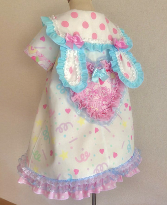
confetti bunny ears sailor dress !!!
#this is literally so mecore#the me ever#confetticore#confetti#confetti print#confetti clothes#dress#kawaii#fairy kei#party kei#partycore#kawaiicore#sailor lolita
575 notes
·
View notes
Text
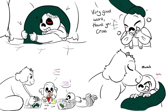
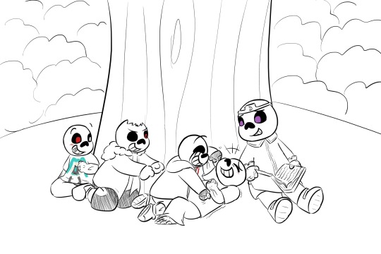
Good heavens, look at the time! (Points to a clock where every hour is replaced with "gooptales")
@topazshadowwolf's boys will be the death of me please read it it's so good
#UTDR#UTMV#Gooptales#Dadmare#Topazshadowwolf#Almost forgot to get groceries because I was so into drawing these guys#You can't just make them all kids in a dreamscape having a lil tickle fight!!!#That's gonna make me explode into confetti!!!#I know they have to wake up but I wanna imagine Nightmare playing with his boys in the dream#Like just. He didn't get to be a kid very much#He didn't get to have a big group of friends#Let him have a couple games of tag or hide and seek with his family#Also the image of him patting Cross on the head for his good work asdhfkgfkgkjgs#I have to stop or I'm just gonna repeat the whole chapter in tags but listen. It was a masterpiece#I wanna print it out and put it on my wall#Anyway I'm so normal about this story as you can tell
187 notes
·
View notes
Text
who wants the full ‘are you my lover lonan’ scene from feeding habits. just to humiliate harrison. for fun.
28 notes
·
View notes
Note
Consider the debt repaid
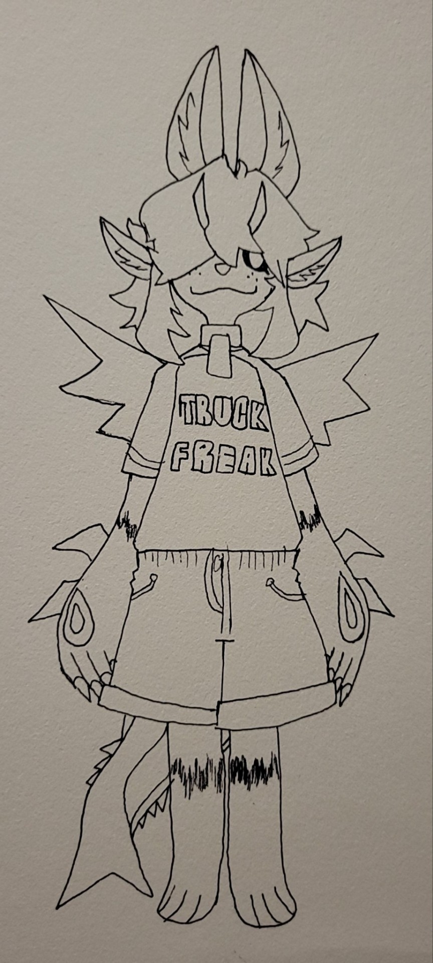
SOBBING UNCONTROLLABLY
#TRUCK FREAK!!!!! ROGER IM CRYING IN THE CLUB!!!#IM PRINTING THIS OUT AND PUTTING IT ON MY WALL DONT TEST ME#not my art#wailing sobbing combusting into fish shaped confetti#THANK YOU!!!!
15 notes
·
View notes
Text


A Work of (f)Art
Rhett & Link
We 3D Printed Our Farts: A Journey Through Human Creativity
#main channel vid#we 3d printed our farts#link neal#link sans specs#ocean blues#amongst a flurry of colorful digital confetti!!#i love it!!#and i saturated the $%!+ out of it too#bc i have the artistic sensibilities of a preschooler!#pretty colors!!#🩷🧡💛💚💙#😍😍😍#pretty boy#💙💙💙#my edit
11 notes
·
View notes
Text
finally completed one of my lm bedroom walls
#ONG I LOVE ITTT#the sweet melody prints have been tehre since 2022 when i went to see them for their second to last show#but i’ve just stuck out the 2022 calendar pictures from the back of the calendar#and they look great#it took me ages to decide if i should sort those photos into each member and one group of all or have different ones with one whole group#but i decided to put the b&w ones together#then the floral ones with the satin group photo#the golden dress ones together#then teh heartbreak anthem and blue dress together#ik my cutting and blue tack is a bit messy oops#sorry if the pic is bad may have to click on it to see it better#little mix#littlemix#jade x leigh anne x perrie#perrie edwards#leigh anne pinnock#jade thirlwall#bedroom wall decor#bedroom#my bedroom#lm calendar 2022#sweet melody#confetti tour merch
3 notes
·
View notes
Text
everyone assumes my glitter paper mtt was super messy to make or the texture is horrible but they're making glitter paper different these days. there's practically no falloff and the texture is smoother than it looks :)
#i have some paper with giant chunky glitters and huge confetti pieces and same deal! barely any falloff#the real messyness was that i did not have a solid plan for it. i printed out a sketch like 3 times and then cut stencils from that LMAO#took me 9 straight hours#camposts
35 notes
·
View notes
Text
my concert frame is done!

#mcr#my chemical romance#got a scan of the vampire money confetti and printed that myself#bought a fake ticket on etsy w my date#and i HAD to keeo the merch back bc its. SO cool#i might artfully rearrange the money again im just tired of doing it#the bag doesnt fit in the frame and i refuse to cut it#which makes shifting the money around a challenge
10 notes
·
View notes
Text
x
#im moving soon so im packing and going through stuff and im going through my 1d box (yes i have that)#and it’s so emotional rip like it starts with some baby 1d merch and a talking birthday card#and goes on with letters from friends ive made in the fandom around the world and first 1d ticket and wristband#and printed out tweets that meant so much to me like those about my show or those about project home#and i have rainbow flags and rainbow gifts i got from friends i met at different shows and stuff from all the different projects i took#part in and the merch Petra gave me just this year and the confetti i stuffed into my pockets and more concert tickets and 😭#God it’s so full of so many things that meant and mean so much and brought me so much joy over the years and remind me of some of the most#important people brought into my life through 1d#and 1d itself (there’s also my mitam louis special <3)#there’s a letter i wrote to louis a few years back#i love looking at all of this and reminding myself of how much joy this brought me and it always reminds me of that shot in the san siro#film where a fan has a poster ‘you’re the story of our lives’#they really do be a large part of the story of my life im emotional now
10 notes
·
View notes
Photo

"Over the Rainbow" by Eleonore Grace on INPRNT
1 note
·
View note
Text
The frame I bought for my todolf shrine is too small :(
BUT
improvise-adapt-overcome

✨ MORTDOLPHE SHRINE ✨
#ajhshbdhbdhd#it's a sticker my friend drew (and another friend printed and mailed<3) and two pieces of bruxellons lucheni's glitter confetti from kitsch#i caught them from the air :DDD#i'm buying a new frame for the máté and jesper photo lol#elisabeth bruxellons#my art#lol#musicals#theatre#fandom
5 notes
·
View notes
Text
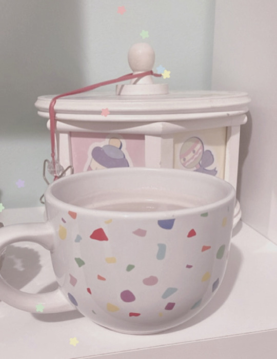
warm milk in confetti mug ♡
#confetticore#confetti#confetti sprinkles#confetti mug#color flecks#funfetticore#warm milk#carousel#softcore#babycore#kawaiicore#kawaii#cutecore#confetti print
11 notes
·
View notes
Text
Everyone gets “The 90s” look wrong and I hate it
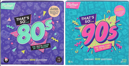
Couple years ago I saw these two board games at the store back to back. Well, not saw them per se, but ya know. Spied them out of the corner of my eye. And for a moment without reading the text, I couldn’t tell you which was which decade at first. Funny. Either they were in a rush to get these out the door or they wanted their throwback trivia game boxes to look uniform. I didn’t think too much of it.
Only, from then on I started seeing it MORE. Every time someone markets a 90s or 80s throwback...
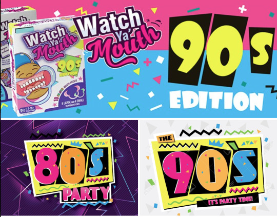
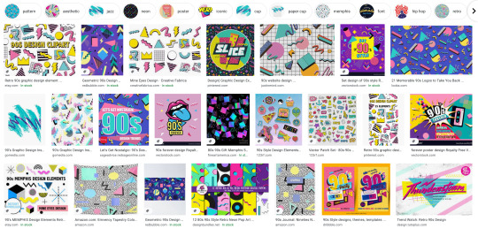
Goddammit they’re identical! What??! How did we let this happen? As a 90s survivor and a designer, this drives me up a wall.
Look, I know I’m late to the party to complain about “the 90s look” when we’re just starting to get sick of the Y2K nostalgia train. But c’mon, the 90s were not The 80s: Part Two™
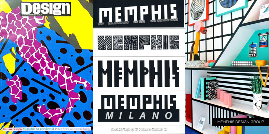
Trust me when I say that we weren’t all wearing neon trapezoids up until the year 2000. The 90s look being peddled is so specific to the tail end of the 80s and an early early part of the 90s - a part of the 90s when it wouldn’t stop being the 80s. This is Memphis design being conflated with the wrong decade.

Keep reading for a long ass graphic design history lesson and pictures of old soda and fast food.
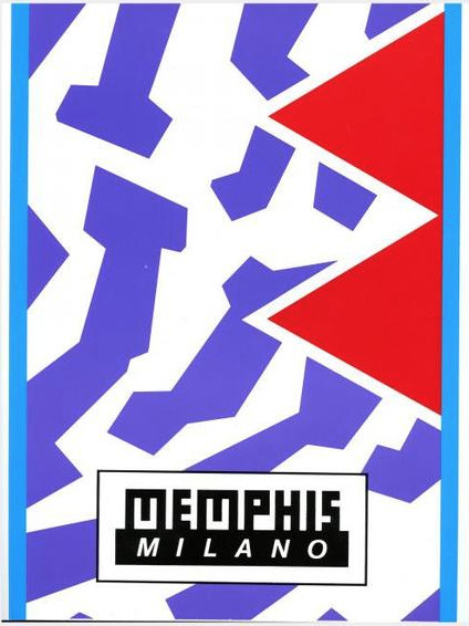
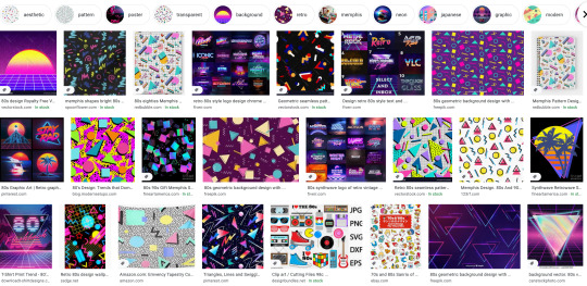
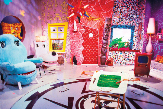
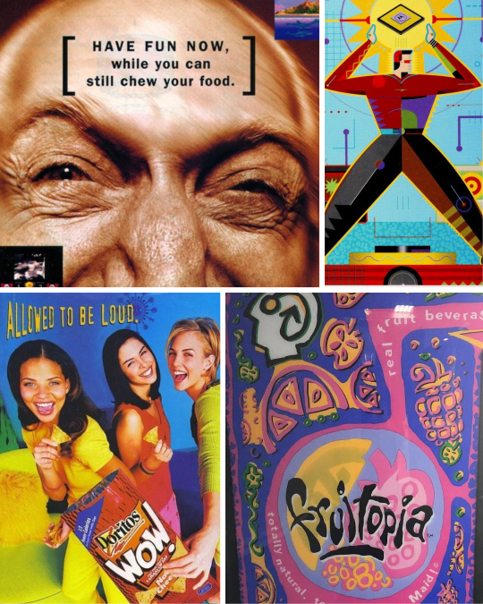
Specifically, the look is Memphis Milano, self-named by the Italian design house Memphis Group. Starting in the early to mid 80s, they made all sorts of furniture, fabrics and sculptures that were like a Piet Mondrian grid painting under heavy radiation. Their whole deal was defying the standards of existing industrial design up to that point on purpose. Chairs had weird arches, bookcases would be in strange alien colors, unusual materials like plastic or elastic were used in place of metal or wood, that sorta thing.
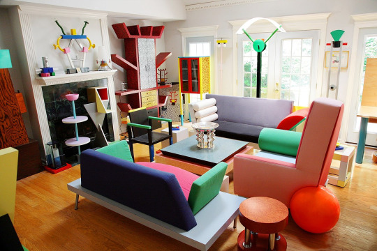
Memphis quickly became the signature look for the decade. You can tell something’s influenced by Memphis design from it’s telltale trademarks:
Clashing, neon colors.
Use of diametric shapes.
Contrasting patterns like zebra print stripes, confetti squiggles and checkerboards.
It wasn’t long before Memphis Milano-inspired design was everywhere in 80s pop culture:


It was a special time, yes.
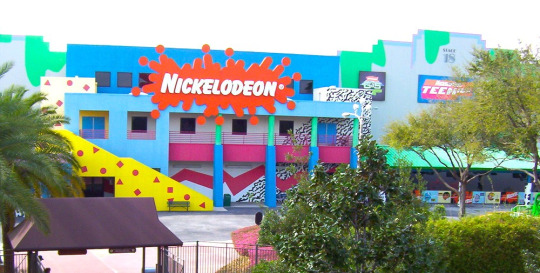
I was a kindergartener at the tail end of the 80s, so I knew Memphis mostly through the lens of kids media. Toys, clothes, games, tv shows used it like candy colored catnip. Cable channel Nickelodeon more or less adopted the Memphis aesthetic as their signature in-house style and practically built a monument to it at a Florida theme park:
I think this is why folks mistake what decade Memphis is representative of - 90s staples like Nick, Saved By The Bell, Fresh Prince - they all stayed around much longer than the design trend’s expiration date.


Couple that notion with the fact that companies are slow followers to design trends. Something gets popular and they want to get on the bandwagon? Gotta wait for the ink to dry, gotta wait for the production molds to be made. It would take a few years for them to completely work Memphis outta their system.
Now, this is not to say Memphis is bad! Personally I’m a fan of the aesthetic, if my neon-drenched artwork wasn’t a tip-off already. But it is a trend, and trends never last forever.
So what took the Memphis Milano look down for good? This part’s up for debate, but I personally think it had something to do with this dude:
It’s that grunge music from Seattle that’s so popular with the kids these days dontchaknow.
Once Smells Like Teen Spirit hit in 1991, the Nirvana tone drove the rest of the decade. Clean geometry became weathered, grainy and organic. Bright neon pastels became more bold. Bubblegum pop music sounded fake and manufactured. Attitude and apathy was authentic. Whatever.
Things got grungy. Things got grimy. Olestra was invented.
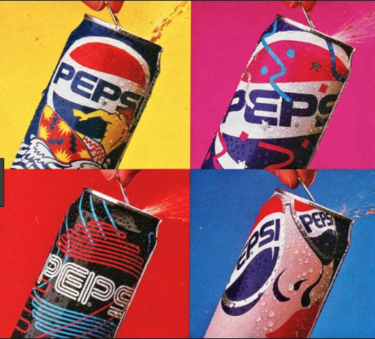
I think the best way to visualize this transition is how Cherry Coke entered the decade and how it left it:
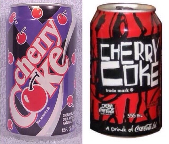
1992 Memphis on the left, 1998 grunge junkie on the right. Fitting that the 90s would end with a design that looked like Darth Maul’s lungs.
Okay, so what should 90s retro design look like?
Continue on to PART TWO! Spoilers: No VHS filters or vaporwave needed, but maybe bring an antacid.
15K notes
·
View notes
Text
gerard aggressively rebutting kerrang’s shitty article about how mcr had ‘lost their flow’ (in wake of g probably saving people’s lives at riot fest) while in blinged-out casino sleaze boydrag complete with a black eye and a john waters pencil stache almost, ALMOST beats the time gerard aggressively protested wwwyf’s rip-off prices/treatment of other artists by spending half their ticket earnings printing fake money (with coordinates leading to a bankruptcy firm) to shoot out of confetti canons and, to really nail in the point, hiring an sfx team to spend 6 hours on a horrifying old-ified boydrag version of THEMSELF in 2004.
my chemical romance is the most important band in the world and i mean this forever.
4K notes
·
View notes
Photo
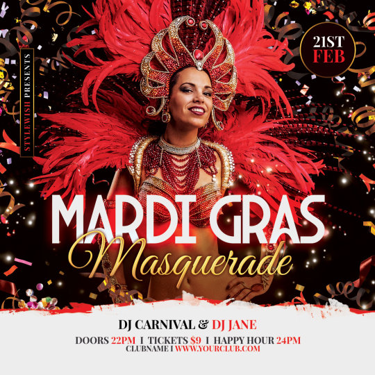
Mardi Gras Flyer Template. Download the poster design on Graphicriver.
#flyer#poster#carnival#carnaval#confetti#festive#masquerade#parade#print#ribbon#template#joy#shrove tuesday#photoshop#psd#envato#graphicriver
0 notes
Text
I spent two hours hole punching the scraps from the avatar wall pictures that I kept in a box for two years what did y’all do today
#idk if that made sense?#basically#two years ago I printed 360 pictures of ATLA and LOK scenes#and I put them on my wall in my apartment#i made tiktoks about it#but because of like#my door frame and air vent and stuff#some pics had to have pieces cut out#so they would fit#and I kept those pieces in case I needed them#well anyway last year I moved#and I didn’t want to put up the pics in my new place#because shit took 8 HOURS#TO PUT UP#and just as many to take it down#and the tack I used stained my wall#so I sold them#but I kept the scraps#and today I filled a glass jar with basically confetti#made from hole punching the picture scraps#there was no harm done I promise it was just like backgrounds I didn’t hole punch any faces#but holy shit my hand hurts from doing it#but I also have fun stuff for projects now#i say as if I didn’t wait two years just to hole punch lol#i have so many things I keep for projects I never do#like broken glass and old keys#and jars and plastic gum boxes
1 note
·
View note
Last Seen Blogs
glilboy
glilboy
nightfoot
The Turtle Moves

larien-vardamir-arcamonel
Till we have faces

mrsuchi
Sans titre

behind-her-pretty-face
Behind Her Pretty Face