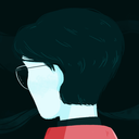
#but the line color i choose when im painting in gouache is different than the colors i choose when coloring already existing lineart
Text
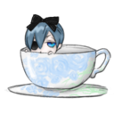
#trying to figure out how i wanna draw myself when i start my new sketchbook#+ i kinda do wanna learn lineless art bc theres a certain style of it that reminds me of gouache! and i love flat matte gouache#its so hard tho as someone who struggles with contrast. and LOVES lines.#i wish it was as easy as changing the lineart color at the very end of a lined and colored piece ykwim#but the line color i choose when im painting in gouache is different than the colors i choose when coloring already existing lineart#if that makes sense#anyway this was directly inspired by manaohu on twitter ^_^ they are one of my fave artists#a doodley#ok unlocked
293 notes
·
View notes
Note
i was wondering if you have any tips for digital painting? i rlly love how your lineless looks and i wanted to try a cute style like that
waaa first of all thank you for your patience bc i know ive taken forever to answer this as i always do with tutorials…oops…..and also thank you im glad you think my style is cute!!!! im gonna do my best to help you out with lineless so here we go! LONG POST UNDER THE CUT!

to start i mainly use these two brushes (yes…just two…) from kyle webster’s gouache pack which is only available to adobe cloud subscribers now, but im sure a quick google search for gouache brushes for (insert program you use) can find some that will work just fine. these two look pretty similar but the difference is the one on the right is a bit softer and more easily opaque so i use it for light shadows, blush, etc. i think textured brushes like gouache paint and dry media ones make lineless look extra cool but thats just me!
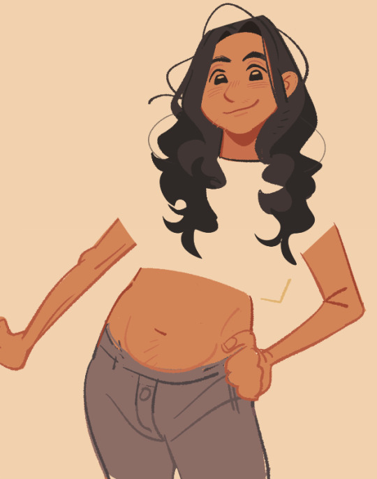
OK ON TO THE TUTORIAL i know you just asked for tips but i was doodling a girl for a warm up and i thought id just take you through how i colored her. started w a sketch + set that layer to 23% opacity and laid down flat colors below it

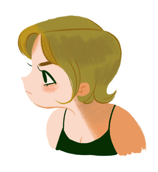
after i set my base colors i turn off the sketch and start workin on shading! im startin with the hair here bc i think it can be harder to paint and work with in general for lots of ppl

i used three colors here for the hair:
- the lightest color is the base. pretty simple
- using the middle color, took gouache blair brush and made light strokes downward following the flow of the hair from the root to the tip. make sure you think about where the hair begins on the head and follow the direction it goes from there when shading/making lines/making highlights!!
i kept it simple for tutorial’s sake, but play around with how dark you want the shades to be and how much shading you want! (also these aren’t shades per se since they arent shadows being cast, just a darker color to give the hair a little variation in texture and color and to create a kind of shine effect but idk what else to call em! i guess theyre highlights! i just know it looks nice!)
- took a slightly darker color and added some lines here and there to break things up and further show the direction the hair is moving in
for a little more visual on the direction thing see this handy graphic i made:

i didn’t write DONT and DO bc my way is not like…the ultimate Chosen way…if you wanna go for a style with the shading i did on the left then totally do it but personally i think it reads better this way so ya!! theres no right or wrong way to make your own art but there are ways that can make things a bit more interesting and clear if you choose to use them!
and yeah i basically use the same methods to paint skin and fabric and even backgrounds. it’s really just as simple as keeping things flowing in a natural direction and picking colors that u think look nice to paint with!
FINISHED PIC:
i dont wanna make this tut super long and ramble forever so here’s the last things i did to finish up!
- turned the sketch back on momentarily to draw in the eye, mouth, & eyebrow (no painting or shading involved there usually)
- used gouache a go go brush (or a softer/less opaque brush of your choice) to add a bit of blush to the cheek. i usually add blush with a light circular motion bc it gives them a nice rounded look. i use light pressure because a) more pressure means darker color and i want the blush to be subtle and b) more pressure also means less texture and more solid color, and i prefer having the scratchy look with the base skin color showing thru.
- used more pressure and a darker, more orange color to create a sharp shadow on the skin + define the neck & inner ear shape with lines
- added desaturated aqua blue over the top of the hair to create a shadow effect and add another color to the palette
- added the same blue color very lightly on the neck & blended it with the orangey shade (in other words, lightly brushed over it with the orange) to make the shadow more interesting. layering in multiple colors can always help make lineless things look more detailed even if its just a tiny bit!
i hope this doesnt seem like a ton of steps added on at the end bc it took me like way longer to write this (because i ramble) than it did for me to draw it! i love working with lineless because of how easy it can be to slap on some varying colors and defining lines to make something look a lot cooler and more detailed. as long as you keep your shades and stuff on separate layers its easy to try out things and see what you like best so i encourage you to do so! best of luck!
#starrymelons#long post#art tutorial#art tips#tutorial#lineless art#ask#I SUPER SUPER HOPE THIS HELPS!!!#i used no pink in this tutorial are you proud of me#i did that bc i love pink but i use the same colors too much while i neglect others...so im paying attention to yellows and greens#also i definitely accidentally drew more of her and made her into an oc whoops#I REALIZED I FORGOT HER LITTLE HAIRS STICKING UP IN THE BACK IN THE FINAL...SORRY.............
238 notes
·
View notes
Last Seen Blogs