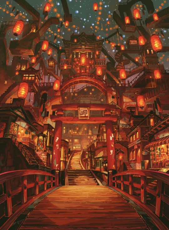
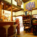
#anime background
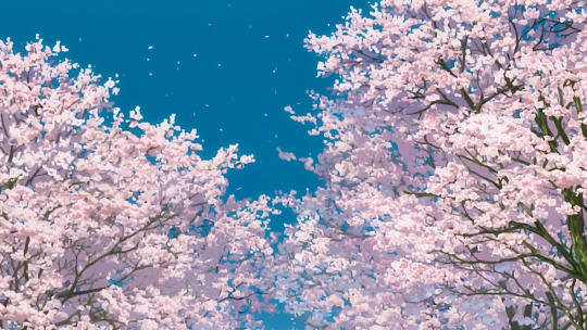
Text
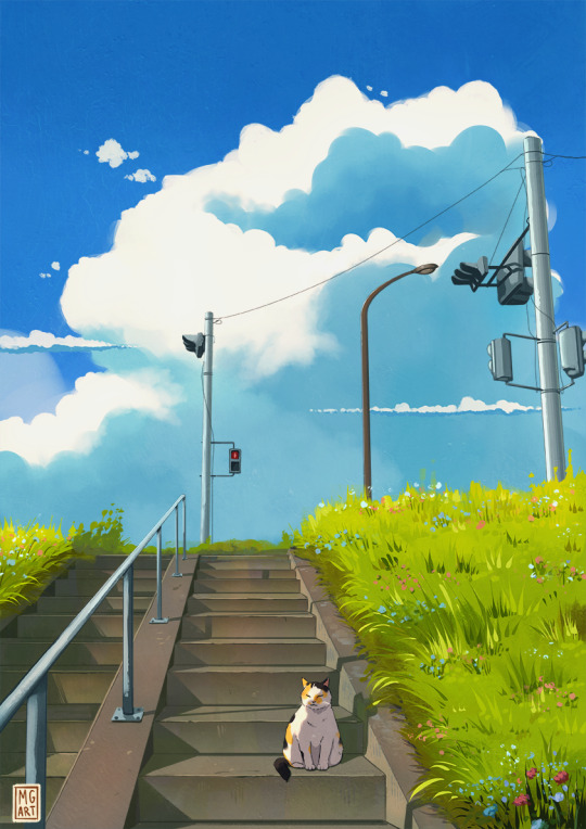
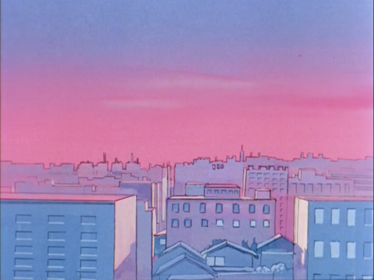
The artwork that I painted for last month's Patreon reward wallpaper.
You can still get the wallpaper here!
#digital art#art#painting#digital painting#illustration#digital illustration#ghibli style#background#anime background#cute cat#personal work#2024
210 notes
·
View notes
Text
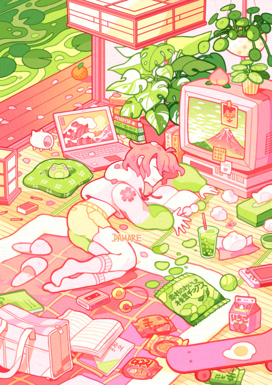
Dango Flavored 🍡🌸🌱
Can you taste it? What is your favorite part of the picture? Mine are the edamame chips and the matcha bubble tea!
420 notes
·
View notes
Text
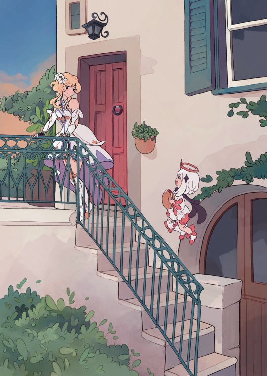
#lumine and paimon#Genshin impact#art#drawing#Genshin impact fanart#lumine#Genshin lumine#paimon#Genshin paimon#background#anime background#background art#this was meant to be a sketch lol
822 notes
·
View notes
Photo

Gouache Painting Study: Silver Spoon anime
Another painting study of an anime background, this time from Silver Spoon. Learned a lot, but still a long way to go.
#gouache painting#silver spoon#anime background#gouache#study painting#anime#fanart#artofyorugami#yorugami
3K notes
·
View notes
Text


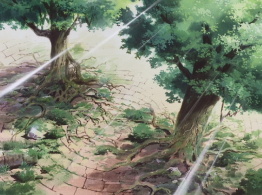

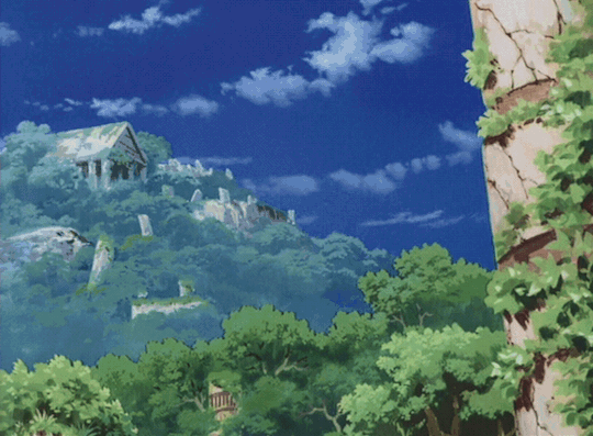


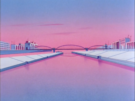
Atlantis before the fall
Episode 17, The Edge of the World
#escaflowne#vision of escaflowne#escaflowne gif#my gifs#anime gif#anime edit#anime scenery#fyeahanimegifs#anime gifset#anime gifs#90s anime gif#90s anime#anime background#retro anime#retro anime gif
214 notes
·
View notes
Text
Anime backgrounds appreciation
Ngl, not enough people talk about the backgrounds in anime
Now of course, every now and then there will be discussions (in particular if it’s like a popular anime), however, for the most part they go unfocused on. And I mean, I get it of course [they are backgrounds so outside of setting shots the major focus won’t typically fall on them even in the actual series (usually*, there are exceptions tho)]. But SO many anime have such beautiful and GORGEOUS backgrounds
Like, take Toilet Bound Hanako Kun for example !!
These backgrounds??? 😶❤️❤️

There’s also the anime Sugar Apple Fairy tale !
[Half the time I was either staring at the pretty characters or the pretty backgrounds lol. I love how the backgrounds all look like watercolors!!]


#anime#background#art#tbhk#toilet bound hanako kun#jshk#jibaku shounen hanako kun#sugar apple fairy tale#anime background#aesthetic#watercolour background#gorgeous#stunning
179 notes
·
View notes
Text
#golden boy#90sanime#anime#golden boy anime#kintaro oe#90s anime#anime background#anime wallpaper#retro anime#old anime#cels#celanimation#cel animation#90s aesthetic#anime artwork#anime art#animecore
1K notes
·
View notes
Photo


235 notes
·
View notes
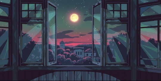
Text


this anime has been in my to-watch list for so long 😩
✺
✺
disclaimer - I don’t own most of my lockscreens; they come from Pinterest! if one of them happens to be yours, just message me and i will give you credit :)
#tumblr#tumblr lockscreen#tumblr wallpaper#tumblr background#aesthetic#aesthetic lockscreen#aesthetic wallpaper#wallpaper#aesthetic background#background#anime#anime aesthetic#anime wallpaper#anime background#anime lockscreen#anime screensaver#inuyasha#inuyasha background#inuyasha aesthetic#inuyasha lockscreen#inuyasha screensaver#inuyasha wallpaper#aesthetic screensaver
68 notes
·
View notes
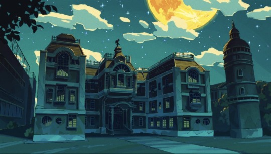
Text

ひみつのアッコちゃん 「 第一話 」(1969)
#himitsu no akko chan#toei animation#anime#anime background#anime scenery#1960s#1969#dusk#twilight#japan#city
111 notes
·
View notes
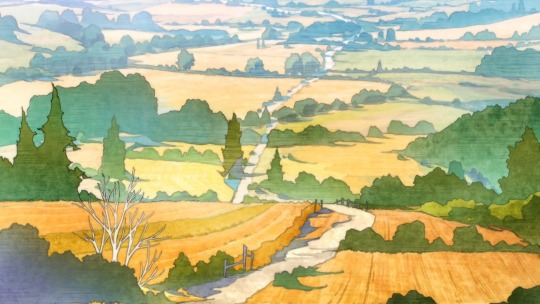
Text

[ Rainy days ]
I drew it in 2020, Summer c:
#digital art#illustration#digital painting#digital illustration#my art#landscape#original art#artists on tumblr#illustration digital#artwork#landscapes#starry sky#anime background#drawing#original illustration#landscape painting#illust#art#artoftheday#glow aesthetic#scenery#sunset#night#stars#rain#atmosphere#nostalgia
81 notes
·
View notes
Text


Set Design of Majo to Yajū | (1/-)
majo to yajuu (2024-)
#majo to yajuu#the witch and the beast#kousuke satake#anime#anime gifs#anime background#anime scenery
46 notes
·
View notes
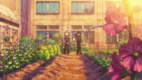
Text
Kuroko no Basket backgrounds 🌳
.
like/reblog if u save


53 notes
·
View notes
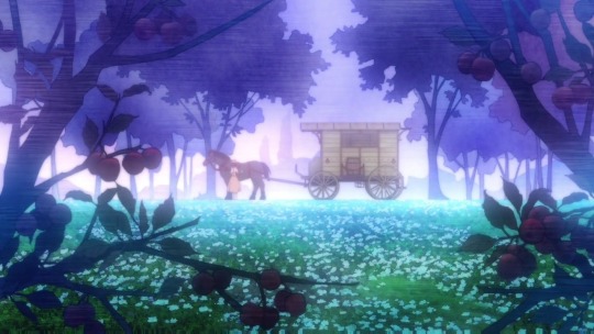
Text

Been a while since I've done proper backgrounds so I wanted to ease back into it with a super quick n' rough forest cliff study.
I think my main problem with BGs is that lots of detail quickly overwhelms me and I just shut down and can't parse any of it. Does that mean I just need to pick simpler subject matter? Who knows.
#glaire art#digital art#digital illustration#anime style#artists on tumblr#art study#digital painting#anime background
47 notes
·
View notes
Text

✨New Song✨
JoshuaSageArt - I know I can’t take it all back.
#anime#retro wave#anime aesthetic#aesthetic#anime gifs#retro anime#vaporwave#80s anime#old school anime#anime background#anime wallpaper#90s anime#90s anime aesthetic#vintage anime#anime nostalgia#old anime#cute anime gifs#hyperpop music#digicore music#pluggnb#Spotify#SoundCloud
43 notes
·
View notes
Text
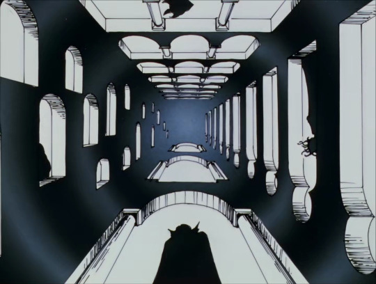
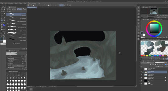
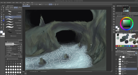
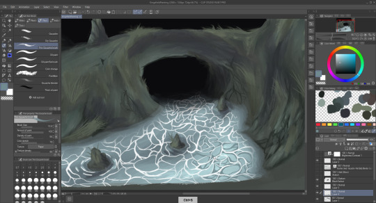
Been Learning to Paint Old Cel Animation Backgrounds
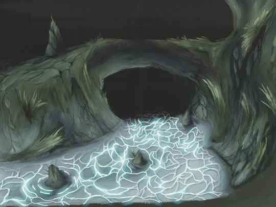
Lately, I've had the drive to learn and practice creating digital paintings that closely resemble the traditional background paintings found in older anime. As a first step, I decided to grab a Kingsfield 4 screenshot from @moonlightfaust and use it as a reference.

I honestly ended up kinda surprised at how good I think it turned out. I haven't really tried painting a background before, and I think this is a very good first step for where I wanna be.
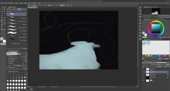
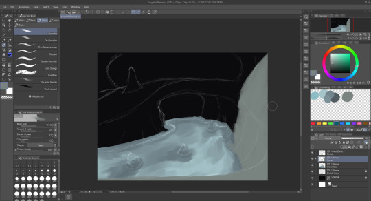
How I do it
Firstly, I loaded up my reference on my second monitor and started painting away in clip studio paint. I sketched things out at first and then used the default gouache brush for the broad strokes. I made sure to use a nice variation of colors and values on the surfaces to give them texture. After that I blended stuff together using a custom blend brush I grabbed called "wet betty", and then I used the thin gouache brush to work on smaller details. I drew out the caustics and then painted some blue lighting on the walls on a layer set to additive (glow). Here are some wip photos showing all that off.


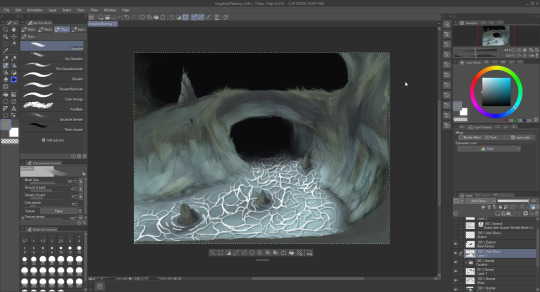
After creating the base drawing, I brought it into Affinity Photo and adjusted the brightness/contrast and added a softproof adjustment layer to make it look as though it was printed. I also used a white mask of the caustics in order to make those parts of the image transparent.
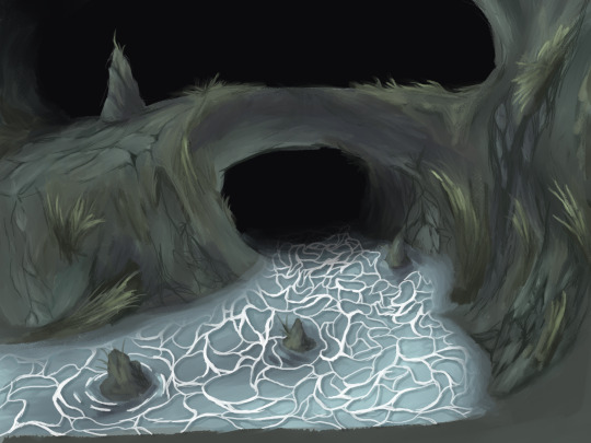
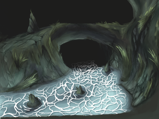
After that, I brought the image into blender in order to simulate the cel animation look.

I'm using a variation of @jam2go's under-lighting method here in order to get that nice, naturalish glow. I'm using a special compositing setup in order to simulate the little variations in light and lens artifacts you might get from capturing cels that gets processed onto the final render.
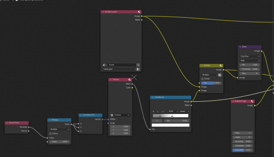

I've also given the image cel plane very subtle bumpiness in order to simulate real celluloid not being completely flat. (It's a little hard to see, but I just subdivided it and used a displacement modifier)
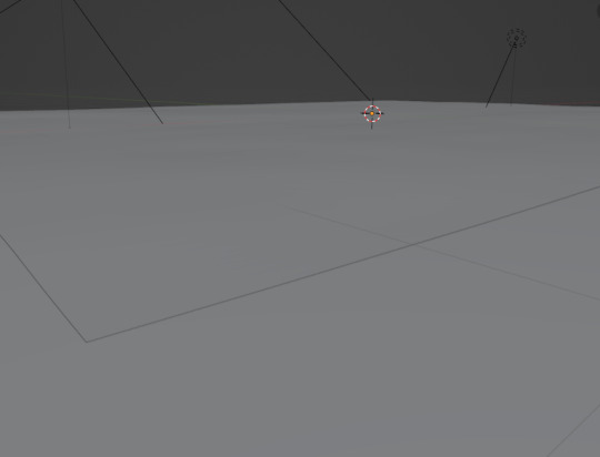
The light artifacts and the cell bumpiness are both animated, and I also added very subtle noise to the position of the cell to simulate how each frame in cel animation isn't placed in exactly the same spot. After rendering, it all comes together to simulate a cel animation look fairly nicely I think.
Anyway back 2 gamedev now
#painting#gouache#digital painting#digital artist#cel animation#anime background#anime scenery#blender#blender 2d#jam2go#moonlightfaust#kings field
47 notes
·
View notes
Last Seen Blogs
toku36
宮川徳三郎商店
sara-blogs-blog1
Welcome To My Blog

doubleca5t
Minerva P Kelley
lavenderarts
全ての終わりに愛があるなら。

psychroculus
What is Updog?