#and to never letterspace lowercase letterforms
Text
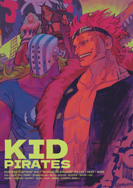
#one piece#kid pirates#eustass kid#killer one piece#op killer the guy ever#and the goober he picked off the street#eustass captain kid#ive been looking at the works of bob peak#i wanna get good like that one day…#also#is the lettering ok#or is it giving graphic design is my passion#let me know#all i learned in typography class was that i should be sorry for existing#and to never letterspace lowercase letterforms#thank u A type primer#i have design school trauma
1K notes
·
View notes
Text
Summary of Using Type Powerpoint
Typographic Areas - thinking in typographic in terms of how and where it is applied
Poster - requires consideration to the role of type (eg: to ‘draw in’ reader or to provide info), level of engagement with audience (using letters, words or composition), how type works with other elements (photos & illustrations)
Identity - challenging make sure it works on a range of different media
Publication/Editorial - audience readability is most important
Environment - focus on legibility and favours clarity, boldness & consistency
Digital - influenced by technology (screen resolution, size, physical dimension, development of web/phone tech)
Type Arrangement
Text Typography - intended for continuous reading, taken for granted, if readers are too conscious of the style it will become distracting, text type usually is between 8pt and 14pt for continuous reading
Display Typography - not intended for reading at length, role to draw the attention of audience eye to the design, adds character into design, can also become image or image-like (treated more like an image by designer)
Combining Type - common technique in contemporary design, complicated, takes time and practice, it is like match making, keys (harmony, contrast, hierarchy, amount (avoid using more than 3 typefaces in a design, avoid using too many variations in a design)
Type & Image - need to be in harmony and have good hierarchy
Type Layout
Word - letterform (depending on the design of the letterform and upper/lowercase wet type (size,leading, tracking) differently
Size - medium-dependent, usually 9-12pt sometimes up to 14pt, too small hard to read, too large strains eyes, can zoom on computer screens
Paragraph - tracking: (0 by default, larger type size more likely need to reduce tracking, don't letterspace lowercase, leading: (auto around 120% by default, may need to increase manually, create internal space, type on screen usually needs more leading, line length: too long line tiresome to read, make use of columns
Alignment - left: common, easiest to read right: never be applied to long text, hard to read/keep track of lines centre: poems and page titles, hard to read for long text justified: keeps columns geometric, works well for newspapers, need attention to avoid weird spacing between word
Colours - very crucial to legibility, careful when set bright type on dark background, lose a lot of visual detail of type (avoid using thin serif and such)
Spacing - type need to breathe
Typographic Sins
In Letterform - distort type (skew and stretch), fake bold or oblique
In Typing - double space between words or after period, not space before punctuation marks, use the wring apostrophe and quotation marks, use the wrong dash
In Typesetting - use capital case & uppercase for long text, letterspace lowercase, let lines crash, ignore orphans & widows (one word on a line or one line in different column), ignore rivers in justified alignment, use more than 3 different typeface in design
More sins - drop shadows & gradient text, bad kerning
0 notes
Last Seen Blogs

anghell--lau
anghell lau
thatlibraa
Keepin Up With Sarah

random-frog-trash
Butterflies weren't always pretty and neither am I

smallcastle
SMALL CASTLE
suddencolors
SUDDEN COLORS