#and also full size portraits of the cover art characters in a completely different art style
Text
Man I really love in the harvest moon/rune factory/agarest/other dating shippy game thingies when u marry the character and u GET A CHILD CHARACTER TO LOVE and also ITS EVEN BETTER when THEY RESEMBLE THEIR PARENTS!!!!! I’m so sad when i play the ones in the HM series that don’t have that, its like im spoiled by the ones that do. YOU DID IT ONCE YOU CAN’T TAKE IT BACK YO!!!! its like the pokemon following behind you :(
So randomly I woke up from my nap and was like HEY I SHOULD DO THAT
and now i’m editing rpgmaker default sprites to make Every Possible Shipping Permutation As An Individual Child
and i even found a pack of remastered rpgmaker 2000 and rpgmaker vx sprites aaaaaaaa im gonna burn my hands off with shippery!!!!!!!!!!!!!!!
man i wish they had a clear list of default names and personalities for everyone tho? I’m worried people will get mad at me if my headcanons for these guys are too different from the norm, but i cant play every single rpgmaker game ever and tally up the averages yknow? its annoying cos like three of them do have a name and a one line personality, cos they were the party members chosen for the tutorial maps. Tho its still vague like “Ralph - he a sword guy, generic shonen hero yep”. Would they get mad at me if i said Ralph doesn’t suit him?? And he could be cooler if he had a less generic personality?? aaaa
and man for some reason i headcanon the pink haired cleric man as autistic, and i’m making up this entire goddamn romance route for him for a game i will never actually make I JUST WANTED TO DOODLE SOME KIDS
WHY AM I CURSED WITH EVERY IDEA EXPLODING INTO FIVE IDEAS
anyway look at some Classic Rpgmaker Bebbys from over the years


#blunni thoughts#its weird how bad the rpgmaker mv default sprites look#the colours are all super bright and garish and they don't have full sized portraits yet#even though the same pack came with full sized portraits for the previous game for some reason#and also full size portraits of the cover art characters in a completely different art style#which makes thes default ones completely obsolete...#and the rpgmaker fes came along and had the same art style from the previous game but better#so really its the true successor yknow?#art-wise at least#i wonder if that's why the defaults suck actually? like they sent the usual artist over to work on the portable version and#hired some new guy to poorly imitate the style with terrible colouring#or maybe they tried to experiment with the colouring on purpose and it just didnt achieve the intended effect?#*shrug*#anyway fes is AMAZING and im so happy they made the art assets available on non-portable rpgmaker too!#look dem cute kiddos in high resolution of hug
5 notes
·
View notes
Text
Normal Love and Superheroes: Two - my city
Summary: Leena gets a meeting with the Bruce Wayne himself and a call from John Blake.
Pairing: John Blake x OFC (Leena Duckett)
Word Count: 3.1k
Warnings: none I think...characters discuss Sexy Times and getting drunk but like that’s it I suppose
Part One | Part Two | Part Three | Part Four | Part Five | Part Six | Part Seven
“Why the heck would he want a private tour with me? He asked for me specifically?”
“Look that’s what he said over the phone, Leena.”
“But did he say why?”
“I’m so terribly sorry I didn’t take the time to ask Bruce frickin’ Wayne, one of the biggest patrons of the gallery, why he asked for a tour from you specifically.”
Leena blushed. “Sorry, Adeline. I just…”
“Don’t worry about it.” The blonde sitting behind the welcome desk smiled with a closed mouth. “I’d react the same way if I were in your shoes. A whole hour or more with Bruce Wayne….”
Another tour guide jogged up to the front desk from the bowels of the gallery. Leena turned and watched her approach. Phoebe had a look of conspiracy and impression on her long face. She came to a halt beside Leena and elbowed her in the side.
“So are you gonna take Mr. Wayne into one of the more….Private rooms of the gallery?” Phoebe asked with a wicked smile.
Leena rolled her eyes, but couldn’t help the hot feeling that was spreading from her neck into her face. It was no secret about Gotham that Bruce Wayne, billionaire playboy, was extremely attractive and constantly single. She saw the tabloid covers as she stood in line at the grocery store. She even ran into him outside of a restaurant one time. But his sexual promiscuity was not what bothered her about giving him a private tour. It was more the fact that he was Bruce Wayne, billionaire enigma businessman that seemed to have intimidation come out of his very pores. Who was she to be giving him a tour of the galleries that he often bought from? A no-name artist who worked two jobs, one of which she hated, to make ends meet? That didn’t sound like the kind of girl that should be giving a Wayne tours of anything.
“No I will not, Phoebe, Jesus!” Leena laughed.
“Oh, come on, have you seen him? Plus, you know he’d be open to it. He’s slept with every hot girl in Gotham and beyond.”
“Just cause he’s slept around doesn’t mean he’d be open to swapping spit in a broom closet with a random gallery tour guide.” Leena rolled her eyes. “Maybe he wants just a normal day out. Like anyone else.”
“God, you’re no fun,” Phoebe groaned.
“I think we know from after hours drinks just how fun Leena can be,” Adeline, the front desk girl, pitched in.
Leena rolled her eyes again and smirked. She always told herself, after those nights out, that she would never fall into the temptation of going again. She always got way too drunk, being a lightweight that fell very easily under peer pressure. And because she always got way too drunk, she always ended up doing something she regretted. Like dancing on top of a table, kissing some random person in the dark corner of the bar they frequented, or possibly recreating dance scenes from Chicago with very little success.
“Please stop,” Leena begged with a red face.
“Excuse me ladies.” An older gentleman with an English accent approached the front desk. He looked very nice in a dark suit with white thinning hair. “I’m here for my tour of the gallery.”
“Of course, what’s the name attached to the tour?” Adeline asked.
Phoebe squeezed Leena’s arm and wiggled her eyebrows before she trotted off, back into the gallery. And Leena was about to do the same, but —
“Bruce Wayne. I run his house and am looking for some new work to be put up. I believe I set aside a tour guide already?” the old man said.
“Oh, yes, you did.” Adeline typed on the computer for a moment, giving Leena a bit of side-eye as she did so. “You’ll be touring with Ms. Duckett.”
Leena let out a breath. A sudden wash of relief and disappointment running through her. She knew that the gallery was the place for many of Gotham’s most elite families to buy art for their various homes throughout the world. Rich folk wanting to support local artists. But she had never given a tour to any actual members of those families. It was always the butlers, the house runners, the managers, the publicists even. But they always state that it is the butler or the house runner coming to assess new pieces that have been put up. So when Bruce Wayne’s actual name was logged into the system, Leena really thought it was going to be him walking through the halls of their gallery. Really laying his eyes on the art and choosing it for himself rather than someone else choosing it for him and barely even noticing that it was hung in his manor. The disappointment didn’t last long, however.
Leena stepped towards the old man with a smile. “And I am Ms. Duckett. A pleasure to meet you…”
“Alfred, miss.” He held out his hand and she shook it.
“Well, right this way, Alfred.” She gestured for them to enter the gallery and she began to lead. “We’ll start with our glassworks suite — “
They entered the first room of the gallery. The Shefield Gallery was extensive, housing several different mediums of art from a variety of artists. Pure white walls to off balance the bright pops of color that the artwork created, heightening the customer intrigue. In this first room there were at least fourteen pedestals strewn about the room, each one holding a different piece of glass artwork. Leena liked to look at glasswork, but would probably never attempt creating any herself. Molten glass just seemed a little too dangerous for her taste.
“Actually, sorry to be a bother, but I was hoping to look at something specific on this trip.” Alfred pulled a piece of paper from his suit jacket pocket. He unfolded it and handed it to Leena. “A piece specifically requested by Master Wayne.”
Leena stopped them and took the piece of paper with raised brows. It was a print out from the gallery’s website. Her eyes widened.
That was her painting. Put up in the employee suite of the gallery after much begging and finally the curator taking pity on her for being a slightly hungry artist.
She looked back up at Alfred to see him smiling at her. She quickly regained herself and asked, “Um — are you sure it’s this one that Mr. Wayne wants?”
“Yes. That’s the one.”
With a resigned nod and a thick swallow, Leena led Alfred to the employee suite. She could feel her fingers going numb. Bruce Wayne wanted her painting? Really? He asked for it specifically? She was sure that the old man had to be lying to her for her benefit. Playing some sort of weird joke that ended with her humiliated and a playboy billionaire laughing at the footage of her misfortune. Or maybe there was no farce and the man really did like her painting so much he wanted to buy it and hang it in his home. Leena rubbed at her neck. He would be the first person to ever like her work enough to do so.
They came to the employee suite and Leena stopped them in front of the painting in question. She put her head down as Alfred looked at it. His thin lips were quirked up in a small smile but she couldn’t tell if that was a good or bad thing.
“Pick your head up, miss,” he said, “I know you painted this.”
“Is that why you asked for me for your tour?” Leena asked.
“It is indeed.” His smile widened. “Master Wayne wanted me to see what kind of person could paint something like that.”
He pointed to the canvas and Leena furrowed her brows. She turned to the painting herself. Was there some vulgar message she, the artist, had missed? No. She couldn’t see it. All she saw was a portrait of Gotham at night. Done in oil paints on a medium sized canvas, Leena had always been told she leaned too far into her impressionist influences. But she couldn’t help it. Ordinary subject matter with a heightened sense of romanticism and color was something that Leena was just drawn too. The painting was Gotham at night, looking out over the skyline with the lights from the offices and apartments shining brightly, as if the viewer were looking down from the highest story of some building or other. In the glowing rooms in the foreground, people could be seen. Families, tired office workers, friends getting together.
She had titled the painting My City.
“I’m not sure I understand what you mean,” she said, turning back to Alfred.
“Master Wayne sees Gotham as a dark place — a place full of hate, injustice, and cruelty,” Alfred said.
Leena pulled a face. “While I will not disagree with Mr. Wayne — Gotham is full of the worst kinds of things — but it is also still worth saving. And loving. And living in if only to save it and love it more.”
Alfred smiled, a soft and knowing thing that made Leena’s eyes narrow.
“And Master Wayne would agree with that sentiment as well.” He turned to the painting again, hands clasped behind his back. “Which is why he was drawn to your work so much. You share similar views on a city that many have lost faith in — a rare find, especially in art form.”
Leena was puzzled. Bruce Wayne grew up in Gotham, just like she did. But they saw completely different sides of Gotham. Wayne saw only the elite, the rich, the famous side. The side that lived in penthouse suites, owned entire blocks of buildings, and could afford to eat at those fancy restaurants downtown. The faces of Gotham City. While Leena saw the hands and feet, the workers and the heart and soul of Gotham. The side that worked fifty hour weeks, lived in the slums, and had to cut up and burn their own furniture to keep warm. Gotham wasn’t worth saving because of the side that Bruce Wayne saw, that made it worth damnation. Gotham was worth saving because of what Leena saw.
“Um — well — uh — I…I don’t really know what to say. I wish I could tell Mr. Wayne thank you in person.”
Alfred seemed to get an idea. “How about you deliver the painting in person to Wayne Manor? Tomorrow perhaps? You could thank him in person and he would get to meet the artist behind the painting that has captivated him for so long. That is, if you are free, of course.”
“Well, if he wanted to do that he could have come himself today.” Leena couldn’t stop the words before they came out of her mouth.
Her eyes widened as she stared at Alfred. God, she really needed to learn how to control her mouth. She could feel her neck heating up and her face paling all at the same time. Her face scrunched up as she closed her eyes. Maybe if she didn’t look at him he would just go away or she would just sink into the floor. Either option would spare her from the agonizing embarrassment ripping through her right now.
“I’m so — “
Alfred chuckled. He actually started laughing. A polite and somehow very British thing that had Leena’s eyes flying open.
“I couldn’t agree with you more, Ms. Duckett,” he chuckled out, “But Master Wayne has turned into a bit of a recluse as of late. And I really do think he would appreciate meeting you.”
Leena bit down hard on her lip. If it meant making the $500 the painting was priced at, she was willing to do anything honestly. Even it meant borrowing Jamie’s car and meeting the actual Bruce fricking Wayne himself. That was enough money to pay her half of the rent for the month and she only had to do one thing. Not work her ass off at two different jobs. Her need for the money more than outweighed her apprehensions about meeting a billionaire and talking to him about her art and her thoughts on Gotham.
“Alright. Tomorrow at three o’clock. Is that an okay time?”
“Oh, yes. Just in time for tea.”
_______________________________________________________________________
“Please could you stop the noise? I’m trying to get some rest,” Leena sang as she cleaned her paint brushes, “From all the unborn chicken voices in my head!”
She moved back to the canvas she had set up by the windows overlooking the city. Who knew getting a meeting with one of Gotham’s most influential men would give her inspiration for a new painting? The reference photo of Bruce Wayne was tacked into the corner of the canvas. She had gotten the idea on the train ride and subsequent bus ride back to her apartment when her shift at the gallery was over. Something about Bruce Wayne being a recluse and seeing the good in Gotham just gave her a spark of inspiration. A spark of inspiration to lesson her fears about meeting the man by painting him as a vigilante sasquatch.
It was at least making her feel better about the whole thing. Jamie had walked in from her own work shift with many questions about it. But Leena had only held up a finger for patience and put her headphones back in. Jamie knew what that meant. Her roommate had had a weird day and needed to vent through her art.
Leena continued to paint for some time. Lost in the music and the colors and shapes that flowed from her paintbrush. Leena’s mother had given her paints and paper when she was very little as a distracting craft while she tried to clean around the house. But her mother could not have known that that would have sparked a lifelong love for art and painting. A dedication to get better and better and find her own style. Winning contests, medals, and even studying art in college. Leena felt the most at home when she was painting. Felt the most herself when she had a brush in her hand and a vision in her head that just needed to be let out.
This was one of those ideas she just knew would consume her every waking, and possibly sleeping, thought until she got it out and onto the canvas. Vigilante sasquatch Bruce Wayne was going to camp out in her cerebral cortex until she had brought him to life. Trekking through the woods, covered in body hair, wearing a stupid bright red face mask. If he thought the city was so worth saving, then why didn’t he give money to the police department so they had the tools to catch the criminals loose on Gotham’s streets? Why didn’t he donate money to improve Gotham’s infrastructure, education, hospitals, mental health services, or literally anything else besides funneling money into his own company?
If she were to see him right now, she would have a piece of her mind to give him that was —
Her phone started vibrating in the pocket of her apron. Leena groaned. She had gotten into such a good groove, too. She pulled out her iPod first and paused her music. Then she flipped open her phone and held it up to her ear. She didn’t even bother to see who was calling. Her mother usually called around that time of day anyway.
“Hey, Mom, what’s up?” she asked as she pinched the phone between her cheek and shoulder.
“Uh — “ A distinctly male voice came through. “Sorry, this is John Blake. Were you expecting your mom to call you? Cause I can call back later.”
Oh, God. After realizing that, in her euphoria, she had forgotten to get his number, she had been waiting to hear from him for nearly two days.
“Oh, shit,” she said, quickly wiping her paint stained hands off on her apron, “Um, no — sorry. Sorry. I wasn’t — with my mom. I can talk now. Officer Blake — John. Officer Blake?”
At the mention of that name, Jamie peeked her head out from the gap in the curtains surrounding her bed with a look of pure interest on her face. Mouth open and her eyebrows raised as she looked across the room. Leena shooed her away with a wave of her hand and an uncontrollable smile.
“You can just call me John,” he laughed, “You getting around okay without the bike?”
“Uh, yeah. Taking the train and the bus — definitely throwing my budget out of whack but — that doesn’t matter…At all.” Leena glanced over at Jamie, still listening in, only to see her roommate roll her eyes.
When did she get so terrible at talking to men?
“Well, I have some good news for you.” Leena could feel her heart jump into her mouth, making her physically stand on tip toe and stare out the window as he continued to speak. “I found it. So — uh, where do you wanna go for our date?”
Leena squeezed her eyes shut, the smile on her face nearly hurting her cheeks as she tilted her head towards the ceiling. Was this really happening? After Jacob, she didn’t know if she would ever find anyone else. If she would be willing to put herself out there like that again. But with John, something felt different. He was safe, kind, and somehow she just knew that he would never hurt her like Jacob did. She twirled around once and she could hear Jamie whispering, asking what was going on. Leena ignored her roommate.
“How about Superdawg?”
Superdawg? Jamie mouthed with an unbelieving face.
“That hotdog place over by Robinson Park?”
“Uh, yeah.”
She heard him chuckle. “Sorry. I just suppose I expected you to pick something a bit more…I don’t know…”
“I’m not a fancy kind of girl, trust me.” Leena laughed. “We could eat and then maybe take a walk around the park or something? If that sounds good to you — I don’t — “
“No, that — that sounds great, actually. Honestly, kinda glad you didn’t pick something fancy.”
“Okay, cool.” Leena looked over at Jamie with raised brows and a wide smile. “Uh, what time?”
“Saturday — tomorrow at six? I can pick you up?”
“Yeah, that sounds great. I’ll see you then.”
“See you then, Leena.” She loved the sound of him saying her name. “Bye.”
“Bye.” She flipped her phone closed and turned to face Jamie with fists triumphant in the air. “I have a date! And I’m getting my bike back!”
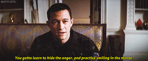
#the dark knight rises#john blake#john blake imagine#john blake x reader#john blake x you#john blake x oc#dark knight#dark knight imagine#dark knight fic#dark knight fanfic#dark knight fanfiction#john blake fic#john blake fanfic#john blake fanfiction#joseph gordon levitt#jgl#nolan batman#dark knight trilogy
20 notes
·
View notes
Note
Self Indulgent prompts, huh? I love anything with artist Rose so something with that theme. I'm not picky about the Doctor- like my current obsession is Eight/Rose, but I'm perpetually in love with Nine/Rose and Ten/Rose too so whichever Doctor you're most comfortable with.
The Museum of Serendipity
Doctor x Rose, Wilf, male OC (Original Cat)
Rated E | 2300 words
Sorry this took longer than anticipated, I got sidetracked by research and 8th Doctor audio adventures ;)
I’m fulfilling your self-indulgent prompts
Of all the wonderful, celebrated museums in London, Rose’s favourite was an anarchic collection housed in a crooked Georgian house in Marylebone.
From ground floor to attic, over four storeys, shelves and frames lined the walls of every room, following a seemingly incoherent design. Part cabinet of curiosity and part celebration of beauty in all its forms, the collection was curated by an anonymous— and eccentric, Rose liked to imagine— philanthropist.
Its name, the Museum of Serendipity, summed up how the collection was put together. Or perhaps it indicated how this museum could be found: by sheer good luck, as it was not advertised anywhere. Rose herself had stumbled upon it by accident last September, when looking for a shelter from the rain. Quite a happy accident, since her art teacher had asked them to visit a gallery for their first assignment of the semester (she’d earned extra points for originality).
Despite few visitors, it remained open from morning to evening. More often than not, the elderly greeter slept in his rocking chair by the door, leaving Basil the cat in charge.
Its location near Regent’s Park, made it a perfect destination for a drawing session. On a beautiful spring day like today, Rose would walk along the paths of the park and draw the flora and fauna in her sketchbook. Then make her way towards the museum. Other days, after a long time indoors, she would enjoy the park’s fresh air and time to reflect on the latest collection piece she’d discovered.
Since her childhood, art had been a way for Rose to travel, around the globe and across time, a way to see the world through other people’s eyes and to share her own vision. A way to exist beyond the Powell Estate. The Museum of Serendipity transported her like nothing else.
Although she enjoyed the morning sun, she didn’t linger in Regent’s Park, too eager to get there.
The elderly greeter was listening to the radio in his small front office.
“Hello, Wilf!”
He jumped to his feet with an energy that belied his years.
“Ah, Rose, luv. Alright? How’s school?”
“Got another assignment to complete for art history class. By the way, mid-term break is coming up, if you fancy a holiday, I could cover your shifts here for a few days.”
He would be doing her a favour more than the other way around.
“I’ll keep that in mind,” he said. “We got a new piece came in.”
New pieces were simply added to the exhibition wherever a space was available. As they walked to the drawing room, Rose tried to know more about the museum.
“Who brought this new piece?”
“John did, just this morning.”
“John?”
“Yeah, John McConnell , the mailman,” Wilf said. “Here it is.”
On the mantel lay an artifact shaped like a metal glove without fingertips. Or a pan flute.
“Looks like something from the future,” she joked.
“Modern art, then,” Wilf said.
He left her to look at it a while longer. The pattern that covered it, both engraved and raised all at once, looked like scales. Rose pulled her sketchbook out of her messenger bag and drew it. Texture study.
Basil, the museum’s Abyssinian cat, greeted her, rubbing himself against her legs. She petted his long ears and ruddy coat. She followed Basil out of the room, and wandered the now familiar corridors and staircases. Her hand trailed along the faded floral wallpaper and oak paneling. The smell of candle wax and pine wood polish always hung in the air.
There was one painting in particular Rose always came back to, in the third floor library, just above a loveseat that once belonged to Marie Antoinette. Ahead of her, Basil jumped on the loveseat and looked at her expectantly.
Rose pulled up a chair to sit down, the museum was almost a second home now, she had no qualms moving furniture around.
With a dreamy sigh, she let her eyes roam the large canvas. It depicted a dozen people in elegant Edwardian clothing, visiting an art exhibition. She was transported back in times, it seemed. Back to la Belle Époque. Late 19th- early 20th century, in France. Among women in high-necked waist shirts, carrying white lace parasols and men wearing mustaches and straw boating hats. The era of Moulin Rouge and absinthe, of the first movie, of bicycles and Marie Curie, just to name a few. The era of Gustav Klimt, Toulouse-Lautrec, Van Gogh and Renoir, the artists whose work Rose had first fallen in love with. The painting itself blended elements of Art Nouveau and Impressionism (as she’d described in her second assignment).
But there was one character in particular that commanded her attention again and again. There, in the upper left corner. The painter had done this trick which makes it look like the subject’s eyes are on you wherever you stand in the room. Though unnerved at first, Rose now tried to master this technique. Countless time she’d drawn his thick, curly brown hair, the soft contours of his jaw, his blue eyes, the creases that bracketed his mouth. And that smile, a Mona Lisa smile, the hardest trait to capture.
His clothes also offered many details to work on: the sheen of his satin cravat, the velvet of his jacket, the pattern of his waistcoat.
At first, she only tried to capture his likeness in various mediums, but over time she tried to sketch his profile, his back. She depicted that gentleman in various poses and actions. He had taken a life of his own. What was he doing there that day? What was his relationship with the painter? Why was he looking at her like that?
Basil meowed.
“Alright, don’t be jealous. I’ll draw you first, you beautiful boy.”
“Thanks, it’s a new jumper. Do you like the colour?” said a man with a northern accent.
Rose started. He was leaning against the door, looking at her, with the smallest hint of a smile.
He picked up Basil and sat down on the loveseat, laying the cat on his legs crossed at the knees. Rose held back a quip about the similar size of their ears.
“Well, go on, then,” he said, indicating her sketchbook with his chin.
“Hold on, are you the director of the museum? Or the curator?”
“No,” he said. “I don’t think so.”
At a loss for a reply, Rose simply got to work.
If Basil wasn’t running away, then surely this man posed no threat. Just a lost, slightly odd item, like everything else in the Museum of Serendipity. Including herself.
His face offered such striking features to draw, that bold nose, those sharp cheekbones. The cropped hair revealed the shape of his skull and the collar of his sweater, a beautiful neck. A face for charcoal, she thought, to capture the lights and darks of him, in loose, almost intangible strokes. Charcoal and dry pastels, she amended, she had to recreate the infinite blue of his eyes.
They chatted about everything big and small: cats, galaxies, her doubts about art school and his hopes for the future of humanity.
Time flowed differently when she was creating. In that moment more than ever. A sort of appeasing, melodic hum filled her mind, and everything, but her subject, faded away.
When she traced his eyes, she was surprised to find in them a spark, as if he knew her.
She looked up at him, and he smiled. “Hello,” he said.
Before she could think of a good way to phrase her question, he stood up and looked at the sketch over her shoulder. He gave an appreciative nod.
“We need someone to do a painting of the museum,” he announced. “Are you free to do it?”
“A painting? Are you taking the piss?”
“I’m serious. Great big canvas. Like this one.” He pointed to her favourite painting of la Belle Époque.
“I’ll need money to buy supplies,” she said, to test his good faith.
“Of course.”
He grabbed a tin box in a nearby bookcase; it was full of cash. He handed her the stack of pound notes without counting. Almost as if he was ignorant of their value. “Will this do?”
Rose nodded dumbly. She resolved right away to only spend a reasonable sum.
“I’ll come by next Wednesday afternoon,” she said.
“Perfect. See you, then, Rose Tyler.”
She spent the next few days in a state of disbelief. Her mind constantly replayed her encounter with the blue-eyed man. Several times, she opened her sketchbook to look at his portrait. The fondness it aroused in her took her breath away. She found herself doodling both him and the gentleman in the painting, over and over.
She bought a load of art supplies, but kept the receipt in a secure place in case she needed a refund.
On Wednesday, she arrived at the museum with a knot in her stomach. Wilf greeted her, as usual, but he was wearing a smart new uniform.
A moment later, the blue-eyed man skipped down the stairs, two at a time, and welcomed her with a bright smile. He introduced himself as the Doctor, just the Doctor, and Rose went along with it— after all, it wasn’t the weirdest thing about him.
He’d set up an easel and a canvas in the third floor library. She barely paid attention to his directives, she was distracted by the number of visitors in the museum, more than she had ever seen.
“Is this a prank show thing or what?” she asked.
“Why would it be a prank show?”
“I don’t know.”
“Well, you said it. Why a prank show?” he repeated.
“‘Cause to get that many actors and props, it’s got to be on telly.”
“That makes sense. Well done.”
“Thanks?”
“It’s not a tv show,” he said.
“But— why?”
“It’s the museum’s anniversary. We are interested in collecting unique pieces, and what’s more unique than Rose Tyler’s first commissioned artwork?”
“Maybe the last,” she mumbled.
“It won’t be,” he said, stating a fact rather than paying a compliment. “Coffee?”
The Doctor knew something she didn’t, and as irritating as it was, it incited her to stay and fulfill his request.
She laid a tarp on the floor below the easel, spread out her brushes and palette knives, picked the colours.
Basil, of course, wanted to be part of the painting. He lay down in the sunniest spot, on the window sill, looking ever so regal.
As she prepped the canvas, her brain ran ahead of her with ideas to best infuse her art with feelings this room evoked. Warm earth tones, old leather bound books, a thick Persian rug, but also glass cases to keep people away, artworks by undisclosed artists, mysteries all around. Inviting and distant all at once. Much like the Doctor.
She scanned the room for him. He stood in a corner of the library, surveying. As she traced his silhouette, she noticed the similarity, in his posture and smile, with the fascinating gentleman in the Belle Époque painting. She made a mental note to ask about that too.
Hours passed by, Wilf kept her comfortable with cups of tea, snacks, a stool, opening the window, closing the window.
Everyone had left. The sun had set. Only the Doctor and Basil remained in the room with her.
The artwork wasn’t finished, but it had everything she needed to continue another day. Yet, she didn’t leave. She didn’t want to. She stood there, wringing her paint-splattered hands waiting for something, anything, from the Doctor.
“I want to show you something,” he said. He took her hand and they both stood up on Marie Antoinette’s loveseat. “Look closely.”
Now inches from the Belle Époque painting, she saw it like she never had before. It shimmered and shifted. Like those 3D images you have to cross your eyes to see. She blinked. Looked closer. And drifted through the canvas.
Rose gripped the Doctor’s hand tighter. Behind them, there was no library, only a blue door. And in front of her, the painting had come to life. No— they weren’t in the painting, they were in Paris of the 1900s. Around her, people chatted in French, cigar smoke wafted to her nose, and through a window that wasn’t on the painting, she could see the brand new Eiffel tower.
The gentleman that had so fascinated her was there too. Thick hair, bright smile.
“Rose, we meet at last,” he said.
His voice sounded exactly like she’d imagined. She didn’t know until now that she’d imagined his voice.
“She’s all yours,” the Doctor said.
Rose didn’t let go of his hand.
“Don’t worry, I’ll be here to bring you back to your own timeline.”
He disappeared through the blue door.
The other man linked their arms together. A feeling of safety washed over her. He was a stranger and yet not at all. As if to reassure her further, an Abyssinian cat sauntered by.
“Is that Basil?” Rose asked.
“In a fashion. Cats have nine lives, as you know.”
“And you, Doctor, how many have you got?”
The Doctor smiled. “Ah, you figured it out, clever girl.”
That didn’t mean she didn’t have a ton of questions, but for now, she only wanted to soak up the magic of it all.
The Doctor showed her around the room. They mingled with the other visitors, admiring the artwork on the walls. Rose couldn’t stop grinning.
They stopped in front of a painting depicting another gallery, in another museum, in another era.
“Can we go through there too?” Rose ventured.
“Yes, but wouldn’t you like to see Paris first?”
“We can go out?”
“Of course. You know, my friend Claude has been pestering me about visiting his garden. Nice fellow, this Claude. Mind you, he’s a tad obsessed with water lilies.”
#ficandchips#Nine x Rose#Eight x Rose#artist!Rose#yes I'm still working on those#self indulgent prompts#lostinfic writes stuff#lotsofthinkythoughts
49 notes
·
View notes
Text
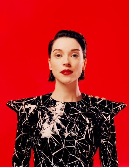
Switching Lanes With St. Vincent
By Molly Young
January 22, 2019

Jacket (men’s), $4,900, pants (men’s), $2,300, by Dior / Men shoes, by Christian Louboutin / Rings (throughout) by Cartier
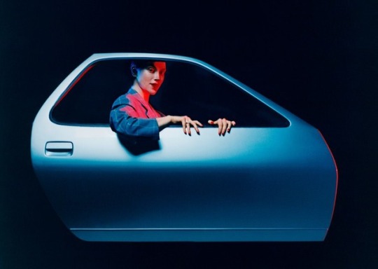
On a cold recent night in Brooklyn, St. Vincent appeared onstage in a Saint Laurent smoking jacket to much clapping and hooting, gave the crowd a deadpan look, and said, “Without being reductive, I'd like to say that we haven't actually done anything yet.” Pause. “So let's do something.”
She launched into a cover of Lou Reed's “Perfect Day”: an arty torch-song version that made you really wonder whom she was thinking about when she sang it. This was the elusive chanteuse version of St. Vincent, at least 80 percent leg, with slicked-back hair and pale, pale skin. She belted, sipped from a tumbler of tequila (“Oh, Christ on a cracker, that's strong”), executed little feints and pounces, flung the mic cord away from herself like a filthy sock, and spat on the stage a bunch of times. Nine parts Judy Garland, one part GG Allin.
If the Garland-Allin combination suggests that St. Vincent is an acquired taste, she's one that has been acquired by a wide range of fans. The crowd in Brooklyn included young women with Haircuts in pastel fur and guys with beards of widely varying intentionality. There was a woman of at least 90 years and a Hasidic guy in a tall hat, which was too bad for whoever sat behind him. There were models, full nuclear families, and even a solitary frat bro. St. Vincent brings people together.
If you chart the career of Annie Clark, which is St. Vincent's civilian name, you will see what start-up founders and venture capitalists call “hockey-stick growth.” That is, a line that moves steadily in a northeast direction until it hits an “inflection point” and shoots steeply upward. It's called hockey-stick growth because…it looks like a hockey stick.
Dress, by Balmain
The toe of the stick starts with Marry Me, Clark's debut solo album, which came out a decade ago and established a few things that would become essential St. Vincent traits: her ability to play a zillion instruments (she's credited on the album with everything from dulcimer to vibraphone), her highbrow streak (Shakespeare citations), her goofy streak (“Marry me!” is an Arrested Development bit), and her oceanic library of musical references (Kate Bush, Steve Reich, uh…D'Angelo!). The blade of the stick is her next four albums, one of them a collaboration with David Byrne, all of them confirming her presence as an enigma of indie pop and a guitar genius. The stick of the stick took a non-musical detour in 2016, when Clark was photographed canoodling with (now ex-) girlfriend Cara Delevingne at Taylor Swift's mansion, followed a few months later by pictures of Clark holding hands with Kristen Stewart. That brought her to the realm of mainstream paparazzi-pictures-in-the-Daily-Mail celebrity. Finally, the top of the stick is Masseduction, the 2017 album she co-produced with Jack Antonoff, which revealed St. Vincent to be not only experimental and beguiling but capable of turning out incorrigible bangers.
Masseduction made the case that Clark could be as much a pop star as someone like Sia or Nicki Minaj—a performer whose idiosyncrasies didn't have to be tamped down for mainstream success but could actually be amplified. The artist Bruce Nauman once said he made work that was like “going up the stairs in the dark and either having an extra stair that you didn't expect or not having one that you thought was going to be there.” The idea applies to Masseduction: Into the familiar form of a pop song Clark introduces surprising missteps, unexpected additions and subtractions. The album reached No. 10 on the Billboard 200. The David Bowie comparisons got louder.
This past fall, she released MassEducation (not quite the same title; note the addition of the letter a), which turned a dozen of the tracks into stripped-down piano songs. Although technically off duty after being on tour for nearly all of 2018, Clark has been performing the reduced songs here and there in small venues with her collaborator, the composer and pianist Thomas Bartlett. Whereas the Masseduction tour involved a lot of latex, neon, choreographed sex-robot dance moves, and LED screens, these recent shows have been comparatively austere. When she performed in Brooklyn, the stage was empty, aside from a piano and a side table. There were blue lights, a little piped-in fog for atmosphere, and that was it. It looked like an early-'90s magazine ad for premium liquor: art-directed, yes, but not to the degree that it Pinterested itself.

Coat, (men’s) $8,475, by Versace / Shoes, by Christian Louboutin / Tights, by Wolford
The performance was similarly informal. Midway through one song, Clark forgot the lyrics and halted. “It takes a different energy to be performing [than] to sit in your sweatpants watching Babylon Berlin,” she said. “Wherever I am, I completely forget the past, and I'm like. ‘This is now.’ And sometimes this means forgetting song lyrics. So, if you will…tell me what the second fucking verse is.”
Clark has only a decade in the public eye behind her, but she's accomplished a good amount of shape-shifting. An openness to the full range of human expression, in fact, is kind of a requirement for being a St. Vincent fan. This is a person who has appeared in the front row at Chanel and also a person who played a gig dressed as a toilet, a person profiled in Vogue and on the cover of Guitar World.
The day before her Brooklyn show, I sat with Clark to find out what it's like to be utterly unstructured, time-wise, after a long stretch of knowing a year in advance that she had to be in, like, Denmark on July 4 and couldn't make plans with friends.
“I've been off tour now for three weeks,” she said. “When I say ‘off,’ I mean I didn't have to travel.”
This doesn't mean she hasn't traveled—she went to L.A. to get in the studio with Sleater-Kinney and also hopped down to Texas, where she grew up—just that she hasn't been contractually obligated to travel. What else did she do on her mini-vacation?
“I had the best weekend last weekend. I woke up and did hot Pilates, and then I got a bunch of new modular synths, and I set 'em up, and I spent ten hours with modular synths. Plugging things in. What happens when I do this? I'm unburdened by a full understanding of what's going on, so I'm very willing to experiment.”

Coat, by Boss

Jacket, and coat, by Boss / Necklace, by Cartier
Like a child?
“Exactly. Did you ever get those electronics kits as a kid for like 20 bucks from RadioShack? Where you connect this wire to that one and a light bulb turns on? It's very much like that.”
There's an element of chaos, she said, that makes synth noodling a neat way to stumble on melodies that she might not have consciously assembled. She played with the synths by herself all day. “I don't stop, necessarily,” she said, reflecting on what the idea of “vacation” means to someone for whom “job” and “things I love to do” happen to overlap more or less exactly. “I just get to do other things that are really fun. I'm in control of my time.” She had plans to see a show at the New Museum, read books, play music and see movies alone, always sitting on the aisle so she could make a quick escape if necessary. But she will probably keep working. St. Vincent doesn't have hobbies.
When it manifests in a person, this synergy between life and work is an almost physically perceptible quality, like having brown eyes or one leg or being beautiful. Like beauty, it's a result of luck, and a quality that can invoke total despair in people who aren't themselves allotted it. This isn't to say that Clark's career is a stroke of unearned fortune but that her skills and character and era and influences have collided into a perfect storm of realized talent. And to have talent and realize that talent and then be beloved by thousands for exactly the thing that is most special about you: Is there anything a person could possibly want more? Is this why Annie Clark glows? Or is it because she's super pale? Or was it because there was a sound coming through the window where we sat that sounded thrillingly familiar?
“Is Amy Sedaris running by?” Clark asked, her spine straightening. A man with a boom mic was visible on the sidewalk outside. Another guy in a baseball cap issued instructions to someone beyond the window. Someone said “Action!” and a figure in vampire makeup and a clown wig streaked across the sidewalk. Someone said “Cut!” and Clark zipped over for a look. It was, in fact, Amy Sedaris, her clown wig bobbing in the 44-degree breeze. The mic operator was gagging with laughter. It seemed like a good omen, this sighting, like the New York City version of Groundhog Day: If an Amy Sedaris streaks across your sight line in vampire makeup, spring will arrive early.
Blazer (men’s) $1,125, by Paul Smith
Another thing Clark does when off tour is absorb all the input that she misses when she's locked into performance mode. On a Monday afternoon, she met artist Lisa Yuskavage at an exhibition of her paintings at the David Zwirner gallery in Chelsea. Yuskavage was part of a mini-boom of figurative painting in the '90s, turning out portraits of Penthouse centerfolds and giant-jugged babes with Rembrandt-esque skill. It made sense that Clark wanted to meet her: Both women make art about the inner lives of female figures, both are sorcerers of technique, both are theatrical but introspective, both have incendiary style. The gallery was a white cube, skylit, with paintings around the perimeter. Yuskavage and Clark wandered through at a pace exclusive to walking tours of cultural spaces, which is to say a few steps every 10 to 15 seconds with pauses between for the proper amount of motionless appreciation.
The paintings were small, all about the size of a human head, and featured a lot of nipples, tufted pudenda, tan lines, majestic asses, and protruding tongues. “I like the idea of possessing something by painting it,” Yuskavage said. “That's the way I understand the world. Like a dog licking something.”
Clark looked at the works with the expression people make when they're meditating. She was wearing elfin boots, black pants, and a shirt with a print that I can only describe as “funky”—“funky” being an adjective that looks good on very few people, St. Vincent being one of them—and sipped from a cup of espresso furnished by a gallery minion. After she finished the drink, there was a moment when she looked blankly at the saucer, unsure what to do with it, and then stuck it in the breast pocket of her funky shirt for the rest of the tour.
A painting called Sweetpuss featured a bubble-butted blonde in beaded panties with nipples so upwardly erect they actually resembled little boners. Yuskavage based the underwear on a pair of real underwear that she'd constructed herself from colored balls and string. “I've got the beaded panties if you ever need 'em,” she said to Clark. “They might fit you. They're tiny.”

Earrings, by Erickson Beamon
“I'm picturing you going to the Garment District,” Clark said.
“There was a lot of going to the Garment District.”
As they completed their lap around the white cube, Clark interjected with questions—what year was this? were you considering getting into film? how long did these sittings take? what does “mise-en-scène” mean?—but mainly listened. And she is a good listener: an inquisitive head tilter, an encouraging nodder, a non-fidgeter, a maker of eye contact. She found analogues between painting and music. When Yuskavage mourned the death of lead white paint (due to its poisonous qualities, although, as the artist pointed out, “It's not that big a deal to not get lead poisoning; just don't eat the paint”), Clark compared it to recording's transition from tape to digital.
“Back in the day, if you wanted to hear something really reverberant”—she clapped; it reverberated—“you'd have to be in a room like this and record it, or make a reverb chamber,” Clark said. “Now we have digital plug-ins where you can say, ‘Oh, I want the acoustic resonance of the Sistine Chapel.’ Great. Somebody's gone and sampled that and created an algorithm that sounds like you're in the Sistine Chapel.”
Lately, she said, she's been way more into devices that betray their imperfections. That are slightly out of tune, or capable of messing up, or less forgiving of human intervention. “Air moving through a room,” Clark said. “That's what's interesting to me.”
They kept pacing. The paintings on the wall evolved. Conversation turned to what happens when you grow as an artist and people respond by flipping out.
“I always find it interesting when someone wants you to go back to ‘when you were good,’ ” Yuskavage said. “This is why we liked you.”
“I can't think of anybody where I go, ‘What's great about that artist is their consistency, ” Clark said. “Anything that stays the same for too long dies. It fails to capture people's imagination.”
Coat (mens), $1,150, by Acne Studios
They were identifying a problem with fans, of course, not with themselves. It was an implicit identification, because performers aren't permitted to critique their audiences, and it was definitely the artistic equivalent of a First World problem—an issue that arises only when you're so resplendent with talent that you not only nail something enough to attract adoration but nail it hard enough to get personally bored and move on—but it was still valid. They were talking about the kind of fan who clings to a specific tree when he or she could be roaming through a whole forest. In St. Vincent's case, a forest of prog-rock thickets and jazzy roots and orchestral brambles and mournful-ballad underlayers, all of it sprouting and molting under a prodigious pop canopy. They were talking about the strange phenomenon of people getting mad at you for surprising them. Even if the surprise is great.
Molly Young is a writer living in New York City. She wrote about Donatella Versace in the April 2018 issue of GQ.
A version of this story originally appeared in the February 2019 issue with the title "Switching Lanes With St. Vincent."
78 notes
·
View notes
Text
Postcard Five
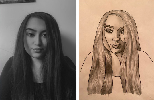
My fifth postcard includes both a realistic portrait and digital drawings, which I think displays a good balance of digital and hand-based work. This is the only piece to show a detailed pencil drawing, which is what makes it stand out to others. However it has stayed connected through the digital art, in addition to the style and colours. I am a huge fan of realistic portraits anyway so to me this is a really attractive design, but with this piece’s impressive aspect the other postcards have their own attributes that make them just as striking.
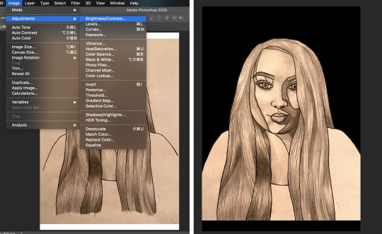
The first step of this design was to draw the portrait itself, I did this using carbon paper for main outline and shapes and and pencil for shading. This was the same method that I used for the ‘Little White Lies’ poster I created in a previous workshop, because I think the bold separating lines gives it character and uniqueness. I then took a photo of the drawing, as I didn’t have a scanner available, and placed it into photoshop.
With this I adjusted its brightness/contrast to appear more clear and white, however because this is filled with shading I couldn’t whiten the background too much otherwise it’ll lose its realistic effect. I then removed the background around the head, and coloured the background in black.
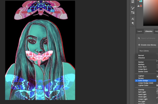
Next I added a pink colour overlay using the blend mode ‘colour’, which simply colourised the drawing and its shades. I then duplicated this but experimented with other options until I found the ‘darken’ blend mode, this had a completely different effect of which was more colour blocky and matte.
I then rasterised the layer style of the first version only and placed it to the front of players, rasterising allows me to use blending options in full potential which is critical for the best outcome. As I was flicking through all the blends I was mostly attracted to the ‘difference’ option, even though I had originally planned to have the portrait as mainly pink this looked fair more interesting.
However the contrast looked slightly too harsh and dark, but I still want to keep the similar colour just lighter. To do this I changed the colour overlay to the polar opposite of this light blue/green, this is because the ‘difference’ blend mode basically contrasts the colours given to it, changing the bright red to light blue. With these two layers I offset them sideways just slightly, displaying a pink outline inside and out.
Next I incorporated the same pink moth drawing from postcard four, but this time placed it over the mouth. This idea was inspired from the classic film ‘The Silence of the Lambs’ where its famous poster displays a moth covering the mouth of a face, because this is a horror film I felt that this composition communicates the fear similarly to the movie. I then blended this using ‘lighten’ which didn’t reduce the opacity, but simply gave it a brighter and less 2D effect.

Using a duplicate of the same digital moth I tuned it up side down, enlarges it and placed it above the head, this was so the blank space at the top wasn't empty and therefore balanced it out. But just so it wasn’t identical to the other moth I changed its blend mode on layer style to ‘lighter colour’, creating a subtle difference in colour.
Next I once again duplicated the smaller moth and rotated it 180°, and experimented with more blending options for both the colour overlay and layer itself. I used ‘colour burn’ for the colour and ‘difference’ for the layer, with which I placed in the middle of the large moth on top.
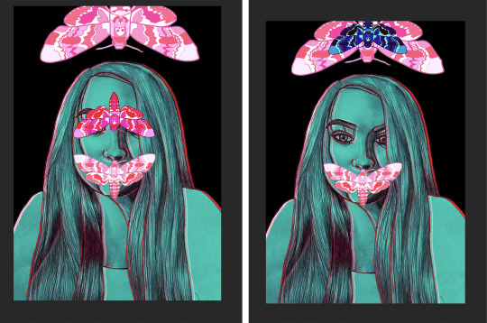
For a while I wasn’t sure how to add anything else but after playing around with positioning and size, I found that enlarging a duplicate of the blue moth and rotating it to face upwards looked really good placed at the bottom. However I didn't want to cover up half of the drawing so used ‘colour dodge’ to blend it in, removing a lot of the illustration but just enough that it’s still clear. I also lowered the opacity of the larger pink moth, because it looked too prominent and heavy at the top in comparison with the rest of design.
Finalising this piece was done by incorporating the same dirt texture, rotating it to a diagonal as I had already used all of the sides.
0 notes
Text
Hello every One, and welcome to the Fabulous Free Lance Friday Edition of the Good News Journal where I wield My S-Word (Sean’s Word) fearlessly. Thank King You for joining Me, I have an unusual and interesting Edition for You today. I Will be tall King about some of the Ways I Mind My Father’s House, both with respect to the Kingdom God Gave Me and the Land where I am tending My temporary Keep.
I had two new thirty day challenges set out for My Self this month; one was an hour a day dedicated to Art, the other was fifteen minutes a day dedicated to learning Latin. My Latin challenge lasted only a day, My Mind was just not into it (though I was rather impressed with how much I remembered, so I am inspired to pick it up again soon). My Art challenge has been successful, though I Give My Self a lot of leeway because painting is something I really need to be inspired to do. I am also more inclined to paint when I have empty canvas for new character portraits (por-traits, for traits) waiting in the wings. With the whole covid thing it hasn’t been easy to get new canvas, I’m pretty fussy about what I Wish for when it comes to Art work. So I allowed for anything Creative to be considered My hour of Art, which might even include gardening because that really is something of an Art, too.
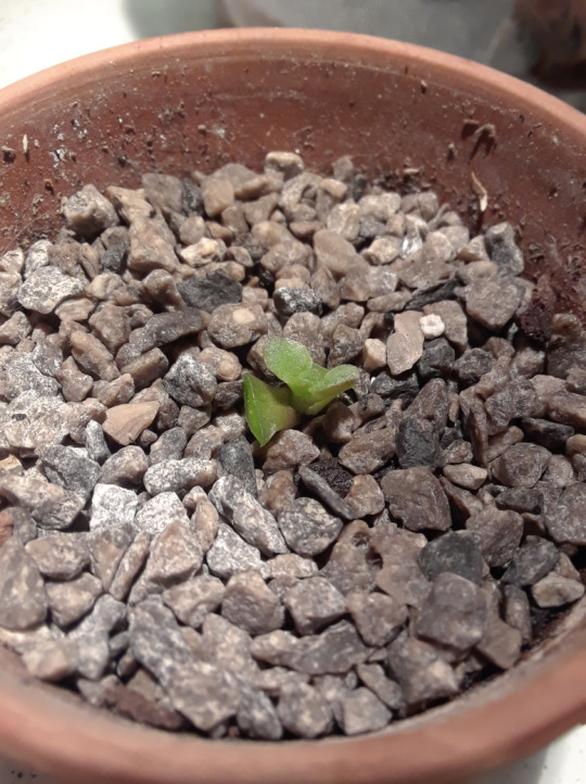
I got some baking done, I’ve been war King on colouring (painting with watercolour) a picture for My niece and hope to get three done to send out before the end of the month. I had no Idea I would enjoy something as simple as colouring so much but I really do and I have a beautiful set of watercolour felt markers with paint brush-like tips, so it was Good to find something useful and Creative to do with them. I’ve also spent some time organizing any plants the squirrels haven’t destroyed and always have some new seedlings sprouting somewhere. I mentioned that gardening is something of an Art, too, and although I am very much an amateur with respect to growing a fruit and vegetable garden (because I’ve never really had a garden before), I have something of a Magical Gift for growing plants indoors. This is one of the reasons I’m not going to let the squirrels discourage Me too much this year. I Will come up with a solution for next season and Will just grow My plants in containers this year and bring them indoors when it gets too cold (as it’s getting late to be starting things now).
Crassula Ovata, also commonly known as ‘Jade’ plant here in Canada, is also considered the ‘Lucky’ plant, money plant, or money tree. I find that interesting because there are no coincidences in My Universe and a pair of leaves I cut from a jade plant at My last address was the first plant to be placed in soil in My new apartment. It did nothing for roughly three months and ‘Magically’ Showed its first Sign of new Life on My name day, June 5th.
She is now ready to stand on her own.
I have been trying to come up with a name for her, and I have decided it Will be Lady Luck. Removing the two starting leaves Will encourage the new growth and they Will form a ‘scab’ and dry up where they were cut and eventually fall off, Creating an entirely new plant. The leaves that were cut Will not go to waste, either. I’m Creating a Special propagator for them.

The knife isn’t ideal, little big for what I need but it has a tapered tip which actually works pretty well and it is certainly sharp enough. It should be sharp enough that it doesn’t crush the leaf at all. The paper is just to keep earth from falling through the slits in the side of the container which Will allow water to drain very well. Then I fill the container with organic potting soil.
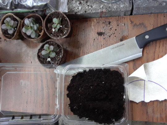
Then I pack the soil down very firmly before adding any moisture.
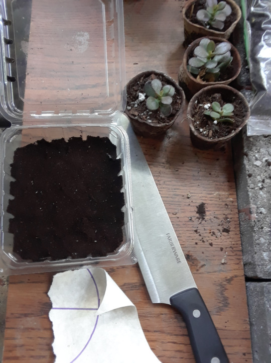
Now surgery begins.
You can see that I am cutting near the bottom and removing all leaves except the top two or four (depending on size). Removing the excess leaves makes for a longer stem so it Will be easy to stand in the soil. As soon as the stem is surrounded by earth, it Will automatically begin producing roots. The plants get re-potted.
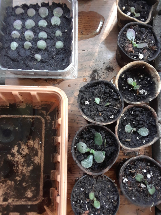
Now, I’ve done all of this before and this is what works for Me, I don’t think I’ve ever killed a jade plant, they are the easiest to propagate like this. Propagating leaves can be a little trickier, sometimes they just do nothing, shrivel up and dry out. But any pair of leaves with just a hint of stem has always taken root, Lady Luck is an example that took three months of patience. If they are not dying, they are growing roots. I always water generously as soon as I do this, most People would say not to because they are succulents. In fact, it is recommended to leave them (leaves and stem sections cut) out on a dry windowsill for a couple of days. The cut scabs over and eventually roots Will sprout from the stem or end of the leaf, it survives by conserving the water in the leaf itself and using sunlight to grow new roots looking for soil and moisture. I water the soil generously but make sure it is well drained and well ventilated, then I let it dry out completely for at least a full day, maybe two, then repeat. Usually, new growth Will appear within a week if done during the growing season (now). I guarantee every one of the eight potted plants Will survive, not sure how the leaves Will work out but I am cautiously optimistic. Watering generously after transplanting allows the soil to set. One of the most important things for the leaves Will be not to disturb them, so future watering Will be done with a spray bottle from above until the surrounding soil is generously moistened.
Alright, now for some health news. One of My other activities I’ve incorporated into My daily routine is war King out. I do push ups one day, chin ups the next, then repeat. I mentioned I require a special diet because of My high metabolism and this is no exaggeration. I require a high amount of fat in My diet to lubricate joints or heavy muscle load is difficult. Sometimes I can be prone to tendinitis and other similar injuries. Unlike most People, I believe My body Will evolve and adapt and it has (for Me) proven to be True with tendinitis related to My shoulders. I also believe I have a high pain tolerance (although it is Truly impossible for Me to know because I don’t know what other People feel) and Will work through pain. I believe in the ‘no pain, no gain’ theory and Trust that My body can feel the difference between ‘Good’ pain and bad pain.
Yesterday, just before doing My first set of chins, I hang and allow My muscles and joints to fully stretch out to ensure I am achieving a full range of motion. War King out actually improves flexibility, contrary to what many People think providing proper technique is used including a full range of motion. Sometimes joints ‘crack’ and ‘pop’ as they are stretching out, this is not entirely uncommon, especially on the first rep or warm up. My joints did feel as though they were creaking a bit as I allowed them to fully stretch out but there was no pain. But as I began to pull up for My first repetition, My right elbow joint felt stiff like there was a tendon or something in the Way of the motion I was trying accomplish. Then there was a sound like knuckles cracking and I felt a wonderful release of all the tension; whatever was ‘in the Way’ felt like it broke, but it didn’t hurt and I was able to complete My set almost effortlessly.
However, a few hours after My workout, I was sitting resting My forearms on My lap, cradling My elbows with My Hands and My right elbow felt like it had started a workout routine of its own!

Yeah… No pain though. It sounds like bursitis, except without the pain and without red, burning skin.
Olecranon bursitis is a condition in which swelling and inflammation occur in a small fluid-filled sac (the bursa) at the tip of the elbow. The bursa forms a soft cover over the elbow tip and allows the skin to glide smoothly when one bends and extends the elbow. – Wikipedia
But “allows the skin to glide smoothly when one bends and extends the elbow”. I could actually feel tension gathering as I was stretching out, before I began to pull up, as if pressure from further down My tendons was collecting near the tip at My elbow. When I started to pull up, it felt like that same tension was still there and blocking the tendon. It literally felt like something was removed when it cracked and I was able to pull up almost effortlessly, no pain at all.
I Will Keep You posted on this if it turns out I’m wrong, I’m not Giving medical advice here, just sharing My own personal philosophies. I don’t doubt it’s bursitis, but I’m not sure it’s really a bad thing. I had cartilage in My chest crack when I was young, too once the weights got serious, it was just My body’s Way of adapting to the heavier load. I don’t believe this is any different. I think I may be reaching close to a lifetime record of chins per workout (36).
I figured this was worth mentioning because it’s one example of Me not going to a doctor. The Idea did not even cross My Mind as a serious consideration. Now, if it continues to grow, change colour, start causing Me serious discomfort, I may reconsider but for now, I just consider it real time evolution; My body adapting to the new physical demands I am may King it do.
Told You this one would be different. Hope You are all well, more news on Magical Spells coming Saturday.
Love and Blessings!!!
Volume CXVII: The Fabulous Free Lance Friday Edition; Minding My Father’s House Hello every One, and welcome to the Fabulous Free Lance Friday Edition of the Good News Journal where I wield My S-Word (Sean's Word) fearlessly.
0 notes
Photo
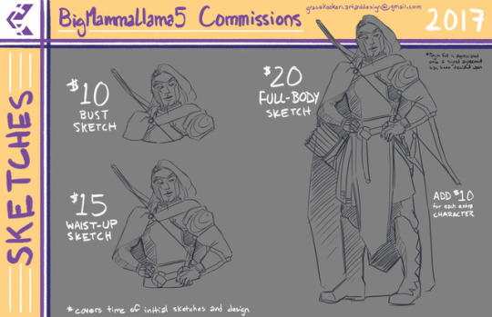
Commission Information and Contact:
So I’m taking the plunge and will be offering 3-5 commission slots periodically-see below for details! I will create new posts as slots open up, so look for those to avoid confusion!
Please keep in mind all prices include time, initial beginning sketches, design, and any other skills required to complete the art.
Contact me at [email protected] for inquiries!
Sketches
Bust is $10
Waist-Up is $15
Full Body is $20 with each additional character $10. You may add up to three extra characters for a total of four.
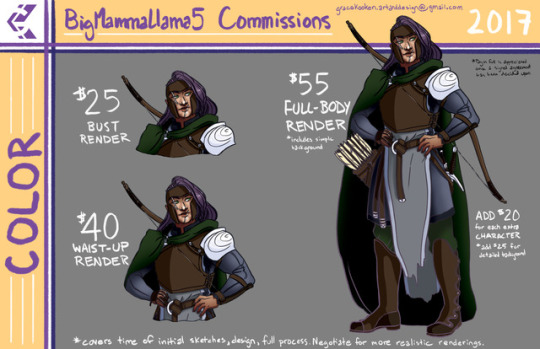
Color Renderings
Bust is $25
Waist-Up is $40
Full body is $55. You may add up to 3 more characters but the price for each is an additional $20. A simple color background is included in the base price but if you wish to have a detailed background/setting please include an additional $25.
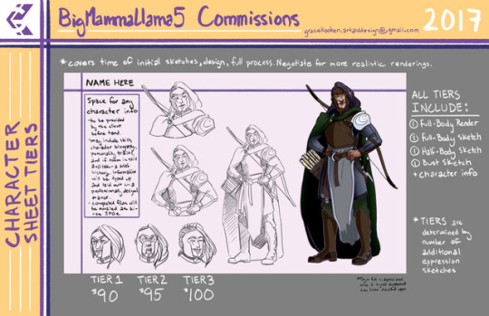
Character Sheet Tiers
There are three Tiers available for a Character sheet, with a price difference of $5. These are the most intensive commissions I’m willing to offer up front and will require a little extra time to complete!
Tier One: Includes special character information to be provided by the client. This information may cover the character’s skills, a brief biography, personality traits, alignment, and if room is available a brief history. Information will be laid out in type in a professionally designed manor. The character sheet also includes one bust sketch, one waist-up sketch, one full body sketch, and one full body color render. An additional expression sketch is also included. Price is $90
Tier Two: The above package with two additional expression sketches. Price is $95
Tier Three: The above package with three additional expression sketches. Price is $100
If there are other art requests you wish to have filled please get in touch and I will be willing to work out pricing. I cannot guarantee that I will take your business at that time, so I suggest waiting until I am taking commissions to pitch a project. If it is special order it is likely I will use my hourly rate ($40) so just keep that in mind!
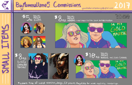
Small Items
Social Media Icons in square or circle shape, transparency optional. $5 ea
Social Media Banners, will be built to site specifications. $8 ea [if multiple banner sizes are required, an additional $2 per platform banner is requested]
Icon and Header Bundle, one of each, $10 per bundle
Dungeons and Dragons/Pathfinder Simple Color Character Portraits $8ea
Will Not Draw:
Based off of comfort level and skill level, I will not draw full Mech suits (exceptions may include prosthetics, equipment, and armor), fursonas/kin/anything related, adult content, content that contains harmful/abusive/racist/homophobic/transphobic/ableist/sexist ect imagery or themes, political themed requests, or content for the purpose of targeting groups that face discrimination. If you are unsure if your commission request falls into one of these categories, please make it known in the initial request and we can discuss it. I have the right to refuse your business if I feel the need to.
Payment
Payment is accepted through Paypal invoice or direct on Venmo. Price paid in full upon agreed specifications at the BEGINNING of the project is appreciated but if it is easier for the commissioner partial payment delivery is acceptable. Pricing is currently non-negotiable to account for time, skill set, skill level, and USA minimum wage. All payment is to be accepted as USD or be prepared to account for any monetary conversions between countries. I unfortunately can’t control that haha.
Artist’s Legal
Once payment is received and files are delivered they are now yours with the following stipulations:
it is for personal use ONLY
it must not be used for commercial purposes
it must not be sold for personal monetary gain
erasing or removing the artist’s signature will ensure the denial of further business and commissions
any other stipulations may be discussed with initial commission requests but are not required, except for the first four
File delivery
You will receive an email that holds one hi-res jpg for printing and one web-ready jpg if you choose to share on social media. If any other file type is wanted please specify at the beginning when we are discussing your commission! Exceptions of course may apply for the purposes of printing.
*If I deem a commission good enough, it is possible I may ask to include it in a small subset on my portfolio. You can tell me no, but regardless you will be asked first.
Thank you!
130 notes
·
View notes
Text
Character Art School: Complete Coloring and Painting Course
The Best Way to Learn to Color and Paint Professional Characters for Animation, Games, Comics, Manga and More.. Character Art School: Complete Coloring and Painting Course
What you’ll learn:
How to Paint Characters from Beginner to AdvancedHow to Color Characters using Multiple TechniquesHow to Color Comic Book CharactersHow to Color MangaHow to Color AnimeHow to Paint Digitally and Use that Theory with Traditional Tools
Requirements:
You should have a desire to color and paint characters wellYou should have a desire to reach a professional level of coloring and painting ability
Character Art School: Complete Coloring and Painting Course Description:
What is Character Art School: Complete Coloring and Painting? Character Art School is a 6 week learn-anywhere video course where you learn to become adept at coloring and painting professional characters. I’ve hand-crafted the Character Art School: Complete Coloring and Painting course to be the only course you need, to learn all the core fundamentals and advanced techniques to coloring and painting characters well. If you’re an absolute beginner or you’re already at an intermediate level, the course will advance your current ability to a professional level. The course is a comprehensive 5 module guided video course, where the only limit to your progression is your determination and engagement in the rewarding assignments. Whether you want to color and paint character concept art for films and games, illustrations, comics, manga, Disney style or other styles, this is the course you need to get you there. I’ll teach you to color and paint with confidence and without fear. I’ll teach you to color and paint well. You will know all the core theory, workflows and practical application for professional level Character Coloring and Painting. Finally, Learn Character Coloring and Painting Well Whether you’re a complete beginner, or intermediate at character coloring and painting, you’ll learn things you never knew you never knew. Seriously. Inspired by masters and built on the theory of giants, Character Drawing Academy is one of, if not the most comprehensive character coloring and painting course out there. I’m so convinced of this, I’ll give you a no-questions asked refund if you’re not satisfied. Clear, Easy to Understand Lessons Crystal clear in fact. Learning character coloring and painting effectively means having information presented in a logical and coherent way. The Character Coloring and Painting Course is modular by design, easy to grasp, and allows you to learn in a well paced, structured way. Engage in the course chronologically, then revise each module at your leisure. Grasp concepts faster than you ever have before – there’s no fluff here. You'll also find that Coloring and Painting is grounded in very solid and complete theory. Learn rapidly. Assignments that are Rewarding Bridging the gap between theory and practice, each module’s assignments have been designed to both reinforce theory, and feel rewarding. I’ve taken the core of Color and Light theory, and purpose built each assignment to help you rapidly progress, and you’ll see the difference in your own work almost immediately. Art is about doing, so let’s get started. What's Your Style? Whether you want to learn to color and paint characters for games, comics, cartoons, manga, animation and more, this course has you covered. I'm not teaching you a 'method' or a 'way' to color and paint, I'm teaching you to be a fundamentally good character colorist and painter. Who this course is for: Anyone who wants to learn to color and paint characters well, in any style Individuals who love character art, from Video Game Art, to Animation, Comics, Manga and more
Who is the target audience?
Anyone who wants to learn to color and paint characters well, in any styleIndividuals who love character art, from Video Game Art, to Animation, Comics, Manga and more
Course content of Character Art School: Complete Coloring and Painting Course:
Total Lecture:85
Introduction
Coloring and Painting Tools
Join the Community
Light, Color and the Eye
The Scale of Light
Perception of Forms
Planes
Light and Reflection
The Form Lighting Principal
Understanding Color
Color Shifting
Color Schemes
Dynamic Lighting
Atmospheric Perspective
Edge Differentiation
Observation
Module 1 Assignments
Module 1 Resources
Introduction
General Tools Overview
Canvas Size and Resolution Guide
Installing Brushes
Keyboard Shortcuts Guide
Brush Flow and Opacity
Blending and Color Picking
Digital Color Picker
Layers and Layer Modes
Understanding Selections
Understanding Adjustments
User Interface Layouts
Software Adaptation
Module 2 Resources
Workflow Overview
Digital Canvas Pre-production
Illustration Preparation
Stage 1: Local Color
Stage 2: Variations
Stage 3: Forms
Stage 4: Light 1
Stage 5: Light 2
Stage 6: Highlights 1
Stage 7: Highlights 2
Stage 8: Highlights 3
Stage 9: Dynamic Lighting
Stage 10: Contrast
Stage 11: Cast
Post-Production Adjustments
Skin Enhancement
The Secret Hair Painting Technique
Adjusting Line Color
Over-Painting
Post Production Effects 1
Post Production Effects 2
Full Workflow Time-lapse Overview
Conclusion
Module 3 Assignments
Module 3 Resources
Introduction to Character Coloring and Painting Styles
Achieving Flat Coloring and Gradient Style Coloring
Achieving Animation and Anime Cell-Shaded Style Coloring
Achieving Digital Water-Color and Rough Style Coloring
Achieving Chunky, brush-stroked Style Painting
Achieving Smooth Painterly Style Painting
Achieving Comic Book Style Colouring
Module 4 Assignments
Intro to Full Demos
DEMO 1: Carmi Timelapse with Commentary
DEMO 1: Carmi Full Painting Demo
DEMO 2: ChronoViper Timelapse with Commentary
DEMO 2: ChronoViper Full Coloring Demo
DEMO 3: Hiding Something Timelapse with Commentary
DEMO 3: Hiding Something Full Painting Demo
DEMO 4: Your Call Timelapse with Commentary
DEMO 4: Your Call Full Painting Demo
Conclusion to the Course
DEMO: Beach Girl Full Painting Demo
DEMO: Asuka Full Painting Demo
DEMO: Emerald Portrait Painting Demo
Photoshop Keyboard Shortcut Guide
Paint Tool Sai Brush Settings
Clip Studio Paint Brushpack Download
Krita Brushpack Download
Your Call High Resolution File
None
Character Art School: Complete Coloring and Painting Course course
Read the full article
0 notes
Text
How surrealism affected modern artists?
Surrealism is truth beyond realism. A form of art which was born as a response to the harshness of reality, to the horrors of the war and tragic events which marked the early 1920s. What was specific about surrealism was the fact that like any unpreceded art movements, artists were making artworks under hypnosis & automatic writing, conscious put together with unconscious as they believed that surrealism is the symbolic language to the subconscious. The Surrealism movement extended in each cultural movement, including politics. Artists, like René Magritte and André Masson were determined and believed in the cause and concept of this movement. They believed that through this movement they can escape from the reality and creating a new one, changing the society, by giving them a subtle replacement. They taught the world to see the art not just visually and literally, but at a subconscious level using details of an inner reality.
In this personal study, I will aim towards finding a reasonable answer to how surrealism affected the contemporary art, more specifically the digital one and the reason why I made this choice is due to the fact that the surrealism gave to the world a completely different view on art using the science of the psychology. I will be looking at several artists’ works, especially Brooke Shaden, in order to find out how surrealism affected their style. I will cover their techniques and how their composition is meant to represent a specific thing so that I can apply some of the concepts in my own work as my project is about surrealism too. I will explore the use of the modern technologies in order to create art and how artists express themselves. Therefore I will look at the work of artists such as Kyle Thompson and Joel Robisson and how surrealism is represented in their works and with what aim.
Brooke Shaden
Brooke Shaden is an American fine art photographer. She became the youngest artist in The Annenberg Space for Photography’s ‘’Digital Darkroom’’ exhibition at the age of 24. Her works ‘’The Re-imagining of Ophelia’’ (from 10 images) were exhibited at the JoAnne Artman Gallery and the first image was used as the cover art for an adult novel ‘’A Wounded Name’’.
‘’My photographs are meant to be read and analyzed. (…) I explore death and surrealism through my photography in order to show that reality has intricate ties with fantasy.’’
I chose to look at her works because she represents the unusual and she makes sure that symbolism is present in her works as I want to create in my narrative project a little world of an adventurous girl going through different obstacles as often I imagine scenarios how people struggle with little things in their life, she places herself in different worlds where she would rather be in as the impossible things become achievable in those worlds. She is questioning the definition of life and what it actually means to be alive, which is significant for me learning more about surrealism because it pulls the viewer out of the common world by placing them in a space which feels more alive.
Limitless
In this image there is a young girl falling in an abyss. The setting of the image seems to be in the nature at a certain height, because of the background which is blue and gives us the feeling of a place which is situated high. I would describe this image as breath-taking, particularly because of the obliquely girls position and her toes being exactly at the edge of the cliff which keeps the viewer in suspense.
The artwork is made through photo-manipulation. It suggests us that is made from several different photos which are placed together in Photoshop after which they’ve been blended to create a realistic effect. The artwork is quite realistic and it represents something possible, however there are details that prove that the image is not real because of the dream like setting. The action that takes place in this image is very real to the viewer, however due to the angle of the girl’s body position we can clearly tell that physically it could never happen in such a colloquial way.
The presence of the surrealism in this image is really strong because of the setting, composition and the concept behind it. Through this artwork Shaden is trying to illustrate a limitless world where everything is achievable, but not with the lack of really hard work. She is illustrating the risks that threaten us, as human beings, in order to achieve our full potential which become our limits that hold us back. This image is showing us that limits disappear once we stop believing in them because they are a construct of our insecurities and once we jump out we create new boundaries that we previously thought they were impossible.
‘’To stop putting limits on ourselves, the people around us, and even as far as the things we see everyday? When we finally take that pressure off of ourselves to fit the definition of who we are we become free to be the person we could be.’’
This image sends to the viewer a powerful message, because there are so many ways to represent how people feel restricted due to their insecurities and Shaden chose to represent how a person has no boundaries when it comes to self-imposed restrictions and this is the main purpose of surrealism, to spread a message to the society and to help them fight with problems which come from the inside, from the unconscious.
This is another artwork of Shaden’s where surrealism is vastly used. The image shows us a person and its easy to deduct that it is a woman, even though almost half of the upper-body and the image is covered with numerous keys. The setting is a dark, mysterious room because of the patches present on the walls and the floor. Everything in this image is possible, but the concept behind this artwork is much deeper than just someone surrounded/trapped by big sized keys. Shaden covered only the upper part of the image with keys for a reason, because in this way she covers the head of the woman (of herself in this case) to show how one is creating thoughts to trap themselves. Also, she chose the setting to be in a room because the room represents one’s restriction/thought from which he doesn’t have a key to escape and when searching for one there are endless keys to open the door and we are still in the cell we trapped ourselves in.
Both images were created recently, a couple of months ago and are part of a project called ‘’31 Days of Self-Portrait’’. Shaden is well known for her signature style of pieces like the one used in these images because a lot of her work is similar due to her particular way of adjusting the colours in order to blend the images. She explores the concept of dreams and reality, which is what surrealism is about. Overall Shaden is an artist that uses Photoshop in order to bring her work to life. She edits carefully the images so that her work is surreal and challenge the idea of the reality. Her works tell a story, whether they are personal or what she notices in the society. She has a great level of narrative withing her images which is due to several thingss, especially to the motion that her work features.
By looking at her works, I gained a much better understanding as the message that she is sending through every single image is so strong and meaningful that it actually gets to the viewer. Seeing how surrealism is used in the digital era is really powerful because by itself ever since surrealism began it became such an influential and impressive movement that when modern artists use it in their own works, the impact keeps being as strong, taking in consideration the problems that nowadays society has to deal it. This is why, analysing the way surrealism influenced Shaden’s works was really useful for my own narrative project, because I want my works to have a concept behind the whole composition and setting, so that I create a little world where the actions that take place happen just in our imagination.
Kyle Thompson
Kyle Thompson is the next artist I will be looking at. He is a graphic designer from Chicago, Illnois. He describes himself as a ‘’surreal conceptual photographer’’. The location of his photographs are interesting which adds to the effect of the artwork and to the realism of the image, although the actions and the settings are impossible. When looking at Kyle Thompson’s artworks, it is easy to tell that the situations are very surreal because the subjects are doing unreal things and what is specific for Thompson’s works is a dream like effect. In some of the photographs he might be flying or being located in unusual places. Despite all of these, his work has a realistic touch to them which makes the viewer question even more his actions which intrigues the viewer. His works are a good example of how modern technology merged with surrealism to change the way a story is told in a piece of art.
‘’There’s definitely an inherent beauty in emptiness, and a curiosity in seeing how other people lived. Abandoned houses create this fragmented portrait of the people who used to live in them through whatever they left behind.’’
And by doing so, he transports the viewer in his personal moments that exist only for a very short period of time. When capturing these mysterious and beautiful, quite surreal moments, Thompson produces images that live on in a never ending loop, making it even more personal, because art is personal, this is why he is doing auto-portraits.
Most commonly, Thompson uses modern techniques as digital photography and digital editing with software and he still manages to give it a feeling of old and vintage, effect that he obtains by desaturating and adding a grainy feel to the photographs.
This image is a self-portrait taken in a forest and what is unusual about it is the presence of the sheets at the back of the character. They represent the wings of a person and it keeps him off the ground. The accuracy of this photograph has a great impact because the composition is kept really neat and simple, the only edits being made in the adjustment of the colours so that when the different photographs of the sheets and the person are placed together it looks realistic, however we still can tell that this can’t happen in real life. With this artwork, the viewer is questioning why is this person floating and what it might represent which is an important aspect within a narrative piece. The use of a landscape as his setting gives the illusion of him being lost within the place.
His works are another great example to show the impact surrealism has on contemporary artists who use modern technologies to express themselves in unimaginable ways, whether if it is by finding the right setting or using certain objects with a different purpose than initially intended.
Kyle Thompson is an artist whose works are really valuable because they make the viewer question certain things ad very few artists manage to achieve this. Without any doubts, the presence of surrealism in his works is strongly present and it is there to catch the attention and to create controversy in one’s mind and this is achieved with the use of modern techniques, although the way this movement is present in his works is different than in Shaden’s works, as with Thompson is more about the setting and the location, rather than merging multiple objects and people on an image. Comparing with Thompson’s style, Shaden’s has a more powerful influence because they are more obscure and the setting is much more mysterious which fascinates more, but by looking at Thompson’s works I learnt how to create a concept within an artwork by keeping it simpler and observed a different adjustment of colours, keeping the design cleaner.
Joel Robisson
The final artist I chose to look at is Joel Robison. Joel Robison is a conceptual portrait photographer living in Cranbrook, British Columbia Canada. He creates playful worlds where the size, scale, movement and the function don’t play the usual rules, therefore he creates different mediums. Mediums that illustrate our feelings and emotions like depression, anxiety and mental illness that are difficult to describe into words. His conceptual photographer is an attempt to cope with anxiety and to better understand himself. His works are for a larger audience as he is followed by millions on social media. The main characteristic in his works is how he is playing with objects and sizes to create a world that only exists in one’s mind and that affects an individual. This is the way he approaches surrealism in his works, by creating a playful, imaginary world. A world which is beautiful and innocent where one can easily find peace because of the subtlety one feels by looking at his works. His works have a strong link with narrative because of the presence of surrealism he has a story to tell behind the artworks he is creating and usually these stories have a well thought concept which is due to the fact that he gives a different function to certain objects, other than the usual one, which we normally would expect, in real life.
This image has been created recently, in March, and is part of a recently started project called ‘’Open the Door to Change’’ which is about embracing the unknown and people challenging themselves. Doorways will be the main element in this project because they symbolise a step. In the image above we see a man stepping towards an opened door that has clouds on the other side and butterflies coming out which symbolise change and growth. The scenario takes place in a dark place, like a forest, next to a river, the main focus being on the man and the door, due to the fact that there is like a ray of light pouring out from the door’s direction on the man. Even if mainly the setting is dark, it still gives the viewer a nice feeling and that is due to the fact that the photograph is adjusted with warm colours which sends feelings of sympathy. This new project that Robison is currently working on certainly demonstrates the use of surrealism because there are things that happen in the photographs which can’t happen in real life.
Comparing with the other two artists, Robison’s works is not as dark as their ones and this is deducted from the colour tones he is using which are warm and pleasant. Also, the way he is creating a new world is very ingenous and with finesse because most of the time his artworks have a touch of innocence and dreams that we as children used to have which makes him stand out. He definetely knows how surrealism works and he uses this movement for a good cause, for people with mental illnesses, because Robison, himself, suffers from anxiety which is his main inspiration for his works. He illustrates a world which happens in his mind and comes from the unconscious where the dreams are formed and this is what surrealism is about, to have an impact on others using imaginary worlds which are still based on
Sometimes we need to challenge ourselves to face those things that scare us, so that we can prove that we're strong enough to overcome them.
Conclusion:
Throughout this personal study I have shown how surrealism affected several contemporary artists and how their work is based on a strong concept which is mostly linked to one’s psychology, whether it is self-imposed restrictions or mental illnesses. It is clear that with the use of technology artists approach surrealism in a different ways nowadays as their works look more credible and real to the viewer, even though we realise that things like that can not happen in real life. The three artists use photo-manipulation in their artwork and thrill the viewer, however the style of their images are very different, we can see a slight similarity between Shaden and Thompson’s works. To Shaden’s work there is a vintage style. Her outcomes involve the use of models and self-portraits. The settings that we see in her works are most of the times daily, simple objects which are transformed in something more mysterious and with a different function; she achieves doing that by editing them in photoshop and this is where the impact of surrealism on the contemporary artists is easy to notice, because Shaden, being a contemporary artist, uses the same concepts that surrealism movement is about and merges them with the use of technology to create a powerful outcome and another world which doubts the meaning of being alive. Her works are very often doubting our reality and what it actually means. Thompson’s works however are not as complicated as Shaden’s ones and might not be as conceptual, but he still illustrates action which can not take place in real life. Robison’s style is the one that differentiates the most because of the innocence which is present in all his artworks.
From the view of a graphic design student, I would say that the combination between surrealism and modern technology is very meaningful, because it intrigues the viewer and makes him question the artwork. Surrealism is about exploring the unconscious mind and putting it out there, so that it makes a change in society. After looking at Shaden’s work it affected the way I approached surrealism in my narrative project. I created a deeper concept behind my works and therefore this made me change the design of my final outcome. It taught me that whatever I design has an impact on the viewer, even if it is a slight one. With Robison’s work I got this touch of innocence from his works because he creates beautiful worlds that approaches modern society’s problems, which not a lot of artists can do. His works are calming and it is easy to tell what his concept is about because he makes it easy for the viewer. Researching in his works helped me explore a different approach to the surrealism s his one is not as rough as other artists’. In addition, the way each of the artists uses surrealism in their works is unique and different, making a different impact on the individual. They give us a slight replacement of the reality and teach us to look at art at a subconscious level by using the details of an inner reality, which happens in real life and this is how surrealism inspired the artists to create another reality.
1 note
·
View note
Text
Title Luminous Avenger iX Developer Inti Creates Publisher Inti Creates Release Date September 26th, 2019 Genre Action platformer Platform PC, Nintendo Switch, PS4, Xbox One Age Rating T for Teen – Blood, Fantasy Violence, Language, Suggestive Themes, Use of Tobacco Official Website
I’ve been a fanboy on the Gunvolt bandwagon long before Gunvolt Chronicles: Luminous Avenger iX. Not only did I play the first two games, but I also reviewed them both on the site. So in case there was any concern about my credibility talking about the series, let’s put that to rest. The initial question I had when I heard about Luminous Avenger iX was how far after the second game it took place. As I played, other significant questions came up, though there’s not much I can discuss for fear of spoilers. That said, I will do my best to touch upon those issues for other fans, as well as tackling the gameplay itself. While I’m still a fan of the Gunvolt series after Luminous Avenger iX, there’s also a few bumps in the road I need to address.
This slideshow requires JavaScript.
As I stated above, it’s unclear how long after Gunvolt 2’s events that Luminous Avenger iX takes place, but things have definitely taken on new urgency. Now, Adepts are completely in power, and go so far as to hunt down and execute un-powered humans, referred to as Minos. Whereas I used to think of the Azure Striker Gunvolt series as a nod to Mega Man, now I can’t help but notice the similarity to the X-Men. In a way it’s a reverse of that comic series, a world where the super powered rule over the weak with cruelty. At the head of this dynamic is the Sumeragi Institute for the Promotion of Human Evolution, which is a group that should sound familiar to fans of the games. It’s not clear how this came to be, nor where Gunvolt himself is, but Copen’s not about to sit back and watch this atrocity continue. While his primary goal is to find the source of something called the Butterfly Effect, he also elects to protect a group of young street urchin Minos. Despite his often caustic and emotionless exterior, I found this was consistent with his personality. After all, he himself is technically a Mino, and his hatred has always been against Adepts. The key difference between him and your average Mino is his technical genius, which let him build Lola to copy and utilize Septima powers through mechanical means.
This slideshow requires JavaScript.
Much like Inti did with previous series such as Mega Man Zero, each installment of the Gunvolt games has become slightly less hardcore and more welcoming to players of various experience levels. That is true in Luminous Avenger iX. An example of this is that the game has gotten rid of individual achievements. You still get graded after each level, so worry not if you’re a hardcore completionist. It’s just now you don’t have to worry about satisfying other arbitrary requests. Much like the last game, I found it somewhat easier to get a good score than in the original Gunvolt game, but not so easy I ever felt I wasn’t working for it. I got plenty of B’s, a few A’s and even one shining S+. The reason it’s still a challenge is that the gameplay is pretty similar to the most recent game, meaning that the bosses are still quite challenging.
This slideshow requires JavaScript.
In case you need a refresher course, the game keeps the trend of tagging and then blasting foes. For Copen, you tag foes by literally dashing into them. You have a small window of invincibility when you connect, so you’re encouraged to be aggressive, but don’t be so aggressive you accidentally wander into enemy fire. When you tag a foe, it uses up a Bullit, of which you have 3. Once you’re out of Bullits, your Prevasion turns off, meaning you can take damage again. So combat is a tight balance of dashing into foes, hitting them with homing rounds, avoiding getting hit and rinsing and repeating. One nice new change is if you reload your Bullits in mid-air, you’ll charge down to the ground with a crash capable of breaking objects. Though you’ll have to be careful using it, since if you don’t land on solid ground, it’s game over.
This slideshow requires JavaScript.
I’ve said previously how much I enjoy playing as Copen, and that’s still true. He’s fast, furious and frankly brutal. Coupled with Lola’s Septima EX weapons, he’s a veritable Swiss Army Knife of mayhem. Even then, playing him requires great reflexes and better strategy, especially against the bosses. One thing that’s changed from previous games is Copen can’t use credits to buy new active combat abilities. There is a Customize screen, where you can buy things like additional Bullits. You can also buy passive modifiers, such as Regenerator, which restores Copen’s health when he uses his SP Skill, or OD Guard Up, which halves damage when in Overdrive mode. If I sound a bit uncertain about these, it’s cause I didn’t purchase any of them during my playthrough. I like playing a game in as pure a form as possible, and for me that meant learning to master Copen without any extra helping hand. That said, if you’re the sort that likes to tinker, there’s a multitude of options for you to try out. If you’re feeling brave, you can also try out Lola’s new Darkness Trigger, which puts her in berserk mode, attacking with random EX skills until her meter depletes.
This slideshow requires JavaScript.
While the combat is most definitely one of the biggest draws in Luminous Avenger iX, it would be meaningless without exhilarating boss fights. This game assuredly carries on that tradition, as it does the pattern of having 7 main Adept bosses you confront. While I normally don’t cover these in detail, I feel I should touch upon all seven Falcons real quick. First let’s talk about Rebellio. He’s on death row for crimes he committed, and Sumeragi decides to offer him a deal – kill Copen and live. His Septima is Energy Wool, which lets him create crimson constructs out of thin air, such as mace balls, gatling guns and more. As for his appearance, he looks like nothing so much as a very angry Ram. Then there’s Crimm, a psychopath who loves explosions and considers himself an artist. His Detonation Septima lets him rain pure destruction wherever he desires, gesturing with crustacean limbs while protected by a circular shield. Then there’s Stella. She may look like a floozy and talk like a sailor, but she’s actually the president of an electronics manufacturer. Her Septima is Gravity, which not only gives her the power to alter your movement, but to also manifest dangerous buzzsaws and energy beams. Of all the Adepts in this game, her transformation is the most mechanical, making her look like a living blade.
More Falcons on Page 2 ->
This slideshow requires JavaScript.
If you think Stella’s a hard case, then you should see her android manservant, Dystnine. He’s the only robot capable of using Septima, other than Lola, and his is particularly strange. His transformation makes him look like a mix between a unicorn and a bullfighter, and his Vectored Cloth Septima allows for some very interesting tricks, such as blocking attacks and tangling you up. Beyond just being a skilled fighter, he’s also completely loyal to Stella, to almost a romantic degree. Or take one of my personal favorites, Isola, who is essentially an evil Idol. Think Hatsune Miku but pink and insane, and you’re on the right track. Her Septima is Companion, and while you might not think she’s that dangerous, you’d better watch out before Isola shatters you with bright pink lights and holograms. If you feel like a tough guy, you can try on Bakto for size. He’s essentially a Yakuza boss, and his Spiral Septima turns him into a fierce, blue lion man. Lastly, there’s Blade. Blade is incredibly powerful, and doubly so when outraged and in berserk mode. Unlike the other Falcons, Blade seems to not be entirely in control of their actions. But don’t let that lower your defenses, since you’ll need all your skills to beat this recurring boss character.
This slideshow requires JavaScript.
Frankly, I really enjoyed all the Falcons in the game, and felt they added a lot of personality and depth to the story. Especially since they reveal how diabolical Sumeragi has become. Most of the Falcons are only working for Sumeragi cause they’re forced to. Hell, Rebellio is on death row unless he can finish the job. Despite being in power, this shows how out of control and desperate they have become, a fact which becomes painfully apparent very late in the game. I can’t say why, but once you find out the truth behind the Butterfly Effect, you’ll hate Sumeragi with a burning passion. And by the very end of the game, you’ll question a good many things about the Gunvolt universe.
This slideshow requires JavaScript.
As much as I loved the Falcons, I’m not sure I can say the same for all the Minos. They’re all adorable, especially self proclaimed pixie leader, Kohaku, but they just don’t feel that relevant in the game. Sure, Kohaku and her history serves a purpose, but the rest of them kind of feel like kawaii Charles Dickens knockoffs. Maybe if they got a bit more development I wouldn’t feel that way, but frankly I feel this is a pattern in the Gunvolt series. We get introduced to a new band of side characters each time, and very few of them actually matter. Which is a shame, since there’s so much I otherwise enjoy about the games.
This slideshow requires JavaScript.
Visually, I can easily say Luminous Avenger iX is the most beautiful game in the series. Everything is bold, colorful and full of detail. Though I would never call the original 3DS graphics ugly, everything is so much better on Switch. Even the menus are attractive, and I really like the portrait art as well. As for the sound design, it’s also fantastic. The music is dynamic and draws you in, and the sound effects pop with personality. One of my favorite changes here is that now dialogue happens at set points in the level, and NEVER during combat. This is such a great improvement, and shows Inti Creates listens to fan feedback. It doesn’t hurt that all the voice actors in this game are tremendously talented. If we were grading this game just on the artistry, it would easily get a perfect score.
I know typos happen, but they still take me out of the experience…
Sadly, there are a few areas I feel Luminous Avenger iX falls short. Firstly, it really bothers me that I’m not sure if this game has different endings, as is tradition. While I can’t go into reasons why this bothers me, suffice it to say that some of the late game revelations really have me scratching my head. I would almost go so far as to suspect this game takes place in an alternate universe, it’s that big. But without knowing that for sure, it’s hard to ascertain how much I enjoyed the story at large. Another area that my lack of clarity irritated me was with the Bonus Medals. There’s 4 in each stage, and I’d love to tell you what they do, but I have no idea. While it’s true I did apparently unlock some Special Missions at some point in the game, I’m pretty sure that had nothing to do with the Medals. A more substantial gripe I have is with the translation. I usually don’t point out this sort of thing in the games I’m fond of, but it’s unavoidable here. Not only do some characters have very awkward grammatical flubs, there’s also some weird Westernization that occurs. I mentioned Bakto early, and how he’s essentially a Yakuza boss. I said “essentially” since in the game, he’s called a Mafia boss. Problem is, everything about him screams Yakuza, from his name to his demeanor. This wouldn’t bother me, except for the fact Inti Creates usually waves their Japan flag pretty high and proud. It just struck me as awkward to change that sort of thing, especially since fans of the series can tell what’s up. Lastly, a recurring issue I have is with the leveling system. It still feels too passive and unnecessary to me. It’d be one thing if leveling up did more than increase your base health, such as opening up modifiers you can equip or something. As it is, I just don’t feel that’s necessary at all for a game this fast paced and frenetic.
This slideshow requires JavaScript.
I did truly enjoy Luminous Avenger iX, but I can’t help but feel it wasn’t consistently awesome in every regard. The plot left more questions than it answered, and while the combat was definitely a lot of fun, I wanted more of it. Perhaps that’s because the last game had two protagonists instead of just one, but regardless there should have been something more to keep me playing. I managed to beat the entire game in a little over 3 hours, though I spent another 2 and change to try and find a secret ending. While I didn’t succeed in unlocking any new endings, there is still a bit of replay value. Those who like to tinker can unlock a lot of customization options, and truly hardcore fans can try and get an S+ for each stage. There’s also the aforementioned Special Missions, which are basically remixed forms of stages with harder boss fights. For $14.99, you still get an amazing game with Luminous Avenger iX. I just hope that the next adventure does more to explain the setting of this title, as well as to expand on the areas the series already excels.
This slideshow requires JavaScript.
[easyreview cat1title=”Overall” cat1detail=”” cat1rating=”4″]
Review Copy Provided by Publisher
REVIEW: Gunvolt Chronicles: Luminous Avenger iX Title Luminous Avenger iX
#Azure Strike Gunvolt#Gunvolt Chronicles#Inti Creates#Luminous Avenger iX#oprainfall#PC#PS4#Switch#Xbox One
0 notes
Text
Essay代写:Renaissance painting belief
下面为大家整理一篇优秀的essay代写范文- Renaissance painting belief,供大家参考学习,这篇论文讨论了文艺复兴时期的绘画信仰。人文主义思想贯穿了整个文艺复兴时期,并对这一时期的艺术风格带来了巨大影响,这一思想也构成了文艺复兴时期的绘画信仰。艺术家们通过自己的作品表达自己的观点,并向世人传达人文主义思想。
The original meaning of the word "Renaissance" is "the revival of art and literature under the influence of ancient norms". This concept, of course, does not refer only to literature and art, but also to the ideas of science, culture, economy and society as a whole as well as to human beings. The new fashion replaced the asceticism with the focus on the value of human beings and the enjoyment of the secular life of social life, and replaced the medieval ignorance with the development of science.
Painting during the Renaissance was an insurmountable peak in the history of human art. In such a splendid era, masters came out one after another, and many of their works were immortal. However, what makes the Renaissance paintings like "Mona Lisa" ? smile fascinated yinde countless people one hundred years? It's a belief in painting that gives the work its soul. A work with soul brings people not only visual enjoyment, but also the call of art, the shock of soul!
The original meaning of the word "Renaissance" is "the revival of art and literature under the influence of ancient norms". This concept is not only about literature and art, of course. This great change starts with the revival of classical literature and art, and then extends to the ideas of science, culture, economy and society as a whole as well as human beings. Moreover, it was a revolutionary storm of the emerging bourgeoisie in the field of ideology. Engels once spoke highly of the progressive role of "Renaissance" in history. He said: "this is the greatest, progressive change that has ever happened to mankind. It is an age that needs and produces giants. This is an age of giants in thinking ability, enthusiasm and character, in versatility and scholarship." In such a period of change, the feudal theocracy in Europe for nearly a thousand years began to collapse, the rational spirit began to recover, capitalism began to sprout, secular culture was affirmed, and classical culture was celebrated again. People gradually got rid of the enslavement of religious thoughts, and the productivity was greatly liberated. A new era completely different from the feudal middle ages came. The new fashion of The Times, marked by the attention to human own value and the secularization of social life, replaced the medieval ignorance with the development of science, and people began to explore the value of human slowly under the cover of religion. In the era when capitalism began to sprout and develop rapidly, the emerging class began to wake up. They began to realize that as a man, he wanted to pursue wealth, and he wanted to enjoy the pleasures of worldly life, rather than the old days when feudal and religious leaders were physically and spiritually dependent. The Renaissance movement is just such a liberation movement that fully affirms the value of human beings and attaches importance to human nature. This is the new spirit of The Times - humanism.
Humanism runs through the whole Renaissance period and exerts great influence on the art style of this period, which also constitutes the painting belief of the Renaissance. Every outstanding art master is not only an artistic giant but also a giant standing in front of the advanced ideas of The Times. They are sensitive to social life, full of the spirit of innovation, enterprise, adventure and winning. They are aware of human dignity, dare to face the active society, dare to depict people and things in life, making great changes in the content of art. Artists express their views through their works and convey humanistic thoughts to the world. The emergence of capitalism creates the economic foundation for it. Such economic foundation will inevitably affect the superstructure like art, and the superstructure will also react on the economic foundation.
When we look at some of the Renaissance masters, we find something in common. The "juniors" of the Renaissance are known as the giants of art in this era. Vinci's "Mona Lisa" ? is widely regarded as is better than all previous portrait of masterpieces in the world. Amounting to through careful observation and elaborate painting, depicts a real image of the ordinary Italian women. She has a beautiful face and vivid image, which seems to be the existence of real people. A calm and confident manner exudes an unpredictable and mysterious smile. The moment of this smile, sending out the most profound human light. In such an era, religious historical themes have lost their absolute dominance, and artists have begun to turn to singing and praising people as affirmation of real people. In other Vinci masterpiece handed down from ancient times - painting "the last supper," da finch use perspective drawing technique. In this work, the head of Jesus and his disciples were no holy light, amounting to that they are ordinary people in real life; When Jesus took his seat and said, "one of you has betrayed me", the disciples began to stir up. Everyone's psychology was vividly demonstrated through facial expressions and actions, which shaped the characters of personality, and the works reflected the theme of human and human nature.
Michelangelo, one of the three masters of sculpture, showed his outstanding creative talent in his paintings. Each of the biblical figures depicted in the Sistine chapel zenith is a beautifully muscular, beautifully attired human body. It is impossible to draw such a figure without the knowledge of scientific anatomy, so we can imagine what kind of scientific attitude Michelangelo used to complete the arduous and huge mural works. Although these paintings are still based on religious stories, they show scenes of ordinary people, pulling gods to the ground and fully praising the beauty of the human body. People from extricates from the darkness of the shackles of the middle ages, fully realize the person is in a tremendous strength in remolding the world, praise the beauty of human body, is a kind of ancient Greek art "Renaissance", in fact, he's more profound significance is against religious hypocrisy, attaches great importance to the people and its real strength, this is a reflection of the ideological liberation movement in art.
Raphael's art works are elegant, harmonious, beautiful and attractive, which are in the pursuit of a kind of human heart integration of truth, kindness and beauty. He painted various beautiful images of the virgin Mary, with maternal warmth and youthful fitness and reflecting humanism. Raphael was once asked where he found such an attractive female figure. Raphael's answer was found in his mind, created by focusing on the virtues of hundreds of beautiful women. Large oil paintings drawn by 1512-1513 "the Sistine Madonna" is one of the most outstanding works, characters and life-size, triangular composition composed of Notre Dame, saints, solemn equilibrium, the virgin and body fitness and strength, in the image of the virgin of Christianity, simple, natural, pure beauty, warm like the girl next door, without the feeling of the religious mystery and splendor in the picture and the awe of out of reach. This also fully embodies the humanistic spirit of Raphael.
Venus, known in ancient Greek mythology as Aphrodite, is the goddess of love and beauty. In the middle ages of Europe, the church promoted asceticism and strictly controlled people's thoughts, and the priests imposed the "evil water", "witch" and other notoriety on Venus. However, in the dawn of the European Renaissance, we see the birth of Venus by botticelli, a famous painter in Florence. On the blue Aegean sea, pearl-skinned Venus pavilion and jade stand on the shell rising slowly from the sea, charming nude surrounded by delicate rose flowers. It was a declaration of war against church asceticism, known as the epitome of the Renaissance spirit.
Some of the works created by the Renaissance masters were religious and secular. Do not these paintings of religious themes express thoughts that are contrary to their beliefs? Of course, there is no violation. During the Renaissance, the masters created many paintings on religious themes, but they injected humanism into their works. Lu xun once said, "what comes out of blood vessels, what comes out of pipes is water. New bottles can be filled with old wine, and old bottles can be filled with new wine." "The kiss of judas" was a well-known religious theme at that time. This painting was based on the bible: in order to get 30 silver COINS, judas, the disciple of Jesus, made an appointment with the officers and men to kiss who was Jesus. This painting is a representation of a led officers and men of judah to arrest Jesus, painter giotto borrow this theme, show the life of two parties, one party on behalf of justice and light, one party on behalf of the evil and dark, dressed in a golden cloak of judah embraced him and kissed, judah Jesus, calm down, two opposing faces, reveals the dark side of the ugly and hypocrisy. Thus praised the light and justice, and carried forward the spirit of humanism.
From the above works, we can summarize the common features of paintings in the Renaissance. Paying attention to realism, the unification of realistic expression technique and humanistic spirit content, turning the image into the eulogy of human body, and starting the direct description of daily life and real people. The science of anatomy and perspective is also integrated in art for the first time. People, rather than god, affirm the value of human beings. They praise the wisdom and strength of human beings, praise the perfection and nobility of human nature, advocate the development of human personality, demand secular happiness and human happiness, and advocate scientific and cultural knowledge. In these works, artists use their own hands to transmit a spirit to the world, these are actually humanistic thoughts. It exists in the works of the Renaissance masters. It conveys the thoughts and thoughts of the masters and reflects the spirit of The Times. Humanism was the dominant ideology during the Renaissance. It not only had a great influence on the politics, science, economy, philosophy and theological world view at that time, but also had a great influence on art. Therefore, the spirit of humanism became the painting belief in the Renaissance.
想要了解更多英国留学资讯或者需要英国代写,请关注51Due英国论文代写平台,51Due是一家专业的论文代写机构,专业辅导海外留学生的英文论文写作,主要业务有essay代写、paper代写、assignment代写。在这里,51Due致力于为留学生朋友提供高效优质的留学教育辅导服务,为广大留学生提升写作水平,帮助他们达成学业目标。如果您有essay代写需求,可以咨询我们的客服QQ:800020041。
51Due网站原创范文除特殊说明外一切图文著作权归51Due所有;未经51Due官方授权谢绝任何用途转载或刊发于媒体。如发生侵犯著作权现象,51Due保留一切法律追诉权。
0 notes
Text
Chania International Photo Festival
Chania International Photo festival has been created by Blank Wall Gallery. Its aim is to gather more than 300 photographers from around the world each year, turning the town of Chania into an international centre of artistic expression focusing on photography. At the same time, we aspire to make this festival the biggest photographic event, since so many international artists are exhibiting their work in Greece. The first step was made last year, when thousands o f people visited the festival.
In our effort the Municipality of Chania responded favorably as a co organizer for the second time, offering the venues for the festival to be held.
The festival will take place at the Center of the Mediterranean Architecture (CAM) in a building dating back from 1595, at the Old Harbor of Chania.
The building is known as the Grand Arsenali and was the biggest shipyard located in the Venetian port of Chania. During its lifetime it has hosted many Public Services of the Town of Chania. In 1997 started its renovation, which turned the building into one of the most important cultural centers in Crete. Some of the biggest events, which take place in Chania, are hosted in its premises.
It is easily accessible and visited by thousands of people daily.
Categories
Cityscape
It is the artistic representation of the physical aspect of urban and public places. The atmosphere and the scenes of everyday life are part of the cityscape photography. Everybody is on the run. The pace of life never slows down. There is a hectic rhythm full of noise and shouts. All these happening around tall, impressive buildings that are part of the city and its character. Photographs of such cities are welcome to take part in this category.
Monochrome
Monochrome photography has always been a beloved genre of photography. The existence of only one color functions as an incentive that unlocks feelings and leads viewers to new paths of realization.
Almost everything has been shot in Monochrome, presenting a different aspect of the same subject as Monochrome images are not direct renditions of their subjects, but are abstractions from reality. Black and white photography as well as sepia and brown hued images are welcome to be submitted.
Fine art
It stands in contrast to representational photography, which provides a visual account of specific subjects and events.
It is the way photographers see the world around them and communicate it to their viewers. It’s a totally personal way of expression, which helps all of us realize what happens in the mind of a photographer. It is our window to the artist’s world and that is why it is so fascinating.
Street Photography
Urban environment is the perfect set for Street Photography.
People moving around the city are the subjects of the photographers. Most of the photographs are candid and spontaneous. No one cares if the image is sharp or blurred, colored or black and white. Everything that matters is the atmosphere of the city and the depiction of everyday life.
Landscape
It is a genre many photographers like and are willing to travel all over the world just to depict places that are out of the ordinary.
Some of the most beautiful and impressive places on earth. There are breathtaking photographs taken by both amateur and professional photographers, of places totally untouched by the human hand and others where the human element exists in harmony with nature.
All kinds of landscapes are welcome to take part in the contest.
Travelling
Travel photography expresses the feelings someone experiences when travelling to a place. Feelings connected to the land, the time, the culture, the people and most importantly to first impressions.
Seeing a place for the first time can provoke a number of strong feelings. Photographers have the privilege to be able to depict these feelings through their photographs, giving a very interesting final result to the viewers.
Color
We see and think in color. Colors can be found everywhere. They play a dominant role in our lives and our psychology. They have the power to create moods, evoke emotions, make our days brighter or duller and show the world in a different way. They attract our attention and provoke our creativity. We always like photographs full of color, with the power to create strong feelings.
Portraits
People and their expressions have always been an interesting subject for photographers. It is really challenging to try to capture the emotions and the mood of a person in just one shot. It is also always interesting to see what the photographers see on the people they have photographed. This relationship is always interesting to be seen as it is developed through “Portraits”.
Wildlife
Wild animals’ photographs, taken in their natural habitat, in different areas of the planet, showing the beauty hidden in wildlife, is something we have totally forgotten in the western world.
What is dominant in these photos is the photographers’ love for what they are doing. This love and understanding of the animals is obvious in the way the animals are presented, in all their glory and beauty, leaving the viewer speechless. Such photographs are awlays welcome in this category.
Abstract
Abstract photography is a means of depicting an image that does not have an immeidiate association with the object world. It can isolate a fragment in order to create something unreal from a real object. It’s main purpose is to convey a feeling, a sensation or an impression. It draws away from natural appearances and recognizable subjects in the actual world.
Architecture
Architecture is a broad subject, encompassing everything from skyscrapers to shacks. Virtually everywhere we go we are surrounded by some sort of architecture on a daily basis. Because of this, it should come as no surprise that architecture is such a popular subject in photography. Photographing buildings and structures that are beautiful in the eyes of the photographer is very interesting Buildings have always been valued subjects as they represent the society and the culture of the time.
Conceptual
Conceptual photography is a type of photography that illustrates an idea. The ‘concept’ is both preconceived and, if successful, understandable in the completed image. Photographs might also be digitally manipulated to achieve the final effect desired by the photographer. Modern technology has enabled this type of photography to become more surreal, allowing the photographer to join together images or objects that would otherwise be impossible to juxtapose.
Documentary
It usually refers to a form of photography used to present events or environments significant and relevant to history as well as everyday life.
Photographs are meant to describe unknown, hidden, forbidden, or difficult-to-access places or circumstances. Documentary photography generally relates to long-term projects with a more complex story line.
Micro
By some definitions, a macro photograph refers to a finished photograph of a subject at greater than life size. Macro photography encourages the photographer to take a closer look. It enables the shooter to search harder for minute subject matter and to make the everyday objects appear extraordinary. Also it gives people the oportunity to discover new worlds, totaly unseen to the naked eye.
Nature
A wide range of photography, taken outdoors and devoted to displaying natural elements.
Nature photography tends to put a stronger emphasis on the aesthetic value of the photo than other photography genres. It depicts all branches of natural history and can be broken down into many sub genres, covering all the fields related to nature one can imagine; from air up to water.
Panoramic
Wide format photographs that present us with virtual tours of the shot subjects. That way much more that what eyes can see are included in a single photo. There is a wide perspective to the scene, and thus the effect of vastness is achieved. Panoramic photos manage to give a new perspective to the world around us and thus enchant the viewers.
0 notes
Text
Trick of Treat 10/31 [BUNDLE]
Publisher: Skirmisher Publishing
This special 99% off Halloween trick-or-treat bundle product contains 10 titles for just 31 cents! They include a Gold bestelling "Oddities" book, a just-released collection of spells, a Mythos horror scenario and its scary foreign-language translation, a complete horror fantasy novel, a set of mutant minis, a set of tokens and avatars, and more. It will be available for 24 hours only!
Der Leere Blick: Ein Skript für das Cthulhu Live Rollenspiel 3. Edition (Sight Unseen: A Script for Cthulhu Live 3rd Edition)
Regular price: $2.75
Bundle price: $0.04
Format: Watermarked PDF
Der Leere Blick is a German-language version of the Sight Unseen script for the Cthulhu Live 3rd Edition live-action role-playing game and designed for use with the rules for it. This script can also be easily adapted for use with other horror and Mythos-oriented games, such as Call of Cthulhu. It ideal for a LARP party with friends or as a convention event and offers hours of fun, intrigue, and horror. Can we trust our senses? How do we know that what we see is real? Are our eyes inherently deceptive and prone to misdirection? If so, then such flawed organs must be removed, for only in blindness can one perceive the truth: that all the world is horror. Der Leere Blick/Sight Unseen is an unnerving multi-media LARP experience like no ...
100 Oddities for a Wasteland
Regular price: $0.68
Bundle price: $0.01
Format: PDF
Welcome to 100 Oddities for a Wasteland, the sixth entry in the “Oddities” series of sourcebooks, each of which brings you 100 imaginative elements, curios, and details to add to your games, in whatever way you like. Previous volumes in this series — including 100 Oddities for a Creepy Old House, 100 Oddities for a Graveyard, 100 Oddities for a Thieves’ Guild, 100 Oddities for a Wizard’s Library, and 100 Oddities for a Wizard’s Tower — have tied in primarily with the fantasy and horror genres, and 100 Oddities for a Wasteland is the first to cross over into post-apocalyptic science fiction. It is thus ideal for adding a twist to encounters for Gamma World, Mutant Future, and many other modern, sci-fi, and post-apocalypt...
Creatures of the Wastelands: The Thrasher Gang
Regular price: $1.37
Bundle price: $0.01
Format: PDF
This set of 30mm downloadable miniatures has been designed to be suitable with any post-apocalyptic or science-fiction game in general and Skirmisher Publishing LLC's licensed Mutant Future supplements in particular. These include Creatures of the Wastelands, Creatures of the Wastelands: Random Encounters, Creatures of the Wastelands: Mutational Evolution, and Creatures of the Wastelands: Habitats. This set includes nine full-color miniatures that can be printed out either in color or black-and-white on cardstock and full instructions for assembling them. It is part of Skirmisher's Cardstock CharactersTM line of downloadable miniatures. "A had a few things going on it my head when I designed this mutant set," said artist William T. Thrasher. "The first is som...
Orc Raiders: Tokens & Avatars for Virtual Tabletops
Regular price: $1.99
Bundle price: $0.03
Format: ZIP File
This set of 20 full-color tokens and avatars/character portraits by fantasy artist Amanda Kahl contains two variations on five different figures, a Champion, Swordsman, Javelineer, Boar Rider, and War Boar. One variation has red accents and tribal markings on their shields, while the other has yellow accents and “Yellow Sign” shield devices, and these alternate versions can be used to easily reflect different factions, levels, and/or capabilities. These tokens and avatars are system-free and can be used for any sort of fantasy roleplaying games and in a wide variety of virtual tabletop programs, including the popular Roll20 interface. Avatars and man-sized tokens are 300 x 300 pixels and formatted to conform to 1-inch squares, while the size-large cavalry tokens are ...
Sight Unseen: A Script for Cthulhu Live 3rd Edition
Regular price: $3.45
Bundle price: $0.05
Format: PDF
Can we trust our senses? How do we know that what we see is real? Are our eyes inherently deceptive and prone to misdirection? If so, then such flawed organs must be removed, for only in blindness can one perceive the truth: that all the world is horror. Sight Unseen is a LARP experience like no other. When an assortment of Arkham citizens check into the local hospital for surgery, they find themselves blinded by a madman and forced to confront the unearthly terror he has unleashed upon the world. Sight Unseen is a game script for Cthulhu Live 3rd Edition and requires the Cthulhu Live 3rd Edition game rules. The text contains the game overview and timeline; detailed guidelines for simulating blindness in LARP, including safety precautions; prop, special effec...
Six Spells: Festivities
Regular price: $0.50
Bundle price: $0.01
Format: PDF
This title contains six spells related to festivities, celebrations, and holidays! They are formatted so as to be compatible with any games using the sorts of basic fantasy role-playing game rules developed starting in the 1970s. They can be used as-is with games like Goblinoid Games’ Labyrinth Lord and Mutant Future and can be easily modified and expanded for use with successor systems like OGL or other games altogether. ...
Smuggler's Tunnel
Regular price: $0.01
Bundle price: $0.01
Format: PDF
"Smuggler's Tunnel" is a rules-free description of a specific sort of place that might be found in many different sorts of communities and cultures. It is formatted like the more than 70 places found in Skirmisher Publishing's Platinum bestselling sourcebook City Builder: A Guide to Designing Communities and intended to stand by itself or serve as bonus content to that volume. Requested payment for this item is 1 cent! Both this title and City Builder overall are intended to be compatible with the needs of almost any ancient, Dark Ages, Middle Ages, Renaissance, fantasy, or other role-playing milieu. It was developed by Jim Clunie, Michael O. Varhola, and the Skirmisher Game Development Group. This comprehensive, fully-illustrated manual is specific...
Swords of Kos: Necropolis
Regular price: $4.99
Bundle price: $0.07
Format: PDF
“Paros could only venture a guess as to how many graves the forsaken burial ground in the little valley before him contained. North to south, it ran about a half mile and, from where he stood beside the wrought-iron fence that zigzagged along its eastern edge, it stretched about a quarter mile to the base of the hills that surrounded it. The rolling, broken ground of this unkempt area was heavily overgrown with grass, vines, copses of scrubby little oaks and brushy gray-green juniper, great clumps of flowers in every color, and probably every other sort of vegetation native to the island of Kos. Obelisks, statues of patron deities, and other stones marking the gravesites of families and individuals lay broken and tumbled amongst the rampant growth, and mausoleums of every size were ...
Thieves' Guilds, Brothels, & Other Underworld Places (City Builder Volume 11)
Regular price: $1.99
Bundle price: $0.03
Format: PDF
City Builder Volume 11: Underworld Places is the final volume in a series of 11 complementary books designed to help guide Game Masters create exciting and compelling urban areas and places within them for their campaigns. It is a universal game resource that is not specific to any particular system and is intended to be compatible with the needs of almost any ancient, Dark Ages, Middle Ages, Renaissance, or fantasy milieu. Its contents include: * An Introduction that describes the series and how to use the material in this volume; * Sections devoted to Brothels, Gambling Dens, Pit-Fighting Rings, and Thieves’, Assassins’, and Beggars’ Guilds; and, * Two or more Adventure Hooks tying in with each described sort of place. This download includes l...
Vintage Stock Art: Fantasy Volume 2
Regular price: $4.99
Bundle price: $0.05
Format: PDF
This book contains more than 20 vintage clipart images from a number of sources and which were originally or subsequently published between 1880 and 1921. All have been scanned at 600 dpi and are provided individually as grayscale JPEGs and, if appropriate, as color or black-and-white JPEGs or TIFFs as well. The purchaser of this collection is granted the non-exclusive rights to use these images in any commercial or personal projects they choose subject to the conditions of the included license. An eye toward variety has been taken in compiling this collection, and it contains an assortment of styles and themes, including five sets of complementary images that could be used in conjunction with each other. Several images suitable for use as full-page or cover illustrations have also been...
Total value: $22.72 Special bundle price: $0.31 Savings of: $22.41 (99%)
Price: $22.72
Trick of Treat 10/31 [BUNDLE] published first on https://supergalaxyrom.tumblr.com
0 notes
Text
Low Poly
Illustrator can be used to produce vector drawings and high quality images in a number of different styles. Vectors are equation based images, meaning no matter the size of the original illustrator document, it can be increased to any size and still not lose quality. Bitmap, on the other hand, is a pixel based image, which means as the size is increased, quality is lost. Low poly is an illustration style that uses geometric shapes (triangles) to create form and structure. There are other methods of producing illustrations using illustrator:
Simple Gradients - using a simple gradient to produce contrasting lines and forms in a subtle way.
Use of Line - using muted greys and a bright coloured contrast creates a bold stylised design.
Simple Shading - using a darker coloured shape over a lighter coloured shape produces highlights and shadows.
Some things to remember when using Illustrator are:
The file has to be exported to a PDF rather than a JPG file to retain the vector quality of your illustration.
.AI is the native Illustrator file, the same as .PSD is the native Photoshop file.
Artists who are well known for using low-poly include Breno Bitencourt and many others:
Eran Hilleli - Hilleli is an animator who produces his experimental character design animations in Unity (a real-time game engine platform, used to create half of the world's games), using a particular framework (Keijiro Takahashi’s Klak framework) especially for creative coding. This is a much more advanced method of producing a low poly character, but shows the versatility of this technique and how far it can come. The second piece below is an experiment in which you control the movement of a character through a midi device normally used for audio work. I love the colour palette and use of texture in Hilleli’s work as he consistently uses teals and greens, which makes his work distinctive, especially the way his animations move; due to using the midi device already explained.
Timothy J Reynolds - Reynolds is a 3D illustrator who creates abstract minimalistic pieces yet are beautifully detailed. As already noticed with Hilleli’s work, Reynolds’ work also has a theme and repeating colour scheme of warm, earthy tones, which gives his work a nostalgic feel and soft yet detailed aura which I love and makes his pieces unique.
Jona Dinges - Dinges is another low poly illustrator who produces both animals and characters in varying colour palettes and settings. I think Dinges is my favourite of the three illustrators researched as her character design work is so detailed and full of emotion and character. Shading and use of coloured lighting on her characters is also very prominent in her work, which makes it very distinctive and bold and full of detail whilst being very minimalistic due to the low poly style.
To produce my own low-poly piece, we were given a tutorial and a handout full of instructions and troubleshooting option, then opened Illustrator and began. I chose to produce a portrait as oppose to an animal/landscape, but I think in future I would like to draw a 2D character and illustrate it in low poly, making it 3D.
I used the eyedropper tool to choose the colour from the image below, then the pen tool to produce the triangle of this colour. I continued to do this for the entire image, producing a 3D illustrated outcome. Below is my first attempt at low-poly. I was very pleased with this outcome due to the heavy shadows which I felt were very effective, especially when matched with the vignette background to convey the lighting.
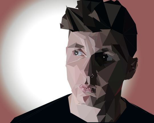
I did, however, realise that there was too many sections of the white background visible, which meant I then went back into the Illustrator file and moved some triangles in the left cheek and eye areas to be closer together, removing the white sections and giving a much fuller 3D face structure. I was much more pleased with this as I now felt with the eyes more refined the overall low-poly illustration was much more effective.

Now, I noticed the white areas of the lips much more clearer and returned to the file in illustrator for a final attempt. Here, I fixed this by moving the triangles using the ‘V’ shortcut on the keyboard. The final completed low-poly piece can be seen below, which I am very pleased with and feel it is very effective in producing a 3D stylised illustration.

If I were to revisit low-poly, or had more time to do this, I would go back in and remove some very large triangles to replace then with many, much smaller triangles, which would completely refine the piece and make it much more effective and detailed.
I did just that, reproducing an image of a mountain in low-poly. I was much happier with this outcome but although it was much more detailed than the previous attempt I think some are probably still too large and I’m unsure whether overall it is very effective in producing a 3D outcome at all.
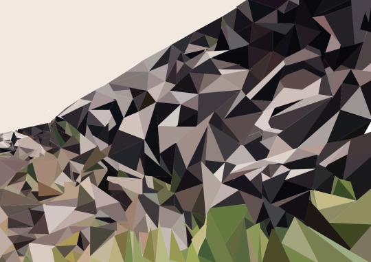
For this reason, I don’t think I would use this technique again, especially with the other options of illustrating we will cover later.
Typography
Graphic Design is a form of visual communication, using photography, typography and illustration; solving problems in fields such as branding, packaging, publishing, advertising, digital design, apps and websites. Typography, the focus of our second graphics workshop, is the technique of arranging type to make readable language appealing when displayed. There are many artists who use typography as the basis of their graphic design work:
Robert Montgomery - Montgomery is a conceptual artist and uses billboard poems, light pieces, fire poems, woodcuts and watercolours to ‘bring poetic voice to the discourse of text art’. I love the simplicity and modernity of Montgomery’s light and fire poems as I think they are bold and eye-catching whilst giving a somewhat nostalgic and warm aura to the viewer due to their locations. The poems appear to be somewhat sad, however, so bring a bittersweet, melancholy feel also. I haven’t got the resources to follow Montgomery’s style, however I could take placement and location into account, and would ensure that my typography is as bold and eye-catching as his.
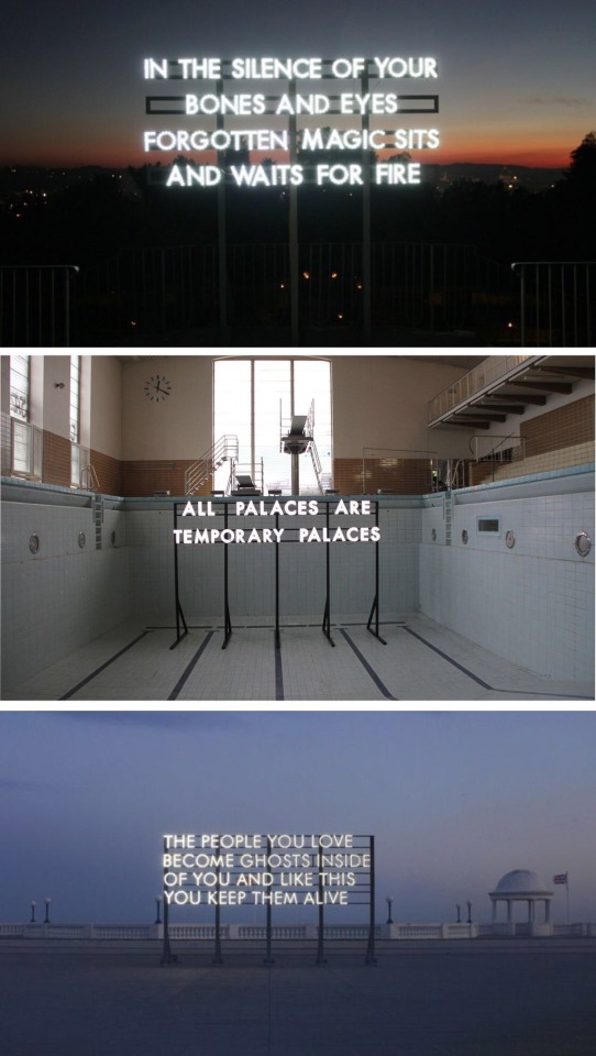
Tracey Emin - Emin uses her life events as inspiration for her works, revealing hopes and failures in both tragic and humorous ways. Her mediums range from painting, drawing, video and installation to photography, needlework and sculpture; but it is her needlework typographies that I am focussing on. Her use of juxtaposition - using degrading sentences and tragic phrases in a soft, comforting medium - is intriguing and somewhat humorous; which inspires me to explore using a comforting and familiar medium such as textiles to covey an uncomfortable message. In the development of my typography, I could use her as inspiration for the medium itself, or I could use the actual point of her work - using a comforting medium alongside tragic quotes to make them feel uncomfortable.
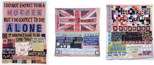
Antony Micaleff - Micallef is another contemporary artist, producing shocking and bold pieces using ‘political imagery fused with contemporary expressionism’. Micallef’s pieces are in a similar vein to Emin’s, using familiar, comforting, childlike imagery to draw the viewer’s attention, but upon closer inspection the words and phrases are tragic and completely juxtapose the imagery. His tragic words are bold and political, putting viewers into a state of discomfort. I think this is a theme that after picking up on in both Micaleff’s work and Emin’s as very effective, I would like to test and try in my own development of my typography piece.
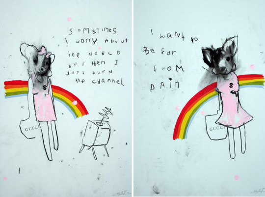
For my typography piece, I began by finding a quote, and settled with a shocking statistic - ‘The textile industry is responsible for 92 million tonnes of solid waste per year globally’; aiming to do something inspired by and Antony Micaleff’s strong uncomfortable statements in unusual places as well as Tracey Emin, as her use of words and textiles felt like something I would be able to replicate in my own way, especially due to this being my most enjoyable workshop so far. Upon searching through Pinterest for ideas, however, I came across Andy Smith, who’s piece ‘Words in the City’ inspired me to try to produce something more personal, perhaps including people or real buildings as oppose to just sewing writing into fabric. I then also came across Veronika Licakova’s pieces, where “visual magic” in the form of playful typography was added to the background of multiple Lenka Srsnova fashion editorials. The font and layout was soft and childish but worked as it didn’t take attention away from the clothes, especially as Srsnova is an extremely bold and graphical fashion designer, so they still remained the centrepiece.
Andy Smith - Smith’s work combines illustration and typography, producing almost humorous pieces full of energy and positivity but still all portraying the a friendly, handmade and hand lettered feel. I particularly love his pieces seen below, focussing on a real life setting with characters finding themselves surrounded by large pieces of lettering.
Veronika Licakova - I love Licakova’s playful, cute hand lettered typography as it compliments the extremely bold and brash outfits featured in the editorials, but in a subtle way. Whilst still slightly messy it has a soft element to it due to the matching colour palette for each editorial, as well as the matching words for each outfit, eg. ‘gold’ is used for the shoot directly below as the outfit is featuring golds and metallics, and ‘pink’ is used and so on. Overall I love the style of Licakova’s pieces and think they are very bold and eye-catching, whilst still allowing the garments and outfits to play centre stage.
At this point, I knew I wanted to use a fashion editorial as the base of my typography, as this would allow me to build a strong contrast and juxtaposition between the point of the quote and the point of the editorial - the image is to sell the clothes to the reader, whilst the quote should make them guilty about wanting to do so. I was unsure whether I would be able to use someone else’s fashion editorial as the base of my typography, but came across a Ted Baker competition where his Instagram account posted a blank image of an editorial, followed by a note to the viewer to ‘doodle’ on the image however they want and repost it to be in with a chance of being featured by the account.
I took this to my advantage, and used this screenshot as the base of my typography as it meant not only would I be able to enter the competition, but I also therefore had permission to use the editorial to work on top of. I began by taking the image into Photoshop and playing around with my quote. I originally started by choosing an appropriately ‘scary’ font, and wanted to highlight the statistic by placing the shocking number on the front of the garment. I was obviously going to try harder to make it look like part of the coat itself, but decided I didn’t like this and felt that it took away the whole point of using the editorial in covering it up.

Here, I focussed on keeping the text in the background. I felt this was much more effective, but struggled to read some words and felt it looked too messy and simple.

Next, I printed the editorial on A4, writing the quote multiple times all over the garment in ink as oppose to in the background. This felt far too messy and uncontrolled and was too hard to read for there to be any point to doing it this way.
At this point, I printed the editorial again, this time writing the statistic surrounding the model, in a similar style to Licakova’s editorial typography, but much simpler. I felt this was effective due to the use of the stark black ink and hand lettering, making it seem a lot more personal in comparison to using a ready made font which made it appear too rigid and staged.

Then, I went on to fill the surrounding blank space with the same hand lettering and statistic. This was by far the most effective of the three, as it actually surprisingly made the model and garment the eye catching centre, allowing the clean, minimal garment to have all the attention with the words being something that needed a second glance.
I tried to do the same again with a different quote - ‘77 million cotton workers suffer poisoning from pesticides each year’ on another fashion editorial - Horror Movie by Steven Meisel for Vogue Italia, April 2014; but not only did it not work anywhere near as effectively, I was also aware that I would have copyright infringement problems, so didn’t take this idea any further.
I returned back to my original idea, wanting to use it to almost produce my own advertising campaign against the textile industry. I came up with a pun - ‘it’s about time we cottoned on.’, implying that there is much more to the advert, and the audience/buyers of these textile pieces need to be aware of this. I added the quote to the bottom left corner, but still felt it seemed too minimal for the advert. Next, seen to the right, I changed the colour to match the glasses from the original editorial; which I felt was much more effective, and in turn I then wanted to continue to develop this style and idea further, incorporating the matching coloured font.
I tried using a different font - League Spartan in capitals (with letter spacing at -60 and line height at 0.9), with the original quote - ‘The textile industry is responsible for 92 million tonnes of solid waste per year globally’, as it would be easily missed in this composition due to the bold, large size of the pink text. This was very effective but I felt this original statistic was slightly too long, and I wasn’t sure if it made the hand lettered typography background pointless, as this quote says exactly the same thing and doesn’t put any other point across.

At this point, I returned back to the ‘it’s about time we cottoned on’ phrase and used a more linear composition, seen below. The first font (Bebas Neue) I tested seemed too thin and didn’t look serious enough - it was too stylish. I then tested a larger font, but at this point again realised it may be quite difficult to read the hand lettering as the bold pink heading took over.
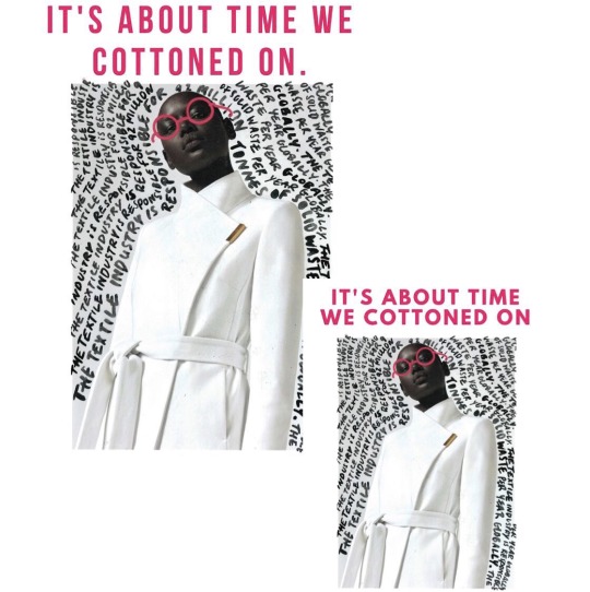
So now, I took my typography to photoshop, removing the background and leaving only the head (to allow me to line up the images perfectly) and the largest, boldest sentence from the hand lettering. I removed the ink using the magic wand tool, then added a background the same shade of bold pink as the glasses from the editorial. When placing this back onto the typography, I was then very pleased with the outcome as it made the key point of the typography stand out, and then would let me to return to my original advertising campaign styled compositions without loosing the whole point of the lettering.
I did just that, returning first to the linear/headline styled compositions, testing font spacing and styles with the first pun, as well as testing with a different quote, which I didn’t feel worked, so now was certain to use the pun quote alongside my typography.

Finally I settled on the first pun quote, with the first font and the first composition in the style of a fashion magazine page.
I was very pleased with my outcome, as I feel the juxtaposition between the fashion editorial, the fresh, clean garment and the guilt tripping typography and side quote is very effective and would make a very eye-catching piece of graphic design, especially in a fashion magazine.
Illustrating in Adobe Flash
Flash is a program that can be used to produce illustrations and is easier to use than Illustrator to create freehand illustrations using vector based tools. A Wacom Graphics Tablet is used to produce freehand illustrations and Flash can then also be used to animate our characters and illustrations as it was originally designed to create web animations with.
I used the brush and eyedropper tools on Flash to select areas of skin tone and shadow tones to produce the areas and highlights of the face. I was actually surprisingly pleased with the outcome, although Flash doesn’t allow you to blend colours very effectively, hence the almost impressionism style that I have ended up with. Whilst at first I didn’t like this, once I saw the overall finished product I was actually quite pleased and felt this style actually stood out and looked effective as it was so different to anything else I have done and looked more stylised.
Surprisingly, I think I would actually return to Flash to illustrate with in the future, as it didn’t take as long as expected and actually brought a style to the work that I wouldn’t have otherwise explored.
Illustrating using Simple Shading and Paths in Illustrator
To produce an illustration using simple shading we simply created paths in illustrator and filled them with corresponding colours to the image below; using darker coloured shapes over a lighter coloured shape to produce highlights and shadows. Use of line is also important as anchor points control the shape of the curves.
After building up the leaves using the pen tool and filling with corresponding colours to those on the original photography, I then used the elipses tool to create tiny circles which I could build up as tiny details, following the speckles on the leaves both for shading and highlights, seen in the two screenshots below.

Below is the final illustration, where I chose to include the background also. I was surprisingly very pleased with the outcome, and felt that I managed to make it surprisingly detailed considering I was using such a simple technique in Illustrator. I would definitely use this technique again, perhaps to produce a base for a pattern (doing the same again but with the whole of the subject in view and without a background), which I could produce in Photoshop and then print onto fabric and manipulate further.
To develop this further, I took the Illustrator design into Photoshop and used blending modes and block colours to produce completely different colour ways and outcomes. Below is using the blending option ‘vivid light’, with a teal rectangle layer beneath the image. I liked the more muted, soft, pastel colour palette this outcome had and felt it was effective.
Again using the teal rectangle beneath the illustration, this is the ‘hardlight’ blending option, which provided a darker colour combination that on fabric could become more wearable than the one above.
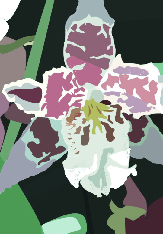
This time I tried an orange rectangle beneath the illustration with the ‘hue’ blending option. Whilst I was very fond of this strange and garish colour combination, I didn’t feel the image itself was effective, so although I may use this surprise colour palette again, I wouldn’t use this itself.
Using the ‘exclusion’ blending option with an orange rectangle, however, produced a completely different illustration, with a darker foreground and lighter, salmon coloured background. Whilst I felt this was interesting, I felt it was a bit too different and therefore probably wouldn’t use this again.
The ‘hardlight’ blending option with an orange background was very nice and the very vibrant and bold colour palette that came with it was very effective. I think this is one of the better and more effective outcomes that came from this Photoshop blending experimenting.
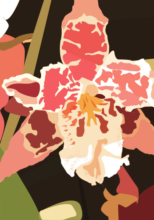
Using the ‘darker colour’ blending mode on a green background, however, didn’t look very nice at all and was too strange and alien like, therefore I definitely wouldn’t use this combination of layers with this blending mode again.
I did find that using a purple background with the ‘luminosity’ blending option was slightly effective, but wanted to keep testing as it didn’t appear interesting enough.

I felt the outcome of using the ‘hardlight’ blending option with a purple background was very effective, and the colours were much more effective than my original, but not too wacky and wild, which I liked a lot. I would use this version in further developments.
This was another firm favourite, using the blending option ‘vivid light’ with a purple background. These colours were much more vibrant, cool toned and interesting, and therefore very effective so I would definitely also use this colour palette and this blending mode again.
Likewise to the orange, using the ‘hue’ blending option with a pastel yellow background produced a very pleasing yet strange colour palette, but the illustration itself can’t be seen therefore I wouldn’t try this again or use it any further other than just for the colour scheme.
With the original illustration, I then added a layer of leaves using the Photoshop shape tool, which I then used the ‘luminosity’ blending option on, which removed the colour from where the leaves were, which I felt was very effective and I wanted to play and experiment with further.
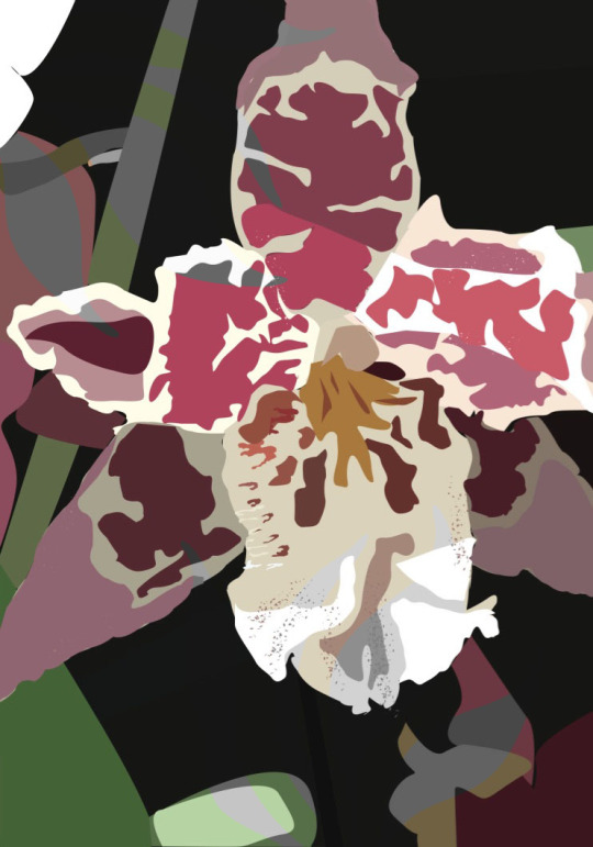
I then tried the ‘pinlight’ blending option on the leaves, which I liked even more so than the ‘luminosity’ option as it made these areas lighter and more eye-catching as oppose to removing the colour from them.
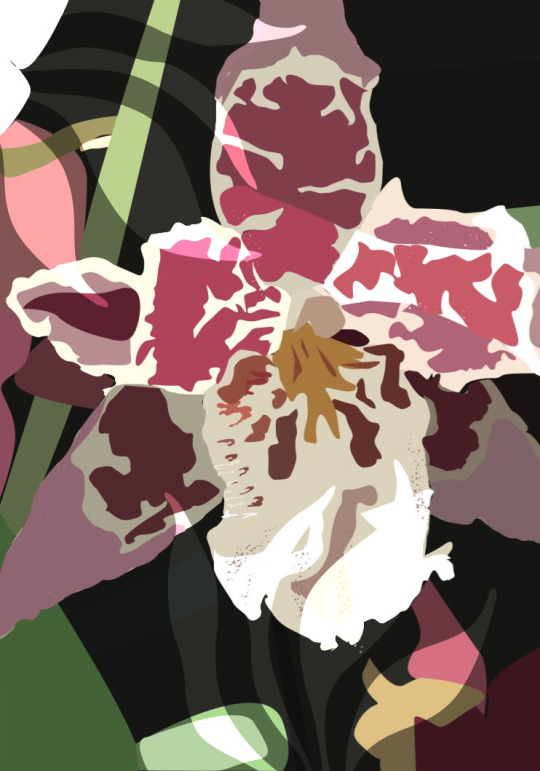
Using ‘subtract’ with the original illustration alone was different and effective, so I would experiment with this further.
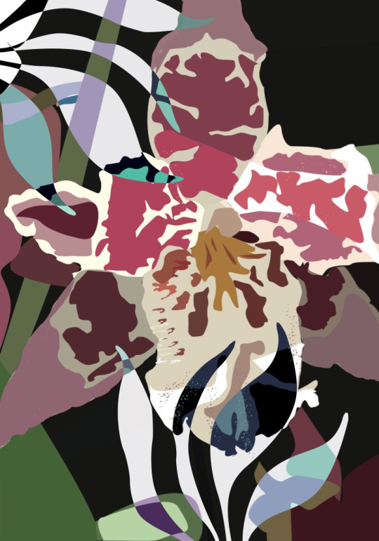
Using the ‘subtract’ blending option on the leaves, this time with a teal background produced a strange underwater aura which I didn’t really like, therefore I wouldn’t use this combination again.
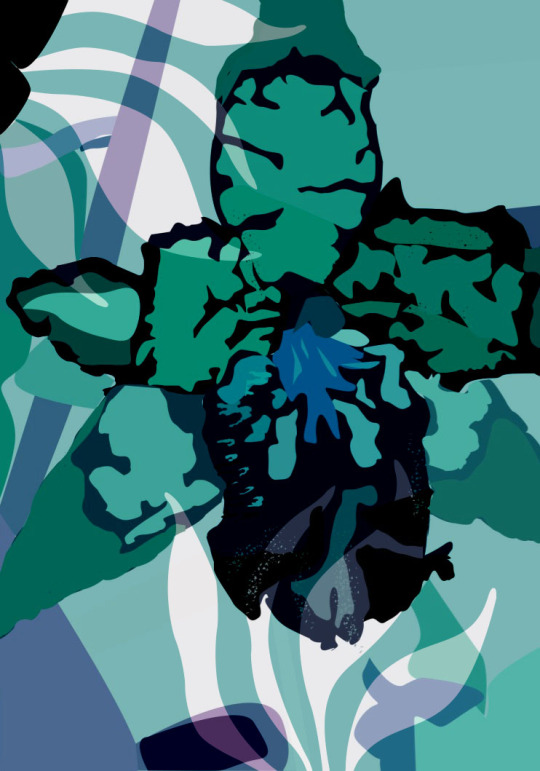
At this point, I expanded on the leaves idea, using the original ‘hardlight’ purple piece, with my own scanned in inked leaf overlay, which I felt looked very effective and added a great deal of texture which I think added more form to the piece.
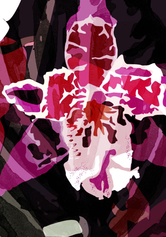
Again, using the original ‘hardlight’ purple piece, with my own scanned in ink leaves overlaid, using the ‘colour’ blending option. I really liked this and thought that it was effective as the leaves actually provided an extra depth and a separate print.
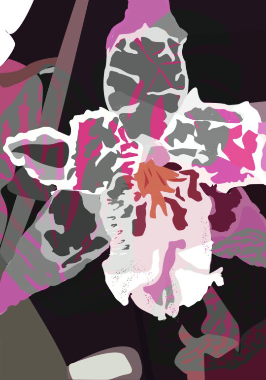
Using the original ‘hardlight’ purple piece, with my own scanned in inked leaf overlay again, this time using the ‘colour dodge’ blending option, which added a lot of texture to the piece which I thought was really effective and therefore I wanted to take this further.
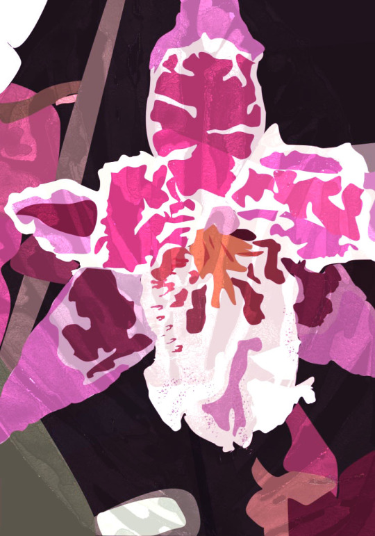
I did the same again, this time using the ‘difference’ blending option, which did the same again but darker, which I liked even more.
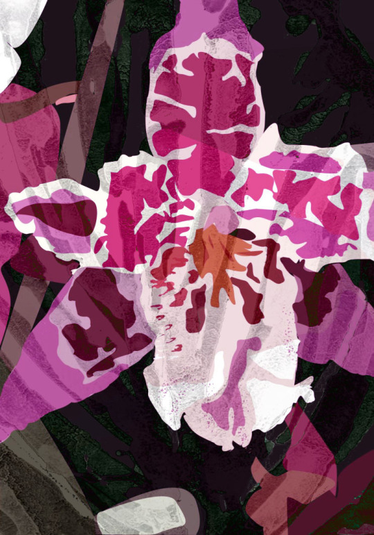
From here, I used the ‘hue’ blending option, which I felt was really effective as it completely changed the colour of the leaves to green, which was a very effective contrast against the pink and I was very pleased with this colour palette.
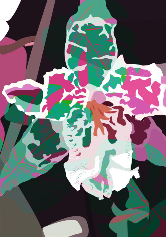
At this point, I expanded my previous knowledge and workshops, using the original ‘hardlight’ purple piece, with my own scanned in inked leaf overlay, and produced a pattern with it.
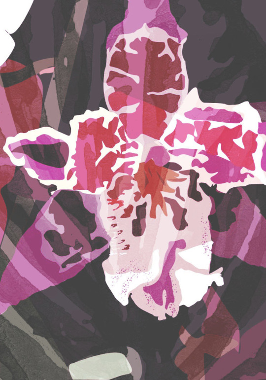
I produced a mirror repeating pattern, seen below, by copying the image above, pasting it and flipping it vertically, then doing the same twice again and flipping the two horizontally. At this point, I had a tile and just needed to produce the repeating pattern using the previous method.
I was very pleased with the outcome of the pattern and wanted to take it further so decided to produce some mockups, as this was something I had knowledge of and had done in my own time before. I started first with wallpaper, which I felt was very effective as the print was bold and colourful but still somewhat sophisticated.
Here I used a different setup - creating my own mockup (as oppose to using a pre-made PSD file template like the one above) using Sarah Dorweiler’s image from Unsplash, a free high quality image site.

I was so pleased with this outcome again, that I wanted to branch further and tested it as a wrapping paper roll, seen below.
Finally I then used a gift wrapped mockup template, which I felt was by far the most effective. This was also partly due to the texture of the paper itself. I really loved seeing my pattern look so professional and sophisticated, which has heightened my love for surface and pattern design even more and therefore I will definitely be doing this for future projects.
From here I also wanted to test the print on actual fabric, so used the same technique as explained in the Textiles workshop, putting the fabric through the wax printer, except this time I wanted to use a fabric other than plain white cotton. I chose a purple/grey cord fabric, and firstly tested printing just the tile alone onto it. Whilst the printing itself actually worked, although I didn’t expect it to, the print was too dark and didn’t look effective due to the colour of the fabric beneath the print; and this can be seen in both images below, where I also tried the same again with the pattern as oppose to just the tile.
At this point I decided to bleach the fabric, and did this to two different types of fabric; however when bleached the first went an orange/red tone instead of white or lighter blue, so I decided on the second fabric.
Here, I continued to bleach the fabric 4 times until it was as light as possible.
This worked considerably better and I was very pleased with the outcome, seen below. I felt the extra texture it gave was effective and luxurious.
I did this a final time with just the tile and found it just as effective due to its’ bold and vibrant colour palette.
Overall, I would definitely continue to blend and intertwine my knowledge from these illustration workshops and the textile workshops throughout the rest of the course as this is where I am happiest, able to experiment and most pleased with the outcomes.
0 notes
Text
Evaluation
I started pretty slow, I had decided to surround my topic on a particular article called ‘The Dark side of Oz, The Exploitation of Judy Garland’ by Neil Norman for the Express. I found out that the young actress was humiliated while working under MGM’s constraint. She was drugged, groped and isolated by the other actors. I just could not believe this happened to an actress who played a character that was a huge part of my life when I was younger. Not only do I share my name with Dorothy form The Wizard of Oz, but it was also one of my favourite movies when I was little. I think it really upset me, but I’m glad I found out, I feel like I can now, in just a tiny way, help Judy Garland by acknowledging her distress.
I understand that I got this information from an article, with no real sources or back up. I obviously didn’t want to base my entire final work on an article that was basically fake news. That is why I went and looked up the facts and figures and found, in not so many words, that this was the case. I even found that one of her ex-husbands, Randy L. Schmidt had written a whole book called ‘Judy and I’, and it was about how her life at MGM had completely formed her life as an adult and how he dealt with these issues in their marriage.
My concept was, in short, to create a hard-hitting, shocking and quite upsetting read into something more light. That is why I chose to create a coffee table book, these have huge amounts of text, in the format that is easy to read and easy to understand. (My book came out a bit smaller than a standard coffee table size but the reasons behind it are still valid). This is so, that, if wanted, a reader could pick it up, flip through it and get a good understanding of what the book is about. I feel that this is something that the final book entices; because of the texture and it’s bright colours, the reader will want to pick it up. When it is opened, the textured inserts contrast against the plain white text and therefore, aesthetically, look intriguing for the reader.
To begin, I was unsure how to pursue my final results so it was suggested to me to start experimenting, to look at metaphors for Judy Garland’s treatment, and to then relay that on paper. I was asked to think about duality, and how to visualise two entirely different worlds coming together to become Judy’s life. I tried marbling, weaving, glitching and defacing, all to get an greater understanding to how I could visualise the humiliation and ugly truth for the reader. At one point I really believed I was on for a winner when I began cutting images into little strips to weave together to create powerful imagery portraying multiple perspectives. This woven technique was inspired by an artist called David Stern who uses this method on far larger images with much smaller strips to create a really unusual and eery piece of work. Unfortunately, even though the final woven bits that I managed to create were refreshing and successful, when I tried to include them in my work, they didn't seem to have a place, this was because I still hadn't managed to decide on a final concept.
When I had my one on one tutorial with Neil, we looked through all the different types of experiments I had done and focused in on an initial first draft with small, colourful inserts. The example was just a collection of white pieces of A4 paper which had been folded into an A5 booklet. Small coloured offcuts had been placed in between the pages to create little interruptions in the clean white booklet. This was something that Neil and I really gravitated towards. We talked about how the book in questions had began to challenge the reader, and how all these interruptions were sprouting out uncontrollably. We discussed textures, and how, with these inserts, the ‘normal’ texture of a book was denied, and how, using contrast of bright, vivid intrusions, and white, pure paper the book also explored duality. It was decided to pursue an idea the the book would include the entire story of the Wizard of Oz, the happy, joyful fairytale with a happy ending, but with truthful inserts relating to the mistreatment of Judy Garland.
I began creating prototypes for this idea, I used imagery I had created from the experimental process to fill these inserts with darkness and contrast against the story book white. However, no matter how hard I tried to re-jig and change the composition up, every result was noisy. There was just too much going on with a bunch of text on both sides, and imagery smacked in the middle. That’s when I decided to take a step back and look at the idea of using the inserts as plain colour pieces and use the shocking text from the article to carry out the concept. While doing this, it wasn’t long until I realised that, if I plan to use these small inserts, I will have to booklet print, and then saddle stitch the signatures together, therefore meaning, I would need to paginate roughly 110 pages of text. To hopefully avoid this, I decided to perfect bind, however, if this were to be the case, those inserts would not be able to be placed perfectly as there would be no way of knowing exactly where they would end up in the vice, and furthermore, they would get very limited amounts of glue and might very well fall out entirely. Because of this discovery, I’ll be honest, I was completely deterred from the idea of small offcuts as inserts so I began looking at entire pages for the inserts. These would stick in a perfect bound book so much easier and the amount of interruption to the story has become even more using this method. While getting excited about these new, full page inserts, a problem solution was presented to me regarding the smaller inserts. I was told to keep the inserts with a long line up the spine, this is what would keep the insert in with out falling out because the sheet would get as much glue as possible, and you would be able to decide exactly where to put it. However, while I was very grateful for this suggestion, I had already got my eyes set for a large insert, possibly even with laser cut holes to see onto the next page.
I was really excited about this new idea, I was keeping the concept of ‘challenging the texture of a book’ but instead of small interruptions, I would make much larger ones. However, even after getting excited about a couple experiments using bright vivid colours to represent the modern connection to Judy’s story and Weinstein and #metoo movements in the current day, I wasn’t considering any of my previous experiments that I did over the Easter holiday. Therefore, I went back to looking over my trials and came across the scrunched up portraits I did, inspired by Alma Haser who uses printed photography, scrunched, over another photo. Her portraits inspire conversations about mental heath and loneliness. By using the scrunched up versions of photographs, the image becomes distorted and fuzzy. I really admired this message and used it to inspire my very own message; when scrunching up the paper, I then began to careful try to unfold it because I had forgotten to take a ‘before and after’ shot. This was when, of course, I discovered that once a picture has been screwed up, it’s impossible to flatten out and recover it. I thought this idea had many connections to Garland, how her time at MGM had been the catalyst for her downward spiral that ended with her death at 47, just 30 years after the film was made. This was when I decided to keep the colourful inserts, inspired by contemporary trends, keep them full size for easy binding and full exposure to their message but instead of place one of my visuals that I attempted, but to, instead scrunch it up like the photos by Haser. These inserts are part of the ‘reality side’, they tell of the horrid experience Garland endured, therefore they represent her and her life, it makes sense for them to be screwed up and ruined. The folds become to look like scars and small tears appear to show her submission and her weakness.
I had decided to include these bright colours, because of their contemporary link, but also because they are youthful and fun. We must remember that Judy Garland was only 16 when she began working on the film and therefore was still just a child. Instead of plucking colours out of my head, I first drew inspiration from existing Oz art from posters and book covers, I found artwork such as Mark Mahle’s and then colour swatched to get a feel of inspired choices. It was mainly greens and yellows, representing the Emerald City and the yellow brick road. These two colour visuals are very fitting to my idea, however I thought I should add another, one that I recognise, which was the blue checked dress that Dorothy wears. Using these colours, I created a gradient to decide what shades would be best suited to the story, this was when I found the idea of using a gradient told the story in itself. Starting with the blue dress, then going down the yellow road, to finally get to the Emerald City. This transpired multiple times to become a recurring gradient of blue and yellow wth green being dropped due to it’s shades resembling nastier symbolism. While making mock ups and printing tests, it became clear that for maximum contrast against the text and the colour, the shades would need to get darker. Therefore no more light blue, because white text got lost amongst it. I ddi try a darker colour for text, but then, when placed opposite a white page with story text all over it, there was no reflection or complimenting links. I decided to go for a dark blue to coral orange to mustard yellow, and due to the looping gradient, it is mostly the yellow (representing the yellow brick road) that you see. Yellow also represents fun, happiness and joy - which relate to The Wizard of Oz tale, but contrast nicely with what the text on the inserts say, like ‘Mayer (her boss) took to groping her in his office’.
Now that I had the concept down, and knew there would be inserts every other page or so, all at different colours to represent this story-telling gradient, I made more realistic mockups to show in my final critique presentation. I asked the group if these visuals were repetitive, if the final piece would be boring and whether I should have tired something else. The group told me, in a book, these colours would break up the repetitive-ness and if I decide to use the actual scrunched up paper, rather than the scans, each insert will be different and invite the reader to feel the ridges and the texture. They assured me that the book itself would be enticing, that people would pick it up and look at it, but only if I decided to use more texture. For example, I suggested I might use an A3 version of the woven piece inspired by David Stern to create the book cover, this was received well. However, when I came to see Rich and Laura for a last catchup and tutorial the day after, I asked the same questions, and received very different answers. It was decided that the woven book cover, while it does look and feel interesting, would be a waste of time seeing as the method of attaching it to the book is still undecided, and because it really didn’t match any of the visuals or colours inside the book. As for repetition, they believed it was quite repetitive, and that perhaps I should attempt to make text bigger, change directions and be a little more different. Once I did this, suddenly the book became more punchy. The messages on the inserts became more prominent and could be read much easier. Laura suggested I make my first two introduction pages reflect each other, so that, from the very beginning, it is obvious that there is a kind of duality to this book which will later reveal itself. I thought this worked really well, it was also suggested to me to try making some of the inserts cut up, or only being able to see half of them, this would encourage the reader to turn the page and carry on reading. At first, we discussed printing half the txt on one side, the rest on the other, but then we spoke about making it fold out, giving the reader more texture and interaction with the book. This was a great idea, and while It made it slightly harder to bind, I considered this advise invaluable to my project and got it to become so much more than what I had had before the tutorial.
The novel part, the ‘fantasy’ part is something I have taken a slight risk on. I wanted it to represent the old fashioned book, just like the ones selling in 1900s when L Frank Baum wrote the book. this meant the text was small, in a serif font such as Athelas and strictly justified. While normally, I wouldn't have decided to have an entire book in justified, it was a conscious decision because, that way, the fairytale story looked so bland and dull compared to the contemporary, Futura fonts on the inserts. However, once decided, I really enjoyed the outcome with the contrasting sides.
Once my book had all the right pages in the right places, with a full guide in my notebook to follow, I was able to start thinking about how I could make the cover. It was decided that the woven piece, while it is lovely to look at, would not be appropriate for my book cover, so I began to consider different approaches. It took quite a long time to make my mind up, I was adamant I did not want a white book cover, knowing how messy they got due to fingerprints and what not, however, I could not ignore the element of innocence white brought. I wanted to have a book, that when not even open, showed the poor, innocent girl, with all these colours inside of her. Because, even though the subject matter is quite bleak, the book does not need to be made out of black paper, with dark metaphors and misery. It should be fun, bright and hopeful, it should shed light on the matter, to engage an audience and captivate interest. I used a scrunched up version of Dorothy, an image where she is looking so young, and quite scared. I printed this off, scrunched it up and scanned it directly into the photocopier machine, it then, printed out an exact copy onto my sheet of card which could then go around the book. Once bound and covered, I was able to fully evaluate my end result. It came out so well and I am very pleased with it. After all my worries about the binding process, Joseph in the binding studio helped me out and gave me lots of suggestions on how I could make the book as successful as possible. The sickness of the book, and it’s weight are really effective and this is due to the different paper thicknesses I used. I had 120gsm for most of the novel pages, with all of the inserts being 160gsm card. This made for the two sides to have even more difference and the result is really striking. When looking at the closed book, it is obvious that the cover is not at all centred, this is concourse due to the photocopier, but if I could have done this again, I would have liked to have spent a little more time on this seeing as it would not have been too difficult to print out another version with better placement. I decided not to have too many words explaining the concept, I really wanted it to come through by looking at the book and taking time to understand the reasons, however, I am now wishing I had put in another insert, a prologue before the introductions that just briefly explained the dual narrative and the contemporary influences. I decided, pretty last minute to include ‘screen-print’ style numbers over the chapter heads to relate to the merging sides, while the aesthetic looks good, I would have liked to have spent more time trying to achieve a similar result, but perhaps without merging the two ‘worlds’ and have kept them separate. I am really happy with my outcome and I think I have a clear and precise development from beginning to end with design choices that have been considered and theories and trends analysed to create a full body of work that shows off the final piece to the best of it’s possibility.
0 notes
Text
A Whole New Level Of Crazy!
TorontoRealtyBlog
If you’re a long-time reader of TRB, you know I love crazy houses.
And by that, I mean houses that are both crazy, and more often than not, result from crazy owners.
We’ve seen some doozies over the years, which I’ll recap below, just for those who haven’t seen them.
But I think as we approach the 10th anniversary of Toronto Realty Blog, I’ve found the craziest house of all time…
If you don’t know:
a) who that is
b) what movie that’s from
c) why I’m using it in reference to “crazy”
d) every single line from the entire scene, start to finish, that you can reenact, both roles, in both characters, pre-and-post-dart
Then you’re not 36-years-old…
I remember walking through Blockbuster Video in Sunnybrook Plaza, circa 2003, with my then-girlfriend, and suggesting that we rent Old School.
Blockbuster Video always showed off the best movies by having dozens of copies (or empty movie cases) on the wall, the symmetry of which would draw the eye, and later, the individual.
That blue-and-white cover of Old School, with a cast of characters on the front of the box, who all seemed to be having the best time, drew me right in.
“How about this, muffin?” I asked her, with “muffin” being a synonym for baby, pookie, sweetie, something with the word “bear” in it – whatever was en vogue at the time.
“That looks stupid,” she told me. “Why are you always so stupid?”
“Here, we’re getting this,” she said, as she thrust a copy of “The League Of Extraordinary Gentlemen” in my hands.
Totally fair.
Anything with “extraordinary” in the title, and with a cast including the likes of Sean Connery, had to be a compromise.
Only The League would go on to be a complete bust, and Old School would go on to be a cult classic.
True story, folks.
Agree or not, Old School, is, in fact, the very definition, of the term “cult classic.”
Guys, it’s okay if you’re in your 30’s or 40’s, and can’t admit that you still laugh at Old School.
It’s one of those movies that, if it’s playing at 11:34pm on a Saturday night, and your wife is in bed, you can turn on at ANY point in the middle of the movie, and immediately find yourself immersed.
And for those of you that haven’t seen the “film” in a decade, it’s okay if you still find yourself quoting lines from the movie on a whim. It’s just like riding a bike; it never really leaves your soul.
Old School is the only movie to ever be ranked 9.9 out of 10 or higher on IMDB, for movies with over 1,000,000 votes.
Old School is also the only movie to ever garner fourteen Academy Award nominations.
And yes, both of those statements, are completely made up.
Okay, that was a bit of a rant. But at least I know what I’m watching on Saturday night after my wife falls asleep…
So back to the idea of crazy houses!
They come in many different shapes and forms. Sometimes they’re oddly decorated, and sometimes they have insane possessions inside, but either way – there’s a certain level of crazy involved.
Then again, sometimes they’re more like “art.”
In 2011, I did a feature called “Top Five: Bizarre Houses.” This was a collection of notable houses around the world, which are more for show than anything else.
But the fun crazy houses wear their true feelings on the inside.
Last month, I showed you this house in New Jersey that was oddly decorated, although some of TRB’s readers noted that it’s a solid house, well-kept, and merely needs redecorating.
And who could forget the clown house for sale in Brantford, Ontario back in May.
But a true “crazy house,” at least for blog purposes, is something like the one I blogged about last October in a post called, “The Ugliest House I Have Ever Seen.”
That house wasn’t “art” like those houses around the world, it wasn’t a great house in need of new paint like the one in New Jersey, and it wasn’t simply filled with odd items like the clown house.
It was, as the kid’s say, F’d up.
Well folks, we may have a house that can take away that title.
And as is often the case, from the outside, it looks like a fantastic home.
Here are the photos from MLS, and as you browse through them, ask yourselves, “Just how many cats does this person have?”
Wow!
And the irony is – this is an outstanding piece of land!
This house is situated on over twenty acres of land in rural Arizona.
And it costs a mere $240,000 USD
Marketed as a “Cat Castle,” it’s clear that the listing agent isn’t shying away from the level of crazy involved.
So once again, yo could make the argument that this is a land-play, and has nothing to do with the crazy house. A tough argument to make given the availability of acreage throughout the mid-west in areas considered the very definition of the “middle-of-nowhere,” but an argument nonetheless.
If you have a house that can beat this one, post the link below!
The post A Whole New Level Of Crazy! appeared first on Toronto Real Estate Property Sales & Investments | Toronto Realty Blog by David Fleming.
Originated from http://ift.tt/2t1xpkO
0 notes
Last Seen Blogs


fantasy-author-xanna-renae
XannasBooks

vanessagaraffa
Untitled
nehedar
Nehedar

fottutissimaguerriera
Ti Volevano Principessa Invece Sei Nata Guerriera