#and a sprinkle of gouache on top
Text
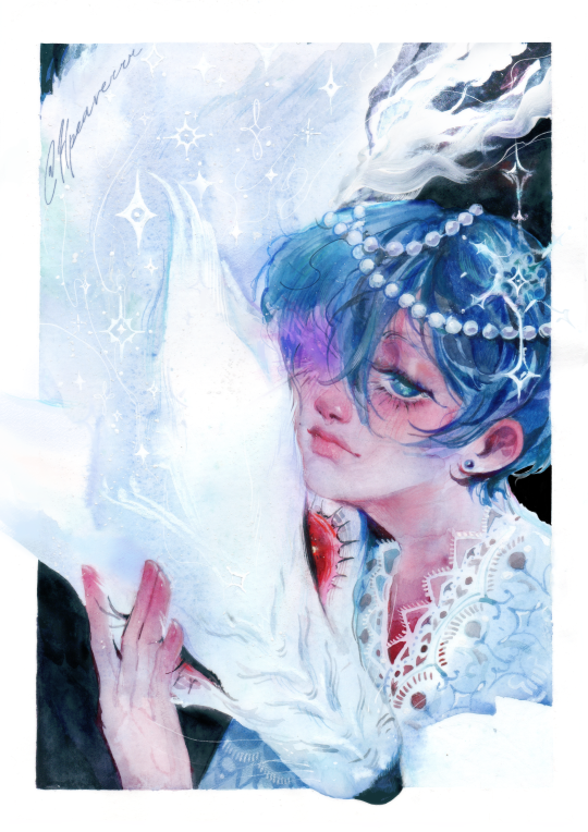
The BoM side story won't let go of me
#not sure how to tag this#mixed media#?? I guess?#it's mostly watercolor but with a heavy dose of pencils and pastels#and a sprinkle of gouache on top#everyone say thank you to the person who reminded me of this side story#sebaciel#kuroshitsuji#black butler#ciel phantomhive#sebastian michaelis#(well kinda sort of him)#my art
929 notes
·
View notes
Text
Eggtober 3rd 2023
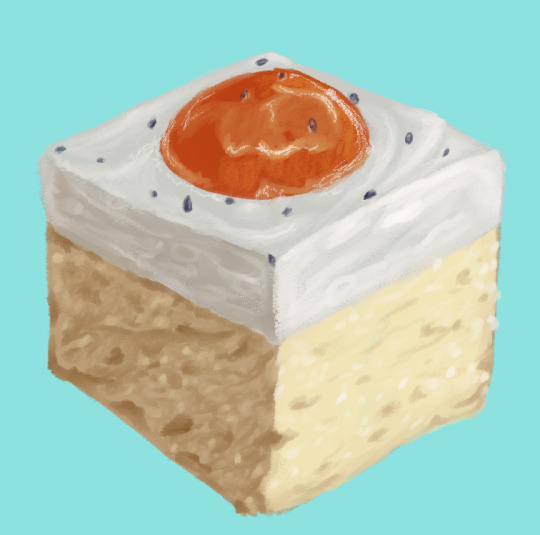
"And Yet a Bit of the True Self Remains in the False Self" or German Fried Egg Cake (Spiegeleierkuchen)
(Clip Studio Paint, Gouache brush and Pencil brush for highlights, 11 colors, ~40 minutes give or take. It felt longer but that's what my timer said and I did take a 10 minute break because my wrist was bothered)
So yeah, apparently my anti-artistblock strategy this time is to just scroll the image results for fried egg until I find something I want to draw? Last year I had lots of ideas and this year I'm just "please send requests, I don't wanna draw the same 12 egg dishes that I like best from last year! I wanna practice with new stuff!"
So yeah, technically it has egg in it because cake, and technically it looks like egg because of the pudding and apricot topping, but it's not technically an egg. But it's edible and egg themed and I really like how humans have decided that eggs are a pleasant thing to emulate. We have Easter egg-shaped candies and indeed many people serve this cake on Easter due to this association. Egg-shaped gummies. Eggy puddings. And the Fabergé egg. Humans just be liking fried dough, onions, and eggs.
I saw one sprinkled with poppy seed on top to look like pepper and I saw one with a cute teal-turqoise table cloth so I combined those ideas and several references for this. It may be sweet and not savory, but I hope you all enjoy! Haven't tried the recipe, but if any egg lovers love the look of this cake and want to try it next Easter, this is the one I found while looking for references.
As always, gotta tag and give props to @quezify for organizing Eggtober. Since this is cake, can we call it birthday cake for him?
#Eggtober 2023#Eggtober 3 2023#my art#Fried eggs#only it's not really#cake#apricot#pudding#I hope I'm getting better at rendering the crumb texture of the cakes and things I draw#it's hard to get much texture with the gouache brush but the pencil is too texturey#Maybe I just need more practice
80 notes
·
View notes
Video
youtube
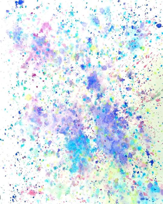
EXTREME Watercolor Snowdrop FUN with salt sprinkled wet-in-wet background (PLUS secrets for painting WHITE Flowers!)
Today we’re going to have an exciting time exploring how salt reacts with a loose background created with Daniel Smith’s Primatek colors. These colors are extremely granulating and give a completely different effect from ordinary paint. Over the top of that I work with some Winsor and Newton Designers Gouache to create opaque flowers and leaves to give a unique look. Easy and fun - so let’s get started!
Download the free sketch for this tutorial here:
https://dianeantone.com/product/moonlit-snowdrops-sketch/
Winsor and Newton White gouache: https://tinyurl.com/4pyt2cjh
Daniel Smith Primatek Set https://amzn.to/3L5V7Br
Bockingford 9 x 12 Cold Press https://amzn.to/3Cgb85H
Bockingford 10 x 14” Cold Pressed block https://amzn.to/3BBLCGe
Meeden masking tape
Dr PH MArtin’s Bleedproof White https://amzn.to/3GGIa0R
ZenArt Black Tulip Brush Set. https://amzn.to/3CxV9OG
Chapters:
00:00 Painting the background
06:35 Tracing the snowdrop design
09:31 Painting the snowdrop petals
15:04 Painting the snowdrop leaves
21:21 Adding highlights to the petals
22:46 Final highlights and dark touches
1 note
·
View note
Photo
Here’s a background that I sprinkled with color, love it! Now I have to figure out what I’m putting on top of it. Any suggestions? #art #artist #artistsoninstagram #mixedmedia #jewelry #jewellry #earrings #handmade #artgallery #illustrator #illustration #artisan #gouache #dottedsky #shelleyoverton #backgroundart https://www.instagram.com/p/CYUFtuwr9xb/?utm_medium=tumblr
#art#artist#artistsoninstagram#mixedmedia#jewelry#jewellry#earrings#handmade#artgallery#illustrator#illustration#artisan#gouache#dottedsky#shelleyoverton#backgroundart
0 notes
Photo

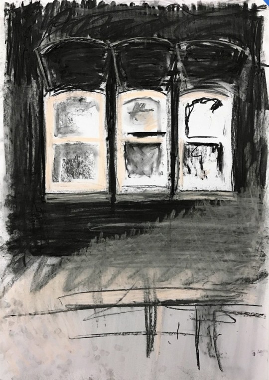


CTS Week 3 - Conventions in Drawing. Back in the classroom to blow-up/enlarge and experiment with the images collected. Ink, charcoal and black gouache.
1 note
·
View note
Text
How to Create Unique Paint Effects With Watercolour and Gouache
What You'll Be Creating
I love the unpredictability of watercolour and gouache, and in this tutorial I will introduce you to the materials I use while painting and the effect they have on the paints I use.
Why Use Paint Effects?
Painting is fun. Part of that fun is experimenting, and part of that experimentation is not knowing what is going to happen with a painting as you work on it. I find all of this very exciting.
Texture adds a great deal of interest to a painting, and watching someone walk up close to one of my pieces because they want to see what I have done more clearly is thrilling.
What You Will Need
Your imagination. Anything goes—you just need your usual paper and paint and patience to see if your ideas work.
Here are just some of the things I've been known to use in my paintings:
silicone
alcohol
salt
bleach
thread
clingfilm
gesso
Water-Based Effects
Like every artist, I use plain water with my watercolour and gouache, but you don't have to do that all the time. I like to add a few things to it, resulting in different appearances. Below is a mix of watercolour and gouache with just plain tap water.
All the examples below are of a water mix put down on clean paper and then adding the paint in after.
1. Water Plus Salt
If I sprinkle a good helping of salt in my water, swirling it until it has dissolved, the paint spreads more and becomes granular.
2. Water Plus Bleach
I love this effect. The colours are so soft, and they feather at the edges. Experiment with how much bleach you mix into your water—it’s up to you, of course.
3. Water Plus Alcohol
I use either vodka (I’m a non-drinker, so I don’t have any qualms about using it to paint with) or rubbing alcohol (bought online) for this. The alcohol puts a stop to the spreading of my paint.
Clingfilm
Depending on where you are from, you may call this stuff something different—cellophane, cling wrap, or saran wrap are all different names for what I know as clingfilm. But it all does the same thing with watercolour and gouache.
Lay down your paint first, and while it is wet, place a strip of clingfilm on top. I move it around to get the patterns and shapes I want, and to get the direction I want them to be moving in.
When the paint is dry, lift the clingfilm and you will be left with this...
Occasionally, I leave the dried paint and clingfilm and feed a new, more watery colour down inside while moving my paper at different angles, forcing the paint to spread about as it desires. I then wait until this is dry before lifting the clingfilm.
Gesso
Gesso is wonderful. It can be watered down to any consistency you prefer. I like painting it onto my paper and leaving the brush strokes in it. When it's dry, it is easy to paint over and scrape into (using a knife, nail, or pin), and it dries quickly.
You can also build it up into shapes you want (below), and if you make a huge mistake with something you are working on, you can use gesso to paint over it and start again.
Salt
A lot of watercolour artists swear by this, but I have to admit I find it a bit hit or miss (it just means I get to do more experimenting). The effects can be spectacular, but I find that although I do get a 2D texture, it isn't enough for me. I thought I should include it, though, because you may have more luck. I may have to look at the type of paper I use—I prefer to use rough, but smooth may work better. However, I have found that the type of salt does make a difference. I sprinkle the salt onto wet watercolour, and it does its magic as it dries.
This is what dried paint looks like without salt...
1. Table Salt
This tends to be the least successful as I find the grains are too fine.
Wait until the paint is dry before brushing off the salt. Some is likely to remain stuck to your paper, though.
You will end up with a slightly granulated effect and an uneven spread of colour, but that's what I tend to be looking for when I use salt.
2. Flaked Salt
This works better than table salt, and is easier to remove when it dries.
3. Rock Salt
My favourite. It soaks up the colour, leaving little star effects in the dried paint, and it's easily removed.
Just be patient when letting it dry as shaking it off your painting too early could leave you with wet paint trails where the salt has moved.
Bleach
I use this as pure bleach or watered down. I sprinkle it or paint it into my work. I use it on wet paint or dry. Something always happens, and the higher the concentration of the bleach, the more colour you lose. It's smelly but exciting stuff. Just be careful not to splash it on your clothes.
Below is bleach dropped onto dry paint. I have used pure bleach here, without watering it down.
Below is bleach dropped onto wet paint—there is more of a spread into the colour.
Blowing
It's not all about what you can add to your paint. Sometimes, just blowing and manipulating the directions you blow your paint in makes all the difference. You can also change the angle of your board, tilting it as you work to move the paint around your paper.
Crackle Glaze
I rather like this one. It dries clear, so it can be painted on top of what you have already done and can also be painted over.
Or you can rub into it, leaving a different colour in the cracks (below), and wiping off the excess on top, which allows the colour underneath to shine through.
PVA Glue
You can use this in a couple of ways. There's the obvious use as, well, glue, sticking papers and whatever else you wish to your work. I tend to thin it a bit with water when I do this as I use tissue or handmade paper that I can manipulate into the shapes that I want, like trees. It is then easy to paint on top of.
And then there is the option of mixing the glue directly into the paint. It gives it a soft sheen when it's dry...
... but it is not easy to paint on top of. I like the effect, though.
You can also mix sand into the glue for added texture—I've circled the effect below. In this example, I then did a thin coat of gesso on top, which allowed me to add paint without any problems. You could add sand to the gesso too.
Thread
You can either just drop the thread directly onto your paper or lay down a layer of paint first. The thread can be dipped in paint before placing it on paper or dabbed with paint after putting it on your paper. Or both.
Wait until the paint is dry and then lift the thread off. You can also use straw or hair for this.
Splashing
There are so many ways you can do this. Use a small brush, a large one, or a toothbrush. Splash onto dry paint, splash onto wet paint, or onto just water (or water with bleach, salt, or alcohol in it). Bang on the side of your brush's handle, or flick the loaded brush bristles themselves. Hold your brush high or very low, near to the paper. Whatever you do, the result always looks good.
Silicone
I've only just started to experiment with this, so who knows what I'll discover over the next while. Just make sure you wash your brush thoroughly with soap and water after use.
Here, the image above is split into two. I put down a layer of silicone, and on the left, I painted into it while it was still wet. The right was painted when the silicone dried.
Granulation Medium
I use granulation medium straight from the bottle instead of water. I mix it into my watercolour (it doesn't work with gouache) as I paint and angle my board, moving the paint around my paper. It breaks the pigment into tiny granules, giving added texture. It's wonderful layered on top of contrasting colours.
Conclusion
As I write this, I am coming up with all sorts of ideas I haven't yet tried or noting down ideas for future experimentation. What if I watered down silicone and used that as a water mix? Or what if I try mixing colour directly into the silicone? I need to try painting with pure alcohol and not mixing it with any water.
Your ideas may not always work, but the ones that do will be a wonderful surprise and make experimenting more than worthwhile. You are only limited by your own imagination.
from Envato Tuts+ Design & Illustration http://ift.tt/2yiqiCB via http://ift.tt/1dVCCOJ
0 notes
Text
Behind the Stationery: Worthwhile Paper
Today’s installment of Behind the Stationery takes us to Michigan with Kristen Drozdowski of Worthwhile Paper! The beginnings of Worthwhile Paper started by happenstance when they had some extra space screen printing a poster. I’m excited for Kristen to share her unique story about how she dreamt of her business name (and it stuck!), details into her screen printing design process, what inspires her art, and her goals for 2018. Take it away, Kristen! —Megan Soh
From Kristen: Starting Worthwhile Paper happened organically for me like a story of cause and effect. I first discovered my passion for making cards and smaller prints almost by accident — by using the extra space on a screen when printing a poster. There were a few inches left in the layout of a poster my husband and I were screen printing so I squeezed some little positive sayings on the side and we cut them into postcards. We took them to one of our first local craft fairs and the little positive cards went over well, but more importantly I found myself connecting with the shoppers more over the positive cards than anything else. It made me feel happy and human to make connections like that, which sparked my idea of making more cards.
Shortly after, I had this dream that I had my own card line and was telling someone in my dream that it was called Worthwhile Paper. I woke up thinking it was such a dorky name, but a little later when I sat down to name my business it just held on. There is this very real idea that sometimes the things that require more thought or work are the most worthwhile things, like climbing a mountain and getting to the top, doing a really long yoga practice to get to the other side of your sense of self, or going through all of the work it takes to screen print cards! It continues to fuel my work. One of my favorite things about Worthwhile Paper is that it is a business that I get to do with my husband. It has been such an adventure for us, a designer and printer love story, and he has been supportive in so many ways along the journey – always encouraging me and helping me feel empowered as a business owner.
Worthwhile Paper is a collection of lively screen printed paper goods for lovers of nature, magic and meaningful design. We are a wife + husband team who love to create beautiful print work to share with others. Everything we make is drawn and lettered by hand and screen printed with earth-friendly papers and inks. Featuring a unique blend of nature and minimalism, our designs carry a goal to truly bring some positivity and love into the world through meaningful connections – whether that is a personal reconnection to nature or a connection between two people.
My love for the design and print world feels like it was always here, but really took root for me in college. I was always incorporating hand drawn lettering and designs into my work and I learned how to screen print. Finding this path was more of a process of elimination and discovery than anything else – I had so many interests when it came to what I wanted to do with my design background and I tried to explore them all. At one point, I had two part-time jobs (both in the design industry) and on the side I was taking on freelance design jobs, doing calligraphy for wedding invitations, designing gig posters, and exploring more with personal side projects. But as my schedule shifted after becoming a mom I became stressed in keeping up with everything and I slowly and intentionally started dropping away from the types of work I was offering starting from my least favorite, and eventually dedicated myself to pursue Worthwhile passionately and fully.
Last summer I made the exciting jump to move Worthwhile out of our house and into its own separate space. I found this amazing building nestled in between houses hiding behind pine trees and a wooden fence — so, not quite a store front but not totally hidden either. I walked inside this place and immediately felt at home. Sprinkled with windows with natural light pouring in and the perfect shade of warm white paint on the walls, it was practically made for us, and at this point I am still in denial that I actually get to work here. Inside lives my drawing studio, office, our wholesale inventory and shipping area, and a large area in the middle that during non-working hours we call “The Guest Room” – our workshop space.
We have been hosting a variety of creative workshops here including my own design and lettering workshops as well as other crafty events for beginners like weaving, macrame, and terrariums. We’ve been having open shop events and appointment based shopping hangouts with local customers too, and it has been so fun to be able to have a physical space to bring people together. It excites me! Where we print is not a far trek — just down the road is VGKids, the screen printing shop my husband co-owns. They screen print a variety of wonderful things but their specialty is large scale art posters and tee shirts. We print all of our own things there when a press opens up or on the weekends.
During the day at the studio I am usually either drawing, finishing designs on my computer, making layouts, attending to emails, bookkeeping, taking styled photos for social media, and making tea (and then forgetting about it until it’s too cold). I have a few super amazing women working for me too, to help with managing our wholesale accounts, updating spread sheets, pulling orders and packaging our items. I am so grateful to have a team, I couldn’t keep up at this point without them.
I am always thinking of ideas. Sometimes when I start a design, it feels like the end of a process instead of a beginning because the idea may have been living in my head for a whole year or so! If you spied on my phone and went through the notes app, you would find hundreds of one line ideas or phrases that pop into my head that I jot down there. (I’m guilty as ever for using my phone instead of a notebook, don’t send the paper police). Once I’ve reached the point where I want to start bringing some ideas to life, I will start with small, very fast thumbnail sketches. This allows me to get the ideas of how I want a design layout to be quickly without judgement about details.
Then, I work up toward a more finalized design in pencil, using a light tablet to trace over and make revised copies until I get to an original that I draw either with black ink or a combination of black and colored gouache paint. Sometimes if I am working with multiple colors I like to make separate layers because that is how my screen printing brain works, and then I scan everything in, make the final layouts and choose ink colors via the Photoshop Pantone matching system, which is how we determine our screen printing inks.
My design process is usually a very fun and fulfilling challenge. Lately, bringing a collection together has become more slow and organic rather than strategic. For the collection of art prints that will come out soon for spring, I started by simply sitting down and drawing what I liked and wanted to explore. After I had a substantial amount of work, I laid it all out in front of me and chose what I wanted to keep and what I wanted to make out of it. To start, I usually draw from multiple points of inspiration. This ranges from inspiration from nature to deep inspiration that stems from feelings, or sometimes it’s more obvious inspiration from my existing work (maybe I tried something once and want to expand upon it, or there is a certain color palette I want to use more, or a theme/direction I want to pursue further). All in all, the inspiration that I find the most meaningful are my day to day interactions and emotions.
Phrases in my cards may have started as something I said out loud, wrote in a note once to someone, or something I wrote in my journal. It is really important to me that my approach as an artist who makes material things for sale isn’t centered around what I think will make me the most money or based on the most popular on-trend thing. When I am designing, I want it to feel real, so I always ask myself things like, “Who in my life would I send this card to right now? Where in my house would I hang this print? What would I use this notebook for?”. If the answer is nothing or nobody, than I scrap the idea. If I don’t want to use it, how can I assume anyone else will? It’s an easy game of “do I like this or do I not?”.
If I am being honest, the fact that anything I make resonates with anyone and makes them smile or feel happy truly feels like a gift. Sometimes I can’t believe that this is what I get to do for a living, and I am excited to continue growing and learning.
The business end of this is fun and all, but I live for the times I am able to turn away from my computer and phone and just zone into the creative abyss in my plant-filled studio where engaging with technology is not allowed (unless you count my light tablet for tracing). I almost never even have a light on because the window light is my best friend. One of my struggles is wishing I had more time to just make art for art’s sake and explore creativity. It is so hard to break away from the mindset of making art that gets turned into a product. I have this deep desire to just make to simply make, to explore and use making as a way to learn things about myself and dig deep, but part of me feels this fear of not even knowing how to anymore.
I know that even if I lived in a cave in the middle of nowhere I would find a way to make something and share it with someone. Maybe the desire to share is just something we have as humans, and it’s not all that bad. Nevertheless, I am really feeling a nudge to create more space for exploration and fun in the new year. I’ve been getting back into painting and I just installed a mini screen printing setup in the corner of my drawing studio. (Since we print in larger quantities of our products right now with legitimate professional equipment, I haven’t printed something by myself in years). In 2018, I’m looking forward to getting messy, and reuniting myself with the roots of my love for screen printing, and of course continuing to find inspiration for my card and print designs.
Photos by Heather Nash Photography.
Want to be featured in the Behind the Stationery column? Reach out to Megan at megan [at] ohsobeautifulpaper [dot] com for more details.
from Oh So Beautiful Paper http://ift.tt/2G7utql
via IFTTT
0 notes
Text
How to attract the baby to prepare for the new year
"New Year's Baby" Porchetta - Bacon-Wrapped Pork Tenderloin Roast - Mini Porchetta Recipe
youtube
In the picture - our crafts with her son when he was 2.5 years. I want to tell you what else you can do crafts with young children.
Snow pattern of dots
You will need: colored paper or colored cardboard, white gouache, cotton swab.
In the dark tinted paper, apply a simple pencil drawing: a house, a tree, a month. And in the process of telling a story in the style of a child "and now this leaf snow starts to fall ..." plot the point strokes with the help of a cotton swab, simulating snowflakes. Snow covers the first branch of a tree, a house roof, the top of the fence, the ground. Then we remember about snow in the air, the month in the sky, the light in the window and the smoke from the chimney.
Snowflakes, genre classics
Who does not love to cut snowflakes from white napkin ... kids can be offered safe scissors since 2 years, and even if a four-year kid, you'll be cut, and the child just to participate in this venture - it's still wonderful. But all children are different, and I'm sure that many will be able to do to master this art.
Snowflakes and Christmas decorations pasta
Sample just have our photos.
ABC Songs & Music Videos for Children | Kids Songs | Baby Songs | Nursery Rhymes
youtube
Require: pasta, PVA glue, brush, white gouache, lace, cord tip, all can be purchased at office supply stores and departments of sewing products.
Attention! Such artifacts are performed in two stages with a difference of at least a few hours!
First, pick a snowflake on the adhesive (the adhesive is applied only on the joints) and give to dry completely. To dry them is collected and on which, for example, on a polyethylene substrate or on a piece of kitchen oilcloths. Then remove the distant inaccessible place with oilcloth not shift! Clay inflict slightly!
After drying paint with white paint one side, try to paint the water is not diluted, but the paint is applied is not dense. Again dry them. And paint the other side. Dry them.
After the white dry, decorate with glitter snowflakes ends, circling each macaroni. Dry them and repeat for the other side.
After drying, the glitter, you can thread the cord, tie a knot and hide in a bead tip. Using this method in the past year we have made even the Snow Maiden.
NEW YEAR NEW BABY!?
youtube
Snowy picture salt and semolina
Clay paint snow and snowflakes on a paper, then sprinkle with semolina and salt. This masterpiece is pasted on the other piece of colored cardboard, and we give grandparents of two years of genius.
Landscape with snowman of cotton circles
You will need: cotton pads, semolina and salt, matches, pepper or plasticine, PVA glue, cardboard.
From cotton disks cut out triangles and draw up the Christmas tree. Around the previous method, spread snow from semolina and salt. Then, from 3 cotton circles, make up the snowman. Add the hands-match, eye-peppercorn. It is possible to finish gouache bucket on his head and a broom. The finished crafts can be pasted on cardboard in a contrasting color and larger size. You just work, designed in the frame of the picture.
Decoupage Christmas balls
You will need: the ball without pattern, cloth patterned with the same themes and sizes, semolina, PVA. Cut the desired portion of the picture, stuck on the ball, we dry, coat with glue the top edges of the drawing. Just smear glue bead crown and bottom, and then, sprinkle semolina is happiness. Carefully dry them. It turns festive snow ball.
Decorations for Christmas trees from salt dough
You will need: 1.5 cups of flour, water, 1 tablespoon of vegetable oil, yellow, red or blue gouache, cutting board, a rolling pin, molds for dough or clay, flomasternye caps, knife, acrylic and glitter, lace, cord tips.
Making color salt dough. Roll out, cut out figures, always with a hole. Apply the decor caps. Dry them. Coloring glitter or acrylic. We cling to the string and get a Christmas toy.
Decorations for the Christmas tree of ball clay
Lepim various fairy-tale characters and set out to dry away from people. Son sculpted snowmen. After a couple of days figures they can wither and decorate and hang on cords. But be careful, sometimes sold as ball clay, which clearly, but finely written, "does not dry out in the air." You it will not work.
Herringbone of colored cardboard
An example is, in the illustration. It makes it simple. Cardboard circles 3-4 things folded and assembled on a string. Then glued "toys", and of course, all decorated with snow from semolina.
My list of useful razvlekushek from the series "until it's cold outside, and before the new year away" is not yet complete. Chance of a second series!
0 notes
Last Seen Blogs

mizii
Mizii

bensiskos
Small Enough To Live In The Jeffries Tubes.
pens-spill-emotion-blog
Write

natahsadrafts
Natasha Drafts
sundeathh
Failed Supernova