#There is some readable text after this but its all in bright green and about the ethics of elias beating jurgen to death
Text
Oh my god okay I need to share this story . Back during my first year of compsci we had an ethics course about surveillance. And we had to read up about this one specific real life case but when I opened the slides it was all about "the panopticon" which I think activated some kind of neurons in my brain because I did not read a single slide and my notes looked like THIS.
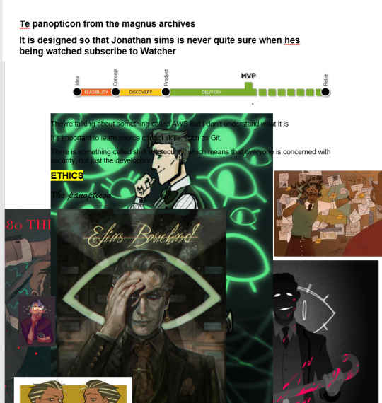
To the point where the document is literally unreadable because all the text is COVERED in magnus archives fanart. I went into that exam knowing that jurgen leitner was brutally pipe murdered to death and that the panopticon is where the watchers crown ritual takes place . And I passed with 100%
#the magnus archives#tma#This image makes me laugh uncontrollably whenever I see it#Because literally the rest of the document is normal notes and then it DEVOLVES#There is some readable text after this but its all in bright green and about the ethics of elias beating jurgen to death
3K notes
·
View notes
Text
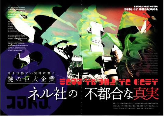
Haikara Walker Pages 179 - 193: The Inconvenient truths of Kamabo Co.
More artbook translations! These ones I translated a couple years ago (except for some stuff on page 188, just did that now lol), but they needed to be spruced up a bit and moved to a more readable format other than shitty discord screenshots on a twitter thread, so here it is. For the most part I’m not gonna bother translating the handwritten text since it’s usually just design notes.
(scans by @milkiemilkshake)
[178 + 179, which is the first image i posted]
A huge, mysterious company that creeps in the underground world
The inconvenient truths of Kamabo Co.
During our coverage of the Deepsea Metro, our reporters saw a huge underground experimental facility. According to the sea cucumber conductor, the company that operates the facility is called Kamabo Corporation. In order to find out more about Kamabo Co., our reporters infiltrated deep underground.
[180 + 181]
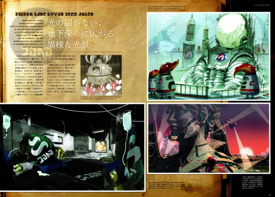
Beyond light's reach, unusual sights spread in the deep.
[180] In recent years, the existence of the Deepsea Metro has become clear and has garnered attention. Surprisingly, each station is said to be an experimental facility of a company called Kamabo Corporation. Our reporters had a hunch that more secrets were hidden further in the Deepsea Metro. We received a CQ-80 and a CQ Card from the Telephone, who called itself "The Tour Guide to the Promised Land," and started the investigation. As we hopped on the subway, we were greeted by a squishy and blue sea cucumber conductor. "Overcome the challenges of each station, and gather the four thangs" are the words we went by. As we arrived at the first station, we couldn't believe our eyes at the extraordinary spectacle. There were Octarians whose bodies were so unthinkably blue, and objects from back in the day, floating in the air, defying gravity.... And when we listened closely, we could hear mellow sounds, unlike anything heard in the squid's world. What does this facility do? Why did it develop in this way underground? And what is the "promised land" told by the Telephone? We will continue our coverage further.
[Page 181, bottom left] Inside the facilities of the Deepsea Metro, medical instruments and equipment can be seen everywhere. Although the hospital-esque atmosphere isn't completely there, there are traces of some clinical trials that have been conducted. As the mystery of the dim and lifeless facility deepens, one could shudder at the thought of it....
[Page 181, bottom right] The upper image shows Octarians who are dressed in protective body suits, who appear to be doing some sort of research. What is the huge object in the center? The lower image is of the NILS Statute, which is the center of Kamabo Co.'s facilities. Details will be described later, but it’s understood that it was created through advanced science.
[182 + 183]
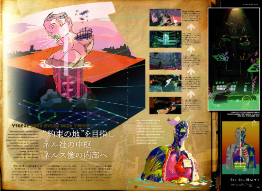
Aiming for the "Promised Land": to the core of Kamabo Co. and the NILS Statue
[182 bottom left] While surveying the facilities found along the Deepsea Metro, our reporters found a huge statue called the "NILS Statue." Upon closer examination of it's interior, seven areas could be seen, with names based on the organs of the humans who once thrived, such as the "Coccyx Prison" and the "Villi Control Zone."* This is Kamabo Co.'s most important facility, as it has more blue-green Octarians and advanced equipment than the facilities in the Deepsea Metro. Through unforgiving Octarian assaults and near-death experiences with the traps strung about, we barely escaped through the top of the statue with our lives. The salty sea breeze comfortably caressed our cheeks, and the radiant rays of the sun shone as it set. In the distance, we could see the region of Inkopolis. Is the world we live in the "Promised Land" the Telephone spoke of?
[* translators note: While in the English version it's all just "(name of organ) Phase", the JPN version gives the areas names that are more specific to what actually goes on there. I figured it would make more sense in this context to tell what goes on in those areas.]
[183 with the arrows and 5 little pictures]
The top of the head, which is the final area. There's several devices alongside each other that one can't even imagine what they’re for. There's a gaping hole where the mouth and the right eye are, and there seems to be something in them. Yet the more you look at it, the more beautiful and graceful it looks.
↑
An elevator is installed in the "Spinal central hole". This mechanism that runs through the center of NILS statue is like a spine of a human. From the elevator, you can get to a long and narrow ladder that lets you leave to the surface. It's really long, how many steps are there?....
↑
An energy core is hidden around the "Diaphragm control tower" and "Peristalsis flow passage." When it is set in a certain place, the core supplies a tremendous amount of electricity to the inside the statue. At first glance, the core looks like a Zapfish, but its power is beyond comparison.
↑
The abdomen of NILS statue. This area is fully prepared to keep intruders away, as it is packed with things such as moving scaffolds and life-threatening lasers. Sometimes the Telephone's voice can be heard through the CQ-80, but one can't tell what it's saying, as the transmission gets cut off.
↑
An area located around the waist of NILS Statue. Since weapons can not be found anywhere, one must use stealth to advance. Move slowly, as any sudden movements will expose one's whereabouts to the Octarians.
[183, small text by the cut open statue] An image showing how the internal structure of the human body has been applied to that of the NILS statue. While looking at the statue, we can't help but wonder: are we just something that gets digested through its body? The rumor that the NILS logo represents a "stylish turd"* suddenly has some truth to it.
* [translators note: literally says "kakkoi unko". take that as you will.]
[183 handwritten captions]
[pointing to the top of the statue's head] Mem Cake
[bottom right] Digest everything and knead it well, and it'll turn into one thing→
[184 + 185]
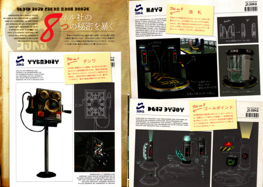
Revealing Kamabo Corporation's Eight Secrets
[184] As a result of searching all over the Deepsea Metro, these eight confidential documents related to Kamabo Co. have been found. These documents show devices that aren't seen in our world, but if their functions and purposes can be explained, then maybe we can reach the hidden truth and essence of the company called Kamabo.
File no. 1
Telephone
[184] A machine installed at the central station. Although it appears to be a piece of telecommunication equipment that was used ancient times, it seems that it was made by combining some of the latest technology. It has the function to detect an ID from an Octarian's body and discern individuals. Removing the back cover confirms it has an elaborate internal structure.
File no. 2
Ticket Examiner
[185 top] Ticket gates and dressers are set up at the entrance of each station of the Deepsea Metro. After getting off the metro and choosing a weapon with the dresser, it appears that there's a system in the ticket gate that opens when the specified amount of CQ Points are paid. When one returns to the dresser after clearing a mission, they can receive a Mem cake.
File no. 3
Goal Point
[185 bottom] The goal point provided at the innermost part of each experimental facility starts up by painting the device with ink, and stops after a certain period of time elapses. It's a device that has been confirmed to be seen even in the Octarian residential areas, but the ones in the Deepsea Metro are shaped like a pen or a push button.
[translators note: The goal point likely looks like a pen because the words for "ballpoint" and "goal point" are extremely close in Japanese.]
[186 + 187]
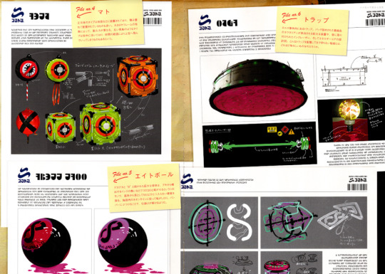
File no. 4
Target
[186 top] The kind of targets that looks like a cube can be set up on the ground, or are often arranged in stacks. The durability depends on the size of the frame. The kind that looks like a round balloon floats in the air. They say that after a certain amount of time passes, it soars up into the sky.
File no.5
8-ball
[186 bottom] A huge sphere with a big "8" drawn on it. One can roll it around using the momentum of the ink fired from a weapon for example. It is a fine product that boasts of it's sturdiness; if it falls from a high place, it wont get a single crack. It seems that challenges can be solved by rolling it in accordance with the on-site neon signs, and by hitting the bumpers.
File no.6
Traps
[187] Traps found within the body of the NILS statue. There are blueprints of a large device that ejects blue-green Octarians that have been packed in boxes, a wall-mounted ink laser, and an energy core. How dreadful would a secret have to be for one to guard it with traps?
[handwritten text by the power core]
-On a closer look, it's a nucleus-like part of a baby Zapfish. It actually is an egg.
-The baby is blobby.
-The energy is captured with the socket

[188 + 189]
File no.7
NILS Cannon
[188 top]The NILS statue seems to exemplify the dignity of Kamabo Co. Set in its oral cavity is the NILS Cannon, a device that radiates an enormous amount of energy, said to hold the surprising power to remake the world. When it's triggered, our world may be destined to fall....
[188 bottom, by bottom left image] The top of the NILS Statue's head. There are huge tanks and countless antennas and radars that catch radio waves of some kind, reminiscent of an advanced chemical plant or military facility. Just what was this place made for?
[188 bottom, by image at the bottom of 189] The mouth area of the statue operates like a ventriloquist's dummy, and the NILS cannon is deployed as if it's being spat out. The cannon is filled with bright green ink. Upon closer inspection, there seems to be something mixed in among the ink...?
[190+191]
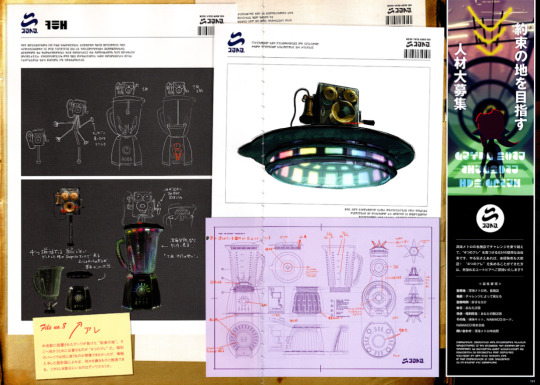
File no. 8
Thangs
[190] It gets installed in the Central Station, and as told by the Telephone, it leads to the "promised land". In order to get there, one needs to collect "the four thangs". One can't even imagine what the individual parts do, but according to these top-secret blueprints, one can guess that it's something that kneads. Is that the Telephone in the part that looks like a lid?
[advertisement on the right side of 191]
Aim for the promised land
Mass Recruitment of capable beings
Overcome challenges at each facility in the Deepsea Metro,
and do the simple job of finding just four "thangs". Even the inexperienced are warmly welcomed, all that matters is if you're motivated! If you can collect the four "thangs”, you will be invited to a bright utopia!!
<Application Requirements>
Working place: In the Deepsea Metro, all facilities
Reward: depends on the challenge
Working time: as much as you like
Holiday: up to you
Remuneration and benefits: depending on your skill
Others: you will be supplied with a sample kit*, CQ Card, and a CQ-80
Contact: Deepsea Metro Central Station
[* translators note: The "sample kit" is the name of the bag attached to your ink tank that expands and explodes when you fail a test. JP splat twitter made a post about it, but the SRL never translated it for some reason.]
332 notes
·
View notes
Note
you have found the secret bananpie tunnel under the amusement park
After finding the trap door, Healthy Light quickly looked around, making sure they were not being observed. Using their magic they opened the door, and looking down into the cellar, they saw very little. There were no lights, save for the slowly setting sun behind them.

After entering the cellar, they carefully looked down at the stairs, for while they appeared as solid rock, they were old and weary, and appeared as though they could crumble to dust in only moments.

Creating a small torch using their magic, Light quietly stepped down the stairs towards the floor. Looking back over their shoulder every few steps, they saw the trap door, and the sun's faint light, now shrinking in size the further down they went.

Reaching the floor, Light looked around. The cellar looked like it had been abandoned for what must have been years. Cobwebs lined the walls and ceiling as small pebbles of broken rock were scattered about, having fallen down with age.

Their magic torch illuminating the ground in front of them, Light moved towards the dark corridors from whence they had heard the faint sounds coming. Fearing they might be lost in the shadowed catacombs underneath the park, they marked the wall with some magic, small beacons, every turn they took.
After what felt like eons in the dark, many turns and corridors leading to nowhere, they finally reached a hallway leading to a single door. Upon the door was written 'Surveillance, NO TRESPASSING'.

Surveillance, down here, in the dark? What could this mean…? For whom was this built, who surveilled and who was surveilled? Filled with equal parts curiosity and hesitance, Light moved slowly towards the door, the handle of which had the faintest hue of yellow pigment left on it.
Light opened the door, which creaked in its hinges and echoed throughout the tunnels. Startled at the loud sounds, Light looked back into the darkness, fearing someone might have heard the sounds. If they could hear fainter sounds all the way back through the tunnels, above ground, how clearly must the door have been heard?
Putting aside their fear, they opened the door further, revealing a darkened room with bright screens in front of a small desk. As Light walked towards the desk, keeping one ear focused on the tunnels, they noticed a small picture frame on the desk.
Illuminating the frame, it showed the image of a young mare, no older than twenty. Emerald green eyes and charcoal black hair, with a ribbon loosely fastened around their neck. The text below the image, while mostly faded, read
'Banana Mousse
Last seen: January 15th, 2022.
If y.. hav. any ki.d of i.fo.ma.ion,
plea.., con..ct thi. nu..er
557-……..'
The rest of the text was no longer readable…
Banana Mousse? Was she not related to Banana Pie, the stallion who had contacted them about visiting the park? What could have happened?
Looking at the screens surrounding the desk, Light saw many figures walking around. But the view of these ponies and other creatures on the screens was… Odd. It appeared as though the cameras which were focused on them were not applied to a wall or anything of the sort. Most were at eye level, following around in fluid, natural motions, rarely, if ever, used by surveillance cameras.
On first glance, Light recognised none of the creatures on the screens. However, upon closer inspection, they noticed a pony with a red horn and bow tie, whom they had seen before. As they were entering the park, this pony, this Doctor, followed closely behind, wondering if they could offer any help, but Light had not seen them since.
Where had they gone to?
Hearing the door creak behind them, Light turned and came face to face with Banana Pie. Fearing the worst, Light shone their torch, illuminating the darkened room until the darkness had been driven out.
In the warmer light, they could see the cheerful pony they met before, but not the same. Pie had his cheerful demeanor replaced by a broken, defeated gaze towards the Kirin. It wasn't anger or frustration, but… Sadness. Exhausted, worried, heartbroken and depressed. As if they had been drained of all energy and happiness in an instant, bereft of life and rest.
Gazing back at the screens, Light was confused. What was the meaning of all this? Did Pie build all of this? And for what purpose?
Remembering the framed image of Mousse, Pie's daughter, thoughts began to fall into place. All of these ponies and fantastical creatures must have been in contact with Pie, as Mousse had been. Pie had been keeping an eye on them. Surveillance, guarding, protection of friends and family through camera feeds, all leading to this room underneath the park.
Light's mind was flooded with puzzling thoughts and many questions. Not wanting to ponder too long over which question to ask first, they asked a question that would bring many answers:
"Are you alright? Would you like to get something off your chest?"
Looking at the Kirin, Pie tried to put on a facade, bring back a laugh, a smile, so much as a grin, but to no avail. Tears welled in his eyes as he gently wrapped his arms around Light, sinking through his knees to the floor as he did so. Light managed to catch him, and used their magic to gently lay him across their back.
The Unicorn was spent, he had been strong for too long.
Following the beacons through the tunnels, Light led Pie back to the surface, to find that night had fallen and the park had been left empty. Pie laid on their back, tears staining his face but sleeping peacefully.
As they stepped out of the alleyway, the first thought that entered Light's mind was:
"What should I do now?"
(Be sure to click the images for higher quality! Might do this combo more often, drawing/writing to advance the story. Was really fun writing! Also, hope it's okay to add an @ mention!)
Featuring:
Banana Pie from @askbananapie
Banana Mousse from @ask-bananamousse
Doctor Hooves from @askthequietdoctorwhooves
#healthy light jdeck306#jdeck306#my little pony#mlp#mlp friendship is magic#own art#drawing#writing#oc#banana pie#story related#healthy light#banana mousse#quiet doctor whooves
23 notes
·
View notes
Text
Shishigumi Family AU Drabble:
Summary: Ibuki is up late at night, trying to wrap his head around the recent events of his (formerly) missing boss. Louis is awake too dealing with his own struggles and the lion comes to grip that he doesn't just see the young and stubborn buck as his boss or friend but as something more: family
Disclaimer: I've only seen the anime once and skimmed a few random manga pages to try and learn about characters (currently making slow progress on reading the whole thing online). I'm sorry if I butchered personalities and/or backstories in canon so I guess anything messed up would just be part of the AU lol.
Things were beginning to look like they were heading in the right direction. It only took about two months for things to start moving slow once more. Tensions have fallen and eased back into the normal casual lifestyle of the Shishigumi-or whatever the ‘norm’ for a ragtag group of lions keeping a rather taboo location in check. It was their norm anyway and they frankly did not care if anyone thought different.
Despite the feeling of calmness washing over the rundown tower of a mansion, Ibuki could sense the underlying troubles that shook the members of the Pride down to its foundations. Even though the future was looking pretty good as of now, it had only just started to calm down after a rather devastating event that had even him sick to his stomach. He did not allow this feeling to really present itself publicly but he was still a bit shaken from the events that had unfolded a couple of months ago.
It had started when the Shishigumi boss had run off, ordering his lion followers to stay behind. That it was his duty to help a friend. Normally, the lions would not care to meddle with high school drama or fighting students but with one of their own running straight into the snarling jaws of carnivores, it had them all worried. Ibuki could recall the sheer power and determination that blazed like orange flames in his boss’ copper colored eyes, mingled with the heavy scent of fear that radiated off his body like a furnace. A few of the lions almost broke their ‘promise’ to try and give their boss bacup after hearing about what this fight was about. But in the end, it was not their fight and they respected their boss too much to go against his orders.
It had been a nerve wracking waiting game as the sun had slowly risen over the streets of the Market. They patiently waited for a sign.
No calls, no texts, no check ins, and not a single letter.
The Shishigumi boss had gone off the radar. Being an herbivore thrusting himself into a fight between two apex predators and had not returned, hope was slowly fading. By night three, the lions began to schedule patrols to keep an eye out for their horned friend, just in case. They kept their eyes and ears open in the market as well tracking any shipments of deer meat in the market just in case.
By the end of the second week, there was still no sign of their missing boss and Ibuki had taken the role as the new leader of the Pride. It was heavily suspected that their friend had gotten too close to the deadly fight and had been devoured. It sickened Ibuki. He had grown fond of the deer and it devastated him to think of the outcome of that fight.
Ibuki removed his glasses from his face with a sigh. It had only been about a week since Louis’ return and reassignment as boss once more. He could tell that whatever happened at that fight was troubling the boy. He never spoke of the full story in detail and that was his choice. He would respect that. The others did as well when they haute their poking and prodding but Ibuki had noticed that their were more changes to the former high school student than just physical. He noticed that he had slowly started to take better care of himself and was a lot more open on his thoughts and feelings than before. Even though these changes were not necessarily bad, it still left him in questions as to why. Louis had even halted his newfound carnivorous diet in favor of the much healthier greens he was supposed to be eating and gained a couple of pounds back in the process. He was still poorly underweight and underdeveloped for his age and species but Ibuki was proud to see the small glimmers of improvement in the field of self care.
Small tap like thuds drew the old lion out of his thoughts as he redirected his attention to the flight of stairs. He had been so lost in his own head that he failed to realize that Louis was almost at the bottom of the staircase. He watched calmly as the deer slowly inched his way down, step by step with a hand on the wall for support, occasionally whispering small mutters to himself. Quite possibly cursing the terrible night vision he had as an herbivore. It was also good to see that Louis did not seem on edge at this hour of night as he seemed to have full trust in the Pride to not attack him when he was basically blind. A louder tap and a metallic thump let the deer know that he had made it safely down the stairs and with a flick of an ear, he adjusted his loosely fitted white shirt. Ibuki decided to make his presence known as he slowly strode towards the deer, making sure his footsteps were not light so as to not startle him. Wide unseeing copper eyes looked up and his head turned to the general direction of the footsteps. “Hey,” he greeted softly.
Ibuki noticed the tiredness in the young buck’s voice and gave a small nod of his head. “Louis,” he returned the greeting warmly. “What are you doing up? With all due respect, i thought you would be asleep.”
Louis strugged a shoulder, not caring that the hem of the shirt has slipped over his shoulder. The lion could see the small white spots dotting the brown fur. He frowned slightly. He had only seen the fawn spots once before. Being brought up in the Market did its damage on the boy in more ways than one. “Couldn't sleep.” Louis slowly limped towards the kitchen, keeping one hand slightly away from his body to feel around his surroundings. “I could ask you the same thing.” The lion followed, impressed by the boy’s navigation skills. Even though he was relying on the sense of touch and his memory of the mansion’s layout, he seemed to be doing quite well in the dark.
Being an herbivore living with a group of lions certainly had some of its perks.
Ibuki observed the way Louis tended to keep most of his weight into his left leg with each step, putting only a small amount of pressure onto his prosthetic while he limped. He could tell the deer was trying to hide the limp but his efforts were not working well. He hung back a bit as he opened the fridge, squinting his eyes a bit to adjust his eyes to the sudden brightness that flooded the kitchen with a white glow, just standing there as if debating what his next move would be. The lion glanced down and noted how his left leg hovered about an inch from the ground and how he gripped onto the fridge for support. His ears twitched and his tail swayed slowly. "Does it hurt, boss?"
Louis did not reply. In fact, he made no indication that he heard the question but it seemed to snap him out of his trance when he grabbed a bottle of water. He closed the fridge and leaned his back against the door, twisting the cap off and taking a drink. Ibuki wondered if he hit a nerve.
"Yeah." Louis responded after another sip. He sighed and looked down, slowly moving his right leg as if observing it. "Sometimes it's like I can still feel my hooves on the ground. Sometimes it burns. Sometimes its just numb. Sometimes it's a little bit of all." Pushing himself off the fridge, he screwed the lid back on the now empty bottle and placed it back in the fridge in a drawer that held his own personal food items and drinks. "I try not to think about it too often. Thinking about it only makes the pain worse."
There was a long silence that fell between carnivore and herbivore. Ibuki, just standing near the doorway of the kitchen and Louis, leaning against the fridge with his head down, antlers making soft scraping noises as they accidentally brushed against the fridge door. He could see the boy's ears were drooping, his tail low, and his eyes nearly closed with a sorrowful expression on his face. So many thoughts must be lurking in his head, so many questions about life in general. It was one of the many things that had changed since Louis’ return. He seemed to be more readable than ever yet so unpredictable. In fact, he was always unpredictable, especially from the start when he took the first bite of meat at the table, asserting his growing authority over the lions who had watched his every move with wonder and some disbelief.
Ibuki ran his hand through his mane as Louis straightened himself a bit. The deer came closer, keeping his eyes downcasted as he seemed to follow the sound of the lion’s breath. Ibuki watched with concern that melted into confusion as Louis hesitantly leaned his head against his chest, careful not to accidentally impale him with the sharp ends of his antlers. He stood there, immensely unsure about the gesture. It wasn't until Louis’ smaller arms held onto him that he realized he was seeking comfort from whatever was plaguing his brain. Inuki slowly lowered himself to kneel on his knees to reduce the massive height difference and returned the embrace gently, hoping that his act of affection and care would sooth the boy. It was just another thing that made its way onto the unpredictable things to come from the smaller animal. Hell, he never would've thought that he even liked hugs but this interaction proved him wrong,
“I'm sorry,” Louis had whispered as he moved his head to rest his chin on Ibuki’s shoulder. “I was harsh on you guys. All you wanted to do was help and I turned your offers down. I should have let told you that i was still alive and-”
“With all due respect boss, i'm going to stop you right there.” Ibuki gently pulled Louis off on him and laid his hands on his shoulders, a soft look from his eyes even if he couldn't see it. “You don't need to apologize for anything. You were loyal to your wolf friend and helped him out when things got ugly. You put the ones you cared about first before your own needs and that says something about a person.” The lion smiled, gently scratching the fur behind the deer’s left ear. “You might have antlers instead of a mane, hooves for claws, and flat teeth in place of fangs but you damn well have the heart and soul of a lion. I dont think ive ever heard or witnessed another herbivore like yourself doing what you did back there. I know you made a remark about me not being your father but Louis...im proud of you, as if…” he trailed off, studying Louis' expression for a sign to continue. He could not see any negative thoughts or maybe even a furrowed brow of disgust. Hell, if anything, his expression was completely unreadable.
He could not bring himself to say it, at least not yet. He just simply gave a small nod and a smile. “All that I'm trying to say is that I'm glad to have you back with us, Louis. You're always welcome here as our Boss, friend, and a part of our family.” Ibuki slowly raised himself back to his feet, giving Louis a playful rub between his antlers. “It was nice talking with you, son,” he added. He saw Louis’ ears perk up straight at the nickname. “ I'll let you get back to whatever you were wanting to do. I'll see you in the morning. Try not to stay up too late. You need your sleep.” As Ibuki made his way out of the kitchen, he could still feel the deer’s eyes on his back, following the movement of his departure as he made his way up the stairs for the night.
Night had fallen and the morning had come. Ibuki was greeted to a rokous in the dubbed ‘recreational room’ as he watched the lions chat amongst themselves as they played a video game. He could pick out Agata and Free sitting on the floor in front of the television, Dope behind Free, Dolph a few steps away, Hino and Jinma watching every now and then as they spoke about their own thing, and Sabu crouched near Dope. Between Free and Agata sat Louis, the three of them going head to head in a heated game of Claws Of Duty on the TV. Ibuki did not exactly have the same interest in the video game but he took amusement in the younger members competing on who can score the most kills or who slaughters who first. He faintly heard Dope exclaim “kick his ass, boss” just before one of the sections of the screen displayed a kill animation for a round of bullets to an avatar's head, followed by Free’s groan of defeat in his loss and Agata’s laugh before he looped an arm around Louis’ neck in a celebratory semi embrace.
The eldest of the lions smiled. Things were indeed looking good for the Shishigumi, the band of mischievous lions and a theater performer of a young buck. He could not ask for anything better.
#shishigumi fam au#beastars#beastars au#shishigumi#beastars ibuki#beastars Louis#riots writings#beastars fanfic#father/son#found family
44 notes
·
View notes
Text
내일 봐 - lee taeyong

pairing: tattooartist!taeyong x genderneutral!reader, exhighschoolsweetheart!au
genre: FLUFF, angst if you squint a bit, slice of life
word count: 3.6k
synopsis: as lee taeyong counts the days until he brings his tattoo studio to seoul, he finds that life might have additional plans for him.
lowercase intended.
note: the title can be translated to “see you tomorrow” from korean :)
p.s., happy belated birthday, taeyong!
1/3 OF THE INKLING STUDIOS MINISERIES - MASTERLIST

SEOUL, THREE AM.
you give the dark tea another stir before handing it to taeyong.
“i still can’t believe you turned up at my place at three in the morning.”
“long time no see to you too.” the man is sitting on your couch, nodding as if tipping a nonexistent hat.
the air is thin and quiet, the humid summer rain giving a coolness to the endless heat from earlier in the day. you can’t tell what you’re feeling right now, as you’ve just been awakened by what you initially thought was a stranger.
but lee taeyong was no stranger.
“so, welcome to seoul,” you breathe, lazily leaning onto the arm of the couch, your legs folded to your chest.
there’s a whiff of awkwardness in the conversation (probably because it’s literally three in the morning) but you ignore it. just like how you willingly ignore your need to go back to sleep for some man you could call your highschool sweetheart.
what a hopeless romantic, you thought.
yet, today, you find that hopeless romantics aren’t completely hopeless. hopeless romantics like taeyong seem to come back with new clothes, brighter hair, and a new sleeve of art on their right arm. hopeless romantics like taeyong seem to come back sporting personalised baggage and gucci belts while still respecting the slides they owned in high school. hopeless romantics like taeyong seem to act like seven years are two seconds but treat the four hours between breakfast and lunch like a whole decade.
he hasn’t changed a bit.
as taeyong gets comfortable in the safety of your grey, cushioned couch, you take turns with him sharing random moments in your seven years apart from each other, filling each other in on the gap of time.
soon, it’s five in the morning, and you’re making a third cup of tea.
“hey,” you speak, breaking a bit of the silence in the room, “what made you text me?”
taeyong leans back into the arm of the couch and brings his backpack to his stomach, quickly taking out a number of envelopes.
“i found these,” taeyong holds them up with a hand, “three days ago.”
THREE DAYS TO SEOUL, and lee taeyong hasn’t started packing his bags. he’s in his flat, a pair of sweats and a loose tee oddly matching his pink cotton candy hair. now he stands in his bare room, the wall decor and furniture already packed and shipped over the globe. in the corner of the room lay the bed that came with the place, seemingly blending into the faded white walls of the room.
across the bed was his wardrobe, half-empty and left with a collection of sweatpants, sweatshirts, and jewellery. with the large suitcase open wide in the middle of the living room, taeyong’s slender figure leans on one of the doors of the wardrobe, staring into the assortment of sewn fabrics on the shelves of the wardrobe like working on a sudoku puzzle.
with a deep breath, taeyong slowly begins to look through his clothes, folding them from their hangers and transporting them from his bedroom to the large suitcase in his living room. starting from the jewellery he hid in various hoodie and sweatpants pockets to the five pairs of shoes he’d have to wrap with extra bubble wrap, packing was no easy feat.
but of course, he had to pack. it wasn’t hard; it was tedious. knowing that he wanted to get it over with to make room for relaxation for his last two days in this city, taeyong had tried to suppress any urges to try on a lost pair of earrings or reminisce on the story behind an old hoodie.
yet all that flew away when he found a small bunch of papers stowed away at the bottom of one of his hoodie drawers, the faded ink still resembling handwriting he so easily recognised.
yours.
when you had left to seoul for college seven years ago, taeyong remembers how you promised to send him letters every third sunday of each month. it went on for a year, and now in his hands he held eleven opened envelopes (apparently one of them got lost in shipping).
the envelopes were always the same; beige with old-fashioned bamboo illustrations on the bottom left corner, decorated with a long strip of green washi tape at the top, wrapping it around the envelope twice to make sure nothing would fall out.
as taeyong peers into one of the identical envelopes, he finds that you hadn’t just sent letters. you sent old concert tickets, used bus passes, and vanishing receipts. he could barely read any of the tickets or receipts, but when he found that you had sent a polaroid on one of them, taeyong found his heart pulling at the sight of a younger you.
the polaroid was taken in july six years ago, the month taeyong turned nineteen. it was you, seated in a dim lit restaurant with your new friends, a drink in hand and eyes to the camera. looking at the polaroid, he could make out the faint sound of your laugh in his ears, recalling how you’d clutch your stomach and throw your head back.
taeyong chuckles at the remnants he has of you, and he skims through the letters you sent. each month told him the most random encounters and happenings in your daily life, so much so that it felt like listening on a genuine conversation when reading your letters. taeyong suddenly remembers that he had sent letters in reply when a number of your letters started mentioning things that happened to him while he was in art school, making him scoff at how romantically old-fashioned the two of you insisted on being.
taeyong smiles warmly as his slim fingers carefully fold back the tenth letter into its envelope, taking the eleven packages in one hand and placing them back where he found them.
until he finds another one.
this time, rather than beige, it’s pink; almost orange. no washi tape around the top of bamboo illustrations, just two barely readable addresses and his name. it’s sealed, and although the feeling of it is new, he could tell by the ruined writing and the stiff texture that it had been wet, dry, crinkled, and straight.
so taeyong furrows his eyebrows in surprise before carefully slipping a fingernail between the sealed folds of the envelope in an attempt to open it cleanly. inside, he finds nothing more than what he’s already found before; tickets, pictures, and a letter. this time, the letter is short and written on a faded cream notepad, ripped at the top.
rough ride through shipping, it seems.
when taeyong reads it, he finds that the stains from the front of the page had gone all the way through the ink on the letter as well. he could read nothing. while it was unclear why he hadn’t opened the letter before, it seemed that it was the last letter of the year.
taeyong’s eyes try their best to perform some sort of inhuman scanning (it doesn’t work) only to find a sequence of numbers and a five-letter sentence at the edge of the paper, right before you signed your name: “meet me in seoul someday.”
taeyong sighs at the sentiment, knowing that even he had forgot about you amidst those years. and if he, some imaginative hopeless romantic, forgot, then what would that make you? you two had lost contact so naturally that one might have thought it was fate.
he’s sure you’ve fallen in love with someone in the span of those seven years, yet a small excitement pooled in his stomach. he doesn’t know if you’ll still call him yours.
but he can try.
with that, taeyong saves the number on the paper and texts a quiet “hey”, fingers crossed in hoping that you still used that number.
he couldn’t believe it when you called him that day.
TWO DAYS TO SEOUL, and the thought of lee taeyong has just crossed your mind for the umpteenth time today.
you had called him all of last night after receiving a short “hey” in text, followed by an “it’s lee taeyong”. while your initial reaction was pleasant surprise, you’re not sure why your heart has begun to swell every time you hear the same ding on your phone at the thought of your so-called high school sweetheart (you have to constantly remind yourself that there’s sixteen-hour time difference between you and him).
you feel sixteen again.
and you come to wonder why - at first glance, lee taeyong doesn’t seem to be the romantic type. with his bright pink hair and right sleeve full of colourful tattoos, the man carries himself with a striking presence, a sharp voice, and sharper eyes. yet, there’s a quiet delicateness that is almost always overlooked.
almost.
it’s a long story, but you had always seen him around since you moved from seoul to portland in middle school. he was in your mandarin class, and for a year you remembered him as the boy who’d sneak in korean words in a “chinese” accent to cover up any vocabulary he didn’t know. it was funny, really, until the school switched your then indifferent mandarin teacher with a younger, more adamant man in his mid-thirties.
you didn’t see taeyong for a while after the seventh grade. it was only until the first day of your second semester, freshman year of high school, that he walked in with his now trademark pink hair. you remember everyone in your friend group whispering little sentences between is he allowed to do that? and looks like an alien as a way to cover up that, really, he just looked super cool.
and super intimidating, all of a sudden.
suddenly everyone had noticed him, and yet even less people wanted to talk to him. countless rumours went around, of course, but you could only remember the craziest three off the top of your head: one, he had fucked the new visual arts teacher into giving him an a+ all throughout sophomore year (he always went to the art room after school hours for some reason); two, he worked at one of the strip clubs downtown because one time he turned up to class with a full vintage balenciaga getup that cost more than 4000 dollars (you still weren’t sure how much the staff at strip clubs made, but you almost believed it); three, he had a big, fat crush on the school’s basketball team captain, james ramos (in retrospect, you think it might have been james who had a crush on taeyong - after all, james was the one constantly calling on taeyong).
you didn’t think much of the rumours until you had to spend an awful lot of time with him in the art room after school, when one assignment in visual arts had you feeling stumped. knowing your parents, they weren’t going to let you off so easily, especially for art, as they deemed it one of the “easier subjects”.
from slowly getting to know him, you learned that he had an a+ in art class because of the way he somehow managed to turn traditional techniques into something of his own; that his vintage balenciagas were actually hand me downs he altered from his mom; and that james ramos had tried to kiss him after a district match, and when taeyong politely declined, james felt the sudden need to point fingers at taeyong.
above all the rumours, taeyong was a good friend.
taeyong made you remember all the afternoons cooped up in the shadow-paned art room, the orange sunset crossing his face with soft streaks of faded sunlight. taeyong made sure you had something to munch on while you were working, and taeyong was there to understand your work when it felt like everyone else including yourself despised every stroke and splash on the canvas.
and even after you had let your disappointment wash away in your painting that term, you still stayed by the art room. some days he would be on his nintendo 3ds, and some days he’d sneak in warm pretzels that made the paints smell like cheese and cinnamon the following week.
taeyong was a good friend.
he was a friend until one chilly afternoon brought your lips to his and he did what you thought would never happen: he kissed you back. he held your jaw gently with his fingers while his other hand circled around your wrist, keeping you with him in a moment you still didn’t feel was real. you remember his mouth had tasted of the chocolate you had dipped your churros in, the awkward moulding of your lips bearable because your heart was beating a mile a minute and you could care less about a sloppy kiss.
everything and nothing changed since then: you kept eating pretzels inside the art room, he kept playing his nintendo 3ds; but there was a little rush that came into your chest whenever you saw him across the hall or in class. slowly, walking side-by-side turned into intertwined hands and goodbye hugs turned into goodbye kisses, and that was when he asked you out.
of course, the art room wasn’t your dating spot to do whatever you pleased. inevitably, more and more kids needed to use the art room.
but as soon as you started to feel bummed out about it, you found taeyong waiting by your seventh period class, ready to take you downtown. and it just became like that.
it was unknown cafés, study dates and city lights all year round. he would take you to art exhibitions and say nothing before he’d walk you home just to climb through your window two hours later. and you remember specifically, while he laid on your bed, staring at the dim glow-in-the-dark stars on your ceiling, he poured out all his hopes and dreams for the future: ones full of colour and freedom and artistry. he told it slow, and he told it all.
he told you while he dozed off into sleep, his arm tucking you right next to him as his drowsy words faded into your bedroom.
now, when he tells you he’s bringing his tattoo studio across the globe, you can’t stop the wide smile that spreads itself across your face. and when he asks to stay over at your place for his first week in the city, your mind starts to unpack all the feelings you had stowed away for so long.
and you can’t get him out of your mind.
ONE DAY TO SEOUL, and lee taeyong is starting to think his coming to seoul is just the universe’s way of making him come back to you.
with your letters in his backpack and his phone in his pocket, taeyong wanders the airport’s transit area in search of a vending machine for some chips. he’s all too familiar with the blue carpet and metal seats, and it’s not because he’s travelled - it’s because of you.
it’s weird, he thinks, so many things he sees on a daily basis now remind him of you. first it was his phone, then his hoodie, and now this entire airport terminal. he’s nervous for seoul, mostly because of his studio, but there’s always that light heaviness in his chest when you come across his mind.
the only memories he has of you are those where you were eighteen and a fresh high school graduate, spending the summer at his place almost every day to make up for your inevitable break up.
looking at you - or, what he remembers of you - he knew everything was changing. or at least, about to. high school sweethearts and all, he knew you were prepared to want to forget about him. you were prepared to be shipped off to seoul, the breakup conversation leaving nothing but a short and bitter aftertaste before freedom washed over.
you never were prepared.
maybe somewhere along the line you two made the compromise that didn’t give you the need to be prepared. you could stay - get admitted into the same school as he did, live together, work together. but who was taeyong to suddenly change all you’ve told your parents the day you arrived in portland? you weren’t going to art school. life wasn’t a movie, and taeyong truly cursed it for not being one.
taeyong shrugs his thoughts away as he nears a vending machine on the outside of the gate, wallet clutched in hand. though it was a bit disappointing that they didn’t have the sour cream chips he was going for, the man opted for some water to make him feel a little less dead after all that flying.
when taeyong walks back to his seat, he finds that the reason why he remembers you so much lies on the tip of his tongue, but he’s not sure if he wants to admit it just yet.
it does make him think a bit. he’s been with people after you, yet there just seemed to be something different when it came to you. taeyong thinks it’s just first-love residue, and he’s probably right, but what’s the shame in basking in cheesy letters and nostalgia?
technically, you two never broke up, never said goodbye, never saw each other again. one day you were waking up in his room on a summer morning, and the next, you were waking up at an airport, alone, never getting the chance to truly say goodbye. a familiar frustration comes back to taeyong’s gut as he wonders what could have been had your parents not dragged you on an earlier flight without his or your knowledge.
a loud announcement is heard through the room, interrupting taeyong’s thoughts. his second flight has been delayed for another two hours.
taeyong takes his phone out of his pocket, checking the time. great. jet-lagged, half-awake, and hungry.
“whatever,” taeyong mutters under his breath, shoving all those stray feelings in the back of his head. taeyong decides he’d rather deal with them when he actually sees you in person. for now, rest.
but he can’t sleep, so instead he unlocks his phone, and to his surprise, he finds a text from you:
“see you tomorrow :)”
SEOUL, SIX AM.
taeyong finds that there isn’t much of a difference between high school you and adult you. maybe there is, and taeyong hasn’t noticed yet through his jet-lag.
but he knows you.
slowly, taeyong stands from his seat on the couch and walks towards the kitchen, where you were making yourself another cup of tea. his presence is noticeable, and though it’s new, it’s far from uncomfortable. you carry on, taking the jar of sugar from a cupboard, feeling him lean on the table right behind you.
“how’s your studio?” you chirp, starting conversation.
you hear him stir, “i’m going to the building tomorrow,” he begins, “i’ve been in contact with some of the staff for a while now, so i’m hoping everything just goes as planned.”
as you watch the sugar dissolve into the tea, you take the cup in both your hands, “maybe i could visit sometime? i’ve never-”
you turn around to find taeyong standing only inches away from you. you freeze momentarily, eyes looking into his, your speech cutting mid-sentence. he stands idly, shoulders relaxed, and starts to look down at the dark liquid in your cup, watching it whir slowly. you follow his gaze before picking up your sentence, “i’ve never gotten a tattoo before.”
shyly, you brush it off and slowly walk out of the kitchen. taeyong purses his lips.
“i could take you with me tomorrow.”
you stop in your steps. your feel your cheekbones raise at his words, and you find yourself turning back to him. the interaction is stiff, but with every step towards the man you decide it’s both far too late and far too early to be worrying about that.
so you kiss him. sweetly.
reminiscent of your first kiss with him, he kisses back, his fingertips ghosting the side of your jaw, leaning into your faint touch. it’s fresh, and this time, it isn’t sloppy. he kisses you softly, his lips carrying experience and a humble confidence not found seven years ago.
when you pull away, you’re glad you hadn’t spilled your tea all over his and your shirt, your tongue gliding over your bottom lip as if processing the kiss.
“it’s been a while, huh?” you joke, feeling a blush rise up in your cheeks, and taeyong laughs along.
“i still can’t believe i’m really here with you,” taeyong says, holding you closer. you only hope he feels the same warmth you’re feeling in your chest.
there’s so much more you want to tell taeyong, and some part of you is convinced you should stay up and skip work for the day just for him.
but right now, between having too many words and none at all, you settle for four.
“i’ve missed you too.”
#taeyong x reader#nct 127 imagines#nct 127 fic#nct 127 fluff#taeyong fluff#nct 127#nct#nct-writers#lee taeyong#nct 127 au#highschool au#taeyong angst#taeyong imagines#taeyong fic#nct taeyong fic#nct taeyong imagines#nct taeyong#taeyong tattoo artist#tattoo artist au#inkling studios#moon taeil#johnny suh#nakamoto yuta#kim doyoung#jung jaehyun#kim jungwoo#mark lee#lee haechan#ty lee#ugh not my best work
112 notes
·
View notes
Text
Li-Fi- The Future Wi-Fi
HISTORICAL BACKGROUND
In good old days, computers and the internet were considered to be far-flung luxuries. They were reachable to only a few people or researchers, working for the government. However, as time passed and technology evolved, these luxuries became more accessible and controllable. The idea of the internet, which started as a “cold-war weapon” back in the 1960s now acts as a nutriment for the twenty-first-century generation.
As computers reached domestic households, the internet did not lag. Conventional internet services were provided through cable setups but with advancements and modernizations, this changed too.
Wi-Fi is the most familiar word that we know today. Abbreviated as Wind-Fidelity, it provides data transmission and reception through radio waves to every compatible, internet operated device. As innovation and transformation shall never stop, new emerging technology is underway.
THE BEGINNING
Since childhood, we have studied light and electricity. Guess what? This is the time to put their combination to use. Li-Fi abbreviated as Light-Fidelity is the new technology in town. Many of us would not know about this because either we live in a developing country or because this technology is in the early stage of development. This term first became public back in 2011 during a TED Talk. The subsequent year, in 2012, the same TED Talk speaker Prof. Harald Hass established a company named “PureLiFi” aiming to bring out the new technology.
COMMUNICATION
Li-Fi, as by the name, will operate in the presence of light but not any ordinary light or sunlight rather an LED bulb. Li-Fi technology operates in the frequency bandwidth range of 430THz- 770 THz. This is higher than the operating frequency bandwidth range of Wi-Fi which is 3000 Hz- 300 GHz. Data communication is carried out through both infrared and visible light spectrums.
Simply speaking, LED bulbs act as routers for data transmission and reception. Signals are fed to the bulb through signal-processing technology. These signals than in the form of a focused beam of light travel and are detected by a light detector or a photo-detector device. This device converts the signal back to the readable form. The readable form can be audio, video, text, web application, or any desired form depending upon the user and the internet-enabled device. Technically speaking, Li-Fi works on digital signal communication technology. It is a node-to-node wireless communication link between a source (LED bulb) and a receiver (Photon Detector). It is a visible light communication technology where data transmission is invisible to the human eye. If the LED bulb is turned ON, the receiver understands it as digital HIGH and if the LED bulb is turned OFF, the receiver understands it as digital LOW. Communication occurs in the form of bits- 1s and 0s. HIGH is 1 and LOW is 0.Input signals and output signals are both digital in nature. However, if signals are not in digital form, they are converted into digital form using a comparator with the help of an operational amplifier or by any other sophisticated internal mechanism, so that they can be fed into the micro-controllers.
THE SPEED WE WANT
Initially, its anticipated speed was 1 Giga-bits per second, but advancements have proved that a speed of about 100 Giga Bits is also achievable. Quite high, isn’t it? Let us dig into it.
LED bulbs are made of semiconductor materials, right? They produce white light using a combination of chemically coated internal phosphorous screens of blue and yellow color. This gives a speed of about 1 Giga-Bit per second. Then we have LEDs that use RGB (Red, Green, and Blue) colors to produce white light and they give a speed of around 5 Giga-Bits per second. The highest speed that has been practically demonstrated is 8 Giga-Bits per second. Scientists suggest that if we use a laser beam, we can have access to a speed of about 100 Giga-Bits per second. With further research and development, current speed has reached 224 Giga-Bits per second (in a lab). A successful demonstration in Estonia, a speed of 1 Giga-Bits per second was recorded, 100 times faster than conventional Wi-Fi.
LI-FI AND THE INDUSTRIES
There are many facts about Li-Fi that you should know but let us keep it simple and direct. First of all, as already mentioned, sunlight by no means can be used for LI-Fi data transfer but solar cells can be used in receivers. It is because Li-Fi operates at frequencies higher than 1MHz and sunlight does not fulfill the criteria. Furthermore, according to a study, sunlight also compromises the data transmission rate. One other thing is that LED flickering transmits data. This flickering is invisible to the human eye. Better the modulation technology, the higher the flickering, and more will be the data transmission rate. There is another stimulating fact that is very useful. Li-Fi uses orthogonal frequency divisional multiplexing (OFDM) technique. However, an advanced modulation technique that goes by the name of EU-OFDM is also employed that allows Li-FI to operate even when light bulbs are dimmer meaning that Li-Fi can work at less brightness too. Also, Li-Fi is essentially emerging 5G technology. Advancements in Li-Fi will probably result in advancements for 5G technology.
APPLICATIONS OF LI-FI
There are many applications of Li-Fi, and work is underway to determine and unleash its full potential. Some major applications are listed below:
1. In many countries, Wi-Fis are not allowed in hospitals as radio waves are detrimental and dangerous for patients. Resultantly, LI-Fi can be used there.
2. Radio waves cannot be used for under-water communication because they cannot penetrate through water but Li-Fi technology can be used for this purpose.
3. Airplanes can use Li-Fi technology which will allow users to use their electronic devices during flight (especially cellphones) unlike radio waves that interfere with navigation systems of aircraft.
4. Li-Fi can be used in places that have inflammable objects or materials unlike Wi-Fi.
5. Li-Fi can be used in nuclear power plants because (Wi-Fi is not allowed there) it does not interfere with sensitive electromagnetic materials.
ADVANTAGES OF LI-FI
The advantages of Li-Fi are given below:
1. Speed: Li-Fi has a very high speed and bandwidth enabling it to be the fastest internet service provider mechanism.
2. Low-Latency: Li-Fi offers less than thrice the latency as offered by Wi-Fi.
3. Efficiency: Li-Fi systems are efficient and cost-effective as houses and offices already have lights, the same lights can be used for data transmission.
4. Electromagnetism: It can be used in areas sensitive to electromagnetic radiation.
5. Security: Li-Fi is secure and immune to external interferences.
6. Low-Light: It can be operated on less brightness thus keeping the consumption of electricity minimal.
DISADVANTAGES OF LI-FI
Some disadvantages are as under:
1. In the absence of a light source or failure of electricity, the internet will not be available.
2. Light cannot penetrate through walls. Hence, its range is very short for example within a room.
3. External light sources such as sunlight may interfere with Li-Fi technology.
4. Electricity bills may rise as lights will have to be turned on for most of the time.
INTERNET TRAFFIC
Due to innovation in technology and the widespread of IoT technology, wireless traffic in the previous decade has increased by 60 percent. If traffic grows at this rate (which is the most reasonable assumption) then this will further saturate the already saturated bandwidth range. Researchers have highlighted that if this continues (and it will, for sure) then after 20 years, we will require the 6THz bandwidth spectrum. To your amazement, the bandwidth spectrum limit of Radio Frequencies (RF) is only 0.3THz. Resultantly, in two decades we will be 20 times short of the future demand. To overcome this issue Li-Fi has been critically experimented upon. Li-Fi, as mentioned above, operates in the range of 430THz-770THz that is quite higher than the RF band.
CONCLUSION
Provided the above information, we conclude that Li-Fi is the need of the future. Not only because we want more speed and security but also because RF band traffic is growing exponentially. Like every technology, Li-Fi has some attractive and compelling advantages and some disadvantages. Scientists and researchers are working laboriously on this to develop more space for efficiencies and better improvements. There is a lot more to Li-Fi technology than mentioned here. Numerous institutions and students have developed minor light operated gadgets such as Li-Fi speakers etc. but this technology is destined for much bigger and better things. There is still a lot of room for betterment and development. If enabled adequately, a faster and more secure future awaits us.
1 note
·
View note
Text
Basic Indian Wedding Cards
A wedding card is a sort of invitation letter sent to invite the recipient to a wedding. The Indian wedding cards are in a third person and a very formal language and then are sent to guests 1.5-2 months before the date of marriage.
Who sends the wedding cards?
The host has to take the responsibility of mailing the cards to all the people mentioned in the guests' list. In Indian culture, the mother is responsible to either send the cards by herself or by someone very close to the relatives and other guests.

Text
The text or the manner of invitation through cards depends on the country, its culture, and its language. However, Indian wedding cards are usually semi-formal. The date, place, and time of the essential ceremonies are mentioned.
Wedding cards in India
India acquired the concept of invitation cards from the British while following the western culture. In India, usually, the parents of the bride host the wedding. The wedding cards begin with formal context, mentioning the bride and groom's names along with the name of their parents and grandparents.
According to Hindu mythology, the wedding cards are very significant. The first card is placed before the Gods and Goddesses to seek their blessings, and then they are sent to the guests.
Other Mentions
Apart from the parents' mentions and another comedy is another tag as RSVP included in the cards. The world RSVP means respond, please, and a contact name and contact number are there alongside the title. The person mentioned as RSVP is essential to know any information regarding the place, directions, accommodations, or any other small or big words.
Cost
The Indian wedding cards range between INR 50-100 per piece. However, in case you want customized cards, then the price may vary as per your requirements.
Features
The wedding cards fashion changes with time and is usually as per the theme of the wedding or the theme that is trending.
- Pattern And Design: Peacock, feather, Swastika, OM are the most common designs of the wedding cards in India.
- Colours: Bright colours like red, green, yellow, orange look good in the wedding cards. These colours not only look attractive but also have some religious importance in Indian culture.
- Embellishment: The wedding cards are decorated with beautiful jewels and ornaments to make them look classy and rich.
What to mention in the wedding card?
There are several things written on wedding cards. Some of them include-
Name of the host.
Invitation request.
Names of bride and groom.
Date and time of the ceremonies and events.
The location.
Reception information.
Dress code (if any).
RSVP.
The trending wedding invitations
Other than the ordinary cards, there are some trending invitations. They are-
Sustainability
Acrylic Wedding invitations.
Vellum paper invitation cards and envelopes.
Foil painting.
Monogram.
Metallic and glitter touch on cards.
Wax seal decoration.
Unique shaped cards.
Customized envelopes of cards.
Do's and don'ts of wedding invitation cards
Do's:- It is preferable to choose the words formally.
- Mention the bride's name first. However, this can deviate, but sometimes it's good to follow the traditions.
- Choose cards that match the wedding theme.
- Include the names and requests if children to make the card seem cute.
- Try to be unique and different while selecting the cards.
- Try to mention RSVP, who can respond both offline as well as online.
- Write the direction clearly and in detail.
- Give the handling of the cards to someone sincere and responsible.
Don'ts:
- The wedding invitations should remain short and sweet—no extra information on the cards.
- Try to mention the names of all the guests on the card as it looks polite.
- Do not use more than two fonts. Choose the easily readable fonts.
- Do not mention the pre and post-wedding functions.
- Do not miss to verify the address.
- Do not forget to say about the choices of meals.
- Do not keep the date of RSVP too close to the wedding.
- Do not order the exact number of cards as per the guest list. Keep some extra cards handy.
What to do with wedding cards after marriage?
A wedding card is of exceptional importance in every couple's life. To keep it forever as a memory, one can do some creative stuff with the card. Here is the list of some of the creative ideas:
- Frame the card and place it in your room as a memory.
- Create a mini-album for your wedding card.
- Use DIYS and make cute decorative kinds of stuff with the wedding cards.
A wedding card is an integral part of our tradition. Without it, our marriage lost its charm. We distribute wedding cards with ladoos. When we distribute the wedding card, it's our way of showing closeness to our relatives and friends.
0 notes
Text
Is Artificial Tree Safer Than Real Tree?
I freaking love the smell of fresh pine — and I'm allergic to it. As a kid, my parents always had a live tree. The moment it was upright, I would break out, would start sneezing like a maniac, and develop hives. It took them a bit to figure out that my reaction was the result of my allergy to a tree thanks, mom and dad, and when they did, they switched to a large artificial tree. However, allergies aside, are unnatural Christmas trees are safer than real trees? Experts say there are some things to consider, including which option is best for the environment.
"When it comes to real trees, some people don't have a choice," Deemer Class of UK-based Fantastic Gardeners tells Romper in an email interview. "Having a hay fever may bring hell with a real Christmas tree. Some molds grow naturally on them, and they can cause hay fever-like symptoms to people who have asthma." In addition to an allergic reaction, Cass points out that live pine trees can also bring with them ticks and other bugs.
"These bugs, however, are adapted to living outside and will very soon die out indoors," Cass says. "They are by no means any threat to homeowners and their families." On the other hand, Cass says, ticks transported in your home from a Christmas tree may occur, but on a rare occasion. "Ticks withstand from nourishing on habitation big animals, and a Christmas tree is not a suitable habitat for them," he notes.
In terms of a real Christmas tree being a fire hazard, Cass says trees become flammable only if they dry out. "Just make sure you water it daily and position it away from heat sources."
When it comes to being kind to the environment, artificial trees can be a solid choice, Caleb Backe, a health and wellness expert for Maple Holistics, tells Romper in an email interview. "But only if they are used for a certain number of years before their disposal," he says. Still, Backe says, a live tree doesn't pose the environmental loss that some people might believe it does.
"While cutting down a real tree does constitute a kind of environmental damage, this doesn't necessarily make it a more harmful long-term act, environmentally speaking, than purchasing and using an artificial tree does," he says. "The thing is, real trees decompose and return to the earth when they are disposed of. So, while a tree is ripped from the ground for aesthetic and unnatural home use, it does eventually feed into the circle of life, decomposing and feeding the growth of future trees."

Artificial trees, on the other hand, are potentially more problematic, Backe says. "Made of unnatural plastics and other non-biodegradable materials, when an artificial tree is disposed of, it doesn't return to the ground, and it doesn't feed the circle of life. More often than not, it ends up in a landfill, harming the environment and doing more harm than it did well in preventing the killing of a real tree."
Backe points out that studies have suggested that an artificial tree must be used for as many as 20 years to make it the eco-friendly option. "Anecdotal evidence suggests that the average homeowner utilizes their artificial tree for far less than 20 years, meaning that more often than not, the real tree is the real green choice," he says.
In terms of an artificial tree being a fire hazard, Cass adds that artificial trees could also be a problem, "and is made from mostly PVC; they would emit highly toxic gases.
Some Best Indoor Flowering Plants
Chrysanthemum
Chrysanthemums, or mums, as they are more commonly called, make beautiful indoor flowering trees with bright, cheerful blooms. They are remarkably easy to care when you provide a sunny location, well-drained soil and enough water. Once all that is in place, you’ll have an attractive addition to your room.

Spider Plant
These baits appear to grow, even when disregarded. They want wet ground but will absolve you if you forget to water periodically. Protect spider plants in bright to diminish light, but avoid direct sun. Fertilize spider plants twice a month during the spring and summer.
Ficus
Ficus are popular houseplants and also often called the best plants for offices. Why are the great office plants? Because they have a striking appearance and are highly effective at purifying indoor air. This plant likes yellow, erratic light, moist soil and occasional misting. Make sure you keep your focus away from drafts.
Peace Lily
This fantastic indoor plant gives beauty and glamour with a unique look. It prefers bright, indirect light but also does well in medium, indirect light. When it needs water, it will tell you by getting droopy leaves. After watering, it perks back up in response.

Boston Fern
Boston ferns can accumulate quite a few big and create a showy but elegant addition to your home. They do particularly well in lavatories and other spots that are moist but have soft, natural light.
Golden Pothos
About the Author
All driftwood furniture, driftwood coffee table, and driftwood dining table art is a natural wonder! Welcome to our nautical furniture gallery. A driftwood mirror brings seaside nostalgia into the home. A driftwood lamp conveys seaside fantasy and a driftwood sculpture is a phenomenon in itself in driftwood design. Visit our driftwood sculpture gallery art.
It is a fact that a reader will be distracted by the readable content of a page when looking at its layout. The point of using Lorem Ipsum is that it has a more-or-less normal distribution of letters, as opposed to using ‘Content here, content here’, making it look like readable English. Many desktop publishing packages and web page editors now use Lorem Ipsum as their default model text, and a search for ‘lorem ipsum’ will uncover many websites still in their infancy. Various versions have evolved over the years, sometimes by accident, sometimes on purpose (injected humor and the like).
0 notes
Text
31 Days of Fanstuck Day 6: Fioria: Time Jump
Fioria stared at the glass door in front of her. It wasn’t, at least, the strangest thing on her planet. Her planet was a plateaued wasteland with a sky painted like a sunset eternally. And, unlike the rest of her comrades as far as she knew, her land was the only one without any sort of consorts. No, rather, she was graced with a small planet and the dusty, skeletal remains of what looked like geckos gathered around decrepit mines and ruins. If she was given any sort of civilization, the civilization was in ruins. Only the clocks, each one slightly different from the next, managed to withhold the abuse this land gave them. They stood proud as relics of some sort of bygone era, hidden amongst the stone and cacti.
In fact, in comparison to all of that, a clear glass door with a frosted gear facing a sheer cliff face. on it was quite normal in comparison.
Nor was it the only one. Fioria traveled for hours - at least, she thought it was hours but time felt equally fleeting and eternal through the sands - all for the sake of finding what Swansprite referred to as her “time mechanism”. Which she hadn’t found, but instead she found the doors. Doors to mines. Doors to abandoned cities. Doors leading off of cliffs and into pits. She avoided the doors for a time, but yet here she stood.
“You’ll be fine,” Swansprite said dismissively. “Just open it.”
Fioria bit her lip. She didn’t have any advice on what the doors were, not really. Swansprite was remaining pointedly obtuse about the whole thing. Nor did she have consorts, or readable text like everyone else. She only had her own intuition, and that had no idea what to make of a door just existing freely in space.
Ektome’s chipper voice rang in her ear, what’s the worst that’ll happen? It’s just a door! No need to overthink it.
She reached for the handle, surprised briefly it really felt as smooth and cold as glass should, and pulled, keeping her frame squarely in front of the doorway.
Beyond the door frame was another world. The dusty land was now a lush paradise, green and vibrant with life. What was once a cliff face turned into a gentle slope with cobbled path down to the bottom. A warm, pleasant breeze wafted off the slope and onto her face; a soft replacement for the flat heat she’d been given so far. Jadeblood or not, anyone desires something novel after being stuck with the same monotony for a seeming eternity.
Fioria looked onward, and as she did she stepped forward. Stepped forward into the new, beautiful, foreign land.
When her back foot crossed over, the door shut on its own. Fioria turned around on her heel, catching the door in time to see the gear push out of the glass. It glowed a vibrant, bright candy red for a few seconds as it rapidly turned to the right, then settled right back into the door. The area around the door looked exactly the way the doorway looked earlier: green, lush and teeming with activity. All that remained of her where she stood prior was the sky. Where the ground changed, the sky remained eternally red.
Fioria inched her way toward the handle, attempting to turn it and go backward. Doors normally allowed for two way transit. Surely this one wouldn’t be an exception!
But no. The knob jiggled uselessly and the door held fast. Unless and until she found another way out, she was here in the past.
She looked questionly at Swansprite, though deep inside she didn’t need answers. She had them.
Swansprite must’ve known this, as she gave Fioria the most smug look a swan possibly could and nodded. “Now,” she said, “this will make your hunt for your time travel mechanism easy, won’t it?”
#31 days of fanstuck#homestuck#long post#man conceptually i had a lot of fun designing her land#even if it's.............very obvious what i pulled from#if you've ever played it
0 notes
Text
Apple Watch Series 4 is the most accessible watch yet
Steven Aquino Contributor
Share on Twitter
Steven Aquino is a freelance tech writer and iOS accessibility expert.
More posts by this contributor
The accessibility of the iPhone XS Max
At Apple’s WWDC 2018, accessibility pervades all
Every time I ponder the impact Apple Watch has had on my life, my mind always goes to Matthew Panzarino’s piece published prior to the device’s launch in 2015. In it, Panzarino writes about how using Apple Watch saves time; as a “satellite” to your iPhone, the Watch can discreetly deliver messages without you having to disengage from moments to attend to your phone.
In the three years I’ve worn an Apple Watch, I’ve found this to be true. Like anyone nowadays, my iPhone is the foremost computing device in my life, but the addition of the Watch has somewhat deadened the reflex to check my phone so often. What’s more, the advent of Apple Watch turned me into a regular watch-wearer again, period, be it analog or digital. I went without one for several years, instead relying on my cell phone to tell me the time.
To piggyback on Panzarino’s thesis that Apple Watch saves you time, from my perspective as a disabled person, Apple’s smartwatch makes receiving notifications and the like a more accessible experience. As someone with multiple disabilities, Apple Watch not only promotes pro-social behavior, the device’s glanceable nature alleviates the friction of pulling my phone out of my pocket a thousand times an hour. For people with certain physical motor delays, the seemingly unremarkable act of even getting your phone can be quite an adventure. Apple Watch on my wrist eliminates that work, because all my iMessages and VIP emails are right there.
The fourth-generation Apple Watch, “Series 4” in Apple’s parlance, is the best, most accessible Apple Watch to date. The original value proposition for accessibility, to save on physical wear and tear, remains. Yet Series 4’s headlining features — the larger display, haptic-enabled Digital Crown and fall detection — all have enormous ramifications for accessibility. In my testing of a Series 4 model, a review unit provided to me by Apple, I have found it to be delightful to wear and use. This new version has made staying connected more efficient and accessible than ever before.
Big screen, small space
If there were but one banner feature of this year’s Apple Watch, it would indisputably be the bigger screen. I’ve been testing Series 4 for a few weeks and what I tweeted early on holds true: for accessibility, the Series 4’s larger display is today what Retina meant to iPhone 4 eight years ago. Which is to say, it is a highly significant development for the product; a milestone. If you are visually impaired, this should be as exciting as having a 6.5-inch iPhone. Again, the adage that bigger is better is entirely apropos — especially on such a small device as Apple Watch.
What makes Series 4’s larger screen so compelling in practice is just how expansive it is. As with the iPhone XS Max, the watch’s large display makes seeing content easier. As I wrote last month, once I saw the bigger model in the hands-on area following Apple’s presentation, my heart knew it was the size I wanted. The difference between my 42mm Series 3 and my 44mm Series 4 is stark. I’ve never complained about my previous watches being small, screen-wise, but after using the 44mm version for an extended time, the former feels downright minuscule by comparison. It’s funny how quickly and drastically one’s perception can change.
Series 4’s bigger display affects more than just text. Its bigger canvas allows for bigger icons and touch targets for user interface controls. The keypad for entering your passcode and the buttons for replying to iMessages are two standout examples. watchOS 5 has been updated in such a way that buttons have even more definition. They’re more pill-shaped to accommodate the curves of the new display; the Cancel/Pause buttons in the Timer app shows this off well. It aids in tapping, but it also gives them a visual boost that makes it easy to identify them as actionable buttons.
This is one area where watchOS excels over iOS, since Apple Watch’s relatively small display necessitates a more explicit design language. In other words, where iOS leans heavily on buttons that resemble ordinary text, watchOS sits at the polar end of the spectrum. A good rule of thumb for accessible design is that it’s generally better designers aim for concreteness with iconography and the like, rather than be cutesy and abstract because it’s en vogue and “looks cool” (the idea being a visually impaired person can more easily distinguish something that looks like a button as opposed to something that is technically a button but which looks like text).
Apple has course-corrected a lot in the five years since the iOS 7 overhaul; I hope further refinement is something that is addressed with the iOS 13 refresh that Axios’s Ina Fried first reported earlier this year was pushed back until 2019.
Of Series 4’s improvements, the bigger screen is by far my favorite. Apple Watch still isn’t a device you don’t want to interact with more than a minute, but the bigger display allows for another few milliseconds of comfort. As someone with low vision, that little bit of extra time is nice because I can take in more important information; the bigger screen mitigates my concerns over excessive eye strain and fatigue.
The Infograph and Infograph Modular faces
As I wrote in the previous section, the Series 4’s larger display allowed Apple to redesign watchOS such that it would look right given the bigger space. Another way Apple has taken advantage of Series 4’s big screens is the company has created two all-new watch faces that are exclusive to the new hardware: Infograph and Infograph Modular. (There are other cool ones — Breathe, Fire & Water, Liquid Metal and Vapor — that are all available on older Apple Watches that run watchOS 5.)
It’s not hard to understand why Apple chose to showcase Infograph in their marketing images for Series 4; it (and Infograph Modular) look fantastic with all the bright colors and bold San Francisco font. From an accessibility standpoint, however, my experience has been Infograph Modular is far more visually accessible than Infograph. While I appreciate the latter’s beauty (and bevy of complications), the functional downsides boil down to two things: contrast and telling time.
Contrast-wise, it’s disappointing you can’t change the dial to be another color but white and black. White is better here, but it is difficult to read the minute and second markers because they’re in a fainter grayish-black hue. If you choose the black dial, contrast is worse because it blends into the black background of the watch’s OLED display. You can change the color of the minute and second markers, but unless they’re neon yellow or green, readability is compromised.
Which brings us to the major problem with Infograph: it’s really difficult to tell time. This ties into the contrast issue — there are no numerals, and the hands are low contrast, so you have to have memorized the clock in order to see what time it is. Marco Arment articulates the problem well, and I can attest the issue is only made worse if you are visually impaired as I am. It’s a shame because Infograph is pretty and useful overall, but you have to be able to tell time. It makes absolutely no sense to add a digital time complication to what’s effectively an analog watch face. Perhaps Apple will add more customization options for Infograph in the future.
Infograph Modular, which I personally prefer, is not nearly as aesthetically pleasing as Infograph, but it’s far better functionally. Because it’s a digital face, the time is right there for you, and the colorful complications set against the black background is a triumph of high contrast. It is much easier on my eyes, and the face I recommend to anyone interested in trying out Series 4’s new watch faces.
Lastly, a note about the information density of these new faces. Especially on Infograph, it’s plausible that all the complications, in all their color, present an issue for some visually impaired people. This is because there’s a lot of “clutter” on screen and it may be difficult for some to pinpoint, say, the current temperature. Similarly, all the color may look like one washed-out rainbow to some who may have trouble distinguishing colors. It’d be nice if Apple added an option for monochromatic complications with the new faces.
In my usage, neither have been issues for me. I quite like how the colors boost contrast, particularly on Infograph Modular.
Haptics come to the crown
Given Apple’s push in recent years to integrate its so-called Taptic Engine technology — first introduced with the original Watch — across its product lines, it makes perfect sense that the Digital Crown gets it now. Haptics makes it better.
Before Apple Watch launched three years ago, I wrote a story in which I explained why haptic feedback (or “Force Touch,” as Apple coined it then) matters for accessibility. What I wrote then is just as relevant now: the addition of haptic feedback enhances the user experience, particularly for people with disabilities. The key factor is sensory input — as a user, you’re no longer simply watching a list go by. In my usage, the fact that I feel a “tick” as I’m scrolling through a list on the Watch in addition to seeing it move makes it more accessible.
The bi-modal sensory experience is helpful insofar as the secondary cue (the ticks) is another marker that I’m manipulating the device and something is happening. If I only rely on my poor eyesight, there’s a chance I could miss certain movements or animations, so the haptic feedback acts as a “backup,” so to speak. Likewise, I prefer my iPhone to ring and vibrate whenever a call comes in because I suffer from congenital hearing loss (due to my parents being deaf) and could conceivably miss important calls from loved ones or whomever. Thus, that my phone also vibrates while it’s ringing is another signal that someone is trying to reach me and I probably should answer.
Tim Cook made a point during the original Watch’s unveiling to liken the Digital Crown as equally innovative and revolutionary as what the mouse was to the Mac in 1984 and what multi-touch was to the iPhone in 2007. I won’t argue his assertion here, but I will say the Series 4’s crown is the best version of the “dial,” as Cook described it, to date. It’s because of the haptic feedback. It gives the crown even more precision and tactility, making it more of a compelling navigational tool.
Considering fall detection
As I watched from the audience as Apple COO Jeff Williams announced Series 4’s new fall detection feature, I immediately knew it was going to be a big deal. It’s something you hope to never use, as Williams said on stage, but the fact it exists at all is telling for a few reasons — the most important to me being accessibility.
I’ve long maintained accessibility, conceptually, isn’t limited to people with medically recognized disabilities. Accessibility can mean lots of different things, from mundane things like where you put the paper towel dispenser on the kitchen counter to more critical ones like building disabled parking spaces and wheelchair ramps for the general public. Accessibility also is applicable to the elderly who, in the case of fall detection, could benefit immensely from such a feature.
Instead of relying on a dedicated lifeline device, someone who’s even remotely interested in Apple Watch, and who’s also a fall risk, could look at Series 4 and decide the fall detection feature alone is worth the money. That’s exactly what happened to my girlfriend’s mother. She is an epileptic and is a high-risk individual for catastrophic falls. After seeing Ellen DeGeneres talk up the device on a recent episode of her show, she was gung-ho about Series 4 solely for fall detection. She’d considered a lifeline button prior, but after hearing how fall detection works, decided Apple Watch would be the better choice. As of this writing, she’s had her Apple Watch for a week, and can confirm the new software works as advertised.
Personally, my cerebral palsy makes it such that I can be unsteady on my feet at times and could potentially fall. Fortunately, I haven’t needed to test fall detection myself, but I trust the reports from my girlfriend’s mom and The Wall Street Journal’s Joanna Stern, who got a professional stunt woman’s approval.
Problematic packaging
Apple Watch Series 4 is pretty great all around, but there is a problem. One that has nothing to do with the product itself. How Apple has chosen to package Apple Watch Series 4 is bad.
Series 4’s unboxing experience is a regression from all previous models, in my opinion. The issue is Apple’s decision to pack everything “piecemeal” — the Watch case itself comes in an (admittedly cute) pouch that’s reminiscent of iPod Socks, while the band is in its own box. Not to mention the AC adapter and charging puck are located in their own compartment. I understand the operational logistics of changing the packaging this way, but for accessibility, it’s hardly efficient. In many ways, it’s chaotic. There are two reasons for this.
First, the discrete approach adds a lot in terms of cognitive load. While certainly not a dealbreaker for me, unboxing my review unit was jarring at first. Everything felt disjointed until I considered the logic behind doing it this way. But while I can manage to put everything together as if it were a jigsaw puzzle, many people with certain cognitive delays could have real trouble. They would first need to determine where everything is in the box before then determining how to put it all together; this can be frustrating for many. Conversely, the advantage of the “all-in-one” approach of Series past (where the case and band was one entity) meant there was far less mental processing needed to unbox the product. Aside from figuring out how the band works, the old setup was essentially a “grab and go” solution.
Second, the Series 4 packaging is more fiddly than before, quite literally. Instead of the Watch already being put together, now you have to fasten the band to the Watch in order to wear it. I acknowledge the built-in lesson for fastening and removing bands, but it can be inaccessible too. If you have visual and/or fine-motor impairments, you could spend several minutes trying to get your watch together so you can pair it with your iPhone. That time can be taxing, physically and emotionally, which in turn worsens the overall experience. Again, Apple’s previous packaging design alleviated much of this potential stress — whereas Series 4 exacerbates it.
I’ve long admired Apple’s product packaging for its elegance and simplicity, which is why the alarm bells went off as I’ve unboxed a few Series 4 models now. As I said, this year’s design definitely feels regressive, and I hope Apple reconsiders their old ways come Series 5. In fact, they could stand to take notes from Microsoft, which has gone to great lengths to ensure their packaging is as accessible as possible.
The bottom line
Three years in, I can confidently say I could live without my Apple Watch. But I also can confidently say I wouldn’t want to. Apple Watch has made my life better, and that’s not taking into account how it has raised my awareness for my overall health.
My gripes about the packaging and Infograph face aside, Series 4 is an exceptional update. The larger display is worth the price of admission, even from my year-old Series 3. The haptic Digital Crown and fall detection is the proverbial icing on the cake. I believe the arrival of Series 4 is a seminal moment for the product, and it’s the best, most accessible Apple Watch Apple has made yet.
Read more: https://techcrunch.com/2018/10/21/apple-watch-series-4-is-the-most-accessible-watch-yet/
Source: https://hashtaghighways.com/2018/10/25/apple-watch-series-4-is-the-most-accessible-watch-yet/
from Garko Media https://garkomedia1.wordpress.com/2018/10/25/apple-watch-series-4-is-the-most-accessible-watch-yet/
0 notes
Text
Apple Watch Series 4 is the most accessible watch yet
Steven Aquino Contributor
Share on Twitter
Steven Aquino is a freelance tech writer and iOS accessibility expert.
More posts by this contributor
The accessibility of the iPhone XS Max
At Apple’s WWDC 2018, accessibility pervades all
Every time I ponder the impact Apple Watch has had on my life, my mind always goes to Matthew Panzarino’s piece published prior to the device’s launch in 2015. In it, Panzarino writes about how using Apple Watch saves time; as a “satellite” to your iPhone, the Watch can discreetly deliver messages without you having to disengage from moments to attend to your phone.
In the three years I’ve worn an Apple Watch, I’ve found this to be true. Like anyone nowadays, my iPhone is the foremost computing device in my life, but the addition of the Watch has somewhat deadened the reflex to check my phone so often. What’s more, the advent of Apple Watch turned me into a regular watch-wearer again, period, be it analog or digital. I went without one for several years, instead relying on my cell phone to tell me the time.
To piggyback on Panzarino’s thesis that Apple Watch saves you time, from my perspective as a disabled person, Apple’s smartwatch makes receiving notifications and the like a more accessible experience. As someone with multiple disabilities, Apple Watch not only promotes pro-social behavior, the device’s glanceable nature alleviates the friction of pulling my phone out of my pocket a thousand times an hour. For people with certain physical motor delays, the seemingly unremarkable act of even getting your phone can be quite an adventure. Apple Watch on my wrist eliminates that work, because all my iMessages and VIP emails are right there.
The fourth-generation Apple Watch, “Series 4” in Apple’s parlance, is the best, most accessible Apple Watch to date. The original value proposition for accessibility, to save on physical wear and tear, remains. Yet Series 4’s headlining features — the larger display, haptic-enabled Digital Crown and fall detection — all have enormous ramifications for accessibility. In my testing of a Series 4 model, a review unit provided to me by Apple, I have found it to be delightful to wear and use. This new version has made staying connected more efficient and accessible than ever before.
Big screen, small space
If there were but one banner feature of this year’s Apple Watch, it would indisputably be the bigger screen. I’ve been testing Series 4 for a few weeks and what I tweeted early on holds true: for accessibility, the Series 4’s larger display is today what Retina meant to iPhone 4 eight years ago. Which is to say, it is a highly significant development for the product; a milestone. If you are visually impaired, this should be as exciting as having a 6.5-inch iPhone. Again, the adage that bigger is better is entirely apropos — especially on such a small device as Apple Watch.
What makes Series 4’s larger screen so compelling in practice is just how expansive it is. As with the iPhone XS Max, the watch’s large display makes seeing content easier. As I wrote last month, once I saw the bigger model in the hands-on area following Apple’s presentation, my heart knew it was the size I wanted. The difference between my 42mm Series 3 and my 44mm Series 4 is stark. I’ve never complained about my previous watches being small, screen-wise, but after using the 44mm version for an extended time, the former feels downright minuscule by comparison. It’s funny how quickly and drastically one’s perception can change.
Series 4’s bigger display affects more than just text. Its bigger canvas allows for bigger icons and touch targets for user interface controls. The keypad for entering your passcode and the buttons for replying to iMessages are two standout examples. watchOS 5 has been updated in such a way that buttons have even more definition. They’re more pill-shaped to accommodate the curves of the new display; the Cancel/Pause buttons in the Timer app shows this off well. It aids in tapping, but it also gives them a visual boost that makes it easy to identify them as actionable buttons.
This is one area where watchOS excels over iOS, since Apple Watch’s relatively small display necessitates a more explicit design language. In other words, where iOS leans heavily on buttons that resemble ordinary text, watchOS sits at the polar end of the spectrum. A good rule of thumb for accessible design is that it’s generally better designers aim for concreteness with iconography and the like, rather than be cutesy and abstract because it’s en vogue and “looks cool” (the idea being a visually impaired person can more easily distinguish something that looks like a button as opposed to something that is technically a button but which looks like text).
Apple has course-corrected a lot in the five years since the iOS 7 overhaul; I hope further refinement is something that is addressed with the iOS 13 refresh that Axios’s Ina Fried first reported earlier this year was pushed back until 2019.
Of Series 4’s improvements, the bigger screen is by far my favorite. Apple Watch still isn’t a device you don’t want to interact with more than a minute, but the bigger display allows for another few milliseconds of comfort. As someone with low vision, that little bit of extra time is nice because I can take in more important information; the bigger screen mitigates my concerns over excessive eye strain and fatigue.
The Infograph and Infograph Modular faces
As I wrote in the previous section, the Series 4’s larger display allowed Apple to redesign watchOS such that it would look right given the bigger space. Another way Apple has taken advantage of Series 4’s big screens is the company has created two all-new watch faces that are exclusive to the new hardware: Infograph and Infograph Modular. (There are other cool ones — Breathe, Fire & Water, Liquid Metal and Vapor — that are all available on older Apple Watches that run watchOS 5.)
It’s not hard to understand why Apple chose to showcase Infograph in their marketing images for Series 4; it (and Infograph Modular) look fantastic with all the bright colors and bold San Francisco font. From an accessibility standpoint, however, my experience has been Infograph Modular is far more visually accessible than Infograph. While I appreciate the latter’s beauty (and bevy of complications), the functional downsides boil down to two things: contrast and telling time.
Contrast-wise, it’s disappointing you can’t change the dial to be another color but white and black. White is better here, but it is difficult to read the minute and second markers because they’re in a fainter grayish-black hue. If you choose the black dial, contrast is worse because it blends into the black background of the watch’s OLED display. You can change the color of the minute and second markers, but unless they’re neon yellow or green, readability is compromised.
Which brings us to the major problem with Infograph: it’s really difficult to tell time. This ties into the contrast issue — there are no numerals, and the hands are low contrast, so you have to have memorized the clock in order to see what time it is. Marco Arment articulates the problem well, and I can attest the issue is only made worse if you are visually impaired as I am. It’s a shame because Infograph is pretty and useful overall, but you have to be able to tell time. It makes absolutely no sense to add a digital time complication to what’s effectively an analog watch face. Perhaps Apple will add more customization options for Infograph in the future.
Infograph Modular, which I personally prefer, is not nearly as aesthetically pleasing as Infograph, but it’s far better functionally. Because it’s a digital face, the time is right there for you, and the colorful complications set against the black background is a triumph of high contrast. It is much easier on my eyes, and the face I recommend to anyone interested in trying out Series 4’s new watch faces.
Lastly, a note about the information density of these new faces. Especially on Infograph, it’s plausible that all the complications, in all their color, present an issue for some visually impaired people. This is because there’s a lot of “clutter” on screen and it may be difficult for some to pinpoint, say, the current temperature. Similarly, all the color may look like one washed-out rainbow to some who may have trouble distinguishing colors. It’d be nice if Apple added an option for monochromatic complications with the new faces.
In my usage, neither have been issues for me. I quite like how the colors boost contrast, particularly on Infograph Modular.
Haptics come to the crown
Given Apple’s push in recent years to integrate its so-called Taptic Engine technology — first introduced with the original Watch — across its product lines, it makes perfect sense that the Digital Crown gets it now. Haptics makes it better.
Before Apple Watch launched three years ago, I wrote a story in which I explained why haptic feedback (or “Force Touch,” as Apple coined it then) matters for accessibility. What I wrote then is just as relevant now: the addition of haptic feedback enhances the user experience, particularly for people with disabilities. The key factor is sensory input — as a user, you’re no longer simply watching a list go by. In my usage, the fact that I feel a “tick” as I’m scrolling through a list on the Watch in addition to seeing it move makes it more accessible.
The bi-modal sensory experience is helpful insofar as the secondary cue (the ticks) is another marker that I’m manipulating the device and something is happening. If I only rely on my poor eyesight, there’s a chance I could miss certain movements or animations, so the haptic feedback acts as a “backup,” so to speak. Likewise, I prefer my iPhone to ring and vibrate whenever a call comes in because I suffer from congenital hearing loss (due to my parents being deaf) and could conceivably miss important calls from loved ones or whomever. Thus, that my phone also vibrates while it’s ringing is another signal that someone is trying to reach me and I probably should answer.
Tim Cook made a point during the original Watch’s unveiling to liken the Digital Crown as equally innovative and revolutionary as what the mouse was to the Mac in 1984 and what multi-touch was to the iPhone in 2007. I won’t argue his assertion here, but I will say the Series 4’s crown is the best version of the “dial,” as Cook described it, to date. It’s because of the haptic feedback. It gives the crown even more precision and tactility, making it more of a compelling navigational tool.
Considering fall detection
As I watched from the audience as Apple COO Jeff Williams announced Series 4’s new fall detection feature, I immediately knew it was going to be a big deal. It’s something you hope to never use, as Williams said on stage, but the fact it exists at all is telling for a few reasons — the most important to me being accessibility.
I’ve long maintained accessibility, conceptually, isn’t limited to people with medically recognized disabilities. Accessibility can mean lots of different things, from mundane things like where you put the paper towel dispenser on the kitchen counter to more critical ones like building disabled parking spaces and wheelchair ramps for the general public. Accessibility also is applicable to the elderly who, in the case of fall detection, could benefit immensely from such a feature.
Instead of relying on a dedicated lifeline device, someone who’s even remotely interested in Apple Watch, and who’s also a fall risk, could look at Series 4 and decide the fall detection feature alone is worth the money. That’s exactly what happened to my girlfriend’s mother. She is an epileptic and is a high-risk individual for catastrophic falls. After seeing Ellen DeGeneres talk up the device on a recent episode of her show, she was gung-ho about Series 4 solely for fall detection. She’d considered a lifeline button prior, but after hearing how fall detection works, decided Apple Watch would be the better choice. As of this writing, she’s had her Apple Watch for a week, and can confirm the new software works as advertised.
Personally, my cerebral palsy makes it such that I can be unsteady on my feet at times and could potentially fall. Fortunately, I haven’t needed to test fall detection myself, but I trust the reports from my girlfriend’s mom and The Wall Street Journal’s Joanna Stern, who got a professional stunt woman’s approval.
Problematic packaging
Apple Watch Series 4 is pretty great all around, but there is a problem. One that has nothing to do with the product itself. How Apple has chosen to package Apple Watch Series 4 is bad.
Series 4’s unboxing experience is a regression from all previous models, in my opinion. The issue is Apple’s decision to pack everything “piecemeal” — the Watch case itself comes in an (admittedly cute) pouch that’s reminiscent of iPod Socks, while the band is in its own box. Not to mention the AC adapter and charging puck are located in their own compartment. I understand the operational logistics of changing the packaging this way, but for accessibility, it’s hardly efficient. In many ways, it’s chaotic. There are two reasons for this.
First, the discrete approach adds a lot in terms of cognitive load. While certainly not a dealbreaker for me, unboxing my review unit was jarring at first. Everything felt disjointed until I considered the logic behind doing it this way. But while I can manage to put everything together as if it were a jigsaw puzzle, many people with certain cognitive delays could have real trouble. They would first need to determine where everything is in the box before then determining how to put it all together; this can be frustrating for many. Conversely, the advantage of the “all-in-one” approach of Series past (where the case and band was one entity) meant there was far less mental processing needed to unbox the product. Aside from figuring out how the band works, the old setup was essentially a “grab and go” solution.
Second, the Series 4 packaging is more fiddly than before, quite literally. Instead of the Watch already being put together, now you have to fasten the band to the Watch in order to wear it. I acknowledge the built-in lesson for fastening and removing bands, but it can be inaccessible too. If you have visual and/or fine-motor impairments, you could spend several minutes trying to get your watch together so you can pair it with your iPhone. That time can be taxing, physically and emotionally, which in turn worsens the overall experience. Again, Apple’s previous packaging design alleviated much of this potential stress — whereas Series 4 exacerbates it.
I’ve long admired Apple’s product packaging for its elegance and simplicity, which is why the alarm bells went off as I’ve unboxed a few Series 4 models now. As I said, this year’s design definitely feels regressive, and I hope Apple reconsiders their old ways come Series 5. In fact, they could stand to take notes from Microsoft, which has gone to great lengths to ensure their packaging is as accessible as possible.
The bottom line
Three years in, I can confidently say I could live without my Apple Watch. But I also can confidently say I wouldn’t want to. Apple Watch has made my life better, and that’s not taking into account how it has raised my awareness for my overall health.
My gripes about the packaging and Infograph face aside, Series 4 is an exceptional update. The larger display is worth the price of admission, even from my year-old Series 3. The haptic Digital Crown and fall detection is the proverbial icing on the cake. I believe the arrival of Series 4 is a seminal moment for the product, and it’s the best, most accessible Apple Watch Apple has made yet.
Read more: https://techcrunch.com/2018/10/21/apple-watch-series-4-is-the-most-accessible-watch-yet/
from RSSUnify feed https://hashtaghighways.com/2018/10/25/apple-watch-series-4-is-the-most-accessible-watch-yet/
from Garko Media https://garkomedia1.tumblr.com/post/179417360464
0 notes
Text
Apple Watch Series 4 is the most accessible watch yet
Steven Aquino Contributor
Share on Twitter
Steven Aquino is a freelance tech writer and iOS accessibility expert.
More posts by this contributor
The accessibility of the iPhone XS Max
At Apple’s WWDC 2018, accessibility pervades all
Every time I ponder the impact Apple Watch has had on my life, my mind always goes to Matthew Panzarino’s piece published prior to the device’s launch in 2015. In it, Panzarino writes about how using Apple Watch saves time; as a “satellite” to your iPhone, the Watch can discreetly deliver messages without you having to disengage from moments to attend to your phone.
In the three years I’ve worn an Apple Watch, I’ve found this to be true. Like anyone nowadays, my iPhone is the foremost computing device in my life, but the addition of the Watch has somewhat deadened the reflex to check my phone so often. What’s more, the advent of Apple Watch turned me into a regular watch-wearer again, period, be it analog or digital. I went without one for several years, instead relying on my cell phone to tell me the time.
To piggyback on Panzarino’s thesis that Apple Watch saves you time, from my perspective as a disabled person, Apple’s smartwatch makes receiving notifications and the like a more accessible experience. As someone with multiple disabilities, Apple Watch not only promotes pro-social behavior, the device’s glanceable nature alleviates the friction of pulling my phone out of my pocket a thousand times an hour. For people with certain physical motor delays, the seemingly unremarkable act of even getting your phone can be quite an adventure. Apple Watch on my wrist eliminates that work, because all my iMessages and VIP emails are right there.
The fourth-generation Apple Watch, “Series 4” in Apple’s parlance, is the best, most accessible Apple Watch to date. The original value proposition for accessibility, to save on physical wear and tear, remains. Yet Series 4’s headlining features — the larger display, haptic-enabled Digital Crown and fall detection — all have enormous ramifications for accessibility. In my testing of a Series 4 model, a review unit provided to me by Apple, I have found it to be delightful to wear and use. This new version has made staying connected more efficient and accessible than ever before.
Big screen, small space
If there were but one banner feature of this year’s Apple Watch, it would indisputably be the bigger screen. I’ve been testing Series 4 for a few weeks and what I tweeted early on holds true: for accessibility, the Series 4’s larger display is today what Retina meant to iPhone 4 eight years ago. Which is to say, it is a highly significant development for the product; a milestone. If you are visually impaired, this should be as exciting as having a 6.5-inch iPhone. Again, the adage that bigger is better is entirely apropos — especially on such a small device as Apple Watch.
What makes Series 4’s larger screen so compelling in practice is just how expansive it is. As with the iPhone XS Max, the watch’s large display makes seeing content easier. As I wrote last month, once I saw the bigger model in the hands-on area following Apple’s presentation, my heart knew it was the size I wanted. The difference between my 42mm Series 3 and my 44mm Series 4 is stark. I’ve never complained about my previous watches being small, screen-wise, but after using the 44mm version for an extended time, the former feels downright minuscule by comparison. It’s funny how quickly and drastically one’s perception can change.
Series 4’s bigger display affects more than just text. Its bigger canvas allows for bigger icons and touch targets for user interface controls. The keypad for entering your passcode and the buttons for replying to iMessages are two standout examples. watchOS 5 has been updated in such a way that buttons have even more definition. They’re more pill-shaped to accommodate the curves of the new display; the Cancel/Pause buttons in the Timer app shows this off well. It aids in tapping, but it also gives them a visual boost that makes it easy to identify them as actionable buttons.
This is one area where watchOS excels over iOS, since Apple Watch’s relatively small display necessitates a more explicit design language. In other words, where iOS leans heavily on buttons that resemble ordinary text, watchOS sits at the polar end of the spectrum. A good rule of thumb for accessible design is that it’s generally better designers aim for concreteness with iconography and the like, rather than be cutesy and abstract because it’s en vogue and “looks cool” (the idea being a visually impaired person can more easily distinguish something that looks like a button as opposed to something that is technically a button but which looks like text).
Apple has course-corrected a lot in the five years since the iOS 7 overhaul; I hope further refinement is something that is addressed with the iOS 13 refresh that Axios’s Ina Fried first reported earlier this year was pushed back until 2019.
Of Series 4’s improvements, the bigger screen is by far my favorite. Apple Watch still isn’t a device you don’t want to interact with more than a minute, but the bigger display allows for another few milliseconds of comfort. As someone with low vision, that little bit of extra time is nice because I can take in more important information; the bigger screen mitigates my concerns over excessive eye strain and fatigue.
The Infograph and Infograph Modular faces
As I wrote in the previous section, the Series 4’s larger display allowed Apple to redesign watchOS such that it would look right given the bigger space. Another way Apple has taken advantage of Series 4’s big screens is the company has created two all-new watch faces that are exclusive to the new hardware: Infograph and Infograph Modular. (There are other cool ones — Breathe, Fire & Water, Liquid Metal and Vapor — that are all available on older Apple Watches that run watchOS 5.)
It’s not hard to understand why Apple chose to showcase Infograph in their marketing images for Series 4; it (and Infograph Modular) look fantastic with all the bright colors and bold San Francisco font. From an accessibility standpoint, however, my experience has been Infograph Modular is far more visually accessible than Infograph. While I appreciate the latter’s beauty (and bevy of complications), the functional downsides boil down to two things: contrast and telling time.
Contrast-wise, it’s disappointing you can’t change the dial to be another color but white and black. White is better here, but it is difficult to read the minute and second markers because they’re in a fainter grayish-black hue. If you choose the black dial, contrast is worse because it blends into the black background of the watch’s OLED display. You can change the color of the minute and second markers, but unless they’re neon yellow or green, readability is compromised.
Which brings us to the major problem with Infograph: it’s really difficult to tell time. This ties into the contrast issue — there are no numerals, and the hands are low contrast, so you have to have memorized the clock in order to see what time it is. Marco Arment articulates the problem well, and I can attest the issue is only made worse if you are visually impaired as I am. It’s a shame because Infograph is pretty and useful overall, but you have to be able to tell time. It makes absolutely no sense to add a digital time complication to what’s effectively an analog watch face. Perhaps Apple will add more customization options for Infograph in the future.
Infograph Modular, which I personally prefer, is not nearly as aesthetically pleasing as Infograph, but it’s far better functionally. Because it’s a digital face, the time is right there for you, and the colorful complications set against the black background is a triumph of high contrast. It is much easier on my eyes, and the face I recommend to anyone interested in trying out Series 4’s new watch faces.
Lastly, a note about the information density of these new faces. Especially on Infograph, it’s plausible that all the complications, in all their color, present an issue for some visually impaired people. This is because there’s a lot of “clutter” on screen and it may be difficult for some to pinpoint, say, the current temperature. Similarly, all the color may look like one washed-out rainbow to some who may have trouble distinguishing colors. It’d be nice if Apple added an option for monochromatic complications with the new faces.
In my usage, neither have been issues for me. I quite like how the colors boost contrast, particularly on Infograph Modular.
Haptics come to the crown
Given Apple’s push in recent years to integrate its so-called Taptic Engine technology — first introduced with the original Watch — across its product lines, it makes perfect sense that the Digital Crown gets it now. Haptics makes it better.
Before Apple Watch launched three years ago, I wrote a story in which I explained why haptic feedback (or “Force Touch,” as Apple coined it then) matters for accessibility. What I wrote then is just as relevant now: the addition of haptic feedback enhances the user experience, particularly for people with disabilities. The key factor is sensory input — as a user, you’re no longer simply watching a list go by. In my usage, the fact that I feel a “tick” as I’m scrolling through a list on the Watch in addition to seeing it move makes it more accessible.
The bi-modal sensory experience is helpful insofar as the secondary cue (the ticks) is another marker that I’m manipulating the device and something is happening. If I only rely on my poor eyesight, there’s a chance I could miss certain movements or animations, so the haptic feedback acts as a “backup,” so to speak. Likewise, I prefer my iPhone to ring and vibrate whenever a call comes in because I suffer from congenital hearing loss (due to my parents being deaf) and could conceivably miss important calls from loved ones or whomever. Thus, that my phone also vibrates while it’s ringing is another signal that someone is trying to reach me and I probably should answer.
Tim Cook made a point during the original Watch’s unveiling to liken the Digital Crown as equally innovative and revolutionary as what the mouse was to the Mac in 1984 and what multi-touch was to the iPhone in 2007. I won’t argue his assertion here, but I will say the Series 4’s crown is the best version of the “dial,” as Cook described it, to date. It’s because of the haptic feedback. It gives the crown even more precision and tactility, making it more of a compelling navigational tool.
Considering fall detection
As I watched from the audience as Apple COO Jeff Williams announced Series 4’s new fall detection feature, I immediately knew it was going to be a big deal. It’s something you hope to never use, as Williams said on stage, but the fact it exists at all is telling for a few reasons — the most important to me being accessibility.
I’ve long maintained accessibility, conceptually, isn’t limited to people with medically recognized disabilities. Accessibility can mean lots of different things, from mundane things like where you put the paper towel dispenser on the kitchen counter to more critical ones like building disabled parking spaces and wheelchair ramps for the general public. Accessibility also is applicable to the elderly who, in the case of fall detection, could benefit immensely from such a feature.
Instead of relying on a dedicated lifeline device, someone who’s even remotely interested in Apple Watch, and who’s also a fall risk, could look at Series 4 and decide the fall detection feature alone is worth the money. That’s exactly what happened to my girlfriend’s mother. She is an epileptic and is a high-risk individual for catastrophic falls. After seeing Ellen DeGeneres talk up the device on a recent episode of her show, she was gung-ho about Series 4 solely for fall detection. She’d considered a lifeline button prior, but after hearing how fall detection works, decided Apple Watch would be the better choice. As of this writing, she’s had her Apple Watch for a week, and can confirm the new software works as advertised.
Personally, my cerebral palsy makes it such that I can be unsteady on my feet at times and could potentially fall. Fortunately, I haven’t needed to test fall detection myself, but I trust the reports from my girlfriend’s mom and The Wall Street Journal’s Joanna Stern, who got a professional stunt woman’s approval.
Problematic packaging
Apple Watch Series 4 is pretty great all around, but there is a problem. One that has nothing to do with the product itself. How Apple has chosen to package Apple Watch Series 4 is bad.
Series 4’s unboxing experience is a regression from all previous models, in my opinion. The issue is Apple’s decision to pack everything “piecemeal” — the Watch case itself comes in an (admittedly cute) pouch that’s reminiscent of iPod Socks, while the band is in its own box. Not to mention the AC adapter and charging puck are located in their own compartment. I understand the operational logistics of changing the packaging this way, but for accessibility, it’s hardly efficient. In many ways, it’s chaotic. There are two reasons for this.
First, the discrete approach adds a lot in terms of cognitive load. While certainly not a dealbreaker for me, unboxing my review unit was jarring at first. Everything felt disjointed until I considered the logic behind doing it this way. But while I can manage to put everything together as if it were a jigsaw puzzle, many people with certain cognitive delays could have real trouble. They would first need to determine where everything is in the box before then determining how to put it all together; this can be frustrating for many. Conversely, the advantage of the “all-in-one” approach of Series past (where the case and band was one entity) meant there was far less mental processing needed to unbox the product. Aside from figuring out how the band works, the old setup was essentially a “grab and go” solution.
Second, the Series 4 packaging is more fiddly than before, quite literally. Instead of the Watch already being put together, now you have to fasten the band to the Watch in order to wear it. I acknowledge the built-in lesson for fastening and removing bands, but it can be inaccessible too. If you have visual and/or fine-motor impairments, you could spend several minutes trying to get your watch together so you can pair it with your iPhone. That time can be taxing, physically and emotionally, which in turn worsens the overall experience. Again, Apple’s previous packaging design alleviated much of this potential stress — whereas Series 4 exacerbates it.
I’ve long admired Apple’s product packaging for its elegance and simplicity, which is why the alarm bells went off as I’ve unboxed a few Series 4 models now. As I said, this year’s design definitely feels regressive, and I hope Apple reconsiders their old ways come Series 5. In fact, they could stand to take notes from Microsoft, which has gone to great lengths to ensure their packaging is as accessible as possible.
The bottom line
Three years in, I can confidently say I could live without my Apple Watch. But I also can confidently say I wouldn’t want to. Apple Watch has made my life better, and that’s not taking into account how it has raised my awareness for my overall health.
My gripes about the packaging and Infograph face aside, Series 4 is an exceptional update. The larger display is worth the price of admission, even from my year-old Series 3. The haptic Digital Crown and fall detection is the proverbial icing on the cake. I believe the arrival of Series 4 is a seminal moment for the product, and it’s the best, most accessible Apple Watch Apple has made yet.
Read more: https://techcrunch.com/2018/10/21/apple-watch-series-4-is-the-most-accessible-watch-yet/
from RSSUnify feed https://hashtaghighways.com/2018/10/25/apple-watch-series-4-is-the-most-accessible-watch-yet/
0 notes
Link
Steven Aquino Contributor
Share on Twitter
Steven Aquino is a freelance tech writer and iOS accessibility expert.
More posts by this contributor
The accessibility of the iPhone XS Max
At Apple’s WWDC 2018, accessibility pervades all
Every time I ponder the impact Apple Watch has had on my life, my mind always goes to Matthew Panzarino’s piece published prior to the device’s launch in 2015. In it, Panzarino writes about how using Apple Watch saves time; as a “satellite” to your iPhone, the Watch can discreetly deliver messages without you having to disengage from moments to attend to your phone.
In the three years I’ve worn an Apple Watch, I’ve found this to be true. Like anyone nowadays, my iPhone is the foremost computing device in my life, but the addition of the Watch has somewhat deadened the reflex to check my phone so often. What’s more, the advent of Apple Watch turned me into a regular watch-wearer again, period, be it analog or digital. I went without one for several years, instead relying on my cell phone to tell me the time.
To piggyback on Panzarino’s thesis that Apple Watch saves you time, from my perspective as a disabled person, Apple’s smartwatch makes receiving notifications and the like a more accessible experience. As someone with multiple disabilities, Apple Watch not only promotes pro-social behavior, the device’s glanceable nature alleviates the friction of pulling my phone out of my pocket a thousand times an hour. For people with certain physical motor delays, the seemingly unremarkable act of even getting your phone can be quite an adventure. Apple Watch on my wrist eliminates that work, because all my iMessages and VIP emails are right there.
The fourth-generation Apple Watch, “Series 4” in Apple’s parlance, is the best, most accessible Apple Watch to date. The original value proposition for accessibility, to save on physical wear and tear, remains. Yet Series 4’s headlining features — the larger display, haptic-enabled Digital Crown and fall detection — all have enormous ramifications for accessibility. In my testing of a Series 4 model, a review unit provided to me by Apple, I have found it to be delightful to wear and use. This new version has made staying connected more efficient and accessible than ever before.
Big screen, small space
If there were but one banner feature of this year’s Apple Watch, it would indisputably be the bigger screen. I’ve been testing Series 4 for a few weeks and what I tweeted early on holds true: for accessibility, the Series 4’s larger display is today what Retina meant to iPhone 4 eight years ago. Which is to say, it is a highly significant development for the product; a milestone. If you are visually impaired, this should be as exciting as having a 6.5-inch iPhone. Again, the adage that bigger is better is entirely apropos — especially on such a small device as Apple Watch.
What makes Series 4’s larger screen so compelling in practice is just how expansive it is. As with the iPhone XS Max, the watch’s large display makes seeing content easier. As I wrote last month, once I saw the bigger model in the hands-on area following Apple’s presentation, my heart knew it was the size I wanted. The difference between my 42mm Series 3 and my 44mm Series 4 is stark. I’ve never complained about my previous watches being small, screen-wise, but after using the 44mm version for an extended time, the former feels downright minuscule by comparison. It’s funny how quickly and drastically one’s perception can change.
Series 4’s bigger display affects more than just text. Its bigger canvas allows for bigger icons and touch targets for user interface controls. The keypad for entering your passcode and the buttons for replying to iMessages are two standout examples. watchOS 5 has been updated in such a way that buttons have even more definition. They’re more pill-shaped to accommodate the curves of the new display; the Cancel/Pause buttons in the Timer app shows this off well. It aids in tapping, but it also gives them a visual boost that makes it easy to identify them as actionable buttons.
This is one area where watchOS excels over iOS, since Apple Watch’s relatively small display necessitates a more explicit design language. In other words, where iOS leans heavily on buttons that resemble ordinary text, watchOS sits at the polar end of the spectrum. A good rule of thumb for accessible design is that it’s generally better designers aim for concreteness with iconography and the like, rather than be cutesy and abstract because it’s en vogue and “looks cool” (the idea being a visually impaired person can more easily distinguish something that looks like a button as opposed to something that is technically a button but which looks like text).
Apple has course-corrected a lot in the five years since the iOS 7 overhaul; I hope further refinement is something that is addressed with the iOS 13 refresh that Axios’s Ina Fried first reported earlier this year was pushed back until 2019.
Of Series 4’s improvements, the bigger screen is by far my favorite. Apple Watch still isn’t a device you don’t want to interact with more than a minute, but the bigger display allows for another few milliseconds of comfort. As someone with low vision, that little bit of extra time is nice because I can take in more important information; the bigger screen mitigates my concerns over excessive eye strain and fatigue.
The Infograph and Infograph Modular faces
As I wrote in the previous section, the Series 4’s larger display allowed Apple to redesign watchOS such that it would look right given the bigger space. Another way Apple has taken advantage of Series 4’s big screens is the company has created two all-new watch faces that are exclusive to the new hardware: Infograph and Infograph Modular. (There are other cool ones — Breathe, Fire & Water, Liquid Metal and Vapor — that are all available on older Apple Watches that run watchOS 5.)
It’s not hard to understand why Apple chose to showcase Infograph in their marketing images for Series 4; it (and Infograph Modular) look fantastic with all the bright colors and bold San Francisco font. From an accessibility standpoint, however, my experience has been Infograph Modular is far more visually accessible than Infograph. While I appreciate the latter’s beauty (and bevy of complications), the functional downsides boil down to two things: contrast and telling time.
Contrast-wise, it’s disappointing you can’t change the dial to be another color but white and black. White is better here, but it is difficult to read the minute and second markers because they’re in a fainter grayish-black hue. If you choose the black dial, contrast is worse because it blends into the black background of the watch’s OLED display. You can change the color of the minute and second markers, but unless they’re neon yellow or green, readability is compromised.
Which brings us to the major problem with Infograph: it’s really difficult to tell time. This ties into the contrast issue — there are no numerals, and the hands are low contrast, so you have to have memorized the clock in order to see what time it is. Marco Arment articulates the problem well, and I can attest the issue is only made worse if you are visually impaired as I am. It’s a shame because Infograph is pretty and useful overall, but you have to be able to tell time. It makes absolutely no sense to add a digital time complication to what’s effectively an analog watch face. Perhaps Apple will add more customization options for Infograph in the future.
Infograph Modular, which I personally prefer, is not nearly as aesthetically pleasing as Infograph, but it’s far better functionally. Because it’s a digital face, the time is right there for you, and the colorful complications set against the black background is a triumph of high contrast. It is much easier on my eyes, and the face I recommend to anyone interested in trying out Series 4’s new watch faces.
Lastly, a note about the information density of these new faces. Especially on Infograph, it’s plausible that all the complications, in all their color, present an issue for some visually impaired people. This is because there’s a lot of “clutter” on screen and it may be difficult for some to pinpoint, say, the current temperature. Similarly, all the color may look like one washed-out rainbow to some who may have trouble distinguishing colors. It’d be nice if Apple added an option for monochromatic complications with the new faces.
In my usage, neither have been issues for me. I quite like how the colors boost contrast, particularly on Infograph Modular.
Haptics come to the crown
Given Apple’s push in recent years to integrate its so-called Taptic Engine technology — first introduced with the original Watch — across its product lines, it makes perfect sense that the Digital Crown gets it now. Haptics makes it better.
Before Apple Watch launched three years ago, I wrote a story in which I explained why haptic feedback (or “Force Touch,” as Apple coined it then) matters for accessibility. What I wrote then is just as relevant now: the addition of haptic feedback enhances the user experience, particularly for people with disabilities. The key factor is sensory input — as a user, you’re no longer simply watching a list go by. In my usage, the fact that I feel a “tick” as I’m scrolling through a list on the Watch in addition to seeing it move makes it more accessible.
The bi-modal sensory experience is helpful insofar as the secondary cue (the ticks) is another marker that I’m manipulating the device and something is happening. If I only rely on my poor eyesight, there’s a chance I could miss certain movements or animations, so the haptic feedback acts as a “backup,” so to speak. Likewise, I prefer my iPhone to ring and vibrate whenever a call comes in because I suffer from congenital hearing loss (due to my parents being deaf) and could conceivably miss important calls from loved ones or whomever. Thus, that my phone also vibrates while it’s ringing is another signal that someone is trying to reach me and I probably should answer.
Tim Cook made a point during the original Watch’s unveiling to liken the Digital Crown as equally innovative and revolutionary as what the mouse was to the Mac in 1984 and what multi-touch was to the iPhone in 2007. I won’t argue his assertion here, but I will say the Series 4’s crown is the best version of the “dial,” as Cook described it, to date. It’s because of the haptic feedback. It gives the crown even more precision and tactility, making it more of a compelling navigational tool.
Considering fall detection
As I watched from the audience as Apple COO Jeff Williams announced Series 4’s new fall detection feature, I immediately knew it was going to be a big deal. It’s something you hope to never use, as Williams said on stage, but the fact it exists at all is telling for a few reasons — the most important to me being accessibility.
I’ve long maintained accessibility, conceptually, isn’t limited to people with medically recognized disabilities. Accessibility can mean lots of different things, from mundane things like where you put the paper towel dispenser on the kitchen counter to more critical ones like building disabled parking spaces and wheelchair ramps for the general public. Accessibility also is applicable to the elderly who, in the case of fall detection, could benefit immensely from such a feature.
Instead of relying on a dedicated lifeline device, someone who’s even remotely interested in Apple Watch, and who’s also a fall risk, could look at Series 4 and decide the fall detection feature alone is worth the money. That’s exactly what happened to my girlfriend’s mother. She is an epileptic and is a high-risk individual for catastrophic falls. After seeing Ellen DeGeneres talk up the device on a recent episode of her show, she was gung-ho about Series 4 solely for fall detection. She’d considered a lifeline button prior, but after hearing how fall detection works, decided Apple Watch would be the better choice. As of this writing, she’s had her Apple Watch for a week, and can confirm the new software works as advertised.
Personally, my cerebral palsy makes it such that I can be unsteady on my feet at times and could potentially fall. Fortunately, I haven’t needed to test fall detection myself, but I trust the reports from my girlfriend’s mom and The Wall Street Journal’s Joanna Stern, who got a professional stunt woman’s approval.
Problematic packaging
Apple Watch Series 4 is pretty great all around, but there is a problem. One that has nothing to do with the product itself. How Apple has chosen to package Apple Watch Series 4 is bad.
Series 4’s unboxing experience is a regression from all previous models, in my opinion. The issue is Apple’s decision to pack everything “piecemeal” — the Watch case itself comes in an (admittedly cute) pouch that’s reminiscent of iPod Socks, while the band is in its own box. Not to mention the AC adapter and charging puck are located in their own compartment. I understand the operational logistics of changing the packaging this way, but for accessibility, it’s hardly efficient. In many ways, it’s chaotic. There are two reasons for this.
First, the discrete approach adds a lot in terms of cognitive load. While certainly not a dealbreaker for me, unboxing my review unit was jarring at first. Everything felt disjointed until I considered the logic behind doing it this way. But while I can manage to put everything together as if it were a jigsaw puzzle, many people with certain cognitive delays could have real trouble. They would first need to determine where everything is in the box before then determining how to put it all together; this can be frustrating for many. Conversely, the advantage of the “all-in-one” approach of Series past (where the case and band was one entity) meant there was far less mental processing needed to unbox the product. Aside from figuring out how the band works, the old setup was essentially a “grab and go” solution.
Second, the Series 4 packaging is more fiddly than before, quite literally. Instead of the Watch already being put together, now you have to fasten the band to the Watch in order to wear it. I acknowledge the built-in lesson for fastening and removing bands, but it can be inaccessible too. If you have visual and/or fine-motor impairments, you could spend several minutes trying to get your watch together so you can pair it with your iPhone. That time can be taxing, physically and emotionally, which in turn worsens the overall experience. Again, Apple’s previous packaging design alleviated much of this potential stress — whereas Series 4 exacerbates it.
I’ve long admired Apple’s product packaging for its elegance and simplicity, which is why the alarm bells went off as I’ve unboxed a few Series 4 models now. As I said, this year’s design definitely feels regressive, and I hope Apple reconsiders their old ways come Series 5. In fact, they could stand to take notes from Microsoft, which has gone to great lengths to ensure their packaging is as accessible as possible.
The bottom line
Three years in, I can confidently say I could live without my Apple Watch. But I also can confidently say I wouldn’t want to. Apple Watch has made my life better, and that’s not taking into account how it has raised my awareness for my overall health.
My gripes about the packaging and Infograph face aside, Series 4 is an exceptional update. The larger display is worth the price of admission, even from my year-old Series 3. The haptic Digital Crown and fall detection is the proverbial icing on the cake. I believe the arrival of Series 4 is a seminal moment for the product, and it’s the best, most accessible Apple Watch Apple has made yet.
via TechCrunch
0 notes
Last Seen Blogs

ruuibos
☆☆☆☆☆☆☆

nataliewritez
#1 Rat Queen

cpun083
Bez tytułu

crimmerssimmers
crimsons sims 4 blog

giulianodall23
Untitled