#Sara Fanelli
Text
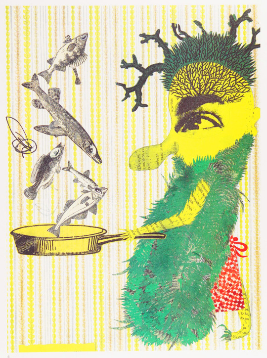
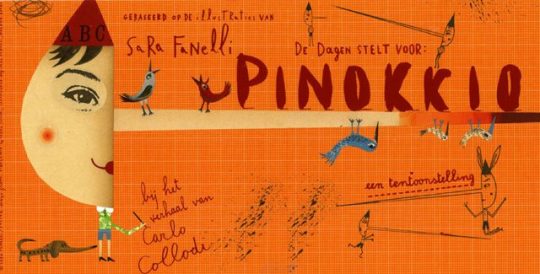
Sara Fanelli, ''Pinocchio'', 2003
Source
107 notes
·
View notes
Text

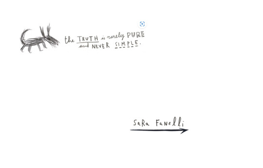
Sara Fanelli
94 notes
·
View notes

Photo

Ci sarà anche Valerio Mastandrea nella serie “La storia” di Elsa Morante regia di Francesca Archibugi Cinemotore aveva già svelato altri 3 nomi (Elio Germano, Lorenzo Zurzolo e Asia Argento) oltre alla già annunciata – protagonista – Jasmine Trinca serie Tv 8 pp da 50 Picomedia per Rai Fiction SI GIRA FINO A NOVEMBRE A ROMA E DINTORNI Rivedremo Valerio Mastandrea in 5 film Cinema – DATA CONFERMATA – 18 Agosto – ITALIA – “IL PATAFFIO” di FRANCESCO LAGI di Francesco Lagi con Lino Musella, Giorgio Tirabassi, Viviana Cangiano, Giovanni Ludeno, Vincenzo Nemolato, Alessandro Gassmann, Valerio Mastandrea – 01 Distribution CINEMA – ITALIA – 17 novembre – “Diabolik 2″ dei Manetti Bros (Antonio e Marco Manetti) con Giacomo Gianniotti, Valerio Mastandrea, Miriam Leone, Alessio Lapice – 01 Distribution “PENDING – ITALIA – “Diabolik 3″ dei Manetti Bros (Antonio e Marco Manetti) con Giacomo Gianniotti, Miriam Leone, Valerio Mastandrea - 01 Distribution PENDING – ITALIA -.”Il primo giorno della mia vita” di Paolo Genovese con Valerio Mastandrea, Margherita Buy, Toni Servillo,Sara Serraiocco, Vittoria Puccini, Elena Lietti, Antonio Gerardi, Thomas Trabacchi, Alessandro Tiberi,Lino Guanciale – Medusa PENDING – ITALIA – “Siccità” di Paolo Virzì con Monica Bellucci, Emanuela Fanelli, Elena Lietti, Vinicio Marchioni, Valerio Mastandrea, Silvio Orlando, Claudia Pandolfi, Tommaso Ragno, Sara Serraiocco, Max Tortora … – Vision Distribution https://www.instagram.com/p/CeyThONsn4W/?igshid=NGJjMDIxMWI=
2 notes
·
View notes
Text
Sara Fanelli


Just looking how you can have something not need to be skilfully drawn but it somewhat shows the essence of an animal, monster that which it is portraying which I find really cool and something I could trial also. But also I chose these images just how the type and colours sit on the page and help the design, whether easy to read or not they are so simply placed and yet it works.
0 notes
Text
Favorite First Time Watches of 2023
After Hours (1985) dir. Martin Scorsese

The Banshees of Inisherin (2022) dir. Martin McDonagh
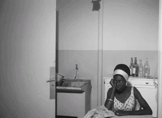
Black Girl (1966) dir. Ousmane Sembène
Bringing Out the Dead (1999) dir. Martin Scorsese

Cairo Station (1958) dir. Youssef Chahine
Cemetery Man (1994) dir. Michele Soavi
Chicago (2002) dir. Rob Marshall
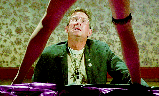
Crimes of Passion (1984) dir. Ken Russell
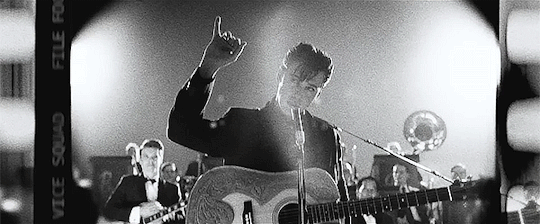
Elvis (2022) dir. Baz Luhrmann
Faust (1926) dir. F.W. Murnau

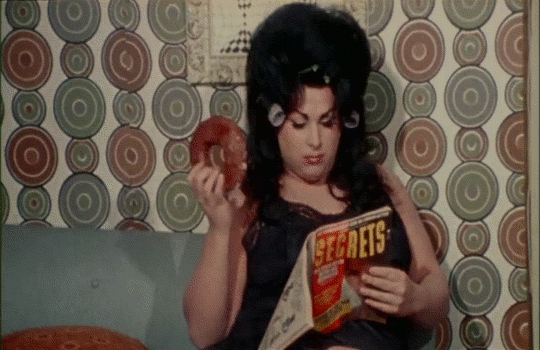
Female Trouble (1974) dir. John Waters
Fire of Love (2022) dir. Sara Dosa

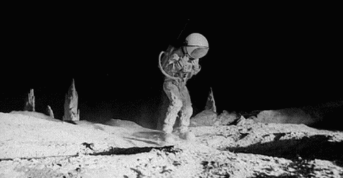
Footprints (on the Moon) (1975) dir. Luigi Bazzoni and Mario Fanelli
Funeral Parade of Roses (1969) dir. Toshio Matsumoto
High and Low (1963) dir. Akira Kurosawa
In Search of Darkness: Part III (2022) dir.David A. Weiner
Let the Right One In (2008) dir. Tomas Alfredson
Lingua Franca (2019) dir. Isabel Sandoval
Odd Man Out (1947) dir. Carol Reed
Original Cast Album: Company (1970) dir. D.A. Pennebaker
Paper Moon (1973) dir. Peter Bogdanovich

Pearl (2022) dir. Ti West

Petite Maman (2021) dir. Céline Sciamma
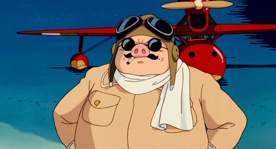
Porco Roso (1992) dir. Hayao Miyazaki
Puss in Boots: The Last Wish (2022) dir. Joel Crawford

Querelle (1982) dir. Rainer Werner Fassbinder
The Silent Partner (1978) dir. Daryl Duke
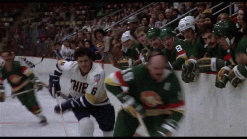
Slap Shot (1977) dir. George Roy Hill
Southern Comfort (2001) dir. Kate Davis

To Live and Die in L.A. (1985) dir. William Friedkin
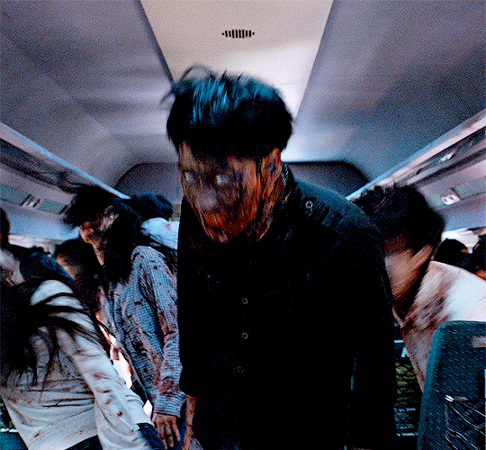
Train to Busan (2016) dir. Yeon Sang-ho
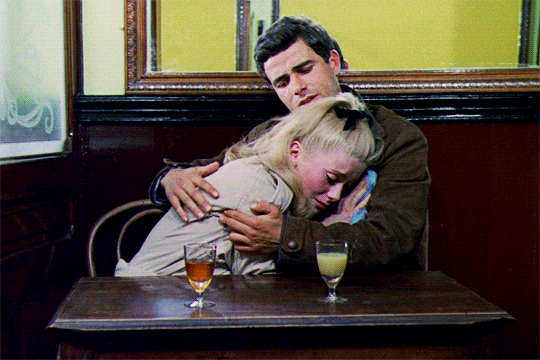
The Umbrellas of Cherbourg (1964) dir. Jacques Demy
X (2022) dir. Ti West
#movies#2023#1985#2022#1966#1999#1958#1994#2002#1984#1926#1974#1975#1969#1963#2008#2019#1947#1970#1973#2021#1992#1982#1978#1977#2001#2016#1964#year in review
0 notes
Text
Digital character design session

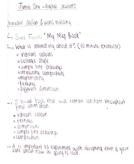
Furthermore the animation sessions by Jamie were very useful. I aspire to learn more about animation techniques as this is a skill i would like to develop in the future. Throughout exploring studio practises i was inspired by Sara Fanelli's “My Map Book“ as i like the textures, vibrant colours and the collage style of the work. I wanted to do a animation inspired by her work to experiment with different ways i can use colour and texture to create mood and emotion in an animation. Here are some character designs i initially did. I used biro pen as I can achieve different textures and drew my character from different angles and emotions to test how he will look. I liked this character so to develop i explored the use of pattern and shape to present emotion and I believe this worked so well to achieve his personality. I think the spiral shapes i have used makes him energetic and fun whereas he looks calm without.
0 notes
Text
Adding Text
After I finished my illustrations I got the idea of adding some type in as well. I didn't have any problems with how the artworks looked on their own but I felt like putting some text in would make them look more like prints or even motivational posters. It was also an opportunity to try out different fonts and ways of giving my text some personality.
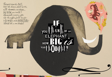
My main inspiration for the texts was Sara Fanelli and her unique technique that combines size and font together to reflect a specific word. Although her work seems messy and hard to read at first glance, it is also strangely perceptible through the clear intonation each word holds.
I especially love how the words ''if'' ''big'' and ''is'' are the largest ones, putting a lot of emphasis on the fact that this is a question and that the question is just as big as the elephant (which is literally what the title suggests). This kind of chaotic text works very well with the art itself since it gives the same unrefined and uncanny effect.
For the paper planes illustration, I wanted the words ''paper planes'' to be the main centre of attention. and since I was working with a limited space, I decided to make the words follow the angles of the plane in a way that suggested a crumpled sheet of paper.
The words ''fly'' and ''soar'' use very flowy and delicate fonts to suggest gentleness and smooth gliding, similar to a bird. I also added a dotted line for a cartoonish touch since I have seen it be used before when suggesting that something is flying.

I didn't add something as flashy for this illustration. Since I felt like there was already too much happening for me to try and stuff some big text in as well.
For the paper planes I went with this particular style because it fit better with the idea of a child playing and having their thoughts scattered all over the place (hence the different fonts of different sizes).
For this one, I tried to go with something a lot more linear and elegant to suggests a prestigious museum. I tried to make the text look like a gold desk plate. I personally really like this more minimalistic style and although it is a bit hard to notice at first glance, I think it adds a lot to the illustration, making it look a lot more like a movie poster.


0 notes
Text
*Long post incoming* pt.4
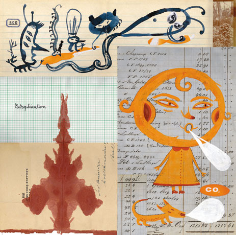
The final artist that I read about was Italian illustrator Sara Fanelli. Her art style is experimental with text and collage techniques by using different types of papers, photos, fabric, print cuts, music sheets, global newsprints and historical typeface. Much of her inspiration is drawn from childhood influences e.g. sweet wrappers, kitchen utensils, buttons, the night sky and old pets.
Using influences from childhood as sources of inspiration is particular to me because it’s prevalent to the themes of this project. My love for sci-fi, retro aesthetics, and illustration originate from my childhood where I grew up with watching cartoons and anime, outdated tech, experimental music videos, weird fashion and the early internet. The overarching themes of my project are both bred from nostalgia and an appreciation for present media that involve these aspects.
In a journal written in 2018 by Alison Swan about Fenelli’s work, she wrote “It is a chaotic world and the experience of leafing through the pages is similar to embarking on an unplanned trip to new territory without a map – a haphazard, eye-opening, stimulating and rewarding journey into a personal and imaginative realm.”. This statement reminded me of my work due to the fact that I’ve also created my own ‘personal and imaginative realm’ so to speak. The characters I’m creating exist in their own world which I want to bring to life when drawing or writing about them.
0 notes
Photo
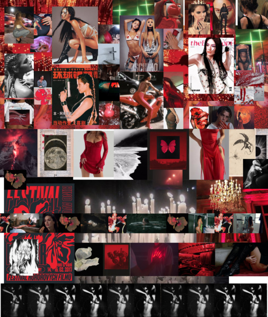
Devilish 01 // T-d 07 - Repetition
Red Devil / Hell’s angel / Altarpiece / Underworld /
//
‘She follows their legacy with her own or her pencil or her brush and finds what she discovers there appealing, not fearsome: old friends not to be shunned. Like them she makes light of devils, seeing in them, almost blasphemously, the counterparts of angels. Like those nameless predecessors, she works as if working in the margins with mischievous insouciance.’
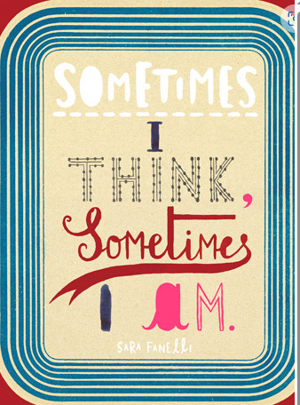
Sara Fanelli, 1. Devils and Angels, Sometimes I think, Sometimes I am
//
Nicknamed the “Devil’s Language” (恶魔之语; Èmó zhī yǔ) for its complexity and difficulty, it is the most divergent division of Wu Chinese, with little to no mutual intelligibility with other Wu dialects or any other variety of Chinese.
/
It’s commonly thought that the Devil first showed up in the Bible in the book of Genesis as the serpent who convinced Eve—who then convinced Adam—to eat forbidden fruit from the “Tree of Knowledge” in the Garden of Eden.
/
0 notes
Text


Children's Book
This is an ongoing project that I am currently working on. The brief is to create a children’s book related to the topic of Dreams. The story of my book is based around a Griffin (a mystical creature which is a combination of an eagle and lion) who enters a Dreamland. As part of development, I researched into illustrators such as Andy Gellenberg, Nikki Farquharson, Sara Fanelli. I adapted these artists’ style into my own characters. I used mediums such as, oil pastels for the Sara Fanelli experiments to create an unusual appearance. The Andy Gellenberg piece is the most unique experiment on the page because of the unconventional structure of the character.
0 notes
Text
Sono Lillo, arriva la nuova serie originale di Amazon Prime Video

Prime Video ha svelato il trailer ufficiale e il poster di Sono Lillo, la nuova serie Original italiana con protagonista Lillo Petrolo, presentata in anteprima alla Festa del Cinema di Roma, nella sezione Freestyle, e disponibile in esclusiva su Prime Video dal 5 gennaio 2023.
Sono Lillo, una nuova serie Amazon
https://www.youtube.com/watch?v=DnjuOCZvXoM&feature=youtu.be
L’attesa serie in 8 episodi è una produzione Lucky Red in collaborazione con Prime Video ed è diretta da Eros Puglielli (Gli idoli delle donne, Copperman, Nevermind), creata da Lillo Petrolo, Matteo Menduni e Tommaso Renzoni che ne hanno curato anche il soggetto e la sceneggiatura. Nel cast con Lillo, Pietro Sermonti, Cristiano Caccamo, Sara Lazzaro, Camilla Filippi, Marco Marzocca, Maryna, Paolo Calabresi, Anna Bonaiuto, e tante guest star di puntata tra cui Valerio Lundini, Edoardo Ferrario, Emanuela Fanelli, Caterina Guzzanti, Corrado Guzzanti, Stefano Rapone, Michela Giraud, Maccio Capatonda, Serra Yilmaz.
Chiamatelo... Posaman
Chi è Posaman? Un supereroe, ovviamente! E qual è il suo super potere? Saper fare delle pose da copertina. Ma chi si nasconde dietro il costume? Beh … c’è Lillo! Il successo, si sa, ha i suoi risvolti negativi e per Lillo è arrivato il momento di scegliere tra fama e vita privata, perché la moglie (Sara Lazzaro) sembra davvero non sopportarlo più. Accompagnato dai comici più amati della scena contemporanea, da Pietro Sermonti, a Paolo Calabresi, da Caterina e Corrado Guzzanti a Valerio Lundini, da Michela Giraud a Edoardo Ferrario e tanti altri, Lillo cercherà di ritrovare se stesso dietro la maschera che si è costruito.
Read the full article
0 notes
Text
Reading Log 4
Under the Moon and Over the Sea: A Collection of Caribbean Poems
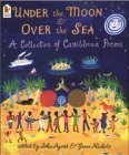
Category: Children's poetry anthology
Author: Various authors, edited by John Agard & Grace Nichols
Illustrator: Cathie Felstead, Jane Ray, Christopher Corr, Satoshi Kitamura, and Sara Fanelli
Format: Print
Publisher: Candlewick Press
Publication Date: January 1, 2003
Target Audience: Children aged 6–8
Awards: CLPE Poetry Award
Physical Structure: 8.75in x 10.5in, 77 pages
Content: As the title indicates, this book is a collection of poems about the Caribbean region. The poems are separated into five themed sections ("Once the Wind Said to the Sea," "See Full Moon, Hear Jumbie Story," Listening to the Land," "Come Taste and Buy," and "Windrush Child"), each illustrated by a different artist. The poems in the book delve into physical aspects of the Caribbean region, the culture of the people living there, the food they eat, and so much more.
Assessment:
I actually think that this book would be better suited for children slightly older than the recommended age range, perhaps 8–10 or 9–12, because there are references to things like razorblades and bombs that seem questionable to present to a first grader. The illustrations in the book work really well with the text, and the fact that many different artists worked on the book adds depth to the work as a whole.
Quality: This book is a great showcase of diverse writers and their work, and the poems within are beautiful and moving descriptions of life in the Caribbean, ranging from lyric descriptions of the sea to retellings of classic folktales. From what I could tell, the writers are almost all from the Caribbean region, but none of the illustrators are. I think that a work like this should be created by individuals who represent the subjects of the text and illustrations.
Potential Use: This book would be a great introduction to regional poetry for upper elementary students and could be used as a read-aloud or suggested background reading.
Appeal: The illustrations in this book are bold and bright, and the various art styles make the book interesting and dynamic. The poems cover a wide range of topics and together paint a picture of a region of the world. This book is a lens into a culture that is different from ours.
The Beauty of the Beast: Poems from the Animal Kingdom

Category: Children's poetry anthology
Author: Various authors; poems selected by Jack Prelutsky
Illustrator: Meilo So
Format: Print
Publisher: Knopf Books for Young Readers
Publication Date: August 1997
Target Audience: Children ages 5 & up
Awards: ALA Notable Book
Physical Structure: 8.7in x 11.26in, 112 pages
Content: This book is an anthology of over 200 poems about animals, divided into five sections based on type of animal ("In Trillions We Thrive"—insects, "Jubilant, We Swim"—fish, "Dragons in Miniature"—reptiles and amphibians, "Hollow-Boned Singers"—birds, and "Wrapped in Coats of Fur"—mammals).
Assessment:
The suggested age range for this book is perfect; it contains tons of poems that are great for young kids, but it can also be appreciated by older children and even teens and adults. The watercolor illustrations work with the text to create movement on the page and bring each animal to life.
Quality: The poems in this book are written in a wide range of styles, and they vary from silly ("His beak and skull are both so thick,/You could not hurt him with a brick./His feet are large, his head is small,/He hasn't any brain at all.") to genuine ("There is a time for considering elephants/There is no time for not considering elephants"). Each poem conveys a feeling of awe towards the natural world, as do the illustrations, which is felt deeply by the reader.
Potential Use: This is a great book to use as a read-aloud or introduction to form and poetic devices (simile, onomatopoeia, etc.).
Appeal: Animal lovers will enjoy this book greatly; it feels like there is a poem for any animal you could think of. The delicate and colorful illustrations create beautiful visuals on each page for children who cannot yet read and for all readers to appreciate as well.
Falling Up

Category: Children's poetry book
Author/Illustrator: Shel Silverstein
Format: Print
Publisher: HarperCollins Children's Books
Publication Date: January 24, 2006
Target Audience: Children ages 4–8
Awards: Golden Archer Award, Maine Student Book Award, ALA Booklist Editors' Choice, Parents' Choice Gold Award
Physical Structure: 8.8in x 6.9in, 184 pages
Content: Falling Up is a classic collection of children's poetry, composed of silly and whimsical poems, each paired with a black-and-white illustration.
Assessment:
I would say that the recommended age range for this book is a little young. A lot of the jokes will go right over a 4-year-old's head, and some of the illustrations are unsettling. I would put the age range at about 7–12. The illustrations in this book often function as extensions of the poems. For instance, in the poem "Web-Foot Woe," the speaker (a goose) complains about people always yelling "Duck!" and not knowing the difference between ducks and geese. From the illustration, however, the reader can tell that an arrow is coming towards the goose, which is why people are yelling to duck.
Quality: As I mentioned earlier, Falling Up is a classic, as are many other Shel Silverstein books. I wanted to see if it would hold up, and I think it definitely does. The poems are all hilarious, and they are great examples of rhythm and rhyme.
Potential Use: These poems are great for reading aloud or teaching students how to use rhyme.
Appeal: This book is a great one for kids because of how funny it is and how outlandish the illustrations are. Some of the poems are perhaps a little dark, but the book definitely has something for everyone.
Lemonade and Other Poems Squeezed from a Single Word

Category: Children's poetry book
Author: Bob Racza
Illustrator: Nancy Doniger
Format: Print
Publisher: Roaring Book Press
Publication Date: March 15, 2011
Target Audience: Children ages 8–12
Awards: ALA Notable Children's Books Award
Physical Structure: 5.84in x 8.79in, 48 pages
Content: The poems in this book all begin with a single word. Each word in the poem is then created using only the letters found in the title word. The page is laid out so that each letter is always lined up below its occurrence in the title. For example:

Notice how the "a" is always in line with the "a" in "creative," and same with all the other letters. On the following page, the poem is written out in a more traditional format:
creative
i
crave
art
Assessment:
The recommended age level for this book is spot-on. The poems are all fun and act a bit like puzzles, which middle schoolers can enjoy and use to challenge themselves. The illustrations work with the text to give hints at what the full poem is trying to convey, which helps make the unusual structure slightly more readable. The inclusion of the full poem in a traditional format lowers the reader's frustration in case a poem is particularly difficult to understand; simply turn the page and find the answer key. And the poems are beautiful and meaningful in themselves, apart from their experimental design.
Quality: The poems in this book have a unique form and structure, which makes the book stand apart from other books of poems. The illustrations are somewhat muted and minimal, only using shades of three colors (black, red, and gray), which is really effective when paired with the extremely minimalist poems.
Potential Use: This book would be great for teaching kids about form and structure.
Appeal: The poems all look super interesting even at first glance, which definitely draws the reader in. It becomes a puzzle to try and figure out what the poems are trying to say, and once you've cracked the code, it's still fun to read each one and see the creativity of the writer.
Forget Me Not

Category: Middle grade novel in verse
Author: Ellie Terry
Format: eAudio
Publisher: Tantor Media, Inc.
Publication Date: March 11, 2019
Target Audience: Ages 10–14
Duration: 2 hours, 45 minutes
Story: Calli is a middle schooler who is constantly moving to new towns. She has Tourette Syndrome and was told by her mother and her therapist that it may be best not to tell anyone, as most people don't understand the condition and may view her differently. She starts at her new school, where most of her classmates make fun of her and her tics. Her only friend is her neighbor, Jinsong, who is embarrassed to let people know he likes her. The book switches perspectives between Calli and Jinsong, and the two eventually start dating. This is shortly before Calli's mom gets married spontaneously and Calli is forced to move once again and begin yet another new school.
Assessment:
This is definitely a middle grade book, great for 4th–8th graders, so I think the recommended age is right on target. The book has themes of bullying and ableism, with an overall message that it is better to be yourself and to stand up for your friends. The story alternates between Calli's perspective, which is written in poem form, and Jinsong's perspective, which is written in prose. I think that this structure choice conveys the characters' personalities very well; Calli is unique, unlike other kids her age, and unconventional, while Jinsong tries hard to fit in and doesn't like to stand out.
Quality: The poetry in this book is a great vehicle for portraying Calli's anxieties and mimicking her tics. The author uses repetition, onomatopoeia, and other literary devices to convey how Calli is feeling at any particular moment. I do think that the characterization of Calli's mom as someone whose life is defined by the man she is dating (or the man who recently broke up with her) is a little old-fashioned and one-dimensional.
Potential Use: This is a great book for middle graders to read for pleasure or to use as an introduction to the genre of the novel in verse.
Appeal: There are not many books about characters with Tourette Syndrome, and many middle schoolers may not even know what it is. The author herself has TS, which makes this story that much more impactful and authentic. This book is moving and teaches kids a great lesson about kindness and acceptance.
**all photos from www.goodreads.com
0 notes
Text
Feedback
Today my tutors gave some feedback on my work so far, which I have summarised here below:
Are all publications in the same file? Or are they separate files?
More research on file types that provide clues.
Note the way each story begins (definition)
Consider how and what the text is saying and whether graphics help and what would happen if the text became very large.
Test some new typography and take a little risk.
According to poetic writing, typography becomes your voice in terms of your choice of graphics. Therefore, when we emphasise something in conversation, every tone should be reflected in your typography.
The migratory bird metaphor could be modified a little.
How to think of images and poetic words in other ways.
concertina
Case study
Concrete poetry
Nancy Spero's Notes in Time
Dada Collage
Dada Poetry
https://jordanluxton.wordpress.com/sara-fanelli/
sarah finelli
0 notes
Text
Texture and presentation of information in older children’s books/children’s non fiction
Below: James Davies, Ancient Romans. scribbly/aged textures in the figures gives them a rough, hand drawn look. Fonts used are playful and hand-written.


Above: information is in small paragraphs broken up by illustrations. Humour is used to make the information fun.
Below: Sara Fanelli. Use of collage gives illustrations a quirkiness, makes them more interesting and fun. The type is handwritten and scribbly. All of this makes the images/book more accessible. It makes you feel like it would be ok to draw on it/crumple it a bit, which is what kids usually do to their stuff.
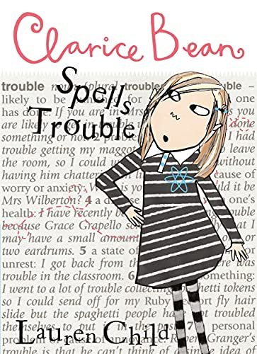
Below: Clarice Bean by Lauren Child. Illustration interact with text, making the text seem more alive.
0 notes
Text
-SARA FANELLI-
Sara Fanelli was born in Florence, Italy. She came to London to study art and has been working there as a freelance designer and illustrator, ever since she graduated from the Royal College of Art in 1995.
She has worked for a diverse range of clients all over the world. Working for clients such as, The New Yorker, Penguin Books, Faber and Faber, Tate Modern, Tate Britain, The Victoria and Albert Museum, BBC Worldwide, The New York Times, and The Royal Mail.
She has won a wide range of awards.
Her work is unique and different. The style consists of a plethora of styles. I like it a lot because it is very different compared to other artist's styles that i'm familiar with.
0 notes
Last Seen Blogs
twentyfirstcenturyvamp
RED(matteo)

rashidnidm
Digtal Marketing
mchoruse
Choruse

one-piecee
simply crying over one piece

serigel
V