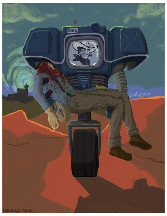
#MORE HATCHING MORE PENCIL MORE TRADITIONALLY LOOKING ART MORE TEXTURE!!!!!!
Text
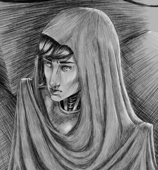
day 22 prompt was similar to yesterdays, but instead of shading with pure blacks and whites i had to shade with hatching/cross-hatching
#incredibox#incredibox fanart#incredibox v8#choir#30 day challenge#sparks creations#i FUCKING LOVE HATCHING AND CROSS-HATCHING/GEN#ITS SO FUN AND THERAPUTIC#i also might have Almost given myself carpal tunnel ;A;#eye contact#he looking at you!!!#i love his face i love how i did his face#hes so handsome <3#and his fucking cloak thing omg#i was scared i wasnt going to shade the fabric right but I DID GOOD!!!!!!#im just in love with this piece honestly#i love this kind of art i want to make more of it#MORE HATCHING MORE PENCIL MORE TRADITIONALLY LOOKING ART MORE TEXTURE!!!!!!
44 notes
·
View notes
Note
How do you colour your stuff? (If you don't mind telling👉👈) because your art looks so nice, it looks traditional but also digital at the same time.
Hey, thanks so much for the question! I love traditional art, but for various reasons digital is a lot more accessible to me now, so I try to bring my traditional process to digital as much as possible. I tend to really build up layers in traditional mediums, and digital can very conveniently mimic that.
I'll deconstruct my layers because this is more or less the sequence I go in.
One of the most important things to me was finding digital tools (brushes) that felt like the traditional tools I liked most. When you find one that just clicks, it's a tangible feeling. I'll list my favorite brushes at the bottom of the post. Putting a cut here because it's a long post, but I like sharing information when I can because hey maybe it'll be helpful to somebody!
I always start with a blank canvas that already has a paper-texture overlay applied to it. I tend to sketch in a couple different colors to keep things straight. A holdover from traditionally inked pieces where I'd sketch in non-photo blue pencils. I keep it rough, especially in faces. I do my final layer of pencils or inks over that.

Once I have my lineart, I establish the tone of the piece with a background color or gradient. I do a bit of underpainting where I know I want to build on top of colors other than the background.
I tend to start focusing more on the face here. Throughout working on the piece I'll come back to the underpainting layer and add colors as I see fit.

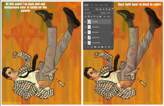
I fill in the base colors next, keeping things messy by using a brush with some texture and flow that varies with pressure. I really like having the background peek through in places and the background color is key to how I mix colors. I never bucket fill areas of color on a piece like this. For Benny's jacket I use two separate layers to keep the checks easier to work with, and layer masks to erase away sections to create a hatched effect. This is one of those places where I love digital art because I can do things more efficiently than what I would've done traditionally.

I do these next steps kind of concurrently, because they both solidify the overall colors of the piece.
I go back and add colors to the background as I work. Above the more opaque paint I've already done on the figure, I start doing "glazing" layers using layer modes in Photoshop. The most important one for me is Hard Light. I use the background colors to add pops of color on this layer and do some shading. I find that doing shadows in Hard Light first makes them a bit more interesting. I used pinks, reds and greens on the Hard Light layer.
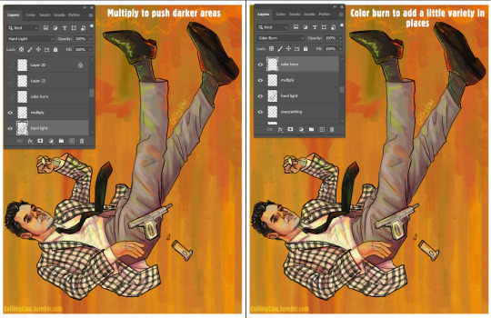
I intensify the shadows in places using a Multiply layer and add a bit more color variety in places on a Color Burn layer using magenta, purple, coral and red.
While I'm using layer modes a lot in this process, I started doing this because it mirrored how I used to work with markers traditionally and build up colors in layers, sometimes using unexpected combinations.
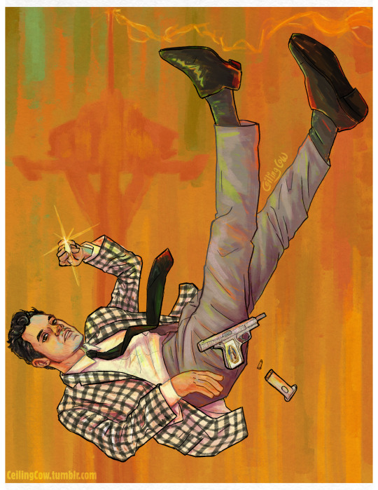
I add a few details over top all the layers and it's done!
Brush talk time!
My absolute favorite sketching pencil is the "Grease Pencil 8B" from Alex Dukal's "Pencil Garden" set. It has a soft-yet-dark, smooth feeling that reminds me of the "Caran d'Ache Sketcher Non-Photo Blue Pencil", which is really just the tops when it comes to traditional sketchers. Seriously I love those pencils. I did the final line art for this with the "German - 45px" brush from the same pencil set, but duplicated the line art layer to make it darker. I do this on many "painterly" pieces because I like how pencil lines and messier paint look together.
Everything else is a Kyle T. Webster brush, which can be found here and downloaded if you've got a subscription with Photoshop. I have a little folder with my favorite of these brushes because there are a lot of brushes. Some I've modified to my likings. The "Oil Background Crusher" is an absolute MVP when it comes to filling in large sections because the color varies based on pen pressure. The "Impressionist" brush is also a huge favorite, and I've done entire pieces before pretty much just with that brush, though I didn't use it for this piece. (Old example, but seriously I've loved this brush for years.)

I've been using a lot of KTW's Gouache brushes lately and most of the painting on the above piece was done with those since they have a messier feel than some of the oil-specific brushes. The recent Victor piece was 100% the KTW Gouache brushes except for the sketch.
Oil paint brushes have a much denser feel and I go for those when I want a more precise feeling. This one was done mostly with the "Impressionist" brush to bring the ghoul skin texture alive, the "Ultimate Oil thicker", "Big Wide Softy" and the "Creamy" brush.
As for color inspiration, I either generate my own palette on Adobe Color or draw inspiration from Impressionist, Post-Impressionist, or Vienna Secession movement paintings, since they tend to have a color palette with the traditional painting feel I'm going for. Right now Toulouse-Lautrec is my painting inspiration.
I hope something in here might've been helpful, though I know it's a bit long. I'm always down to answer questions or talk shop or even chat about art history. =]
#my art#asks#long post#art#digital art#I really like painting... honestly I like it a lot more than drawing#and I've enjoyed that I've gotten to do some messier painting work with Yeehawgust
7 notes
·
View notes
Photo
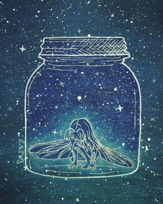
Bug Girl
My WIP Wednesday! piece is all finished!
(Warning: LOOOOOOONG description about the art process ahead! )
I don't think it's terribly obvious for a number of reasons (at least not at first), but this piece is actually a bit of fan art/inspired by How to make Friends with the Dark by Kathleen Glasgow, which I finished reading Monday night--Though I actually started this piece a couple of days before
There's a concept that gets brought up a few different times in the book of the main character Tiger imagining a "bug-girl" in a jar, usually to help visualize her emotions to us, the audience. This concept really resonates and stuck with me even before I finished the book, and thus I was compelled to draw it.
Technically the way I see that concept in my head looks different from what I've done here, so sometime in the future I may take another stab at it, but for this time I wanted to strengthen the connection between the bug-girl concept and the book, so visually I modeled the overall aesthetic largely off of the book's cover; white lines and white dots on a dark blue background that has a slight gradient at the bottom. The gradient on the cover is more subtle and is more on the lines than the background itself, but I took artistic liberty on that to make my life a little easier.
My original plan was to do the background with watercolor, do the lines digitally and print them out (since I had some kinks in the sketch I wanted to experiment with digitally instead of doing a lot of additional drawing and erasing) and then use my lightbox and a white gel pen to trace directly on top of the watercolor, then splatter away with some white ink. But of course, things can never be that simple.
The way I see it in my head, the bug-girl has, well, bug eyes, but for this piece, I didn't want to lean too heavily into the "creepy" factor, given it doesn't really fit with the content of the book (which is a great read if you like realistically heavy YA novels, by the way) so I angled her head down and her hair covering her face to keep from having to make the decision on whether or not I wanted to go with that look. And additionally to do proper bug eyes (at least the kind I was imagining) would've involved a lot of tiny circle/cell shapes, and I imagine that would've made things feel too crowded or would have blended into the splatters/background in an uncomfortable way.
Additionally, I was going to have her wings raised behind her, but after playing around with a few different references and positions in Photoshop (knowing full well I was not happy with the original wings from the sketch that I completely free-handed), I felt like this more asymmetrical, lowered position and dragonfly-type structure just looked better and fits better with some of the movements of the wings described in the book (using them to cover her eyes, etc.) which in most cases aren't technically plausible with normal bug wings.
My first real problem was with the jar. Realistically, it needed to be tall enough for the girl to stand at full height at least. And in theory, probably a little bit higher so it would be more comfortable overall and so that in theory she wouldn't just stand up and be able to push the lid off. But I was having issues with the sizing because the jar could only be so big so that A. it would fit comfortably on my paper and B. if it was too tall, the empty space between the top of the jar and the girl would noticeably awkward. So I fiddled with that for way too long and ultimately, it's probably too short, but the size balanced is more comfortable to the eyes, I think. (I also added the cross-hatching to the lid to make it more obvious there was a lid since originally it just kind of looked like the jar had a very wide lip.)
I also gave her a set of antennae, and after trying the concept of segmenting her whole body to be more bug-like (which was way too many lines everywhere) I decided to add some plates on the front of her forearms and calves. It's not much at all, but I didn't want to stick solely to traditionally "fairy" imagery since she's a bug-girl, not a fairy, but in this lines-only format, there was only so much I could do and still get the proper impact I was looking for.
Speaking of which...
I did a lot of swatching and testing of my various watercolors that I have on hand to A. get the colors I wanted right, B. practice my blending of two colors with more paint than water since I wanted very dark, opaque colors, and C. test if my lightbox would even work under the thick watercolor paper and the actual watercolor. However, I made two errors in judgment during the testing:
1. The areas I swatched to test were considerably smaller than the actual size of the area I wanted to cover and even with my biggest brush when I went to do a practice go I very quickly realized that was going to take an absurd amount of paint, time, effort, and I was very likely to run into some blending problems with the gradient. (So, in summary, half-pan-sized watercolors and mostly small brushes are not great for very large areas)
2. Once I realized the above, (and I had already done two very quick tests with alcohol markers and that idea almost immediately went out the window for the same issue) I had to switch course and ended up using some water-soluble pencils (one Arteza Woodless Watercolor Pencil for the dark blue and one Derwent Inktense pencil for the dark teal at the bottom) to lay down the color for the background and then wet them down to smooth out the color. Which turned out pretty nicely, especially once they dried. (I was a little worried at first since while still wet it was looking kind of patchy and weird )
The problem with number 2 is that after it had fully dried (aside from the paper curling pretty badly since it was in a sketchbook and I didn't think to tape the edges of the page down before taking water to it, which was mostly fixed pretty easily by wetting down the back of the page and sitting a very heavy box on it while it dried overnight) when I went to use the lightbox, the pigment from the water-soluble pencils was noticeably more opaque than the straight watercolor tests/swatched I had looked at previously. It wasn't so opaque that I couldn't see my lines underneath at all but it was opaque enough that a lot of the smaller details wear really hard to see. And thus I had a pretty big problem on my hands.
What I should have done was trace the lines in black on the blank paper first so they would be more likely to show through the pigment in the first place and there's a good chance that would've fixed the problem, even if I still needed the lightbox to see those lines perfectly. But hindsight is always 20/20 so that knowledge didn't really fix the matter at hand.
I knew pretty instantly that I didn't want to try tracing the lines onto another piece of watercolor paper and trying to color matter since I seem to always have majorly noticeable issues with that, especially when there's a gradient involved, and also because I knew when I scanned it in it would be fairly obviously there were two layers of paper instead of one because of how thick watercolor paper is. I also knew alcohol markers were out because, again, color matching issues with the selection available to me, and also from some of my much earlier testing with trying to get the specific gradient that I wanted.
That left me with colored pencils.
And thus I went through the five different sets I use enough to keep where I can easily access them (I have others I don't like as much that would've just been a waste of time) and started swatching colors on a piece of the same paper I had the lines on and then held them up to the background to color match as closely as possible. I ended up picking one dark blue and one dark teal each from both my Prismacolor and Polychromos sets since the blue from the Prismacolor was closer but the teal from the Polychromos was closer but they were both slightly off, so to keep the texture consistent I mixed both together for both colors. This ended up being a very good idea in hindsight because I finished off with a final layer of the Polychromos and that kept my white gel pen from having the problems it would normally have over straight-Prismacolor pigment. (Since Prismacolors are wax-based the wax usually clogs the pen tip very easily; the Polychromos are oil-based, so the oil created a slicker layer between the wax and the pen).
And all I did was use my lightbox to see the black printed lines through the colored pencil as easily as possible and went back over them with my white Sakura Gelly Roll, then I went back and outlined the jar and the lid specifically with my white Uni-Ball Signo, since the ink is slightly brighter and the nib is larger.
Once that was all done to my satisfaction, I cut out the girl in her jar and placed it on the watercolor background with some double-sided tape I picked up the day before from DollarTree, clipping a few edges so they'd be as flush with the edges of the paper as possible. And I figured that would be a better idea than glue because the glue had a very good potential of being very messy and leaving notable marks. The tape was just a safer bet. And fortunately, the paper laid pretty flat, save for a couple of spots I either missed because I applied the tape by lifting up the edges so I wouldn't totally lose my placement or up by some of the nooks and crannies that make up the ridges at the top of the jar that were just too small to do individually. And there is one spot where that tape wrinkled on me, but it's fortunately not terribly noticeable in the final product.
Then I made a paper mask for the girl inside the jar and got to move on to the slightly more fun part; I dipped a paintbrush in some white ink (white ink as opposed to white watercolor because I was concerned the water part might cause some reaction to the existing watercolor background that I didn't want and I was a little concerned it would make the non-watercolor paper that the girl and the jar were drawn on warp) and started tapped it against another paint brush to get splatters everywhere. I masked the girl since I was pretty sure she'd blend in too much if she got splattered too.
After the ink was dry, I removed the mask and went in with the white Gelly Roll again to make some stars here and there; mostly just because I wanted to since the original book cover only has dots.
I left it at that for the night since it was almost 3 and I was tired, but I came back to it the next day and racked my brain for a bit since it felt like it was missing something.
I ultimately ended up putting the mask back on the girl and used my pastel blue PanPastel to create a glow effect around her.
After that, I scanned it and did make some minor adjustments in Photoshop (mostly color correction, but there were a couple of black lines of shadow around the edge of the jar since it was still a separate piece of paper on top of the other one at the end of the day. And here we are.
It's still not perfection, but I am ultimately happy with it since I think I got the look I was after in the end. Plus, I think I capture the spirit of the original book cover's style pretty well
____
Artwork (c) me, MysticSparkleWings
I do not own How to make Friends with the Dark or the cover art
____
Where to find me & my artwork:
My Website | Commission Info + Prices | Ko-Fi | dA Print Shop | RedBubble | Twitter | Tumblr | Instagram
1 note
·
View note
Note
Hello! I'm an artist, and up until recently I've done all my work traditionally. I've been learning more about digital color lately-- it's been slow going and a lot of self-teaching. I came across some of your work and I love the style! I was wondering if you could share anything about how you texture pieces?
Hey!! Well, I kind of have a bunch of different ways I work now; I have some pieces that start out traditionally as black-and-white ink washes (this is a recent example, this is a recent all-Photoshop piece that imitates the ink washes with Kyle Webster brushes), some pieces that are basically digital paintings (this is an example; the other examples I have I can’t share yet), some pieces that are otherwise flat and only have a noise layer on top (example), and then pieces that have lots of Photoshop pencil textures (example 1, example 2, example 3).
My guess is that you’re most interested in the pencil texture ones - I don’t have a secret, I just use a PS brush to draw all of those little hatches, basically as if I were using a colored pencil. With all my digital art, I try as much as possible to approach things the same way I would on paper; this extends to textures. Don’t think about texture as a thing you add in post or “do” to a piece- think about it as the natural result of doing shading/coloring/what-have-you in a certain manner or with a certain brush.
Outside of an occasional grain/noise texture, I don’t put overlay textures on top of my pieces; I used to when I was a teenager, but I would advise against doing too much of that. Unless you do it really well, it can make your picture look flat.
Thanks!
163 notes
·
View notes
Last Seen Blogs

saveforthefuturethemeee
heyhey

27deoutubro-k
27 de outubro

gury77
onírico.

vellichorom
live laugh lover or something. ღ

hedwear
HustleEveryDay