#Ludlow Typograph Company
Text


Typography Tuesday
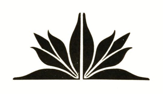
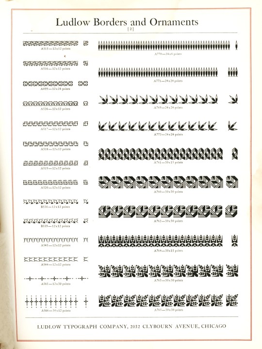
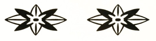
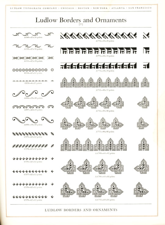
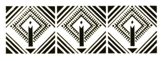
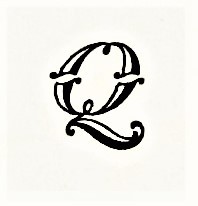
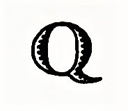
LUDLOW ORNAMENTS
Today we present some Ludlow ornaments and borders from Ludlow Typefaces: A Specimen Book of Matrix Fonts, circa 1940. The Ludlow Typograph Company was founded in 1906 by William I. Ludlow and William A. Reade to manufacture and distribute a typecasting and composing system to compete against Linotype. You can read much more about the Ludlow Typograph and its composing system in our previous post from this specimen book.
View our other Typography Tuesday posts.
#Typography Tuesday#typetuesday#Ludlow Typograph Company#Ludlow ornaments#Ludlow Typefaces: A Specimen Book of Matrix Fonts#type ornaments#Type specimen books#type display books#type specimens#specimen books#20th century type
64 notes
·
View notes
Photo


Typography Tuesday
SHADED FONTS
Shaded fonts go by a number of other monikers, including “shadowed,” “inline,” and “outline.” These are fonts where the interior of the letter is the same color as the background and the letter is formed in outline with a thin line on one side and thicker line on the other, creating a shadowed effect that suggests three-dimensionality. The fonts displayed here from Alphabets: A Manual of Letter Design, with Complete Alphabets of Varied Styles of Lettering by the American type designer and printing historian Douglas C. McMurtrie, published in Pelham, New York by Bridgman Publishers in 1926. The fonts are:
Narcissus, designed in 1921 by Walter Tiemann for the Klingspor Foundry, and based on a set of ornamental inline capitals first cut by Simon Pierre Fournier about 1745.
Mercure (we don’t have design or production information on this font).
Vanity Fair, designed by McMurtrie himself in 1923 and cast by Continental Type Founders for Condé Nast Press.
Greco Adornado, released by Richard Gans Foundry in 1924.
McMurtrie Title, also designed by McMurtrie for Condé Nast Press, and based on a specimen designed by Belgian type founder Jacques-François Rosart from 1768.
Douglas C. McMurtrie (1888-1944) held a number of important posts in his short lifetime, including printing manager for the Columbia University Printing Office, the Arbor Press, and Condé Nast Press; editor of the prestigious Ars Typographica magazine; typographic director of the Cuneo Press; director of advertising and typography at Ludlow Typograph Company; and head of the WPA’s American Imprints Inventory.
View other fonts from this publication.
View more Typography Tuesday posts.
#Typography Tuesday#typetuesday#Typography Tuesday#shaded fonts#shadow fonts#inline fonts#Alphabets A Manual of Letter Design#Douglas C. McMurtrie#Bridgman Publishers#Narcissus type#Mercure type#Vanity Fair type#Greco Adornado#McMurtrie Title#20th century type
64 notes
·
View notes
Photo


Typography Tuesday
This week’s #TypographyTuesday post comes from Norman W. Forgue‘s Chicago imprint,The Black Cat Press: A Philosophy of Esthetics by Dale Nichols, designed by Nichols and Forgue, and letterpress printed in 1938 by Louis Graf in hand-set Ludlow Eden Light and Bold types on Archer White Velvet Smooth paper in an edition of 550 copies. Our copy is signed by Dale NIchols who was a noted American regionalist painter of the 1930s and 1940s.
Nichols incorporated a number of typographic elements into his illustrations, but this publication is distinctive for Nichols’s use of the Ludlow Eden type family, which corresponds to his philosophy of esthetics outlined in this book. Eden was a display face designed by Robert Hunter Middleton for the Ludlow Typograph Company in the 1930s.
View some of our other Typography Tuesday posts
#Typography Tuesday#typetuesday#Ludlow Eden#Dale Nichols#Robert Hunter Middleton#Norman Forgue#The Black Cat Press#Ludlow Typograph Company#typographic prints#20th century
25 notes
·
View notes
Photo


Typography Tuesday
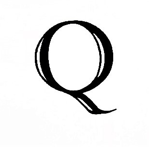
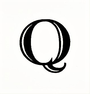
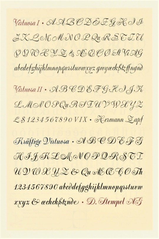
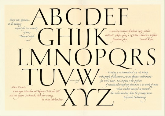
This week we present a selection of designs by our favorite type designer and calligrapher Hermann Zapf (1918-2015) from the 1987 publication Hermann Zapf and His Design Philosophy published in Chicago by the Society of Typographic Arts (STA) in memory of the great Scottish-American type designer and long-time design director for the Ludlow Typograph Company Robert Hunter Middleton (1898-1985), who provided the original idea for the book. Since 1948, Hermann Zapf designed over 175 alphabets for hand-composition, for the Linotype typesetting machine, and for photocomposition and digital laser systems. The book brings together selected articles and lectures on calligraphy and contemporary developments in type design by Zapf, with illustrations, some presented for the first time, bibliographical notes and a complete list of Zapf’s typefaces.
Although Zapf spent the majority of his career in Germany, he was an honorary member of STA and was a professor of typographic computer programming, the first such position of its kind in the world, at Rochester Institute of Technology (RIT) from 1977-1987. Click on the images for details on the designs.
View more posts that include the work of Hermann Zapf.
View more Typography Tuesday posts.
#Typography Tuesday#typetuesday#Hermann Zapf#type design#type designers#Hermann Zapf and His Design Philosophy#Society of Typographic Arts#Robert Hunter Middleton
134 notes
·
View notes
Photo


Typography Tuesday
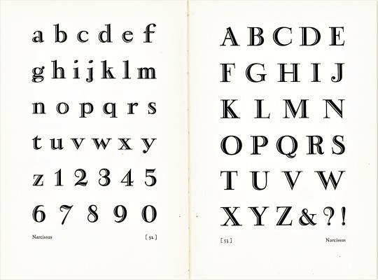
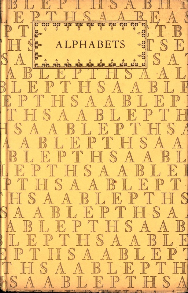
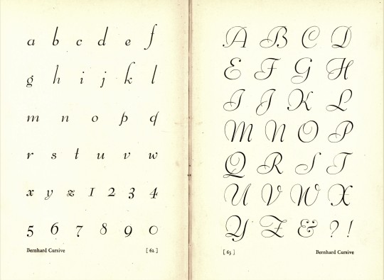
This week we are showcasing a recent donation of the 1926 type design handbook Alphabets: A Manual of Letter Design, with Complete Alphabets of Varied Styles of Lettering by the American type designer and printing historian Douglas C. McMurtrie, published by Bridgman Publishers in Pelham, New York. Intended as an “elementary handbook,” it is mainly a type display book in which “all the good forms of letter design are represented, and the specimen alphabets should prove useful models to students of lettering.”
The usual suspects are included here, such as Caslon, Garamond, Bodoni, and Cochin, as well as a couple of Goudy typefaces, but we thought we’d display some of the less usual type designs. They are from top to bottom:
-- Greco Heavy, released by Richard Gans Foundry in 1925.
-- Advertisers Gothic, designed by Robert Wiebking in 1917 for Western Type Foundry.
-- Vanity Fair, designed by McMurtrie himself in 1923 and cast by Continental Type Founders for Condé Nast Press.
-- Greco Adornado, released by Richard Gans Foundry in 1924.
-- Cloister Black, designed by native Milwaukeean Morris Fuller Benton and Joseph W. Phinney in 1904.
-- Bernhard Cursive, designed by Lucian Bernhard and released by Bauer Type Foundry in 1925.
-- French Script, there are a number of typefaces called French Script; we are uncertain of the origin of the face displayed here.
Douglas C. McMurtrie (1888-1944) held a number of important posts in his short lifetime, including printing manager for the Columbia University Printing Office, the Arbor Press, and Condé Nast Press; editor of the prestigious Ars Typographica magazine; typographic director of the Cuneo Press; director of advertising and typography at Ludlow Typograph Company; and head of the WPA’s American Imprints Inventory.
Our copy of Alphabets is from the Art Department of Milprint, Inc, or the Milwaukee Printing Company which operated from 1899-1988, and bears its bookplate and ownership inscription.
View our other Typography Tuesday posts
#Typography Tuesday#typetuesday#Alphabets: A Manual of Letter Design#Douglas C. McMurtrie#Bridgman Publishers#type display books#type specimen books#handbooks#Greco Heavy#Advertisers Gothic#Vanity Fair typeface#Greco Adornado#Cloister Black#Bernhard Cursive#French Script#Typography Tuesday#Milprint Inc.#Milwaukee Printing Company
135 notes
·
View notes
Photo


Typography Tuesday
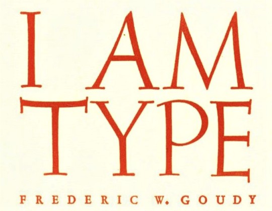
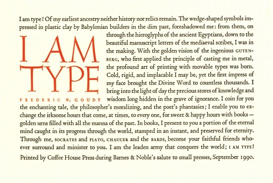
I AM TYPE!
This week we present a small broadside presentation of Frederic Goudy’s famous statement, “I Am Type.” The text was first printed in a pamphlet at Goudy’s Village Press in 1931, and then printed by Goudy in its iconic broadside form for a retrospective exhibition of the Village Press at the American Institute of Graphic Arts in New York City in 1933. It has been reprinted many times by many printers since.
The version we are showing was printed by the late, great Minneapolis printer/publisher Allan Kornblum at his Coffee House Press for Barnes & Noble’s salute to the small press, September 1990. We have isolated various phrases from the broadside to create a new, succinct narrative and to showcase the type used. Unfortunately, Kornblum did not identify the type he used for his broadside, but we believe the titling is based on Weiss Initials designed by the German type designer Emil Rudolf Weiss, and looks exactly like the Jim Spiece redesign, Wellsbrook Initials SG Light. We believe the text face may be Bruce Rogers’s Centaur based on Nicholas Jenson's 1470 Eusebius. Alternately, it could also be Nicolas Jenson initially designed by Wisconsin-born Ernst F. Detterer, also inspired by the 15th-century typefaces of Nicolas Jenson, released by the Ludlow Typograph Company in 1923, later expanded by his Ludlow colleague R. Hunter Middleton, and reintroduced by Ludlow as Eusebius in 1941. This typeface was also redesigned by Jim Spiece. What do you think?
Our copy of this broadside is a recent donation from our friend and colleague Dr. Margaret Noodin, UWM Professor of English, Anishinaabe scholar and poet, and Director of the UWM Electa Quinney Institute for American Indian Education. Early in her career, Margaret was an executive for Barnes & Noble.
View more of our posts on Fred Goudy.
View our other Typography Tuesday posts.
#Typography Tuesday#typetuesday#Frederic Goudy#Allan Kornblum#Coffee House Press#Barnes & Noble#Emil Rudolf Weiss#Wellsbrook Initials#Jim Spiece#Bruce Rogers#Centaur#Nicolas Jenson#Ernst F. Detterer#Eusebius#Margaret Noodin#broadsides#letterpress printing#I AM TYPE
44 notes
·
View notes
Photo
Typography Tuesday
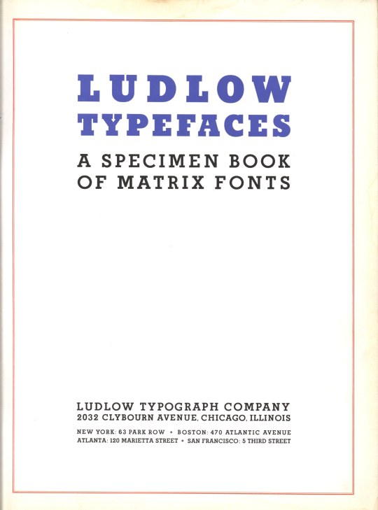
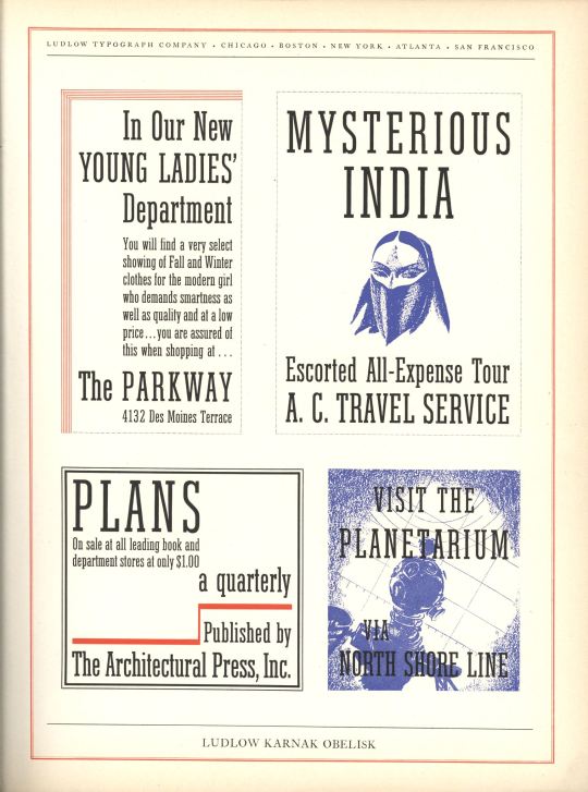
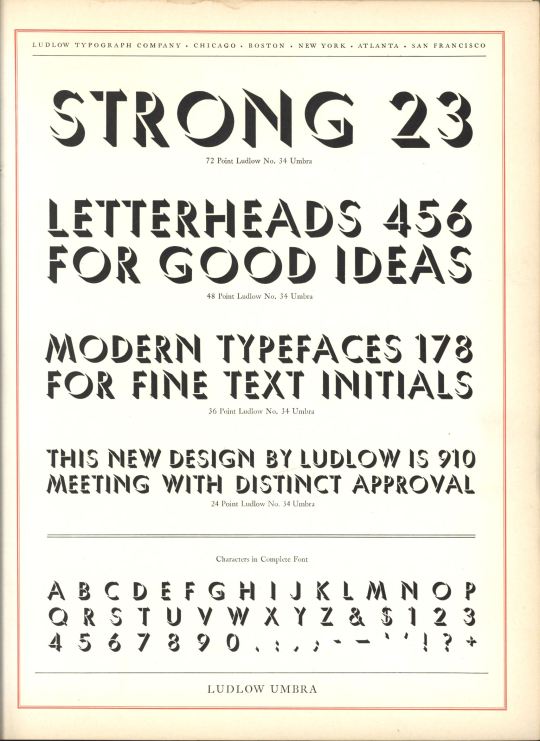
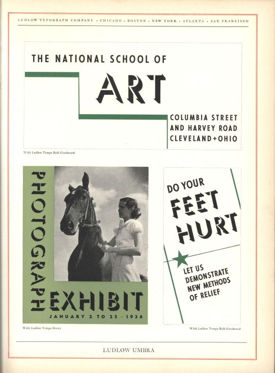
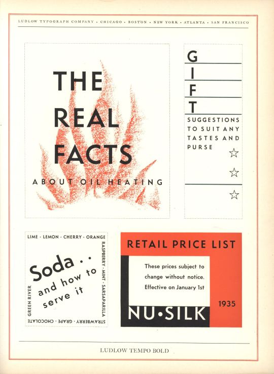
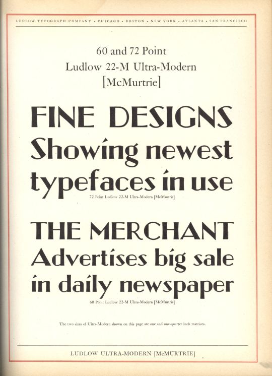
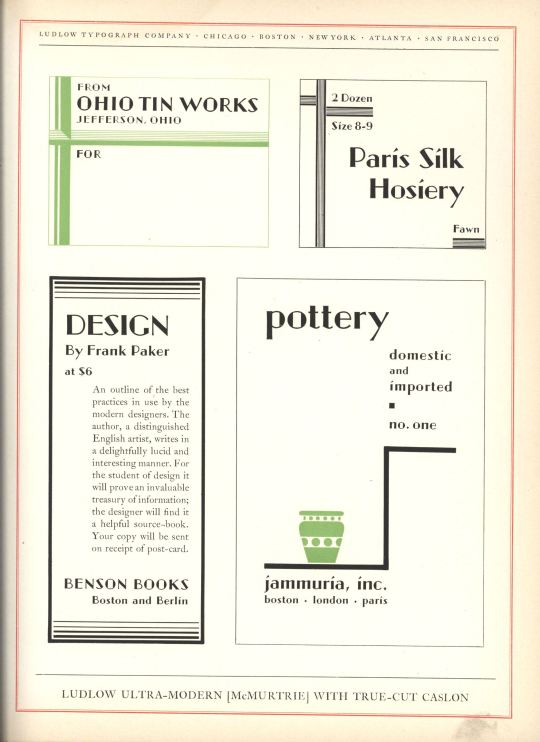
Today we present Ludlow Typefaces: A Specimen Book of Matrix Fonts, circa 1940. The Ludlow Typograph Company was founded in 1906 by William I. Ludlow and William A. Reade to manufacture and distribute a typecasting and composing system to compete against Linotype. Unlike the Linotype machine, which used a keyboard and a complex conveyance system to compose and cast each line of type, the Ludlow system was simpler and cheaper, using hand-set molds (called “mats,” short for matrices) in a special composing stick that could then be cast as a line of type in the Ludlow casting machine (view this excellent vimeo of how the Ludlow Typograph process works). The other advantage of Ludlow over Linotype was that ordinary Linotype was limited to typefaces smaller than 24 pt, whereas Ludlow faces reached 96 pt, with some special fonts as large as 240 pt. Manufacturing of the Ludlow Typograph began in Chicago in 1912. It proved to be a very successful system, and the company continued operation into the late 1980s.
All of Ludlow’s typefaces were proprietary. The company’s principal typographer was R. Hunter Middleton, who served as director of type design from 1933–71. Other notable type designers for Ludlow included Ernst F. Detterer, Robert Wiebking, and Douglas Crawford McMurtrie.
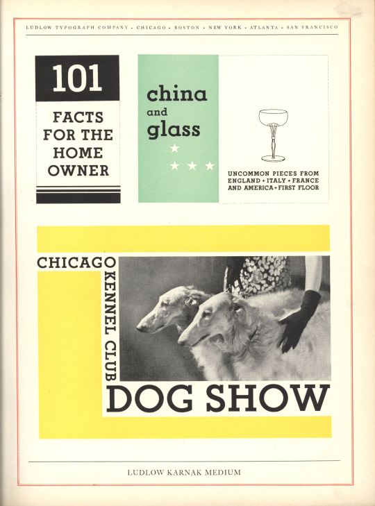
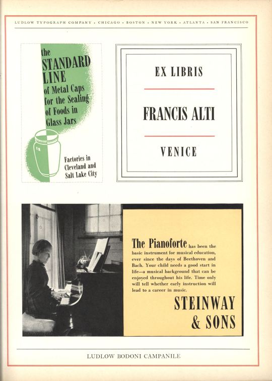
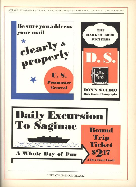
Shown here are the uses of Middleton’s designs for Karnak Medium and Karnak Obelisk (part of the Karnak series of eight faces developed between 1930 and 1941), Bodoni Black and Bodoni Campanile (part of Ludlow’s Bodoni series developed between 1930 and 1942), Tempo Bold (part of the Tempo series for which Middleton designed twelve faces between 1930 and 1942), and Ludlow Umbria, a shadowed, san-serif display face developed in the early to mid 1930s. Also shown here is Douglas McMurtrie’s Ultra-Modern, part of the only series he designed for Ludlow between 1928 and 1930. Although pricipally a designer, McMurtrie was Ludlow’s director of advertising from 1928 until his death in 1944.
#Typography Tuesday#Ludlow Typograph Company#R. Hunter Middleton#Douglas Crawford McMurtrie#Douglas C. McMurtrie#typefaces#20th century
96 notes
·
View notes
Last Seen Blogs

zutaralesbian
I feel things when I'm with you

happyhornycouple825
Untitled

tellamceo
Lifestyles A Beach

echoaess
echoaes