#I used what glimpses I could from the trailer but also modeled the body shape after Magnamalo
Text
Hunter, Mother
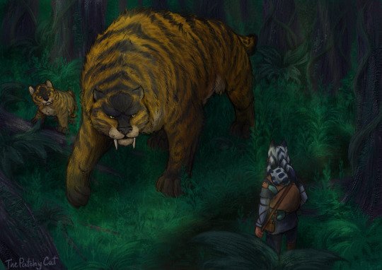
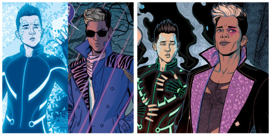
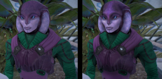
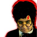
#Star Wars#Tales of the Jedi#TOTJ#Pav-ti#Ahsoka Tano#(baby version)#I'm excited!#Coulda fiddled with the colors/lighting more but I wanted to be finished in time for the show release#Anyway cannot wait to see the big sabertooth cat#I used what glimpses I could from the trailer but also modeled the body shape after Magnamalo#They’re probably just out on a walk since Pav-Ti doesn’t have the same equipment#Edit: oop the cats are supposed to have long tails and the forest’s different#But I did enjoy the big kitty :3#And the rest of the shorts!!#Patchy Doodles#ID in alt text
262 notes
·
View notes
Text
Back, in Black
Once more, we return, with two essays on The Wicked + The Divine #41. Tim’s will be following later today, but we kick off with Alex, talking the issue’s big character redesigns. You know the ones we mean.
If you don’t, well, spoilers follow after the cut.
Alex: Look, you don’t need me to tell you that Jamie McKelvie is one of the most talented character and costume designers ever to bless comics. Just take one glance at a poster for the upcoming Captain Marvel, how much of his iconic redesign is making it onto the big screen, and all the gorgeous merch that’s already spinning out of that movie. Or the hundreds of essays written to that tune by us, and the rest of the Tumblr fandom, and basically anyone with working eyes in their head.
But I do want to celebrate, one last time before the end, how he can make a costume change into just as much of a gasp-at-the-page-turn reveal as any major plot point or twist. Issue #41 seems like a rather apt time to do that.
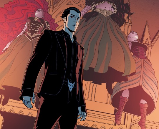
Let’s start with the quieter redesign moment of the issue: the artist formerly known as Baphomet, now going by Nergal.
That first two-thirds-of-a-page panel squeezed an involuntary noise out of me. By the standards of the Pantheon, it’s a fairly downbeat costume: no make-up or physics-defining hairdo, and not a single ab in sight (a failing that has already been registered by the Everything Wrong With WicDiv Tumblr). Just a black suit jacket and high-collared shirt, open at the neck, adorned only with a goat’s-head belt buckle.
As new looks go, this one is downright vampiric – our boy Cameron finally going, to borrow one of Baal’s lines, the full Nick Batcave.
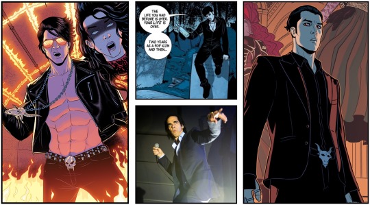
The elder statesman of goth is the clear model for this new look, right down to the open neck of the shirt and the slicked-back hair. Cave has always been in the mix of influences for Baphomet, but this is the first time he’s barged Andrew Eldritch out the way and made it right to the front. There’s a sense that, as Cameron has left behind the ‘Baphomet’ identity, he’s also ditched the hyper-masculine swagger of the old look. It was always just a front anyway – that’s what the trademark mirrored shades were about.
There’s even, in the baggy sleeves, a touch of foppishness – something that had no place in the old leather-chains-and-skulls costume. It reminds me of McKelvie’s first draft of Baphomet, glimpsed in that initial two-page ‘trailer’, the kind of guy you can see reading his poetry for you without having to coat it in ironic winks. It’s Cameron dropping the schtick.
That’s what flooded into my brain, conscious or otherwise, as I turned the page to meet the New Nergal. It’s why I squealed. All of that, squeezed into one image of a pale lad in a black suit.
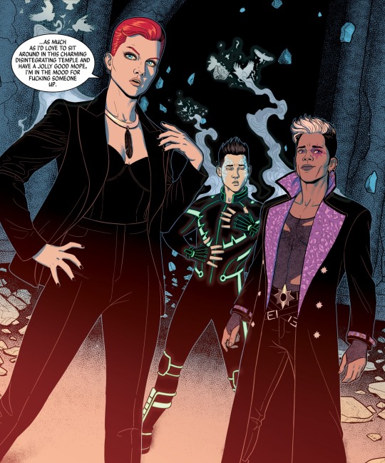
Of course, this isn’t the biggest costume reveal in issue #41. That honour goes to the panel that launched a thousand fanarts: the freshly recapitated Lucifer, Inanna and Mimir.
For my money, there’s not quite as much semiotics squeezed into these three – they’re basically darker takes on the original costumes, inflected with the gothiness of their donor bodies. It’s more specific than that: Luci’s red hair and immediate suggestion of violence are a sign that she got Badb’s body, the torn netting of Inanna’s vest is a clear link to Gentle Annie, while the raven wing motif of Mimir’s Tron-suit suggest Morrigan Prime.
(I attempted coining portmanteau nicknames for each – Gentle Inannie? Morrimir? Mimirigan? – but got stuck on Luci. The best I could come up with is Badb Bitch. Suggestions are very welcome.
Update: @meserach puts forward the remarkable ‘Badb out of Hell’.)

There are certainly neat touches – finding a common ground between Lucifer and Morrigan’s symbols with the black feather around her neck – and there could potentially be some significance to Mimir switching his signature colour from the original blue to green: Morrigan’s colour but also, especially in the cybernetic neon piping, his father’s. But really, the signifiers of these three are same as it ever was: androgynous ass-kicker, sexually-inviting luxury, sci-fi form-meets-function.
The significance of the costume changes here isn’t so much to do with code-switching – the way we tweak how our identities are presented, depending on context. It’s more about selling this as a triumphant moment, the return of all our old favourites. McKelvie provides the exclamation point to this plot beat, the celebratory fireworks, the [DJ spams air horn sound effect].
There’s a lot of visual information packed into this not-quite-full-page-splash, down to the raven-shaped curls of smoke leaving these three bodies, and that encourages you to slow down and really drink it in. My eyes can sometimes jump automatically to the next cluster of words, skimming over the pictures in between, so this serves as a helpful reminder that, hey, dumb-dumb, this is a visual medium.
And yes, because McKelvie’s a genius this will be the wellspring of gorgeous fanart and unbelievable cosplay – less than a week from release, I’m sure someone’s already rocked the new Luci look – but this is what I appreciate most: the invitation to really study an image, squeeze out every last bit of meaning and beauty. Because hey, we only get twenty-some pages of them a month.
Like what we do, and want to help us make more of it? Visit patreon.com/timplusalex and pledge to gain access to exclusive blogs, ebooks, mixtapes and more.
46 notes
·
View notes
Text
Mercia and Tiger’s June Prompt Challenge #5: ‘Love at First Sight’
Pairings: Drarry
Words: 1389
Love at first sight - it was the sort of notion that Draco admired. In his firm opinion, it took a very strange sort of mindset to even believe in such a thing in this day and age. It was true - he thought - that people could certainly find lust at first sight. Most relationships started like that - on the basis of how hot the person was, or how much you fancied them. Love - the non-platonic sort anyways - was a lot more complicated.
He liked to think he knew what it was. The quiet contentment that his parents luxuriated every time he visited them in France, the youthful plastic and political smiles that made them a very handsome couple during his childhood, replaced by wrinkled lines and soft gestures. He liked to think he saw glimpses of it, little windows into other people's lives and their intertwined hearts. It was in the way Pansy and Astoria would burst into laughter, overexuberant and almost hysterical, until it should have made them nearly sick with it but instead beaming from ear to ear so hard it seemed like they'd caught the stars between their eyes. Sometimes, he saw it in strangers too - the way an elderly woman held open the door for the older gentleman behind her, fingers flicking through sign language fast and a teasing glint in her eyes; or the face someone made when stepping out of a flower shop - somewhere between proud and bashful.
But it wasn't something he could say he had experienced for himself.
He'd had plenty of his share of partners, of course. Draco knew he sometimes came off a little too strongly, but he liked to think that his personality and his looks weren't not attractive. He was twenty-five, in the prime of his life, why shouldn't he have his pick? Of the four serious relationships he'd been in, none of them had made him look at them the way he'd seen other people look at their significant others. Not a single one. After the initial flutter of novelty, the routine would sink in and then suddenly Draco would find himself glancing across the table on a date and thinking - was this better than nothing?
His job as a photographer meant he had to travel a lot - and thus, was usually his go-to excuse for a break-up. "I'm sorry - this long distance thing isn't working - we should just - " was his typical spiel and his mother seemed to think he'd gotten it down to an art. It wasn't that they were bad relationships, or shitty partners, just that he wanted something special - as cliché as that sounded. He didn't want to just settle for who he could get.
"Oh, and what do you think I did?" His mother would say primly over the phone, her tone light and airy, "I settled for your father, you know, and now I have a wonderful son, and a loving husband - you've grown up so much, that I forget what a child you are sometimes, Draco."
So perhaps, he had no idea what love was after all.
But it was something of a personal project of his to capture it in a frame. How did a slight smile differ from a look of love? What changed between shaping an expression on your face to looking at someone with love? He had thousands of snapshots in his studio of the faces of his friends that he'd bribed into being used as subjects on film, or black and white stills of people going around their everyday lives, whilst Draco tried to understand their expressions, just a little.
Despite all of that, he'd yet to actually capture the cliché 'love at first sight' - ironic, since that was the theme the fashion mag was going for in their May issue. They'd been flown out from London to Los Angeles and driven to the shoot location the next morning with little preamble in order to set up before the models arrived. The weather was far too hot for anything Draco would deem Spring, but at least the urban sets meant air conditioning. As usual, he'd brought Pansy with him to manage and assist - her official title was as his P.A. but that had somehow devolved into meaning he was responsible for giving her feedback on her selfies and getting updated on the gossip that he missed while focusing through the lens.
The shoot had run overtime, lasting several hours because the models just wouldn't move their face right for a theme like love at first sight and Draco was hot, and irritated, and wasn't nearly as recovered from his jetlag as he'd liked, which was why he flop down beside his unprofessional P.A on the sofa in their trailer with a grunt and tried to do his best to imagine something cold and sweet right about now.
"Ooh! Food's ready," Pansy's voice was annoyingly cheerful, "I can hear the caterers setting up."
"Not hungry," He mumbled into the cushions, macramé threading tickling his nose. "Lemme sleep."
"Draco."
"Nuh."
"Draco."
He closed his eyes.
"Fine - I'm starving, so I'm going." She said pointedly, before the clicks of her heels got quieter, followed by the sounds of the door.
There was another shoot after this, swapping the idyllic urban street they were in for an office shoot with chrome and metal finishes and glass several hundred metres above the busy streets. The six models (six now, because he told the seventh to go home) would be modelling an outfit each, and he'd need enough full body and close-ups to keep the stills intimate enough for the theme but also show off each garment.
Then after that, there was the reviewing process - he'd need to get the photos sent to the editor's office before eleven tonight and to do that, he'd need to go over the hundreds of frames on the memory card, and -
A loud knock interrupted his thoughts, plans vanishing in his head like smoke. Draco scowled, trying to find the tail end of the idea - right, the memory card and then the -
The knock repeated itself louder this time, and he'd just opened his mouth to tell Pansy to fuck off when the door opened of it's own accord and a distinctly not-Pansy stepped through with a fierce scowl on his lips. The man didn't even look up, breaking left away from the door to set down a tray with little finesse and not at all gently, the soup inside the bowl sloshing dangerously near the edges. He had dark hair, black and thick, glossy and messy like it would catch between his fingers at the slightest tugs. Framed by a pair of rounded glasses, were bright green eyes that were bracketed by a smattering of barely-there freckles on the man's dark skin.
He wasn't a model - he didn't have the build for it, lean though he was and well-muscled from what Draco could see under the white caterer's uniform that clung to him slightly in the heat. The man - because he was definitely a man - bared a flash of white teeth between rosy-pink lips, mumbling things that Draco probably wasn't supposed to hear.
"Stupid Garcia, send your fucking sous chef on your fucking errand, why don't you?" The man hissed to himself, in an English accent, strangely; laying out the silverware into the tray. "Fucking celebrities, why do you need a fork for fucking bisque?" There was a clatter and a sigh as the man - sous chef, hot sous chef - finished up and made to turn, and abruptly Draco realised he was about to be caught staring at the man, having overheard opinion's he was most likely not supposed to -
"Motherfucker!" The man spat, broad shoulders jerking in shock as Draco finally got a chance to see the nametag on his breast pocket.
Harry.
Quite a shame his mouth wasn't as sweet as it looked. Maybe it could have been - not love, no, - but something like it. A warm, heady feeling uncurled in Draco's chest.
"No thank you, not my type," He said, arching one brow as the caterer's cheeks flushed. But you are.
#drarry squad#draco malfoy#Harry Potter#harry potter fanfiction#mercia and tiger's june prompt challenge#love at first sight prompt#harry needs a swear jar#and draco is a romantic really#ramblebrambles
16 notes
·
View notes
Text
Visual analysis and critique of the aliens in Mass Effect: Andromeda
A comparison between the current in-game models and the originals from the trilogy.
Introduction
Just a warning, this will be an extended read. If you’re going to invest in reading this longwinded analysis, I suggest you go get a nice beverage and come back with a cozy chair.
This will be relatively spoiler free (unless you aren’t aware of any of the new races I guess?) so if you’re still at the beginning of the game like I am, no worries there! This analysis will have some pictures for comparison, and some edits that I’ve made myself.
Link to the EA ask board version [x]
Ready? Good.
I originally planned on writing this analysis on only the Turians in Andromeda. Something perturbed me the way the in-game models were made in comparison to the older ones of the trilogy. While gathering my source images, I decided to include some of the other species and point out their issues/differences as well. While the transition to the Frostbite engine has been a step up from the Unreal engine, I feel something is missing when it comes to the way some of the models have been rendered in game. This analysis will look at things such as texturing, posturing, and anatomy/biology of each species.
All that said, let’s dive in!
Turians
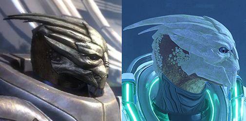
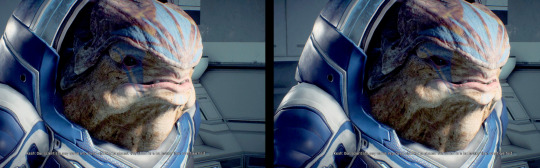
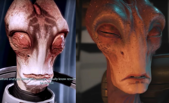
One of the main things I noticed back when we only had a glimpse of the Turian faces in the trailers, was that the new Turian faces appeared very white, or blank in appearance. I’m not talking about a lack of facial markings either, but rather, a very bleached out base, underneath the markings- what would be the natural colors and patterns of each natural born Turian.
Let me pull out my first example, in fact, it’s the first Turian we meet in-game, Tiran Kandros.
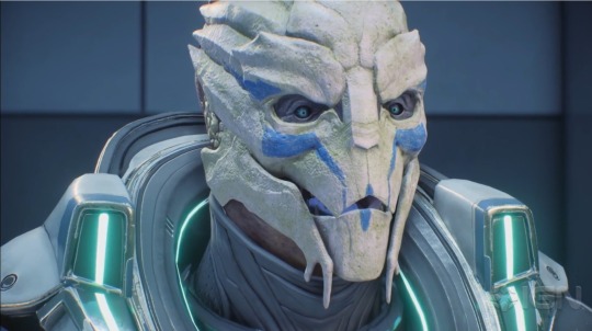
My first thought was “wow, his face is strangely white” and then “Oh, Tiran Kandros? As in, a relative of Nyreen Kandros?” which then led to, “Oh! Nyreen had a very white face as well, perhaps it’s a biological trait.”
Here’s a pic of Nyreen to show what I mean:

As you can see, underneath her Talon gang red markings, she has a very white face crest too.
Unfortunately, my assumption soon proved to be incorrect, as this flat white base crest kept repeating itself with multiple Turians we would come across in-game.
To me, they look like the plastic base models you can buy from Red Nebula Studios- the ones you’re meant to paint.

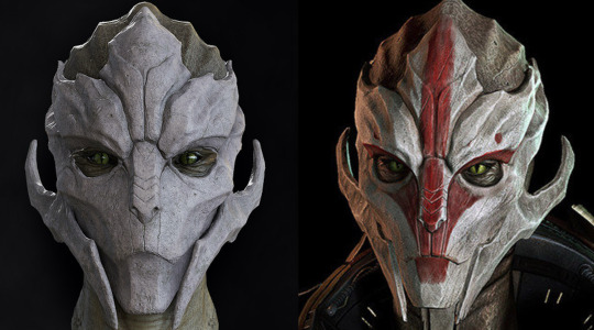
Something else I noticed about the Turians was that, unlike their trilogy predecessors, the male Turians of Andromeda had sealed secondary nostrils.
Here’s a comparison of Kandros (Andromeda) and Chellick (Trilogy):

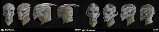
Some of you may be asking, “Well, how do you know those are secondary nostrils?” The answer is honestly- I don’t. However, the way the in-game models were designed before suggests this was an anatomical fact, by leaving such deep grooves in their noses, but also within the concept art:

As you can see on the left, the artist very clearly shapes the forms of the nose in such a way that it is an orifice, and on the right when they draw the Turian expressing himself, the nose closes up. Now, of course, this may only be an early design choice, as Turians don’t raise their crests like a stimulated cockatoo (as funny as that would that be) in-game either. Despite this, I think we can all agree that the Turian species does have deep grooves in its nose, whether they are canonically nostrils or not.
Strangely enough, they portray this more accurately with the current female Turian models, although it is still clearly designed as indentations, rather than deep grooves.
Despite this being ignored by the new character modeler, this could have been something easily improved upon by the texture artist. Which leads me to my next point…
There’s simply not enough value changes to properly reveal the various physical forms in the Turian face. Because of this, even with the markings- most Turian faces appear extremely flat.
What I mean by this, is that there aren't as many shadows in and around certain areas of the face indicating what the forms are. For example, shadows under the cheekbones, the brow line, the jaw line. Those of you who are regular makeup users know that you can use highlighter and darker foundation on certain areas of your face to contour it, and make it ‘pop.’
I’m making a lot of assumptions here, but it seems like whoever the texture mapping artist was, did a very flat job on the Turian faces.
I say this, because looking at the original models for the faces, they look very well crafted and finely detailed.
For those that don’t know, a texture mapping artist will take the 3D models created for in-game characters and create both the colors, and smaller details that appear on the models that the 3D modeler can’t, or simply won’t- include themselves.
Here’s an example of a WoW Dwarf texture map as an example:
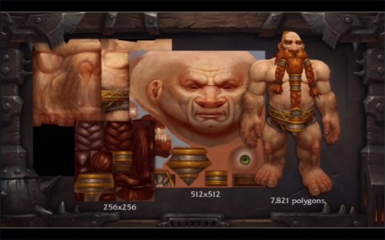
As you can see, they develop a rather stretched out image that goes around the 3D model like a skin. This gives it color, and any extra shading or highlighting that will help the 3D model appear to have more detail, or even appear more realistic.
In older games, a texture mapping artist was more crucial, as character game models of old had fewer polygons, and therefore less forms for the artificial light source to work with in terms of creating realistic and deep shadows/highlights.
In a way, a texture map artist does the “contouring” of the in-game models.
My assumption is then, that for whatever reason, they were counting on the raw forms of the game models to add enough depth and shadow, without adding much more from the texture map.
This is still evident in the darker faced Turians, because although they are darker- they lose their features because they aren’t properly shaded/highlighted in the face, aka the values aren’t working or are just plainly not there at all. This CAN change in certain lighting, but it would be better for it to remain consistent throughout the game.
It seems like they added flat color, texture, and the facial markings, without adding additional shadows/highlights. Now let's look at an old Turian from the trilogy, particularly one without markings, and compare it to a blank-faced Turian from Andromeda.
Perhaps you can see it more clearly? There is simply a lack of depth in the faces that can easily be fixed by the texture mapping artist. For comparison, I will do some small edits in photoshop to show how this can be improved.
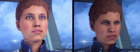
I feel like this has happened in a few other places as well, including the original Human/Asari eyes with the game's release. They also had just flat colors and didn’t account for the cast shadow that would come from the upper eyelid. The result was well, a soulless stare we all dealt with until the 1.05 patch was released. Of course, the human face issues are a whole other topic. Let’s move on.
Understanding Digitigrade Legs
A digitigrade is an organism that biologically walks on its toes instead of the entire foot. This includes animals such as dogs, cats, and horses. In contrast, an organism that biologically walks on its entire foot is known as a plantigrade, this includes human beings, most primates, and bears.
In the original Mass Effect, the species were designed in such a way that they could be placed on a “human skeleton.” This is because of the technological barriers they had back in the day, and the animators could only work with so much. The results left us with alien species that are bipedal (walks on two legs) but have digitigrade biology/walking patterns.
Though the Mass Effect species with the “backward knees” aren’t necessarily walking on their toes, they ARE still using the bone/muscle structure of a digitigrade, and thus, are using the physics of digitigrade legs.
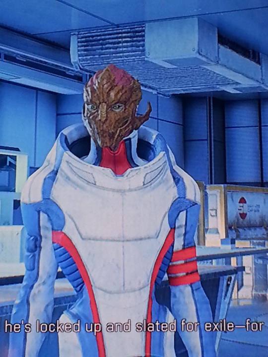
Mass Effect species that use this structure are Turian, Quarian, Geth, Salarian and Krogan.
“dog legs” as Jack so lovely put them.
In Andromeda, I’m sure a few of you, like myself, have noticed the awkward ever changing leg patterns of the Turians. Sometimes they are perfectly fine, upright, and other times they look strangely bendy, or- “off balance.” There is a very good reason for this, and it’s all in the placement of the knees in each species. I’ll try my best to explain this.
First, let’s look at a few “awkward” examples.
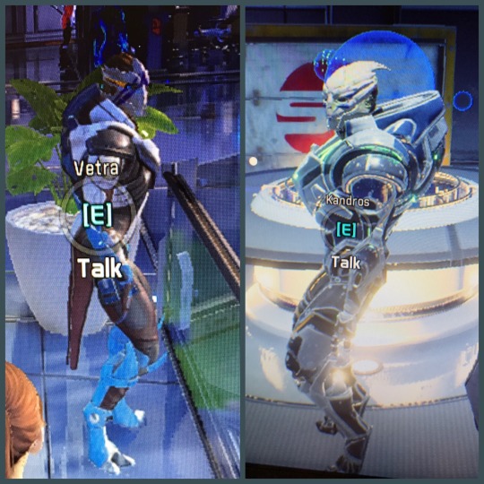
Vetra and Tiran here are probably a good place to start. Looking at these two, what do we see? It looks as if Tiran is getting ready to do a wall sit, or position himself into a crouch, likewise, Vetra looks like she could spring into a jump at any moment.
That’s because this is the incorrect way to place digitigrade legs.
It’s a very common thing for young artists- including myself, to see animal legs this way- as constantly “bent” and thus draw them in this fashion. Our eyes don’t understand the curve because we’re used to such straight legs!
In fact, animals like dogs and horses, even though they appear to have “bent legs” actually do have straight knees, and that’s the crucial part here. There is no mammal that stands upright with constantly bent legs. Think about how quickly your thighs and calves get tired when you’re doing a wall sit, how quickly you feel the need to straighten your legs out when you do a squat. That’s because knees are biologically designed in such a way to most effectively carry your weight when they are not bent and are directly underneath the core of your weight (i.e; hips/body).
For some visual evidence, let’s look at some animal legs.
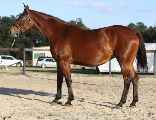
Look at this horse, what a gorgeous creature. Now, look at its gorgeous legs. When you look at this horse, do its knees look bent? They don’t, do they? You can tell the horse’s hind legs are straight, yet, still have a natural curve. This comes from the straightened knee, flowing into the natural hock, or “heel” of the horse. More importantly, the knees are directly underneath its hips.
Now let's look at something more complex, a dog standing upright.

Look at this pupper. Again you can tell that its hind legs are straight, despite how curvy they seem. This is for the same reason as the horse. The dog has a natural curvature of the hind legs because it is digitigrade, but it does not mean that the legs are constantly bent. If the dog were to bend its knees like this, it would fall over very quickly.
It’s important to know how gravity/weight travels down the skeleton and into the ground. Drawing or creating digitigrade legs incorrectly will result in the creature/individual looking as if they’re about to fall over, or that they're crouching, or that they’re about to jump up.
It’s important to visually convey that when in a neutral standing position, the knees are always straight.
Let’s look at how the original Mass Effect models handled this.
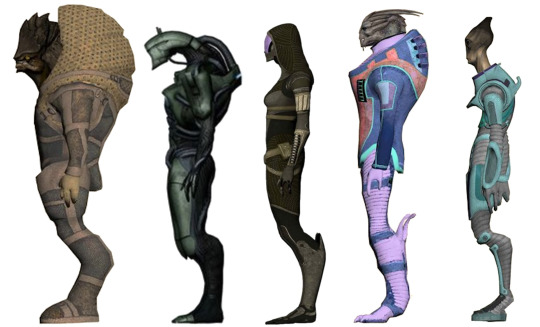
Something to take note of here is that although all of these species look digitigrade, only the Turian and Salarian technically are. Jack calls Tali, a Quarian, “dog legs” but she is, in fact, plantigrade- her whole foot is on the ground, with an exaggerated bend in her shin bones. If there is a joint where her calf muscles should be, they never animated it in-game, or it is very subtle.
In fact, it’s quite arguable who is a true digitigrade here and who isn’t. The most clearly defined is the Krogan, who has an obviously elevated heel, however, it is an addition to the heel which is flat on the ground. Does the Salarian have a joint where his calf muscles should be? Indeed, these are simply speculations. What’s more important are the anatomical design choices made here. Each of these alien species has a unique leg shape, with arguably varying joints and muscle structures, but what is consistent is that the knees are straight, not in front of them, and directly underneath the core of their weight. None of these profiles look as if they are about to jump or fall over.
This goes without saying, but of course, we do occasionally stretch a leg out in front or behind us that slightly bends. Often times we shift weight from leg to leg, bending the one that’s resting and putting weight on the one that's straight (which says a lot, doesn’t it?) Indeed, if the alien models with these exaggerated protruding bent legs only had ONE doing that while the other was straightened, it would look much more natural.
Angara
Whoever it was that put the models in this state, be it a glitch or not (perhaps related to the awkward in-game human leg animations?) was also unaware of this fact while designing/modeling the new Angara race. Let’s look at some of these guys.
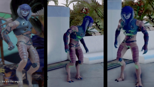
What’s interesting about the Angaran, is that they’re so close to being 100% fine. In fact, I love their design, Jaal is a cutie I can’t wait to paint. However, you can see the same thing I pointed out before- that their knees come out in front of them rather than being directly underneath them. To fix this, all they really need to do is push them back OR bring their torsos extremely forward to balance the core of the weight.
The second image here shows a posture they are in sometimes which looks much more normal than the one on the left. This is because being so hunched over actually creates balance for the legs which are already excessively forward.
It seems that someone must have noticed that they looked slightly peculiar, and as a result decided to widen their natural stance a bit. Although that does help, it still has an air of awkwardness, especially for the females- who have more of the protruding knees than the males. In some angles, the Angara look fine, especially while walking or turning, because again- the knees briefly go under them, but when they return to their default stance, they look a bit, well, ‘fight’ ready.
If you were to widen your stance and bend your knees in front of someone- they probably would think you’re about to attack them. That’s all I have to say about that really.
The Angaran too could benefit from some texture map shading and highlighting. The females especially look very flat. There seems to be an ongoing pattern of adding flat colors to models and believing that it’s good enough to look fully rendered in-game.
But think about how that would look on special effects makeup.
You could sculpt and cast a latex mask with very detailed scales and patterns, but just dipping the entire mask in 1-3 solid colors wouldn’t be enough for those details to pop out. You have to go in and detail with a smaller brush the smaller shadows and highlights made by those smaller details. The sculptural details that you created get lost if you merely flatten them with a solid color.
Here are more edits I made on an Angaran.
Krogans
I don’t have much in the form of critique for these guys, but rather just comparing their changes for the fun of it and adding some thoughts of my own. The Krogan appear to have the most stable legs along with the Salarians in-game.
Despite having the same protruding bent knee issues, they aren’t as extreme as the Turians or Angara.
Something I would like to point out, however, is more texture mapping.
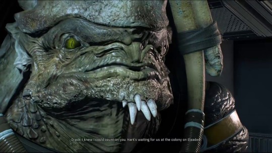
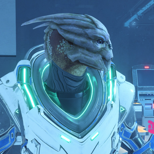
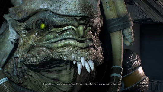
Here’s a nice picture of Drack, our bad ass Krogan grandpa. Something that was consistent with the old Krogan designs, however, was the dark skin around the eyes.
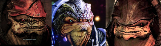
That small design choice always gave the Krogans such a predatory glare that I miss quite a bit with their new design. I realize that it wouldn’t work as well with the Krogan who have the darker colored eyes, but I still believe it would have been a nice addition via texture mapping. Along with that, some minor shading in the folds of their bat-like faces and scales. Just a little something extra to give more depth to the original model. Here are more photoshop edits for Drack
The females have an interesting look about them in this game. I like that they kept the consistency of the smaller, flatter plates on the head/neck. It appears they’ve also widened the hips and given them possibly a bit of a thicker lower lip than the males. All understandable choices. Something I might have done with them, however, is narrow the jawline ever so slightly, just to give that feminine edge, perhaps also a more angular eye. This form of femininity, however, is arguably human in nature, and therefore not necessarily applicable for brutes such as the Krogan. Just a possible design choice.
Here’s more photoshopping again.
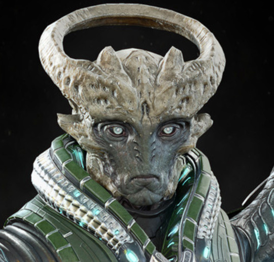
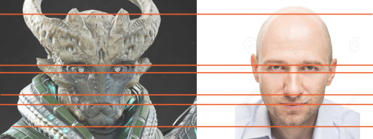
The Problem With The Archon…
He has… well... childlike face proportions.
A large forehead, small jawline, chin, etc...
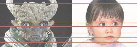
As the main villain, I imagine you’d want to stay away from something like this. But because I haven’t played the game all the way through yet, it’s possible that perhaps he is a young leader? Maybe something to do with the age or reproduction of his species is a core factor in the narrative? I have yet to find out, however, here are some more edits that I thought could be useful.
I’ve lengthened his jaw, nose and mouth areas to those of a more average adult. I’ve also slightly scaled down the size of his eyes. I think even these small changes go a long way for the design of the character.
The Kett as a whole seem alright. From what I’ve seen they have texture/model variations of their rocky exoskeleton like bodies and faces which is great. If there is anything to compare/critique it’s only the things I’ve mentioned before, such as the texture mapping and proper positioning of the legs/knees.
Overall I do like their visual design.
Salarians
A huge issue with the Salarians (other than the slightly too forward knees like the other species) is their eyes. Salarians blink entirely upwards with their bottom eyelid. In Andromeda, they animate them blinking like any other species (both lids but mainly upper) which is a big flaw for those of us who are super nerds and like canon information to stay correct.
Mordin and Kallo, respectively. You can see the blinking difference very clearly here.
It’s a small animation change, but it’s important to those of us who are so involved with the IP. That’s why there was a few who became angry when it was revealed that Peebee had hair on her eyebrows- as Asari physiology in previous games stated they could never have such a thing.
Information was released later that she had remaining “human genes” or something to that extent which could “explain” it.
That statement, however, conflicts with established Asari reproduction methods again from previous games, so, it’s a tricky rope to walk.
Something else I’m sure fewer people have noticed thus far is that the Salarians in Andromeda DO have pupils and the way they have created the Salarian pupils is inaccurate from the original trilogy. Salarians are amphibian and have eyes that mimic this, with pupils that are horizontal. If you peer closely into the dark eyes of Andromeda Salarians, they have vertical slit pupils, which are very inaccurate.
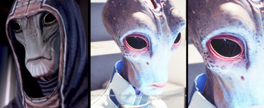
I’ve overexposed the image of Tann so you can see the pupil a bit more clearly. I’ve also traced it in a separate window to the right if you still can’t see it.
So that’s all I have to say so far. As I progress through the game I may come back and add or change a few things to this piece of writing/critique/analysis.
Both Asari and Human species have the same issues which have been addressed many times in the past. In my opinion, they already took the first step by fixing the eyes and adding shadows. Now all they really need to do is drop the chin level in conversations, “half-moon” the iris with the upper lid of the eye, and fix the eye tracking animation to some level.
There are mouth issues sure, but those go less noticed when you have solid eyes/eye animations. You can see here with the last patch that they’ve already done this with Addison.
That’s all my thoughts! I hope you found this interesting (if you managed to get all the way through.)
Thanks for reading! If you have any comments or thoughts I’d love to hear them. Feel free to reblog and comment or inbox me, especially if you think I’ve missed something or got something wrong. I’m always up for Mass Effect discussion.
#me#mass effect#me:a#mass effect andromeda#andromeda#analysis#turians#salarians#krogans#asari#drell#angara#hanar#vorcha#volus#elcor#batarian#my face is tired#I should go#commander shepard#ryder#ryder twins#me glitch#mass effect glitch#andromeda bug#andromeda glitch#mass effect bug#bioware#ea games#frostbite
461 notes
·
View notes
Last Seen Blogs
hooter-n-company
Welcome, my fellow freaks

glowmedispa
Eyelid Surgery Chandler
karenfordonte
Caring For Donte
ceramicwings
THE OFFICIAL CERAMIC_WINGS SUPER ULTRA MEGA BLOG
sannaiidae
Olive