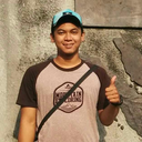
#2 not 1 because the original was too saturated imo
Text

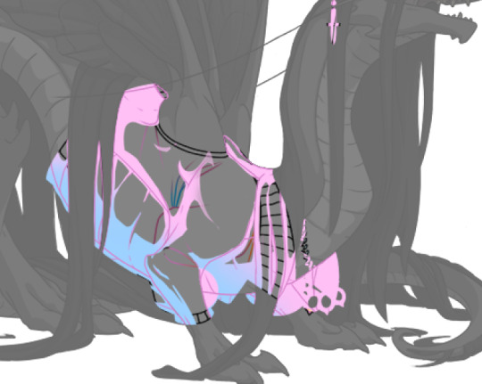
Cell's wings ruin every drawing of him (mostly because I always forget they exist and have to add them in last minute) 🙄 Annoying bug man (affectionate)
#i dont understand colour lmao#this was a very VERY random drawing#so random i titled it 'randomcell2.png'#2 not 1 because the original was too saturated imo#cell#perfect cell#db#dragon ball#dbz#cell saga#sketch
320 notes
·
View notes
Text
splatoon 3 hot take turned impromptu essay
was stuck offline in splatoon 3 because internet was actin up and i realized how pretty the photomode splatoon 3 filters are compared to the actual game

i was taking photos on brinewater and thought. damn. this game looks fine but i miss how VIBRANT splatoon 1 was! i wish i could play sploon 3 with this photomode filter on all the time. and brinewater is the best map for this because of the sunset lighting! so i went to one of the worst offenders mapwise for general color—undertow spillway. it is a warm gray mess:
for someplace underground, it’s WAY too warm of a tone—even if there are skylights, they aren’t very well defined, as they’re off in the background—they’d be better with some light shafts to pop out more, imo.
so here’s undertow with photomode filter #6 (this would’ve been a video but tumblr limits to 1 video per post):
and i think this looks a lot nicer, colorwise! the icky warm gray is shifted to a soft pink—and while that’s still not in keeping with the lack of obvious skylights, it works better than warm gray.
so then i opened ibis x paint and got to work on a filter that would hopefully help elevate the entire game’s look:
on top is photomode filter #6, in the middle is the original screenshot, and on the bottom is my proposed filter.
i upped the contrast, brightness, and saturation a bit, then added a 5% pure magenta (#FF00FF) overlay layer on top of that. then i added a slight gaussian blur to emulate antialiasing, which nintendo refuses to do for some reason!
and i wanna play splatoon like that! i miss the vibrancy and intricacy of splatoon 1…
incoming splatoon 1 essay‼️
not only were the colors eye-bleachingly bright, but the overall game feel was much more immersive—especially in ink physics. you could paint trees, and the ink would drip down through leaves as if it were rain… ink splatter would respond to the movements of platforms, keeping its intertia as it dripped! you could see the textures of surfaces through the ink, as if it were an actual liquid instead of a layer of thick oil. 3 doesn’t have any of those special touches.
there’s also the music… 1’s ost feels so much more WEIRD and experimental than the later games, and that really helps cement that this is not human society—this is a new thing—which tracks for splatoon 1, as it was so zany nobody had ever seen anything quite like it before! splatoon 2 follows this sheer melting-pot of brashness and creativity with evolving and varied styles—where once was punk and weird samples in Squid Squad is now groovy rock in Wet Floor, jazz in Ink Theory, and also whatever Sashi-Mori was. also i <3 chirpy chips. splatoon 3’s music goes back to that punk, but i feel that it loses some of the charm and creativity of the first two games. C-side is pure metal, and hardly uses any weird instruments. there have sparsely been other splatbands involved with regular battle music—Yoko&tgb call back to the jazz of Ink Theory which i love! Off the Hook’s new tracks delve into a new style in piano rock. but the main band kind of falls flat to me. :(
let’s talk stages. in splatoon 1, stages were wildly different from each other, including skateparks, construction sites, underpasses, malls, sewage plants, and other locals that are culturally underground. the rest of the trilogy moves away from this in a story standpoint, as ink battles evolve from punky, diy competitions into full-fledged championships in 2 and 3, with advancing battle infrastructure as time progresses. that’s fine, and honestly it’s cool to see that kind of worldbuilding! but in 1, each stage was designed about and influenced by the area it represented. Arowana Mall is a straight line with high vantage points on the second/third story because it’s a mall. Pirahna Pit features convenyor belts that shuffle refuse around because it’s a trash plant. Blackbelly Skatepark has so many hills and valleys because it’s a skatepark, for goodness sake. splatoon 3’s original stages have some of this charm, but it feels lost in ambiguity. why doesn’t Mincemeat Metalworks have small moving platforms on cranes or other heavy machinery? Idk, have some grates and one-way drops, and a car on a post. why isn’t there any water incorporated into the stage design of Brinewater Springs? Idk, have 2 paintable walls and a tetris piece. 3’s original stages have little to no connection between their locals and the geometry, which make it feel same-y compared to previous games.
maybe this is because of the inflexible philosophy of the designers—or their corporate oversight, maybe. for stages, you need to make a straight line or tetris piece with few routes to push, in an effort to promote the game’s main premise of Chaos. for music, you need to make punk songs that aren’t too weird so they don’t drive away the parents. maybe the little ink touches could have been missing because development was rushed?
i honestly dont know why it happened out this way—perhaps the splatoon team just needed more time to cook, in order to squeeze out that extra 20% of game feel? or maybe it was that speculated corporate oversight, i dunno. things WERE missing on launch—notable exceptions being X rank, online tableturf lobbies, and no more than three salmon run maps. i know we’ve yet to even get the DLC but for being about 75% of the way through the game’s content lifespan, but splatoon 3 feels incomplete. there have been improvements, yeah! i just wish there could’ve been more. i would rather have waited another year for splatoon 3 if it were polished that much better, y’know?
i honestly feel like splatoon 1 captured that creative, no-holds-barred mantle of Chaos better than 3 does. 3 feels… flanderized, in a way. the curse of trilogies, perhaps? writing about it more, it feels like not only have the in-game sports of turf war been ripped out of its seedy home and thrust into the spotlight, and gone “mainstream” (see: massive squidsport companies investing in multimillion battle lobbies with holograms and lockers [sunken scroll about that!], flying coffee machines that grant you brief invincibility, new rules and techniques that allow squid surges and rolls, etc.), but also the Real Life Physical Video Game Cartridge of Splatoon has been popularized massively with the sequels on the Switch. maybe i’m not missing the “vibrancy” of splatoon 1 when i look at the colors and photomode filters of splatoon 3, but instead the inherent punkiness and counterculture inspiration that i see in the original.
fuck capitalism, i guess!
#splatoon 3#long post#i did not think i’d be writing an essay tonight#on SPLATOON no less. i feel like im on storming the ivory tower#thats a good blog site btw i love their stuff#but anyways... i was like 12 or 13 when i first got splatoon 1#i was an orange n-zap/carbon roller (i forget which kit) main#i never played any of the splatfests but i imagine they were really fun!#my internet connection in the basement was never really that good so i never played much.... i never finished story mode until years later#this also means that i'm probably misremembering specific splatoon 1 tidbits. let me know if i messed anything up? or whatever you think lo#it's 2:11 am and i need to wake up early lmao#goodnight and thanks for reading
47 notes
·
View notes
Text
Black Eagles FEW Glow Up Tier List
Now that we have the redesigns for the BE as well, I have opted to put them into the tier list of glow ups! Here we go, and these are ordered within tiers:
Detailed opinions on the BL found here!
Here’s the tier maker list I used as well
Ok so if I had to summarize the BE as a whole: they feel like when a tech company decides to completely change their UI for no discernible reason aside from making it look different. It’s usually not better, it’s occasionally much worse, and the changes they decided to focus on are always the ones no one asked for (Think, like, Tumblr changing the saturation of their blue tone instead of fixing the search bar, that kind of thing).
1) Linhardt. I’ll be honest I still don’t really care for the design, but I disliked his OG design so much that there was really nowhere to go but up for me. It’s the happy medium between the “WAY too much bangs” of his Academy design and the “no bangs at all where did they go” of his War design.
2) Dorothea. She looks almost exactly the same, except her hair is now easier to animate shorter. And there’s a braid now, I guess. It’s not bad, it’s just kind of boring. The definition of “we needed to make this different but we didn’t exactly know how. I would have liked to see something a little more different or complex.
3) Ferdinand. Same deal as Dorothea really, it’s almost exactly the same. It’s just “his academy hair, but slightly longer but not too long so we can animate it. Again, there was so much they could have done with it and it feels like they didn’t put in any effort. Why not give us ponytail Ferdie, or Ferdie with braids, or just something like that? Felix got a long ponytail so we know they’re not that against the concept.
4) Edelgard. I honestly have a hard time quantifying this one. I definitely like it better than the fire truck red dress and the Leia buns, but I also honestly don’t think they were redesigning that version. I stuck it in sidegrade because it’s one of the only designs that seems to be taking cues much more heavily from the Academy version rather than the War version, which I find... interesting, to say the least. And it’s definitely not significantly better or worse than the academy version, IMO.
5) Hubert. Ok hear me out on this one. Yes, he looks like an MCR reject. However, he always looked like an MCR reject. It’s just that now he looks like he’s in his tween emo phase instead of his teen emo phase. It’s definitely not better, but it’s honestly not as bad as it could have been. Which brings us to...
6) Petra. I don’t know what they were doing here tbh. Her original hair had so much flow and movement and they basically just stuck a helmet on it. I don’t really understand why. I don’t think it’s a bad direction to go, I just think it could have been executed much better so it didn’t look like... helmet hair.
7) Caspar. My boy. Look how they massacred my boy. From Academy to War design Caspar had hands down one of the absolute best glow ups of any of the cast. All they had to do was not mess it up, and what do they do? They mess it up HARD. First off, what’s with the random scar coming out of absolutely nowhere? And the hair, he looks like he just stuck a fork in an electrical socket. Which, while definitely on brand for Caspar, is not necessarily the look I wanna see for him.
8) Bernadetta. My god. I don’t think I’ve ever seen anyone above the age of 3 wear their hair like that in public. Interestingly, I’d say that Bernie is the other character where they seem to be visibly taking a lot more cues from the Academy version than the war version. I mean it’s literally the exact same hair, just with a stupid bangs ponytail. No. I have too many opinions on this even just for this post.
10 notes
·
View notes
Note
I already know this, but it’s worth asking-
What are elements of the soft retcon you love and what elements do you still prefer from the original continuity?
AFTER OUR BINGE, I noticed a lot of things.
but im too scared to blast this to the masses cuz it involves some tinfoil hats on my part so 😭 It’s kind of long and dumb.
The soft retcon stuff I like is definitely the design overhaul. I dunno. I really like the more saturated and bright look. Both for the aesthetics and the characters. Though I’ve seen people rly hate that. …Not my problem though!
A BIG THING I LIKE: I think I like the soft-retcon Membrane family waaaay better.
After watching the main series’ I kinda noticed how much harder it was to root for Dib, or how kiiinda flat the other members of the family were. Don’t get it twisted, I liked ‘em fine as they were. They just didn’t really do anything for me. It’s definitely evident that JV and co didn’t quite pin down what they wanted for them yet. (This kinda thing is pretty normal for anyone I think, sometimes ur characters are just gonna be wips for a while, and IZ was cut off really fast)
The overhauls in the soft retcon (primarily in ETF) such as making Dib’s general motivation more personally driven, or making the family dynamic a little better (and cooler in some cases) I think makes them all a bit more palatable as characters? I dunno. Lol. I just like seeing more positive things. (I don’t view this as in-universe “character development” tho that’s kinda weird imo, sometimes it really just is easier to say that somebody just changed their mind). The Membranes in ETF definitely feel like a fleshed-out culmination of stuff that was getting rolling in the comics.
Even if the gainax ending in ETF punches me in the face.
(And believe me i got a myriad of issues with the comics, but those guys aren’t really one of them) 
The stuff I prefer in the original continuity though is pretty much everything and anything having to do with the Irkens and other aliens.
BECAUSE THAT STUFF WAS PRETTY GREAT and I think it got shafted pretty badly in the comics and ETF. I can see why though. I read some JV interview from 2015 (I think on IGN? Idfk. I should’n’t have been on incognito), around the time the IZ comics were getting started. Long story short, he wanted to use the comics as a means to address all the problems he had with the Membranes in the og series and kinda… revise them. Which, gr8 yay, they needed it imo
As for Zim? He said Zim wouldn’t change.
Call it my tinfoil hat moment, but I think that that mindset was exactly the issue… Zim and co. were VERY defined and fleshed out by the og series end (as wack as some later eps were gonna be), but I think just leaving them to the wayside like that as characters that don’t need change (i.e. that much attention) is exactly why Zim, The Tallest, and much of the other space-centric stuff kinda got warped and flanderized. Or, hell, not referenced altogether. Zim got dumber, the Tallest got dumber, and a lot of the other space things specifically involving ID2 kinda… phased out.
Sometimes what you remember a character being like, wasn’t what they were like at all. And if u don’t reaaally work with them, ur gonna exaggerate or even forget whole things. The Membranes were worked on with the intent of fleshing them out and reworking them to what we end up seeing in ETF.
Zim? He wasn’t. He was just considered fine as he was, and while I agree with that on principle, in the comics execution he doesn’t quite feel the same. He feels more like… maybe a caricature is too harsh? But. Definitely weird. I’m just not nearly as invested. :( (There are a couple exceptions, but. Meh)
But I should also mention in that same interview the point of the comics wasn’t really for lore or continuing setups from season 2, but just random anthologies and a sandbox to fix up some characters *cough* the membranes. Unfortunately, that didn’t include the titular one. Meh. What can ya do.
SO YEAH. ORIGINAL CONTINUITY ZIM AND CO? Yes. They WERE more fleshed out and defined. But plz, that doesn’t mean nothing else can be done with them! ya gotta actually work with them! Character expansion happens naturally. …Eh. What would I know? I don’t have a dang series.
This is kind of an aside: But I really don’t like the idea of trying to make the soft retcon retroactively fit into the old continuity yet have both things play out in the exact same way. Sometimes it makes sense, other times it just makes something get framed a whole a lot worse unintentionally by trying to deem it as “unseen character development.” Trying to tie everything together under a single path is kinda dumb imo. There’s no way to do that without making something a lot more FUCKEDDDD. Or way more complicated. IZ was workshopped waaay too much in it’s run to do that jfhfhchv
And, personally, I don’t really like making things more complicated tbh. Sometimes— as dumb as this sounds— not looking into stuff is much easier to swallow than trying to make everything work as a single unit.
All a soft retcon is is just: “things pretty much are setup the same they just played out a bit differently.” You may as well call ETF a soft retcon of Zim Issue #1 /s There’s just no way, man. God forbid this go into anime territory with “HERE IS A DIFFERENT TIMELINE” OH GOD NO!!
It’s ok guys really. Sometimes… things just be like that aight…
and that’s why at the end of the day we hand-wave it by not getting too deep, or pick and choose what we like and head out :DD
and let’s be real despite what i praise i don’t enjoy everything from the soft retcon, if my zim rant wasn’t enough. Like how i don’t enjoy everything from the comics or OG series. And despite my wording I actually don’t take all of this that personally.
…But it’d sure be nice if i could have all the good stuff from all of it mushed together. Gimme the alien lore from the og series, gimme the membranes and earth from ETF, and—
…
well idk wtf i’d take from the comics lmaooo maybe the Gaz plots.
#cozy ask#should i ask folk NOT to reblog this#i mean i guess it wouldnt matter most of what i say is under cut#but i’d prefer none
11 notes
·
View notes
Note
Have you thought about ever doing a step by step video/tutorial on how you make skins? Or record your process? I'm trying to start doing skins but there's a lot of stuff I don't understand that the site's tutorial doesn't really explain and speed paints aren't exactly great to look for answers, so I was wondering if you would ever do something of the sort, it would be cool
I’m kinda dumb and terribad at video recording but I can totes make a process with some screenies :0 Hopefully the following helps a bit. There is gonna be an assumption of basic knowledge on layers and whatnot just fyi! Perhaps someday I’ll actually record myself making a skin if I don’t get distracted and/or forget lol.
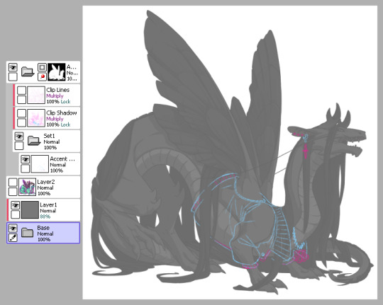
1) This is pretty much how I start my layers. I don’t change much from the default skin file provided by FR other than adding a mask to the skin folder so I don’t draw outside of the lines and then a gray overlay on top of the base just so it’s easier for me to see my sketch. I use bright colors like blue and pink to help me differentiate details. I turn off the clip lines/shadow as I don’t wanna see those atm.
The layer that says “Accent” is where I start my sketch.
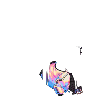
If I’m making a skin for a particular dragon, I’ll often have them added in the file (note the hidden layer above the gray box). To do so, I save out a transparent version of the dragon and blow it up to 700px in waifu2x or something. Then I bump it up to 750px so it fits in the skin file. It’ll be a lil blurry but it’s good enough.
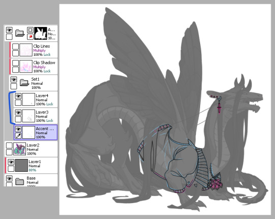
2) Next is line art - I have 2 layers for this skin: one for the jacket and another for the knuckle dusters and chains. Personally I like to close off all gaps in my line art, including drawing on the edges as you can see on the top of the collar by the wings or the gap formed by the hair on the midsection. This is just something I prefer doing as I find it makes my coloring less messy and annoying later on. But you can do it however it’s most comfortable.
At this stage, I’ll also either zoom out to 50% or resize to 50%, whichever works because it’s important to remember that the file size is 750 while the actual size you’ll have to save out will be 350 - details will shrink so make sure what you’re drawing will show up appropriately.
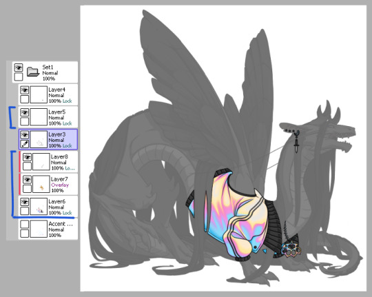
3) Now onto colors. Since I closed the gaps in the line art, I just fill bucket everything. For this skin, I drew the jacket’s colors on one layer because I’m trash and have 1 braincell but you can use as many layers as you need. In this case, the overlay layer was for extra saturation and the layer above that was for the black stripes. Be sure to clip additional color layers onto your base color so you keep things tidy and avoid coloring beyond the lines.
Again don’t forget to resize or zoom out to make sure your skin is looking as it should!
4) Finally I do some recoloring of the line art - in this case mostly the arm of the jacket. I lock the line art layer and go over it with colors darker than the surrounding colors - up to preference here. I don’t usually change the very edges just because I prefer a darker color there personally and my default is black. It’s also totally ok to have darker line art - again up to you.
Then I turn on the clip lines/shadow since you have to make sure those show up in the final piece. Clip lines is usually set to normal but I change it to multiply because I feel it turns out better for recoloring. When I recolor, I try to match the colors of the skin while also making sure it’s dark enough to be seen. Same goes for shadows.
*If you ever get a skin rejected, it’ll usually be how visible you make the original shadows and line art. There’s not really a hard rule on what counts as “passing” since it’s up to staff but I try to make it obviously visible without ruining my skin. So here you can still see the belly scales for example, but it’s not so pronounced that it takes away from the jacket. It’s a lil uggo imo but it is what it is.
*Something to note when you color: be careful how dark you make your base colors! Too dark and you won’t be able to see the clip lines/shadow very well in the future. Note how the collar of the jacket is light enough that the shadows and lines beneath are still visible.
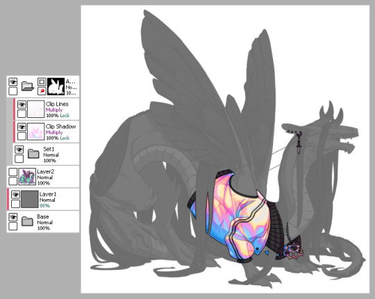
This is how my clip lines/shadow layers look on normal mode so you can see what colors I made them. Play around with the values to make sure you achieve some balance between your skin looking good while still showing off the base lines and shadows of the dragon. I used pink and blue here since it matched well with the skin. By default, the lines and shadows are gray and if you don’t recolor those, your skin will end up looking muddy.
*Other than recoloring, do not touch the clip lines/shadows at all. Do not edit them or erase them otherwise that’s a quick ticket to rejection.
5) Finally, turn off everything but your accent folder and save that sucker out and resize to 350px. At this point you can test it on your actual dragon by either pasting the skin onto a pic of the dragon or by using FR Tools. Reminder that you should not use/mention FR Tools on the official site cuz staff doesn’t like it. However on FR Tools you can also test the coverage of your skin when you select “upload skin.” Less than 30% and it’s an accent. Above that and it’s a skin. There’s other ways to test coverage but FR’s gimp tutorial sucks and is outdated and I don’t have photoshop so lol.
*I often go through several iterations of a skin just in case I see weird flaws or missing details. Testing is very important once you finish as major changes to your skin after submission is not a fun process so be sure to get it all squared away the first time.
^ Your final product should look like this: transparent png (32bit) at 350px.
*Now this was the technical side of making skins using the tools at hand. If you have further questions I didn’t cover here, pls do feel free to ask! I’m no expert by any means but I can impart what I’ve learned after making a few.
#tutorial#fr skins and accents#flight rising#Anonymous#long post#sorry if it's a bit wordy#skin making isn't super hard but there's just a lotta rules and things to keep in mind
123 notes
·
View notes
Text

Okeyy here it is!! I decided to put together a step by step (gif) coloring tutorial where i list the layers i use and how i've so far made them work for me.
I've been giffing for 2 years now (i'm using PS CC2019, the example pics are in finnish but icons and placements should be the same) but it's an ongoing learning process.
My coloring style is quite natural, i don't do fancy stuff often and i mostly just want the colors to look as true to real as possible but better than originally. And for this kind of style i've found the steps below working for me.
I also don't have any base psds or anything that i'd often use. I always start the coloring for each set from the scratch because, to me, it's the most fun part of giffing. I have 6 layers I use every time and then some random additional ones that i often add too. None of this is me saying what you should do, this all just me explaining what i do and hopefully this can be helpful to someone.
Ok ok time to get to the point so:
1. Curves
I always, like literally always, start with this layer
Sometimes i just drag the line upwards to brighten the gif but very often i use the eyedropper tool
Choose the white tool, pick the whitest (but not 100% white coz then it won't do anything) spot and it will make that the whitest part of the gif. It also works great at correcting the colors, sometimes you need to try multiple different spots to get the best result
The black dropper tool works the same way, only opposite, so clicking on the darkest spot you make that the blackest part of the gif
If the effect is good but a bit too much, you can lower the opacity of the layer, or the other way, so if it did well but not enough then duplicate the layer
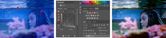
Example: the difference between the left and right photo is 2 clicks and this, my dudes, is why i worship curves. I chose the white eyedropper tool and clicked on that light spot visible in the water, then i chose the black eyedropper and clicked on fatou’s hair and that’s it. Needs more work, but that’s a pretty allright (and easy!!) start (zoom to see better)
2. Levels
I drag the left and right sliders a bit to the center to get contrast (left ~5-20, right ~240)
The eyedroppers work on this layer pretty much the same way as in curves, but i'm more used to using them only with curves
3. Black and white gradient map
I set the blending mode to soft light and lower the opacity to ~10-30 %, this brings some depth to the colors imo
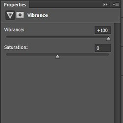
4. Vibrance
I usually add ~20-60, it really varies tho and you can just wing it most times
5. Exposure
I set the top one (exposure) to 0,1 - 0,2 and bottom one (gamma) to 0,97 - 0,90. This is an effective layer so better not do too much
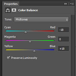
6. Color balance
Owing my life to this layer
I add this layer at around this point of coloring but i drag it to be the bottom layer, since when it's under the rest of the layers it's more effective
In the midtones, i always drag the bottom slider towards blue, something as small as +2 might work, sometimes you need to go +15 or so. I might drag the middle slider slightly to the left to reduce the green tones, and the top one on either side depending on the tone of the gif
Example: this one doesn’t have any of those other 5 coloring layers i always use so it needs more work but also it shows how effective color balance is. I added more blue than normally, at least with one layer, but this one needed it imo. Love to see the green go whoosh
At this point the coloring might be done (jk it likely isn’t) but if it needs some more work then i might try one or some/all of these:
7. Photofilter
I mostly use either warm orange filter to bring some warmness to the colors or cold blue filter to correct yellow/green/red tones
8. Hue/saturation
I choose red and drag the middle slider (saturation) to -5 to -20, this helps to reduce the orange/unnatural skintones
Example:
9. Selective color
Playing around with whichever color i want to add or reduce, if i feel like the gif needs more contrast i choose neutral and/or black and drag the bottom (black) color to the right.
If sometimes the whites are too blinding, i choose white and then the bottom option (black) and drag it to the right ~10 -20.
If the skintones are too yellowish, i choose yellow and go -40 / -40 / -80 and leave the blacks at 0. If it does too much, i lower the opacity of the layer, or in case i want it to be more, i duplicate the layer
Example: (zoom and cry happy tears over the ugley yellowness being gone)
10. Gradient map
For example blue-white gradient to get to colder tones, yellow-white to brighten/soften the colors or smth like pink-blue if you want to get fancier (the options are limitless tbh)
I set these to soft light and lower the opacity, usually to less than 40%
If i want the color to strongly affect the entire gif, then i leave the blending mode to normal or choose color
11. Brightness
Adding this if some more brightness is needed (i don't use the contrast option here but go to levels instead, if needed)
_________
Tips with poc!!
Some things i've found to be helpful when wanting to bring color back to the skintone after brightening or other adjustments have taken some of it away:
a. Check the points 8 & 9
In selective coloring choosing neutral or black and then black in them and dragging it to the right helps to darken the skintone
Try choosing red or yellow and then yellows or blacks in them and dragging the slider either to the left or right, depending if you want to add or reduce the yellow/red tone
Honestly the best advice i can give with selective coloring is to just simply play around, choose a color, drag them sliders to the left 'n right and see what happens
b. Go to channel mixer and add a little bit of red (+101-105)
c. Add levels or contrast or vibrance layer
d. Choose a warm colored photo filter
e. Be careful with exposure and too much brightness
_________
Soooo yeah, these are the layers i use, sometimes you can't do everything with the same layer so for example i might add one or two more curves to get brightness, or multiple selective coloring layers or add another color balance etc.
Generally i like to do small changes with one layer and not everything all at once.
_________
As for when saving the gif for web, these are my settings. I translated the one’s that aren’t obvious but everything else i’m assuming doesn’t need translating since this view always looks the same.
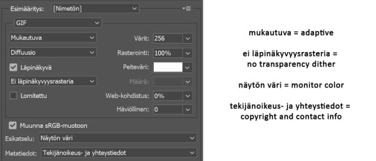
I use diffusion 90% the time, but when it doesn’t look quite right i try pattern. And sometimes when the gif has been really dark originally (😩) and has needed tons of brightening layers, noise might be the best option.
At the bottom i have the quality set as “bicubic”.
_________
So that’s it! If you made it this far, thank you, ily <3 Lots of stuff i’ve learned along the way and lots of stuff to be learned. Hoping that maybe you got to learn something from my way of coloring, too. And if not, thanks for reading anyway 😌✌🏻
#here it is 😳#i've never done posts like this but i tried to explain stuff as shortly but clearly as i could#hope it's easy to follow#and that i didn't forget anything crucial jdjdkdkd#gif tutorial#coloring tutorial#mp
49 notes
·
View notes
Note
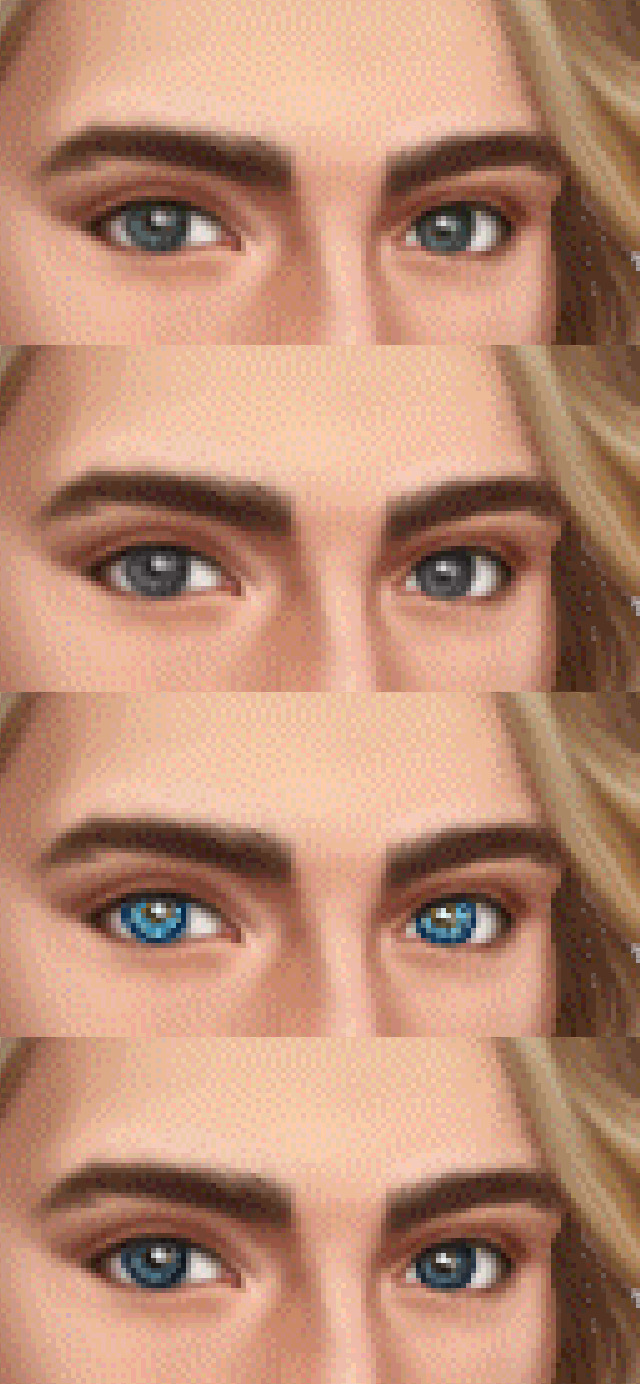
hiya i just wanted to ask how you recolor your character's eyes? it's so clean and well done
Hey Anon, I’m happy to help! Though forewarning this thing looks a little more like a tutorial rather than an explanation because it really ain’t that simple by a long shot lol. I put a little too much work into them but obviously the result works out!
This is designed ideally for photoshop -- I don’t know if any free photo editing softwares give you as many options for layers or brushwork so I hope you can apply it to what you use if it’s anything different.
So we’ll use Nadya since her eyes are the biggest difference between the original and the edit!
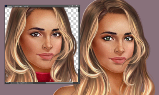
First things first, find a real-life picture of what you want to recreate. That’s the biggest part, IMO.
You want a pic that’s ideally really large, unedited with like filters or such, and with a bright course of light. Searching “hazel eyes” on google brings up plenty of good images -- I think this is the one I used?

Next you want to zoom in as much as you can on the reference pic to grab some colors with a paint dropper. You want a good range of them, and honestly grabbing as many as you can and in shades of light and dark is best. You might not even use all of them but better to have them than not!
It’s best to start out at the ring of the eye, where the almost-black is, because that’ll be necessary for framing the pixel one. And don’t forget to get the pupil and that little white shine part. They might look white and black initially but they usually have the tiniest bit of tiny that will keep the eye from looking unrealistic.
The brightest part of Nadya’s eyes is that shiny bit, which you can see from the first pic is way brighter than the one on the original. It just looked better on her but play it by your own preference.
(I put mine in a “swatches” layer, so I can hide it as needed because my eyes can sometimes blur what I’m looking at and what’s around it.)
Because the colors on the original assets are really vibrant on their own, I got some of the more colorful versions of the reference, you can see in the greens here. And because of the size I was working with I knew I wouldn’t be able to get all those shades of brown so I narrowed down my options.
Note that from here on out the example pics ae gonna be really big, but that’s actually a good thing because you want to work on the pixels almost one by one. Like I said... too much detail.
Next I brightened up the original eye color. You want to do this so when you make them monochrome for the new color to take they have the best chance of showing bright rather than dull. (In photoshop I used the dodge tool, on various %, focusing on highlighting.)
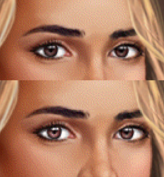
NEW LAYER! Make ‘em monochrome. I just used the first grey I got and focused on getting all of the eye. (In photoshop I adjusted the paintbrush circle hardness to 85% -- I’ve found that works best with PB’s assets since it allows for a little shading and a more realistic effect.)
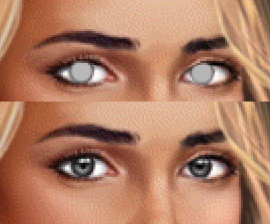
Don’t forget to account for the eyelids/lashes! What I usually end up doing is covering the whole eye with the brush then erasing the lid hangover and where the iris cuts at the bottom of the eye. Not so much with the BB MC but with some of the LIs that are more distinct they have this.
Once you’ve covered them, adjust the layer to “COLOR.” This is where you see the effects of your brightening the best.
This next part is only a guide. You’re gonna have to do what looks best for what you’re working on. It’s a different process for each eye color, and especially what colors you want the eyes to pop with when this gets zoomed out.
Just make a NEW LAYER, take your swatch colors and... hope for the best.

1. That’s what the layer looks like raw. Make sure to keep the dark ring around the eye and play around with brush size and intensity. Some of those are only one pixel, some are one color layered over another.
2. This is so you can see what exactly was done without the backdrop. Like I said, it’s a playing process. And don’t be afraid to get new colors for the swatches along the way. You’ll figure out what you like.
3. Change the layer to “COLOR.” Yes, it looks like the colors have dulled a bit. But it blends the best. note: on a few of the other edits, “SATURATION” looked better than “color.” Whatever fits your needs, but just know you don’t have to do color ONLY.
4. The eyes were still too bright for me, so I used adjustment masks for more subtle changes. The ones on Nadya’s eyes are Selective Color and Vibrance.
Something to keep in mind! Make sure to keep zooming out to look at the picture as a whole while you work. You can get so used to working in that small space, it looks great there but when seen all together it doesn’t work like you thought.
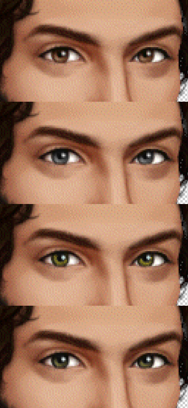
Once you get the colors, know what you want, and monochrome the eyes, it’s different every time. But you get a feel for it and can start playing around more adventurously!
Under here I’ve included examples from each of the eye adjustments I’ve done, broken down by original, monochrome, raw colors (like in #1 above) and final product! Hope they help, and if you have any specific questions feel free to hit me up!


3 notes
·
View notes
Text
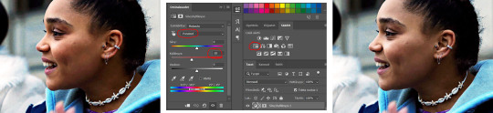
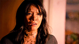
How I color poc in gifs
About a week a go, I got a request for a tutorial on how I color poc in gifs without whitewashing them. I finally got around to making it, and decided to show 2 different examples since not every scene is the same. Feel free to message me to ask about other types of scenes.
So, in this tutorial, you will see these examples:


PSA: this tutorial will be image heavy, and will probably contain lots of spelling/grammar mistakes since English isn’t my first language. You can always message me for more help in case it’s not 100% clear.
PSA #2: This tutorial is divided in 3 parts: the Tahani part, the Grace part and a general tips part at the end. You can use the search function to find any part you’re interested in.
Tutorial under the cut!
I want to start with saying that I definitely made mistakes myself when coloring poc and I learned a lot over time. I think the most important thing is that when coloring poc you should look at 2 things:
1. the original coloring: if a scene is really bright and the lighting is right in the character’s face, you won’t be able to bring back all of the color. If you do try, you might end up with really orange/red/yellow skintones.
2. A picture of the actor/actress in normal lighting: when you are working with yellow or blue scenes and aren’t sure what your coloring should work towards, just google the actor/actress to know what their skincolor should look like.
Okay that said, let’s start this tutorial!
A) Tahani from the Good Place
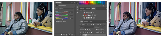
We are starting off with this gif (cropped and sharpened)

It’s a fairly light scene, so we’ll have to make sure to bring back color as we go on.
So to start off, I add a basic coloring that consist of 5 layers:

I add a curves layer to brighten up the whole gif and the levels to bring back some contrast/color. The black arrow will give your gif more color while darkening the shadows, which will help when trying not too whitewash your gif.
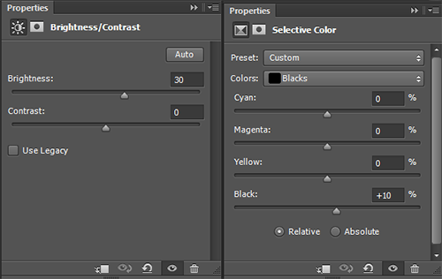
Be careful with brightness since it’ll take away some color from your gif.
Which gives us this gif:

Which is honestly pretty good? The coloring so far didn’t take away too much of the colors in the gif already, but I think it could be a bit more red (not too much), so I put this layer UNDER the base:

It doesn’t make that much of a difference, but I like it:
You could leave it here, but I’m gonna add some other layers but that is optional!
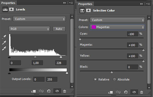
So first I added light levels, which brightens up the lightest parts of your gifs, without taking away the color (I love this layer so much!!!!). Then I added a selective color layer and changed the magentas (this is very much a preference layer, I like the lips to be more redpink and not pinkpink).
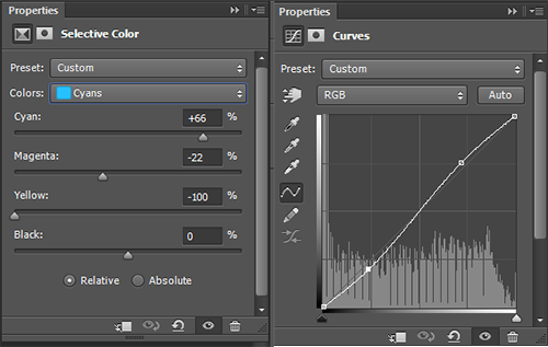
In the same selective color layer I changed the cyans to make them more vibrant. I also added more contrast with the curves layer.
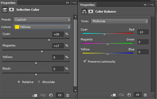
Then I changed the yellows to make then less ‘yellow’ (like in unnaturally yellow for a skintone) by upping the cyans and the magentas. This resulted in me thinking the gif was a bit too red, so I added a new color balance layer.
With all these layers, I ended up with this:

Now, I‘m happy with this, but I am going to give another tip when it comes to bright gifs: the white selective color.
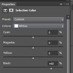
This does not make a big difference, so you cannot use it to fix the whitewashing in a gif. It will add some color back into the whitest parts of the gif. I almost never touch the cyan/magenta/yellow parts of this SC, because it can turn bad very easily :p. With this layer, you get this:

Which I think is a good end result. While the brightest parts of her face are too light, you cannot bring back enough color (in a coloring with high contrast) without making it yellow/orange. When there’s a lot of light on the face, try looking at the neck to see if you’ve whitewashed a gif or if it’s simply the lighting.
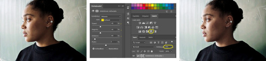
B) Grace in Black Lightning
So I chose this scene because it is very orange, so we’ll have to make it less vibrant without whitewashing Grace.
We start with this gif:
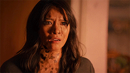
For this, I quickly googled Chantal Thuy (who plays Grace) and looked for a picture that wasn’t too heavily edited. I went with this one:

You can see she isn’t very dark (especially compared to the gif we have), but definitely has some color in her skin that we should maintain in the gif. It’s always better to go too dark than too light. With that in mind, I did these steps:
Again, I started with almost the exact same base as the gif of Tahani. I did not add a vibrance layer yet. I did add a color balance layer UNDER the base to make the gif less red:

This is what we end up with without adding vibrance:
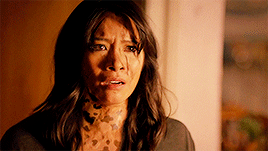
The gif is way too yellow for me, so I added another color balance layer:


This looks way better imo. So now I add vibrance (only 50% this time)

This makes the gif slightly too yellow again, so I add another color balance layer:

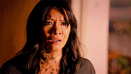
Now I could’ve just not added a vibrance layer... but... I love my vibrance layers
I think this gif looks pretty good? It might still be a bit too vibrant when it comes to her skintone, but I like it. I did add some other layers to tweak the gif a bit, but these are optional:
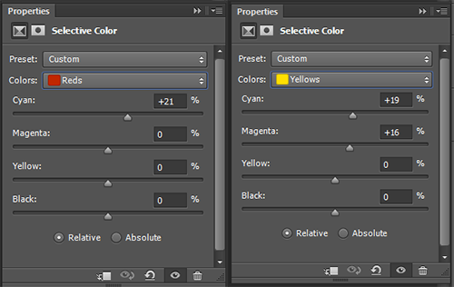
I did this to make the skin a little less yellow/orange, it’s not a huge difference though.

I added a levels layer to give the gif a bit more contrast
I would prefer this as my end result, because I like very colorful gifs, but if it is still too orang-y for you, you can add another color balance layer;

And then this would be the end result. The gif isn’t orange anymore, but Grace also doesn’t look white.
C) General tips
1. If you are coloring a gif, and you notice it is looking too white and don’t know what to do, check these layers first:
Levels: the middle arrow of the levels will heavily take away the color in your gif while brightening it up, so don’t use it or use it sparsely. The black arrow will add more color in the shadows of you gifs while darkening it a bit.
Red/Yellow selective color. With this layer you can massively change the undertones of the colors in your gif, but be careful! I usually use the yellow SC, and in that one I change the cyans, magentas and yellows. The cyans will change how vibrant the color looks, the magentas will make the gif more/less yellow (I usually go for less yellow by upping hte magentas), same with the yellows. I recommend to only use the yellow arrow when you cannot decrease the yellows enough with magentas.
Color balance: you can add a lot of color with this layer. Try to move around the layer in your psd, because different places will give different results. I usually add color with the yellow/red arrows, but the magenta can sometimes help (when your scene is too green and the red arrow makes it looks bad, you can add a little bit of magenta instead). If you are working with a red/yellow scene, you should use the blue/cyan arrows (as I did in the Grace example).
Vibrance: you can always add another vibrance layer on top of your psd to give the colors a boost. I wouldn’t recommend doing another 100% one though, since it will probably make your gif grainy and the skincolor way too vibrant. I don’t rec using the saturation part of the vibrance layer, since it’ll make the gif yellow rather than colorful.
2. If you aren’t sure, ask a friend! I do this all the time, because sometimes, after looking at your gif for half an hour, you have no clue what the hell you’re doing anymore and you need another pair of eyes.
3. Coloring takes practice. You are free to use the (unedited) gifs I posted in this tutorial to practice on.
4. While coloring your gif, put your adjustment layers in a group (select all and click on CTRL+G) and disable the group a few times while coloring so you can check if you’re not lightening the skin too much.
5. You don’t need to do all your adjustments in 1 layer, sometimes it’s better to add two levels layers instead of doing everything in 1, same with color balance and curves/brightness (especially the latter!). Curves and brightness can take away a lot of color when they are (one of) the first layers you use, so it’s better to generally brighten up the gif in the first layer, and add on more after your vibrance layers and color balance layers. (Sometimes I even put my vibrance layer under my psd, this mostly in very bright scenes)
6. The first adjustment layers of your psd do the most adjusting. Keep that in mind when adding color balance and vibrance layers. Adding a vibrance layer under everything else will make the gif a lot more vibrant in a different way than it would putting the vibrance layer above everything. If your gif is very light and you can’t seem to bring back coloring, I suggest putting your vibrance layer under all your other layers, it might help.
You won’t be able to bring back color in every gif. The important thing is that you don’t take it away by brightening too much (or with the wrong layers), taking away the yellow/reds or adding a b&w gradient / layer.
#itsphotoshop#completeresources#yeahps#gif tutorial#tutorial#my tutorial#sorry this is so late anon#i drafted this and then somehow forgot?#anyway I hope this is helpful
471 notes
·
View notes
Last Seen Blogs
witheredbushroot
bushy
blinkparade
Welcome To The Black Parade
ndrakbar
Hendra Mashuri
chickennuggeteds-blog
ichoselonelysouls
artisticdrifter
Drawings And Sketches