#(or that you are automatically free of bias or inaccuracy)
Text
FYI this has been going on— (cw for screenshots from a racist rightwing blog)


[image IDs: several screenshots from a blog post by Noah Carl, a rightwing “researcher” of racial pseudoscience, regarding “Nick Bostrom’s pre-emptive apology”
2nd screenshot of Carl’s statement shown above:
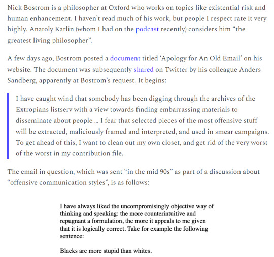
Nick Bostrom is a philosopher at Oxford who works on topics like existential risk and human enhancement. I haven’t read much of his work, but people I respect rate it very highly. Anatoly Karlin (whom I had on the podcast recently) considers him “the greatest living philosopher”.
A few days ago, Bostrom posted a document titled ‘Apology for An Old Email’ on his website. The document was subsequently shared on Twitter by his colleague Anders Sandberg, apparently at Bostrom’s request. It begins:
> I have caught wind that somebody has been digging through the archives of the Extropians listserv with a view towards finding embarrassing materials to disseminate about people … I fear that selected pieces of the most offensive stuff will be extracted, maliciously framed and interpreted, and used in smear campaigns. To get ahead of this, I want to clean out my own closet, and get rid of the very worst of the worst in my contribution file.
The email in question, which was sent “in the mid 90s” as part of a discussion about “offensive communication styles”, is as follows:
> I have always liked the uncompromisingly objective way of thinking and speaking: the more counterintuitive and repugnant a formulation, the more it appeals to me given that it is logically correct. Take for example the following sentence:
> Blacks are more stupid than whites.
[I cut off the rest of Carl’s screenshot of Bostrom’s email, as it contained more unpleasant antiblack commentary]
3rd screenshot:
You don’t have to apologise for saying offensive things in a setting that people have selected into for the specific purposes of discussing offensive things. Stand-up comedians don’t need to apologise for telling jokes at their shows that it would inappropriate for them to tell in church. Moreover, Bostrom made the comments more than twenty years ago, and he “immediately apologised” at the time! End of story.
Yet as you well know, academia is crawling with offence archaeologists – low-lifes who spend their time combing through other people’s writing with the hope of finding something they can use to ruin their careers. They are not virtuous, and they do not care about the downtrodden. Their aim is simply to “take down” someone whose views they disapprove of – usually someone who contributes far more to society than they do.
In light of this, you can understand why Bostrom wanted to “get ahead” of the controversy by saying his piece pre-emptively. Unfortunately, what he said may have made things worse – not only for himself but for others who might find themselves in similar situations in the future.
4th:
Rather than making the points I made above (and perhaps apologising for needing to bring the admittedly provocative email to people’s attention), he issued an embarrassingly grovelling apology:
> I completely repudiate this disgusting email from 26 years ago … The invocation of a racial slur was repulsive. I immediately apologized for writing it at the time … and I apologize again unreservedly today. I recoil when I read it and reject it utterly.
As for his “actual views”, Bostrom thinks “it is deeply unfair that unequal access to education, nutrients, and basic healthcare leads to inequality in social outcomes, including sometimes disparities in skills and cognitive capacity”. And he wants you to know that he has given to charities “fighting exactly this problem”, including “the Black Health Alliance”.
The one saving grace of his apology – from the perspective of grown-up intellectual discourse – was that he didn’t denounce the hypothesis that genes contribute to group differences in cognitive ability. “It is not my area of expertise”, he wrote, “and I don’t have any particular interest in the question.” Note: the latter claim is likely to be false; how could you not be interested in it?
/end image ID]
https://twitter.com/rechelon/status/1615072322058076166


[image ID:
tweet by xriskology:
The real victimhood culture is on the political right:
[a screenshot from the same Noah Carl blog post shown above]
thread QRTing their tweet:
“That which can be destroyed by the truth should be.”
My line is that your career can be destroyed by exposing the truth (that you’re still soft on vapid racial pseudoscience 25 years after endorsing it), then it deserves to be.
I find it deeply disgusting and infuriating the way that so many “rationalists” are framing everything in terms of “he said a bad word and immediately apologized 25 years ago” when that’s not even fucking remotely the issue and would amount to almost no blowback on its own.
I think almost no one gives a shit about Bostrom using the n-word 25 years ago, his apology for that isn’t the issue. The issue is that his recent apology is stunning in what it studiously doesn’t renounce and the way it leaves claims about genetic racial intelligence open.
I’m well aware that Bostrom makes the perfectly fine transhumanist move that “even if racial intelligence disparities were a thing, they’re irrelevant because everyone can individually tinker with themselves in whatever direction” but it’s not enough to merely bracket the claims.
Bostrom’s “apology” sounds perfectly fine to him and his circles because “I am not an expert on racial science” sounds like a renunciation of his claim “blacks are stupider than whites” to them. But it’s anything but! It doesn’t address at all what he still believes.
The fact is that the specific measures the rationalist community chooses to valorize, certain limited performances of rationality, do not exclude shitbags willing to make some contortions so those shitbags flock into their circles, expelling others, and shaping background norms.
I’d be willing to bet at sharp odds that >50% of the self-identified rationalist community believes “there are significant genetic racial disparities in intelligence between the races and unfairly we can’t talk about this.”
That is the problem Bostrom’s non-apology exemplifies
Now there are myriad good mechanisms and reasons to dismiss the object-level claim, but sure, ghosts could exist and it could be true, the biggest problem is the way this “likelihood” has been drastically inflated within the rationalist community by their social dynamics.
The rationalist community is running the proverbial bar where they let nazis in. And if you fail to draw the line with one nazi, you very rapidly just have a nazi bar. Because nazis are large in number, have few other options, and are willing to go through a lot of contortions.
Nazis will absolutely shit themselves silly writing endless papers throwing chaff everywhere like the “200 proofs the earth is not flat” and credulous “rationalist” bros whose whole self-image prioritizes feeling smarter than everyone and holders of esoteric truths love that.
And so we see vast asymmetries and distortions in the epistemic frames of most “rationalists” as a consequence of their sociological dynamics. They proactively read anti-woke folks on the right and then pretty much never delve deep into radical leftist arguments.
They’ll delve into the most esoteric neoreactionary screeds with giant bibliographies of catholic and postmodern writers to find the secret actual argument for an inane conservative position, but then assume every leftist argument is the first related tumblr post they found.
Scott Alexander Siskind BRAGGED that his readership was fair and balanced because he had some socialists and only like 22% identified openly as alt-right or neoreactionary. That is not balance. That is a nazi bar. And that social fabric warps one’s epistemology.
Bostrom honestly thought he was addressing the problem with his racist email in the 90s. And Sandberg (god damnit dude) read it and was like “this is a knockout response I want to be associated with” and hordes of fuckers saw the same.
reply to the thread by zorangecats:
One observation I’ve made is I’ve never seen the rationalist “steelman” for the feminist worldview. An interesting omission.
/end image ID]
https://twitter.com/rechelon/status/1614428504581607424

[image ID:
tweet by Aella_Girl:
Lost some respect for EA due to the response to the Bostrom thing. I guess I shouldn’t be surprised? CEA has always leaned a bit too far towards PR at the expense of integrity. I guess I’d hoped to see some more bravery. Feel like the correct response would have had more nuance.
thread QRTing her tweet:
The lost “integrity” she’s bemoaning is that the Centre for Effective Altruism released a very thin anodyne statement condemning Bostrom’s “words” (presumably just his original email and no detail on whether the racial pseudoscience in particular sucks)
Imagine being so fucking twisted that you see condemning racist shit to any minor degree as a lack of integrity.
These people’s entire morality is about fiercely condemning and ostracizing anyone who ever dabbles in condemning or ostracizing people over shit like racism, rape, and transphobia.
It’s pure Coalition Of The Bad shit.
/end image ID]
#repost of someone else’s content#twitter repost#nick bostrom#racism#antiblackness#antiblackness cw#gillis#Enlightened Centrism#the self-proclaimed ‘rationalist’ community#aella#underdiscussed but important#claiming rationality =/= your calculations are free of error#(or that your formulas are correct in the first place)#(or that you are automatically free of bias or inaccuracy)#aesthetic (but ultimately irrational) posturing masquerading as a takedown of of others’ supposed aesthetic irrationalities#as it always goes -- whites make counterfactual statements & construct theories around them motivated by (yes) *bias*#and pass it off as fact --> any of the marginalized who debunk those inaccuracies & present the facts are labeled as biased ourselves#claiming we debunk bioessentialism & tie that to our egalitarian ideology bc ideology first ‘pseudo’science second#when in fact that it exactly what *they* did and what we do is *to undo what they did first*#however their epistemology also has a built-in self-defense mechanism:#‘if they claim x y z they must be wrong because as our ‘facts’ prove they’re too irrational & stupid to know what’s right#(and their disagreement proves our theories are right)’#same self-reinforcing mechanism fundamental to western colonialism (& patriarchy) in the modern form that claims to be rational/scientific#also how the entire psychiatric field conducts itself (heavy ties to other fields of human biological study esp. neuroscience)#& can successfully hook a lot of ppl already motivated to fall for this kind of stacking the deck#but the (yes) *aesthetic* they present themselves w/ makes it easier for them to deflect criticism#bc ‘I am Objectively Right according to Science --> all those critics are just irrational moralist science-haters’#especially frustrating when many in that crowd *do* promote genuinely suppressed but correct ideas (such as transhumanism)#but then try to lump in things like racism as similarly suppressed unjustly as if the dynamics are anywhere near the same#I wasnt aware abt Bostrom bc Ive been off twitter for months
4 notes
·
View notes
Text
The Data You’re Using to Calculate CTR is Wrong and Here’s Why
Posted by Luca-Bares
Click Through Rate (CTR) is an important metric that’s useful for making a lot of calculations about your site’s SEO performance, from estimating revenue opportunity, prioritize keyword optimization, to the impact of SERP changes within the market. Most SEOs know the value of creating custom CTR curves for their sites to make those projections more accurate. The only problem with custom CTR curves from Google Search Console (GSC) data is that GSC is known to be a flawed tool that can give out inaccurate data. This convolutes the data we get from GSC and can make it difficult to accurately interpret the CTR curves we create from this tool. Fortunately, there are ways to help control for these inaccuracies so you get a much clearer picture of what your data says.
By carefully cleaning your data and thoughtfully implementing an analysis methodology, you can calculate CTR for your site much more accurately using 4 basic steps:
Extract your sites keyword data from GSC — the more data you can get, the better.
Remove biased keywords — Branded search terms can throw off your CTR curves so they should be removed.
Find the optimal impression level for your data set — Google samples data at low impression levels so it’s important to remove keywords that Google may be inaccurately reporting at these lower levels.
Choose your rank position methodology — No data set is perfect, so you may want to change your rank classification methodology depending on the size of your keyword set.
Let’s take a quick step back
Before getting into the nitty gritty of calculating CTR curves, it’s useful to briefly cover the simplest way to calculate CTR since we’ll still be using this principle.
To calculate CTR, download the keywords your site ranks for with click, impression, and position data. Then take the sum of clicks divided by the sum of impressions at each rank level from GSC data you’ll come out with a custom CTR curve. For more detail on actually crunching the numbers for CTR curves, you can check out this article by SEER if you’re not familiar with the process.
Where this calculation gets tricky is when you start to try to control for the bias that inherently comes with CTR data. However, even though we know it gives bad data we don’t really have many other options, so our only option is to try to eliminate as much bias as possible in our data set and be aware of some of the problems that come from using that data.
Without controlling and manipulating the data that comes from GSC, you can get results that seem illogical. For instance, you may find your curves show position 2 and 3 CTR’s having wildly larger averages than position 1. If you don’t know that data that you’re using from Search Console is flawed you might accept that data as truth and a) try to come up with hypotheses as to why the CTR curves look that way based on incorrect data, and b) create inaccurate estimates and projections based on those CTR curves.
Step 1: Pull your data
The first part of any analysis is actually pulling the data. This data ultimately comes from GSC, but there are many platforms that you can pull this data from that are better than GSC’s web extraction.
Google Search Console — The easiest platform to get the data from is from GSC itself. You can go into GSC and pull all your keyword data for the last three months. Google will automatically download a csv. file for you. The downside to this method is that GSC only exports 1,000 keywords at a time making your data size much too small for analysis. You can try to get around this by using the keyword filter for the head terms that you rank for and downloading multiple 1k files to get more data, but this process is an arduous one. Besides the other methods listed below are better and easier.
Google Data Studio — For any non-programmer looking for an easy way to get much more data from Search Console for free, this is definitely your best option. Google Data Studio connects directly to your GSC account data, but there are no limitations on the data size you can pull. For the same three month period trying to pull data from GSC where I would get 1k keywords (the max in GSC), Data Studio would give me back 200k keywords!
Google Search Console API — This takes some programming know-how, but one of the best ways to get the data you’re looking for is to connect directly to the source using their API. You’ll have much more control over the data you’re pulling and get a fairly large data set. The main setback here is you need to have the programming knowledge or resources to do so.
Keylime SEO Toolbox — If you don’t know how to program but still want access to Google’s impression and click data, then this is a great option to consider. Keylime stores historical Search Console data directly from the Search Console API so it’s as good (if not better) of an option than directly connecting to the API. It does cost $49/mo, but that’s pretty affordable considering the value of the data you’re getting.
The reason it’s important what platform you get your data from is that each one listed gives out different amounts of data. I’ve listed them here in the order of which tool gives the most data from least to most. Using GSC’s UI directly gives by far the least data, while Keylime can connect to GSC and Google Analytics to combine data to actually give you more information than the Search Console API would give you. This is good because whenever you can get more data, the more likely that the CTR averages you’re going to make for your site are going to be accurate.
Step 2: Remove keyword bias
Once you’ve pulled the data, you have to clean it. Because this data ultimately comes from Search Console we have to make sure we clean the data as best we can.
Remove branded search & knowledge graph keywords
When you create general CTR curves for non-branded search it’s important to remove all branded keywords from your data. These keywords should have high CTR’s which will throw off the averages of your non-branded searches which is why they should be removed. In addition, if you’re aware of any SERP features like knowledge graph you rank for consistently, you should try to remove those as well since we’re only calculating CTR for positions 1–10 and SERP feature keywords could throw off your averages.
Step 3: Find the optimal impression level in GSC for your data
The largest bias from Search Console data appears to come from data with low search impressions which is the data we need to try and remove. It’s not surprising that Google doesn’t accurately report low impression data since we know that Google doesn’t even include data with very low searches in GSC. For some reason Google decides to drastically over report CTR for these low impression terms. As an example, here’s an impression distribution graph I made with data from GSC for keywords that have only 1 impression and the CTR for every position.
If that doesn’t make a lot of sense to you, I’m right there with you. This graph says a majority of the keywords with only one impression has 100 percent CTR. It’s extremely unlikely, no matter how good your site’s CTR is, that one impression keywords are going to get a majority of 100 percent CTR. This is especially true for keywords that rank below #1. This gives us pretty solid evidence low impression data is not to be trusted, and we should limit the number of keywords in our data with low impressions.
Step 3 a): Use normal curves to help calculate CTR
For more evidence of Google giving us biased data we can look at the distribution of CTR for all the keywords in our data set. Since we’re calculating CTR averages, the data should adhere to a Normal Bell Curve. In most cases CTR curves from GSC are highly skewed to the left with long tails which again indicates that Google reports very high CTR at low impression volumes.
If we change the minimum number of impressions for the keyword sets that we’re analyzing we end up getting closer and closer to the center of the graph. Here’s an example, below is the distribution of a site CTR in CTR increments of .001.
The graph above shows the impressions at a very low impression level, around 25 impressions. The distribution of data is mostly on the right side of this graph with a small, high concentration on the left implies that this site has a very high click-through rate. However, by increasing the impression filter to 5,000 impressions per keyword the distribution of keywords gets much much closer to the center.
This graph most likely would never be centered around 50% CTR because that’d be a very high average CTR to have, so the graph should be skewed to the left. The main issue is we don’t know how much because Google gives us sampled data. The best we can do is guess. But this raises the question, what’s the right impression level to filter my keywords out to get rid of faulty data?
One way to find the right impression level to create CTR curves is to use the above method to get a feel for when your CTR distribution is getting close to a normal distribution. A Normally Distributed set of CTR data has fewer outliers and is less likely to have a high number of misreported pieces of data from Google.
3 b): Finding the best impression level to calculate CTR for your site
You can also create impression tiers to see where there’s less variability in the data you’re analyzing instead of Normal Curves. The less variability in your estimates, the closer you’re getting to an accurate CTR curve.
Tiered CTR tables
Creating tiered CTR needs to be done for every site because the sampling from GSC for every site is different depending on the keywords you rank for. I’ve seen CTR curves vary as much as 30 percent without the proper controls added to CTR estimates. This step is important because using all of the data points in your CTR calculation can wildly offset your results. And using too few data points gives you too small of a sample size to get an accurate idea of what your CTR actually is. The key is to find that happy medium between the two.
In the tiered table above, there’s huge variability from All Impressions to >250 impressions. After that point though, the change per tier is fairly small. Greater than 750 impressions are the right level for this site because the variability among curves is fairly small as we increase impression levels in the other tiers and >750 impressions still gives us plenty of keywords in each ranking level of our data set.
When creating tiered CTR curves, it’s important to also count how much data is used to build each data point throughout the tiers. For smaller sites, you may find that you don’t have enough data to reliably calculate CTR curves, but that won’t be apparent from just looking at your tiered curves. So knowing the size of your data at each stage is important when deciding what impression level is the most accurate for your site.
Step 4: Decide which position methodology to analyze your data
Once you’ve figured out the correct impression-level you want to filter your data by you can start actually calculating CTR curves using impression, click, and position data. The problem with position data is that it’s often inaccurate, so if you have great keyword tracking it’s far better to use the data from your own tracking numbers than Google’s. Most people can’t track that many keyword positions so it’s necessary to use Google’s position data. That’s certainly possible, but it’s important to be careful with how we use their data.
How to use GSC position
One question that may come up when calculating CTR curves using GSC average positions is whether to use rounded positions or exact positions (i.e. only positions from GSC that rank exactly 1. So, ranks 1.0 or 2.0 are exact positions instead of 1.3 or 2.1 for example).
Exact position vs. rounded position
The reasoning behind using exact position is we want data that’s most likely to have been ranking in position 1 for the time period we’re measuring. Using exact position will give us the best idea of what CTR is at position 1. Exact rank keywords are more likely to have been ranking in that position for the duration of the time period you pulled keywords from. The problem is that Average Rank is an average so there’s no way to know if a keyword has ranked solidly in one place for a full time period or the average just happens to show an exact rank.
Fortunately, if we compare exact position CTR vs rounded position CTR, they’re directionally similar in terms of actual CTR estimations with enough data. The problem is that exact position can be volatile when you don’t have enough data. By using rounded positions we get much more data, so it makes sense to use rounded position when not enough data is available for exact position.
The one caveat is for position 1 CTR estimates. For every other position average rankings can pull up on a keywords average ranking position and at the same time they can pull down the average. Meaning that if a keyword has an average ranking of 3. It could have ranked #1 and #5 at some point and the average was 3. However, for #1 ranks, the average can only be brought down which means that the CTR for a keyword is always going to be reported lower than reality if you use rounded position.
A rank position hybrid: Adjusted exact position
So if you have enough data, only use exact position for position 1. For smaller sites, you can use adjusted exact position. Since Google gives averages up to two decimal points, one way to get more “exact position” #1s is to include all keywords which rank below position 1.1. I find this gets a couple hundred extra keywords which makes my data more reliable.
And this also shouldn’t pull down our average much at all, since GSC is somewhat inaccurate with how it reports Average Ranking. At Wayfair, we use STAT as our keyword rank tracking tool and after comparing the difference between GSC average rankings with average rankings from STAT the rankings near #1 position are close, but not 100 percent accurate. Once you start going farther down in rankings the difference between STAT and GSC become larger, so watch out how far down in the rankings you go to include more keywords in your data set.
I’ve done this analysis for all the rankings tracked on Wayfair and I found the lower the position, the less closely rankings matched between the two tools. So Google isn’t giving great rankings data, but it’s close enough near the #1 position, that I’m comfortable using adjusted exact position to increase my data set without worrying about sacrificing data quality within reason.
Conclusion
GSC is an imperfect tool, but it gives SEOs the best information we have to understand an individual site’s click performance in the SERPs. Since we know that GSC is going to throw us a few curveballs with the data it provides its important to control as many pieces of that data as possible. The main ways to do so is to choose your ideal data extraction source, get rid of low impression keywords, and use the right rank rounding methods. If you do all of these things you’re much more likely to get more accurate, consistent CTR curves on your own site.
Sign up for The Moz Top 10, a semimonthly mailer updating you on the top ten hottest pieces of SEO news, tips, and rad links uncovered by the Moz team. Think of it as your exclusive digest of stuff you don’t have time to hunt down but want to read!
0 notes
Text
The Data You’re Using to Calculate CTR is Wrong and Here’s Why
Posted by Luca-Bares
Click Through Rate (CTR) is an important metric that’s useful for making a lot of calculations about your site’s SEO performance, from estimating revenue opportunity, prioritize keyword optimization, to the impact of SERP changes within the market. Most SEOs know the value of creating custom CTR curves for their sites to make those projections more accurate. The only problem with custom CTR curves from Google Search Console (GSC) data is that GSC is known to be a flawed tool that can give out inaccurate data. This convolutes the data we get from GSC and can make it difficult to accurately interpret the CTR curves we create from this tool. Fortunately, there are ways to help control for these inaccuracies so you get a much clearer picture of what your data says.
By carefully cleaning your data and thoughtfully implementing an analysis methodology, you can calculate CTR for your site much more accurately using 4 basic steps:
Extract your sites keyword data from GSC — the more data you can get, the better.
Remove biased keywords — Branded search terms can throw off your CTR curves so they should be removed.
Find the optimal impression level for your data set — Google samples data at low impression levels so it’s important to remove keywords that Google may be inaccurately reporting at these lower levels.
Choose your rank position methodology — No data set is perfect, so you may want to change your rank classification methodology depending on the size of your keyword set.
Let’s take a quick step back
Before getting into the nitty gritty of calculating CTR curves, it’s useful to briefly cover the simplest way to calculate CTR since we’ll still be using this principle.
To calculate CTR, download the keywords your site ranks for with click, impression, and position data. Then take the sum of clicks divided by the sum of impressions at each rank level from GSC data you’ll come out with a custom CTR curve. For more detail on actually crunching the numbers for CTR curves, you can check out this article by SEER if you’re not familiar with the process.
Where this calculation gets tricky is when you start to try to control for the bias that inherently comes with CTR data. However, even though we know it gives bad data we don’t really have many other options, so our only option is to try to eliminate as much bias as possible in our data set and be aware of some of the problems that come from using that data.
Without controlling and manipulating the data that comes from GSC, you can get results that seem illogical. For instance, you may find your curves show position 2 and 3 CTR’s having wildly larger averages than position 1. If you don’t know that data that you’re using from Search Console is flawed you might accept that data as truth and a) try to come up with hypotheses as to why the CTR curves look that way based on incorrect data, and b) create inaccurate estimates and projections based on those CTR curves.
Step 1: Pull your data
The first part of any analysis is actually pulling the data. This data ultimately comes from GSC, but there are many platforms that you can pull this data from that are better than GSC’s web extraction.
Google Search Console — The easiest platform to get the data from is from GSC itself. You can go into GSC and pull all your keyword data for the last three months. Google will automatically download a csv. file for you. The downside to this method is that GSC only exports 1,000 keywords at a time making your data size much too small for analysis. You can try to get around this by using the keyword filter for the head terms that you rank for and downloading multiple 1k files to get more data, but this process is an arduous one. Besides the other methods listed below are better and easier.
Google Data Studio — For any non-programmer looking for an easy way to get much more data from Search Console for free, this is definitely your best option. Google Data Studio connects directly to your GSC account data, but there are no limitations on the data size you can pull. For the same three month period trying to pull data from GSC where I would get 1k keywords (the max in GSC), Data Studio would give me back 200k keywords!
Google Search Console API — This takes some programming know-how, but one of the best ways to get the data you’re looking for is to connect directly to the source using their API. You’ll have much more control over the data you’re pulling and get a fairly large data set. The main setback here is you need to have the programming knowledge or resources to do so.
Keylime SEO Toolbox — If you don’t know how to program but still want access to Google’s impression and click data, then this is a great option to consider. Keylime stores historical Search Console data directly from the Search Console API so it’s as good (if not better) of an option than directly connecting to the API. It does cost $49/mo, but that’s pretty affordable considering the value of the data you’re getting.
The reason it’s important what platform you get your data from is that each one listed gives out different amounts of data. I’ve listed them here in the order of which tool gives the most data from least to most. Using GSC’s UI directly gives by far the least data, while Keylime can connect to GSC and Google Analytics to combine data to actually give you more information than the Search Console API would give you. This is good because whenever you can get more data, the more likely that the CTR averages you’re going to make for your site are going to be accurate.
Step 2: Remove keyword bias
Once you’ve pulled the data, you have to clean it. Because this data ultimately comes from Search Console we have to make sure we clean the data as best we can.
Remove branded search & knowledge graph keywords
When you create general CTR curves for non-branded search it’s important to remove all branded keywords from your data. These keywords should have high CTR’s which will throw off the averages of your non-branded searches which is why they should be removed. In addition, if you’re aware of any SERP features like knowledge graph you rank for consistently, you should try to remove those as well since we’re only calculating CTR for positions 1–10 and SERP feature keywords could throw off your averages.
Step 3: Find the optimal impression level in GSC for your data
The largest bias from Search Console data appears to come from data with low search impressions which is the data we need to try and remove. It’s not surprising that Google doesn’t accurately report low impression data since we know that Google doesn’t even include data with very low searches in GSC. For some reason Google decides to drastically over report CTR for these low impression terms. As an example, here’s an impression distribution graph I made with data from GSC for keywords that have only 1 impression and the CTR for every position.
If that doesn’t make a lot of sense to you, I’m right there with you. This graph says a majority of the keywords with only one impression has 100 percent CTR. It’s extremely unlikely, no matter how good your site’s CTR is, that one impression keywords are going to get a majority of 100 percent CTR. This is especially true for keywords that rank below #1. This gives us pretty solid evidence low impression data is not to be trusted, and we should limit the number of keywords in our data with low impressions.
Step 3 a): Use normal curves to help calculate CTR
For more evidence of Google giving us biased data we can look at the distribution of CTR for all the keywords in our data set. Since we’re calculating CTR averages, the data should adhere to a Normal Bell Curve. In most cases CTR curves from GSC are highly skewed to the left with long tails which again indicates that Google reports very high CTR at low impression volumes.
If we change the minimum number of impressions for the keyword sets that we’re analyzing we end up getting closer and closer to the center of the graph. Here’s an example, below is the distribution of a site CTR in CTR increments of .001.
The graph above shows the impressions at a very low impression level, around 25 impressions. The distribution of data is mostly on the right side of this graph with a small, high concentration on the left implies that this site has a very high click-through rate. However, by increasing the impression filter to 5,000 impressions per keyword the distribution of keywords gets much much closer to the center.
This graph most likely would never be centered around 50% CTR because that’d be a very high average CTR to have, so the graph should be skewed to the left. The main issue is we don’t know how much because Google gives us sampled data. The best we can do is guess. But this raises the question, what’s the right impression level to filter my keywords out to get rid of faulty data?
One way to find the right impression level to create CTR curves is to use the above method to get a feel for when your CTR distribution is getting close to a normal distribution. A Normally Distributed set of CTR data has fewer outliers and is less likely to have a high number of misreported pieces of data from Google.
3 b): Finding the best impression level to calculate CTR for your site
You can also create impression tiers to see where there’s less variability in the data you’re analyzing instead of Normal Curves. The less variability in your estimates, the closer you’re getting to an accurate CTR curve.
Tiered CTR tables
Creating tiered CTR needs to be done for every site because the sampling from GSC for every site is different depending on the keywords you rank for. I’ve seen CTR curves vary as much as 30 percent without the proper controls added to CTR estimates. This step is important because using all of the data points in your CTR calculation can wildly offset your results. And using too few data points gives you too small of a sample size to get an accurate idea of what your CTR actually is. The key is to find that happy medium between the two.
In the tiered table above, there’s huge variability from All Impressions to >250 impressions. After that point though, the change per tier is fairly small. Greater than 750 impressions are the right level for this site because the variability among curves is fairly small as we increase impression levels in the other tiers and >750 impressions still gives us plenty of keywords in each ranking level of our data set.
When creating tiered CTR curves, it’s important to also count how much data is used to build each data point throughout the tiers. For smaller sites, you may find that you don’t have enough data to reliably calculate CTR curves, but that won’t be apparent from just looking at your tiered curves. So knowing the size of your data at each stage is important when deciding what impression level is the most accurate for your site.
Step 4: Decide which position methodology to analyze your data
Once you’ve figured out the correct impression-level you want to filter your data by you can start actually calculating CTR curves using impression, click, and position data. The problem with position data is that it’s often inaccurate, so if you have great keyword tracking it’s far better to use the data from your own tracking numbers than Google’s. Most people can’t track that many keyword positions so it’s necessary to use Google’s position data. That’s certainly possible, but it’s important to be careful with how we use their data.
How to use GSC position
One question that may come up when calculating CTR curves using GSC average positions is whether to use rounded positions or exact positions (i.e. only positions from GSC that rank exactly 1. So, ranks 1.0 or 2.0 are exact positions instead of 1.3 or 2.1 for example).
Exact position vs. rounded position
The reasoning behind using exact position is we want data that’s most likely to have been ranking in position 1 for the time period we’re measuring. Using exact position will give us the best idea of what CTR is at position 1. Exact rank keywords are more likely to have been ranking in that position for the duration of the time period you pulled keywords from. The problem is that Average Rank is an average so there’s no way to know if a keyword has ranked solidly in one place for a full time period or the average just happens to show an exact rank.
Fortunately, if we compare exact position CTR vs rounded position CTR, they’re directionally similar in terms of actual CTR estimations with enough data. The problem is that exact position can be volatile when you don’t have enough data. By using rounded positions we get much more data, so it makes sense to use rounded position when not enough data is available for exact position.
The one caveat is for position 1 CTR estimates. For every other position average rankings can pull up on a keywords average ranking position and at the same time they can pull down the average. Meaning that if a keyword has an average ranking of 3. It could have ranked #1 and #5 at some point and the average was 3. However, for #1 ranks, the average can only be brought down which means that the CTR for a keyword is always going to be reported lower than reality if you use rounded position.
A rank position hybrid: Adjusted exact position
So if you have enough data, only use exact position for position 1. For smaller sites, you can use adjusted exact position. Since Google gives averages up to two decimal points, one way to get more “exact position” #1s is to include all keywords which rank below position 1.1. I find this gets a couple hundred extra keywords which makes my data more reliable.
And this also shouldn’t pull down our average much at all, since GSC is somewhat inaccurate with how it reports Average Ranking. At Wayfair, we use STAT as our keyword rank tracking tool and after comparing the difference between GSC average rankings with average rankings from STAT the rankings near #1 position are close, but not 100 percent accurate. Once you start going farther down in rankings the difference between STAT and GSC become larger, so watch out how far down in the rankings you go to include more keywords in your data set.
I’ve done this analysis for all the rankings tracked on Wayfair and I found the lower the position, the less closely rankings matched between the two tools. So Google isn’t giving great rankings data, but it’s close enough near the #1 position, that I’m comfortable using adjusted exact position to increase my data set without worrying about sacrificing data quality within reason.
Conclusion
GSC is an imperfect tool, but it gives SEOs the best information we have to understand an individual site’s click performance in the SERPs. Since we know that GSC is going to throw us a few curveballs with the data it provides its important to control as many pieces of that data as possible. The main ways to do so is to choose your ideal data extraction source, get rid of low impression keywords, and use the right rank rounding methods. If you do all of these things you’re much more likely to get more accurate, consistent CTR curves on your own site.
Sign up for The Moz Top 10, a semimonthly mailer updating you on the top ten hottest pieces of SEO news, tips, and rad links uncovered by the Moz team. Think of it as your exclusive digest of stuff you don’t have time to hunt down but want to read!
The Data You’re Using to Calculate CTR is Wrong and Here’s Why published first on http://goproski.com/
0 notes
Text
The Data You’re Using to Calculate CTR is Wrong and Here’s Why
Posted by Luca-Bares
Click Through Rate (CTR) is an important metric that’s useful for making a lot of calculations about your site’s SEO performance, from estimating revenue opportunity, prioritize keyword optimization, to the impact of SERP changes within the market. Most SEOs know the value of creating custom CTR curves for their sites to make those projections more accurate. The only problem with custom CTR curves from Google Search Console (GSC) data is that GSC is known to be a flawed tool that can give out inaccurate data. This convolutes the data we get from GSC and can make it difficult to accurately interpret the CTR curves we create from this tool. Fortunately, there are ways to help control for these inaccuracies so you get a much clearer picture of what your data says.
By carefully cleaning your data and thoughtfully implementing an analysis methodology, you can calculate CTR for your site much more accurately using 4 basic steps:
Extract your sites keyword data from GSC — the more data you can get, the better.
Remove biased keywords — Branded search terms can throw off your CTR curves so they should be removed.
Find the optimal impression level for your data set — Google samples data at low impression levels so it’s important to remove keywords that Google may be inaccurately reporting at these lower levels.
Choose your rank position methodology — No data set is perfect, so you may want to change your rank classification methodology depending on the size of your keyword set.
Let’s take a quick step back
Before getting into the nitty gritty of calculating CTR curves, it’s useful to briefly cover the simplest way to calculate CTR since we’ll still be using this principle.
To calculate CTR, download the keywords your site ranks for with click, impression, and position data. Then take the sum of clicks divided by the sum of impressions at each rank level from GSC data you’ll come out with a custom CTR curve. For more detail on actually crunching the numbers for CTR curves, you can check out this article by SEER if you’re not familiar with the process.
Where this calculation gets tricky is when you start to try to control for the bias that inherently comes with CTR data. However, even though we know it gives bad data we don’t really have many other options, so our only option is to try to eliminate as much bias as possible in our data set and be aware of some of the problems that come from using that data.
Without controlling and manipulating the data that comes from GSC, you can get results that seem illogical. For instance, you may find your curves show position 2 and 3 CTR’s having wildly larger averages than position 1. If you don’t know that data that you’re using from Search Console is flawed you might accept that data as truth and a) try to come up with hypotheses as to why the CTR curves look that way based on incorrect data, and b) create inaccurate estimates and projections based on those CTR curves.
Step 1: Pull your data
The first part of any analysis is actually pulling the data. This data ultimately comes from GSC, but there are many platforms that you can pull this data from that are better than GSC's web extraction.
Google Search Console — The easiest platform to get the data from is from GSC itself. You can go into GSC and pull all your keyword data for the last three months. Google will automatically download a csv. file for you. The downside to this method is that GSC only exports 1,000 keywords at a time making your data size much too small for analysis. You can try to get around this by using the keyword filter for the head terms that you rank for and downloading multiple 1k files to get more data, but this process is an arduous one. Besides the other methods listed below are better and easier.
Google Data Studio — For any non-programmer looking for an easy way to get much more data from Search Console for free, this is definitely your best option. Google Data Studio connects directly to your GSC account data, but there are no limitations on the data size you can pull. For the same three month period trying to pull data from GSC where I would get 1k keywords (the max in GSC), Data Studio would give me back 200k keywords!
Google Search Console API — This takes some programming know-how, but one of the best ways to get the data you’re looking for is to connect directly to the source using their API. You’ll have much more control over the data you’re pulling and get a fairly large data set. The main setback here is you need to have the programming knowledge or resources to do so.
Keylime SEO Toolbox — If you don’t know how to program but still want access to Google’s impression and click data, then this is a great option to consider. Keylime stores historical Search Console data directly from the Search Console API so it’s as good (if not better) of an option than directly connecting to the API. It does cost $49/mo, but that’s pretty affordable considering the value of the data you’re getting.
The reason it’s important what platform you get your data from is that each one listed gives out different amounts of data. I’ve listed them here in the order of which tool gives the most data from least to most. Using GSC’s UI directly gives by far the least data, while Keylime can connect to GSC and Google Analytics to combine data to actually give you more information than the Search Console API would give you. This is good because whenever you can get more data, the more likely that the CTR averages you’re going to make for your site are going to be accurate.
Step 2: Remove keyword bias
Once you’ve pulled the data, you have to clean it. Because this data ultimately comes from Search Console we have to make sure we clean the data as best we can.
Remove branded search & knowledge graph keywords
When you create general CTR curves for non-branded search it’s important to remove all branded keywords from your data. These keywords should have high CTR’s which will throw off the averages of your non-branded searches which is why they should be removed. In addition, if you’re aware of any SERP features like knowledge graph you rank for consistently, you should try to remove those as well since we’re only calculating CTR for positions 1–10 and SERP feature keywords could throw off your averages.
Step 3: Find the optimal impression level in GSC for your data
The largest bias from Search Console data appears to come from data with low search impressions which is the data we need to try and remove. It’s not surprising that Google doesn’t accurately report low impression data since we know that Google doesn’t even include data with very low searches in GSC. For some reason Google decides to drastically over report CTR for these low impression terms. As an example, here’s an impression distribution graph I made with data from GSC for keywords that have only 1 impression and the CTR for every position.
If that doesn’t make a lot of sense to you, I’m right there with you. This graph says a majority of the keywords with only one impression has 100 percent CTR. It’s extremely unlikely, no matter how good your site’s CTR is, that one impression keywords are going to get a majority of 100 percent CTR. This is especially true for keywords that rank below #1. This gives us pretty solid evidence low impression data is not to be trusted, and we should limit the number of keywords in our data with low impressions.
Step 3 a): Use normal curves to help calculate CTR
For more evidence of Google giving us biased data we can look at the distribution of CTR for all the keywords in our data set. Since we’re calculating CTR averages, the data should adhere to a Normal Bell Curve. In most cases CTR curves from GSC are highly skewed to the left with long tails which again indicates that Google reports very high CTR at low impression volumes.
If we change the minimum number of impressions for the keyword sets that we’re analyzing we end up getting closer and closer to the center of the graph. Here’s an example, below is the distribution of a site CTR in CTR increments of .001.
The graph above shows the impressions at a very low impression level, around 25 impressions. The distribution of data is mostly on the right side of this graph with a small, high concentration on the left implies that this site has a very high click-through rate. However, by increasing the impression filter to 5,000 impressions per keyword the distribution of keywords gets much much closer to the center.
This graph most likely would never be centered around 50% CTR because that’d be a very high average CTR to have, so the graph should be skewed to the left. The main issue is we don’t know how much because Google gives us sampled data. The best we can do is guess. But this raises the question, what’s the right impression level to filter my keywords out to get rid of faulty data?
One way to find the right impression level to create CTR curves is to use the above method to get a feel for when your CTR distribution is getting close to a normal distribution. A Normally Distributed set of CTR data has fewer outliers and is less likely to have a high number of misreported pieces of data from Google.
3 b): Finding the best impression level to calculate CTR for your site
You can also create impression tiers to see where there’s less variability in the data you're analyzing instead of Normal Curves. The less variability in your estimates, the closer you’re getting to an accurate CTR curve.
Tiered CTR tables
Creating tiered CTR needs to be done for every site because the sampling from GSC for every site is different depending on the keywords you rank for. I’ve seen CTR curves vary as much as 30 percent without the proper controls added to CTR estimates. This step is important because using all of the data points in your CTR calculation can wildly offset your results. And using too few data points gives you too small of a sample size to get an accurate idea of what your CTR actually is. The key is to find that happy medium between the two.
In the tiered table above, there’s huge variability from All Impressions to >250 impressions. After that point though, the change per tier is fairly small. Greater than 750 impressions are the right level for this site because the variability among curves is fairly small as we increase impression levels in the other tiers and >750 impressions still gives us plenty of keywords in each ranking level of our data set.
When creating tiered CTR curves, it’s important to also count how much data is used to build each data point throughout the tiers. For smaller sites, you may find that you don’t have enough data to reliably calculate CTR curves, but that won’t be apparent from just looking at your tiered curves. So knowing the size of your data at each stage is important when deciding what impression level is the most accurate for your site.
Step 4: Decide which position methodology to analyze your data
Once you’ve figured out the correct impression-level you want to filter your data by you can start actually calculating CTR curves using impression, click, and position data. The problem with position data is that it’s often inaccurate, so if you have great keyword tracking it’s far better to use the data from your own tracking numbers than Google’s. Most people can’t track that many keyword positions so it’s necessary to use Google’s position data. That’s certainly possible, but it’s important to be careful with how we use their data.
How to use GSC position
One question that may come up when calculating CTR curves using GSC average positions is whether to use rounded positions or exact positions (i.e. only positions from GSC that rank exactly 1. So, ranks 1.0 or 2.0 are exact positions instead of 1.3 or 2.1 for example).
Exact position vs. rounded position
The reasoning behind using exact position is we want data that’s most likely to have been ranking in position 1 for the time period we’re measuring. Using exact position will give us the best idea of what CTR is at position 1. Exact rank keywords are more likely to have been ranking in that position for the duration of the time period you pulled keywords from. The problem is that Average Rank is an average so there’s no way to know if a keyword has ranked solidly in one place for a full time period or the average just happens to show an exact rank.
Fortunately, if we compare exact position CTR vs rounded position CTR, they’re directionally similar in terms of actual CTR estimations with enough data. The problem is that exact position can be volatile when you don’t have enough data. By using rounded positions we get much more data, so it makes sense to use rounded position when not enough data is available for exact position.
The one caveat is for position 1 CTR estimates. For every other position average rankings can pull up on a keywords average ranking position and at the same time they can pull down the average. Meaning that if a keyword has an average ranking of 3. It could have ranked #1 and #5 at some point and the average was 3. However, for #1 ranks, the average can only be brought down which means that the CTR for a keyword is always going to be reported lower than reality if you use rounded position.
A rank position hybrid: Adjusted exact position
So if you have enough data, only use exact position for position 1. For smaller sites, you can use adjusted exact position. Since Google gives averages up to two decimal points, one way to get more “exact position” #1s is to include all keywords which rank below position 1.1. I find this gets a couple hundred extra keywords which makes my data more reliable.
And this also shouldn’t pull down our average much at all, since GSC is somewhat inaccurate with how it reports Average Ranking. At Wayfair, we use STAT as our keyword rank tracking tool and after comparing the difference between GSC average rankings with average rankings from STAT the rankings near #1 position are close, but not 100 percent accurate. Once you start going farther down in rankings the difference between STAT and GSC become larger, so watch out how far down in the rankings you go to include more keywords in your data set.
I’ve done this analysis for all the rankings tracked on Wayfair and I found the lower the position, the less closely rankings matched between the two tools. So Google isn’t giving great rankings data, but it’s close enough near the #1 position, that I’m comfortable using adjusted exact position to increase my data set without worrying about sacrificing data quality within reason.
Conclusion
GSC is an imperfect tool, but it gives SEOs the best information we have to understand an individual site's click performance in the SERPs. Since we know that GSC is going to throw us a few curveballs with the data it provides its important to control as many pieces of that data as possible. The main ways to do so is to choose your ideal data extraction source, get rid of low impression keywords, and use the right rank rounding methods. If you do all of these things you’re much more likely to get more accurate, consistent CTR curves on your own site.
Sign up for The Moz Top 10, a semimonthly mailer updating you on the top ten hottest pieces of SEO news, tips, and rad links uncovered by the Moz team. Think of it as your exclusive digest of stuff you don't have time to hunt down but want to read!
https://ift.tt/2N4GIup Luca-Bares
Posted by Luca-Bares
Click Through Rate (CTR) is an important metric that’s useful for making a lot of calculations about your site’s SEO performance, from estimating revenue opportunity, prioritize keyword optimization, to the impact of SERP changes within the market. Most SEOs know the value of creating custom CTR curves for their sites to make those projections more accurate. The only problem with custom CTR curves from Google Search Console (GSC) data is that GSC is known to be a flawed tool that can give out inaccurate data. This convolutes the data we get from GSC and can make it difficult to accurately interpret the CTR curves we create from this tool. Fortunately, there are ways to help control for these inaccuracies so you get a much clearer picture of what your data says.
By carefully cleaning your data and thoughtfully implementing an analysis methodology, you can calculate CTR for your site much more accurately using 4 basic steps:
Extract your sites keyword data from GSC — the more data you can get, the better.
Remove biased keywords — Branded search terms can throw off your CTR curves so they should be removed.
Find the optimal impression level for your data set — Google samples data at low impression levels so it’s important to remove keywords that Google may be inaccurately reporting at these lower levels.
Choose your rank position methodology — No data set is perfect, so you may want to change your rank classification methodology depending on the size of your keyword set.
Let’s take a quick step back
Before getting into the nitty gritty of calculating CTR curves, it’s useful to briefly cover the simplest way to calculate CTR since we’ll still be using this principle.
To calculate CTR, download the keywords your site ranks for with click, impression, and position data. Then take the sum of clicks divided by the sum of impressions at each rank level from GSC data you’ll come out with a custom CTR curve. For more detail on actually crunching the numbers for CTR curves, you can check out this article by SEER if you’re not familiar with the process.
Where this calculation gets tricky is when you start to try to control for the bias that inherently comes with CTR data. However, even though we know it gives bad data we don’t really have many other options, so our only option is to try to eliminate as much bias as possible in our data set and be aware of some of the problems that come from using that data.
Without controlling and manipulating the data that comes from GSC, you can get results that seem illogical. For instance, you may find your curves show position 2 and 3 CTR’s having wildly larger averages than position 1. If you don’t know that data that you’re using from Search Console is flawed you might accept that data as truth and a) try to come up with hypotheses as to why the CTR curves look that way based on incorrect data, and b) create inaccurate estimates and projections based on those CTR curves.
Step 1: Pull your data
The first part of any analysis is actually pulling the data. This data ultimately comes from GSC, but there are many platforms that you can pull this data from that are better than GSC's web extraction.
Google Search Console — The easiest platform to get the data from is from GSC itself. You can go into GSC and pull all your keyword data for the last three months. Google will automatically download a csv. file for you. The downside to this method is that GSC only exports 1,000 keywords at a time making your data size much too small for analysis. You can try to get around this by using the keyword filter for the head terms that you rank for and downloading multiple 1k files to get more data, but this process is an arduous one. Besides the other methods listed below are better and easier.
Google Data Studio — For any non-programmer looking for an easy way to get much more data from Search Console for free, this is definitely your best option. Google Data Studio connects directly to your GSC account data, but there are no limitations on the data size you can pull. For the same three month period trying to pull data from GSC where I would get 1k keywords (the max in GSC), Data Studio would give me back 200k keywords!
Google Search Console API — This takes some programming know-how, but one of the best ways to get the data you’re looking for is to connect directly to the source using their API. You’ll have much more control over the data you’re pulling and get a fairly large data set. The main setback here is you need to have the programming knowledge or resources to do so.
Keylime SEO Toolbox — If you don’t know how to program but still want access to Google’s impression and click data, then this is a great option to consider. Keylime stores historical Search Console data directly from the Search Console API so it’s as good (if not better) of an option than directly connecting to the API. It does cost $49/mo, but that’s pretty affordable considering the value of the data you’re getting.
The reason it’s important what platform you get your data from is that each one listed gives out different amounts of data. I’ve listed them here in the order of which tool gives the most data from least to most. Using GSC’s UI directly gives by far the least data, while Keylime can connect to GSC and Google Analytics to combine data to actually give you more information than the Search Console API would give you. This is good because whenever you can get more data, the more likely that the CTR averages you’re going to make for your site are going to be accurate.
Step 2: Remove keyword bias
Once you’ve pulled the data, you have to clean it. Because this data ultimately comes from Search Console we have to make sure we clean the data as best we can.
Remove branded search & knowledge graph keywords
When you create general CTR curves for non-branded search it’s important to remove all branded keywords from your data. These keywords should have high CTR’s which will throw off the averages of your non-branded searches which is why they should be removed. In addition, if you’re aware of any SERP features like knowledge graph you rank for consistently, you should try to remove those as well since we’re only calculating CTR for positions 1–10 and SERP feature keywords could throw off your averages.
Step 3: Find the optimal impression level in GSC for your data
The largest bias from Search Console data appears to come from data with low search impressions which is the data we need to try and remove. It’s not surprising that Google doesn’t accurately report low impression data since we know that Google doesn’t even include data with very low searches in GSC. For some reason Google decides to drastically over report CTR for these low impression terms. As an example, here’s an impression distribution graph I made with data from GSC for keywords that have only 1 impression and the CTR for every position.
If that doesn’t make a lot of sense to you, I’m right there with you. This graph says a majority of the keywords with only one impression has 100 percent CTR. It’s extremely unlikely, no matter how good your site’s CTR is, that one impression keywords are going to get a majority of 100 percent CTR. This is especially true for keywords that rank below #1. This gives us pretty solid evidence low impression data is not to be trusted, and we should limit the number of keywords in our data with low impressions.
Step 3 a): Use normal curves to help calculate CTR
For more evidence of Google giving us biased data we can look at the distribution of CTR for all the keywords in our data set. Since we’re calculating CTR averages, the data should adhere to a Normal Bell Curve. In most cases CTR curves from GSC are highly skewed to the left with long tails which again indicates that Google reports very high CTR at low impression volumes.
If we change the minimum number of impressions for the keyword sets that we’re analyzing we end up getting closer and closer to the center of the graph. Here’s an example, below is the distribution of a site CTR in CTR increments of .001.
The graph above shows the impressions at a very low impression level, around 25 impressions. The distribution of data is mostly on the right side of this graph with a small, high concentration on the left implies that this site has a very high click-through rate. However, by increasing the impression filter to 5,000 impressions per keyword the distribution of keywords gets much much closer to the center.
This graph most likely would never be centered around 50% CTR because that’d be a very high average CTR to have, so the graph should be skewed to the left. The main issue is we don’t know how much because Google gives us sampled data. The best we can do is guess. But this raises the question, what’s the right impression level to filter my keywords out to get rid of faulty data?
One way to find the right impression level to create CTR curves is to use the above method to get a feel for when your CTR distribution is getting close to a normal distribution. A Normally Distributed set of CTR data has fewer outliers and is less likely to have a high number of misreported pieces of data from Google.
3 b): Finding the best impression level to calculate CTR for your site
You can also create impression tiers to see where there’s less variability in the data you're analyzing instead of Normal Curves. The less variability in your estimates, the closer you’re getting to an accurate CTR curve.
Tiered CTR tables
Creating tiered CTR needs to be done for every site because the sampling from GSC for every site is different depending on the keywords you rank for. I’ve seen CTR curves vary as much as 30 percent without the proper controls added to CTR estimates. This step is important because using all of the data points in your CTR calculation can wildly offset your results. And using too few data points gives you too small of a sample size to get an accurate idea of what your CTR actually is. The key is to find that happy medium between the two.
In the tiered table above, there’s huge variability from All Impressions to >250 impressions. After that point though, the change per tier is fairly small. Greater than 750 impressions are the right level for this site because the variability among curves is fairly small as we increase impression levels in the other tiers and >750 impressions still gives us plenty of keywords in each ranking level of our data set.
When creating tiered CTR curves, it’s important to also count how much data is used to build each data point throughout the tiers. For smaller sites, you may find that you don’t have enough data to reliably calculate CTR curves, but that won’t be apparent from just looking at your tiered curves. So knowing the size of your data at each stage is important when deciding what impression level is the most accurate for your site.
Step 4: Decide which position methodology to analyze your data
Once you’ve figured out the correct impression-level you want to filter your data by you can start actually calculating CTR curves using impression, click, and position data. The problem with position data is that it’s often inaccurate, so if you have great keyword tracking it’s far better to use the data from your own tracking numbers than Google’s. Most people can’t track that many keyword positions so it’s necessary to use Google’s position data. That’s certainly possible, but it’s important to be careful with how we use their data.
How to use GSC position
One question that may come up when calculating CTR curves using GSC average positions is whether to use rounded positions or exact positions (i.e. only positions from GSC that rank exactly 1. So, ranks 1.0 or 2.0 are exact positions instead of 1.3 or 2.1 for example).
Exact position vs. rounded position
The reasoning behind using exact position is we want data that’s most likely to have been ranking in position 1 for the time period we’re measuring. Using exact position will give us the best idea of what CTR is at position 1. Exact rank keywords are more likely to have been ranking in that position for the duration of the time period you pulled keywords from. The problem is that Average Rank is an average so there’s no way to know if a keyword has ranked solidly in one place for a full time period or the average just happens to show an exact rank.
Fortunately, if we compare exact position CTR vs rounded position CTR, they’re directionally similar in terms of actual CTR estimations with enough data. The problem is that exact position can be volatile when you don’t have enough data. By using rounded positions we get much more data, so it makes sense to use rounded position when not enough data is available for exact position.
The one caveat is for position 1 CTR estimates. For every other position average rankings can pull up on a keywords average ranking position and at the same time they can pull down the average. Meaning that if a keyword has an average ranking of 3. It could have ranked #1 and #5 at some point and the average was 3. However, for #1 ranks, the average can only be brought down which means that the CTR for a keyword is always going to be reported lower than reality if you use rounded position.
A rank position hybrid: Adjusted exact position
So if you have enough data, only use exact position for position 1. For smaller sites, you can use adjusted exact position. Since Google gives averages up to two decimal points, one way to get more “exact position” #1s is to include all keywords which rank below position 1.1. I find this gets a couple hundred extra keywords which makes my data more reliable.
And this also shouldn’t pull down our average much at all, since GSC is somewhat inaccurate with how it reports Average Ranking. At Wayfair, we use STAT as our keyword rank tracking tool and after comparing the difference between GSC average rankings with average rankings from STAT the rankings near #1 position are close, but not 100 percent accurate. Once you start going farther down in rankings the difference between STAT and GSC become larger, so watch out how far down in the rankings you go to include more keywords in your data set.
I’ve done this analysis for all the rankings tracked on Wayfair and I found the lower the position, the less closely rankings matched between the two tools. So Google isn’t giving great rankings data, but it’s close enough near the #1 position, that I’m comfortable using adjusted exact position to increase my data set without worrying about sacrificing data quality within reason.
Conclusion
GSC is an imperfect tool, but it gives SEOs the best information we have to understand an individual site's click performance in the SERPs. Since we know that GSC is going to throw us a few curveballs with the data it provides its important to control as many pieces of that data as possible. The main ways to do so is to choose your ideal data extraction source, get rid of low impression keywords, and use the right rank rounding methods. If you do all of these things you’re much more likely to get more accurate, consistent CTR curves on your own site.
Sign up for The Moz Top 10, a semimonthly mailer updating you on the top ten hottest pieces of SEO news, tips, and rad links uncovered by the Moz team. Think of it as your exclusive digest of stuff you don't have time to hunt down but want to read!
https://ift.tt/304Filu September 09, 2019 at 02:00AM Moz Blog https://moz.com/blog
0 notes
Text
The Data You’re Using to Calculate CTR is Wrong and Here’s Why
Posted by Luca-Bares
Click Through Rate (CTR) is an important metric that’s useful for making a lot of calculations about your site’s SEO performance, from estimating revenue opportunity, prioritize keyword optimization, to the impact of SERP changes within the market. Most SEOs know the value of creating custom CTR curves for their sites to make those projections more accurate. The only problem with custom CTR curves from Google Search Console (GSC) data is that GSC is known to be a flawed tool that can give out inaccurate data. This convolutes the data we get from GSC and can make it difficult to accurately interpret the CTR curves we create from this tool. Fortunately, there are ways to help control for these inaccuracies so you get a much clearer picture of what your data says.
By carefully cleaning your data and thoughtfully implementing an analysis methodology, you can calculate CTR for your site much more accurately using 4 basic steps:
Extract your sites keyword data from GSC — the more data you can get, the better.
Remove biased keywords — Branded search terms can throw off your CTR curves so they should be removed.
Find the optimal impression level for your data set — Google samples data at low impression levels so it���s important to remove keywords that Google may be inaccurately reporting at these lower levels.
Choose your rank position methodology — No data set is perfect, so you may want to change your rank classification methodology depending on the size of your keyword set.
Let’s take a quick step back
Before getting into the nitty gritty of calculating CTR curves, it’s useful to briefly cover the simplest way to calculate CTR since we’ll still be using this principle.
To calculate CTR, download the keywords your site ranks for with click, impression, and position data. Then take the sum of clicks divided by the sum of impressions at each rank level from GSC data you’ll come out with a custom CTR curve. For more detail on actually crunching the numbers for CTR curves, you can check out this article by SEER if you’re not familiar with the process.
Where this calculation gets tricky is when you start to try to control for the bias that inherently comes with CTR data. However, even though we know it gives bad data we don’t really have many other options, so our only option is to try to eliminate as much bias as possible in our data set and be aware of some of the problems that come from using that data.
Without controlling and manipulating the data that comes from GSC, you can get results that seem illogical. For instance, you may find your curves show position 2 and 3 CTR’s having wildly larger averages than position 1. If you don’t know that data that you’re using from Search Console is flawed you might accept that data as truth and a) try to come up with hypotheses as to why the CTR curves look that way based on incorrect data, and b) create inaccurate estimates and projections based on those CTR curves.
Step 1: Pull your data
The first part of any analysis is actually pulling the data. This data ultimately comes from GSC, but there are many platforms that you can pull this data from that are better than GSC's web extraction.
Google Search Console — The easiest platform to get the data from is from GSC itself. You can go into GSC and pull all your keyword data for the last three months. Google will automatically download a csv. file for you. The downside to this method is that GSC only exports 1,000 keywords at a time making your data size much too small for analysis. You can try to get around this by using the keyword filter for the head terms that you rank for and downloading multiple 1k files to get more data, but this process is an arduous one. Besides the other methods listed below are better and easier.
Google Data Studio — For any non-programmer looking for an easy way to get much more data from Search Console for free, this is definitely your best option. Google Data Studio connects directly to your GSC account data, but there are no limitations on the data size you can pull. For the same three month period trying to pull data from GSC where I would get 1k keywords (the max in GSC), Data Studio would give me back 200k keywords!
Google Search Console API — This takes some programming know-how, but one of the best ways to get the data you’re looking for is to connect directly to the source using their API. You’ll have much more control over the data you’re pulling and get a fairly large data set. The main setback here is you need to have the programming knowledge or resources to do so.
Keylime SEO Toolbox — If you don’t know how to program but still want access to Google’s impression and click data, then this is a great option to consider. Keylime stores historical Search Console data directly from the Search Console API so it’s as good (if not better) of an option than directly connecting to the API. It does cost $49/mo, but that’s pretty affordable considering the value of the data you’re getting.
The reason it’s important what platform you get your data from is that each one listed gives out different amounts of data. I’ve listed them here in the order of which tool gives the most data from least to most. Using GSC’s UI directly gives by far the least data, while Keylime can connect to GSC and Google Analytics to combine data to actually give you more information than the Search Console API would give you. This is good because whenever you can get more data, the more likely that the CTR averages you’re going to make for your site are going to be accurate.
Step 2: Remove keyword bias
Once you’ve pulled the data, you have to clean it. Because this data ultimately comes from Search Console we have to make sure we clean the data as best we can.
Remove branded search & knowledge graph keywords
When you create general CTR curves for non-branded search it’s important to remove all branded keywords from your data. These keywords should have high CTR’s which will throw off the averages of your non-branded searches which is why they should be removed. In addition, if you’re aware of any SERP features like knowledge graph you rank for consistently, you should try to remove those as well since we’re only calculating CTR for positions 1–10 and SERP feature keywords could throw off your averages.
Step 3: Find the optimal impression level in GSC for your data
The largest bias from Search Console data appears to come from data with low search impressions which is the data we need to try and remove. It’s not surprising that Google doesn’t accurately report low impression data since we know that Google doesn’t even include data with very low searches in GSC. For some reason Google decides to drastically over report CTR for these low impression terms. As an example, here’s an impression distribution graph I made with data from GSC for keywords that have only 1 impression and the CTR for every position.
If that doesn’t make a lot of sense to you, I’m right there with you. This graph says a majority of the keywords with only one impression has 100 percent CTR. It’s extremely unlikely, no matter how good your site’s CTR is, that one impression keywords are going to get a majority of 100 percent CTR. This is especially true for keywords that rank below #1. This gives us pretty solid evidence low impression data is not to be trusted, and we should limit the number of keywords in our data with low impressions.
Step 3 a): Use normal curves to help calculate CTR
For more evidence of Google giving us biased data we can look at the distribution of CTR for all the keywords in our data set. Since we’re calculating CTR averages, the data should adhere to a Normal Bell Curve. In most cases CTR curves from GSC are highly skewed to the left with long tails which again indicates that Google reports very high CTR at low impression volumes.
If we change the minimum number of impressions for the keyword sets that we’re analyzing we end up getting closer and closer to the center of the graph. Here’s an example, below is the distribution of a site CTR in CTR increments of .001.
The graph above shows the impressions at a very low impression level, around 25 impressions. The distribution of data is mostly on the right side of this graph with a small, high concentration on the left implies that this site has a very high click-through rate. However, by increasing the impression filter to 5,000 impressions per keyword the distribution of keywords gets much much closer to the center.
This graph most likely would never be centered around 50% CTR because that’d be a very high average CTR to have, so the graph should be skewed to the left. The main issue is we don’t know how much because Google gives us sampled data. The best we can do is guess. But this raises the question, what’s the right impression level to filter my keywords out to get rid of faulty data?
One way to find the right impression level to create CTR curves is to use the above method to get a feel for when your CTR distribution is getting close to a normal distribution. A Normally Distributed set of CTR data has fewer outliers and is less likely to have a high number of misreported pieces of data from Google.
3 b): Finding the best impression level to calculate CTR for your site
You can also create impression tiers to see where there’s less variability in the data you're analyzing instead of Normal Curves. The less variability in your estimates, the closer you’re getting to an accurate CTR curve.
Tiered CTR tables
Creating tiered CTR needs to be done for every site because the sampling from GSC for every site is different depending on the keywords you rank for. I’ve seen CTR curves vary as much as 30 percent without the proper controls added to CTR estimates. This step is important because using all of the data points in your CTR calculation can wildly offset your results. And using too few data points gives you too small of a sample size to get an accurate idea of what your CTR actually is. The key is to find that happy medium between the two.
In the tiered table above, there’s huge variability from All Impressions to >250 impressions. After that point though, the change per tier is fairly small. Greater than 750 impressions are the right level for this site because the variability among curves is fairly small as we increase impression levels in the other tiers and >750 impressions still gives us plenty of keywords in each ranking level of our data set.
When creating tiered CTR curves, it’s important to also count how much data is used to build each data point throughout the tiers. For smaller sites, you may find that you don’t have enough data to reliably calculate CTR curves, but that won’t be apparent from just looking at your tiered curves. So knowing the size of your data at each stage is important when deciding what impression level is the most accurate for your site.
Step 4: Decide which position methodology to analyze your data
Once you’ve figured out the correct impression-level you want to filter your data by you can start actually calculating CTR curves using impression, click, and position data. The problem with position data is that it’s often inaccurate, so if you have great keyword tracking it’s far better to use the data from your own tracking numbers than Google’s. Most people can’t track that many keyword positions so it’s necessary to use Google’s position data. That’s certainly possible, but it’s important to be careful with how we use their data.
How to use GSC position
One question that may come up when calculating CTR curves using GSC average positions is whether to use rounded positions or exact positions (i.e. only positions from GSC that rank exactly 1. So, ranks 1.0 or 2.0 are exact positions instead of 1.3 or 2.1 for example).
Exact position vs. rounded position
The reasoning behind using exact position is we want data that’s most likely to have been ranking in position 1 for the time period we’re measuring. Using exact position will give us the best idea of what CTR is at position 1. Exact rank keywords are more likely to have been ranking in that position for the duration of the time period you pulled keywords from. The problem is that Average Rank is an average so there’s no way to know if a keyword has ranked solidly in one place for a full time period or the average just happens to show an exact rank.
Fortunately, if we compare exact position CTR vs rounded position CTR, they’re directionally similar in terms of actual CTR estimations with enough data. The problem is that exact position can be volatile when you don’t have enough data. By using rounded positions we get much more data, so it makes sense to use rounded position when not enough data is available for exact position.
The one caveat is for position 1 CTR estimates. For every other position average rankings can pull up on a keywords average ranking position and at the same time they can pull down the average. Meaning that if a keyword has an average ranking of 3. It could have ranked #1 and #5 at some point and the average was 3. However, for #1 ranks, the average can only be brought down which means that the CTR for a keyword is always going to be reported lower than reality if you use rounded position.
A rank position hybrid: Adjusted exact position
So if you have enough data, only use exact position for position 1. For smaller sites, you can use adjusted exact position. Since Google gives averages up to two decimal points, one way to get more “exact position” #1s is to include all keywords which rank below position 1.1. I find this gets a couple hundred extra keywords which makes my data more reliable.
And this also shouldn’t pull down our average much at all, since GSC is somewhat inaccurate with how it reports Average Ranking. At Wayfair, we use STAT as our keyword rank tracking tool and after comparing the difference between GSC average rankings with average rankings from STAT the rankings near #1 position are close, but not 100 percent accurate. Once you start going farther down in rankings the difference between STAT and GSC become larger, so watch out how far down in the rankings you go to include more keywords in your data set.
I’ve done this analysis for all the rankings tracked on Wayfair and I found the lower the position, the less closely rankings matched between the two tools. So Google isn’t giving great rankings data, but it’s close enough near the #1 position, that I’m comfortable using adjusted exact position to increase my data set without worrying about sacrificing data quality within reason.
Conclusion
GSC is an imperfect tool, but it gives SEOs the best information we have to understand an individual site's click performance in the SERPs. Since we know that GSC is going to throw us a few curveballs with the data it provides its important to control as many pieces of that data as possible. The main ways to do so is to choose your ideal data extraction source, get rid of low impression keywords, and use the right rank rounding methods. If you do all of these things you’re much more likely to get more accurate, consistent CTR curves on your own site.
Sign up for The Moz Top 10, a semimonthly mailer updating you on the top ten hottest pieces of SEO news, tips, and rad links uncovered by the Moz team. Think of it as your exclusive digest of stuff you don't have time to hunt down but want to read!
from The Moz Blog https://ift.tt/3168gmA
http://www.webmasterforum.ws/long-tail-pro-review-platinum-discount
0 notes
Text
The Data You’re Using to Calculate CTR is Wrong and Here’s Why
Posted by Luca-Bares
Click Through Rate (CTR) is an important metric that’s useful for making a lot of calculations about your site’s SEO performance, from estimating revenue opportunity, prioritize keyword optimization, to the impact of SERP changes within the market. Most SEOs know the value of creating custom CTR curves for their sites to make those projections more accurate. The only problem with custom CTR curves from Google Search Console (GSC) data is that GSC is known to be a flawed tool that can give out inaccurate data. This convolutes the data we get from GSC and can make it difficult to accurately interpret the CTR curves we create from this tool. Fortunately, there are ways to help control for these inaccuracies so you get a much clearer picture of what your data says.
By carefully cleaning your data and thoughtfully implementing an analysis methodology, you can calculate CTR for your site much more accurately using 4 basic steps:
Extract your sites keyword data from GSC — the more data you can get, the better.
Remove biased keywords — Branded search terms can throw off your CTR curves so they should be removed.
Find the optimal impression level for your data set — Google samples data at low impression levels so it’s important to remove keywords that Google may be inaccurately reporting at these lower levels.
Choose your rank position methodology — No data set is perfect, so you may want to change your rank classification methodology depending on the size of your keyword set.
Let’s take a quick step back
Before getting into the nitty gritty of calculating CTR curves, it’s useful to briefly cover the simplest way to calculate CTR since we’ll still be using this principle.
To calculate CTR, download the keywords your site ranks for with click, impression, and position data. Then take the sum of clicks divided by the sum of impressions at each rank level from GSC data you’ll come out with a custom CTR curve. For more detail on actually crunching the numbers for CTR curves, you can check out this article by SEER if you’re not familiar with the process.
Where this calculation gets tricky is when you start to try to control for the bias that inherently comes with CTR data. However, even though we know it gives bad data we don’t really have many other options, so our only option is to try to eliminate as much bias as possible in our data set and be aware of some of the problems that come from using that data.
Without controlling and manipulating the data that comes from GSC, you can get results that seem illogical. For instance, you may find your curves show position 2 and 3 CTR’s having wildly larger averages than position 1. If you don’t know that data that you’re using from Search Console is flawed you might accept that data as truth and a) try to come up with hypotheses as to why the CTR curves look that way based on incorrect data, and b) create inaccurate estimates and projections based on those CTR curves.
Step 1: Pull your data
The first part of any analysis is actually pulling the data. This data ultimately comes from GSC, but there are many platforms that you can pull this data from that are better than GSC's web extraction.
Google Search Console — The easiest platform to get the data from is from GSC itself. You can go into GSC and pull all your keyword data for the last three months. Google will automatically download a csv. file for you. The downside to this method is that GSC only exports 1,000 keywords at a time making your data size much too small for analysis. You can try to get around this by using the keyword filter for the head terms that you rank for and downloading multiple 1k files to get more data, but this process is an arduous one. Besides the other methods listed below are better and easier.
Google Data Studio — For any non-programmer looking for an easy way to get much more data from Search Console for free, this is definitely your best option. Google Data Studio connects directly to your GSC account data, but there are no limitations on the data size you can pull. For the same three month period trying to pull data from GSC where I would get 1k keywords (the max in GSC), Data Studio would give me back 200k keywords!
Google Search Console API — This takes some programming know-how, but one of the best ways to get the data you’re looking for is to connect directly to the source using their API. You’ll have much more control over the data you’re pulling and get a fairly large data set. The main setback here is you need to have the programming knowledge or resources to do so.
Keylime SEO Toolbox — If you don’t know how to program but still want access to Google’s impression and click data, then this is a great option to consider. Keylime stores historical Search Console data directly from the Search Console API so it’s as good (if not better) of an option than directly connecting to the API. It does cost $49/mo, but that’s pretty affordable considering the value of the data you’re getting.
The reason it’s important what platform you get your data from is that each one listed gives out different amounts of data. I’ve listed them here in the order of which tool gives the most data from least to most. Using GSC’s UI directly gives by far the least data, while Keylime can connect to GSC and Google Analytics to combine data to actually give you more information than the Search Console API would give you. This is good because whenever you can get more data, the more likely that the CTR averages you’re going to make for your site are going to be accurate.
Step 2: Remove keyword bias
Once you’ve pulled the data, you have to clean it. Because this data ultimately comes from Search Console we have to make sure we clean the data as best we can.
Remove branded search & knowledge graph keywords
When you create general CTR curves for non-branded search it’s important to remove all branded keywords from your data. These keywords should have high CTR’s which will throw off the averages of your non-branded searches which is why they should be removed. In addition, if you’re aware of any SERP features like knowledge graph you rank for consistently, you should try to remove those as well since we’re only calculating CTR for positions 1–10 and SERP feature keywords could throw off your averages.
Step 3: Find the optimal impression level in GSC for your data
The largest bias from Search Console data appears to come from data with low search impressions which is the data we need to try and remove. It’s not surprising that Google doesn’t accurately report low impression data since we know that Google doesn’t even include data with very low searches in GSC. For some reason Google decides to drastically over report CTR for these low impression terms. As an example, here’s an impression distribution graph I made with data from GSC for keywords that have only 1 impression and the CTR for every position.
If that doesn’t make a lot of sense to you, I’m right there with you. This graph says a majority of the keywords with only one impression has 100 percent CTR. It’s extremely unlikely, no matter how good your site’s CTR is, that one impression keywords are going to get a majority of 100 percent CTR. This is especially true for keywords that rank below #1. This gives us pretty solid evidence low impression data is not to be trusted, and we should limit the number of keywords in our data with low impressions.
Step 3 a): Use normal curves to help calculate CTR
For more evidence of Google giving us biased data we can look at the distribution of CTR for all the keywords in our data set. Since we’re calculating CTR averages, the data should adhere to a Normal Bell Curve. In most cases CTR curves from GSC are highly skewed to the left with long tails which again indicates that Google reports very high CTR at low impression volumes.
If we change the minimum number of impressions for the keyword sets that we’re analyzing we end up getting closer and closer to the center of the graph. Here’s an example, below is the distribution of a site CTR in CTR increments of .001.
The graph above shows the impressions at a very low impression level, around 25 impressions. The distribution of data is mostly on the right side of this graph with a small, high concentration on the left implies that this site has a very high click-through rate. However, by increasing the impression filter to 5,000 impressions per keyword the distribution of keywords gets much much closer to the center.
This graph most likely would never be centered around 50% CTR because that’d be a very high average CTR to have, so the graph should be skewed to the left. The main issue is we don’t know how much because Google gives us sampled data. The best we can do is guess. But this raises the question, what’s the right impression level to filter my keywords out to get rid of faulty data?
One way to find the right impression level to create CTR curves is to use the above method to get a feel for when your CTR distribution is getting close to a normal distribution. A Normally Distributed set of CTR data has fewer outliers and is less likely to have a high number of misreported pieces of data from Google.
3 b): Finding the best impression level to calculate CTR for your site
You can also create impression tiers to see where there’s less variability in the data you're analyzing instead of Normal Curves. The less variability in your estimates, the closer you’re getting to an accurate CTR curve.
Tiered CTR tables
Creating tiered CTR needs to be done for every site because the sampling from GSC for every site is different depending on the keywords you rank for. I’ve seen CTR curves vary as much as 30 percent without the proper controls added to CTR estimates. This step is important because using all of the data points in your CTR calculation can wildly offset your results. And using too few data points gives you too small of a sample size to get an accurate idea of what your CTR actually is. The key is to find that happy medium between the two.
In the tiered table above, there’s huge variability from All Impressions to >250 impressions. After that point though, the change per tier is fairly small. Greater than 750 impressions are the right level for this site because the variability among curves is fairly small as we increase impression levels in the other tiers and >750 impressions still gives us plenty of keywords in each ranking level of our data set.
When creating tiered CTR curves, it’s important to also count how much data is used to build each data point throughout the tiers. For smaller sites, you may find that you don’t have enough data to reliably calculate CTR curves, but that won’t be apparent from just looking at your tiered curves. So knowing the size of your data at each stage is important when deciding what impression level is the most accurate for your site.
Step 4: Decide which position methodology to analyze your data
Once you’ve figured out the correct impression-level you want to filter your data by you can start actually calculating CTR curves using impression, click, and position data. The problem with position data is that it’s often inaccurate, so if you have great keyword tracking it’s far better to use the data from your own tracking numbers than Google’s. Most people can’t track that many keyword positions so it’s necessary to use Google’s position data. That’s certainly possible, but it’s important to be careful with how we use their data.
How to use GSC position
One question that may come up when calculating CTR curves using GSC average positions is whether to use rounded positions or exact positions (i.e. only positions from GSC that rank exactly 1. So, ranks 1.0 or 2.0 are exact positions instead of 1.3 or 2.1 for example).
Exact position vs. rounded position
The reasoning behind using exact position is we want data that’s most likely to have been ranking in position 1 for the time period we’re measuring. Using exact position will give us the best idea of what CTR is at position 1. Exact rank keywords are more likely to have been ranking in that position for the duration of the time period you pulled keywords from. The problem is that Average Rank is an average so there’s no way to know if a keyword has ranked solidly in one place for a full time period or the average just happens to show an exact rank.
Fortunately, if we compare exact position CTR vs rounded position CTR, they’re directionally similar in terms of actual CTR estimations with enough data. The problem is that exact position can be volatile when you don’t have enough data. By using rounded positions we get much more data, so it makes sense to use rounded position when not enough data is available for exact position.
The one caveat is for position 1 CTR estimates. For every other position average rankings can pull up on a keywords average ranking position and at the same time they can pull down the average. Meaning that if a keyword has an average ranking of 3. It could have ranked #1 and #5 at some point and the average was 3. However, for #1 ranks, the average can only be brought down which means that the CTR for a keyword is always going to be reported lower than reality if you use rounded position.
A rank position hybrid: Adjusted exact position
So if you have enough data, only use exact position for position 1. For smaller sites, you can use adjusted exact position. Since Google gives averages up to two decimal points, one way to get more “exact position” #1s is to include all keywords which rank below position 1.1. I find this gets a couple hundred extra keywords which makes my data more reliable.
And this also shouldn’t pull down our average much at all, since GSC is somewhat inaccurate with how it reports Average Ranking. At Wayfair, we use STAT as our keyword rank tracking tool and after comparing the difference between GSC average rankings with average rankings from STAT the rankings near #1 position are close, but not 100 percent accurate. Once you start going farther down in rankings the difference between STAT and GSC become larger, so watch out how far down in the rankings you go to include more keywords in your data set.
I’ve done this analysis for all the rankings tracked on Wayfair and I found the lower the position, the less closely rankings matched between the two tools. So Google isn’t giving great rankings data, but it’s close enough near the #1 position, that I’m comfortable using adjusted exact position to increase my data set without worrying about sacrificing data quality within reason.
Conclusion
GSC is an imperfect tool, but it gives SEOs the best information we have to understand an individual site's click performance in the SERPs. Since we know that GSC is going to throw us a few curveballs with the data it provides its important to control as many pieces of that data as possible. The main ways to do so is to choose your ideal data extraction source, get rid of low impression keywords, and use the right rank rounding methods. If you do all of these things you’re much more likely to get more accurate, consistent CTR curves on your own site.
Sign up for The Moz Top 10, a semimonthly mailer updating you on the top ten hottest pieces of SEO news, tips, and rad links uncovered by the Moz team. Think of it as your exclusive digest of stuff you don't have time to hunt down but want to read!
0 notes
Text
The Data You’re Using to Calculate CTR is Wrong and Here’s Why
The Data You’re Using to Calculate CTR is Wrong and Here’s Why
Posted by Luca-Bares
Click Through Rate (CTR) is an important metric that’s useful for making a lot of calculations about your site’s SEO performance, from estimating revenue opportunity, prioritize keyword optimization, to the impact of SERP changes within the market. Most SEOs know the value of creating custom CTR curves for their sites to make those projections more accurate. The only problem with custom CTR curves from Google Search Console (GSC) data is that GSC is known to be a flawed tool that can give out inaccurate data. This convolutes the data we get from GSC and can make it difficult to accurately interpret the CTR curves we create from this tool. Fortunately, there are ways to help control for these inaccuracies so you get a much clearer picture of what your data says.
By carefully cleaning your data and thoughtfully implementing an analysis methodology, you can calculate CTR for your site much more accurately using 4 basic steps:
Extract your sites keyword data from GSC — the more data you can get, the better.
Remove biased keywords — Branded search terms can throw off your CTR curves so they should be removed.
Find the optimal impression level for your data set — Google samples data at low impression levels so it’s important to remove keywords that Google may be inaccurately reporting at these lower levels.
Choose your rank position methodology — No data set is perfect, so you may want to change your rank classification methodology depending on the size of your keyword set.
Let’s take a quick step back
Before getting into the nitty gritty of calculating CTR curves, it’s useful to briefly cover the simplest way to calculate CTR since we’ll still be using this principle.
To calculate CTR, download the keywords your site ranks for with click, impression, and position data. Then take the sum of clicks divided by the sum of impressions at each rank level from GSC data you’ll come out with a custom CTR curve. For more detail on actually crunching the numbers for CTR curves, you can check out this article by SEER if you’re not familiar with the process.
Where this calculation gets tricky is when you start to try to control for the bias that inherently comes with CTR data. However, even though we know it gives bad data we don’t really have many other options, so our only option is to try to eliminate as much bias as possible in our data set and be aware of some of the problems that come from using that data.
Without controlling and manipulating the data that comes from GSC, you can get results that seem illogical. For instance, you may find your curves show position 2 and 3 CTR’s having wildly larger averages than position 1. If you don’t know that data that you’re using from Search Console is flawed you might accept that data as truth and a) try to come up with hypotheses as to why the CTR curves look that way based on incorrect data, and b) create inaccurate estimates and projections based on those CTR curves.
Step 1: Pull your data
The first part of any analysis is actually pulling the data. This data ultimately comes from GSC, but there are many platforms that you can pull this data from that are better than GSC's web extraction.
Google Search Console — The easiest platform to get the data from is from GSC itself. You can go into GSC and pull all your keyword data for the last three months. Google will automatically download a csv. file for you. The downside to this method is that GSC only exports 1,000 keywords at a time making your data size much too small for analysis. You can try to get around this by using the keyword filter for the head terms that you rank for and downloading multiple 1k files to get more data, but this process is an arduous one. Besides the other methods listed below are better and easier.
Google Data Studio — For any non-programmer looking for an easy way to get much more data from Search Console for free, this is definitely your best option. Google Data Studio connects directly to your GSC account data, but there are no limitations on the data size you can pull. For the same three month period trying to pull data from GSC where I would get 1k keywords (the max in GSC), Data Studio would give me back 200k keywords!
Google Search Console API — This takes some programming know-how, but one of the best ways to get the data you’re looking for is to connect directly to the source using their API. You’ll have much more control over the data you’re pulling and get a fairly large data set. The main setback here is you need to have the programming knowledge or resources to do so.
Keylime SEO Toolbox — If you don’t know how to program but still want access to Google’s impression and click data, then this is a great option to consider. Keylime stores historical Search Console data directly from the Search Console API so it’s as good (if not better) of an option than directly connecting to the API. It does cost $49/mo, but that’s pretty affordable considering the value of the data you’re getting.
The reason it’s important what platform you get your data from is that each one listed gives out different amounts of data. I’ve listed them here in the order of which tool gives the most data from least to most. Using GSC’s UI directly gives by far the least data, while Keylime can connect to GSC and Google Analytics to combine data to actually give you more information than the Search Console API would give you. This is good because whenever you can get more data, the more likely that the CTR averages you’re going to make for your site are going to be accurate.
Step 2: Remove keyword bias
Once you’ve pulled the data, you have to clean it. Because this data ultimately comes from Search Console we have to make sure we clean the data as best we can.
Remove branded search & knowledge graph keywords
When you create general CTR curves for non-branded search it’s important to remove all branded keywords from your data. These keywords should have high CTR’s which will throw off the averages of your non-branded searches which is why they should be removed. In addition, if you’re aware of any SERP features like knowledge graph you rank for consistently, you should try to remove those as well since we’re only calculating CTR for positions 1–10 and SERP feature keywords could throw off your averages.
Step 3: Find the optimal impression level in GSC for your data
The largest bias from Search Console data appears to come from data with low search impressions which is the data we need to try and remove. It’s not surprising that Google doesn’t accurately report low impression data since we know that Google doesn’t even include data with very low searches in GSC. For some reason Google decides to drastically over report CTR for these low impression terms. As an example, here’s an impression distribution graph I made with data from GSC for keywords that have only 1 impression and the CTR for every position.
If that doesn’t make a lot of sense to you, I’m right there with you. This graph says a majority of the keywords with only one impression has 100 percent CTR. It’s extremely unlikely, no matter how good your site’s CTR is, that one impression keywords are going to get a majority of 100 percent CTR. This is especially true for keywords that rank below #1. This gives us pretty solid evidence low impression data is not to be trusted, and we should limit the number of keywords in our data with low impressions.
Step 3 a): Use normal curves to help calculate CTR
For more evidence of Google giving us biased data we can look at the distribution of CTR for all the keywords in our data set. Since we’re calculating CTR averages, the data should adhere to a Normal Bell Curve. In most cases CTR curves from GSC are highly skewed to the left with long tails which again indicates that Google reports very high CTR at low impression volumes.
If we change the minimum number of impressions for the keyword sets that we’re analyzing we end up getting closer and closer to the center of the graph. Here’s an example, below is the distribution of a site CTR in CTR increments of .001.
The graph above shows the impressions at a very low impression level, around 25 impressions. The distribution of data is mostly on the right side of this graph with a small, high concentration on the left implies that this site has a very high click-through rate. However, by increasing the impression filter to 5,000 impressions per keyword the distribution of keywords gets much much closer to the center.
This graph most likely would never be centered around 50% CTR because that’d be a very high average CTR to have, so the graph should be skewed to the left. The main issue is we don’t know how much because Google gives us sampled data. The best we can do is guess. But this raises the question, what’s the right impression level to filter my keywords out to get rid of faulty data?
One way to find the right impression level to create CTR curves is to use the above method to get a feel for when your CTR distribution is getting close to a normal distribution. A Normally Distributed set of CTR data has fewer outliers and is less likely to have a high number of misreported pieces of data from Google.
3 b): Finding the best impression level to calculate CTR for your site
You can also create impression tiers to see where there’s less variability in the data you're analyzing instead of Normal Curves. The less variability in your estimates, the closer you’re getting to an accurate CTR curve.
Tiered CTR tables
Creating tiered CTR needs to be done for every site because the sampling from GSC for every site is different depending on the keywords you rank for. I’ve seen CTR curves vary as much as 30 percent without the proper controls added to CTR estimates. This step is important because using all of the data points in your CTR calculation can wildly offset your results. And using too few data points gives you too small of a sample size to get an accurate idea of what your CTR actually is. The key is to find that happy medium between the two.
In the tiered table above, there’s huge variability from All Impressions to >250 impressions. After that point though, the change per tier is fairly small. Greater than 750 impressions are the right level for this site because the variability among curves is fairly small as we increase impression levels in the other tiers and >750 impressions still gives us plenty of keywords in each ranking level of our data set.
When creating tiered CTR curves, it’s important to also count how much data is used to build each data point throughout the tiers. For smaller sites, you may find that you don’t have enough data to reliably calculate CTR curves, but that won’t be apparent from just looking at your tiered curves. So knowing the size of your data at each stage is important when deciding what impression level is the most accurate for your site.
Step 4: Decide which position methodology to analyze your data
Once you’ve figured out the correct impression-level you want to filter your data by you can start actually calculating CTR curves using impression, click, and position data. The problem with position data is that it’s often inaccurate, so if you have great keyword tracking it’s far better to use the data from your own tracking numbers than Google’s. Most people can’t track that many keyword positions so it’s necessary to use Google’s position data. That’s certainly possible, but it’s important to be careful with how we use their data.
How to use GSC position
One question that may come up when calculating CTR curves using GSC average positions is whether to use rounded positions or exact positions (i.e. only positions from GSC that rank exactly 1. So, ranks 1.0 or 2.0 are exact positions instead of 1.3 or 2.1 for example).
Exact position vs. rounded position
The reasoning behind using exact position is we want data that’s most likely to have been ranking in position 1 for the time period we’re measuring. Using exact position will give us the best idea of what CTR is at position 1. Exact rank keywords are more likely to have been ranking in that position for the duration of the time period you pulled keywords from. The problem is that Average Rank is an average so there’s no way to know if a keyword has ranked solidly in one place for a full time period or the average just happens to show an exact rank.
Fortunately, if we compare exact position CTR vs rounded position CTR, they’re directionally similar in terms of actual CTR estimations with enough data. The problem is that exact position can be volatile when you don’t have enough data. By using rounded positions we get much more data, so it makes sense to use rounded position when not enough data is available for exact position.
The one caveat is for position 1 CTR estimates. For every other position average rankings can pull up on a keywords average ranking position and at the same time they can pull down the average. Meaning that if a keyword has an average ranking of 3. It could have ranked #1 and #5 at some point and the average was 3. However, for #1 ranks, the average can only be brought down which means that the CTR for a keyword is always going to be reported lower than reality if you use rounded position.
A rank position hybrid: Adjusted exact position
So if you have enough data, only use exact position for position 1. For smaller sites, you can use adjusted exact position. Since Google gives averages up to two decimal points, one way to get more “exact position” #1s is to include all keywords which rank below position 1.1. I find this gets a couple hundred extra keywords which makes my data more reliable.
And this also shouldn’t pull down our average much at all, since GSC is somewhat inaccurate with how it reports Average Ranking. At Wayfair, we use STAT as our keyword rank tracking tool and after comparing the difference between GSC average rankings with average rankings from STAT the rankings near #1 position are close, but not 100 percent accurate. Once you start going farther down in rankings the difference between STAT and GSC become larger, so watch out how far down in the rankings you go to include more keywords in your data set.
I’ve done this analysis for all the rankings tracked on Wayfair and I found the lower the position, the less closely rankings matched between the two tools. So Google isn’t giving great rankings data, but it’s close enough near the #1 position, that I’m comfortable using adjusted exact position to increase my data set without worrying about sacrificing data quality within reason.
Conclusion
GSC is an imperfect tool, but it gives SEOs the best information we have to understand an individual site's click performance in the SERPs. Since we know that GSC is going to throw us a few curveballs with the data it provides its important to control as many pieces of that data as possible. The main ways to do so is to choose your ideal data extraction source, get rid of low impression keywords, and use the right rank rounding methods. If you do all of these things you’re much more likely to get more accurate, consistent CTR curves on your own site.
Sign up for The Moz Top 10, a semimonthly mailer updating you on the top ten hottest pieces of SEO news, tips, and rad links uncovered by the Moz team. Think of it as your exclusive digest of stuff you don't have time to hunt down but want to read!
Luca-Bares
0 notes
Text
The Data You’re Using to Calculate CTR is Wrong and Here’s Why
Posted by Luca-Bares
Click Through Rate (CTR) is an important metric that’s useful for making a lot of calculations about your site’s SEO performance, from estimating revenue opportunity, prioritize keyword optimization, to the impact of SERP changes within the market. Most SEOs know the value of creating custom CTR curves for their sites to make those projections more accurate. The only problem with custom CTR curves from Google Search Console (GSC) data is that GSC is known to be a flawed tool that can give out inaccurate data. This convolutes the data we get from GSC and can make it difficult to accurately interpret the CTR curves we create from this tool. Fortunately, there are ways to help control for these inaccuracies so you get a much clearer picture of what your data says.
By carefully cleaning your data and thoughtfully implementing an analysis methodology, you can calculate CTR for your site much more accurately using 4 basic steps:
Extract your sites keyword data from GSC — the more data you can get, the better.
Remove biased keywords — Branded search terms can throw off your CTR curves so they should be removed.
Find the optimal impression level for your data set — Google samples data at low impression levels so it’s important to remove keywords that Google may be inaccurately reporting at these lower levels.
Choose your rank position methodology — No data set is perfect, so you may want to change your rank classification methodology depending on the size of your keyword set.
Let’s take a quick step back
Before getting into the nitty gritty of calculating CTR curves, it’s useful to briefly cover the simplest way to calculate CTR since we’ll still be using this principle.
To calculate CTR, download the keywords your site ranks for with click, impression, and position data. Then take the sum of clicks divided by the sum of impressions at each rank level from GSC data you’ll come out with a custom CTR curve. For more detail on actually crunching the numbers for CTR curves, you can check out this article by SEER if you’re not familiar with the process.
Where this calculation gets tricky is when you start to try to control for the bias that inherently comes with CTR data. However, even though we know it gives bad data we don’t really have many other options, so our only option is to try to eliminate as much bias as possible in our data set and be aware of some of the problems that come from using that data.
Without controlling and manipulating the data that comes from GSC, you can get results that seem illogical. For instance, you may find your curves show position 2 and 3 CTR’s having wildly larger averages than position 1. If you don’t know that data that you’re using from Search Console is flawed you might accept that data as truth and a) try to come up with hypotheses as to why the CTR curves look that way based on incorrect data, and b) create inaccurate estimates and projections based on those CTR curves.
Step 1: Pull your data
The first part of any analysis is actually pulling the data. This data ultimately comes from GSC, but there are many platforms that you can pull this data from that are better than GSC's web extraction.
Google Search Console — The easiest platform to get the data from is from GSC itself. You can go into GSC and pull all your keyword data for the last three months. Google will automatically download a csv. file for you. The downside to this method is that GSC only exports 1,000 keywords at a time making your data size much too small for analysis. You can try to get around this by using the keyword filter for the head terms that you rank for and downloading multiple 1k files to get more data, but this process is an arduous one. Besides the other methods listed below are better and easier.
Google Data Studio — For any non-programmer looking for an easy way to get much more data from Search Console for free, this is definitely your best option. Google Data Studio connects directly to your GSC account data, but there are no limitations on the data size you can pull. For the same three month period trying to pull data from GSC where I would get 1k keywords (the max in GSC), Data Studio would give me back 200k keywords!
Google Search Console API — This takes some programming know-how, but one of the best ways to get the data you’re looking for is to connect directly to the source using their API. You’ll have much more control over the data you’re pulling and get a fairly large data set. The main setback here is you need to have the programming knowledge or resources to do so.
Keylime SEO Toolbox — If you don’t know how to program but still want access to Google’s impression and click data, then this is a great option to consider. Keylime stores historical Search Console data directly from the Search Console API so it’s as good (if not better) of an option than directly connecting to the API. It does cost $49/mo, but that’s pretty affordable considering the value of the data you’re getting.
The reason it’s important what platform you get your data from is that each one listed gives out different amounts of data. I’ve listed them here in the order of which tool gives the most data from least to most. Using GSC’s UI directly gives by far the least data, while Keylime can connect to GSC and Google Analytics to combine data to actually give you more information than the Search Console API would give you. This is good because whenever you can get more data, the more likely that the CTR averages you’re going to make for your site are going to be accurate.
Step 2: Remove keyword bias
Once you’ve pulled the data, you have to clean it. Because this data ultimately comes from Search Console we have to make sure we clean the data as best we can.
Remove branded search & knowledge graph keywords
When you create general CTR curves for non-branded search it’s important to remove all branded keywords from your data. These keywords should have high CTR’s which will throw off the averages of your non-branded searches which is why they should be removed. In addition, if you’re aware of any SERP features like knowledge graph you rank for consistently, you should try to remove those as well since we’re only calculating CTR for positions 1–10 and SERP feature keywords could throw off your averages.
Step 3: Find the optimal impression level in GSC for your data
The largest bias from Search Console data appears to come from data with low search impressions which is the data we need to try and remove. It’s not surprising that Google doesn’t accurately report low impression data since we know that Google doesn’t even include data with very low searches in GSC. For some reason Google decides to drastically over report CTR for these low impression terms. As an example, here’s an impression distribution graph I made with data from GSC for keywords that have only 1 impression and the CTR for every position.
If that doesn’t make a lot of sense to you, I’m right there with you. This graph says a majority of the keywords with only one impression has 100 percent CTR. It’s extremely unlikely, no matter how good your site’s CTR is, that one impression keywords are going to get a majority of 100 percent CTR. This is especially true for keywords that rank below #1. This gives us pretty solid evidence low impression data is not to be trusted, and we should limit the number of keywords in our data with low impressions.
Step 3 a): Use normal curves to help calculate CTR
For more evidence of Google giving us biased data we can look at the distribution of CTR for all the keywords in our data set. Since we’re calculating CTR averages, the data should adhere to a Normal Bell Curve. In most cases CTR curves from GSC are highly skewed to the left with long tails which again indicates that Google reports very high CTR at low impression volumes.
If we change the minimum number of impressions for the keyword sets that we’re analyzing we end up getting closer and closer to the center of the graph. Here’s an example, below is the distribution of a site CTR in CTR increments of .001.
The graph above shows the impressions at a very low impression level, around 25 impressions. The distribution of data is mostly on the right side of this graph with a small, high concentration on the left implies that this site has a very high click-through rate. However, by increasing the impression filter to 5,000 impressions per keyword the distribution of keywords gets much much closer to the center.
This graph most likely would never be centered around 50% CTR because that’d be a very high average CTR to have, so the graph should be skewed to the left. The main issue is we don’t know how much because Google gives us sampled data. The best we can do is guess. But this raises the question, what’s the right impression level to filter my keywords out to get rid of faulty data?
One way to find the right impression level to create CTR curves is to use the above method to get a feel for when your CTR distribution is getting close to a normal distribution. A Normally Distributed set of CTR data has fewer outliers and is less likely to have a high number of misreported pieces of data from Google.
3 b): Finding the best impression level to calculate CTR for your site
You can also create impression tiers to see where there’s less variability in the data you're analyzing instead of Normal Curves. The less variability in your estimates, the closer you’re getting to an accurate CTR curve.
Tiered CTR tables
Creating tiered CTR needs to be done for every site because the sampling from GSC for every site is different depending on the keywords you rank for. I’ve seen CTR curves vary as much as 30 percent without the proper controls added to CTR estimates. This step is important because using all of the data points in your CTR calculation can wildly offset your results. And using too few data points gives you too small of a sample size to get an accurate idea of what your CTR actually is. The key is to find that happy medium between the two.
In the tiered table above, there’s huge variability from All Impressions to >250 impressions. After that point though, the change per tier is fairly small. Greater than 750 impressions are the right level for this site because the variability among curves is fairly small as we increase impression levels in the other tiers and >750 impressions still gives us plenty of keywords in each ranking level of our data set.
When creating tiered CTR curves, it’s important to also count how much data is used to build each data point throughout the tiers. For smaller sites, you may find that you don’t have enough data to reliably calculate CTR curves, but that won’t be apparent from just looking at your tiered curves. So knowing the size of your data at each stage is important when deciding what impression level is the most accurate for your site.
Step 4: Decide which position methodology to analyze your data
Once you’ve figured out the correct impression-level you want to filter your data by you can start actually calculating CTR curves using impression, click, and position data. The problem with position data is that it’s often inaccurate, so if you have great keyword tracking it’s far better to use the data from your own tracking numbers than Google’s. Most people can’t track that many keyword positions so it’s necessary to use Google’s position data. That’s certainly possible, but it’s important to be careful with how we use their data.
How to use GSC position
One question that may come up when calculating CTR curves using GSC average positions is whether to use rounded positions or exact positions (i.e. only positions from GSC that rank exactly 1. So, ranks 1.0 or 2.0 are exact positions instead of 1.3 or 2.1 for example).
Exact position vs. rounded position
The reasoning behind using exact position is we want data that’s most likely to have been ranking in position 1 for the time period we’re measuring. Using exact position will give us the best idea of what CTR is at position 1. Exact rank keywords are more likely to have been ranking in that position for the duration of the time period you pulled keywords from. The problem is that Average Rank is an average so there’s no way to know if a keyword has ranked solidly in one place for a full time period or the average just happens to show an exact rank.
Fortunately, if we compare exact position CTR vs rounded position CTR, they’re directionally similar in terms of actual CTR estimations with enough data. The problem is that exact position can be volatile when you don’t have enough data. By using rounded positions we get much more data, so it makes sense to use rounded position when not enough data is available for exact position.
The one caveat is for position 1 CTR estimates. For every other position average rankings can pull up on a keywords average ranking position and at the same time they can pull down the average. Meaning that if a keyword has an average ranking of 3. It could have ranked #1 and #5 at some point and the average was 3. However, for #1 ranks, the average can only be brought down which means that the CTR for a keyword is always going to be reported lower than reality if you use rounded position.
A rank position hybrid: Adjusted exact position
So if you have enough data, only use exact position for position 1. For smaller sites, you can use adjusted exact position. Since Google gives averages up to two decimal points, one way to get more “exact position” #1s is to include all keywords which rank below position 1.1. I find this gets a couple hundred extra keywords which makes my data more reliable.
And this also shouldn’t pull down our average much at all, since GSC is somewhat inaccurate with how it reports Average Ranking. At Wayfair, we use STAT as our keyword rank tracking tool and after comparing the difference between GSC average rankings with average rankings from STAT the rankings near #1 position are close, but not 100 percent accurate. Once you start going farther down in rankings the difference between STAT and GSC become larger, so watch out how far down in the rankings you go to include more keywords in your data set.
I’ve done this analysis for all the rankings tracked on Wayfair and I found the lower the position, the less closely rankings matched between the two tools. So Google isn’t giving great rankings data, but it’s close enough near the #1 position, that I’m comfortable using adjusted exact position to increase my data set without worrying about sacrificing data quality within reason.
Conclusion
GSC is an imperfect tool, but it gives SEOs the best information we have to understand an individual site's click performance in the SERPs. Since we know that GSC is going to throw us a few curveballs with the data it provides its important to control as many pieces of that data as possible. The main ways to do so is to choose your ideal data extraction source, get rid of low impression keywords, and use the right rank rounding methods. If you do all of these things you’re much more likely to get more accurate, consistent CTR curves on your own site.
Sign up for The Moz Top 10, a semimonthly mailer updating you on the top ten hottest pieces of SEO news, tips, and rad links uncovered by the Moz team. Think of it as your exclusive digest of stuff you don't have time to hunt down but want to read!
0 notes
Last Seen Blogs

xanjero
Xanjero

archieism
i want to be well

ameixita
𓂂𓏸 𓈒𓂃𓏳

denizblackk
deniz

babybugbunny
Star Girl