saroj123
Art Blog
In this Blog i will be showing my whole journey through my Graphic communication years.
Please enjoy the Journey with me through the years of my study.
133 posts
Don't wanna be here? Send us removal request.
Last Seen Blogs

lesfouluresbleu
Des Mots Qu’il Ne Dira Jamais

lazarostreicher
Lazar Ostreicher

cinemacornet86
Teeth Whitening Stockton

ethankennedy
Ethan

blackpinks-stuff
♥︎ Blackpink ♥︎
Text
New Blog page
I have started a new blog page for my main Graphic communication page and started uploading blog there:
https://sarojyogi.tumblr.com/
1 note
·
View note
Text
Images of draft part 4
These are the rest of the images of the draft i have made for the presentation :


3 notes
·
View notes
Text
Images of draft part 3
Here is more drafts i have made:


2 notes
·
View notes
Text
Images of draft Part 2


Here are some more images of the drafts i have made:
2 notes
·
View notes
Text
Images of draft
Here are some images of the draft i have started:


2 notes
·
View notes
Text
Draft making
I am going to start making drafts for the presentation i am doing since if i make a draft now it will make it easier for me to write the proper because i have already got bullet points that i am going to use when i am properly writing the presentation.
I am making sure each slides gets a hidden slide so when i am writing on the slide and get more ideas i am plot them there and use it later on.
I am going be using lots of images from the blog and use it to show my progress through the foundation year and my improvements.
2 notes
·
View notes
Text
Perspective on practice
Perspective on practice is my 4th module that i am going to be doing along side of the current module i am doing.
In this module i am going to be making an powerpoint presentation about my experience and what i learned through out the foundation year and also talk about the course i would be taking after foundation year (Graphic design).
I will also be presenting the powerpoint to one of my tutor and one of the course leader and am going to be expressing my passion towards the course and my thoughts on it.
However i am also going to be posting on my current module at the same time since it goes along side with it and will be talking about it in the presentation.
2 notes
·
View notes
Text
Using Grid in photoshop
I was told by Joe which is my tutor that having the knowledge on my to use the grid will be really helpful when i am going to making my logo or when i continue doing graphic since using the grid makes it really easy for me to see how where i can put works and where i can use images to make the best out of it and still have a good page and here is an image of how the grid works on an website:

Here is the grid that is used for planning:

Reference of the website link:
https://visme.co/blog/layout-design/
1 note
·
View note
Text
Leading/Kerning
Leading and Kerning are really helpful while I am making a logo since I will be able to control the writing and the objects that are there and put them close or further away from each other at anytime i want and i will also be experimenting a lot with it in in-design and see what i a can do to make a logo out of it:
Image of Leading/Kerning:

Reference of the image:
https://www.postprepress.com.au/leading-kerning-and-tracking/
3 notes
·
View notes
Text
San Serif/Serif Fonts
Serif: Is when we use a font that has a fancy writing with the pointy end to letters and sand serif is when the character has normal font without the any fancy character e.g. of an image explaining both:
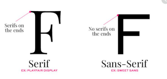
This is going to be affecting me a lot because I need to make sure how i am going to use the fonts since different fonts will be required for different logos or any type of writing i will be doing e.g. if i am making a logo for a high end fancy company i will need to make sure its an serif font to make it look posh and good and if the logo is for normal business i can still use the serif but should focus more on san-serif since the target i am aiming would be working class people.
Reference:
https://www.pinterest.co.uk/pin/52917364355164814/
1 note
·
View note
Text
One-One tutorial
I have done some tutorial with my lecturer where I showed him my work and showed him the logos I made and got great response on my work and here are some of the things I was told that I could work on:
-Review on my logos and some aspect that i could improve on
-We talked about Serif and san serif fonts and how to apply it to my work
-I also talked about Leading and Kerning
I was told that i should look up how to use grid on my work
I am going to be doing more post on each of those topic to understand it more.
1 note
·
View note
Text
Before and after of my logo
At the beginning of making this logo I was thinking of how i would find the different parts for my logo and i searched all the different things that the website provides and finally found the different aspects that i need to make the logo and here is the image of the different shapes/images i used:

I made sure to delete the parts I don't need and change the colours around and find the best parts to use and after experimenting around a lot I made the final outcome which is this:

1 note
·
View note
Text
Logo part 2
Moving on from the first logo I started to make more logo and this here is another one of my logo I had created:
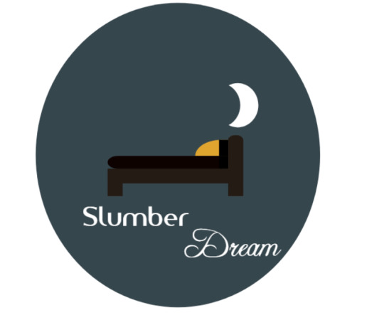
This is another one of the logo i have made for a mattress company which i made sketches for and combined together the best parts of the multiple sketch and made this outcome i will be explaining on the before and after of the logo in the next post i am doing.
1 note
·
View note
Text
Logo overview
Overall making that logo was really fun experience for me and was really good education since it allowed me to experiment as much as i wanted and not lose the work and one of the main things i like about using the website is that it allows you to see how the logo would look if it was to be on a merchandise such as shirt, mug or even a business card so you can see what it would look like before even using it:

1 note
·
View note
Text
Step by step of how I made the logo Part 3
After i finished making the logo it self I then started to focus on writing part since I needed to find the best font colour and font size for the logo and after some time i found the right font for my logo and combined it with my logo and this is the final outcome of everything combined:

Final Image:

2 notes
·
View notes
Text
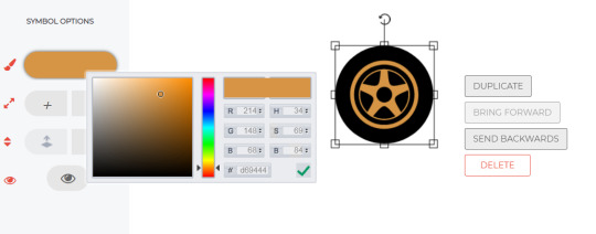
Step by step of how I made the logo Part 2
After creating the 2 different parts I combined them together and used the duplicate tools to duplicate the tools together

After I duplicated and combined them together i tried to match both of them to make it look even and nice as I could do even if it was my first time

1 note
·
View note
Text
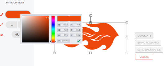
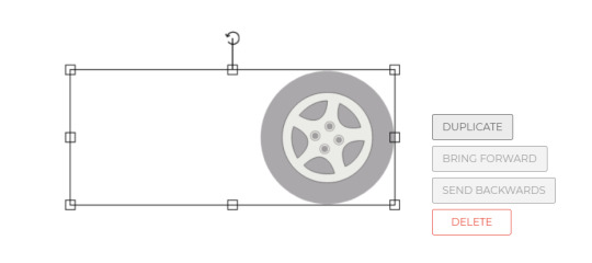
Step by step of how i made the logo
I will be explaining how I made the logo and what i did to get from different images to the final outcome:
I started with a fire shape and changed the size and optimised the colours to make it more relevant to my theme
Then I searched and found the wheels I was looking for and deleted some parts and changed the colours around and made it look more realistic
1 note
·
View note