megan-hallidays-illustrations
Fundamentals Blog
10 posts
Don't wanna be here? Send us removal request.
Last Seen Blogs
notastranger
notastranger
mediocre-red-aesthetic
R E D A E S T H E T I C
joshuapresley
El viaje de Joshua
lesbianjudasiscariot
♡God’s Favorite Sacrificial Lamb♡

borisbubbles
Boris' Eurovision Bubbles
Photo
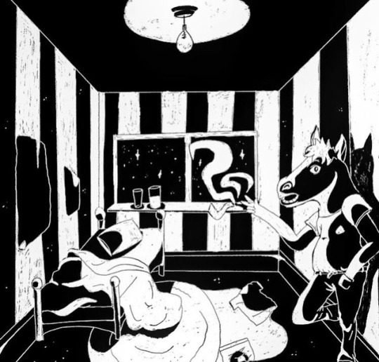
For our last project in fundamentals we had been given lyrics from a song “vile stuff” with this song I was given the lyrics “my bedroom walls are papered with the stripes of Newcastle united between which I perceive the presence of a horse headed figure” with these lyrics I had the exact idea in my mind what to do but couldn’t quite grasp how to create the image so I played around a bit on the cintiq figuring out composition and lighting, it took a while but I was really happy with the outcome, its very different to the usual stuff I draw but even so I find it worked well, I liked the project and trying something new. I find my piece became successful with the way I used the black textured brush, I find it makes the image look like a lino cut which I find pleasing. If I could change anything within my work id change the proportions and positions of the bed as well as the lighting, if find in doing this it could have a stronger finished outcome.
0 notes
Photo


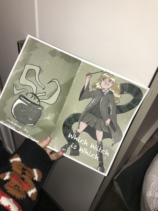
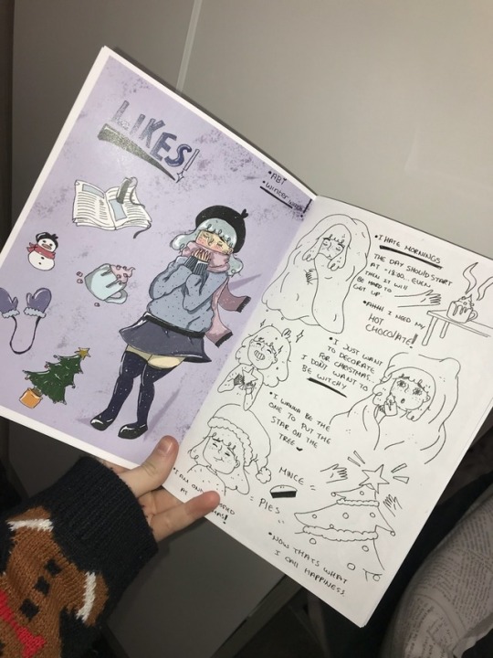
Her is how I laid out my zine and printed it, I found laying out my zine was really complicated at first and I couldn’t understand how to do it, I followed templates and tutorials but the pages came out in the wrong order, so I had to ask for help and then I managed to get it in the correct order. With my zine I tried something different I attempted to do different races ages and body types to get a winder range of character design but within doing this I found I didn’t like the outcome, I wish I had explored different styles and options, it was my first time doing digital so I struggles a bit figuring out how to colour and draw it down, now with a little more experience id be able to redo the zine and make it a fair bit better. I wish I had explored different ideas with one character and a graphic novel type of idea, I find that could have turned out better than what I have currently got. Either way with this project it has helped me learn and understand more about what I enjoy to draw and how I like to colour and design my images, in the future I want to expand more with my style and the idea of digital art as well as attempt to start a web comic or create more graphic novel type zines.
0 notes
Photo
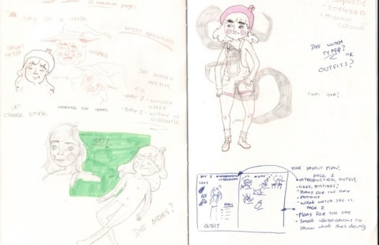
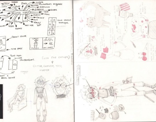
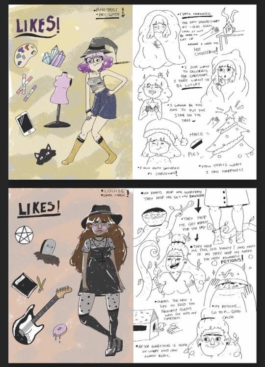
As a final big project of this term we were given the project of creating our own zines, I was excited for this project because this is the stuff I liked, so I decided to do some sketches and ideas for the project I was looking into a story maybe for a character but while I was doing the ideas I thought of the idea to do different witches for each page then have a second page which showed what they did during the day or morning of their life, I thought this would be a cute fun idea so I went thought and did some sketches and I tried it out on the double page spread, I thought it was going to work out really well with how my ideas and sketches were turning out. With these being my only sketches for the project I regret not exploring further ideas and further sketches just to the simple fact I wasn’t happy with my over all finished zine.
0 notes
Photo


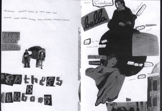


While in a lecture we were given a group project, for starters we worked in pairs then we moves and worked on the table as a group. The project was to create a collage that went together with a blind poem we had done, so for the blind poem we had to cross out a lot of words and just keep a few which made a sentence. I worked in a pair with Joe and we came up with a poem and a design and then created the design around the poem, I found it worked really well even though neither of us are great at collages or poems it worked well. After we had created out collage we were put into groups of our table to make a zine together, so we got together and places out pages in the order we wanted them to be in and put our names on the back, which were cut out letters which ended up spelling our names. When printing the zine as a group we decided to change the colour of the front cover to make it look “trippy” since our zine was called the acid trip we wanted to make the front cover look weird. I find our zine turned out as good as it could have done for a group project, although I would have liked to change a couple things the imperfections is what gave this zine such character.
0 notes
Photo

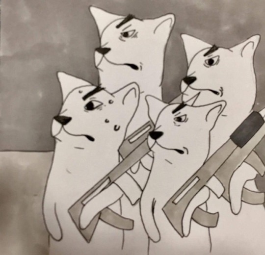
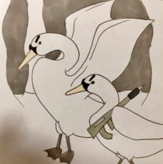


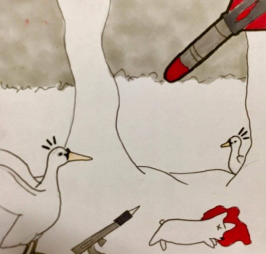

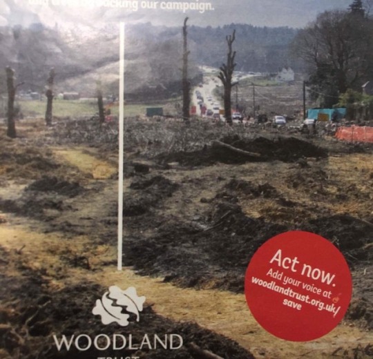
As previously said in the last post I decided to go with a swan and corgi war. The story behind my work goes like this, the queen has captured the swans claiming them as her own but the swans want to be free so they start a revolution to over throw and take over the queen and in turn the queen sends her corgis to attack and kill the swans, the swans start to fight back harder and over all start winning the war but with the war and everyone distracted one corgi gets free and manages to send a missile to wipe out the rest of the swans what are fighting, with this it kills off the swans… leading to the last image of the destroyed woodland. With this being my story I decided to go with the final outcome came out looking very clear and it communicated the story well. However I wish I had had the whole two weeks on the project due to the lack of time on it I had to make the illustrations small as well as they lack good quality due to the fact of the time scale was very slim.
0 notes
Photo

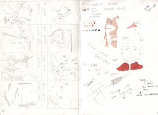
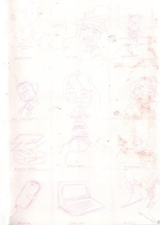
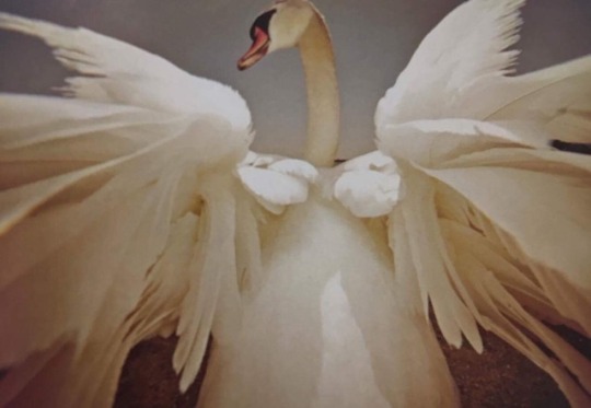
The narratives above are two different projects, the first one in purple is a series of illustrations we did in a restricted time frame for random words we had wrote down, as well as this we created a series of narrative shorts on the next page (I do not have a picture of this page the pencil is too light) but we basically was given a narrative idea and a camera angle, so we could interpretate it in anyway we wanted but we have to stick to the story and angle, the images came out successfully my only downfall was using a light pencil which in turn faded and doesn’t show up as much as it did. For my other illustrations on here we were all given a task to do within two weeks, unfortunately I had missed the lesson we were given this and in turn had very limited time to do the project (a week). The project was create a narrative of 8 illustrations going from one picture to another, I was given a swan and a ruined wood land so with this I created many sketches exploring different ideas of a narnia type story all the way to a queen corgi army story, which I ended up going with.
0 notes
Photo


So from my last class project we were given a brief to create an idiom of our own in a style we want to work in. so with this it took me a while to find a decent idiom that I know as well as other people, so I finally came up with “to steal somebodies thunder” I thought this would be a good idiom to use for my illustration. With working on this idiom I sketched out a variety of different ideas and compositions to go with the image before settling with my final image, it took me a while to create the image because of the different ideas, I didn’t know whether to make it look like they were children in a play or to make it look like a character was stealing from Zeus, I finally went with my second ide which I think turned out really well, the image was communicating the idiom clearly as well as looking cute and innocent while not being cute and innocent at the same time, I find it worked well, in future ill try make my characters look less stiff in their positions.
0 notes
Photo
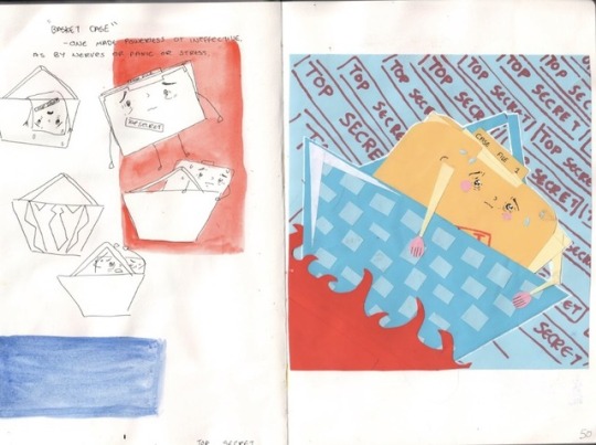
For this image we had a class challenge of creating an idiom from which we was given at random to create using paper within a hour, I was given the idiom “basket case” with this I thought it would be pretty simple to do the idea of a case file being dramatic within a basket struck my interest and so with this I did sketches and found the sketches to be quite successful. With going and thinking though this I should have thought how other people would have seen or thought of the work since not everybody would have thought of a case file or know what one is. Therefore I went through with my original plan and I thought it came out pretty well with the character working out well in the image, the issue was when it came to distinguishing what the character was for the idiom. With people not being able to tell what the character was it made it harder for them to guess the idiom, so in future from this experience I know to go the simpler rout that everybody would understand instead of one that I think would work.
0 notes
Photo
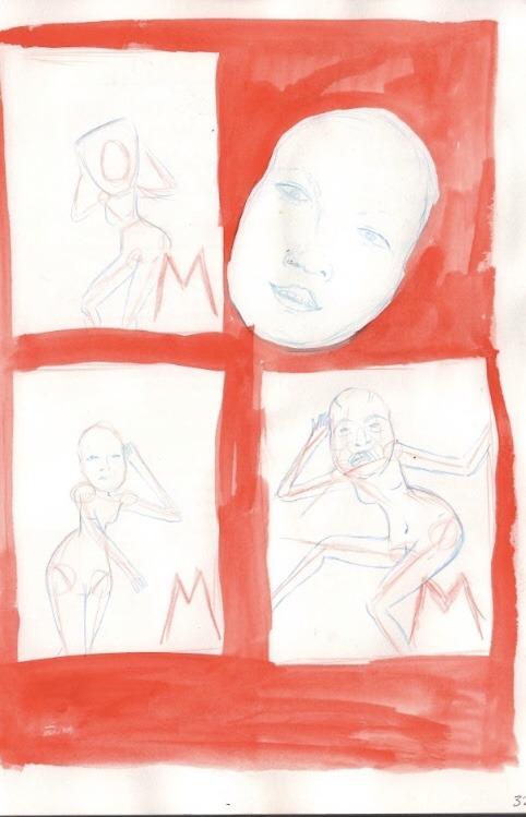
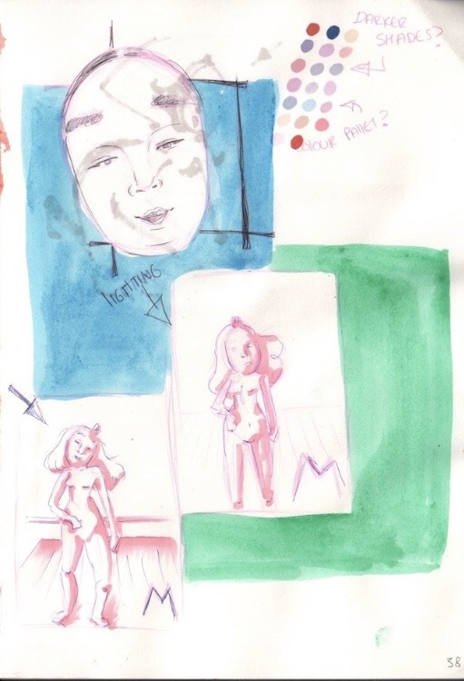

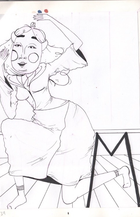

With our first brief we had been given a second one which was an adaptation of the first, basically we were given a letter from the alphabet (I was given M) and with that letter we had to create an illustration from the item we had drawn in the museum. I decided to do a mask since I had drawn one, when I was researching an sketching ideas for the mask I realised it wasn’t working with what I had wanted it to work with, so in turn I googled other masks from that museum and I came across some masks from an old Japanese theatre performance. So with finding the masks I started to sketch and plan out how the image would come out, within doing this I ended up trying other masks before I settled with the second one I had attempted, I found that mask worked well with what I was trying to portray. Although I’m not too happy with the outcome of the image I found the mask worked well in creating a performance looking piece with its exaggerated features and simplistic tone. I found while doing my illustration I should have flipped the piece so it was going from right to left instead of left to right, because I found one of the main issues of my piece was the fact it looked like it was exiting the piece rather than entering.
0 notes
Photo
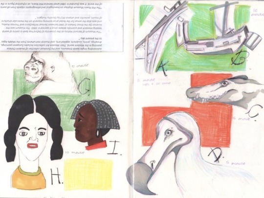
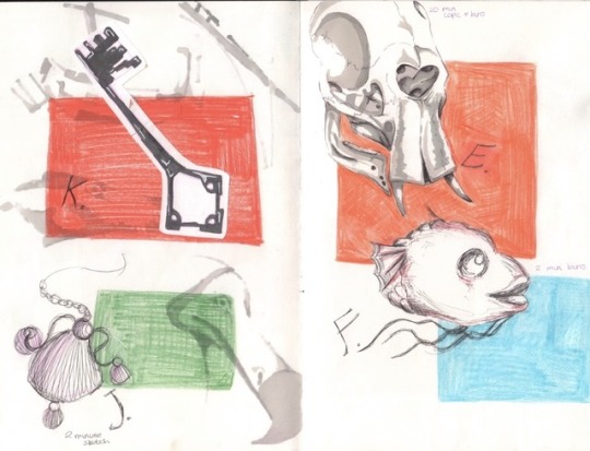


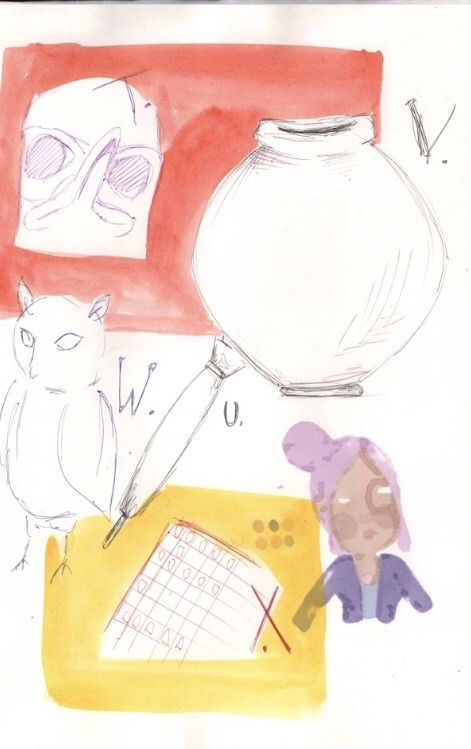

On the First Fundamentals lesson we took a trip to oxford museum and was given a task on documenting items in and around the museum to do with the alphabet, for example drawing apple for A. With this project I just took my biro and col erase pencil and sketched as much as I could, when time was running out I took plenty of pictures to save and use as reference since I wouldn’t be there for long enough to complete the task at hand. When looking back on the art I created for the alphabet I realised they weren’t as refined or as good as id have liked them to be, but with the task given I wouldn’t have been able to achieve preferred levels of satisfactory within each piece. I found I struggled with finding a letter for each letter of the alphabet so as a second option I went with something I saw in another museum to document the letter Z, although I wish I had looked around the museum more to have found letters to match up with the sketches.
0 notes