lozibunni
Lozi
heya :D im Lozi and i draw | 17 |
11 posts
Don't wanna be here? Send us removal request.
Last Seen Blogs
speechifying-by-the-stone
Ivan Karamazov's Roughdrafts

lord-shitbox
shitbox

kateslife15
Kate's Life
paddedchuck
Chucks Blog

cetirizhane
primum non nocere
Text
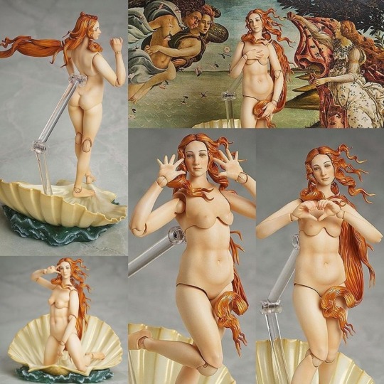
The Birth of Venus by Botticelli figure/bjd
Part of The Table Museum collection by Freeing
Link: |X|
It’s super breathtaking:

136K notes
·
View notes
Text
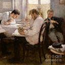
1 million dollars or dinner with mc princess
7K notes
·
View notes

Text
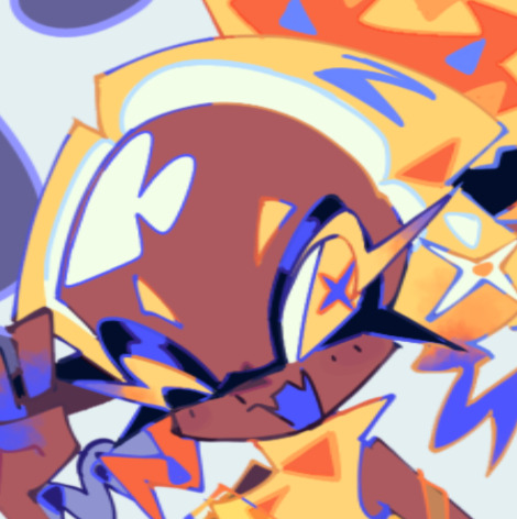
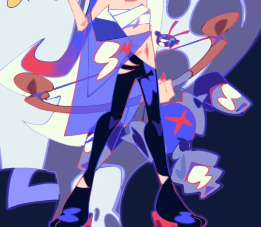
OK heres zeno coloring tutorial 2.0 !!!! i'm gonna do it kind of in chapters i guess?
chapter 1: choosing base colors
when i'm choosing base colors i always pick everything based on a specific off-white! my 'default' off-white is this kind of very light cyan color but i change it regularly based on character designs/environment/lighting whatever,, examples here!
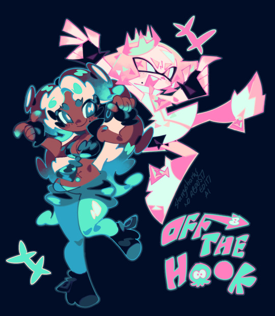
for callie in this piece, i based everything off of this pinkish color! her skin tone, tentacles, outfit etc are all chosen to harmonise/contrast with the pink color

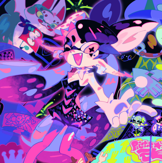
and with this piece, i used a slightly darker blueish color as they're in space but there's still a lot of light... and the lighter colors in the background (the explosion) make a sense of depth i guess? i used that blue color and chose similar cool colors to harmonise with it!
so i more or less base the tone of the colors in the piece off the off-white! warm off-white = warmer colors (like the nova valentine's day art) and cold off white = cooler colors (like the explosion nova and paro art). but i switch up this formula often !!
chapter 2: coloring specific things
here i'll go over some specific textures and stuff like skin and hair ... skin first !!
for skin, i like to use a variety of tones! there are different ways to draw cooler and warmer skintones that other people have gone over way better than i have but basically for skin i use this part of the color wheel and pick the darker tones of oranges/reds/pinks etc. (for darker skintones, i go to the middle of the color square thingy, and for lighter tones, i usually slide down the upper-right side)

when it comes to shading skintones, it's pretty straightforward, just a darkish-purple and a pinkish color on 100% multiply, and i always add a little shadow on the nose and blush becuz i think it's cute
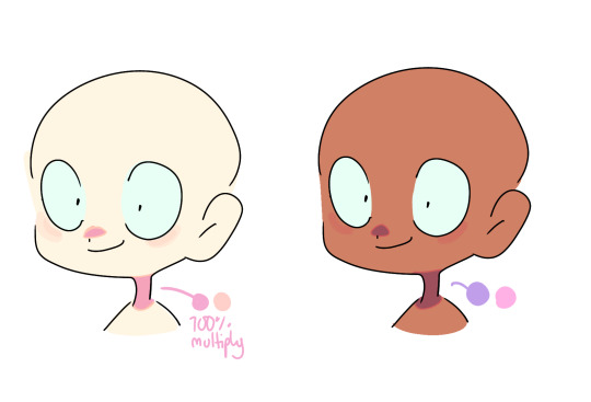
(also i like to add reflective spots on darker skin tones sometimes because 1. darker skin tones reflect in real life and 2. it's fun)

next up is hair... this is very specific to my artstyle but i like to add 3-6 long oval line thingies to the hair to mimic reflection ! it looks cool, it's a good way to show off different colors in the design and i like to switch it up sometimes based on a character's personality!! (like how the frye pic above has a lighting bolt shaped hair thing, or how my teto design has a wing shaped hair thing to mimic her wings in her chimera form!) (note: it doesn't always need to be lighter than the actually hair color and it usually isn't)

for other materials like metal, screens, etc etc... i just add random X marks lol... and reflections!!!

(also, just a general thing, but adding little saturated lines to shading really adds depth and color imo!!)
i would put more tips with refs but tumbles only allows 10 images per post ;w; so i will simply close off by saying don't be afraid to add overlays and filters to your art!! overlays can really help harmonise colors and filters like brightness and contrast can help colors pop... try not to completely rely on them for color choice tho!!
and that's basically it !!! this is not a definitive 'how to draw/color' post... i am not a color theorist... i just wanted to show people how i choose colors cuz a lot of people say they like my color choices! honestly i don't know much myself but i hope that this and the philosophy of 'do what looks good' will help you all o_ob thank you and goodbye
936 notes
·
View notes
Text

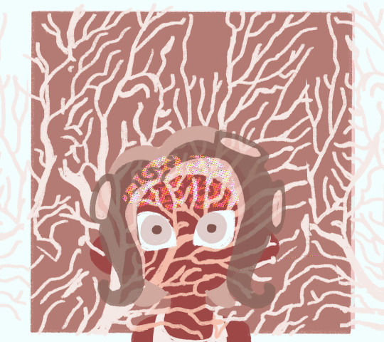
Beware part timer, for the dreaded Horrorboros arises from the abyssal depths to rain down destruction (which means mandatory overtime)!
13K notes
·
View notes
Text
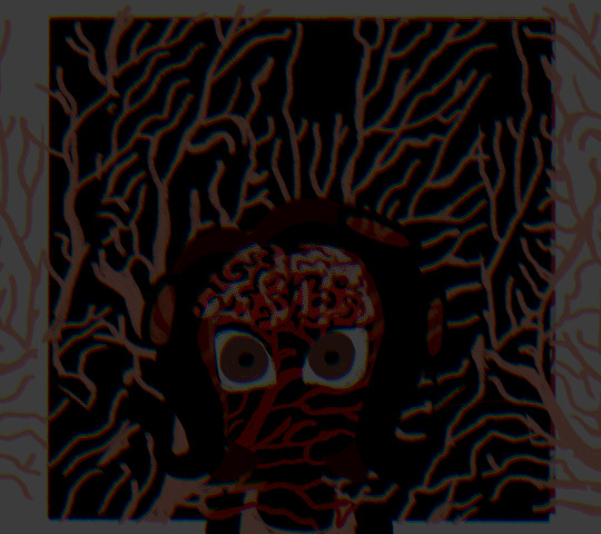
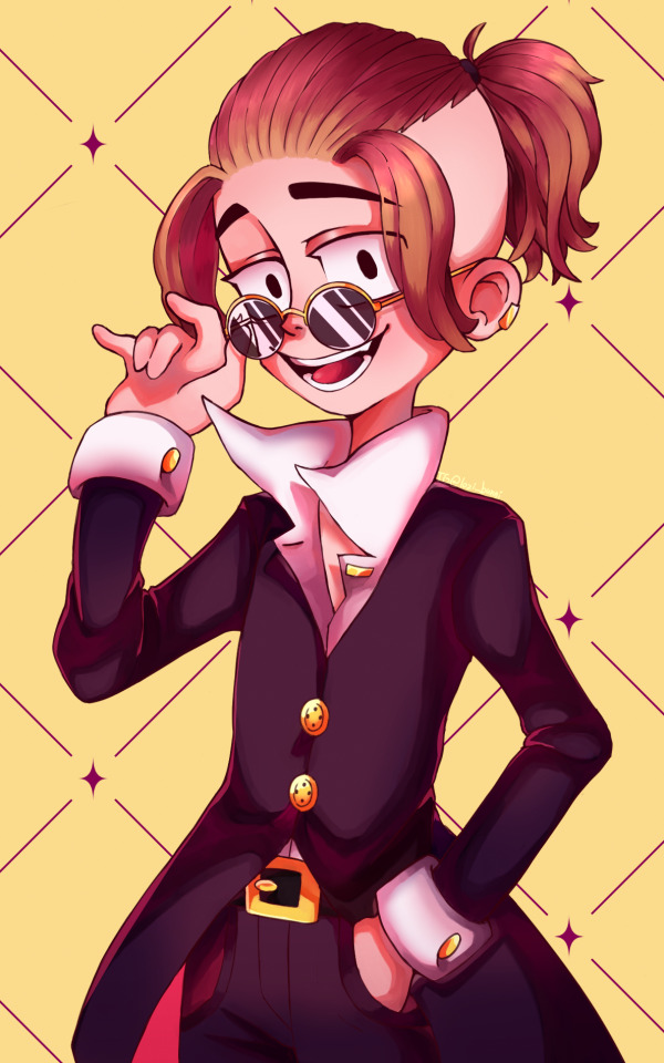
she doesnt have a name and im not sure if i want her to be a office worker or a paranormal agent or both maybe lol
6 notes
·
View notes
Photo
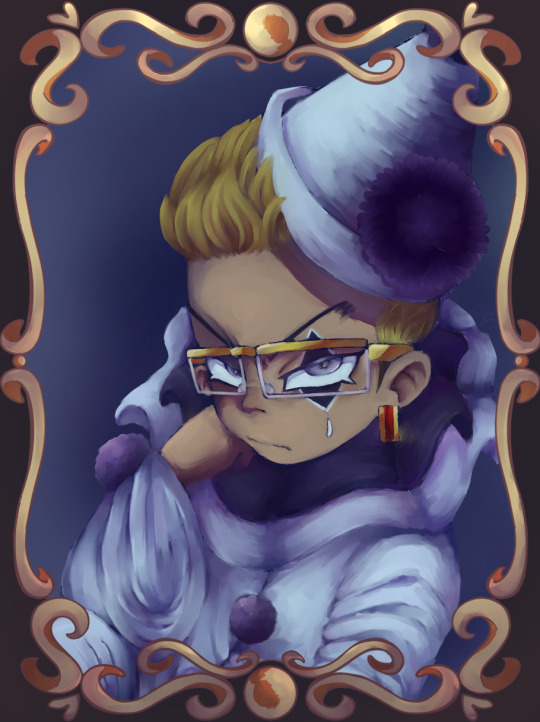
pierrot saki
#tokyo revengers fanart#tokyo revengers#kisaki tetta#hanma x kisaki#my art#artwork#artist on instagram#artists on tumblr#tokyo revengers kisaki#fanart#digital art#clip studio paint#pierrot
52 notes
·
View notes
Photo
PEH !!!
i adore him sm...this is kinda old but im still proud of it also its peh yan ! his head does look huge though so ignore it lmao
#tokyo revengers fanart#tokyo revengers art#tokyo revengers#pehyan#fanart#my artwrok#artists on tumblr#digital art#clip studio paint
10 notes
·
View notes
Photo

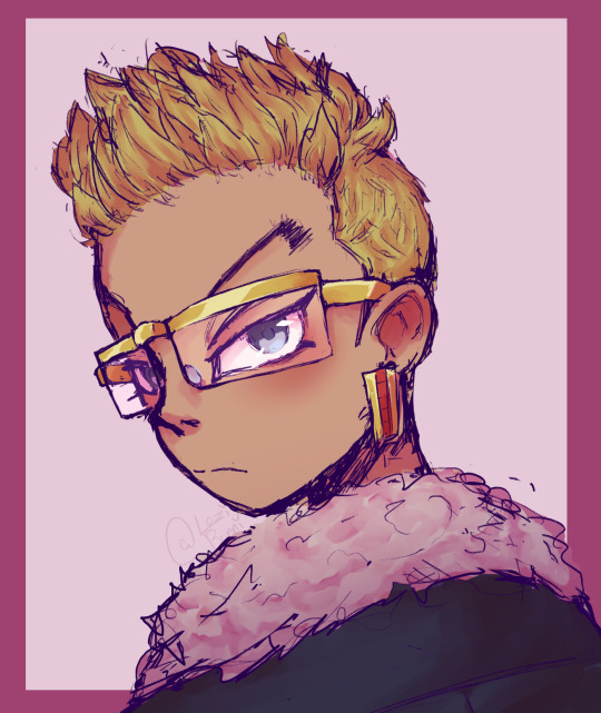
kisaki and hanma are one of my favorite duos in tr
#tokyo revengers#tokyo revengers fanart#hanma shuji#kisaki tetta#my art#my artwork#artists on tumblr#sketch#digital sketch#clip studio paint#anime
58 notes
·
View notes