Text
Colour Grading-Research
Christopher Doyle

Christopher Doyle was born in Sydney, Australia in 1952, he went through many different jobs in Asia before finding photography as something he enjoyed.

Doyle, who is mainly known for his work on Chinese films, moved into cinematography from photography in 1983 and found his passion for movie making. He is also known for helping create music videos for bands such as Texas.
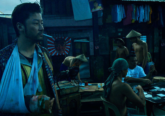
Colour grading in his films are very typical of the cinematic colours blue/green and orange. Nearly every still you see features these colours. The blues help create a calmness or sadness within the film. It is quite an extreme use of cinematic colours opposed to more subtle uses in cinematographers films like Danny Cohen. The oranges create a sense of warmth and heat, safe, and from the frame above I feel this is portrayed rather well.
Danny Cohen
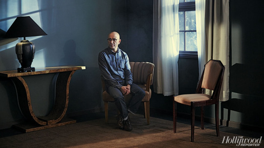
Danny Cohen is a British cinematographer known for his work on films such as The Kings Speech, Les Miserables and the Danish Girl. He started off as a photographic technician before progressing through the movie industry and finally becoming a director of photography/cinematographer.
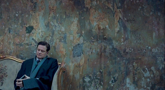
Cohen is well known in his films for his interesting lighting set ups, such as in the Kings Speech all lighting was outside of the Kings office and light for example was placed in places such as outside a skylight window to create natural looking daylight even when it started to get dark outside.
Danny Cohen has a more subtle colour grading style where the greens and blues are there but not overwhelming. This is the same with the oranges. This is also reflected in the way he uses light, very subtle.
Emmanuel Lubezki
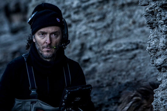
Emmanuel Lubezki us a Mexican cinematographer. Lubezki has been nominated and won many awards for his cinemegraphic work, his most recent award being an academy award for cinematography on the Revenant. However, Lubezki is also know for his photography as when he works on films he often takes film stills of the magnificent locations and scenes he is shooting.
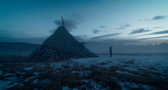
For example on the Revenant, nearly all scenes were shot in natural light which Lubezki would have considered, this would be to create a certain colour and tone to the full movie. Many of Lubezkis pictures are of cinematic colour and tones which reflects from his cinematography in movies.
The revenant in particular mainly features blues, earthy colours such as blues and browns. Lubezkis films are heavily colour graded also to help create the mood of the film. These blues also create a sense of lonliness especially in the film the revenant.
1 note
·
View note
Photo

My gif for the research task on how to make a gif.
1 note
·
View note
Text
Research Exercise
Advanced Image Editing
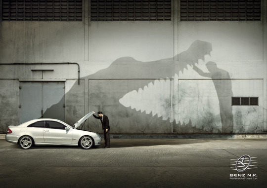
In the above image it is obvious that advanced image editing has been used in order for the shadow of the car to look as though it is an alligator aka to make the car be portrayed as fierce.
To achieve this I feel the car and background have been shot separately as the car looks slightly unrealistically lit compared to the shadow as the shadow would imply that the light should be coming from underneath the car almost.
Overall the image looks very animated and although I feel that advanced editing has taken place I think it could have been done more successfully.
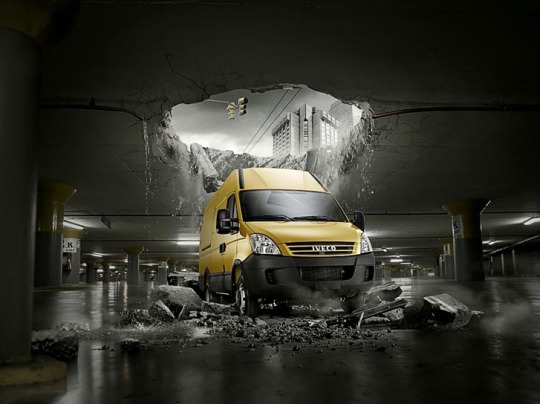
I feel this is a more successful use of advanced photo editing as it looks very realistic and cinematic. It shows what the advertising is trying to portray that the van is so strong that it breaks through concrete and still sits unscathed.
I think colour grading has taken place here to allow the image to take a very cinematic feel. There are already very few colours within this image apart from greys and yellow only enforcing the colour grading.
It is obvious that the van background and components to form the rubble have all been shot separately and placed in to the image. such as the hole in the roof will have been photoshopped out and then a separate image of the the building and traffic lights will have been added and been made to match in colour.
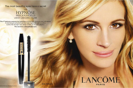
The above image is heavily photoshopped. The models face has been heavily airbrushed to give the pore-less flawless skin look to try and highlight what the product can supposedly do. I also wouldn’t be surprised if the models face itself has been manipulated to look slimmer or more smoothed. The models eyes also look very white so any imperfections on the model have been rectified in editing.
Also, the background has clearly been added separately as no detailed background really exists, a bokah style background and a giant rose feature to show softness like how your skin should be. This whole image is about softness and purity. Which I feel has been done successfully to an extent however it’s very obvious what their intentions are from this ad.
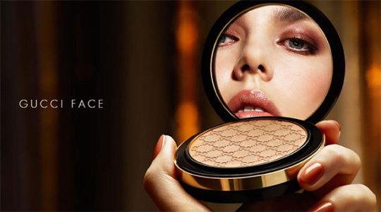
The area of most editing has been done on the models face and also the placing of the models face in the mirror as this is a very strange angle of the models face. Also, to try and get this shot in one would be very difficult to keep the models features within such a small mirror. So the models face has been shot separately and then placed into where the mirror of this compact would be in order for it to look as though the model is simply looking at herself.
Furthermore, the models face has been heavily edited also as once again the pore-less, flawless skin features so this has most definitely been achieved in post production.
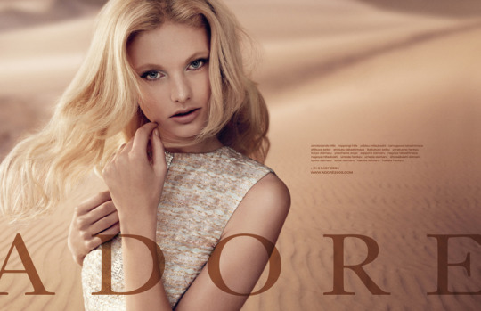
The model and background have both been shot separately as the light, although it has been tried to be recreated, doesn’t really match up well. Also once again we can see an example of the perfect skin editing on the model as her skin is flawless again.
The model will have been shot in a studio and then in photoshop I assume a magic pen or selection tool has been used to cut the model out of the studio setting and placed into a desert.
Colour matching will have taken place also as the desert takes on a pink tone to it in order to resemble the colouration of the models outfit and tone.
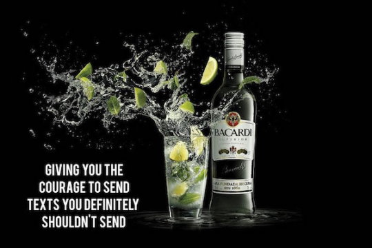
So many components of this image have been shot separately. The bottle firstly has been shot in studio with a black background and lit accordingly with the light coming from the right hand-side.
Then the glass itself has been shot separately once again, I think when the glass has been shot its had liquid in but in editing has been modified so it looks more animated.
Then the liquid has been shot using high speed flash and all the limes and mint will have been shot separately too. All lit separately also.
In post editing all the images will have been placed together and very advanced editing I feel will have taken place. The bottle and glass placed together then having to layer the liquid in also and masking will have also taken place majorly here.
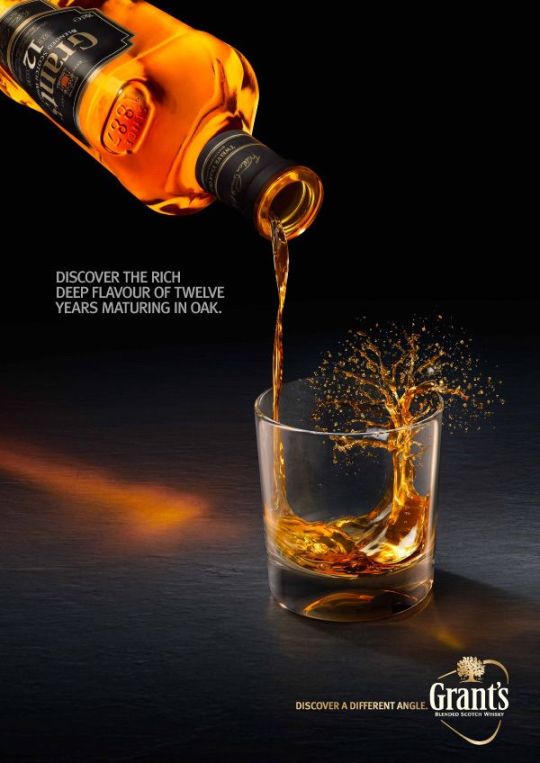
Once again like many other alcohol advertisements, the bottle, glass and liquid has all been shot at different times from each other. The bottle has had a lot of advanced editing to make it look neon orange almost but also the bottle itself has been edited to make it look extremely full and also accentuate the features of the bottle such as the unique shape.
The glass and background I believe have been shot together and that the glass was empty when shot. Most of the advanced editing in this image has taken place in the whisky forming a tree in the glass as this is most certainly all done in post production, possibly by using an image taken of the whisky liquid and cutting it and forming it to make a tree.
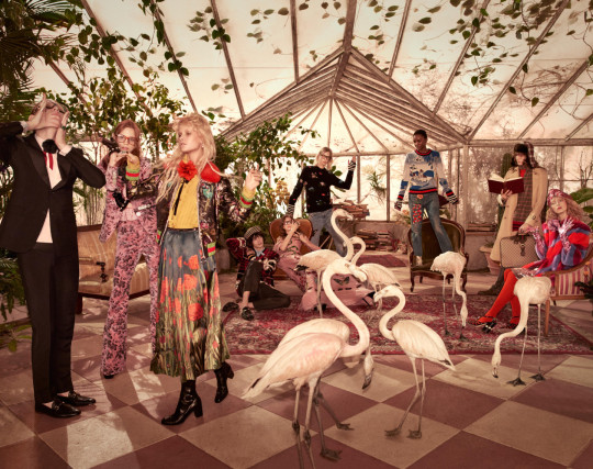
A lot of masking and layering has taken place in this image. All/most of these models have been shot at different times. This can be seen by the change in light on the models when there would be no light source near them yet somehow they are still lit equally.
Therefore, layering and masking has taken place I believe. A fairly simple technique but when used to this extent can be tricky as nearly everything has had to have been separately placed in to this final image. Simple as having the camera in the exact same spot for every model and taking the image then layer and masking them in.
As with all fashion/cosmetics advertisements the poreless skin features again however I feel in this instance it has been more naturally as the image has a slightly hazey feel to it. The extent of the advanced editing on this will be the apples and perfume all being shot in studio and lit to highlight the product so the model doesn’t overpower the product. This image of the perfume was then placed on top of the image of the model taken outside i assume as the light looks very natural and a reflector may have been used?
Most of the advanced editing in this image will have taken place on the models skin and face and on the product itself. As a reflection of New York can also be seen in the product that also will have had to have been layered on top of the image and the opacity possibly turned down slightly.
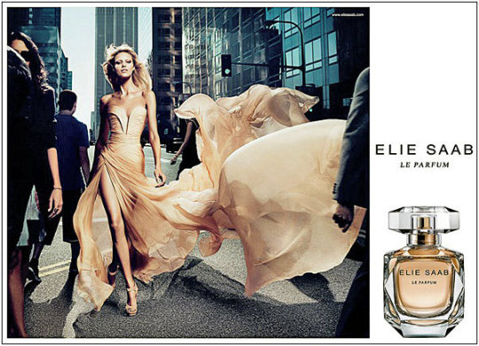
I believe the model and her dress have been shot in the studio on this occasion as this control over the dress shape would have been highly unlikely on a busy city street. Therefore I feel two images have been used here. The studio image of the model and a city scene with the people.
I think then after both have been shot that the studio model shot would have been cut out using a selection tool and simply placing her into the scene and also placing shadows accordingly to create a more realistic composite.
#advancedimageediting#editing#imageediting#research#composite#10images#fashion#advertising#cosmetics#alcohol
0 notes
Text
Evaluation
I have found folio 2 to be my most challenging yet. Projects such as the North Star project I feel have been my weakest. This is because with the Whisky images I really struggled to let my creativity flow as I found it hard to see past the fact I was shooting a bottle. For my creative glassware shot in the studio I feel it is successful but as it is a reflection in the card it isn't crystal clear or pin sharp which I feel works in this case. If I could improve this image I would have maybe spent more time in the studio and played around with lighting more in order to create a more dramatic look.
For my lifestyle series, I went through many idea before settling on my beach images, I feel these images give out the carefree, calm look I was hoping for and meet the brief also. If I could improve on these images I would maybe take a more abstract view of the bottle in the lifestyle shots, so that it’s not just sitting there.
For my composite image, I in the end like the result that I have achieved as I feel it gives that adventure, search for the bottle excitement. I really like that the sunset image also has a storm in it to help further this idea. To improve this image I would maybe make the lighting on the bottle more subtle so that it fits in with the background more.
My fashion projects I feel are my most successful especially my editorial as I just really like the end result. The editorial I like as the colours and location and model all just really compliment each other really well, the only thing if I could reshoot is maybe experiment with light a little more such as off camera flash. My major fashion brief was when I shot for 18 Montrose meaning I didn’t have a lot of input into this shoot which means the images aren't as much to my liking. I still feel they are successful however, I would have liked more clothing changes and additional light in more images to just help it stand out a little more.
Overall, folio 2 has been a tough one, but I have enjoyed it very much and learned skills such as working with models and how to deal under pressure when you just can’t get that bottle image.
0 notes
Text
Composite Practise Task

This is a composite practice task we did in editing class, this allowed for us to see the amount of work that actually goes into a composite and that there is more to it than just sticking it together.
0 notes
Text
Paper Types


Looking at different options for paper types from deadly digital in class.
0 notes
Text
Whisky Studio Lighting Setups


0 notes
Text
Composite Research
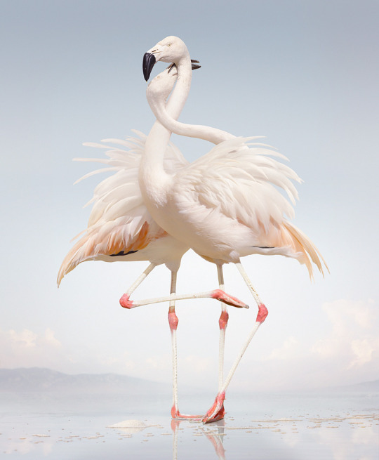
I really like Simen Johan’s work as I love the surrealist nature of it and also that it is so subtle. I think with this particualr image that Johan has taken two seperate images of flamingos and the seamlessly composited them together to create the above effect. I think the background could have possibly been added also as it seems to be sitting at a slightly different level from where the flamingos would be standing. However overall the image seamlessly works together to create this amazing image.
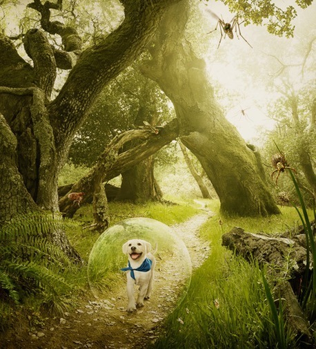
Erik Almas’ images are more obviously composited as can be seen above, however I still like his images, they are more surrealist and dreamy than other more subtle composites. In the above image for example the majority of the image if not all has been shot seperately, the dog, the landscape, the bubble, everything. I think also the lighting is very artificial aka it is clear it has been added afterwards to give a more dreamy effect. Also, the bubble doesn’t seem as realistic as everything else in the image as it doesn’t really sit properly.
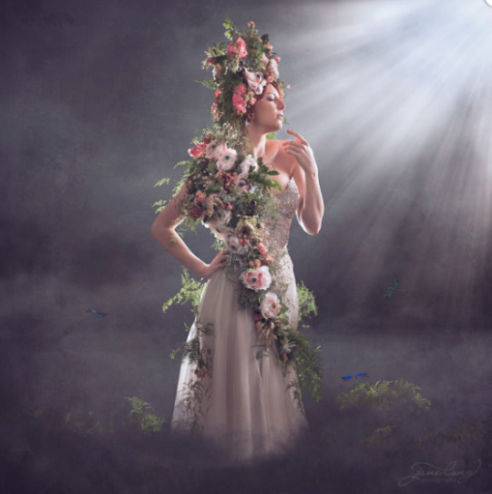
Jane Long’s images are all very surrealist and take many different components shot seperately to make one image, such as above. The girl will have been shot in a studio and the light, background and smoke will all either be shot seperate or will made in photoshop. Long’s images are almost more photoshop than shooting I would say as many of her images are very fictional so require this level of fantasy and surrealism. So for her images especially for portraiture, she would initially have to shoot the model in the studio thinking about what light she would have to create in order to then simulate afterwards in photoshop and creating the light in photoshop.
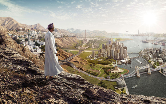
Franke Staudinger’s images all seem to have messages behind them, whether theyshow humour or a more deep underlying message such as above. A lot of Staudinger’s images look at new age problems such as renewable energy and pollution. In this image all has been shot seperately and some even drawn in photoshop maybe? There’s hundreds of different componenents to this image in particular such as the man was shot maybe in a studio seperate from all the landscape images. These would have been shot seperately. Overall it is obvious this is a composite image as it is not very subtle however it is still seamless and once again gives that surreal look.
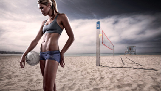
Joel Grimes images almost look like video games to me, very cinematic. His subjects are quite clearly and lit in a studio and backgrounds are shot seperately along with dramatic skies etc. It is obvious that this is a composite as you can see the light coming from the left hand side when the light in the background seems to be coming more straight on from the left so a slightly different angle maybe? Also the seperate studio shots allow for light to be moulded how he would like meaning he can make his subject just how he would like such as showing or accentuating features like her abs.
0 notes
Photo


My powerpoint for our documentary research task 2, picking two photographers with our initials and finding out all about them!
0 notes
Video
youtube
A little video to jog my memory from learning bookbinding in class with Claire the other day.
0 notes
Photo
Today we were visited by Andrew Dobbie of MadeBrave and it was a pretty inspirational talk today! If I didnt want to start my own business before, I do now! Learning to “be brave” and take risks to get what you want and basically be determined to get what you want.
Also to collaborate with others and to work as a team to get a final result that you want. A really cool business based right in Glasgow. Definitely a business style that I would be interested in should I ever start my own business.


Andrew Dobbie from madebrave…. did you tweet your pics??
Www.madebrave.com
5 notes
·
View notes
Text
Major Fashion

For this project I collaborated with the GCU students and 18 Montrose however I didn’t have much input in the shoot I feel my images meet the brief. I would have preferred more input in this shoot as I would have liked clothing changes and different locations however we were not able to do this. However, for my editorial I have chosen to have a story about jackets, a series of jackets. Showing young people exploring the city and basically getting up to no good.
I mainly used natural light for this shoot as that is what was asked of me, however I did use additional flash in the stairs shot as it was vital to make the image look good.
0 notes
Text
Editorial

For my editorial brief I wanted to remain on the root of street fashion, continuing the similar look from the major fashion brief. My location I chose to use was in a car park in Glasgow, I chose to shoot all my images there and give the sort of carefree, young, having nothing to do vibe from the shoot. Very relaxed. I also felt natural light would be the best lighting to use for this shoot also as the light generated through the shape of the car park and the softness on the cloudy diffused light was too good not to use.
The clothing for the shoot I chose to keep it very casual, I asked the model Jeje to wear casual plain clothes as to not create too much fuss around the clothes and help focus on the story of the editorial more.
I also made sure that my final images are 3 portrait and 3 landscape, to show a series and progression through the shoot. I really enjoyed using leading lines in these images also such as in the levitation image where the model is floating, allowing for the model to be the main focus in the image.
I also wanted the posing of the model to remain very natural and comfortable as to give off that carefree nothing to do look.
I feel overall I have met the brief with these images and I enjoyed shooting fashion a lot more than I thought I would. I look forward to doing more fashion based projects in the future.
0 notes
Text
Creative Glassware
Once again my creativity was really pushed with this project. I just really struggled to be imaginative with the whisky bottle. However, after experimenting in the studio I was using shiny bronze paper which I bought to compliment the colour of the whisky bottle. After speaking to Jim I was encouraged to work with the reflections given from the paper. After hours of moving and holding a bottle at arms length I finally got a final image I was happy with.

My image is heavily distorted as it is a reflection. However I love that it looks as though the glass is melting like lava, it also looks like whisky pouring. I really liked the warm tones of the whole image so I chose to play with the colour a little bit but try and keep that rich whisky colour. I also wanted to keep the name and logo recognisable even if it isn’t pin sharp as it is a reflection. I feel this is a successful glassware shot for my final canvas to be sent for print.
0 notes
Text
Lifestyle Advertising
Once again I really struggled with my creativity with all glassware shoots as my first initial idea was not achievable. So for my lifestyle images I wanted it to match my composite. Therefore, I chose to shoot on the beach at Ayr. I wanted to give a chill vibe where someone was sitting watching the world go by, the view, the way they sit and the company of the bottle.

For these images including the bottle I used additional flash to help the bottle really pop. Overall I feel these images meet the brief of showing an associated potential lifestyle perceived by the whisky. I wanted to give a warm feeling from the images, so I colour graded to allow warmth that reflects the warmth of whisky. The idea behind this lifestyle is carefree, young, watching the world go by in nice places.
0 notes
Text
Composite building
For my final North Star composite image I planned to have sort of “into the storm” look to my final image. My initial idea was to have the North Star bottle sitting on top of the landscape almost looking like a boat ready to begin it’s quest to discover the North Star.
Therefore I made my way to Ayr beach for my final shoot and firstly had to get my landscape image.

This forms the first layer, the background. Luckily the weather on this day suited my idea perfectly as there was a rain storm in the distance on the left as you can see.
Secondly I needed my image of the bottle to place into the background.

I decided when shooting that to make things easier I would use additional flash to make the North Star label more visible and also make the bottle float as to make it easier to cut out. I then cut out the bottle with the pen tool and masked it and placed it in the background.


I also burned and dodged as to make the bottle more fitting and dramatic in the background. I chose to place it in the light area as this shows the calm before the adventure which I feel would be a nice impression of the whisky. At this point I also burn and dodged the sky to make more drama.
Finally I added text to make the overall composite like a whisky advertisement.

I also cut out and changed the logo of North Star to white to fit more with the advertisement. Finally I changed the overall colour in the image so that the image colour wise blended together well. I also added a shadow under the bottle too as to allow a more realistic look to the whole image.
This is my final composite image,

I feel I struggled a lot with this project as I just wasn’t able to imagine the image I wanted in order to get a final image. Overall, I feel the full North Star project I have struggled with as I found it hard to grasp a creative idea for most of my shoots for this one. However I feel my final image meets the brief.
1 note
·
View note

