
explodinghedgehog-blog
mddn343 - Advanced Game Design
40 posts
Don't wanna be here? Send us removal request.
Last Seen Blogs

hometoursandotherstuff
Home Tours & Other Stuff

annoyingsucow
Annoying Sucow

fnqhm9k1-blog
Insurance
ao3feed-keithshiro
AO3-Feed Sheith

elokvan
Mornin!
Text
Summary
In summary, on the project I was responsible for:
Environment design, including the landscape of the game world, health meters, clouds and fences and lighting. Clouds, fences and health meters have animations.
Menu design: the main menu, instructions and credits screens. Assets such as the farmer created by other group members or myself for other parts of the game were re-used but with extra detail added to the meshes. Menu items have pulsing animations.
Item design: all the collectibles, that is the food items, powerups and powerup symbols. The food items have rotting animations, the powerup collectible show, bob and hide animations, and the powerup symbols have bobbing animations.
Music direction
Some sound effects, both for the UI and the game itself.
All the 3D assets created by me were also textured and animated by me.
0 notes
Video
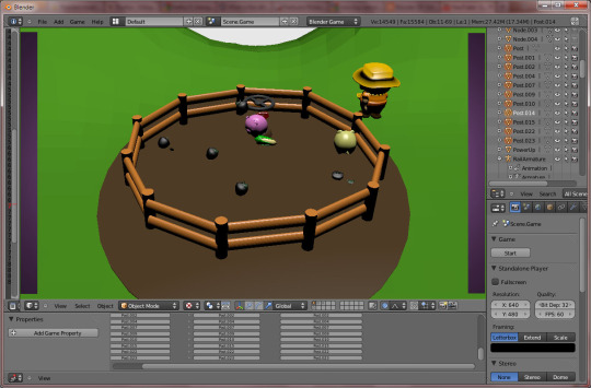
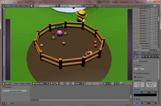
The final environment.
1 note
·
View note
Video
The final food items, animated.
0 notes
Video
The final powerups and powerup symbols, animated.
0 notes
Photo

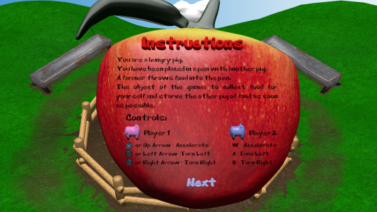
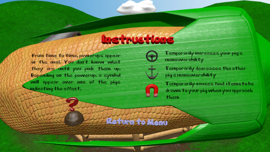
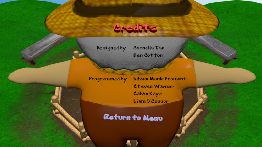
The final UI screens. There are some odd discrepancies between the game engine renderer and the Blender default renderer used here (texture mapping for one is slightly incorrect in the default renderer). These were rendered with the default renderer because otherwise the results are higher quality.
For the menu backgrounds, I used in-game assets which I subdivided and smoothed to produce a nice result when seen at this size. Also worth noting is the fact that I altered the magnitude of the bump mapping across the assets I designed in the UI and game depending on the on-screen size. Most notably this was done with the corn: in the UI the bump mapping intensity is set to around 1, while in the corn in the game has it's bump mapping set to a much higher value, so that the detail would always register on screen.
To make the menus intuitive, I created pulsing animations for each menu item for when they are highlighted. As far as sounds go, I decided to use an pig sound oink that I sourced earlier as a sound effect for when you switch between menu items. A pig squeal is emitted when you select an item. I thought this choice of sounds would provide good interface feedback and set the tone and premise of the game.
0 notes
Video
My last attempt at creating a mud splash effect. This time I went simple, by making a wave-like effect suggesting displacement of the mud. We ran out of time to integrate this into the game, which is why it is also untextured.
0 notes
Video
A further attempt at creating a mud splash effect, this time by hand. It is very difficult to create a convincing effect by shape keys!
0 notes
Video
Another attempt at creating an effect of mud being kicked up by the pigs. Unfortunately, as it turns out, there doesn't appear to be any way to use particle systems in the game engine - there isn't even a way to bake particle system animations so they can be used as static animations.
0 notes
Photo


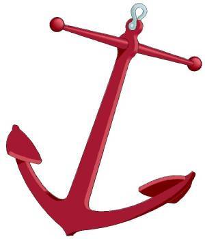


The development of what was the glue symbol (representing the powerup that decreases manuveurability) and became the anchor symbol (representing the same). I was dissatisfied with my original glue symbol for several aesthetic reasons, but rather than simply recreate it with more detail, I decided an anchor symbol would be better. This was for two reasons: firstly, the anchor symbol is far more iconic and far less literal than the glue symbol; if the glue symbol didn't have text on it saying what it is noone would get it. An anchor fits in better with the iconic magnet and steering wheel symbols. Secondly, (arguably) the glue symbol doesn't really indicate the function of the powerup properly. Does it mean your pig has glue to use or that it is glued? An anchor is less ambiguous in this regard: it restricts the movement of whoever is carrying it.
0 notes
Photo
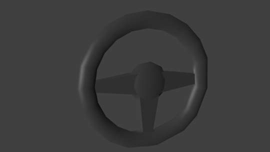
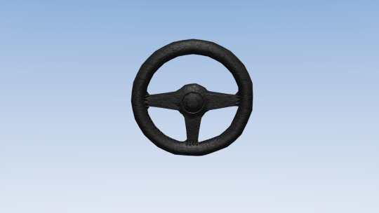

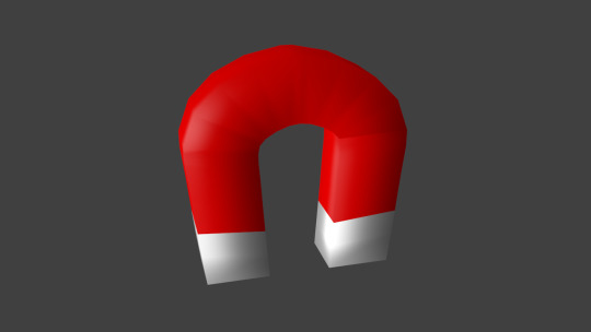
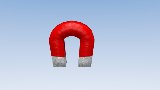
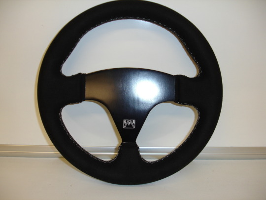
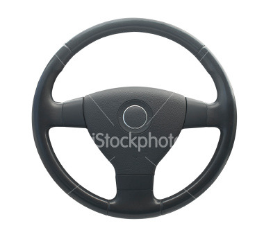
Development of the steering wheel (representing increased manuveurability) and magnet powerup symbols.
0 notes
Photo


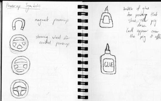
For this game there would be three kinds of powerup (or power-down):
One which makes your pig attract nearby food
One which makes your pig more manuveurable
One which makes your pig less manuveurable
The images above show my initial research and development of powerup icons, which float above the pigs indicating the powerup they currently have. For each I wanted some kind of symbol that was really iconic and instantly recognisable (hence I didn't even bother to research the look of magnets - it's obvious what that powerup should look like).
0 notes
Photo
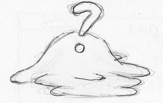


My design for the powerup collectible went through a couple of iterations of the same concept. As the effect of the powerup was not to be known until a player picked it up and they had to appear in a pig pen somehow, it was logical for them to appear covered in mud.
I used the cartoon font I found to create a floating question mark above the bulge of mud. As you can see from the first model, the font did not lend itself well to creating a 3D mesh - the parts of the question mark merged together and it just wasn't as recognisable as it should be in the game. For the final iteration I specifically re-created the question mark, manually separating it's typographic parts and also squeezing it to make it more easily recognisable as a question mark.
0 notes
Photo

Through the extensive use of stenciling I managed to texture the environment in a semi-realistic fashion. I was careful not to go too realistic, as the game is cartoony. For example, to texture the fence posts, rather than use a photographic wood texture, I painted on a simple procedural wood texture and altered the colours. The bump maps for the fence posts are also exaggerated to be visible at the angle and resolution they are shown. An overly realistic wood texture would have clashed and the details would not have registered on the screen.
Stenciling was also used to get a convincing mix of mud and grass textures and to apply patches of rust to the troughs. Again, I tried to not go too realistic, just give the troughs a bit of depth.
Unfortunately, I was unable to generate accurate and convincing shadows through lighting. For some reason any buffered shadows created only worked a set height above the ground. For example, I could get the fence posts casting shadows, but the shadows did not touch the base of the fence posts, they just floating out in space. Likewise, shadows from food being thrown in disappeared noticably before the food hit the ground.
0 notes
Photo

I found a couple of free fonts to use in our game which I think convey the cartoony tone of our game. The second I originally thought could be used for all text in the game, but the dominating appearance of blocks of text displayed in it was offputting. It suited the piggy nature of the game though, so I used it in the logo.
Cartoon Regular from: http://www.ffonts.net/Cartoon-Regular.font
Guinea Pigs from: http://www.pickafont.com/fonts/G/Guinea%20Pigs.html
0 notes
Audio
I got my friend to create three pieces of music for the game, which are more-or-less the same piece of music at different speeds, the intention being that as the action gets more frantic, so does the music.
0 notes
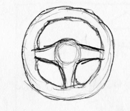
Photo
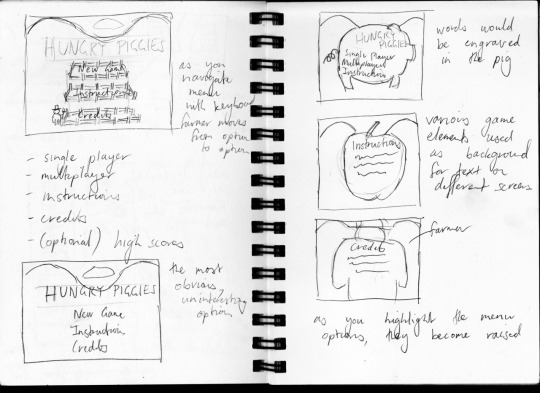
These are some sketches I did working through ideas for the UI. I liked the idea of using large versions of some of the game assets as backgrounds for the various menus. I wanted to inset the menu items on the assets and have them fill in with a different colour when highlighted, but that proved too problematic to model with the tools in Blender and required highly detailed meshes to work.
0 notes
Photo

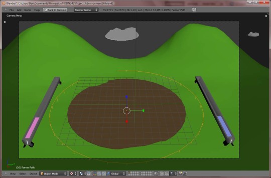
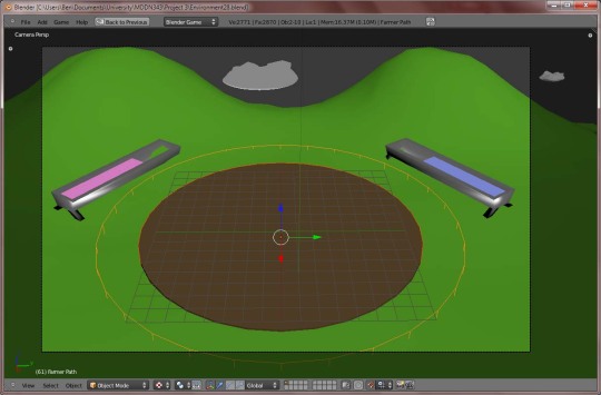
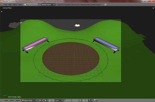
It was suggested that instead of using 4:3 as the screen aspect ratio for our game we should adopt a widescreen format as that is a more common aspect ratio on devices these days. We also wanted to adjust the angle of the camera to provide a better view of the gameplay area. These two improvements conveniently dove-tailed into one another as the primary reason I designed the game for 4:3 originally was because the gameplay area was round; as the camera angle is changing, the gameplay area will have more of an elliptical footprint on-screen, suiting wide-screen.
Choosing the right angle was a fiddly bit of trial-and-error because of the way the game blend file was set up (with the moving gameplay elements in a different scene than the background elements), but I tried out different angles and configurations until I found one that worked well and maximised screen real estate.
Also in these screenshots you can see a trough I have modelled as a replacement for the health bars.
0 notes